
 | This page, part of the
Graphics Lab Wikiproject, is an
archive of requests for December 2008. Please do not edit the contents of this page. You can submit new requests here. |
Stale Information
Romeo and Juliet
-
 Straighten, maybe crop
 -
 Maybe some straighten, maybe some crop
 -
 Straighten top line (probably minor crop since rest of image is straight?)
 -
 Do something with black border


.jpg)
-
 cropped and adjusted levels
 -
 Rotated
and cropped -
 Perspective adjusted, cropped, brightness/contrast adjusted


Article(s): Romeo and Juliet
Request: At the Romeo and Juliet featured article candidature I commented that many of the images needed nice crops, cleaning. I have listed above the ones I thought were most obvious that someone could help with but feel free to look at the article if you think you can help with others. My 'comments' are vague because I am not good at this... but all of the images I paste I think could be cleaned up somewhat to make this a better FAC.
It may be a good idea to upload as different, restored images and then comment on the FAC or change them yourselves rather than overwriting these images. gren グレン 12:45, 4 November 2008 (UTC)
Graphist opinion: I uploaded a new version of the portrait of John Gielgud. The author requested that his work integrity should not be touched. I hope that the black border was not part of the work. What do you think? -- pabouk ( talk) 11:32, 5 November 2008 (UTC)
- That is excellent. I'm only sorry most users will only see it as a thumbnail: the full version is great. Thank you.
AndyJones (
talk) 21:20, 5 November 2008 (UTC)
- Rotated
and croppedImage:Mary Saunderson.jpg uploaded as new file. ■ MMXX talk 15:52, 6 November 2008 (UTC)
- Rotated
I straightened out Image:Arthur Brooke Tragicall His.jpg somewhat, feel free to revert if you want the old version back. Tadpole9( talk • contribs) 20:08, 8 November 2008 (UTC)
- I also retouched the second image, but didn't replace the original this time. Tadpole9( talk • contribs) 22:06, 8 November 2008 (UTC)
Is image straight?
-
 4 corners marker

Article(s): Quadripoint
Request: I tried to straighten the image from its right-tilted original but I am not convinced that it is entirely straight yet. But it may just be the curve of my monitor distracing me. Can someone with better image software chek it? Rmhermen ( talk) 18:05, 8 November 2008 (UTC)
Graphist opinion: It was off a tad. But it depends what you wanted to look straight, for instance I used the cross as my vert and horiz measures. Out of curiosity what software did you use? If you feel my edit detracts from the image please revert it! §hep • ¡Talk to me! 18:16, 8 November 2008 (UTC)
- Iz becuz zhe wiki needs to get sum new image rendering software. (That was fun) §hep • ¡Talk to me! 22:18, 8 November 2008 (UTC)
- I'm very familiar with these type of conflicts. Due to the angle of the shot, it may never be fixed completely with a "straighting" software.
Herzegovina
-
 Bosnia, Herzegovina and Serbia before the Ottoman conquest in the 15th Century. (JPG)
 -
James1293's bad/autotraced/etc version

Article(s): History of Bosnia and Herzegovina, Duchy of Herzegovina
Request: Bosna Krallığı is Bosnian Kingdom, Hersek Dükalığı is Duchy of Herzegovina, Sırp Despotluğu is Serbian Despotate, Macaristan is Kingdom of Hungary, Venedikliler ise Republic of Venice, Karadağ is Montenegro, Osmanlı Devleti is Ottoman Empire, Eflak is Wallachia, Adriyatik Denizi is Adriatic Sea. SVG ification, and upload Commons, please. Lord Leatherface ( talk) 16:04, 15 October 2008 (UTC)
Graphist opinion: I'll try it. James1293 ( talk) 00:46, 25 October 2008 (UTC)
- On second thought, someone else can do it. I need to work on my speed-svg skills... I think i might be tracing too meticulously.
James1293 (
talk) 01:04, 25 October 2008 (UTC)
- Tried it more... It's pretty difficult. Does it really need svg?
James1293 (
talk) 19:27, 9 November 2008 (UTC)
- Stale tag removed. §hep • ¡Talk to me! 22:15, 9 November 2008 (UTC)
- Tried it more... It's pretty difficult. Does it really need svg?
James1293 (
talk) 19:27, 9 November 2008 (UTC)
- On second thought, someone else can do it. I need to work on my speed-svg skills... I think i might be tracing too meticulously.
James1293 (
talk) 01:04, 25 October 2008 (UTC)
french translation needed
-

-
 English Trans


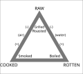
Article(s): Cooking
Request: Please provide an English Version! 118.90.131.160 ( talk) 22:19, 9 November 2008 (UTC)
Graphist opinion: Do these translations look right?
§hep •
¡Talk to me! 22:26, 9 November 2008 (UTC)
Translations:
- CRU = ???
- Grillé = Grilled
- Bouilli = Boiled
- POURRI = MAY
- Fermenté = Fermented
- Vapeur = Steam
- CUIT = COOKED
- Fumé = Smoked
- Rôti = Roast
- How's that? §hep • ¡Talk to me! 22:44, 9 November 2008 (UTC)
- CRU = Raw
- Grillé = Grilled
- Bouilli = Boiled
- POURRI = Rotten
- Fermenté = Fermented
- Vapeur = Steamed
- CUIT = COOKED
- Fumé = Smoked
- Rôti = Roasted
- I think this is better. Jackaranga ( talk) 22:59, 9 November 2008 (UTC)
- Thanks for the second pair of eyes Jackaranga. §hep • ¡Talk to me! 02:12, 10 November 2008 (UTC)
National Emblem of the People's Republic of China
-
 Current image

Article(s): Various
Request: The current image isn't matching to current laws of China. The legal image of the state emblem is located at http://www.safp.gov.mo/external/chin/apm/files/info/64/china_logo.gif Can the image above be changed to match the image I am linking here? User:Zscout370 (Return Fire) 01:08, 10 November 2008 (UTC)
Graphist opinion:
Three-point field goal diagram(s)
-
 Pre-existing SVG

Article(s): Three-point field goal
Request: This article needs, at the very least, a pictorial representation of the NBA three-point line as described in the "Rule specifications" section (including the "closest point" also described in the section) Furthermore, perhaps a comparison of three-point line distances would be nice. If you have any questions, please contact me at my talk page. Ian Manka 09:00, 9 November 2008 (UTC)
Graphist opinion: To whoever does this I found an SVG that might be helpful at Basketball. §hep • ¡Talk to me! 17:08, 9 November 2008 (UTC)
- This one maybe too, there are some others here and here. §hep • ¡Talk to me! 17:20, 9 November 2008 (UTC)
Efron and other dice
-
 Original
 -
 Other Original
 -
 Vector
 -
 Vector
Article(s): Nontransitive dice
Request: Quick vectorizations, not even sure if it's worth the time =) ... I'd do it, but I'm a bit busy. I'll probably just do it later this week if no one else gets to it. James1293 ( talk) 18:28, 9 November 2008 (UTC)
Graphist opinion: Vectorized "transitive dice" -- GateKeeperX ( talk) 10:39, 15 November 2008 (UTC)
- Vectorized "Efron dice", (is the last cube not supposed to have a number on top?) -- GateKeeperX ( talk) 11:16, 15 November 2008 (UTC)
Demographics of Iraq

Article(s): Demographics of Iraq, and others
Request: SVG ification, and upload Commons new version, please.-- Lord Leatherface ( talk) 14:50, 5 November 2008 (UTC)
Graphist opinion: It's probably earier just to click the "create a new section" link if you need a template. I hope the header wasn't supposed to say Romeo and Juliet. §hep • ¡Talk to me! 20:43, 5 November 2008 (UTC)
- I found an alternative map to use as a base if someone wants to take a crack at this. Kmusser ( talk) 18:41, 2 December 2008 (UTC)
Wings of a dragonfly
-
 Macro shot of wings of a dragonfly .
 -
 Another shot with the dragonfly in focus too.


Article(s):
Request: I would like someone to improve these pictures so that I can submit them to the already well endorsed Dragonfly article. I guess the images need a bit of sharpening and slight colour corrections. Any help would be greatly appreciated.
Graphist opinion: I apologize in advance if this seems a little harsh but honestly, these images are not going to be improved with sharpening. There is simply not enough detail there to sharpen. You need to retake the images with better lighting, focus (get the wings to lie along the focal plane) and more depth of field. WP has a lot of very good dragonfly images so you are up against some very steep competition and with all the PP in the world, these are not going to come close. Mfield ( talk) 04:41, 18 November 2008 (UTC)
Earth images
-
 Illustration of the life-cycle of the Sun.
 -
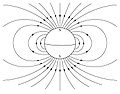 Dipole field from NASA.
 -


Article(s):
Earth mostly, but each image is used several times.
Request: Is there any chance someone could SVGify these ones? Cheers, Ben ( talk) 01:08, 15 November 2008 (UTC)
Graphist opinion: svged, the image in the middle, the Dipole field. -- GateKeeperX ( talk) 06:17, 15 November 2008 (UTC)
- svg'ed, the world map image, please check to make sure I didn't miss anything. --
GateKeeperX (
talk) 09:38, 15 November 2008 (UTC)
- Nothing missed on the world map, but a few nit picks if that is allowed :) Can ..
- cT patch on Australia and Africa be moved to the left a bit;
- mE patch that is just east of S. America be moved to the left a bit;
- mT patch that is just east of S. America be enlarged a bit?
- Also, is it possible to get the edges a little fuzzy to give the impression these regions are approximate? Thanks for all your help,
Ben (
talk) 10:09, 15 November 2008 (UTC)
- One big issue, don't use those longitude lines over an equirectangular projection! This requires some redesigning.
Tadpole9(
talk •
contribs) 04:28, 18 November 2008 (UTC)
- Tadpole, feel free to redesign/redo the svg, I haven't had much time this week, so if anyone wants to give it a try. -- GateKeeper( X) @ 17:13, 19 November 2008 (UTC)
- One big issue, don't use those longitude lines over an equirectangular projection! This requires some redesigning.
Tadpole9(
talk •
contribs) 04:28, 18 November 2008 (UTC)
- Nothing missed on the world map, but a few nit picks if that is allowed :) Can ..
India/China border
-
 China
China -
 India
India
.svg)
.svg)
Request: I made these orthographic maps, and based the national borders on the default borders from the output generator. ( [1]) I noticed that the old robinson map for China ( Image:Location China.svg) had some unrecognised territories in light green. I tried to do the same thing on China's globe.
Now I've got these messages on Commons:
Thanks for the India projection. But for inclusion on Wikipedia, I'm afraid we would have to neutrally represent the map of India. The version you uploaded equates the Line of Control as the International border. Please could you edit the disputed regions? Nichalp ( talk) 14:26, 4 November 2008 (UTC)
I suppose we should stick with the previous, established map until this has been sorted out. -- Dbachmann ( talk) 20:09, 9 November 2008 (UTC)
Hi.this is a link to the political map of India which shows international boundaries rather than line of actual control. http://www.mapsofindia.com/maps/india/india-political-map.htm And this is a an official link http://india.gov.in/maps/indiaindex.php Please change the picture or remove it completely as it is not factually accurate. 125.17.226.3 13:33, 12 November 2008 (UTC)
- Hi sorry, I missed out on your reply: Please see Image:India-locator-map-blank.svg. It explains the scenario very well. Kashmir and Arunachal Pradesh are the disputed areas. Nichalp ( talk) 19:55, 15 November 2008 (UTC)
- Dear Ssolbergj, your map of China colors Arunachal Pradesh in light green (together with Taiwan)which implies it is somehow rather a part of CHina although under Indian administration. Why then doesn't the India map have Aksai Chin (a Chinese administered region claimed by India) be colored light green on the India map? Same goes with Pakistan occupied kashmir. Shouldn't those areas be in light green too? Please maintain neutrality as prescribed under Wikipedia:Neutral point of view. I look forward to you recoloring those maps with a NPOV in mind and not China slanted views. (Reference: [2] vs [3]. Thank you.
Can someone please sort this out and draw the right borders? I'm lost. :( -
SSJ
☎ 14:22, 22 November 2008 (UTC)
Graphist opinion:
Cloud Computing
-
 traditional server infrastructure
 -
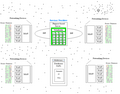 cloud computing infrastructure


Article(s): Cloud computing
- Currently use for talk page explanation only.
Request: Remove blurry shadow. General shaping to make the shape more smooth. Ramu50 ( talk) 02:40, 26 November 2008 (UTC)
Thanks -- Ramu50 ( talk) 02:40, 26 November 2008 (UTC)
Graphist opinion:
Two points:
- PNG or better, SVG is preferred for this type of image (see [4])
- The first image is missing licensing (the biggest issue here), as well as a description. Plus, both are uncategorized.
Tadpole9( talk • contribs) 06:36, 26 November 2008 (UTC)
- In fact the "blurry shadow" is caused by storing the images in JPEG format. If you have the original images stored losslessly uploading them will certainly help (if someone is not going to redraw them completely to SVG). -- pabouk ( talk) 09:13, 26 November 2008 (UTC)
incomplete image chart, help needed
| Back | Sides | |
|---|---|---|
| Strap | Tie | |
| T-back |

| |
| G-string |

|
|
| V-string |

| |
Request: This amazing chart features at the article on
Thong (clothing). But, alas, it's incomplete. There are more significant variants remains to be added. I can't darw, and I can't get the original sketchmaster to work on the project. Can the graphic workshop help?
Aditya(
talk •
contribs) 07:23, 28 November 2008 (UTC)
Graphist opinion: I created a C-String illustration, could you be more specific about which additional variants should be created? (Also I would recommend the others be converted from .png to .svg format) -- GateKeeper( X) @ 18:35, 28 November 2008 (UTC)
-

CString

- A cheeky may be very useful. Commons has an image of a regular thong (the commonest type), but it doesn't fit the graphic scheme here. I completely agree to the .svg idea. But, I don't have a software to do that, and already I had to come to this page for the conversion. Thank you very much. And, did I tell you that C-string came just fabulous? Looking forward to seeing the magic of Wikipedia at work. Thanks again. Aditya( talk • contribs) 02:46, 29 November 2008 (UTC)
Shield from the arms of the University of East Anglia

Article(s):
University of East Anglia
Request: Could the shield please be either redrawn or touched up to make the quality as good as this image here: ICL-crest.png? However, I cannot stress how important it is to keep the blue of the shield and the motto. The image's quality is extremely poor, and cannot be currently be used. I would be immensely grateful if one of you talented few could help us out! Many thanks. AlpsAlpsAlps ( talk) 21:45, 30 November 2008 (UTC)
Graphist opinion:
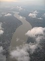
Colour correction on aerial photos
-
 Brisbane River, Brisbane
 -

-
 Edit of #2 by Mfield
 -

-

-
-


Request: Do you have any advice for how to make the colour of photos taken from aircraft windows look a little less "whited-out"? My adjustments using curves are a bit of an improvement on the original, but there must be a better way. I'd like to know exactly what tools you use to get the best results. Cheers Gobeirne ( talk) 06:49, 28 November 2008 (UTC)
Graphist opinion: I modified the first one a bit with Google's Picasa 3. I uploaded it over the original to save space, feel free to revert. I'm not sure if I'd call these the best results, considering I only tweaked only one of the defaults, but I think it's an improvement. My only problem was I couldn't tell if the earth was supposed to be that brown or not. If you'd like to see it, I have the image tweaked in the Windows Live software that comes with Vista, too. Although it's a bit dark (again just the defaults). I hope you find Picasa useful. We have a page here that has some other recommended software. §hep • ¡Talk to me! 07:09, 28 November 2008 (UTC)
Graphist opinion: I performed a series of corrections on #2 and uploaded it as #3 in the gallery. Corrected levels, adjusted color balance to remove atmospheric color cast, noise reduction and sharpening. Mfield ( talk) 02:52, 2 December 2008 (UTC)
Fiat Palio Multijet Diesel photo
-
 Photo of the Fiat Palio 1.3 Multijet Diesel in India
 -
 Lowered contrast, brightness, lowered some glare.
 -
 Tone down highlights and lift shadows on car, remove pylon reflection on hood, convert image profile from AdobeRGB to sRGB for correct web color display by Mfield


Article(s): Fiat Palio
Request: Can someone please generally improve the image? There is a bit of glare on the hood and the windscreen and the sunshine is a bit too bright. Ganeshrg ( talk) 07:10, 11 November 2008 (UTC)
Graphist opinion: Attempted. -- Kamangir1214 ( talk) 05:18, 16 November 2008 (UTC)
- Please do not resample the image to a lower resolution (in addition with so bad antialiasing - see the "stairs" on the lower edge of the left window). -- pabouk ( talk) 16:18, 17 November 2008 (UTC)
- Thanks Kamangir1214 for the effort. I am still looking for a more general improvement on the image though. Would anyone like to take this up? Ganeshrg ( talk) 18:13, 17 November 2008 (UTC)
Added another edit - Tone down highlights and lift shadows on car, remove pylon reflection on hood, convert image profile from AdobeRGB to sRGB for correct web color display. No resize. Mfield ( talk) 18:23, 17 November 2008 (UTC)
- Mfield, the surroundings look a lot better and so does the car hood. I can notice very strong artefacts on the A,B and C pillars and the region just below the windows. —Preceding unsigned comment added by Ganeshrg ( talk • contribs) 04:46, 18 November 2008 (UTC)
- I am not sure what zoom level you are seeing these at but this is a pretty small resolution to be working with in jpeg so it will have some compression artifacts that will be compounded by PP. If you are referring to noise then I am afraid that really you need to take a better picture to begin with, noise is a side effect of lifting detail out of such shadow unless you are using an expensive camera body at a low ISO. I can add noise reduction but it will lose you some detail. It should be easy enough to shoot this on an overcast day. There is only so much that can be done do rescue information when the image has been shot in in bright sunlight with the subject effectively backlit.
Mfield (
talk) 05:04, 18 November 2008 (UTC)
- Mfield, I have to comfirm that there are clearly visible compression artifacts in your edit. They probably appeared after you overboosted the red colour of the car. --
pabouk (
talk) 11:37, 2 December 2008 (UTC)
- I am afraid you are mistaken. I did not boost the red color of the car at all. I performed a shadow lift, which would have made more visible compression artifacts and lack of information in the shadows that were already present. Hence "it will have some compression artifacts that will be compounded by PP". If the car appears more red in my edit it is because it is was converted to the correct sRGB color profile for the web and now appears correctly in your browser. If the car now appears the wrong color then the color was incorrectly captured by the camera or was shifted by whatever editing originally resulted in the image becoming AdobeRGB. The fact of the matter is that it is impossible to pull enough shadow information out of such a poorly lit, underexposed shot that has been saved with both such high jpeg compression. Mfield ( talk) 16:12, 2 December 2008 (UTC)
- Mfield, I have to comfirm that there are clearly visible compression artifacts in your edit. They probably appeared after you overboosted the red colour of the car. --
pabouk (
talk) 11:37, 2 December 2008 (UTC)
Image of Salyut 7

Article(s): Salyut 7
Request: If this image could be restored to a decent quality, that would be fantastic - the view is spectacular, and its one of very, very few images of the Soviet Salyut space stations that is in existence. Colds7ream ( talk) 22:06, 1 December 2008 (UTC)
Graphist opinion: That looks like a scan from a news paper or magazine. If we can somehow find the original, that would be best. --- J.S ( T/ C/ WRE) 22:12, 1 December 2008 (UTC)
- I did a little cleaning, at least until a new version can be found. --
pbroks13
talk? 02:22, 2 December 2008 (UTC)
- Yes, it does look that way, but as the original film is probably buried in a filing cabinet somwhere in Russia or Kazakhstan, we can;t get hold of it. On the other hand, even just that cleanup has made the image look a lot better, so maybe there's hope yet. Thanks! Colds7ream ( talk) 18:06, 2 December 2008 (UTC)
Resolved Information
Income tax
-
 income taxes by country

Article(s): Income tax
Request: This image renders correctly in firefox's svg render and did render well in the wikipedia one, but it seems to have broken. What can I do to correct this? GameKeeper ( talk) 14:45, 7 November 2008 (UTC)
Graphist opinion: This should probably go to Wikipedia:Village pump (technical), I don't remember the software Wikimedia uses, (something Wizard?) but if it worked before and not now it's most likely a software issue. §hep • ¡Talk to me! 17:31, 7 November 2008 (UTC)
- It should be fixed now. --
pbroks13
talk? 20:28, 7 November 2008 (UTC)
- Unfortunately you did not say what did you change. Did you convert the text to image? -- pabouk ( talk) 22:23, 7 November 2008 (UTC)
- ImageMagick ? 68.39.174.238 ( talk) 00:56, 9 November 2008 (UTC)
A question: What's with the astericks and shouldn't it be "Slovakia" ? 68.39.174.238 ( talk) 00:55, 9 November 2008 (UTC)
Coat of arms of Palau
Chris (クリス • フィッチ) ( talk) 00:42, 29 November 2008 (UTC)
-
 #1 color to match Image:Execseal.png
 -
 #3 All done (maybe?)


Article(s): Palau, politics template so dozens of articles
Request: color to match Image:Execseal.png-- Chris (クリス • フィッチ) ( talk) 00:39, 8 November 2008 (UTC)
Graphist opinion: There isn't a .gif but a PNG does exist, did you mean that one? §hep • ¡Talk to me! 01:05, 8 November 2008 (UTC)
- Yes, thank you! Chris (クリス • フィッチ) ( talk) 01:45, 8 November 2008 (UTC)
- Fixed both, I think.
Chris (クリス • フィッチ) (
talk) 11:57, 9 November 2008 (UTC)
- Anyone? Chris (クリス • フィッチ) ( talk) 15:47, 21 November 2008 (UTC)
- Please color Image:Palau seal.gif to match Image:Execseal.png, svgify both if you can. Note both have name change tags on them. Thank you for responding, Mononomic!
Chris (クリス • フィッチ) (
talk) 17:25, 27 November 2008 (UTC)
- I have colored the image and it is now located at Image:Coat of arms of Palau.png per the name change request. Is the image OK? In general, it's very hard to do work on such small images. The [[:]] will be very difficult to improve or vectorize. The coat of arms might be slightly easier, but I don't have those extreme skills to do it. Let me know what you think. Mononomic ( talk) 18:05, 27 November 2008 (UTC)
- Brilliant, thank you! Can you give 2 and 3 a plain white center, instead of the paint-colored white? Thank you so much! Chris (クリス • フィッチ) ( talk) 18:34, 27 November 2008 (UTC)
- Transparent sounds great, please, for both!
Chris (クリス • フィッチ) (
talk) 14:18, 28 November 2008 (UTC)
- OK, like I said above, I can do little with [[:]]. I can put most of it on the transparent background (like around the seal) but the seal itself will still have that different background color. The coat of arms I can put on a transparent background entirely. Sorry to make this so difficult! What do you want to do? Mononomic ( talk) 18:53, 28 November 2008 (UTC)
- Gotcha. Okay, then transparent background for Execseal.png, coat of arms put on a transparent background entirely. Chris (クリス • フィッチ) ( talk) 00:03, 29 November 2008 (UTC)
- Perfect, thank you! I have tagged both of them to be moved to Commons. Chris (クリス • フィッチ) ( talk) 00:42, 29 November 2008 (UTC)
Karesi, Kara İzi

Article(s): Karesi
Request: This is flag of Karesi. Can you SVG ification, and upload Commons new version, please?-- Lord Leatherface ( talk) 11:50, 29 November 2008 (UTC)
Graphist opinion: Vectorized to Image:Flag_of_Karesi.svg. How's that? Mononomic ( talk) 16:15, 29 November 2008 (UTC)
- Thank you very much. Marvelous!-- Lord Leatherface ( talk) 23:55, 29 November 2008 (UTC)
Karelo-Finnish SSR Coat of Arms
-
 Original jpg, best version available
 -
transparent background png
.png)
Article(s): Karelo-Finnish Soviet Socialist Republic
Request: I tried making a transparent background png version from the jpg, and it doesn't look bad in the article, but if you look more closely or paste it to a black background you see the cropping of the white background has failed somewhat. My skills just aren't enough because of the COA's details in the middle. It just bothers me that articles are using somewhat faulty version because of me. :) So if someone's up for it, just replace the the current png, thanks. Pudeo ⺮ 19:36, 30 November 2008 (UTC)
Graphist opinion: I cleaned up as much of the white as I could. Tadpole9( talk • contribs)
- The stripes just under the hammer & sicke appear to be a bit buggy, but it's a lot better than mine. Thanks! -- Pudeo ⺮ 19:45, 1 December 2008 (UTC)
Portal
-

-
 New version


Article(s): Portal (video game)
Request: Could you please add some color on the floor and walls of the image so that they would be visible on black background as well? Maybe some sort of very light grey. Also if there is anything else that you think would make the image look good, please don't hesitate to do it. Diego_pmc Talk 07:15, 5 December 2008 (UTC)
Graphist opinion: How's that? -- pbroks13 talk? 07:31, 5 December 2008 (UTC)
- That was fast. It's good, but could you make the grey even lighter? The walls in the game are almost all white, and I'd like it is the image looks kinda the same. Diego_pmc Talk 07:44, 5 December 2008 (UTC)
- Thanks! Diego_pmc Talk 07:58, 5 December 2008 (UTC)
Cholera in Zimbabwe
-
 Municipalities of Zimbabwe - blank SVG
 -
 Provinces of Zimbabwe - blank SVG
 -
 Helpful to show districts of Zimbabwe but not correct
 -

-
 My version


Article(s): Zimbabwe, 2008 Zimbabwean cholera outbreak
Request: I would like someone to make a map of the Cholera outbreak in Zimbabwe based on the one on the BBC website. While I have created a blank map of the municipalities of Zimbabwe and one of the provinces, I don't have one of the districts and the yellow/red one I have included in the gallery may come in helpful but isn't wholly correct (see the map on the BBC website). I hope the other two blank maps I have added will help. Thanks a lot. Mangwanani (talk) 13:23, 7 December 2008 (UTC)
Graphist opinion: WHO Zimbabwe report may come in handy. But what bugs me the most is that you can't find a detailed description of the situation on WHO website. How come BBC knows more? -- Ahnode ( talk) 19:55, 7 December 2008 (UTC)
- No idea. But the map is quite nifty...
Mangwanani
(talk) 20:33, 7 December 2008 (UTC)
- I've managed do make a version of my own. Feel free to tweak. Mangwanani (talk) 17:42, 8 December 2008 (UTC)
Flag of the Zimbabwe Defence Forces
-
 Zim Defence Forces

Article(s): Zimbabwe, Military of Zimbabwe, List of Zimbabwean flags
Request: Remove blank border around flag. Thanks Mangwanani (talk) 14:56, 7 December 2008 (UTC)
Graphist opinion: Done-- 23230 talk 17:27, 10 December 2008 (UTC)
- Thanks a million. Mangwanani (talk) 19:13, 10 December 2008 (UTC)
Tugs Flag


Request: hi, i was wondering if anyone here would be interested in creating a simple SVG image. I'm terrible at making them. After not really getting any help by leaving messages to users on Wikipedia, i ended up here.
So the image i'm looking for is very simple. I'm looking to get a black flag, with a white circle in the middle of it. It doesn't really get any more than that - its supposed to be similar to Image:TUGS Flag.svg. The image is shown in the top of this image, as well as the far left of here and middle right of here. I understand its hard to see but if anyone could help me even the tiniest bit that would be amazing :D
I figured it should be around the scale of normal flags, i think its 4.5:3? that may not be true. The image is to be used on Template:TUGS as well as a userbox along the same lines as that, which i've not yet made.
Again, if anyone could help me, that would be amazing. I'll keep an eye on the page, I've got my talk page as well if anyone feels the need :) -- SteelersFanUK06 ReplyOnMine! 23:58, 8 December 2008 (UTC)
Graphist opinion: Here you go! By the way, if you want a logo for your wiki project, I have a few ideas. This is one of the few shows I vaguely remember from my childhood.-- 23230 talk 17:19, 10 December 2008 (UTC)
Coat of arms and flag of Tripolitania
-

-
 svg
svg -

-


Article(s): Tripolitania
Request: SVG please and Can you upload Commons, please. -- Lord Leatherface ( talk) 10:55, 10 December 2008 (UTC)
Graphist opinion:An svg version of the flag is available now. I am a bit reluctant of converting the second picture to svg as well as neither is used in any article. The quality of the coat of arms is not the best either. bamse ( talk) 01:49, 11 December 2008 (UTC)
- Also I use these svg images in Turkish Wikipedia and Latvian Wikipedia. Can you make Crescent in
Image:Coat of arms of Vilayet-i Trablusgarp.jpg like Crescent in
Image:Flag of Vilayet-i Trablusgarp.svg, please.? Do you understand me?--
Lord Leatherface (
talk) 12:25, 11 December 2008 (UTC)
- Like this? A word of warning: I don't know anything about Heraldry, so I am not sure if the outline of the coat of arms is correct. Also i don't know what the colours should be like. I used 0/102/0 (RGB) for the green and 238/238/236 (RGB) for the crescent based on Image:Flag of Vilayet-i Trablusgarp.gif. bamse ( talk) 13:29, 11 December 2008 (UTC)
- Excuse me. I can speak a bit English. Can you thin Crescents in coat of arms, please?-- Lord Leatherface ( talk) 15:17, 11 December 2008 (UTC)
- Yes, it's better than old version. Thank you, very much.-- Lord Leatherface ( talk) 18:59, 11 December 2008 (UTC)
handprints of Van Johnson
-
 Original
 -
 Cropped, perspective fixed


Article(s): Van Johnson
Request: fix perspective, trim to encyclopedic... Chris (クリス • フィッチ) ( talk) 23:53, 12 December 2008 (UTC)
Graphist opinion: File:Handprints of Van Johnson.jpg How's that? Mononomic ( talk) 15:04, 13 December 2008 (UTC)
- Very good, thank you! Chris (クリス • フィッチ) ( talk) 16:19, 13 December 2008 (UTC)
Bacon's Castle
![]() Done as per Much improved. Thanks of
Rmhermen
Done as per Much improved. Thanks of
Rmhermen
-
 Bacon's Castle

Article(s): Bacon's Castle
Request: Can something be done to correct the apparent lean of the outside walls? And maybe a better crop? Rmhermen ( talk) 15:16, 24 November 2008 (UTC)
Graphist opinion: Cropped and adjusted the perspective. If the changes don't look good feel free to revert. Tadpole9( talk • contribs) 18:13, 24 November 2008 (UTC) I did a more complete correction, color balance adjustment and sharpen. I uploaded it over again so check the version history and see which you prefer. Mfield ( talk) 04:06, 2 December 2008 (UTC)
Coat of arms of Ireland
![]() Done
Done
-
 Coat of arms of Ireland
 -
 Standard coat of arms shape


Article(s): Coat of arms of Ireland
Request: The Coat of arms of Ireland seems to be an odd shape. Could somebody change it to the standard shape (see image 2), and add a black border (which also seems to be standard)? Thank you! Cameron * 21:20, 6 December 2008 (UTC)
Graphist opinion: I don't think there is a "standard" shape for coats of arms. I think, (but I am not sure) that this shape is ment to match the historical shape. It seems to match up with the only other source for it that i could find. ----- J.S ( T/ C/ WRE) 21:50, 6 December 2008 (UTC)
- OK, fair enough. Feel free to remove this proposal. I merely mention it because it has been bugging me for a while. Especially when it is listed with other coat of arms. :) Best, -- Cameron * 21:56, 6 December 2008 (UTC)
There are various shapes of shield (see Escutcheon (heraldry), but on most it doesn’t matter. The only government link seems to be here (the Irish embassy in Argentina of all places!) and that shows the same shape. Unless it is evidence of a specific shape, then usually the creator of the image has free reign. As for the black line, I really don’t think it matters. Unless it is defined in the blazon (formal description) of the arms, it is the opinion of the once again the graphic's creator as to whether to add a boarder or not. The representation of a coat of arms is really up to interpretation of the blazon, for example all of these show three yellow lions on a red field (the arms of England), but all do it differently.


Therefore it is probably best to stick to the status quo. By the way, apologies for the lesson. You asked for someone with knowledge, but I can get rather longwinded on the subject!- 23230 talk 17:56, 10 December 2008 (UTC)
Coat of arms of the Satovcha Municipality
-
 Coat of arms of the Satovcha Municipality.
 -
 SVG version


Article(s): Satovcha Municipality, Satovcha, bg:Шаблон:Община Сатовча...
Request: Vectorize please! Chech Explorer ( talk) 00:24, 19 December 2008 (UTC)
Graphist opinion: Here you are. I just changed the colours a bit. What do you think? -- Ahnode ( talk) 14:33, 20 December 2008 (UTC)
- It's great. Thanks! I can change the colors if needed but I don't think it's necessary. -- Chech Explorer ( talk) 18:01, 20 December 2008 (UTC)
request for a new image for non articles
-
 Speedy delete symbol
 -
 Speedy keep symbol
 -
Speedy keep symbol green


I would like a "speedy keep" icon for voting based on this image but replacing the delete icon with the keep icon-- Ipatrol ( talk) 20:14, 5 December 2008 (UTC)
- Graphist Opinion: How's the above? I wasn't sure if you wanted to GA symbol or the checkmark, so I went with the keep symbol that's in the same boat as the delete symbol used. §hep • ¡Talk to me! 21:34, 5 December 2008 (UTC)
- Graphist Opinion: We must have been working on that at eactly the same time, and have used exactly the same derivative files. Mine looks a little more zoomy though ;) Mfield ( talk) 21:43, 5 December 2008 (UTC)
- That's different. I beat ya by 36 minutes! :P Now watch, I bet Ipatrol wanted the green symbol...(That'd make my day) §hep • ¡Talk to me! 21:52, 5 December 2008 (UTC)
- Tell you what then, I'll change mine to green to keep options open ;) Some renaming of both to include colors would probably be a good plan too, as all that distinguishes them is .SVG instead of .svg Mfield ( talk) 22:00, 5 December 2008 (UTC)
- Now that's some interesting color mixing! I was talking about Symbol support vote.svg, which I see used as a keep symbol every now and again. §hep • ¡Talk to me! 22:06, 5 December 2008 (UTC)
Sorry shep, blue for me. you can db the green one as I see no need. snowball on non-deletion discussions can used the "cancelled process" image. The keep is blue because "support" might mean delete.-- Ipatrol ( talk) 18:48, 14 December 2008 (UTC) P.S. please move the blue one to a lowercase svg for ease of use (very few have an uppercase extension)-- Ipatrol ( talk) 18:53, 14 December 2008 (UTC)
- Sorry? I won! YAY :P I'll move the image right now. §hep • ¡Talk to me! 05:44, 21 December 2008 (UTC)
Image:Constudevent.gif
-
 Early left anterior negativity
 -
 Early left anterior negativity, vectorized, caption removed


![[2]](https://commons.wikimedia.org/wiki/Image:People's_Republic_of_China_(orthographic_projection).svg)
![[3]](https://commons.wikimedia.org/wiki/Image:India_(orthographic_projection).svg)
.gif)
Article(s): Early left anterior negativity
Request: Make the lines sharper and do whatever you feel will improve the image. The clear background thing might be good. Enlarging it without changing the proportions might be good as well. The image may be used on the Main Page if cleaned up. See DYK nom. -- Suntag ☼ 18:30, 20 December 2008 (UTC)
- Specifically, enlarging the peak labels (N1, P2, etc.) would help it show up better at 100x100px resolution. — Politizer talk/ contribs 19:14, 20 December 2008 (UTC)
Graphist opinion: It may be easier better just to redo the image. If you can give me some of the data points, I can remake the chart and it will be an SVG. I'm going to try without any information and see what I can do. By the way, the DYK is really cool!
Mononomic (
talk) 15:32, 21 December 2008 (UTC)
- Unfortunately, I don't have the data; it's not my graph, it's just something I found on commons (originally from wikibooks), and there's no information saying what it's a graph of or anything. Do the data points have to be exact, or can you estimate things? (Sorry, I'm not super familiar with how vectorization works.) — Politizer talk/ contribs 15:43, 21 December 2008 (UTC)
- How's this ( File:ComponentsofERP.svg)? I just traced it instead of making a new graph. I can make any line/data/point/other stuff changes that you'd like. Mononomic ( talk) 16:20, 21 December 2008 (UTC)
- Looks great. I think the title "The components of event related potentials" should be removed since it can always be explained in the image caption. -- Suntag ☼ 16:28, 21 December 2008 (UTC)
- Done. Do you want to replace all the instances of the original GIF with the new SVG or do you want me to do it? Mononomic ( talk) 16:39, 21 December 2008 (UTC)
- Thanks. Go ahead and replace them. It's Politizer image, but I think it seems finished. -- Suntag ☼ 16:46, 21 December 2008 (UTC)
- (ec) That looks great; I've gone through and replaced all the original GIFs. Is it possible to enlarge the labels (N1, etc.) so that they're readable at 100px? (If not—ie, if 100px is just way too small anyway—then it's not a huge deal). Thanks! — Politizer talk/ contribs 16:47, 21 December 2008 (UTC)
- Whoops, sorry, I didn't even see your comment when I pushed the Save page button. I need some coffee... I'll change the size and correct my silly spelling error in just a few minutes. I know this image is all over wikispace (WikiBooks, Commons, and the 'pedia too) so can you replace/redirect/link those images to this new one? Or do I need to upload it to all of those different spaces? I can edit the images but I'm not super-great at getting them where they need to be. Thanks! Mononomic ( talk) 16:52, 21 December 2008 (UTC)
- I should be able to do that...I don't use commons or wikibooks a whole lot, but I have an integrated account or whatever, and I assume "what links here" works the same everywhere. I've already done the replacements at Wikipedia, at least. When you change the size and spelling, that will be reflected in the same image, right—I won't need to change the links that I've already changed? — Politizer talk/ contribs 16:55, 21 December 2008 (UTC)
- Yep, the changes I've just made should be reflected globally over Wikipedia. However, you may need to upload again to wikibooks and commons if you uploaded before I made the changes. I'm not exactly sure about the second part, but I know Wikipedia will be OK. Mononomic ( talk) 16:58, 21 December 2008 (UTC)
- Ok. I think probably the easiest thing is for me to wait until after you've finished making the changes, and then after that I can upload it to commons and speedy delete the one here; once it's at commons I think it should be usable everywhere. — Politizer talk/ contribs 17:02, 21 December 2008 (UTC)
- Don't speedy delete! It's important to have the image trail so we can see where every image on Wikipedia came from to preserve the GNU license. The changes are done, by the way, and I've added a comment on the DYK talk page letting others know that too. Mononomic ( talk) 17:04, 21 December 2008 (UTC)
- Oh, ok! Phew. Normally once I move an image to commons then I'm told to delete the one at WP...so does that mean I shouldn't take this one to Commons, or is there some sort of special tag that can say "yes there's a duplicate of this on Commons, but we need to keep this one here as well")? Maybe I should ask the copyright/licensing people? (by the way, the new version of the image looks great; thanks again!) — Politizer talk/ contribs 17:13, 21 December 2008 (UTC)
- Yeah, I'd ask someone else who knows a little more. Maybe I'm wrong. I think this is a special case: we have it originally from Wikibooks and then it was transferred to the Commons, and then to Wikipedia, and then back to Commons... Why don't you post something on the Admin's noticeboard? Mononomic ( talk) 18:22, 21 December 2008 (UTC)
Robert La Follette's signature
-
 Robert La Follette's signature
Article(s): Robert M. La Follette, Sr.
Request: A really weak image, this could really benefit from being strengthened in some way or another. Is there any way that the signature itself could be made stronger and a higher contrast with the background? Nyttend ( talk) 15:48, 21 December 2008 (UTC)
Graphist opinion: I changed the brightness and contrast, and replaced the original file. Feel free to revert if it's not a step in the right direction. Mononomic ( talk) 16:36, 21 December 2008 (UTC)
|
| This page, part of the
Graphics Lab Wikiproject, is an
archive of requests for December 2008. Please do not edit the contents of this page. You can submit new requests here. |
Stale Information
Romeo and Juliet
-
Straighten, maybe crop
-
Maybe some straighten, maybe some crop
-
Straighten top line (probably minor crop since rest of image is straight?)
-
Do something with black border
-
cropped and adjusted levels
-
Rotated
and cropped -
Perspective adjusted, cropped, brightness/contrast adjusted
Article(s): Romeo and Juliet
Request: At the Romeo and Juliet featured article candidature I commented that many of the images needed nice crops, cleaning. I have listed above the ones I thought were most obvious that someone could help with but feel free to look at the article if you think you can help with others. My 'comments' are vague because I am not good at this... but all of the images I paste I think could be cleaned up somewhat to make this a better FAC.
It may be a good idea to upload as different, restored images and then comment on the FAC or change them yourselves rather than overwriting these images. gren グレン 12:45, 4 November 2008 (UTC)
Graphist opinion: I uploaded a new version of the portrait of John Gielgud. The author requested that his work integrity should not be touched. I hope that the black border was not part of the work. What do you think? -- pabouk ( talk) 11:32, 5 November 2008 (UTC)
- That is excellent. I'm only sorry most users will only see it as a thumbnail: the full version is great. Thank you.
AndyJones (
talk) 21:20, 5 November 2008 (UTC)
- Rotated
and croppedImage:Mary Saunderson.jpg uploaded as new file. ■ MMXX talk 15:52, 6 November 2008 (UTC)
- Rotated
I straightened out Image:Arthur Brooke Tragicall His.jpg somewhat, feel free to revert if you want the old version back. Tadpole9( talk • contribs) 20:08, 8 November 2008 (UTC)
- I also retouched the second image, but didn't replace the original this time. Tadpole9( talk • contribs) 22:06, 8 November 2008 (UTC)
Is image straight?
-
4 corners marker
Article(s): Quadripoint
Request: I tried to straighten the image from its right-tilted original but I am not convinced that it is entirely straight yet. But it may just be the curve of my monitor distracing me. Can someone with better image software chek it? Rmhermen ( talk) 18:05, 8 November 2008 (UTC)
Graphist opinion: It was off a tad. But it depends what you wanted to look straight, for instance I used the cross as my vert and horiz measures. Out of curiosity what software did you use? If you feel my edit detracts from the image please revert it! §hep • ¡Talk to me! 18:16, 8 November 2008 (UTC)
- Iz becuz zhe wiki needs to get sum new image rendering software. (That was fun) §hep • ¡Talk to me! 22:18, 8 November 2008 (UTC)
- I'm very familiar with these type of conflicts. Due to the angle of the shot, it may never be fixed completely with a "straighting" software.
Herzegovina
-
Bosnia, Herzegovina and Serbia before the Ottoman conquest in the 15th Century. (JPG)
-
James1293's bad/autotraced/etc version
Article(s): History of Bosnia and Herzegovina, Duchy of Herzegovina
Request: Bosna Krallığı is Bosnian Kingdom, Hersek Dükalığı is Duchy of Herzegovina, Sırp Despotluğu is Serbian Despotate, Macaristan is Kingdom of Hungary, Venedikliler ise Republic of Venice, Karadağ is Montenegro, Osmanlı Devleti is Ottoman Empire, Eflak is Wallachia, Adriyatik Denizi is Adriatic Sea. SVG ification, and upload Commons, please. Lord Leatherface ( talk) 16:04, 15 October 2008 (UTC)
Graphist opinion: I'll try it. James1293 ( talk) 00:46, 25 October 2008 (UTC)
- On second thought, someone else can do it. I need to work on my speed-svg skills... I think i might be tracing too meticulously.
James1293 (
talk) 01:04, 25 October 2008 (UTC)
- Tried it more... It's pretty difficult. Does it really need svg?
James1293 (
talk) 19:27, 9 November 2008 (UTC)
- Stale tag removed. §hep • ¡Talk to me! 22:15, 9 November 2008 (UTC)
- Tried it more... It's pretty difficult. Does it really need svg?
James1293 (
talk) 19:27, 9 November 2008 (UTC)
- On second thought, someone else can do it. I need to work on my speed-svg skills... I think i might be tracing too meticulously.
James1293 (
talk) 01:04, 25 October 2008 (UTC)
french translation needed
-
-
English Trans
Article(s): Cooking
Request: Please provide an English Version! 118.90.131.160 ( talk) 22:19, 9 November 2008 (UTC)
Graphist opinion: Do these translations look right?
§hep •
¡Talk to me! 22:26, 9 November 2008 (UTC)
Translations:
- CRU = ???
- Grillé = Grilled
- Bouilli = Boiled
- POURRI = MAY
- Fermenté = Fermented
- Vapeur = Steam
- CUIT = COOKED
- Fumé = Smoked
- Rôti = Roast
- How's that? §hep • ¡Talk to me! 22:44, 9 November 2008 (UTC)
- CRU = Raw
- Grillé = Grilled
- Bouilli = Boiled
- POURRI = Rotten
- Fermenté = Fermented
- Vapeur = Steamed
- CUIT = COOKED
- Fumé = Smoked
- Rôti = Roasted
- I think this is better. Jackaranga ( talk) 22:59, 9 November 2008 (UTC)
- Thanks for the second pair of eyes Jackaranga. §hep • ¡Talk to me! 02:12, 10 November 2008 (UTC)
National Emblem of the People's Republic of China
-
Current image
Article(s): Various
Request: The current image isn't matching to current laws of China. The legal image of the state emblem is located at http://www.safp.gov.mo/external/chin/apm/files/info/64/china_logo.gif Can the image above be changed to match the image I am linking here? User:Zscout370 (Return Fire) 01:08, 10 November 2008 (UTC)
Graphist opinion:
Three-point field goal diagram(s)
-
Pre-existing SVG
Article(s): Three-point field goal
Request: This article needs, at the very least, a pictorial representation of the NBA three-point line as described in the "Rule specifications" section (including the "closest point" also described in the section) Furthermore, perhaps a comparison of three-point line distances would be nice. If you have any questions, please contact me at my talk page. Ian Manka 09:00, 9 November 2008 (UTC)
Graphist opinion: To whoever does this I found an SVG that might be helpful at Basketball. §hep • ¡Talk to me! 17:08, 9 November 2008 (UTC)
- This one maybe too, there are some others here and here. §hep • ¡Talk to me! 17:20, 9 November 2008 (UTC)
Efron and other dice
-
Original
-
Other Original
-
Vector
-
Vector
Article(s): Nontransitive dice
Request: Quick vectorizations, not even sure if it's worth the time =) ... I'd do it, but I'm a bit busy. I'll probably just do it later this week if no one else gets to it. James1293 ( talk) 18:28, 9 November 2008 (UTC)
Graphist opinion: Vectorized "transitive dice" -- GateKeeperX ( talk) 10:39, 15 November 2008 (UTC)
- Vectorized "Efron dice", (is the last cube not supposed to have a number on top?) -- GateKeeperX ( talk) 11:16, 15 November 2008 (UTC)
Demographics of Iraq
Article(s): Demographics of Iraq, and others
Request: SVG ification, and upload Commons new version, please.-- Lord Leatherface ( talk) 14:50, 5 November 2008 (UTC)
Graphist opinion: It's probably earier just to click the "create a new section" link if you need a template. I hope the header wasn't supposed to say Romeo and Juliet. §hep • ¡Talk to me! 20:43, 5 November 2008 (UTC)
- I found an alternative map to use as a base if someone wants to take a crack at this. Kmusser ( talk) 18:41, 2 December 2008 (UTC)
Wings of a dragonfly
-
Macro shot of wings of a dragonfly .
-
Another shot with the dragonfly in focus too.
Article(s):
Request: I would like someone to improve these pictures so that I can submit them to the already well endorsed Dragonfly article. I guess the images need a bit of sharpening and slight colour corrections. Any help would be greatly appreciated.
Graphist opinion: I apologize in advance if this seems a little harsh but honestly, these images are not going to be improved with sharpening. There is simply not enough detail there to sharpen. You need to retake the images with better lighting, focus (get the wings to lie along the focal plane) and more depth of field. WP has a lot of very good dragonfly images so you are up against some very steep competition and with all the PP in the world, these are not going to come close. Mfield ( talk) 04:41, 18 November 2008 (UTC)
Earth images
-
Illustration of the life-cycle of the Sun.
-
Dipole field from NASA.
-
Article(s):
Earth mostly, but each image is used several times.
Request: Is there any chance someone could SVGify these ones? Cheers, Ben ( talk) 01:08, 15 November 2008 (UTC)
Graphist opinion: svged, the image in the middle, the Dipole field. -- GateKeeperX ( talk) 06:17, 15 November 2008 (UTC)
- svg'ed, the world map image, please check to make sure I didn't miss anything. --
GateKeeperX (
talk) 09:38, 15 November 2008 (UTC)
- Nothing missed on the world map, but a few nit picks if that is allowed :) Can ..
- cT patch on Australia and Africa be moved to the left a bit;
- mE patch that is just east of S. America be moved to the left a bit;
- mT patch that is just east of S. America be enlarged a bit?
- Also, is it possible to get the edges a little fuzzy to give the impression these regions are approximate? Thanks for all your help,
Ben (
talk) 10:09, 15 November 2008 (UTC)
- One big issue, don't use those longitude lines over an equirectangular projection! This requires some redesigning.
Tadpole9(
talk •
contribs) 04:28, 18 November 2008 (UTC)
- Tadpole, feel free to redesign/redo the svg, I haven't had much time this week, so if anyone wants to give it a try. -- GateKeeper( X) @ 17:13, 19 November 2008 (UTC)
- One big issue, don't use those longitude lines over an equirectangular projection! This requires some redesigning.
Tadpole9(
talk •
contribs) 04:28, 18 November 2008 (UTC)
- Nothing missed on the world map, but a few nit picks if that is allowed :) Can ..
India/China border
-
China
-
India
Request: I made these orthographic maps, and based the national borders on the default borders from the output generator. ( [1]) I noticed that the old robinson map for China ( Image:Location China.svg) had some unrecognised territories in light green. I tried to do the same thing on China's globe.
Now I've got these messages on Commons:
Thanks for the India projection. But for inclusion on Wikipedia, I'm afraid we would have to neutrally represent the map of India. The version you uploaded equates the Line of Control as the International border. Please could you edit the disputed regions? Nichalp ( talk) 14:26, 4 November 2008 (UTC)
I suppose we should stick with the previous, established map until this has been sorted out. -- Dbachmann ( talk) 20:09, 9 November 2008 (UTC)
Hi.this is a link to the political map of India which shows international boundaries rather than line of actual control. http://www.mapsofindia.com/maps/india/india-political-map.htm And this is a an official link http://india.gov.in/maps/indiaindex.php Please change the picture or remove it completely as it is not factually accurate. 125.17.226.3 13:33, 12 November 2008 (UTC)
- Hi sorry, I missed out on your reply: Please see Image:India-locator-map-blank.svg. It explains the scenario very well. Kashmir and Arunachal Pradesh are the disputed areas. Nichalp ( talk) 19:55, 15 November 2008 (UTC)
- Dear Ssolbergj, your map of China colors Arunachal Pradesh in light green (together with Taiwan)which implies it is somehow rather a part of CHina although under Indian administration. Why then doesn't the India map have Aksai Chin (a Chinese administered region claimed by India) be colored light green on the India map? Same goes with Pakistan occupied kashmir. Shouldn't those areas be in light green too? Please maintain neutrality as prescribed under Wikipedia:Neutral point of view. I look forward to you recoloring those maps with a NPOV in mind and not China slanted views. (Reference: [2] vs [3]. Thank you.
Can someone please sort this out and draw the right borders? I'm lost. :( -
SSJ
☎ 14:22, 22 November 2008 (UTC)
Graphist opinion:
Cloud Computing
-
traditional server infrastructure
-
cloud computing infrastructure
Article(s): Cloud computing
- Currently use for talk page explanation only.
Request: Remove blurry shadow. General shaping to make the shape more smooth. Ramu50 ( talk) 02:40, 26 November 2008 (UTC)
Thanks -- Ramu50 ( talk) 02:40, 26 November 2008 (UTC)
Graphist opinion:
Two points:
- PNG or better, SVG is preferred for this type of image (see [4])
- The first image is missing licensing (the biggest issue here), as well as a description. Plus, both are uncategorized.
Tadpole9( talk • contribs) 06:36, 26 November 2008 (UTC)
- In fact the "blurry shadow" is caused by storing the images in JPEG format. If you have the original images stored losslessly uploading them will certainly help (if someone is not going to redraw them completely to SVG). -- pabouk ( talk) 09:13, 26 November 2008 (UTC)
incomplete image chart, help needed
| Back | Sides | |
|---|---|---|
| Strap | Tie | |
| T-back |
| |
| G-string |
|
|
| V-string |
| |
Request: This amazing chart features at the article on
Thong (clothing). But, alas, it's incomplete. There are more significant variants remains to be added. I can't darw, and I can't get the original sketchmaster to work on the project. Can the graphic workshop help?
Aditya(
talk •
contribs) 07:23, 28 November 2008 (UTC)
Graphist opinion: I created a C-String illustration, could you be more specific about which additional variants should be created? (Also I would recommend the others be converted from .png to .svg format) -- GateKeeper( X) @ 18:35, 28 November 2008 (UTC)
-
CString
- A cheeky may be very useful. Commons has an image of a regular thong (the commonest type), but it doesn't fit the graphic scheme here. I completely agree to the .svg idea. But, I don't have a software to do that, and already I had to come to this page for the conversion. Thank you very much. And, did I tell you that C-string came just fabulous? Looking forward to seeing the magic of Wikipedia at work. Thanks again. Aditya( talk • contribs) 02:46, 29 November 2008 (UTC)
Shield from the arms of the University of East Anglia
Article(s):
University of East Anglia
Request: Could the shield please be either redrawn or touched up to make the quality as good as this image here: ICL-crest.png? However, I cannot stress how important it is to keep the blue of the shield and the motto. The image's quality is extremely poor, and cannot be currently be used. I would be immensely grateful if one of you talented few could help us out! Many thanks. AlpsAlpsAlps ( talk) 21:45, 30 November 2008 (UTC)
Graphist opinion:
Colour correction on aerial photos
-
Brisbane River, Brisbane
-
-
Edit of #2 by Mfield
-
-
-
-
Request: Do you have any advice for how to make the colour of photos taken from aircraft windows look a little less "whited-out"? My adjustments using curves are a bit of an improvement on the original, but there must be a better way. I'd like to know exactly what tools you use to get the best results. Cheers Gobeirne ( talk) 06:49, 28 November 2008 (UTC)
Graphist opinion: I modified the first one a bit with Google's Picasa 3. I uploaded it over the original to save space, feel free to revert. I'm not sure if I'd call these the best results, considering I only tweaked only one of the defaults, but I think it's an improvement. My only problem was I couldn't tell if the earth was supposed to be that brown or not. If you'd like to see it, I have the image tweaked in the Windows Live software that comes with Vista, too. Although it's a bit dark (again just the defaults). I hope you find Picasa useful. We have a page here that has some other recommended software. §hep • ¡Talk to me! 07:09, 28 November 2008 (UTC)
Graphist opinion: I performed a series of corrections on #2 and uploaded it as #3 in the gallery. Corrected levels, adjusted color balance to remove atmospheric color cast, noise reduction and sharpening. Mfield ( talk) 02:52, 2 December 2008 (UTC)
Fiat Palio Multijet Diesel photo
-
Photo of the Fiat Palio 1.3 Multijet Diesel in India
-
Lowered contrast, brightness, lowered some glare.
-
Tone down highlights and lift shadows on car, remove pylon reflection on hood, convert image profile from AdobeRGB to sRGB for correct web color display by Mfield
Article(s): Fiat Palio
Request: Can someone please generally improve the image? There is a bit of glare on the hood and the windscreen and the sunshine is a bit too bright. Ganeshrg ( talk) 07:10, 11 November 2008 (UTC)
Graphist opinion: Attempted. -- Kamangir1214 ( talk) 05:18, 16 November 2008 (UTC)
- Please do not resample the image to a lower resolution (in addition with so bad antialiasing - see the "stairs" on the lower edge of the left window). -- pabouk ( talk) 16:18, 17 November 2008 (UTC)
- Thanks Kamangir1214 for the effort. I am still looking for a more general improvement on the image though. Would anyone like to take this up? Ganeshrg ( talk) 18:13, 17 November 2008 (UTC)
Added another edit - Tone down highlights and lift shadows on car, remove pylon reflection on hood, convert image profile from AdobeRGB to sRGB for correct web color display. No resize. Mfield ( talk) 18:23, 17 November 2008 (UTC)
- Mfield, the surroundings look a lot better and so does the car hood. I can notice very strong artefacts on the A,B and C pillars and the region just below the windows. —Preceding unsigned comment added by Ganeshrg ( talk • contribs) 04:46, 18 November 2008 (UTC)
- I am not sure what zoom level you are seeing these at but this is a pretty small resolution to be working with in jpeg so it will have some compression artifacts that will be compounded by PP. If you are referring to noise then I am afraid that really you need to take a better picture to begin with, noise is a side effect of lifting detail out of such shadow unless you are using an expensive camera body at a low ISO. I can add noise reduction but it will lose you some detail. It should be easy enough to shoot this on an overcast day. There is only so much that can be done do rescue information when the image has been shot in in bright sunlight with the subject effectively backlit.
Mfield (
talk) 05:04, 18 November 2008 (UTC)
- Mfield, I have to comfirm that there are clearly visible compression artifacts in your edit. They probably appeared after you overboosted the red colour of the car. --
pabouk (
talk) 11:37, 2 December 2008 (UTC)
- I am afraid you are mistaken. I did not boost the red color of the car at all. I performed a shadow lift, which would have made more visible compression artifacts and lack of information in the shadows that were already present. Hence "it will have some compression artifacts that will be compounded by PP". If the car appears more red in my edit it is because it is was converted to the correct sRGB color profile for the web and now appears correctly in your browser. If the car now appears the wrong color then the color was incorrectly captured by the camera or was shifted by whatever editing originally resulted in the image becoming AdobeRGB. The fact of the matter is that it is impossible to pull enough shadow information out of such a poorly lit, underexposed shot that has been saved with both such high jpeg compression. Mfield ( talk) 16:12, 2 December 2008 (UTC)
- Mfield, I have to comfirm that there are clearly visible compression artifacts in your edit. They probably appeared after you overboosted the red colour of the car. --
pabouk (
talk) 11:37, 2 December 2008 (UTC)
Image of Salyut 7
Article(s): Salyut 7
Request: If this image could be restored to a decent quality, that would be fantastic - the view is spectacular, and its one of very, very few images of the Soviet Salyut space stations that is in existence. Colds7ream ( talk) 22:06, 1 December 2008 (UTC)
Graphist opinion: That looks like a scan from a news paper or magazine. If we can somehow find the original, that would be best. --- J.S ( T/ C/ WRE) 22:12, 1 December 2008 (UTC)
- I did a little cleaning, at least until a new version can be found. --
pbroks13
talk? 02:22, 2 December 2008 (UTC)
- Yes, it does look that way, but as the original film is probably buried in a filing cabinet somwhere in Russia or Kazakhstan, we can;t get hold of it. On the other hand, even just that cleanup has made the image look a lot better, so maybe there's hope yet. Thanks! Colds7ream ( talk) 18:06, 2 December 2008 (UTC)
Resolved Information
Income tax
-
income taxes by country
Article(s): Income tax
Request: This image renders correctly in firefox's svg render and did render well in the wikipedia one, but it seems to have broken. What can I do to correct this? GameKeeper ( talk) 14:45, 7 November 2008 (UTC)
Graphist opinion: This should probably go to Wikipedia:Village pump (technical), I don't remember the software Wikimedia uses, (something Wizard?) but if it worked before and not now it's most likely a software issue. §hep • ¡Talk to me! 17:31, 7 November 2008 (UTC)
- It should be fixed now. --
pbroks13
talk? 20:28, 7 November 2008 (UTC)
- Unfortunately you did not say what did you change. Did you convert the text to image? -- pabouk ( talk) 22:23, 7 November 2008 (UTC)
- ImageMagick ? 68.39.174.238 ( talk) 00:56, 9 November 2008 (UTC)
A question: What's with the astericks and shouldn't it be "Slovakia" ? 68.39.174.238 ( talk) 00:55, 9 November 2008 (UTC)
Coat of arms of Palau
Chris (クリス • フィッチ) ( talk) 00:42, 29 November 2008 (UTC)
-
#1 color to match Image:Execseal.png
-
#3 All done (maybe?)
Article(s): Palau, politics template so dozens of articles
Request: color to match Image:Execseal.png-- Chris (クリス • フィッチ) ( talk) 00:39, 8 November 2008 (UTC)
Graphist opinion: There isn't a .gif but a PNG does exist, did you mean that one? §hep • ¡Talk to me! 01:05, 8 November 2008 (UTC)
- Yes, thank you! Chris (クリス • フィッチ) ( talk) 01:45, 8 November 2008 (UTC)
- Fixed both, I think.
Chris (クリス • フィッチ) (
talk) 11:57, 9 November 2008 (UTC)
- Anyone? Chris (クリス • フィッチ) ( talk) 15:47, 21 November 2008 (UTC)
- Please color Image:Palau seal.gif to match Image:Execseal.png, svgify both if you can. Note both have name change tags on them. Thank you for responding, Mononomic!
Chris (クリス • フィッチ) (
talk) 17:25, 27 November 2008 (UTC)
- I have colored the image and it is now located at Image:Coat of arms of Palau.png per the name change request. Is the image OK? In general, it's very hard to do work on such small images. The [[:]] will be very difficult to improve or vectorize. The coat of arms might be slightly easier, but I don't have those extreme skills to do it. Let me know what you think. Mononomic ( talk) 18:05, 27 November 2008 (UTC)
- Brilliant, thank you! Can you give 2 and 3 a plain white center, instead of the paint-colored white? Thank you so much! Chris (クリス • フィッチ) ( talk) 18:34, 27 November 2008 (UTC)
- Transparent sounds great, please, for both!
Chris (クリス • フィッチ) (
talk) 14:18, 28 November 2008 (UTC)
- OK, like I said above, I can do little with [[:]]. I can put most of it on the transparent background (like around the seal) but the seal itself will still have that different background color. The coat of arms I can put on a transparent background entirely. Sorry to make this so difficult! What do you want to do? Mononomic ( talk) 18:53, 28 November 2008 (UTC)
- Gotcha. Okay, then transparent background for Execseal.png, coat of arms put on a transparent background entirely. Chris (クリス • フィッチ) ( talk) 00:03, 29 November 2008 (UTC)
- Perfect, thank you! I have tagged both of them to be moved to Commons. Chris (クリス • フィッチ) ( talk) 00:42, 29 November 2008 (UTC)
Karesi, Kara İzi
Article(s): Karesi
Request: This is flag of Karesi. Can you SVG ification, and upload Commons new version, please?-- Lord Leatherface ( talk) 11:50, 29 November 2008 (UTC)
Graphist opinion: Vectorized to Image:Flag_of_Karesi.svg. How's that? Mononomic ( talk) 16:15, 29 November 2008 (UTC)
- Thank you very much. Marvelous!-- Lord Leatherface ( talk) 23:55, 29 November 2008 (UTC)
Karelo-Finnish SSR Coat of Arms
-
Original jpg, best version available
-
transparent background png
Article(s): Karelo-Finnish Soviet Socialist Republic
Request: I tried making a transparent background png version from the jpg, and it doesn't look bad in the article, but if you look more closely or paste it to a black background you see the cropping of the white background has failed somewhat. My skills just aren't enough because of the COA's details in the middle. It just bothers me that articles are using somewhat faulty version because of me. :) So if someone's up for it, just replace the the current png, thanks. Pudeo ⺮ 19:36, 30 November 2008 (UTC)
Graphist opinion: I cleaned up as much of the white as I could. Tadpole9( talk • contribs)
- The stripes just under the hammer & sicke appear to be a bit buggy, but it's a lot better than mine. Thanks! -- Pudeo ⺮ 19:45, 1 December 2008 (UTC)
Portal
-
-
New version
Article(s): Portal (video game)
Request: Could you please add some color on the floor and walls of the image so that they would be visible on black background as well? Maybe some sort of very light grey. Also if there is anything else that you think would make the image look good, please don't hesitate to do it. Diego_pmc Talk 07:15, 5 December 2008 (UTC)
Graphist opinion: How's that? -- pbroks13 talk? 07:31, 5 December 2008 (UTC)
- That was fast. It's good, but could you make the grey even lighter? The walls in the game are almost all white, and I'd like it is the image looks kinda the same. Diego_pmc Talk 07:44, 5 December 2008 (UTC)
- Thanks! Diego_pmc Talk 07:58, 5 December 2008 (UTC)
Cholera in Zimbabwe
-
Municipalities of Zimbabwe - blank SVG
-
Provinces of Zimbabwe - blank SVG
-
Helpful to show districts of Zimbabwe but not correct
-
-
My version
Article(s): Zimbabwe, 2008 Zimbabwean cholera outbreak
Request: I would like someone to make a map of the Cholera outbreak in Zimbabwe based on the one on the BBC website. While I have created a blank map of the municipalities of Zimbabwe and one of the provinces, I don't have one of the districts and the yellow/red one I have included in the gallery may come in helpful but isn't wholly correct (see the map on the BBC website). I hope the other two blank maps I have added will help. Thanks a lot. Mangwanani (talk) 13:23, 7 December 2008 (UTC)
Graphist opinion: WHO Zimbabwe report may come in handy. But what bugs me the most is that you can't find a detailed description of the situation on WHO website. How come BBC knows more? -- Ahnode ( talk) 19:55, 7 December 2008 (UTC)
- No idea. But the map is quite nifty...
Mangwanani
(talk) 20:33, 7 December 2008 (UTC)
- I've managed do make a version of my own. Feel free to tweak. Mangwanani (talk) 17:42, 8 December 2008 (UTC)
Flag of the Zimbabwe Defence Forces
-
Zim Defence Forces
Article(s): Zimbabwe, Military of Zimbabwe, List of Zimbabwean flags
Request: Remove blank border around flag. Thanks Mangwanani (talk) 14:56, 7 December 2008 (UTC)
Graphist opinion: Done-- 23230 talk 17:27, 10 December 2008 (UTC)
- Thanks a million. Mangwanani (talk) 19:13, 10 December 2008 (UTC)
Tugs Flag
Request: hi, i was wondering if anyone here would be interested in creating a simple SVG image. I'm terrible at making them. After not really getting any help by leaving messages to users on Wikipedia, i ended up here.
So the image i'm looking for is very simple. I'm looking to get a black flag, with a white circle in the middle of it. It doesn't really get any more than that - its supposed to be similar to Image:TUGS Flag.svg. The image is shown in the top of this image, as well as the far left of here and middle right of here. I understand its hard to see but if anyone could help me even the tiniest bit that would be amazing :D
I figured it should be around the scale of normal flags, i think its 4.5:3? that may not be true. The image is to be used on Template:TUGS as well as a userbox along the same lines as that, which i've not yet made.
Again, if anyone could help me, that would be amazing. I'll keep an eye on the page, I've got my talk page as well if anyone feels the need :) -- SteelersFanUK06 ReplyOnMine! 23:58, 8 December 2008 (UTC)
Graphist opinion: Here you go! By the way, if you want a logo for your wiki project, I have a few ideas. This is one of the few shows I vaguely remember from my childhood.-- 23230 talk 17:19, 10 December 2008 (UTC)
Coat of arms and flag of Tripolitania
-
-
svg
-
-
Article(s): Tripolitania
Request: SVG please and Can you upload Commons, please. -- Lord Leatherface ( talk) 10:55, 10 December 2008 (UTC)
Graphist opinion:An svg version of the flag is available now. I am a bit reluctant of converting the second picture to svg as well as neither is used in any article. The quality of the coat of arms is not the best either. bamse ( talk) 01:49, 11 December 2008 (UTC)
- Also I use these svg images in Turkish Wikipedia and Latvian Wikipedia. Can you make Crescent in
Image:Coat of arms of Vilayet-i Trablusgarp.jpg like Crescent in
Image:Flag of Vilayet-i Trablusgarp.svg, please.? Do you understand me?--
Lord Leatherface (
talk) 12:25, 11 December 2008 (UTC)
- Like this? A word of warning: I don't know anything about Heraldry, so I am not sure if the outline of the coat of arms is correct. Also i don't know what the colours should be like. I used 0/102/0 (RGB) for the green and 238/238/236 (RGB) for the crescent based on Image:Flag of Vilayet-i Trablusgarp.gif. bamse ( talk) 13:29, 11 December 2008 (UTC)
- Excuse me. I can speak a bit English. Can you thin Crescents in coat of arms, please?-- Lord Leatherface ( talk) 15:17, 11 December 2008 (UTC)
- Yes, it's better than old version. Thank you, very much.-- Lord Leatherface ( talk) 18:59, 11 December 2008 (UTC)
handprints of Van Johnson
-
Original
-
Cropped, perspective fixed
Article(s): Van Johnson
Request: fix perspective, trim to encyclopedic... Chris (クリス • フィッチ) ( talk) 23:53, 12 December 2008 (UTC)
Graphist opinion: File:Handprints of Van Johnson.jpg How's that? Mononomic ( talk) 15:04, 13 December 2008 (UTC)
- Very good, thank you! Chris (クリス • フィッチ) ( talk) 16:19, 13 December 2008 (UTC)
Bacon's Castle
![]() Done as per Much improved. Thanks of
Rmhermen
Done as per Much improved. Thanks of
Rmhermen
-
Bacon's Castle
Article(s): Bacon's Castle
Request: Can something be done to correct the apparent lean of the outside walls? And maybe a better crop? Rmhermen ( talk) 15:16, 24 November 2008 (UTC)
Graphist opinion: Cropped and adjusted the perspective. If the changes don't look good feel free to revert. Tadpole9( talk • contribs) 18:13, 24 November 2008 (UTC) I did a more complete correction, color balance adjustment and sharpen. I uploaded it over again so check the version history and see which you prefer. Mfield ( talk) 04:06, 2 December 2008 (UTC)
Coat of arms of Ireland
![]() Done
Done
-
Coat of arms of Ireland
-
Standard coat of arms shape
Article(s): Coat of arms of Ireland
Request: The Coat of arms of Ireland seems to be an odd shape. Could somebody change it to the standard shape (see image 2), and add a black border (which also seems to be standard)? Thank you! Cameron * 21:20, 6 December 2008 (UTC)
Graphist opinion: I don't think there is a "standard" shape for coats of arms. I think, (but I am not sure) that this shape is ment to match the historical shape. It seems to match up with the only other source for it that i could find. ----- J.S ( T/ C/ WRE) 21:50, 6 December 2008 (UTC)
- OK, fair enough. Feel free to remove this proposal. I merely mention it because it has been bugging me for a while. Especially when it is listed with other coat of arms. :) Best, -- Cameron * 21:56, 6 December 2008 (UTC)
There are various shapes of shield (see Escutcheon (heraldry), but on most it doesn’t matter. The only government link seems to be here (the Irish embassy in Argentina of all places!) and that shows the same shape. Unless it is evidence of a specific shape, then usually the creator of the image has free reign. As for the black line, I really don’t think it matters. Unless it is defined in the blazon (formal description) of the arms, it is the opinion of the once again the graphic's creator as to whether to add a boarder or not. The representation of a coat of arms is really up to interpretation of the blazon, for example all of these show three yellow lions on a red field (the arms of England), but all do it differently.
Therefore it is probably best to stick to the status quo. By the way, apologies for the lesson. You asked for someone with knowledge, but I can get rather longwinded on the subject!- 23230 talk 17:56, 10 December 2008 (UTC)
Coat of arms of the Satovcha Municipality
-
Coat of arms of the Satovcha Municipality.
-
SVG version
Article(s): Satovcha Municipality, Satovcha, bg:Шаблон:Община Сатовча...
Request: Vectorize please! Chech Explorer ( talk) 00:24, 19 December 2008 (UTC)
Graphist opinion: Here you are. I just changed the colours a bit. What do you think? -- Ahnode ( talk) 14:33, 20 December 2008 (UTC)
- It's great. Thanks! I can change the colors if needed but I don't think it's necessary. -- Chech Explorer ( talk) 18:01, 20 December 2008 (UTC)
request for a new image for non articles
-
Speedy delete symbol
-
Speedy keep symbol
-
Speedy keep symbol green
I would like a "speedy keep" icon for voting based on this image but replacing the delete icon with the keep icon-- Ipatrol ( talk) 20:14, 5 December 2008 (UTC)
- Graphist Opinion: How's the above? I wasn't sure if you wanted to GA symbol or the checkmark, so I went with the keep symbol that's in the same boat as the delete symbol used. §hep • ¡Talk to me! 21:34, 5 December 2008 (UTC)
- Graphist Opinion: We must have been working on that at eactly the same time, and have used exactly the same derivative files. Mine looks a little more zoomy though ;) Mfield ( talk) 21:43, 5 December 2008 (UTC)
- That's different. I beat ya by 36 minutes! :P Now watch, I bet Ipatrol wanted the green symbol...(That'd make my day) §hep • ¡Talk to me! 21:52, 5 December 2008 (UTC)
- Tell you what then, I'll change mine to green to keep options open ;) Some renaming of both to include colors would probably be a good plan too, as all that distinguishes them is .SVG instead of .svg Mfield ( talk) 22:00, 5 December 2008 (UTC)
- Now that's some interesting color mixing! I was talking about Symbol support vote.svg, which I see used as a keep symbol every now and again. §hep • ¡Talk to me! 22:06, 5 December 2008 (UTC)
Sorry shep, blue for me. you can db the green one as I see no need. snowball on non-deletion discussions can used the "cancelled process" image. The keep is blue because "support" might mean delete.-- Ipatrol ( talk) 18:48, 14 December 2008 (UTC) P.S. please move the blue one to a lowercase svg for ease of use (very few have an uppercase extension)-- Ipatrol ( talk) 18:53, 14 December 2008 (UTC)
- Sorry? I won! YAY :P I'll move the image right now. §hep • ¡Talk to me! 05:44, 21 December 2008 (UTC)
Image:Constudevent.gif
-
Early left anterior negativity
-
Early left anterior negativity, vectorized, caption removed
Article(s): Early left anterior negativity
Request: Make the lines sharper and do whatever you feel will improve the image. The clear background thing might be good. Enlarging it without changing the proportions might be good as well. The image may be used on the Main Page if cleaned up. See DYK nom. -- Suntag ☼ 18:30, 20 December 2008 (UTC)
- Specifically, enlarging the peak labels (N1, P2, etc.) would help it show up better at 100x100px resolution. — Politizer talk/ contribs 19:14, 20 December 2008 (UTC)
Graphist opinion: It may be easier better just to redo the image. If you can give me some of the data points, I can remake the chart and it will be an SVG. I'm going to try without any information and see what I can do. By the way, the DYK is really cool!
Mononomic (
talk) 15:32, 21 December 2008 (UTC)
- Unfortunately, I don't have the data; it's not my graph, it's just something I found on commons (originally from wikibooks), and there's no information saying what it's a graph of or anything. Do the data points have to be exact, or can you estimate things? (Sorry, I'm not super familiar with how vectorization works.) — Politizer talk/ contribs 15:43, 21 December 2008 (UTC)
- How's this ( File:ComponentsofERP.svg)? I just traced it instead of making a new graph. I can make any line/data/point/other stuff changes that you'd like. Mononomic ( talk) 16:20, 21 December 2008 (UTC)
- Looks great. I think the title "The components of event related potentials" should be removed since it can always be explained in the image caption. -- Suntag ☼ 16:28, 21 December 2008 (UTC)
- Done. Do you want to replace all the instances of the original GIF with the new SVG or do you want me to do it? Mononomic ( talk) 16:39, 21 December 2008 (UTC)
- Thanks. Go ahead and replace them. It's Politizer image, but I think it seems finished. -- Suntag ☼ 16:46, 21 December 2008 (UTC)
- (ec) That looks great; I've gone through and replaced all the original GIFs. Is it possible to enlarge the labels (N1, etc.) so that they're readable at 100px? (If not—ie, if 100px is just way too small anyway—then it's not a huge deal). Thanks! — Politizer talk/ contribs 16:47, 21 December 2008 (UTC)
- Whoops, sorry, I didn't even see your comment when I pushed the Save page button. I need some coffee... I'll change the size and correct my silly spelling error in just a few minutes. I know this image is all over wikispace (WikiBooks, Commons, and the 'pedia too) so can you replace/redirect/link those images to this new one? Or do I need to upload it to all of those different spaces? I can edit the images but I'm not super-great at getting them where they need to be. Thanks! Mononomic ( talk) 16:52, 21 December 2008 (UTC)
- I should be able to do that...I don't use commons or wikibooks a whole lot, but I have an integrated account or whatever, and I assume "what links here" works the same everywhere. I've already done the replacements at Wikipedia, at least. When you change the size and spelling, that will be reflected in the same image, right—I won't need to change the links that I've already changed? — Politizer talk/ contribs 16:55, 21 December 2008 (UTC)
- Yep, the changes I've just made should be reflected globally over Wikipedia. However, you may need to upload again to wikibooks and commons if you uploaded before I made the changes. I'm not exactly sure about the second part, but I know Wikipedia will be OK. Mononomic ( talk) 16:58, 21 December 2008 (UTC)
- Ok. I think probably the easiest thing is for me to wait until after you've finished making the changes, and then after that I can upload it to commons and speedy delete the one here; once it's at commons I think it should be usable everywhere. — Politizer talk/ contribs 17:02, 21 December 2008 (UTC)
- Don't speedy delete! It's important to have the image trail so we can see where every image on Wikipedia came from to preserve the GNU license. The changes are done, by the way, and I've added a comment on the DYK talk page letting others know that too. Mononomic ( talk) 17:04, 21 December 2008 (UTC)
- Oh, ok! Phew. Normally once I move an image to commons then I'm told to delete the one at WP...so does that mean I shouldn't take this one to Commons, or is there some sort of special tag that can say "yes there's a duplicate of this on Commons, but we need to keep this one here as well")? Maybe I should ask the copyright/licensing people? (by the way, the new version of the image looks great; thanks again!) — Politizer talk/ contribs 17:13, 21 December 2008 (UTC)
- Yeah, I'd ask someone else who knows a little more. Maybe I'm wrong. I think this is a special case: we have it originally from Wikibooks and then it was transferred to the Commons, and then to Wikipedia, and then back to Commons... Why don't you post something on the Admin's noticeboard? Mononomic ( talk) 18:22, 21 December 2008 (UTC)
Robert La Follette's signature
-
Robert La Follette's signature
Article(s): Robert M. La Follette, Sr.
Request: A really weak image, this could really benefit from being strengthened in some way or another. Is there any way that the signature itself could be made stronger and a higher contrast with the background? Nyttend ( talk) 15:48, 21 December 2008 (UTC)
Graphist opinion: I changed the brightness and contrast, and replaced the original file. Feel free to revert if it's not a step in the right direction. Mononomic ( talk) 16:36, 21 December 2008 (UTC)