
 | This page, part of the
Graphics Lab Wikiproject, is an
archive of requests for 2021. Please do not edit the contents of this page. You can submit new requests here. |

Transparent background
- Article(s)
- Tekken
- Request
- Can someone please make the background transparent? I tried myself but the checkered background is still not transparent. Thanks. QuestFour ( talk) 03:42, 17 September 2022 (UTC)
- Discussion
 Done by
痛
HapHaxion (
talk /
contribs) 13:48, 26 September 2022 (UTC)
Done by
痛
HapHaxion (
talk /
contribs) 13:48, 26 September 2022 (UTC)
- {{ resolved}}
Queensland State Badge 1901-1952 and 2022-present
{{ resolved}}
-
 Queensland State flag 1901-1952 and to be 2022-present (Uses Tudor Crown)
 -
 Queensland State Badge 1952-2022 (Uses St Edwards Crown)
 -
 Badge of Queensland (1901–1952)
.svg)

.svg)
- Article(s)
- Flag of Queensland
- Request
- Would it be possible for someone to create SVG files of the Former (and expected to be now current) State badge of of Queensland (Tudor Crown) (from 1901-1952, 2022-present) in the same way as the current state badge (pictured above as well) that uses the St Edwards Crown, as displayed here [ [1]]. Thanks. Nford24 ( PE121 Personnel Request Form) 06:34, 1 October 2022 (UTC)
- Discussion
@ Nford24: It seems that User:Fry1989 has already created such a File. Will that be okay? Snow Lion Fenian ( talk) 10:28, 1 October 2022 (UTC) @ Snow Lion Fenian: Absolutely does! Thankyou so much! 23:19, 1 October 2022 (UTC)
Zubří
-
 Zubří COA SVG
 -
 Zubří FLAG PNG


- Article(s)
- Zubří
- Request
- Is there someone that can kindly make flag from png to svg using coa? Many, many and many thanks in advantage!!! -- 93.34.228.121 ( talk) 16:36, 26 September 2022 (UTC)
- Discussion
- @
93.34.228.121: Done, present at
File:Zubří prapor.svg.
HapHaxion (
talk /
contribs) 17:07, 30 September 2022 (UTC)
- {{ resolved}}
Manilva
-
 Manilva COA SVG
 -
 Manilva FLAG JPG
 -
 Honduras flag, for color tone
.svg)


- Article(s)
- Manilva
- Request
- Is there someone that can kindly make flag from jpg to svg using coa? Strips are 1/3, 1/3, 1/3. Many, many and many thanks in advantage!!! -- 93.34.228.121 ( talk) 16:38, 26 September 2022 (UTC)
- Discussion
- @
93.34.228.121: Done, present at
File:Bandera de Manilva.svg.
HapHaxion (
talk /
contribs) 16:56, 30 September 2022 (UTC)
- {{ resolved}}
Canary Wiki Order

-
 Spanish Wiki Order
 -
 Flag of the Canary Islands


- Article(s)
- Discussion pages of participants
- Request
- Please create an image of the Canary Wiki Order to be awarded for significant contributions on this topic. Can be created based on the Spanish Wikiorden (attached): create a new file by replacing the flag of Spain with the flag of the Canary Islands (attached) -- Villarreal9 ( talk) 15:01, 4 September 2022 (UTC)
- Discussion
- Done available at
File:BoNM - Canary Islands.svg
Flagvisioner (
talk) 04:06, 5 September 2022 (UTC)
Coat of arms of Queensland (1902–1953)
{{ resolved}}
-
 Coat of arms of Queensland (1893–1902 and 1953–1977)
 -
 Tudor Crown1902–1953
 -
 1902–1953
.svg)
.svg)
.svg)
- Article(s)
- Coat of arms of Queensland and Tudor Crown (heraldry)
- Request
- Can someone please create an SVG file of the coat of arms used in Queensland from 1902 to 1953. It would be almost the same as the 1893 version provided above, only with the Tudor Crown at the top instead of Saint Edward's Crown. Thanks. Snow Lion Fenian ( talk) 22:50, 1 October 2022 (UTC)
- Discussion
![]() Done
Sodacan (
talk) 10:28, 7 October 2022 (UTC)
Done
Sodacan (
talk) 10:28, 7 October 2022 (UTC)
- @ Sodacan: Nicely done, and many thanks. Snow Lion Fenian ( talk) 15:09, 7 October 2022 (UTC)
Royal Cypher of King Edward VIII - PNG to SVG
{{ resolved}}
-
 Cypher of Edward VIII (PNG)
 -
 Cypher of Charles III (SVG)
 -
 Done
Done


- Article(s)
- Any article this file already appears on.
- Request
- Could someone please redraw the above PNG file of the Royal Cypher of King Edward VIII as SVG, using elements from the Cypher of current King Charles III (specifically the exact style of the Tudor Crown, the same shade of yellow as the letters, and with the Roman numerals matching the colour scheme of the letters). Thanks. Snow Lion Fenian ( talk) 16:16, 30 September 2022 (UTC)
- Discussion
![]() Done
Sodacan (
talk) 22:11, 8 October 2022 (UTC)
Done
Sodacan (
talk) 22:11, 8 October 2022 (UTC)
- @ Sodacan: Perfect, thanks! Snow Lion Fenian ( talk) 22:32, 8 October 2022 (UTC)
Royal Cypher of King George V
{{ resolved}}
-
Cypher of Charles III
-
 George V's cypher on the gates of Queen Mary's Gardens.
 -
 Done
Done -
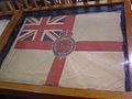 King's Colour for the Royal Navy (1925–1936).
 -
 Blank version.
 -
 George V's colour for the Royal Navy (Done)


.svg)
- Article(s)
- George V, Tudor Crown (heraldry), Royal cypher.
- Request
- Would someone please create an SVG file of the cypher of Britain's King George V, visible on the above photo, as well as part of these images here and here, using elements from the cypher of current King Charles III provided above (specifically the exact style of the Tudor Crown, as well as the same shade of yellow for the letters). Thanks. Snow Lion Fenian ( talk) 16:40, 4 October 2022 (UTC)
- Discussion
![]() Done
Sodacan (
talk) 22:11, 8 October 2022 (UTC)
Done
Sodacan (
talk) 22:11, 8 October 2022 (UTC)
- @
Sodacan: Terrific job, and thanks again! And while we're here, would you also be willing to create George V's version of the "King's Colour for the Royal Navy" (used from 1925–1936, according to
here), based on the above photo? As you can see, it would consist of his cypher placed in the centre of the blank version of the King's Colour, which I noticed you also created. Please?
Snow Lion Fenian (
talk) 15:57, 9 October 2022 (UTC)
- Done, @
Snow Lion Fenian:.
Sodacan (
talk) 12:51, 11 October 2022 (UTC)
- @ Sodacan: Brilliant work, and thank you as always! Snow Lion Fenian ( talk) 15:19, 11 October 2022 (UTC)
- @
Sodacan: Terrific job, and thanks again! And while we're here, would you also be willing to create George V's version of the "King's Colour for the Royal Navy" (used from 1925–1936, according to
here), based on the above photo? As you can see, it would consist of his cypher placed in the centre of the blank version of the King's Colour, which I noticed you also created. Please?
Snow Lion Fenian (
talk) 15:57, 9 October 2022 (UTC)
Elizabeth II signature
{{ resolved}}
-
 Current signature
- Article(s)
- Elizabeth II
- Request
- Could somebody please update this signature with smoother lines with more even thickness? A similar image can be found here. Thank you in advance. nagual design 00:16, 23 September 2022 (UTC)
- ...Pretty please? nagual design 19:21, 24 September 2022 (UTC)
- Discussion
- @ Nagualdesign: How is that? – Pbrks ( t • c) 15:14, 25 September 2022 (UTC)
-
Pbrks, could you add back the
tittle?
Peter Ormond
💬 19:18, 28 September 2022 (UTC)
- @ Peter Ormond: Didn't notice that, added. – Pbrks ( t • c) 23:34, 28 September 2022 (UTC)
Good article and featured article topicon redesign
-
 Current good article icon
 -
 Current featured content icon


- Article(s)
- 5,859 featured articles
- 3,696 featured lists
- 32,507 good articles
- Assorted additional talk, help, and process pages
- Request
- Yes, this one is a big one.
- Background: The current symbols for good articles and featured content have been used since those systems were introduced way back in Wikipedia's early days. They have significant problems. The featured article icon is too skeuomorphic, giving it an outdated look, and its excessive detail causes it to render poorly at small scale. The good article icon, meanwhile, has been adopted throughout the rest of Wikimedia (and in some places on Wikipedia) as the "support vote" icon, leading to conflicting usage. Far worse than the issues with them individually, however, is the fact that there is no shared visual language between them (the GA icon uses the norro style, and the FA icon does not use any style). When compounded by their overall lack of prominence (a separate issue that we're trying to address), this has led to the unfortunate situation where many (perhaps most) non-editing readers could not tell you whether a star or a green badge is a higher distinction. Given how much effort we put into the GA/FA systems, there's more than a bit of tragic irony to that.
- Process: This is the first stage in the process of redesigning the icons (after informal discussions in various places). Ideally, several proposals will be put forth that can be compared against the status quo in a more formal and widely-advertised round of !voting (similar to the process for the MediaWiki logo redesign), with the winner adopted.
- Design details: The redesigned icons could end up being anything from checkmarks (a la the Twitter verification badge) to a silver star for GAs to a multi-star system that begins with one star for stubs and increases thereafter; feel free to get creative.
- Also, since the whole idea here is to unify the symbology, the redesign will need to include the associated symbols in addition to the main icons. You don't have to design them all now, but candidates with at least an articulated vision of what they should look like may be more likely to win support once we reach the formal !voting stage. Here are the current icons still in use that I could find (there may be a few more fringe ones):
Related icons
|
|---|
|


- In truth, the potential scope of this project could be a lot bigger, trying to unify all of the icons used anywhere on Wikipedia. However, recent attempts to do so have failed, and their utility is questionable, given that most icons do not appear in reader-facing areas and thus have a vastly more limited reach. Redesigning these two icons is a more feasible task with clear and significant benefits for readers across tens of thousands of pages.
- Cheers, {{u| Sdkb}} talk 05:08, 7 October 2020 (UTC)
- Discussion
- @ Sdkb: I would recommend posting this at the Commons graphics lab as well, as it is significantly more active over there. Pbrks ( talk) 14:50, 16 October 2020 (UTC)
- Consider color blindness (esp. red-green): In data visualization circles, there is increasing awareness of how graphics should be crafted to allow color blind individuals to distinguish through shading, what normally sighted individuals distinguish directly through color perception. (One can test shading in Photoshop etc by removing saturation.) It's my understanding that red-green color blindness is a common type, though not the only type of color blindness. Some color scales are better than others: see Scientific American. — RCraig09 ( talk) 22:53, 17 October 2020 (UTC)
Resolved discussion about mandate for change
|
|---|
|
- This is my passing opinion. There is a ooui icon called "articleCheck" () and this is what I think a "GA" icon should look similar to. Basically a sheet (representing a page) with a check on it. And in a green color instead of black. For the FA icon, a simple star/medal design on a sheet with an appropriate color would make sense to keep the two icons inline with each other. SInce I believe that most users could understand a star is more important than a check icon. Basic icons such as these are the only way to keep them readable when used as topicons. Terasail [✉] 17:00, 11 January 2021 (UTC)
Update: Mandate acquired
The formal Village Pump proposal has been archived, and per here, it successfully acquired a mandate for the icons to be redesigned, so I am removing the "on hold" box around this section. I'll leave it up to others to decide how precisely to proceed from here; I hope that someone steps up to take the lead on shepherding the process from here forward, since I'm not sure I can do it myself. This thread can be archived once (and only once) we've moved to the next stage. {{u| Sdkb}} talk 22:09, 24 December 2020 (UTC)
- As a note,
there is also a proposal about it.
Ahmetlii (
talk) 10:33, 29 December 2020 (UTC)
- @ Ahmetlii: That's a much more ambitious but still underdeveloped proposal that's been sitting for a while; in my view, it would need a lot of work to become comprehensive enough to become useful, and I don't see that amount of work forthcoming or really worth the effort. I think we should focus on this one, much more feasible task that we have agreed to do, rather than dreaming about bringing all of Wikipedia in line with a universal standard that, realistically, is not likely to happen any time soon. {{u| Sdkb}} talk 23:53, 31 December 2020 (UTC)
- The icons should be changed to something the average reader is familiar with. The current icons are nice, but they're nice to Wikipedians. The average reader probably has no idea what this means. We should aim to use images which readers will understand. For example: silver star, gold star. A tick / double tick. Or something along those lines. It should be obvious to a reader what it symbolises. ProcrastinatingReader ( talk) 02:55, 20 March 2021 (UTC)
Proposal 1
The following discussion is closed. Please do not modify it. Subsequent comments should be made on the appropriate discussion page. No further edits should be made to this discussion.
-
 Proposal
 -
 Prop with assessments
@ Sdkb: I've went ahead and made some icon ideas and where I think they would be appropriate. Let me know your thoughts. Pbrks ( talk) 14:44, 2 April 2021 (UTC)
- Pbrks, there are some nice icons in that set; thanks for putting it together! I think the next step would be arranging a large-scale discussion for those and any other proposals. {{u| Sdkb}} talk 16:53, 2 April 2021 (UTC)
Tol's icons


I don't know if people still want to implement this, but I was working on some icons for personal use that render better at smaller sizes and recalled the village pump proposal to do something similar. I'm a terrible graphic designer, but I figured I'd post them here in case anybody is interested. I based them on Wikimedia's
OOUI icons; I converted the <path>s in the icons to more human-readable SVG elements and colored them based on
Wikimedia Design's color palette. I used a star for the featured icon because it is similar to the existing one, but used a check for the good icon so distinguish it from a support !vote icon. I plan to make more for A/B/C classes. My main problem is that I am unsure how to best represent former, former candidate, candidate, and reassessment icons. I'm currently thinking a cross for former, a question mark for candidate, and both combined in some way for former candidate. I have no good idea for reassessment — magnifying glass, maybe? I'd appreciate some other opinions on how these look and what to do. Thanks for your time!
Tol (
talk |
contribs) @ 00:31, 3 September 2021 (UTC)
- All of the icons so far in small icon form:


 . I put something in the "start" icon instead of making it blank like the existing symbol (
 ). As for "stub", I am unsure if I should model it off the existing symbol (
 ) and do a partial circle, or use something else like
 (perhaps too close to the list icon?).
Tol (
talk |
contribs) @ 17:41, 3 September 2021 (UTC)
(perhaps too close to the list icon?).
Tol (
talk |
contribs) @ 17:41, 3 September 2021 (UTC)
- @
Tol: These are nice, although I'm not sold on a tick for GA. Question mark works well for candidates (presumably in the gold or green circles), and I don't see why reassessment couldn't use the same icon given it's an assessment of some sort in both cases. I'm not sure a former candidate icon is that important in the grand scheme of things. I would prefer stubs use a partial circle to lines, just so all article rating have a similar aesthetic which distinguishes them from lists.
CMD (
talk) 15:57, 6 September 2021 (UTC)
- @ Chipmunkdavis: Thanks for the feedback. For the GA icon, I was trying to avoid a star like the FA icon (which would have accessibility problems) and a plus sign (some people thought having the same icon for support votes and good articles is confusing). I haven't been able to get the question mark to look good, but I think I'm close to getting it (I'll probably upload an FA candidate icon soon). I'll do the partial circle for stub. Thank you again! Tol ( talk | contribs) @ 18:48, 6 September 2021 (UTC)
- Hi Tol! Sorry, I'm just seeing this now. My first thought is that, as we saw with Pbrk's proposal, editors are instinctively resistant to design changes. We managed to eek out a mandate for the GA/FA icons, but I think any current proposal that also tries to handle other classes beyond that will unfortunately be dead on arrival. Regarding the GA/FA icons, I think we need something more fundamental. The biggest problem is still that there's nothing in particular signaling that FA is one step above GA. {{u| Sdkb}} talk 18:56, 16 October 2021 (UTC)
- @
Tol: These are nice, although I'm not sold on a tick for GA. Question mark works well for candidates (presumably in the gold or green circles), and I don't see why reassessment couldn't use the same icon given it's an assessment of some sort in both cases. I'm not sure a former candidate icon is that important in the grand scheme of things. I would prefer stubs use a partial circle to lines, just so all article rating have a similar aesthetic which distinguishes them from lists.
CMD (
talk) 15:57, 6 September 2021 (UTC)
- I think personally that what we saw with Pbrk's proposal was a bunch of people who would oppose any change what so ever and were rightfully miffed that a discussion affecting over 40,000+ pages had small participation. JMHO casualdejekyll 20:40, 25 March 2022 (UTC)
Proposed flag of the President of Ireland (1944)
{{ resolved}}
-
 Arms of Sessenheim
.svg)
- Article(s)
- President of Ireland, Secretary-General to the President (Ireland), Children of Lir and List of flags of Ireland.
- Request
- Will someone please create an SVG file of the proposed (albeit unadopted) flag for the President of Ireland from 1944, designed by the President's Secretary, Michael McDunphy, as seen here, using the matching swan templates from the above image. Thanks. Snow Lion Fenian ( talk) 15:23, 15 October 2022 (UTC)
- Discussion
- @
Snow Lion Fenian: Done. Present at
File:Flag of the President of Ireland (1944 proposal).svg.
HapHaxion (
talk /
contribs) 16:37, 18 October 2022 (UTC)
- @ HapHaxion: Great work, and thank you! Snow Lion Fenian ( talk) 18:03, 18 October 2022 (UTC)
Flag of Bonnets Rouges
{{ resolved}}
- Article(s)
- Bonnets Rouges, List of Breton flags.
- Request
- Would someone please create an SVG file of the flag of the Bonnets Rouges protest movement, as seen here. Thanks. Snow Lion Fenian ( talk) 15:13, 18 October 2022 (UTC)
- Discussion
- @
Snow Lion Fenian: Done. Present at
File:Bonnets Rouges flag.svg.
HapHaxion (
talk /
contribs) 16:26, 18 October 2022 (UTC)
- @ HapHaxion: Many thanks! Snow Lion Fenian ( talk) 18:05, 18 October 2022 (UTC)
Logo clean-up request
{{ resolved}}
_title_screen.jpg)
- Article(s)
- Cluedo (Australian game show)
- Request
- Please can someone clean up the logo for this TV series? Thank you in advance!-- Coin945 ( talk) 06:38, 10 October 2022 (UTC)
- Discussion
![]() Done I removed the specs, assuming that's what you meant.
Auguel (
talk) 13:48, 13 October 2022 (UTC)
Done I removed the specs, assuming that's what you meant.
Auguel (
talk) 13:48, 13 October 2022 (UTC)
Request
-
 Central/Carpathian romani Wikipedia logo
- Article(s)
- Request
- Is there someone that can make corrections to this logo?
Text now is:
WikipedijA
E phuterďi enciklopedija
and should be
WikipedijA
E phuterďi enciklopedija
after the correction please make text to svg.
Many, many and many thanks in advance!!!
-- 158.148.121.39 ( talk) 13:31, 22 August 2022 (UTC)
- Discussion
Penguin Scout
-
 Penguin Scout
 -
 SVG
SVG


- Article(s)
- Request
- Please convert this to an clean SVG for future use. Thanks. -- evrik ( talk) 23:45, 19 August 2022 (UTC)
 Bumping thread. --
evrik (
talk) 20:22, 28 August 2022 (UTC) --
evrik (
talk) 20:22, 28 August 2022 (UTC)
Bumping thread. --
evrik (
talk) 20:22, 28 August 2022 (UTC) --
evrik (
talk) 20:22, 28 August 2022 (UTC)- Discussion
- @ Evrik: How is that? – Pbrks ( t • c) 15:49, 25 September 2022 (UTC)
Modernise this drawing from 1858, make it more vibrant
-
 Frogs web that had been inflammed with mustard

- Article(s)
- Joseph Lister
- Request
- Is it possible to brighten this image, somehow, modernise it is such a way that makes it more vibrant and colourful. It is from 1858 and is the result of an experiment by Joseph Lister. There is more of these drawings and I would like to see how well they could be improved. Thanks -- scope_creep Talk 19:52, 26 September 2022 (UTC)
- Discussion
Flag of Bangor University
{{ resolved}}
-
 Arms of Bangor University
 -
 vectored flag


- Article(s)
- Bangor University, List of Welsh flags.
- Request
- Can someone please create an SVG file of the flag of Bangor University, as seen here. It's a banner of the university's coat of arms, provided above. Thanks. Snow Lion Fenian ( talk) 21:59, 6 October 2022 (UTC)
- Discussion
![]() Request taken by
FOX 52
talk! 05:48, 26 October 2022 (UTC).
Request taken by
FOX 52
talk! 05:48, 26 October 2022 (UTC).
- @
Snow Lion Fenian: - Done
FOX 52
talk! 05:52, 26 October 2022 (UTC)
- @
FOX 52: Thank you so much! Although, is there any chance you could make the tongues of all four smaller lions black, in line with the original photo? Also, could you add in the extra semi-circular symbols (I'm not sure what the right term for them is) that surround the large lion in the white section? I know they're not clearly visible in the original photo (my apologies), but this other
photo here should provide a better visual.
Snow Lion Fenian (
talk) 12:41, 26 October 2022 (UTC)
- @
Snow Lion Fenian: there -
FOX 52
talk! 03:53, 27 October 2022 (UTC)
- @
FOX 52: Great work! Although I notice the new version of the file has a small white line under the bottom-right yellow section. Any chance of fixing that? Sorry for the inconvenience.
Snow Lion Fenian (
talk) 21:42, 27 October 2022 (UTC)
- Yeah, no problem
FOX 52
talk! 22:21, 27 October 2022 (UTC)
- @ FOX 52: That's terrific, and thank you profusely for all your hard work. I appreciate it enormously. Snow Lion Fenian ( talk) 22:40, 27 October 2022 (UTC)
- Yeah, no problem
FOX 52
talk! 22:21, 27 October 2022 (UTC)
- @
FOX 52: Great work! Although I notice the new version of the file has a small white line under the bottom-right yellow section. Any chance of fixing that? Sorry for the inconvenience.
Snow Lion Fenian (
talk) 21:42, 27 October 2022 (UTC)
- @
Snow Lion Fenian: there -
FOX 52
talk! 03:53, 27 October 2022 (UTC)
- @
FOX 52: Thank you so much! Although, is there any chance you could make the tongues of all four smaller lions black, in line with the original photo? Also, could you add in the extra semi-circular symbols (I'm not sure what the right term for them is) that surround the large lion in the white section? I know they're not clearly visible in the original photo (my apologies), but this other
photo here should provide a better visual.
Snow Lion Fenian (
talk) 12:41, 26 October 2022 (UTC)
Extract signature
{{ resolved}}
-
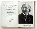 Book frontispiece with portrait and signature of Sholem Aleichem

.svg)
- Article(s)
- Sholem Aleichem
- Request
- Could you extract the signature from the bottom of the image and then upload it as a separate image? It would be useful in the writer's article, in the infobox's signature-image parameter. 123.51.107.94 ( talk) 05:37, 27 October 2022 (UTC)
- Discussion
https://commons.wikimedia.org/wiki/File:Sholem_Aleichem_Signature.svg. Here you go. User1042 ( talk) 13:34, 27 October 2022 (UTC)
|
| This page, part of the
Graphics Lab Wikiproject, is an
archive of requests for 2021. Please do not edit the contents of this page. You can submit new requests here. |
Transparent background
- Article(s)
- Tekken
- Request
- Can someone please make the background transparent? I tried myself but the checkered background is still not transparent. Thanks. QuestFour ( talk) 03:42, 17 September 2022 (UTC)
- Discussion
- Done by
痛
HapHaxion (
talk /
contribs) 13:48, 26 September 2022 (UTC)
- {{ resolved}}
Queensland State Badge 1901-1952 and 2022-present
{{ resolved}}
-
Queensland State flag 1901-1952 and to be 2022-present (Uses Tudor Crown)
-
Queensland State Badge 1952-2022 (Uses St Edwards Crown)
-
Badge of Queensland (1901–1952)
- Article(s)
- Flag of Queensland
- Request
- Would it be possible for someone to create SVG files of the Former (and expected to be now current) State badge of of Queensland (Tudor Crown) (from 1901-1952, 2022-present) in the same way as the current state badge (pictured above as well) that uses the St Edwards Crown, as displayed here [ [1]]. Thanks. Nford24 ( PE121 Personnel Request Form) 06:34, 1 October 2022 (UTC)
- Discussion
@ Nford24: It seems that User:Fry1989 has already created such a File. Will that be okay? Snow Lion Fenian ( talk) 10:28, 1 October 2022 (UTC) @ Snow Lion Fenian: Absolutely does! Thankyou so much! 23:19, 1 October 2022 (UTC)
Zubří
-
Zubří COA SVG
-
Zubří FLAG PNG
- Article(s)
- Zubří
- Request
- Is there someone that can kindly make flag from png to svg using coa? Many, many and many thanks in advantage!!! -- 93.34.228.121 ( talk) 16:36, 26 September 2022 (UTC)
- Discussion
- @
93.34.228.121: Done, present at
File:Zubří prapor.svg.
HapHaxion (
talk /
contribs) 17:07, 30 September 2022 (UTC)
- {{ resolved}}
Manilva
-
Manilva COA SVG
-
Manilva FLAG JPG
-
Honduras flag, for color tone
- Article(s)
- Manilva
- Request
- Is there someone that can kindly make flag from jpg to svg using coa? Strips are 1/3, 1/3, 1/3. Many, many and many thanks in advantage!!! -- 93.34.228.121 ( talk) 16:38, 26 September 2022 (UTC)
- Discussion
- @
93.34.228.121: Done, present at
File:Bandera de Manilva.svg.
HapHaxion (
talk /
contribs) 16:56, 30 September 2022 (UTC)
- {{ resolved}}
Canary Wiki Order
-
Spanish Wiki Order
-
Flag of the Canary Islands
- Article(s)
- Discussion pages of participants
- Request
- Please create an image of the Canary Wiki Order to be awarded for significant contributions on this topic. Can be created based on the Spanish Wikiorden (attached): create a new file by replacing the flag of Spain with the flag of the Canary Islands (attached) -- Villarreal9 ( talk) 15:01, 4 September 2022 (UTC)
- Discussion
- Done available at
File:BoNM - Canary Islands.svg
Flagvisioner (
talk) 04:06, 5 September 2022 (UTC)
Coat of arms of Queensland (1902–1953)
{{ resolved}}
-
Coat of arms of Queensland (1893–1902 and 1953–1977)
-
Tudor Crown1902–1953
-
1902–1953
- Article(s)
- Coat of arms of Queensland and Tudor Crown (heraldry)
- Request
- Can someone please create an SVG file of the coat of arms used in Queensland from 1902 to 1953. It would be almost the same as the 1893 version provided above, only with the Tudor Crown at the top instead of Saint Edward's Crown. Thanks. Snow Lion Fenian ( talk) 22:50, 1 October 2022 (UTC)
- Discussion
![]() Done
Sodacan (
talk) 10:28, 7 October 2022 (UTC)
Done
Sodacan (
talk) 10:28, 7 October 2022 (UTC)
- @ Sodacan: Nicely done, and many thanks. Snow Lion Fenian ( talk) 15:09, 7 October 2022 (UTC)
Royal Cypher of King Edward VIII - PNG to SVG
{{ resolved}}
-
Cypher of Edward VIII (PNG)
-
Cypher of Charles III (SVG)
-
Done
- Article(s)
- Any article this file already appears on.
- Request
- Could someone please redraw the above PNG file of the Royal Cypher of King Edward VIII as SVG, using elements from the Cypher of current King Charles III (specifically the exact style of the Tudor Crown, the same shade of yellow as the letters, and with the Roman numerals matching the colour scheme of the letters). Thanks. Snow Lion Fenian ( talk) 16:16, 30 September 2022 (UTC)
- Discussion
![]() Done
Sodacan (
talk) 22:11, 8 October 2022 (UTC)
Done
Sodacan (
talk) 22:11, 8 October 2022 (UTC)
- @ Sodacan: Perfect, thanks! Snow Lion Fenian ( talk) 22:32, 8 October 2022 (UTC)
Royal Cypher of King George V
{{ resolved}}
-
Cypher of Charles III
-
George V's cypher on the gates of Queen Mary's Gardens.
-
Done
-
King's Colour for the Royal Navy (1925–1936).
-
Blank version.
-
George V's colour for the Royal Navy (Done)
- Article(s)
- George V, Tudor Crown (heraldry), Royal cypher.
- Request
- Would someone please create an SVG file of the cypher of Britain's King George V, visible on the above photo, as well as part of these images here and here, using elements from the cypher of current King Charles III provided above (specifically the exact style of the Tudor Crown, as well as the same shade of yellow for the letters). Thanks. Snow Lion Fenian ( talk) 16:40, 4 October 2022 (UTC)
- Discussion
![]() Done
Sodacan (
talk) 22:11, 8 October 2022 (UTC)
Done
Sodacan (
talk) 22:11, 8 October 2022 (UTC)
- @
Sodacan: Terrific job, and thanks again! And while we're here, would you also be willing to create George V's version of the "King's Colour for the Royal Navy" (used from 1925–1936, according to
here), based on the above photo? As you can see, it would consist of his cypher placed in the centre of the blank version of the King's Colour, which I noticed you also created. Please?
Snow Lion Fenian (
talk) 15:57, 9 October 2022 (UTC)
- Done, @
Snow Lion Fenian:.
Sodacan (
talk) 12:51, 11 October 2022 (UTC)
- @ Sodacan: Brilliant work, and thank you as always! Snow Lion Fenian ( talk) 15:19, 11 October 2022 (UTC)
- @
Sodacan: Terrific job, and thanks again! And while we're here, would you also be willing to create George V's version of the "King's Colour for the Royal Navy" (used from 1925–1936, according to
here), based on the above photo? As you can see, it would consist of his cypher placed in the centre of the blank version of the King's Colour, which I noticed you also created. Please?
Snow Lion Fenian (
talk) 15:57, 9 October 2022 (UTC)
Elizabeth II signature
{{ resolved}}
-
Current signature
- Article(s)
- Elizabeth II
- Request
- Could somebody please update this signature with smoother lines with more even thickness? A similar image can be found here. Thank you in advance. nagual design 00:16, 23 September 2022 (UTC)
- ...Pretty please? nagual design 19:21, 24 September 2022 (UTC)
- Discussion
- @ Nagualdesign: How is that? – Pbrks ( t • c) 15:14, 25 September 2022 (UTC)
-
Pbrks, could you add back the
tittle?
Peter Ormond
💬 19:18, 28 September 2022 (UTC)
- @ Peter Ormond: Didn't notice that, added. – Pbrks ( t • c) 23:34, 28 September 2022 (UTC)
Good article and featured article topicon redesign
-
Current good article icon
-
Current featured content icon
- Article(s)
- 5,859 featured articles
- 3,696 featured lists
- 32,507 good articles
- Assorted additional talk, help, and process pages
- Request
- Yes, this one is a big one.
- Background: The current symbols for good articles and featured content have been used since those systems were introduced way back in Wikipedia's early days. They have significant problems. The featured article icon is too skeuomorphic, giving it an outdated look, and its excessive detail causes it to render poorly at small scale. The good article icon, meanwhile, has been adopted throughout the rest of Wikimedia (and in some places on Wikipedia) as the "support vote" icon, leading to conflicting usage. Far worse than the issues with them individually, however, is the fact that there is no shared visual language between them (the GA icon uses the norro style, and the FA icon does not use any style). When compounded by their overall lack of prominence (a separate issue that we're trying to address), this has led to the unfortunate situation where many (perhaps most) non-editing readers could not tell you whether a star or a green badge is a higher distinction. Given how much effort we put into the GA/FA systems, there's more than a bit of tragic irony to that.
- Process: This is the first stage in the process of redesigning the icons (after informal discussions in various places). Ideally, several proposals will be put forth that can be compared against the status quo in a more formal and widely-advertised round of !voting (similar to the process for the MediaWiki logo redesign), with the winner adopted.
- Design details: The redesigned icons could end up being anything from checkmarks (a la the Twitter verification badge) to a silver star for GAs to a multi-star system that begins with one star for stubs and increases thereafter; feel free to get creative.
- Also, since the whole idea here is to unify the symbology, the redesign will need to include the associated symbols in addition to the main icons. You don't have to design them all now, but candidates with at least an articulated vision of what they should look like may be more likely to win support once we reach the formal !voting stage. Here are the current icons still in use that I could find (there may be a few more fringe ones):
Related icons
|
|---|
|
- In truth, the potential scope of this project could be a lot bigger, trying to unify all of the icons used anywhere on Wikipedia. However, recent attempts to do so have failed, and their utility is questionable, given that most icons do not appear in reader-facing areas and thus have a vastly more limited reach. Redesigning these two icons is a more feasible task with clear and significant benefits for readers across tens of thousands of pages.
- Cheers, {{u| Sdkb}} talk 05:08, 7 October 2020 (UTC)
- Discussion
- @ Sdkb: I would recommend posting this at the Commons graphics lab as well, as it is significantly more active over there. Pbrks ( talk) 14:50, 16 October 2020 (UTC)
- Consider color blindness (esp. red-green): In data visualization circles, there is increasing awareness of how graphics should be crafted to allow color blind individuals to distinguish through shading, what normally sighted individuals distinguish directly through color perception. (One can test shading in Photoshop etc by removing saturation.) It's my understanding that red-green color blindness is a common type, though not the only type of color blindness. Some color scales are better than others: see Scientific American. — RCraig09 ( talk) 22:53, 17 October 2020 (UTC)
Resolved discussion about mandate for change
|
|---|
|
- This is my passing opinion. There is a ooui icon called "articleCheck" () and this is what I think a "GA" icon should look similar to. Basically a sheet (representing a page) with a check on it. And in a green color instead of black. For the FA icon, a simple star/medal design on a sheet with an appropriate color would make sense to keep the two icons inline with each other. SInce I believe that most users could understand a star is more important than a check icon. Basic icons such as these are the only way to keep them readable when used as topicons. Terasail [✉] 17:00, 11 January 2021 (UTC)
Update: Mandate acquired
The formal Village Pump proposal has been archived, and per here, it successfully acquired a mandate for the icons to be redesigned, so I am removing the "on hold" box around this section. I'll leave it up to others to decide how precisely to proceed from here; I hope that someone steps up to take the lead on shepherding the process from here forward, since I'm not sure I can do it myself. This thread can be archived once (and only once) we've moved to the next stage. {{u| Sdkb}} talk 22:09, 24 December 2020 (UTC)
- As a note,
there is also a proposal about it.
Ahmetlii (
talk) 10:33, 29 December 2020 (UTC)
- @ Ahmetlii: That's a much more ambitious but still underdeveloped proposal that's been sitting for a while; in my view, it would need a lot of work to become comprehensive enough to become useful, and I don't see that amount of work forthcoming or really worth the effort. I think we should focus on this one, much more feasible task that we have agreed to do, rather than dreaming about bringing all of Wikipedia in line with a universal standard that, realistically, is not likely to happen any time soon. {{u| Sdkb}} talk 23:53, 31 December 2020 (UTC)
- The icons should be changed to something the average reader is familiar with. The current icons are nice, but they're nice to Wikipedians. The average reader probably has no idea what this means. We should aim to use images which readers will understand. For example: silver star, gold star. A tick / double tick. Or something along those lines. It should be obvious to a reader what it symbolises. ProcrastinatingReader ( talk) 02:55, 20 March 2021 (UTC)
Proposal 1
The following discussion is closed. Please do not modify it. Subsequent comments should be made on the appropriate discussion page. No further edits should be made to this discussion.
-
Proposal
-
Prop with assessments
@ Sdkb: I've went ahead and made some icon ideas and where I think they would be appropriate. Let me know your thoughts. Pbrks ( talk) 14:44, 2 April 2021 (UTC)
- Pbrks, there are some nice icons in that set; thanks for putting it together! I think the next step would be arranging a large-scale discussion for those and any other proposals. {{u| Sdkb}} talk 16:53, 2 April 2021 (UTC)
Tol's icons
I don't know if people still want to implement this, but I was working on some icons for personal use that render better at smaller sizes and recalled the village pump proposal to do something similar. I'm a terrible graphic designer, but I figured I'd post them here in case anybody is interested. I based them on Wikimedia's
OOUI icons; I converted the <path>s in the icons to more human-readable SVG elements and colored them based on
Wikimedia Design's color palette. I used a star for the featured icon because it is similar to the existing one, but used a check for the good icon so distinguish it from a support !vote icon. I plan to make more for A/B/C classes. My main problem is that I am unsure how to best represent former, former candidate, candidate, and reassessment icons. I'm currently thinking a cross for former, a question mark for candidate, and both combined in some way for former candidate. I have no good idea for reassessment — magnifying glass, maybe? I'd appreciate some other opinions on how these look and what to do. Thanks for your time!
Tol (
talk |
contribs) @ 00:31, 3 September 2021 (UTC)
- All of the icons so far in small icon form: . I put something in the "start" icon instead of making it blank like the existing symbol (
). As for "stub", I am unsure if I should model it off the existing symbol (
) and do a partial circle, or use something else like
(perhaps too close to the list icon?).
Tol (
talk |
contribs) @ 17:41, 3 September 2021 (UTC)
- @
Tol: These are nice, although I'm not sold on a tick for GA. Question mark works well for candidates (presumably in the gold or green circles), and I don't see why reassessment couldn't use the same icon given it's an assessment of some sort in both cases. I'm not sure a former candidate icon is that important in the grand scheme of things. I would prefer stubs use a partial circle to lines, just so all article rating have a similar aesthetic which distinguishes them from lists.
CMD (
talk) 15:57, 6 September 2021 (UTC)
- @ Chipmunkdavis: Thanks for the feedback. For the GA icon, I was trying to avoid a star like the FA icon (which would have accessibility problems) and a plus sign (some people thought having the same icon for support votes and good articles is confusing). I haven't been able to get the question mark to look good, but I think I'm close to getting it (I'll probably upload an FA candidate icon soon). I'll do the partial circle for stub. Thank you again! Tol ( talk | contribs) @ 18:48, 6 September 2021 (UTC)
- Hi Tol! Sorry, I'm just seeing this now. My first thought is that, as we saw with Pbrk's proposal, editors are instinctively resistant to design changes. We managed to eek out a mandate for the GA/FA icons, but I think any current proposal that also tries to handle other classes beyond that will unfortunately be dead on arrival. Regarding the GA/FA icons, I think we need something more fundamental. The biggest problem is still that there's nothing in particular signaling that FA is one step above GA. {{u| Sdkb}} talk 18:56, 16 October 2021 (UTC)
- @
Tol: These are nice, although I'm not sold on a tick for GA. Question mark works well for candidates (presumably in the gold or green circles), and I don't see why reassessment couldn't use the same icon given it's an assessment of some sort in both cases. I'm not sure a former candidate icon is that important in the grand scheme of things. I would prefer stubs use a partial circle to lines, just so all article rating have a similar aesthetic which distinguishes them from lists.
CMD (
talk) 15:57, 6 September 2021 (UTC)
- I think personally that what we saw with Pbrk's proposal was a bunch of people who would oppose any change what so ever and were rightfully miffed that a discussion affecting over 40,000+ pages had small participation. JMHO casualdejekyll 20:40, 25 March 2022 (UTC)
Proposed flag of the President of Ireland (1944)
{{ resolved}}
-
Arms of Sessenheim
- Article(s)
- President of Ireland, Secretary-General to the President (Ireland), Children of Lir and List of flags of Ireland.
- Request
- Will someone please create an SVG file of the proposed (albeit unadopted) flag for the President of Ireland from 1944, designed by the President's Secretary, Michael McDunphy, as seen here, using the matching swan templates from the above image. Thanks. Snow Lion Fenian ( talk) 15:23, 15 October 2022 (UTC)
- Discussion
- @
Snow Lion Fenian: Done. Present at
File:Flag of the President of Ireland (1944 proposal).svg.
HapHaxion (
talk /
contribs) 16:37, 18 October 2022 (UTC)
- @ HapHaxion: Great work, and thank you! Snow Lion Fenian ( talk) 18:03, 18 October 2022 (UTC)
Flag of Bonnets Rouges
{{ resolved}}
- Article(s)
- Bonnets Rouges, List of Breton flags.
- Request
- Would someone please create an SVG file of the flag of the Bonnets Rouges protest movement, as seen here. Thanks. Snow Lion Fenian ( talk) 15:13, 18 October 2022 (UTC)
- Discussion
- @
Snow Lion Fenian: Done. Present at
File:Bonnets Rouges flag.svg.
HapHaxion (
talk /
contribs) 16:26, 18 October 2022 (UTC)
- @ HapHaxion: Many thanks! Snow Lion Fenian ( talk) 18:05, 18 October 2022 (UTC)
Logo clean-up request
{{ resolved}}
- Article(s)
- Cluedo (Australian game show)
- Request
- Please can someone clean up the logo for this TV series? Thank you in advance!-- Coin945 ( talk) 06:38, 10 October 2022 (UTC)
- Discussion
![]() Done I removed the specs, assuming that's what you meant.
Auguel (
talk) 13:48, 13 October 2022 (UTC)
Done I removed the specs, assuming that's what you meant.
Auguel (
talk) 13:48, 13 October 2022 (UTC)
Request
-
Central/Carpathian romani Wikipedia logo
- Article(s)
- Request
- Is there someone that can make corrections to this logo?
Text now is:
WikipedijA
E phuterďi enciklopedija
and should be
WikipedijA
E phuterďi enciklopedija
after the correction please make text to svg.
Many, many and many thanks in advance!!!
-- 158.148.121.39 ( talk) 13:31, 22 August 2022 (UTC)
- Discussion
Penguin Scout
-
Penguin Scout
-
SVG
- Article(s)
- Request
- Please convert this to an clean SVG for future use. Thanks. -- evrik ( talk) 23:45, 19 August 2022 (UTC)
- Bumping thread. --
evrik (
talk) 20:22, 28 August 2022 (UTC) --
evrik (
talk) 20:22, 28 August 2022 (UTC)
- Discussion
- @ Evrik: How is that? – Pbrks ( t • c) 15:49, 25 September 2022 (UTC)
Modernise this drawing from 1858, make it more vibrant
-
Frogs web that had been inflammed with mustard
- Article(s)
- Joseph Lister
- Request
- Is it possible to brighten this image, somehow, modernise it is such a way that makes it more vibrant and colourful. It is from 1858 and is the result of an experiment by Joseph Lister. There is more of these drawings and I would like to see how well they could be improved. Thanks -- scope_creep Talk 19:52, 26 September 2022 (UTC)
- Discussion
Flag of Bangor University
{{ resolved}}
-
Arms of Bangor University
-
vectored flag
- Article(s)
- Bangor University, List of Welsh flags.
- Request
- Can someone please create an SVG file of the flag of Bangor University, as seen here. It's a banner of the university's coat of arms, provided above. Thanks. Snow Lion Fenian ( talk) 21:59, 6 October 2022 (UTC)
- Discussion
![]() Request taken by
FOX 52
talk! 05:48, 26 October 2022 (UTC).
Request taken by
FOX 52
talk! 05:48, 26 October 2022 (UTC).
- @
Snow Lion Fenian: - Done
FOX 52
talk! 05:52, 26 October 2022 (UTC)
- @
FOX 52: Thank you so much! Although, is there any chance you could make the tongues of all four smaller lions black, in line with the original photo? Also, could you add in the extra semi-circular symbols (I'm not sure what the right term for them is) that surround the large lion in the white section? I know they're not clearly visible in the original photo (my apologies), but this other
photo here should provide a better visual.
Snow Lion Fenian (
talk) 12:41, 26 October 2022 (UTC)
- @
Snow Lion Fenian: there -
FOX 52
talk! 03:53, 27 October 2022 (UTC)
- @
FOX 52: Great work! Although I notice the new version of the file has a small white line under the bottom-right yellow section. Any chance of fixing that? Sorry for the inconvenience.
Snow Lion Fenian (
talk) 21:42, 27 October 2022 (UTC)
- Yeah, no problem
FOX 52
talk! 22:21, 27 October 2022 (UTC)
- @ FOX 52: That's terrific, and thank you profusely for all your hard work. I appreciate it enormously. Snow Lion Fenian ( talk) 22:40, 27 October 2022 (UTC)
- Yeah, no problem
FOX 52
talk! 22:21, 27 October 2022 (UTC)
- @
FOX 52: Great work! Although I notice the new version of the file has a small white line under the bottom-right yellow section. Any chance of fixing that? Sorry for the inconvenience.
Snow Lion Fenian (
talk) 21:42, 27 October 2022 (UTC)
- @
Snow Lion Fenian: there -
FOX 52
talk! 03:53, 27 October 2022 (UTC)
- @
FOX 52: Thank you so much! Although, is there any chance you could make the tongues of all four smaller lions black, in line with the original photo? Also, could you add in the extra semi-circular symbols (I'm not sure what the right term for them is) that surround the large lion in the white section? I know they're not clearly visible in the original photo (my apologies), but this other
photo here should provide a better visual.
Snow Lion Fenian (
talk) 12:41, 26 October 2022 (UTC)
Extract signature
{{ resolved}}
-
Book frontispiece with portrait and signature of Sholem Aleichem
- Article(s)
- Sholem Aleichem
- Request
- Could you extract the signature from the bottom of the image and then upload it as a separate image? It would be useful in the writer's article, in the infobox's signature-image parameter. 123.51.107.94 ( talk) 05:37, 27 October 2022 (UTC)
- Discussion
https://commons.wikimedia.org/wiki/File:Sholem_Aleichem_Signature.svg. Here you go. User1042 ( talk) 13:34, 27 October 2022 (UTC)