
 | This page, part of the
Graphics Lab Wikiproject, is an
archive of requests for 2021. Please do not edit the contents of this page. You can submit new requests here. |

Remove handwriting and abnormalities
{{
resolved}}
-
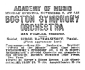 Advertisement of a musical performance

- Article(s)
- Piano Concerto No. 2 (Rachmaninoff)
- Request
- There is a stray "N" written between "Soloist" and "SERGE". There are also a speck on "P" in "SYMPHONY". If there are any other abnormalities I'd be glad if any one of you could fix them, I know you have a keen eye for such details. I'm trying to get the article to FA. Cheers - Wretchskull ( talk) 09:39, 28 October 2022 (UTC)
- Discussion
![]() Request taken. —
RCraig09 (
talk)
20:16, 28 October 2022 (UTC)
Request taken. —
RCraig09 (
talk)
20:16, 28 October 2022 (UTC)
 Done Let me know if any further changes are needed. —
RCraig09 (
talk)
20:45, 28 October 2022 (UTC)
Done Let me know if any further changes are needed. —
RCraig09 (
talk)
20:45, 28 October 2022 (UTC)
Logo of the Level Crossing Removal Project
{{ resolved}} Could somebody please vectorise the logo of the level crossing removal project, for use on the level crossing removal project article. HoHo3143 ( talk) 09:54, 25 October 2022 (UTC)
- @
HoHo3143: Per
WP:NFC, users should not vectorize non-free logos. However, I was able to find an official vector version at
[1]. Done –
Pbrks (
t •
c)
17:22, 25 October 2022 (UTC)
Conversion of Bath city F.C. logo
{{ resolved}} The convention of Bath City F.C. PNG club logo to SVG. The PNG logo looks extremely blurry on mobile. If its not possible to convert, perhaps creating the logo via SVG. thank you very much. Joseph1891 ( talk) 19:06, 31 October 2022 (UTC)
- Done by
RedPatch; present at
File:Bath City SVG.svg.
HapHaxion (
talk /
contribs)
18:44, 1 November 2022 (UTC)
Yep it’s been done 👍 thanks for your help.
Congressional Caucuses
-
 Logo of the New Democrat Coalition, a caucus of moderate members of the Democratic Party in the House of Representative of U.S. Congress.
- Article(s)
- Request
Vectorization. -- 16052022m ( talk) 21:00, 5 November 2022 (UTC)
- Discussion
- Vector available
here –
Berrely •
T∕
C
17:37, 6 November 2022 (UTC)
- Done. Present at
File:New Democrat Coalition logo.svg.
HapHaxion (
talk /
contribs)
16:43, 7 November 2022 (UTC)
- {{ resolved}}
Logo of the Association des enseignantes et des enseignants franco-ontariens
- Article(s)
- Association des enseignantes et des enseignants franco-ontariens
- Request
- Could the background of this logo be made transparent and the image be cropped appropriately (with the logo centred)? Thanks, Graham ( talk) 05:45, 7 November 2022 (UTC)
- Discussion
- Done. Present at
File:Logo - Association des enseignantes et des enseignants franco-ontariens.png.
HapHaxion (
talk /
contribs)
16:50, 7 November 2022 (UTC)
- {{ resolved}}
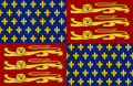
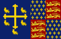
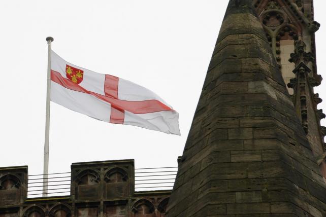
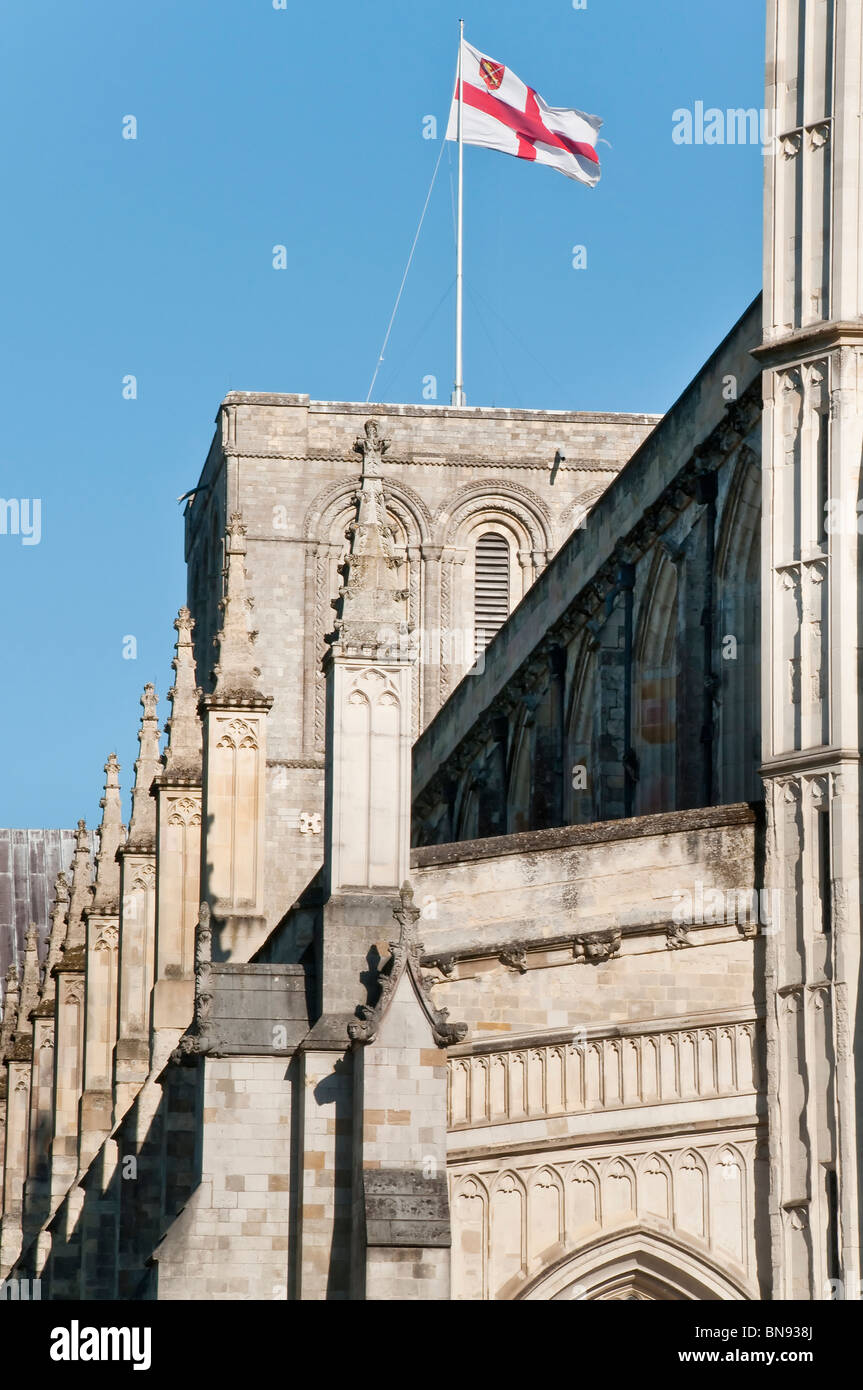
Royal Standard of England (1422–1461 and 1470–1471)
{{ resolved}}
-
 Royal Arms of England (1422–1461 and 1470–1471), on which the Standard is based.
 -
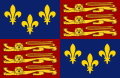 Royal Standard of England (first adopted in 1406), which comprises the right half of the 1422 version.
 -
-
-

.svg)
.svg)
.svg)
.svg)
.svg)
- Article(s)
- List of English flags, List of United Kingdom flags and Royal Standard of the United Kingdom.
- Request
- Will someone please create an SVG file of the Royal Standard of England used from 1422–1461 and again from 1470–1471, based on the Royal Arms above. Thanks.
Snow Lion Fenian (
talk) 21:43, 30 September 2022 (UTC)
 Bumping thread.
Snow Lion Fenian (
talk)
11:58, 31 October 2022 (UTC)
Bumping thread.
Snow Lion Fenian (
talk)
11:58, 31 October 2022 (UTC)
- Hey
Snow Lion Fenian, so you want a new flag (or standard), but with the content of the shield (or arms) to the left? Do you have a preference as to which lions/fleur de lil/colorscheme to use? It doesn't make much of a difference to me, is just a different starting point. Cheers! --
Lommes (
talk)
15:33, 8 November 2022 (UTC)
- @
Lommes: Thanks for asking! Well, I think it would be fitting for the the lions/fleur-de-lis/colour scheme (and indeed the flag ratio as well) on the new Standard to all match those of the 1406 version of the Standard to the upper-right. Given that that's how they're displayed on most other Wikimedia Files of the English Royal Standards from the medieval era, which I've added above for reference.
Snow Lion Fenian (
talk)
18:26, 8 November 2022 (UTC)

-
Snow Lion Fenian, please give feedback as to whether this is as intended or you need further alterations. --
Lommes (
talk)
18:52, 8 November 2022 (UTC)
- @
Lommes: Terrific work, and thank you for your time! Much obliged.
Snow Lion Fenian (
talk)
19:29, 8 November 2022 (UTC)
- Hey,
Snow Lion Fenian, happy to help. Can you then mark your request {{tl|resolved|~~~~}}, so the bots can archive it? Thanks. --
Lommes (
talk)
20:39, 8 November 2022 (UTC)
- I am sorry, you already did. Didnt see it at the top... Apologies.
Lommes (
talk)
20:46, 8 November 2022 (UTC)
- @ Lommes: It's okay, no worries. Snow Lion Fenian ( talk) 21:06, 8 November 2022 (UTC)
- I am sorry, you already did. Didnt see it at the top... Apologies.
Lommes (
talk)
20:46, 8 November 2022 (UTC)
- Hey,
Snow Lion Fenian, happy to help. Can you then mark your request {{tl|resolved|~~~~}}, so the bots can archive it? Thanks. --
Lommes (
talk)
20:39, 8 November 2022 (UTC)
- @
Lommes: Terrific work, and thank you for your time! Much obliged.
Snow Lion Fenian (
talk)
19:29, 8 November 2022 (UTC)
- @
Lommes: Thanks for asking! Well, I think it would be fitting for the the lions/fleur-de-lis/colour scheme (and indeed the flag ratio as well) on the new Standard to all match those of the 1406 version of the Standard to the upper-right. Given that that's how they're displayed on most other Wikimedia Files of the English Royal Standards from the medieval era, which I've added above for reference.
Snow Lion Fenian (
talk)
18:26, 8 November 2022 (UTC)
- Hey
Snow Lion Fenian, so you want a new flag (or standard), but with the content of the shield (or arms) to the left? Do you have a preference as to which lions/fleur de lil/colorscheme to use? It doesn't make much of a difference to me, is just a different starting point. Cheers! --
Lommes (
talk)
15:33, 8 November 2022 (UTC)
.svg)
- Discussion
Signature of British monarchs and royal family members
- Requested Media

- Article(s)
- Charles I of England
- Mary II of England
- Adelaide of Saxe-Meiningen
- Victoria, Princess Royal
- Princess Louise, Duchess of Argyll
- William, Prince of Wales
- Sarah, Duchess of York
- Princess Margaret, Countess of Snowdon
- Prince Andrew, Duke of York
- Prince Edward, Earl of Wessex and Forfar
- Request
- Please convert all signatures to SVG. Note that the signatures of all other British monarchs and royal family members have been properly vectorized. Many thanks in advance to anyone who volunteers to do the job. Keivan.f Talk 05:51, 6 October 2022 (UTC)
- Reply


- Hey
Keivan.f, here is the lot. Except "VickyPR", the quality of the image doesn't allow for a conversion (at least not with my skills and patience). And as to the Duke of York, you have to find someone else to do it. I am not touching him, not even his signature, not even for the good of Wikipedia.--
Lommes (
talk)
00:09, 8 November 2022 (UTC)
-
Lommes, thank you so much for the efforts. I really appreciate it. And I totally understand your unwillingness to do Andrew's signature. I mean, he is not particularly a favorite among the public at this point, for obvious reasons. I will probably have it nominated again in the future in case someone might be willing to do it for encyclopedic purposes. Again, thanks a lot.
Keivan.f
Talk
05:07, 8 November 2022 (UTC)
- So, from my side this is Done.
Keivan.f, if you have any further requests for changes or alterations, please let me know. If not, please mark this topic as {{tl|resolved|~~~~}}. Thanks! --
Lommes (
talk)
15:02, 8 November 2022 (UTC)
- {{ resolved}} Lommes, yes, it appears that the work is done here thanks to you. I now mark it as resolved, and will bring up Victoria and Andrew's signature again at a later request. Many thanks. Keivan.f Talk 16:37, 8 November 2022 (UTC)
- So, from my side this is
-
Lommes, thank you so much for the efforts. I really appreciate it. And I totally understand your unwillingness to do Andrew's signature. I mean, he is not particularly a favorite among the public at this point, for obvious reasons. I will probably have it nominated again in the future in case someone might be willing to do it for encyclopedic purposes. Again, thanks a lot.
Keivan.f
Talk
05:07, 8 November 2022 (UTC)
- Hey
Keivan.f, here is the lot. Except "VickyPR", the quality of the image doesn't allow for a conversion (at least not with my skills and patience). And as to the Duke of York, you have to find someone else to do it. I am not touching him, not even his signature, not even for the good of Wikipedia.--
Lommes (
talk)
00:09, 8 November 2022 (UTC)
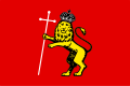
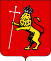
Symbols of the city of Vladimir
-
 Flag of the city of Vladimir
 -
 Coat of arms of the city of Vladimir

.png)
- Article(s)
- Vladimir, Russia
- Request
- Hello, please vectorize the image data. Thank you! — ArtSmir ( talk) 04:44, 26 October 2022 (UTC)
- Discussion
-
 Flag of the city of Vladimir
 -
 Coat of arms of the city of Vladimir

.svg)
- Done Hey,
ArtSmir, conversion complete. The lion isn't perfect, but i was working from a very small image size. If you have any requests for changes, please tell me. If you are satisfied, please mark this as {{tl|resolved|~~~~}} . Also please replace the original images, they are used on about
~80 articles and
over 300 articles in all Wikipedias. I guess there is a template somewhere. But please, please, please, replace the PNGs with the new files, or ask someone who knows how to do it automatically (I don't). There are few things on Wikipedia I hate more than
the list of images which have SVG replacements, but where the PNG/JPG is still in wide use... Thanks! --
Lommes (
talk)
18:57, 9 November 2022 (UTC)
English university flags
-
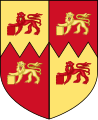
 Arms of the University of Cambridge
 -
 Arms of the University of Oxford
 -
 Arms of the University of Bristol
 -
 Arms of the University of Warwick
 -
 Arms of the University of London
 -
 Arms of the University of East Anglia
 -
 Arms of the University of Hull
 -
 Flag of England


- Article(s)
- List of English flags, List of United Kingdom flags, among others.
- Request
- Alright, I know this may seem like a rather tall order, but could someone please create SVG files of the flags of the following English universities:
1) Flag of the University of Cambridge, as seen here and here (front flag), based on the Arms provided above.
2) Flag of the University of Oxford, as seen here (back flag), based on the Arms provided above.
3) Flag of the University of Bristol, as seen here, based on the Arms provided above.
4) Flag of the University of Warwick, as seen here, based on the Arms provided above.
5) Flag of the University of London, as seen here, based on the Arms provided above.
6) Flag of the University of East Anglia, as seen here, based on the Arms provided above.
7) Flag of the University of Hull, as seen here, by placing the above Arms in the centre of the provided English flag template.
8) Flag of the University of Roehampton, as seen here.
Thanks. Snow Lion Fenian ( talk) 18:12, 29 October 2022 (UTC)
- Discussion
-
 Flag of the University of Oxford
 -
 Flag of the University of Cambridge
 -
 Flag of the University of Bristol
 -
 Flag of the University of Warwick
 -
 Flag of the University of Hull
 -
 Flag of the University of East Anglia
 -
 Flag of the University of London
 -
 Flag of the University of Roehampton


It's already late, so I only made Oxbridge. Perhaps, if I find the time, I will do the others tomorrow or later in the week. Please, Snow Lion Fenian, review and give feedback. I based both of them mainly on the photo you linked showing the actual flags. However, some comments: Oxford. I think it is pretty close to the picture, but the arms had a red border around the book, which the photographed flag lacks. If you want, I can make it yellow (excuse me, Or), as in the photo. Cambridge. The ermine (i think that's what these black spikes are called) change with every flag or coat I see. I used the arrangement on the photo. However, the closed book in the center of Cambridge clearly looks different in the photo, but it is hard to see what it actually looks like precisely. Accordingly, I just used the one on the coat of arms. Also, if you want a different lion length, i discovered these lions exist in XtraShort, S, M, L and Xtralong-Lion-Size. I used the Medium lion, as it most closely matched the photo. However, again, other depictions show L or even XL lions. Please advise on how to proceed further. -- Lommes ( talk) 21:18, 8 November 2022 (UTC)
- @
Lommes: Thank you so much for taking this on! As for your questions, your version of the Cambridge University flag seems fine the way it is. Regarding the Oxford one... yes, perhaps it would be prudent to change the red border to a yellow one. And would you be willing to change the shade of yellow on all the objects to closer match the shade from the photo, as well as the exact shade of the blue background to that of the photo as well? Sorry about this, and thanks again.
Snow Lion Fenian (
talk)
23:28, 8 November 2022 (UTC)
-
Snow Lion Fenian please check again. the "exact shade of the blue background" can't be derived from a photo (physics of light), but i tried my best. if you want it darker/lighter or more/less-saturated, please tell me. --
Lommes (
talk)
11:44, 9 November 2022 (UTC)
- I also made Bristol. On the provided photo many of the elements are simplified, look for example at the Sun, or the Waves. I used the exact elements from the coat of arms, as they already were there. If you want the more simplified version, i'd have to recreate them. Please tell me if this is okay, or you need any changes.--
Lommes (
talk)
12:14, 9 November 2022 (UTC)
- Here is Warwick now.--
Lommes (
talk)
14:04, 9 November 2022 (UTC)
- And here is Hull. --
Lommes (
talk)
14:13, 9 November 2022 (UTC)
- And finally East Anglia. The link you provided for the University of London gives "502 Bad Gateway", so I couldn't reach it. I also couldn't find a photo of the flag in use, so I have no reference whatsoever. So instead of creating a phantastical fake flag, I decided to skip it. All others should be done now.
Snow Lion Fenian, please review and give feedback. If everything is fine, please mark as {{tl|resolved|~~~~}} . Cheers!--
Lommes (
talk)
15:24, 9 November 2022 (UTC)
- @
Lommes: Brilliant job! Thank you profusely for doing all of these. And regarding the University of London flag, sorry for the inconvenience with the link. I genuinely don't know what's gone wrong with it, considering it was working fine when I first put it there. I have a suggestion... try going onto this page
here, and click on "University of London" in the table of contents (or even try this fresh version of the other link
here). And if those don't work, then apologies in advance. Also, is there any chance you could also create the University of Roehampton flag as well, or is that link not working too? Again, sorry for the bother and thanks for all you've done.
Snow Lion Fenian (
talk)
16:27, 9 November 2022 (UTC)
-
Snow Lion Fenian, the "fresh version" worked. And i didn't even see Roehampton. Both done. If you have any requests for changes, please tell me. Cheers! --
Lommes (
talk)
16:54, 9 November 2022 (UTC)
- @
Lommes: Thank you! And yes, now that I think of it, is there any chance you could enlarge the castle on the East Anglian flag, to bring it more into line with the size of the one from the link?
Snow Lion Fenian (
talk)
17:21, 9 November 2022 (UTC)
- Yes, Snow Lion Fenian, of course. Is changed above. Tho we have to keep in mind that quite possibly "ivan sache" knows just as much or as little as us. A photo of the flag flying is most certainly an authoritative source, but some guy 18 years ago, from the Flags of the World site....??? His flag is also missing the three english flags on top of the castle, which the Coat of Arms quite clearly has, i have seen four different versions, all with flags. His is the only without them... -- Lommes ( talk) 17:52, 9 November 2022 (UTC)
- @
Lommes: Thank you! And yes, now that I think of it, is there any chance you could enlarge the castle on the East Anglian flag, to bring it more into line with the size of the one from the link?
Snow Lion Fenian (
talk)
17:21, 9 November 2022 (UTC)
-
Snow Lion Fenian, the "fresh version" worked. And i didn't even see Roehampton. Both done. If you have any requests for changes, please tell me. Cheers! --
Lommes (
talk)
16:54, 9 November 2022 (UTC)
- @
Lommes: Brilliant job! Thank you profusely for doing all of these. And regarding the University of London flag, sorry for the inconvenience with the link. I genuinely don't know what's gone wrong with it, considering it was working fine when I first put it there. I have a suggestion... try going onto this page
here, and click on "University of London" in the table of contents (or even try this fresh version of the other link
here). And if those don't work, then apologies in advance. Also, is there any chance you could also create the University of Roehampton flag as well, or is that link not working too? Again, sorry for the bother and thanks for all you've done.
Snow Lion Fenian (
talk)
16:27, 9 November 2022 (UTC)
- And finally East Anglia. The link you provided for the University of London gives "502 Bad Gateway", so I couldn't reach it. I also couldn't find a photo of the flag in use, so I have no reference whatsoever. So instead of creating a phantastical fake flag, I decided to skip it. All others should be done now.
Snow Lion Fenian, please review and give feedback. If everything is fine, please mark as {{tl|resolved|~~~~}} . Cheers!--
Lommes (
talk)
15:24, 9 November 2022 (UTC)
- And here is Hull. --
Lommes (
talk)
14:13, 9 November 2022 (UTC)
- Here is Warwick now.--
Lommes (
talk)
14:04, 9 November 2022 (UTC)
- I also made Bristol. On the provided photo many of the elements are simplified, look for example at the Sun, or the Waves. I used the exact elements from the coat of arms, as they already were there. If you want the more simplified version, i'd have to recreate them. Please tell me if this is okay, or you need any changes.--
Lommes (
talk)
12:14, 9 November 2022 (UTC)
-
Snow Lion Fenian please check again. the "exact shade of the blue background" can't be derived from a photo (physics of light), but i tried my best. if you want it darker/lighter or more/less-saturated, please tell me. --
Lommes (
talk)
11:44, 9 November 2022 (UTC)
Scottish university flags
{{ resolved}}
-
 Arms of the University of Edinburgh
 -
 Arms of the University of Glasgow
 -
 Arms of the University of Aberdeen


- Article(s)
- List of Scottish flags, List of United Kingdom flags, among others.
- Request
- Alright, could someone please create SVG files of the flags of the following Scottish universities:
1) Flag of the University of Edinburgh, as seen here, based on the Arms provided above.
2) Flag of the University of Glasgow, as seen here, based on the Arms provided above (albeit with the symbols changed to gold).
3) Flag of the University of Aberdeen, as seen here, based on the Arms provided above.
4) Flag of Edinburgh Napier University, as seen here.
Thanks. Snow Lion Fenian ( talk) 21:26, 31 October 2022 (UTC)
- Discussion
-
 Flag of the University of Edinburgh
 -
 Flag of the Napier University Edinburgh
 -
 Flag of the University of Glasgow


- Hey
Snow Lion Fenian, i made the Edinburgh flag. Please note that the arms has black flags flying from the towers, the reference image has red flags. As I couldn't find a photo of an actual flag flying, i presumed the arms to be correct. Please review and give feedback. I also made Napier, but as it is so simple, I guess there is nothing to feedback. Not 100% sure yet, but i might have to leave for quite some time tomorrow, so depending on how that goes I might not be able to do Glasgow and/or Aberdeen. If i find time later tonight, I will try, tho. Cheers! --
Lommes (
talk)
15:44, 10 November 2022 (UTC)
- @
Lommes: That's perfectly fine, and my profuse thanks for completing these two flags! Great job!
Snow Lion Fenian (
talk)
16:31, 10 November 2022 (UTC)
- Here is Aberdeen. For me the PNG-renderer shows a problem where (in the upper right quarter of the flag) some of the red squares seem to bleed over into the yellow ones, as if there is one or two pixel wrong. This isn't present in the SVG, and I don't know what causes it. Perhaps someone who knows more about
librsvg can help? I made a note in the file description on Wikimedia Commons and listed it in the category "Pictures showing a librsvg bug".--
Lommes (
talk)
18:36, 10 November 2022 (UTC)
- I re-uploaded the flag with a different baseline resolution, but i don't think it has changed in a substantial way. I still see two pixels which should be yellow but actually are red. :-( --
Lommes (
talk)
18:44, 10 November 2022 (UTC)
- @
Lommes: That's okay, and thanks again!
Snow Lion Fenian (
talk)
20:14, 10 November 2022 (UTC)
-
Snow Lion Fenian: the day went well, so here is a glaswegian flag for an irish snow lion. i think is Done, unless you have further requests. --
Lommes (
talk)
20:41, 11 November 2022 (UTC)
- @ Lommes: Amazing job as always, and once again my sincerest thanks for all your hard work in creating these flags for both the Scottish and English universities. You've really gone above and beyond. Take care! Snow Lion Fenian ( talk) 23:44, 11 November 2022 (UTC)
-
Snow Lion Fenian: the day went well, so here is a glaswegian flag for an irish snow lion. i think is
- @
Lommes: That's okay, and thanks again!
Snow Lion Fenian (
talk)
20:14, 10 November 2022 (UTC)
- I re-uploaded the flag with a different baseline resolution, but i don't think it has changed in a substantial way. I still see two pixels which should be yellow but actually are red. :-( --
Lommes (
talk)
18:44, 10 November 2022 (UTC)
- Here is Aberdeen. For me the PNG-renderer shows a problem where (in the upper right quarter of the flag) some of the red squares seem to bleed over into the yellow ones, as if there is one or two pixel wrong. This isn't present in the SVG, and I don't know what causes it. Perhaps someone who knows more about
librsvg can help? I made a note in the file description on Wikimedia Commons and listed it in the category "Pictures showing a librsvg bug".--
Lommes (
talk)
18:36, 10 November 2022 (UTC)
- @
Lommes: That's perfectly fine, and my profuse thanks for completing these two flags! Great job!
Snow Lion Fenian (
talk)
16:31, 10 November 2022 (UTC)
The Queen Consort's signature
{{ resolved}}
- Article(s)
- Camilla, Queen Consort
- Request
- The request has been submitted by a number of users at Talk:Camilla, Queen Consort#Signature and Talk:Camilla, Queen Consort#The Queen’s signature, who also provided a link which shows Camilla's new signature as queen consort. A vectorized (SVG) version by the illustrators of the graphics lab is much needed for use in the article. Many thanks. Keivan.f Talk 01:24, 12 November 2022 (UTC)
- Discussion
- Hey
Keivan.f, here you go. I think is Done, unless you have further requests. Cheers! --
Lommes (
talk)
14:15, 12 November 2022 (UTC)
- Thank you so much Lommes for the prompt response and the wonderful work. I will now mark it as resolved. Cheers. Keivan.f Talk 15:00, 12 November 2022 (UTC)
Minor hue change.
-
 Russian flag

- Article(s)
- Flag of Russia
- Request
- The blue shade is not consistent with the Wikipedia article, which specifies thar according to Russian law, hex #0032A0 / RGB 0–50–160 is the correct color. It's very slightly off. The red is completely correct, though (hex #DA291C / RGB 218–41–28). When this is fixed, the Russian flag on Wikipedia will be in complete agreement with the relevant laws. Also consider correcting files that are derivatives of the Russian flag, such as the Presidential standard of Russia, historical flags of Russia that have these colors, etc. -- 108.160.120.110 ( talk) 09:37, 7 October 2022 (UTC)
- Discussion
- @
108.160.120.110: This request can be made by using the template {{Edit fully-protected}} followed by what you want changed on the
talk page of the file in question.
HapHaxion (
talk /
contribs)
19:38, 11 October 2022 (UTC)
- Done, and will keep an eye on it. 108.160.120.110 ( talk) 16:46, 14 October 2022 (UTC)
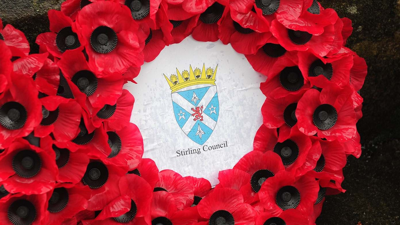
Flag of Stirling - JPG to SVG
{{ resolved}}
-
 Flag of Stirling (JPG)
 -
 Scottish national flag (SVG)
 -
 Scottish royal banner (SVG)


- Article(s)
- Stirling, Flag of Scotland, List of Scottish flags, List of United Kingdom flags.
- Request
- Can someone please redraw the above JPG file of the flag of the city of Stirling as SVG please, using elements from the SVG Scottish national flag and royal banner provided above. And I'd also ask that the stars on the new file be modified so that they look closer to how they do on the actual flag of Stirling (particularly the top and bottom ones), as seen on the Arms of Stirling here, on which the flag is based. Thanks. Snow Lion Fenian ( talk) 18:39, 4 November 2022 (UTC)
- Discussion
-
 Coat of arms of Stirling
 -
 Flag of Stirling


- Hey
Snow Lion Fenian, Done. I made the flag you requested. I also remade the Coat of Arms because the PNG was such low quality. However, there is an issue of color. The linked "Brasão_de_Stirlingshire" uses a dark blue background. A reference image i found on the Stirling Coucil website (
https://scprodweb.blob.core.windows.net/cache/0/5/5/9/4/1/0559412cba2a5a6f5d50d081ad637cc917bdf44f.jpg ) uses a very light blue background. I decided to split the difference and use the official blue of the Scottish flag. Please advise whether I should change it to any other blue. Also, if you are happy with my work, could you please check the 20 odd pages using the existing PNG arms (a list of these pages is on
File:Brasão_de_Stirlingshire.png) and replace it with the new SVG one? That would be just great. Thanks! --
Lommes (
talk)
14:07, 12 November 2022 (UTC)
- @ Lommes: Those are fantastic, and many thanks again for taking the time to help out. Much obliged. And I can now confirm that I've replaced the PNG version of the arms on all relevant pages with your new SVG one as you asked. Take care! Snow Lion Fenian ( talk) 13:46, 13 November 2022 (UTC)
Flag of the Diocese of Truro
{{ resolved}}
-
 Arms of the Diocese of Truro
 -
Saint George's Cross

- Article(s)
- Diocese of Truro, List of Cornish flags.
- Request
- Could someone please create an SVG file of the flag of the Diocese of Truro, as seen here, using the templates provided above. Thanks. Snow Lion Fenian ( talk) 15:04, 13 November 2022 (UTC)
- Discussion
- @
Snow Lion Fenian: Done. Present at
File:Flag of the Diocese of Truro.svg.
HapHaxion (
talk /
contribs)
21:27, 13 November 2022 (UTC)
- @ HapHaxion: That's great, and thanks very much! Snow Lion Fenian ( talk) 23:22, 13 November 2022 (UTC)
Jamaica Police Insignia
- Article(s)
- Jamaica Constabulary Force
- Request
- Can anyone upload the rank insignia of the Jamaica Constabulary Force? Source -- Peter Ormond 💬 23:05, 16 October 2022 (UTC)
- Discussion
Coats of arms of Iraq (1992-2004)
{{ resolved}}
-
 Description of first image
 -
 Description of second image (if needed)
.svg)

- Article(s)
- File:Coat of arms of Iraq (1991–2004).svg
- Request
- Hi could you upload a version of the first with the botten of the fils 2? Iraq changed it name in 1992.--
Panam2014 (
talk)
05:42, 29 October 2022 (UTC)
- Hey
Panam2014, just so I understand properly: I think both eagles are the same, just the shield and the green block are different. Is that right? And your request, as I understand it, is for an eagle with the first shield (showing takbir and stars), but combined with the second green block (saying "Jumhuriyat al-`Iraq")? Am I correct? --
Lommes (
talk)
15:08, 8 November 2022 (UTC)
- @ Lommes: yes. Panam2014 ( talk) 19:31, 9 November 2022 (UTC)
- Hey
Panam2014, just so I understand properly: I think both eagles are the same, just the shield and the green block are different. Is that right? And your request, as I understand it, is for an eagle with the first shield (showing takbir and stars), but combined with the second green block (saying "Jumhuriyat al-`Iraq")? Am I correct? --
Lommes (
talk)
15:08, 8 November 2022 (UTC)
- Discussion
-
 Coat of arms of Iraq (1992)
.svg)
- Hey
Panam2014, Done. Please review and give feedback. --
Lommes (
talk)
19:42, 9 November 2022 (UTC)
- Hey
Panam2014,
- Hey @
Panam2014, can you give me feedback? Is this what you wanted? Cheers! --
Lommes (
talk)
13:54, 15 November 2022 (UTC)
- @
Lommes: excellent!
Panam2014 (
talk)
14:17, 15 November 2022 (UTC)
- @ Panam2014, can you then please mark this request as {{tl|resolved|~~~~}}? Thanks! -- Lommes ( talk) 14:25, 15 November 2022 (UTC)
- @
Lommes: excellent!
Panam2014 (
talk)
14:17, 15 November 2022 (UTC)
Ontario English Catholic Teachers' Association logo
- Article(s)
- Ontario English Catholic Teachers' Association
- Request
- Could the background of this logo be made transparent please? Thanks, Graham ( talk) 06:50, 4 November 2022 (UTC)
- Discussion
-
 The Logo of the Ontario English Catholic Teachers Association
- Hey Graham11, see my SVG replacement. Please tell me if you have any further requests. Thanks! -- Lommes ( talk) 15:28, 8 November 2022 (UTC)
- After seven days of no reply from @
Graham11, and given that the original file is no longer in use and the article has been updated with my SVG replacement logo, I mark this as Done and {{
resolved}} --
Lommes (
talk)
13:53, 15 November 2022 (UTC)
Church of England diocese flags
{{ resolved}}
-
 Flag of the Diocese of Birmingham
 -
 Arms of the Diocese of Birmingham (shield only)
 -
 Flag of the Diocese of Derby
 -
 Arms of the Diocese of Derby (shield only)
 -
 Flag of the Diocese of Gloucester
 -
 Arms of the Diocese of Gloucester
 -
 Flag of the Diocese of Lichfield
 -
 Arms of the Diocese of Lichfield
 -
 Flag of the Diocese of Rochester
 -
 Arms of the Diocese of Rochester (shield only)
 -
 Flag of the Diocese of Salisbury
 -
 Arms of the Diocese of Salisbury (shield only)
 -
English flag template


.jpg)

.jpg)


.jpg)


- Article(s)
- Flag of England, among others.
- Request
- Alright, could someone please create SVG files of the flags used by the following Dioceses of the Church of England:
1) The Flag of the Anglican Diocese of Birmingham, as seen in the above photo.
2) The Flag of the Diocese of Derby, as seen in the above photo.
3) The Flag of the Diocese of Gloucester, as seen in the above photo.
4) The Flag of the Diocese of Lichfield, as seen in the above photo.
5) The Flag of the Diocese of Rochester, as seen here as well as in the above photo.
6) The Flag of the Diocese of Salisbury, as seen in the above photo.
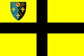
As you can see, all of these can be created by placing the Dioceses' arms in the canton of the English flag template provided above (note that Gloucester is the only one out of this particular set that has the full arms on its flag, with the others displaying only the shield). Thanks. Snow Lion Fenian ( talk) 15:04, 15 November 2022 (UTC)
- Discussion
- @
Snow Lion Fenian: Done. Present at:
- File:Flag of the Diocese of Gloucester.svg
- File:Flag of the Diocese of Lichfield.svg
- File:Flag of the Diocese of Birmingham.svg
- File:Flag of the Diocese of Derby.svg
- File:Flag of the Diocese of Rochester.svg
- File:Flag of the Diocese of Salisbury.svg.
HapHaxion ( talk / contribs) 18:24, 15 November 2022 (UTC)
- @ HapHaxion: Nice work, and many thanks! Snow Lion Fenian ( talk) 19:46, 15 November 2022 (UTC)
Good article and featured article topicon redesign
-
 Current good article icon
 -
 Current featured content icon


- Article(s)
- 5,859 featured articles
- 3,696 featured lists
- 32,507 good articles
- Assorted additional talk, help, and process pages
- Request
- Yes, this one is a big one.
- Background: The current symbols for good articles and featured content have been used since those systems were introduced way back in Wikipedia's early days. They have significant problems. The featured article icon is too skeuomorphic, giving it an outdated look, and its excessive detail causes it to render poorly at small scale. The good article icon, meanwhile, has been adopted throughout the rest of Wikimedia (and in some places on Wikipedia) as the "support vote" icon, leading to conflicting usage. Far worse than the issues with them individually, however, is the fact that there is no shared visual language between them (the GA icon uses the norro style, and the FA icon does not use any style). When compounded by their overall lack of prominence (a separate issue that we're trying to address), this has led to the unfortunate situation where many (perhaps most) non-editing readers could not tell you whether a star or a green badge is a higher distinction. Given how much effort we put into the GA/FA systems, there's more than a bit of tragic irony to that.
- Process: This is the first stage in the process of redesigning the icons (after informal discussions in various places). Ideally, several proposals will be put forth that can be compared against the status quo in a more formal and widely-advertised round of !voting (similar to the process for the MediaWiki logo redesign), with the winner adopted.
- Design details: The redesigned icons could end up being anything from checkmarks (a la the Twitter verification badge) to a silver star for GAs to a multi-star system that begins with one star for stubs and increases thereafter; feel free to get creative.
- Also, since the whole idea here is to unify the symbology, the redesign will need to include the associated symbols in addition to the main icons. You don't have to design them all now, but candidates with at least an articulated vision of what they should look like may be more likely to win support once we reach the formal !voting stage. Here are the current icons still in use that I could find (there may be a few more fringe ones):
Related icons
|
|---|
|


- In truth, the potential scope of this project could be a lot bigger, trying to unify all of the icons used anywhere on Wikipedia. However, recent attempts to do so have failed, and their utility is questionable, given that most icons do not appear in reader-facing areas and thus have a vastly more limited reach. Redesigning these two icons is a more feasible task with clear and significant benefits for readers across tens of thousands of pages.
- Cheers, {{u| Sdkb}} talk 05:08, 7 October 2020 (UTC)
- Discussion
- @
Sdkb: I would recommend posting this at the
Commons graphics lab as well, as it is significantly more active over there.
Pbrks (
talk)
14:50, 16 October 2020 (UTC)
- @ Pbrks: Thanks for the tip. Since this request is specific to en-WP, I'd prefer the main discussion be hosted here, but I'll copy the request there and invite folks over. {{u| Sdkb}} talk 21:38, 17 October 2020 (UTC)
- Consider color blindness (esp. red-green): In data visualization circles, there is increasing awareness of how graphics should be crafted to allow color blind individuals to distinguish through shading, what normally sighted individuals distinguish directly through color perception. (One can test shading in Photoshop etc by removing saturation.) It's my understanding that red-green color blindness is a common type, though not the only type of color blindness. Some color scales are better than others: see Scientific American. — RCraig09 ( talk) 22:53, 17 October 2020 (UTC)
Resolved discussion about mandate for change
|
|---|
|
- This is my passing opinion. There is a ooui icon called "articleCheck" () and this is what I think a "GA" icon should look similar to. Basically a sheet (representing a page) with a check on it. And in a green color instead of black. For the FA icon, a simple star/medal design on a sheet with an appropriate color would make sense to keep the two icons inline with each other. SInce I believe that most users could understand a star is more important than a check icon. Basic icons such as these are the only way to keep them readable when used as topicons. Terasail [✉] 17:00, 11 January 2021 (UTC)
Update: Mandate acquired
The formal Village Pump proposal has been archived, and per here, it successfully acquired a mandate for the icons to be redesigned, so I am removing the "on hold" box around this section. I'll leave it up to others to decide how precisely to proceed from here; I hope that someone steps up to take the lead on shepherding the process from here forward, since I'm not sure I can do it myself. This thread can be archived once (and only once) we've moved to the next stage. {{u| Sdkb}} talk 22:09, 24 December 2020 (UTC)
- As a note,
there is also a proposal about it.
Ahmetlii (
talk)
10:33, 29 December 2020 (UTC)
- @ Ahmetlii: That's a much more ambitious but still underdeveloped proposal that's been sitting for a while; in my view, it would need a lot of work to become comprehensive enough to become useful, and I don't see that amount of work forthcoming or really worth the effort. I think we should focus on this one, much more feasible task that we have agreed to do, rather than dreaming about bringing all of Wikipedia in line with a universal standard that, realistically, is not likely to happen any time soon. {{u| Sdkb}} talk 23:53, 31 December 2020 (UTC)
- The icons should be changed to something the average reader is familiar with. The current icons are nice, but they're nice to Wikipedians. The average reader probably has no idea what this means. We should aim to use images which readers will understand. For example: silver star, gold star. A tick / double tick. Or something along those lines. It should be obvious to a reader what it symbolises. ProcrastinatingReader ( talk) 02:55, 20 March 2021 (UTC)
Proposal 1
The following discussion is closed. Please do not modify it. Subsequent comments should be made on the appropriate discussion page. No further edits should be made to this discussion.
-
 Proposal
 -
 Prop with assessments
@ Sdkb: I've went ahead and made some icon ideas and where I think they would be appropriate. Let me know your thoughts. Pbrks ( talk) 14:44, 2 April 2021 (UTC)
- Pbrks, there are some nice icons in that set; thanks for putting it together! I think the next step would be arranging a large-scale discussion for those and any other proposals. {{u| Sdkb}} talk 16:53, 2 April 2021 (UTC)
Tol's icons


I don't know if people still want to implement this, but I was working on some icons for personal use that render better at smaller sizes and recalled the village pump proposal to do something similar. I'm a terrible graphic designer, but I figured I'd post them here in case anybody is interested. I based them on Wikimedia's
OOUI icons; I converted the <path>s in the icons to more human-readable SVG elements and colored them based on
Wikimedia Design's color palette. I used a star for the featured icon because it is similar to the existing one, but used a check for the good icon so distinguish it from a support !vote icon. I plan to make more for A/B/C classes. My main problem is that I am unsure how to best represent former, former candidate, candidate, and reassessment icons. I'm currently thinking a cross for former, a question mark for candidate, and both combined in some way for former candidate. I have no good idea for reassessment — magnifying glass, maybe? I'd appreciate some other opinions on how these look and what to do. Thanks for your time!
Tol (
talk |
contribs) @
00:31, 3 September 2021 (UTC)
- All of the icons so far in small icon form:


 . I put something in the "start" icon instead of making it blank like the existing symbol (
 ). As for "stub", I am unsure if I should model it off the existing symbol (
 ) and do a partial circle, or use something else like
 (perhaps too close to the list icon?).
Tol (
talk |
contribs) @
17:41, 3 September 2021 (UTC)
(perhaps too close to the list icon?).
Tol (
talk |
contribs) @
17:41, 3 September 2021 (UTC)
- @
Tol: These are nice, although I'm not sold on a tick for GA. Question mark works well for candidates (presumably in the gold or green circles), and I don't see why reassessment couldn't use the same icon given it's an assessment of some sort in both cases. I'm not sure a former candidate icon is that important in the grand scheme of things. I would prefer stubs use a partial circle to lines, just so all article rating have a similar aesthetic which distinguishes them from lists.
CMD (
talk)
15:57, 6 September 2021 (UTC)
- @ Chipmunkdavis: Thanks for the feedback. For the GA icon, I was trying to avoid a star like the FA icon (which would have accessibility problems) and a plus sign (some people thought having the same icon for support votes and good articles is confusing). I haven't been able to get the question mark to look good, but I think I'm close to getting it (I'll probably upload an FA candidate icon soon). I'll do the partial circle for stub. Thank you again! Tol ( talk | contribs) @ 18:48, 6 September 2021 (UTC)
- Hi Tol! Sorry, I'm just seeing this now. My first thought is that, as we saw with Pbrk's proposal, editors are instinctively resistant to design changes. We managed to eek out a mandate for the GA/FA icons, but I think any current proposal that also tries to handle other classes beyond that will unfortunately be dead on arrival. Regarding the GA/FA icons, I think we need something more fundamental. The biggest problem is still that there's nothing in particular signaling that FA is one step above GA. {{u| Sdkb}} talk 18:56, 16 October 2021 (UTC)
- @
Tol: These are nice, although I'm not sold on a tick for GA. Question mark works well for candidates (presumably in the gold or green circles), and I don't see why reassessment couldn't use the same icon given it's an assessment of some sort in both cases. I'm not sure a former candidate icon is that important in the grand scheme of things. I would prefer stubs use a partial circle to lines, just so all article rating have a similar aesthetic which distinguishes them from lists.
CMD (
talk)
15:57, 6 September 2021 (UTC)
- I think personally that what we saw with Pbrk's proposal was a bunch of people who would oppose any change what so ever and were rightfully miffed that a discussion affecting over 40,000+ pages had small participation. JMHO casualdejekyll 20:40, 25 March 2022 (UTC)
![]() Bumping thread. {{u|
Sdkb}}
talk
16:42, 17 October 2022 (UTC)
Bumping thread. {{u|
Sdkb}}
talk
16:42, 17 October 2022 (UTC)
Flag of the Diocese of Coventry
{{ resolved}}
-
 Arms of the Diocese of Coventry

- Article(s)
- Diocese of Coventry, List of English flags.
- Request
- Will someone please create an SVG file of the flag of the Church of England Diocese of Coventry, as seen here. It's a banner of the Diocese's coat of arms, provided above. Thanks. Snow Lion Fenian ( talk) 14:35, 17 November 2022 (UTC)
- Discussion
- Do you happen to have the flag's proper length to width ratio? The image appears to show it moving so I can't really tell from that. HapHaxion ( talk / contribs) 15:35, 17 November 2022 (UTC)

Flag of the Diocese of Coventry - @
HapHaxion: I didn't see your comment, so apologies for interrupting, but I just made a first attempt. I used the Flag of England as a baseline, which roughly matches (and seemed a reasonable base). But there is another problem, I wanted @
Snow Lion Fenian to ask: What about the length/width of the outer bars. In the Coat of Arms the width of the outer bars is basically three times the width of long bars connecting the center square with the outer bars, and my SVG flag does the same. However, in the photo, it seems to me, these are subtly longer, perhaps 3.5 times or so. Can any of you see what I see? Or is it just the weird perspective? Also, HapHaxion, if you see anything to improve, please feel free to just change or overwrite my uploaded file. Apologies again for jumping into this.
Lommes (
talk)
16:26, 17 November 2022 (UTC)
- @ Lommes: Fantastic job! And although I'm uncertain of the actual ratio of the flag in the photo myself, I have no problem trusting your judgement on this. Thanks again for your help, always appreciated! Snow Lion Fenian ( talk) 00:27, 18 November 2022 (UTC)

Flag of the Free City of Danzig (Napoleonic)
-
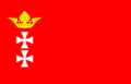
-

-
 Cross pattée
 -


.svg)
Article(s): w:Flag of Gdańsk, en:Free City of Danzig (Napoleonic)
- Request
- Please make some historical flags of the city of Gdansk.
- Free City of Danzig (1807–1814). According to this website, in Napoleon's time a flag with a pattée cross and a crown of leaves were introduced. Since the exact appearance of the crown is unknown, use a crown from the interwar period (in 1920 they defined this pattern as the restoration of the symbol of the first free city).
- Free City of Danzig flag proposal (1807). Same symbols as above, but a blue background like the French flag.
-
Swiãtopôłk (
talk)
23:04, 13 November 2022 (UTC)
-
 Request taken by
Lommes (
talk)
22:32, 17 November 2022 (UTC).
Request taken by
Lommes (
talk)
22:32, 17 November 2022 (UTC).
-
- Discussion
-
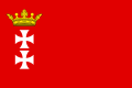 Flag of the Free City of Danzig (1807–1814)
 -
 Flag of the Free City of Danzig (1807–1814), blue version


Hey
Swiãtopôłk, i made both flags. Do you also want a coat of arms in this design? There is
![]() , currently used in the
Free City of Danzig (Napoleonic) article, but it has the wrong crown, according to what you wrote above, and it also has a subtly different shade of red. I took my shade of red from the Coat of Arms you provided,
, currently used in the
Free City of Danzig (Napoleonic) article, but it has the wrong crown, according to what you wrote above, and it also has a subtly different shade of red. I took my shade of red from the Coat of Arms you provided,
![]() , which is just the tiniest bit darker than the red of the French flag. The blue I used is from the French flag, as requested. Also, the flag in the
Free City of Danzig (Napoleonic) article,
, which is just the tiniest bit darker than the red of the French flag. The blue I used is from the French flag, as requested. Also, the flag in the
Free City of Danzig (Napoleonic) article,
![]() , has the crosses bordered in black. I followed the gif you provided,
, has the crosses bordered in black. I followed the gif you provided,
![]() , and left them unbordered. Please review and give feedback.--
Lommes (
talk)
22:56, 17 November 2022 (UTC)
, and left them unbordered. Please review and give feedback.--
Lommes (
talk)
22:56, 17 November 2022 (UTC)
- Lommes Thanks for the flags. It's fine without the black outline. As for the coat of arms, I'm gathering materials for the next request. If you are able to do it with a coin that would be great. Grand Coat of Arms and small Coat of Arms. Swiãtopôłk ( talk) 00:18, 18 November 2022 (UTC)
{{
resolved}}![]() Bumping thread.
Swiãtopôłk (
talk)
15:22, 18 November 2022 (UTC)
Bumping thread.
Swiãtopôłk (
talk)
15:22, 18 November 2022 (UTC)
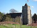
Flag of St Austell Parish, Cornwall
{{ resolved}}
-
 Map of Cornwall

- Article(s)
- Holy Trinity Church, St Austell and List of Cornish flags.
- Request
- Will someone please create an SVG file of the flag of St Austell Parish, Cornwall, as seen and described on this page here. As you can see, it includes a map of Cornwall, which I've provided a template for above. Thanks. Snow Lion Fenian ( talk) 15:32, 15 November 2022 (UTC)
![]() Request taken by
Lommes (
talk)
13:55, 20 November 2022 (UTC).
Request taken by
Lommes (
talk)
13:55, 20 November 2022 (UTC).
- Discussion

- Hey
Snow Lion Fenian, i made the flag. Done I am very unsure about the background color. The reference image you provided, showing the real flag flying, shows something like a royal blue, perhaps a bit less saturated, which is roughly what I used in my recreation. However,
this image, also from the parish itself, shows a more purple hue. Perhaps is still a blue, but it has much more red elements than the flag photo (which to me looks like a more or less pure blue). I couldn't find anything discussing the hue of the flag or anything local (like the town itself) using a similar hue. So, ultimately, this is my best guess. Please give me your opinion. As to ratio, I think 2:1 fits best with what we see in the flying flag. As always, please review and give feedback. Cheers! --
Lommes (
talk)
14:24, 20 November 2022 (UTC)
- Hey
Snow Lion Fenian, i made the flag.
- And now I found something regarding the colour: this image, also released by the parish, has the word "strength" in a specific blue tone that is very similar, and to me suggests it might well be the right one. So I changed the flag accordingly. Still, if you disagree, or think my reasoning isn't well grounded, please tell me. Cheers! -- Lommes ( talk) 14:29, 20 November 2022 (UTC)
- @ Lommes: Thanks as alway! And yes, I do trust your logic and reasoning behind your choice of the specific shade of blue. That's actually a rather clever interpretation. Much obliged! Snow Lion Fenian ( talk) 15:02, 20 November 2022 (UTC)
Flags of the Dioceses of the Church in Wales
{{ resolved}}
-
 Arms of the Diocese of Bangor
 -
 Arms of the Diocese of St Asaph
 -
 Arms of the Diocese of St Davids
 -
 Arms of the Diocese of Swansea and Brecon


- Article(s)
- List of Welsh flags, among others.
- Request
- Can someone please create SVG files for the flags used by the following Dioceses of the Church in Wales:
1) Flag of the Diocese of Bangor, as seen here and here.
2) Flag of the Diocese of St Asaph, as seen here.
3) Flag of the Diocese of St Davids, as seen here and here.
4) Flag of the Diocese of Swansea and Brecon, as seen here.
As you can see, all of these are banners of the Dioceses' coats of arms, which I've provided above. Thanks. Snow Lion Fenian ( talk) 22:58, 18 November 2022 (UTC)
- Discussion
.svg)
@ Snow Lion Fenian: In the CiW's early days, this source says before those were adopted, they did the Church of England style of the arms in the corner on a reversed flag of St David instead of St George. Would you think it worthwhile if it be asked that these be made too? The C of E God Save the King! ( talk) 20:08, 19 November 2022 (UTC)
- Done, @
Snow Lion Fenian, based on the files and images provided, please check them and please state any issues with such images; see gallery below:


- Done, @
The C of E, also created images of your request, hope these suit your request. Although to be honest, re-reading the source you provided it could be interpreted that the use of shields on English diocese flags, may have lead to the production of the early version of St Davids flag itself rather than a version with a diocese shield? Unless I read that incorrectly? But it was a simple task so don't mind if they're not used. Gallery below:
_with_Diocese_of_Bangor_Shield_in_Canton.svg)
_with_Diocese_of_St_Asaph_Shield_in_Canton.svg)
_with_Diocese_of_St_Davids_Shield_in_Canton.svg)
_with_Diocese_of_Swansea_and_Brecon_Shield_in_Canton.svg)
- Please tag with {{
resolved}} if there are no more issues, many thanks.
Dank
Jae
23:33, 19 November 2022 (UTC)
- @ DankJae: Thank you so much, those are terrific! Though, in the spirit of @ The C of E:'s request, perhaps you could also create files called "Flag of St David (early) with Diocese of Llandaff Shield in Canton" and "Flag of St David (early) with Diocese of Monmouth Shield in Canton", by placing the shields provided below in the canton of the inverted St. David's Cross? Sorry about this, the only reason those two Dioceses weren't part of my own original request is because I can't seem to find any modern flag for them anywhere online. But I see no reason why they shouldn't be covered by TCOE's own request. If it's okay? Snow Lion Fenian ( talk) 02:12, 20 November 2022 (UTC)
-
 Arms of the Diocese of Llandaff
 -
 Arms of the Diocese of Monmouth


- @
Snow Lion Fenian:, Done, no problem, although most credit goes to the original contributors of the arms above :D. Here are the remaining two:
- @
Snow Lion Fenian:,
-
 Llandaff
 -
 Monmouth
_with_Diocese_of_Llandaff_Shield_in_Canton.svg)
_with_Diocese_of_Monmouth_Shield_in_Canton.svg)
Many Thanks, Dank Jae 02:32, 20 November 2022 (UTC)
- @ DankJae: Thanks for all your help, much obliged! :) Snow Lion Fenian ( talk) 15:52, 20 November 2022 (UTC)
More Church of England diocese flags
{{ resolved}}
-
 Arms of the Diocese of Bath and Wells
 -
 Arms of the Diocese of Bristol
 -
 Arms of the Diocese of Carlisle
 -
 Arms of the Diocese of Chelmsford
 -
 Arms of the Diocese in Europe
 -
 Arms of the Diocese of Exeter
 -
 Arms of the Diocese of Guildford
 -
 Arms of the Diocese of Hereford
 -
 Arms of the Diocese of Leeds
 -
 Arms of the Diocese of London
 -
 Arms of the Diocese of Norwich
 -
 Arms of the Diocese of Portsmouth
 -
 Arms of the Diocese of Southwark
 -
 Arms of the Diocese of St Albans
 -
 Arms of the Diocese of Winchester
 -
English flag template


- Article(s)
- Flag of England, among others.
- Request
- Okay, similar to my previous request, could someone please create SVG files for the following Church of England diocese flags:
1) Flag of the Diocese of Bath and Wells, as seen here.
2) Flag of the Diocese of Bristol, as seen here.
3) Flag of the Diocese of Carlisle, as seen here.
4) Flag of the Diocese of Chelmsford, as seen here.
5) Flag of the Diocese in Europe, as seen here.
6) Flag of the Diocese of Exeter, as seen here.
7) Flag of the Diocese of Guildford, as seen here.
8) Flag of the Diocese of Hereford, as seen here.
9) Flag of the Anglican Diocese of Leeds, as seen here.
10) Flag of the Diocese of London, as seen here.
11) Flag of the Diocese of Norwich, as seen here.
12) Flag of the Anglican Diocese of Portsmouth, as seen here.
13) Flag of the Diocese of Southwark, as seen here.
14) Flag of the Diocese of St Albans, as seen here.
15) Flag of the Diocese of Winchester, as seen here.
All of these can be created by placing the shields from the above coats of arms in the canton of the provided English flag template. Thanks. Snow Lion Fenian ( talk) 22:23, 16 November 2022 (UTC)
- Discussion
- @
Snow Lion Fenian: Done. All present on Commons at format File:Flag of the (Article title).svg
HapHaxion (
talk /
contribs)
15:51, 22 November 2022 (UTC)
- @ HapHaxion: My profuse thanks for all your hard work! Always appreciated! Snow Lion Fenian ( talk) 00:22, 23 November 2022 (UTC)
Request
-
 Offical Coat of Arms of Caibarién, Cuba

- Article(s)
- w:Caibarién
- Request
- Make Coat of arms of Caibarién Svg? Also you can make it look like more like this http://3.bp.blogspot.com/-LND5NlSZhSg/UNnkXx9Q2DI/AAAAAAAAM3g/7S3QoJFX6Ik/s1600/Slide7.GIF since the orignal looks alot like a photograph, try to keep the lighter blue and dont do the white under CubanoBoi ( talk) 19:04, 5 October 2022 (UTC)
- Discussion
Shield and Flag of Wrexham Glyndŵr University
{{ resolved}}
-
 Arms of the Bureau of Heraldry (with the lion template)
 -
 Book template


- Article(s)
- Armorial of British universities, Wrexham Glyndŵr University, List of Welsh flags, List of United Kingdom flags.
- Request
- Could someone please create an SVG file of the shield from the arms of Wrexham Glyndŵr University, as seen here, using the SVG lion and book templates provided above (though if anyone is aware of any other SVG templates that could work better, then please feel free to improvise). And, while we're here, perhaps the flag of the University could be created as well, which is a banner of the University's arms, as seen here. Thanks. Snow Lion Fenian ( talk) 14:21, 13 November 2022 (UTC)
- Discussion
@
Snow Lion Fenian: ![]() Done as shown below, (mainly) based on the templates you've provided, if there are any issues be free to raise them, can you also check the descriptions and categories of the files, many thanks.
Dank
Jae
23:37, 25 November 2022 (UTC)
Done as shown below, (mainly) based on the templates you've provided, if there are any issues be free to raise them, can you also check the descriptions and categories of the files, many thanks.
Dank
Jae
23:37, 25 November 2022 (UTC)
-
 Shield
 -
 Flag
Flag


- @ DankJae: Those are both great, and thanks again for your contributions! Much obliged. Snow Lion Fenian ( talk) 01:56, 26 November 2022 (UTC)
Flag of Adsav
-
 Flag of Adsav

- Article(s)
- Adsav, List of Breton flags, List of French flags.
- Request
- Could someone please create an SVG file of the flag of the Breton secessionist political party Adsav, as seen in the above photo and on this page here. Thanks. Snow Lion Fenian ( talk) 14:52, 18 October 2022 (UTC)
- Discussion
Here is a better reference: https://www.crwflags.com/fotw/images/f/fr%7Dadsav.gif. User1042 ( talk) 18:25, 27 October 2022 (UTC)
|
| This page, part of the
Graphics Lab Wikiproject, is an
archive of requests for 2021. Please do not edit the contents of this page. You can submit new requests here. |
Remove handwriting and abnormalities
{{ resolved}}
-
Advertisement of a musical performance
- Article(s)
- Piano Concerto No. 2 (Rachmaninoff)
- Request
- There is a stray "N" written between "Soloist" and "SERGE". There are also a speck on "P" in "SYMPHONY". If there are any other abnormalities I'd be glad if any one of you could fix them, I know you have a keen eye for such details. I'm trying to get the article to FA. Cheers - Wretchskull ( talk) 09:39, 28 October 2022 (UTC)
- Discussion
![]() Request taken. —
RCraig09 (
talk)
20:16, 28 October 2022 (UTC)
Request taken. —
RCraig09 (
talk)
20:16, 28 October 2022 (UTC)
- Done Let me know if any further changes are needed. —
RCraig09 (
talk)
20:45, 28 October 2022 (UTC)
Logo of the Level Crossing Removal Project
{{ resolved}} Could somebody please vectorise the logo of the level crossing removal project, for use on the level crossing removal project article. HoHo3143 ( talk) 09:54, 25 October 2022 (UTC)
- @
HoHo3143: Per
WP:NFC, users should not vectorize non-free logos. However, I was able to find an official vector version at
[1]. Done –
Pbrks (
t •
c)
17:22, 25 October 2022 (UTC)
Conversion of Bath city F.C. logo
{{ resolved}} The convention of Bath City F.C. PNG club logo to SVG. The PNG logo looks extremely blurry on mobile. If its not possible to convert, perhaps creating the logo via SVG. thank you very much. Joseph1891 ( talk) 19:06, 31 October 2022 (UTC)
- Done by
RedPatch; present at
File:Bath City SVG.svg.
HapHaxion (
talk /
contribs)
18:44, 1 November 2022 (UTC)
Yep it’s been done 👍 thanks for your help.
Congressional Caucuses
-
Logo of the New Democrat Coalition, a caucus of moderate members of the Democratic Party in the House of Representative of U.S. Congress.
- Article(s)
- Request
Vectorization. -- 16052022m ( talk) 21:00, 5 November 2022 (UTC)
- Discussion
- Vector available
here –
Berrely •
T∕
C
17:37, 6 November 2022 (UTC)
- Done. Present at
File:New Democrat Coalition logo.svg.
HapHaxion (
talk /
contribs)
16:43, 7 November 2022 (UTC)
- {{ resolved}}
Logo of the Association des enseignantes et des enseignants franco-ontariens
- Article(s)
- Association des enseignantes et des enseignants franco-ontariens
- Request
- Could the background of this logo be made transparent and the image be cropped appropriately (with the logo centred)? Thanks, Graham ( talk) 05:45, 7 November 2022 (UTC)
- Discussion
- Done. Present at
File:Logo - Association des enseignantes et des enseignants franco-ontariens.png.
HapHaxion (
talk /
contribs)
16:50, 7 November 2022 (UTC)
- {{ resolved}}
Royal Standard of England (1422–1461 and 1470–1471)
{{ resolved}}
-
Royal Arms of England (1422–1461 and 1470–1471), on which the Standard is based.
-
Royal Standard of England (first adopted in 1406), which comprises the right half of the 1422 version.
-
-
-
- Article(s)
- List of English flags, List of United Kingdom flags and Royal Standard of the United Kingdom.
- Request
- Will someone please create an SVG file of the Royal Standard of England used from 1422–1461 and again from 1470–1471, based on the Royal Arms above. Thanks.
Snow Lion Fenian (
talk) 21:43, 30 September 2022 (UTC) Bumping thread.
Snow Lion Fenian (
talk)
11:58, 31 October 2022 (UTC)
- Hey
Snow Lion Fenian, so you want a new flag (or standard), but with the content of the shield (or arms) to the left? Do you have a preference as to which lions/fleur de lil/colorscheme to use? It doesn't make much of a difference to me, is just a different starting point. Cheers! --
Lommes (
talk)
15:33, 8 November 2022 (UTC)
- @
Lommes: Thanks for asking! Well, I think it would be fitting for the the lions/fleur-de-lis/colour scheme (and indeed the flag ratio as well) on the new Standard to all match those of the 1406 version of the Standard to the upper-right. Given that that's how they're displayed on most other Wikimedia Files of the English Royal Standards from the medieval era, which I've added above for reference.
Snow Lion Fenian (
talk)
18:26, 8 November 2022 (UTC)
-
Snow Lion Fenian, please give feedback as to whether this is as intended or you need further alterations. --
Lommes (
talk)
18:52, 8 November 2022 (UTC)
- @
Lommes: Terrific work, and thank you for your time! Much obliged.
Snow Lion Fenian (
talk)
19:29, 8 November 2022 (UTC)
- Hey,
Snow Lion Fenian, happy to help. Can you then mark your request {{tl|resolved|~~~~}}, so the bots can archive it? Thanks. --
Lommes (
talk)
20:39, 8 November 2022 (UTC)
- I am sorry, you already did. Didnt see it at the top... Apologies.
Lommes (
talk)
20:46, 8 November 2022 (UTC)
- @ Lommes: It's okay, no worries. Snow Lion Fenian ( talk) 21:06, 8 November 2022 (UTC)
- I am sorry, you already did. Didnt see it at the top... Apologies.
Lommes (
talk)
20:46, 8 November 2022 (UTC)
- Hey,
Snow Lion Fenian, happy to help. Can you then mark your request {{tl|resolved|~~~~}}, so the bots can archive it? Thanks. --
Lommes (
talk)
20:39, 8 November 2022 (UTC)
- @
Lommes: Terrific work, and thank you for your time! Much obliged.
Snow Lion Fenian (
talk)
19:29, 8 November 2022 (UTC)
- @
Lommes: Thanks for asking! Well, I think it would be fitting for the the lions/fleur-de-lis/colour scheme (and indeed the flag ratio as well) on the new Standard to all match those of the 1406 version of the Standard to the upper-right. Given that that's how they're displayed on most other Wikimedia Files of the English Royal Standards from the medieval era, which I've added above for reference.
Snow Lion Fenian (
talk)
18:26, 8 November 2022 (UTC)
- Hey
Snow Lion Fenian, so you want a new flag (or standard), but with the content of the shield (or arms) to the left? Do you have a preference as to which lions/fleur de lil/colorscheme to use? It doesn't make much of a difference to me, is just a different starting point. Cheers! --
Lommes (
talk)
15:33, 8 November 2022 (UTC)
- Discussion
Signature of British monarchs and royal family members
- Requested Media
- Article(s)
- Charles I of England
- Mary II of England
- Adelaide of Saxe-Meiningen
- Victoria, Princess Royal
- Princess Louise, Duchess of Argyll
- William, Prince of Wales
- Sarah, Duchess of York
- Princess Margaret, Countess of Snowdon
- Prince Andrew, Duke of York
- Prince Edward, Earl of Wessex and Forfar
- Request
- Please convert all signatures to SVG. Note that the signatures of all other British monarchs and royal family members have been properly vectorized. Many thanks in advance to anyone who volunteers to do the job. Keivan.f Talk 05:51, 6 October 2022 (UTC)
- Reply
- Hey
Keivan.f, here is the lot. Except "VickyPR", the quality of the image doesn't allow for a conversion (at least not with my skills and patience). And as to the Duke of York, you have to find someone else to do it. I am not touching him, not even his signature, not even for the good of Wikipedia.--
Lommes (
talk)
00:09, 8 November 2022 (UTC)
-
Lommes, thank you so much for the efforts. I really appreciate it. And I totally understand your unwillingness to do Andrew's signature. I mean, he is not particularly a favorite among the public at this point, for obvious reasons. I will probably have it nominated again in the future in case someone might be willing to do it for encyclopedic purposes. Again, thanks a lot.
Keivan.f
Talk
05:07, 8 November 2022 (UTC)
- So, from my side this is Done.
Keivan.f, if you have any further requests for changes or alterations, please let me know. If not, please mark this topic as {{tl|resolved|~~~~}}. Thanks! --
Lommes (
talk)
15:02, 8 November 2022 (UTC)
- {{ resolved}} Lommes, yes, it appears that the work is done here thanks to you. I now mark it as resolved, and will bring up Victoria and Andrew's signature again at a later request. Many thanks. Keivan.f Talk 16:37, 8 November 2022 (UTC)
- So, from my side this is
-
Lommes, thank you so much for the efforts. I really appreciate it. And I totally understand your unwillingness to do Andrew's signature. I mean, he is not particularly a favorite among the public at this point, for obvious reasons. I will probably have it nominated again in the future in case someone might be willing to do it for encyclopedic purposes. Again, thanks a lot.
Keivan.f
Talk
05:07, 8 November 2022 (UTC)
- Hey
Keivan.f, here is the lot. Except "VickyPR", the quality of the image doesn't allow for a conversion (at least not with my skills and patience). And as to the Duke of York, you have to find someone else to do it. I am not touching him, not even his signature, not even for the good of Wikipedia.--
Lommes (
talk)
00:09, 8 November 2022 (UTC)
Symbols of the city of Vladimir
-
Flag of the city of Vladimir
-
Coat of arms of the city of Vladimir
- Article(s)
- Vladimir, Russia
- Request
- Hello, please vectorize the image data. Thank you! — ArtSmir ( talk) 04:44, 26 October 2022 (UTC)
- Discussion
-
Flag of the city of Vladimir
-
Coat of arms of the city of Vladimir
- Done Hey,
ArtSmir, conversion complete. The lion isn't perfect, but i was working from a very small image size. If you have any requests for changes, please tell me. If you are satisfied, please mark this as {{tl|resolved|~~~~}} . Also please replace the original images, they are used on about
~80 articles and
over 300 articles in all Wikipedias. I guess there is a template somewhere. But please, please, please, replace the PNGs with the new files, or ask someone who knows how to do it automatically (I don't). There are few things on Wikipedia I hate more than
the list of images which have SVG replacements, but where the PNG/JPG is still in wide use... Thanks! --
Lommes (
talk)
18:57, 9 November 2022 (UTC)
English university flags
-
Arms of the University of Cambridge
-
Arms of the University of Oxford
-
Arms of the University of Bristol
-
Arms of the University of Warwick
-
Arms of the University of London
-
Arms of the University of East Anglia
-
Arms of the University of Hull
-
Flag of England
- Article(s)
- List of English flags, List of United Kingdom flags, among others.
- Request
- Alright, I know this may seem like a rather tall order, but could someone please create SVG files of the flags of the following English universities:
1) Flag of the University of Cambridge, as seen here and here (front flag), based on the Arms provided above.
2) Flag of the University of Oxford, as seen here (back flag), based on the Arms provided above.
3) Flag of the University of Bristol, as seen here, based on the Arms provided above.
4) Flag of the University of Warwick, as seen here, based on the Arms provided above.
5) Flag of the University of London, as seen here, based on the Arms provided above.
6) Flag of the University of East Anglia, as seen here, based on the Arms provided above.
7) Flag of the University of Hull, as seen here, by placing the above Arms in the centre of the provided English flag template.
8) Flag of the University of Roehampton, as seen here.
Thanks. Snow Lion Fenian ( talk) 18:12, 29 October 2022 (UTC)
- Discussion
-
Flag of the University of Oxford
-
Flag of the University of Cambridge
-
Flag of the University of Bristol
-
Flag of the University of Warwick
-
Flag of the University of Hull
-
Flag of the University of East Anglia
-
Flag of the University of London
-
Flag of the University of Roehampton
It's already late, so I only made Oxbridge. Perhaps, if I find the time, I will do the others tomorrow or later in the week. Please, Snow Lion Fenian, review and give feedback. I based both of them mainly on the photo you linked showing the actual flags. However, some comments: Oxford. I think it is pretty close to the picture, but the arms had a red border around the book, which the photographed flag lacks. If you want, I can make it yellow (excuse me, Or), as in the photo. Cambridge. The ermine (i think that's what these black spikes are called) change with every flag or coat I see. I used the arrangement on the photo. However, the closed book in the center of Cambridge clearly looks different in the photo, but it is hard to see what it actually looks like precisely. Accordingly, I just used the one on the coat of arms. Also, if you want a different lion length, i discovered these lions exist in XtraShort, S, M, L and Xtralong-Lion-Size. I used the Medium lion, as it most closely matched the photo. However, again, other depictions show L or even XL lions. Please advise on how to proceed further. -- Lommes ( talk) 21:18, 8 November 2022 (UTC)
- @
Lommes: Thank you so much for taking this on! As for your questions, your version of the Cambridge University flag seems fine the way it is. Regarding the Oxford one... yes, perhaps it would be prudent to change the red border to a yellow one. And would you be willing to change the shade of yellow on all the objects to closer match the shade from the photo, as well as the exact shade of the blue background to that of the photo as well? Sorry about this, and thanks again.
Snow Lion Fenian (
talk)
23:28, 8 November 2022 (UTC)
-
Snow Lion Fenian please check again. the "exact shade of the blue background" can't be derived from a photo (physics of light), but i tried my best. if you want it darker/lighter or more/less-saturated, please tell me. --
Lommes (
talk)
11:44, 9 November 2022 (UTC)
- I also made Bristol. On the provided photo many of the elements are simplified, look for example at the Sun, or the Waves. I used the exact elements from the coat of arms, as they already were there. If you want the more simplified version, i'd have to recreate them. Please tell me if this is okay, or you need any changes.--
Lommes (
talk)
12:14, 9 November 2022 (UTC)
- Here is Warwick now.--
Lommes (
talk)
14:04, 9 November 2022 (UTC)
- And here is Hull. --
Lommes (
talk)
14:13, 9 November 2022 (UTC)
- And finally East Anglia. The link you provided for the University of London gives "502 Bad Gateway", so I couldn't reach it. I also couldn't find a photo of the flag in use, so I have no reference whatsoever. So instead of creating a phantastical fake flag, I decided to skip it. All others should be done now.
Snow Lion Fenian, please review and give feedback. If everything is fine, please mark as {{tl|resolved|~~~~}} . Cheers!--
Lommes (
talk)
15:24, 9 November 2022 (UTC)
- @
Lommes: Brilliant job! Thank you profusely for doing all of these. And regarding the University of London flag, sorry for the inconvenience with the link. I genuinely don't know what's gone wrong with it, considering it was working fine when I first put it there. I have a suggestion... try going onto this page
here, and click on "University of London" in the table of contents (or even try this fresh version of the other link
here). And if those don't work, then apologies in advance. Also, is there any chance you could also create the University of Roehampton flag as well, or is that link not working too? Again, sorry for the bother and thanks for all you've done.
Snow Lion Fenian (
talk)
16:27, 9 November 2022 (UTC)
-
Snow Lion Fenian, the "fresh version" worked. And i didn't even see Roehampton. Both done. If you have any requests for changes, please tell me. Cheers! --
Lommes (
talk)
16:54, 9 November 2022 (UTC)
- @
Lommes: Thank you! And yes, now that I think of it, is there any chance you could enlarge the castle on the East Anglian flag, to bring it more into line with the size of the one from the link?
Snow Lion Fenian (
talk)
17:21, 9 November 2022 (UTC)
- Yes, Snow Lion Fenian, of course. Is changed above. Tho we have to keep in mind that quite possibly "ivan sache" knows just as much or as little as us. A photo of the flag flying is most certainly an authoritative source, but some guy 18 years ago, from the Flags of the World site....??? His flag is also missing the three english flags on top of the castle, which the Coat of Arms quite clearly has, i have seen four different versions, all with flags. His is the only without them... -- Lommes ( talk) 17:52, 9 November 2022 (UTC)
- @
Lommes: Thank you! And yes, now that I think of it, is there any chance you could enlarge the castle on the East Anglian flag, to bring it more into line with the size of the one from the link?
Snow Lion Fenian (
talk)
17:21, 9 November 2022 (UTC)
-
Snow Lion Fenian, the "fresh version" worked. And i didn't even see Roehampton. Both done. If you have any requests for changes, please tell me. Cheers! --
Lommes (
talk)
16:54, 9 November 2022 (UTC)
- @
Lommes: Brilliant job! Thank you profusely for doing all of these. And regarding the University of London flag, sorry for the inconvenience with the link. I genuinely don't know what's gone wrong with it, considering it was working fine when I first put it there. I have a suggestion... try going onto this page
here, and click on "University of London" in the table of contents (or even try this fresh version of the other link
here). And if those don't work, then apologies in advance. Also, is there any chance you could also create the University of Roehampton flag as well, or is that link not working too? Again, sorry for the bother and thanks for all you've done.
Snow Lion Fenian (
talk)
16:27, 9 November 2022 (UTC)
- And finally East Anglia. The link you provided for the University of London gives "502 Bad Gateway", so I couldn't reach it. I also couldn't find a photo of the flag in use, so I have no reference whatsoever. So instead of creating a phantastical fake flag, I decided to skip it. All others should be done now.
Snow Lion Fenian, please review and give feedback. If everything is fine, please mark as {{tl|resolved|~~~~}} . Cheers!--
Lommes (
talk)
15:24, 9 November 2022 (UTC)
- And here is Hull. --
Lommes (
talk)
14:13, 9 November 2022 (UTC)
- Here is Warwick now.--
Lommes (
talk)
14:04, 9 November 2022 (UTC)
- I also made Bristol. On the provided photo many of the elements are simplified, look for example at the Sun, or the Waves. I used the exact elements from the coat of arms, as they already were there. If you want the more simplified version, i'd have to recreate them. Please tell me if this is okay, or you need any changes.--
Lommes (
talk)
12:14, 9 November 2022 (UTC)
-
Snow Lion Fenian please check again. the "exact shade of the blue background" can't be derived from a photo (physics of light), but i tried my best. if you want it darker/lighter or more/less-saturated, please tell me. --
Lommes (
talk)
11:44, 9 November 2022 (UTC)
Scottish university flags
{{ resolved}}
-
Arms of the University of Edinburgh
-
Arms of the University of Glasgow
-
Arms of the University of Aberdeen
- Article(s)
- List of Scottish flags, List of United Kingdom flags, among others.
- Request
- Alright, could someone please create SVG files of the flags of the following Scottish universities:
1) Flag of the University of Edinburgh, as seen here, based on the Arms provided above.
2) Flag of the University of Glasgow, as seen here, based on the Arms provided above (albeit with the symbols changed to gold).
3) Flag of the University of Aberdeen, as seen here, based on the Arms provided above.
4) Flag of Edinburgh Napier University, as seen here.
Thanks. Snow Lion Fenian ( talk) 21:26, 31 October 2022 (UTC)
- Discussion
-
Flag of the University of Edinburgh
-
Flag of the Napier University Edinburgh
-
Flag of the University of Glasgow
- Hey
Snow Lion Fenian, i made the Edinburgh flag. Please note that the arms has black flags flying from the towers, the reference image has red flags. As I couldn't find a photo of an actual flag flying, i presumed the arms to be correct. Please review and give feedback. I also made Napier, but as it is so simple, I guess there is nothing to feedback. Not 100% sure yet, but i might have to leave for quite some time tomorrow, so depending on how that goes I might not be able to do Glasgow and/or Aberdeen. If i find time later tonight, I will try, tho. Cheers! --
Lommes (
talk)
15:44, 10 November 2022 (UTC)
- @
Lommes: That's perfectly fine, and my profuse thanks for completing these two flags! Great job!
Snow Lion Fenian (
talk)
16:31, 10 November 2022 (UTC)
- Here is Aberdeen. For me the PNG-renderer shows a problem where (in the upper right quarter of the flag) some of the red squares seem to bleed over into the yellow ones, as if there is one or two pixel wrong. This isn't present in the SVG, and I don't know what causes it. Perhaps someone who knows more about
librsvg can help? I made a note in the file description on Wikimedia Commons and listed it in the category "Pictures showing a librsvg bug".--
Lommes (
talk)
18:36, 10 November 2022 (UTC)
- I re-uploaded the flag with a different baseline resolution, but i don't think it has changed in a substantial way. I still see two pixels which should be yellow but actually are red. :-( --
Lommes (
talk)
18:44, 10 November 2022 (UTC)
- @
Lommes: That's okay, and thanks again!
Snow Lion Fenian (
talk)
20:14, 10 November 2022 (UTC)
-
Snow Lion Fenian: the day went well, so here is a glaswegian flag for an irish snow lion. i think is Done, unless you have further requests. --
Lommes (
talk)
20:41, 11 November 2022 (UTC)
- @ Lommes: Amazing job as always, and once again my sincerest thanks for all your hard work in creating these flags for both the Scottish and English universities. You've really gone above and beyond. Take care! Snow Lion Fenian ( talk) 23:44, 11 November 2022 (UTC)
-
Snow Lion Fenian: the day went well, so here is a glaswegian flag for an irish snow lion. i think is
- @
Lommes: That's okay, and thanks again!
Snow Lion Fenian (
talk)
20:14, 10 November 2022 (UTC)
- I re-uploaded the flag with a different baseline resolution, but i don't think it has changed in a substantial way. I still see two pixels which should be yellow but actually are red. :-( --
Lommes (
talk)
18:44, 10 November 2022 (UTC)
- Here is Aberdeen. For me the PNG-renderer shows a problem where (in the upper right quarter of the flag) some of the red squares seem to bleed over into the yellow ones, as if there is one or two pixel wrong. This isn't present in the SVG, and I don't know what causes it. Perhaps someone who knows more about
librsvg can help? I made a note in the file description on Wikimedia Commons and listed it in the category "Pictures showing a librsvg bug".--
Lommes (
talk)
18:36, 10 November 2022 (UTC)
- @
Lommes: That's perfectly fine, and my profuse thanks for completing these two flags! Great job!
Snow Lion Fenian (
talk)
16:31, 10 November 2022 (UTC)
The Queen Consort's signature
{{ resolved}}
- Article(s)
- Camilla, Queen Consort
- Request
- The request has been submitted by a number of users at Talk:Camilla, Queen Consort#Signature and Talk:Camilla, Queen Consort#The Queen’s signature, who also provided a link which shows Camilla's new signature as queen consort. A vectorized (SVG) version by the illustrators of the graphics lab is much needed for use in the article. Many thanks. Keivan.f Talk 01:24, 12 November 2022 (UTC)
- Discussion
- Hey
Keivan.f, here you go. I think is Done, unless you have further requests. Cheers! --
Lommes (
talk)
14:15, 12 November 2022 (UTC)
- Thank you so much Lommes for the prompt response and the wonderful work. I will now mark it as resolved. Cheers. Keivan.f Talk 15:00, 12 November 2022 (UTC)
Minor hue change.
-
Russian flag
- Article(s)
- Flag of Russia
- Request
- The blue shade is not consistent with the Wikipedia article, which specifies thar according to Russian law, hex #0032A0 / RGB 0–50–160 is the correct color. It's very slightly off. The red is completely correct, though (hex #DA291C / RGB 218–41–28). When this is fixed, the Russian flag on Wikipedia will be in complete agreement with the relevant laws. Also consider correcting files that are derivatives of the Russian flag, such as the Presidential standard of Russia, historical flags of Russia that have these colors, etc. -- 108.160.120.110 ( talk) 09:37, 7 October 2022 (UTC)
- Discussion
- @
108.160.120.110: This request can be made by using the template {{Edit fully-protected}} followed by what you want changed on the
talk page of the file in question.
HapHaxion (
talk /
contribs)
19:38, 11 October 2022 (UTC)
- Done, and will keep an eye on it. 108.160.120.110 ( talk) 16:46, 14 October 2022 (UTC)
Flag of Stirling - JPG to SVG
{{ resolved}}
-
Flag of Stirling (JPG)
-
Scottish national flag (SVG)
-
Scottish royal banner (SVG)
- Article(s)
- Stirling, Flag of Scotland, List of Scottish flags, List of United Kingdom flags.
- Request
- Can someone please redraw the above JPG file of the flag of the city of Stirling as SVG please, using elements from the SVG Scottish national flag and royal banner provided above. And I'd also ask that the stars on the new file be modified so that they look closer to how they do on the actual flag of Stirling (particularly the top and bottom ones), as seen on the Arms of Stirling here, on which the flag is based. Thanks. Snow Lion Fenian ( talk) 18:39, 4 November 2022 (UTC)
- Discussion
-
Coat of arms of Stirling
-
Flag of Stirling
- Hey
Snow Lion Fenian, Done. I made the flag you requested. I also remade the Coat of Arms because the PNG was such low quality. However, there is an issue of color. The linked "Brasão_de_Stirlingshire" uses a dark blue background. A reference image i found on the Stirling Coucil website (
https://scprodweb.blob.core.windows.net/cache/0/5/5/9/4/1/0559412cba2a5a6f5d50d081ad637cc917bdf44f.jpg ) uses a very light blue background. I decided to split the difference and use the official blue of the Scottish flag. Please advise whether I should change it to any other blue. Also, if you are happy with my work, could you please check the 20 odd pages using the existing PNG arms (a list of these pages is on
File:Brasão_de_Stirlingshire.png) and replace it with the new SVG one? That would be just great. Thanks! --
Lommes (
talk)
14:07, 12 November 2022 (UTC)
- @ Lommes: Those are fantastic, and many thanks again for taking the time to help out. Much obliged. And I can now confirm that I've replaced the PNG version of the arms on all relevant pages with your new SVG one as you asked. Take care! Snow Lion Fenian ( talk) 13:46, 13 November 2022 (UTC)
Flag of the Diocese of Truro
{{ resolved}}
-
Arms of the Diocese of Truro
-
Saint George's Cross
- Article(s)
- Diocese of Truro, List of Cornish flags.
- Request
- Could someone please create an SVG file of the flag of the Diocese of Truro, as seen here, using the templates provided above. Thanks. Snow Lion Fenian ( talk) 15:04, 13 November 2022 (UTC)
- Discussion
- @
Snow Lion Fenian: Done. Present at
File:Flag of the Diocese of Truro.svg.
HapHaxion (
talk /
contribs)
21:27, 13 November 2022 (UTC)
- @ HapHaxion: That's great, and thanks very much! Snow Lion Fenian ( talk) 23:22, 13 November 2022 (UTC)
Jamaica Police Insignia
- Article(s)
- Jamaica Constabulary Force
- Request
- Can anyone upload the rank insignia of the Jamaica Constabulary Force? Source -- Peter Ormond 💬 23:05, 16 October 2022 (UTC)
- Discussion
Coats of arms of Iraq (1992-2004)
{{ resolved}}
-
Description of first image
-
Description of second image (if needed)
- Article(s)
- File:Coat of arms of Iraq (1991–2004).svg
- Request
- Hi could you upload a version of the first with the botten of the fils 2? Iraq changed it name in 1992.--
Panam2014 (
talk)
05:42, 29 October 2022 (UTC)
- Hey
Panam2014, just so I understand properly: I think both eagles are the same, just the shield and the green block are different. Is that right? And your request, as I understand it, is for an eagle with the first shield (showing takbir and stars), but combined with the second green block (saying "Jumhuriyat al-`Iraq")? Am I correct? --
Lommes (
talk)
15:08, 8 November 2022 (UTC)
- @ Lommes: yes. Panam2014 ( talk) 19:31, 9 November 2022 (UTC)
- Hey
Panam2014, just so I understand properly: I think both eagles are the same, just the shield and the green block are different. Is that right? And your request, as I understand it, is for an eagle with the first shield (showing takbir and stars), but combined with the second green block (saying "Jumhuriyat al-`Iraq")? Am I correct? --
Lommes (
talk)
15:08, 8 November 2022 (UTC)
- Discussion
-
Coat of arms of Iraq (1992)
- Hey
Panam2014, Done. Please review and give feedback. --
Lommes (
talk)
19:42, 9 November 2022 (UTC)
- Hey
Panam2014,
- Hey @
Panam2014, can you give me feedback? Is this what you wanted? Cheers! --
Lommes (
talk)
13:54, 15 November 2022 (UTC)
- @
Lommes: excellent!
Panam2014 (
talk)
14:17, 15 November 2022 (UTC)
- @ Panam2014, can you then please mark this request as {{tl|resolved|~~~~}}? Thanks! -- Lommes ( talk) 14:25, 15 November 2022 (UTC)
- @
Lommes: excellent!
Panam2014 (
talk)
14:17, 15 November 2022 (UTC)
Ontario English Catholic Teachers' Association logo
- Article(s)
- Ontario English Catholic Teachers' Association
- Request
- Could the background of this logo be made transparent please? Thanks, Graham ( talk) 06:50, 4 November 2022 (UTC)
- Discussion
-
The Logo of the Ontario English Catholic Teachers Association
- Hey Graham11, see my SVG replacement. Please tell me if you have any further requests. Thanks! -- Lommes ( talk) 15:28, 8 November 2022 (UTC)
- After seven days of no reply from @
Graham11, and given that the original file is no longer in use and the article has been updated with my SVG replacement logo, I mark this as Done and {{
resolved}} --
Lommes (
talk)
13:53, 15 November 2022 (UTC)
Church of England diocese flags
{{ resolved}}
-
Flag of the Diocese of Birmingham
-
Arms of the Diocese of Birmingham (shield only)
-
Flag of the Diocese of Derby
-
Arms of the Diocese of Derby (shield only)
-
Flag of the Diocese of Gloucester
-
Arms of the Diocese of Gloucester
-
Flag of the Diocese of Lichfield
-
Arms of the Diocese of Lichfield
-
Flag of the Diocese of Rochester
-
Arms of the Diocese of Rochester (shield only)
-
Flag of the Diocese of Salisbury
-
Arms of the Diocese of Salisbury (shield only)
-
English flag template
- Article(s)
- Flag of England, among others.
- Request
- Alright, could someone please create SVG files of the flags used by the following Dioceses of the Church of England:
1) The Flag of the Anglican Diocese of Birmingham, as seen in the above photo.
2) The Flag of the Diocese of Derby, as seen in the above photo.
3) The Flag of the Diocese of Gloucester, as seen in the above photo.
4) The Flag of the Diocese of Lichfield, as seen in the above photo.
5) The Flag of the Diocese of Rochester, as seen here as well as in the above photo.
6) The Flag of the Diocese of Salisbury, as seen in the above photo.
As you can see, all of these can be created by placing the Dioceses' arms in the canton of the English flag template provided above (note that Gloucester is the only one out of this particular set that has the full arms on its flag, with the others displaying only the shield). Thanks. Snow Lion Fenian ( talk) 15:04, 15 November 2022 (UTC)
- Discussion
- @
Snow Lion Fenian: Done. Present at:
- File:Flag of the Diocese of Gloucester.svg
- File:Flag of the Diocese of Lichfield.svg
- File:Flag of the Diocese of Birmingham.svg
- File:Flag of the Diocese of Derby.svg
- File:Flag of the Diocese of Rochester.svg
- File:Flag of the Diocese of Salisbury.svg.
HapHaxion ( talk / contribs) 18:24, 15 November 2022 (UTC)
- @ HapHaxion: Nice work, and many thanks! Snow Lion Fenian ( talk) 19:46, 15 November 2022 (UTC)
Good article and featured article topicon redesign
-
Current good article icon
-
Current featured content icon
- Article(s)
- 5,859 featured articles
- 3,696 featured lists
- 32,507 good articles
- Assorted additional talk, help, and process pages
- Request
- Yes, this one is a big one.
- Background: The current symbols for good articles and featured content have been used since those systems were introduced way back in Wikipedia's early days. They have significant problems. The featured article icon is too skeuomorphic, giving it an outdated look, and its excessive detail causes it to render poorly at small scale. The good article icon, meanwhile, has been adopted throughout the rest of Wikimedia (and in some places on Wikipedia) as the "support vote" icon, leading to conflicting usage. Far worse than the issues with them individually, however, is the fact that there is no shared visual language between them (the GA icon uses the norro style, and the FA icon does not use any style). When compounded by their overall lack of prominence (a separate issue that we're trying to address), this has led to the unfortunate situation where many (perhaps most) non-editing readers could not tell you whether a star or a green badge is a higher distinction. Given how much effort we put into the GA/FA systems, there's more than a bit of tragic irony to that.
- Process: This is the first stage in the process of redesigning the icons (after informal discussions in various places). Ideally, several proposals will be put forth that can be compared against the status quo in a more formal and widely-advertised round of !voting (similar to the process for the MediaWiki logo redesign), with the winner adopted.
- Design details: The redesigned icons could end up being anything from checkmarks (a la the Twitter verification badge) to a silver star for GAs to a multi-star system that begins with one star for stubs and increases thereafter; feel free to get creative.
- Also, since the whole idea here is to unify the symbology, the redesign will need to include the associated symbols in addition to the main icons. You don't have to design them all now, but candidates with at least an articulated vision of what they should look like may be more likely to win support once we reach the formal !voting stage. Here are the current icons still in use that I could find (there may be a few more fringe ones):
Related icons
|
|---|
|
- In truth, the potential scope of this project could be a lot bigger, trying to unify all of the icons used anywhere on Wikipedia. However, recent attempts to do so have failed, and their utility is questionable, given that most icons do not appear in reader-facing areas and thus have a vastly more limited reach. Redesigning these two icons is a more feasible task with clear and significant benefits for readers across tens of thousands of pages.
- Cheers, {{u| Sdkb}} talk 05:08, 7 October 2020 (UTC)
- Discussion
- @
Sdkb: I would recommend posting this at the
Commons graphics lab as well, as it is significantly more active over there.
Pbrks (
talk)
14:50, 16 October 2020 (UTC)
- @ Pbrks: Thanks for the tip. Since this request is specific to en-WP, I'd prefer the main discussion be hosted here, but I'll copy the request there and invite folks over. {{u| Sdkb}} talk 21:38, 17 October 2020 (UTC)
- Consider color blindness (esp. red-green): In data visualization circles, there is increasing awareness of how graphics should be crafted to allow color blind individuals to distinguish through shading, what normally sighted individuals distinguish directly through color perception. (One can test shading in Photoshop etc by removing saturation.) It's my understanding that red-green color blindness is a common type, though not the only type of color blindness. Some color scales are better than others: see Scientific American. — RCraig09 ( talk) 22:53, 17 October 2020 (UTC)
Resolved discussion about mandate for change
|
|---|
|
- This is my passing opinion. There is a ooui icon called "articleCheck" () and this is what I think a "GA" icon should look similar to. Basically a sheet (representing a page) with a check on it. And in a green color instead of black. For the FA icon, a simple star/medal design on a sheet with an appropriate color would make sense to keep the two icons inline with each other. SInce I believe that most users could understand a star is more important than a check icon. Basic icons such as these are the only way to keep them readable when used as topicons. Terasail [✉] 17:00, 11 January 2021 (UTC)
Update: Mandate acquired
The formal Village Pump proposal has been archived, and per here, it successfully acquired a mandate for the icons to be redesigned, so I am removing the "on hold" box around this section. I'll leave it up to others to decide how precisely to proceed from here; I hope that someone steps up to take the lead on shepherding the process from here forward, since I'm not sure I can do it myself. This thread can be archived once (and only once) we've moved to the next stage. {{u| Sdkb}} talk 22:09, 24 December 2020 (UTC)
- As a note,
there is also a proposal about it.
Ahmetlii (
talk)
10:33, 29 December 2020 (UTC)
- @ Ahmetlii: That's a much more ambitious but still underdeveloped proposal that's been sitting for a while; in my view, it would need a lot of work to become comprehensive enough to become useful, and I don't see that amount of work forthcoming or really worth the effort. I think we should focus on this one, much more feasible task that we have agreed to do, rather than dreaming about bringing all of Wikipedia in line with a universal standard that, realistically, is not likely to happen any time soon. {{u| Sdkb}} talk 23:53, 31 December 2020 (UTC)
- The icons should be changed to something the average reader is familiar with. The current icons are nice, but they're nice to Wikipedians. The average reader probably has no idea what this means. We should aim to use images which readers will understand. For example: silver star, gold star. A tick / double tick. Or something along those lines. It should be obvious to a reader what it symbolises. ProcrastinatingReader ( talk) 02:55, 20 March 2021 (UTC)
Proposal 1
The following discussion is closed. Please do not modify it. Subsequent comments should be made on the appropriate discussion page. No further edits should be made to this discussion.
-
Proposal
-
Prop with assessments
@ Sdkb: I've went ahead and made some icon ideas and where I think they would be appropriate. Let me know your thoughts. Pbrks ( talk) 14:44, 2 April 2021 (UTC)
- Pbrks, there are some nice icons in that set; thanks for putting it together! I think the next step would be arranging a large-scale discussion for those and any other proposals. {{u| Sdkb}} talk 16:53, 2 April 2021 (UTC)
Tol's icons
I don't know if people still want to implement this, but I was working on some icons for personal use that render better at smaller sizes and recalled the village pump proposal to do something similar. I'm a terrible graphic designer, but I figured I'd post them here in case anybody is interested. I based them on Wikimedia's
OOUI icons; I converted the <path>s in the icons to more human-readable SVG elements and colored them based on
Wikimedia Design's color palette. I used a star for the featured icon because it is similar to the existing one, but used a check for the good icon so distinguish it from a support !vote icon. I plan to make more for A/B/C classes. My main problem is that I am unsure how to best represent former, former candidate, candidate, and reassessment icons. I'm currently thinking a cross for former, a question mark for candidate, and both combined in some way for former candidate. I have no good idea for reassessment — magnifying glass, maybe? I'd appreciate some other opinions on how these look and what to do. Thanks for your time!
Tol (
talk |
contribs) @
00:31, 3 September 2021 (UTC)
- All of the icons so far in small icon form: . I put something in the "start" icon instead of making it blank like the existing symbol (
). As for "stub", I am unsure if I should model it off the existing symbol (
) and do a partial circle, or use something else like
(perhaps too close to the list icon?).
Tol (
talk |
contribs) @
17:41, 3 September 2021 (UTC)
- @
Tol: These are nice, although I'm not sold on a tick for GA. Question mark works well for candidates (presumably in the gold or green circles), and I don't see why reassessment couldn't use the same icon given it's an assessment of some sort in both cases. I'm not sure a former candidate icon is that important in the grand scheme of things. I would prefer stubs use a partial circle to lines, just so all article rating have a similar aesthetic which distinguishes them from lists.
CMD (
talk)
15:57, 6 September 2021 (UTC)
- @ Chipmunkdavis: Thanks for the feedback. For the GA icon, I was trying to avoid a star like the FA icon (which would have accessibility problems) and a plus sign (some people thought having the same icon for support votes and good articles is confusing). I haven't been able to get the question mark to look good, but I think I'm close to getting it (I'll probably upload an FA candidate icon soon). I'll do the partial circle for stub. Thank you again! Tol ( talk | contribs) @ 18:48, 6 September 2021 (UTC)
- Hi Tol! Sorry, I'm just seeing this now. My first thought is that, as we saw with Pbrk's proposal, editors are instinctively resistant to design changes. We managed to eek out a mandate for the GA/FA icons, but I think any current proposal that also tries to handle other classes beyond that will unfortunately be dead on arrival. Regarding the GA/FA icons, I think we need something more fundamental. The biggest problem is still that there's nothing in particular signaling that FA is one step above GA. {{u| Sdkb}} talk 18:56, 16 October 2021 (UTC)
- @
Tol: These are nice, although I'm not sold on a tick for GA. Question mark works well for candidates (presumably in the gold or green circles), and I don't see why reassessment couldn't use the same icon given it's an assessment of some sort in both cases. I'm not sure a former candidate icon is that important in the grand scheme of things. I would prefer stubs use a partial circle to lines, just so all article rating have a similar aesthetic which distinguishes them from lists.
CMD (
talk)
15:57, 6 September 2021 (UTC)
- I think personally that what we saw with Pbrk's proposal was a bunch of people who would oppose any change what so ever and were rightfully miffed that a discussion affecting over 40,000+ pages had small participation. JMHO casualdejekyll 20:40, 25 March 2022 (UTC)
![]() Bumping thread. {{u|
Sdkb}}
talk
16:42, 17 October 2022 (UTC)
Bumping thread. {{u|
Sdkb}}
talk
16:42, 17 October 2022 (UTC)
Flag of the Diocese of Coventry
{{ resolved}}
-
Arms of the Diocese of Coventry
- Article(s)
- Diocese of Coventry, List of English flags.
- Request
- Will someone please create an SVG file of the flag of the Church of England Diocese of Coventry, as seen here. It's a banner of the Diocese's coat of arms, provided above. Thanks. Snow Lion Fenian ( talk) 14:35, 17 November 2022 (UTC)
- Discussion
- Do you happen to have the flag's proper length to width ratio? The image appears to show it moving so I can't really tell from that. HapHaxion ( talk / contribs) 15:35, 17 November 2022 (UTC)
Flag of the Diocese of Coventry - @
HapHaxion: I didn't see your comment, so apologies for interrupting, but I just made a first attempt. I used the Flag of England as a baseline, which roughly matches (and seemed a reasonable base). But there is another problem, I wanted @
Snow Lion Fenian to ask: What about the length/width of the outer bars. In the Coat of Arms the width of the outer bars is basically three times the width of long bars connecting the center square with the outer bars, and my SVG flag does the same. However, in the photo, it seems to me, these are subtly longer, perhaps 3.5 times or so. Can any of you see what I see? Or is it just the weird perspective? Also, HapHaxion, if you see anything to improve, please feel free to just change or overwrite my uploaded file. Apologies again for jumping into this.
Lommes (
talk)
16:26, 17 November 2022 (UTC)
- @ Lommes: Fantastic job! And although I'm uncertain of the actual ratio of the flag in the photo myself, I have no problem trusting your judgement on this. Thanks again for your help, always appreciated! Snow Lion Fenian ( talk) 00:27, 18 November 2022 (UTC)
Flag of the Free City of Danzig (Napoleonic)
-
-
-
Cross pattée
-
Article(s): w:Flag of Gdańsk, en:Free City of Danzig (Napoleonic)
- Request
- Please make some historical flags of the city of Gdansk.
- Free City of Danzig (1807–1814). According to this website, in Napoleon's time a flag with a pattée cross and a crown of leaves were introduced. Since the exact appearance of the crown is unknown, use a crown from the interwar period (in 1920 they defined this pattern as the restoration of the symbol of the first free city).
- Free City of Danzig flag proposal (1807). Same symbols as above, but a blue background like the French flag.
-
Swiãtopôłk (
talk)
23:04, 13 November 2022 (UTC)
-
Request taken by
Lommes (
talk)
22:32, 17 November 2022 (UTC).
-
- Discussion
-
Flag of the Free City of Danzig (1807–1814)
-
Flag of the Free City of Danzig (1807–1814), blue version
Hey
Swiãtopôłk, i made both flags. Do you also want a coat of arms in this design? There is
![]() , currently used in the
Free City of Danzig (Napoleonic) article, but it has the wrong crown, according to what you wrote above, and it also has a subtly different shade of red. I took my shade of red from the Coat of Arms you provided,
, currently used in the
Free City of Danzig (Napoleonic) article, but it has the wrong crown, according to what you wrote above, and it also has a subtly different shade of red. I took my shade of red from the Coat of Arms you provided,
![]() , which is just the tiniest bit darker than the red of the French flag. The blue I used is from the French flag, as requested. Also, the flag in the
Free City of Danzig (Napoleonic) article,
, which is just the tiniest bit darker than the red of the French flag. The blue I used is from the French flag, as requested. Also, the flag in the
Free City of Danzig (Napoleonic) article,
![]() , has the crosses bordered in black. I followed the gif you provided,
, has the crosses bordered in black. I followed the gif you provided,
![]() , and left them unbordered. Please review and give feedback.--
Lommes (
talk)
22:56, 17 November 2022 (UTC)
, and left them unbordered. Please review and give feedback.--
Lommes (
talk)
22:56, 17 November 2022 (UTC)
- Lommes Thanks for the flags. It's fine without the black outline. As for the coat of arms, I'm gathering materials for the next request. If you are able to do it with a coin that would be great. Grand Coat of Arms and small Coat of Arms. Swiãtopôłk ( talk) 00:18, 18 November 2022 (UTC)
{{
resolved}}![]() Bumping thread.
Swiãtopôłk (
talk)
15:22, 18 November 2022 (UTC)
Bumping thread.
Swiãtopôłk (
talk)
15:22, 18 November 2022 (UTC)
Flag of St Austell Parish, Cornwall
{{ resolved}}
-
Map of Cornwall
- Article(s)
- Holy Trinity Church, St Austell and List of Cornish flags.
- Request
- Will someone please create an SVG file of the flag of St Austell Parish, Cornwall, as seen and described on this page here. As you can see, it includes a map of Cornwall, which I've provided a template for above. Thanks. Snow Lion Fenian ( talk) 15:32, 15 November 2022 (UTC)
![]() Request taken by
Lommes (
talk)
13:55, 20 November 2022 (UTC).
Request taken by
Lommes (
talk)
13:55, 20 November 2022 (UTC).
- Discussion
- Hey
Snow Lion Fenian, i made the flag. Done I am very unsure about the background color. The reference image you provided, showing the real flag flying, shows something like a royal blue, perhaps a bit less saturated, which is roughly what I used in my recreation. However,
this image, also from the parish itself, shows a more purple hue. Perhaps is still a blue, but it has much more red elements than the flag photo (which to me looks like a more or less pure blue). I couldn't find anything discussing the hue of the flag or anything local (like the town itself) using a similar hue. So, ultimately, this is my best guess. Please give me your opinion. As to ratio, I think 2:1 fits best with what we see in the flying flag. As always, please review and give feedback. Cheers! --
Lommes (
talk)
14:24, 20 November 2022 (UTC)
- Hey
Snow Lion Fenian, i made the flag.
- And now I found something regarding the colour: this image, also released by the parish, has the word "strength" in a specific blue tone that is very similar, and to me suggests it might well be the right one. So I changed the flag accordingly. Still, if you disagree, or think my reasoning isn't well grounded, please tell me. Cheers! -- Lommes ( talk) 14:29, 20 November 2022 (UTC)
- @ Lommes: Thanks as alway! And yes, I do trust your logic and reasoning behind your choice of the specific shade of blue. That's actually a rather clever interpretation. Much obliged! Snow Lion Fenian ( talk) 15:02, 20 November 2022 (UTC)
Flags of the Dioceses of the Church in Wales
{{ resolved}}
-
Arms of the Diocese of Bangor
-
Arms of the Diocese of St Asaph
-
Arms of the Diocese of St Davids
-
Arms of the Diocese of Swansea and Brecon
- Article(s)
- List of Welsh flags, among others.
- Request
- Can someone please create SVG files for the flags used by the following Dioceses of the Church in Wales:
1) Flag of the Diocese of Bangor, as seen here and here.
2) Flag of the Diocese of St Asaph, as seen here.
3) Flag of the Diocese of St Davids, as seen here and here.
4) Flag of the Diocese of Swansea and Brecon, as seen here.
As you can see, all of these are banners of the Dioceses' coats of arms, which I've provided above. Thanks. Snow Lion Fenian ( talk) 22:58, 18 November 2022 (UTC)
- Discussion
@ Snow Lion Fenian: In the CiW's early days, this source says before those were adopted, they did the Church of England style of the arms in the corner on a reversed flag of St David instead of St George. Would you think it worthwhile if it be asked that these be made too? The C of E God Save the King! ( talk) 20:08, 19 November 2022 (UTC)
- Done, @
Snow Lion Fenian, based on the files and images provided, please check them and please state any issues with such images; see gallery below:
- Done, @
The C of E, also created images of your request, hope these suit your request. Although to be honest, re-reading the source you provided it could be interpreted that the use of shields on English diocese flags, may have lead to the production of the early version of St Davids flag itself rather than a version with a diocese shield? Unless I read that incorrectly? But it was a simple task so don't mind if they're not used. Gallery below:
- Please tag with {{
resolved}} if there are no more issues, many thanks.
Dank
Jae
23:33, 19 November 2022 (UTC)
- @ DankJae: Thank you so much, those are terrific! Though, in the spirit of @ The C of E:'s request, perhaps you could also create files called "Flag of St David (early) with Diocese of Llandaff Shield in Canton" and "Flag of St David (early) with Diocese of Monmouth Shield in Canton", by placing the shields provided below in the canton of the inverted St. David's Cross? Sorry about this, the only reason those two Dioceses weren't part of my own original request is because I can't seem to find any modern flag for them anywhere online. But I see no reason why they shouldn't be covered by TCOE's own request. If it's okay? Snow Lion Fenian ( talk) 02:12, 20 November 2022 (UTC)
-
Arms of the Diocese of Llandaff
-
Arms of the Diocese of Monmouth
- @
Snow Lion Fenian:, Done, no problem, although most credit goes to the original contributors of the arms above :D. Here are the remaining two:
- @
Snow Lion Fenian:,
-
Llandaff
-
Monmouth
Many Thanks, Dank Jae 02:32, 20 November 2022 (UTC)
- @ DankJae: Thanks for all your help, much obliged! :) Snow Lion Fenian ( talk) 15:52, 20 November 2022 (UTC)
More Church of England diocese flags
{{ resolved}}
-
Arms of the Diocese of Bath and Wells
-
Arms of the Diocese of Bristol
-
Arms of the Diocese of Carlisle
-
Arms of the Diocese of Chelmsford
-
Arms of the Diocese in Europe
-
Arms of the Diocese of Exeter
-
Arms of the Diocese of Guildford
-
Arms of the Diocese of Hereford
-
Arms of the Diocese of Leeds
-
Arms of the Diocese of London
-
Arms of the Diocese of Norwich
-
Arms of the Diocese of Portsmouth
-
Arms of the Diocese of Southwark
-
Arms of the Diocese of St Albans
-
Arms of the Diocese of Winchester
-
English flag template
- Article(s)
- Flag of England, among others.
- Request
- Okay, similar to my previous request, could someone please create SVG files for the following Church of England diocese flags:
1) Flag of the Diocese of Bath and Wells, as seen here.
2) Flag of the Diocese of Bristol, as seen here.
3) Flag of the Diocese of Carlisle, as seen here.
4) Flag of the Diocese of Chelmsford, as seen here.
5) Flag of the Diocese in Europe, as seen here.
6) Flag of the Diocese of Exeter, as seen here.
7) Flag of the Diocese of Guildford, as seen here.
8) Flag of the Diocese of Hereford, as seen here.
9) Flag of the Anglican Diocese of Leeds, as seen here.
10) Flag of the Diocese of London, as seen here.
11) Flag of the Diocese of Norwich, as seen here.
12) Flag of the Anglican Diocese of Portsmouth, as seen here.
13) Flag of the Diocese of Southwark, as seen here.
14) Flag of the Diocese of St Albans, as seen here.
15) Flag of the Diocese of Winchester, as seen here.
All of these can be created by placing the shields from the above coats of arms in the canton of the provided English flag template. Thanks. Snow Lion Fenian ( talk) 22:23, 16 November 2022 (UTC)
- Discussion
- @
Snow Lion Fenian: Done. All present on Commons at format File:Flag of the (Article title).svg
HapHaxion (
talk /
contribs)
15:51, 22 November 2022 (UTC)
- @ HapHaxion: My profuse thanks for all your hard work! Always appreciated! Snow Lion Fenian ( talk) 00:22, 23 November 2022 (UTC)
Request
-
Offical Coat of Arms of Caibarién, Cuba
- Article(s)
- w:Caibarién
- Request
- Make Coat of arms of Caibarién Svg? Also you can make it look like more like this http://3.bp.blogspot.com/-LND5NlSZhSg/UNnkXx9Q2DI/AAAAAAAAM3g/7S3QoJFX6Ik/s1600/Slide7.GIF since the orignal looks alot like a photograph, try to keep the lighter blue and dont do the white under CubanoBoi ( talk) 19:04, 5 October 2022 (UTC)
- Discussion
Shield and Flag of Wrexham Glyndŵr University
{{ resolved}}
-
Arms of the Bureau of Heraldry (with the lion template)
-
Book template
- Article(s)
- Armorial of British universities, Wrexham Glyndŵr University, List of Welsh flags, List of United Kingdom flags.
- Request
- Could someone please create an SVG file of the shield from the arms of Wrexham Glyndŵr University, as seen here, using the SVG lion and book templates provided above (though if anyone is aware of any other SVG templates that could work better, then please feel free to improvise). And, while we're here, perhaps the flag of the University could be created as well, which is a banner of the University's arms, as seen here. Thanks. Snow Lion Fenian ( talk) 14:21, 13 November 2022 (UTC)
- Discussion
@
Snow Lion Fenian: ![]() Done as shown below, (mainly) based on the templates you've provided, if there are any issues be free to raise them, can you also check the descriptions and categories of the files, many thanks.
Dank
Jae
23:37, 25 November 2022 (UTC)
Done as shown below, (mainly) based on the templates you've provided, if there are any issues be free to raise them, can you also check the descriptions and categories of the files, many thanks.
Dank
Jae
23:37, 25 November 2022 (UTC)
-
Shield
-
Flag
- @ DankJae: Those are both great, and thanks again for your contributions! Much obliged. Snow Lion Fenian ( talk) 01:56, 26 November 2022 (UTC)
Flag of Adsav
-
Flag of Adsav
- Article(s)
- Adsav, List of Breton flags, List of French flags.
- Request
- Could someone please create an SVG file of the flag of the Breton secessionist political party Adsav, as seen in the above photo and on this page here. Thanks. Snow Lion Fenian ( talk) 14:52, 18 October 2022 (UTC)
- Discussion
Here is a better reference: https://www.crwflags.com/fotw/images/f/fr%7Dadsav.gif. User1042 ( talk) 18:25, 27 October 2022 (UTC)