| This is an archive of past discussions. Do not edit the contents of this page. If you wish to start a new discussion or revive an old one, please do so on the current talk page. |
| Archive 1 |
Note from an Editor
I want to thank you all for your suggestions and work on this article. You have contributed greatly to the success and professional appearance of the site. Note that I consider every suggestion with as much care as you took in writing them. Please continue to make suggestions and comments about the article. Your friend PollShark ( talk) 06:32, 22 April 2008 (UTC)
Predicted Results
This is a response to JamesMLane's edit summary content about the need for this section: YES. It's not particularly relevant who is ahead in a single state, as the presidency is decided by an aggregation of the state results through the Electoral College. Sure, individual readers could aggregate the results for themselves if they want to know how the big picture looks (and realize that national opinion polls which do not segregate their results by state are dubious indicators at best), but as PollShark has been so diligent as to keep the aggregation up to date for everyone, no one else has to duplicate the work (unless they want to check PS's work). Sketch051 ( talk) 18:43, 20 March 2008 (UTC)
- An aggregation is interesting -- in the runup to 2004 I myself was addicted to http://www.electoral-vote.com for that type of total (except that the Votemaster there averages the most recent polls instead of just using one). Nevertheless, that doesn't mean it's appropriate Wikipedia content. We generally avoid, as unencylopedic, compilations of this sort that change constantly. There's no guarantee that PollShark or anyone else will continue the updating.
- At a minimum, to let the reader know how current the information is, I suggest that the compilation note when it was last updated. JamesMLane t c 02:57, 21 March 2008 (UTC)
State Links
I've made two substantial changes to the state links, neither of which affects the data reflected: (1) The links in the summary (Predicted Results) now point to the state-specific poll results in the main article (2) The state name headers of the state-specific poll result sections are now links to the state's article.
I did this for a string of reasons: the article is long, and scrolling is a nuisance; if you are clicking on a state's name in the results summary, you're more likely interested in the poll results which put that state in a particular candidate's column than in general information about the state; but if you're already looking at a state-specific set of results, you very likely might want to read more about the state to gain a greater understanding of the significance of the poll results.
Hopefully PollShark will still be able to easily cut & paste state references into the appropriate candidate's column as new data are available without any significant increase in the workload. Sketch051 ( talk) 00:08, 27 March 2008 (UTC)
New York
The latest poll shouldn't be included in the electoral thing because it includes Condoleezza Rice.
The poll does include Secretary Rice, however the particular questions that include the general election matchup does not and is not the information I placed on the website. PollShark
?
What is the difference between the wikipedia article that we are talking about now and this one http://en.wikipedia.org/wiki/Opinion_polling_by_state_for_the_United_States_presidential_election%2C_2008
68.45.9.206 ( talk) 20:25, 11 April 2008 (UTC)
That one has a color-coded map for the hypothetical matchups, this one has tabular data. I see no particular reason why they need to be kept separate, as long as a merged version has: 1) the state-by-state poll data, 2) the tabular aggregate of electoral votes, and 3) the color-coded map. Sketch051 ( talk) 16:24, 14 April 2008 (UTC)
I agree. Marshie71 ( talk) 21:27, 14 April 2008 (UTC)
Electoral Map
It's inaccurate for the state of Michigan, Minnesota, New Jersey, New York, Oregon, and Wisconsin. I propose getting rid of it as we already have a text comparison section, and maintaining the graphic isn't being done. —Preceding unsigned comment added by ChPr ( talk • contribs) 19:37, 15 April 2008 (UTC)

Old version 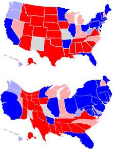
New version


- Uploaded a new map. New version is higher quality, language-neutral, easier to edit, can be seen side by side, and includes map showing electoral strength. I don't know how recent the data is, though. I just copied the data from the old map, which said April 17.
CT should be colored light blue for Clinton vs McCain. Jayavarman1 ( talk) 05:46, 29 April 2008 (UTC)
- Clinton is in fact winning by an average of 5.3%, which is within the margin of darker red. The Evil Spartan ( talk) 07:54, 29 April 2008 (UTC)
The most recent electoral map is inaccurate, only reflecting the single most recent poll (ie, Obama only won VA by a large margin once, but McCain won VA the two polls before that). Also, Obama isn't winning SC or WV. —Preceding unsigned comment added by Compsci10 ( talk • contribs) 23:30, 9 June 2008 (UTC)
Size of Polls
The page that was merged with this one listed how many people were polled in each poll; I find that information useful when doing statistical analysis, and I'd like to see it return. PsyMar ( talk) 00:30, 16 April 2008 (UTC)
Map redux
I have yet another version of the map. Fairly similar to the one above, except that now we indicate states with very heavy learnings (>10%). Thus the text might look something like this:
| Clinton vs. McCain | Obama vs. McCain |

|

|
| Clinton leads by over 10% (40) | Obama leads by over 10% (56) |
| Clinton leads by over 5% (191) | Obama leads by over 5% (202) |
| Clinton leads over 1%(229) | Obama leads over 1% (217) |
| Within 1% (50) | Within 1% (46) |
| McCain leads over 1% (259) | McCain leads over 1% (275) |
| McCain leads by over 5% (206) | McCain leads by over 5% (215) |
| McCain leads by over 10% (126) | McCain leads by over 10% (120) |
| Totals | Totals |
| McCain leads: 259 electoral votes
Clinton leads: 229 electoral votes |
McCain leads: 275 electoral votes
Obama leads: 217 electoral votes |
What do you think of the new format? Do you like the really dark states and the appearance? If not, we might try a scheme like this one. The Evil Spartan ( talk) 08:11, 29 April 2008 (UTC)
- Hi Spartan, thanks for taking the map and running with it!
- As a map junkie I really like your additional colors, but I wonder if it may be too busy/complex for normal people. Any normal people have an opinion?
-
Szu (
talk)
18:16, 2 May 2008 (UTC)
- I was feeling the same way. So you like the color schemes? Waiting additional responses. The Evil Spartan ( talk) 21:02, 2 May 2008 (UTC)
- Yes I like the colors, but they definitely make the image more complex, so I think you're right to wait for additional opinions. If any random people are reading this, go ahead share your thoughts.
-
Szu (
talk)
01:10, 4 May 2008 (UTC)
- I'm also a fan of maps,but red is red and blue is blue. Anyone who just wants to know who wins can get that easy enough from this map. Those who want more detail also get that. I vote ys as well. -- Aranae ( talk) 06:10, 4 May 2008 (UTC)
- Red is brown and blue is almost purple here... —Preceding unsigned comment added by Rakunus ( talk • contribs) 20:55, 29 May 2008 (UTC)
Time for some structural revision
I figure, given that Obama is now presumed to be the nominee, that it's time we focus solely on McCain vs Obama. Also, there has to be time period in which polls have to have been taken to continue being considered valid. It's now May, and some states' latest data goes as far back as February and March. Finally, we have to be sure we update the top of the article along with the bottom. There have been discrepancies between the maps/individual state polling sections and the predicted results section. Fifty7 ( talk) 14:22, 8 May 2008 (UTC)
- To your three points:
- 1) Obama is not the presumed nominee, and it would be a failure of WP:NPOV to assume as much
- 2) For the maps, data older than 45 days is ignored if possible; if there aren't many polls, however, the older ones are necessary to establish averages.
- 3) The maps work on a different scale than the bottom results. On the bottom, the latest result is simply used. The maps try to work out more of an average - read the blurb below them (I have done this because too many polls will see large variations, and this keeps those in check). I've updated the maps almost daily. I don't understand why people (of which you are certainly not the first) continue to claim they're wrong or behind when the algorithm is explicitly stated to be different under the image. The Evil Spartan ( talk) 08:06, 9 May 2008 (UTC)
North Carolina too close to call?
I don't think so, a lot of polls gave the win to McCain and then one gives a tie between Obama and McCain, I think McCain still wins this state, or at least until two polls in a row place Obama ahead. Someone, please update the states and electoral votes. This is especially considering the fact that a poll made the same day gave McCain a 9 point lead over Obama. So yeah, McCain is winning North Carolina, not too close to call. —Preceding unsigned comment added by 68.243.98.35 ( talk) 19:09, 10 May 2008 (UTC)
- In fact, you may have a point as to how the numbers are tallied. The way I've been tallying the maps is different from the way PollShark has done the totals on the bottom. He simply uses the latest poll. Perhaps you can point him to this thread. I explained on the page how I did the maps. The Evil Spartan ( talk) 00:43, 11 May 2008 (UTC)
Beautification
Thought I would add some color to our site. Hope you like. Your friend PollShark ( talk) 08:00, 29 May 2008 (UTC)
Flawed approach
I have to say that the way this article projects electoral vote totals is flawed. FiveThirtyEight.com's process is much more accurate, as it takes into account everything from the date polls were taken with different weight to the past accuracy of polling organizations. I propose that this article follow the fivethirtyeight.com model rather than simply basing a prediction on the latest poll taken with no regard for how close or how far apart, on average, various state races are. -- Fifty7 ( talk) 16:34, 31 May 2008 (UTC)
- We're not really predicting results in the bottom section, simply summarizing the current outlook. Predictions, you're right, should be made on more than just the most recent poll. However since we're not predicting results the current format is fine.
PollShark (
talk)
11:15, 1 June 2008 (UTC)
- Eh, I don't think the common reader will make that distinction. I've been following this article for awhile, and I even made the mistake. I think we should, at the very least, make an effort to put up an accurate predictions section then. -- Fifty7 ( talk) 14:18, 1 June 2008 (UTC)
- Also, it should be noted that, in the Maps of most recent polling data section, the bottom section is referred to as "predicted results". -- Fifty7 ( talk) 14:21, 1 June 2008 (UTC)
Clinton
What should we do about Hillary Clinton? She has not dropped out, and she's actually relatively close in number of delegates (compared with, say, Ron Paul vs. McCain). I do not believe the content should be removed as this juncture. 64.178.96.168 ( talk) 17:37, 4 June 2008 (UTC)
I was thinking the time has come to separate the polls. From now on, as Survey USA has done recently, most of the polls will be only between McCain and Obama. She's now begun her campaign for Vice President and seems to be resigned to the fact that she's not going to be the nominee. Last night was as close to a concession speech as you'll get from the Clintons. I say lets seperate. PollShark ( talk) 20:31, 4 June 2008 (UTC)
- Perhaps we should hold our own little poll here to establish consensus?
The Evil Spartan (
talk)
20:56, 4 June 2008 (UTC)
- Two notes:
- 1)PollShark, I have no idea where you tried to just vote. If it's Clinton out now, put it under that heading; if it's in until concedes, please put a # in front of your name.
- 2)See http://fivethirtyeight.com for a great explanation of why this may be premature. The Evil Spartan ( talk) 21:10, 4 June 2008 (UTC)
Poll
- Leave in Clinton until Democratic convention
- Leave in Clinton until if/when she concedes
- Take out Clinton now
Breaking News
New York Times just reported that Clinton has suspended her campaign effective tommorrow. I guess this moots the point of the poll. PollShark ( talk) 23:24, 4 June 2008 (UTC)
- I heard it was leaked that it would be effective as of Friday. We can wait two days; really. The Evil Spartan ( talk) 23:51, 4 June 2008 (UTC)
- Since it's already done and every major news service on earth and Howard Wolfson, chief Clinton strategist, has confirmed the story we'll leave it :) PollShark ( talk) 00:44, 5 June 2008 (UTC)
- Formal campaign statement has now been released from Clinton confirming stories. PollShark ( talk) 00:52, 5 June 2008 (UTC)
Images
I would just like to know how the presidential seal, white house logo, party logos and campaign symbols are not fair use images. PollShark ( talk) 13:28, 6 June 2008 (UTC)
- The presidential seal and white house logo are public domain because they belong to the federal government. The logos belonging to the individual parties and campaigns are copyrighted. The Evil Spartan ( talk) 15:58, 7 June 2008 (UTC)
- Not to make a point of constitutional law but we are the federal government according to the theory of democracy.
PollShark (
talk)
18:55, 7 June 2008 (UTC)
- I don't think you understand what fair use means. Please read up on WP:FU. If you still don't understand, please come back. The Evil Spartan ( talk) 04:47, 9 June 2008 (UTC)
South Carolina and West Virginia?
South Carolina and West Virginia definitely in McCain's hands, but the map shows SC blue. Can someone please change the map and the Electoral Vote count too? Thank you. —Preceding unsigned comment added by Cchow2 ( talk • contribs) 05:26, 10 June 2008 (UTC)
 Done - map redone.
The Evil Spartan (
talk)
21:03, 17 June 2008 (UTC)
Done - map redone.
The Evil Spartan (
talk)
21:03, 17 June 2008 (UTC)
Projection based on weighted averages of aggregate statewide polling data
I added the pretty darn credible projections out of Nate Silver's FiveThirtyEight.com, as it is a highly accurate representation of the information presented in the whole article. I'll keep the map updated each day as new polls come in. -- Fifty7 ( talk) 23:36, 12 June 2008 (UTC)
- I am a bit worried we are stepping on the toes of copyright infringement by using someone else's methodology to construct a map. The map may fall under fair use, however. I am going to ask for administrator clarification. The Evil Spartan ( talk) 21:01, 17 June 2008 (UTC)
Name of Article
Why is this article called "Statewide..." instead of "State..." or "State by state..."? "Statewide" means "at the state level rather than the local". Either of the others would means what's intended, i.e., "at the state rather than national level". - Rrius ( talk) 08:30, 14 June 2008 (UTC)
- By all means make an alternate proposal. The Evil Spartan ( talk) 21:01, 17 June 2008 (UTC)
More visible last update date
I think the date on which maps and final results were last updated should be more visible for all those political junkies who come on the site more than once. —Preceding unsigned comment added by 89.212.193.29 ( talk) 11:43, 14 June 2008 (UTC)
Florida, Florida, Florida
Someone needs to change the color of Florida on the map. A poll was released today that shows Obama leading McCain for the first time ever. RIP Tim Russert. -- Hobie Hunter ( talk) 18:51, 18 June 2008 (UTC)
- FiveThirtyEight updated accordingly, I'd have updated earlier but I was at work all day. 'Tis done. --
Fifty7 (
talk)
04:35, 19 June 2008 (UTC)
- It was no nesscary to put RIP Tim Russert at the end was it? America69 ( talk) 15:35, 28 June 2008 (UTC)
whats up with the MAP ?
What is going on with the map? (and I don't mean which state is shaded for which candidate..) It seems like every other day the structure of the map changes or the key changes or the color scheme changes. (i am not referring to the fivethirtyeight map) The map is an incredible resource that I check daily to see updates and general trends, when I do not have the time to digest all of the individual statewide polls. Why can't we just keep it one way and then update it as the polls change accordingly. Why do we need to continuously change the colors and layout of the map? Marshie71 ( talk) 00:47, 20 June 2008 (UTC)
- I was updating it daily; someone else came along and added what he thought was a more attractive map, but categorically refused to ever update it, so I've undone the change. The Evil Spartan ( talk) 06:08, 28 June 2008 (UTC)
Map
I would like to raise two issues with this map. 1. is what The Evil Spartan raised above. 2. is the fact that this map seems political bias to me. NOT ONE other political website that I have covered down to the detail rates Ohio as "Safe Obama". Not one othere website list Colorado and New Mexico as "Safe Obama", but as "Tossup" or "Leaning Obama". This map is definently not right. I ask that all of you look at Nate Silver's Wikipedia page. It says "Beginning in October 2007, Silver began to publish a diary under the pseudonym "Poblano" on the progressive political blog Daily Kos. Daily Kos is a far left blog. If we are going to put maps on Wikipedia, let's make sure that they are politically correct, and none of the far left, or far right leaning stuff. This just looks like another liberal blog, making liberal maps. America69 ( talk) 01:42, 20 June 2008 (UTC)
- Comment - Electoral-Vote has a very interesting map, that is non-partisan on this election. This would be a better map, as it is actually based on polling data. Is it possible to attempt to retrieve this map for Wikipedia, with permission?? America69Sh ( talk) 01:45, 20 June 2008 (UTC)
- The website for electoral-vote is here [1]. Look at it and see what I mean. America69 ( talk) 01:48, 20 June 2008 (UTC)
The map is getting ridiculous. I'm not here to promote a certain candidate, but there is no way Montana and West Virginia are undecided based on the current polls that are listed - they are for McCain, either safe or solid. Also, North Carolina and Nevada are not undecided either - they are swing McCain. Someone already pointed out Ohio is not solid Obama, but I'd also like to add I wouldn't even consider VA or MI swing Obama - they're closer to undecided. Furthermore, I don't know why several states along the southern border have changed from safe McCain to solid McCain - it is clearly obvious they are safe, not solid. Everytime I come back to this page there's an even more liberal slant than before, and it's reached the point where it's inaccurate. —Preceding unsigned comment added by Compsci10 ( talk • contribs) 04:10, 21 June 2008 (UTC)
I'm the Wikipedia editor who has been managing the FiveThirtyEight map in this article. First, let me say that the worded-assignments in the map (for example, that a margin of 8% or more makes a state "safe") were my own doing, not Silver's, and as we can all agree, that was definitely a mistake. Now, the map currently says Ohio is "Solid Obama", not "Safe", and while the color is correct (the current statistical projection is that Obama would win Ohio by 6.8 points, FiveThirtyEight.com says Ohio is "Lean DEM". Please be assured, I am not here to defend my map as infallible, but only to point out a few things. One is that this map was put together for my own private purposes, and I assigned the titles for margins of victory ("Safe", "Solid", etc.) long before I ever considered putting it up on Wikipedia. In order to put it up on Wikipedia, I obtained permission from 270toWin.com to use their map model here, and then I simply color coded the states according to the day's projections on FiveThirtyEight.com. Now, and this has to be said, to call DailyKos far-left, or at least to assert that by association that Silver has some sort of inherent bias, is just plain uninformed. Silver's a statistician, and the only reason his blog has gotten any attention is that it's been pretty damn accurate so far. I don't consider it to be biased, nor am I trying to push a partisan agenda here. I think I've shown that by admitting the dumb mistake I made, and I'm definitely open to suggestions as to how to improve the map. Note that I'm asking how to improve how to present the reliable, credible information from FiveThirtyEight.com, and not what would be a good substitute for it, as I don't believe such a thing exists. Should the map simply be two colors, red or blue, no matter how small or large the margin is, with the margin of projected victory within each state typed in below the electoral vote total? Or perhaps try to color code it according to the newly-worded designations being used at FiveThirtyEight ("Toss-Up", "Lean", "Likely", "Safe"), which had already led me to consider altering the map this morning? Or maybe some combination (which is where I'm leaning)? Thanks. -- Fifty7 ( talk) 04:48, 21 June 2008 (UTC)
- Responded on Fifty7's talk page.
America69 (
talk)
15:18, 21 June 2008 (UTC)
- Map updated. It's just two colors and the margins of projected victory are clearly presented with each state, so as to not misrepresent any information. The percentage font may be a bit too small; that was necessary just to make the map without any complications. If the font is too small, clicking on the map for the full size will fix that (although right now if you click on it, the image is still updating and you'll get the old one). -- Fifty7 ( talk) 03:01, 22 June 2008 (UTC)
- I dont know how appropriate projections are for an encyclopedia. I think that the purpose of this page is to give the available polling data, rather than using the projections of one random statistician... it is hardly a consensus of expert opinions. I mean, I visit Nate's site daily, but I am just questioning if it belongs on this page. -Luckydevil713 ( talk) 00:03, 23 June 2008 (UTC)
- Nate revamped the 538 model today to factor in timing bias. It's now projecting what Nate's methodology has determined to be the most likely outcome in November, with IN, MO, NV, and FL reverting to red. My guess is that the new model is still in beta and might change around a little bit yet, but it's worth noting. -- Kudzu1 ( talk) 00:38, 27 June 2008 (UTC)
As I type this, based on the average of the last three polls in Michigan which is a six point lead for Obama, that state should be colored medium blue. NOT the light blue that shows as I type this. Steelbeard1 ( talk) 11:48, 28 June 2008 (UTC)
- Thanks for the heads up. In fact, if you read the scheme, you will note that if there are more than 3 polls in the last 45 days, it uses all of those. In this case, we have 5 polls in 45 days, with an average of +1.6 for Obama. The Evil Spartan ( talk) 18:53, 28 June 2008 (UTC)
District of Columbia
Shouldn't there be a poll listed for the District of Columbia. ⁂†Poison the Well†⁂ ( talk) 21:58, 24 June 2008 (UTC)
- There haven't be any yet.
America69 (
talk)
22:38, 24 June 2008 (UTC)
- On the projection map Dc is listed with a 58.2% going towards Mr. Obama.
⁂†Poison the Well†⁂ (
talk)
06:05, 25 June 2008 (UTC)
- That is data from another site, based off previous years. No Democrat has ever had less than 85% of the DC vote, even in landslide years. The Evil Spartan ( talk) 00:53, 27 June 2008 (UTC)
- On the projection map Dc is listed with a 58.2% going towards Mr. Obama.
⁂†Poison the Well†⁂ (
talk)
06:05, 25 June 2008 (UTC)
the MAP!!!
why do we have to keep on changing the map ??? adding the different shades of red/blue just make it more confusing and much harder to read. PLEASE PLEASE PLEASE stop making it more complicated and keep things they way they were. —Preceding unsigned comment added by 138.16.29.197 ( talk) 21:46, 28 June 2008 (UTC)
- I received feedback above that it was better that way. You should have said something then. The Evil Spartan ( talk) 02:28, 29 June 2008 (UTC)
- Well, I don't monitor the discussion page as much as I monitor the actual article. Maybe I should pay attention to the discussion more closely, but I personally think that the map is not an improvement and that it actually more confusing and less helpful this way.
138.16.29.197 (
talk)
04:55, 29 June 2008 (UTC)
- Anyone else care to opine?
The Evil Spartan (
talk)
04:58, 29 June 2008 (UTC)
- I have weighed in before, but here it is again. The map is laid out in shades of red and blue. For those only interested in simple colors, it shouldn't be too difficult to figure out red vs. blue whether that red happens to be pink, rose, burgandy, etc. and the blue is powder, sky, or midnight. For those that want more information out of the map, it's there. The new maps are an improvement, because they add a lot more information while adding minimal complexity. --
Aranae (
talk)
05:35, 29 June 2008 (UTC)
- I think the map should be simplified. Seven different shades are too much. Five was just right. --
Hobie Hunter (
talk)
02:17, 30 June 2008 (UTC)
- I disagree, the seven shades are just right--three shades of blue for Obama, three shades of red for McCain and off-white for ties.
Steelbeard1 (
talk) 12:03, 30 June 2008
- I like the five shades MUCH better than the seven shades. it just gets too complicated. 138.16.29.197 ( talk) 17:53, 5 July 2008 (UTC)
- I disagree, the seven shades are just right--three shades of blue for Obama, three shades of red for McCain and off-white for ties.
Steelbeard1 (
talk) 12:03, 30 June 2008
- I think the map should be simplified. Seven different shades are too much. Five was just right. --
Hobie Hunter (
talk)
02:17, 30 June 2008 (UTC)
- I have weighed in before, but here it is again. The map is laid out in shades of red and blue. For those only interested in simple colors, it shouldn't be too difficult to figure out red vs. blue whether that red happens to be pink, rose, burgandy, etc. and the blue is powder, sky, or midnight. For those that want more information out of the map, it's there. The new maps are an improvement, because they add a lot more information while adding minimal complexity. --
Aranae (
talk)
05:35, 29 June 2008 (UTC)
- Anyone else care to opine?
The Evil Spartan (
talk)
04:58, 29 June 2008 (UTC)
Pollshark Tank
There is a link at the very bottom of the external link section. I was looking at it, and I really don't see why that is there. It is a blog. Why is his blog there. If it stays there, why is the Daily Kos not there, or Politics 1 not there. All of them have polls. I want to know what you think. America69 ( talk) 19:16, 29 June 2008 (UTC)
- Removed.
Henrymrx (
talk)
20:28, 29 June 2008 (UTC)
- Thank you. America69 ( talk) 22:31, 30 June 2008 (UTC)
Obama v. McCain charts in battleground states
Using Wikipedia data from this article and Excel, I crunched the numbers in states where the lead in the polls for any one candidate is close or has shown signs of swinging back and forth between Obama and McCain. At this point, I've selected Florida, Pennsylvania, Ohio, Michigan, Virginia, Indiana and Missouri for additional analysis using charts and trendlines. I believe that these seven states are, as it happens, a good representative example, because three of the states are currently leaning toward Obama (Ohio, Michigan and Pennsylvania), three are currently leaning toward McCain (Florida, Indiana and Missouri) and Virginia is virtually tied. Incidentally, between these seven states, there are 120 electoral votes at stake, which represents 44% of the total (270) needed to secure the nomination. In most of the states, there are still at least about 10% of the voters with no opinion yet between the two candidates (or are supporting a third candidate). Your thoughts, suggestions and general input are greatly appreciated. If time is available, I will work to create these charts in the more visually friendly PNG format.-- Robapalooza ( talk) 23:31, 7 July 2008 (UTC)
Zogby polls shouldn't be included
Zogboy polls should not be included, as you know they are very inaccurate... —Preceding unsigned comment added by 203.84.187.94 ( talk) 03:50, 16 July 2008 (UTC)
- Do you want to add something to back up your claim. That is a pretty big claim.
America69 (
talk)
04:23, 16 July 2008 (UTC)
- I have heard this claim before. Additionally, the polls, I believe, were taken on the internet, which provides obvious bias issues. Bob Barr hit 9%, curiously, in many states (one only need think of Ron Paul's internet popularity to understand this). The polls in general also seemed to tilt a bit more Obama than the ones around them. The Evil Spartan ( talk) 07:24, 16 July 2008 (UTC)
- I second the idea to remove the Zogby polls. There are so many others that could be used which are statistically accurate. It's great to be considered, maybe we can have a link or something, but we must remember that this is internet polling. Even John McCain doesn't know how to use the internet... sigh. 216.164.28.43 ( talk) 19:37, 16 July 2008 (UTC) To back up the original poster's claim, I present this: http://www.fivethirtyeight.com/search/label/pollster%20ratings Besides, we do have some information based on FiveThirtyEight's website right here in Wikipedia. Specifically, I'm speaking of this. http://en.wikipedia.org/wiki/Statewide_opinion_polling_for_the_United_States_presidential_election%2C_2008#Election_Day_projection Smrterthansmrt ( talk) 19:59, 16 July 2008 (UTC)
- I also support removing Zogby polls. I was just asking if the IP has any source to back up his claim. America69 ( talk) 20:14, 16 July 2008 (UTC)
- Hrm. Please notice that the FiveThirtyEight chart referenced above makes a distinction between "Zogby" and "Zogby Interactive" with the former being in the middle of the list and the latter near the bottom. If we want to discuss removing the Internet based polling, I think I'm fine with that. However, I think Zogby's traditional polls should stay. I would also like to see more references about criticism of the methodology of the Zogby Interactive polls before we remove them. Henrymrx ( talk) 20:30, 16 July 2008 (UTC)
- I agree, they must be removed, internet polls aren't to be trusted, as people using proxies could vote twice or from another country/state. I think this should stay using traditional polls. —Preceding
unsigned comment added by
70.11.231.50 (
talk)
23:59, 16 July 2008 (UTC)
- I must point out that we're not at all sure they're internet polls. In fact, I think I remember Nate Silver at fivethirtyeight (listed above) saying specifically that these 30-something were not internet based. But my memory is dying on this matter. The Evil Spartan ( talk) 00:07, 17 July 2008 (UTC)
- Thank you, Spartan. Let's not throw the baby out with the bathwater, so to speak. Henrymrx ( talk) 00:16, 17 July 2008 (UTC)
- These Zogby polls are, in fact, internet-based [2]. However, that is not enough reason to remove them. YouGov has been conducting internet-based polls for years and they have predicted British elections much better than traditional pollsters. Nate Silver's pollster ratings is not a very good reason to remove them either, and Silver himself has included these polls in his model (albeit with a diminished weight). Xaoiv ( talk) 02:18, 17 July 2008 (UTC)
- Now that I've looked at the reference, I think we need to consider keeping these polls. These are not just open website polls that anyone can participate in. These polls are by invitation. They're not subject to supporters of one candidate "flooding" them. On the other hand, good polls should have a solid random sample. Not everyone has access to the Internet. Almost everyone has a phone.
Henrymrx (
talk)
02:39, 17 July 2008 (UTC)
- Exactly. Although there is some inherent bias in only polling internet users, these are still scientific opinion polls. Xaoiv ( talk) —Preceding comment was added at 02:59, 17 July 2008 (UTC)
- Now that I've looked at the reference, I think we need to consider keeping these polls. These are not just open website polls that anyone can participate in. These polls are by invitation. They're not subject to supporters of one candidate "flooding" them. On the other hand, good polls should have a solid random sample. Not everyone has access to the Internet. Almost everyone has a phone.
Henrymrx (
talk)
02:39, 17 July 2008 (UTC)
- I believe it's a rather slippery slope if we begin judging the merits of polls based on outlying results or differential methodology. As long as the process is scientific, as this one is, I believe it should be listed since that is the criteria for inclusion on the page. PollShark ( talk) 08:17, 17 July 2008 (UTC)
- Yes but there's no point in using those polls, we all know that Obama has a lot of support on the net and McCain's supporters are mostly older people that probably don't use a computer. Perhaps they should be set apart in an "Internet Polls" section to prevent confusion. I mean common, next they're gonna show Obama winning Utah! —Preceding
unsigned comment added by
70.11.70.68 (
talk)
14:21, 17 July 2008 (UTC)
- Zogby weighs the results based on demographics, so there being more young people on the internet shouldn't (theoretically) be a problem. Rami R 16:00, 17 July 2008 (UTC)
- I second PollShark's and Xaoiv's opinions. Basically, so long as the polls can be claimed to be scientific, and there isn't a reliable source directly claiming otherwise, there is no reason to remove them. Rami R 16:00, 17 July 2008 (UTC)
- All polls, including Zogby and the New York Times, are inherently flawed in one way or another. As long as it isn't a poll where a single user can post a response multiple times or where there is obvious bias, I think it should be included.-- Robapalooza ( talk) 16:47, 17 July 2008 (UTC)
- Real Clear Politics did NOT include Zogby polls. Zogby polls do not explain how they obtain their data, except that they got the results from the internet. If you want to include them, that's fine, but don't use them to calculate who is ahead. -- cchow2 ( talk) 16:20, 17 July 2008 (UTC)
- Zogby polls are bogus and misleading, Obama leading in Arizona? that's the most ridiculous poll ever! —Preceding unsigned comment added by 203.84.187.94 ( talk) 12:23, 18 July 2008 (UTC)
- I have to agree to some extent. Obama ahead by 3 in Arizona, by 2 in Arkansas, by -5 in Kentucky, by -7 in Louisiana, by 14 in Michigan, by 16 in New Mexico, by 9 in North Carolina, by -5 in Oklahoma, by 1 in South Carolina, by +5 in Tennessee. While much of the polling data looks to be about average, there is unquestionably a pro-Obama and pro-independent tilt in the data. This is worrisome. The Evil Spartan ( talk) 14:58, 18 July 2008 (UTC)
- In an election like this where there is such an anti republican tilt to the political landscape, I believe that every state can be in play. Traditional polls also do not inlude cell phone users which discriminates against young, mostly democratic voters. Finally, Al Gore lost Tennessee, his home state, in 2000 so its possible that McCain could lose Arizona. Just because something is different doesn't mean it's flawed, that kind of mindset is called prejudice.—Preceding unsigned comment added by PollShark ( talk • contribs)
- No PollShark. If the results are consistently tilted in one direction compared to other polls, and in the direction we predicted it would be according the source, then there is a fatal flaw in poll. And, as others have pointed out above, they are included on fivethirtyeight, but with a mostly reduced weight. The Evil Spartan ( talk) 17:05, 18 July 2008 (UTC)
- Who's tp say other polls aren't consistently overstating support the other way because of their polling methods? Just because one's favorite canidate is on the short end of an imaginary stick doesn't mean that poll is any more inaccurate than other polls. PollShark ( talk) 19:47, 18 July 2008 (UTC)
- RealClearPolitics did not include those online Zogby polls. Every poll has shown John McCain leading in Arizona, Arkansas, North Carolina, and South Carolina. Only Zogby shows otherwise... If you think those ONLINE Zogby polls are meaningful, then please also include the AOL Straw Poll. Each person can only vote once so it's fair deal. http://news.aol.com/political-machine/straw-poll/ (P.S. Zogby polls did not even indicate the different groups/demographics they polled from and most importantly HOW they obtained the data from, so disqualify Zogby polls if you want to disqualify AOL straw polls.) -- cchow2 ( talk) 15:59, 18 July 2008 (UTC)
- This article only includes scientific public opinion polls (as stated in the introduction). The Zogby polls fit the criteria and the AOL straw poll does not. Xaoiv ( talk) 20:55, 18 July 2008 (UTC)
- Just REMOVE the zogby polls!!! OK? grrrr —Preceding unsigned comment added by 203.84.187.94 ( talk) 05:01, 19 July 2008 (UTC)
- The last thing I'll say about the Zogby poll is that, with the exception of a couple of states, it largely mirrors the results from other polls from each state. The only exception is that it does give strong support to congressman Barr, but this does not constitute a flaw. Who would have thought that in 91 Perot would have garnered so much support? With the strong rejection of McCain's moderate view by some staunch conservatives like Ann Coulter and the strong support of a third party movement from those like Lou Dobbs, there could be a sizable portion of the population that will support Barr. The reason why you don't see this for Nader is because liberals aren't as likely as republicans to vote independent even when there is not a strong Democrat in the race, the exception being Vermont of course. There is a strong Democrat in the race, however, and a strong urge to elect a democrat among the party base. Thus I would expect strong support among, the growing according to Rasmussen's party ID calculator, democratic party base and some dissention among the conservatives to Barr because of the reputation McCain has for dissention from the party line. Thus Zogby might actually be more accurate than the other pollsters in the race so far. Also the telephone method of random digit dialing used by the majority of pollsters is not the panacea of survey research. Liberals, especially lower class ones, work during the day and are with their children during the night more so than conservatives, so telephone polls, often time consuming, may discriminate against working class voters who tend to be liberal leaning. Internet, or email, polls may be more effective and time saving than the traditional poll, especially if there is some password protection involved. With the number of people with internet access reaching numbers close to the number of people with traditional phone lines, a growing number are switching to cell phone only, internet polls may be the wave of the future. Just some factors to consider when making a judgement. PollShark ( talk) 20:46, 19 July 2008 (UTC)
- I'd like to clarify my previous statement (I second the idea...) to say "Zogby Interactive" polling, specifically. I am referring to their internet-based polling. I myself am a Democrat, so I am not playing any partisan card. These interactive polls are consistently off with the other pollsters in a few states. However, instead of removing them, we could allow or create a new section for internet polling, to show the differences. Should we be mixing telephone-based polling with the internet-based in the same tables for states? Could we get more internet-based polling? Smrterthansmrt ( talk) 21:44, 19 July 2008 (UTC)
- I have a better idea. Why don't we include them as is, but put a star (*) next to them? The Evil Spartan ( talk) 22:15, 19 July 2008 (UTC)
- @EvilSpartan: This is a good idea. I mean tossing them honestly was unreasonable, they should be noted as internet polls. Should the Internet polls be included in the "Latest results (using latest polling when available)" section which shows delegate split based on most recent polling? Smrterthansmrt ( talk) 23:34, 19 July 2008 (UTC)
- I "saw the light" and "reluctantly" excluded Zogby numbers from the projection which gave Obama one more electoral vote. (So much for Zogby's liberal bias)
- We can, of course, still include them in the results. I don't have a preference either way (though I will have to recalculate the maps). The Evil Spartan ( talk) 04:45, 20 July 2008 (UTC)
Marking the polls with an asterisk is ridiculous. The polls are either scientific and should be included as-is, or they're not and should be removed. It can't be both ways. @Spartan: Why redo the map? Isn't the whole point of using poll averages to prevent a single poll from skewing the results? Rami R 10:20, 20 July 2008 (UTC)
- You still didn't give a reason as to why to remove the asterisk, there's nothing 'ridiculous' about marking the polls as internet-based. It would give reason as to why some states have one poll only headed Obama's way, and that poll just happens to be a Zogby Interactive poll (e.g. Arizona, Arkansas, Montana, North Carolina, South Carolina). If I were to get rid of the Zogby polls, would you just reverse that too Rami? You can't have it both ways. We should not be mixing polls that were performed in different manners, which is why I suggest breaking the internet polling from the telephone polling, so we can include all polling.
Above all, it's an asterisk. No "huge" change. Smrterthansmrt ( talk) 17:14, 20 July 2008 (UTC)
- Up until now, the article made no distinction between the polls. They were all presented as-is, as "scientific, state-wide public opinion polls". The asterisk is a huge change because it implies that some "scientific, state-wide public opinion polls" are better than others. This, in and of itself, is not improper. The problem is that the decision to designate these polls as less-worthy of attention is based on the original research of this discussion's participants. The decision on whether to include these polls in the article at-all is different from deciding on the asterisks, because in the inclusion decision we don't decide on the "worthiness" of the poll, we merely decide whether the poll meets the criteria that the article itself imposes ("scientific, state-wide public opinion polls"). We have not concluded that the polls are not scientific, and per Wikipedia:Consensus that's all that is needed to keep the polls. So to answer your question, if you were to remove the polls, I would definitely revert you. Rami R 18:46, 20 July 2008 (UTC)
- How does sorting the polls, like I previously suggested, imply some polls are less worthy than others? That's like saying because we list Alabama's polls first, we are saying they are more worthy than Wyoming's. Noting them as internet polls did not make them less-worthy. Noting them as internet polls did not change any of the statistical information on this page-- such as section 2.1 (Latest results (using latest polling when available)) in the article. However, under the title of this article, these polls should not be removed (My question was rhetorical). The problem is that this article favors telephone-based polling, as we only have one internet-based poll, causing the conflict in the first place. Smrterthansmrt ( talk) 21:04, 20 July 2008 (UTC)
- As much as I would like to believe these Zogby polls from AZ, NC, and AR, I can't. Its obvious that there is something wrong with the way that Zogby International gathers its statistics (over the internet). The specific polls in question should be removed because they are highly inaccurate. 68.45.9.206 ( talk) 22:39, 20 July 2008 (UTC)
- @:68.45.9.206: Are we going for accuracy or is the purpose of this page to show opinion polling, as the title states? I don't know the answer to this question. I think this is where we are divided. We call these polls "inaccurate". However, when we begin removing polls, to what extent do they need to be "inaccurate" to be considered removed? Again, all these questions I'm just throwing around hypothetically. However, a more pressing issue: Half of the asterisks are before the hyperlink icon, and half are after. I think we mean to have them all after, so I'll correct this. (E.g., we have them after in Alabama, but before in South Carolina). When it comes to these polls, I think we can reach a sensible compromise. I know we discussed the keeping/not keeping, and to this point, they should be kept. Marking them as internet polls I feel is a reasonable compromise. I'm not sure if we should include them in the statistics below the poll charts. It appears Spartan is not including them, as noted at the end of the poll tables. Smrterthansmrt ( talk) 22:54, 20 July 2008 (UTC)
- I'm not a fan of using obviously bad data, but given that these polls are being included with an asterisk, I think it needs to be clear that these are not just "Internet polls." The basis for their inclusion is that they are scientific polls, albeit conducted using a different methodology than most. I've tried to clarify that in the footnote. (If I'm misunderstanding, and these really are just unmediated online polls, they clearly do not belong here.) Smith.dan ( talk) 16:09, 21 July 2008 (UTC)
- Zogby polls are in fact scientific-- they do not compare to say AOL's straw poll which has McCain winning all 50 U.S. States. To read about how Zogby conducts their polls, see: http://interactive.zogby.com/home.html Here's a part of the webpage: "As is usual in polling, weightings are applied to ensure that the selection of participants accurately reflects characteristics of the voting population, including region, party, age, race, religion, and gender." Smrterthansmrt ( talk) 17:19, 21 July 2008 (UTC)
- Well, now that I thought about it, the polls are okay with an asterisk. We just should try and make sure that we aren't misleading anyone. 68.45.9.206 ( talk) 17:22, 21 July 2008 (UTC)
Is War Room Logistics (Florida) a RS?
Anyone have an opinion as to whether War Room Logistics [3] July 7-8 2008 Barack Obama 47.2% John McCain 44.5% is a RS?-- Robapalooza ( talk) 16:48, 17 July 2008 (UTC)
- Although they are new (formed in 2007) and they have only polled Florida (where they are based), I don't see any reason to think they are unreliable. For what it's worth, I found the reference to War Room Logistics on FiveThirtyEight.com. Xaoiv ( talk) 21:28, 17 July 2008 (UTC)
- If they have no partisan relations, and they are Florida-based, I think they should be kept. Smrterthansmrt ( talk) 21:44, 19 July 2008 (UTC)
Arizona?
The latest poll for Arizona should be the Rasmussen poll surveyed on June 25 rather than the online Zogby poll. For the Zogby poll, the majority of the data is collected before June 25 since it spams from June 11 to 30. The "median date" is June 20/21 so that's before Rasmussen's June 25. Therefore, I believe it makes more sense to use the Rasmussen poll as the latest poll. (User talk: cchow2|talk) 3:30, 27 July 2008 (UTC)
- there is also a problem with Indiana. The latest poll shows McCain winning, but it was from the zogby online polls, which we are not using. Obama is leading in the last poll that we are using for the projections section. This might be the case with some other states too. 68.45.9.206 ( talk) 04:16, 31 July 2008 (UTC)
Playing Devil's Advocate on the Projection Map
What is the reasoning behind using Nate's projection map in contrast to any other projection map? Electoral-vote.com also compiles polls and puts an algorithm to them, but they don't have a special section, as do countless other sites. It doesn't seem that his prediction holds any more weight than theirs, so I am just wondering how it fits onto a encyclopedic article, or where the expert consensus is in regards to his research. -Luckydevil713 ( talk) 00:11, 29 July 2008 (UTC)
ties, leads and misrepresenting statistics
Almost every state by state poll has a margin of error of +/- 4%. When two candidates are within 4% of each other, they are tied as far as the data can tell. The list of states where each candidate is in the lead under "latest results" should list these states as tied: CO, FL, IN, MI, MT, NV, NH, NC, ND, OH, SD, VA.
I know that there is an urge to declare a winner and to show a definitive result, but things are not that certain and an encyclopedia article should show the facts as they are, with all of the uncertainty. The use of bold to indicate the leader in each poll should likewise be removed when the candidates are within 4% (or within the margin of error) of each other. Bcharles ( talk) 06:51, 3 August 2008 (UTC)
- Ridiculous. Everything should be changed back to how it was. The "unbolding" makes it harder to read the results and immiedietly see a winner or trend. 68.45.9.206 ( talk) 14:45, 3 August 2008 (UTC)
- This is exactly the point. You are deceiving yourself if you read winners or trends from data beyond its statistical significance. Polls that have a margin of error of +/- 4% are not meaningful for differences of 4% or less.
- The lack of bold for statistically tied polls actually tells you that it is a close race in that state, on that date. This allows you to see significant trends and potential swing states much more easily. Bcharles ( talk) 18:37, 3 August 2008 (UTC)
- Not all scientific polling is a solid +/- 4%. If you want to unbold everything, you must look at each individual pollster's margin of error, and if it's within their margins, we can discuss making this change. The reason why this is a problem is because in Section 2, we show the last polling results... so if there's no clear winner, are we going to go by the most recently polled OR the most recently "bold" one. Either way, you just can't pick 4% and decide that is that, because not all of these scientific polls are +/- 4%. So, look at each pollster's margin of error, and base it on their MoE, not a percentage you choose to pick. I'm not going to be the one to revert it, but it is inaccurate to express +/- 4% for ALL polls. 216.164.28.43 ( talk) 17:20, 3 August 2008 (UTC)
- You are right that indicating a leader or statistical tie should be based on the specific poll's margin of error and not on some arbitrary number. Every state political poll that i have looked at (that includes many) has a margin of error of 4%. This seems to be the industry standard. A couple of reasons are that no one wants to pay for data that has greater than 4% MoE, and other sources of error keep even polls with the largest sample sizes from being meaningful at less the 4% significance, so it is not worth the expense to do larger samples.
- There may be exceptions to the 4% MoE, and i agree that those should be indicated and evaluated based on their specific MoE. Bcharles ( talk) 18:37, 3 August 2008 (UTC)
- I agree with what was stated directly above. You can not just arbitrarily pick 4% and apply it to every single poll. Furthermore, the "latest results based on latest polling" absolutely MUST be restored to how it was before. It is crazy to have so many states under the "tied" section solely because of the random 4% margin of error standard. Everything should also be rebolded. Marshie71 ( talk) 17:42, 3 August 2008 (UTC)
- The 4% margin of error is not random but based on what almost every poll indicates is it's MoE (see comment above). States that are within the MoE of a poll are tied as far as anyone can tell. Bcharles ( talk) 18:37, 3 August 2008 (UTC)
- The problem is that the decision to decide all polls have a +/- 4% MoE is based on the original research of this discussion's participants. 216.164.28.43 ( talk) 20:06, 3 August 2008 (
- Please try to get some consensus before implementing changes like this. This is an entirely arbitrary change that makes the results harder to read. Just because a lead in a certain poll has a greater than 5% chance of being due to chance does not mean that it IS due to chance. For example, if a poll has a sample size of 1200, even a 1% difference has a greater than 50% chance of reflecting a true lead (the margin of error with a 50% confidence interval would be 0.97%). Xaoiv ( talk) 22:34, 3 August 2008 (UTC)
To whoever just fixed the article, THANK YOU. This is the way that it should be. 68.45.9.206 ( talk) 20:14, 3 August 2008 (UTC)
- Okay, so now some of the polls have an 'Other' section? Eh, this page doesn't look as tidy as it did a day ago. Could we please draw some consensus before making these significant changes? 216.164.28.43 ( talk) 23:48, 3 August 2008 (UTC) I changed all the "someone else"'s to "Other", just to clean up the page a bit.
- I agree. People, please discuss major changes to the article before actually making the changes. I believe that this article is extremely valuable and I check it almost daily. A consensus before making large changes is the only responsible way to handle this. 68.45.9.206 ( talk) 02:24, 4 August 2008 (UTC)
Latest results (using latest polling when available)
Some great work on this article. But I have a question/problem: can someone explain how this 'Latest results' section is formulated? Taking Missouri as an example, it is in the Republican list. But although the latest polls show a 5% for McCain the previous one shows a 5% for Obama and other recent ones show the state a tie. Strikes me that the overall situation in this state is a tie at the moment or very narrow McCain. Some other states are classed as Rep, Dem or Tie and have similar issues with them. Setwisohi ( talk) 16:07, 3 August 2008 (UTC)
- The latest results only looks at the last poll (excluding internet polls). This can be misleading as you point out, but if the last poll showed one of the candidates with a statistically significant lead, it goes in their column until the next poll comes out. It could help to use weighted averages, but that opens up a can of worms as to how you weight and calculate the average. And it complicates the task of updating the list. See the above discussion on ties and leads, regarding statistically significant leads and statistical ties. Bcharles ( talk) 18:04, 3 August 2008 (UTC)
OK, thanks for that. So it's a fairly 'rough' list but does give a general idea of the way the state is tilting? That's good enough for me. Setwisohi ( talk) 19:20, 3 August 2008 (UTC)
Zogby International Polls and the MAP
Why is Indiana colored light red? If anything, it should be light blue, since Obama is leading in the two most recent polls that we are accepting as credible.
We are not using the Zogby International polls for the "Latest results (using latest polling when available)" section. Therefore, I believe that we shouldn't use the Zogby International polls for the "Maps of most recent polling data" section.
We would then also probably need to change the colors of Arizona and Texas (darker red needed) and any other states that the Zogby polls effected. 68.45.9.206 ( talk) 18:56, 5 August 2008 (UTC)
- He is leading in two polls, but only by one point; the other poll has McCain up by 8, meaning he's up by an average of 2.
64.178.97.27 (
talk)
21:02, 7 August 2008 (UTC)
- But we have deemed the Zogby International poll as being inaccurate (but still scientific). 68.45.9.206 ( talk) 14:50, 9 August 2008 (UTC)
Polls commissioned from partisan sources
Polls commissioned from partisan sources are notoriously unreliable; as such, I have recently removed an Alaska poll showing Obama up by 4. Most other sites do not include such polls (e.g., http://fivethirtyeight.com, http://realclearpolitics.com) because they introduce logistical problems into the equation. Pollsters are under pressure to get a favorable result to insure a returning customer, and if the poll doesn't show a positive result, it's usually not released into the public.
The only exception thus far has been some polls commissioned by the dailykos; because they have been done in conjunction with Research2000, an established polling group.
So far, it has been the practice on this page not to introduce such polls (e.g., one commissioned by the Florida Chamber of Commerce, a pro-McCain group); as such we ought to be consistent and leave them out. The Evil Spartan ( talk) 00:04, 13 August 2008 (UTC)
- Well, your argument does make sense. However, I had thought that we were going to include any poll that was sufficiently scientific. Can you give me some other examples that we have excluded from this list? Now that I check, I don't see any Fox polls in this list.
Henrymrx (
talk)
01:40, 13 August 2008 (UTC)
- Some of the Rasmussen polls were conducted in partnership with Fox.
[4]
[5] Scott Rasmussen is himself a Republican partisan. We also have many polls listed that were conducted by Democratic (e.g. Public Policy Polling) and Republican (e.g. Strategic Vision) firms. I don't know of any polls that have been excluded because they were commissioned by partisan interests. The Florida Chamber of Commerce poll is included.
Xaoiv (
talk)
02:20, 13 August 2008 (UTC)
- Good to know. I'm putting that Alaska poll back in then.
Henrymrx (
talk)
06:25, 13 August 2008 (UTC)
- The issue is usually not a matter of the political leanings of the pollster. These individuals and groups are making a living off of their poll results and would lose credibility very quickly if they started biasing their results to produce a desired answer. The problem is when internal/partisan polls are done for a specific paying client (like a political campaign) and that client cherry picks which ones to release. For example, say the Obama campaign was footing the bill for this Alaska poll and pretend that they have commissioned 5 AK polls this year but this is the only one they allowed the polling company to release to the public. That type of a scenario is a concern, because they may be only releasing what the client wants the public to hear. If this AK pollster falls into that category, the poll should not be included. If they do not, their political leanings shouldn't lead to exclusion. -- Aranae ( talk) 08:23, 13 August 2008 (UTC)
- Good to know. I'm putting that Alaska poll back in then.
Henrymrx (
talk)
06:25, 13 August 2008 (UTC)
- Some of the Rasmussen polls were conducted in partnership with Fox.
[4]
[5] Scott Rasmussen is himself a Republican partisan. We also have many polls listed that were conducted by Democratic (e.g. Public Policy Polling) and Republican (e.g. Strategic Vision) firms. I don't know of any polls that have been excluded because they were commissioned by partisan interests. The Florida Chamber of Commerce poll is included.
Xaoiv (
talk)
02:20, 13 August 2008 (UTC)
- For my part, I'd like to see all polls carried out by reputable agencies included. Even those with a partisan bias as described above. Generaly speaking I find such polls to reveal a good deal about underlying trends.
Setwisohi (
talk)
09:08, 13 August 2008 (UTC)
- OK, for my part, this is a bad idea. There is a big difference between an established polling firm that happens to have someone with political leanings that runs it (it's inevitable that the leader of a company will have some leanings) and a poll specifically commissioned by a group with an agenda, that is pushing for a positive result, and will only publish the result if it's positive. They all should be removed. All other major sources, including http://www.electoral-vote.com/, http://fivethirtyeight.com, and http://realclearpolitics.com do not even include these results because they have a history of poor accuracy. This is a very bad idea. The Evil Spartan ( talk) 12:58, 13 August 2008 (UTC)
- For what it's worth, Pollster.com has included this poll and Nate Silver wrote that he is waiting for a response from Hays before deciding whether to include it. I understand why we should have reservations about this poll but, again, I don't know of any polls that have been excluded from this article for that reason. Xaoiv ( talk) 18:39, 13 August 2008 (UTC)
- I really think Poblano at 538.com has taken the right approach. We're all saying who are you and what is your approach to releasing polls (do you cherry pick?). Nate is finding that out. I would follow his lead. -- Aranae ( talk) 19:49, 13 August 2008 (UTC)
I agree with EvilSpartan. Most major site do not even include that Hays Poll. If you want to include it, fine, but don't use that poll in any calculations. cchow2 ( talk) 12:58, 13 August 2008 (UTC)
- To some extent, it comes down to declaring what is in fact a "scientific" poll. Is a scientific poll partisan? Can a scientific poll internet-based? What polls should not be included in our tables, but not in our results? If we had a clear definition of a "scientific poll", we would not have this issue. I guess we should open debate to whether or not partisan can = scientific. We already do have partisan pollsters, such as PPP. However, what we have already concluded is this: That just because we find a poll to be "inaccurate" (personally) does not mean that we do not include it in the tables, however, it is up to debate if we use in the results sections. We have concluded that we do cannot purposely omit pollsters based on original research, for we have no way to say "to what degree a pollster needs to be considered unreliable". Yes, we all know that some polls are grossly wrong, but we should show ALL information within the charts, since we are not going for pollster accuracy. Smrterthansmrt ( talk) 23:04, 17 August 2008 (UTC)
Third parties' candidates
It would be interesting to see them on the spredsheets. Or at least "don't know" percentage should be visible. —Preceding unsigned comment added by 213.250.61.151 ( talk) 16:17, 14 August 2008 (UTC)
Regular Poll updates
Good work all those who keep these coming. Amazing how things have changed recently. If it was election day today, it looks like 264 - 262 with just 12 votes undecided. (Montana and Colorado). Could be real cliffhanger. Keep the polls coming! Setwisohi ( talk) 15:18, 21 August 2008 (UTC)
- Yeah, will somebody add the new Zogby polls? They *finally* posted their August 15 - 19 polls, and I'm excited to just I don't know see it on the wiki page. Haha, but I'm just too lazy to do it myself. :D 216.164.28.43 ( talk) 22:02, 22 August 2008 (UTC)
- Will somebody please REMOVE the new Zogby polls? They are ridiculously inaccurate and are misleading. 68.45.9.206 ( talk) 00:54, 27 August 2008 (UTC)
- We have been through and through on these polls. We have gone to heaven and hell with these Zogby polls. After our rather intense debate, we decided that all polls stay, as we are not the judges of inaccurate or accurate polling. All scientific state-wide polls are included, partisan or not. Really, this is closed debate and they are here to stay now. Smrterthansmrt ( talk) 00:55, 1 September 2008 (UTC)
Palin
Every news outlet is reporting that Palin will be McCain's running mate. I've added her to the article along with a photo I found on Commons. If someone can find a better one, that would rock. Henrymrx ( talk) 15:15, 29 August 2008 (UTC)
Joe Biden's picture is missing! Who took it? —Preceding unsigned comment added by 89.212.2.86 ( talk) 18:28, 29 August 2008 (UTC)
References?
Where is this information coming from? Where the references?-- Rtphokie ( talk) 03:40, 1 September 2008 (UTC)
- erm... they are opinion polls. Click on one and you'll see the source. (Although, in some cases, I expect the polls may no longer be viewable). Or am I missing the point? Setwisohi ( talk) 09:38, 1 September 2008 (UTC)
- I was expecting a reference section like most wiki articles but give that this is essentially one big set of links to references. I guess it makes sense to do it this way.-- Rtphokie ( talk) 15:18, 1 September 2008 (UTC)
Poll Archive
I've archived all polls older than 3 months, provided that there are at least three poll without a star next to them for the state. The polls really don't help that much anyway, and the page is getting very large. You can find the archive at Talk:Statewide opinion polling for the United States presidential election, 2008/Archive. The Evil Spartan ( talk) 20:31, 5 September 2008 (UTC)
Safe states
I have had a look at the Rasmussen Reports balance of power calculator - while I think it's mostly accurate, it isn't based on the same polls as ours, and seems to leave several pretty safe states out. I propose one of two different methods of determining a safe state: 1) A state has never polled for the opponent or as a tie. States with only a few polls (e.g., Delaware) shouldn't be a problem because pollsters (at this point) have only really ignored states that are already obvious. 2) A state has never polled within 5 points for the opponent. This is a little less inclusive, but looks better to me - it would remove states like Minnesota, Washington, and North Carolina which are not really safe.
Thoughts? The Evil Spartan ( talk) 21:35, 9 September 2008 (UTC)
I think we can follow Rasmussen's method and make a category called 'Likely States". Obama is definitely a lot stronger in Deleware than PA, but right now they are in the same category (Lean Dem). McCain is definitely a lot stronger in TX than OH, but right now they are in the same category (Lean GOP).
cchow2 ( talk) 21:00, 11 September 2008 (UTC)
Agree with cchow2 - we need to add a 'Likely' column for the reasons given Setwisohi ( talk) 09:17, 13 September 2008 (UTC)
The Palin photo

Just a thought, shouldn't Palin's 'outdoor' profile image be replaced with the same staid 'formal' image as the others? (Or, alternatively, the others be replaced with rather more endearing images?). Setwisohi ( talk) 09:21, 13 September 2008 (UTC)
- If you know of a free use formal-looking image (free use required by our image use policy), feel free to add it. Though I don't really mind if the images are changed to less-than-formal ones :P Rami R 15:41, 13 September 2008 (UTC)
Indiana should be deleted, replaced with Colorado
Indiana should be removed in the battleground graphs... it's not a battleground state anymore... should be replaced with Colorado instead —Preceding unsigned comment added by 125.60.235.231 ( talk) 02:26, 14 September 2008 (UTC)
- Agree - It makes total sense. Exo ( talk) 03:04, 17 September 2008 (UTC)
- Disagree - As long as Chuck Todd thinks Indiana is still in play, I think it's still a battleground. I do think we should add Colorado, though. Henrymrx ( talk) 06:12, 17 September 2008 (UTC)
- Yeah, Colorado has been swing since the beginning of the race... Exo ( talk) 05:25, 18 September 2008 (UTC)
- I am neutral on Indiana, though it may be extra (as is Missouri). However, we should definitely add Colorado. I don't know if the creator of the graphs is around anymore; perhaps he would like to send us his source data? The Evil Spartan ( talk) 16:01, 18 September 2008 (UTC)
- The latest poll in Indiana gives it to Obama. It must still be marginal. Setwisohi ( talk) 20:20, 18 September 2008 (UTC)
MAP & POLL RESULTS
Is it possible to match the map with poll results? Today Obama is leading on the polls but not on the map: it's confusing. Thanks -- Jaykb ( talk) 09:09, 18 September 2008 (UTC)
- The map is of individual state results, and is a compilation of recent polling. The map is up to date given recent statewide polling results. If you want nationwide polling, try
Nationwide opinion polling for the United States presidential election, 2008.
The Evil Spartan (
talk)
16:00, 18 September 2008 (UTC)
- I don't think the map shows the same as poll results (for example WA). I don't know how to change colors, otherwise I'd do it. Can someone do it? -- Jaykb ( talk) 18:19, 21 September 2008 (UTC)
Why isn't Washington state among the states Obama is ahead in?
According to the latest poll, he is ahead... I think those results need revision! —Preceding unsigned comment added by 99.202.249.245 ( talk) 12:44, 20 September 2008 (UTC)
- He is ahead. It's just in the "likely" category as opposed to the "leaning" category. The Evil Spartan ( talk) 14:43, 20 September 2008 (UTC)
WHY? BECAUSE the page images are controlled by a single user!
I find it strange that in this page polls & especially maps are edited by only a single (conservative) contributor. This might explain your question Why isn't Washington state among the states Obama is ahead in?. I think that one of the problem is that maps do not match with the current polls. I fear a manipulation of these maps that overestimate McCain's results on the statewide polls through map colors. -- Jaykb ( talk) 19:33, 21 September 2008 (UTC)
- Try to
assume good faith, please. The map is based on an average of the past month's polling data. The exact algorithm is detailed at the
image description page, and thus not really open to manipulation. You have one example of what may just be a miscalculation. Please don't go shouting "Bias!" with just that.
Rami R
19:53, 21 September 2008 (UTC)
- OK: again, Washington state is ahead in the polls: it's in the "likely" category, which is more Obama friendly than the "leaning" category (categories, which, BTW, I do not edit). Washington state has also always been ahead on my maps, though for a few days it slipped into the light shade of blue because polls were indicating the race was closer there.
- You can do the math yourself on these states, if you'd like. I've fully enumerated the math I use; it's not that difficult. An average of all polls in the past month, with a minimum of 3 polls if there are less than that many in the past month.
- I am almost the only user who has edited the maps (it is more time consuming than just adding polls); I am certainly not the only user who adds the polls, and I haven't even touched the charts. I have edited those, but I work in conjunction with other users in order to try to ensure neutrality. The Evil Spartan ( talk) 02:16, 22 September 2008 (UTC)
- Maybe we should also list the average of the polling data per state, not just the recent results. -- Wulf Isebrand ( talk) 12:40, 24 September 2008 (UTC)
- I'd like to publicly state, as someone who is NOT a conservative, that I am willing to vouch for Evil Spartan's good faith. I've watched (and tinkered with) this article for MONTHS and seen his numerous edits. I've seen him revert bad edits favoring either candidate. He has made every effort, as far as I can see, to live by
WP:NPOV.
Henrymrx (
talk)
14:59, 24 September 2008 (UTC)
- Also, note that the map is dated. The maps are more time consuming and can't be updated every day, particularly if only one editor is doing the work, yet new polls are coming out every few hours. The map may be a bit out of date, but that's okay as it is labeled as such. It will catch up. No one's trying to cheat here. -- Aranae ( talk) 15:36, 24 September 2008 (UTC)
- I'd like to publicly state, as someone who is NOT a conservative, that I am willing to vouch for Evil Spartan's good faith. I've watched (and tinkered with) this article for MONTHS and seen his numerous edits. I've seen him revert bad edits favoring either candidate. He has made every effort, as far as I can see, to live by
WP:NPOV.
Henrymrx (
talk)
14:59, 24 September 2008 (UTC)
Allright! I am glad to see there are several people interested inthis issue, not just Evil spartan who is doing all the work with maps. I tryed to modify them but it is true it takes me very long and maybe it is not possible to change it every day eve if I'd like to. Therefore I also agree on good faith for Evil Spartan but maybe wie could help him if we can? -- Jaykb ( talk) 21:08, 25 September 2008 (UTC)
- As suggested here, I've enumerated my exact numbers. Feel free to pretty up the formatting, which is fairly lousy right now. The Evil Spartan ( talk) 05:19, 30 September 2008 (UTC)
Images of other candidates
-
 Libertarian nominee
Bob Barr -
 Green Party nominee
Cynthia McKinney -
 Independent candidate
Ralph Nader


I've been fixing the tables recently that are usually messed up by various other candidates. But I was thinking today: Why don't we have their images at the top of the page with Obama and McCain? Additionally, do we need images of Biden and Palin there, as the polling on this page is indirectly about them, and their names only appear once (in the Latest results column) and with that of their running mates.-- Patrick «» 17:55, 25 September 2008 (UTC)
- Almost none of the polls taken mention any third party candidate by name, so I'm not sure how much relevance they would have to the article. Anyway, where's Chuck Baldwin? The Constitution Party is on enough state's ballots to win. Honestly, I think the page is fine as it is, though I would not have strong objections to removing Biden's and Palin's image. Masebrock ( talk) 00:02, 3 October 2008 (UTC)
"Safe States" and "Likely States"
I'm having issues with this disclaimer:
Notes:
- §- "Safe" states are listed safe by Rasmussen Reports: Balance of Power Calculator
- †- "Likely" states are states that have polled ahead for a candidate in each circumstance for the previous 5 months (including polls in archive).
With shifting opinion polls including those from Virginia and North Carolina shifting from McCain to Obama as well as Michigan solidifying Obama's support, I feel that the disclaimer should be removed so that it reflects web sites such as http://www.electoral-vote.com and http://www.fivethirtyeight.com which quickly change a state's status as the polling changes. This would not apply to the maps in this article as long as it indicates the date that the map was last revised. Steelbeard1 ( talk) 17:27, 27 September 2008 (UTC)
Thanks
The colors of the electoral map are much easier to see now. NS Zakeruga ( talk) 20:57, 29 September 2008 (UTC)
The new table with latest state poll results
Now that there is a new table reflecting the latest state polling results, I think we can kill the straight list which has become misleading because of the disclaimer forcing states such as Michigan which show solid leads which are forced to show thin leads. Steelbeard1 ( talk) 16:55, 2 October 2008 (UTC)
- You're really funny. First you erase a whole section of the article which constitutes the combined work of dozens of users just because you don't think it's accurate enough (and you do so without waiting for people to support your point of view) and then you complain about a revert of that change because this hasn't been discussed before. That's double standard − to say the least. The two sections serve different purposes: One illustrates the day-to-day state of the race according to the latest polls, the other has a wider perspective in using an algorithm for polls conducted over a specific period. I see no problem in using two different approaches − as long as that difference is explained accurately. However, I would support a modification of the "5 months"-rule. A couple of weeks before the election a persistent lead over a period of two months should be sufficient to label a state "likely" for one candidate.
85.178.107.147 (
talk)
18:13, 2 October 2008 (UTC)
- The list you are pushing is becoming misleading because your restrictive disclaimer does not allow for shifting leads. The new table below the maps is more accurate regarding the lead margins which is based on the polls within a month instead of over several months.
Steelbeard1 (
talk)
18:16, 2 October 2008 (UTC)
- I am not "pushing" anything, I'm merely stating that radical changes such as erasing a whole section of an article without waiting for others users to support such a step is problematic. Besides, the race has seen such a dramatic shift over the last month or so that it's questionable that the second approach really shows a "more accurate" picture than the first one. So, yes, I guess I'm in favor of keeping the old "latest polling" section. 85.178.107.147 ( talk) 18:34, 2 October 2008 (UTC)
- The list you are pushing is becoming misleading because your restrictive disclaimer does not allow for shifting leads. The new table below the maps is more accurate regarding the lead margins which is based on the polls within a month instead of over several months.
Steelbeard1 (
talk)
18:16, 2 October 2008 (UTC)
Steelbeard, I am reverting your latest edit. You did this backwards. You should have brought up the deletion here first. Instead, you are expecting others to justify restoring it. You're the one proposing the change, so you need to justify your position first, especially when we're talking about deletion of material that is properly sourced. Henrymrx ( talk) 18:25, 2 October 2008 (UTC)
- The properly sourced material is becoming increasingly outdated. Can we do away with the restrictive disclaimers making the list misleading and just stick to the most recent polls? Steelbeard1 ( talk) 18:29, 2 October 2008 (UTC)
- I agree with the proposal by Steelbeard. The map section now covers what is needed and it covers it pretty well. The section he removed was flawed - basing things on the last poll only is pretty meaningless. I also think he is well within his rights to remove a section without first consulting others. True, once that initial removal was reverted, then the matter should be brought to discussion. But it is here now and that's what matters.
Setwisohi (
talk)
18:40, 2 October 2008 (UTC)
- The list in question is now updated to truly reflect the latest poll figures.
Steelbeard1 (
talk)
20:34, 2 October 2008 (UTC)
- I guess you are talking about the 7 column chart under the map. Where are you getting those percentage figures? I don't see any citation. I don't see any explanation for the source of your numbers. Are you averaging them yourself? That would violate WP:OR. Are you getting them from RCP? From FiveThirtyEight? Where? You may not like the latest polling section above it, but at least a reader can figure out where the data is coming from. I'm half tempted to remove your chart for being unsourced nonsense. However, I will keep WP:AGF in mind while I wait for you fix it. Henrymrx ( talk) 22:00, 2 October 2008 (UTC)
- The list in question is now updated to truly reflect the latest poll figures.
Steelbeard1 (
talk)
20:34, 2 October 2008 (UTC)
- I agree with the proposal by Steelbeard. The map section now covers what is needed and it covers it pretty well. The section he removed was flawed - basing things on the last poll only is pretty meaningless. I also think he is well within his rights to remove a section without first consulting others. True, once that initial removal was reverted, then the matter should be brought to discussion. But it is here now and that's what matters.
Setwisohi (
talk)
18:40, 2 October 2008 (UTC)
The Evil Spartan started the new table as shown by the edit in [6]. If you are reading this, Evil Spartan, can you add your input? Steelbeard1 ( talk) 22:14, 2 October 2008 (UTC)
- The new map was in response to a complaint I had on commons. I have fully enumerated the method used to obtain the numbers; in short, it relies on recent polling data, with more weight placed on the most recent data. The more length explanation, which I am placing on the image description page is as follows. :
- Full weight is given to the most recent 3 polls.
- The algorithm checks if there were 6 polls in the past 15 days. If there were, it weights only these polls. For each day since the most recent poll, it will lose 1/15th of its weight. For example, if the most recent poll was August 27th, and there is a poll from August 15th, it will have only 1/5 (3/15) the weight.
- If there are not that many polls in the past 15 days, it does the same as above, but weights according to the past 30 days. In this case, the August 15th poll will have a weight of 3/5 (18/30). This second provision is because some states are less polled than others, and aren't able to evaluate trends as well.
- If anyone would like access to the OpenOffice Calc document I use to perform the calculations, I would be glad to provide it. I would even be willing to try to put up a website that briefly performs the calculations for any given input, so that the data can be verified. I apologize for causing so much confusion, but the map was hopelessly out of date, and it wasn't that difficult to come up with a believable formula. As you can see, the map is much more accurate to the most recent data now than it was before the calculations.
- In response to Henrymrx: I did provide any explanation on the image page, as stated in that section. I am going to try to expand it a bit more to better the explanation.
- Finally: does anybody believe this formula is too complex and thus constitutes original research? It is a very difficult line to draw here: when are we just reporting the data, and does the math become too complex? I was willing to bet that, because I have provided the formula, it is a legit calculation - and even if, the map is housed on commons, which has no such policy, so it may not be an issue. The Evil Spartan ( talk) 01:35, 3 October 2008 (UTC)
Greenberg Quinlan Rosner/Democracy Corps poll
I've marked this as an organization affiliated with a particular group. Democracy Corps is a group very similar to MoveOn.org; this alone wouldn't be enough, because we've included Research 2000/Daily Kos polls before. However, I am particularly worried about the statement on the GQR website:
Greenberg Quinlan Rosner is a global leader in public opinion research and strategic consulting. Whether you want to win your election, lead your country, increase your bottom line, or change the world, Greenberg Quinlan Rosner can help you find the answer.
This reads to me like several of the other polling groups I've seen that try to find a result friendly to the group paying for the result. The Evil Spartan ( talk) 17:49, 3 October 2008 (UTC)
Ciruli Associates/ Economic Development Council of Colorado
Why is this Colorado poll marked as partisan?
198.185.18.207 ( talk) 20:27, 3 October 2008 (UTC)
- Their website states: " EDCC professionally represents the collective economic development interests of both the private and public sectors. Our mission is to strategically retain, expand and attract primary employers." It appears they have a specific mission in the private field, and are not really reliable. Compare with our treatment of state branches of the
Chamber of Commerce.
The Evil Spartan (
talk)
21:51, 3 October 2008 (UTC)
- OK. Both RealClearPolitics and FiveThirtyEight.com have included it. Because I'm the one that added the stars, I'll remove them; if anyone objects, feel free to say so. The Evil Spartan ( talk) 01:30, 4 October 2008 (UTC)
Palin photo
Which version should we use? Any preferences? 90.231.2.252 ( talk) 21:34, 3 October 2008 (UTC)
Personally I prefer the one picked by User:JaGa - but reverted their choice in case people felt strongly about it. 90.231.2.252 ( talk) 21:36, 3 October 2008 (UTC)
-
 Choice A
 -
 Choice B
 -
 Choice C


Choice A
- Support the clearest and most simple is the best option. Choice B is out of focus and the lowest resolution, Choice C need color and brightness balance.-- Patrick «» 05:03, 7 October 2008 (UTC)
Choice B
- Support I think B looks more "official" and fits better with the other pics. -- JaGa talk 22:40, 3 October 2008 (UTC)
- Support per JaGa The Evil Spartan ( talk) 01:31, 4 October 2008 (UTC)
- Support Person in the background is distracting on C, A looks unprofessional. Not entirely happy with B, but I suppose there's not a free "official" image. Masebrock ( talk) 05:18, 4 October 2008 (UTC)
- This Alaska state gov't page has a great official photo, but for some reason it's hands off. (Update: I asked over at the Sarah Palin page, and this photo has been formally requested, but with no success.) JaGa talk 08:00, 4 October 2008 (UTC)
- Support - fits best with the photos of the other three. 85.178.67.7 ( talk) 10:41, 4 October 2008 (UTC)
- Support - Why don't we just go ahead and use it? It's clearly better than the other two. Only one vote, with no reason attached, went to another choice (C). Minutiaman ( talk) 19:38, 4 October 2008 (UTC)
- OK. -- JaGa talk 20:42, 4 October 2008 (UTC)
Choice C
- Support per JaGa The Evil Spartan ( talk) 01:31, 4 October 2008 (UTC)
Safe/Likely/Leaning States Classification
I am confused by how we are categorizing states as safe, likely, or leaning. What makes New Hampshire a "safe" Obama state but Wisconsin, a state in which McCain has apparently never led, just "likely"? I have observed a lot of movement lately, not so much of swinging leaning states (which are easier to categorize) but "leaning" to "likely" and "likely" to "safe" in Obama's columns. Minutiaman ( talk) 23:25, 6 October 2008 (UTC)
- The straight list and the map data use different criteria. They are explained in each section. In a nutshell, the straight list uses only the latest polls while the map data uses the averages of the more recent polls covering a month.
Steelbeard1 (
talk)
02:47, 7 October 2008 (UTC)
- I've got a question. How do we determine which poll is the "newest"? Ohio is a good example. Isn't the poll taken of the 5th newer than the poll taken on the 3rd-5th? Some polls are taken over a time span of a week or more. I think that the "newest" poll should be the poll conducted in the most recent time span. I mean, a poll taken on the 29th should be considered more recent than one taken on the 19-29th.
Masebrock (
talk)
03:32, 7 October 2008 (UTC)
- For the Ohio example, the two polls overlap as both include data collected on October 5. Therefore, the margins are totaled, then divided by 2 to get the averaged margin for inclusion in the list. Is there an obvious example of a poll conducted over a 10-day period listed in the article? Steelbeard1 ( talk) 03:49, 7 October 2008 (UTC)
- I've got a question. How do we determine which poll is the "newest"? Ohio is a good example. Isn't the poll taken of the 5th newer than the poll taken on the 3rd-5th? Some polls are taken over a time span of a week or more. I think that the "newest" poll should be the poll conducted in the most recent time span. I mean, a poll taken on the 29th should be considered more recent than one taken on the 19-29th.
Masebrock (
talk)
03:32, 7 October 2008 (UTC)
To whoever suggested that multiple polls 'concluded' on the same day be averaged out, that's a good idea to end the confusion. Steelbeard1 ( talk) 15:09, 7 October 2008 (UTC)
- A Zogby International poll was taken June 11-30 for California, Colorado, others. Shouldn't that be considered less recent than a poll taken on June 30?
Masebrock (
talk)
15:21, 7 October 2008 (UTC)
- We don't use Zogby International polls to calculate numbers: we simply list them.
The Evil Spartan (
talk)
15:52, 7 October 2008 (UTC)
- You seem to be missing the point. Here's another example: There is a University of Texas poll that was taken from July 18 to July 30. If there was a poll taken for the same state on July 30, shouldn't that be considered "more recent" than the one spanning over a week back? Masebrock ( talk) 20:58, 7 October 2008 (UTC)
- We don't use Zogby International polls to calculate numbers: we simply list them.
The Evil Spartan (
talk)
15:52, 7 October 2008 (UTC)
- I have to agree with Minutiaman. The new system for determining safe/likely/leaning is simply too flui13:19, 12 October 2008 (UTC)
FanofPolling (
talk)d. The old system was better. Or maybe we could base it fully on
Rasmussen Reports Calculator. But I don't like the new one.
The Evil Spartan (
talk)
15:52, 7 October 2008 (UTC)
- I've already made it clear I'm not a fan of the current way we're running this system. I'm proposing a mini-!vote:
- I thought votes were for one choice only. The Evil Spartan voted for three of the four choices. Steelbeard1 ( talk) 00:35, 12 October 2008 (UTC)
- I've already made it clear I'm not a fan of the current way we're running this system. I'm proposing a mini-!vote:
- A Zogby International poll was taken June 11-30 for California, Colorado, others. Shouldn't that be considered less recent than a poll taken on June 30?
Masebrock (
talk)
15:21, 7 October 2008 (UTC)
!Vote on Safe/Likely/Leaning classification
- Current system
- 10+ on most recent polls = safe
- 5-10 = likely
- 0-5 = leaning
- Use Rasmussen Reports Balance of Power Calculator
- third party source
- Use previous system
- Safe=Rasmussen calculator; likely=state has polled for candidate in each and every poll for past 5 months.
- Get rid of the section - other sections are more accurate
AFD rationale
Partisan Polling
In the article, it is implied that "a poll commissioned by an organization affiliated with a specific candidate" should be marked with "**" and it is stated that such a poll should "not [be] used in calculating results below". At Real Clear Politics, certain pollsters are regularly marked with "(D)" and with "(R)". Assuming this stands for party affiliation, shouldn't such polls be marked here as well and be excluded from calculations in general? On the other hand: This would apply to all polls conducted by "Public Policy Polling" (D) and "Strategic Vision" (R), two polling firms which have relatively good marks in the Pollster Ratings at the "FiveThirtyEight" website. I want to raise this issue, because I just posted a poll by "Public Policy Polling" which shows a relatively large lead for Obama in Virginia. FanofPolling ( talk) 15:38, 9 October 2008 (UTC)
Colored map based on recent polls
Isn't the colored map in the "Maps of recent polling data" section sort of the definition of original research? Presenting recent polls in this article is fine, but then doing a weighted average of the previous 10, selecting which polls to present in the first place, picking a weighting algorithm, and picking thresholds for different colors are all original analysis. If we want to present a map, I think we need to pick some reliable source and use their rolled up state-by-state analysis, from which we could create our own map (that would probably end up looking very similar to their map). -- Rick Block ( talk) 16:25, 12 October 2008 (UTC)
- Is there some reason this comment is being ignored by the folks watching this page? My next stop will be
WP:IFD. I think this is a serious matter, worthy of discussion. I believe it is wholely inappropriate for Wikipedia to be presenting our own election map, using our own algorithm for deciding what color to use for each state. --
Rick Block (
talk)
03:43, 16 October 2008 (UTC)
- The image is hosted at commons, where the original research policy is not in force.
The Evil Spartan (
talk)
04:48, 16 October 2008 (UTC)
- That said, if you wish to remove the images, feel free: you may have a point. I actually removed my own images recently, but quickly received requests to undo it. The page also recently underwent an AFD with a speedy-keep, if that's relevant. The Evil Spartan ( talk) 04:49, 16 October 2008 (UTC)
- The image is hosted at commons, where the original research policy is not in force.
The Evil Spartan (
talk)
04:48, 16 October 2008 (UTC)
Upon further thought, I am thinking of moving this to Wikinews, with a prominent link from this page. I would do so myself if I wasn't working 8000 hours per week. Original research is not a problem there, from what I can tell. The Evil Spartan ( talk) 19:52, 17 October 2008 (UTC)
North Dakota wrong shade on colored " recent polling" maps
The information accompanying the "recent polling" maps states that North Dakota is in the Leans McCain category while its shade of red on the maps suggests it is in the Safe McCain category. One or the other is not up to date. —Preceding unsigned comment added by 74.178.203.248 ( talk • contribs)
- Gosh golly. Thanks. The Evil Spartan ( talk) 04:37, 17 October 2008 (UTC)
Request for semi-protection denied
Because of the recent edit warring, I had requested semi-protection for this article. It was declined for reasons given at [7]. If any administrators are editing this article, can you check out the IP addresses carrying out the edit warring and block them if necessary? Steelbeard1 ( talk) 17:01, 22 October 2008 (UTC)
Lead margin
I think the regular contributors here should take note of the "Lead Margin" column in the National polling article. This visual appeal may be better than the comparison of all those numbers and boldings. -- Natural RX 16:29, 23 October 2008 (UTC)
For example, Missouri would look like so:
| Poll Source | Date administered | Democrat | % | Republican | % | Lead Margin |
|---|---|---|---|---|---|---|
| Rasmussen Reports/Fox News | October 26 2008 | Barack Obama | 48% | John McCain | 47% | 1 |
| Survey USA | October 25- 26 2008 | Barack Obama | 48% | John McCain | 48% | 0 |
| Reuters/Zogby | October 23- 26 2008 | Barack Obama | 48.2% | John McCain | 45.7% | 2.5 |
| Mason-Dixon/NBC | October 22- 23 2008 | Barack Obama | 45% | John McCain | 46% | 1 |
| Research 2000/Post-Dispatch | October 20- 23 2008 | Barack Obama | 48% | John McCain | 47% | 1 |
| Zogby Interactive * | October 17- 20 2008 | Barack Obama | 48% | John McCain | 48.3% | 0.3 |
| Fox News/Rasmussen Reports | October 19, 2008 | Barack Obama | 49% | John McCain | 44% | 5 |
| Suffolk University | October 17- 19 2008 | Barack Obama | 44% | John McCain | 45% | 1 |
| Rasmussen Reports | October 15, 2008 | Barack Obama | 52% | John McCain | 46% | 6 |
| CNN/Time Magazine/Opinion Research | October 11- 14 2008 | Barack Obama | 48% | John McCain | 49% | 1 |
| Zogby Interactive * | October 9- 13 2008 | Barack Obama | 50% | John McCain | 44% | 6 |
| Fox News/Rasmussen Reports | October 12, 2008 | Barack Obama | 50% | John McCain | 47% | 3 |
| Public Policy Polling | October 11- 12 2008 | Barack Obama | 48% | John McCain | 46% | 2 |
| SurveyUSA | October 10- 12 2008 | Barack Obama | 51% | John McCain | 43% | 8 |
| American Research Group | October 4- 6 2008 | Barack Obama | 46% | John McCain | 49% | 3 |
| Fox News/Rasmussen Reports | October 5 2008 | Barack Obama | 50% | John McCain | 47% | 3 |
|
CNN/Time Magazine/ Opinion Research |
September 28- 30 2008 | Barack Obama | 49% | John McCain | 48% | 1 |
| Survey USA | September 23- 24 2008 | Barack Obama | 46% | John McCain | 48% | 2 |
| St Louis Post-Dispatch/Research 2000 | September 22- 24 2008 | Barack Obama | 47% | John McCain | 48% | 1 |
| St Louis Post-Dispatch/Research 2000 | September 15- 18 2008 | Barack Obama | 45% | John McCain | 49% | 4 |
| American Research Group | September 11- 15 2008 | Barack Obama | 45% | John McCain | 50% | 5 |
| Zogby Interactive * | September 9- 12 2008 | Barack Obama | 42.4% | John McCain | 48.5% | 6.1 |
| Rasmussen Reports | September 11, 2008 | Barack Obama | 46% | John McCain | 51% | 5 |
| Time/CNN/Opinion Research | September 7- 9 2008 | Barack Obama | 44% | John McCain | 48% | 4 |
| Public Policy Polling | August 13- 17 2008 | Barack Obama | 40% | John McCain | 50% | 10 |
| Rasmussen Reports | August 7 2008 | Barack Obama | 44% | John McCain | 50% | 6 |
| Survey USA | July 29- 31 2008 | Barack Obama | 44% | John McCain | 49% | 5 |
|
Research 2000/ St. Louis Post Dispatch |
July 7- 10 2008 | Barack Obama | 48% | John McCain | 43% | 5 |
| Rasmussen Reports | July 7 2008 | Barack Obama | 42% | John McCain | 47% | 5 |
| Public Policy Polling | July 2- 5 2008 | Barack Obama | 44% | John McCain | 47% | 3 |
Thoughts? -- Natural RX 19:20, 29 October 2008 (UTC)
- Go ahead and try it. Steelbeard1 ( talk) 19:27, 29 October 2008 (UTC)
I started with the above Missouri example and did Alabama. I encourage others to include the lead margin for the other states, but I have not yet figured out how to do it in states with minor party candidate fields inserted. Steelbeard1 ( talk) 15:45, 30 October 2008 (UTC)
- Yay! My idea gained ground on the statewide page! Okay, okay, I know I don't own any wikipedia pages. I'm still pleased to see it has been accepted as generally a good idea. Kudos to you all for tackling that. The national polls took forever, I can't imagine the work involved for the state polls. aremisasling ( talk) 21:06, 3 November 2008 (UTC)
Poll accuracy
I think the election results should be placed in this article so that the poll accuracy could be described for each state. See this!
This could be done like this:
| Poll Source | Date administered | Democrat | % | Republican | % | Lead Margin |
|---|---|---|---|---|---|---|
| Election result | November 4 2008 | Barack Obama | 38.8% | John McCain | 60.4% | 21,6
|
| Survey USA | October 27- 28 2008 | Barack Obama | 36% | John McCain | 61% | 25
|
| Capital Survey Research Center | October 15- 21 2008 | Barack Obama | 34% | John McCain | 54% | 20
|
| Survey USA | October 8- 9 2008 | Barack Obama | 35% | John McCain | 62% | 27
|
| Capital Research Center | October 6- 7, 2008 | Barack Obama | 35% | John McCain | 54.5% | 19.5
|
| Rasmussen Reports | September 22, 2008 | Barack Obama | 39% | John McCain | 60% | 21
|
| Survey USA | September 16- 17 2008 | Barack Obama | 34% | John McCain | 64% | 30
|
| American Research Group | September 13- 16 2008 | Barack Obama | 36% | John McCain | 58% | 22
|
|
University of South Alabama/ Press-Register |
September 8- 15 2008 | Barack Obama | 25% | John McCain | 52% | 27
|
|
Capital Survey Research Center/ Alabama Education Association |
September 3- 9 2008 | Barack Obama | 35% | John McCain | 55% | 20
|
|
Capital Survey Research Center/ Alabama Education Association |
July 29- August 4 2008 | Barack Obama | 34% | John McCain | 47% | 13
|
| Rasmussen Reports | July 31, 2008 | Barack Obama | 38% | John McCain | 58% | 20
|
| This is an archive of past discussions. Do not edit the contents of this page. If you wish to start a new discussion or revive an old one, please do so on the current talk page. |
| Archive 1 |
Note from an Editor
I want to thank you all for your suggestions and work on this article. You have contributed greatly to the success and professional appearance of the site. Note that I consider every suggestion with as much care as you took in writing them. Please continue to make suggestions and comments about the article. Your friend PollShark ( talk) 06:32, 22 April 2008 (UTC)
Predicted Results
This is a response to JamesMLane's edit summary content about the need for this section: YES. It's not particularly relevant who is ahead in a single state, as the presidency is decided by an aggregation of the state results through the Electoral College. Sure, individual readers could aggregate the results for themselves if they want to know how the big picture looks (and realize that national opinion polls which do not segregate their results by state are dubious indicators at best), but as PollShark has been so diligent as to keep the aggregation up to date for everyone, no one else has to duplicate the work (unless they want to check PS's work). Sketch051 ( talk) 18:43, 20 March 2008 (UTC)
- An aggregation is interesting -- in the runup to 2004 I myself was addicted to http://www.electoral-vote.com for that type of total (except that the Votemaster there averages the most recent polls instead of just using one). Nevertheless, that doesn't mean it's appropriate Wikipedia content. We generally avoid, as unencylopedic, compilations of this sort that change constantly. There's no guarantee that PollShark or anyone else will continue the updating.
- At a minimum, to let the reader know how current the information is, I suggest that the compilation note when it was last updated. JamesMLane t c 02:57, 21 March 2008 (UTC)
State Links
I've made two substantial changes to the state links, neither of which affects the data reflected: (1) The links in the summary (Predicted Results) now point to the state-specific poll results in the main article (2) The state name headers of the state-specific poll result sections are now links to the state's article.
I did this for a string of reasons: the article is long, and scrolling is a nuisance; if you are clicking on a state's name in the results summary, you're more likely interested in the poll results which put that state in a particular candidate's column than in general information about the state; but if you're already looking at a state-specific set of results, you very likely might want to read more about the state to gain a greater understanding of the significance of the poll results.
Hopefully PollShark will still be able to easily cut & paste state references into the appropriate candidate's column as new data are available without any significant increase in the workload. Sketch051 ( talk) 00:08, 27 March 2008 (UTC)
New York
The latest poll shouldn't be included in the electoral thing because it includes Condoleezza Rice.
The poll does include Secretary Rice, however the particular questions that include the general election matchup does not and is not the information I placed on the website. PollShark
?
What is the difference between the wikipedia article that we are talking about now and this one http://en.wikipedia.org/wiki/Opinion_polling_by_state_for_the_United_States_presidential_election%2C_2008
68.45.9.206 ( talk) 20:25, 11 April 2008 (UTC)
That one has a color-coded map for the hypothetical matchups, this one has tabular data. I see no particular reason why they need to be kept separate, as long as a merged version has: 1) the state-by-state poll data, 2) the tabular aggregate of electoral votes, and 3) the color-coded map. Sketch051 ( talk) 16:24, 14 April 2008 (UTC)
I agree. Marshie71 ( talk) 21:27, 14 April 2008 (UTC)
Electoral Map
It's inaccurate for the state of Michigan, Minnesota, New Jersey, New York, Oregon, and Wisconsin. I propose getting rid of it as we already have a text comparison section, and maintaining the graphic isn't being done. —Preceding unsigned comment added by ChPr ( talk • contribs) 19:37, 15 April 2008 (UTC)
Old version New version
- Uploaded a new map. New version is higher quality, language-neutral, easier to edit, can be seen side by side, and includes map showing electoral strength. I don't know how recent the data is, though. I just copied the data from the old map, which said April 17.
CT should be colored light blue for Clinton vs McCain. Jayavarman1 ( talk) 05:46, 29 April 2008 (UTC)
- Clinton is in fact winning by an average of 5.3%, which is within the margin of darker red. The Evil Spartan ( talk) 07:54, 29 April 2008 (UTC)
The most recent electoral map is inaccurate, only reflecting the single most recent poll (ie, Obama only won VA by a large margin once, but McCain won VA the two polls before that). Also, Obama isn't winning SC or WV. —Preceding unsigned comment added by Compsci10 ( talk • contribs) 23:30, 9 June 2008 (UTC)
Size of Polls
The page that was merged with this one listed how many people were polled in each poll; I find that information useful when doing statistical analysis, and I'd like to see it return. PsyMar ( talk) 00:30, 16 April 2008 (UTC)
Map redux
I have yet another version of the map. Fairly similar to the one above, except that now we indicate states with very heavy learnings (>10%). Thus the text might look something like this:
| Clinton vs. McCain | Obama vs. McCain |
|
|
|
| Clinton leads by over 10% (40) | Obama leads by over 10% (56) |
| Clinton leads by over 5% (191) | Obama leads by over 5% (202) |
| Clinton leads over 1%(229) | Obama leads over 1% (217) |
| Within 1% (50) | Within 1% (46) |
| McCain leads over 1% (259) | McCain leads over 1% (275) |
| McCain leads by over 5% (206) | McCain leads by over 5% (215) |
| McCain leads by over 10% (126) | McCain leads by over 10% (120) |
| Totals | Totals |
| McCain leads: 259 electoral votes
Clinton leads: 229 electoral votes |
McCain leads: 275 electoral votes
Obama leads: 217 electoral votes |
What do you think of the new format? Do you like the really dark states and the appearance? If not, we might try a scheme like this one. The Evil Spartan ( talk) 08:11, 29 April 2008 (UTC)
- Hi Spartan, thanks for taking the map and running with it!
- As a map junkie I really like your additional colors, but I wonder if it may be too busy/complex for normal people. Any normal people have an opinion?
-
Szu (
talk)
18:16, 2 May 2008 (UTC)
- I was feeling the same way. So you like the color schemes? Waiting additional responses. The Evil Spartan ( talk) 21:02, 2 May 2008 (UTC)
- Yes I like the colors, but they definitely make the image more complex, so I think you're right to wait for additional opinions. If any random people are reading this, go ahead share your thoughts.
-
Szu (
talk)
01:10, 4 May 2008 (UTC)
- I'm also a fan of maps,but red is red and blue is blue. Anyone who just wants to know who wins can get that easy enough from this map. Those who want more detail also get that. I vote ys as well. -- Aranae ( talk) 06:10, 4 May 2008 (UTC)
- Red is brown and blue is almost purple here... —Preceding unsigned comment added by Rakunus ( talk • contribs) 20:55, 29 May 2008 (UTC)
Time for some structural revision
I figure, given that Obama is now presumed to be the nominee, that it's time we focus solely on McCain vs Obama. Also, there has to be time period in which polls have to have been taken to continue being considered valid. It's now May, and some states' latest data goes as far back as February and March. Finally, we have to be sure we update the top of the article along with the bottom. There have been discrepancies between the maps/individual state polling sections and the predicted results section. Fifty7 ( talk) 14:22, 8 May 2008 (UTC)
- To your three points:
- 1) Obama is not the presumed nominee, and it would be a failure of WP:NPOV to assume as much
- 2) For the maps, data older than 45 days is ignored if possible; if there aren't many polls, however, the older ones are necessary to establish averages.
- 3) The maps work on a different scale than the bottom results. On the bottom, the latest result is simply used. The maps try to work out more of an average - read the blurb below them (I have done this because too many polls will see large variations, and this keeps those in check). I've updated the maps almost daily. I don't understand why people (of which you are certainly not the first) continue to claim they're wrong or behind when the algorithm is explicitly stated to be different under the image. The Evil Spartan ( talk) 08:06, 9 May 2008 (UTC)
North Carolina too close to call?
I don't think so, a lot of polls gave the win to McCain and then one gives a tie between Obama and McCain, I think McCain still wins this state, or at least until two polls in a row place Obama ahead. Someone, please update the states and electoral votes. This is especially considering the fact that a poll made the same day gave McCain a 9 point lead over Obama. So yeah, McCain is winning North Carolina, not too close to call. —Preceding unsigned comment added by 68.243.98.35 ( talk) 19:09, 10 May 2008 (UTC)
- In fact, you may have a point as to how the numbers are tallied. The way I've been tallying the maps is different from the way PollShark has done the totals on the bottom. He simply uses the latest poll. Perhaps you can point him to this thread. I explained on the page how I did the maps. The Evil Spartan ( talk) 00:43, 11 May 2008 (UTC)
Beautification
Thought I would add some color to our site. Hope you like. Your friend PollShark ( talk) 08:00, 29 May 2008 (UTC)
Flawed approach
I have to say that the way this article projects electoral vote totals is flawed. FiveThirtyEight.com's process is much more accurate, as it takes into account everything from the date polls were taken with different weight to the past accuracy of polling organizations. I propose that this article follow the fivethirtyeight.com model rather than simply basing a prediction on the latest poll taken with no regard for how close or how far apart, on average, various state races are. -- Fifty7 ( talk) 16:34, 31 May 2008 (UTC)
- We're not really predicting results in the bottom section, simply summarizing the current outlook. Predictions, you're right, should be made on more than just the most recent poll. However since we're not predicting results the current format is fine.
PollShark (
talk)
11:15, 1 June 2008 (UTC)
- Eh, I don't think the common reader will make that distinction. I've been following this article for awhile, and I even made the mistake. I think we should, at the very least, make an effort to put up an accurate predictions section then. -- Fifty7 ( talk) 14:18, 1 June 2008 (UTC)
- Also, it should be noted that, in the Maps of most recent polling data section, the bottom section is referred to as "predicted results". -- Fifty7 ( talk) 14:21, 1 June 2008 (UTC)
Clinton
What should we do about Hillary Clinton? She has not dropped out, and she's actually relatively close in number of delegates (compared with, say, Ron Paul vs. McCain). I do not believe the content should be removed as this juncture. 64.178.96.168 ( talk) 17:37, 4 June 2008 (UTC)
I was thinking the time has come to separate the polls. From now on, as Survey USA has done recently, most of the polls will be only between McCain and Obama. She's now begun her campaign for Vice President and seems to be resigned to the fact that she's not going to be the nominee. Last night was as close to a concession speech as you'll get from the Clintons. I say lets seperate. PollShark ( talk) 20:31, 4 June 2008 (UTC)
- Perhaps we should hold our own little poll here to establish consensus?
The Evil Spartan (
talk)
20:56, 4 June 2008 (UTC)
- Two notes:
- 1)PollShark, I have no idea where you tried to just vote. If it's Clinton out now, put it under that heading; if it's in until concedes, please put a # in front of your name.
- 2)See http://fivethirtyeight.com for a great explanation of why this may be premature. The Evil Spartan ( talk) 21:10, 4 June 2008 (UTC)
Poll
- Leave in Clinton until Democratic convention
- Leave in Clinton until if/when she concedes
- Take out Clinton now
Breaking News
New York Times just reported that Clinton has suspended her campaign effective tommorrow. I guess this moots the point of the poll. PollShark ( talk) 23:24, 4 June 2008 (UTC)
- I heard it was leaked that it would be effective as of Friday. We can wait two days; really. The Evil Spartan ( talk) 23:51, 4 June 2008 (UTC)
- Since it's already done and every major news service on earth and Howard Wolfson, chief Clinton strategist, has confirmed the story we'll leave it :) PollShark ( talk) 00:44, 5 June 2008 (UTC)
- Formal campaign statement has now been released from Clinton confirming stories. PollShark ( talk) 00:52, 5 June 2008 (UTC)
Images
I would just like to know how the presidential seal, white house logo, party logos and campaign symbols are not fair use images. PollShark ( talk) 13:28, 6 June 2008 (UTC)
- The presidential seal and white house logo are public domain because they belong to the federal government. The logos belonging to the individual parties and campaigns are copyrighted. The Evil Spartan ( talk) 15:58, 7 June 2008 (UTC)
- Not to make a point of constitutional law but we are the federal government according to the theory of democracy.
PollShark (
talk)
18:55, 7 June 2008 (UTC)
- I don't think you understand what fair use means. Please read up on WP:FU. If you still don't understand, please come back. The Evil Spartan ( talk) 04:47, 9 June 2008 (UTC)
South Carolina and West Virginia?
South Carolina and West Virginia definitely in McCain's hands, but the map shows SC blue. Can someone please change the map and the Electoral Vote count too? Thank you. —Preceding unsigned comment added by Cchow2 ( talk • contribs) 05:26, 10 June 2008 (UTC)
- Done - map redone.
The Evil Spartan (
talk)
21:03, 17 June 2008 (UTC)
Projection based on weighted averages of aggregate statewide polling data
I added the pretty darn credible projections out of Nate Silver's FiveThirtyEight.com, as it is a highly accurate representation of the information presented in the whole article. I'll keep the map updated each day as new polls come in. -- Fifty7 ( talk) 23:36, 12 June 2008 (UTC)
- I am a bit worried we are stepping on the toes of copyright infringement by using someone else's methodology to construct a map. The map may fall under fair use, however. I am going to ask for administrator clarification. The Evil Spartan ( talk) 21:01, 17 June 2008 (UTC)
Name of Article
Why is this article called "Statewide..." instead of "State..." or "State by state..."? "Statewide" means "at the state level rather than the local". Either of the others would means what's intended, i.e., "at the state rather than national level". - Rrius ( talk) 08:30, 14 June 2008 (UTC)
- By all means make an alternate proposal. The Evil Spartan ( talk) 21:01, 17 June 2008 (UTC)
More visible last update date
I think the date on which maps and final results were last updated should be more visible for all those political junkies who come on the site more than once. —Preceding unsigned comment added by 89.212.193.29 ( talk) 11:43, 14 June 2008 (UTC)
Florida, Florida, Florida
Someone needs to change the color of Florida on the map. A poll was released today that shows Obama leading McCain for the first time ever. RIP Tim Russert. -- Hobie Hunter ( talk) 18:51, 18 June 2008 (UTC)
- FiveThirtyEight updated accordingly, I'd have updated earlier but I was at work all day. 'Tis done. --
Fifty7 (
talk)
04:35, 19 June 2008 (UTC)
- It was no nesscary to put RIP Tim Russert at the end was it? America69 ( talk) 15:35, 28 June 2008 (UTC)
whats up with the MAP ?
What is going on with the map? (and I don't mean which state is shaded for which candidate..) It seems like every other day the structure of the map changes or the key changes or the color scheme changes. (i am not referring to the fivethirtyeight map) The map is an incredible resource that I check daily to see updates and general trends, when I do not have the time to digest all of the individual statewide polls. Why can't we just keep it one way and then update it as the polls change accordingly. Why do we need to continuously change the colors and layout of the map? Marshie71 ( talk) 00:47, 20 June 2008 (UTC)
- I was updating it daily; someone else came along and added what he thought was a more attractive map, but categorically refused to ever update it, so I've undone the change. The Evil Spartan ( talk) 06:08, 28 June 2008 (UTC)
Map
I would like to raise two issues with this map. 1. is what The Evil Spartan raised above. 2. is the fact that this map seems political bias to me. NOT ONE other political website that I have covered down to the detail rates Ohio as "Safe Obama". Not one othere website list Colorado and New Mexico as "Safe Obama", but as "Tossup" or "Leaning Obama". This map is definently not right. I ask that all of you look at Nate Silver's Wikipedia page. It says "Beginning in October 2007, Silver began to publish a diary under the pseudonym "Poblano" on the progressive political blog Daily Kos. Daily Kos is a far left blog. If we are going to put maps on Wikipedia, let's make sure that they are politically correct, and none of the far left, or far right leaning stuff. This just looks like another liberal blog, making liberal maps. America69 ( talk) 01:42, 20 June 2008 (UTC)
- Comment - Electoral-Vote has a very interesting map, that is non-partisan on this election. This would be a better map, as it is actually based on polling data. Is it possible to attempt to retrieve this map for Wikipedia, with permission?? America69Sh ( talk) 01:45, 20 June 2008 (UTC)
- The website for electoral-vote is here [1]. Look at it and see what I mean. America69 ( talk) 01:48, 20 June 2008 (UTC)
The map is getting ridiculous. I'm not here to promote a certain candidate, but there is no way Montana and West Virginia are undecided based on the current polls that are listed - they are for McCain, either safe or solid. Also, North Carolina and Nevada are not undecided either - they are swing McCain. Someone already pointed out Ohio is not solid Obama, but I'd also like to add I wouldn't even consider VA or MI swing Obama - they're closer to undecided. Furthermore, I don't know why several states along the southern border have changed from safe McCain to solid McCain - it is clearly obvious they are safe, not solid. Everytime I come back to this page there's an even more liberal slant than before, and it's reached the point where it's inaccurate. —Preceding unsigned comment added by Compsci10 ( talk • contribs) 04:10, 21 June 2008 (UTC)
I'm the Wikipedia editor who has been managing the FiveThirtyEight map in this article. First, let me say that the worded-assignments in the map (for example, that a margin of 8% or more makes a state "safe") were my own doing, not Silver's, and as we can all agree, that was definitely a mistake. Now, the map currently says Ohio is "Solid Obama", not "Safe", and while the color is correct (the current statistical projection is that Obama would win Ohio by 6.8 points, FiveThirtyEight.com says Ohio is "Lean DEM". Please be assured, I am not here to defend my map as infallible, but only to point out a few things. One is that this map was put together for my own private purposes, and I assigned the titles for margins of victory ("Safe", "Solid", etc.) long before I ever considered putting it up on Wikipedia. In order to put it up on Wikipedia, I obtained permission from 270toWin.com to use their map model here, and then I simply color coded the states according to the day's projections on FiveThirtyEight.com. Now, and this has to be said, to call DailyKos far-left, or at least to assert that by association that Silver has some sort of inherent bias, is just plain uninformed. Silver's a statistician, and the only reason his blog has gotten any attention is that it's been pretty damn accurate so far. I don't consider it to be biased, nor am I trying to push a partisan agenda here. I think I've shown that by admitting the dumb mistake I made, and I'm definitely open to suggestions as to how to improve the map. Note that I'm asking how to improve how to present the reliable, credible information from FiveThirtyEight.com, and not what would be a good substitute for it, as I don't believe such a thing exists. Should the map simply be two colors, red or blue, no matter how small or large the margin is, with the margin of projected victory within each state typed in below the electoral vote total? Or perhaps try to color code it according to the newly-worded designations being used at FiveThirtyEight ("Toss-Up", "Lean", "Likely", "Safe"), which had already led me to consider altering the map this morning? Or maybe some combination (which is where I'm leaning)? Thanks. -- Fifty7 ( talk) 04:48, 21 June 2008 (UTC)
- Responded on Fifty7's talk page.
America69 (
talk)
15:18, 21 June 2008 (UTC)
- Map updated. It's just two colors and the margins of projected victory are clearly presented with each state, so as to not misrepresent any information. The percentage font may be a bit too small; that was necessary just to make the map without any complications. If the font is too small, clicking on the map for the full size will fix that (although right now if you click on it, the image is still updating and you'll get the old one). -- Fifty7 ( talk) 03:01, 22 June 2008 (UTC)
- I dont know how appropriate projections are for an encyclopedia. I think that the purpose of this page is to give the available polling data, rather than using the projections of one random statistician... it is hardly a consensus of expert opinions. I mean, I visit Nate's site daily, but I am just questioning if it belongs on this page. -Luckydevil713 ( talk) 00:03, 23 June 2008 (UTC)
- Nate revamped the 538 model today to factor in timing bias. It's now projecting what Nate's methodology has determined to be the most likely outcome in November, with IN, MO, NV, and FL reverting to red. My guess is that the new model is still in beta and might change around a little bit yet, but it's worth noting. -- Kudzu1 ( talk) 00:38, 27 June 2008 (UTC)
As I type this, based on the average of the last three polls in Michigan which is a six point lead for Obama, that state should be colored medium blue. NOT the light blue that shows as I type this. Steelbeard1 ( talk) 11:48, 28 June 2008 (UTC)
- Thanks for the heads up. In fact, if you read the scheme, you will note that if there are more than 3 polls in the last 45 days, it uses all of those. In this case, we have 5 polls in 45 days, with an average of +1.6 for Obama. The Evil Spartan ( talk) 18:53, 28 June 2008 (UTC)
District of Columbia
Shouldn't there be a poll listed for the District of Columbia. ⁂†Poison the Well†⁂ ( talk) 21:58, 24 June 2008 (UTC)
- There haven't be any yet.
America69 (
talk)
22:38, 24 June 2008 (UTC)
- On the projection map Dc is listed with a 58.2% going towards Mr. Obama.
⁂†Poison the Well†⁂ (
talk)
06:05, 25 June 2008 (UTC)
- That is data from another site, based off previous years. No Democrat has ever had less than 85% of the DC vote, even in landslide years. The Evil Spartan ( talk) 00:53, 27 June 2008 (UTC)
- On the projection map Dc is listed with a 58.2% going towards Mr. Obama.
⁂†Poison the Well†⁂ (
talk)
06:05, 25 June 2008 (UTC)
the MAP!!!
why do we have to keep on changing the map ??? adding the different shades of red/blue just make it more confusing and much harder to read. PLEASE PLEASE PLEASE stop making it more complicated and keep things they way they were. —Preceding unsigned comment added by 138.16.29.197 ( talk) 21:46, 28 June 2008 (UTC)
- I received feedback above that it was better that way. You should have said something then. The Evil Spartan ( talk) 02:28, 29 June 2008 (UTC)
- Well, I don't monitor the discussion page as much as I monitor the actual article. Maybe I should pay attention to the discussion more closely, but I personally think that the map is not an improvement and that it actually more confusing and less helpful this way.
138.16.29.197 (
talk)
04:55, 29 June 2008 (UTC)
- Anyone else care to opine?
The Evil Spartan (
talk)
04:58, 29 June 2008 (UTC)
- I have weighed in before, but here it is again. The map is laid out in shades of red and blue. For those only interested in simple colors, it shouldn't be too difficult to figure out red vs. blue whether that red happens to be pink, rose, burgandy, etc. and the blue is powder, sky, or midnight. For those that want more information out of the map, it's there. The new maps are an improvement, because they add a lot more information while adding minimal complexity. --
Aranae (
talk)
05:35, 29 June 2008 (UTC)
- I think the map should be simplified. Seven different shades are too much. Five was just right. --
Hobie Hunter (
talk)
02:17, 30 June 2008 (UTC)
- I disagree, the seven shades are just right--three shades of blue for Obama, three shades of red for McCain and off-white for ties.
Steelbeard1 (
talk) 12:03, 30 June 2008
- I like the five shades MUCH better than the seven shades. it just gets too complicated. 138.16.29.197 ( talk) 17:53, 5 July 2008 (UTC)
- I disagree, the seven shades are just right--three shades of blue for Obama, three shades of red for McCain and off-white for ties.
Steelbeard1 (
talk) 12:03, 30 June 2008
- I think the map should be simplified. Seven different shades are too much. Five was just right. --
Hobie Hunter (
talk)
02:17, 30 June 2008 (UTC)
- I have weighed in before, but here it is again. The map is laid out in shades of red and blue. For those only interested in simple colors, it shouldn't be too difficult to figure out red vs. blue whether that red happens to be pink, rose, burgandy, etc. and the blue is powder, sky, or midnight. For those that want more information out of the map, it's there. The new maps are an improvement, because they add a lot more information while adding minimal complexity. --
Aranae (
talk)
05:35, 29 June 2008 (UTC)
- Anyone else care to opine?
The Evil Spartan (
talk)
04:58, 29 June 2008 (UTC)
Pollshark Tank
There is a link at the very bottom of the external link section. I was looking at it, and I really don't see why that is there. It is a blog. Why is his blog there. If it stays there, why is the Daily Kos not there, or Politics 1 not there. All of them have polls. I want to know what you think. America69 ( talk) 19:16, 29 June 2008 (UTC)
- Removed.
Henrymrx (
talk)
20:28, 29 June 2008 (UTC)
- Thank you. America69 ( talk) 22:31, 30 June 2008 (UTC)
Obama v. McCain charts in battleground states
Using Wikipedia data from this article and Excel, I crunched the numbers in states where the lead in the polls for any one candidate is close or has shown signs of swinging back and forth between Obama and McCain. At this point, I've selected Florida, Pennsylvania, Ohio, Michigan, Virginia, Indiana and Missouri for additional analysis using charts and trendlines. I believe that these seven states are, as it happens, a good representative example, because three of the states are currently leaning toward Obama (Ohio, Michigan and Pennsylvania), three are currently leaning toward McCain (Florida, Indiana and Missouri) and Virginia is virtually tied. Incidentally, between these seven states, there are 120 electoral votes at stake, which represents 44% of the total (270) needed to secure the nomination. In most of the states, there are still at least about 10% of the voters with no opinion yet between the two candidates (or are supporting a third candidate). Your thoughts, suggestions and general input are greatly appreciated. If time is available, I will work to create these charts in the more visually friendly PNG format.-- Robapalooza ( talk) 23:31, 7 July 2008 (UTC)
Zogby polls shouldn't be included
Zogboy polls should not be included, as you know they are very inaccurate... —Preceding unsigned comment added by 203.84.187.94 ( talk) 03:50, 16 July 2008 (UTC)
- Do you want to add something to back up your claim. That is a pretty big claim.
America69 (
talk)
04:23, 16 July 2008 (UTC)
- I have heard this claim before. Additionally, the polls, I believe, were taken on the internet, which provides obvious bias issues. Bob Barr hit 9%, curiously, in many states (one only need think of Ron Paul's internet popularity to understand this). The polls in general also seemed to tilt a bit more Obama than the ones around them. The Evil Spartan ( talk) 07:24, 16 July 2008 (UTC)
- I second the idea to remove the Zogby polls. There are so many others that could be used which are statistically accurate. It's great to be considered, maybe we can have a link or something, but we must remember that this is internet polling. Even John McCain doesn't know how to use the internet... sigh. 216.164.28.43 ( talk) 19:37, 16 July 2008 (UTC) To back up the original poster's claim, I present this: http://www.fivethirtyeight.com/search/label/pollster%20ratings Besides, we do have some information based on FiveThirtyEight's website right here in Wikipedia. Specifically, I'm speaking of this. http://en.wikipedia.org/wiki/Statewide_opinion_polling_for_the_United_States_presidential_election%2C_2008#Election_Day_projection Smrterthansmrt ( talk) 19:59, 16 July 2008 (UTC)
- I also support removing Zogby polls. I was just asking if the IP has any source to back up his claim. America69 ( talk) 20:14, 16 July 2008 (UTC)
- Hrm. Please notice that the FiveThirtyEight chart referenced above makes a distinction between "Zogby" and "Zogby Interactive" with the former being in the middle of the list and the latter near the bottom. If we want to discuss removing the Internet based polling, I think I'm fine with that. However, I think Zogby's traditional polls should stay. I would also like to see more references about criticism of the methodology of the Zogby Interactive polls before we remove them. Henrymrx ( talk) 20:30, 16 July 2008 (UTC)
- I agree, they must be removed, internet polls aren't to be trusted, as people using proxies could vote twice or from another country/state. I think this should stay using traditional polls. —Preceding
unsigned comment added by
70.11.231.50 (
talk)
23:59, 16 July 2008 (UTC)
- I must point out that we're not at all sure they're internet polls. In fact, I think I remember Nate Silver at fivethirtyeight (listed above) saying specifically that these 30-something were not internet based. But my memory is dying on this matter. The Evil Spartan ( talk) 00:07, 17 July 2008 (UTC)
- Thank you, Spartan. Let's not throw the baby out with the bathwater, so to speak. Henrymrx ( talk) 00:16, 17 July 2008 (UTC)
- These Zogby polls are, in fact, internet-based [2]. However, that is not enough reason to remove them. YouGov has been conducting internet-based polls for years and they have predicted British elections much better than traditional pollsters. Nate Silver's pollster ratings is not a very good reason to remove them either, and Silver himself has included these polls in his model (albeit with a diminished weight). Xaoiv ( talk) 02:18, 17 July 2008 (UTC)
- Now that I've looked at the reference, I think we need to consider keeping these polls. These are not just open website polls that anyone can participate in. These polls are by invitation. They're not subject to supporters of one candidate "flooding" them. On the other hand, good polls should have a solid random sample. Not everyone has access to the Internet. Almost everyone has a phone.
Henrymrx (
talk)
02:39, 17 July 2008 (UTC)
- Exactly. Although there is some inherent bias in only polling internet users, these are still scientific opinion polls. Xaoiv ( talk) —Preceding comment was added at 02:59, 17 July 2008 (UTC)
- Now that I've looked at the reference, I think we need to consider keeping these polls. These are not just open website polls that anyone can participate in. These polls are by invitation. They're not subject to supporters of one candidate "flooding" them. On the other hand, good polls should have a solid random sample. Not everyone has access to the Internet. Almost everyone has a phone.
Henrymrx (
talk)
02:39, 17 July 2008 (UTC)
- I believe it's a rather slippery slope if we begin judging the merits of polls based on outlying results or differential methodology. As long as the process is scientific, as this one is, I believe it should be listed since that is the criteria for inclusion on the page. PollShark ( talk) 08:17, 17 July 2008 (UTC)
- Yes but there's no point in using those polls, we all know that Obama has a lot of support on the net and McCain's supporters are mostly older people that probably don't use a computer. Perhaps they should be set apart in an "Internet Polls" section to prevent confusion. I mean common, next they're gonna show Obama winning Utah! —Preceding
unsigned comment added by
70.11.70.68 (
talk)
14:21, 17 July 2008 (UTC)
- Zogby weighs the results based on demographics, so there being more young people on the internet shouldn't (theoretically) be a problem. Rami R 16:00, 17 July 2008 (UTC)
- I second PollShark's and Xaoiv's opinions. Basically, so long as the polls can be claimed to be scientific, and there isn't a reliable source directly claiming otherwise, there is no reason to remove them. Rami R 16:00, 17 July 2008 (UTC)
- All polls, including Zogby and the New York Times, are inherently flawed in one way or another. As long as it isn't a poll where a single user can post a response multiple times or where there is obvious bias, I think it should be included.-- Robapalooza ( talk) 16:47, 17 July 2008 (UTC)
- Real Clear Politics did NOT include Zogby polls. Zogby polls do not explain how they obtain their data, except that they got the results from the internet. If you want to include them, that's fine, but don't use them to calculate who is ahead. -- cchow2 ( talk) 16:20, 17 July 2008 (UTC)
- Zogby polls are bogus and misleading, Obama leading in Arizona? that's the most ridiculous poll ever! —Preceding unsigned comment added by 203.84.187.94 ( talk) 12:23, 18 July 2008 (UTC)
- I have to agree to some extent. Obama ahead by 3 in Arizona, by 2 in Arkansas, by -5 in Kentucky, by -7 in Louisiana, by 14 in Michigan, by 16 in New Mexico, by 9 in North Carolina, by -5 in Oklahoma, by 1 in South Carolina, by +5 in Tennessee. While much of the polling data looks to be about average, there is unquestionably a pro-Obama and pro-independent tilt in the data. This is worrisome. The Evil Spartan ( talk) 14:58, 18 July 2008 (UTC)
- In an election like this where there is such an anti republican tilt to the political landscape, I believe that every state can be in play. Traditional polls also do not inlude cell phone users which discriminates against young, mostly democratic voters. Finally, Al Gore lost Tennessee, his home state, in 2000 so its possible that McCain could lose Arizona. Just because something is different doesn't mean it's flawed, that kind of mindset is called prejudice.—Preceding unsigned comment added by PollShark ( talk • contribs)
- No PollShark. If the results are consistently tilted in one direction compared to other polls, and in the direction we predicted it would be according the source, then there is a fatal flaw in poll. And, as others have pointed out above, they are included on fivethirtyeight, but with a mostly reduced weight. The Evil Spartan ( talk) 17:05, 18 July 2008 (UTC)
- Who's tp say other polls aren't consistently overstating support the other way because of their polling methods? Just because one's favorite canidate is on the short end of an imaginary stick doesn't mean that poll is any more inaccurate than other polls. PollShark ( talk) 19:47, 18 July 2008 (UTC)
- RealClearPolitics did not include those online Zogby polls. Every poll has shown John McCain leading in Arizona, Arkansas, North Carolina, and South Carolina. Only Zogby shows otherwise... If you think those ONLINE Zogby polls are meaningful, then please also include the AOL Straw Poll. Each person can only vote once so it's fair deal. http://news.aol.com/political-machine/straw-poll/ (P.S. Zogby polls did not even indicate the different groups/demographics they polled from and most importantly HOW they obtained the data from, so disqualify Zogby polls if you want to disqualify AOL straw polls.) -- cchow2 ( talk) 15:59, 18 July 2008 (UTC)
- This article only includes scientific public opinion polls (as stated in the introduction). The Zogby polls fit the criteria and the AOL straw poll does not. Xaoiv ( talk) 20:55, 18 July 2008 (UTC)
- Just REMOVE the zogby polls!!! OK? grrrr —Preceding unsigned comment added by 203.84.187.94 ( talk) 05:01, 19 July 2008 (UTC)
- The last thing I'll say about the Zogby poll is that, with the exception of a couple of states, it largely mirrors the results from other polls from each state. The only exception is that it does give strong support to congressman Barr, but this does not constitute a flaw. Who would have thought that in 91 Perot would have garnered so much support? With the strong rejection of McCain's moderate view by some staunch conservatives like Ann Coulter and the strong support of a third party movement from those like Lou Dobbs, there could be a sizable portion of the population that will support Barr. The reason why you don't see this for Nader is because liberals aren't as likely as republicans to vote independent even when there is not a strong Democrat in the race, the exception being Vermont of course. There is a strong Democrat in the race, however, and a strong urge to elect a democrat among the party base. Thus I would expect strong support among, the growing according to Rasmussen's party ID calculator, democratic party base and some dissention among the conservatives to Barr because of the reputation McCain has for dissention from the party line. Thus Zogby might actually be more accurate than the other pollsters in the race so far. Also the telephone method of random digit dialing used by the majority of pollsters is not the panacea of survey research. Liberals, especially lower class ones, work during the day and are with their children during the night more so than conservatives, so telephone polls, often time consuming, may discriminate against working class voters who tend to be liberal leaning. Internet, or email, polls may be more effective and time saving than the traditional poll, especially if there is some password protection involved. With the number of people with internet access reaching numbers close to the number of people with traditional phone lines, a growing number are switching to cell phone only, internet polls may be the wave of the future. Just some factors to consider when making a judgement. PollShark ( talk) 20:46, 19 July 2008 (UTC)
- I'd like to clarify my previous statement (I second the idea...) to say "Zogby Interactive" polling, specifically. I am referring to their internet-based polling. I myself am a Democrat, so I am not playing any partisan card. These interactive polls are consistently off with the other pollsters in a few states. However, instead of removing them, we could allow or create a new section for internet polling, to show the differences. Should we be mixing telephone-based polling with the internet-based in the same tables for states? Could we get more internet-based polling? Smrterthansmrt ( talk) 21:44, 19 July 2008 (UTC)
- I have a better idea. Why don't we include them as is, but put a star (*) next to them? The Evil Spartan ( talk) 22:15, 19 July 2008 (UTC)
- @EvilSpartan: This is a good idea. I mean tossing them honestly was unreasonable, they should be noted as internet polls. Should the Internet polls be included in the "Latest results (using latest polling when available)" section which shows delegate split based on most recent polling? Smrterthansmrt ( talk) 23:34, 19 July 2008 (UTC)
- I "saw the light" and "reluctantly" excluded Zogby numbers from the projection which gave Obama one more electoral vote. (So much for Zogby's liberal bias)
- We can, of course, still include them in the results. I don't have a preference either way (though I will have to recalculate the maps). The Evil Spartan ( talk) 04:45, 20 July 2008 (UTC)
Marking the polls with an asterisk is ridiculous. The polls are either scientific and should be included as-is, or they're not and should be removed. It can't be both ways. @Spartan: Why redo the map? Isn't the whole point of using poll averages to prevent a single poll from skewing the results? Rami R 10:20, 20 July 2008 (UTC)
- You still didn't give a reason as to why to remove the asterisk, there's nothing 'ridiculous' about marking the polls as internet-based. It would give reason as to why some states have one poll only headed Obama's way, and that poll just happens to be a Zogby Interactive poll (e.g. Arizona, Arkansas, Montana, North Carolina, South Carolina). If I were to get rid of the Zogby polls, would you just reverse that too Rami? You can't have it both ways. We should not be mixing polls that were performed in different manners, which is why I suggest breaking the internet polling from the telephone polling, so we can include all polling.
Above all, it's an asterisk. No "huge" change. Smrterthansmrt ( talk) 17:14, 20 July 2008 (UTC)
- Up until now, the article made no distinction between the polls. They were all presented as-is, as "scientific, state-wide public opinion polls". The asterisk is a huge change because it implies that some "scientific, state-wide public opinion polls" are better than others. This, in and of itself, is not improper. The problem is that the decision to designate these polls as less-worthy of attention is based on the original research of this discussion's participants. The decision on whether to include these polls in the article at-all is different from deciding on the asterisks, because in the inclusion decision we don't decide on the "worthiness" of the poll, we merely decide whether the poll meets the criteria that the article itself imposes ("scientific, state-wide public opinion polls"). We have not concluded that the polls are not scientific, and per Wikipedia:Consensus that's all that is needed to keep the polls. So to answer your question, if you were to remove the polls, I would definitely revert you. Rami R 18:46, 20 July 2008 (UTC)
- How does sorting the polls, like I previously suggested, imply some polls are less worthy than others? That's like saying because we list Alabama's polls first, we are saying they are more worthy than Wyoming's. Noting them as internet polls did not make them less-worthy. Noting them as internet polls did not change any of the statistical information on this page-- such as section 2.1 (Latest results (using latest polling when available)) in the article. However, under the title of this article, these polls should not be removed (My question was rhetorical). The problem is that this article favors telephone-based polling, as we only have one internet-based poll, causing the conflict in the first place. Smrterthansmrt ( talk) 21:04, 20 July 2008 (UTC)
- As much as I would like to believe these Zogby polls from AZ, NC, and AR, I can't. Its obvious that there is something wrong with the way that Zogby International gathers its statistics (over the internet). The specific polls in question should be removed because they are highly inaccurate. 68.45.9.206 ( talk) 22:39, 20 July 2008 (UTC)
- @:68.45.9.206: Are we going for accuracy or is the purpose of this page to show opinion polling, as the title states? I don't know the answer to this question. I think this is where we are divided. We call these polls "inaccurate". However, when we begin removing polls, to what extent do they need to be "inaccurate" to be considered removed? Again, all these questions I'm just throwing around hypothetically. However, a more pressing issue: Half of the asterisks are before the hyperlink icon, and half are after. I think we mean to have them all after, so I'll correct this. (E.g., we have them after in Alabama, but before in South Carolina). When it comes to these polls, I think we can reach a sensible compromise. I know we discussed the keeping/not keeping, and to this point, they should be kept. Marking them as internet polls I feel is a reasonable compromise. I'm not sure if we should include them in the statistics below the poll charts. It appears Spartan is not including them, as noted at the end of the poll tables. Smrterthansmrt ( talk) 22:54, 20 July 2008 (UTC)
- I'm not a fan of using obviously bad data, but given that these polls are being included with an asterisk, I think it needs to be clear that these are not just "Internet polls." The basis for their inclusion is that they are scientific polls, albeit conducted using a different methodology than most. I've tried to clarify that in the footnote. (If I'm misunderstanding, and these really are just unmediated online polls, they clearly do not belong here.) Smith.dan ( talk) 16:09, 21 July 2008 (UTC)
- Zogby polls are in fact scientific-- they do not compare to say AOL's straw poll which has McCain winning all 50 U.S. States. To read about how Zogby conducts their polls, see: http://interactive.zogby.com/home.html Here's a part of the webpage: "As is usual in polling, weightings are applied to ensure that the selection of participants accurately reflects characteristics of the voting population, including region, party, age, race, religion, and gender." Smrterthansmrt ( talk) 17:19, 21 July 2008 (UTC)
- Well, now that I thought about it, the polls are okay with an asterisk. We just should try and make sure that we aren't misleading anyone. 68.45.9.206 ( talk) 17:22, 21 July 2008 (UTC)
Is War Room Logistics (Florida) a RS?
Anyone have an opinion as to whether War Room Logistics [3] July 7-8 2008 Barack Obama 47.2% John McCain 44.5% is a RS?-- Robapalooza ( talk) 16:48, 17 July 2008 (UTC)
- Although they are new (formed in 2007) and they have only polled Florida (where they are based), I don't see any reason to think they are unreliable. For what it's worth, I found the reference to War Room Logistics on FiveThirtyEight.com. Xaoiv ( talk) 21:28, 17 July 2008 (UTC)
- If they have no partisan relations, and they are Florida-based, I think they should be kept. Smrterthansmrt ( talk) 21:44, 19 July 2008 (UTC)
Arizona?
The latest poll for Arizona should be the Rasmussen poll surveyed on June 25 rather than the online Zogby poll. For the Zogby poll, the majority of the data is collected before June 25 since it spams from June 11 to 30. The "median date" is June 20/21 so that's before Rasmussen's June 25. Therefore, I believe it makes more sense to use the Rasmussen poll as the latest poll. (User talk: cchow2|talk) 3:30, 27 July 2008 (UTC)
- there is also a problem with Indiana. The latest poll shows McCain winning, but it was from the zogby online polls, which we are not using. Obama is leading in the last poll that we are using for the projections section. This might be the case with some other states too. 68.45.9.206 ( talk) 04:16, 31 July 2008 (UTC)
Playing Devil's Advocate on the Projection Map
What is the reasoning behind using Nate's projection map in contrast to any other projection map? Electoral-vote.com also compiles polls and puts an algorithm to them, but they don't have a special section, as do countless other sites. It doesn't seem that his prediction holds any more weight than theirs, so I am just wondering how it fits onto a encyclopedic article, or where the expert consensus is in regards to his research. -Luckydevil713 ( talk) 00:11, 29 July 2008 (UTC)
ties, leads and misrepresenting statistics
Almost every state by state poll has a margin of error of +/- 4%. When two candidates are within 4% of each other, they are tied as far as the data can tell. The list of states where each candidate is in the lead under "latest results" should list these states as tied: CO, FL, IN, MI, MT, NV, NH, NC, ND, OH, SD, VA.
I know that there is an urge to declare a winner and to show a definitive result, but things are not that certain and an encyclopedia article should show the facts as they are, with all of the uncertainty. The use of bold to indicate the leader in each poll should likewise be removed when the candidates are within 4% (or within the margin of error) of each other. Bcharles ( talk) 06:51, 3 August 2008 (UTC)
- Ridiculous. Everything should be changed back to how it was. The "unbolding" makes it harder to read the results and immiedietly see a winner or trend. 68.45.9.206 ( talk) 14:45, 3 August 2008 (UTC)
- This is exactly the point. You are deceiving yourself if you read winners or trends from data beyond its statistical significance. Polls that have a margin of error of +/- 4% are not meaningful for differences of 4% or less.
- The lack of bold for statistically tied polls actually tells you that it is a close race in that state, on that date. This allows you to see significant trends and potential swing states much more easily. Bcharles ( talk) 18:37, 3 August 2008 (UTC)
- Not all scientific polling is a solid +/- 4%. If you want to unbold everything, you must look at each individual pollster's margin of error, and if it's within their margins, we can discuss making this change. The reason why this is a problem is because in Section 2, we show the last polling results... so if there's no clear winner, are we going to go by the most recently polled OR the most recently "bold" one. Either way, you just can't pick 4% and decide that is that, because not all of these scientific polls are +/- 4%. So, look at each pollster's margin of error, and base it on their MoE, not a percentage you choose to pick. I'm not going to be the one to revert it, but it is inaccurate to express +/- 4% for ALL polls. 216.164.28.43 ( talk) 17:20, 3 August 2008 (UTC)
- You are right that indicating a leader or statistical tie should be based on the specific poll's margin of error and not on some arbitrary number. Every state political poll that i have looked at (that includes many) has a margin of error of 4%. This seems to be the industry standard. A couple of reasons are that no one wants to pay for data that has greater than 4% MoE, and other sources of error keep even polls with the largest sample sizes from being meaningful at less the 4% significance, so it is not worth the expense to do larger samples.
- There may be exceptions to the 4% MoE, and i agree that those should be indicated and evaluated based on their specific MoE. Bcharles ( talk) 18:37, 3 August 2008 (UTC)
- I agree with what was stated directly above. You can not just arbitrarily pick 4% and apply it to every single poll. Furthermore, the "latest results based on latest polling" absolutely MUST be restored to how it was before. It is crazy to have so many states under the "tied" section solely because of the random 4% margin of error standard. Everything should also be rebolded. Marshie71 ( talk) 17:42, 3 August 2008 (UTC)
- The 4% margin of error is not random but based on what almost every poll indicates is it's MoE (see comment above). States that are within the MoE of a poll are tied as far as anyone can tell. Bcharles ( talk) 18:37, 3 August 2008 (UTC)
- The problem is that the decision to decide all polls have a +/- 4% MoE is based on the original research of this discussion's participants. 216.164.28.43 ( talk) 20:06, 3 August 2008 (
- Please try to get some consensus before implementing changes like this. This is an entirely arbitrary change that makes the results harder to read. Just because a lead in a certain poll has a greater than 5% chance of being due to chance does not mean that it IS due to chance. For example, if a poll has a sample size of 1200, even a 1% difference has a greater than 50% chance of reflecting a true lead (the margin of error with a 50% confidence interval would be 0.97%). Xaoiv ( talk) 22:34, 3 August 2008 (UTC)
To whoever just fixed the article, THANK YOU. This is the way that it should be. 68.45.9.206 ( talk) 20:14, 3 August 2008 (UTC)
- Okay, so now some of the polls have an 'Other' section? Eh, this page doesn't look as tidy as it did a day ago. Could we please draw some consensus before making these significant changes? 216.164.28.43 ( talk) 23:48, 3 August 2008 (UTC) I changed all the "someone else"'s to "Other", just to clean up the page a bit.
- I agree. People, please discuss major changes to the article before actually making the changes. I believe that this article is extremely valuable and I check it almost daily. A consensus before making large changes is the only responsible way to handle this. 68.45.9.206 ( talk) 02:24, 4 August 2008 (UTC)
Latest results (using latest polling when available)
Some great work on this article. But I have a question/problem: can someone explain how this 'Latest results' section is formulated? Taking Missouri as an example, it is in the Republican list. But although the latest polls show a 5% for McCain the previous one shows a 5% for Obama and other recent ones show the state a tie. Strikes me that the overall situation in this state is a tie at the moment or very narrow McCain. Some other states are classed as Rep, Dem or Tie and have similar issues with them. Setwisohi ( talk) 16:07, 3 August 2008 (UTC)
- The latest results only looks at the last poll (excluding internet polls). This can be misleading as you point out, but if the last poll showed one of the candidates with a statistically significant lead, it goes in their column until the next poll comes out. It could help to use weighted averages, but that opens up a can of worms as to how you weight and calculate the average. And it complicates the task of updating the list. See the above discussion on ties and leads, regarding statistically significant leads and statistical ties. Bcharles ( talk) 18:04, 3 August 2008 (UTC)
OK, thanks for that. So it's a fairly 'rough' list but does give a general idea of the way the state is tilting? That's good enough for me. Setwisohi ( talk) 19:20, 3 August 2008 (UTC)
Zogby International Polls and the MAP
Why is Indiana colored light red? If anything, it should be light blue, since Obama is leading in the two most recent polls that we are accepting as credible.
We are not using the Zogby International polls for the "Latest results (using latest polling when available)" section. Therefore, I believe that we shouldn't use the Zogby International polls for the "Maps of most recent polling data" section.
We would then also probably need to change the colors of Arizona and Texas (darker red needed) and any other states that the Zogby polls effected. 68.45.9.206 ( talk) 18:56, 5 August 2008 (UTC)
- He is leading in two polls, but only by one point; the other poll has McCain up by 8, meaning he's up by an average of 2.
64.178.97.27 (
talk)
21:02, 7 August 2008 (UTC)
- But we have deemed the Zogby International poll as being inaccurate (but still scientific). 68.45.9.206 ( talk) 14:50, 9 August 2008 (UTC)
Polls commissioned from partisan sources
Polls commissioned from partisan sources are notoriously unreliable; as such, I have recently removed an Alaska poll showing Obama up by 4. Most other sites do not include such polls (e.g., http://fivethirtyeight.com, http://realclearpolitics.com) because they introduce logistical problems into the equation. Pollsters are under pressure to get a favorable result to insure a returning customer, and if the poll doesn't show a positive result, it's usually not released into the public.
The only exception thus far has been some polls commissioned by the dailykos; because they have been done in conjunction with Research2000, an established polling group.
So far, it has been the practice on this page not to introduce such polls (e.g., one commissioned by the Florida Chamber of Commerce, a pro-McCain group); as such we ought to be consistent and leave them out. The Evil Spartan ( talk) 00:04, 13 August 2008 (UTC)
- Well, your argument does make sense. However, I had thought that we were going to include any poll that was sufficiently scientific. Can you give me some other examples that we have excluded from this list? Now that I check, I don't see any Fox polls in this list.
Henrymrx (
talk)
01:40, 13 August 2008 (UTC)
- Some of the Rasmussen polls were conducted in partnership with Fox.
[4]
[5] Scott Rasmussen is himself a Republican partisan. We also have many polls listed that were conducted by Democratic (e.g. Public Policy Polling) and Republican (e.g. Strategic Vision) firms. I don't know of any polls that have been excluded because they were commissioned by partisan interests. The Florida Chamber of Commerce poll is included.
Xaoiv (
talk)
02:20, 13 August 2008 (UTC)
- Good to know. I'm putting that Alaska poll back in then.
Henrymrx (
talk)
06:25, 13 August 2008 (UTC)
- The issue is usually not a matter of the political leanings of the pollster. These individuals and groups are making a living off of their poll results and would lose credibility very quickly if they started biasing their results to produce a desired answer. The problem is when internal/partisan polls are done for a specific paying client (like a political campaign) and that client cherry picks which ones to release. For example, say the Obama campaign was footing the bill for this Alaska poll and pretend that they have commissioned 5 AK polls this year but this is the only one they allowed the polling company to release to the public. That type of a scenario is a concern, because they may be only releasing what the client wants the public to hear. If this AK pollster falls into that category, the poll should not be included. If they do not, their political leanings shouldn't lead to exclusion. -- Aranae ( talk) 08:23, 13 August 2008 (UTC)
- Good to know. I'm putting that Alaska poll back in then.
Henrymrx (
talk)
06:25, 13 August 2008 (UTC)
- Some of the Rasmussen polls were conducted in partnership with Fox.
[4]
[5] Scott Rasmussen is himself a Republican partisan. We also have many polls listed that were conducted by Democratic (e.g. Public Policy Polling) and Republican (e.g. Strategic Vision) firms. I don't know of any polls that have been excluded because they were commissioned by partisan interests. The Florida Chamber of Commerce poll is included.
Xaoiv (
talk)
02:20, 13 August 2008 (UTC)
- For my part, I'd like to see all polls carried out by reputable agencies included. Even those with a partisan bias as described above. Generaly speaking I find such polls to reveal a good deal about underlying trends.
Setwisohi (
talk)
09:08, 13 August 2008 (UTC)
- OK, for my part, this is a bad idea. There is a big difference between an established polling firm that happens to have someone with political leanings that runs it (it's inevitable that the leader of a company will have some leanings) and a poll specifically commissioned by a group with an agenda, that is pushing for a positive result, and will only publish the result if it's positive. They all should be removed. All other major sources, including http://www.electoral-vote.com/, http://fivethirtyeight.com, and http://realclearpolitics.com do not even include these results because they have a history of poor accuracy. This is a very bad idea. The Evil Spartan ( talk) 12:58, 13 August 2008 (UTC)
- For what it's worth, Pollster.com has included this poll and Nate Silver wrote that he is waiting for a response from Hays before deciding whether to include it. I understand why we should have reservations about this poll but, again, I don't know of any polls that have been excluded from this article for that reason. Xaoiv ( talk) 18:39, 13 August 2008 (UTC)
- I really think Poblano at 538.com has taken the right approach. We're all saying who are you and what is your approach to releasing polls (do you cherry pick?). Nate is finding that out. I would follow his lead. -- Aranae ( talk) 19:49, 13 August 2008 (UTC)
I agree with EvilSpartan. Most major site do not even include that Hays Poll. If you want to include it, fine, but don't use that poll in any calculations. cchow2 ( talk) 12:58, 13 August 2008 (UTC)
- To some extent, it comes down to declaring what is in fact a "scientific" poll. Is a scientific poll partisan? Can a scientific poll internet-based? What polls should not be included in our tables, but not in our results? If we had a clear definition of a "scientific poll", we would not have this issue. I guess we should open debate to whether or not partisan can = scientific. We already do have partisan pollsters, such as PPP. However, what we have already concluded is this: That just because we find a poll to be "inaccurate" (personally) does not mean that we do not include it in the tables, however, it is up to debate if we use in the results sections. We have concluded that we do cannot purposely omit pollsters based on original research, for we have no way to say "to what degree a pollster needs to be considered unreliable". Yes, we all know that some polls are grossly wrong, but we should show ALL information within the charts, since we are not going for pollster accuracy. Smrterthansmrt ( talk) 23:04, 17 August 2008 (UTC)
Third parties' candidates
It would be interesting to see them on the spredsheets. Or at least "don't know" percentage should be visible. —Preceding unsigned comment added by 213.250.61.151 ( talk) 16:17, 14 August 2008 (UTC)
Regular Poll updates
Good work all those who keep these coming. Amazing how things have changed recently. If it was election day today, it looks like 264 - 262 with just 12 votes undecided. (Montana and Colorado). Could be real cliffhanger. Keep the polls coming! Setwisohi ( talk) 15:18, 21 August 2008 (UTC)
- Yeah, will somebody add the new Zogby polls? They *finally* posted their August 15 - 19 polls, and I'm excited to just I don't know see it on the wiki page. Haha, but I'm just too lazy to do it myself. :D 216.164.28.43 ( talk) 22:02, 22 August 2008 (UTC)
- Will somebody please REMOVE the new Zogby polls? They are ridiculously inaccurate and are misleading. 68.45.9.206 ( talk) 00:54, 27 August 2008 (UTC)
- We have been through and through on these polls. We have gone to heaven and hell with these Zogby polls. After our rather intense debate, we decided that all polls stay, as we are not the judges of inaccurate or accurate polling. All scientific state-wide polls are included, partisan or not. Really, this is closed debate and they are here to stay now. Smrterthansmrt ( talk) 00:55, 1 September 2008 (UTC)
Palin
Every news outlet is reporting that Palin will be McCain's running mate. I've added her to the article along with a photo I found on Commons. If someone can find a better one, that would rock. Henrymrx ( talk) 15:15, 29 August 2008 (UTC)
Joe Biden's picture is missing! Who took it? —Preceding unsigned comment added by 89.212.2.86 ( talk) 18:28, 29 August 2008 (UTC)
References?
Where is this information coming from? Where the references?-- Rtphokie ( talk) 03:40, 1 September 2008 (UTC)
- erm... they are opinion polls. Click on one and you'll see the source. (Although, in some cases, I expect the polls may no longer be viewable). Or am I missing the point? Setwisohi ( talk) 09:38, 1 September 2008 (UTC)
- I was expecting a reference section like most wiki articles but give that this is essentially one big set of links to references. I guess it makes sense to do it this way.-- Rtphokie ( talk) 15:18, 1 September 2008 (UTC)
Poll Archive
I've archived all polls older than 3 months, provided that there are at least three poll without a star next to them for the state. The polls really don't help that much anyway, and the page is getting very large. You can find the archive at Talk:Statewide opinion polling for the United States presidential election, 2008/Archive. The Evil Spartan ( talk) 20:31, 5 September 2008 (UTC)
Safe states
I have had a look at the Rasmussen Reports balance of power calculator - while I think it's mostly accurate, it isn't based on the same polls as ours, and seems to leave several pretty safe states out. I propose one of two different methods of determining a safe state: 1) A state has never polled for the opponent or as a tie. States with only a few polls (e.g., Delaware) shouldn't be a problem because pollsters (at this point) have only really ignored states that are already obvious. 2) A state has never polled within 5 points for the opponent. This is a little less inclusive, but looks better to me - it would remove states like Minnesota, Washington, and North Carolina which are not really safe.
Thoughts? The Evil Spartan ( talk) 21:35, 9 September 2008 (UTC)
I think we can follow Rasmussen's method and make a category called 'Likely States". Obama is definitely a lot stronger in Deleware than PA, but right now they are in the same category (Lean Dem). McCain is definitely a lot stronger in TX than OH, but right now they are in the same category (Lean GOP).
cchow2 ( talk) 21:00, 11 September 2008 (UTC)
Agree with cchow2 - we need to add a 'Likely' column for the reasons given Setwisohi ( talk) 09:17, 13 September 2008 (UTC)
The Palin photo
Just a thought, shouldn't Palin's 'outdoor' profile image be replaced with the same staid 'formal' image as the others? (Or, alternatively, the others be replaced with rather more endearing images?). Setwisohi ( talk) 09:21, 13 September 2008 (UTC)
- If you know of a free use formal-looking image (free use required by our image use policy), feel free to add it. Though I don't really mind if the images are changed to less-than-formal ones :P Rami R 15:41, 13 September 2008 (UTC)
Indiana should be deleted, replaced with Colorado
Indiana should be removed in the battleground graphs... it's not a battleground state anymore... should be replaced with Colorado instead —Preceding unsigned comment added by 125.60.235.231 ( talk) 02:26, 14 September 2008 (UTC)
- Agree - It makes total sense. Exo ( talk) 03:04, 17 September 2008 (UTC)
- Disagree - As long as Chuck Todd thinks Indiana is still in play, I think it's still a battleground. I do think we should add Colorado, though. Henrymrx ( talk) 06:12, 17 September 2008 (UTC)
- Yeah, Colorado has been swing since the beginning of the race... Exo ( talk) 05:25, 18 September 2008 (UTC)
- I am neutral on Indiana, though it may be extra (as is Missouri). However, we should definitely add Colorado. I don't know if the creator of the graphs is around anymore; perhaps he would like to send us his source data? The Evil Spartan ( talk) 16:01, 18 September 2008 (UTC)
- The latest poll in Indiana gives it to Obama. It must still be marginal. Setwisohi ( talk) 20:20, 18 September 2008 (UTC)
MAP & POLL RESULTS
Is it possible to match the map with poll results? Today Obama is leading on the polls but not on the map: it's confusing. Thanks -- Jaykb ( talk) 09:09, 18 September 2008 (UTC)
- The map is of individual state results, and is a compilation of recent polling. The map is up to date given recent statewide polling results. If you want nationwide polling, try
Nationwide opinion polling for the United States presidential election, 2008.
The Evil Spartan (
talk)
16:00, 18 September 2008 (UTC)
- I don't think the map shows the same as poll results (for example WA). I don't know how to change colors, otherwise I'd do it. Can someone do it? -- Jaykb ( talk) 18:19, 21 September 2008 (UTC)
Why isn't Washington state among the states Obama is ahead in?
According to the latest poll, he is ahead... I think those results need revision! —Preceding unsigned comment added by 99.202.249.245 ( talk) 12:44, 20 September 2008 (UTC)
- He is ahead. It's just in the "likely" category as opposed to the "leaning" category. The Evil Spartan ( talk) 14:43, 20 September 2008 (UTC)
WHY? BECAUSE the page images are controlled by a single user!
I find it strange that in this page polls & especially maps are edited by only a single (conservative) contributor. This might explain your question Why isn't Washington state among the states Obama is ahead in?. I think that one of the problem is that maps do not match with the current polls. I fear a manipulation of these maps that overestimate McCain's results on the statewide polls through map colors. -- Jaykb ( talk) 19:33, 21 September 2008 (UTC)
- Try to
assume good faith, please. The map is based on an average of the past month's polling data. The exact algorithm is detailed at the
image description page, and thus not really open to manipulation. You have one example of what may just be a miscalculation. Please don't go shouting "Bias!" with just that.
Rami R
19:53, 21 September 2008 (UTC)
- OK: again, Washington state is ahead in the polls: it's in the "likely" category, which is more Obama friendly than the "leaning" category (categories, which, BTW, I do not edit). Washington state has also always been ahead on my maps, though for a few days it slipped into the light shade of blue because polls were indicating the race was closer there.
- You can do the math yourself on these states, if you'd like. I've fully enumerated the math I use; it's not that difficult. An average of all polls in the past month, with a minimum of 3 polls if there are less than that many in the past month.
- I am almost the only user who has edited the maps (it is more time consuming than just adding polls); I am certainly not the only user who adds the polls, and I haven't even touched the charts. I have edited those, but I work in conjunction with other users in order to try to ensure neutrality. The Evil Spartan ( talk) 02:16, 22 September 2008 (UTC)
- Maybe we should also list the average of the polling data per state, not just the recent results. -- Wulf Isebrand ( talk) 12:40, 24 September 2008 (UTC)
- I'd like to publicly state, as someone who is NOT a conservative, that I am willing to vouch for Evil Spartan's good faith. I've watched (and tinkered with) this article for MONTHS and seen his numerous edits. I've seen him revert bad edits favoring either candidate. He has made every effort, as far as I can see, to live by
WP:NPOV.
Henrymrx (
talk)
14:59, 24 September 2008 (UTC)
- Also, note that the map is dated. The maps are more time consuming and can't be updated every day, particularly if only one editor is doing the work, yet new polls are coming out every few hours. The map may be a bit out of date, but that's okay as it is labeled as such. It will catch up. No one's trying to cheat here. -- Aranae ( talk) 15:36, 24 September 2008 (UTC)
- I'd like to publicly state, as someone who is NOT a conservative, that I am willing to vouch for Evil Spartan's good faith. I've watched (and tinkered with) this article for MONTHS and seen his numerous edits. I've seen him revert bad edits favoring either candidate. He has made every effort, as far as I can see, to live by
WP:NPOV.
Henrymrx (
talk)
14:59, 24 September 2008 (UTC)
Allright! I am glad to see there are several people interested inthis issue, not just Evil spartan who is doing all the work with maps. I tryed to modify them but it is true it takes me very long and maybe it is not possible to change it every day eve if I'd like to. Therefore I also agree on good faith for Evil Spartan but maybe wie could help him if we can? -- Jaykb ( talk) 21:08, 25 September 2008 (UTC)
- As suggested here, I've enumerated my exact numbers. Feel free to pretty up the formatting, which is fairly lousy right now. The Evil Spartan ( talk) 05:19, 30 September 2008 (UTC)
Images of other candidates
-
Libertarian nominee
Bob Barr -
Green Party nominee
Cynthia McKinney -
Independent candidate
Ralph Nader
I've been fixing the tables recently that are usually messed up by various other candidates. But I was thinking today: Why don't we have their images at the top of the page with Obama and McCain? Additionally, do we need images of Biden and Palin there, as the polling on this page is indirectly about them, and their names only appear once (in the Latest results column) and with that of their running mates.-- Patrick «» 17:55, 25 September 2008 (UTC)
- Almost none of the polls taken mention any third party candidate by name, so I'm not sure how much relevance they would have to the article. Anyway, where's Chuck Baldwin? The Constitution Party is on enough state's ballots to win. Honestly, I think the page is fine as it is, though I would not have strong objections to removing Biden's and Palin's image. Masebrock ( talk) 00:02, 3 October 2008 (UTC)
"Safe States" and "Likely States"
I'm having issues with this disclaimer:
Notes:
- §- "Safe" states are listed safe by Rasmussen Reports: Balance of Power Calculator
- †- "Likely" states are states that have polled ahead for a candidate in each circumstance for the previous 5 months (including polls in archive).
With shifting opinion polls including those from Virginia and North Carolina shifting from McCain to Obama as well as Michigan solidifying Obama's support, I feel that the disclaimer should be removed so that it reflects web sites such as http://www.electoral-vote.com and http://www.fivethirtyeight.com which quickly change a state's status as the polling changes. This would not apply to the maps in this article as long as it indicates the date that the map was last revised. Steelbeard1 ( talk) 17:27, 27 September 2008 (UTC)
Thanks
The colors of the electoral map are much easier to see now. NS Zakeruga ( talk) 20:57, 29 September 2008 (UTC)
The new table with latest state poll results
Now that there is a new table reflecting the latest state polling results, I think we can kill the straight list which has become misleading because of the disclaimer forcing states such as Michigan which show solid leads which are forced to show thin leads. Steelbeard1 ( talk) 16:55, 2 October 2008 (UTC)
- You're really funny. First you erase a whole section of the article which constitutes the combined work of dozens of users just because you don't think it's accurate enough (and you do so without waiting for people to support your point of view) and then you complain about a revert of that change because this hasn't been discussed before. That's double standard − to say the least. The two sections serve different purposes: One illustrates the day-to-day state of the race according to the latest polls, the other has a wider perspective in using an algorithm for polls conducted over a specific period. I see no problem in using two different approaches − as long as that difference is explained accurately. However, I would support a modification of the "5 months"-rule. A couple of weeks before the election a persistent lead over a period of two months should be sufficient to label a state "likely" for one candidate.
85.178.107.147 (
talk)
18:13, 2 October 2008 (UTC)
- The list you are pushing is becoming misleading because your restrictive disclaimer does not allow for shifting leads. The new table below the maps is more accurate regarding the lead margins which is based on the polls within a month instead of over several months.
Steelbeard1 (
talk)
18:16, 2 October 2008 (UTC)
- I am not "pushing" anything, I'm merely stating that radical changes such as erasing a whole section of an article without waiting for others users to support such a step is problematic. Besides, the race has seen such a dramatic shift over the last month or so that it's questionable that the second approach really shows a "more accurate" picture than the first one. So, yes, I guess I'm in favor of keeping the old "latest polling" section. 85.178.107.147 ( talk) 18:34, 2 October 2008 (UTC)
- The list you are pushing is becoming misleading because your restrictive disclaimer does not allow for shifting leads. The new table below the maps is more accurate regarding the lead margins which is based on the polls within a month instead of over several months.
Steelbeard1 (
talk)
18:16, 2 October 2008 (UTC)
Steelbeard, I am reverting your latest edit. You did this backwards. You should have brought up the deletion here first. Instead, you are expecting others to justify restoring it. You're the one proposing the change, so you need to justify your position first, especially when we're talking about deletion of material that is properly sourced. Henrymrx ( talk) 18:25, 2 October 2008 (UTC)
- The properly sourced material is becoming increasingly outdated. Can we do away with the restrictive disclaimers making the list misleading and just stick to the most recent polls? Steelbeard1 ( talk) 18:29, 2 October 2008 (UTC)
- I agree with the proposal by Steelbeard. The map section now covers what is needed and it covers it pretty well. The section he removed was flawed - basing things on the last poll only is pretty meaningless. I also think he is well within his rights to remove a section without first consulting others. True, once that initial removal was reverted, then the matter should be brought to discussion. But it is here now and that's what matters.
Setwisohi (
talk)
18:40, 2 October 2008 (UTC)
- The list in question is now updated to truly reflect the latest poll figures.
Steelbeard1 (
talk)
20:34, 2 October 2008 (UTC)
- I guess you are talking about the 7 column chart under the map. Where are you getting those percentage figures? I don't see any citation. I don't see any explanation for the source of your numbers. Are you averaging them yourself? That would violate WP:OR. Are you getting them from RCP? From FiveThirtyEight? Where? You may not like the latest polling section above it, but at least a reader can figure out where the data is coming from. I'm half tempted to remove your chart for being unsourced nonsense. However, I will keep WP:AGF in mind while I wait for you fix it. Henrymrx ( talk) 22:00, 2 October 2008 (UTC)
- The list in question is now updated to truly reflect the latest poll figures.
Steelbeard1 (
talk)
20:34, 2 October 2008 (UTC)
- I agree with the proposal by Steelbeard. The map section now covers what is needed and it covers it pretty well. The section he removed was flawed - basing things on the last poll only is pretty meaningless. I also think he is well within his rights to remove a section without first consulting others. True, once that initial removal was reverted, then the matter should be brought to discussion. But it is here now and that's what matters.
Setwisohi (
talk)
18:40, 2 October 2008 (UTC)
The Evil Spartan started the new table as shown by the edit in [6]. If you are reading this, Evil Spartan, can you add your input? Steelbeard1 ( talk) 22:14, 2 October 2008 (UTC)
- The new map was in response to a complaint I had on commons. I have fully enumerated the method used to obtain the numbers; in short, it relies on recent polling data, with more weight placed on the most recent data. The more length explanation, which I am placing on the image description page is as follows. :
- Full weight is given to the most recent 3 polls.
- The algorithm checks if there were 6 polls in the past 15 days. If there were, it weights only these polls. For each day since the most recent poll, it will lose 1/15th of its weight. For example, if the most recent poll was August 27th, and there is a poll from August 15th, it will have only 1/5 (3/15) the weight.
- If there are not that many polls in the past 15 days, it does the same as above, but weights according to the past 30 days. In this case, the August 15th poll will have a weight of 3/5 (18/30). This second provision is because some states are less polled than others, and aren't able to evaluate trends as well.
- If anyone would like access to the OpenOffice Calc document I use to perform the calculations, I would be glad to provide it. I would even be willing to try to put up a website that briefly performs the calculations for any given input, so that the data can be verified. I apologize for causing so much confusion, but the map was hopelessly out of date, and it wasn't that difficult to come up with a believable formula. As you can see, the map is much more accurate to the most recent data now than it was before the calculations.
- In response to Henrymrx: I did provide any explanation on the image page, as stated in that section. I am going to try to expand it a bit more to better the explanation.
- Finally: does anybody believe this formula is too complex and thus constitutes original research? It is a very difficult line to draw here: when are we just reporting the data, and does the math become too complex? I was willing to bet that, because I have provided the formula, it is a legit calculation - and even if, the map is housed on commons, which has no such policy, so it may not be an issue. The Evil Spartan ( talk) 01:35, 3 October 2008 (UTC)
Greenberg Quinlan Rosner/Democracy Corps poll
I've marked this as an organization affiliated with a particular group. Democracy Corps is a group very similar to MoveOn.org; this alone wouldn't be enough, because we've included Research 2000/Daily Kos polls before. However, I am particularly worried about the statement on the GQR website:
Greenberg Quinlan Rosner is a global leader in public opinion research and strategic consulting. Whether you want to win your election, lead your country, increase your bottom line, or change the world, Greenberg Quinlan Rosner can help you find the answer.
This reads to me like several of the other polling groups I've seen that try to find a result friendly to the group paying for the result. The Evil Spartan ( talk) 17:49, 3 October 2008 (UTC)
Ciruli Associates/ Economic Development Council of Colorado
Why is this Colorado poll marked as partisan?
198.185.18.207 ( talk) 20:27, 3 October 2008 (UTC)
- Their website states: " EDCC professionally represents the collective economic development interests of both the private and public sectors. Our mission is to strategically retain, expand and attract primary employers." It appears they have a specific mission in the private field, and are not really reliable. Compare with our treatment of state branches of the
Chamber of Commerce.
The Evil Spartan (
talk)
21:51, 3 October 2008 (UTC)
- OK. Both RealClearPolitics and FiveThirtyEight.com have included it. Because I'm the one that added the stars, I'll remove them; if anyone objects, feel free to say so. The Evil Spartan ( talk) 01:30, 4 October 2008 (UTC)
Palin photo
Which version should we use? Any preferences? 90.231.2.252 ( talk) 21:34, 3 October 2008 (UTC)
Personally I prefer the one picked by User:JaGa - but reverted their choice in case people felt strongly about it. 90.231.2.252 ( talk) 21:36, 3 October 2008 (UTC)
-
Choice A
-
Choice B
-
Choice C
Choice A
- Support the clearest and most simple is the best option. Choice B is out of focus and the lowest resolution, Choice C need color and brightness balance.-- Patrick «» 05:03, 7 October 2008 (UTC)
Choice B
- Support I think B looks more "official" and fits better with the other pics. -- JaGa talk 22:40, 3 October 2008 (UTC)
- Support per JaGa The Evil Spartan ( talk) 01:31, 4 October 2008 (UTC)
- Support Person in the background is distracting on C, A looks unprofessional. Not entirely happy with B, but I suppose there's not a free "official" image. Masebrock ( talk) 05:18, 4 October 2008 (UTC)
- This Alaska state gov't page has a great official photo, but for some reason it's hands off. (Update: I asked over at the Sarah Palin page, and this photo has been formally requested, but with no success.) JaGa talk 08:00, 4 October 2008 (UTC)
- Support - fits best with the photos of the other three. 85.178.67.7 ( talk) 10:41, 4 October 2008 (UTC)
- Support - Why don't we just go ahead and use it? It's clearly better than the other two. Only one vote, with no reason attached, went to another choice (C). Minutiaman ( talk) 19:38, 4 October 2008 (UTC)
- OK. -- JaGa talk 20:42, 4 October 2008 (UTC)
Choice C
- Support per JaGa The Evil Spartan ( talk) 01:31, 4 October 2008 (UTC)
Safe/Likely/Leaning States Classification
I am confused by how we are categorizing states as safe, likely, or leaning. What makes New Hampshire a "safe" Obama state but Wisconsin, a state in which McCain has apparently never led, just "likely"? I have observed a lot of movement lately, not so much of swinging leaning states (which are easier to categorize) but "leaning" to "likely" and "likely" to "safe" in Obama's columns. Minutiaman ( talk) 23:25, 6 October 2008 (UTC)
- The straight list and the map data use different criteria. They are explained in each section. In a nutshell, the straight list uses only the latest polls while the map data uses the averages of the more recent polls covering a month.
Steelbeard1 (
talk)
02:47, 7 October 2008 (UTC)
- I've got a question. How do we determine which poll is the "newest"? Ohio is a good example. Isn't the poll taken of the 5th newer than the poll taken on the 3rd-5th? Some polls are taken over a time span of a week or more. I think that the "newest" poll should be the poll conducted in the most recent time span. I mean, a poll taken on the 29th should be considered more recent than one taken on the 19-29th.
Masebrock (
talk)
03:32, 7 October 2008 (UTC)
- For the Ohio example, the two polls overlap as both include data collected on October 5. Therefore, the margins are totaled, then divided by 2 to get the averaged margin for inclusion in the list. Is there an obvious example of a poll conducted over a 10-day period listed in the article? Steelbeard1 ( talk) 03:49, 7 October 2008 (UTC)
- I've got a question. How do we determine which poll is the "newest"? Ohio is a good example. Isn't the poll taken of the 5th newer than the poll taken on the 3rd-5th? Some polls are taken over a time span of a week or more. I think that the "newest" poll should be the poll conducted in the most recent time span. I mean, a poll taken on the 29th should be considered more recent than one taken on the 19-29th.
Masebrock (
talk)
03:32, 7 October 2008 (UTC)
To whoever suggested that multiple polls 'concluded' on the same day be averaged out, that's a good idea to end the confusion. Steelbeard1 ( talk) 15:09, 7 October 2008 (UTC)
- A Zogby International poll was taken June 11-30 for California, Colorado, others. Shouldn't that be considered less recent than a poll taken on June 30?
Masebrock (
talk)
15:21, 7 October 2008 (UTC)
- We don't use Zogby International polls to calculate numbers: we simply list them.
The Evil Spartan (
talk)
15:52, 7 October 2008 (UTC)
- You seem to be missing the point. Here's another example: There is a University of Texas poll that was taken from July 18 to July 30. If there was a poll taken for the same state on July 30, shouldn't that be considered "more recent" than the one spanning over a week back? Masebrock ( talk) 20:58, 7 October 2008 (UTC)
- We don't use Zogby International polls to calculate numbers: we simply list them.
The Evil Spartan (
talk)
15:52, 7 October 2008 (UTC)
- I have to agree with Minutiaman. The new system for determining safe/likely/leaning is simply too flui13:19, 12 October 2008 (UTC)
FanofPolling (
talk)d. The old system was better. Or maybe we could base it fully on
Rasmussen Reports Calculator. But I don't like the new one.
The Evil Spartan (
talk)
15:52, 7 October 2008 (UTC)
- I've already made it clear I'm not a fan of the current way we're running this system. I'm proposing a mini-!vote:
- I thought votes were for one choice only. The Evil Spartan voted for three of the four choices. Steelbeard1 ( talk) 00:35, 12 October 2008 (UTC)
- I've already made it clear I'm not a fan of the current way we're running this system. I'm proposing a mini-!vote:
- A Zogby International poll was taken June 11-30 for California, Colorado, others. Shouldn't that be considered less recent than a poll taken on June 30?
Masebrock (
talk)
15:21, 7 October 2008 (UTC)
!Vote on Safe/Likely/Leaning classification
- Current system
- 10+ on most recent polls = safe
- 5-10 = likely
- 0-5 = leaning
- Use Rasmussen Reports Balance of Power Calculator
- third party source
- Use previous system
- Safe=Rasmussen calculator; likely=state has polled for candidate in each and every poll for past 5 months.
- Get rid of the section - other sections are more accurate
AFD rationale
Partisan Polling
In the article, it is implied that "a poll commissioned by an organization affiliated with a specific candidate" should be marked with "**" and it is stated that such a poll should "not [be] used in calculating results below". At Real Clear Politics, certain pollsters are regularly marked with "(D)" and with "(R)". Assuming this stands for party affiliation, shouldn't such polls be marked here as well and be excluded from calculations in general? On the other hand: This would apply to all polls conducted by "Public Policy Polling" (D) and "Strategic Vision" (R), two polling firms which have relatively good marks in the Pollster Ratings at the "FiveThirtyEight" website. I want to raise this issue, because I just posted a poll by "Public Policy Polling" which shows a relatively large lead for Obama in Virginia. FanofPolling ( talk) 15:38, 9 October 2008 (UTC)
Colored map based on recent polls
Isn't the colored map in the "Maps of recent polling data" section sort of the definition of original research? Presenting recent polls in this article is fine, but then doing a weighted average of the previous 10, selecting which polls to present in the first place, picking a weighting algorithm, and picking thresholds for different colors are all original analysis. If we want to present a map, I think we need to pick some reliable source and use their rolled up state-by-state analysis, from which we could create our own map (that would probably end up looking very similar to their map). -- Rick Block ( talk) 16:25, 12 October 2008 (UTC)
- Is there some reason this comment is being ignored by the folks watching this page? My next stop will be
WP:IFD. I think this is a serious matter, worthy of discussion. I believe it is wholely inappropriate for Wikipedia to be presenting our own election map, using our own algorithm for deciding what color to use for each state. --
Rick Block (
talk)
03:43, 16 October 2008 (UTC)
- The image is hosted at commons, where the original research policy is not in force.
The Evil Spartan (
talk)
04:48, 16 October 2008 (UTC)
- That said, if you wish to remove the images, feel free: you may have a point. I actually removed my own images recently, but quickly received requests to undo it. The page also recently underwent an AFD with a speedy-keep, if that's relevant. The Evil Spartan ( talk) 04:49, 16 October 2008 (UTC)
- The image is hosted at commons, where the original research policy is not in force.
The Evil Spartan (
talk)
04:48, 16 October 2008 (UTC)
Upon further thought, I am thinking of moving this to Wikinews, with a prominent link from this page. I would do so myself if I wasn't working 8000 hours per week. Original research is not a problem there, from what I can tell. The Evil Spartan ( talk) 19:52, 17 October 2008 (UTC)
North Dakota wrong shade on colored " recent polling" maps
The information accompanying the "recent polling" maps states that North Dakota is in the Leans McCain category while its shade of red on the maps suggests it is in the Safe McCain category. One or the other is not up to date. —Preceding unsigned comment added by 74.178.203.248 ( talk • contribs)
- Gosh golly. Thanks. The Evil Spartan ( talk) 04:37, 17 October 2008 (UTC)
Request for semi-protection denied
Because of the recent edit warring, I had requested semi-protection for this article. It was declined for reasons given at [7]. If any administrators are editing this article, can you check out the IP addresses carrying out the edit warring and block them if necessary? Steelbeard1 ( talk) 17:01, 22 October 2008 (UTC)
Lead margin
I think the regular contributors here should take note of the "Lead Margin" column in the National polling article. This visual appeal may be better than the comparison of all those numbers and boldings. -- Natural RX 16:29, 23 October 2008 (UTC)
For example, Missouri would look like so:
| Poll Source | Date administered | Democrat | % | Republican | % | Lead Margin |
|---|---|---|---|---|---|---|
| Rasmussen Reports/Fox News | October 26 2008 | Barack Obama | 48% | John McCain | 47% | 1 |
| Survey USA | October 25- 26 2008 | Barack Obama | 48% | John McCain | 48% | 0 |
| Reuters/Zogby | October 23- 26 2008 | Barack Obama | 48.2% | John McCain | 45.7% | 2.5 |
| Mason-Dixon/NBC | October 22- 23 2008 | Barack Obama | 45% | John McCain | 46% | 1 |
| Research 2000/Post-Dispatch | October 20- 23 2008 | Barack Obama | 48% | John McCain | 47% | 1 |
| Zogby Interactive * | October 17- 20 2008 | Barack Obama | 48% | John McCain | 48.3% | 0.3 |
| Fox News/Rasmussen Reports | October 19, 2008 | Barack Obama | 49% | John McCain | 44% | 5 |
| Suffolk University | October 17- 19 2008 | Barack Obama | 44% | John McCain | 45% | 1 |
| Rasmussen Reports | October 15, 2008 | Barack Obama | 52% | John McCain | 46% | 6 |
| CNN/Time Magazine/Opinion Research | October 11- 14 2008 | Barack Obama | 48% | John McCain | 49% | 1 |
| Zogby Interactive * | October 9- 13 2008 | Barack Obama | 50% | John McCain | 44% | 6 |
| Fox News/Rasmussen Reports | October 12, 2008 | Barack Obama | 50% | John McCain | 47% | 3 |
| Public Policy Polling | October 11- 12 2008 | Barack Obama | 48% | John McCain | 46% | 2 |
| SurveyUSA | October 10- 12 2008 | Barack Obama | 51% | John McCain | 43% | 8 |
| American Research Group | October 4- 6 2008 | Barack Obama | 46% | John McCain | 49% | 3 |
| Fox News/Rasmussen Reports | October 5 2008 | Barack Obama | 50% | John McCain | 47% | 3 |
|
CNN/Time Magazine/ Opinion Research |
September 28- 30 2008 | Barack Obama | 49% | John McCain | 48% | 1 |
| Survey USA | September 23- 24 2008 | Barack Obama | 46% | John McCain | 48% | 2 |
| St Louis Post-Dispatch/Research 2000 | September 22- 24 2008 | Barack Obama | 47% | John McCain | 48% | 1 |
| St Louis Post-Dispatch/Research 2000 | September 15- 18 2008 | Barack Obama | 45% | John McCain | 49% | 4 |
| American Research Group | September 11- 15 2008 | Barack Obama | 45% | John McCain | 50% | 5 |
| Zogby Interactive * | September 9- 12 2008 | Barack Obama | 42.4% | John McCain | 48.5% | 6.1 |
| Rasmussen Reports | September 11, 2008 | Barack Obama | 46% | John McCain | 51% | 5 |
| Time/CNN/Opinion Research | September 7- 9 2008 | Barack Obama | 44% | John McCain | 48% | 4 |
| Public Policy Polling | August 13- 17 2008 | Barack Obama | 40% | John McCain | 50% | 10 |
| Rasmussen Reports | August 7 2008 | Barack Obama | 44% | John McCain | 50% | 6 |
| Survey USA | July 29- 31 2008 | Barack Obama | 44% | John McCain | 49% | 5 |
|
Research 2000/ St. Louis Post Dispatch |
July 7- 10 2008 | Barack Obama | 48% | John McCain | 43% | 5 |
| Rasmussen Reports | July 7 2008 | Barack Obama | 42% | John McCain | 47% | 5 |
| Public Policy Polling | July 2- 5 2008 | Barack Obama | 44% | John McCain | 47% | 3 |
Thoughts? -- Natural RX 19:20, 29 October 2008 (UTC)
- Go ahead and try it. Steelbeard1 ( talk) 19:27, 29 October 2008 (UTC)
I started with the above Missouri example and did Alabama. I encourage others to include the lead margin for the other states, but I have not yet figured out how to do it in states with minor party candidate fields inserted. Steelbeard1 ( talk) 15:45, 30 October 2008 (UTC)
- Yay! My idea gained ground on the statewide page! Okay, okay, I know I don't own any wikipedia pages. I'm still pleased to see it has been accepted as generally a good idea. Kudos to you all for tackling that. The national polls took forever, I can't imagine the work involved for the state polls. aremisasling ( talk) 21:06, 3 November 2008 (UTC)
Poll accuracy
I think the election results should be placed in this article so that the poll accuracy could be described for each state. See this!
This could be done like this:
| Poll Source | Date administered | Democrat | % | Republican | % | Lead Margin |
|---|---|---|---|---|---|---|
| Election result | November 4 2008 | Barack Obama | 38.8% | John McCain | 60.4% | 21,6
|
| Survey USA | October 27- 28 2008 | Barack Obama | 36% | John McCain | 61% | 25
|
| Capital Survey Research Center | October 15- 21 2008 | Barack Obama | 34% | John McCain | 54% | 20
|
| Survey USA | October 8- 9 2008 | Barack Obama | 35% | John McCain | 62% | 27
|
| Capital Research Center | October 6- 7, 2008 | Barack Obama | 35% | John McCain | 54.5% | 19.5
|
| Rasmussen Reports | September 22, 2008 | Barack Obama | 39% | John McCain | 60% | 21
|
| Survey USA | September 16- 17 2008 | Barack Obama | 34% | John McCain | 64% | 30
|
| American Research Group | September 13- 16 2008 | Barack Obama | 36% | John McCain | 58% | 22
|
|
University of South Alabama/ Press-Register |
September 8- 15 2008 | Barack Obama | 25% | John McCain | 52% | 27
|
|
Capital Survey Research Center/ Alabama Education Association |
September 3- 9 2008 | Barack Obama | 35% | John McCain | 55% | 20
|
|
Capital Survey Research Center/ Alabama Education Association |
July 29- August 4 2008 | Barack Obama | 34% | John McCain | 47% | 13
|
| Rasmussen Reports | July 31, 2008 | Barack Obama | 38% | John McCain | 58% | 20
|