-
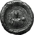
 An armored car, captured from the ALA ( Arab Liberation Army- Kaukji's army) on 1948. The car still carries the ALA emblem, a dagger stabbing a Star of David. It was captured after the ALA defeat in the Galilee and his flight from Palestine campaign.

Article(s): Arab Liberation Army
Request:
- This question is a continuation of a previous discussion here. I have uploaded a good quality image as opposed to the low quality image of the previous discussion, which was scanned from a book.
Since previously it was suggested the the "a dagger stabbing a "Shield of David"" is "doctored", will you please have your opinion whether the emblem might be "doctored" this time too?
The same armored car, but without the camouflage painting, is seen here:
- http://ww2photo.se/tanks/can/armerc/otter1.htm.
- http://www.iwm.org.uk/collections/search?query=otter+car&submit=&items_per_page=10
More about this type of armored car: Otter Light Reconnaissance Car.
Looking at the background, there are sources who describe verbally the emblem as is] (some of with a slight modification).
The source for this image is the Haganah / I.D.F archive, where they claim to have more photos with the same emblem Ykantor ( talk) 09:02, 6 December 2013 (UTC)
Graphist opinion(s):
- In the last discussion, the further I got into it, the less I was convinced the photos had been doctored. While at first glance they certainly looked doctored (that is, the emblem appeared to be added to the photo after it was taken), my opinion now is that they probably were not. The high resolution photo you offer further suggests they were not doctored. All that said, I wouldn't support erasing all trace of this discussion from the image description pages. There should be a link pointing to these discussions we've had on the subject. – JBarta ( talk) 21:17, 3 December 2013 (UTC)
- I'm not officially a "graphicist" but I do have quite a lot of experience with photo manipulation so I'm posting here. As I said in an earlier discussion, I was not convinced by the arguments that the photo is doctored. Now I am even less convinced. A lot can be learned from this hires image of exactly the same model from a similar angle. On the vehicle with the emblem, especially the lo-res version, it appeared that a corner of the vehicle passed through the left edge of the emblem, giving difficulties of shade and shape as well as raising the question of why someone would paint the emblem around a corner. However, the image I am bringing shows that the panel is completely flat, and the "corner" is just an optical illusion created by the camouflage pattern. I think the photo is genuine. Zero talk 14:10, 6 December 2013 (UTC)
- On the other hand, I strongly disagree with the description of the emblem. You can say that the dagger is stabbing the Magen David all you like, but it simply isn't. Take a fresh look; that dagger is sitting flat on top of the Magen David with a small sheath to hold it there. That dagger is not stabbing or even menacing the star. It doesn't make any sense as an Arab emblem. I think it is a Jewish emblem.
Zero
talk
14:10, 6 December 2013 (UTC)
- to Zero: yours:""That dagger is not stabbing or even menacing the star'". Why will not you magnify the image and see for yourself?
Ykantor (
talk)
16:44, 6 December 2013 (UTC)
- I did that before posting, gimme a break. I stand by my assessment. Stabbing looks nothing like that.
Zero
talk
02:37, 7 December 2013 (UTC)
-
Full Definition of STAB, transitive verb, : to wound or pierce by the thrust of a pointed object or weapon . "Merriam-webster" does not agree with you.
Ykantor (
talk)
06:49, 7 December 2013 (UTC)
- That's funny. Well, if I have to get stabbed by someone I'll choose you to maximise my chance of survival. Here is what it really looks like (warning: graphic and disturbing). Zero talk 07:29, 7 December 2013 (UTC)
- But "Merriam-webster" does not agree with you yet.
Ykantor (
talk)
09:29, 7 December 2013 (UTC)
- Merriam-webster doesn't agree nor disagree with what Zero0000 says. Anybody can see that the dagger doesn't stab the Magen David. But it is not the issue.
Pluto2012 (
talk)
13:50, 7 December 2013 (UTC)
- Do you know better than Merriam-webster? Ykantor ( talk) 14:45, 7 December 2013 (UTC)
- Merriam-webster doesn't agree nor disagree with what Zero0000 says. Anybody can see that the dagger doesn't stab the Magen David. But it is not the issue.
Pluto2012 (
talk)
13:50, 7 December 2013 (UTC)
-
Full Definition of STAB, transitive verb, : to wound or pierce by the thrust of a pointed object or weapon . "Merriam-webster" does not agree with you.
Ykantor (
talk)
06:49, 7 December 2013 (UTC)
- I did that before posting, gimme a break. I stand by my assessment. Stabbing looks nothing like that.
Zero
talk
02:37, 7 December 2013 (UTC)
- to Zero: yours:""That dagger is not stabbing or even menacing the star'". Why will not you magnify the image and see for yourself?
Ykantor (
talk)
16:44, 6 December 2013 (UTC)
- On the other hand, I strongly disagree with the description of the emblem. You can say that the dagger is stabbing the Magen David all you like, but it simply isn't. Take a fresh look; that dagger is sitting flat on top of the Magen David with a small sheath to hold it there. That dagger is not stabbing or even menacing the star. It doesn't make any sense as an Arab emblem. I think it is a Jewish emblem.
Zero
talk
14:10, 6 December 2013 (UTC)
Other comments:
- Could you get an additional image from that archive, along with a brief description of its origin? Perhaps one which - like the written sources cited so far - is dripping blood? –
SJ
+
06:18, 6 December 2013 (UTC)
- to SJ: The archive is not fully digitized, so the process is slow, and depends on their initiative and in me, reminding them frequently. We need lot of patience, and a bit of luck. Ykantor ( talk) 21:40, 6 December 2013 (UTC)
- As Zero notes here, the caption is dubious, and must be rewritten. I have suggested attribution to Benny Morris for the claims that it is an official ALA emblem, and that the dagger stabs at the magen (which it does not appear to, but lies over it). I don't see any problem with the photo, but with its description and the file should clarify, unless a photo with blood-dripping comes up, that we are dealing with an interpretation.
Nishidani (
talk)
14:50, 6 December 2013 (UTC)
- Nish, does Morris refer to this photo? If not, it is OR to present the photo to illustrate Morris' words, especially as it doesn't match Morris' words. It is plausible that there was an ALA emblem like Morris describes but it isn't what appears in the photo.
Zero
talk
15:12, 6 December 2013 (UTC)
- There ya go, chief. Didn't have Morris at my elbow and took refs to him from Ykantor at his word. Without wishing to come over as a brownnoser, I agree with you throughout on this, except for the notion that it might be Jewish, which would be perplexing in context (if a Jewish symbol were on an Arab vehicle, the implication would be that it was placed there by (victorious) Jews). I find nothing problematical with the idea an emblem like this might have been used officially, but find the documentation poor, the caption odd, and its use instrumental. These issues must be clarified before rushing to use them on wiki pages.
Nishidani (
talk)
16:51, 6 December 2013 (UTC)
- Aren't these supposed to be captured Arab vehicles? Of course they would have been immediately put to use (assuming they still worked) and could be painted with Jewish emblems then.
Zero
talk
02:33, 7 December 2013 (UTC)
- It is supposed to be an ALA vehicle that participated to the Yehiam convoy "battle". What is written in Arab below the drawing ?
- Note that if the foolowing document is true, it cannot be a Jewish Symbol : [1] and if it is a Jewish symbol, than the document is a piece of forgery as barely found...
- Pluto2012 ( talk) 08:41, 7 December 2013 (UTC)
- Aren't these supposed to be captured Arab vehicles? Of course they would have been immediately put to use (assuming they still worked) and could be painted with Jewish emblems then.
Zero
talk
02:33, 7 December 2013 (UTC)
- There ya go, chief. Didn't have Morris at my elbow and took refs to him from Ykantor at his word. Without wishing to come over as a brownnoser, I agree with you throughout on this, except for the notion that it might be Jewish, which would be perplexing in context (if a Jewish symbol were on an Arab vehicle, the implication would be that it was placed there by (victorious) Jews). I find nothing problematical with the idea an emblem like this might have been used officially, but find the documentation poor, the caption odd, and its use instrumental. These issues must be clarified before rushing to use them on wiki pages.
Nishidani (
talk)
16:51, 6 December 2013 (UTC)
- Nish, does Morris refer to this photo? If not, it is OR to present the photo to illustrate Morris' words, especially as it doesn't match Morris' words. It is plausible that there was an ALA emblem like Morris describes but it isn't what appears in the photo.
Zero
talk
15:12, 6 December 2013 (UTC)
- You make good points. Of course I don't really know it is a Jewish symbol. All I really know is that something doesn't stack up here. If someone wanted to draw a dagger stabbing a magen david, it would have been so easy to draw it actually embedded in the star as when someone is fatally stabbed, with the dripping blood Morris writes of, instead of held harmlessly against it. As it stands, it is quite innocuous compared to how it could have been. I don't believe that Israel attempted to forge an Arab emblem either, for exactly the same reason (in that case Israel would have made it look gruesome, but it doesn't). Perhaps it is an Arab emblem whose symbolism we don't understand, for example a reference to some other symbol people knew at the time. I don't know.
Zero
talk
12:00, 7 December 2013 (UTC)
- Which means in sum that, if we set aside the secondary sources, all we have visually is a Magen David with a dagger. Sources interpret this as 'stabbing', for which we have, as yet, no visual evidence, since equally one could say the dagger lies atop the magen, as a sword often lies atop a funeral bier of an officer of rank. In the absence of visual evidence, one would have to write, therefore, 'a Magen David with a dagger' (until we, or historians, can sort this out, meaning asking Benny Morris, Henry Laurens, Gilbert Achcar or Philip Mattar). Nishidani ( talk) 12:31, 7 December 2013 (UTC)
- Pluto's
link takes us to a photo appearing in the Egyptian newspaper al-Mussawar, Cairo. April 3, 1948. There is a connect therefore with the report Ykantor mentions that in Cairo at the time 'hotel fronts and billboards were plastered with posters of a dagger dripping blood, on its handle the Star of David emblematic of Zionism.'( Kenneth W. Bilby, New Star in the Near East, Doubleday, 1950 p.7) where the dagger is identified as Zionist.
Nishidani (
talk)
12:39, 7 December 2013 (UTC)
- The inital picture was published by Ynhockey from a 1951's book written Alexander Doran (Lutzki) [2].
- Lutzki was not an historian. He worked for the Arab Department of the Jewish Agency, then for the Israeli Foreign Ministry. He became ambassador. In his book in 1951, he also published a document in French written by the Mufti that was only found back 40 years later in the UN Nations's archives by Wiesenthal Centre. In this document the Mufti stated that he was aware of the Holocaust and was suggesting this to be implemented in Palestine... [3].
-
Pluto2012 (
talk)
13:50, 7 December 2013 (UTC)
- Not related to our problem here directly, Pluto. But if there is a document saying the Mufti suggested the holocaust be implemented in Palestine, that should be immediately cited on the al-Husayni page. The book you cite p.110, does not say that. The Davidic symbol was widespread in medieval Arabic literature as the Jewish Virtual Library article on the Magen shows. Nishidani ( talk) 11:18, 8 December 2013 (UTC)
- You make good points. Of course I don't really know it is a Jewish symbol. All I really know is that something doesn't stack up here. If someone wanted to draw a dagger stabbing a magen david, it would have been so easy to draw it actually embedded in the star as when someone is fatally stabbed, with the dripping blood Morris writes of, instead of held harmlessly against it. As it stands, it is quite innocuous compared to how it could have been. I don't believe that Israel attempted to forge an Arab emblem either, for exactly the same reason (in that case Israel would have made it look gruesome, but it doesn't). Perhaps it is an Arab emblem whose symbolism we don't understand, for example a reference to some other symbol people knew at the time. I don't know.
Zero
talk
12:00, 7 December 2013 (UTC)
The word "stabbing" is my personal translation of the image title, taken from this Dotan book. I have just tried Google translation, which results in: stuck, thrusted, inserted. Ykantor ( talk)


Article(s): Samuel Nicholas
Request:
- trim to oval... -- Kintetsubuffalo ( talk) 04:48, 28 December 2013 (UTC)
Graphist opinion(s):
 Done. I also made a png with transparent background for the infobox, but can't upload it (using DerivativeFX) until the licensing is sorted.
nagualdesign (
talk)
06:01, 28 December 2013 (UTC)
Done. I also made a png with transparent background for the infobox, but can't upload it (using DerivativeFX) until the licensing is sorted.
nagualdesign (
talk)
06:01, 28 December 2013 (UTC)
- Thanks! What licensing thing needs sorted? Is the original wrong?--
Kintetsubuffalo (
talk)
09:10, 28 December 2013 (UTC)
- In all honesty I have no idea. I'm not very good at that sort of thing. I was just trying to upload using DerivativeFX and it spat the dummy out. Give me a few minutes and I'll retry... nagualdesign ( talk) 09:20, 28 December 2013 (UTC)
- ...Nope. Sorry, it's still throwing up an error.
nagualdesign (
talk)
09:24, 28 December 2013 (UTC)
- I uploaded using the basic upload form. nagualdesign ( talk) 04:05, 1 January 2014 (UTC)
- Thanks! What licensing thing needs sorted? Is the original wrong?--
Kintetsubuffalo (
talk)
09:10, 28 December 2013 (UTC)

Article(s): Rosalynn Carter
Request:
- trim uneven white space... -- Kintetsubuffalo ( talk) 09:19, 28 December 2013 (UTC)
Graphist opinion(s):
- Done I quite liked the left-right balance, actually. (Uneven ≠ unbalanced.) Although it was a tad more artistic than encyclopedic.
nagualdesign (
talk)
09:38, 28 December 2013 (UTC)
- Really? Maybe it's a trait I don't have, it looked wrong to me. Something about aspect ratio or where the face is supposed to be?--
Kintetsubuffalo (
talk)
10:19, 28 December 2013 (UTC)
- Photographers often avoid placing their subject in the centre of the frame, so as to add interest to the composition. Encyclopedic images are normally dead centre. But even now I've left more lead room on the right than on the left. Hair doesn't carry the same 'weight' (in the compositional sense) as the profile of a face. nagualdesign ( talk) 05:54, 1 January 2014 (UTC)
- Really? Maybe it's a trait I don't have, it looked wrong to me. Something about aspect ratio or where the face is supposed to be?--
Kintetsubuffalo (
talk)
10:19, 28 December 2013 (UTC)

Article(s): Tuva
Request:
- rotate to straight, even out border... -- Kintetsubuffalo ( talk) 13:07, 1 January 2014 (UTC)
Graphist opinion(s):
- Done. Also cleaned background.
nagualdesign (
talk)
14:09, 1 January 2014 (UTC)
- Beautiful, thank you!-- Kintetsubuffalo ( talk) 06:23, 2 January 2014 (UTC)


Article(s): Pliny the elder
Request:
- oval-cut png, please. whatever text is at the bottom is too small to be legible... -- Kintetsubuffalo ( talk) 03:15, 1 January 2014 (UTC)
Graphist opinion(s):
- Done. Also uploaded transparent version.
nagualdesign (
talk)
04:00, 1 January 2014 (UTC)
- Perfect! Much bueno-er!-- Kintetsubuffalo ( talk) 05:31, 1 January 2014 (UTC)
-
 Parks Covered Bridge in Ohio, USA

Article(s): National Register of Historic Places listings in Perry County, Ohio
Request:
- Unfortunately, I've never gotten a program that can do lossless image rotation. Nyttend ( talk) 06:29, 1 January 2014 (UTC)
Graphist opinion(s):
- Done multiple changes, including rotation. FYI, there's no such thing as lossless image rotation, only good and bad algorithms (and of course sloppy and careful execution). Generally speaking, rotation causes loss of acutance/blurring, which can be remedied via careful sharpening. Hope that helps. Regards,
nagualdesign (
talk)
07:34, 1 January 2014 (UTC)
.jpg)
.jpg)
Article(s): Paul P. Kanoa
Request:
- Crop and create as derivative
commons:File:Legislature of the Kingdom of Hawaii in 1886 (crop).jpg and clean if need be Thanks.--
KAVEBEAR (
talk)
07:52, 1 January 2014 (UTC)
- Can you crop a picture of John Smith Walker, Luther Aholo and Paul P. Kanoa to use on Ministry of Finance (Hawaii), Ministry of Foreign Affairs (Hawaii) and Ministry of the Interior (Hawaii)?-- KAVEBEAR ( talk) 19:50, 2 January 2014 (UTC)
Graphist opinion(s):
- Cropped and uploaded, ready for cleaning. I didn't straighten this image as it would have likely cut through the gentleman on the far right (Hana Kaai). It can be done though, I'm sure, but I'll let someone else have a go.
nagualdesign (
talk)
08:07, 1 January 2014 (UTC)
- Done - Straightened and cleaned.
nagualdesign (
talk)
10:41, 1 January 2014 (UTC)
- Thanks.-- KAVEBEAR ( talk) 23:17, 1 January 2014 (UTC)
Can you crop a picture of John Smith Walker, Luther Aholo and Paul P. Kanoa to use on Ministry of Finance (Hawaii), Ministry of Foreign Affairs (Hawaii) and Ministry of the Interior (Hawaii)?-- KAVEBEAR ( talk) 19:50, 2 January 2014 (UTC)
- From this image? I think the individuals are a little too small for any crops to be useful. Sorry. Perhaps you could use the whole image, and copy the text that was cropped (from the original) into the file page description, so everyone can see who's who, then on the thumbnail you could use the caption, "Back row, 3rd from left", or whatever. nagualdesign ( talk) 04:20, 4 January 2014 (UTC)
- ..Better yet, you could add annotations to the image file page. nagualdesign ( talk) 05:28, 4 January 2014 (UTC)
-
 Maximilian I
 -
 Charles VII


Article(s): Maximilian I, Holy Roman Emperor, Charles VII, Holy Roman Emperor
Request:
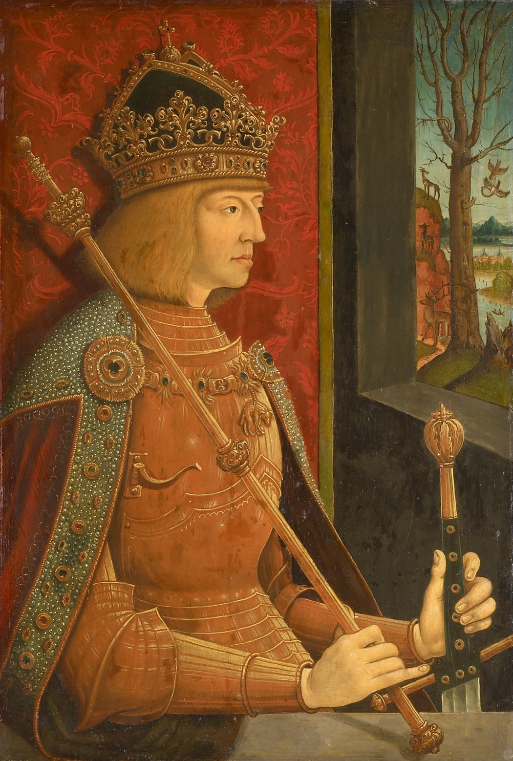
- Could someone possibly improve the quality of the above portrait (Maximilian I), to look like
this one please, many thanks.
TRAJAN 117 (
talk)
16:31, 2 January 2014 (UTC)
- Please also improve the quality of Charles VII,s portrait as well, many thanks. TRAJAN 117 ( talk) 17:17, 2 January 2014 (UTC)
Graphist opinion(s):
- I made an attempt to adjust Maximilian I. In all honesty I'm not really happy with it. Although the image is larger, it has less tonal detail than the smaller image, particularly in the shadows. Attempting to match the two left the blacks looking milky. Perhaps someone else will have more success. Failing that, I'd suggest ignoring the smaller image and giving free rein to improve the image in whatever way possible. nagualdesign ( talk) 17:31, 2 January 2014 (UTC)
Note: Download the original upload (6.73MB) before editing!
- Unless you have some reliable evidence that these two images do NOT accurately reflect what these two paintings look like I think the best choice is to do nothing to them at all as any changes may result in a material misrepresentation of the original artworks.
Centpacrr (
talk)
23:34, 2 January 2014 (UTC)
- Well, they can't both be accurate can they. One or both of them are definitely wrong, right?
nagualdesign (
talk)
17:43, 6 January 2014 (UTC)
- I would revert the current images of both portraits to the original uploads, but I am not the OP so it is not my call. What this section asks for is "Graphist opinion(s)" and so that what this is. Sorry if it was not made clear enough to anyone that what I meant by doing "nothing at all" was to use the original files. Centpacrr ( talk) 19:20, 6 January 2014 (UTC)
- Well, they can't both be accurate can they. One or both of them are definitely wrong, right?
nagualdesign (
talk)
17:43, 6 January 2014 (UTC)

Article(s): Eduard Shevardnadze and many other articles
Request:
- Please clear the noise. -- Երևանցի talk 01:30, 3 January 2014 (UTC)
Graphist opinion(s): The noise you are talking about is really just the grain of the film and only really visible at full resolution. I've softened the background just a bit but left the face and hands alone to retain detail. I don't think it really needs anything else as the grain is not even really noticeable at normal web viewing size in the article. This to me is a case where "less is more". Centpacrr ( talk) 03:30, 3 January 2014 (UTC)
- I guess you're right. Thanks. -- Երևանցի talk 21:45, 4 January 2014 (UTC)
.jpg)
Article(s): Charles Ezra Sprague
Request:
- remove left shading from (presumably) book spine... -- Kintetsubuffalo ( talk) 09:37, 3 January 2014 (UTC)
Graphist opinion(s):![]() Done
Centpacrr (
talk)
16:40, 3 January 2014 (UTC)
Done
Centpacrr (
talk)
16:40, 3 January 2014 (UTC)
- Back, thank you!--
Kintetsubuffalo (
talk)
08:18, 5 January 2014 (UTC)
- ps, can you trim off a bit of that unneeded background now that the shading is gone? Thanks.-- Kintetsubuffalo ( talk) 08:18, 5 January 2014 (UTC)
-
 Seal of Berengar I

Article(s): Berengar I of Italy
Request:
- Crop, and remove the excess around the seal. TRAJAN 117 ( talk) 11:24, 3 January 2014 (UTC)
Graphist opinion(s):![]() Done
Centpacrr (
talk)
16:40, 3 January 2014 (UTC)
Done
Centpacrr (
talk)
16:40, 3 January 2014 (UTC)
- Looks great, many thanks! TRAJAN 117 ( talk) 10:36, 4 January 2014 (UTC)
-
 Sir Charles Kennedy c. 1894

Article(s): Charles Kennedy (diplomat)
Request:
- Very old and faded photograph, can anything be done to restore/improve it? -- January ( talk) 13:23, 4 January 2014 (UTC)
Graphist opinion(s):
![]() Done Cropped, greyscale, cleanup - mostly face, contrast adjustments for detail. (
Hohum
@)
17:33, 4 January 2014 (UTC)
Done Cropped, greyscale, cleanup - mostly face, contrast adjustments for detail. (
Hohum
@)
17:33, 4 January 2014 (UTC)
- Cropped a little further and did much more complete cleanup and restoration. Centpacrr ( talk) 23:22, 4 January 2014 (UTC)
-
 Seal of Charles the Great Done
 -
 Seal of Otto I Done
 -
 Seal of Otto III Done
 -
 Seal of Henry II Done
 -
 Seal of Conrad II Done
 -
 Seal of Henry III Done
 -
 Seal of Henry IV Done
 -
 Seal of Henry V Done
 -
 Seal of Lothair III Done


Article(s): Holy Roman Emperor
Request:
- Crop restore, and remove backgrounds where necessary. TRAJAN 117 ( talk) 23:49, 4 January 2014 (UTC)
Graphist opinion(s):
File:Abdullah Azzam Brigades Logo.jpg
Article(s): Abdullah Azzam Brigades
Request:
- remove background, trim to circle... -- Kintetsubuffalo ( talk) 07:15, 5 January 2014 (UTC)
Graphist opinion(s):![]() Done
Centpacrr (
talk)
16:19, 5 January 2014 (UTC)
Done
Centpacrr (
talk)
16:19, 5 January 2014 (UTC)
- Great, thank you!-- Kintetsubuffalo ( talk) 09:59, 6 January 2014 (UTC)

Article(s): Francis_Bacon
Request:
- trim a little closer oval, there's a bippy at the top and you can make out pixels... -- Kintetsubuffalo ( talk) 12:51, 5 January 2014 (UTC)
Graphist opinion(s):
- Done - Kind regards,
Fallschirmjäger
✉
15:18, 5 January 2014 (UTC)
- Fantastic, that's much smoother! Kintetsubuffalo ( talk) 10:05, 6 January 2014 (UTC)
-
 Confederate Memorial's inscription

Article(s): Confederate Memorial (Romney, West Virginia)
Request:
- To the phenomenally gifted graphists, would it be possible to rotate this image slightly to the left and crop it so that it focuses more closely on the memorial's inscription? I'd also like to see if it's possible to sharpen the text so that it is more legible. Thank you! -- Caponer ( talk) 18:31, 5 January 2014 (UTC)
Graphist opinion(s):![]() Done Rotated 2.5º CCW, cropped & slightly sharpened as requested.
Centpacrr (
talk)
19:10, 5 January 2014 (UTC)
Done Rotated 2.5º CCW, cropped & slightly sharpened as requested.
Centpacrr (
talk)
19:10, 5 January 2014 (UTC)
- Thank you Centpacrr! Job well done! -- Caponer ( talk) 19:12, 5 January 2014 (UTC)
-
 Confederate Memorial in Romney, West Virginia

Article(s): Confederate Memorial (Romney, West Virginia)
Request:
- To the graphists, I apologize for not including this image with the one above. Would it also be possible to slightly rotate this image to the left and sharpen it so that the memorial is more clearly visible? The background light obscures the memorial's detailing. I'll leave any other edits to the discretion of the very talented graphists. -- Caponer ( talk) 19:18, 5 January 2014 (UTC)
Graphist opinion(s):![]() Done Rotated 2.5ºCCW, agma, crop, increase contrast of inscription to make it more readable.
Centpacrr (
talk)
19:53, 5 January 2014 (UTC)
Done Rotated 2.5ºCCW, agma, crop, increase contrast of inscription to make it more readable.
Centpacrr (
talk)
19:53, 5 January 2014 (UTC)
- As always, terrific job Centpacrr! -- Caponer ( talk) 20:23, 5 January 2014 (UTC)
-

-
 vignetting removed

.jpg)
Article(s): Adam Levine
Request:
- Remove vignetting and upload separately. I haven't been able to do it, sadly.-- — Crisco 1492 ( talk) 11:41, 6 January 2014 (UTC)
- Thanks. — Crisco 1492 ( talk) 13:55, 6 January 2014 (UTC)
Graphist opinion(s):![]() Done
Centpacrr (
talk)
16:17, 6 January 2014 (UTC)
Done
Centpacrr (
talk)
16:17, 6 January 2014 (UTC)
-
-
 also remove the two golden stickers(?)


Article(s): Red Fort
Request:
- I cannot remove the reflection at the edges. Is it possible to smooth these parts out without cropping. Feel free to use the source material if it helps. On the second one also please remove these two golden stickers, I am not quite sure what they are, but the painting underneath shimmers slightly through. --
Gryffindor (
talk)
20:36, 6 January 2014 (UTC)
- Thank you. Could you also please smoothe the edges a little bit without cutting any of the picture itself, I wasn't able to crop properly with the circle and the edges still look rather rough.
Gryffindor (
talk)
10:28, 7 January 2014 (UTC)
- Perfect, thank you very much. Gryffindor ( talk) 13:59, 7 January 2014 (UTC)
- Thank you. Could you also please smoothe the edges a little bit without cutting any of the picture itself, I wasn't able to crop properly with the circle and the edges still look rather rough.
Gryffindor (
talk)
10:28, 7 January 2014 (UTC)
Graphist opinion(s):![]() Done
Centpacrr (
talk)
00:41, 7 January 2014 (UTC)
Done
Centpacrr (
talk)
00:41, 7 January 2014 (UTC)
-
 Coat of Arms of Jaqeli family

Article(s): House of Jaqeli
Request:
- Please remove that yellow outline around the wild goat and the banner. Jaqeli ( talk) 17:44, 7 January 2014 (UTC)
Graphist opinion(s):![]() Done
Centpacrr (
talk)
18:16, 7 January 2014 (UTC)
Done
Centpacrr (
talk)
18:16, 7 January 2014 (UTC)
Article: HMS Phoebe (43)
The picture of this ship arriving in Valetta, Malta, (at the beginning of the article), is marked in the summary as '1949', but in the Comment box '1939'.
Which is the correct year? The ship's article picture caption states her arriving, but it doesn't say when.
Clicking on the image only gives a talk page which says: "There are many things this page is NOT for"... one of them is:
"Requesting corrections to the image (try the talk page of an article that the image is used in, or contact the graphics lab.)"
So I've come here. RASAM ( talk) 22:11, 7 January 2014 (UTC)
- This page is not for historical investigation, sorry. Look at the other sections to see what sort of things are done here. Zero talk 13:04, 8 January 2014 (UTC)
.jpg)
Article(s): Theodora
Request:
- make background white and/or pngify... -- Kintetsubuffalo ( talk) 02:54, 11 January 2014 (UTC)
Graphist opinion(s):I fixed the image for you but I am unable to upload because the host page for the image is locked. I have therefore uploaded it to my own server here from which you can access it and upload it whenever the WP image host page is unlocked. Sorry. Centpacrr ( talk) 03:07, 11 January 2014 (UTC)
- Thank you! I'm going to be gone for a bit, the image will be unlocked when the mainpage flips to the new date.-- Kintetsubuffalo ( talk) 03:48, 11 January 2014 (UTC)

Article(s): Israel Druze Boy and Girl Scout Association
Request:
- fix warp-should be round... -- Kintetsubuffalo ( talk) 03:46, 11 January 2014 (UTC)
Graphist opinion(s):
![]() Done -
Fallschirmjäger
✉
16:03, 11 January 2014 (UTC)
Done -
Fallschirmjäger
✉
16:03, 11 January 2014 (UTC)
- Thank you, much better!-- Kintetsubuffalo ( talk) 04:00, 12 January 2014 (UTC)

Article(s): Oscar Charleston
Request:
- um, wow, where to begin? this is terrible... -- Kintetsubuffalo ( talk) 05:16, 11 January 2014 (UTC)
Graphist opinion(s):
- I'm all for polishing turds if I think I can get a slight sheen, but there's another phrase that springs to mind here; If you start with sh*t, you end up with crap. This image is unworthy of article space, IMO. nagualdesign ( talk) 01:34, 12 January 2014 (UTC)
- There is not much to work with with this image but I have tweaked it a bit and think it at least slightly better. Keep it if you like, Kintetsubuffalo, or revert if not.
Centpacrr (
talk)
02:51, 12 January 2014 (UTC)
- Centpacrr. You have introduced light pink areas in the background. (
Hohum
@)
15:28, 12 January 2014 (UTC)
- Corrected. Centpacrr ( talk) 16:39, 12 January 2014 (UTC)
- Centpacrr. You have introduced light pink areas in the background. (
Hohum
@)
15:28, 12 January 2014 (UTC)
- There is not much to work with with this image but I have tweaked it a bit and think it at least slightly better. Keep it if you like, Kintetsubuffalo, or revert if not.
Centpacrr (
talk)
02:51, 12 January 2014 (UTC)
- Thanks. It's a shame, as there are 7 really nice images at
http://badassoftheweek.com/index.cgi?id=76256892766 Since he's long deceased, can we make a case for uploading a better one?--
Kintetsubuffalo (
talk)
04:05, 12 January 2014 (UTC)
- Any image published before 1923 with or without ©, or any image published before 1978 without © is public domain. If one of those qualifies then it can be used. Centpacrr ( talk) 04:45, 12 January 2014 (UTC)
-
 Romney Depot in 1886

Article(s): Valley, West Virginia
Request:
- To the multi-talented Wikipedia Graphists, could you please sharpen this black and white image, and if possible, could you "equalize" the image's color--it was taken with my iPhone, and there are multiple reflections of light within the photo. I'm not sure if this can be remedied, but if so, it would be greatly appreciated! Thank you for all your amazing work! -- Caponer ( talk) 20:30, 12 January 2014 (UTC)
Graphist opinion(s):![]() Done Tweaked as requested.
Centpacrr (
talk)
03:42, 13 January 2014 (UTC)
Done Tweaked as requested.
Centpacrr (
talk)
03:42, 13 January 2014 (UTC)
- Thank you, as always, Centpacrr! It looks better than it did in 1886! -- Caponer ( talk) 07:38, 13 January 2014 (UTC)

Article(s): Hans Lippershey
Request:
- trim, maybe new version?... -- Kintetsubuffalo ( talk) 02:55, 13 January 2014 (UTC)
Graphist opinion(s):![]() Done Tweaked as requested.
Centpacrr (
talk)
03:55, 13 January 2014 (UTC)
Done Tweaked as requested.
Centpacrr (
talk)
03:55, 13 January 2014 (UTC)

Article(s): Christiane Vulpius
Request:
- remove yellowing and extra space... -- Kintetsubuffalo ( talk) 07:27, 13 January 2014 (UTC)
Graphist opinion(s):![]() Done
Centpacrr (
talk)
08:04, 13 January 2014 (UTC)
Done
Centpacrr (
talk)
08:04, 13 January 2014 (UTC)
- That's it, thank you!-- Kintetsubuffalo ( talk) 09:03, 13 January 2014 (UTC)
_Major-General_Charles_George_Gordon_greeting_reinforcements_at_Khartoum_in_1885-_TIMEA.jpg)
Article(s): Charles George Gordon
Request:
- rotate and crop... -- Kintetsubuffalo ( talk) 13:08, 13 January 2014 (UTC)
Graphist opinion(s):![]() Done Rotated 2.4ºCCW and croped.
Centpacrr (
talk)
14:56, 13 January 2014 (UTC)
Done Rotated 2.4ºCCW and croped.
Centpacrr (
talk)
14:56, 13 January 2014 (UTC)
- Thank you!-- Kintetsubuffalo ( talk) 05:07, 25 January 2014 (UTC)
-
 Statue of Plácido Domingo in Mexico City

Article(s): Plácido Domingo
Request:
- I think this pic needs some light adjustment (first of all white balance), since it was taken against the light. The light in the background seems to be too bright. I tried with some GIMP filters, with poor results.-- Carnby ( talk) 13:49, 13 January 2014 (UTC)
Graphist opinion(s):
-
 Request taken by --
Victor•
talk
21:59, 13 January 2014 (UTC).
Request taken by --
Victor•
talk
21:59, 13 January 2014 (UTC).
- Done --
Victor•
talk
11:20, 15 January 2014 (UTC)
- Thank you!-- Carnby ( talk) 17:22, 15 January 2014 (UTC)
-
 The office of the president at the Presidential Palace in Warsaw

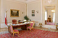
Article(s): President_of_Poland
Request:
- Could you please try to remove fisheye effect, without deleting too much (e.g. the R. P. and the eagle in the upper right corner)?-- Carnby ( talk) 21:28, 14 January 2014 (UTC)
Graphist opinion(s):![]() Done
Centpacrr (
talk)
23:04, 14 January 2014 (UTC)
Done
Centpacrr (
talk)
23:04, 14 January 2014 (UTC)
- Thank you!--
Carnby (
talk)
17:22, 15 January 2014 (UTC)
- I had a go at it and worked from the original to reapply the lens correction, as Centpacrr's version was good but a little blurry. I also kept the same image width. Feel free to revert if you prefer Centpacrr's version. Cheers,
Fallschirmjäger
✉
22:38, 15 January 2014 (UTC)
- I understand, probaly your version is slightly better but you have partially cut off the R. P. and the eagle in the upper right corner...--
Carnby (
talk)
07:32, 23 January 2014 (UTC)
- Readjusted image from original being sure to not cut off any portion of the Eagle and R P. Centpacrr ( talk) 08:25, 23 January 2014 (UTC)
- Now it looks good. Thanks a lot!-- Carnby ( talk) 19:58, 24 January 2014 (UTC)
- I understand, probaly your version is slightly better but you have partially cut off the R. P. and the eagle in the upper right corner...--
Carnby (
talk)
07:32, 23 January 2014 (UTC)
- I had a go at it and worked from the original to reapply the lens correction, as Centpacrr's version was good but a little blurry. I also kept the same image width. Feel free to revert if you prefer Centpacrr's version. Cheers,
Fallschirmjäger
✉
22:38, 15 January 2014 (UTC)
-
 Photo
Photo

Article(s): Jammu-Sialkot Line
Request:
- Can you try to enhance the image, and remove the flash reflection on the glass? Thanks -- RaviC ( talk) 00:18, 16 January 2014 (UTC)
Graphist opinion(s):
![]() Request taken by
Centpacrr (
talk) 00:24, 16 January 2014 (UTC).
Request taken by
Centpacrr (
talk) 00:24, 16 January 2014 (UTC).
![]() Done Removed flash and other reflections; agma; crp.
Centpacrr (
talk)
00:52, 16 January 2014 (UTC)
Done Removed flash and other reflections; agma; crp.
Centpacrr (
talk)
00:52, 16 January 2014 (UTC)
-
- Thanks! -- RaviC ( talk) 00:57, 16 January 2014 (UTC)

Article(s): Carl Yastrzemski
Request:
- Hi, I uploaded this image a while ago, but when I attempted to crop it, as you can see in the image above, it became completely darkened. Could someone attempt to do the same crop, but without the darkening? Thanks.-- Delaywaves • talk 03:13, 16 January 2014 (UTC)
Graphist opinion(s):
- Request taken. --
Victor•
talk
03:48, 16 January 2014 (UTC)
![]() Done
Centpacrr (
talk)
05:44, 16 January 2014 (UTC)
Done
Centpacrr (
talk)
05:44, 16 January 2014 (UTC)
- Re-cropped from the original at File:Carl Yastrzemski at Fenway Park.jpg without jpg pixelation in dark areas. ( Hohum @) 01:49, 19 January 2014 (UTC)
-
 Krikor Torosyan

Article(s): Krikor Torosyan (Future article)
Request:
- If there's anyway we can reduce the blur that would be great. Also, I think the picture needs a little straightening to meet a better vertical position. The outer black circle frame needs to be more solid. Any other general improvements to the pic would be great. Thanks in advance. Etienne Dolet ( talk) 06:18, 16 January 2014 (UTC)
Graphist opinion(s):
![]() Request taken by
Centpacrr (
talk) 06:51, 16 January 2014 (UTC).
Request taken by
Centpacrr (
talk) 06:51, 16 January 2014 (UTC). ![]() Done
Centpacrr (
talk)
07:23, 16 January 2014 (UTC)
Done
Centpacrr (
talk)
07:23, 16 January 2014 (UTC)
-
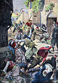 Armenian Genocide in the Petit Journal

Article(s): Press coverage during the Armenian Genocide
Request:
- Very very valuable photograph that I have just uploaded. The quality is not too good. I am hoping to make it like this...
[4]. If it's too big of a task, no worries. Any general improvements to this valuable photograph will do.
Etienne Dolet (
talk)
07:53, 16 January 2014 (UTC)
- Thanks! Aren't the colors a bit harsh though? I was hoping it can come out like this... [5]. Étienne Dolet ( talk) 23:24, 18 January 2014 (UTC)
Graphist opinion(s):I have desaturated the colors a bit. The smaller image, however, appears to be of a painting while this image looks like a reproduction of a hand colored engraving of that painting to me so it will not have nearly the range of colors of the original art work. Centpacrr ( talk) 01:34, 19 January 2014 (UTC)

Article(s): Negoro-ji
Request:
- fix seam and warp... -- Kintetsubuffalo ( talk) 08:50, 18 January 2014 (UTC)
Graphist opinion(s):![]() Done
Centpacrr (
talk)
09:26, 18 January 2014 (UTC)
Done
Centpacrr (
talk)
09:26, 18 January 2014 (UTC)
- Thanks, except it doesn't have a black frame all around it, that was residual from being copied from a book.-- Kintetsubuffalo ( talk) 12:29, 18 January 2014 (UTC)
- That's it, thank you guys!-- Kintetsubuffalo ( talk) 17:36, 18 January 2014 (UTC)
-
 Ilia Chavchavadze
 -
 Transparent png


Article(s): Ilia Chavchavadze
Request:
- Please crop it in an oval form by making it transparent with PNG/SVG around it. Jaqeli ( talk) 18:30, 19 January 2014 (UTC)
Graphist opinion(s):
- Done - Cropped to transparent oval and converted to black & white.
Fallschirmjäger
✉
21:15, 19 January 2014 (UTC)
- @ Fallschirmjäger: Thank you. Jaqeli ( talk) 10:43, 20 January 2014 (UTC)
-
 Valley View

Article(s): Valley View (Romney, West Virginia)
Request:
- To the talented and creative graphists, I am requesting that the above image be lightened, perhaps by modifying the article's light contrast. I'm open to other suggestions to enhance this image. Thank you for all your wonderful contributions to Wikipedia! -- Caponer ( talk) 03:21, 20 January 2014 (UTC)
Graphist opinion(s):
![]() Request taken by
Centpacrr (
talk) 05:14, 20 January 2014 (UTC). Adjusted gamma to show detail of area in shadow.
Centpacrr (
talk)
05:40, 20 January 2014 (UTC)
Request taken by
Centpacrr (
talk) 05:14, 20 January 2014 (UTC). Adjusted gamma to show detail of area in shadow.
Centpacrr (
talk)
05:40, 20 January 2014 (UTC)
- Centpacrr, thank you as always for your brilliant work! -- Caponer ( talk) 01:24, 21 January 2014 (UTC)


Article(s): Heraclius I of Kakheti and Teimuraz II of Georgia
Request:
- Please remove and crop the text out from the first pic and if possible colorize the picture of King Heraclius.
- Please crop the second pic of King Teimuraz in an oval form by making it transparent with PNG/SVG around it.
Thank you. Jaqeli ( talk) 12:29, 20 January 2014 (UTC)
Graphist opinion(s):
-
Request taken by
Carnby (
talk)
18:21, 21 January 2014 (UTC). Do you need separate versions of the cropped images?
- @
Carnby: Yes it would be better if they're seperate versions.
Jaqeli (
talk)
19:39, 21 January 2014 (UTC)
- Done--
Carnby (
talk)
20:26, 21 January 2014 (UTC)
- @ Carnby: Thanks a lot. Jaqeli ( talk) 21:49, 21 January 2014 (UTC)
- @
Carnby: Yes it would be better if they're seperate versions.
Jaqeli (
talk)
19:39, 21 January 2014 (UTC)
Logo of Tbilisi Metro
-
 Logo
Logo
Article(s): Tbilisi Metro
Request:
- Please vectorize and make the logo transparent PNG/SVG by removing the white around "M" Jaqeli ( talk) 13:56, 21 January 2014 (UTC)
Graphist opinion(s):
- Done?--
Carnby (
talk)
20:26, 21 January 2014 (UTC)
- @ Carnby: Thanks for the logo as well. Jaqeli ( talk) 21:50, 21 January 2014 (UTC)
-
 Signature
 -
 Vector version
 -
 Signature
 -
 Vector version


Article(s): Teimuraz II of Georgia and Archil of Imereti
Request:
- Please vectorize these signatures by making them PNG/SVG transparent. Thank you. Jaqeli ( talk) 22:30, 21 January 2014 (UTC)
Graphist opinion(s):
- Done I would like to know if they look good.--
Carnby (
talk)
20:13, 22 January 2014 (UTC)
- They're perfect. Thanks a lot again. Jaqeli ( talk) 21:37, 22 January 2014 (UTC)
-
 Signature of George V of Georgia
 -
 Vector version
 -
 Signature of David IV of Georgia
 -
 Vector version
 -
 Signature of Tamar of Georgia
 -
 Vector version
 -
 Signature of Vakhtang VI of Kartli
 -
 Vector version


Article(s): Articles presented above.
Request:
- Please vectorize these signatures into SVG format. Jaqeli ( talk) 10:42, 23 January 2014 (UTC)
Graphist opinion(s):
- Done Are they good?--
Carnby (
talk)
22:18, 23 January 2014 (UTC)
- @ Carnby: Thank you Carnby a lot. Can you please if you can vectorize in SVG these 4 more signatures? Jaqeli ( talk) 03:10, 24 January 2014 (UTC)
-
 Signature of George VII of Georgia
 -
 Vector version
 -
 Signature of George VIII of Georgia
 -
 Vector version
 -
 Signature of George IV of Georgia
 -
 Vector version
 -
 Signature of Alexander I of Georgia
 -
 Vector version


![]() Done?--
Carnby (
talk)
18:38, 24 January 2014 (UTC)
Done?--
Carnby (
talk)
18:38, 24 January 2014 (UTC)
- @ Carnby: Thank you. They are all perfect. Jaqeli ( talk) 09:24, 25 January 2014 (UTC)
-
Campaign poster
Article(s): Thai general election, 2014
Request:
- I uploaded this picture verticall from here, but it turned horizontal upon upload. Can someone please flip it? Lihaas ( talk) 14:05, 23 January 2014 (UTC)
Graphist opinion(s):
- Done - Regards,
Fallschirmjäger
✉
17:34, 23 January 2014 (UTC)
- Thanks Lihaas ( talk) 12:52, 25 January 2014 (UTC)
-
 Albert Dubois-Pillet

Article(s): Albert Dubois-Pillet
Request:
- Can the frame be removed? -- MANdARAX • XAЯAbИAM 02:22, 25 January 2014 (UTC)
Graphist opinion(s):![]() Done
Centpacrr (
talk)
03:16, 25 January 2014 (UTC)
Done
Centpacrr (
talk)
03:16, 25 January 2014 (UTC)
- Wow! That was fast. Thanks! MANdARAX • XAЯAbИAM 03:33, 25 January 2014 (UTC)
-

-
 Crop/cut to oval
 -
 Attempt to repair


Article(s): Matthew Phipps Shiel
Request:
- cut to oval... -- Kintetsubuffalo ( talk) 05:05, 25 January 2014 (UTC)
Graphist opinion(s):
- Done Two versions: a simple crop and an attempt to repair/improve the image.--
Carnby (
talk)
11:31, 26 January 2014 (UTC)
- The second one is great! Thank you and thanks for the heads up!-- Kintetsubuffalo ( talk) 16:18, 1 February 2014 (UTC)

Article(s): Richmann
Request:
- trim closer-snippets left at bottom and right... -- Kintetsubuffalo ( talk) 05:12, 25 January 2014 (UTC)
Graphist opinion(s):![]() Done
Centpacrr (
talk)
08:35, 25 January 2014 (UTC)
Done
Centpacrr (
talk)
08:35, 25 January 2014 (UTC)
- Thank you!-- Kintetsubuffalo ( talk) 15:44, 26 January 2014 (UTC)
-
 Signature of Zviad Gamsakhurdia
 -
 Vector version
 -
 Signature of Luarsab II of Kartli
 -
 Vector version


Article(s): Articles presented above.
Request:
- Please SVG vectorize the signatures of President Gamsakhurdia and King Luarsab II. Thank you. Jaqeli ( talk) 10:52, 25 January 2014 (UTC)
Graphist opinion(s):
- Done Are they OK (especially King Luarsab II one)?--
Carnby (
talk)
14:23, 25 January 2014 (UTC)
- Again, they are perfect! Thanks a lot Carnby. If you can and have time can you please vectorize this also? Jaqeli ( talk) 14:34, 25 January 2014 (UTC)
-
 Signature of Pyotr Bagration
 -
 Vector version


![]() Done The signature was in bad conditions especially in the final part, I tried to restore Cyrillic script, but corrections are welcome.--
Carnby (
talk)
15:14, 25 January 2014 (UTC)
Done The signature was in bad conditions especially in the final part, I tried to restore Cyrillic script, but corrections are welcome.--
Carnby (
talk)
15:14, 25 January 2014 (UTC)
- Thank you very much for your work. His cyrillic signature is well done.
Jaqeli (
talk)
15:25, 25 January 2014 (UTC)
- Just looked at the first letter and it should have a circle at little "B" just like it has here
 . Can you please update it if possible?
Jaqeli (
talk)
17:46, 25 January 2014 (UTC)
. Can you please update it if possible?
Jaqeli (
talk)
17:46, 25 January 2014 (UTC)
- Now?--
Carnby (
talk)
20:27, 25 January 2014 (UTC)
- Circle of little "B" needs to be bolder and as in the original picture there was no connection between the letters "B" and "a" so their connection update is wrong and needs to be removed. Please just make circle of "b" bold and remove the connection of "b" to "a".
Jaqeli (
talk)
20:57, 25 January 2014 (UTC)
- Now?--
Carnby (
talk)
21:38, 25 January 2014 (UTC)
- Can you make the circle bolder and can you please close the circle to seem one letter?
Jaqeli (
talk)
21:56, 25 January 2014 (UTC)
- Now?--
Carnby (
talk)
02:13, 26 January 2014 (UTC)
- Now that is golden. Perfect. Thanks a lot. If you have time can you make these also?
Jaqeli (
talk)
11:23, 26 January 2014 (UTC)
- Yep, but remember to give me some feedback after all these vectorizations :-) ( talk) 11:33, 26 January 2014 (UTC)
- Now that is golden. Perfect. Thanks a lot. If you have time can you make these also?
Jaqeli (
talk)
11:23, 26 January 2014 (UTC)
- Now?--
Carnby (
talk)
02:13, 26 January 2014 (UTC)
- Can you make the circle bolder and can you please close the circle to seem one letter?
Jaqeli (
talk)
21:56, 25 January 2014 (UTC)
- Now?--
Carnby (
talk)
21:38, 25 January 2014 (UTC)
- Circle of little "B" needs to be bolder and as in the original picture there was no connection between the letters "B" and "a" so their connection update is wrong and needs to be removed. Please just make circle of "b" bold and remove the connection of "b" to "a".
Jaqeli (
talk)
20:57, 25 January 2014 (UTC)
- Now?--
Carnby (
talk)
20:27, 25 January 2014 (UTC)
- Just looked at the first letter and it should have a circle at little "B" just like it has here
- Thank you very much for your work. His cyrillic signature is well done.
Jaqeli (
talk)
15:25, 25 January 2014 (UTC)
-
 Signature of Shota Rustaveli
 -
 Vector version
 -
 Signature of Teimuraz I of Kakheti
 -
 Vector version
 -
 Signature of Alexander II of Kakheti
 -
 Vector version


![]() Done--
Carnby (
talk)
23:15, 27 January 2014 (UTC)
Done--
Carnby (
talk)
23:15, 27 January 2014 (UTC)
- Thanks again.
Jaqeli (
talk)
23:32, 27 January 2014 (UTC)
- @
Carnby: Just noticed the lines in the signature of King Teimuraz I is not connected in the middle and can you please connect them if possible?
Jaqeli (
talk)
18:35, 28 January 2014 (UTC)
- Where exactly?--
Carnby (
talk)
18:41, 28 January 2014 (UTC)
- @
Carnby: It looks like number 8 in the middle and the line is not connected.
Jaqeli (
talk)
18:53, 28 January 2014 (UTC)
- Now?--
Carnby (
talk)
20:01, 28 January 2014 (UTC)
- Perfect! Thank you. :) Jaqeli ( talk) 20:07, 28 January 2014 (UTC)
- Now?--
Carnby (
talk)
20:01, 28 January 2014 (UTC)
- @
Carnby: It looks like number 8 in the middle and the line is not connected.
Jaqeli (
talk)
18:53, 28 January 2014 (UTC)
- Where exactly?--
Carnby (
talk)
18:41, 28 January 2014 (UTC)
- @
Carnby: Just noticed the lines in the signature of King Teimuraz I is not connected in the middle and can you please connect them if possible?
Jaqeli (
talk)
18:35, 28 January 2014 (UTC)
- Thanks again.
Jaqeli (
talk)
23:32, 27 January 2014 (UTC)
-

-
 Cropped
 -
 Derived work

.jpg)
Article(s): Heinrich Marschner
Request:
- since we're doing signatures, can this one be split from the image?... -- Kintetsubuffalo ( talk) 19:54, 25 January 2014 (UTC)
Graphist opinion(s):
- Done?--
Carnby (
talk)
10:04, 26 January 2014 (UTC)
- Can you trim it from the pic so we can infobox it?--
Kintetsubuffalo (
talk)
16:22, 1 February 2014 (UTC)
- @ Kintetsubuffalo: Now?-- Carnby ( talk) 19:55, 1 February 2014 (UTC)
- Can you trim it from the pic so we can infobox it?--
Kintetsubuffalo (
talk)
16:22, 1 February 2014 (UTC)
- Thank you and thanks for the heads up!-- Kintetsubuffalo ( talk) 14:10, 8 February 2014 (UTC)

Article(s): Ralph Richardson
Request: Could you talented people remove the watermark please? Many thanks -- Loeba (talk) 19:02, 26 January 2014 (UTC)
Graphist opinion(s):
![]() Request taken by
Centpacrr (
talk) 23:35, 26 January 2014 (UTC).
Request taken by
Centpacrr (
talk) 23:35, 26 January 2014 (UTC). ![]() Done
Centpacrr (
talk)
01:10, 27 January 2014 (UTC)
Done
Centpacrr (
talk)
01:10, 27 January 2014 (UTC)
- Fantastic job as always, thank you -- Loeba (talk) 07:36, 27 January 2014 (UTC)
-
 The Silver Cross Tavern pub sign

Article(s): Silver Cross Tavern
Request:
- I think the picture would be better if the colour of the sign could be cleaned up and brightened so the details on the sign can be easier to see. The C of E God Save the Queen! ( talk) 20:29, 26 January 2014 (UTC)
Graphist opinion(s):![]() Done
Centpacrr (
talk)
23:07, 26 January 2014 (UTC)
Done
Centpacrr (
talk)
23:07, 26 January 2014 (UTC)
- Just my opinion: would be better to slightly rotate the image and remove the small dome on the lower left corner?--
Carnby (
talk)
11:31, 28 January 2014 (UTC)
- Done (
Hohum
@)
18:19, 28 January 2014 (UTC)
- Just my opinion: would be better to slightly rotate the image and remove the small dome on the lower left corner?--
Carnby (
talk)
11:31, 28 January 2014 (UTC)

Article(s): Teimuraz I of Kakheti
Request:
- Please remove the white text on the left. Jaqeli ( talk) 11:15, 27 January 2014 (UTC)
Graphist opinion(s):
-
Request taken.
Fallschirmjäger
✉
12:15, 27 January 2014 (UTC)
- Done -
Fallschirmjäger
✉
12:29, 27 January 2014 (UTC)
- Thank you. Jaqeli ( talk) 12:42, 27 January 2014 (UTC)
-

-
 Cropped version
 -
 Transparent version


Article(s): Giorgi Saakadze
Request:
- Please remove the text below and crop it a bit and if it is possible change the colours of a picture for the face to have a bit of a light as it is now too dark. And please upload that file seperately. Thanks. Jaqeli ( talk) 13:30, 27 January 2014 (UTC)
Graphist opinion(s):
- Done?--
Carnby (
talk)
22:14, 27 January 2014 (UTC)
- Is it somehow also possible to remove the yellow background entirely and make it transparent SVG while leaving only the the face as it is now?
Jaqeli (
talk)
23:33, 27 January 2014 (UTC)
- Done--
Carnby (
talk)
23:49, 27 January 2014 (UTC)
- Many thanks Carnby. Jaqeli ( talk) 00:02, 28 January 2014 (UTC)
- Is it somehow also possible to remove the yellow background entirely and make it transparent SVG while leaving only the the face as it is now?
Jaqeli (
talk)
23:33, 27 January 2014 (UTC)
-
 Great Ex Telescope with noise, texture and interference

Article(s): Great Paris Exhibition Telescope of 1900
Request:
- Could you please reduce noise, texture and interference with Fourier analysis? I tried it with a GIMP tutorial but I achieved nothing.-- Carnby ( talk) 14:03, 28 January 2014 (UTC)
Graphist opinion(s):
- Done Fourier analysis doesn't work well when the underlying image is composed of dots and lines in my experienced. Cleaned up mostly by making it greyscale. (
Hohum
@)
18:28, 28 January 2014 (UTC)
- Then uploaded a better scan. (
Hohum
@)
18:33, 28 January 2014 (UTC)
- Excellent!-- Carnby ( talk) 18:38, 28 January 2014 (UTC)
- Then uploaded a better scan. (
Hohum
@)
18:33, 28 January 2014 (UTC)
-

-
 Bigger version without text
.jpg)
_repaired.jpg)
![[1]](https://commons.wikimedia.org/wiki/File:The_army_of_liberation_works_wonders_al_mussawar_19480403.jpg)
![[2]](https://upload.wikimedia.org/wikipedia/commons/archive/8/82/20110423200920!Qawuqjis_armored_vehicle.jpg)
.jpg)
![[4]](http://www.imprescriptible.fr/photographies/massacres/petit-journal.jpg)
Article(s): Demetrius II of Georgia
Request:
- Please remove the white text around the face and chest of King Demetre and if possible increase the size of the picture without damaging its quality. Jaqeli ( talk) 18:30, 28 January 2014 (UTC)
Graphist opinion(s):
- Done Not an easy task, criticism and suggestions are welcome--
Carnby (
talk)
15:23, 31 January 2014 (UTC)
- Thanks a lot again. It is very well done. Jaqeli ( talk) 15:56, 31 January 2014 (UTC)
-
 Signature of Irakli Garibashvili
 -
 Vector version
 -
 Signature of Luarsab I of Kartli
 -
 Vector version
Article(s): Presented above.
Request:
- Please SVG vectorize the signatures. Jaqeli ( talk) 21:27, 29 January 2014 (UTC)
Graphist opinion(s):
- Done--
Carnby (
talk)
15:23, 31 January 2014 (UTC)
- @
Carnby: Perfect. But can you please add one dot in the signature of Prime Minister Garibashvili. It needs one dot next to letter ი
Jaqeli (
talk)
15:54, 31 January 2014 (UTC)
- Now?--
Carnby (
talk)
16:22, 31 January 2014 (UTC)
- Now its great. Thanks. Jaqeli ( talk) 16:33, 31 January 2014 (UTC)
- Now?--
Carnby (
talk)
16:22, 31 January 2014 (UTC)
- @
Carnby: Perfect. But can you please add one dot in the signature of Prime Minister Garibashvili. It needs one dot next to letter ი
Jaqeli (
talk)
15:54, 31 January 2014 (UTC)
-
An armored car, captured from the ALA ( Arab Liberation Army- Kaukji's army) on 1948. The car still carries the ALA emblem, a dagger stabbing a Star of David. It was captured after the ALA defeat in the Galilee and his flight from Palestine campaign.
Article(s): Arab Liberation Army
Request:
- This question is a continuation of a previous discussion here. I have uploaded a good quality image as opposed to the low quality image of the previous discussion, which was scanned from a book.
Since previously it was suggested the the "a dagger stabbing a "Shield of David"" is "doctored", will you please have your opinion whether the emblem might be "doctored" this time too?
The same armored car, but without the camouflage painting, is seen here:
- http://ww2photo.se/tanks/can/armerc/otter1.htm.
- http://www.iwm.org.uk/collections/search?query=otter+car&submit=&items_per_page=10
More about this type of armored car: Otter Light Reconnaissance Car.
Looking at the background, there are sources who describe verbally the emblem as is] (some of with a slight modification).
The source for this image is the Haganah / I.D.F archive, where they claim to have more photos with the same emblem Ykantor ( talk) 09:02, 6 December 2013 (UTC)
Graphist opinion(s):
- In the last discussion, the further I got into it, the less I was convinced the photos had been doctored. While at first glance they certainly looked doctored (that is, the emblem appeared to be added to the photo after it was taken), my opinion now is that they probably were not. The high resolution photo you offer further suggests they were not doctored. All that said, I wouldn't support erasing all trace of this discussion from the image description pages. There should be a link pointing to these discussions we've had on the subject. – JBarta ( talk) 21:17, 3 December 2013 (UTC)
- I'm not officially a "graphicist" but I do have quite a lot of experience with photo manipulation so I'm posting here. As I said in an earlier discussion, I was not convinced by the arguments that the photo is doctored. Now I am even less convinced. A lot can be learned from this hires image of exactly the same model from a similar angle. On the vehicle with the emblem, especially the lo-res version, it appeared that a corner of the vehicle passed through the left edge of the emblem, giving difficulties of shade and shape as well as raising the question of why someone would paint the emblem around a corner. However, the image I am bringing shows that the panel is completely flat, and the "corner" is just an optical illusion created by the camouflage pattern. I think the photo is genuine. Zero talk 14:10, 6 December 2013 (UTC)
- On the other hand, I strongly disagree with the description of the emblem. You can say that the dagger is stabbing the Magen David all you like, but it simply isn't. Take a fresh look; that dagger is sitting flat on top of the Magen David with a small sheath to hold it there. That dagger is not stabbing or even menacing the star. It doesn't make any sense as an Arab emblem. I think it is a Jewish emblem.
Zero
talk
14:10, 6 December 2013 (UTC)
- to Zero: yours:""That dagger is not stabbing or even menacing the star'". Why will not you magnify the image and see for yourself?
Ykantor (
talk)
16:44, 6 December 2013 (UTC)
- I did that before posting, gimme a break. I stand by my assessment. Stabbing looks nothing like that.
Zero
talk
02:37, 7 December 2013 (UTC)
-
Full Definition of STAB, transitive verb, : to wound or pierce by the thrust of a pointed object or weapon . "Merriam-webster" does not agree with you.
Ykantor (
talk)
06:49, 7 December 2013 (UTC)
- That's funny. Well, if I have to get stabbed by someone I'll choose you to maximise my chance of survival. Here is what it really looks like (warning: graphic and disturbing). Zero talk 07:29, 7 December 2013 (UTC)
- But "Merriam-webster" does not agree with you yet.
Ykantor (
talk)
09:29, 7 December 2013 (UTC)
- Merriam-webster doesn't agree nor disagree with what Zero0000 says. Anybody can see that the dagger doesn't stab the Magen David. But it is not the issue.
Pluto2012 (
talk)
13:50, 7 December 2013 (UTC)
- Do you know better than Merriam-webster? Ykantor ( talk) 14:45, 7 December 2013 (UTC)
- Merriam-webster doesn't agree nor disagree with what Zero0000 says. Anybody can see that the dagger doesn't stab the Magen David. But it is not the issue.
Pluto2012 (
talk)
13:50, 7 December 2013 (UTC)
-
Full Definition of STAB, transitive verb, : to wound or pierce by the thrust of a pointed object or weapon . "Merriam-webster" does not agree with you.
Ykantor (
talk)
06:49, 7 December 2013 (UTC)
- I did that before posting, gimme a break. I stand by my assessment. Stabbing looks nothing like that.
Zero
talk
02:37, 7 December 2013 (UTC)
- to Zero: yours:""That dagger is not stabbing or even menacing the star'". Why will not you magnify the image and see for yourself?
Ykantor (
talk)
16:44, 6 December 2013 (UTC)
- On the other hand, I strongly disagree with the description of the emblem. You can say that the dagger is stabbing the Magen David all you like, but it simply isn't. Take a fresh look; that dagger is sitting flat on top of the Magen David with a small sheath to hold it there. That dagger is not stabbing or even menacing the star. It doesn't make any sense as an Arab emblem. I think it is a Jewish emblem.
Zero
talk
14:10, 6 December 2013 (UTC)
Other comments:
- Could you get an additional image from that archive, along with a brief description of its origin? Perhaps one which - like the written sources cited so far - is dripping blood? –
SJ
+
06:18, 6 December 2013 (UTC)
- to SJ: The archive is not fully digitized, so the process is slow, and depends on their initiative and in me, reminding them frequently. We need lot of patience, and a bit of luck. Ykantor ( talk) 21:40, 6 December 2013 (UTC)
- As Zero notes here, the caption is dubious, and must be rewritten. I have suggested attribution to Benny Morris for the claims that it is an official ALA emblem, and that the dagger stabs at the magen (which it does not appear to, but lies over it). I don't see any problem with the photo, but with its description and the file should clarify, unless a photo with blood-dripping comes up, that we are dealing with an interpretation.
Nishidani (
talk)
14:50, 6 December 2013 (UTC)
- Nish, does Morris refer to this photo? If not, it is OR to present the photo to illustrate Morris' words, especially as it doesn't match Morris' words. It is plausible that there was an ALA emblem like Morris describes but it isn't what appears in the photo.
Zero
talk
15:12, 6 December 2013 (UTC)
- There ya go, chief. Didn't have Morris at my elbow and took refs to him from Ykantor at his word. Without wishing to come over as a brownnoser, I agree with you throughout on this, except for the notion that it might be Jewish, which would be perplexing in context (if a Jewish symbol were on an Arab vehicle, the implication would be that it was placed there by (victorious) Jews). I find nothing problematical with the idea an emblem like this might have been used officially, but find the documentation poor, the caption odd, and its use instrumental. These issues must be clarified before rushing to use them on wiki pages.
Nishidani (
talk)
16:51, 6 December 2013 (UTC)
- Aren't these supposed to be captured Arab vehicles? Of course they would have been immediately put to use (assuming they still worked) and could be painted with Jewish emblems then.
Zero
talk
02:33, 7 December 2013 (UTC)
- It is supposed to be an ALA vehicle that participated to the Yehiam convoy "battle". What is written in Arab below the drawing ?
- Note that if the foolowing document is true, it cannot be a Jewish Symbol : [1] and if it is a Jewish symbol, than the document is a piece of forgery as barely found...
- Pluto2012 ( talk) 08:41, 7 December 2013 (UTC)
- Aren't these supposed to be captured Arab vehicles? Of course they would have been immediately put to use (assuming they still worked) and could be painted with Jewish emblems then.
Zero
talk
02:33, 7 December 2013 (UTC)
- There ya go, chief. Didn't have Morris at my elbow and took refs to him from Ykantor at his word. Without wishing to come over as a brownnoser, I agree with you throughout on this, except for the notion that it might be Jewish, which would be perplexing in context (if a Jewish symbol were on an Arab vehicle, the implication would be that it was placed there by (victorious) Jews). I find nothing problematical with the idea an emblem like this might have been used officially, but find the documentation poor, the caption odd, and its use instrumental. These issues must be clarified before rushing to use them on wiki pages.
Nishidani (
talk)
16:51, 6 December 2013 (UTC)
- Nish, does Morris refer to this photo? If not, it is OR to present the photo to illustrate Morris' words, especially as it doesn't match Morris' words. It is plausible that there was an ALA emblem like Morris describes but it isn't what appears in the photo.
Zero
talk
15:12, 6 December 2013 (UTC)
- You make good points. Of course I don't really know it is a Jewish symbol. All I really know is that something doesn't stack up here. If someone wanted to draw a dagger stabbing a magen david, it would have been so easy to draw it actually embedded in the star as when someone is fatally stabbed, with the dripping blood Morris writes of, instead of held harmlessly against it. As it stands, it is quite innocuous compared to how it could have been. I don't believe that Israel attempted to forge an Arab emblem either, for exactly the same reason (in that case Israel would have made it look gruesome, but it doesn't). Perhaps it is an Arab emblem whose symbolism we don't understand, for example a reference to some other symbol people knew at the time. I don't know.
Zero
talk
12:00, 7 December 2013 (UTC)
- Which means in sum that, if we set aside the secondary sources, all we have visually is a Magen David with a dagger. Sources interpret this as 'stabbing', for which we have, as yet, no visual evidence, since equally one could say the dagger lies atop the magen, as a sword often lies atop a funeral bier of an officer of rank. In the absence of visual evidence, one would have to write, therefore, 'a Magen David with a dagger' (until we, or historians, can sort this out, meaning asking Benny Morris, Henry Laurens, Gilbert Achcar or Philip Mattar). Nishidani ( talk) 12:31, 7 December 2013 (UTC)
- Pluto's
link takes us to a photo appearing in the Egyptian newspaper al-Mussawar, Cairo. April 3, 1948. There is a connect therefore with the report Ykantor mentions that in Cairo at the time 'hotel fronts and billboards were plastered with posters of a dagger dripping blood, on its handle the Star of David emblematic of Zionism.'( Kenneth W. Bilby, New Star in the Near East, Doubleday, 1950 p.7) where the dagger is identified as Zionist.
Nishidani (
talk)
12:39, 7 December 2013 (UTC)
- The inital picture was published by Ynhockey from a 1951's book written Alexander Doran (Lutzki) [2].
- Lutzki was not an historian. He worked for the Arab Department of the Jewish Agency, then for the Israeli Foreign Ministry. He became ambassador. In his book in 1951, he also published a document in French written by the Mufti that was only found back 40 years later in the UN Nations's archives by Wiesenthal Centre. In this document the Mufti stated that he was aware of the Holocaust and was suggesting this to be implemented in Palestine... [3].
-
Pluto2012 (
talk)
13:50, 7 December 2013 (UTC)
- Not related to our problem here directly, Pluto. But if there is a document saying the Mufti suggested the holocaust be implemented in Palestine, that should be immediately cited on the al-Husayni page. The book you cite p.110, does not say that. The Davidic symbol was widespread in medieval Arabic literature as the Jewish Virtual Library article on the Magen shows. Nishidani ( talk) 11:18, 8 December 2013 (UTC)
- You make good points. Of course I don't really know it is a Jewish symbol. All I really know is that something doesn't stack up here. If someone wanted to draw a dagger stabbing a magen david, it would have been so easy to draw it actually embedded in the star as when someone is fatally stabbed, with the dripping blood Morris writes of, instead of held harmlessly against it. As it stands, it is quite innocuous compared to how it could have been. I don't believe that Israel attempted to forge an Arab emblem either, for exactly the same reason (in that case Israel would have made it look gruesome, but it doesn't). Perhaps it is an Arab emblem whose symbolism we don't understand, for example a reference to some other symbol people knew at the time. I don't know.
Zero
talk
12:00, 7 December 2013 (UTC)
The word "stabbing" is my personal translation of the image title, taken from this Dotan book. I have just tried Google translation, which results in: stuck, thrusted, inserted. Ykantor ( talk)
Article(s): Samuel Nicholas
Request:
- trim to oval... -- Kintetsubuffalo ( talk) 04:48, 28 December 2013 (UTC)
Graphist opinion(s):
- Done. I also made a png with transparent background for the infobox, but can't upload it (using DerivativeFX) until the licensing is sorted.
nagualdesign (
talk)
06:01, 28 December 2013 (UTC)
- Thanks! What licensing thing needs sorted? Is the original wrong?--
Kintetsubuffalo (
talk)
09:10, 28 December 2013 (UTC)
- In all honesty I have no idea. I'm not very good at that sort of thing. I was just trying to upload using DerivativeFX and it spat the dummy out. Give me a few minutes and I'll retry... nagualdesign ( talk) 09:20, 28 December 2013 (UTC)
- ...Nope. Sorry, it's still throwing up an error.
nagualdesign (
talk)
09:24, 28 December 2013 (UTC)
- I uploaded using the basic upload form. nagualdesign ( talk) 04:05, 1 January 2014 (UTC)
- Thanks! What licensing thing needs sorted? Is the original wrong?--
Kintetsubuffalo (
talk)
09:10, 28 December 2013 (UTC)
Article(s): Rosalynn Carter
Request:
- trim uneven white space... -- Kintetsubuffalo ( talk) 09:19, 28 December 2013 (UTC)
Graphist opinion(s):
- Done I quite liked the left-right balance, actually. (Uneven ≠ unbalanced.) Although it was a tad more artistic than encyclopedic.
nagualdesign (
talk)
09:38, 28 December 2013 (UTC)
- Really? Maybe it's a trait I don't have, it looked wrong to me. Something about aspect ratio or where the face is supposed to be?--
Kintetsubuffalo (
talk)
10:19, 28 December 2013 (UTC)
- Photographers often avoid placing their subject in the centre of the frame, so as to add interest to the composition. Encyclopedic images are normally dead centre. But even now I've left more lead room on the right than on the left. Hair doesn't carry the same 'weight' (in the compositional sense) as the profile of a face. nagualdesign ( talk) 05:54, 1 January 2014 (UTC)
- Really? Maybe it's a trait I don't have, it looked wrong to me. Something about aspect ratio or where the face is supposed to be?--
Kintetsubuffalo (
talk)
10:19, 28 December 2013 (UTC)
Article(s): Tuva
Request:
- rotate to straight, even out border... -- Kintetsubuffalo ( talk) 13:07, 1 January 2014 (UTC)
Graphist opinion(s):
- Done. Also cleaned background.
nagualdesign (
talk)
14:09, 1 January 2014 (UTC)
- Beautiful, thank you!-- Kintetsubuffalo ( talk) 06:23, 2 January 2014 (UTC)
Article(s): Pliny the elder
Request:
- oval-cut png, please. whatever text is at the bottom is too small to be legible... -- Kintetsubuffalo ( talk) 03:15, 1 January 2014 (UTC)
Graphist opinion(s):
- Done. Also uploaded transparent version.
nagualdesign (
talk)
04:00, 1 January 2014 (UTC)
- Perfect! Much bueno-er!-- Kintetsubuffalo ( talk) 05:31, 1 January 2014 (UTC)
-
Parks Covered Bridge in Ohio, USA
Article(s): National Register of Historic Places listings in Perry County, Ohio
Request:
- Unfortunately, I've never gotten a program that can do lossless image rotation. Nyttend ( talk) 06:29, 1 January 2014 (UTC)
Graphist opinion(s):
- Done multiple changes, including rotation. FYI, there's no such thing as lossless image rotation, only good and bad algorithms (and of course sloppy and careful execution). Generally speaking, rotation causes loss of acutance/blurring, which can be remedied via careful sharpening. Hope that helps. Regards,
nagualdesign (
talk)
07:34, 1 January 2014 (UTC)
Article(s): Paul P. Kanoa
Request:
- Crop and create as derivative
commons:File:Legislature of the Kingdom of Hawaii in 1886 (crop).jpg and clean if need be Thanks.--
KAVEBEAR (
talk)
07:52, 1 January 2014 (UTC)
- Can you crop a picture of John Smith Walker, Luther Aholo and Paul P. Kanoa to use on Ministry of Finance (Hawaii), Ministry of Foreign Affairs (Hawaii) and Ministry of the Interior (Hawaii)?-- KAVEBEAR ( talk) 19:50, 2 January 2014 (UTC)
Graphist opinion(s):
- Cropped and uploaded, ready for cleaning. I didn't straighten this image as it would have likely cut through the gentleman on the far right (Hana Kaai). It can be done though, I'm sure, but I'll let someone else have a go.
nagualdesign (
talk)
08:07, 1 January 2014 (UTC)
- Done - Straightened and cleaned.
nagualdesign (
talk)
10:41, 1 January 2014 (UTC)
- Thanks.-- KAVEBEAR ( talk) 23:17, 1 January 2014 (UTC)
Can you crop a picture of John Smith Walker, Luther Aholo and Paul P. Kanoa to use on Ministry of Finance (Hawaii), Ministry of Foreign Affairs (Hawaii) and Ministry of the Interior (Hawaii)?-- KAVEBEAR ( talk) 19:50, 2 January 2014 (UTC)
- From this image? I think the individuals are a little too small for any crops to be useful. Sorry. Perhaps you could use the whole image, and copy the text that was cropped (from the original) into the file page description, so everyone can see who's who, then on the thumbnail you could use the caption, "Back row, 3rd from left", or whatever. nagualdesign ( talk) 04:20, 4 January 2014 (UTC)
- ..Better yet, you could add annotations to the image file page. nagualdesign ( talk) 05:28, 4 January 2014 (UTC)
-
Maximilian I
-
Charles VII
Article(s): Maximilian I, Holy Roman Emperor, Charles VII, Holy Roman Emperor
Request:
- Could someone possibly improve the quality of the above portrait (Maximilian I), to look like
this one please, many thanks.
TRAJAN 117 (
talk)
16:31, 2 January 2014 (UTC)
- Please also improve the quality of Charles VII,s portrait as well, many thanks. TRAJAN 117 ( talk) 17:17, 2 January 2014 (UTC)
Graphist opinion(s):
- I made an attempt to adjust Maximilian I. In all honesty I'm not really happy with it. Although the image is larger, it has less tonal detail than the smaller image, particularly in the shadows. Attempting to match the two left the blacks looking milky. Perhaps someone else will have more success. Failing that, I'd suggest ignoring the smaller image and giving free rein to improve the image in whatever way possible. nagualdesign ( talk) 17:31, 2 January 2014 (UTC)
Note: Download the original upload (6.73MB) before editing!
- Unless you have some reliable evidence that these two images do NOT accurately reflect what these two paintings look like I think the best choice is to do nothing to them at all as any changes may result in a material misrepresentation of the original artworks.
Centpacrr (
talk)
23:34, 2 January 2014 (UTC)
- Well, they can't both be accurate can they. One or both of them are definitely wrong, right?
nagualdesign (
talk)
17:43, 6 January 2014 (UTC)
- I would revert the current images of both portraits to the original uploads, but I am not the OP so it is not my call. What this section asks for is "Graphist opinion(s)" and so that what this is. Sorry if it was not made clear enough to anyone that what I meant by doing "nothing at all" was to use the original files. Centpacrr ( talk) 19:20, 6 January 2014 (UTC)
- Well, they can't both be accurate can they. One or both of them are definitely wrong, right?
nagualdesign (
talk)
17:43, 6 January 2014 (UTC)
Article(s): Eduard Shevardnadze and many other articles
Request:
- Please clear the noise. -- Երևանցի talk 01:30, 3 January 2014 (UTC)
Graphist opinion(s): The noise you are talking about is really just the grain of the film and only really visible at full resolution. I've softened the background just a bit but left the face and hands alone to retain detail. I don't think it really needs anything else as the grain is not even really noticeable at normal web viewing size in the article. This to me is a case where "less is more". Centpacrr ( talk) 03:30, 3 January 2014 (UTC)
- I guess you're right. Thanks. -- Երևանցի talk 21:45, 4 January 2014 (UTC)
Article(s): Charles Ezra Sprague
Request:
- remove left shading from (presumably) book spine... -- Kintetsubuffalo ( talk) 09:37, 3 January 2014 (UTC)
Graphist opinion(s):![]() Done
Centpacrr (
talk)
16:40, 3 January 2014 (UTC)
Done
Centpacrr (
talk)
16:40, 3 January 2014 (UTC)
- Back, thank you!--
Kintetsubuffalo (
talk)
08:18, 5 January 2014 (UTC)
- ps, can you trim off a bit of that unneeded background now that the shading is gone? Thanks.-- Kintetsubuffalo ( talk) 08:18, 5 January 2014 (UTC)
-
Seal of Berengar I
Article(s): Berengar I of Italy
Request:
- Crop, and remove the excess around the seal. TRAJAN 117 ( talk) 11:24, 3 January 2014 (UTC)
Graphist opinion(s):![]() Done
Centpacrr (
talk)
16:40, 3 January 2014 (UTC)
Done
Centpacrr (
talk)
16:40, 3 January 2014 (UTC)
- Looks great, many thanks! TRAJAN 117 ( talk) 10:36, 4 January 2014 (UTC)
-
Sir Charles Kennedy c. 1894
Article(s): Charles Kennedy (diplomat)
Request:
- Very old and faded photograph, can anything be done to restore/improve it? -- January ( talk) 13:23, 4 January 2014 (UTC)
Graphist opinion(s):
![]() Done Cropped, greyscale, cleanup - mostly face, contrast adjustments for detail. (
Hohum
@)
17:33, 4 January 2014 (UTC)
Done Cropped, greyscale, cleanup - mostly face, contrast adjustments for detail. (
Hohum
@)
17:33, 4 January 2014 (UTC)
- Cropped a little further and did much more complete cleanup and restoration. Centpacrr ( talk) 23:22, 4 January 2014 (UTC)
-
Seal of Charles the Great Done
-
Seal of Otto I Done
-
Seal of Otto III Done
-
Seal of Henry II Done
-
Seal of Conrad II Done
-
Seal of Henry III Done
-
Seal of Henry IV Done
-
Seal of Henry V Done
-
Seal of Lothair III Done
Article(s): Holy Roman Emperor
Request:
- Crop restore, and remove backgrounds where necessary. TRAJAN 117 ( talk) 23:49, 4 January 2014 (UTC)
Graphist opinion(s):
File:Abdullah Azzam Brigades Logo.jpg
Article(s): Abdullah Azzam Brigades
Request:
- remove background, trim to circle... -- Kintetsubuffalo ( talk) 07:15, 5 January 2014 (UTC)
Graphist opinion(s):![]() Done
Centpacrr (
talk)
16:19, 5 January 2014 (UTC)
Done
Centpacrr (
talk)
16:19, 5 January 2014 (UTC)
- Great, thank you!-- Kintetsubuffalo ( talk) 09:59, 6 January 2014 (UTC)
Article(s): Francis_Bacon
Request:
- trim a little closer oval, there's a bippy at the top and you can make out pixels... -- Kintetsubuffalo ( talk) 12:51, 5 January 2014 (UTC)
Graphist opinion(s):
- Done - Kind regards,
Fallschirmjäger
✉
15:18, 5 January 2014 (UTC)
- Fantastic, that's much smoother! Kintetsubuffalo ( talk) 10:05, 6 January 2014 (UTC)
-
Confederate Memorial's inscription
Article(s): Confederate Memorial (Romney, West Virginia)
Request:
- To the phenomenally gifted graphists, would it be possible to rotate this image slightly to the left and crop it so that it focuses more closely on the memorial's inscription? I'd also like to see if it's possible to sharpen the text so that it is more legible. Thank you! -- Caponer ( talk) 18:31, 5 January 2014 (UTC)
Graphist opinion(s):![]() Done Rotated 2.5º CCW, cropped & slightly sharpened as requested.
Centpacrr (
talk)
19:10, 5 January 2014 (UTC)
Done Rotated 2.5º CCW, cropped & slightly sharpened as requested.
Centpacrr (
talk)
19:10, 5 January 2014 (UTC)
- Thank you Centpacrr! Job well done! -- Caponer ( talk) 19:12, 5 January 2014 (UTC)
-
Confederate Memorial in Romney, West Virginia
Article(s): Confederate Memorial (Romney, West Virginia)
Request:
- To the graphists, I apologize for not including this image with the one above. Would it also be possible to slightly rotate this image to the left and sharpen it so that the memorial is more clearly visible? The background light obscures the memorial's detailing. I'll leave any other edits to the discretion of the very talented graphists. -- Caponer ( talk) 19:18, 5 January 2014 (UTC)
Graphist opinion(s):![]() Done Rotated 2.5ºCCW, agma, crop, increase contrast of inscription to make it more readable.
Centpacrr (
talk)
19:53, 5 January 2014 (UTC)
Done Rotated 2.5ºCCW, agma, crop, increase contrast of inscription to make it more readable.
Centpacrr (
talk)
19:53, 5 January 2014 (UTC)
- As always, terrific job Centpacrr! -- Caponer ( talk) 20:23, 5 January 2014 (UTC)
-
-
vignetting removed
Article(s): Adam Levine
Request:
- Remove vignetting and upload separately. I haven't been able to do it, sadly.-- — Crisco 1492 ( talk) 11:41, 6 January 2014 (UTC)
- Thanks. — Crisco 1492 ( talk) 13:55, 6 January 2014 (UTC)
Graphist opinion(s):![]() Done
Centpacrr (
talk)
16:17, 6 January 2014 (UTC)
Done
Centpacrr (
talk)
16:17, 6 January 2014 (UTC)
-
-
also remove the two golden stickers(?)
Article(s): Red Fort
Request:
- I cannot remove the reflection at the edges. Is it possible to smooth these parts out without cropping. Feel free to use the source material if it helps. On the second one also please remove these two golden stickers, I am not quite sure what they are, but the painting underneath shimmers slightly through. --
Gryffindor (
talk)
20:36, 6 January 2014 (UTC)
- Thank you. Could you also please smoothe the edges a little bit without cutting any of the picture itself, I wasn't able to crop properly with the circle and the edges still look rather rough.
Gryffindor (
talk)
10:28, 7 January 2014 (UTC)
- Perfect, thank you very much. Gryffindor ( talk) 13:59, 7 January 2014 (UTC)
- Thank you. Could you also please smoothe the edges a little bit without cutting any of the picture itself, I wasn't able to crop properly with the circle and the edges still look rather rough.
Gryffindor (
talk)
10:28, 7 January 2014 (UTC)
Graphist opinion(s):![]() Done
Centpacrr (
talk)
00:41, 7 January 2014 (UTC)
Done
Centpacrr (
talk)
00:41, 7 January 2014 (UTC)
-
Coat of Arms of Jaqeli family
Article(s): House of Jaqeli
Request:
- Please remove that yellow outline around the wild goat and the banner. Jaqeli ( talk) 17:44, 7 January 2014 (UTC)
Graphist opinion(s):![]() Done
Centpacrr (
talk)
18:16, 7 January 2014 (UTC)
Done
Centpacrr (
talk)
18:16, 7 January 2014 (UTC)
Article: HMS Phoebe (43)
The picture of this ship arriving in Valetta, Malta, (at the beginning of the article), is marked in the summary as '1949', but in the Comment box '1939'.
Which is the correct year? The ship's article picture caption states her arriving, but it doesn't say when.
Clicking on the image only gives a talk page which says: "There are many things this page is NOT for"... one of them is:
"Requesting corrections to the image (try the talk page of an article that the image is used in, or contact the graphics lab.)"
So I've come here. RASAM ( talk) 22:11, 7 January 2014 (UTC)
- This page is not for historical investigation, sorry. Look at the other sections to see what sort of things are done here. Zero talk 13:04, 8 January 2014 (UTC)
Article(s): Theodora
Request:
- make background white and/or pngify... -- Kintetsubuffalo ( talk) 02:54, 11 January 2014 (UTC)
Graphist opinion(s):I fixed the image for you but I am unable to upload because the host page for the image is locked. I have therefore uploaded it to my own server here from which you can access it and upload it whenever the WP image host page is unlocked. Sorry. Centpacrr ( talk) 03:07, 11 January 2014 (UTC)
- Thank you! I'm going to be gone for a bit, the image will be unlocked when the mainpage flips to the new date.-- Kintetsubuffalo ( talk) 03:48, 11 January 2014 (UTC)
Article(s): Israel Druze Boy and Girl Scout Association
Request:
- fix warp-should be round... -- Kintetsubuffalo ( talk) 03:46, 11 January 2014 (UTC)
Graphist opinion(s):
![]() Done -
Fallschirmjäger
✉
16:03, 11 January 2014 (UTC)
Done -
Fallschirmjäger
✉
16:03, 11 January 2014 (UTC)
- Thank you, much better!-- Kintetsubuffalo ( talk) 04:00, 12 January 2014 (UTC)
Article(s): Oscar Charleston
Request:
- um, wow, where to begin? this is terrible... -- Kintetsubuffalo ( talk) 05:16, 11 January 2014 (UTC)
Graphist opinion(s):
- I'm all for polishing turds if I think I can get a slight sheen, but there's another phrase that springs to mind here; If you start with sh*t, you end up with crap. This image is unworthy of article space, IMO. nagualdesign ( talk) 01:34, 12 January 2014 (UTC)
- There is not much to work with with this image but I have tweaked it a bit and think it at least slightly better. Keep it if you like, Kintetsubuffalo, or revert if not.
Centpacrr (
talk)
02:51, 12 January 2014 (UTC)
- Centpacrr. You have introduced light pink areas in the background. (
Hohum
@)
15:28, 12 January 2014 (UTC)
- Corrected. Centpacrr ( talk) 16:39, 12 January 2014 (UTC)
- Centpacrr. You have introduced light pink areas in the background. (
Hohum
@)
15:28, 12 January 2014 (UTC)
- There is not much to work with with this image but I have tweaked it a bit and think it at least slightly better. Keep it if you like, Kintetsubuffalo, or revert if not.
Centpacrr (
talk)
02:51, 12 January 2014 (UTC)
- Thanks. It's a shame, as there are 7 really nice images at
http://badassoftheweek.com/index.cgi?id=76256892766 Since he's long deceased, can we make a case for uploading a better one?--
Kintetsubuffalo (
talk)
04:05, 12 January 2014 (UTC)
- Any image published before 1923 with or without ©, or any image published before 1978 without © is public domain. If one of those qualifies then it can be used. Centpacrr ( talk) 04:45, 12 January 2014 (UTC)
-
Romney Depot in 1886
Article(s): Valley, West Virginia
Request:
- To the multi-talented Wikipedia Graphists, could you please sharpen this black and white image, and if possible, could you "equalize" the image's color--it was taken with my iPhone, and there are multiple reflections of light within the photo. I'm not sure if this can be remedied, but if so, it would be greatly appreciated! Thank you for all your amazing work! -- Caponer ( talk) 20:30, 12 January 2014 (UTC)
Graphist opinion(s):![]() Done Tweaked as requested.
Centpacrr (
talk)
03:42, 13 January 2014 (UTC)
Done Tweaked as requested.
Centpacrr (
talk)
03:42, 13 January 2014 (UTC)
- Thank you, as always, Centpacrr! It looks better than it did in 1886! -- Caponer ( talk) 07:38, 13 January 2014 (UTC)
Article(s): Hans Lippershey
Request:
- trim, maybe new version?... -- Kintetsubuffalo ( talk) 02:55, 13 January 2014 (UTC)
Graphist opinion(s):![]() Done Tweaked as requested.
Centpacrr (
talk)
03:55, 13 January 2014 (UTC)
Done Tweaked as requested.
Centpacrr (
talk)
03:55, 13 January 2014 (UTC)
Article(s): Christiane Vulpius
Request:
- remove yellowing and extra space... -- Kintetsubuffalo ( talk) 07:27, 13 January 2014 (UTC)
Graphist opinion(s):![]() Done
Centpacrr (
talk)
08:04, 13 January 2014 (UTC)
Done
Centpacrr (
talk)
08:04, 13 January 2014 (UTC)
- That's it, thank you!-- Kintetsubuffalo ( talk) 09:03, 13 January 2014 (UTC)
Article(s): Charles George Gordon
Request:
- rotate and crop... -- Kintetsubuffalo ( talk) 13:08, 13 January 2014 (UTC)
Graphist opinion(s):![]() Done Rotated 2.4ºCCW and croped.
Centpacrr (
talk)
14:56, 13 January 2014 (UTC)
Done Rotated 2.4ºCCW and croped.
Centpacrr (
talk)
14:56, 13 January 2014 (UTC)
- Thank you!-- Kintetsubuffalo ( talk) 05:07, 25 January 2014 (UTC)
-
Statue of Plácido Domingo in Mexico City
Article(s): Plácido Domingo
Request:
- I think this pic needs some light adjustment (first of all white balance), since it was taken against the light. The light in the background seems to be too bright. I tried with some GIMP filters, with poor results.-- Carnby ( talk) 13:49, 13 January 2014 (UTC)
Graphist opinion(s):
-
Request taken by --
Victor•
talk
21:59, 13 January 2014 (UTC).
- Done --
Victor•
talk
11:20, 15 January 2014 (UTC)
- Thank you!-- Carnby ( talk) 17:22, 15 January 2014 (UTC)
-
The office of the president at the Presidential Palace in Warsaw
Article(s): President_of_Poland
Request:
- Could you please try to remove fisheye effect, without deleting too much (e.g. the R. P. and the eagle in the upper right corner)?-- Carnby ( talk) 21:28, 14 January 2014 (UTC)
Graphist opinion(s):![]() Done
Centpacrr (
talk)
23:04, 14 January 2014 (UTC)
Done
Centpacrr (
talk)
23:04, 14 January 2014 (UTC)
- Thank you!--
Carnby (
talk)
17:22, 15 January 2014 (UTC)
- I had a go at it and worked from the original to reapply the lens correction, as Centpacrr's version was good but a little blurry. I also kept the same image width. Feel free to revert if you prefer Centpacrr's version. Cheers,
Fallschirmjäger
✉
22:38, 15 January 2014 (UTC)
- I understand, probaly your version is slightly better but you have partially cut off the R. P. and the eagle in the upper right corner...--
Carnby (
talk)
07:32, 23 January 2014 (UTC)
- Readjusted image from original being sure to not cut off any portion of the Eagle and R P. Centpacrr ( talk) 08:25, 23 January 2014 (UTC)
- Now it looks good. Thanks a lot!-- Carnby ( talk) 19:58, 24 January 2014 (UTC)
- I understand, probaly your version is slightly better but you have partially cut off the R. P. and the eagle in the upper right corner...--
Carnby (
talk)
07:32, 23 January 2014 (UTC)
- I had a go at it and worked from the original to reapply the lens correction, as Centpacrr's version was good but a little blurry. I also kept the same image width. Feel free to revert if you prefer Centpacrr's version. Cheers,
Fallschirmjäger
✉
22:38, 15 January 2014 (UTC)
-
Photo
Article(s): Jammu-Sialkot Line
Request:
- Can you try to enhance the image, and remove the flash reflection on the glass? Thanks -- RaviC ( talk) 00:18, 16 January 2014 (UTC)
Graphist opinion(s):
![]() Request taken by
Centpacrr (
talk) 00:24, 16 January 2014 (UTC).
Request taken by
Centpacrr (
talk) 00:24, 16 January 2014 (UTC).
![]() Done Removed flash and other reflections; agma; crp.
Centpacrr (
talk)
00:52, 16 January 2014 (UTC)
Done Removed flash and other reflections; agma; crp.
Centpacrr (
talk)
00:52, 16 January 2014 (UTC)
-
- Thanks! -- RaviC ( talk) 00:57, 16 January 2014 (UTC)
Article(s): Carl Yastrzemski
Request:
- Hi, I uploaded this image a while ago, but when I attempted to crop it, as you can see in the image above, it became completely darkened. Could someone attempt to do the same crop, but without the darkening? Thanks.-- Delaywaves • talk 03:13, 16 January 2014 (UTC)
Graphist opinion(s):
- Request taken. --
Victor•
talk
03:48, 16 January 2014 (UTC)
![]() Done
Centpacrr (
talk)
05:44, 16 January 2014 (UTC)
Done
Centpacrr (
talk)
05:44, 16 January 2014 (UTC)
- Re-cropped from the original at File:Carl Yastrzemski at Fenway Park.jpg without jpg pixelation in dark areas. ( Hohum @) 01:49, 19 January 2014 (UTC)
-
Krikor Torosyan
Article(s): Krikor Torosyan (Future article)
Request:
- If there's anyway we can reduce the blur that would be great. Also, I think the picture needs a little straightening to meet a better vertical position. The outer black circle frame needs to be more solid. Any other general improvements to the pic would be great. Thanks in advance. Etienne Dolet ( talk) 06:18, 16 January 2014 (UTC)
Graphist opinion(s):
![]() Request taken by
Centpacrr (
talk) 06:51, 16 January 2014 (UTC).
Request taken by
Centpacrr (
talk) 06:51, 16 January 2014 (UTC). ![]() Done
Centpacrr (
talk)
07:23, 16 January 2014 (UTC)
Done
Centpacrr (
talk)
07:23, 16 January 2014 (UTC)
-
Armenian Genocide in the Petit Journal
Article(s): Press coverage during the Armenian Genocide
Request:
- Very very valuable photograph that I have just uploaded. The quality is not too good. I am hoping to make it like this...
[4]. If it's too big of a task, no worries. Any general improvements to this valuable photograph will do.
Etienne Dolet (
talk)
07:53, 16 January 2014 (UTC)
- Thanks! Aren't the colors a bit harsh though? I was hoping it can come out like this... [5]. Étienne Dolet ( talk) 23:24, 18 January 2014 (UTC)
Graphist opinion(s):I have desaturated the colors a bit. The smaller image, however, appears to be of a painting while this image looks like a reproduction of a hand colored engraving of that painting to me so it will not have nearly the range of colors of the original art work. Centpacrr ( talk) 01:34, 19 January 2014 (UTC)
Article(s): Negoro-ji
Request:
- fix seam and warp... -- Kintetsubuffalo ( talk) 08:50, 18 January 2014 (UTC)
Graphist opinion(s):![]() Done
Centpacrr (
talk)
09:26, 18 January 2014 (UTC)
Done
Centpacrr (
talk)
09:26, 18 January 2014 (UTC)
- Thanks, except it doesn't have a black frame all around it, that was residual from being copied from a book.-- Kintetsubuffalo ( talk) 12:29, 18 January 2014 (UTC)
- That's it, thank you guys!-- Kintetsubuffalo ( talk) 17:36, 18 January 2014 (UTC)
-
Ilia Chavchavadze
-
Transparent png
Article(s): Ilia Chavchavadze
Request:
- Please crop it in an oval form by making it transparent with PNG/SVG around it. Jaqeli ( talk) 18:30, 19 January 2014 (UTC)
Graphist opinion(s):
- Done - Cropped to transparent oval and converted to black & white.
Fallschirmjäger
✉
21:15, 19 January 2014 (UTC)
- @ Fallschirmjäger: Thank you. Jaqeli ( talk) 10:43, 20 January 2014 (UTC)
-
Valley View
Article(s): Valley View (Romney, West Virginia)
Request:
- To the talented and creative graphists, I am requesting that the above image be lightened, perhaps by modifying the article's light contrast. I'm open to other suggestions to enhance this image. Thank you for all your wonderful contributions to Wikipedia! -- Caponer ( talk) 03:21, 20 January 2014 (UTC)
Graphist opinion(s):
![]() Request taken by
Centpacrr (
talk) 05:14, 20 January 2014 (UTC). Adjusted gamma to show detail of area in shadow.
Centpacrr (
talk)
05:40, 20 January 2014 (UTC)
Request taken by
Centpacrr (
talk) 05:14, 20 January 2014 (UTC). Adjusted gamma to show detail of area in shadow.
Centpacrr (
talk)
05:40, 20 January 2014 (UTC)
- Centpacrr, thank you as always for your brilliant work! -- Caponer ( talk) 01:24, 21 January 2014 (UTC)
Article(s): Heraclius I of Kakheti and Teimuraz II of Georgia
Request:
- Please remove and crop the text out from the first pic and if possible colorize the picture of King Heraclius.
- Please crop the second pic of King Teimuraz in an oval form by making it transparent with PNG/SVG around it.
Thank you. Jaqeli ( talk) 12:29, 20 January 2014 (UTC)
Graphist opinion(s):
-
Request taken by
Carnby (
talk)
18:21, 21 January 2014 (UTC). Do you need separate versions of the cropped images?
- @
Carnby: Yes it would be better if they're seperate versions.
Jaqeli (
talk)
19:39, 21 January 2014 (UTC)
- Done--
Carnby (
talk)
20:26, 21 January 2014 (UTC)
- @ Carnby: Thanks a lot. Jaqeli ( talk) 21:49, 21 January 2014 (UTC)
- @
Carnby: Yes it would be better if they're seperate versions.
Jaqeli (
talk)
19:39, 21 January 2014 (UTC)
Logo of Tbilisi Metro
-
Logo
Article(s): Tbilisi Metro
Request:
- Please vectorize and make the logo transparent PNG/SVG by removing the white around "M" Jaqeli ( talk) 13:56, 21 January 2014 (UTC)
Graphist opinion(s):
- Done?--
Carnby (
talk)
20:26, 21 January 2014 (UTC)
- @ Carnby: Thanks for the logo as well. Jaqeli ( talk) 21:50, 21 January 2014 (UTC)
-
Signature
-
Vector version
-
Signature
-
Vector version
Article(s): Teimuraz II of Georgia and Archil of Imereti
Request:
- Please vectorize these signatures by making them PNG/SVG transparent. Thank you. Jaqeli ( talk) 22:30, 21 January 2014 (UTC)
Graphist opinion(s):
- Done I would like to know if they look good.--
Carnby (
talk)
20:13, 22 January 2014 (UTC)
- They're perfect. Thanks a lot again. Jaqeli ( talk) 21:37, 22 January 2014 (UTC)
-
Signature of George V of Georgia
-
Vector version
-
Signature of David IV of Georgia
-
Vector version
-
Signature of Tamar of Georgia
-
Vector version
-
Signature of Vakhtang VI of Kartli
-
Vector version
Article(s): Articles presented above.
Request:
- Please vectorize these signatures into SVG format. Jaqeli ( talk) 10:42, 23 January 2014 (UTC)
Graphist opinion(s):
- Done Are they good?--
Carnby (
talk)
22:18, 23 January 2014 (UTC)
- @ Carnby: Thank you Carnby a lot. Can you please if you can vectorize in SVG these 4 more signatures? Jaqeli ( talk) 03:10, 24 January 2014 (UTC)
-
Signature of George VII of Georgia
-
Vector version
-
Signature of George VIII of Georgia
-
Vector version
-
Signature of George IV of Georgia
-
Vector version
-
Signature of Alexander I of Georgia
-
Vector version
![]() Done?--
Carnby (
talk)
18:38, 24 January 2014 (UTC)
Done?--
Carnby (
talk)
18:38, 24 January 2014 (UTC)
- @ Carnby: Thank you. They are all perfect. Jaqeli ( talk) 09:24, 25 January 2014 (UTC)
-
Campaign poster
Article(s): Thai general election, 2014
Request:
- I uploaded this picture verticall from here, but it turned horizontal upon upload. Can someone please flip it? Lihaas ( talk) 14:05, 23 January 2014 (UTC)
Graphist opinion(s):
- Done - Regards,
Fallschirmjäger
✉
17:34, 23 January 2014 (UTC)
- Thanks Lihaas ( talk) 12:52, 25 January 2014 (UTC)
-
Albert Dubois-Pillet
Article(s): Albert Dubois-Pillet
Request:
- Can the frame be removed? -- MANdARAX • XAЯAbИAM 02:22, 25 January 2014 (UTC)
Graphist opinion(s):![]() Done
Centpacrr (
talk)
03:16, 25 January 2014 (UTC)
Done
Centpacrr (
talk)
03:16, 25 January 2014 (UTC)
- Wow! That was fast. Thanks! MANdARAX • XAЯAbИAM 03:33, 25 January 2014 (UTC)
-
-
Crop/cut to oval
-
Attempt to repair
Article(s): Matthew Phipps Shiel
Request:
- cut to oval... -- Kintetsubuffalo ( talk) 05:05, 25 January 2014 (UTC)
Graphist opinion(s):
- Done Two versions: a simple crop and an attempt to repair/improve the image.--
Carnby (
talk)
11:31, 26 January 2014 (UTC)
- The second one is great! Thank you and thanks for the heads up!-- Kintetsubuffalo ( talk) 16:18, 1 February 2014 (UTC)
Article(s): Richmann
Request:
- trim closer-snippets left at bottom and right... -- Kintetsubuffalo ( talk) 05:12, 25 January 2014 (UTC)
Graphist opinion(s):![]() Done
Centpacrr (
talk)
08:35, 25 January 2014 (UTC)
Done
Centpacrr (
talk)
08:35, 25 January 2014 (UTC)
- Thank you!-- Kintetsubuffalo ( talk) 15:44, 26 January 2014 (UTC)
-
Signature of Zviad Gamsakhurdia
-
Vector version
-
Signature of Luarsab II of Kartli
-
Vector version
Article(s): Articles presented above.
Request:
- Please SVG vectorize the signatures of President Gamsakhurdia and King Luarsab II. Thank you. Jaqeli ( talk) 10:52, 25 January 2014 (UTC)
Graphist opinion(s):
- Done Are they OK (especially King Luarsab II one)?--
Carnby (
talk)
14:23, 25 January 2014 (UTC)
- Again, they are perfect! Thanks a lot Carnby. If you can and have time can you please vectorize this also? Jaqeli ( talk) 14:34, 25 January 2014 (UTC)
-
Signature of Pyotr Bagration
-
Vector version
![]() Done The signature was in bad conditions especially in the final part, I tried to restore Cyrillic script, but corrections are welcome.--
Carnby (
talk)
15:14, 25 January 2014 (UTC)
Done The signature was in bad conditions especially in the final part, I tried to restore Cyrillic script, but corrections are welcome.--
Carnby (
talk)
15:14, 25 January 2014 (UTC)
- Thank you very much for your work. His cyrillic signature is well done.
Jaqeli (
talk)
15:25, 25 January 2014 (UTC)
- Just looked at the first letter and it should have a circle at little "B" just like it has here
. Can you please update it if possible?
Jaqeli (
talk)
17:46, 25 January 2014 (UTC)
- Now?--
Carnby (
talk)
20:27, 25 January 2014 (UTC)
- Circle of little "B" needs to be bolder and as in the original picture there was no connection between the letters "B" and "a" so their connection update is wrong and needs to be removed. Please just make circle of "b" bold and remove the connection of "b" to "a".
Jaqeli (
talk)
20:57, 25 January 2014 (UTC)
- Now?--
Carnby (
talk)
21:38, 25 January 2014 (UTC)
- Can you make the circle bolder and can you please close the circle to seem one letter?
Jaqeli (
talk)
21:56, 25 January 2014 (UTC)
- Now?--
Carnby (
talk)
02:13, 26 January 2014 (UTC)
- Now that is golden. Perfect. Thanks a lot. If you have time can you make these also?
Jaqeli (
talk)
11:23, 26 January 2014 (UTC)
- Yep, but remember to give me some feedback after all these vectorizations :-) ( talk) 11:33, 26 January 2014 (UTC)
- Now that is golden. Perfect. Thanks a lot. If you have time can you make these also?
Jaqeli (
talk)
11:23, 26 January 2014 (UTC)
- Now?--
Carnby (
talk)
02:13, 26 January 2014 (UTC)
- Can you make the circle bolder and can you please close the circle to seem one letter?
Jaqeli (
talk)
21:56, 25 January 2014 (UTC)
- Now?--
Carnby (
talk)
21:38, 25 January 2014 (UTC)
- Circle of little "B" needs to be bolder and as in the original picture there was no connection between the letters "B" and "a" so their connection update is wrong and needs to be removed. Please just make circle of "b" bold and remove the connection of "b" to "a".
Jaqeli (
talk)
20:57, 25 January 2014 (UTC)
- Now?--
Carnby (
talk)
20:27, 25 January 2014 (UTC)
- Just looked at the first letter and it should have a circle at little "B" just like it has here
- Thank you very much for your work. His cyrillic signature is well done.
Jaqeli (
talk)
15:25, 25 January 2014 (UTC)
-
Signature of Shota Rustaveli
-
Vector version
-
Signature of Teimuraz I of Kakheti
-
Vector version
-
Signature of Alexander II of Kakheti
-
Vector version
![]() Done--
Carnby (
talk)
23:15, 27 January 2014 (UTC)
Done--
Carnby (
talk)
23:15, 27 January 2014 (UTC)
- Thanks again.
Jaqeli (
talk)
23:32, 27 January 2014 (UTC)
- @
Carnby: Just noticed the lines in the signature of King Teimuraz I is not connected in the middle and can you please connect them if possible?
Jaqeli (
talk)
18:35, 28 January 2014 (UTC)
- Where exactly?--
Carnby (
talk)
18:41, 28 January 2014 (UTC)
- @
Carnby: It looks like number 8 in the middle and the line is not connected.
Jaqeli (
talk)
18:53, 28 January 2014 (UTC)
- Now?--
Carnby (
talk)
20:01, 28 January 2014 (UTC)
- Perfect! Thank you. :) Jaqeli ( talk) 20:07, 28 January 2014 (UTC)
- Now?--
Carnby (
talk)
20:01, 28 January 2014 (UTC)
- @
Carnby: It looks like number 8 in the middle and the line is not connected.
Jaqeli (
talk)
18:53, 28 January 2014 (UTC)
- Where exactly?--
Carnby (
talk)
18:41, 28 January 2014 (UTC)
- @
Carnby: Just noticed the lines in the signature of King Teimuraz I is not connected in the middle and can you please connect them if possible?
Jaqeli (
talk)
18:35, 28 January 2014 (UTC)
- Thanks again.
Jaqeli (
talk)
23:32, 27 January 2014 (UTC)
-
-
Cropped
-
Derived work
Article(s): Heinrich Marschner
Request:
- since we're doing signatures, can this one be split from the image?... -- Kintetsubuffalo ( talk) 19:54, 25 January 2014 (UTC)
Graphist opinion(s):
- Done?--
Carnby (
talk)
10:04, 26 January 2014 (UTC)
- Can you trim it from the pic so we can infobox it?--
Kintetsubuffalo (
talk)
16:22, 1 February 2014 (UTC)
- @ Kintetsubuffalo: Now?-- Carnby ( talk) 19:55, 1 February 2014 (UTC)
- Can you trim it from the pic so we can infobox it?--
Kintetsubuffalo (
talk)
16:22, 1 February 2014 (UTC)
- Thank you and thanks for the heads up!-- Kintetsubuffalo ( talk) 14:10, 8 February 2014 (UTC)
Article(s): Ralph Richardson
Request: Could you talented people remove the watermark please? Many thanks -- Loeba (talk) 19:02, 26 January 2014 (UTC)
Graphist opinion(s):
![]() Request taken by
Centpacrr (
talk) 23:35, 26 January 2014 (UTC).
Request taken by
Centpacrr (
talk) 23:35, 26 January 2014 (UTC). ![]() Done
Centpacrr (
talk)
01:10, 27 January 2014 (UTC)
Done
Centpacrr (
talk)
01:10, 27 January 2014 (UTC)
- Fantastic job as always, thank you -- Loeba (talk) 07:36, 27 January 2014 (UTC)
-
The Silver Cross Tavern pub sign
Article(s): Silver Cross Tavern
Request:
- I think the picture would be better if the colour of the sign could be cleaned up and brightened so the details on the sign can be easier to see. The C of E God Save the Queen! ( talk) 20:29, 26 January 2014 (UTC)
Graphist opinion(s):![]() Done
Centpacrr (
talk)
23:07, 26 January 2014 (UTC)
Done
Centpacrr (
talk)
23:07, 26 January 2014 (UTC)
- Just my opinion: would be better to slightly rotate the image and remove the small dome on the lower left corner?--
Carnby (
talk)
11:31, 28 January 2014 (UTC)
- Done (
Hohum
@)
18:19, 28 January 2014 (UTC)
- Just my opinion: would be better to slightly rotate the image and remove the small dome on the lower left corner?--
Carnby (
talk)
11:31, 28 January 2014 (UTC)
Article(s): Teimuraz I of Kakheti
Request:
- Please remove the white text on the left. Jaqeli ( talk) 11:15, 27 January 2014 (UTC)
Graphist opinion(s):
-
Request taken.
Fallschirmjäger
✉
12:15, 27 January 2014 (UTC)
- Done -
Fallschirmjäger
✉
12:29, 27 January 2014 (UTC)
- Thank you. Jaqeli ( talk) 12:42, 27 January 2014 (UTC)
-
-
Cropped version
-
Transparent version
Article(s): Giorgi Saakadze
Request:
- Please remove the text below and crop it a bit and if it is possible change the colours of a picture for the face to have a bit of a light as it is now too dark. And please upload that file seperately. Thanks. Jaqeli ( talk) 13:30, 27 January 2014 (UTC)
Graphist opinion(s):
- Done?--
Carnby (
talk)
22:14, 27 January 2014 (UTC)
- Is it somehow also possible to remove the yellow background entirely and make it transparent SVG while leaving only the the face as it is now?
Jaqeli (
talk)
23:33, 27 January 2014 (UTC)
- Done--
Carnby (
talk)
23:49, 27 January 2014 (UTC)
- Many thanks Carnby. Jaqeli ( talk) 00:02, 28 January 2014 (UTC)
- Is it somehow also possible to remove the yellow background entirely and make it transparent SVG while leaving only the the face as it is now?
Jaqeli (
talk)
23:33, 27 January 2014 (UTC)
-
Great Ex Telescope with noise, texture and interference
Article(s): Great Paris Exhibition Telescope of 1900
Request:
- Could you please reduce noise, texture and interference with Fourier analysis? I tried it with a GIMP tutorial but I achieved nothing.-- Carnby ( talk) 14:03, 28 January 2014 (UTC)
Graphist opinion(s):
- Done Fourier analysis doesn't work well when the underlying image is composed of dots and lines in my experienced. Cleaned up mostly by making it greyscale. (
Hohum
@)
18:28, 28 January 2014 (UTC)
- Then uploaded a better scan. (
Hohum
@)
18:33, 28 January 2014 (UTC)
- Excellent!-- Carnby ( talk) 18:38, 28 January 2014 (UTC)
- Then uploaded a better scan. (
Hohum
@)
18:33, 28 January 2014 (UTC)
-
-
Bigger version without text
Article(s): Demetrius II of Georgia
Request:
- Please remove the white text around the face and chest of King Demetre and if possible increase the size of the picture without damaging its quality. Jaqeli ( talk) 18:30, 28 January 2014 (UTC)
Graphist opinion(s):
- Done Not an easy task, criticism and suggestions are welcome--
Carnby (
talk)
15:23, 31 January 2014 (UTC)
- Thanks a lot again. It is very well done. Jaqeli ( talk) 15:56, 31 January 2014 (UTC)
-
Signature of Irakli Garibashvili
-
Vector version
-
Signature of Luarsab I of Kartli
-
Vector version
Article(s): Presented above.
Request:
- Please SVG vectorize the signatures. Jaqeli ( talk) 21:27, 29 January 2014 (UTC)
Graphist opinion(s):
- Done--
Carnby (
talk)
15:23, 31 January 2014 (UTC)
- @
Carnby: Perfect. But can you please add one dot in the signature of Prime Minister Garibashvili. It needs one dot next to letter ი
Jaqeli (
talk)
15:54, 31 January 2014 (UTC)
- Now?--
Carnby (
talk)
16:22, 31 January 2014 (UTC)
- Now its great. Thanks. Jaqeli ( talk) 16:33, 31 January 2014 (UTC)
- Now?--
Carnby (
talk)
16:22, 31 January 2014 (UTC)
- @
Carnby: Perfect. But can you please add one dot in the signature of Prime Minister Garibashvili. It needs one dot next to letter ი
Jaqeli (
talk)
15:54, 31 January 2014 (UTC)