
Article(s): Belarus–European Union relations
Request:
- Sorry, I forgot about this map when I made that other request. Would someone please colour Croatia in as part of the EU.
Graphist opinion(s):
 Done -- [[
axg
//
✉ ]]
18:33, 5 February 2014 (UTC)
Done -- [[
axg
//
✉ ]]
18:33, 5 February 2014 (UTC)
Article(s): Happisburgh footprints
-
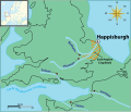 Map showing location of Happisburg

Request:
- It would be great to have a map showing Southern Britain during the early Pleistocene, when south-east Britain was still joined to the European continent, showing the ancient coastlines and rivers overlaid on a modern outline map, so that the location of the recently discovered Happisburgh footprints can be put in context. The type of map I have in mind is like that shown on the British Museum website here, and should be fairly easy to create (but beyond my skills). I have been unable to find anything appropriate on Commons, but pleased let me know if such a map already exists there. BabelStone ( talk) 15:33, 9 February 2014 (UTC)
Graphist opinion(s):
![]() Request taken. I've been reading about these footprints in the press and it's a shame that they will soon be destroyed by the sea. Lets immortalise them with a Wikipedia map.
► Philg88 ◄
Request taken. I've been reading about these footprints in the press and it's a shame that they will soon be destroyed by the sea. Lets immortalise them with a Wikipedia map.
► Philg88 ◄
![]() talk
16:39, 9 February 2014 (UTC)
talk
16:39, 9 February 2014 (UTC)
![]() Done Please comment on the above.
► Philg88 ◄
Done Please comment on the above.
► Philg88 ◄
![]() talk
08:41, 10 February 2014 (UTC)
talk
08:41, 10 February 2014 (UTC)
-- [[ axg // ✉ ]] 19:52, 3 February 2014 (UTC)


Article(s): Every article these maps are already on.
Request:
- Someone please colour Croatia as part of the EU on these maps, they joined on 1 July 2013.
Graphist opinion(s):
![]() Done -- [[
axg
//
✉ ]]
19:52, 3 February 2014 (UTC)
Done -- [[
axg
//
✉ ]]
19:52, 3 February 2014 (UTC)
-
 Greek places renamed

Article(s): Geographical name changes in Turkey
Request:
- Hello, I really would like a better quality map of Turkey for these pictures. Also, if there's any way to improve the colors in the photographs that would be great. I would also like the map to be in uniform with one another. Basically, a general improvement in these maps would be great. Thanks so much!!! Proudbolsahye ( talk) 06:38, 6 January 2014 (UTC)
Graphist opinion(s):
- I will make svg versions of those.
 Request taken by
Goran tek-en (
talk)
16:23, 24 January 2014 (UTC).
Request taken by
Goran tek-en (
talk)
16:23, 24 January 2014 (UTC).
- Now you can look at the three drafts I have made and leave me feedback on those, thanks.
- Get back to me. -- Goran tek-en ( talk) 20:04, 28 January 2014 (UTC)
- I will make svg versions of those.
@ Proudbolsahye: I need your feedback as above. -- Goran tek-en ( talk) 19:51, 4 February 2014 (UTC)
- Can we have this uploaded now? Étienne Dolet ( talk) 00:30, 12 February 2014 (UTC)
Now you can find them here;
![]() Done --
Goran tek-en (
talk)
14:24, 12 February 2014 (UTC)
Done --
Goran tek-en (
talk)
14:24, 12 February 2014 (UTC)
-
 Map of countries by form of government

Article(s): Democracy, Government, Liberal democracy, List of countries by system of government, Parliamentary republic, Presidential system, Single-party state, plus tons on other projects
Request:
- If possible, please strengthen the contrasts at national borders. Until I viewed the map at 2000px resolution, I thought that San Marino had been omitted, because lower resolutions didn't display (at least that I could see) the border between San Marino and Italy. A change like this would presumably also make it a bit easier to see borders between larger countries. -- Nyttend ( talk) 13:46, 7 December 2013 (UTC)
Graphist opinion(s):
- This looks as if it shouldn't be difficult. But I'm not going to have time to do anything for the next few days. Maybe I'll have a look at it early next week. (This is not a claim that I'm working on it: I'm not.)
Maproom (
talk)
23:47, 23 January 2014 (UTC)
- Unlikely to be Tuesday, my schedule has slipped. If anyone else wants to take this on, I shall not be unhappy :-)
- Done, but
- I have not done this well. The borders are now not all equally thick, because I have failed to find how some of them are controlled. Also, some coastlines are now black and thick, though it would be better if they weren't. I could wish that the svg was more structured, and contained a few comments - I guess Inkscape is responsible. The file is over 10,000 lines long, with no easy way to find which frontier is controlled by which lines of svg. Maproom ( talk) 23:05, 29 January 2014 (UTC)
- Unlikely to be Tuesday, my schedule has slipped. If anyone else wants to take this on, I shall not be unhappy :-)
![]() Request taken by
Goran tek-en (
talk)
14:07, 30 January 2014 (UTC).
Request taken by
Goran tek-en (
talk)
14:07, 30 January 2014 (UTC).
- Now you can look
at a draft here. I used another base map so there might be some small differences. Give me feedback on it, thanks.
- I don't think it's Inkscape fault. When you save as Plain svg this is what happendes. All layers are removed but what was in one layer is grouped together. Sometimes it's better to save it as Inkscape to keep the layers for the next who will work on the file. --
Goran tek-en (
talk)
16:24, 30 January 2014 (UTC)
- If
São Tomé (the yellow island in the Gulf of Guinea) is meant to be the shape of the island, it is much too big. But it's not a circle.
Maproom (
talk)
17:04, 30 January 2014 (UTC)
- I did what the map provided showed, I have no detail knowledge on this. I go by the material I'm provided with. I have made some changes to it and you
look at a new draft here, maybe you have to relad the page to get the new image.
- If you want me to do something else then what the provided image shows you have to tell me in details, thanks. --
Goran tek-en (
talk)
18:20, 30 January 2014 (UTC)
- I gave feedback, I didn't mean to imply that the error was your fault. Anyway, it looks good now! Maproom ( talk) 20:03, 30 January 2014 (UTC)
- I did what the map provided showed, I have no detail knowledge on this. I go by the material I'm provided with. I have made some changes to it and you
look at a new draft here, maybe you have to relad the page to get the new image.
- If
São Tomé (the yellow island in the Gulf of Guinea) is meant to be the shape of the island, it is much too big. But it's not a circle.
Maproom (
talk)
17:04, 30 January 2014 (UTC)
![]() Done
New version uploaded. --
Goran tek-en (
talk)
19:49, 4 February 2014 (UTC)
Done
New version uploaded. --
Goran tek-en (
talk)
19:49, 4 February 2014 (UTC)

Article(s): Adana massacre
Request:
- Vectorize and make it into a .svg file and upload it as a separate file. Please make any improvements you seem fit. Thank you. Étienne Dolet ( talk) 06:36, 19 February 2014 (UTC)
Graphist opinion(s):
-
Request taken by
Goran tek-en (
talk)
14:22, 19 February 2014 (UTC).
-
EtienneDolet Do you want all the text as it is or can we remove some text? --
Goran tek-en (
talk)
13:55, 20 February 2014 (UTC)
-
Goran tek-en Please retain all the names on the map. I would greatly appreciate that. Also, if you can find a more visible color for the burnt districts, I would greatly be appreciative of that as well. Do you think changing the colors would be better? If you don't, leave it as is. Thanks so much.
Étienne Dolet (
talk)
23:12, 20 February 2014 (UTC)
-
EtienneDolet Now it's uploaded
The City of Adana, if there is anything you would like to have changed just tell me, thanks. --
Goran tek-en (
talk)
13:37, 21 February 2014 (UTC)
- Goran tek-en Thanks so much. I have sent it over to Wikipedia:Featured picture candidates. Let's hope for the best. Feel free to vote as well. Thanks, Étienne Dolet ( talk) 23:39, 21 February 2014 (UTC)
-
Goran tek-en Quick question...don't you think it's better to have the fonts on the map in black rather than grey?
Étienne Dolet (
talk)
03:45, 22 February 2014 (UTC)
- It looks great! I wish I knew how to vectorise an image with such good results. What tools do you use? (Both cemeteries, to the north-west, have lost an "e".) Maproom ( talk) 07:28, 22 February 2014 (UTC)
-
EtienneDolet Now it's uploaded
The City of Adana, if there is anything you would like to have changed just tell me, thanks. --
Goran tek-en (
talk)
13:37, 21 February 2014 (UTC)
-
Goran tek-en Please retain all the names on the map. I would greatly appreciate that. Also, if you can find a more visible color for the burnt districts, I would greatly be appreciative of that as well. Do you think changing the colors would be better? If you don't, leave it as is. Thanks so much.
Étienne Dolet (
talk)
23:12, 20 February 2014 (UTC)
-
EtienneDolet Do you want all the text as it is or can we remove some text? --
Goran tek-en (
talk)
13:55, 20 February 2014 (UTC)
Thanks for correcting my spelling, new version uploaded. I use Inkscape and it's all handmade. You can't use any tracing tool or things like that. I think it's more about being accurate and consistent in your work. -- Goran tek-en ( talk) 10:19, 22 February 2014 (UTC)
-
EtienneDolet I like when maps/illustrations are, to me harmonic and beautiful, and I think grey fits more in in the overall picture. Then on the other hand it has to work for it's purpose also so have a look at
this with black and tell me which you want? --
Goran tek-en (
talk)
10:28, 22 February 2014 (UTC)
-
Goran tek-en I think with the black font it will be more legible. Which is I think most important. I do agree however that the grey creates more harmony. But to me I would like it to be black so that people can read it at first sight. If you can please upload the black fonts that would be great. Thanks so much.
Étienne Dolet (
talk)
20:33, 22 February 2014 (UTC)
- It's now uploaded. -- Goran tek-en ( talk) 12:04, 23 February 2014 (UTC)
-
Goran tek-en I think with the black font it will be more legible. Which is I think most important. I do agree however that the grey creates more harmony. But to me I would like it to be black so that people can read it at first sight. If you can please upload the black fonts that would be great. Thanks so much.
Étienne Dolet (
talk)
20:33, 22 February 2014 (UTC)
![]() Done
Done
-
 GIF of Boston map in article
 -
 SVG similar to Boston map in article


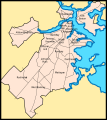
Article(s): Neighborhoods of Boston
Request:
- I've been modifying the Neighborhoods of Boston article and would really appreciate an updated map of the neighborhoods based on the City of Boston's current map. The gallery above has both the GIF used in the article and an SVG that appears to be the source for the GIF; I put both because I'm not sure which is easier to work with. The map in the article is missing Bay Village, West End, and Mid Dorchester; has Allston & Brighton as one combined neighborhood rather than two separate ones; and has mislabeled Fenway Kenmore as Fenway. Thanks in advance for your help! Nadhika99 ( talk) 08:59, 30 January 2014 (UTC)
Graphist opinion(s):
- Why don't you take an OpenStreetMap as basis for your map.
Wereldburger758 (
talk)
12:04, 31 January 2014 (UTC)
- Excellent suggestion! -
here is a link to help.
► Philg88 ◄
 talk
21:06, 1 February 2014 (UTC)
talk
21:06, 1 February 2014 (UTC)
- Excellent suggestion! -
here is a link to help.
► Philg88 ◄
![]() Request taken by
Goran tek-en (
talk)
18:28, 6 February 2014 (UTC).
Request taken by
Goran tek-en (
talk)
18:28, 6 February 2014 (UTC).
- @
Nadhika99: Now you can have
a look at a draft and give me feedback on it, thanks.
- Eventually I will need the following;
- Name of the file
- Description
- Category/ies
- to be able to upload it as a new file or if you want me to upload it as a version of the existing. -- Goran tek-en ( talk) 17:46, 8 February 2014 (UTC)
- @
Goran tek-en: That looks good! "North End" is misspelled though. Is it possible to remove the red lines? A reader who's not familiar with Boston might think those are the neighborhood boundaries and get confused by them. Here's the info you requested -
- Name: Boston ONS Neighborhoods (it's a new file)
- Description: Map depicting the neighborhoods of Boston as defined by the City of Boston's Office of Neighborhood Services
- Category/ies: Maps of Boston; Maps of Neighborhoods; Neighborhoods in Boston
- Thank you so much for your help!!
Nadhika99 (
talk)
07:05, 9 February 2014 (UTC)
- Comment: @
Goran tek-en: Nice Map! Well Done!
► Philg88 ◄
talk
08:39, 9 February 2014 (UTC)
- I did the changes and now you can find it here
Boston ONS Neighborhoods. I couldn't find the category Maps of Neighborhoods so then you would have to create it and add it later, thanks. --
Goran tek-en (
talk)
12:06, 9 February 2014 (UTC)
- @ Goran tek-en: That looks fantastic!! I added the Maps of neighborhoods category. Thank you so much for making the map!!! Nadhika99 ( talk) 21:29, 9 February 2014 (UTC)
- I did the changes and now you can find it here
Boston ONS Neighborhoods. I couldn't find the category Maps of Neighborhoods so then you would have to create it and add it later, thanks. --
Goran tek-en (
talk)
12:06, 9 February 2014 (UTC)
- Comment: @
Goran tek-en: Nice Map! Well Done!
► Philg88 ◄
- @
Goran tek-en: That looks good! "North End" is misspelled though. Is it possible to remove the red lines? A reader who's not familiar with Boston might think those are the neighborhood boundaries and get confused by them. Here's the info you requested -
![]() Done
Done
-
 This map should be redrawn.
 -
 It should be based on this.
 -
 Map by CIA.
 -
 Map by UN but heavily modified. The original can be seen here.
 -
 Finished map


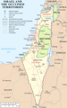
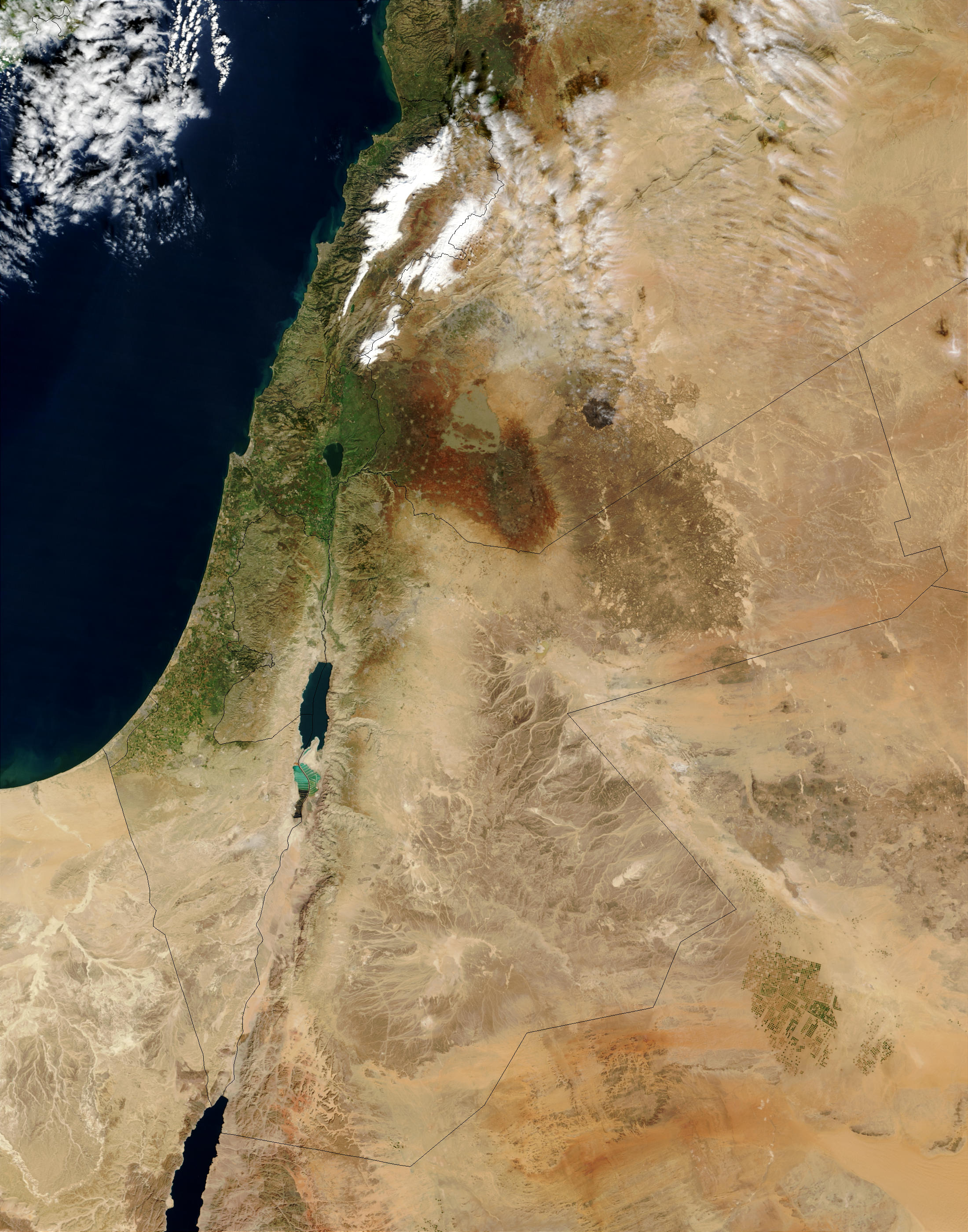
Article(s): Geography of Jordan, Outline of Jordan, United Nations Security Council Resolution 1351 and Water conflict in the Middle East and North Africa.
Request:
- The map by NASA shows the Golan Heights as a part of Israel. The borders were barely visible first but they were emphasized by an user. I am requesting that the lines showing the Golan Heights should be based on File:Syria location map3.svg. Thank you. -- IRISZOOM ( talk) 20:39, 1 February 2014 (UTC)
Graphist opinion(s):
- Comment: This is a potentially difficult task from an
NPOV aspect - according to the
Golan Heights article there are different definitions of what is included in the area. The map lab doesn't make decisions on matters like that - do you have a
consensus for the change? Best,
► Philg88 ◄
talk
21:12, 1 February 2014 (UTC)
- This is about political borders. The Golan Heights is occupied by Israel. There is a consensus about that, which the article and maps show. Here is another map (BBC). File:Golan heights rel89-orig.jpg is another one by CIA.
- In Template talk:Location map Syria#Restoration of location map, there was a consensus:
- Closing per a request at WP:ANRFC. Consensus was that the different color, hatched version (i.e. File:Syria location map3.svg) should be used in light of events related to the occupation of this particular region of Syria. However, Huon's comments regarding context are worth careful consideration. Articles not closely related these events may not require a map version with a different color. It is, therefore, worthwhile to discuss usage of File:Syria location map3.svg on a case-by-case basis if there is any significant objection to its relevance on Syria-related articles. I, JethroBT drop me a line 03:11, 27 September 2013 (UTC)
- And this is not about using a specific colour but just mark the lines correctly. -- IRISZOOM ( talk) 23:44, 1 February 2014 (UTC)
Comment: OK, that's good news. The bad news is that the
original source map from NASA has these lines and because it is in jpg format there is no way to remove them without making a mess of the map. Is there an alternative (unmarked) topographic map that you know of over which the borders from Syria location map3.svg can be overlaid? Best,
► Philg88 ◄
![]() talk
12:58, 2 February 2014 (UTC)
talk
12:58, 2 February 2014 (UTC)
- Wouldn't it be possible to emphasize the lines on the original map as done before but using dotted lines on the Golan Heights and then overlay the missing ones? Then it wouldn't matter that the original lines are not removed because they are barely visible and are going to be overwritten. -- IRISZOOM ( talk) 20:21, 2 February 2014 (UTC)
![]() Request taken. Let me see what I can come up with.
► Philg88 ◄
Request taken. Let me see what I can come up with.
► Philg88 ◄
![]() talk
08:39, 3 February 2014 (UTC)
talk
08:39, 3 February 2014 (UTC)
- Comment: Please see the draft image above. This is made using the borders of [Syria location map3.svg] shown above and the original topographic map from the NASA website. I have marked the Golan Heights but I'm not clear as to what the areas marked in blue, green and yellow on either side are - from some cursory research I think the blue one on the left is something to do with the UN and the other two on the right are something to do with Syria - you know the area better than I do so please advise. All other comments are, of course, welcome. Best,
► Philg88 ◄
talk
22:50, 3 February 2014 (UTC)
- Thank you. I am wondering about those boxes with colours. Are they just temporary? Otherwise the map looks weird. And could you use black instead of red?
- File:GolanHistoricalBorders.svg is a good map for that. However, no description is needed here, just the lines. Dotted lines (space between) would be ideal. The ones for the West Bank and Gaza Strip too. But the important thing is too not show occupied territorries as a part of the occupying country so the current version is good.
- While I was searching, I found File:MiddleEast A2003031 0820 250m without lines.jpg. A user removed the lines (including the weird one on the top left). That's great. However, it would be good to have the alternative you are working on. -- IRISZOOM ( talk) 00:09, 4 February 2014 (UTC)
You are confusing me now, do you want a map without lines since you say that
File:MiddleEast A2003031 0820 250m without lines.jpg is great? The map I made is a draft - the boxes with the colours are temporary and so are the red lines for the borders - they are so you know what I mean when I ask questions. Please confirm whether you want to keep the demilitarised zone and the cease fire lines around the Golan Heights - if they are not labelled or referenced in a legend it is going to confuse people as to what they are - It may be best to delete them altogether.
► Philg88 ◄
![]() talk
08:53, 4 February 2014 (UTC)
talk
08:53, 4 February 2014 (UTC)
- I am saying that it was great to find this one but one with borders gives another alternative.
- I want to keep the lines but I don't think it's necessary for descriptions, just use dotted lines as File:Syria location map3.svg. -- IRISZOOM ( talk) 16:37, 4 February 2014 (UTC)
![]() Done Have a look at the new version above and let me know if you need any changes. Best
► Philg88 ◄
Done Have a look at the new version above and let me know if you need any changes. Best
► Philg88 ◄
![]() talk
05:07, 5 February 2014 (UTC)
talk
05:07, 5 February 2014 (UTC)
- It looks great with the exception of the altered seas. Perhaps the small white edge to the left should be removed. -- IRISZOOM ( talk) 05:40, 5 February 2014 (UTC)
Sorry about the altered seas - force of habit :) They have gone and so has the white line. Please mark the request as "Resolved"
► Philg88 ◄
![]() talk
08:48, 5 February 2014 (UTC)
talk
08:48, 5 February 2014 (UTC)
- Thank you very much. But could you remove the last line (from the right) on Golan? That is the border of Quneitra Governorate and not part of the lines. -- IRISZOOM ( talk) 16:08, 5 February 2014 (UTC)
Gone :)
► Philg88 ◄
![]() talk
16:51, 5 February 2014 (UTC)
talk
16:51, 5 February 2014 (UTC)
- Thank you. :) Great work. -- IRISZOOM ( talk) 17:03, 5 February 2014 (UTC)
Article(s): Belarus–European Union relations
Request:
- Sorry, I forgot about this map when I made that other request. Would someone please colour Croatia in as part of the EU.
Graphist opinion(s):
- Done -- [[
axg
//
✉ ]]
18:33, 5 February 2014 (UTC)
Article(s): Happisburgh footprints
-
Map showing location of Happisburg
Request:
- It would be great to have a map showing Southern Britain during the early Pleistocene, when south-east Britain was still joined to the European continent, showing the ancient coastlines and rivers overlaid on a modern outline map, so that the location of the recently discovered Happisburgh footprints can be put in context. The type of map I have in mind is like that shown on the British Museum website here, and should be fairly easy to create (but beyond my skills). I have been unable to find anything appropriate on Commons, but pleased let me know if such a map already exists there. BabelStone ( talk) 15:33, 9 February 2014 (UTC)
Graphist opinion(s):
![]() Request taken. I've been reading about these footprints in the press and it's a shame that they will soon be destroyed by the sea. Lets immortalise them with a Wikipedia map.
► Philg88 ◄
Request taken. I've been reading about these footprints in the press and it's a shame that they will soon be destroyed by the sea. Lets immortalise them with a Wikipedia map.
► Philg88 ◄
![]() talk
16:39, 9 February 2014 (UTC)
talk
16:39, 9 February 2014 (UTC)
![]() Done Please comment on the above.
► Philg88 ◄
Done Please comment on the above.
► Philg88 ◄
![]() talk
08:41, 10 February 2014 (UTC)
talk
08:41, 10 February 2014 (UTC)
-- [[ axg // ✉ ]] 19:52, 3 February 2014 (UTC)
Article(s): Every article these maps are already on.
Request:
- Someone please colour Croatia as part of the EU on these maps, they joined on 1 July 2013.
Graphist opinion(s):
![]() Done -- [[
axg
//
✉ ]]
19:52, 3 February 2014 (UTC)
Done -- [[
axg
//
✉ ]]
19:52, 3 February 2014 (UTC)
-
Greek places renamed
Article(s): Geographical name changes in Turkey
Request:
- Hello, I really would like a better quality map of Turkey for these pictures. Also, if there's any way to improve the colors in the photographs that would be great. I would also like the map to be in uniform with one another. Basically, a general improvement in these maps would be great. Thanks so much!!! Proudbolsahye ( talk) 06:38, 6 January 2014 (UTC)
Graphist opinion(s):
- I will make svg versions of those.
Request taken by
Goran tek-en (
talk)
16:23, 24 January 2014 (UTC).
- Now you can look at the three drafts I have made and leave me feedback on those, thanks.
- Get back to me. -- Goran tek-en ( talk) 20:04, 28 January 2014 (UTC)
- I will make svg versions of those.
@ Proudbolsahye: I need your feedback as above. -- Goran tek-en ( talk) 19:51, 4 February 2014 (UTC)
- Can we have this uploaded now? Étienne Dolet ( talk) 00:30, 12 February 2014 (UTC)
Now you can find them here;
![]() Done --
Goran tek-en (
talk)
14:24, 12 February 2014 (UTC)
Done --
Goran tek-en (
talk)
14:24, 12 February 2014 (UTC)
-
Map of countries by form of government
Article(s): Democracy, Government, Liberal democracy, List of countries by system of government, Parliamentary republic, Presidential system, Single-party state, plus tons on other projects
Request:
- If possible, please strengthen the contrasts at national borders. Until I viewed the map at 2000px resolution, I thought that San Marino had been omitted, because lower resolutions didn't display (at least that I could see) the border between San Marino and Italy. A change like this would presumably also make it a bit easier to see borders between larger countries. -- Nyttend ( talk) 13:46, 7 December 2013 (UTC)
Graphist opinion(s):
- This looks as if it shouldn't be difficult. But I'm not going to have time to do anything for the next few days. Maybe I'll have a look at it early next week. (This is not a claim that I'm working on it: I'm not.)
Maproom (
talk)
23:47, 23 January 2014 (UTC)
- Unlikely to be Tuesday, my schedule has slipped. If anyone else wants to take this on, I shall not be unhappy :-)
- Done, but
- I have not done this well. The borders are now not all equally thick, because I have failed to find how some of them are controlled. Also, some coastlines are now black and thick, though it would be better if they weren't. I could wish that the svg was more structured, and contained a few comments - I guess Inkscape is responsible. The file is over 10,000 lines long, with no easy way to find which frontier is controlled by which lines of svg. Maproom ( talk) 23:05, 29 January 2014 (UTC)
- Unlikely to be Tuesday, my schedule has slipped. If anyone else wants to take this on, I shall not be unhappy :-)
![]() Request taken by
Goran tek-en (
talk)
14:07, 30 January 2014 (UTC).
Request taken by
Goran tek-en (
talk)
14:07, 30 January 2014 (UTC).
- Now you can look
at a draft here. I used another base map so there might be some small differences. Give me feedback on it, thanks.
- I don't think it's Inkscape fault. When you save as Plain svg this is what happendes. All layers are removed but what was in one layer is grouped together. Sometimes it's better to save it as Inkscape to keep the layers for the next who will work on the file. --
Goran tek-en (
talk)
16:24, 30 January 2014 (UTC)
- If
São Tomé (the yellow island in the Gulf of Guinea) is meant to be the shape of the island, it is much too big. But it's not a circle.
Maproom (
talk)
17:04, 30 January 2014 (UTC)
- I did what the map provided showed, I have no detail knowledge on this. I go by the material I'm provided with. I have made some changes to it and you
look at a new draft here, maybe you have to relad the page to get the new image.
- If you want me to do something else then what the provided image shows you have to tell me in details, thanks. --
Goran tek-en (
talk)
18:20, 30 January 2014 (UTC)
- I gave feedback, I didn't mean to imply that the error was your fault. Anyway, it looks good now! Maproom ( talk) 20:03, 30 January 2014 (UTC)
- I did what the map provided showed, I have no detail knowledge on this. I go by the material I'm provided with. I have made some changes to it and you
look at a new draft here, maybe you have to relad the page to get the new image.
- If
São Tomé (the yellow island in the Gulf of Guinea) is meant to be the shape of the island, it is much too big. But it's not a circle.
Maproom (
talk)
17:04, 30 January 2014 (UTC)
![]() Done
New version uploaded. --
Goran tek-en (
talk)
19:49, 4 February 2014 (UTC)
Done
New version uploaded. --
Goran tek-en (
talk)
19:49, 4 February 2014 (UTC)
Article(s): Adana massacre
Request:
- Vectorize and make it into a .svg file and upload it as a separate file. Please make any improvements you seem fit. Thank you. Étienne Dolet ( talk) 06:36, 19 February 2014 (UTC)
Graphist opinion(s):
-
Request taken by
Goran tek-en (
talk)
14:22, 19 February 2014 (UTC).
-
EtienneDolet Do you want all the text as it is or can we remove some text? --
Goran tek-en (
talk)
13:55, 20 February 2014 (UTC)
-
Goran tek-en Please retain all the names on the map. I would greatly appreciate that. Also, if you can find a more visible color for the burnt districts, I would greatly be appreciative of that as well. Do you think changing the colors would be better? If you don't, leave it as is. Thanks so much.
Étienne Dolet (
talk)
23:12, 20 February 2014 (UTC)
-
EtienneDolet Now it's uploaded
The City of Adana, if there is anything you would like to have changed just tell me, thanks. --
Goran tek-en (
talk)
13:37, 21 February 2014 (UTC)
- Goran tek-en Thanks so much. I have sent it over to Wikipedia:Featured picture candidates. Let's hope for the best. Feel free to vote as well. Thanks, Étienne Dolet ( talk) 23:39, 21 February 2014 (UTC)
-
Goran tek-en Quick question...don't you think it's better to have the fonts on the map in black rather than grey?
Étienne Dolet (
talk)
03:45, 22 February 2014 (UTC)
- It looks great! I wish I knew how to vectorise an image with such good results. What tools do you use? (Both cemeteries, to the north-west, have lost an "e".) Maproom ( talk) 07:28, 22 February 2014 (UTC)
-
EtienneDolet Now it's uploaded
The City of Adana, if there is anything you would like to have changed just tell me, thanks. --
Goran tek-en (
talk)
13:37, 21 February 2014 (UTC)
-
Goran tek-en Please retain all the names on the map. I would greatly appreciate that. Also, if you can find a more visible color for the burnt districts, I would greatly be appreciative of that as well. Do you think changing the colors would be better? If you don't, leave it as is. Thanks so much.
Étienne Dolet (
talk)
23:12, 20 February 2014 (UTC)
-
EtienneDolet Do you want all the text as it is or can we remove some text? --
Goran tek-en (
talk)
13:55, 20 February 2014 (UTC)
Thanks for correcting my spelling, new version uploaded. I use Inkscape and it's all handmade. You can't use any tracing tool or things like that. I think it's more about being accurate and consistent in your work. -- Goran tek-en ( talk) 10:19, 22 February 2014 (UTC)
-
EtienneDolet I like when maps/illustrations are, to me harmonic and beautiful, and I think grey fits more in in the overall picture. Then on the other hand it has to work for it's purpose also so have a look at
this with black and tell me which you want? --
Goran tek-en (
talk)
10:28, 22 February 2014 (UTC)
-
Goran tek-en I think with the black font it will be more legible. Which is I think most important. I do agree however that the grey creates more harmony. But to me I would like it to be black so that people can read it at first sight. If you can please upload the black fonts that would be great. Thanks so much.
Étienne Dolet (
talk)
20:33, 22 February 2014 (UTC)
- It's now uploaded. -- Goran tek-en ( talk) 12:04, 23 February 2014 (UTC)
-
Goran tek-en I think with the black font it will be more legible. Which is I think most important. I do agree however that the grey creates more harmony. But to me I would like it to be black so that people can read it at first sight. If you can please upload the black fonts that would be great. Thanks so much.
Étienne Dolet (
talk)
20:33, 22 February 2014 (UTC)
![]() Done
Done
-
GIF of Boston map in article
-
SVG similar to Boston map in article
Article(s): Neighborhoods of Boston
Request:
- I've been modifying the Neighborhoods of Boston article and would really appreciate an updated map of the neighborhoods based on the City of Boston's current map. The gallery above has both the GIF used in the article and an SVG that appears to be the source for the GIF; I put both because I'm not sure which is easier to work with. The map in the article is missing Bay Village, West End, and Mid Dorchester; has Allston & Brighton as one combined neighborhood rather than two separate ones; and has mislabeled Fenway Kenmore as Fenway. Thanks in advance for your help! Nadhika99 ( talk) 08:59, 30 January 2014 (UTC)
Graphist opinion(s):
- Why don't you take an OpenStreetMap as basis for your map.
Wereldburger758 (
talk)
12:04, 31 January 2014 (UTC)
- Excellent suggestion! -
here is a link to help.
► Philg88 ◄
talk
21:06, 1 February 2014 (UTC)
- Excellent suggestion! -
here is a link to help.
► Philg88 ◄
![]() Request taken by
Goran tek-en (
talk)
18:28, 6 February 2014 (UTC).
Request taken by
Goran tek-en (
talk)
18:28, 6 February 2014 (UTC).
- @
Nadhika99: Now you can have
a look at a draft and give me feedback on it, thanks.
- Eventually I will need the following;
- Name of the file
- Description
- Category/ies
- to be able to upload it as a new file or if you want me to upload it as a version of the existing. -- Goran tek-en ( talk) 17:46, 8 February 2014 (UTC)
- @
Goran tek-en: That looks good! "North End" is misspelled though. Is it possible to remove the red lines? A reader who's not familiar with Boston might think those are the neighborhood boundaries and get confused by them. Here's the info you requested -
- Name: Boston ONS Neighborhoods (it's a new file)
- Description: Map depicting the neighborhoods of Boston as defined by the City of Boston's Office of Neighborhood Services
- Category/ies: Maps of Boston; Maps of Neighborhoods; Neighborhoods in Boston
- Thank you so much for your help!!
Nadhika99 (
talk)
07:05, 9 February 2014 (UTC)
- Comment: @
Goran tek-en: Nice Map! Well Done!
► Philg88 ◄
talk
08:39, 9 February 2014 (UTC)
- I did the changes and now you can find it here
Boston ONS Neighborhoods. I couldn't find the category Maps of Neighborhoods so then you would have to create it and add it later, thanks. --
Goran tek-en (
talk)
12:06, 9 February 2014 (UTC)
- @ Goran tek-en: That looks fantastic!! I added the Maps of neighborhoods category. Thank you so much for making the map!!! Nadhika99 ( talk) 21:29, 9 February 2014 (UTC)
- I did the changes and now you can find it here
Boston ONS Neighborhoods. I couldn't find the category Maps of Neighborhoods so then you would have to create it and add it later, thanks. --
Goran tek-en (
talk)
12:06, 9 February 2014 (UTC)
- Comment: @
Goran tek-en: Nice Map! Well Done!
► Philg88 ◄
- @
Goran tek-en: That looks good! "North End" is misspelled though. Is it possible to remove the red lines? A reader who's not familiar with Boston might think those are the neighborhood boundaries and get confused by them. Here's the info you requested -
![]() Done
Done
-
This map should be redrawn.
-
It should be based on this.
-
Map by CIA.
-
Map by UN but heavily modified. The original can be seen here.
-
Finished map
Article(s): Geography of Jordan, Outline of Jordan, United Nations Security Council Resolution 1351 and Water conflict in the Middle East and North Africa.
Request:
- The map by NASA shows the Golan Heights as a part of Israel. The borders were barely visible first but they were emphasized by an user. I am requesting that the lines showing the Golan Heights should be based on File:Syria location map3.svg. Thank you. -- IRISZOOM ( talk) 20:39, 1 February 2014 (UTC)
Graphist opinion(s):
- Comment: This is a potentially difficult task from an
NPOV aspect - according to the
Golan Heights article there are different definitions of what is included in the area. The map lab doesn't make decisions on matters like that - do you have a
consensus for the change? Best,
► Philg88 ◄
talk
21:12, 1 February 2014 (UTC)
- This is about political borders. The Golan Heights is occupied by Israel. There is a consensus about that, which the article and maps show. Here is another map (BBC). File:Golan heights rel89-orig.jpg is another one by CIA.
- In Template talk:Location map Syria#Restoration of location map, there was a consensus:
- Closing per a request at WP:ANRFC. Consensus was that the different color, hatched version (i.e. File:Syria location map3.svg) should be used in light of events related to the occupation of this particular region of Syria. However, Huon's comments regarding context are worth careful consideration. Articles not closely related these events may not require a map version with a different color. It is, therefore, worthwhile to discuss usage of File:Syria location map3.svg on a case-by-case basis if there is any significant objection to its relevance on Syria-related articles. I, JethroBT drop me a line 03:11, 27 September 2013 (UTC)
- And this is not about using a specific colour but just mark the lines correctly. -- IRISZOOM ( talk) 23:44, 1 February 2014 (UTC)
Comment: OK, that's good news. The bad news is that the
original source map from NASA has these lines and because it is in jpg format there is no way to remove them without making a mess of the map. Is there an alternative (unmarked) topographic map that you know of over which the borders from Syria location map3.svg can be overlaid? Best,
► Philg88 ◄
![]() talk
12:58, 2 February 2014 (UTC)
talk
12:58, 2 February 2014 (UTC)
- Wouldn't it be possible to emphasize the lines on the original map as done before but using dotted lines on the Golan Heights and then overlay the missing ones? Then it wouldn't matter that the original lines are not removed because they are barely visible and are going to be overwritten. -- IRISZOOM ( talk) 20:21, 2 February 2014 (UTC)
![]() Request taken. Let me see what I can come up with.
► Philg88 ◄
Request taken. Let me see what I can come up with.
► Philg88 ◄
![]() talk
08:39, 3 February 2014 (UTC)
talk
08:39, 3 February 2014 (UTC)
- Comment: Please see the draft image above. This is made using the borders of [Syria location map3.svg] shown above and the original topographic map from the NASA website. I have marked the Golan Heights but I'm not clear as to what the areas marked in blue, green and yellow on either side are - from some cursory research I think the blue one on the left is something to do with the UN and the other two on the right are something to do with Syria - you know the area better than I do so please advise. All other comments are, of course, welcome. Best,
► Philg88 ◄
talk
22:50, 3 February 2014 (UTC)
- Thank you. I am wondering about those boxes with colours. Are they just temporary? Otherwise the map looks weird. And could you use black instead of red?
- File:GolanHistoricalBorders.svg is a good map for that. However, no description is needed here, just the lines. Dotted lines (space between) would be ideal. The ones for the West Bank and Gaza Strip too. But the important thing is too not show occupied territorries as a part of the occupying country so the current version is good.
- While I was searching, I found File:MiddleEast A2003031 0820 250m without lines.jpg. A user removed the lines (including the weird one on the top left). That's great. However, it would be good to have the alternative you are working on. -- IRISZOOM ( talk) 00:09, 4 February 2014 (UTC)
You are confusing me now, do you want a map without lines since you say that
File:MiddleEast A2003031 0820 250m without lines.jpg is great? The map I made is a draft - the boxes with the colours are temporary and so are the red lines for the borders - they are so you know what I mean when I ask questions. Please confirm whether you want to keep the demilitarised zone and the cease fire lines around the Golan Heights - if they are not labelled or referenced in a legend it is going to confuse people as to what they are - It may be best to delete them altogether.
► Philg88 ◄
![]() talk
08:53, 4 February 2014 (UTC)
talk
08:53, 4 February 2014 (UTC)
- I am saying that it was great to find this one but one with borders gives another alternative.
- I want to keep the lines but I don't think it's necessary for descriptions, just use dotted lines as File:Syria location map3.svg. -- IRISZOOM ( talk) 16:37, 4 February 2014 (UTC)
![]() Done Have a look at the new version above and let me know if you need any changes. Best
► Philg88 ◄
Done Have a look at the new version above and let me know if you need any changes. Best
► Philg88 ◄
![]() talk
05:07, 5 February 2014 (UTC)
talk
05:07, 5 February 2014 (UTC)
- It looks great with the exception of the altered seas. Perhaps the small white edge to the left should be removed. -- IRISZOOM ( talk) 05:40, 5 February 2014 (UTC)
Sorry about the altered seas - force of habit :) They have gone and so has the white line. Please mark the request as "Resolved"
► Philg88 ◄
![]() talk
08:48, 5 February 2014 (UTC)
talk
08:48, 5 February 2014 (UTC)
- Thank you very much. But could you remove the last line (from the right) on Golan? That is the border of Quneitra Governorate and not part of the lines. -- IRISZOOM ( talk) 16:08, 5 February 2014 (UTC)
Gone :)
► Philg88 ◄
![]() talk
16:51, 5 February 2014 (UTC)
talk
16:51, 5 February 2014 (UTC)
- Thank you. :) Great work. -- IRISZOOM ( talk) 17:03, 5 February 2014 (UTC)