| This is an
archive of past discussions for the period 2017. Do not edit the contents of this page. If you wish to start a new discussion or revive an old one, please do so on the current main page. |

Time Zones in Africa.

- Article(s)
- [ [1]], others.
- Request
- The border between Mali and Guinea is missing. Could someone add it in? 8.40.151.110 ( talk) 16:43, 1 July 2017 (UTC)
Also, clean up the inter-time zone border in the DRC. 8.40.151.110 ( talk) 16:45, 1 July 2017 (UTC)
Also, Sudan will change its time zone to UTC+2 on 1 November. This needs to be reflected. Source: https://www.timeanddate.com/news/time/sudan-new-time-zone.html 8.40.151.110 ( talk) 16:08, 19 October 2017 (UTC)
- Graphist opinion(s)
Treaty of Nöteborg 1323
Hi, the Treaty of Nöteborg is the first known border between Finland, Sweden and Novgorod and thus quite important. The prevailing view in research is that the border had two lines and the area between belonged jointly to West-Finnish/Swedish and Russo-Karelian cultures respectively. This view is supported by Iron Age material discoveries. I made a map to Finnish wikipedia according to historians Jarl Gallén and Johan Lind (1991) but I am not happy to the quality of the map. Template doesn`t have too many pixels and the graphics need to be better etc. Also description box would be grate to add already to the map. I can fill it with information if needed.
Finnish wikipedia link: https://fi.wikipedia.org/wiki/P%C3%A4hkin%C3%A4saaren_rauha Link to the map by me: https://fi.wikipedia.org/wiki/Tiedosto:P%C3%A4hkin%C3%A4saaren_rauhan_raja_1323_5.jpg
- Request
- Totally new map of the border or good quality template and some help.
- Sources
Jarl Gallen: Nöteborgsfreden och Finlands medeltida östgräns (1968), Pirjo Uino: Ancient Karelia (1997), Haggren er al.: Muinaisuutemme jäljet (2015) — Preceding unsigned comment added by Velivieras ( talk • contribs) 11:55, 16 August 2017 (UTC)
2
@ Scope creep: I can't find or read the names of two cities and then there is a dot I can't see any name for. It's encircled on this image. Also I have very hard to read the different dates, what is at the base of arrows, which numbers or letters. -- Goran tek-en ( talk) 18:41, 4 September 2017 (UTC)
Left is La Feuillée, the mid dot, is a dot, above it is Stenay. The one of the right is Dudenhofen. scope_creep ( talk) 20:50, 4 September 2017 (UTC)
- @
Scope creep: I can find several La Feuillée but to me none of them are right. If you can get me a link on a map it would be great.
- Are you sure it's Dudenhofen, to me and his map that is on the wrong side of the border, should it not be in France? --
Goran tek-en (
talk)
18:21, 5 September 2017 (UTC)
- @ Goran tek-en: It looks like your right. I reads like Dudenhofen, but it is definitely not that. Too far out to the right, but a long way. I created some intersecting grid lines on google earth, and created a triangle where it should have been in, but couldn't locate it. So I guess miss it out for the moment. I saw this map: [2] (map 4 on bottom left) which was the unit operations for the invasion, and its got a bunch of places all over, lots in common with this map, but Dudenhofen is not it. I have added the La Feuillie as well for correct location.
I've made a list of the names of cities, on the map, ones in doubt, which may help.
- Saint-Valery-sur-Somme
- Elbeuf
- Rouen
- La Feuillie, Seine-Maritime
- Clermont, Oise
- Montdidier, Somme, above Clermont (Line)
- Amiens, above to the left of Montdidier (Line)
- Abbeville, to the left and up of Amies. (Line)
- Arras to the top left from Amiens
- Péronne, Somme to the right of Amiens (Line)
- Saint-Quentin, Aisne to the right of Peronne
- Compiègne (line)
- Soissons (Line)
- Reims (Line)
- Rethel (line)
- Machault, Ardennes (line)
- Vouziers to the right of Rethel (line)
- Grandpré, Ardennes (Line)
- Stenay (Line)
- Montmédy(line)
- Arlon (line, belgium)
- Verdun
- Wissembourg (line)
- Strasbourg and Nancy on roughly same line (line)
- Colmar (line)
- Mulhouse (line)
- Belfort (line)
- Metz
- Haguenau (next to Wissenbourg)
- Elbeuf (botton next to Rouen)
- Creil (below Clermont)
- Senlis to the right of Creil
- Pontoise (bottom left of Creil)
- Meaux (to the left of pontoise)
- Reims to the bottom right of Soissons
- Épernay below it,
- Châlons-en-Champagne to the right of Eparnay
Hope that helps. scope_creep ( talk) 23:42, 5 September 2017 (UTC)
- @ Scope creep: Draft for #2. I have guessed some of the texts so check them specially. Give me feedback, thanks. -- Goran tek-en ( talk) 18:52, 6 September 2017 (UTC)
- @ Goran tek-en: There is a mistake in the box. It looks decent overall, I'll check it tomorrow. scope_creep ( talk) 00:18, 7 September 2017 (UTC)
- Name:Chart 4 radio intelligence operation findings during French Campaign
- Description:Intercept units findings during Signal intelligence operations by Germany against France
- Category:Germany in World War II
There is a coupe of things wrong with it.
- In the legend box, then French name is not complete.
- The bit round Grandpre, doesn't show the three 'xxx' on top of the box. Seems a bit crowded.
- The mulhouse box at the bottom right, doesn't have the 'eighth' within it.
- Below wissenbourg, you have a box representing an army. It has 'Second' in it, when it should be 'fifth'
- There is dates missing next to Troyes.
- Can you move the date to the left of Geradmer, closer to the town. Or below. I see it is miles away on the original map.
- @
Scope creep:
New draft, is really the letters/numbers for the German armies correct, I guess for several.
- Fixed
- Made the 'xxx' more visible. There is a lot of information just there, moved some around.
- Fixed
- Fixed
- Moved it. I thought the date was for both of the armies. What do you mean by "I see it is miles away on the original map."?
- Feedback, thanks. --
Goran tek-en (
talk)
18:32, 7 September 2017 (UTC)
- That is pretty decent. It was pretty decent before, better now. Maybe worth firing in an English Channel label in the channel. Good work. scope_creep ( talk) 19:45, 7 September 2017 (UTC)
@ Scope creep: Now you can find it here Commons:file:Chart 4 radio intelligence operation findings during French Campaign.svg. -- Goran tek-en ( talk) 17:38, 8 September 2017 (UTC)
- @ Goran tek-en: That's it placed in the article. scope_creep ( talk) 18:27, 8 September 2017 (UTC)
3
@ Scope creep: Draft of map 3. The legend is not finished, tell me what you want in it and the texts for it. Feedback, thanks. -- Goran tek-en ( talk) 19:14, 13 September 2017 (UTC)
- Will do. scope_creep ( talk) 22:20, 13 September 2017 (UTC)
@ Goran tek-en: All in excellent. Although the legend box, im not sure how to fill it in. There is no mile indicator, which would be handy. I don't what the circles mean on top of the box. The dashes are a NATO standard. The circles mean Direction finding (D/F) units, the others which are Intcp intercept companies. OB West, 5th Panzer Army, Blue line is a front. Red lines are D/F and intercept bearings. scope_creep ( talk) 13:58, 14 September 2017 (UTC)
- Add a mile indicator
Legend Box:
- Single dash - intcp company
- Three dashes - command intcp company.
- Square box with circle - D/F unit (I'll add an extensive caption and include direction finding)
- OB West - Army Command
- Fifth Panzer - 5th Panzer Army
- Blue line - British Front
- Red line - D/F and Intcp direction
- Ariel - Intercept station
Thanks. scope_creep ( talk) 14:07, 14 September 2017 (UTC)
- @ Scope creep: New draft, feedback, thanks. -- Goran tek-en ( talk) 19:47, 14 September 2017 (UTC)
@ Goran tek-en:
- Name: Chart 6 German radio intelligence operations in the Mediterranean and North Africa theatre March 1943
- Description:Armies, Direction finding and Intercept units movements during Signal intelligence operations by Germany in the Mediterranean and North Africa theatre in March 1943.
- Category:Germany in World War II.
@ Goran tek-en: Its complete. scope_creep ( talk) 00:58, 16 September 2017 (UTC)
4
@ Scope creep: Draft of #4. You also have to tell me what you want in the legend and text's, feedback.-- Goran tek-en ( talk) 18:20, 21 September 2017 (UTC)
Hi Goran tek-en, excellent work as usual. More detail than in the original.
The rest I'll do tomorrow. I need to read the doc. One part is microwave links. scope_creep ( talk) 18:43, 21 September 2017 (UTC)
4.1
Hi @ Goran tek-en: Can you change the following:
On the diagram.
- No distance marker.
- Between Rome and Sicily, please next to line: radio teletype circuit. By that point in the war, mid 43, Germany was starting to distrust Enigma cipher machine, and was using fixed communication lines.
- Between Sicily and Tunis it is a Decimeter Microwave
- Between Rome to Tunis = 70 Watt SW Comm circuit.
- The dashes between fifth panzer and africa korps = Comm circuit
- Between Sicily and Gabes = 70 Watt SW Comm circuit.
In the legend box:
- 5th Panzer, is the 5th Panzer Army
- OB Southwest is OB Southwest. We don't have a page for it yet.
- Single dash - intcp company
- Three dashes - command intcp company
- Take out that first dashes at the bottom. The first of three.
- dashed, dashed, dashed - Comm Circuit.
The diagram may be need to bigger. I don't how it would work. It seems to be a bundle, even a whole bundle, or even a whole lot. I'll see how it looks, it could overwhelm it, symbols all over the shop, like Google Earth gets sometimes. Ive added this for later. Hope that helps.
- Name: Chart 7 German Communication Circuits used by Intercept Units in Africa and Near East March 1943
- Description:Armies, Direction finding and Intercept units movements during Signal intelligence operations by Germany in Africa and Near East March 1943
- Category:Germany in World War II.
Update. Hi @ Goran tek-en:, I've put in an update between Rome and Sicily. It is now radio teletype circuit. Might be too late. scope_creep ( talk) 18:17, 23 September 2017 (UTC)
- @ Scope creep: New draft, feedback, thanks. I don't understand what you wrote above "The diagram may be need to ....". -- Goran tek-en ( talk) 18:31, 24 September 2017 (UTC)
- @ Goran tek-en:, Yip. I think thats all right. It is one interpretation of what the doc says. I don't know if it is the right one, but it will do. For such a simple diagram. I thought it would be less complex. Good work. Its good. scope_creep ( talk) 18:53, 24 September 2017 (UTC)
5
@ Scope creep: I need your help now. I have tried to find the names of the cities but I'm very unsure for many of them. There is also the spelling of them, should it be English, German, maybe they have changed over time or there own names. I need you to write a list with the name I put in the map and then the one you want, thanks. -- Goran tek-en ( talk) 17:43, 27 September 2017 (UTC)
@ Goran tek-en: No worries. Scope creep ( talk) 22:44, 27 September 2017 (UTC) @ Goran tek-en: About half done. Scope creep ( talk) 01:04, 29 September 2017 (UTC) @ Goran tek-en: These are about 10 odd that don't have articles. Soon. Scope creep ( talk) 20:49, 29 September 2017 (UTC)
Hi @ Goran tek-en:, Finally got the list finished, apart from a couple, which I can identify, or don't have WP page. There is several which has slightly different names, like Stalingrad now being Volgograd. I think half a dozen like that. There is a couple I think which are completely different.
- Lublin Lublin
- Lancut Łańcut
- Rezeszow Rzeszów
- Tomaszow Tomaszów Lubelski County
- Lviv Lviv
- Brody Brody
- Wlodawa Włodawa
- Kovel Kovel
- Rivne Rivne
- Zhytomyr Zhytomyr
- Novohrad-volynskyi Novohrad-Volynskyi
- Berdychiv Berdychiv
- Kiev Kiev
- Bila Tsekva Bila Tserkva
- Kozyatyn Koziatyn
- Uman Uman
- Cherkasy Cherkasy
- Chernihiv Chernihiv
- Okeksandriya Oleksandriia
- Sumy Sumy
- Kremenchuk Kremenchuk
- Dnipro Dnipro
- Poltava Poltava
- Novomoskovsk Novomoskovsk, Ukraine
- Kursk Kursk
- Kharkiv Kharkiv
- lyzm Izium
- Lozova Lozova
- Belgorod Belgorod
- Pupyansk Kupiansk
- Stary Oskol Stary Oskol
- Nova Oskol Novy Oskol
- Slovyansk Sloviansk
- Voronezh Voronezh
- Starobilsk Starobilsk
- Soledar Soledar
- Kamensk-Shaktinsky Kamensk-Shakhtinsky
- Millerovo Millerovo
- Kalach Kalach-na-Donu
- Stalingrad Volgograd
- Nikopol Nikopol, Ukraine
- Zaporizhia Zaporizhia
- Lasi Lasy
- Bacau Bacău
- Chisinau Chișinău
- Odessa Odessa
- Mykolaiv Mykolaiv
- Taganrog Taganrog
- Galati Galați
- Simferopol Simferopol
- Sevastopol Sevastopol
- Kherson Kherson
- Melitopol Melitopol
- Osypenko Osypenko, Berdyansk Raion
- Mariupol Mariupol
- Yesk Yeysk
- Kerch Kerch
- Krasnodar Krasnodar
- Maykop Maykop
- Stavropol Stavropol
- Krasnodar
- Rostov
- Maykop
- Feodosia
Scope creep ( talk) 21:14, 2 October 2017 (UTC)
- @
Scope creep: For me you don't need to link to an article, thanks for the names.
- I need to know if the Hungarian and Romanian armies were on the German side as the Italian were (at first)?
- There is so much information in this map and trying to make all of it visible makes the map cluttered or messy. I will add everything and then you can tell me if we should change anything. But could this not be made in to two maps, to me it mixes armies and intelligence, but maybe that wont work for you. -- Goran tek-en ( talk) 19:17, 5 October 2017 (UTC)
- I need to know if the Hungarian and Romanian armies were on the German side as the Italian were (at first)?
- @ Goran tek-en:, they were both German allies at the time. If the map is crowded, can you not make the map bigger. It can be A2, or more accurately A3 in landscape, in size, and put on the article, with the thumb attribute on, when it is placed on the page, and expanded accordingly. There is no reason why it needs to be a tiny map. I would rather have a large map which could scrolled by hand, say on an ipad or by scrollbars on a windows desktop. scope_creep ( talk) 21:09, 6 October 2017 (UTC)
- And make subsequent icons, intercept stations, flows etc smaller.
scope_creep (
talk)
21:13, 6 October 2017 (UTC)
- @
Scope creep:
Draft to check. As this is a svg it can be enlarged when viewed without any quality lost, feedback, thanks. --
Goran tek-en (
talk)
15:42, 7 October 2017 (UTC)
- Your right, massive amount of details. scope_creep ( talk) 16:46, 7 October 2017 (UTC)
- I seems to be pretty decent. There is a couple of wee bits. In the bottom right legend box, can you change:
- @
Scope creep:
Draft to check. As this is a svg it can be enlarged when viewed without any quality lost, feedback, thanks. --
Goran tek-en (
talk)
15:42, 7 October 2017 (UTC)
- Change Army group South to Army Group South. It is a names, as in a document, so it is upper case.
- Same for Army Group Center, make it Army Group Centre (European spelling)
- Change Hungarian 2 Army to Hungarian Second Army (if you can), which is offician name.
- Change German 2 Army to German 2nd Army
- Change 1th Panzer Army into 1st Panzer Army
- Change Italian 8 Army to Italian 8th Army
- Change Army group A to Army Group A
- Change Romanian 3 army to Romanian 3rd Army
- Change all the army from lowercare to uppercase in lower legend box.
- Add a distance measure.
scope_creep ( talk) 15:43, 8 October 2017 (UTC)
- At the top right, split the Sovietunion, and into Soviet Union
scope_creep ( talk) 15:52, 8 October 2017 (UTC)
@ Goran tek-en: Had a look at it, seems ok. Good work. A lot of details, information dense. scope_creep ( talk) 22:12, 8 October 2017 (UTC) @ Goran tek-en:, I think this map is a good as any i've seen on Wikipedia. Excellent work. scope_creep ( talk) 12:12, 11 October 2017 (UTC)
- @ Scope creep: I have been and still are sick so it will take a while before I continue, I will ping you. -- Goran tek-en ( talk) 14:10, 11 October 2017 (UTC)
@ Goran tek-en:, Sorry to hear that. Take care of your self. Stay warm, drink plenty of fluids. Hope its not serious. scope_creep ( talk) 18:08, 11 October 2017 (UTC)
- @
Scope creep:
New draft to check. --
Goran tek-en (
talk)
16:53, 14 October 2017 (UTC)
- One but 1. Change 1th Panzer Army at no. 8 in the legend box to 1st Panzer Army. I have went through it section by section. It is decent. Publish after that.
scope_creep (
talk)
19:02, 14 October 2017 (UTC)
- @
Scope creep: Will fix that and also add the distance measure bar. I will need the following;
- Name of the file:Chart 9 German Radio Intelligence Operations in Southern Russia 1941-42
- Description:Armies, Direction finding and Intercept units movements during Signal intelligence operations by Germany in Southern Russian 1941-1942
- Category/ies at commons:Germany in World War II
- to be able to upload it at commons. -- Goran tek-en ( talk) 16:04, 15 October 2017 (UTC)
- @
Scope creep: Will fix that and also add the distance measure bar. I will need the following;
- One but 1. Change 1th Panzer Army at no. 8 in the legend box to 1st Panzer Army. I have went through it section by section. It is decent. Publish after that.
scope_creep (
talk)
19:02, 14 October 2017 (UTC)
- @
Scope creep:
New draft to check. --
Goran tek-en (
talk)
16:53, 14 October 2017 (UTC)
@
Goran tek-en: filled in.
scope_creep (
talk)
19:21, 15 October 2017 (UTC)
- @
Scope creep: Now you can find it here
Commons:file:Chart 9 German Radio Intelligence Operations in Southern Russia 1941-42.svg. If you are happy with this please put the code
{{resolved|1=~~~~}}on this request so it can be archived, thanks. -- Goran tek-en ( talk) 17:05, 16 October 2017 (UTC)
![]() Done
Done
Editing World Map with Individual US States
I was looking for a world map that also featured individual US states that I could edit. I came across this one [3]. However, while it's easy to edit and change the colors of countries, I can't figure out how to do it for individual states (if it's even possible). Does anyone know how to edit individual states on that map? Or can someone suggest a better alternative map? - AnonWikiEditor ( talk) 19:59, 23 September 2017 (UTC)
- @ AnonWikiEditor: We might be able to give more specific help if you told us what software you were using to edit the file, but in any graphical vector editor (e.g. Inkscape, Adobe Illustrator), it should be a simple case of selecting the US, ungrouping the states, then selecting an individual state and changing the fill. – Joe ( talk) 14:12, 19 November 2017 (UTC)
Abortion law
At the article Abortion law, on the map, Chile must be showed with a new color, since its law is unlike any other law showed on the color legend. Abortion in Chile is only legal for risk to maternal life, rape, fetal defects. [4]. So a new color for this situation is needed. See the discussion here: Talk:Abortion_law#Chile_on_the_map.

2A02:2F01:502F:FFFF:0:0:6465:4D68 ( talk)
- Marking as resolved. This is really an editorial discussion that belongs on the article's talk page. – Joe ( talk) 14:18, 19 November 2017 (UTC)
Wards of Japan

- Article(s)
- Wards of Japan
- Request
- Since this map was made the following additional cities have been divided into wards: Hamamatsu (between Nagoya and Shizuoka), Okayama (between Hiroshima and Kobe), Sapporo and Kumamoto (beyond map scope). Please extend and add… -- Kintetsubuffalo ( talk) 15:38, 28 September 2017 (UTC)
- Graphist opinion(s)
Maps for Japan Prefecture
- Article(s)
- Nezame no toko
- Request
- This article needs a map of the Nagano Prefecture. It is currently using the Nagano City map, and the location of the article subject does not fall within the map. According to Category:Japan prefecture location map templates, there are maps available for 15 of Japan's 47 prefectures; Nagano is not one of them. MB 02:40, 3 October 2017 (UTC)
- Graphist opinion(s)
Administrative map of Pahang
- Article(s)
- Pahang
- Divisions of Malaysia
- Request
- Please create the administrative divisions map for Pahang, a state of Malaysia. Appreciate to create it in both, blank and labelled version. You can refer to the official website of Pahang ruler for your reference here -- Ø:G ( talk) 09:24, 10 October 2017 (UTC)
- Graphist opinion(s)
Philmont Scout Ranch

- Article(s)
- Philmont Scout Ranch
- Request
- please create a map of the camp itself, multiple examples exist at https://www.google.co.jp/search?q=philmont+scout+ranch+map&source=lnms&tbm=isch&sa=X&ved=0ahUKEwi0vYOsl4HXAhUKmJQKHXA8BXcQ_AUICigB&biw=1351&bih=608#imgrc=15VyswiYQC3skM:&spf=1508570585220 but none are free use… -- Kintetsubuffalo ( talk) 07:26, 21 October 2017 (UTC)
- Graphist opinion(s)
-
 Comment: Just noting that there is data available at Open Street Map for the camp that can be used to make a map
https://www.openstreetmap.org/#map=12/36.4637/-105.1241
Comment: Just noting that there is data available at Open Street Map for the camp that can be used to make a map
https://www.openstreetmap.org/#map=12/36.4637/-105.1241 - Unfortunately that is too large of a area for me, my weak computer couldn't handle that much data at a time, so I'll have to pass on this one. But just wanted to point others to the data at OSM that can be used for this request. -
Offnfopt
(talk)
10:40, 21 October 2017 (UTC)
- @
Offnfopt: A user created
File:Philmont Scout Ranch.svg, woohoo! However, per
WP:NOTUSA, can that bit be changed to "United States"?--
Kintetsubuffalo (
talk)
02:38, 15 November 2017 (UTC)
 Done by
Beckvalle, marking as resolved. –
Joe (
talk)
14:23, 19 November 2017 (UTC)
Done by
Beckvalle, marking as resolved. –
Joe (
talk)
14:23, 19 November 2017 (UTC)
- @
Offnfopt: A user created
File:Philmont Scout Ranch.svg, woohoo! However, per
WP:NOTUSA, can that bit be changed to "United States"?--
Kintetsubuffalo (
talk)
02:38, 15 November 2017 (UTC)
List of Presidents of india
-
 map of India depicting no of presidents from each state
 -
 Map with acceptable border depiction of India


- Article(s)
- List of Presidents of India
- Request
- image 1 work has been done on a Government of India map (Which is POV and thus unacceptable) could anyone please change it to outline of the map at image 2 keeping the data same (basically change the kashmir part of it) -
To ping
me add {{ping|
Force Radical}} OR [[
User:Force Radical]]
07:18, 27 October 2017 (UTC)
- As a clarification I only need the border of Kashmir to be redrawn to match the actual shape the shape of Kashmir under control of India as depicted in image 2.Thanks in advance-
To ping
me add {{ping|
Force Radical}} OR [[
User:Force Radical]]
09:35, 28 October 2017 (UTC)
- Graphist opinion(s)
- Done
Maproom (
talk)
17:22, 2 November 2017 (UTC)
- Note, there is the custom on the map workshop and wikipedia "don't wipe out countries out of the map". We are Wikipedia, individuals from all around the world, we have no reason to distord reality and remove neighbor countries so to single a country out of the world. The most elegant way is to color the subject, India here, without wiping out neighbors. -- Yug (talk) 22:12, 22 November 2017 (UTC)
Czech Republic topographic map


- Article(s)
- [ [5]
- Request
- Hello, would you make svg topographic map of the Czech Republic similar to this map: https://upload.wikimedia.org/wikipedia/commons/0/0a/Washington_topographic_map-fr.svg? there is only administraion white map ( https://upload.wikimedia.org/wikipedia/commons/1/10/Czech_Republic_adm_location_map.svg) Would be possible also add railways into map?
Tomashavelec ( talk) 11:44, 5 November 2017 (UTC)
- Graphist opinion(s)
![]() Request taken by
Ikonact (
talk)
20:27, 11 November 2017 (UTC).:
Request taken by
Ikonact (
talk)
20:27, 11 November 2017 (UTC).:
I made a draft. Please check and let me know. -- Ikonact ( talk) 20:27, 11 November 2017 (UTC)
- Railways added -- Ikonact ( talk) 09:45, 20 November 2017 (UTC)
![]() Done--
Ikonact (
talk)
15:49, 27 November 2017 (UTC)
Done--
Ikonact (
talk)
15:49, 27 November 2017 (UTC)
Map for Tottenham outrage
-
 Rather poor map that appeared in the Daily Mail in 1909
- Article(s)
- Tottenham outrage
- Request
- I am after a map similar to that found attached; another (much clearer) version can sen seen here. I have two other versions of the map which I can email to whoever wants to pick this up, both of which will be of use. Please let me know if you have any questions, or email me if you want to see the other two maps. Thanks very much for anyone who is able to help. - SchroCat ( talk) 15:09, 9 November 2017 (UTC)
- Graphist opinion(s)
![]() Request taken by
Goran tek-en (
talk) 15:24, 13 December 2017 (UTC). You can email me the other images and I will get back to you when I have questions. --
Goran tek-en (
talk)
15:24, 13 December 2017 (UTC)
Request taken by
Goran tek-en (
talk) 15:24, 13 December 2017 (UTC). You can email me the other images and I will get back to you when I have questions. --
Goran tek-en (
talk)
15:24, 13 December 2017 (UTC)
- @
SchroCat:
Now there is a draft for you to look at. The different sources say different things, so this is one version of them combined. I have put in numbers for the special places so they can be explained in the description. As always, give me straight feedback, what you want more in the map, removed or whatever, all goes, thanks. Please ping me. --
Goran tek-en (
talk)
12:41, 18 December 2017 (UTC)
- Hi Goran tek-en, that is absolutely brilliant! I don't think it needs any changes at all - it's perfect! Thanks so much for doing this! Cheers - SchroCat ( talk) 13:13, 18 December 2017 (UTC)
- @
SchroCat: I will need the following;
- Name of the file
- Description
- Category/ies at commons
- Name and author of the book
- to be able to upload it at commons. -- Goran tek-en ( talk) 15:48, 18 December 2017 (UTC)
- Name:
- Route of the Tottenham outrage chase
- Description:
- The route of the chase in the
Tottenham outrage, showing:
- 1. The Schnurmann rubber factory
- 2. Tottenham police station
- 3. Where Ralph Joscelyne was killed
- 4. Where PC Tyler was killed
- 5. Where Helfeld shot himself
- 6. Where Lepidus committed suicide
- The route of the chase in the
Tottenham outrage, showing:
- Categories:
- Tottenham outrage
- Maps of London
- Name and author of the book:
- Barton, Geoffrey (2017). The Tottenham Outrage and Walthamstow Tram Chase: The Most Spectacular Hot Pursuit in History. Waterside Press. pp. 174–175. ISBN 978-1-909976-40-5.
Please let me know if you need anything else – and huge thanks once again! – SchroCat ( talk) 20:04, 18 December 2017 (UTC)
- Walthamstow is labelled on the new map as Walthamston - I assume this is a typo, rather than an old spelling variant that I'm unaware of?
PaleCloudedWhite (
talk)
20:42, 18 December 2017 (UTC)
- Thanks PaleCloudedWhite, well spotted! Goran tek-en, could you make that change? I've gone over the rest, and the other spelling is correct. - SchroCat ( talk) 20:51, 18 December 2017 (UTC)
- Walthamstow is labelled on the new map as Walthamston - I assume this is a typo, rather than an old spelling variant that I'm unaware of?
PaleCloudedWhite (
talk)
20:42, 18 December 2017 (UTC)
@
SchroCat: Now you can find it here
Commons:file:Route of the Tottenham outrage chase.svg. If you are happy with this please put the code {{resolved|1=~~~~}} on this request so it can be archived, thanks. ![]() Done --
Goran tek-en (
talk)
16:21, 19 December 2017 (UTC)
Done --
Goran tek-en (
talk)
16:21, 19 December 2017 (UTC)
Mosquito County
- Article(s)
- Mosquito County
- Request
- please increase legibility and save as png… -- Kintetsubuffalo ( talk) 09:54, 13 November 2017 (UTC)
- Graphist opinion(s)
Occitania

- Article(s)
- Occitania
- Request
- please create png or svg as not all browsers support pdfs… -- Kintetsubuffalo ( talk) 04:03, 2 December 2017 (UTC)
- Graphist opinion(s)
.jpg)
- Article(s)
- Aquitaine
- Request
- please wikify, standardize fonts and make less like a halftime-touchscreen map… -- Kintetsubuffalo ( talk) 04:05, 2 December 2017 (UTC)
- Graphist opinion(s)
Wikification
-
 St James's Square, showing where WPC Fletcher was shot

- Article(s)
- Murder of Yvonne Fletcher
- Request
- I've put together a rather rough and ready map showing four points of interest (Libyan embassy, the site of two demonstrations and the position of a policewoman when she was shot). It's correct but amateurish; would someone be able to Wikify it for me please? (I'm not worried about the OpenStreetMap labels shown on the map, except the street names and the name of the square). Thanks very much. SchroCat ( talk) 10:51, 5 December 2017 (UTC)
- Graphist opinion(s)
![]() Request taken by
Goran tek-en (
talk)
15:57, 30 December 2017 (UTC).
Request taken by
Goran tek-en (
talk)
15:57, 30 December 2017 (UTC).
@
SchroCat:
Draft to look at. Give me feedback, please ping, thanks. --
Goran tek-en (
talk)
14:35, 1 January 2018 (UTC)
- Hi Goran tek-en, that's great - thanks once again for your efforts. Can we add two labels onto the map: one for St James's Square, and one for the road running off to the right of the square, Charles II Street. Thanks again - SchroCat ( talk) 15:05, 1 January 2018 (UTC)
- @
SchroCat:
New draft to look at.
- If this is OK I will need a name for the file, rest of the info I will take from your image.
- In the Summary of your image you have two Info boxes with in each other, why? --
Goran tek-en (
talk)
15:40, 1 January 2018 (UTC)
- How about St James's Square map, when WPC Fletcher was shot. No idea why there are two: I was trying to show it was my work, but based on open street map. Cheers -
SchroCat (
talk)
16:28, 1 January 2018 (UTC)
- @
SchroCat: Now you can find it here
Commons:file:St James's Square map, when WPC Fletcher was shot.svg. If you are happy with this please put the code
{{resolved|1=~~~~}}on this request so it can be archived, thanks. Done --
Goran tek-en (
talk)
17:26, 1 January 2018 (UTC)
- @
SchroCat: Now you can find it here
Commons:file:St James's Square map, when WPC Fletcher was shot.svg. If you are happy with this please put the code
- How about St James's Square map, when WPC Fletcher was shot. No idea why there are two: I was trying to show it was my work, but based on open street map. Cheers -
SchroCat (
talk)
16:28, 1 January 2018 (UTC)
- @
SchroCat:
New draft to look at.
Virginia Attorney General election, 2013
-
Description of first image Results pf the election between Herring and Obenshain
-
Description of second image (if needed)
-
Description of third image (if needed; don't request too many at once, though)
- Article(s)
- [[]] Virginia Attorney General election, 2013
- Request
- Details of your request go here… -- 69.161.95.42 ( talk) 13:51, 12 December 2017 (UTC)
- Graphist opinion(s)
Same here as the one below.
Virginia Attorney General election, 2013 Map.
Virginia Attorney General election, 2013
-
Description of first image Virginia Attorney General election, 2013; results by county between herring and Obenshain.
-
Description of second image (if needed)
-
Description of third image (if needed; don't request too many at once, though)
- Article(s)
- [[]]
- Request
- Virginia Attorney General election, 2013
- Details of your request go here… -- 138.78.130.52 ( talk) 19:31, 12 December 2017 (UTC)Virginia Attorney General election, 2013; results by county between herring and Obenshain.
- Graphist opinion(s)
-
Description of first image
-
Description of second image (if needed)
-
Description of third image (if needed; don't request too many at once, though)
- Article(s)
- [[]]
- Request
- Details of your request go here… -- Ttcjames ( talk) 17:11, 13 December 2017 (UTC) Map of the Virginia Attorney General Race, 2013 and 2009
- Graphist opinion(s)
To me this is not serious, not enough information or anything.
North Africa

- Article(s)
- North Africa
- Request
- please remove watermarks, credits, logos per WPMOS… -- Kintetsubuffalo ( talk) 12:36, 14 December 2017 (UTC)
- Graphist opinion(s)
- Done.
Maproom (
talk)
15:03, 18 December 2017 (UTC)
It seems as this is fixed.
Muscogee_language

- Article(s)
- Muscogee_language
- Request
- please remove first “w” in Quapaw… -- Kintetsubuffalo ( talk) 03:06, 15 December 2017 (UTC)
- Graphist opinion(s)
- Done
Maproom (
talk)
12:35, 15 December 2017 (UTC)
- Thank you!-- Kintetsubuffalo ( talk) 08:30, 16 December 2017 (UTC)
Rhodesia
_-_ru.svg)
_-_es.svg)
_-_en.svg)
- Article(s)
- Rhodesia
- Request
- English version please. The pink area represents North-Western Rhodesia and the blue area North-Eastern Rhodesia from 1905 until 1911, when they were unified. The red line denotes the border between them from 1899 to 1905. The green area is Barotseland.… -- Kintetsubuffalo ( talk) 12:21, 18 December 2017 (UTC)
- Graphist opinion(s)
- Done. See the third image above. I worked from the Russian version.
- The Spanish version contains the country names as text, but that text is not rendered in the image. The Spanish text you see in the image is rendered from SVG paths. I don't understand why people create images like that. It's an abuse of the SVG format. It makes the image larger (though only about 50% in this case), slower to render, and much more difficult to edit. I wish they wouldn't do it.
Maproom (
talk)
13:03, 18 December 2017 (UTC)
- That was fast, thank you!-- Kintetsubuffalo ( talk) 13:20, 18 December 2017 (UTC)
Greater_Armenia

- Article(s)
- Greater_Armenia
- Request
- please remove a in "lesser"… -- Kintetsubuffalo ( talk) 13:19, 18 December 2017 (UTC)
- Graphist opinion(s)
- Done.
Maproom (
talk)
14:24, 18 December 2017 (UTC)
- Thank you!-- Kintetsubuffalo ( talk) 14:42, 18 December 2017 (UTC)
Buffalo's Canal Houses of Ill-Fame
[6], another high-quality fork: [7]
- Article(s)
- Buffalo, New York and/or History of Buffalo, New York
- Request
- Asking for a vector
conversionversion of the map; something readable and simple to illustrate Buffalo's vibrant Canal life from the 1840s to the 1930s. I understand it's object-intensive and might be considered a project, so if it's not a priority for right now, that's fine. It's in the public domain as the date has expired, and I can find a source for it later. -- Buffaboy talk 02:39, 8 December 2017 (UTC) - Graphist opinion(s)
I can help you but first I would like you to move this request to the map section as that is where it belongs. Just ping me when done and I will take it, thanks. -- Goran tek-en ( talk) 15:43, 13 December 2017 (UTC)
- @ Goran tek-en and Buffaboy: This request has been moved to the Map workshop for better organization. -- AntiCompositeNumber ( Ring me) 03:47, 20 December 2017 (UTC)
![]() Request taken by
Goran tek-en (
talk)
20:26, 21 December 2017 (UTC).
Request taken by
Goran tek-en (
talk)
20:26, 21 December 2017 (UTC).
@
Buffaboy: Can you tell me a bit more of what you want. Do you just want a svg version with the dots and so on, or what? This is your subject I have zero knowledge, remember that. Please ping me, thanks. --
Goran tek-en (
talk)
20:26, 21 December 2017 (UTC)
- @
Goran tek-en: Hi thanks for taking the request. Yes, essentially I'm just asking for an SVG version, but without the legend or the text seen at the top of the map. That can be described in the image description. If you could retain the colors (instead of how they were changed in the other map), that would look good as well.
Buffaboy
talk
20:38, 21 December 2017 (UTC)
- @
Buffaboy:
A draft to check, the colors are picked so they work for most people with different forms of color blindness. Feedback, any thing goes, thanks. --
Goran tek-en (
talk)
18:38, 26 December 2017 (UTC)
- @
Goran tek-en: I like it a lot, it's simple, not confusing and is very illustrative!
Buffaboy
talk
20:50, 26 December 2017 (UTC)
- @
Buffaboy: I will need the following;
- Name of the file
- Description
- Category/ies at commons
- to be able to upload it at commons. --
Goran tek-en (
talk)
- NAME: Buffalo Canal Houses of Ill Fame
- Desc: A map showing part of Buffalo's Canal District, then known as Dante Place, in the late 18th/early 19th century.
- Category: Maps of Buffalo, New York
Buffaboy
talk
18:55, 27 December 2017 (UTC)
- @
Buffaboy: Now you can find it here
Commons:file:Buffalo Canal Houses of Ill Fame.svg. If you are happy with this please put the code
{{resolved|1=~~~~}}on this request so it can be archived, thanks. Done --
Goran tek-en (
talk)
19:22, 27 December 2017 (UTC)
- @
Buffaboy: Now you can find it here
Commons:file:Buffalo Canal Houses of Ill Fame.svg. If you are happy with this please put the code
- @
Buffaboy: I will need the following;
- @
Goran tek-en: I like it a lot, it's simple, not confusing and is very illustrative!
Buffaboy
talk
20:50, 26 December 2017 (UTC)
- @
Buffaboy:
A draft to check, the colors are picked so they work for most people with different forms of color blindness. Feedback, any thing goes, thanks. --
Goran tek-en (
talk)
18:38, 26 December 2017 (UTC)
SVG has invalid code
-
 SVG map of Bath County, Virginia

- Article(s)
- 47 articles at en:wp, plus 43 articles on 34 other wikis
- Request
- See Wikipedia:Village_pump_(technical)/Archive_154#Map_won't_render_at_a_specific_resolution. Our Virginia county locator maps appear to have some sort of validation error that often causes them not to appear properly. Would it be possible to modify or recreate this map so that it validates properly? We need all 133 city and county maps to be updated, so I'd really appreciate it if you made it human-editable so that I could create derivative works myself rather than making you do the other 132. Nyttend ( talk) 03:18, 30 December 2017 (UTC)
- Graphist opinion(s)
![]() Request taken by
Goran tek-en (
talk)
13:48, 30 December 2017 (UTC).
Request taken by
Goran tek-en (
talk)
13:48, 30 December 2017 (UTC).
The code for both of those are valid according to
w3c. Hopefully that will make them work. I actually think that the large size could be a problem at some thumb sizes. This is not something I can prove it's just my experience and understanding.
Here I will tell you wath I have done. I work on Ubuntu 16.04 and used Inkscape 0.91. How Inkscape work on other OS and versions is nothing I can say.
- Open file in Inkscape
- Open XML editor, shift+ctrl+x (Edit/XML editor)
- In text on left side, find <svg:clipPath id=".....">
- Click to mark it, then find the symbol for Delete node above, has a red/white X in it, click that to remove the node. This removes the thicker outline.
- Select all ctrl+a and make a group ctrl+g of it.
- Select all ctrl+a, click on the padlock symbol (to locked) at the top to make changes same prorpotion W and H.
- Click to mark all four of the symbols to the right of W and H at the top, they should all four have a line around them.
- To the left of the four symbols choose px in the list.
- In the W value box change the value to something under 1000 px, I choose 748, and you can probably kepp the same number for all of the files.
- Hit Enter to execute and the drawing should be like 1/10 of before.
- Shift+ctrl+d (File/Document properties). In the middle you will find Custom size, choose px in the Units list.
- Under that click on Resize page to content...
- In the four fields type 2 in each and then click on button Resize page to drawing or selection. Close the window and the page is now the right size for the drawing.
- Now go to Save as or Save a copy, which you prefer.
- Down in the right hand corner pick Optimized SVG (*.svg) from the list, change the name if you want.
- In the window for Optimized... unceck everything in the Options tabe. The two at the bottom was 5 and Space for me.
- In tab Ids check Remove unused ID names for elements and Shorten IDs, nothing else.
- Click on OK to execute.
- This should give you the same as this file: optimized and 748px wide
- Done I can't say this really really has fixed the problem but I hope so test if you can before you do all of them. If you are happy with this please put the code
{{resolved|1=~~~~}}on this request so it can be archived, thanks. -- Goran tek-en ( talk) 13:48, 30 December 2017 (UTC)
-
Goran tek-en, thank you, but I'm somewhat confused with editing the 748px file. How do I adjust which entity is colored? When I move the code
<use style="fill:#ff0000" xlink:href="#a" height="100%" width="100%" y="0" x="0"/>from place to place (always putting it at the end of a <path d=> </> string), Bath County remains highlighted, even though this is the only reference to FF0000. I don't understand what the <g></g> tags do; do I have to put it in the right place in relation to them? I encounter the same problem with the larger file;<use xlink:href="#a" fill="red"/>is the only reference to "red", but moving it from place to place still leaves Bath County highlighted. Nyttend ( talk) 14:07, 30 December 2017 (UTC)
- @
Nyttend: I didn't think of that you would edit only this fill in a text editor and make all the different versions from it, then you don't need my explanation.
-
Download this file and try your way again, let me now how it goes, thanks. --
Goran tek-en (
talk)
14:33, 30 December 2017 (UTC)
- @
Nyttend: I just found out that all the parts have no white background, I have to fix that. You can test the file above but I will send you a new one within an hour, roughly. --
Goran tek-en (
talk)
14:41, 30 December 2017 (UTC)
- Just back from snow shovelling, or I would have responded sooner. Yes, I have nothing more sophisticated than Windows Paint, so Notepad is the only way that I cna edit an SVG. Unfortunately, I get a 404 error when I click "Download this file". I'm about to be gone again and won't be back until almost midnight UTC (if not later), so I won't respond to anything until then. Thanks!
Nyttend (
talk)
15:33, 30 December 2017 (UTC)
- @
Nyttend: The error is because I removed that file. You can always install Inkscape it's open source.
-
Download this file, it has white in all the different parts. Search for
<path style="stroke-linejoin:round;stroke:#000000;stroke-width:11.89;fill:#ff0000"and change the fill:# value as you need. - There are also 8 groups which the g stands for
<g style="stroke-linejoin:round;stroke:#000000;stroke-width:119;fill:#ffffff" transform="matrix(.099917 0 0 .099917 -40182 -19321)"> <path style="fill:#ffffff". I didn't break up them as I don't know if they are supposed to be in a group or not. But you can change in the same way, the whole group is the first fill and each path fill is the second fill. Hope this helps. -- Goran tek-en ( talk) 15:47, 30 December 2017 (UTC)- Thank
you; this is exactly what I was seeking. I'll let you know if I need any help, but I think I'll try from here on finishing all the different versions.
Nyttend (
talk)
03:25, 31 December 2017 (UTC)
- @
Nyttend: If you knew from the beginning what you wanted, why didn't you write that? It would have saved me work.
- If you are happy with this please put the code
{{resolved|1=~~~~}}on this request so it can be archived, thanks. -- Goran tek-en ( talk) 13:54, 31 December 2017 (UTC)- Because I know almost nothing about SVGs; what I wrote at the start is the best description I had (and the best description I still have) of what I wanted. Had you been making the request, what would you have said?
Nyttend (
talk)
13:59, 31 December 2017 (UTC)
- @
Nyttend: Often you can go different paths to reach the same goal, same here. I work much with Inkscape and as it's open source I assumed that you would use that to edit the files. To my understanding now, you knew/believed that you wanted to edit the files in a text editor. If I had had that information from the beginning I would have worked differently with this, the whole part with editing in Inkscape is useless. It would have been great if you started with to say that you know almost nothing about SVGs but you wished to do the editing in a text editor. Then we could have discussed how to approach this. --
Goran tek-en (
talk)
15:26, 31 December 2017 (UTC)
- That's why I said "human-editable"; I partly remembered {{
NoInkscape}} and figured that "human-editable" meant that it could be modified in a text editor without much difficulty.
Nyttend (
talk)
15:31, 31 December 2017 (UTC)
- To me "human-editable" means that you do it by "manually" (even in Inkscape) and not by a script, code or programming. --
Goran tek-en (
talk)
18:01, 31 December 2017 (UTC)
- I'll try to remember this if I make any more requests; sorry for being confusing. This is what happens when I try to talk like people whose language I don't really understand :-) Nyttend ( talk) 23:44, 31 December 2017 (UTC)
- To me "human-editable" means that you do it by "manually" (even in Inkscape) and not by a script, code or programming. --
Goran tek-en (
talk)
18:01, 31 December 2017 (UTC)
- That's why I said "human-editable"; I partly remembered {{
NoInkscape}} and figured that "human-editable" meant that it could be modified in a text editor without much difficulty.
Nyttend (
talk)
15:31, 31 December 2017 (UTC)
- @
Nyttend: Often you can go different paths to reach the same goal, same here. I work much with Inkscape and as it's open source I assumed that you would use that to edit the files. To my understanding now, you knew/believed that you wanted to edit the files in a text editor. If I had had that information from the beginning I would have worked differently with this, the whole part with editing in Inkscape is useless. It would have been great if you started with to say that you know almost nothing about SVGs but you wished to do the editing in a text editor. Then we could have discussed how to approach this. --
Goran tek-en (
talk)
15:26, 31 December 2017 (UTC)
- Because I know almost nothing about SVGs; what I wrote at the start is the best description I had (and the best description I still have) of what I wanted. Had you been making the request, what would you have said?
Nyttend (
talk)
13:59, 31 December 2017 (UTC)
- @
Nyttend: If you knew from the beginning what you wanted, why didn't you write that? It would have saved me work.
- Thank
you; this is exactly what I was seeking. I'll let you know if I need any help, but I think I'll try from here on finishing all the different versions.
Nyttend (
talk)
03:25, 31 December 2017 (UTC)
- @
Nyttend: The error is because I removed that file. You can always install Inkscape it's open source.
- Just back from snow shovelling, or I would have responded sooner. Yes, I have nothing more sophisticated than Windows Paint, so Notepad is the only way that I cna edit an SVG. Unfortunately, I get a 404 error when I click "Download this file". I'm about to be gone again and won't be back until almost midnight UTC (if not later), so I won't respond to anything until then. Thanks!
Nyttend (
talk)
15:33, 30 December 2017 (UTC)
- @
Nyttend: I just found out that all the parts have no white background, I have to fix that. You can test the file above but I will send you a new one within an hour, roughly. --
Goran tek-en (
talk)
14:41, 30 December 2017 (UTC)
- @
Nyttend: I didn't think of that you would edit only this fill in a text editor and make all the different versions from it, then you don't need my explanation.
-
Goran tek-en, thank you, but I'm somewhat confused with editing the 748px file. How do I adjust which entity is colored? When I move the code
Paraguay War map translation
-
 German version
 -
 English version


- Article(s)
- History of Paraguay, Paraguayan War, etc.
- Request
- Map needs all labels to be translated from German to English. I can provide all the translations. — Μετάknowledge discuss/ deeds 08:21, 1 January 2018 (UTC)
- Graphist opinion(s)
@ Metaknowledge:, you should ask the uploader of the map. It was drawn on my request and reserach, so I could help in case of unclarities.-- Antemister ( talk) 09:49, 1 January 2018 (UTC)
- @ Chumwa: created it, but I presume anyone can make an English version, right? — Μετάknowledge discuss/ deeds 10:02, 1 January 2018 (UTC)
- Legend: Paraguayan War / 1864 – 1870 / Paraguayan territory after the war / Disputed, extensive uninhabited area in the Gran Chaco / Paraguayan territorial losses / 1879 national borders / Current borders of Paraguay
- Within the map, the following need to be changed as follows: Bolivien - Bolivia, Kaiserreich Brasilien - Brazilian Empire, Argentinien - Argentina, Nordteil beansprucht von - Northern area claimed by, Grenzziehung kam de facto nicht zur Wirkung - The drawing of borders had no de facto effect, 1897 von US-Präsident Hayes ausgehandelte Grenzziehung - Negotiated borders drawn in 1897 by US President Hayes, Südteil bis zum Rio Verde beansprucht von - Southern area up to the Río Verde claimed by, beansprucht von - Claimed by, Stellungssystem Humaitá - Siege of Humaitá, In der ersten... - In the first half on the 19th century, intermittently occupied by Paraguay. Control by Argentina was confirmed by the 1852 Derqui–Varela Treaty., Das Gebiet östlich... - The eastern area of Misiones was disputed until 1895 between Argentina and Brazil.
- Please ask if anything is unclear. —
Μετάknowledge
discuss/
deeds
06:21, 2 January 2018 (UTC)
- Here you are. Thanks for the translation! --
Chumwa (
talk) 22:14, 2 January 2018 (UTC)
- @
Chumwa: Unfortunately, I just noticed a minor typo. I wrote "In the first half on the 19th century", which should have been "... of the 19th century". Could you please fix that in the map? —
Μετάknowledge
discuss/
deeds
04:42, 3 January 2018 (UTC)
- No problem. That's don now. --
Chumwa (
talk) 06:52, 3 January 2018 (UTC) — Preceding
unsigned comment added by
Chumwa (
talk •
contribs)
- This seems to be done and can be archived.
- Done– Goran tek-en ( talk) 19:05, 3 January 2018 (UTC)
 Resolved
- This seems to be done and can be archived.
- No problem. That's don now. --
Chumwa (
talk) 06:52, 3 January 2018 (UTC) — Preceding
unsigned comment added by
Chumwa (
talk •
contribs)
- @
Chumwa: Unfortunately, I just noticed a minor typo. I wrote "In the first half on the 19th century", which should have been "... of the 19th century". Could you please fix that in the map? —
Μετάknowledge
discuss/
deeds
04:42, 3 January 2018 (UTC)
- Here you are. Thanks for the translation! --
Chumwa (
talk) 22:14, 2 January 2018 (UTC)
- Please ask if anything is unclear. —
Μετάknowledge
discuss/
deeds
06:21, 2 January 2018 (UTC)
Denikin's Moscow Offensive.svg correction
-
 SVG map of Denikin's Moscow Offensive

- Article(s)
- Southern Front (RSFSR) and other Russian Civil War-related articles
- Request
I'd like a correction to this map – the unit shown as the "7th Army" in the center of the map, holding positions around Voronezh, should be "8th Army" as per the original source map. The Soviet 7th Army did not serve on the Southern Front. I have brought this up on the map creator's talk page, but did not receive a response.
Kges1901 (
talk)
21:31, 2 January 2018 (UTC)
- New version uploaded. Done If you are happy with this please put the code
{{resolved|1=~~~~}}on this request so it can be archived, thanks. -- Goran tek-en ( talk) 10:15, 3 January 2018 (UTC)
British Isles climate map
-
 Climate hardiness zones in the UK

- Article(s)
- Climate of the British Isles — Climate of the United Kingdom — Geography of England — Hardiness zone — Pennines. Also twelve pages on ten other wikis.
- Request
- There are little dotted lines in four random places: off Sussex in the English Channel, off Northumbria (midway between 8 and 9) in the North Sea, off Munster (and going past the Isles of Scilly) in the Atlantic, and on the western fringe of Ireland in the Atlantic, headed northwest toward Iceland. These aren't explained, and given the position of the last one, I doubt that they're shipping lanes. Unless you can divine their purpose, could you remove them? -- Nyttend ( talk) 04:14, 10 December 2017 (UTC)
- Graphist opinion(s)
- The dotted lines are the continuation into the sea of the borders between the climatic zones.
Maproom (
talk)
09:34, 10 December 2017 (UTC)
- I noticed that they continue the borders, but are seaweeds or sea waters addressed for climate hardiness? If not, what's the point, since nothing grows or can grow in the open sea? That's what I meant by "unexplained": the point of displaying them (i.e. how they contribute to the meaning given by the map), not the graphical reason for their appearance in the first place.
Nyttend (
talk)
12:44, 10 December 2017 (UTC)
- IMO the dotted line between 9 and 10 is useful. While it may not have a direct meaning to the marine areas it crosses, the context makes it clear the ratings only apply to land areas, and the addition of the line makes it easier to determine which of the coastal sections are 10. I cannot see a tangible benefit to the 8/9 line. A bigger concern for me is the source - what data does this represent?--
Nilf
anion (
talk)
16:06, 10 December 2017 (UTC)
- This map represents the UK in terms of
USDA hardiness zones for growing plants, based on winter temperatures. It is not a climate map, though it seems - mistakenly - to be being used for that purpose (see its use in
Pennines and
Geography of England for example).
PaleCloudedWhite (
talk)
16:51, 10 December 2017 (UTC)
- My question is what is the source for the boundaries shown? This map has no indication where that data came from, and without knowing that cannot gauge its accuracy. Compare to these two maps, produced by two different British nurseries, which also purport to show USDA hardiness zones (
[8]
[9]).--
Nilf
anion (
talk)
17:23, 10 December 2017 (UTC)
- The zones are divided according to specified ranges of average annual minimum winter temperature
[10] - so maybe people make their own maps? Perhaps we should ask the uploader,
MPF, who is still active on Commons.
PaleCloudedWhite (
talk)
17:42, 10 December 2017 (UTC)
- Below is a reply from MPF, copied from my Commons user talkpage. PaleCloudedWhite ( talk) 14:22, 11 December 2017 (UTC)
- Hi PaleCloudedWhite - thanks for the tag about
File:UK zonemap.png. You're right in your analysis, and right that it shouldn't really be on the Pennines or the Geography of England pages; do please remove it from those. Yes, I made this myself (original research is permitted on Commons!), but it is as you say, from average annual minimum winter temperatures. I like to think that my map is more accurate than the other two that @
Nilfanion: mentioned - the first is wildly out in giving a large part of central Scotland as zone 6 (would only apply to the high tops of the Cairngorms) and too much of England as zone 7, while the second is rather haphazard (badly drawn) in its zone boundaries, not matching landforms too well. There may be errors in mine too; anyone with access to better detail is welcome to upload a new version. The dotted lines out to sea are for convenience only to highlight the narrow warmer coastal districts; while the 8/9 boundary is less tricky to see than the 9/10 boundary, removing one but leaving the other would make the map look very odd. I also made (and still have) a similar map for Europe, but never got round to uploading it here. Hope this helps! -
MPF (
talk)
01:12, 11 December 2017 (UTC)
- While OR is permitted on Commons, we should be careful about how we present it on Wikipedia. The data (ie the annual average minimum temps) underlying the map must have come from somewhere, hopefully a reliable source for such information. My concern is I can't see where to even begin to attempt a verification of the data, not the conversion of that data to a graphic (acceptable OR!). For instance, is the representation of the Pennines more accurate than the other two? I don't know. On the plus side, the Met Office has released a ton of climatological data (to 5km precision) under the OGL. Extracting annual average minimums from that is just number crunching.-- Nilf anion ( talk) 15:19, 11 December 2017 (UTC)
- The zones are divided according to specified ranges of average annual minimum winter temperature
[10] - so maybe people make their own maps? Perhaps we should ask the uploader,
MPF, who is still active on Commons.
PaleCloudedWhite (
talk)
17:42, 10 December 2017 (UTC)
- My question is what is the source for the boundaries shown? This map has no indication where that data came from, and without knowing that cannot gauge its accuracy. Compare to these two maps, produced by two different British nurseries, which also purport to show USDA hardiness zones (
[8]
[9]).--
Nilf
anion (
talk)
17:23, 10 December 2017 (UTC)
- This map represents the UK in terms of
USDA hardiness zones for growing plants, based on winter temperatures. It is not a climate map, though it seems - mistakenly - to be being used for that purpose (see its use in
Pennines and
Geography of England for example).
PaleCloudedWhite (
talk)
16:51, 10 December 2017 (UTC)
- IMO the dotted line between 9 and 10 is useful. While it may not have a direct meaning to the marine areas it crosses, the context makes it clear the ratings only apply to land areas, and the addition of the line makes it easier to determine which of the coastal sections are 10. I cannot see a tangible benefit to the 8/9 line. A bigger concern for me is the source - what data does this represent?--
Nilf
anion (
talk)
16:06, 10 December 2017 (UTC)
- I noticed that they continue the borders, but are seaweeds or sea waters addressed for climate hardiness? If not, what's the point, since nothing grows or can grow in the open sea? That's what I meant by "unexplained": the point of displaying them (i.e. how they contribute to the meaning given by the map), not the graphical reason for their appearance in the first place.
Nyttend (
talk)
12:44, 10 December 2017 (UTC)
Request of locator maps
I need locator maps of the following countries:
- Comoros-Qatar
- Belgium-Qatar
- Estonia-Qatar
- Austria-Qatar
- Bangladesh-Qatar
- Austria-Poland
- Nazi Germany-Soviet Union (1942)
- Western Germany-Soviet Union
Thanks-- Mikey641 ( talk) 10:49, 21 November 2017 (UTC)
- @ Mikey641:Despite "Location maps" being at the top of this page, I think you're supposed to create it yourself using the the template Template:Location_map. I found it too confusing but maybe you'll have better luck. Prburley ( talk) 14:35, 13 December 2017 (UTC)
- @
Prburley: I need a locator map, not a location. ex.
File:Cuba–France locator.svg, I used to make these myself but I don't have illustrator anymore.--
Mikey641 (
talk)
14:46, 13 December 2017 (UTC)
- @ Mikey641: Inkscape is a free and open source alternative to Illustrator that you could use. A lot of base locator maps on Commons are also specifically formatted so that they can be edited with any text editor.
- If not I'm sure there are people here who would happy to help you make them. I think the reason that you have not had any responses so far is that it is not very clear from your request what you actually want. Please specify what map you would like to base these on (e.g. the whole world? Europe? Europe and the Middle East?), exactly which countries you want highlighted, what colours you want, etc. You may find the preformatted "new request" form linked at the top of the page useful. – Joe ( talk) 15:59, 13 December 2017 (UTC)
Island nations

- Article(s)
- Island nations
- Request
- please make version with full names instead of internet abbreviations… -- Kintetsubuffalo ( talk) 13:22, 14 December 2017 (UTC)
- Graphist opinion(s)
Then please post a list here: abbreviation-name. -- Goran tek-en ( talk) 19:31, 29 December 2017 (UTC)
- cu - Cuba, jm - Jamaica, lc - Saint Lucia, bs - Bahamas, do - Dominican Republic, ht - Haiti, gd - Grenada, tt - Trinidad and Tobago, kn - Saint Kitts and Nevis, ag - Antigua and Barbuda, dm - Dominica, bb - Barbados, vc - Saint Vincent and the Grenadines, cv - Cape Verde, is - Iceland, ie - Ireland, uk - United Kingdom, st - São Tomé and Príncipe, mt - Malta, cy - Cyprus, bh - Bahrain, km - Comoros, mg - Madagascar, mu - Mauritius, sc - Seychelles, mv - Maldives, lk - Sri Lanka, sg - Singapore, id - Indonesia, bn - Brunei, tl - East Timor, jp - Japan, tw - Taiwan, ph - Philippines, pw - Palau, pg - Papua New Guinea, vu - Vanuatu, nz - New Zealand, fm - Micronesia, nr - Nauru, sb - Solomon Islands, fj - Fiji, mh - Marshall Islands, ki - Kiribati, tv - Tuvalu, ws - Samoa, to - Tonga —
Μετάknowledge
discuss/
deeds
08:12, 1 January 2018 (UTC)
-
 Request taken by
Goran tek-en (
talk)
19:23, 3 January 2018 (UTC).
Request taken by
Goran tek-en (
talk)
19:23, 3 January 2018 (UTC).
- @
Kintetsubuffalo:
Draft to check, ping me, thanks. --
Goran tek-en (
talk)
18:45, 6 January 2018 (UTC)
- @
Goran tek-en: That's a great start, thank you so much! Can you use a sans-serif font (Helvetica, Arial...), and can you color the islands for visibility. please?--
Kintetsubuffalo (
talk)
00:16, 7 January 2018 (UTC)
- @
Kintetsubuffalo: I don't understand, I use Liberation sans and that is the same as (Helvetica, Arial...). When I view it on that link it's correct to me.
- With coloring do you mean different colors for each island nation (very hard as it's so many). They have the color we use on maps for "main subject".
- @
Kintetsubuffalo: I don't understand, I use Liberation sans and that is the same as (Helvetica, Arial...). When I view it on that link it's correct to me.
- @
Goran tek-en: That's a great start, thank you so much! Can you use a sans-serif font (Helvetica, Arial...), and can you color the islands for visibility. please?--
Kintetsubuffalo (
talk)
00:16, 7 January 2018 (UTC)
- @
Kintetsubuffalo:
Draft to check, ping me, thanks. --
Goran tek-en (
talk)
18:45, 6 January 2018 (UTC)
-
- names3.svg is the best one, thanks! For me, the font shows up as similar to Times New Roman.--
Kintetsubuffalo (
talk)
03:59, 8 January 2018 (UTC)
- @
Kintetsubuffalo: Sorry for late replay, the watch function doesn't work all the time.
- Regarding the font, It might have something to do with server the image is showed on. Let's check it when it's uploaded and if still a problem I will adress it.
- I will need the following;
- Name of the file
- Description
- Category/ies at commons
- to be able to upload it at commons. --
Goran tek-en (
talk)
10:43, 12 January 2018 (UTC)
- @ Goran tek-en: Thank you so much!
- Name of the file File:Island nations named.svg
- Description "World Map showing island countries which are sovereign states and states with limited recognition, as listed on http://en.wikipedia.org/wiki/List_of_island_countries"
- @
Kintetsubuffalo: Sorry for late replay, the watch function doesn't work all the time.
[[Category:SVG maps of the world]] ::* Category/ies at commons[[Category:Locator maps of islands]] -- Kintetsubuffalo ( talk) 11:57, 12 January 2018 (UTC)
- @
Kintetsubuffalo: Now you can find it here
Commons:file:Island nations named.svg.
- If you still see the font as a serif just ping me.
- If you are happy with this please put the code
{{resolved|1=~~~~}}on this request so it can be archived, thanks. Done --
Goran tek-en (
talk)
17:08, 12 January 2018 (UTC)
- @
Kintetsubuffalo: Now you can find it here
Commons:file:Island nations named.svg.
Districts and PBT of Johor
- Article(s)
- Johor
- Location Map
- Request
- I would like to ask somebody to do a favor to create a district-level map for Johor with its' local government boundary based of this file. angys ( Talk Talk) 10:04, 22 December 2017 (UTC)
- Graphist opinion(s)
We have this
Commons:file:Malaysia_location_map.svg as a location map of Malaysia. If you want a district map of a specific part you will have to provide a source that we can use. The pdf-file you link to contains 24 pages so it's not easy to use, you have to understand that we have zero knowledge of the subject and need a source we can work from directly without having to search or read a lot of information. Thanks for your understanding. --
Goran tek-en (
talk)
19:18, 3 January 2018 (UTC)
- OK, that will be page 8's map. The place has been shown on the right side of the map and you can see
Local government in Malaysia if you feel that was hard to know.
angys (
Talk Talk)
09:51, 5 January 2018 (UTC)
- @
*angys*: It would help a lot if you followed the normal way to edit/write here concerning new lines, indent and stuff like that. Also you link to a page "
Local governments in Malaysia" that doesn't exist, why?
- You write "if you feel that was hard to know" and I don't really understand what you mean but I feel it's not something kind you mean by it. If you don't accept that we graphic workers do just , graphic work, and the requester provides all the necessary information in a way that is easy to access for us it will be very hard to help you with your requests. We have normally zero knowledge on the subject and we just want what we need to complete the request. We don't do research and we don't look thru a lot of material to try to find some information which is probably very clear to the requester. I will check in the pdf on p8. --
Goran tek-en (
talk)
20:44, 5 January 2018 (UTC)
- I just want to tell you that those information has been provided in the PDF. Actually I have given a clear information but if you really dont know I apologize to you.
angys (
Talk Talk)
02:12, 6 January 2018 (UTC)
- @
*angys*: If you look at the text/code in edit mode you can see that to make a New line you have to put the code
<br>at the end of previous line. Or in the head of the edit window click Advanced and then the Return/Enter symbol. - As you can see at the start of this line there is four
::::which gives an indent which increases as you put more of them. If you look at your edit there were three and now I put four to increase the indent. This is so that it's easy to follow a discussion and get the last edit. When there are many::::::::::::::we just start over from zero again. Check in any request here to find out this and more. It's very helpful to use the Show preview function below to check everything before one click on Publish changes. -- Goran tek-en ( talk) 19:03, 6 January 2018 (UTC)-
Request taken by
Goran tek-en (
talk)
19:05, 6 January 2018 (UTC).
- Noted angys ( Talk Talk) 05:15, 7 January 2018 (UTC)
- @
*angys*: I want you to
look at this draft and check that's it right so far. Then we have to decide how to do with the long names to the right (PBT names). It will be hard to fit them in the different areas so we can do in different ways. Colors is one way but it can easily become a problem for people with color viewing problems. My suggestion is that we put numbers (as I show with 1 and 2) and then either put the names in a legend on the map or put the names in the description field of the map?
- Putting it in the description field makes it easier to translate, tell me which you want and what/if to change in the map, please ping me, thanks. --
Goran tek-en (
talk)
14:19, 7 January 2018 (UTC)
- @
Goran tek-en: Thanks, the map look nice. I suggest that the district border can be thicker and the PBT (local authorities) border can be thinner. I think numbering is not ok and maybe you can do for location map and label the map by using template e.g. {{
Penang district level labelled map}}. So far Johor have 10 district and 16 local authority, if you want to do a map that already labelled, maybe you can consider just using short name e.g.
Majlis Bandaraya Iskandar Puteri (Iskandar Puteri City) for only Iskandar Puteri and for Majlis Daerah Simpang Renggam only Spg. Renggam. Best regards.
angys (
Talk Talk)
15:33, 7 January 2018 (UTC)
- @
*angys*: The template {{
Penang district level labelled map}} is something that works on wikipedia when some one writes an article. The template use, in this case, a png image as base image and then adding the names. So as a graphic worker I would have done the png (in that case) and then you as a editor of the article will do the rest using the template. I create an image and then I upload it to commons, not wikipedia. I will try to shorten the names and then we will go from there. --
Goran tek-en (
talk)
19:02, 7 January 2018 (UTC)
- @
*angys*:
Draft with names, feedback, thanks. --
Goran tek-en (
talk)
19:20, 7 January 2018 (UTC)
- @
Goran tek-en:OK, Your maps got a little bit error. Firstly I have noted that the district border you can thicker it and the PBT (local authorities) border can be thinner e.g.
Segamat District have 2 PBT due to it's land size too big abd split to Labis town and Segamat municipal..
- The second one is spme of the name in the map spell wrong.
- Tempatan Penggerang can be more shorter to Pengerang (one g, Tempatan means locality)
- Pasir Guadang is Pasir Gudang
- Johor Bahru Tengah now called Iskandar Puteri
- The Segamat should change with Simpang Renggam.
- I think the map may be can do 2 version that 1 version is blank while another version with text which is translateable to fit some special script e.g. Japanese, Chinese, Arabisan... That is my little opinion and thank you for your working. :)
angys (
Talk Talk)
22:56, 7 January 2018 (UTC)
- @ *angys*: If you mean the border in the darker area, district, and the lighter area, PBT. To me there is a big difference int both thickness and type of line, different dashes, so I don't understand why you want it thicker, thinner for?
- I start to think that I don't really understand the differences of the different types of areas you are talking about. I understand that you try to explain for me by linking to e.g. Segamat District but to me as without any knowledge of the structure levels it's still hard to understand and I really don't want to digg into it.
- Please just tell me exactly what to change e.g. Change the border between Kluang and Mersing to a thinner line, etc.
- Once we got this right we can decide which versions you need. New draft with names. -- Goran tek-en ( talk) 14:32, 8 January 2018 (UTC)
- The second one is spme of the name in the map spell wrong.
- @
Goran tek-en:OK, Your maps got a little bit error. Firstly I have noted that the district border you can thicker it and the PBT (local authorities) border can be thinner e.g.
Segamat District have 2 PBT due to it's land size too big abd split to Labis town and Segamat municipal..
- @
*angys*:
Draft with names, feedback, thanks. --
Goran tek-en (
talk)
19:20, 7 January 2018 (UTC)
- @
*angys*: The template {{
Penang district level labelled map}} is something that works on wikipedia when some one writes an article. The template use, in this case, a png image as base image and then adding the names. So as a graphic worker I would have done the png (in that case) and then you as a editor of the article will do the rest using the template. I create an image and then I upload it to commons, not wikipedia. I will try to shorten the names and then we will go from there. --
Goran tek-en (
talk)
19:02, 7 January 2018 (UTC)
- @
Goran tek-en: Thanks, the map look nice. I suggest that the district border can be thicker and the PBT (local authorities) border can be thinner. I think numbering is not ok and maybe you can do for location map and label the map by using template e.g. {{
Penang district level labelled map}}. So far Johor have 10 district and 16 local authority, if you want to do a map that already labelled, maybe you can consider just using short name e.g.
Majlis Bandaraya Iskandar Puteri (Iskandar Puteri City) for only Iskandar Puteri and for Majlis Daerah Simpang Renggam only Spg. Renggam. Best regards.
angys (
Talk Talk)
15:33, 7 January 2018 (UTC)
-
- @
*angys*: If you look at the text/code in edit mode you can see that to make a New line you have to put the code
- I just want to tell you that those information has been provided in the PDF. Actually I have given a clear information but if you really dont know I apologize to you.
angys (
Talk Talk)
02:12, 6 January 2018 (UTC)
- @
*angys*: It would help a lot if you followed the normal way to edit/write here concerning new lines, indent and stuff like that. Also you link to a page "
Local governments in Malaysia" that doesn't exist, why?
@ Goran tek-en:Next time probably I will say it clearly.
- Q:If you mean the border in the darker area, district, and the lighter area, PBT. To me there is a big difference int both thickness and type of line, different dashes, so I don't understand why you want it thicker, thinner for?
- A:District are first place, and than for PBT. You can think that district is bigger than PBT. For you to easier know about it, Segamat District=Segamat+Labis.
- Q:Please just tell me exactly what to change e.g. Change the border between Kluang and Mersing to a thinner line, etc.
- A:OK, Change the border between Kluang and Simpang Renggam, Segamat and Labis, Johor Bahru Iskandar Puteri and Pasir Gudang, Kota Tinggi and Pengerang, Yong Peng and Batu Pahat to a thinner line
- Johor Bahru Tengah now called Iskandar Puteri
Malaysia's Administrative divisions very unique because it had seperate to district and PBT (local authorities). Thank you for your understanding.Regards :) angys ( Talk Talk) 16:52, 8 January 2018 (UTC)
- @
*angys*:
New draft with different lines etc. --
Goran tek-en (
talk)
19:22, 9 January 2018 (UTC)
- @ Goran tek-en:Change the border between Iskandar Puteri and Johor Bahru to a thinner line.
- There are also some typo
- Johor Bahru Tengah → Iskandar Puteri
- Iskandar Puteri → Johor Bahru
- Labia → Labis
-
angys (
Talk Talk)
22:59, 9 January 2018 (UTC)
- @
*angys*:
New draft. --
Goran tek-en (
talk)
18:37, 11 January 2018 (UTC)
- @
Goran tek-en:Look nice, so the Johor PBT labelled map has been done and I would like to see a blank map for location map use, Thank You.
angys (
Talk Talk)
22:43, 11 January 2018 (UTC)
- @
*angys*: I will need the following;
- Name of the file
- Description
- Category/ies at commons
- to be able to upload the labelled version at commons.
- @
Goran tek-en:
- Name of the file→Districts and PBT of Johor
- Description→A map showing districts and PBT (local authorities) of Johor
- Category/ies at commons→Maps of Johor
-
angys (
Talk Talk)
10:40, 12 January 2018 (UTC)
- @
*angys*: Now you can find it here
Commons:File:Districts and PBT of Johor.svg.
- Did you look at the blank draft, Draft for blank version. -- Goran tek-en ( talk) 16:49, 12 January 2018 (UTC)
- @
Goran tek-en:Yes, I would like to use a blank map for location map in infobox settlement. (I think you can remove the legend for the blank version one. And may you add Geographic limits for the map like
File:Map of Iskandar Malaysia municipal governments.png)
- Name of the file→Johor location map
- Description→A map showing districts and PBT (local authorities) of Johor (blank version)
- Category/ies at commons→Maps of Johor angys ( Talk Talk) 17:31, 12 January 2018 (UTC)
- Correction for the Labelled map
- Region border→State border (Malaysia predominantly use state and not region.)
angys (
Talk Talk)
17:34, 12 January 2018 (UTC)
- @
*angys*: Now you can find it here
Commons:File:Districts and PBT of Johor.svg.
- @
Goran tek-en:
- @
*angys*: I will need the following;
- @
Goran tek-en:Look nice, so the Johor PBT labelled map has been done and I would like to see a blank map for location map use, Thank You.
angys (
Talk Talk)
22:43, 11 January 2018 (UTC)
- @
*angys*:
New draft. --
Goran tek-en (
talk)
18:37, 11 January 2018 (UTC)
@
*angys*: New version labelled is uploaded.
Now you can find it here
Commons:File:Johor location map.svg, you should check the geografical area. If you are happy with this please put the code {{resolved|1=~~~~}} on this request so it can be archived, thanks. ![]() Done --
Goran tek-en (
talk)
13:17, 13 January 2018 (UTC)
Done --
Goran tek-en (
talk)
13:17, 13 January 2018 (UTC)
locator
@ Goran tek-en:For that 2 map I think it is Ok and I would like to request you to create locator map for 10 district like File:Daerah Petaling Highlighted in the State of Selangor, Malaysia.svg so that I can put in on each district's page.
- Name of the file→File:XXX Highlighted in Johor, Malaysia.svg
- Description→Location of XXX district, Selangor, Malaysia
- Category/ies at commons→Maps of Johor
- @
*angys*:
-
Commons:file:Batu Pahat highlighted in Johor, Malaysia.svg
-
Commons:file:Johor Bahru highlighted in Johor, Malaysia.svg
-
Commons:file:Kluang highlighted in Johor, Malaysia.svg
-
Commons:file:Kota Tinggi highlighted in Johor, Malaysia.svg
-
Commons:file:Kulai highlighted in Johor, Malaysia.svg
-
Commons:file:Mersing highlighted in Johor, Malaysia.svg
-
Commons:file:Muar highlighted in Johor, Malaysia.svg
-
Commons:file:Pontian highlighted in Johor, Malaysia.svg
-
Commons:file:Segamat highlighted in Johor, Malaysia.svg
-
Commons:file:Tangkak highlighted in Johor, Malaysia.svg --
Goran tek-en (
talk)
18:05, 20 January 2018 (UTC)
- @
Goran tek-en:, look good, but I think that locator map can be focus at Johor area only, other area is not necessary at all. Thanks. (and the 2 outer islands located in east coast of Johor is belong to Pontian, and West Coast is for Mersing)
angys (
Talk Talk)
18:10, 20 January 2018 (UTC)
- @
*angys*: I don't understand if you want me to change something, in that case be specific and direct. As I understood it we should use tha map we had and just turn it into those locator maps. --
Goran tek-en (
talk)
19:24, 20 January 2018 (UTC)
- OK, keep that angys ( Talk Talk) 04:29, 21 January 2018 (UTC)
- @
*angys*: I don't understand if you want me to change something, in that case be specific and direct. As I understood it we should use tha map we had and just turn it into those locator maps. --
Goran tek-en (
talk)
19:24, 20 January 2018 (UTC)
- @
Goran tek-en:, look good, but I think that locator map can be focus at Johor area only, other area is not necessary at all. Thanks. (and the 2 outer islands located in east coast of Johor is belong to Pontian, and West Coast is for Mersing)
angys (
Talk Talk)
18:10, 20 January 2018 (UTC)
Chinese translation
I request for doing a chinese translation for the map. The word has provided as below and you just need to copy and paste it.
- Johor Bahru-新山
- Iskandar Puteri-依斯干达公主城
- Pasir Gudang-巴西古当
- Kulai-古来
- Segamat-昔加末
- Labis-拉美士
- Tangkak-东甲
- Muar-麻坡
- Batu Pahat-峇株巴辖
- Yong Peng-永平
- Pontian-笨珍
- Kluang-居銮
- Simpang Renggam-新邦令金
- Mersing-丰盛港县
- Kota Tinggi-哥打丁宜
- Pengerang-边佳兰
- Country border-国界
- State border-州界
- District border-县界
- PBT (local authorities) border-地方政府边界
angys ( Talk Talk) 14:21, 13 January 2018 (UTC)
- @
*angys*: Both locator and translation will have to wait some time. --
Goran tek-en (
talk)
15:37, 13 January 2018 (UTC)
- ABC
angys (
Talk Talk)
15:05, 20 January 2018 (UTC)
- @ *angys*: Draft to check. There are two names I divided on two rows, if it's not correct please write it here, thanks. -- Goran tek-en ( talk) 18:25, 20 January 2018 (UTC)
- ABC
angys (
Talk Talk)
15:05, 20 January 2018 (UTC)
Look nice, but actually Mersing is 丰盛港 only (typo as I add a District behind Mersing). angys ( Talk Talk) 19:17, 20 January 2018 (UTC)
Perekop–Chongar operation Soviet plan map translation
-
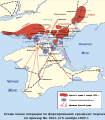 SVG map of the Soviet plan for the Perekop–Chongar oepration

- Article(s)
- Southern Front (RSFSR) and other Russian Civil War-related articles
- Request
I'd like an English translation of this map as we cannot expect our readers to be able to read foreign languages. Requesting here as original uploader seems to be inactive. Please do not include the text at the bottom starting with "Схема" as it properly belongs in the image caption. Text to translate:
- In Legend: Красные армии в 4 ноябру 1920 г. = Red Army positions on 4 November 1920; Основная групировка Белых - Main White units, Двнжения красной армии - Attack axis of Red Army units
- Bodies of water: Черное Море = Black Sea; Азовское Море = Sea of Azov; Днепр = Dnieper; Ингулец = Inhulets; Салгир = Salgir; Аравмская Смрелка = Arabat Spit.
- Inhabited places: Херсон = Kherson; Борислав = Beryslav; Наховка = Kakhovka; Федоровка = Fyodorovka; Травневе = Travneve; Мелитополь = Melitopol; Радывоновка = Radivonovka; Ниж Серагозы = Nizhny Serogozy; Фрунзе = Frunze; Ивановка = Ivanovka; Петровка = Petrovka; Аскания Нова = Askaniya Nova; Второе Приморское = Vtoroye Primorskoye; Скадовск = Skadovsk; Хорты = Khorly; Черновы = Chernovy; Строгановка = Stroganovka; Громовка = Gromovka; Ново Михайловка = Novomikhailovka; Перекоп = Perekop; Армянский Базар = Armyansky Bazar; Ново Алексеевска = Novoalekseyevka; Геническ = Genichesk; Новый Азов = Novy Azov; Новодмитревная = Novodmitriyevnaya; Рыкова = Rykova; Ново Григоровка = Novogrigorovka; Партизаны = Partizany, Чонгар = Chongar, Тион Джанкой = Tion Dzhankoy; Кирча Шуя = Kircha Shuya; Ишуиь = Yushun; Кочнары = Kochnary; Бнион Мамчин = Binon Mamchin; Бяринь = Byariny; Дюрбинь = Dyurbiny; Джанкой = Dzhankoy; Курман-Кемельчи = Kurman-Kemelchi; Симферополь = Simferopol; Севастополь = Sevastopol; Ялта = Yalta; Феодосия = Feodosiya; Керчь = Kerch; Nowotroicka = Novotroitskoye
- Military units: 6 АРМИЯ = 6th Army; МАХНО = Black Army: 1 КОНАРМИЯ = 1st Cavalry Army; 2 КОНАРМИЯ = 2nd Cavalry Army; 13 АРМИЯ = 13th Army; 4 АРМИЯ = 4th Army; 11 КОРПУС = 1st Army Corps (typo in map); резервы = Reserve
Kges1901 (
talk)
22:37, 2 January 2018 (UTC)
- That image doesn't have any text in it. What you see as text is generated from <path> structures in the file. This makes it far more difficult (and well beyond my ability) to edit. I could manage a PNG or other bitmap file, or a sensibly constructed SVG, but not an SVG file like this which combines the worse aspects of both.
Maproom (
talk)
15:55, 11 January 2018 (UTC)
- Well, hopefully, someone with the expertise to edit it will come along. Kges1901 ( talk) 00:03, 12 January 2018 (UTC)
- That image doesn't have any text in it. What you see as text is generated from <path> structures in the file. This makes it far more difficult (and well beyond my ability) to edit. I could manage a PNG or other bitmap file, or a sensibly constructed SVG, but not an SVG file like this which combines the worse aspects of both.
Maproom (
talk)
15:55, 11 January 2018 (UTC)
![]() Request taken by
Goran tek-en (
talk)
18:21, 12 January 2018 (UTC).
Request taken by
Goran tek-en (
talk)
18:21, 12 January 2018 (UTC).
- @
Kges1901: That image had a lot of problems in it besides for not having any text information. I have redone it and changed it to follow (as far as possible)
the template we use. You should check so I got the unit size and type of unit correct. There is one name, in purple on my draft, which I couldn't find a translation for.
Draft for you to check, give me feedback, please ping me, thanks. --
Goran tek-en (
talk)
20:33, 16 January 2018 (UTC)
- @
Goran tek-en: The unit sizes are right. All other units (besides the cavalry armies) are infantry. The name is Yevpatoriya. Otherwise, great work!
Kges1901 (
talk)
20:44, 16 January 2018 (UTC)
- @
Kges1901:
New draft. If this is OK I will need the following;
- Name of the file
- Description
- Category/ies at commons
- to be able to upload it at commons. --
Goran tek-en (
talk)
12:05, 17 January 2018 (UTC)
- @
Goran tek-en:
- Perekop–Chongar operation Soviet plan map en
- A map of the Soviet plan for the Perekop–Chongar operation of 1920
- Maps of the Civil war of Russia Kges1901 ( talk) 12:39, 17 January 2018 (UTC)
- @
Goran tek-en:
- @
Kges1901:
New draft. If this is OK I will need the following;
- @
Goran tek-en: The unit sizes are right. All other units (besides the cavalry armies) are infantry. The name is Yevpatoriya. Otherwise, great work!
Kges1901 (
talk)
20:44, 16 January 2018 (UTC)
@
Kges1901: Now you can find it here
Commons:file:Perekop–Chongar operation Soviet plan map-en.svg. If you are happy with this please put the code {{resolved|1=~~~~}} on this request so it can be archived, thanks. ![]() Done --
Goran tek-en (
talk)
14:46, 17 January 2018 (UTC)
Done --
Goran tek-en (
talk)
14:46, 17 January 2018 (UTC)
This is fixed.
15th Tank Corps
- Article(s)
- 15th Tank Corps
- Request
Translation and upload of maps including unit actions from offline sources, in order to provide better maps for a military unit article nominated for FA. I will send scans and translations of Russian and Polish terms in response to email if this request is accepted. The mapmaker need not do any research on this, simply create a map and add colors; I will be available for questions.
Kges1901 (
talk)
12:08, 2 January 2018 (UTC)
- It's hard to accept when one doesn't know the extent of the request. Saying "simply create a map and add colors" doesn't tell me much. --
Goran tek-en (
talk)
10:19, 3 January 2018 (UTC)
- I will email the original map with translations, all you have to do is edit the translations into the map, and possibly add background colors as these are black and white maps. I have two maps for the Soviet invasion of Poland and four more for campaigns on the Eastern Front.
Kges1901 (
talk)
11:03, 3 January 2018 (UTC)
- Mostly I/we (graphic workers, commons) try to make SVG files for maps as it's better in general,
Transition_to_SVG. If it's not that one for a specific reason wants to keep the original map, like historical document or other. So to me there is probably more work on this then what you think. Have you checked so that we can do this, there is no license stopping us?
- If there is no problems with licenses and it's OK for you that I convert them into SVG I will take this request, please ping me, thanks. --
Goran tek-en (
talk)
19:02, 3 January 2018 (UTC)
- @
Goran tek-en: There are no licensing problems and I'm ok with svg maps.
Kges1901 (
talk)
22:33, 3 January 2018 (UTC)
- @
Kges1901: I will also need a source for the images/maps that we will use as base material.
Request taken by
Goran tek-en (
talk)
13:24, 4 January 2018 (UTC).
- @
Goran tek-en: I have emailed you the sources.
Kges1901 (
talk)
13:44, 4 January 2018 (UTC)
- @
Kges1901: Thanks, will you email me the maps also. --
Goran tek-en (
talk)
15:12, 4 January 2018 (UTC)
- @
Goran tek-en: I cannot attach the maps using the Wikipedia email function. You'll have to respond to my email.
Kges1901 (
talk)
15:15, 4 January 2018 (UTC)
- @
Kges1901: I will start to work with them now. You said before that there was no problem with the license, but to me the maps are taken from a book which probably has a copyright on it. I don't know if the maps are made just for that book or if it's historical documents, but anyway, to my understanding the book still has its copyright.
Derivative_works,
2D_copying,
Screenshots.
- This is were my knowledge about those things starts to be vague, I don't know enough about copyrights like this. So what I can see I can only use those maps as a source of information and then I will have to make new versions of them which differ enough to be considered as my work.
- I need your help on telling/showing me which part of Poland the image 17 to 20 september.png shows? I have searched for Grodno but there are several around Poland.-- Goran tek-en ( talk) 13:11, 5 January 2018 (UTC)
- @ Goran tek-en: The Grodno in the map is this Grodno, the main topic on English Wikipedia. Commons category Commons Category:Maps of Hrodna Region may be useful for you to make base maps. I emailed you links to Google Mymaps that I created noting the populated places. Apologies for it being harder than I anticipated. Kges1901 ( talk) 13:31, 5 January 2018 (UTC)
- @
Kges1901: Mostly it is more complicated as we graphic worker as good as always have zero knowledge of the subject. You must have spelled the category wrong because it's a red link. Your Mymaps are very good for me, thanks. --
Goran tek-en (
talk)
16:52, 7 January 2018 (UTC)
- @
Kges1901: I want you to check
this draft so I got the over all area correct. Also I want you to tell me if there is more of the basic information you want in the map, or removed, or otherwise, thanks. --
Goran tek-en (
talk)
18:37, 7 January 2018 (UTC)
- @ Goran tek-en: - The draft is great, except that you are missing the Servach River, which is the river right next to Baranovichi. Kges1901 ( talk) 23:39, 7 January 2018 (UTC)
- @ Kges1901: Check if I got Servach right. Do you want the different types of arrows to be different on the new map also? Can you then list for me what they means. -- Goran tek-en ( talk) 14:51, 8 January 2018 (UTC)
- @
Kges1901: I want you to check
this draft so I got the over all area correct. Also I want you to tell me if there is more of the basic information you want in the map, or removed, or otherwise, thanks. --
Goran tek-en (
talk)
18:37, 7 January 2018 (UTC)
- @
Kges1901: I will start to work with them now. You said before that there was no problem with the license, but to me the maps are taken from a book which probably has a copyright on it. I don't know if the maps are made just for that book or if it's historical documents, but anyway, to my understanding the book still has its copyright.
Derivative_works,
2D_copying,
Screenshots.
- @
Goran tek-en: I cannot attach the maps using the Wikipedia email function. You'll have to respond to my email.
Kges1901 (
talk)
15:15, 4 January 2018 (UTC)
- @
Kges1901: Thanks, will you email me the maps also. --
Goran tek-en (
talk)
15:12, 4 January 2018 (UTC)
- @
Goran tek-en: I have emailed you the sources.
Kges1901 (
talk)
13:44, 4 January 2018 (UTC)
- @
Kges1901: I will also need a source for the images/maps that we will use as base material.
- @
Goran tek-en: There are no licensing problems and I'm ok with svg maps.
Kges1901 (
talk)
22:33, 3 January 2018 (UTC)
- Mostly I/we (graphic workers, commons) try to make SVG files for maps as it's better in general,
Transition_to_SVG. If it's not that one for a specific reason wants to keep the original map, like historical document or other. So to me there is probably more work on this then what you think. Have you checked so that we can do this, there is no license stopping us?
- I will email the original map with translations, all you have to do is edit the translations into the map, and possibly add background colors as these are black and white maps. I have two maps for the Soviet invasion of Poland and four more for campaigns on the Eastern Front.
Kges1901 (
talk)
11:03, 3 January 2018 (UTC)
@ Goran tek-en: Apologies, I should have been more specific - the Servach is very close to Baranovichi to the west. The arrows represent the movement of the specific military units. To create originality, I suggest you use different colors. For example, you could color each of the brigades a different color and use the same color for the arrows. Specifically: Arrow 1 with triangles is the 2nd Light Tank Brigade, Arrow 2 with dots is the 27th Light Tank Brigade, Arrow 3 with dashes is the 20th Motor Rifle and Machine Gun Brigade, Arrow 4 is the 21st Light Tank Brigade, arrow 6 is the 29th Light Tank Brigade, and arrow 5 is the 32nd Light Tank Brigade. Kges1901 ( talk) 14:57, 8 January 2018 (UTC)
- @
Kges1901: Rivers are very hard to see both on GMaps or OSM.
Is it not this one, the red/pink? Otherwise I will need you to show me somehow. --
Goran tek-en (
talk)
16:43, 8 January 2018 (UTC)
- @
Goran tek-en: You have it marked in the right place. Note that the mouth of the Servach is
here (it flows into the Neman). It is easier to see rivers on map view. However, I noticed that you marked the national borders for modern day, but since this is in a historical context the 1939 border should be marked. You can find the 1939 borders in the map I sent you, and they are clearly delineated in files on Commons such as
File:Kamp_wrzesn9-16.png
Kges1901 (
talk)
18:09, 8 January 2018 (UTC)
- @
Kges1901: I was just going to ask you about the borders, thanks for the info. At commons and wikipedia we try to keep some kind of structure and identity between maps that have the same purpose, this so it's easier for the viewers. For this reason we have different templates and
this template is for military maps. If you look at the top left part there are symbols for different sizes and types of units.
In this new draft I have used them. But I'm not sure I got the sizes or types of units correct so check this and everything else also, thanks. --
Goran tek-en (
talk)
19:56, 9 January 2018 (UTC)
- @
Goran tek-en: You got the unit types right except that the 20th MRB is a brigade and thus should have one 'X'. The 15th TC is a corps and should have three 'X's. Don't forget that the 'u' in Soviet Union is capitalized, and third country in the northwest corner is Lithuania. The last thing for this map will be adding the dates. Thank you for putting the work in to make the map.
Kges1901 (
talk)
20:38, 9 January 2018 (UTC)
- @
Kges1901:
New draft. There are two new green lines which I found now, missed them before. It's hard to see but I think I got them right. They are green just now so it's easy for you to see them, will make them read. Feedback, thanks. --
Goran tek-en (
talk)
16:36, 10 January 2018 (UTC)
- @
Goran tek-en: Looks great, thanks.
Kges1901 (
talk)
22:30, 10 January 2018 (UTC)
- @
Kges1901:I will need the following;
- Name of the file
- Description
- Category/ies at commons
- to be able to upload it at commons. -- Goran tek-en ( talk) 18:39, 11 January 2018 (UTC)
- @
Kges1901:I will need the following;
- @
Goran tek-en: Looks great, thanks.
Kges1901 (
talk)
22:30, 10 January 2018 (UTC)
- @
Kges1901:
New draft. There are two new green lines which I found now, missed them before. It's hard to see but I think I got them right. They are green just now so it's easy for you to see them, will make them read. Feedback, thanks. --
Goran tek-en (
talk)
16:36, 10 January 2018 (UTC)
- @
Goran tek-en: You got the unit types right except that the 20th MRB is a brigade and thus should have one 'X'. The 15th TC is a corps and should have three 'X's. Don't forget that the 'u' in Soviet Union is capitalized, and third country in the northwest corner is Lithuania. The last thing for this map will be adding the dates. Thank you for putting the work in to make the map.
Kges1901 (
talk)
20:38, 9 January 2018 (UTC)
- @
Kges1901: I was just going to ask you about the borders, thanks for the info. At commons and wikipedia we try to keep some kind of structure and identity between maps that have the same purpose, this so it's easier for the viewers. For this reason we have different templates and
this template is for military maps. If you look at the top left part there are symbols for different sizes and types of units.
In this new draft I have used them. But I'm not sure I got the sizes or types of units correct so check this and everything else also, thanks. --
Goran tek-en (
talk)
19:56, 9 January 2018 (UTC)
- @
Goran tek-en: You have it marked in the right place. Note that the mouth of the Servach is
here (it flows into the Neman). It is easier to see rivers on map view. However, I noticed that you marked the national borders for modern day, but since this is in a historical context the 1939 border should be marked. You can find the 1939 borders in the map I sent you, and they are clearly delineated in files on Commons such as
File:Kamp_wrzesn9-16.png
Kges1901 (
talk)
18:09, 8 January 2018 (UTC)
17-24
@ Kges1901: When I look at 20-24 on the map I can't help wonder why is this not included in 17-20 which then would turn into 17-24? I will await your answer before uploading the previous one or start on this one, thanks. -- Goran tek-en ( talk) 19:20, 11 January 2018 (UTC)
- @
Goran tek-en: I initially thought it should be separate because otherwise the first map would cover too large of an area. But I noticed that you included the Suwalki area in the first map, so the second would should be combined. I will send you a mymap of the key locations.
Kges1901 (
talk)
21:37, 11 January 2018 (UTC)
- @
Kges1901: But you have already sent me one, I will combine them. --
Goran tek-en (
talk)
10:30, 12 January 2018 (UTC)
- @
Kges1901:
Draft to look at. --
Goran tek-en (
talk)
16:28, 12 January 2018 (UTC)
- @ Goran tek-en: Great work and thanks for taking it on. The name should be File:15th Tank Corps in Poland 17–24 September 1939. The Description in English should be: Movements of the Soviet 15th Tank Corps in the Soviet invasion of Poland, 17–24 September 1939. Also includes early movements of the independent 29th and 32nd Tank Brigades. Categories: Maps of the Polish Defensive War of 1939, Soviet invasion of Poland of 1939 Kges1901 ( talk) 20:46, 12 January 2018 (UTC)
- @
Kges1901:
Draft to look at. --
Goran tek-en (
talk)
16:28, 12 January 2018 (UTC)
- @
Kges1901: But you have already sent me one, I will combine them. --
Goran tek-en (
talk)
10:30, 12 January 2018 (UTC)
@ Kges1901: Now you can find it here Commons:File:15th Tank Corps in Poland 17–24 September 1939.svg. -- Goran tek-en ( talk) 13:29, 13 January 2018 (UTC)
Southern Kaluga Oblast 1942
Will be sending copyrighted scans of maps from a book soon. I will provide you a mymaps since it is hard to create them from scratch.
Kges1901 (
talk) 20:46, 12 January 2018 (UTC)
:@
Kges1901: The three maps you sent me are in Russian, so I need a translation of the city names as they are in your mymaps. --
Goran tek-en (
talk)
17:52, 13 January 2018 (UTC)
- @
Kges1901: I will need explanation of all the different lines and arrows of the three maps you sent me as
numbers here. Also the grey part which represents forest to me, should they be included in the map? --
Goran tek-en (
talk)
13:16, 15 January 2018 (UTC)
- @
Goran tek-en: Line 1 is the initial Soviet position on 22 August 1942. Line 2 is the positions at the end of the day. Arrows 3 and 4 are the movement of the 15th Tank Corps. Line 5 is the Soviet position on 26 August. Arrow 6 is also 15th Tank Corps, arrow 7 is a German attack. The gray area is indeed forest, and should be marked.
Kges1901 (
talk)
13:54, 15 January 2018 (UTC)
- @
Kges1901: I found a typo in the legend on this
Commons:File:15th Tank Corps in Poland 17–24 September 1939.svg, I had switched Corps Brigade, new version uploaded (it can take some time for the preview to be updated). The others are coming soon. --
Goran tek-en (
talk)
16:51, 19 January 2018 (UTC)
- @
Kges1901: Drafts to check. I didn't really understand the different arrows so I have made some assumptions and you need to correct me, the legends and everything else.
- @
Goran tek-en: Comments:
- 22 August: the other movement directly south of Novogryn is of both the 15th Tank Corps and the 154th Rifle Division (the second one is an infantry unit, a division, abbreviated as RD). Note that during the battle the corps was subordinated to the 3rd Tank Army (an armored unit, a field army equivalent, abbreviated as TA), so you can put an icon for the 3rd Tank Army behind the Soviet line close to the west of Slobodka.
- 26 August: The northernmost attack towards Belyy Kamen is actually by the 3rd Tank Corps. That line south of Novogryn is actually for 27 August, after the end of the period. The Soviet arrows heading east for the 12th and 15th Tank Corps represent repositioning or retreats.
- 26–31 August (more accurately 27–31 August): The northernmost arrow towards Ozhigovo is actually the 3rd Tank Corps. Again the eastward/northward Soviet arrows for the 12th and 15th Tank Corps are retreats. Since the scale is different, you should extend the 15th Tank Corps arrow for this map closer to Leonovo as shown in the map I sent you for greater accuracy, and move the start of the arrow very close northwest of Pakom. Kges1901 ( talk) 00:20, 20 January 2018 (UTC)
- @
Goran tek-en: Comments:
- @
Kges1901: Drafts to check. I didn't really understand the different arrows so I have made some assumptions and you need to correct me, the legends and everything else.
- @
Kges1901: I found a typo in the legend on this
Commons:File:15th Tank Corps in Poland 17–24 September 1939.svg, I had switched Corps Brigade, new version uploaded (it can take some time for the preview to be updated). The others are coming soon. --
Goran tek-en (
talk)
16:51, 19 January 2018 (UTC)
- @
Goran tek-en: Line 1 is the initial Soviet position on 22 August 1942. Line 2 is the positions at the end of the day. Arrows 3 and 4 are the movement of the 15th Tank Corps. Line 5 is the Soviet position on 26 August. Arrow 6 is also 15th Tank Corps, arrow 7 is a German attack. The gray area is indeed forest, and should be marked.
Kges1901 (
talk)
13:54, 15 January 2018 (UTC)
- @
Kges1901: I will need explanation of all the different lines and arrows of the three maps you sent me as
numbers here. Also the grey part which represents forest to me, should they be included in the map? --
Goran tek-en (
talk)
13:16, 15 January 2018 (UTC)
- @
Kges1901: New drafts.
- @
Goran tek-en: Looks great, thanks.
Kges1901 (
talk)
23:04, 20 January 2018 (UTC)
- @
Kges1901: I will need the following for each file;
- Name of the file
- Description
- Category/ies at commons
- to be able to upload it at commons.— Preceding
unsigned comment added by
Goran tek-en (
talk •
contribs)
- @
Goran tek-en:
- 3rd Tank Army in the Kozelsk Offensive, 22 August 1942 (1), 3rd Tank Army in the Kozelsk Offensive, 26 August 1942 (2), 3rd Tank Army in the Kozelsk Offensive, 27–31 August (3).
- Actions of the 3rd Tank Army in the Kozelsk Offensive, 22 August 1942 (1), Actions of the 3rd Tank Army in the Kozelsk Offensive, 26 August 1942 (2), Actions of the 3rd Tank Army in the Kozelsk Offensive, 27–31 August 1942 (3)
- Maps of battles on the Eastern Front in World War II, The counter-attack by troops of the Western front in the area of Sukhinichi, Kozelsk (all) Kges1901 ( talk) 11:46, 21 January 2018 (UTC)
- @
Goran tek-en:
- @
Kges1901: I will need the following for each file;
- @
Goran tek-en: Looks great, thanks.
Kges1901 (
talk)
23:04, 20 January 2018 (UTC)
- @
Kges1901: New drafts.
@ Kges1901: Now you can find them here;
- Commons:File:3rd Tank Army in the Kozelsk Offensive, 22 August 1942.svg
- Commons:File:3rd Tank Army in the Kozelsk Offensive, 26 August 1942.svg
-
Commons:File:3rd Tank Army in the Kozelsk Offensive, 27–31 August 1942.svg. If you are happy with this please put the code
{{resolved|1=~~~~}}on this request so it can be archived, thanks. Done --
Goran tek-en (
talk)
13:27, 21 January 2018 (UTC)
Perekop–Chongar operation Soviet plan map translation
-
SVG map of the Soviet plan for the Perekop–Chongar oepration
- Article(s)
- Southern Front (RSFSR) and other Russian Civil War-related articles
- Request
I'd like an English translation of this map as we cannot expect our readers to be able to read foreign languages. Requesting here as original uploader seems to be inactive. Please do not include the text at the bottom starting with "Схема" as it properly belongs in the image caption. Text to translate:
- In Legend: Красные армии в 4 ноябру 1920 г. = Red Army positions on 4 November 1920; Основная групировка Белых - Main White units, Двнжения красной армии - Attack axis of Red Army units
- Bodies of water: Черное Море = Black Sea; Азовское Море = Sea of Azov; Днепр = Dnieper; Ингулец = Inhulets; Салгир = Salgir; Аравмская Смрелка = Arabat Spit.
- Inhabited places: Херсон = Kherson; Борислав = Beryslav; Наховка = Kakhovka; Федоровка = Fyodorovka; Травневе = Travneve; Мелитополь = Melitopol; Радывоновка = Radivonovka; Ниж Серагозы = Nizhny Serogozy; Фрунзе = Frunze; Ивановка = Ivanovka; Петровка = Petrovka; Аскания Нова = Askaniya Nova; Второе Приморское = Vtoroye Primorskoye; Скадовск = Skadovsk; Хорты = Khorly; Черновы = Chernovy; Строгановка = Stroganovka; Громовка = Gromovka; Ново Михайловка = Novomikhailovka; Перекоп = Perekop; Армянский Базар = Armyansky Bazar; Ново Алексеевска = Novoalekseyevka; Геническ = Genichesk; Новый Азов = Novy Azov; Новодмитревная = Novodmitriyevnaya; Рыкова = Rykova; Ново Григоровка = Novogrigorovka; Партизаны = Partizany, Чонгар = Chongar, Тион Джанкой = Tion Dzhankoy; Кирча Шуя = Kircha Shuya; Ишуиь = Yushun; Кочнары = Kochnary; Бнион Мамчин = Binon Mamchin; Бяринь = Byariny; Дюрбинь = Dyurbiny; Джанкой = Dzhankoy; Курман-Кемельчи = Kurman-Kemelchi; Симферополь = Simferopol; Севастополь = Sevastopol; Ялта = Yalta; Феодосия = Feodosiya; Керчь = Kerch; Nowotroicka = Novotroitskoye
- Military units: 6 АРМИЯ = 6th Army; МАХНО = Black Army: 1 КОНАРМИЯ = 1st Cavalry Army; 2 КОНАРМИЯ = 2nd Cavalry Army; 13 АРМИЯ = 13th Army; 4 АРМИЯ = 4th Army; 11 КОРПУС = 1st Army Corps (typo in map); резервы = Reserve
Kges1901 (
talk)
22:37, 2 January 2018 (UTC)
- That image doesn't have any text in it. What you see as text is generated from <path> structures in the file. This makes it far more difficult (and well beyond my ability) to edit. I could manage a PNG or other bitmap file, or a sensibly constructed SVG, but not an SVG file like this which combines the worse aspects of both.
Maproom (
talk)
15:55, 11 January 2018 (UTC)
- Well, hopefully, someone with the expertise to edit it will come along. Kges1901 ( talk) 00:03, 12 January 2018 (UTC)
- That image doesn't have any text in it. What you see as text is generated from <path> structures in the file. This makes it far more difficult (and well beyond my ability) to edit. I could manage a PNG or other bitmap file, or a sensibly constructed SVG, but not an SVG file like this which combines the worse aspects of both.
Maproom (
talk)
15:55, 11 January 2018 (UTC)
![]() Request taken by
Goran tek-en (
talk)
18:21, 12 January 2018 (UTC).
Request taken by
Goran tek-en (
talk)
18:21, 12 January 2018 (UTC).
- @
Kges1901: That image had a lot of problems in it besides for not having any text information. I have redone it and changed it to follow (as far as possible)
the template we use. You should check so I got the unit size and type of unit correct. There is one name, in purple on my draft, which I couldn't find a translation for.
Draft for you to check, give me feedback, please ping me, thanks. --
Goran tek-en (
talk)
20:33, 16 January 2018 (UTC)
- @
Goran tek-en: The unit sizes are right. All other units (besides the cavalry armies) are infantry. The name is Yevpatoriya. Otherwise, great work!
Kges1901 (
talk)
20:44, 16 January 2018 (UTC)
- @
Kges1901:
New draft. If this is OK I will need the following;
- Name of the file
- Description
- Category/ies at commons
- to be able to upload it at commons. --
Goran tek-en (
talk)
12:05, 17 January 2018 (UTC)
- @
Goran tek-en:
- Perekop–Chongar operation Soviet plan map en
- A map of the Soviet plan for the Perekop–Chongar operation of 1920
- Maps of the Civil war of Russia Kges1901 ( talk) 12:39, 17 January 2018 (UTC)
- @
Goran tek-en:
- @
Kges1901:
New draft. If this is OK I will need the following;
- @
Goran tek-en: The unit sizes are right. All other units (besides the cavalry armies) are infantry. The name is Yevpatoriya. Otherwise, great work!
Kges1901 (
talk)
20:44, 16 January 2018 (UTC)
@
Kges1901: Now you can find it here
Commons:file:Perekop–Chongar operation Soviet plan map-en.svg. If you are happy with this please put the code {{resolved|1=~~~~}} on this request so it can be archived, thanks. ![]() Done --
Goran tek-en (
talk)
14:46, 17 January 2018 (UTC)
Done --
Goran tek-en (
talk)
14:46, 17 January 2018 (UTC)
This is fixed.
Districts and PBT of Johor
- Article(s)
- Johor
- Location Map
- Request
- I would like to ask somebody to do a favor to create a district-level map for Johor with its' local government boundary based of this file. angys ( Talk Talk) 10:04, 22 December 2017 (UTC)
- Graphist opinion(s)
We have this
Commons:file:Malaysia_location_map.svg as a location map of Malaysia. If you want a district map of a specific part you will have to provide a source that we can use. The pdf-file you link to contains 24 pages so it's not easy to use, you have to understand that we have zero knowledge of the subject and need a source we can work from directly without having to search or read a lot of information. Thanks for your understanding. --
Goran tek-en (
talk)
19:18, 3 January 2018 (UTC)
- OK, that will be page 8's map. The place has been shown on the right side of the map and you can see
Local government in Malaysia if you feel that was hard to know.
angys (
Talk Talk)
09:51, 5 January 2018 (UTC)
- @
*angys*: It would help a lot if you followed the normal way to edit/write here concerning new lines, indent and stuff like that. Also you link to a page "
Local governments in Malaysia" that doesn't exist, why?
- You write "if you feel that was hard to know" and I don't really understand what you mean but I feel it's not something kind you mean by it. If you don't accept that we graphic workers do just , graphic work, and the requester provides all the necessary information in a way that is easy to access for us it will be very hard to help you with your requests. We have normally zero knowledge on the subject and we just want what we need to complete the request. We don't do research and we don't look thru a lot of material to try to find some information which is probably very clear to the requester. I will check in the pdf on p8. --
Goran tek-en (
talk)
20:44, 5 January 2018 (UTC)
- I just want to tell you that those information has been provided in the PDF. Actually I have given a clear information but if you really dont know I apologize to you.
angys (
Talk Talk)
02:12, 6 January 2018 (UTC)
- @
*angys*: If you look at the text/code in edit mode you can see that to make a New line you have to put the code
<br>at the end of previous line. Or in the head of the edit window click Advanced and then the Return/Enter symbol. - As you can see at the start of this line there is four
::::which gives an indent which increases as you put more of them. If you look at your edit there were three and now I put four to increase the indent. This is so that it's easy to follow a discussion and get the last edit. When there are many::::::::::::::we just start over from zero again. Check in any request here to find out this and more. It's very helpful to use the Show preview function below to check everything before one click on Publish changes. -- Goran tek-en ( talk) 19:03, 6 January 2018 (UTC)-
Request taken by
Goran tek-en (
talk)
19:05, 6 January 2018 (UTC).
- Noted angys ( Talk Talk) 05:15, 7 January 2018 (UTC)
- @
*angys*: I want you to
look at this draft and check that's it right so far. Then we have to decide how to do with the long names to the right (PBT names). It will be hard to fit them in the different areas so we can do in different ways. Colors is one way but it can easily become a problem for people with color viewing problems. My suggestion is that we put numbers (as I show with 1 and 2) and then either put the names in a legend on the map or put the names in the description field of the map?
- Putting it in the description field makes it easier to translate, tell me which you want and what/if to change in the map, please ping me, thanks. --
Goran tek-en (
talk)
14:19, 7 January 2018 (UTC)
- @
Goran tek-en: Thanks, the map look nice. I suggest that the district border can be thicker and the PBT (local authorities) border can be thinner. I think numbering is not ok and maybe you can do for location map and label the map by using template e.g. {{
Penang district level labelled map}}. So far Johor have 10 district and 16 local authority, if you want to do a map that already labelled, maybe you can consider just using short name e.g.
Majlis Bandaraya Iskandar Puteri (Iskandar Puteri City) for only Iskandar Puteri and for Majlis Daerah Simpang Renggam only Spg. Renggam. Best regards.
angys (
Talk Talk)
15:33, 7 January 2018 (UTC)
- @
*angys*: The template {{
Penang district level labelled map}} is something that works on wikipedia when some one writes an article. The template use, in this case, a png image as base image and then adding the names. So as a graphic worker I would have done the png (in that case) and then you as a editor of the article will do the rest using the template. I create an image and then I upload it to commons, not wikipedia. I will try to shorten the names and then we will go from there. --
Goran tek-en (
talk)
19:02, 7 January 2018 (UTC)
- @
*angys*:
Draft with names, feedback, thanks. --
Goran tek-en (
talk)
19:20, 7 January 2018 (UTC)
- @
Goran tek-en:OK, Your maps got a little bit error. Firstly I have noted that the district border you can thicker it and the PBT (local authorities) border can be thinner e.g.
Segamat District have 2 PBT due to it's land size too big abd split to Labis town and Segamat municipal..
- The second one is spme of the name in the map spell wrong.
- Tempatan Penggerang can be more shorter to Pengerang (one g, Tempatan means locality)
- Pasir Guadang is Pasir Gudang
- Johor Bahru Tengah now called Iskandar Puteri
- The Segamat should change with Simpang Renggam.
- I think the map may be can do 2 version that 1 version is blank while another version with text which is translateable to fit some special script e.g. Japanese, Chinese, Arabisan... That is my little opinion and thank you for your working. :)
angys (
Talk Talk)
22:56, 7 January 2018 (UTC)
- @ *angys*: If you mean the border in the darker area, district, and the lighter area, PBT. To me there is a big difference int both thickness and type of line, different dashes, so I don't understand why you want it thicker, thinner for?
- I start to think that I don't really understand the differences of the different types of areas you are talking about. I understand that you try to explain for me by linking to e.g. Segamat District but to me as without any knowledge of the structure levels it's still hard to understand and I really don't want to digg into it.
- Please just tell me exactly what to change e.g. Change the border between Kluang and Mersing to a thinner line, etc.
- Once we got this right we can decide which versions you need. New draft with names. -- Goran tek-en ( talk) 14:32, 8 January 2018 (UTC)
- The second one is spme of the name in the map spell wrong.
- @
Goran tek-en:OK, Your maps got a little bit error. Firstly I have noted that the district border you can thicker it and the PBT (local authorities) border can be thinner e.g.
Segamat District have 2 PBT due to it's land size too big abd split to Labis town and Segamat municipal..
- @
*angys*:
Draft with names, feedback, thanks. --
Goran tek-en (
talk)
19:20, 7 January 2018 (UTC)
- @
*angys*: The template {{
Penang district level labelled map}} is something that works on wikipedia when some one writes an article. The template use, in this case, a png image as base image and then adding the names. So as a graphic worker I would have done the png (in that case) and then you as a editor of the article will do the rest using the template. I create an image and then I upload it to commons, not wikipedia. I will try to shorten the names and then we will go from there. --
Goran tek-en (
talk)
19:02, 7 January 2018 (UTC)
- @
Goran tek-en: Thanks, the map look nice. I suggest that the district border can be thicker and the PBT (local authorities) border can be thinner. I think numbering is not ok and maybe you can do for location map and label the map by using template e.g. {{
Penang district level labelled map}}. So far Johor have 10 district and 16 local authority, if you want to do a map that already labelled, maybe you can consider just using short name e.g.
Majlis Bandaraya Iskandar Puteri (Iskandar Puteri City) for only Iskandar Puteri and for Majlis Daerah Simpang Renggam only Spg. Renggam. Best regards.
angys (
Talk Talk)
15:33, 7 January 2018 (UTC)
-
- @
*angys*: If you look at the text/code in edit mode you can see that to make a New line you have to put the code
- I just want to tell you that those information has been provided in the PDF. Actually I have given a clear information but if you really dont know I apologize to you.
angys (
Talk Talk)
02:12, 6 January 2018 (UTC)
- @
*angys*: It would help a lot if you followed the normal way to edit/write here concerning new lines, indent and stuff like that. Also you link to a page "
Local governments in Malaysia" that doesn't exist, why?
@ Goran tek-en:Next time probably I will say it clearly.
- Q:If you mean the border in the darker area, district, and the lighter area, PBT. To me there is a big difference int both thickness and type of line, different dashes, so I don't understand why you want it thicker, thinner for?
- A:District are first place, and than for PBT. You can think that district is bigger than PBT. For you to easier know about it, Segamat District=Segamat+Labis.
- Q:Please just tell me exactly what to change e.g. Change the border between Kluang and Mersing to a thinner line, etc.
- A:OK, Change the border between Kluang and Simpang Renggam, Segamat and Labis, Johor Bahru Iskandar Puteri and Pasir Gudang, Kota Tinggi and Pengerang, Yong Peng and Batu Pahat to a thinner line
- Johor Bahru Tengah now called Iskandar Puteri
Malaysia's Administrative divisions very unique because it had seperate to district and PBT (local authorities). Thank you for your understanding.Regards :) angys ( Talk Talk) 16:52, 8 January 2018 (UTC)
- @
*angys*:
New draft with different lines etc. --
Goran tek-en (
talk)
19:22, 9 January 2018 (UTC)
- @ Goran tek-en:Change the border between Iskandar Puteri and Johor Bahru to a thinner line.
- There are also some typo
- Johor Bahru Tengah → Iskandar Puteri
- Iskandar Puteri → Johor Bahru
- Labia → Labis
-
angys (
Talk Talk)
22:59, 9 January 2018 (UTC)
- @
*angys*:
New draft. --
Goran tek-en (
talk)
18:37, 11 January 2018 (UTC)
- @
Goran tek-en:Look nice, so the Johor PBT labelled map has been done and I would like to see a blank map for location map use, Thank You.
angys (
Talk Talk)
22:43, 11 January 2018 (UTC)
- @
*angys*: I will need the following;
- Name of the file
- Description
- Category/ies at commons
- to be able to upload the labelled version at commons.
- @
Goran tek-en:
- Name of the file→Districts and PBT of Johor
- Description→A map showing districts and PBT (local authorities) of Johor
- Category/ies at commons→Maps of Johor
-
angys (
Talk Talk)
10:40, 12 January 2018 (UTC)
- @
*angys*: Now you can find it here
Commons:File:Districts and PBT of Johor.svg.
- Did you look at the blank draft, Draft for blank version. -- Goran tek-en ( talk) 16:49, 12 January 2018 (UTC)
- @
Goran tek-en:Yes, I would like to use a blank map for location map in infobox settlement. (I think you can remove the legend for the blank version one. And may you add Geographic limits for the map like
File:Map of Iskandar Malaysia municipal governments.png)
- Name of the file→Johor location map
- Description→A map showing districts and PBT (local authorities) of Johor (blank version)
- Category/ies at commons→Maps of Johor angys ( Talk Talk) 17:31, 12 January 2018 (UTC)
- Correction for the Labelled map
- Region border→State border (Malaysia predominantly use state and not region.)
angys (
Talk Talk)
17:34, 12 January 2018 (UTC)
- @
*angys*: Now you can find it here
Commons:File:Districts and PBT of Johor.svg.
- @
Goran tek-en:
- @
*angys*: I will need the following;
- @
Goran tek-en:Look nice, so the Johor PBT labelled map has been done and I would like to see a blank map for location map use, Thank You.
angys (
Talk Talk)
22:43, 11 January 2018 (UTC)
- @
*angys*:
New draft. --
Goran tek-en (
talk)
18:37, 11 January 2018 (UTC)
@
*angys*: New version labelled is uploaded.
Now you can find it here
Commons:File:Johor location map.svg, you should check the geografical area. If you are happy with this please put the code {{resolved|1=~~~~}} on this request so it can be archived, thanks. ![]() Done --
Goran tek-en (
talk)
13:17, 13 January 2018 (UTC)
Done --
Goran tek-en (
talk)
13:17, 13 January 2018 (UTC)
locator
@ Goran tek-en:For that 2 map I think it is Ok and I would like to request you to create locator map for 10 district like File:Daerah Petaling Highlighted in the State of Selangor, Malaysia.svg so that I can put in on each district's page.
- Name of the file→File:XXX Highlighted in Johor, Malaysia.svg
- Description→Location of XXX district, Selangor, Malaysia
- Category/ies at commons→Maps of Johor
- @
*angys*:
-
Commons:file:Batu Pahat highlighted in Johor, Malaysia.svg
-
Commons:file:Johor Bahru highlighted in Johor, Malaysia.svg
-
Commons:file:Kluang highlighted in Johor, Malaysia.svg
-
Commons:file:Kota Tinggi highlighted in Johor, Malaysia.svg
-
Commons:file:Kulai highlighted in Johor, Malaysia.svg
-
Commons:file:Mersing highlighted in Johor, Malaysia.svg
-
Commons:file:Muar highlighted in Johor, Malaysia.svg
-
Commons:file:Pontian highlighted in Johor, Malaysia.svg
-
Commons:file:Segamat highlighted in Johor, Malaysia.svg
-
Commons:file:Tangkak highlighted in Johor, Malaysia.svg --
Goran tek-en (
talk)
18:05, 20 January 2018 (UTC)
- @
Goran tek-en:, look good, but I think that locator map can be focus at Johor area only, other area is not necessary at all. Thanks. (and the 2 outer islands located in east coast of Johor is belong to Pontian, and West Coast is for Mersing)
angys (
Talk Talk)
18:10, 20 January 2018 (UTC)
- @
*angys*: I don't understand if you want me to change something, in that case be specific and direct. As I understood it we should use tha map we had and just turn it into those locator maps. --
Goran tek-en (
talk)
19:24, 20 January 2018 (UTC)
- OK, keep that angys ( Talk Talk) 04:29, 21 January 2018 (UTC)
- @
*angys*: I don't understand if you want me to change something, in that case be specific and direct. As I understood it we should use tha map we had and just turn it into those locator maps. --
Goran tek-en (
talk)
19:24, 20 January 2018 (UTC)
- @
Goran tek-en:, look good, but I think that locator map can be focus at Johor area only, other area is not necessary at all. Thanks. (and the 2 outer islands located in east coast of Johor is belong to Pontian, and West Coast is for Mersing)
angys (
Talk Talk)
18:10, 20 January 2018 (UTC)
Chinese translation
I request for doing a chinese translation for the map. The word has provided as below and you just need to copy and paste it.
- Johor Bahru-新山
- Iskandar Puteri-依斯干达公主城
- Pasir Gudang-巴西古当
- Kulai-古来
- Segamat-昔加末
- Labis-拉美士
- Tangkak-东甲
- Muar-麻坡
- Batu Pahat-峇株巴辖
- Yong Peng-永平
- Pontian-笨珍
- Kluang-居銮
- Simpang Renggam-新邦令金
- Mersing-丰盛港县
- Kota Tinggi-哥打丁宜
- Pengerang-边佳兰
- Country border-国界
- State border-州界
- District border-县界
- PBT (local authorities) border-地方政府边界
angys ( Talk Talk) 14:21, 13 January 2018 (UTC)
- @
*angys*: Both locator and translation will have to wait some time. --
Goran tek-en (
talk)
15:37, 13 January 2018 (UTC)
- ABC
angys (
Talk Talk)
15:05, 20 January 2018 (UTC)
- @ *angys*: Draft to check. There are two names I divided on two rows, if it's not correct please write it here, thanks. -- Goran tek-en ( talk) 18:25, 20 January 2018 (UTC)
- ABC
angys (
Talk Talk)
15:05, 20 January 2018 (UTC)
Look nice, but actually Mersing is 丰盛港 only (typo as I add a District behind Mersing).
angys (
Talk Talk)
19:17, 20 January 2018 (UTC)
- @
*angys*: Now you can find it here
Commons:file:Districts and PBT of Johor-zh.svg. You will have to add the Chinese description. If you are happy with this please put the code
{{resolved|1=~~~~}}on this request so it can be archived, thanks. Done --
Goran tek-en (
talk)
14:10, 22 January 2018 (UTC)
Image map vectorization
-
 Map of islands, that became a place of HMAS AE1 of detection.

![[2]](https://upload.wikimedia.org/wikipedia/commons/1/1f/1939-1940-battle_of_france-plan-evolution.jpg)
![[3]](https://upload.wikimedia.org/wikipedia/commons/8/83/Blank_Map_with_US_subdivisions.svg)
![[6]](https://winecoastersblog.files.wordpress.com/2015/11/img_0575.jpg)
![[7]](http://www.historicpictoric.com/blog/wp-content/uploads/2016/02/CanalMap-edit-bmm-border-final-1024x816.jpg)
![[8]](http://www.gcnursery.co.uk/hardchrt.jpg)
![[9]](http://www.trebrown.com/images/uk_zonemap.gif)
- Article(s)
- Duke of York Islands
- Request
- There is a request to make this picture in vector (SVG) format. -- Kirill Borisenko ( talk) 21:05, 3 January 2018 (UTC)
- Graphist opinion(s)
- Done, uploaded to
File:Duke of York Islands.svg There's some issues with the font rendering at certain thumbnail sizes though. --
AntiCompositeNumber (
talk)
01:33, 14 January 2018 (UTC)
- Thank you! -- Kirill Borisenko ( talk) 22:45, 19 January 2018 (UTC)
Seems to be fixed.
| This is an
archive of past discussions for the period 2017. Do not edit the contents of this page. If you wish to start a new discussion or revive an old one, please do so on the current main page. |
Time Zones in Africa.
- Article(s)
- [ [1]], others.
- Request
- The border between Mali and Guinea is missing. Could someone add it in? 8.40.151.110 ( talk) 16:43, 1 July 2017 (UTC)
Also, clean up the inter-time zone border in the DRC. 8.40.151.110 ( talk) 16:45, 1 July 2017 (UTC)
Also, Sudan will change its time zone to UTC+2 on 1 November. This needs to be reflected. Source: https://www.timeanddate.com/news/time/sudan-new-time-zone.html 8.40.151.110 ( talk) 16:08, 19 October 2017 (UTC)
- Graphist opinion(s)
Treaty of Nöteborg 1323
Hi, the Treaty of Nöteborg is the first known border between Finland, Sweden and Novgorod and thus quite important. The prevailing view in research is that the border had two lines and the area between belonged jointly to West-Finnish/Swedish and Russo-Karelian cultures respectively. This view is supported by Iron Age material discoveries. I made a map to Finnish wikipedia according to historians Jarl Gallén and Johan Lind (1991) but I am not happy to the quality of the map. Template doesn`t have too many pixels and the graphics need to be better etc. Also description box would be grate to add already to the map. I can fill it with information if needed.
Finnish wikipedia link: https://fi.wikipedia.org/wiki/P%C3%A4hkin%C3%A4saaren_rauha Link to the map by me: https://fi.wikipedia.org/wiki/Tiedosto:P%C3%A4hkin%C3%A4saaren_rauhan_raja_1323_5.jpg
- Request
- Totally new map of the border or good quality template and some help.
- Sources
Jarl Gallen: Nöteborgsfreden och Finlands medeltida östgräns (1968), Pirjo Uino: Ancient Karelia (1997), Haggren er al.: Muinaisuutemme jäljet (2015) — Preceding unsigned comment added by Velivieras ( talk • contribs) 11:55, 16 August 2017 (UTC)
2
@ Scope creep: I can't find or read the names of two cities and then there is a dot I can't see any name for. It's encircled on this image. Also I have very hard to read the different dates, what is at the base of arrows, which numbers or letters. -- Goran tek-en ( talk) 18:41, 4 September 2017 (UTC)
Left is La Feuillée, the mid dot, is a dot, above it is Stenay. The one of the right is Dudenhofen. scope_creep ( talk) 20:50, 4 September 2017 (UTC)
- @
Scope creep: I can find several La Feuillée but to me none of them are right. If you can get me a link on a map it would be great.
- Are you sure it's Dudenhofen, to me and his map that is on the wrong side of the border, should it not be in France? --
Goran tek-en (
talk)
18:21, 5 September 2017 (UTC)
- @ Goran tek-en: It looks like your right. I reads like Dudenhofen, but it is definitely not that. Too far out to the right, but a long way. I created some intersecting grid lines on google earth, and created a triangle where it should have been in, but couldn't locate it. So I guess miss it out for the moment. I saw this map: [2] (map 4 on bottom left) which was the unit operations for the invasion, and its got a bunch of places all over, lots in common with this map, but Dudenhofen is not it. I have added the La Feuillie as well for correct location.
I've made a list of the names of cities, on the map, ones in doubt, which may help.
- Saint-Valery-sur-Somme
- Elbeuf
- Rouen
- La Feuillie, Seine-Maritime
- Clermont, Oise
- Montdidier, Somme, above Clermont (Line)
- Amiens, above to the left of Montdidier (Line)
- Abbeville, to the left and up of Amies. (Line)
- Arras to the top left from Amiens
- Péronne, Somme to the right of Amiens (Line)
- Saint-Quentin, Aisne to the right of Peronne
- Compiègne (line)
- Soissons (Line)
- Reims (Line)
- Rethel (line)
- Machault, Ardennes (line)
- Vouziers to the right of Rethel (line)
- Grandpré, Ardennes (Line)
- Stenay (Line)
- Montmédy(line)
- Arlon (line, belgium)
- Verdun
- Wissembourg (line)
- Strasbourg and Nancy on roughly same line (line)
- Colmar (line)
- Mulhouse (line)
- Belfort (line)
- Metz
- Haguenau (next to Wissenbourg)
- Elbeuf (botton next to Rouen)
- Creil (below Clermont)
- Senlis to the right of Creil
- Pontoise (bottom left of Creil)
- Meaux (to the left of pontoise)
- Reims to the bottom right of Soissons
- Épernay below it,
- Châlons-en-Champagne to the right of Eparnay
Hope that helps. scope_creep ( talk) 23:42, 5 September 2017 (UTC)
- @ Scope creep: Draft for #2. I have guessed some of the texts so check them specially. Give me feedback, thanks. -- Goran tek-en ( talk) 18:52, 6 September 2017 (UTC)
- @ Goran tek-en: There is a mistake in the box. It looks decent overall, I'll check it tomorrow. scope_creep ( talk) 00:18, 7 September 2017 (UTC)
- Name:Chart 4 radio intelligence operation findings during French Campaign
- Description:Intercept units findings during Signal intelligence operations by Germany against France
- Category:Germany in World War II
There is a coupe of things wrong with it.
- In the legend box, then French name is not complete.
- The bit round Grandpre, doesn't show the three 'xxx' on top of the box. Seems a bit crowded.
- The mulhouse box at the bottom right, doesn't have the 'eighth' within it.
- Below wissenbourg, you have a box representing an army. It has 'Second' in it, when it should be 'fifth'
- There is dates missing next to Troyes.
- Can you move the date to the left of Geradmer, closer to the town. Or below. I see it is miles away on the original map.
- @
Scope creep:
New draft, is really the letters/numbers for the German armies correct, I guess for several.
- Fixed
- Made the 'xxx' more visible. There is a lot of information just there, moved some around.
- Fixed
- Fixed
- Moved it. I thought the date was for both of the armies. What do you mean by "I see it is miles away on the original map."?
- Feedback, thanks. --
Goran tek-en (
talk)
18:32, 7 September 2017 (UTC)
- That is pretty decent. It was pretty decent before, better now. Maybe worth firing in an English Channel label in the channel. Good work. scope_creep ( talk) 19:45, 7 September 2017 (UTC)
@ Scope creep: Now you can find it here Commons:file:Chart 4 radio intelligence operation findings during French Campaign.svg. -- Goran tek-en ( talk) 17:38, 8 September 2017 (UTC)
- @ Goran tek-en: That's it placed in the article. scope_creep ( talk) 18:27, 8 September 2017 (UTC)
3
@ Scope creep: Draft of map 3. The legend is not finished, tell me what you want in it and the texts for it. Feedback, thanks. -- Goran tek-en ( talk) 19:14, 13 September 2017 (UTC)
- Will do. scope_creep ( talk) 22:20, 13 September 2017 (UTC)
@ Goran tek-en: All in excellent. Although the legend box, im not sure how to fill it in. There is no mile indicator, which would be handy. I don't what the circles mean on top of the box. The dashes are a NATO standard. The circles mean Direction finding (D/F) units, the others which are Intcp intercept companies. OB West, 5th Panzer Army, Blue line is a front. Red lines are D/F and intercept bearings. scope_creep ( talk) 13:58, 14 September 2017 (UTC)
- Add a mile indicator
Legend Box:
- Single dash - intcp company
- Three dashes - command intcp company.
- Square box with circle - D/F unit (I'll add an extensive caption and include direction finding)
- OB West - Army Command
- Fifth Panzer - 5th Panzer Army
- Blue line - British Front
- Red line - D/F and Intcp direction
- Ariel - Intercept station
Thanks. scope_creep ( talk) 14:07, 14 September 2017 (UTC)
- @ Scope creep: New draft, feedback, thanks. -- Goran tek-en ( talk) 19:47, 14 September 2017 (UTC)
@ Goran tek-en:
- Name: Chart 6 German radio intelligence operations in the Mediterranean and North Africa theatre March 1943
- Description:Armies, Direction finding and Intercept units movements during Signal intelligence operations by Germany in the Mediterranean and North Africa theatre in March 1943.
- Category:Germany in World War II.
@ Goran tek-en: Its complete. scope_creep ( talk) 00:58, 16 September 2017 (UTC)
4
@ Scope creep: Draft of #4. You also have to tell me what you want in the legend and text's, feedback.-- Goran tek-en ( talk) 18:20, 21 September 2017 (UTC)
Hi Goran tek-en, excellent work as usual. More detail than in the original.
The rest I'll do tomorrow. I need to read the doc. One part is microwave links. scope_creep ( talk) 18:43, 21 September 2017 (UTC)
4.1
Hi @ Goran tek-en: Can you change the following:
On the diagram.
- No distance marker.
- Between Rome and Sicily, please next to line: radio teletype circuit. By that point in the war, mid 43, Germany was starting to distrust Enigma cipher machine, and was using fixed communication lines.
- Between Sicily and Tunis it is a Decimeter Microwave
- Between Rome to Tunis = 70 Watt SW Comm circuit.
- The dashes between fifth panzer and africa korps = Comm circuit
- Between Sicily and Gabes = 70 Watt SW Comm circuit.
In the legend box:
- 5th Panzer, is the 5th Panzer Army
- OB Southwest is OB Southwest. We don't have a page for it yet.
- Single dash - intcp company
- Three dashes - command intcp company
- Take out that first dashes at the bottom. The first of three.
- dashed, dashed, dashed - Comm Circuit.
The diagram may be need to bigger. I don't how it would work. It seems to be a bundle, even a whole bundle, or even a whole lot. I'll see how it looks, it could overwhelm it, symbols all over the shop, like Google Earth gets sometimes. Ive added this for later. Hope that helps.
- Name: Chart 7 German Communication Circuits used by Intercept Units in Africa and Near East March 1943
- Description:Armies, Direction finding and Intercept units movements during Signal intelligence operations by Germany in Africa and Near East March 1943
- Category:Germany in World War II.
Update. Hi @ Goran tek-en:, I've put in an update between Rome and Sicily. It is now radio teletype circuit. Might be too late. scope_creep ( talk) 18:17, 23 September 2017 (UTC)
- @ Scope creep: New draft, feedback, thanks. I don't understand what you wrote above "The diagram may be need to ....". -- Goran tek-en ( talk) 18:31, 24 September 2017 (UTC)
- @ Goran tek-en:, Yip. I think thats all right. It is one interpretation of what the doc says. I don't know if it is the right one, but it will do. For such a simple diagram. I thought it would be less complex. Good work. Its good. scope_creep ( talk) 18:53, 24 September 2017 (UTC)
5
@ Scope creep: I need your help now. I have tried to find the names of the cities but I'm very unsure for many of them. There is also the spelling of them, should it be English, German, maybe they have changed over time or there own names. I need you to write a list with the name I put in the map and then the one you want, thanks. -- Goran tek-en ( talk) 17:43, 27 September 2017 (UTC)
@ Goran tek-en: No worries. Scope creep ( talk) 22:44, 27 September 2017 (UTC) @ Goran tek-en: About half done. Scope creep ( talk) 01:04, 29 September 2017 (UTC) @ Goran tek-en: These are about 10 odd that don't have articles. Soon. Scope creep ( talk) 20:49, 29 September 2017 (UTC)
Hi @ Goran tek-en:, Finally got the list finished, apart from a couple, which I can identify, or don't have WP page. There is several which has slightly different names, like Stalingrad now being Volgograd. I think half a dozen like that. There is a couple I think which are completely different.
- Lublin Lublin
- Lancut Łańcut
- Rezeszow Rzeszów
- Tomaszow Tomaszów Lubelski County
- Lviv Lviv
- Brody Brody
- Wlodawa Włodawa
- Kovel Kovel
- Rivne Rivne
- Zhytomyr Zhytomyr
- Novohrad-volynskyi Novohrad-Volynskyi
- Berdychiv Berdychiv
- Kiev Kiev
- Bila Tsekva Bila Tserkva
- Kozyatyn Koziatyn
- Uman Uman
- Cherkasy Cherkasy
- Chernihiv Chernihiv
- Okeksandriya Oleksandriia
- Sumy Sumy
- Kremenchuk Kremenchuk
- Dnipro Dnipro
- Poltava Poltava
- Novomoskovsk Novomoskovsk, Ukraine
- Kursk Kursk
- Kharkiv Kharkiv
- lyzm Izium
- Lozova Lozova
- Belgorod Belgorod
- Pupyansk Kupiansk
- Stary Oskol Stary Oskol
- Nova Oskol Novy Oskol
- Slovyansk Sloviansk
- Voronezh Voronezh
- Starobilsk Starobilsk
- Soledar Soledar
- Kamensk-Shaktinsky Kamensk-Shakhtinsky
- Millerovo Millerovo
- Kalach Kalach-na-Donu
- Stalingrad Volgograd
- Nikopol Nikopol, Ukraine
- Zaporizhia Zaporizhia
- Lasi Lasy
- Bacau Bacău
- Chisinau Chișinău
- Odessa Odessa
- Mykolaiv Mykolaiv
- Taganrog Taganrog
- Galati Galați
- Simferopol Simferopol
- Sevastopol Sevastopol
- Kherson Kherson
- Melitopol Melitopol
- Osypenko Osypenko, Berdyansk Raion
- Mariupol Mariupol
- Yesk Yeysk
- Kerch Kerch
- Krasnodar Krasnodar
- Maykop Maykop
- Stavropol Stavropol
- Krasnodar
- Rostov
- Maykop
- Feodosia
Scope creep ( talk) 21:14, 2 October 2017 (UTC)
- @
Scope creep: For me you don't need to link to an article, thanks for the names.
- I need to know if the Hungarian and Romanian armies were on the German side as the Italian were (at first)?
- There is so much information in this map and trying to make all of it visible makes the map cluttered or messy. I will add everything and then you can tell me if we should change anything. But could this not be made in to two maps, to me it mixes armies and intelligence, but maybe that wont work for you. -- Goran tek-en ( talk) 19:17, 5 October 2017 (UTC)
- I need to know if the Hungarian and Romanian armies were on the German side as the Italian were (at first)?
- @ Goran tek-en:, they were both German allies at the time. If the map is crowded, can you not make the map bigger. It can be A2, or more accurately A3 in landscape, in size, and put on the article, with the thumb attribute on, when it is placed on the page, and expanded accordingly. There is no reason why it needs to be a tiny map. I would rather have a large map which could scrolled by hand, say on an ipad or by scrollbars on a windows desktop. scope_creep ( talk) 21:09, 6 October 2017 (UTC)
- And make subsequent icons, intercept stations, flows etc smaller.
scope_creep (
talk)
21:13, 6 October 2017 (UTC)
- @
Scope creep:
Draft to check. As this is a svg it can be enlarged when viewed without any quality lost, feedback, thanks. --
Goran tek-en (
talk)
15:42, 7 October 2017 (UTC)
- Your right, massive amount of details. scope_creep ( talk) 16:46, 7 October 2017 (UTC)
- I seems to be pretty decent. There is a couple of wee bits. In the bottom right legend box, can you change:
- @
Scope creep:
Draft to check. As this is a svg it can be enlarged when viewed without any quality lost, feedback, thanks. --
Goran tek-en (
talk)
15:42, 7 October 2017 (UTC)
- Change Army group South to Army Group South. It is a names, as in a document, so it is upper case.
- Same for Army Group Center, make it Army Group Centre (European spelling)
- Change Hungarian 2 Army to Hungarian Second Army (if you can), which is offician name.
- Change German 2 Army to German 2nd Army
- Change 1th Panzer Army into 1st Panzer Army
- Change Italian 8 Army to Italian 8th Army
- Change Army group A to Army Group A
- Change Romanian 3 army to Romanian 3rd Army
- Change all the army from lowercare to uppercase in lower legend box.
- Add a distance measure.
scope_creep ( talk) 15:43, 8 October 2017 (UTC)
- At the top right, split the Sovietunion, and into Soviet Union
scope_creep ( talk) 15:52, 8 October 2017 (UTC)
@ Goran tek-en: Had a look at it, seems ok. Good work. A lot of details, information dense. scope_creep ( talk) 22:12, 8 October 2017 (UTC) @ Goran tek-en:, I think this map is a good as any i've seen on Wikipedia. Excellent work. scope_creep ( talk) 12:12, 11 October 2017 (UTC)
- @ Scope creep: I have been and still are sick so it will take a while before I continue, I will ping you. -- Goran tek-en ( talk) 14:10, 11 October 2017 (UTC)
@ Goran tek-en:, Sorry to hear that. Take care of your self. Stay warm, drink plenty of fluids. Hope its not serious. scope_creep ( talk) 18:08, 11 October 2017 (UTC)
- @
Scope creep:
New draft to check. --
Goran tek-en (
talk)
16:53, 14 October 2017 (UTC)
- One but 1. Change 1th Panzer Army at no. 8 in the legend box to 1st Panzer Army. I have went through it section by section. It is decent. Publish after that.
scope_creep (
talk)
19:02, 14 October 2017 (UTC)
- @
Scope creep: Will fix that and also add the distance measure bar. I will need the following;
- Name of the file:Chart 9 German Radio Intelligence Operations in Southern Russia 1941-42
- Description:Armies, Direction finding and Intercept units movements during Signal intelligence operations by Germany in Southern Russian 1941-1942
- Category/ies at commons:Germany in World War II
- to be able to upload it at commons. -- Goran tek-en ( talk) 16:04, 15 October 2017 (UTC)
- @
Scope creep: Will fix that and also add the distance measure bar. I will need the following;
- One but 1. Change 1th Panzer Army at no. 8 in the legend box to 1st Panzer Army. I have went through it section by section. It is decent. Publish after that.
scope_creep (
talk)
19:02, 14 October 2017 (UTC)
- @
Scope creep:
New draft to check. --
Goran tek-en (
talk)
16:53, 14 October 2017 (UTC)
@
Goran tek-en: filled in.
scope_creep (
talk)
19:21, 15 October 2017 (UTC)
- @
Scope creep: Now you can find it here
Commons:file:Chart 9 German Radio Intelligence Operations in Southern Russia 1941-42.svg. If you are happy with this please put the code
{{resolved|1=~~~~}}on this request so it can be archived, thanks. -- Goran tek-en ( talk) 17:05, 16 October 2017 (UTC)
![]() Done
Done
Editing World Map with Individual US States
I was looking for a world map that also featured individual US states that I could edit. I came across this one [3]. However, while it's easy to edit and change the colors of countries, I can't figure out how to do it for individual states (if it's even possible). Does anyone know how to edit individual states on that map? Or can someone suggest a better alternative map? - AnonWikiEditor ( talk) 19:59, 23 September 2017 (UTC)
- @ AnonWikiEditor: We might be able to give more specific help if you told us what software you were using to edit the file, but in any graphical vector editor (e.g. Inkscape, Adobe Illustrator), it should be a simple case of selecting the US, ungrouping the states, then selecting an individual state and changing the fill. – Joe ( talk) 14:12, 19 November 2017 (UTC)
Abortion law
At the article Abortion law, on the map, Chile must be showed with a new color, since its law is unlike any other law showed on the color legend. Abortion in Chile is only legal for risk to maternal life, rape, fetal defects. [4]. So a new color for this situation is needed. See the discussion here: Talk:Abortion_law#Chile_on_the_map.
2A02:2F01:502F:FFFF:0:0:6465:4D68 ( talk)
- Marking as resolved. This is really an editorial discussion that belongs on the article's talk page. – Joe ( talk) 14:18, 19 November 2017 (UTC)
Wards of Japan
- Article(s)
- Wards of Japan
- Request
- Since this map was made the following additional cities have been divided into wards: Hamamatsu (between Nagoya and Shizuoka), Okayama (between Hiroshima and Kobe), Sapporo and Kumamoto (beyond map scope). Please extend and add… -- Kintetsubuffalo ( talk) 15:38, 28 September 2017 (UTC)
- Graphist opinion(s)
Maps for Japan Prefecture
- Article(s)
- Nezame no toko
- Request
- This article needs a map of the Nagano Prefecture. It is currently using the Nagano City map, and the location of the article subject does not fall within the map. According to Category:Japan prefecture location map templates, there are maps available for 15 of Japan's 47 prefectures; Nagano is not one of them. MB 02:40, 3 October 2017 (UTC)
- Graphist opinion(s)
Administrative map of Pahang
- Article(s)
- Pahang
- Divisions of Malaysia
- Request
- Please create the administrative divisions map for Pahang, a state of Malaysia. Appreciate to create it in both, blank and labelled version. You can refer to the official website of Pahang ruler for your reference here -- Ø:G ( talk) 09:24, 10 October 2017 (UTC)
- Graphist opinion(s)
Philmont Scout Ranch
- Article(s)
- Philmont Scout Ranch
- Request
- please create a map of the camp itself, multiple examples exist at https://www.google.co.jp/search?q=philmont+scout+ranch+map&source=lnms&tbm=isch&sa=X&ved=0ahUKEwi0vYOsl4HXAhUKmJQKHXA8BXcQ_AUICigB&biw=1351&bih=608#imgrc=15VyswiYQC3skM:&spf=1508570585220 but none are free use… -- Kintetsubuffalo ( talk) 07:26, 21 October 2017 (UTC)
- Graphist opinion(s)
-
Comment: Just noting that there is data available at Open Street Map for the camp that can be used to make a map
https://www.openstreetmap.org/#map=12/36.4637/-105.1241
- Unfortunately that is too large of a area for me, my weak computer couldn't handle that much data at a time, so I'll have to pass on this one. But just wanted to point others to the data at OSM that can be used for this request. -
Offnfopt
(talk)
10:40, 21 October 2017 (UTC)
- @
Offnfopt: A user created
File:Philmont Scout Ranch.svg, woohoo! However, per
WP:NOTUSA, can that bit be changed to "United States"?--
Kintetsubuffalo (
talk)
02:38, 15 November 2017 (UTC)
- Done by
Beckvalle, marking as resolved. –
Joe (
talk)
14:23, 19 November 2017 (UTC)
- @
Offnfopt: A user created
File:Philmont Scout Ranch.svg, woohoo! However, per
WP:NOTUSA, can that bit be changed to "United States"?--
Kintetsubuffalo (
talk)
02:38, 15 November 2017 (UTC)
List of Presidents of india
-
map of India depicting no of presidents from each state
-
Map with acceptable border depiction of India
- Article(s)
- List of Presidents of India
- Request
- image 1 work has been done on a Government of India map (Which is POV and thus unacceptable) could anyone please change it to outline of the map at image 2 keeping the data same (basically change the kashmir part of it) -
To ping
me add {{ping|
Force Radical}} OR [[
User:Force Radical]]
07:18, 27 October 2017 (UTC)
- As a clarification I only need the border of Kashmir to be redrawn to match the actual shape the shape of Kashmir under control of India as depicted in image 2.Thanks in advance-
To ping
me add {{ping|
Force Radical}} OR [[
User:Force Radical]]
09:35, 28 October 2017 (UTC)
- Graphist opinion(s)
- Done
Maproom (
talk)
17:22, 2 November 2017 (UTC)
- Note, there is the custom on the map workshop and wikipedia "don't wipe out countries out of the map". We are Wikipedia, individuals from all around the world, we have no reason to distord reality and remove neighbor countries so to single a country out of the world. The most elegant way is to color the subject, India here, without wiping out neighbors. -- Yug (talk) 22:12, 22 November 2017 (UTC)
Czech Republic topographic map
- Article(s)
- [ [5]
- Request
- Hello, would you make svg topographic map of the Czech Republic similar to this map: https://upload.wikimedia.org/wikipedia/commons/0/0a/Washington_topographic_map-fr.svg? there is only administraion white map ( https://upload.wikimedia.org/wikipedia/commons/1/10/Czech_Republic_adm_location_map.svg) Would be possible also add railways into map?
Tomashavelec ( talk) 11:44, 5 November 2017 (UTC)
- Graphist opinion(s)
![]() Request taken by
Ikonact (
talk)
20:27, 11 November 2017 (UTC).:
Request taken by
Ikonact (
talk)
20:27, 11 November 2017 (UTC).:
I made a draft. Please check and let me know. -- Ikonact ( talk) 20:27, 11 November 2017 (UTC)
- Railways added -- Ikonact ( talk) 09:45, 20 November 2017 (UTC)
![]() Done--
Ikonact (
talk)
15:49, 27 November 2017 (UTC)
Done--
Ikonact (
talk)
15:49, 27 November 2017 (UTC)
Map for Tottenham outrage
-
Rather poor map that appeared in the Daily Mail in 1909
- Article(s)
- Tottenham outrage
- Request
- I am after a map similar to that found attached; another (much clearer) version can sen seen here. I have two other versions of the map which I can email to whoever wants to pick this up, both of which will be of use. Please let me know if you have any questions, or email me if you want to see the other two maps. Thanks very much for anyone who is able to help. - SchroCat ( talk) 15:09, 9 November 2017 (UTC)
- Graphist opinion(s)
![]() Request taken by
Goran tek-en (
talk) 15:24, 13 December 2017 (UTC). You can email me the other images and I will get back to you when I have questions. --
Goran tek-en (
talk)
15:24, 13 December 2017 (UTC)
Request taken by
Goran tek-en (
talk) 15:24, 13 December 2017 (UTC). You can email me the other images and I will get back to you when I have questions. --
Goran tek-en (
talk)
15:24, 13 December 2017 (UTC)
- @
SchroCat:
Now there is a draft for you to look at. The different sources say different things, so this is one version of them combined. I have put in numbers for the special places so they can be explained in the description. As always, give me straight feedback, what you want more in the map, removed or whatever, all goes, thanks. Please ping me. --
Goran tek-en (
talk)
12:41, 18 December 2017 (UTC)
- Hi Goran tek-en, that is absolutely brilliant! I don't think it needs any changes at all - it's perfect! Thanks so much for doing this! Cheers - SchroCat ( talk) 13:13, 18 December 2017 (UTC)
- @
SchroCat: I will need the following;
- Name of the file
- Description
- Category/ies at commons
- Name and author of the book
- to be able to upload it at commons. -- Goran tek-en ( talk) 15:48, 18 December 2017 (UTC)
- Name:
- Route of the Tottenham outrage chase
- Description:
- The route of the chase in the
Tottenham outrage, showing:
- 1. The Schnurmann rubber factory
- 2. Tottenham police station
- 3. Where Ralph Joscelyne was killed
- 4. Where PC Tyler was killed
- 5. Where Helfeld shot himself
- 6. Where Lepidus committed suicide
- The route of the chase in the
Tottenham outrage, showing:
- Categories:
- Tottenham outrage
- Maps of London
- Name and author of the book:
- Barton, Geoffrey (2017). The Tottenham Outrage and Walthamstow Tram Chase: The Most Spectacular Hot Pursuit in History. Waterside Press. pp. 174–175. ISBN 978-1-909976-40-5.
Please let me know if you need anything else – and huge thanks once again! – SchroCat ( talk) 20:04, 18 December 2017 (UTC)
- Walthamstow is labelled on the new map as Walthamston - I assume this is a typo, rather than an old spelling variant that I'm unaware of?
PaleCloudedWhite (
talk)
20:42, 18 December 2017 (UTC)
- Thanks PaleCloudedWhite, well spotted! Goran tek-en, could you make that change? I've gone over the rest, and the other spelling is correct. - SchroCat ( talk) 20:51, 18 December 2017 (UTC)
- Walthamstow is labelled on the new map as Walthamston - I assume this is a typo, rather than an old spelling variant that I'm unaware of?
PaleCloudedWhite (
talk)
20:42, 18 December 2017 (UTC)
@
SchroCat: Now you can find it here
Commons:file:Route of the Tottenham outrage chase.svg. If you are happy with this please put the code {{resolved|1=~~~~}} on this request so it can be archived, thanks. ![]() Done --
Goran tek-en (
talk)
16:21, 19 December 2017 (UTC)
Done --
Goran tek-en (
talk)
16:21, 19 December 2017 (UTC)
Mosquito County
- Article(s)
- Mosquito County
- Request
- please increase legibility and save as png… -- Kintetsubuffalo ( talk) 09:54, 13 November 2017 (UTC)
- Graphist opinion(s)
Occitania
- Article(s)
- Occitania
- Request
- please create png or svg as not all browsers support pdfs… -- Kintetsubuffalo ( talk) 04:03, 2 December 2017 (UTC)
- Graphist opinion(s)
- Article(s)
- Aquitaine
- Request
- please wikify, standardize fonts and make less like a halftime-touchscreen map… -- Kintetsubuffalo ( talk) 04:05, 2 December 2017 (UTC)
- Graphist opinion(s)
Wikification
-
St James's Square, showing where WPC Fletcher was shot
- Article(s)
- Murder of Yvonne Fletcher
- Request
- I've put together a rather rough and ready map showing four points of interest (Libyan embassy, the site of two demonstrations and the position of a policewoman when she was shot). It's correct but amateurish; would someone be able to Wikify it for me please? (I'm not worried about the OpenStreetMap labels shown on the map, except the street names and the name of the square). Thanks very much. SchroCat ( talk) 10:51, 5 December 2017 (UTC)
- Graphist opinion(s)
![]() Request taken by
Goran tek-en (
talk)
15:57, 30 December 2017 (UTC).
Request taken by
Goran tek-en (
talk)
15:57, 30 December 2017 (UTC).
@
SchroCat:
Draft to look at. Give me feedback, please ping, thanks. --
Goran tek-en (
talk)
14:35, 1 January 2018 (UTC)
- Hi Goran tek-en, that's great - thanks once again for your efforts. Can we add two labels onto the map: one for St James's Square, and one for the road running off to the right of the square, Charles II Street. Thanks again - SchroCat ( talk) 15:05, 1 January 2018 (UTC)
- @
SchroCat:
New draft to look at.
- If this is OK I will need a name for the file, rest of the info I will take from your image.
- In the Summary of your image you have two Info boxes with in each other, why? --
Goran tek-en (
talk)
15:40, 1 January 2018 (UTC)
- How about St James's Square map, when WPC Fletcher was shot. No idea why there are two: I was trying to show it was my work, but based on open street map. Cheers -
SchroCat (
talk)
16:28, 1 January 2018 (UTC)
- @
SchroCat: Now you can find it here
Commons:file:St James's Square map, when WPC Fletcher was shot.svg. If you are happy with this please put the code
{{resolved|1=~~~~}}on this request so it can be archived, thanks. Done --
Goran tek-en (
talk)
17:26, 1 January 2018 (UTC)
- @
SchroCat: Now you can find it here
Commons:file:St James's Square map, when WPC Fletcher was shot.svg. If you are happy with this please put the code
- How about St James's Square map, when WPC Fletcher was shot. No idea why there are two: I was trying to show it was my work, but based on open street map. Cheers -
SchroCat (
talk)
16:28, 1 January 2018 (UTC)
- @
SchroCat:
New draft to look at.
Virginia Attorney General election, 2013
-
Description of first image Results pf the election between Herring and Obenshain
-
Description of second image (if needed)
-
Description of third image (if needed; don't request too many at once, though)
- Article(s)
- [[]] Virginia Attorney General election, 2013
- Request
- Details of your request go here… -- 69.161.95.42 ( talk) 13:51, 12 December 2017 (UTC)
- Graphist opinion(s)
Same here as the one below.
Virginia Attorney General election, 2013 Map.
Virginia Attorney General election, 2013
-
Description of first image Virginia Attorney General election, 2013; results by county between herring and Obenshain.
-
Description of second image (if needed)
-
Description of third image (if needed; don't request too many at once, though)
- Article(s)
- [[]]
- Request
- Virginia Attorney General election, 2013
- Details of your request go here… -- 138.78.130.52 ( talk) 19:31, 12 December 2017 (UTC)Virginia Attorney General election, 2013; results by county between herring and Obenshain.
- Graphist opinion(s)
-
Description of first image
-
Description of second image (if needed)
-
Description of third image (if needed; don't request too many at once, though)
- Article(s)
- [[]]
- Request
- Details of your request go here… -- Ttcjames ( talk) 17:11, 13 December 2017 (UTC) Map of the Virginia Attorney General Race, 2013 and 2009
- Graphist opinion(s)
To me this is not serious, not enough information or anything.
North Africa
- Article(s)
- North Africa
- Request
- please remove watermarks, credits, logos per WPMOS… -- Kintetsubuffalo ( talk) 12:36, 14 December 2017 (UTC)
- Graphist opinion(s)
- Done.
Maproom (
talk)
15:03, 18 December 2017 (UTC)
It seems as this is fixed.
Muscogee_language
- Article(s)
- Muscogee_language
- Request
- please remove first “w” in Quapaw… -- Kintetsubuffalo ( talk) 03:06, 15 December 2017 (UTC)
- Graphist opinion(s)
- Done
Maproom (
talk)
12:35, 15 December 2017 (UTC)
- Thank you!-- Kintetsubuffalo ( talk) 08:30, 16 December 2017 (UTC)
Rhodesia
- Article(s)
- Rhodesia
- Request
- English version please. The pink area represents North-Western Rhodesia and the blue area North-Eastern Rhodesia from 1905 until 1911, when they were unified. The red line denotes the border between them from 1899 to 1905. The green area is Barotseland.… -- Kintetsubuffalo ( talk) 12:21, 18 December 2017 (UTC)
- Graphist opinion(s)
- Done. See the third image above. I worked from the Russian version.
- The Spanish version contains the country names as text, but that text is not rendered in the image. The Spanish text you see in the image is rendered from SVG paths. I don't understand why people create images like that. It's an abuse of the SVG format. It makes the image larger (though only about 50% in this case), slower to render, and much more difficult to edit. I wish they wouldn't do it.
Maproom (
talk)
13:03, 18 December 2017 (UTC)
- That was fast, thank you!-- Kintetsubuffalo ( talk) 13:20, 18 December 2017 (UTC)
Greater_Armenia
- Article(s)
- Greater_Armenia
- Request
- please remove a in "lesser"… -- Kintetsubuffalo ( talk) 13:19, 18 December 2017 (UTC)
- Graphist opinion(s)
- Done.
Maproom (
talk)
14:24, 18 December 2017 (UTC)
- Thank you!-- Kintetsubuffalo ( talk) 14:42, 18 December 2017 (UTC)
Buffalo's Canal Houses of Ill-Fame
[6], another high-quality fork: [7]
- Article(s)
- Buffalo, New York and/or History of Buffalo, New York
- Request
- Asking for a vector
conversionversion of the map; something readable and simple to illustrate Buffalo's vibrant Canal life from the 1840s to the 1930s. I understand it's object-intensive and might be considered a project, so if it's not a priority for right now, that's fine. It's in the public domain as the date has expired, and I can find a source for it later. -- Buffaboy talk 02:39, 8 December 2017 (UTC) - Graphist opinion(s)
I can help you but first I would like you to move this request to the map section as that is where it belongs. Just ping me when done and I will take it, thanks. -- Goran tek-en ( talk) 15:43, 13 December 2017 (UTC)
- @ Goran tek-en and Buffaboy: This request has been moved to the Map workshop for better organization. -- AntiCompositeNumber ( Ring me) 03:47, 20 December 2017 (UTC)
![]() Request taken by
Goran tek-en (
talk)
20:26, 21 December 2017 (UTC).
Request taken by
Goran tek-en (
talk)
20:26, 21 December 2017 (UTC).
@
Buffaboy: Can you tell me a bit more of what you want. Do you just want a svg version with the dots and so on, or what? This is your subject I have zero knowledge, remember that. Please ping me, thanks. --
Goran tek-en (
talk)
20:26, 21 December 2017 (UTC)
- @
Goran tek-en: Hi thanks for taking the request. Yes, essentially I'm just asking for an SVG version, but without the legend or the text seen at the top of the map. That can be described in the image description. If you could retain the colors (instead of how they were changed in the other map), that would look good as well.
Buffaboy
talk
20:38, 21 December 2017 (UTC)
- @
Buffaboy:
A draft to check, the colors are picked so they work for most people with different forms of color blindness. Feedback, any thing goes, thanks. --
Goran tek-en (
talk)
18:38, 26 December 2017 (UTC)
- @
Goran tek-en: I like it a lot, it's simple, not confusing and is very illustrative!
Buffaboy
talk
20:50, 26 December 2017 (UTC)
- @
Buffaboy: I will need the following;
- Name of the file
- Description
- Category/ies at commons
- to be able to upload it at commons. --
Goran tek-en (
talk)
- NAME: Buffalo Canal Houses of Ill Fame
- Desc: A map showing part of Buffalo's Canal District, then known as Dante Place, in the late 18th/early 19th century.
- Category: Maps of Buffalo, New York
Buffaboy
talk
18:55, 27 December 2017 (UTC)
- @
Buffaboy: Now you can find it here
Commons:file:Buffalo Canal Houses of Ill Fame.svg. If you are happy with this please put the code
{{resolved|1=~~~~}}on this request so it can be archived, thanks. Done --
Goran tek-en (
talk)
19:22, 27 December 2017 (UTC)
- @
Buffaboy: Now you can find it here
Commons:file:Buffalo Canal Houses of Ill Fame.svg. If you are happy with this please put the code
- @
Buffaboy: I will need the following;
- @
Goran tek-en: I like it a lot, it's simple, not confusing and is very illustrative!
Buffaboy
talk
20:50, 26 December 2017 (UTC)
- @
Buffaboy:
A draft to check, the colors are picked so they work for most people with different forms of color blindness. Feedback, any thing goes, thanks. --
Goran tek-en (
talk)
18:38, 26 December 2017 (UTC)
SVG has invalid code
-
SVG map of Bath County, Virginia
- Article(s)
- 47 articles at en:wp, plus 43 articles on 34 other wikis
- Request
- See Wikipedia:Village_pump_(technical)/Archive_154#Map_won't_render_at_a_specific_resolution. Our Virginia county locator maps appear to have some sort of validation error that often causes them not to appear properly. Would it be possible to modify or recreate this map so that it validates properly? We need all 133 city and county maps to be updated, so I'd really appreciate it if you made it human-editable so that I could create derivative works myself rather than making you do the other 132. Nyttend ( talk) 03:18, 30 December 2017 (UTC)
- Graphist opinion(s)
![]() Request taken by
Goran tek-en (
talk)
13:48, 30 December 2017 (UTC).
Request taken by
Goran tek-en (
talk)
13:48, 30 December 2017 (UTC).
The code for both of those are valid according to
w3c. Hopefully that will make them work. I actually think that the large size could be a problem at some thumb sizes. This is not something I can prove it's just my experience and understanding.
Here I will tell you wath I have done. I work on Ubuntu 16.04 and used Inkscape 0.91. How Inkscape work on other OS and versions is nothing I can say.
- Open file in Inkscape
- Open XML editor, shift+ctrl+x (Edit/XML editor)
- In text on left side, find <svg:clipPath id=".....">
- Click to mark it, then find the symbol for Delete node above, has a red/white X in it, click that to remove the node. This removes the thicker outline.
- Select all ctrl+a and make a group ctrl+g of it.
- Select all ctrl+a, click on the padlock symbol (to locked) at the top to make changes same prorpotion W and H.
- Click to mark all four of the symbols to the right of W and H at the top, they should all four have a line around them.
- To the left of the four symbols choose px in the list.
- In the W value box change the value to something under 1000 px, I choose 748, and you can probably kepp the same number for all of the files.
- Hit Enter to execute and the drawing should be like 1/10 of before.
- Shift+ctrl+d (File/Document properties). In the middle you will find Custom size, choose px in the Units list.
- Under that click on Resize page to content...
- In the four fields type 2 in each and then click on button Resize page to drawing or selection. Close the window and the page is now the right size for the drawing.
- Now go to Save as or Save a copy, which you prefer.
- Down in the right hand corner pick Optimized SVG (*.svg) from the list, change the name if you want.
- In the window for Optimized... unceck everything in the Options tabe. The two at the bottom was 5 and Space for me.
- In tab Ids check Remove unused ID names for elements and Shorten IDs, nothing else.
- Click on OK to execute.
- This should give you the same as this file: optimized and 748px wide
- Done I can't say this really really has fixed the problem but I hope so test if you can before you do all of them. If you are happy with this please put the code
{{resolved|1=~~~~}}on this request so it can be archived, thanks. -- Goran tek-en ( talk) 13:48, 30 December 2017 (UTC)
-
Goran tek-en, thank you, but I'm somewhat confused with editing the 748px file. How do I adjust which entity is colored? When I move the code
<use style="fill:#ff0000" xlink:href="#a" height="100%" width="100%" y="0" x="0"/>from place to place (always putting it at the end of a <path d=> </> string), Bath County remains highlighted, even though this is the only reference to FF0000. I don't understand what the <g></g> tags do; do I have to put it in the right place in relation to them? I encounter the same problem with the larger file;<use xlink:href="#a" fill="red"/>is the only reference to "red", but moving it from place to place still leaves Bath County highlighted. Nyttend ( talk) 14:07, 30 December 2017 (UTC)
- @
Nyttend: I didn't think of that you would edit only this fill in a text editor and make all the different versions from it, then you don't need my explanation.
-
Download this file and try your way again, let me now how it goes, thanks. --
Goran tek-en (
talk)
14:33, 30 December 2017 (UTC)
- @
Nyttend: I just found out that all the parts have no white background, I have to fix that. You can test the file above but I will send you a new one within an hour, roughly. --
Goran tek-en (
talk)
14:41, 30 December 2017 (UTC)
- Just back from snow shovelling, or I would have responded sooner. Yes, I have nothing more sophisticated than Windows Paint, so Notepad is the only way that I cna edit an SVG. Unfortunately, I get a 404 error when I click "Download this file". I'm about to be gone again and won't be back until almost midnight UTC (if not later), so I won't respond to anything until then. Thanks!
Nyttend (
talk)
15:33, 30 December 2017 (UTC)
- @
Nyttend: The error is because I removed that file. You can always install Inkscape it's open source.
-
Download this file, it has white in all the different parts. Search for
<path style="stroke-linejoin:round;stroke:#000000;stroke-width:11.89;fill:#ff0000"and change the fill:# value as you need. - There are also 8 groups which the g stands for
<g style="stroke-linejoin:round;stroke:#000000;stroke-width:119;fill:#ffffff" transform="matrix(.099917 0 0 .099917 -40182 -19321)"> <path style="fill:#ffffff". I didn't break up them as I don't know if they are supposed to be in a group or not. But you can change in the same way, the whole group is the first fill and each path fill is the second fill. Hope this helps. -- Goran tek-en ( talk) 15:47, 30 December 2017 (UTC)- Thank
you; this is exactly what I was seeking. I'll let you know if I need any help, but I think I'll try from here on finishing all the different versions.
Nyttend (
talk)
03:25, 31 December 2017 (UTC)
- @
Nyttend: If you knew from the beginning what you wanted, why didn't you write that? It would have saved me work.
- If you are happy with this please put the code
{{resolved|1=~~~~}}on this request so it can be archived, thanks. -- Goran tek-en ( talk) 13:54, 31 December 2017 (UTC)- Because I know almost nothing about SVGs; what I wrote at the start is the best description I had (and the best description I still have) of what I wanted. Had you been making the request, what would you have said?
Nyttend (
talk)
13:59, 31 December 2017 (UTC)
- @
Nyttend: Often you can go different paths to reach the same goal, same here. I work much with Inkscape and as it's open source I assumed that you would use that to edit the files. To my understanding now, you knew/believed that you wanted to edit the files in a text editor. If I had had that information from the beginning I would have worked differently with this, the whole part with editing in Inkscape is useless. It would have been great if you started with to say that you know almost nothing about SVGs but you wished to do the editing in a text editor. Then we could have discussed how to approach this. --
Goran tek-en (
talk)
15:26, 31 December 2017 (UTC)
- That's why I said "human-editable"; I partly remembered {{
NoInkscape}} and figured that "human-editable" meant that it could be modified in a text editor without much difficulty.
Nyttend (
talk)
15:31, 31 December 2017 (UTC)
- To me "human-editable" means that you do it by "manually" (even in Inkscape) and not by a script, code or programming. --
Goran tek-en (
talk)
18:01, 31 December 2017 (UTC)
- I'll try to remember this if I make any more requests; sorry for being confusing. This is what happens when I try to talk like people whose language I don't really understand :-) Nyttend ( talk) 23:44, 31 December 2017 (UTC)
- To me "human-editable" means that you do it by "manually" (even in Inkscape) and not by a script, code or programming. --
Goran tek-en (
talk)
18:01, 31 December 2017 (UTC)
- That's why I said "human-editable"; I partly remembered {{
NoInkscape}} and figured that "human-editable" meant that it could be modified in a text editor without much difficulty.
Nyttend (
talk)
15:31, 31 December 2017 (UTC)
- @
Nyttend: Often you can go different paths to reach the same goal, same here. I work much with Inkscape and as it's open source I assumed that you would use that to edit the files. To my understanding now, you knew/believed that you wanted to edit the files in a text editor. If I had had that information from the beginning I would have worked differently with this, the whole part with editing in Inkscape is useless. It would have been great if you started with to say that you know almost nothing about SVGs but you wished to do the editing in a text editor. Then we could have discussed how to approach this. --
Goran tek-en (
talk)
15:26, 31 December 2017 (UTC)
- Because I know almost nothing about SVGs; what I wrote at the start is the best description I had (and the best description I still have) of what I wanted. Had you been making the request, what would you have said?
Nyttend (
talk)
13:59, 31 December 2017 (UTC)
- @
Nyttend: If you knew from the beginning what you wanted, why didn't you write that? It would have saved me work.
- Thank
you; this is exactly what I was seeking. I'll let you know if I need any help, but I think I'll try from here on finishing all the different versions.
Nyttend (
talk)
03:25, 31 December 2017 (UTC)
- @
Nyttend: The error is because I removed that file. You can always install Inkscape it's open source.
- Just back from snow shovelling, or I would have responded sooner. Yes, I have nothing more sophisticated than Windows Paint, so Notepad is the only way that I cna edit an SVG. Unfortunately, I get a 404 error when I click "Download this file". I'm about to be gone again and won't be back until almost midnight UTC (if not later), so I won't respond to anything until then. Thanks!
Nyttend (
talk)
15:33, 30 December 2017 (UTC)
- @
Nyttend: I just found out that all the parts have no white background, I have to fix that. You can test the file above but I will send you a new one within an hour, roughly. --
Goran tek-en (
talk)
14:41, 30 December 2017 (UTC)
- @
Nyttend: I didn't think of that you would edit only this fill in a text editor and make all the different versions from it, then you don't need my explanation.
-
Goran tek-en, thank you, but I'm somewhat confused with editing the 748px file. How do I adjust which entity is colored? When I move the code
Paraguay War map translation
-
German version
-
English version
- Article(s)
- History of Paraguay, Paraguayan War, etc.
- Request
- Map needs all labels to be translated from German to English. I can provide all the translations. — Μετάknowledge discuss/ deeds 08:21, 1 January 2018 (UTC)
- Graphist opinion(s)
@ Metaknowledge:, you should ask the uploader of the map. It was drawn on my request and reserach, so I could help in case of unclarities.-- Antemister ( talk) 09:49, 1 January 2018 (UTC)
- @ Chumwa: created it, but I presume anyone can make an English version, right? — Μετάknowledge discuss/ deeds 10:02, 1 January 2018 (UTC)
- Legend: Paraguayan War / 1864 – 1870 / Paraguayan territory after the war / Disputed, extensive uninhabited area in the Gran Chaco / Paraguayan territorial losses / 1879 national borders / Current borders of Paraguay
- Within the map, the following need to be changed as follows: Bolivien - Bolivia, Kaiserreich Brasilien - Brazilian Empire, Argentinien - Argentina, Nordteil beansprucht von - Northern area claimed by, Grenzziehung kam de facto nicht zur Wirkung - The drawing of borders had no de facto effect, 1897 von US-Präsident Hayes ausgehandelte Grenzziehung - Negotiated borders drawn in 1897 by US President Hayes, Südteil bis zum Rio Verde beansprucht von - Southern area up to the Río Verde claimed by, beansprucht von - Claimed by, Stellungssystem Humaitá - Siege of Humaitá, In der ersten... - In the first half on the 19th century, intermittently occupied by Paraguay. Control by Argentina was confirmed by the 1852 Derqui–Varela Treaty., Das Gebiet östlich... - The eastern area of Misiones was disputed until 1895 between Argentina and Brazil.
- Please ask if anything is unclear. —
Μετάknowledge
discuss/
deeds
06:21, 2 January 2018 (UTC)
- Here you are. Thanks for the translation! --
Chumwa (
talk) 22:14, 2 January 2018 (UTC)
- @
Chumwa: Unfortunately, I just noticed a minor typo. I wrote "In the first half on the 19th century", which should have been "... of the 19th century". Could you please fix that in the map? —
Μετάknowledge
discuss/
deeds
04:42, 3 January 2018 (UTC)
- No problem. That's don now. --
Chumwa (
talk) 06:52, 3 January 2018 (UTC) — Preceding
unsigned comment added by
Chumwa (
talk •
contribs)
- This seems to be done and can be archived.
- Done– Goran tek-en ( talk) 19:05, 3 January 2018 (UTC) Resolved
- This seems to be done and can be archived.
- No problem. That's don now. --
Chumwa (
talk) 06:52, 3 January 2018 (UTC) — Preceding
unsigned comment added by
Chumwa (
talk •
contribs)
- @
Chumwa: Unfortunately, I just noticed a minor typo. I wrote "In the first half on the 19th century", which should have been "... of the 19th century". Could you please fix that in the map? —
Μετάknowledge
discuss/
deeds
04:42, 3 January 2018 (UTC)
- Here you are. Thanks for the translation! --
Chumwa (
talk) 22:14, 2 January 2018 (UTC)
- Please ask if anything is unclear. —
Μετάknowledge
discuss/
deeds
06:21, 2 January 2018 (UTC)
Denikin's Moscow Offensive.svg correction
-
SVG map of Denikin's Moscow Offensive
- Article(s)
- Southern Front (RSFSR) and other Russian Civil War-related articles
- Request
I'd like a correction to this map – the unit shown as the "7th Army" in the center of the map, holding positions around Voronezh, should be "8th Army" as per the original source map. The Soviet 7th Army did not serve on the Southern Front. I have brought this up on the map creator's talk page, but did not receive a response.
Kges1901 (
talk)
21:31, 2 January 2018 (UTC)
- New version uploaded. Done If you are happy with this please put the code
{{resolved|1=~~~~}}on this request so it can be archived, thanks. -- Goran tek-en ( talk) 10:15, 3 January 2018 (UTC)
British Isles climate map
-
Climate hardiness zones in the UK
- Article(s)
- Climate of the British Isles — Climate of the United Kingdom — Geography of England — Hardiness zone — Pennines. Also twelve pages on ten other wikis.
- Request
- There are little dotted lines in four random places: off Sussex in the English Channel, off Northumbria (midway between 8 and 9) in the North Sea, off Munster (and going past the Isles of Scilly) in the Atlantic, and on the western fringe of Ireland in the Atlantic, headed northwest toward Iceland. These aren't explained, and given the position of the last one, I doubt that they're shipping lanes. Unless you can divine their purpose, could you remove them? -- Nyttend ( talk) 04:14, 10 December 2017 (UTC)
- Graphist opinion(s)
- The dotted lines are the continuation into the sea of the borders between the climatic zones.
Maproom (
talk)
09:34, 10 December 2017 (UTC)
- I noticed that they continue the borders, but are seaweeds or sea waters addressed for climate hardiness? If not, what's the point, since nothing grows or can grow in the open sea? That's what I meant by "unexplained": the point of displaying them (i.e. how they contribute to the meaning given by the map), not the graphical reason for their appearance in the first place.
Nyttend (
talk)
12:44, 10 December 2017 (UTC)
- IMO the dotted line between 9 and 10 is useful. While it may not have a direct meaning to the marine areas it crosses, the context makes it clear the ratings only apply to land areas, and the addition of the line makes it easier to determine which of the coastal sections are 10. I cannot see a tangible benefit to the 8/9 line. A bigger concern for me is the source - what data does this represent?--
Nilf
anion (
talk)
16:06, 10 December 2017 (UTC)
- This map represents the UK in terms of
USDA hardiness zones for growing plants, based on winter temperatures. It is not a climate map, though it seems - mistakenly - to be being used for that purpose (see its use in
Pennines and
Geography of England for example).
PaleCloudedWhite (
talk)
16:51, 10 December 2017 (UTC)
- My question is what is the source for the boundaries shown? This map has no indication where that data came from, and without knowing that cannot gauge its accuracy. Compare to these two maps, produced by two different British nurseries, which also purport to show USDA hardiness zones (
[8]
[9]).--
Nilf
anion (
talk)
17:23, 10 December 2017 (UTC)
- The zones are divided according to specified ranges of average annual minimum winter temperature
[10] - so maybe people make their own maps? Perhaps we should ask the uploader,
MPF, who is still active on Commons.
PaleCloudedWhite (
talk)
17:42, 10 December 2017 (UTC)
- Below is a reply from MPF, copied from my Commons user talkpage. PaleCloudedWhite ( talk) 14:22, 11 December 2017 (UTC)
- Hi PaleCloudedWhite - thanks for the tag about
File:UK zonemap.png. You're right in your analysis, and right that it shouldn't really be on the Pennines or the Geography of England pages; do please remove it from those. Yes, I made this myself (original research is permitted on Commons!), but it is as you say, from average annual minimum winter temperatures. I like to think that my map is more accurate than the other two that @
Nilfanion: mentioned - the first is wildly out in giving a large part of central Scotland as zone 6 (would only apply to the high tops of the Cairngorms) and too much of England as zone 7, while the second is rather haphazard (badly drawn) in its zone boundaries, not matching landforms too well. There may be errors in mine too; anyone with access to better detail is welcome to upload a new version. The dotted lines out to sea are for convenience only to highlight the narrow warmer coastal districts; while the 8/9 boundary is less tricky to see than the 9/10 boundary, removing one but leaving the other would make the map look very odd. I also made (and still have) a similar map for Europe, but never got round to uploading it here. Hope this helps! -
MPF (
talk)
01:12, 11 December 2017 (UTC)
- While OR is permitted on Commons, we should be careful about how we present it on Wikipedia. The data (ie the annual average minimum temps) underlying the map must have come from somewhere, hopefully a reliable source for such information. My concern is I can't see where to even begin to attempt a verification of the data, not the conversion of that data to a graphic (acceptable OR!). For instance, is the representation of the Pennines more accurate than the other two? I don't know. On the plus side, the Met Office has released a ton of climatological data (to 5km precision) under the OGL. Extracting annual average minimums from that is just number crunching.-- Nilf anion ( talk) 15:19, 11 December 2017 (UTC)
- The zones are divided according to specified ranges of average annual minimum winter temperature
[10] - so maybe people make their own maps? Perhaps we should ask the uploader,
MPF, who is still active on Commons.
PaleCloudedWhite (
talk)
17:42, 10 December 2017 (UTC)
- My question is what is the source for the boundaries shown? This map has no indication where that data came from, and without knowing that cannot gauge its accuracy. Compare to these two maps, produced by two different British nurseries, which also purport to show USDA hardiness zones (
[8]
[9]).--
Nilf
anion (
talk)
17:23, 10 December 2017 (UTC)
- This map represents the UK in terms of
USDA hardiness zones for growing plants, based on winter temperatures. It is not a climate map, though it seems - mistakenly - to be being used for that purpose (see its use in
Pennines and
Geography of England for example).
PaleCloudedWhite (
talk)
16:51, 10 December 2017 (UTC)
- IMO the dotted line between 9 and 10 is useful. While it may not have a direct meaning to the marine areas it crosses, the context makes it clear the ratings only apply to land areas, and the addition of the line makes it easier to determine which of the coastal sections are 10. I cannot see a tangible benefit to the 8/9 line. A bigger concern for me is the source - what data does this represent?--
Nilf
anion (
talk)
16:06, 10 December 2017 (UTC)
- I noticed that they continue the borders, but are seaweeds or sea waters addressed for climate hardiness? If not, what's the point, since nothing grows or can grow in the open sea? That's what I meant by "unexplained": the point of displaying them (i.e. how they contribute to the meaning given by the map), not the graphical reason for their appearance in the first place.
Nyttend (
talk)
12:44, 10 December 2017 (UTC)
Request of locator maps
I need locator maps of the following countries:
- Comoros-Qatar
- Belgium-Qatar
- Estonia-Qatar
- Austria-Qatar
- Bangladesh-Qatar
- Austria-Poland
- Nazi Germany-Soviet Union (1942)
- Western Germany-Soviet Union
Thanks-- Mikey641 ( talk) 10:49, 21 November 2017 (UTC)
- @ Mikey641:Despite "Location maps" being at the top of this page, I think you're supposed to create it yourself using the the template Template:Location_map. I found it too confusing but maybe you'll have better luck. Prburley ( talk) 14:35, 13 December 2017 (UTC)
- @
Prburley: I need a locator map, not a location. ex.
File:Cuba–France locator.svg, I used to make these myself but I don't have illustrator anymore.--
Mikey641 (
talk)
14:46, 13 December 2017 (UTC)
- @ Mikey641: Inkscape is a free and open source alternative to Illustrator that you could use. A lot of base locator maps on Commons are also specifically formatted so that they can be edited with any text editor.
- If not I'm sure there are people here who would happy to help you make them. I think the reason that you have not had any responses so far is that it is not very clear from your request what you actually want. Please specify what map you would like to base these on (e.g. the whole world? Europe? Europe and the Middle East?), exactly which countries you want highlighted, what colours you want, etc. You may find the preformatted "new request" form linked at the top of the page useful. – Joe ( talk) 15:59, 13 December 2017 (UTC)
Island nations
- Article(s)
- Island nations
- Request
- please make version with full names instead of internet abbreviations… -- Kintetsubuffalo ( talk) 13:22, 14 December 2017 (UTC)
- Graphist opinion(s)
Then please post a list here: abbreviation-name. -- Goran tek-en ( talk) 19:31, 29 December 2017 (UTC)
- cu - Cuba, jm - Jamaica, lc - Saint Lucia, bs - Bahamas, do - Dominican Republic, ht - Haiti, gd - Grenada, tt - Trinidad and Tobago, kn - Saint Kitts and Nevis, ag - Antigua and Barbuda, dm - Dominica, bb - Barbados, vc - Saint Vincent and the Grenadines, cv - Cape Verde, is - Iceland, ie - Ireland, uk - United Kingdom, st - São Tomé and Príncipe, mt - Malta, cy - Cyprus, bh - Bahrain, km - Comoros, mg - Madagascar, mu - Mauritius, sc - Seychelles, mv - Maldives, lk - Sri Lanka, sg - Singapore, id - Indonesia, bn - Brunei, tl - East Timor, jp - Japan, tw - Taiwan, ph - Philippines, pw - Palau, pg - Papua New Guinea, vu - Vanuatu, nz - New Zealand, fm - Micronesia, nr - Nauru, sb - Solomon Islands, fj - Fiji, mh - Marshall Islands, ki - Kiribati, tv - Tuvalu, ws - Samoa, to - Tonga —
Μετάknowledge
discuss/
deeds
08:12, 1 January 2018 (UTC)
-
Request taken by
Goran tek-en (
talk)
19:23, 3 January 2018 (UTC).
- @
Kintetsubuffalo:
Draft to check, ping me, thanks. --
Goran tek-en (
talk)
18:45, 6 January 2018 (UTC)
- @
Goran tek-en: That's a great start, thank you so much! Can you use a sans-serif font (Helvetica, Arial...), and can you color the islands for visibility. please?--
Kintetsubuffalo (
talk)
00:16, 7 January 2018 (UTC)
- @
Kintetsubuffalo: I don't understand, I use Liberation sans and that is the same as (Helvetica, Arial...). When I view it on that link it's correct to me.
- With coloring do you mean different colors for each island nation (very hard as it's so many). They have the color we use on maps for "main subject".
- @
Kintetsubuffalo: I don't understand, I use Liberation sans and that is the same as (Helvetica, Arial...). When I view it on that link it's correct to me.
- @
Goran tek-en: That's a great start, thank you so much! Can you use a sans-serif font (Helvetica, Arial...), and can you color the islands for visibility. please?--
Kintetsubuffalo (
talk)
00:16, 7 January 2018 (UTC)
- @
Kintetsubuffalo:
Draft to check, ping me, thanks. --
Goran tek-en (
talk)
18:45, 6 January 2018 (UTC)
-
- names3.svg is the best one, thanks! For me, the font shows up as similar to Times New Roman.--
Kintetsubuffalo (
talk)
03:59, 8 January 2018 (UTC)
- @
Kintetsubuffalo: Sorry for late replay, the watch function doesn't work all the time.
- Regarding the font, It might have something to do with server the image is showed on. Let's check it when it's uploaded and if still a problem I will adress it.
- I will need the following;
- Name of the file
- Description
- Category/ies at commons
- to be able to upload it at commons. --
Goran tek-en (
talk)
10:43, 12 January 2018 (UTC)
- @ Goran tek-en: Thank you so much!
- Name of the file File:Island nations named.svg
- Description "World Map showing island countries which are sovereign states and states with limited recognition, as listed on http://en.wikipedia.org/wiki/List_of_island_countries"
- @
Kintetsubuffalo: Sorry for late replay, the watch function doesn't work all the time.
[[Category:SVG maps of the world]] ::* Category/ies at commons[[Category:Locator maps of islands]] -- Kintetsubuffalo ( talk) 11:57, 12 January 2018 (UTC)
- @
Kintetsubuffalo: Now you can find it here
Commons:file:Island nations named.svg.
- If you still see the font as a serif just ping me.
- If you are happy with this please put the code
{{resolved|1=~~~~}}on this request so it can be archived, thanks. Done --
Goran tek-en (
talk)
17:08, 12 January 2018 (UTC)
- @
Kintetsubuffalo: Now you can find it here
Commons:file:Island nations named.svg.
Districts and PBT of Johor
- Article(s)
- Johor
- Location Map
- Request
- I would like to ask somebody to do a favor to create a district-level map for Johor with its' local government boundary based of this file. angys ( Talk Talk) 10:04, 22 December 2017 (UTC)
- Graphist opinion(s)
We have this
Commons:file:Malaysia_location_map.svg as a location map of Malaysia. If you want a district map of a specific part you will have to provide a source that we can use. The pdf-file you link to contains 24 pages so it's not easy to use, you have to understand that we have zero knowledge of the subject and need a source we can work from directly without having to search or read a lot of information. Thanks for your understanding. --
Goran tek-en (
talk)
19:18, 3 January 2018 (UTC)
- OK, that will be page 8's map. The place has been shown on the right side of the map and you can see
Local government in Malaysia if you feel that was hard to know.
angys (
Talk Talk)
09:51, 5 January 2018 (UTC)
- @
*angys*: It would help a lot if you followed the normal way to edit/write here concerning new lines, indent and stuff like that. Also you link to a page "
Local governments in Malaysia" that doesn't exist, why?
- You write "if you feel that was hard to know" and I don't really understand what you mean but I feel it's not something kind you mean by it. If you don't accept that we graphic workers do just , graphic work, and the requester provides all the necessary information in a way that is easy to access for us it will be very hard to help you with your requests. We have normally zero knowledge on the subject and we just want what we need to complete the request. We don't do research and we don't look thru a lot of material to try to find some information which is probably very clear to the requester. I will check in the pdf on p8. --
Goran tek-en (
talk)
20:44, 5 January 2018 (UTC)
- I just want to tell you that those information has been provided in the PDF. Actually I have given a clear information but if you really dont know I apologize to you.
angys (
Talk Talk)
02:12, 6 January 2018 (UTC)
- @
*angys*: If you look at the text/code in edit mode you can see that to make a New line you have to put the code
<br>at the end of previous line. Or in the head of the edit window click Advanced and then the Return/Enter symbol. - As you can see at the start of this line there is four
::::which gives an indent which increases as you put more of them. If you look at your edit there were three and now I put four to increase the indent. This is so that it's easy to follow a discussion and get the last edit. When there are many::::::::::::::we just start over from zero again. Check in any request here to find out this and more. It's very helpful to use the Show preview function below to check everything before one click on Publish changes. -- Goran tek-en ( talk) 19:03, 6 January 2018 (UTC)-
Request taken by
Goran tek-en (
talk)
19:05, 6 January 2018 (UTC).
- Noted angys ( Talk Talk) 05:15, 7 January 2018 (UTC)
- @
*angys*: I want you to
look at this draft and check that's it right so far. Then we have to decide how to do with the long names to the right (PBT names). It will be hard to fit them in the different areas so we can do in different ways. Colors is one way but it can easily become a problem for people with color viewing problems. My suggestion is that we put numbers (as I show with 1 and 2) and then either put the names in a legend on the map or put the names in the description field of the map?
- Putting it in the description field makes it easier to translate, tell me which you want and what/if to change in the map, please ping me, thanks. --
Goran tek-en (
talk)
14:19, 7 January 2018 (UTC)
- @
Goran tek-en: Thanks, the map look nice. I suggest that the district border can be thicker and the PBT (local authorities) border can be thinner. I think numbering is not ok and maybe you can do for location map and label the map by using template e.g. {{
Penang district level labelled map}}. So far Johor have 10 district and 16 local authority, if you want to do a map that already labelled, maybe you can consider just using short name e.g.
Majlis Bandaraya Iskandar Puteri (Iskandar Puteri City) for only Iskandar Puteri and for Majlis Daerah Simpang Renggam only Spg. Renggam. Best regards.
angys (
Talk Talk)
15:33, 7 January 2018 (UTC)
- @
*angys*: The template {{
Penang district level labelled map}} is something that works on wikipedia when some one writes an article. The template use, in this case, a png image as base image and then adding the names. So as a graphic worker I would have done the png (in that case) and then you as a editor of the article will do the rest using the template. I create an image and then I upload it to commons, not wikipedia. I will try to shorten the names and then we will go from there. --
Goran tek-en (
talk)
19:02, 7 January 2018 (UTC)
- @
*angys*:
Draft with names, feedback, thanks. --
Goran tek-en (
talk)
19:20, 7 January 2018 (UTC)
- @
Goran tek-en:OK, Your maps got a little bit error. Firstly I have noted that the district border you can thicker it and the PBT (local authorities) border can be thinner e.g.
Segamat District have 2 PBT due to it's land size too big abd split to Labis town and Segamat municipal..
- The second one is spme of the name in the map spell wrong.
- Tempatan Penggerang can be more shorter to Pengerang (one g, Tempatan means locality)
- Pasir Guadang is Pasir Gudang
- Johor Bahru Tengah now called Iskandar Puteri
- The Segamat should change with Simpang Renggam.
- I think the map may be can do 2 version that 1 version is blank while another version with text which is translateable to fit some special script e.g. Japanese, Chinese, Arabisan... That is my little opinion and thank you for your working. :)
angys (
Talk Talk)
22:56, 7 January 2018 (UTC)
- @ *angys*: If you mean the border in the darker area, district, and the lighter area, PBT. To me there is a big difference int both thickness and type of line, different dashes, so I don't understand why you want it thicker, thinner for?
- I start to think that I don't really understand the differences of the different types of areas you are talking about. I understand that you try to explain for me by linking to e.g. Segamat District but to me as without any knowledge of the structure levels it's still hard to understand and I really don't want to digg into it.
- Please just tell me exactly what to change e.g. Change the border between Kluang and Mersing to a thinner line, etc.
- Once we got this right we can decide which versions you need. New draft with names. -- Goran tek-en ( talk) 14:32, 8 January 2018 (UTC)
- The second one is spme of the name in the map spell wrong.
- @
Goran tek-en:OK, Your maps got a little bit error. Firstly I have noted that the district border you can thicker it and the PBT (local authorities) border can be thinner e.g.
Segamat District have 2 PBT due to it's land size too big abd split to Labis town and Segamat municipal..
- @
*angys*:
Draft with names, feedback, thanks. --
Goran tek-en (
talk)
19:20, 7 January 2018 (UTC)
- @
*angys*: The template {{
Penang district level labelled map}} is something that works on wikipedia when some one writes an article. The template use, in this case, a png image as base image and then adding the names. So as a graphic worker I would have done the png (in that case) and then you as a editor of the article will do the rest using the template. I create an image and then I upload it to commons, not wikipedia. I will try to shorten the names and then we will go from there. --
Goran tek-en (
talk)
19:02, 7 January 2018 (UTC)
- @
Goran tek-en: Thanks, the map look nice. I suggest that the district border can be thicker and the PBT (local authorities) border can be thinner. I think numbering is not ok and maybe you can do for location map and label the map by using template e.g. {{
Penang district level labelled map}}. So far Johor have 10 district and 16 local authority, if you want to do a map that already labelled, maybe you can consider just using short name e.g.
Majlis Bandaraya Iskandar Puteri (Iskandar Puteri City) for only Iskandar Puteri and for Majlis Daerah Simpang Renggam only Spg. Renggam. Best regards.
angys (
Talk Talk)
15:33, 7 January 2018 (UTC)
-
- @
*angys*: If you look at the text/code in edit mode you can see that to make a New line you have to put the code
- I just want to tell you that those information has been provided in the PDF. Actually I have given a clear information but if you really dont know I apologize to you.
angys (
Talk Talk)
02:12, 6 January 2018 (UTC)
- @
*angys*: It would help a lot if you followed the normal way to edit/write here concerning new lines, indent and stuff like that. Also you link to a page "
Local governments in Malaysia" that doesn't exist, why?
@ Goran tek-en:Next time probably I will say it clearly.
- Q:If you mean the border in the darker area, district, and the lighter area, PBT. To me there is a big difference int both thickness and type of line, different dashes, so I don't understand why you want it thicker, thinner for?
- A:District are first place, and than for PBT. You can think that district is bigger than PBT. For you to easier know about it, Segamat District=Segamat+Labis.
- Q:Please just tell me exactly what to change e.g. Change the border between Kluang and Mersing to a thinner line, etc.
- A:OK, Change the border between Kluang and Simpang Renggam, Segamat and Labis, Johor Bahru Iskandar Puteri and Pasir Gudang, Kota Tinggi and Pengerang, Yong Peng and Batu Pahat to a thinner line
- Johor Bahru Tengah now called Iskandar Puteri
Malaysia's Administrative divisions very unique because it had seperate to district and PBT (local authorities). Thank you for your understanding.Regards :) angys ( Talk Talk) 16:52, 8 January 2018 (UTC)
- @
*angys*:
New draft with different lines etc. --
Goran tek-en (
talk)
19:22, 9 January 2018 (UTC)
- @ Goran tek-en:Change the border between Iskandar Puteri and Johor Bahru to a thinner line.
- There are also some typo
- Johor Bahru Tengah → Iskandar Puteri
- Iskandar Puteri → Johor Bahru
- Labia → Labis
-
angys (
Talk Talk)
22:59, 9 January 2018 (UTC)
- @
*angys*:
New draft. --
Goran tek-en (
talk)
18:37, 11 January 2018 (UTC)
- @
Goran tek-en:Look nice, so the Johor PBT labelled map has been done and I would like to see a blank map for location map use, Thank You.
angys (
Talk Talk)
22:43, 11 January 2018 (UTC)
- @
*angys*: I will need the following;
- Name of the file
- Description
- Category/ies at commons
- to be able to upload the labelled version at commons.
- @
Goran tek-en:
- Name of the file→Districts and PBT of Johor
- Description→A map showing districts and PBT (local authorities) of Johor
- Category/ies at commons→Maps of Johor
-
angys (
Talk Talk)
10:40, 12 January 2018 (UTC)
- @
*angys*: Now you can find it here
Commons:File:Districts and PBT of Johor.svg.
- Did you look at the blank draft, Draft for blank version. -- Goran tek-en ( talk) 16:49, 12 January 2018 (UTC)
- @
Goran tek-en:Yes, I would like to use a blank map for location map in infobox settlement. (I think you can remove the legend for the blank version one. And may you add Geographic limits for the map like
File:Map of Iskandar Malaysia municipal governments.png)
- Name of the file→Johor location map
- Description→A map showing districts and PBT (local authorities) of Johor (blank version)
- Category/ies at commons→Maps of Johor angys ( Talk Talk) 17:31, 12 January 2018 (UTC)
- Correction for the Labelled map
- Region border→State border (Malaysia predominantly use state and not region.)
angys (
Talk Talk)
17:34, 12 January 2018 (UTC)
- @
*angys*: Now you can find it here
Commons:File:Districts and PBT of Johor.svg.
- @
Goran tek-en:
- @
*angys*: I will need the following;
- @
Goran tek-en:Look nice, so the Johor PBT labelled map has been done and I would like to see a blank map for location map use, Thank You.
angys (
Talk Talk)
22:43, 11 January 2018 (UTC)
- @
*angys*:
New draft. --
Goran tek-en (
talk)
18:37, 11 January 2018 (UTC)
@
*angys*: New version labelled is uploaded.
Now you can find it here
Commons:File:Johor location map.svg, you should check the geografical area. If you are happy with this please put the code {{resolved|1=~~~~}} on this request so it can be archived, thanks. ![]() Done --
Goran tek-en (
talk)
13:17, 13 January 2018 (UTC)
Done --
Goran tek-en (
talk)
13:17, 13 January 2018 (UTC)
locator
@ Goran tek-en:For that 2 map I think it is Ok and I would like to request you to create locator map for 10 district like File:Daerah Petaling Highlighted in the State of Selangor, Malaysia.svg so that I can put in on each district's page.
- Name of the file→File:XXX Highlighted in Johor, Malaysia.svg
- Description→Location of XXX district, Selangor, Malaysia
- Category/ies at commons→Maps of Johor
- @
*angys*:
-
Commons:file:Batu Pahat highlighted in Johor, Malaysia.svg
-
Commons:file:Johor Bahru highlighted in Johor, Malaysia.svg
-
Commons:file:Kluang highlighted in Johor, Malaysia.svg
-
Commons:file:Kota Tinggi highlighted in Johor, Malaysia.svg
-
Commons:file:Kulai highlighted in Johor, Malaysia.svg
-
Commons:file:Mersing highlighted in Johor, Malaysia.svg
-
Commons:file:Muar highlighted in Johor, Malaysia.svg
-
Commons:file:Pontian highlighted in Johor, Malaysia.svg
-
Commons:file:Segamat highlighted in Johor, Malaysia.svg
-
Commons:file:Tangkak highlighted in Johor, Malaysia.svg --
Goran tek-en (
talk)
18:05, 20 January 2018 (UTC)
- @
Goran tek-en:, look good, but I think that locator map can be focus at Johor area only, other area is not necessary at all. Thanks. (and the 2 outer islands located in east coast of Johor is belong to Pontian, and West Coast is for Mersing)
angys (
Talk Talk)
18:10, 20 January 2018 (UTC)
- @
*angys*: I don't understand if you want me to change something, in that case be specific and direct. As I understood it we should use tha map we had and just turn it into those locator maps. --
Goran tek-en (
talk)
19:24, 20 January 2018 (UTC)
- OK, keep that angys ( Talk Talk) 04:29, 21 January 2018 (UTC)
- @
*angys*: I don't understand if you want me to change something, in that case be specific and direct. As I understood it we should use tha map we had and just turn it into those locator maps. --
Goran tek-en (
talk)
19:24, 20 January 2018 (UTC)
- @
Goran tek-en:, look good, but I think that locator map can be focus at Johor area only, other area is not necessary at all. Thanks. (and the 2 outer islands located in east coast of Johor is belong to Pontian, and West Coast is for Mersing)
angys (
Talk Talk)
18:10, 20 January 2018 (UTC)
Chinese translation
I request for doing a chinese translation for the map. The word has provided as below and you just need to copy and paste it.
- Johor Bahru-新山
- Iskandar Puteri-依斯干达公主城
- Pasir Gudang-巴西古当
- Kulai-古来
- Segamat-昔加末
- Labis-拉美士
- Tangkak-东甲
- Muar-麻坡
- Batu Pahat-峇株巴辖
- Yong Peng-永平
- Pontian-笨珍
- Kluang-居銮
- Simpang Renggam-新邦令金
- Mersing-丰盛港县
- Kota Tinggi-哥打丁宜
- Pengerang-边佳兰
- Country border-国界
- State border-州界
- District border-县界
- PBT (local authorities) border-地方政府边界
angys ( Talk Talk) 14:21, 13 January 2018 (UTC)
- @
*angys*: Both locator and translation will have to wait some time. --
Goran tek-en (
talk)
15:37, 13 January 2018 (UTC)
- ABC
angys (
Talk Talk)
15:05, 20 January 2018 (UTC)
- @ *angys*: Draft to check. There are two names I divided on two rows, if it's not correct please write it here, thanks. -- Goran tek-en ( talk) 18:25, 20 January 2018 (UTC)
- ABC
angys (
Talk Talk)
15:05, 20 January 2018 (UTC)
Look nice, but actually Mersing is 丰盛港 only (typo as I add a District behind Mersing). angys ( Talk Talk) 19:17, 20 January 2018 (UTC)
Perekop–Chongar operation Soviet plan map translation
-
SVG map of the Soviet plan for the Perekop–Chongar oepration
- Article(s)
- Southern Front (RSFSR) and other Russian Civil War-related articles
- Request
I'd like an English translation of this map as we cannot expect our readers to be able to read foreign languages. Requesting here as original uploader seems to be inactive. Please do not include the text at the bottom starting with "Схема" as it properly belongs in the image caption. Text to translate:
- In Legend: Красные армии в 4 ноябру 1920 г. = Red Army positions on 4 November 1920; Основная групировка Белых - Main White units, Двнжения красной армии - Attack axis of Red Army units
- Bodies of water: Черное Море = Black Sea; Азовское Море = Sea of Azov; Днепр = Dnieper; Ингулец = Inhulets; Салгир = Salgir; Аравмская Смрелка = Arabat Spit.
- Inhabited places: Херсон = Kherson; Борислав = Beryslav; Наховка = Kakhovka; Федоровка = Fyodorovka; Травневе = Travneve; Мелитополь = Melitopol; Радывоновка = Radivonovka; Ниж Серагозы = Nizhny Serogozy; Фрунзе = Frunze; Ивановка = Ivanovka; Петровка = Petrovka; Аскания Нова = Askaniya Nova; Второе Приморское = Vtoroye Primorskoye; Скадовск = Skadovsk; Хорты = Khorly; Черновы = Chernovy; Строгановка = Stroganovka; Громовка = Gromovka; Ново Михайловка = Novomikhailovka; Перекоп = Perekop; Армянский Базар = Armyansky Bazar; Ново Алексеевска = Novoalekseyevka; Геническ = Genichesk; Новый Азов = Novy Azov; Новодмитревная = Novodmitriyevnaya; Рыкова = Rykova; Ново Григоровка = Novogrigorovka; Партизаны = Partizany, Чонгар = Chongar, Тион Джанкой = Tion Dzhankoy; Кирча Шуя = Kircha Shuya; Ишуиь = Yushun; Кочнары = Kochnary; Бнион Мамчин = Binon Mamchin; Бяринь = Byariny; Дюрбинь = Dyurbiny; Джанкой = Dzhankoy; Курман-Кемельчи = Kurman-Kemelchi; Симферополь = Simferopol; Севастополь = Sevastopol; Ялта = Yalta; Феодосия = Feodosiya; Керчь = Kerch; Nowotroicka = Novotroitskoye
- Military units: 6 АРМИЯ = 6th Army; МАХНО = Black Army: 1 КОНАРМИЯ = 1st Cavalry Army; 2 КОНАРМИЯ = 2nd Cavalry Army; 13 АРМИЯ = 13th Army; 4 АРМИЯ = 4th Army; 11 КОРПУС = 1st Army Corps (typo in map); резервы = Reserve
Kges1901 (
talk)
22:37, 2 January 2018 (UTC)
- That image doesn't have any text in it. What you see as text is generated from <path> structures in the file. This makes it far more difficult (and well beyond my ability) to edit. I could manage a PNG or other bitmap file, or a sensibly constructed SVG, but not an SVG file like this which combines the worse aspects of both.
Maproom (
talk)
15:55, 11 January 2018 (UTC)
- Well, hopefully, someone with the expertise to edit it will come along. Kges1901 ( talk) 00:03, 12 January 2018 (UTC)
- That image doesn't have any text in it. What you see as text is generated from <path> structures in the file. This makes it far more difficult (and well beyond my ability) to edit. I could manage a PNG or other bitmap file, or a sensibly constructed SVG, but not an SVG file like this which combines the worse aspects of both.
Maproom (
talk)
15:55, 11 January 2018 (UTC)
![]() Request taken by
Goran tek-en (
talk)
18:21, 12 January 2018 (UTC).
Request taken by
Goran tek-en (
talk)
18:21, 12 January 2018 (UTC).
- @
Kges1901: That image had a lot of problems in it besides for not having any text information. I have redone it and changed it to follow (as far as possible)
the template we use. You should check so I got the unit size and type of unit correct. There is one name, in purple on my draft, which I couldn't find a translation for.
Draft for you to check, give me feedback, please ping me, thanks. --
Goran tek-en (
talk)
20:33, 16 January 2018 (UTC)
- @
Goran tek-en: The unit sizes are right. All other units (besides the cavalry armies) are infantry. The name is Yevpatoriya. Otherwise, great work!
Kges1901 (
talk)
20:44, 16 January 2018 (UTC)
- @
Kges1901:
New draft. If this is OK I will need the following;
- Name of the file
- Description
- Category/ies at commons
- to be able to upload it at commons. --
Goran tek-en (
talk)
12:05, 17 January 2018 (UTC)
- @
Goran tek-en:
- Perekop–Chongar operation Soviet plan map en
- A map of the Soviet plan for the Perekop–Chongar operation of 1920
- Maps of the Civil war of Russia Kges1901 ( talk) 12:39, 17 January 2018 (UTC)
- @
Goran tek-en:
- @
Kges1901:
New draft. If this is OK I will need the following;
- @
Goran tek-en: The unit sizes are right. All other units (besides the cavalry armies) are infantry. The name is Yevpatoriya. Otherwise, great work!
Kges1901 (
talk)
20:44, 16 January 2018 (UTC)
@
Kges1901: Now you can find it here
Commons:file:Perekop–Chongar operation Soviet plan map-en.svg. If you are happy with this please put the code {{resolved|1=~~~~}} on this request so it can be archived, thanks. ![]() Done --
Goran tek-en (
talk)
14:46, 17 January 2018 (UTC)
Done --
Goran tek-en (
talk)
14:46, 17 January 2018 (UTC)
This is fixed.
15th Tank Corps
- Article(s)
- 15th Tank Corps
- Request
Translation and upload of maps including unit actions from offline sources, in order to provide better maps for a military unit article nominated for FA. I will send scans and translations of Russian and Polish terms in response to email if this request is accepted. The mapmaker need not do any research on this, simply create a map and add colors; I will be available for questions.
Kges1901 (
talk)
12:08, 2 January 2018 (UTC)
- It's hard to accept when one doesn't know the extent of the request. Saying "simply create a map and add colors" doesn't tell me much. --
Goran tek-en (
talk)
10:19, 3 January 2018 (UTC)
- I will email the original map with translations, all you have to do is edit the translations into the map, and possibly add background colors as these are black and white maps. I have two maps for the Soviet invasion of Poland and four more for campaigns on the Eastern Front.
Kges1901 (
talk)
11:03, 3 January 2018 (UTC)
- Mostly I/we (graphic workers, commons) try to make SVG files for maps as it's better in general,
Transition_to_SVG. If it's not that one for a specific reason wants to keep the original map, like historical document or other. So to me there is probably more work on this then what you think. Have you checked so that we can do this, there is no license stopping us?
- If there is no problems with licenses and it's OK for you that I convert them into SVG I will take this request, please ping me, thanks. --
Goran tek-en (
talk)
19:02, 3 January 2018 (UTC)
- @
Goran tek-en: There are no licensing problems and I'm ok with svg maps.
Kges1901 (
talk)
22:33, 3 January 2018 (UTC)
- @
Kges1901: I will also need a source for the images/maps that we will use as base material.
Request taken by
Goran tek-en (
talk)
13:24, 4 January 2018 (UTC).
- @
Goran tek-en: I have emailed you the sources.
Kges1901 (
talk)
13:44, 4 January 2018 (UTC)
- @
Kges1901: Thanks, will you email me the maps also. --
Goran tek-en (
talk)
15:12, 4 January 2018 (UTC)
- @
Goran tek-en: I cannot attach the maps using the Wikipedia email function. You'll have to respond to my email.
Kges1901 (
talk)
15:15, 4 January 2018 (UTC)
- @
Kges1901: I will start to work with them now. You said before that there was no problem with the license, but to me the maps are taken from a book which probably has a copyright on it. I don't know if the maps are made just for that book or if it's historical documents, but anyway, to my understanding the book still has its copyright.
Derivative_works,
2D_copying,
Screenshots.
- This is were my knowledge about those things starts to be vague, I don't know enough about copyrights like this. So what I can see I can only use those maps as a source of information and then I will have to make new versions of them which differ enough to be considered as my work.
- I need your help on telling/showing me which part of Poland the image 17 to 20 september.png shows? I have searched for Grodno but there are several around Poland.-- Goran tek-en ( talk) 13:11, 5 January 2018 (UTC)
- @ Goran tek-en: The Grodno in the map is this Grodno, the main topic on English Wikipedia. Commons category Commons Category:Maps of Hrodna Region may be useful for you to make base maps. I emailed you links to Google Mymaps that I created noting the populated places. Apologies for it being harder than I anticipated. Kges1901 ( talk) 13:31, 5 January 2018 (UTC)
- @
Kges1901: Mostly it is more complicated as we graphic worker as good as always have zero knowledge of the subject. You must have spelled the category wrong because it's a red link. Your Mymaps are very good for me, thanks. --
Goran tek-en (
talk)
16:52, 7 January 2018 (UTC)
- @
Kges1901: I want you to check
this draft so I got the over all area correct. Also I want you to tell me if there is more of the basic information you want in the map, or removed, or otherwise, thanks. --
Goran tek-en (
talk)
18:37, 7 January 2018 (UTC)
- @ Goran tek-en: - The draft is great, except that you are missing the Servach River, which is the river right next to Baranovichi. Kges1901 ( talk) 23:39, 7 January 2018 (UTC)
- @ Kges1901: Check if I got Servach right. Do you want the different types of arrows to be different on the new map also? Can you then list for me what they means. -- Goran tek-en ( talk) 14:51, 8 January 2018 (UTC)
- @
Kges1901: I want you to check
this draft so I got the over all area correct. Also I want you to tell me if there is more of the basic information you want in the map, or removed, or otherwise, thanks. --
Goran tek-en (
talk)
18:37, 7 January 2018 (UTC)
- @
Kges1901: I will start to work with them now. You said before that there was no problem with the license, but to me the maps are taken from a book which probably has a copyright on it. I don't know if the maps are made just for that book or if it's historical documents, but anyway, to my understanding the book still has its copyright.
Derivative_works,
2D_copying,
Screenshots.
- @
Goran tek-en: I cannot attach the maps using the Wikipedia email function. You'll have to respond to my email.
Kges1901 (
talk)
15:15, 4 January 2018 (UTC)
- @
Kges1901: Thanks, will you email me the maps also. --
Goran tek-en (
talk)
15:12, 4 January 2018 (UTC)
- @
Goran tek-en: I have emailed you the sources.
Kges1901 (
talk)
13:44, 4 January 2018 (UTC)
- @
Kges1901: I will also need a source for the images/maps that we will use as base material.
- @
Goran tek-en: There are no licensing problems and I'm ok with svg maps.
Kges1901 (
talk)
22:33, 3 January 2018 (UTC)
- Mostly I/we (graphic workers, commons) try to make SVG files for maps as it's better in general,
Transition_to_SVG. If it's not that one for a specific reason wants to keep the original map, like historical document or other. So to me there is probably more work on this then what you think. Have you checked so that we can do this, there is no license stopping us?
- I will email the original map with translations, all you have to do is edit the translations into the map, and possibly add background colors as these are black and white maps. I have two maps for the Soviet invasion of Poland and four more for campaigns on the Eastern Front.
Kges1901 (
talk)
11:03, 3 January 2018 (UTC)
@ Goran tek-en: Apologies, I should have been more specific - the Servach is very close to Baranovichi to the west. The arrows represent the movement of the specific military units. To create originality, I suggest you use different colors. For example, you could color each of the brigades a different color and use the same color for the arrows. Specifically: Arrow 1 with triangles is the 2nd Light Tank Brigade, Arrow 2 with dots is the 27th Light Tank Brigade, Arrow 3 with dashes is the 20th Motor Rifle and Machine Gun Brigade, Arrow 4 is the 21st Light Tank Brigade, arrow 6 is the 29th Light Tank Brigade, and arrow 5 is the 32nd Light Tank Brigade. Kges1901 ( talk) 14:57, 8 January 2018 (UTC)
- @
Kges1901: Rivers are very hard to see both on GMaps or OSM.
Is it not this one, the red/pink? Otherwise I will need you to show me somehow. --
Goran tek-en (
talk)
16:43, 8 January 2018 (UTC)
- @
Goran tek-en: You have it marked in the right place. Note that the mouth of the Servach is
here (it flows into the Neman). It is easier to see rivers on map view. However, I noticed that you marked the national borders for modern day, but since this is in a historical context the 1939 border should be marked. You can find the 1939 borders in the map I sent you, and they are clearly delineated in files on Commons such as
File:Kamp_wrzesn9-16.png
Kges1901 (
talk)
18:09, 8 January 2018 (UTC)
- @
Kges1901: I was just going to ask you about the borders, thanks for the info. At commons and wikipedia we try to keep some kind of structure and identity between maps that have the same purpose, this so it's easier for the viewers. For this reason we have different templates and
this template is for military maps. If you look at the top left part there are symbols for different sizes and types of units.
In this new draft I have used them. But I'm not sure I got the sizes or types of units correct so check this and everything else also, thanks. --
Goran tek-en (
talk)
19:56, 9 January 2018 (UTC)
- @
Goran tek-en: You got the unit types right except that the 20th MRB is a brigade and thus should have one 'X'. The 15th TC is a corps and should have three 'X's. Don't forget that the 'u' in Soviet Union is capitalized, and third country in the northwest corner is Lithuania. The last thing for this map will be adding the dates. Thank you for putting the work in to make the map.
Kges1901 (
talk)
20:38, 9 January 2018 (UTC)
- @
Kges1901:
New draft. There are two new green lines which I found now, missed them before. It's hard to see but I think I got them right. They are green just now so it's easy for you to see them, will make them read. Feedback, thanks. --
Goran tek-en (
talk)
16:36, 10 January 2018 (UTC)
- @
Goran tek-en: Looks great, thanks.
Kges1901 (
talk)
22:30, 10 January 2018 (UTC)
- @
Kges1901:I will need the following;
- Name of the file
- Description
- Category/ies at commons
- to be able to upload it at commons. -- Goran tek-en ( talk) 18:39, 11 January 2018 (UTC)
- @
Kges1901:I will need the following;
- @
Goran tek-en: Looks great, thanks.
Kges1901 (
talk)
22:30, 10 January 2018 (UTC)
- @
Kges1901:
New draft. There are two new green lines which I found now, missed them before. It's hard to see but I think I got them right. They are green just now so it's easy for you to see them, will make them read. Feedback, thanks. --
Goran tek-en (
talk)
16:36, 10 January 2018 (UTC)
- @
Goran tek-en: You got the unit types right except that the 20th MRB is a brigade and thus should have one 'X'. The 15th TC is a corps and should have three 'X's. Don't forget that the 'u' in Soviet Union is capitalized, and third country in the northwest corner is Lithuania. The last thing for this map will be adding the dates. Thank you for putting the work in to make the map.
Kges1901 (
talk)
20:38, 9 January 2018 (UTC)
- @
Kges1901: I was just going to ask you about the borders, thanks for the info. At commons and wikipedia we try to keep some kind of structure and identity between maps that have the same purpose, this so it's easier for the viewers. For this reason we have different templates and
this template is for military maps. If you look at the top left part there are symbols for different sizes and types of units.
In this new draft I have used them. But I'm not sure I got the sizes or types of units correct so check this and everything else also, thanks. --
Goran tek-en (
talk)
19:56, 9 January 2018 (UTC)
- @
Goran tek-en: You have it marked in the right place. Note that the mouth of the Servach is
here (it flows into the Neman). It is easier to see rivers on map view. However, I noticed that you marked the national borders for modern day, but since this is in a historical context the 1939 border should be marked. You can find the 1939 borders in the map I sent you, and they are clearly delineated in files on Commons such as
File:Kamp_wrzesn9-16.png
Kges1901 (
talk)
18:09, 8 January 2018 (UTC)
17-24
@ Kges1901: When I look at 20-24 on the map I can't help wonder why is this not included in 17-20 which then would turn into 17-24? I will await your answer before uploading the previous one or start on this one, thanks. -- Goran tek-en ( talk) 19:20, 11 January 2018 (UTC)
- @
Goran tek-en: I initially thought it should be separate because otherwise the first map would cover too large of an area. But I noticed that you included the Suwalki area in the first map, so the second would should be combined. I will send you a mymap of the key locations.
Kges1901 (
talk)
21:37, 11 January 2018 (UTC)
- @
Kges1901: But you have already sent me one, I will combine them. --
Goran tek-en (
talk)
10:30, 12 January 2018 (UTC)
- @
Kges1901:
Draft to look at. --
Goran tek-en (
talk)
16:28, 12 January 2018 (UTC)
- @ Goran tek-en: Great work and thanks for taking it on. The name should be File:15th Tank Corps in Poland 17–24 September 1939. The Description in English should be: Movements of the Soviet 15th Tank Corps in the Soviet invasion of Poland, 17–24 September 1939. Also includes early movements of the independent 29th and 32nd Tank Brigades. Categories: Maps of the Polish Defensive War of 1939, Soviet invasion of Poland of 1939 Kges1901 ( talk) 20:46, 12 January 2018 (UTC)
- @
Kges1901:
Draft to look at. --
Goran tek-en (
talk)
16:28, 12 January 2018 (UTC)
- @
Kges1901: But you have already sent me one, I will combine them. --
Goran tek-en (
talk)
10:30, 12 January 2018 (UTC)
@ Kges1901: Now you can find it here Commons:File:15th Tank Corps in Poland 17–24 September 1939.svg. -- Goran tek-en ( talk) 13:29, 13 January 2018 (UTC)
Southern Kaluga Oblast 1942
Will be sending copyrighted scans of maps from a book soon. I will provide you a mymaps since it is hard to create them from scratch.
Kges1901 (
talk) 20:46, 12 January 2018 (UTC)
:@
Kges1901: The three maps you sent me are in Russian, so I need a translation of the city names as they are in your mymaps. --
Goran tek-en (
talk)
17:52, 13 January 2018 (UTC)
- @
Kges1901: I will need explanation of all the different lines and arrows of the three maps you sent me as
numbers here. Also the grey part which represents forest to me, should they be included in the map? --
Goran tek-en (
talk)
13:16, 15 January 2018 (UTC)
- @
Goran tek-en: Line 1 is the initial Soviet position on 22 August 1942. Line 2 is the positions at the end of the day. Arrows 3 and 4 are the movement of the 15th Tank Corps. Line 5 is the Soviet position on 26 August. Arrow 6 is also 15th Tank Corps, arrow 7 is a German attack. The gray area is indeed forest, and should be marked.
Kges1901 (
talk)
13:54, 15 January 2018 (UTC)
- @
Kges1901: I found a typo in the legend on this
Commons:File:15th Tank Corps in Poland 17–24 September 1939.svg, I had switched Corps Brigade, new version uploaded (it can take some time for the preview to be updated). The others are coming soon. --
Goran tek-en (
talk)
16:51, 19 January 2018 (UTC)
- @
Kges1901: Drafts to check. I didn't really understand the different arrows so I have made some assumptions and you need to correct me, the legends and everything else.
- @
Goran tek-en: Comments:
- 22 August: the other movement directly south of Novogryn is of both the 15th Tank Corps and the 154th Rifle Division (the second one is an infantry unit, a division, abbreviated as RD). Note that during the battle the corps was subordinated to the 3rd Tank Army (an armored unit, a field army equivalent, abbreviated as TA), so you can put an icon for the 3rd Tank Army behind the Soviet line close to the west of Slobodka.
- 26 August: The northernmost attack towards Belyy Kamen is actually by the 3rd Tank Corps. That line south of Novogryn is actually for 27 August, after the end of the period. The Soviet arrows heading east for the 12th and 15th Tank Corps represent repositioning or retreats.
- 26–31 August (more accurately 27–31 August): The northernmost arrow towards Ozhigovo is actually the 3rd Tank Corps. Again the eastward/northward Soviet arrows for the 12th and 15th Tank Corps are retreats. Since the scale is different, you should extend the 15th Tank Corps arrow for this map closer to Leonovo as shown in the map I sent you for greater accuracy, and move the start of the arrow very close northwest of Pakom. Kges1901 ( talk) 00:20, 20 January 2018 (UTC)
- @
Goran tek-en: Comments:
- @
Kges1901: Drafts to check. I didn't really understand the different arrows so I have made some assumptions and you need to correct me, the legends and everything else.
- @
Kges1901: I found a typo in the legend on this
Commons:File:15th Tank Corps in Poland 17–24 September 1939.svg, I had switched Corps Brigade, new version uploaded (it can take some time for the preview to be updated). The others are coming soon. --
Goran tek-en (
talk)
16:51, 19 January 2018 (UTC)
- @
Goran tek-en: Line 1 is the initial Soviet position on 22 August 1942. Line 2 is the positions at the end of the day. Arrows 3 and 4 are the movement of the 15th Tank Corps. Line 5 is the Soviet position on 26 August. Arrow 6 is also 15th Tank Corps, arrow 7 is a German attack. The gray area is indeed forest, and should be marked.
Kges1901 (
talk)
13:54, 15 January 2018 (UTC)
- @
Kges1901: I will need explanation of all the different lines and arrows of the three maps you sent me as
numbers here. Also the grey part which represents forest to me, should they be included in the map? --
Goran tek-en (
talk)
13:16, 15 January 2018 (UTC)
- @
Kges1901: New drafts.
- @
Goran tek-en: Looks great, thanks.
Kges1901 (
talk)
23:04, 20 January 2018 (UTC)
- @
Kges1901: I will need the following for each file;
- Name of the file
- Description
- Category/ies at commons
- to be able to upload it at commons.— Preceding
unsigned comment added by
Goran tek-en (
talk •
contribs)
- @
Goran tek-en:
- 3rd Tank Army in the Kozelsk Offensive, 22 August 1942 (1), 3rd Tank Army in the Kozelsk Offensive, 26 August 1942 (2), 3rd Tank Army in the Kozelsk Offensive, 27–31 August (3).
- Actions of the 3rd Tank Army in the Kozelsk Offensive, 22 August 1942 (1), Actions of the 3rd Tank Army in the Kozelsk Offensive, 26 August 1942 (2), Actions of the 3rd Tank Army in the Kozelsk Offensive, 27–31 August 1942 (3)
- Maps of battles on the Eastern Front in World War II, The counter-attack by troops of the Western front in the area of Sukhinichi, Kozelsk (all) Kges1901 ( talk) 11:46, 21 January 2018 (UTC)
- @
Goran tek-en:
- @
Kges1901: I will need the following for each file;
- @
Goran tek-en: Looks great, thanks.
Kges1901 (
talk)
23:04, 20 January 2018 (UTC)
- @
Kges1901: New drafts.
@ Kges1901: Now you can find them here;
- Commons:File:3rd Tank Army in the Kozelsk Offensive, 22 August 1942.svg
- Commons:File:3rd Tank Army in the Kozelsk Offensive, 26 August 1942.svg
-
Commons:File:3rd Tank Army in the Kozelsk Offensive, 27–31 August 1942.svg. If you are happy with this please put the code
{{resolved|1=~~~~}}on this request so it can be archived, thanks. Done --
Goran tek-en (
talk)
13:27, 21 January 2018 (UTC)
Perekop–Chongar operation Soviet plan map translation
-
SVG map of the Soviet plan for the Perekop–Chongar oepration
- Article(s)
- Southern Front (RSFSR) and other Russian Civil War-related articles
- Request
I'd like an English translation of this map as we cannot expect our readers to be able to read foreign languages. Requesting here as original uploader seems to be inactive. Please do not include the text at the bottom starting with "Схема" as it properly belongs in the image caption. Text to translate:
- In Legend: Красные армии в 4 ноябру 1920 г. = Red Army positions on 4 November 1920; Основная групировка Белых - Main White units, Двнжения красной армии - Attack axis of Red Army units
- Bodies of water: Черное Море = Black Sea; Азовское Море = Sea of Azov; Днепр = Dnieper; Ингулец = Inhulets; Салгир = Salgir; Аравмская Смрелка = Arabat Spit.
- Inhabited places: Херсон = Kherson; Борислав = Beryslav; Наховка = Kakhovka; Федоровка = Fyodorovka; Травневе = Travneve; Мелитополь = Melitopol; Радывоновка = Radivonovka; Ниж Серагозы = Nizhny Serogozy; Фрунзе = Frunze; Ивановка = Ivanovka; Петровка = Petrovka; Аскания Нова = Askaniya Nova; Второе Приморское = Vtoroye Primorskoye; Скадовск = Skadovsk; Хорты = Khorly; Черновы = Chernovy; Строгановка = Stroganovka; Громовка = Gromovka; Ново Михайловка = Novomikhailovka; Перекоп = Perekop; Армянский Базар = Armyansky Bazar; Ново Алексеевска = Novoalekseyevka; Геническ = Genichesk; Новый Азов = Novy Azov; Новодмитревная = Novodmitriyevnaya; Рыкова = Rykova; Ново Григоровка = Novogrigorovka; Партизаны = Partizany, Чонгар = Chongar, Тион Джанкой = Tion Dzhankoy; Кирча Шуя = Kircha Shuya; Ишуиь = Yushun; Кочнары = Kochnary; Бнион Мамчин = Binon Mamchin; Бяринь = Byariny; Дюрбинь = Dyurbiny; Джанкой = Dzhankoy; Курман-Кемельчи = Kurman-Kemelchi; Симферополь = Simferopol; Севастополь = Sevastopol; Ялта = Yalta; Феодосия = Feodosiya; Керчь = Kerch; Nowotroicka = Novotroitskoye
- Military units: 6 АРМИЯ = 6th Army; МАХНО = Black Army: 1 КОНАРМИЯ = 1st Cavalry Army; 2 КОНАРМИЯ = 2nd Cavalry Army; 13 АРМИЯ = 13th Army; 4 АРМИЯ = 4th Army; 11 КОРПУС = 1st Army Corps (typo in map); резервы = Reserve
Kges1901 (
talk)
22:37, 2 January 2018 (UTC)
- That image doesn't have any text in it. What you see as text is generated from <path> structures in the file. This makes it far more difficult (and well beyond my ability) to edit. I could manage a PNG or other bitmap file, or a sensibly constructed SVG, but not an SVG file like this which combines the worse aspects of both.
Maproom (
talk)
15:55, 11 January 2018 (UTC)
- Well, hopefully, someone with the expertise to edit it will come along. Kges1901 ( talk) 00:03, 12 January 2018 (UTC)
- That image doesn't have any text in it. What you see as text is generated from <path> structures in the file. This makes it far more difficult (and well beyond my ability) to edit. I could manage a PNG or other bitmap file, or a sensibly constructed SVG, but not an SVG file like this which combines the worse aspects of both.
Maproom (
talk)
15:55, 11 January 2018 (UTC)
![]() Request taken by
Goran tek-en (
talk)
18:21, 12 January 2018 (UTC).
Request taken by
Goran tek-en (
talk)
18:21, 12 January 2018 (UTC).
- @
Kges1901: That image had a lot of problems in it besides for not having any text information. I have redone it and changed it to follow (as far as possible)
the template we use. You should check so I got the unit size and type of unit correct. There is one name, in purple on my draft, which I couldn't find a translation for.
Draft for you to check, give me feedback, please ping me, thanks. --
Goran tek-en (
talk)
20:33, 16 January 2018 (UTC)
- @
Goran tek-en: The unit sizes are right. All other units (besides the cavalry armies) are infantry. The name is Yevpatoriya. Otherwise, great work!
Kges1901 (
talk)
20:44, 16 January 2018 (UTC)
- @
Kges1901:
New draft. If this is OK I will need the following;
- Name of the file
- Description
- Category/ies at commons
- to be able to upload it at commons. --
Goran tek-en (
talk)
12:05, 17 January 2018 (UTC)
- @
Goran tek-en:
- Perekop–Chongar operation Soviet plan map en
- A map of the Soviet plan for the Perekop–Chongar operation of 1920
- Maps of the Civil war of Russia Kges1901 ( talk) 12:39, 17 January 2018 (UTC)
- @
Goran tek-en:
- @
Kges1901:
New draft. If this is OK I will need the following;
- @
Goran tek-en: The unit sizes are right. All other units (besides the cavalry armies) are infantry. The name is Yevpatoriya. Otherwise, great work!
Kges1901 (
talk)
20:44, 16 January 2018 (UTC)
@
Kges1901: Now you can find it here
Commons:file:Perekop–Chongar operation Soviet plan map-en.svg. If you are happy with this please put the code {{resolved|1=~~~~}} on this request so it can be archived, thanks. ![]() Done --
Goran tek-en (
talk)
14:46, 17 January 2018 (UTC)
Done --
Goran tek-en (
talk)
14:46, 17 January 2018 (UTC)
This is fixed.
Districts and PBT of Johor
- Article(s)
- Johor
- Location Map
- Request
- I would like to ask somebody to do a favor to create a district-level map for Johor with its' local government boundary based of this file. angys ( Talk Talk) 10:04, 22 December 2017 (UTC)
- Graphist opinion(s)
We have this
Commons:file:Malaysia_location_map.svg as a location map of Malaysia. If you want a district map of a specific part you will have to provide a source that we can use. The pdf-file you link to contains 24 pages so it's not easy to use, you have to understand that we have zero knowledge of the subject and need a source we can work from directly without having to search or read a lot of information. Thanks for your understanding. --
Goran tek-en (
talk)
19:18, 3 January 2018 (UTC)
- OK, that will be page 8's map. The place has been shown on the right side of the map and you can see
Local government in Malaysia if you feel that was hard to know.
angys (
Talk Talk)
09:51, 5 January 2018 (UTC)
- @
*angys*: It would help a lot if you followed the normal way to edit/write here concerning new lines, indent and stuff like that. Also you link to a page "
Local governments in Malaysia" that doesn't exist, why?
- You write "if you feel that was hard to know" and I don't really understand what you mean but I feel it's not something kind you mean by it. If you don't accept that we graphic workers do just , graphic work, and the requester provides all the necessary information in a way that is easy to access for us it will be very hard to help you with your requests. We have normally zero knowledge on the subject and we just want what we need to complete the request. We don't do research and we don't look thru a lot of material to try to find some information which is probably very clear to the requester. I will check in the pdf on p8. --
Goran tek-en (
talk)
20:44, 5 January 2018 (UTC)
- I just want to tell you that those information has been provided in the PDF. Actually I have given a clear information but if you really dont know I apologize to you.
angys (
Talk Talk)
02:12, 6 January 2018 (UTC)
- @
*angys*: If you look at the text/code in edit mode you can see that to make a New line you have to put the code
<br>at the end of previous line. Or in the head of the edit window click Advanced and then the Return/Enter symbol. - As you can see at the start of this line there is four
::::which gives an indent which increases as you put more of them. If you look at your edit there were three and now I put four to increase the indent. This is so that it's easy to follow a discussion and get the last edit. When there are many::::::::::::::we just start over from zero again. Check in any request here to find out this and more. It's very helpful to use the Show preview function below to check everything before one click on Publish changes. -- Goran tek-en ( talk) 19:03, 6 January 2018 (UTC)-
Request taken by
Goran tek-en (
talk)
19:05, 6 January 2018 (UTC).
- Noted angys ( Talk Talk) 05:15, 7 January 2018 (UTC)
- @
*angys*: I want you to
look at this draft and check that's it right so far. Then we have to decide how to do with the long names to the right (PBT names). It will be hard to fit them in the different areas so we can do in different ways. Colors is one way but it can easily become a problem for people with color viewing problems. My suggestion is that we put numbers (as I show with 1 and 2) and then either put the names in a legend on the map or put the names in the description field of the map?
- Putting it in the description field makes it easier to translate, tell me which you want and what/if to change in the map, please ping me, thanks. --
Goran tek-en (
talk)
14:19, 7 January 2018 (UTC)
- @
Goran tek-en: Thanks, the map look nice. I suggest that the district border can be thicker and the PBT (local authorities) border can be thinner. I think numbering is not ok and maybe you can do for location map and label the map by using template e.g. {{
Penang district level labelled map}}. So far Johor have 10 district and 16 local authority, if you want to do a map that already labelled, maybe you can consider just using short name e.g.
Majlis Bandaraya Iskandar Puteri (Iskandar Puteri City) for only Iskandar Puteri and for Majlis Daerah Simpang Renggam only Spg. Renggam. Best regards.
angys (
Talk Talk)
15:33, 7 January 2018 (UTC)
- @
*angys*: The template {{
Penang district level labelled map}} is something that works on wikipedia when some one writes an article. The template use, in this case, a png image as base image and then adding the names. So as a graphic worker I would have done the png (in that case) and then you as a editor of the article will do the rest using the template. I create an image and then I upload it to commons, not wikipedia. I will try to shorten the names and then we will go from there. --
Goran tek-en (
talk)
19:02, 7 January 2018 (UTC)
- @
*angys*:
Draft with names, feedback, thanks. --
Goran tek-en (
talk)
19:20, 7 January 2018 (UTC)
- @
Goran tek-en:OK, Your maps got a little bit error. Firstly I have noted that the district border you can thicker it and the PBT (local authorities) border can be thinner e.g.
Segamat District have 2 PBT due to it's land size too big abd split to Labis town and Segamat municipal..
- The second one is spme of the name in the map spell wrong.
- Tempatan Penggerang can be more shorter to Pengerang (one g, Tempatan means locality)
- Pasir Guadang is Pasir Gudang
- Johor Bahru Tengah now called Iskandar Puteri
- The Segamat should change with Simpang Renggam.
- I think the map may be can do 2 version that 1 version is blank while another version with text which is translateable to fit some special script e.g. Japanese, Chinese, Arabisan... That is my little opinion and thank you for your working. :)
angys (
Talk Talk)
22:56, 7 January 2018 (UTC)
- @ *angys*: If you mean the border in the darker area, district, and the lighter area, PBT. To me there is a big difference int both thickness and type of line, different dashes, so I don't understand why you want it thicker, thinner for?
- I start to think that I don't really understand the differences of the different types of areas you are talking about. I understand that you try to explain for me by linking to e.g. Segamat District but to me as without any knowledge of the structure levels it's still hard to understand and I really don't want to digg into it.
- Please just tell me exactly what to change e.g. Change the border between Kluang and Mersing to a thinner line, etc.
- Once we got this right we can decide which versions you need. New draft with names. -- Goran tek-en ( talk) 14:32, 8 January 2018 (UTC)
- The second one is spme of the name in the map spell wrong.
- @
Goran tek-en:OK, Your maps got a little bit error. Firstly I have noted that the district border you can thicker it and the PBT (local authorities) border can be thinner e.g.
Segamat District have 2 PBT due to it's land size too big abd split to Labis town and Segamat municipal..
- @
*angys*:
Draft with names, feedback, thanks. --
Goran tek-en (
talk)
19:20, 7 January 2018 (UTC)
- @
*angys*: The template {{
Penang district level labelled map}} is something that works on wikipedia when some one writes an article. The template use, in this case, a png image as base image and then adding the names. So as a graphic worker I would have done the png (in that case) and then you as a editor of the article will do the rest using the template. I create an image and then I upload it to commons, not wikipedia. I will try to shorten the names and then we will go from there. --
Goran tek-en (
talk)
19:02, 7 January 2018 (UTC)
- @
Goran tek-en: Thanks, the map look nice. I suggest that the district border can be thicker and the PBT (local authorities) border can be thinner. I think numbering is not ok and maybe you can do for location map and label the map by using template e.g. {{
Penang district level labelled map}}. So far Johor have 10 district and 16 local authority, if you want to do a map that already labelled, maybe you can consider just using short name e.g.
Majlis Bandaraya Iskandar Puteri (Iskandar Puteri City) for only Iskandar Puteri and for Majlis Daerah Simpang Renggam only Spg. Renggam. Best regards.
angys (
Talk Talk)
15:33, 7 January 2018 (UTC)
-
- @
*angys*: If you look at the text/code in edit mode you can see that to make a New line you have to put the code
- I just want to tell you that those information has been provided in the PDF. Actually I have given a clear information but if you really dont know I apologize to you.
angys (
Talk Talk)
02:12, 6 January 2018 (UTC)
- @
*angys*: It would help a lot if you followed the normal way to edit/write here concerning new lines, indent and stuff like that. Also you link to a page "
Local governments in Malaysia" that doesn't exist, why?
@ Goran tek-en:Next time probably I will say it clearly.
- Q:If you mean the border in the darker area, district, and the lighter area, PBT. To me there is a big difference int both thickness and type of line, different dashes, so I don't understand why you want it thicker, thinner for?
- A:District are first place, and than for PBT. You can think that district is bigger than PBT. For you to easier know about it, Segamat District=Segamat+Labis.
- Q:Please just tell me exactly what to change e.g. Change the border between Kluang and Mersing to a thinner line, etc.
- A:OK, Change the border between Kluang and Simpang Renggam, Segamat and Labis, Johor Bahru Iskandar Puteri and Pasir Gudang, Kota Tinggi and Pengerang, Yong Peng and Batu Pahat to a thinner line
- Johor Bahru Tengah now called Iskandar Puteri
Malaysia's Administrative divisions very unique because it had seperate to district and PBT (local authorities). Thank you for your understanding.Regards :) angys ( Talk Talk) 16:52, 8 January 2018 (UTC)
- @
*angys*:
New draft with different lines etc. --
Goran tek-en (
talk)
19:22, 9 January 2018 (UTC)
- @ Goran tek-en:Change the border between Iskandar Puteri and Johor Bahru to a thinner line.
- There are also some typo
- Johor Bahru Tengah → Iskandar Puteri
- Iskandar Puteri → Johor Bahru
- Labia → Labis
-
angys (
Talk Talk)
22:59, 9 January 2018 (UTC)
- @
*angys*:
New draft. --
Goran tek-en (
talk)
18:37, 11 January 2018 (UTC)
- @
Goran tek-en:Look nice, so the Johor PBT labelled map has been done and I would like to see a blank map for location map use, Thank You.
angys (
Talk Talk)
22:43, 11 January 2018 (UTC)
- @
*angys*: I will need the following;
- Name of the file
- Description
- Category/ies at commons
- to be able to upload the labelled version at commons.
- @
Goran tek-en:
- Name of the file→Districts and PBT of Johor
- Description→A map showing districts and PBT (local authorities) of Johor
- Category/ies at commons→Maps of Johor
-
angys (
Talk Talk)
10:40, 12 January 2018 (UTC)
- @
*angys*: Now you can find it here
Commons:File:Districts and PBT of Johor.svg.
- Did you look at the blank draft, Draft for blank version. -- Goran tek-en ( talk) 16:49, 12 January 2018 (UTC)
- @
Goran tek-en:Yes, I would like to use a blank map for location map in infobox settlement. (I think you can remove the legend for the blank version one. And may you add Geographic limits for the map like
File:Map of Iskandar Malaysia municipal governments.png)
- Name of the file→Johor location map
- Description→A map showing districts and PBT (local authorities) of Johor (blank version)
- Category/ies at commons→Maps of Johor angys ( Talk Talk) 17:31, 12 January 2018 (UTC)
- Correction for the Labelled map
- Region border→State border (Malaysia predominantly use state and not region.)
angys (
Talk Talk)
17:34, 12 January 2018 (UTC)
- @
*angys*: Now you can find it here
Commons:File:Districts and PBT of Johor.svg.
- @
Goran tek-en:
- @
*angys*: I will need the following;
- @
Goran tek-en:Look nice, so the Johor PBT labelled map has been done and I would like to see a blank map for location map use, Thank You.
angys (
Talk Talk)
22:43, 11 January 2018 (UTC)
- @
*angys*:
New draft. --
Goran tek-en (
talk)
18:37, 11 January 2018 (UTC)
@
*angys*: New version labelled is uploaded.
Now you can find it here
Commons:File:Johor location map.svg, you should check the geografical area. If you are happy with this please put the code {{resolved|1=~~~~}} on this request so it can be archived, thanks. ![]() Done --
Goran tek-en (
talk)
13:17, 13 January 2018 (UTC)
Done --
Goran tek-en (
talk)
13:17, 13 January 2018 (UTC)
locator
@ Goran tek-en:For that 2 map I think it is Ok and I would like to request you to create locator map for 10 district like File:Daerah Petaling Highlighted in the State of Selangor, Malaysia.svg so that I can put in on each district's page.
- Name of the file→File:XXX Highlighted in Johor, Malaysia.svg
- Description→Location of XXX district, Selangor, Malaysia
- Category/ies at commons→Maps of Johor
- @
*angys*:
-
Commons:file:Batu Pahat highlighted in Johor, Malaysia.svg
-
Commons:file:Johor Bahru highlighted in Johor, Malaysia.svg
-
Commons:file:Kluang highlighted in Johor, Malaysia.svg
-
Commons:file:Kota Tinggi highlighted in Johor, Malaysia.svg
-
Commons:file:Kulai highlighted in Johor, Malaysia.svg
-
Commons:file:Mersing highlighted in Johor, Malaysia.svg
-
Commons:file:Muar highlighted in Johor, Malaysia.svg
-
Commons:file:Pontian highlighted in Johor, Malaysia.svg
-
Commons:file:Segamat highlighted in Johor, Malaysia.svg
-
Commons:file:Tangkak highlighted in Johor, Malaysia.svg --
Goran tek-en (
talk)
18:05, 20 January 2018 (UTC)
- @
Goran tek-en:, look good, but I think that locator map can be focus at Johor area only, other area is not necessary at all. Thanks. (and the 2 outer islands located in east coast of Johor is belong to Pontian, and West Coast is for Mersing)
angys (
Talk Talk)
18:10, 20 January 2018 (UTC)
- @
*angys*: I don't understand if you want me to change something, in that case be specific and direct. As I understood it we should use tha map we had and just turn it into those locator maps. --
Goran tek-en (
talk)
19:24, 20 January 2018 (UTC)
- OK, keep that angys ( Talk Talk) 04:29, 21 January 2018 (UTC)
- @
*angys*: I don't understand if you want me to change something, in that case be specific and direct. As I understood it we should use tha map we had and just turn it into those locator maps. --
Goran tek-en (
talk)
19:24, 20 January 2018 (UTC)
- @
Goran tek-en:, look good, but I think that locator map can be focus at Johor area only, other area is not necessary at all. Thanks. (and the 2 outer islands located in east coast of Johor is belong to Pontian, and West Coast is for Mersing)
angys (
Talk Talk)
18:10, 20 January 2018 (UTC)
Chinese translation
I request for doing a chinese translation for the map. The word has provided as below and you just need to copy and paste it.
- Johor Bahru-新山
- Iskandar Puteri-依斯干达公主城
- Pasir Gudang-巴西古当
- Kulai-古来
- Segamat-昔加末
- Labis-拉美士
- Tangkak-东甲
- Muar-麻坡
- Batu Pahat-峇株巴辖
- Yong Peng-永平
- Pontian-笨珍
- Kluang-居銮
- Simpang Renggam-新邦令金
- Mersing-丰盛港县
- Kota Tinggi-哥打丁宜
- Pengerang-边佳兰
- Country border-国界
- State border-州界
- District border-县界
- PBT (local authorities) border-地方政府边界
angys ( Talk Talk) 14:21, 13 January 2018 (UTC)
- @
*angys*: Both locator and translation will have to wait some time. --
Goran tek-en (
talk)
15:37, 13 January 2018 (UTC)
- ABC
angys (
Talk Talk)
15:05, 20 January 2018 (UTC)
- @ *angys*: Draft to check. There are two names I divided on two rows, if it's not correct please write it here, thanks. -- Goran tek-en ( talk) 18:25, 20 January 2018 (UTC)
- ABC
angys (
Talk Talk)
15:05, 20 January 2018 (UTC)
Look nice, but actually Mersing is 丰盛港 only (typo as I add a District behind Mersing).
angys (
Talk Talk)
19:17, 20 January 2018 (UTC)
- @
*angys*: Now you can find it here
Commons:file:Districts and PBT of Johor-zh.svg. You will have to add the Chinese description. If you are happy with this please put the code
{{resolved|1=~~~~}}on this request so it can be archived, thanks. Done --
Goran tek-en (
talk)
14:10, 22 January 2018 (UTC)
Image map vectorization
-
Map of islands, that became a place of HMAS AE1 of detection.
- Article(s)
- Duke of York Islands
- Request
- There is a request to make this picture in vector (SVG) format. -- Kirill Borisenko ( talk) 21:05, 3 January 2018 (UTC)
- Graphist opinion(s)
- Done, uploaded to
File:Duke of York Islands.svg There's some issues with the font rendering at certain thumbnail sizes though. --
AntiCompositeNumber (
talk)
01:33, 14 January 2018 (UTC)
- Thank you! -- Kirill Borisenko ( talk) 22:45, 19 January 2018 (UTC)
Seems to be fixed.