-
 The Sesame Street sign.
 -
 The Istockphoto logo.
So File:Sesame Street logo.svg was already a SVG but it was PD-textlogo and about to be moved to Commons. File:IStock LP 2014 Corporate Logo.png was also PD-textlogo and ready for Commons but it was a PNG. I took care of both of them, but for some reason I couldn't upload either as a SVG (the uploader changes .svg to .svg.jpg). I put them in their respective articles, but the SS logo was RV'd for being lower quality. I'd like to convert them both to SVG. Hop on Bananas ( talk) 18:15, 27 September 2015 (UTC)
Edit:Both originally had trans. backgrounds, but the uploader changed them to white. Hop on Bananas ( talk) 18:20, 27 September 2015 (UTC)
Edit 2:When I moved File:This Side of Paradise dust jacket.gif to WC, the filetype changed from .gif to .gif.png. The file is now on WC here. I'll tag it with the should be PNG tag (forgot the template name). Anyway, it seems like the uploader changes everything to .jpg. Is anyone else having this problem? — Preceding unsigned comment added by Hop on Bananas ( talk • contribs) 22:29, 27 September 2015 (UTC)
- It's been renamed to File:This Side of Paradise dust jacket.jpg. postdlf ( talk) 01:29, 28 September 2015 (UTC)
So, using CommonsHelper (which I'd have used in the first place if I'd known about it back then) I uploaded a new SVG (CommonsHelper doesn't change the filename) and replaced all uses (except on this page) of File:Sesame Street logo.svg with it. It's at File:Sesame Street sign.svg. (CommonsHelper wouldn't let me upload the image with the same filename but a different file format as File:Sesame Street logo.jpg, so I changed the name to something else appropriate). I think we can delete both File:Sesame Street logo.svg and File:Sesame Street logo.jpg. Hop on Bananas ( talk) 14:57, 12 October 2015 (UTC)
Actually, we can save the JPG version on Commons since it's tagged with {{ Vector version available}}, but we can delete the local SVG since I've replaced it with the Commons SVG everywhere it's used (except here). Hop on Bananas ( talk) 17:38, 12 October 2015 (UTC)
Edit:The local SVG has been deleted. I guess that problem is covered. Hop on Bananas ( talk) 23:33, 12 October 2015 (UTC)

- Article(s)
- Cops (TV series)
- Request
- The logo is found non-free. I want to upload the logo from this site, but I think either PNG or SVG is more suitable. Nevertheless, it's still non-free, so it shouldn't be uploaded to Commons. -- George Ho ( talk) 12:59, 26 September 2015 (UTC)
- Graphist opinion(s)
- @
George Ho: It looks like
your target source file is in
.webp format. Chrome will display WebP as it is a web standard promulgated by Google. You could use an online converter
(for example, zamzar) to convert the WebP source to PNG and upload the resulting PNG. Cheers,
Mliu92 (
talk)
17:59, 26 September 2015 (UTC)
- I uploaded the photo to my account. I was cautious about that "free" converter, so I uploaded it in JPEG format instead because I was able to save it in the same format. -- George Ho ( talk) 18:27, 26 September 2015 (UTC)

- Article(s)
- Flag of the Benin Empire
- Request
- using http://collections.rmg.co.uk/collections/objects/557.html please make a closer approximation… -- Kintetsubuffalo ( talk) 05:53, 19 September 2015 (UTC)
- Graphist opinion(s)
-
 Existing Image, used on European debt crisis and similar pages
 -
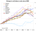 I made my own graph using OECD data (thin lines) and overlaid it, trying to match the percentages and the years as exactly as possible.
 -
 I made my own graph using OECD data (thin lines) and overlaid it, this time trying to match the lines as exactly as possible.


- Article(s)
- European debt crisis and others
- Request
- There is a problem with the first Image, made by Spitzl, as used on Wikipedia. First of all, weirdly, it is an SVG file, with only Bitmap content, the lines are not vector. But this problem is minor. The bigger one is the data itself. I went to http://stats.oecd.org/Index.aspx?QueryName=426&QueryType=View&Lang=en which is given as the source and downloaded the data myself, then made a new graph using the same data. But my graph looks different, which (given it is supposedly the same data from the same source) should not be the case.
- In the second image I overlaid my own graph (thin lines) on the image currently used, trying to match the percentages and the years as exactly as possible. Sorry about Ireland, forgot about them. Everything is off, sometimes substantially so.
- In the third image I did the same again, but this time disregarded the X- and Y-axis labeling (I know, you should not do this!) instead trying to match the lines as good as possible. Here most work out well, but France and Portugal are still very much off.
- I would love to upload my ODS file, but commons does not accept ODS files. Instead I describe what I did. I downloaded the annual growth rate table from the URL given above, then set 2000 as 100, and used the following formula for the next years: =LASTYEAR/(100+GROWTHRATE)*100
- Can anyone help making sense of this? Did I do something really wrong? Did Spitzl do something really wrong? Is there another explanation? Thanks a lot in advance.--
Lommes (
talk)
10:38, 1 September 2015 (UTC)
- Dear Lommes, when I made this graph I used the figures from "Total Economy". That means, when you go to the OECD data source, you need not change not only the measure drop down menu to "Index OECD base year (2010=100)" but also the sector to "Total Economy". Hope that solves the problem. If you still get different results, feel free to replace the graph with your own. Best wishes, -- spitzl ( talk) 20:24, 1 September 2015 (UTC)
- Graphist opinion(s)
Can anyone please make a SVG file from http://www.econstor.eu/bitstream/10419/82577/1/755451449.pdf pages 17 and 18?
- Article(s)
- Growth accounting
- Request
- Can someone please make a SVG graphics file with these graphs from the Postscript in the PDF files? -- EllenCT ( talk) 01:31, 4 September 2015 (UTC)
- Graphist opinion(s)


- Article(s)
- SUNY Polytechnic Institute
- Request
- Looking to have the logo and wordmark of school vectorized. Many thanks in advance. -- Buffaboy talk 20:35, 11 September 2015 (UTC)
- Graphist opinion(s)
- For graphists: per the SUNY Poly Standards Manual the colors are PMS Blue 288 (hex #002C73) and PMS Gold 124 (hex #EDA900). The fonts are Friz Quadrata (custom kerning between "Y" and "T") and Azo Sans, with recommendations to use AGaramond and Helvetica as close substitutes. Cheers, Mliu92 ( talk) 03:44, 13 September 2015 (UTC)
-
India GDP 1950-2014, in rupees, $US
-
India GDP growth % 1950-2014
- Request
- The stats in this numerical table would be better presented as a graphical chart. -- Beland ( talk) 04:57, 14 September 2015 (UTC)
- Graphist opinion(s)
-
Double-headed eagle of Marwanids
- Article(s)
- en:Marwanids
- Request
- May you please vectorize this double-headed eagle of Marwanids?-- Gomada ( talk) 22:20, 16 September 2015 (UTC)
- Graphist opinion(s)
-
Double-headed eagle of Ayyubids
- Article(s)
- en:Ayyubid Dynasty
- Request
- May you please vectorize this double-headed eagle of Ayyubids? -- Gomada ( talk) 22:56, 16 September 2015 (UTC)
- Graphist opinion(s)
-
 1
1 -
 2
2 -
 3
3 -
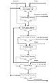
 1: flowchart
 -
 3: auf Deutsch
 -
 3: in English
 -
 2: auf Deutsch
 -
 2: in English


_-de.svg)
.svg)
Please vectorize:
| German | English |
|---|---|
| Beschickung | Feed |
| Bleiabscheider | Pb separator |
| Gaswäsche | Scrubbing |
| Steigrohr | Riser pipe |
| Spruehkondensator | Injection condenser |
| Brennkammern | Melting chambers |
| Retorte | Zinc furnace |
| Rekuperator | Recuperator |
| Abgas | Exhaust |
| Austragswalze | Roller |
| Austragsschnecke | Screw |
| German | English |
|---|---|
| Zellensäure | cells acid |
| Röstgut | roasted ore |
| Neutrale Laugung | neutral leaching |
| Fest-Flüssig-Trennung | solid-liquid separation |
| Heiße saure Laugung | hot acid leaching |
| Blei-Silber-Rückstand | Pb-Ag residue |
| Vorneutralisation | pre-neutralization |
| Jarosit-Fällung | jarosite preciptation |
| Jarosit-Rückstand | jarosite residue |
-- Kopiersperre ( talk) 20:03, 17 June 2015 (UTC)
- @ Kopiersperre: I'll take these. I have a couple ready to go, but the vertical continuous retorting furnace is taking some thought, and my current plan is to combine the given drawing with the original patent held by New Jersey Zinc Company (1948), which is slightly more detailed: U.S. patent 2,457,552
- Cheers, Mliu92 ( talk) 19:53, 9 July 2015 (UTC)
- @ Mliu92: Thank you very much.-- Kopiersperre ( talk) 20:53, 9 July 2015 (UTC)
- @ Kopiersperre: Sorry for the long delay. I have some drawings for #2 up now, based on the patent writeup and illustration. Please make sure my translation makes sense.
- Cheers, Mliu92 ( talk) 07:55, 5 September 2015 (UTC)
- @ Mliu92: Your translation is quite fine. Only some umlauts are missing. Thanks a lot!-- Kopiersperre ( talk) 12:08, 5 September 2015 (UTC)
![]() Done
Done
-
 starting point
 -
 States, scaled by population
.svg)

- Article(s)
- List of U.S. states by population density
- Request
- Vox has a fantastic visualization of what the U.S. would look like when each state is scaled proportional to population. I think it would make a great illustration for our article if someone was willing to make a similar, but free use vector image. – czar 19:28, 21 August 2015 (UTC)
- Graphist opinion(s)
-
 Request taken by
Mliu92 (
talk)
16:07, 22 September 2015 (UTC).
Request taken by
Mliu92 (
talk)
16:07, 22 September 2015 (UTC). - @
Czar: This is an interesting request, and one that was solved mathematically using the data at the linked article. By definition, the population density is the population divided by area, or:
- or, equivalently,
- We want to resize each state according to its population, so each state's new area will be defined by a new (constant) population density, :
- We can substitute for in the above expression to get:
- This means the new area is simply the existing area multiplied by an areal scaling factor . Since area is the product of two dimensions, we can apply an equal scaling factor in each dimension (which is what the SVG expects) by taking the square root of the areal scaling factor:
- I took the new population density to be equal to the 2013 population density of New Jersey, 1,210.1 persons per square mile, which in essence normalizes the scaling factor to New Jersey. For instance, California has a population density of 246.1 persons per square mile, so:
- That means that I can apply a scaling transformation factor of 0.451 to the California SVG object in each (x,y) dimension. When all is said and done, though, I had to end up translating most of the state SVG objects as well, so it ended up being a matrix transform (scaling + translation). When the population and/or land areas update, the updated data could be used to adjust the scaling factors in the SVG directly without having to go through a graphical editor. Please feel free to adjust the SVG file to taste, as the scaling also affects the border size of the file.
 Done Cheers,
Mliu92 (
talk)
16:07, 22 September 2015 (UTC)
Done Cheers,
Mliu92 (
talk)
16:07, 22 September 2015 (UTC)
- Nice work! Added it to the article. Thank you! – czar 16:25, 22 September 2015 (UTC)


-
 Standard of the Supreme Commander
 -
 Vector, in 2:1 ratio
 -
 Vector, in 3:2 ratio


- Request
- Could somebody draw a vector version please, many thanks. TRAJAN 117 ( talk) 11:25, 24 August 2015 (UTC)
- Graphist opinion(s)
- @
TRAJAN 117: Hi, here are a couple of options. According to Flags of the World, there is also a 3:2 version. Cheers,
Mliu92 (
talk)
14:55, 31 August 2015 (UTC)
- @ Mliu92: Looks great, many thanks! TRAJAN 117 ( talk) 18:29, 1 September 2015 (UTC)

- Article(s)
Katy Perry, The Prismatic World Tour
- Request
c:KatyPerry in Shanghai.jpg, Please cut the sides of the picture to allow more central to the artist and improve quality with photoshoot. C. Jonel ( talk) 18:16, 27 August 2015 (UTC)
- Graphist opinion(s)
![]() Done
Done
- Moved to Photography Workshop. Mliu92 ( talk) 15:15, 31 August 2015 (UTC)


I'd be very grateful if a skilled user could expand the abbreviations used in the above image 9used in Lung), so that it can be made more readable. -- Tom (LT) ( talk) 23:51, 30 August 2015 (UTC)
- Done I also created a SVG version of the file, which is now shown in the gallery.
Carl Henderson (
talk)
06:48, 3 October 2015 (UTC)
- Thanks very much for this, it's greatly appreciated. -- Tom (LT) ( talk) 10:26, 3 October 2015 (UTC)
-
 Naval Ensign
 -
 Naval Ensign (vector)
 -
 Guards Ensign
 -
 Guards Ensign (vector)


- Article(s)
- Flag of North Korea
- Request
- Could somebody draw vector versions of these two flags please, many thanks. TRAJAN 117 ( talk) 22:57, 1 September 2015 (UTC)
- Graphist opinion(s)
- @
TRAJAN 117: Here are the vector versions. I used text (근위대) instead of shapes for the Hangul on the second flag, so it's not an exact match. Cheers,
Mliu92 (
talk)
18:11, 3 September 2015 (UTC)
- @
Mliu92: Many thanks!
 TRAJAN 117 (
talk)
01:48, 4 September 2015 (UTC)
TRAJAN 117 (
talk)
01:48, 4 September 2015 (UTC)
- @
Mliu92: Many thanks!
- Article(s)
- Seton Hall Pirates
- Request
- Please update the colors in this file to the new colors from the latest graphics manual. Blue: #004488 , Silver #A2AAAD Thanks. --Corkythe hornetfan 00:32, 19 September 2015 (UTC)
- Graphist opinion(s)
- @ Corkythehornetfan: Updated colors: blue is now #004488 (was #0060A9 ) and silver is now #A2AAAD (was #BCBDB0 ). Cheers, Mliu92 ( talk) 17:21, 19 September 2015 (UTC)
-
 University of Florida old colors
- Article(s)
- University of Florida
- Request
- Please update the colors in the file to #0021A5 and #FF4A00 . The colors have since updated since this file was originally uploaded in 2011. Source can be found here. -- Corkythe hornetfan 18:10, 11 September 2015 (UTC)
- Graphist opinion(s)
![]() Done
///EuroCar
GT
03:02, 13 September 2015 (UTC)
Done
///EuroCar
GT
03:02, 13 September 2015 (UTC)

Please create a vector version of the DIA seal.-- Kopiersperre ( talk) 13:34, 13 September 2015 (UTC)
- Done, the colours seem different (one is lighter, the other a bit darker), however I extracted the SVG version from the official source.
///EuroCar
GT
16:19, 13 September 2015 (UTC)
- @
EuroCarGT: Thanks. Do you think I should globally replace the PNG with the SVG?--
Kopiersperre (
talk)
07:22, 12 October 2015 (UTC)
- @ Kopiersperre: Definitely, it is better with vector logos. ///EuroCar GT 15:55, 12 October 2015 (UTC)
- @
EuroCarGT: Thanks. Do you think I should globally replace the PNG with the SVG?--
Kopiersperre (
talk)
07:22, 12 October 2015 (UTC)
-
 Flag of Seborga
 -
 vector Flag
 -
 Coat of arms of Seborga
 -
vector Coat of arms

.svg)

- Article(s)
- Principality of Seborga
- Request
- The file of Seborga's flag doesn't look right, It looks like it's been traced poorly. Can someone please retrace the crown and the shield in the flag? After that, can you also vectorise the coat of arms using the elements from the flag? Thanks in advance. -- 109.77.100.184 ( talk) 16:20, 12 September 2015 (UTC)
- Graphist opinion(s)
- I used
an "official" source to retrace the crown and shield. I may not get to the CoA in a timely fashion, so other illustrators should feel free to take that one on. Cheers,
Mliu92 (
talk)
07:00, 13 September 2015 (UTC)
- I had some spare time today and finished the Coat of Arms as well. Please let me know what you think. Cheers, Mliu92 ( talk) 07:07, 14 September 2015 (UTC)
Perfect except for one thing. The inner outline of the flag's shield is missing a corner. Fix that and it's a job well done. -- 109.77.119.122 ( talk) 21:07, 18 September 2015 (UTC)
- Here's a fix. Mliu92 ( talk) 17:31, 19 September 2015 (UTC)
-
 State Department seal
 -
 draft SoS seal


- Request
- Anybody mind making the Seal of the Secretary of State of the US, as seen here? Fry1989 eh? 17:44, 24 September 2015 (UTC)
- Graphist opinion(s)
-
Request taken by
Mliu92 (
talk)
15:55, 25 September 2015 (UTC).
- @ Fry1989: Let me know what you think about this draft. I reused the central portion of the State Department Seal with some edits (updated colors, gold border in the field of thirteen stars). The typeface is Century Schoolbook, but it appears the weight used in the actual seal is some extra-heavy weight that I don't have installed. I adjusted it to space roughly identical to the spacing around the rim, although there ended up being more space between letters than the original, as a result.
- Cheers,
Mliu92 (
talk)
15:55, 25 September 2015 (UTC)
- That's great, thanks :) Fry1989 eh? 17:38, 25 September 2015 (UTC)
-
 Clearway symbol field
 -
 Clearway symbol field construction


- Article(s)
- Request
- Would someone be able to create this symbol? I can't seem to figure it out myself. It has a height of 140 units and width of 120 units, and a radius for each curve of 110, but I don't know how to do the curves so they end in points like that. Fry1989 eh? 17:45, 1 October 2015 (UTC)
- Graphist opinion(s)
![]() Request taken by
Mliu92 (
talk)
13:58, 7 October 2015 (UTC).
Request taken by
Mliu92 (
talk)
13:58, 7 October 2015 (UTC).
- @
Fry1989: I think this is the one you were asking for ... How does this look? I also uploaded a file that illustrates how I created this shape, four overlapping circles with radius = 110 units. You can use Inkscape's "intersection" (two shapes at a time) to create it. Let me know if you want me to add text as well (using Roadgeek typeface?). Cheers,
Mliu92 (
talk)
13:58, 7 October 2015 (UTC)
- Thanks, that's something new for me to learn :) That is great! Fry1989 eh? 18:04, 7 October 2015 (UTC)
-
The Sesame Street sign.
-
The Istockphoto logo.
So File:Sesame Street logo.svg was already a SVG but it was PD-textlogo and about to be moved to Commons. File:IStock LP 2014 Corporate Logo.png was also PD-textlogo and ready for Commons but it was a PNG. I took care of both of them, but for some reason I couldn't upload either as a SVG (the uploader changes .svg to .svg.jpg). I put them in their respective articles, but the SS logo was RV'd for being lower quality. I'd like to convert them both to SVG. Hop on Bananas ( talk) 18:15, 27 September 2015 (UTC)
Edit:Both originally had trans. backgrounds, but the uploader changed them to white. Hop on Bananas ( talk) 18:20, 27 September 2015 (UTC)
Edit 2:When I moved File:This Side of Paradise dust jacket.gif to WC, the filetype changed from .gif to .gif.png. The file is now on WC here. I'll tag it with the should be PNG tag (forgot the template name). Anyway, it seems like the uploader changes everything to .jpg. Is anyone else having this problem? — Preceding unsigned comment added by Hop on Bananas ( talk • contribs) 22:29, 27 September 2015 (UTC)
- It's been renamed to File:This Side of Paradise dust jacket.jpg. postdlf ( talk) 01:29, 28 September 2015 (UTC)
So, using CommonsHelper (which I'd have used in the first place if I'd known about it back then) I uploaded a new SVG (CommonsHelper doesn't change the filename) and replaced all uses (except on this page) of File:Sesame Street logo.svg with it. It's at File:Sesame Street sign.svg. (CommonsHelper wouldn't let me upload the image with the same filename but a different file format as File:Sesame Street logo.jpg, so I changed the name to something else appropriate). I think we can delete both File:Sesame Street logo.svg and File:Sesame Street logo.jpg. Hop on Bananas ( talk) 14:57, 12 October 2015 (UTC)
Actually, we can save the JPG version on Commons since it's tagged with {{ Vector version available}}, but we can delete the local SVG since I've replaced it with the Commons SVG everywhere it's used (except here). Hop on Bananas ( talk) 17:38, 12 October 2015 (UTC)
Edit:The local SVG has been deleted. I guess that problem is covered. Hop on Bananas ( talk) 23:33, 12 October 2015 (UTC)
- Article(s)
- Cops (TV series)
- Request
- The logo is found non-free. I want to upload the logo from this site, but I think either PNG or SVG is more suitable. Nevertheless, it's still non-free, so it shouldn't be uploaded to Commons. -- George Ho ( talk) 12:59, 26 September 2015 (UTC)
- Graphist opinion(s)
- @
George Ho: It looks like
your target source file is in
.webp format. Chrome will display WebP as it is a web standard promulgated by Google. You could use an online converter
(for example, zamzar) to convert the WebP source to PNG and upload the resulting PNG. Cheers,
Mliu92 (
talk)
17:59, 26 September 2015 (UTC)
- I uploaded the photo to my account. I was cautious about that "free" converter, so I uploaded it in JPEG format instead because I was able to save it in the same format. -- George Ho ( talk) 18:27, 26 September 2015 (UTC)
- Article(s)
- Flag of the Benin Empire
- Request
- using http://collections.rmg.co.uk/collections/objects/557.html please make a closer approximation… -- Kintetsubuffalo ( talk) 05:53, 19 September 2015 (UTC)
- Graphist opinion(s)
-
Existing Image, used on European debt crisis and similar pages
-
I made my own graph using OECD data (thin lines) and overlaid it, trying to match the percentages and the years as exactly as possible.
-
I made my own graph using OECD data (thin lines) and overlaid it, this time trying to match the lines as exactly as possible.
- Article(s)
- European debt crisis and others
- Request
- There is a problem with the first Image, made by Spitzl, as used on Wikipedia. First of all, weirdly, it is an SVG file, with only Bitmap content, the lines are not vector. But this problem is minor. The bigger one is the data itself. I went to http://stats.oecd.org/Index.aspx?QueryName=426&QueryType=View&Lang=en which is given as the source and downloaded the data myself, then made a new graph using the same data. But my graph looks different, which (given it is supposedly the same data from the same source) should not be the case.
- In the second image I overlaid my own graph (thin lines) on the image currently used, trying to match the percentages and the years as exactly as possible. Sorry about Ireland, forgot about them. Everything is off, sometimes substantially so.
- In the third image I did the same again, but this time disregarded the X- and Y-axis labeling (I know, you should not do this!) instead trying to match the lines as good as possible. Here most work out well, but France and Portugal are still very much off.
- I would love to upload my ODS file, but commons does not accept ODS files. Instead I describe what I did. I downloaded the annual growth rate table from the URL given above, then set 2000 as 100, and used the following formula for the next years: =LASTYEAR/(100+GROWTHRATE)*100
- Can anyone help making sense of this? Did I do something really wrong? Did Spitzl do something really wrong? Is there another explanation? Thanks a lot in advance.--
Lommes (
talk)
10:38, 1 September 2015 (UTC)
- Dear Lommes, when I made this graph I used the figures from "Total Economy". That means, when you go to the OECD data source, you need not change not only the measure drop down menu to "Index OECD base year (2010=100)" but also the sector to "Total Economy". Hope that solves the problem. If you still get different results, feel free to replace the graph with your own. Best wishes, -- spitzl ( talk) 20:24, 1 September 2015 (UTC)
- Graphist opinion(s)
Can anyone please make a SVG file from http://www.econstor.eu/bitstream/10419/82577/1/755451449.pdf pages 17 and 18?
- Article(s)
- Growth accounting
- Request
- Can someone please make a SVG graphics file with these graphs from the Postscript in the PDF files? -- EllenCT ( talk) 01:31, 4 September 2015 (UTC)
- Graphist opinion(s)
- Article(s)
- SUNY Polytechnic Institute
- Request
- Looking to have the logo and wordmark of school vectorized. Many thanks in advance. -- Buffaboy talk 20:35, 11 September 2015 (UTC)
- Graphist opinion(s)
- For graphists: per the SUNY Poly Standards Manual the colors are PMS Blue 288 (hex #002C73) and PMS Gold 124 (hex #EDA900). The fonts are Friz Quadrata (custom kerning between "Y" and "T") and Azo Sans, with recommendations to use AGaramond and Helvetica as close substitutes. Cheers, Mliu92 ( talk) 03:44, 13 September 2015 (UTC)
-
India GDP 1950-2014, in rupees, $US
-
India GDP growth % 1950-2014
- Request
- The stats in this numerical table would be better presented as a graphical chart. -- Beland ( talk) 04:57, 14 September 2015 (UTC)
- Graphist opinion(s)
-
Double-headed eagle of Marwanids
- Article(s)
- en:Marwanids
- Request
- May you please vectorize this double-headed eagle of Marwanids?-- Gomada ( talk) 22:20, 16 September 2015 (UTC)
- Graphist opinion(s)
-
Double-headed eagle of Ayyubids
- Article(s)
- en:Ayyubid Dynasty
- Request
- May you please vectorize this double-headed eagle of Ayyubids? -- Gomada ( talk) 22:56, 16 September 2015 (UTC)
- Graphist opinion(s)
-
1
-
2
-
3
-
1: flowchart
-
3: auf Deutsch
-
3: in English
-
2: auf Deutsch
-
2: in English
Please vectorize:
| German | English |
|---|---|
| Beschickung | Feed |
| Bleiabscheider | Pb separator |
| Gaswäsche | Scrubbing |
| Steigrohr | Riser pipe |
| Spruehkondensator | Injection condenser |
| Brennkammern | Melting chambers |
| Retorte | Zinc furnace |
| Rekuperator | Recuperator |
| Abgas | Exhaust |
| Austragswalze | Roller |
| Austragsschnecke | Screw |
| German | English |
|---|---|
| Zellensäure | cells acid |
| Röstgut | roasted ore |
| Neutrale Laugung | neutral leaching |
| Fest-Flüssig-Trennung | solid-liquid separation |
| Heiße saure Laugung | hot acid leaching |
| Blei-Silber-Rückstand | Pb-Ag residue |
| Vorneutralisation | pre-neutralization |
| Jarosit-Fällung | jarosite preciptation |
| Jarosit-Rückstand | jarosite residue |
-- Kopiersperre ( talk) 20:03, 17 June 2015 (UTC)
- @ Kopiersperre: I'll take these. I have a couple ready to go, but the vertical continuous retorting furnace is taking some thought, and my current plan is to combine the given drawing with the original patent held by New Jersey Zinc Company (1948), which is slightly more detailed: U.S. patent 2,457,552
- Cheers, Mliu92 ( talk) 19:53, 9 July 2015 (UTC)
- @ Mliu92: Thank you very much.-- Kopiersperre ( talk) 20:53, 9 July 2015 (UTC)
- @ Kopiersperre: Sorry for the long delay. I have some drawings for #2 up now, based on the patent writeup and illustration. Please make sure my translation makes sense.
- Cheers, Mliu92 ( talk) 07:55, 5 September 2015 (UTC)
- @ Mliu92: Your translation is quite fine. Only some umlauts are missing. Thanks a lot!-- Kopiersperre ( talk) 12:08, 5 September 2015 (UTC)
![]() Done
Done
-
starting point
-
States, scaled by population
- Article(s)
- List of U.S. states by population density
- Request
- Vox has a fantastic visualization of what the U.S. would look like when each state is scaled proportional to population. I think it would make a great illustration for our article if someone was willing to make a similar, but free use vector image. – czar 19:28, 21 August 2015 (UTC)
- Graphist opinion(s)
-
Request taken by
Mliu92 (
talk)
16:07, 22 September 2015 (UTC).
- @
Czar: This is an interesting request, and one that was solved mathematically using the data at the linked article. By definition, the population density is the population divided by area, or:
- or, equivalently,
- We want to resize each state according to its population, so each state's new area will be defined by a new (constant) population density, :
- We can substitute for in the above expression to get:
- This means the new area is simply the existing area multiplied by an areal scaling factor . Since area is the product of two dimensions, we can apply an equal scaling factor in each dimension (which is what the SVG expects) by taking the square root of the areal scaling factor:
- I took the new population density to be equal to the 2013 population density of New Jersey, 1,210.1 persons per square mile, which in essence normalizes the scaling factor to New Jersey. For instance, California has a population density of 246.1 persons per square mile, so:
- That means that I can apply a scaling transformation factor of 0.451 to the California SVG object in each (x,y) dimension. When all is said and done, though, I had to end up translating most of the state SVG objects as well, so it ended up being a matrix transform (scaling + translation). When the population and/or land areas update, the updated data could be used to adjust the scaling factors in the SVG directly without having to go through a graphical editor. Please feel free to adjust the SVG file to taste, as the scaling also affects the border size of the file.
- Done Cheers,
Mliu92 (
talk)
16:07, 22 September 2015 (UTC)
- Nice work! Added it to the article. Thank you! – czar 16:25, 22 September 2015 (UTC)
-
Standard of the Supreme Commander
-
Vector, in 2:1 ratio
-
Vector, in 3:2 ratio
- Request
- Could somebody draw a vector version please, many thanks. TRAJAN 117 ( talk) 11:25, 24 August 2015 (UTC)
- Graphist opinion(s)
- @
TRAJAN 117: Hi, here are a couple of options. According to Flags of the World, there is also a 3:2 version. Cheers,
Mliu92 (
talk)
14:55, 31 August 2015 (UTC)
- @ Mliu92: Looks great, many thanks! TRAJAN 117 ( talk) 18:29, 1 September 2015 (UTC)
- Article(s)
Katy Perry, The Prismatic World Tour
- Request
c:KatyPerry in Shanghai.jpg, Please cut the sides of the picture to allow more central to the artist and improve quality with photoshoot. C. Jonel ( talk) 18:16, 27 August 2015 (UTC)
- Graphist opinion(s)
![]() Done
Done
- Moved to Photography Workshop. Mliu92 ( talk) 15:15, 31 August 2015 (UTC)
I'd be very grateful if a skilled user could expand the abbreviations used in the above image 9used in Lung), so that it can be made more readable. -- Tom (LT) ( talk) 23:51, 30 August 2015 (UTC)
- Done I also created a SVG version of the file, which is now shown in the gallery.
Carl Henderson (
talk)
06:48, 3 October 2015 (UTC)
- Thanks very much for this, it's greatly appreciated. -- Tom (LT) ( talk) 10:26, 3 October 2015 (UTC)
-
Naval Ensign
-
Naval Ensign (vector)
-
Guards Ensign
-
Guards Ensign (vector)
- Article(s)
- Flag of North Korea
- Request
- Could somebody draw vector versions of these two flags please, many thanks. TRAJAN 117 ( talk) 22:57, 1 September 2015 (UTC)
- Graphist opinion(s)
- @
TRAJAN 117: Here are the vector versions. I used text (근위대) instead of shapes for the Hangul on the second flag, so it's not an exact match. Cheers,
Mliu92 (
talk)
18:11, 3 September 2015 (UTC)
- @
Mliu92: Many thanks!
TRAJAN 117 (
talk)
01:48, 4 September 2015 (UTC)
- @
Mliu92: Many thanks!
- Article(s)
- Seton Hall Pirates
- Request
- Please update the colors in this file to the new colors from the latest graphics manual. Blue: #004488 , Silver #A2AAAD Thanks. --Corkythe hornetfan 00:32, 19 September 2015 (UTC)
- Graphist opinion(s)
- @ Corkythehornetfan: Updated colors: blue is now #004488 (was #0060A9 ) and silver is now #A2AAAD (was #BCBDB0 ). Cheers, Mliu92 ( talk) 17:21, 19 September 2015 (UTC)
-
University of Florida old colors
- Article(s)
- University of Florida
- Request
- Please update the colors in the file to #0021A5 and #FF4A00 . The colors have since updated since this file was originally uploaded in 2011. Source can be found here. -- Corkythe hornetfan 18:10, 11 September 2015 (UTC)
- Graphist opinion(s)
![]() Done
///EuroCar
GT
03:02, 13 September 2015 (UTC)
Done
///EuroCar
GT
03:02, 13 September 2015 (UTC)
Please create a vector version of the DIA seal.-- Kopiersperre ( talk) 13:34, 13 September 2015 (UTC)
- Done, the colours seem different (one is lighter, the other a bit darker), however I extracted the SVG version from the official source.
///EuroCar
GT
16:19, 13 September 2015 (UTC)
- @
EuroCarGT: Thanks. Do you think I should globally replace the PNG with the SVG?--
Kopiersperre (
talk)
07:22, 12 October 2015 (UTC)
- @ Kopiersperre: Definitely, it is better with vector logos. ///EuroCar GT 15:55, 12 October 2015 (UTC)
- @
EuroCarGT: Thanks. Do you think I should globally replace the PNG with the SVG?--
Kopiersperre (
talk)
07:22, 12 October 2015 (UTC)
-
Flag of Seborga
-
vector Flag
-
Coat of arms of Seborga
-
vector Coat of arms
- Article(s)
- Principality of Seborga
- Request
- The file of Seborga's flag doesn't look right, It looks like it's been traced poorly. Can someone please retrace the crown and the shield in the flag? After that, can you also vectorise the coat of arms using the elements from the flag? Thanks in advance. -- 109.77.100.184 ( talk) 16:20, 12 September 2015 (UTC)
- Graphist opinion(s)
- I used
an "official" source to retrace the crown and shield. I may not get to the CoA in a timely fashion, so other illustrators should feel free to take that one on. Cheers,
Mliu92 (
talk)
07:00, 13 September 2015 (UTC)
- I had some spare time today and finished the Coat of Arms as well. Please let me know what you think. Cheers, Mliu92 ( talk) 07:07, 14 September 2015 (UTC)
Perfect except for one thing. The inner outline of the flag's shield is missing a corner. Fix that and it's a job well done. -- 109.77.119.122 ( talk) 21:07, 18 September 2015 (UTC)
- Here's a fix. Mliu92 ( talk) 17:31, 19 September 2015 (UTC)
-
State Department seal
-
draft SoS seal
- Request
- Anybody mind making the Seal of the Secretary of State of the US, as seen here? Fry1989 eh? 17:44, 24 September 2015 (UTC)
- Graphist opinion(s)
-
Request taken by
Mliu92 (
talk)
15:55, 25 September 2015 (UTC).
- @ Fry1989: Let me know what you think about this draft. I reused the central portion of the State Department Seal with some edits (updated colors, gold border in the field of thirteen stars). The typeface is Century Schoolbook, but it appears the weight used in the actual seal is some extra-heavy weight that I don't have installed. I adjusted it to space roughly identical to the spacing around the rim, although there ended up being more space between letters than the original, as a result.
- Cheers,
Mliu92 (
talk)
15:55, 25 September 2015 (UTC)
- That's great, thanks :) Fry1989 eh? 17:38, 25 September 2015 (UTC)
-
Clearway symbol field
-
Clearway symbol field construction
- Article(s)
- Request
- Would someone be able to create this symbol? I can't seem to figure it out myself. It has a height of 140 units and width of 120 units, and a radius for each curve of 110, but I don't know how to do the curves so they end in points like that. Fry1989 eh? 17:45, 1 October 2015 (UTC)
- Graphist opinion(s)
![]() Request taken by
Mliu92 (
talk)
13:58, 7 October 2015 (UTC).
Request taken by
Mliu92 (
talk)
13:58, 7 October 2015 (UTC).
- @
Fry1989: I think this is the one you were asking for ... How does this look? I also uploaded a file that illustrates how I created this shape, four overlapping circles with radius = 110 units. You can use Inkscape's "intersection" (two shapes at a time) to create it. Let me know if you want me to add text as well (using Roadgeek typeface?). Cheers,
Mliu92 (
talk)
13:58, 7 October 2015 (UTC)
- Thanks, that's something new for me to learn :) That is great! Fry1989 eh? 18:04, 7 October 2015 (UTC)