| This is an archive of past discussions. Do not edit the contents of this page. If you wish to start a new discussion or revive an old one, please do so on the current talk page. |
| Archive 1 | Archive 2 | Archive 3 | Archive 4 | Archive 5 |
Comments on the highlighting of the state on the map
I really like the picture of the state with the county highlighted. Some of the counties in California are like that. They need to be a bit smaller. But of course there is no reason that we can't have both sets of pictures, but I find that it is most useful to know where in a state it is. As for integrating them in the articles, I can easily use the rambot to add them to existing articles if you don't already have a bot. I just finished a second pass of the counties where I updated the list of cities in the counties but it only updated a subset of counties which were not up to date. It is really up to you what you want to do. If you have your own bot, you can insert the pictures. It should be really simple to do. My main concern is that the pictures are not inserted haphazardly anywhere in the article. For what its worth, I downloaded and am planning on processing all the FIPS data on counties and cities, so I may be doing a pass sometime soon updating the county information, but I don't have that scheduled in. I am a bit busy from time to time :) -- Ram-Man
I also like the idea of having locator maps but I'm with Ram-Man in stating these images should be small (ala the California counties) and placed in the correct places. Since some people are doing great work on adding adjacent county and highway lists to the geography sections of county articles, I vote to have the locator maps placed in the vast white areas to the right of these lists. Before anybody does anything though, please check out m:Wikipediatlas. IMO those maps are the best in terms of look and utility. -- mav
- Mav, I added a comment to that page at the Metapedia and provided a link that has some great pre-rendered maps. They've got not only county maps for every state, but also worls maps and country maps. The first map for "Africa" on that site is excellent for example. It is large, but the lines are anti-aliased and the individual countries in africa are outlined. Since the maps is plain, it can be easily colored with a "Flood Fill" command and unneeded border can be removed safely. All the maps are that site are available for public non-commercial use and distribution. See utexas.edu. -- Robert Lee
Unfortunately, I fear the non-commerical use clause doesn't have compatibility with the FDL. -- Ellmist Monday, November 11th, 2002
I've been working around the edges, adding or editing a few place articles. As a result I've got one recommendation and some comments:
- The recommendation is that any new Township article should have a title based on Aaa Township, Bbb County, State. Sure, its sometimes creates unnecessary verbage, but going back later to disambiguate or move articles is such a pain.
- I tried a table of data, but decied against it. It cluttes up the article. I'd only change my mind if we build a general template to be used for all geographic and political subdivisions of a country. For now, thats way too many articles to go back to, and the research gets really tough for villages and townships.
- In the discussion about maps, I'd vote for the state outline version. Several universities (besides UT) have the same outlines, which to me implies a tiger or similar public domain source, I just haven't found it yet.
- Lou I 17:26 22 Jun 2003 (UTC)
Discussion moved from Wikipedia:Village pump by Wapcaplet 14:10 5 Jul 2003 (UTC)
A Map for US cities and Counties
Dunno if anyone has suggested this before; when browsing random articles, I often come across some of the many U.S. cities and counties imported by Rambot. It would be quite cool, I think, to have a small state map that indicates whereabout these cities and counties are (a dot for cities, a highlighted outline for counties, sort of like we already have for U.S. state articles). Is there a public-domain or GPL source for maps like this? If not, I don't imagine it'd be too hard for a dedicated soul to create them (just time-consuming). -- Wapcaplet 23:32 4 Jul 2003 (UTC)
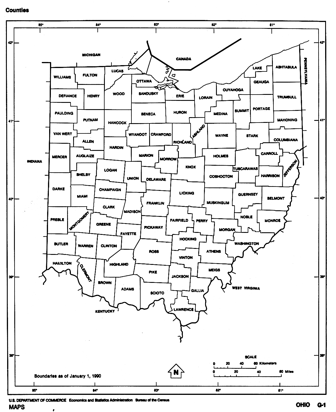
I did find a collection of public-domain U.S. maps, including nice large county maps like this one of Ohio. They would take quite a bit of editing to reduce to an appropriate format for what I'm thinking of, but could be quite nice! If anybody knows of another public source for similar maps, let me know. I'd be interested in working on these. -- Wapcaplet 23:37 4 Jul 2003 (UTC)
- There is always the U.S. Geological Survey which has data and a web application to generate maps of just about anywhere. They are more like street maps though. Never underestimate the numbers of dedicated souls out there, myself included. These things have a way of eventually getting done. -- Ram-Man 00:33 5 Jul 2003 (UTC)
- I did look at that web site and they want us to add a citation saying that we got the maps from their web site. It is public domain, so doesn't that mean that the citation is not strictly required? I don't know enough about copyright issues, so maybe I am missing something. -- Ram-Man 00:39 5 Jul 2003 (UTC)
- Since there are so many US cities and towns, I think the best idea would be if we could have an in-software method of converting longitude-latitude co-ordinates to a dot on a map. Possible implementations are popping into my mind as I type -- I don't think it would be that hard. -- Tim Starling 01:08 5 Jul 2003 (UTC)
- Ideas please to m:Wikipediatlas with the others. -- Brion 01:17 5 Jul 2003 (UTC)
- Based on these maps (well, the one for New York), I quickly (ish - 20 minutes) did for the state of New York a set (62) of PNGs of the state with each county highlighted individually in red (as with the images of British counties such as at Warwickshire); should I bother uploading these? I know it's only one state, but I could do the others over the next few days if people want. They are available here (I haven't shrunk them yet, though). Alternatively, I could not bother :-) -- James F. 01:22 5 Jul 2003 (UTC)
- I did California and Nevada some time ago, by all means do more if you like. It will likely be quite some while, if ever, before we have an automatic system for doing this. -- Brion 01:42 5 Jul 2003 (UTC)
- If we collaborated, we could pretty quickly get through all of the states (as long as we can agree on consistent choices of color and size). Ideally, we'd have software to automatically render this stuff (and even more ideally, it'd be SVG), but maybe we should cobble something together in the meantime, at the very least for the U.S. counties. I am thinking that the state should have a black outline, with 50% or so grey lines for the county outlines. The counties should all be white, except the highlighted one which should be perhaps a nice blue color (Good contrast with both the white and the grey/black). Somewhere around 200-300 pixels wide would probably be good, with a clickable link to a larger version (especially for large states). Just my thoughts, at least. As for accreditation issues - I would have no problem crediting the US Census or UTexas or whoever as the original source, but we'll be doing lots of manipulation to these images so it's probably not necessary.
- As for source material for the maps, I've found three good possibilities:
- US Census Bureau, clickable county maps, good quality, but colored. Might be hard to trim out unnecessary stuff.
- UTexas, particularly the US Census 1990 outline maps. Nice clean black and white version, but has extra garbage that would need to be removed.
- Texas A&M, do-it-yourself county highlighted maps. Makes our work much easier, but I do not know if these images are public or GPL, and it may be hard to remove the county names.
- I'd personally prefer the black and white 1990 Census outline maps. Anyone who's interested in helping me work on these, leave a note on my talk page. Or, if James F. wants to do them all, I would have no problem with that either. Let me know if you want me to lend a hand, James. I can make my images conform to whatever you're comfortable with. -- Wapcaplet 02:54 5 Jul 2003 (UTC)
- I'm happy to get on with it on my own if people think that this will be worthwhile. I did the examples with full red as that's what used elsewhere for similar positional micro-maps (counties of Britain amongst them). It's clear and visible. We could decide to use something else, if you want, but... Standards are standards, after all. I'd suggest making this part of the suitable WikiProject; move discussion there? -- James F. 03:22 5 Jul 2003 (UTC)
It looks like there are several different practices in use. I don't know if there are any "standards", necessarily.
- White with red highlight: Counties in England, ex. Herefordshire, Staffordshire.
- Yellow with brown highlight: List of California counties
- Dark grey with light grey highlight: Lander County, Nevada, Esmeralda County, Nevada, and the rest of Nevada
- White with dark red highlight: Cumberland County, Maine, as a sample
- Dark blue with light blue highlight: m:Wikipediatlas, as a sample
Of these, red on white seems to be the most common, however. Blue-on-blue looks nice but is kind of at odds with the custom of using blue for water in maps (not to mention it may be hard for some people to distinguish between shades of blue). I do think the state border should somehow be thicker, or darker, than the county borders (thicker would probably suffice, since the county borders would get pretty light at smaller sizes anyway). The only con I can see with using white for the rest of the state is that it may be hard to distinguish the state from the surrounding area at smaller sizes (especially on coastal states with small islands). This is probably not much of an issue, though, since we're just trying to show where the county is.
On balance, I'd have to agree that red on white is probably the way to go. Size is another important issue. Most states are likely to look okay at around 300 pixels wide, at most. Even [ Texas] isn't too bad at this size. However, some counties are very small, and would practically vanish at this size. Storey County, Nevada is the smallest one I can think of, but there may be tinier ones. A big state with some small counties might have troubles at this resolution. We can just make all our maps large, say, 600 pixels to be safe, and use an automated tool to resize them all. If some get too small, we can make those a bit larger. 200 pixels might be enough; we'll see how it goes. Maybe we should try a couple at that size, to see how they turn out (and whether we need to make the state border thicker or whatnot). -- Wapcaplet 14:10 5 Jul 2003 (UTC)
- Sounds good. Will get on with it, then :-) -- James F. 15:27 5 Jul 2003 (UTC)
- Well, 2 hours later, I've done another 3 states (coastline takes a while). Output is still at
[1]. Still to do:
- 48 states (:-))
- decide to what size to shrink the images to
- run pngcrush on them
- upload files
- is there a batch image upload facility - there are going to be a few hundred of these for the east coast alone...?
- If anyone wants to help (please, feel free :-)) here are some points as to how I'm doing them (based on the PD images such as
this one):
- Remove all text, symbols and markers on the image saying that it's from the 1990 census.
- Remove all markers of external states/countries, including their subdivisions.
- Remove lines that split counties from each other where there is already a split (such as two islands with a division line between them) - we're using colour to partition the counties, so such lines are not needed and detract from the image).
- Fill in coastline where it was previously obscured by text
- Downconvert the image to 1bit.
- Upconvert the image to >1bit and add pure red as a colour.
- For each county:
- Fill in the county in question with red (including unattached islands, etc.)
- Save each as an optimised PNG file.
- I'm currently doing the northern east coast (working around New England), so anywhere off to the south or west would be safe from work duplication.
- We should also work out how we want these put into the county pages, and how we mention that they reflect borders as of the 1990 census, and that they are for guide purposes only and people should not use them for anything important, such as navigation (is there a standard Wikipedia cartographic disclaimer, or should we make one up?).
- -- James F. 16:52 5 Jul 2003 (UTC)
Looking good! I will gladly pitch in. For now, I will start on California, Nevada, Oregon, Washington, and (gulp) Alaska. I've just looked at the outline map of Alaska; many tiny counties with lots of coastline, which are quite hard to distinguish. I don't know how easy these will be to clean up, but I will give it a shot; Alaska is likely to be one of the hardest. -- Wapcaplet 17:40 5 Jul 2003 (UTC)
- Have fun. Of course, 'tiny' is a relative comment; these 'small' counties are still rather large... Alaska is 1.5m km2, after all. -- James F. 18:40 5 Jul 2003 (UTC)
- Very true :) But when the whole state is < 300 pixels wide, some counties might end up being sub-pixel... anyhow, Alaska went relatively well. I doubt I got all the smaller islands with any degree of accuracy, but it should be enough for our purposes. I don't have them online anywhere; I'll set something up once I get a few more done. -- Wapcaplet 19:37 5 Jul 2003 (UTC)
- Feel free to email them to me if you want; then they'll all be in the same place at once.
- -- James F. 20:21 5 Jul 2003 (UTC)
I'll email smaller-sized versions to you (since the RGB PNG files are around 60+K each). Also, I've adapted a small script (called shrink to resize them, if you would like to use something similar:
#!/bin/bash
for file in $2; do
  convert -size $1 "$file" -resize $1 -colors 256 "small/$file"
done
Usage:
./shrink [size] "[file(s)]"
./shrink 200 "*.png"
I'm an extreme newbie at shell scripting, so you may be able to do better if you have experience with it. Anyhow, I will e-mail you a chunk of them in a day or two. I've so far finished Alaska, California, Oregon, and Washington (with Nevada soon to come). After that I'll start working my way eastward.
We should come up with a naming convention for these, too. Existing ones are like this:
Which may be a bit too long. I'm thinking something along the lines of California_San_Luis_Obispo_County.png or even CA_San_Luis_Obispo_County.png. What do you think?
-- Wapcaplet 23:11 5 Jul 2003 (UTC)
- The best example of a large state with a small county that I have encountered is San Francisco County. In the current version at 200 pixels wide, the county is visible, though it's a mere speck. I guess maybe choosing the size on a state-by-state basis might be the best idea (it'd look weird to have the same state at different sizes on different county articles). California might need 300 pixels, but for Rhode Island with its 5 counties, 300 pixels might be excessive. Of course we can wait and see what looks good. I've finished California! This goes pretty quick once you get going... -- Wapcaplet 20:16 5 Jul 2003 (UTC)
- Image names are supposed to be long and descriptive, and if possible should make for acceptable alt text by themselves. -- Brion 23:14 5 Jul 2003 (UTC)
- I've so far done 11 states (Connecticut, Delaware, Maine, Maryland, Massachusetts, New Hampshire, New Jersey, New York, Ohio, Pennsylvania, Vermont) , totalling 326 counties; the names are of the format "Fairfield County, Connecticut.png", which is perhaps not really good enough in term of descriptivity.
- As for size, a one-size- (ahem) -fits-all policy would seem to me to be best, so that the format of county pages across all states would be the same. Consistency is a good thing.
- However, I'm now going to bed.
- -- James F. 23:22 5 Jul 2003 (UTC)
- Good point Brion. We should probably stick with the existing California/Nevada naming format. I am not too opposed to a one-size-fits-all scheme, but I've just tried shrinking some of the Alaska ones; they are going to need at least 350 pixels (probably 400) of width in order to make some of the (relatively) smaller counties visible. Perhaps with some creative cropping, I can fix that... most of Alaska's width is accounted for by the Aleutian islands.
- How would you feel about using additional highlighting on the smaller counties? I'm thinking that a smallish red circle around the county would help make it easier to spot, especially if it's close to being a single pixel. Alaska's West Aleutians county consists of lots of small islands. Encircling these would make them much easier to distinguish at sub-400-pixel sizes. If we can do this, I think we can definitely keep all the states at 300 pixels wide.
- I have no idea if we can batch-upload these... surely there is a way. (Maybe Rambot can do it for us?) -- Wapcaplet 00:06 6 Jul 2003 (UTC)
- What about "Map of <state> highlighting <county> county" for the naming format?
- Additional highlighting is fine with me; with this, would 300px be OK? It seems most reasonable a compromise.
- I think dumping the uploading onto a bot sounds most suitable.
- And now, I really am going to bed. :-)
- -- James F. 00:21 6 Jul 2003 (UTC)
- 300 pixels will suffice. We'll make it suffice, one way or another :-) I agree with that naming format too. -- Wapcaplet 01:00 6 Jul 2003 (UTC)
Crap. I am noticing that setting the width at a consistent 300 pixels tends to cause some size differences in terms of height. We probably should have agreed on a maximum width and height, since the tall skinny states (like Illinois, Vermont, etc.) end up looking huge at 300 pixels wide. I just compared all of the states I've done, and most are okay... Illinois and Indiana should probably be padded with whitespace on the left and right prior to resizing, so the height doesn't get out of control. -- Wapcaplet 16:20 12 Jul 2003 (UTC)
- It's normal (well...) to have variation in height; I'm not concerned about this at all; the images flow down the page normally. The reason for restriction of width is the problems it creates with text flow; no such problems are created due to height. I think changing the size of the borders would be a less-good idea, as it's a bodge to make it look different (not IMO better)...
- James F. 01:42 13 Jul 2003 (UTC)
I've made some modified versions (using whitespace padding, so they stay at 300 pixels). To me, the following disparity is jarring (county is arbitrary):
File:TX County large.png File:IL County large.png
The above is what happens if we set a fixed width of 300 pixels, and let height vary accordingly. If we constrain them all to less than 300 pixels in height, also, it seems to keep the proportions a little better (and also keeps the file size under control). Here's the resized Illinois, which to me looks better:
Let me know what you think. -- Wapcaplet 02:48 13 Jul 2003 (UTC)
- I find the padding un-neat. After all, it is unlikely that people will see two different states' counties' maps at once, but we do want coherence and similarity between their pages.
- James F. 18:07 13 Jul 2003 (UTC)
That is certainly true... the padding is something of a hack, but it won't be as visible on the resulting pages. Let me try a couple of mock-ups (see Wikipedia talk:WikiProject U.S. Counties/mockups.)
States done so far
By James F.
- Connecticut
- Delaware
- Maine
- Maryland
- Massachusetts
- New Hampshire
- New Jersey
- New York
- Ohio
- Pennsylvania
- Vermont
By Wapcaplet
- All the rest
Links to here
Any chance of a link here from the image description page of all the images? Martin 12:27, 16 Sep 2003 (UTC)
- Oh, my bad - the bot-images seem to have them - I just happened to pick on some that were uploaded manually. Martin 13:18, 16 Sep 2003 (UTC)
| This is an archive of past discussions. Do not edit the contents of this page. If you wish to start a new discussion or revive an old one, please do so on the current talk page. |
| Archive 1 | Archive 2 | Archive 3 | Archive 4 | Archive 5 |
Comments on the highlighting of the state on the map
I really like the picture of the state with the county highlighted. Some of the counties in California are like that. They need to be a bit smaller. But of course there is no reason that we can't have both sets of pictures, but I find that it is most useful to know where in a state it is. As for integrating them in the articles, I can easily use the rambot to add them to existing articles if you don't already have a bot. I just finished a second pass of the counties where I updated the list of cities in the counties but it only updated a subset of counties which were not up to date. It is really up to you what you want to do. If you have your own bot, you can insert the pictures. It should be really simple to do. My main concern is that the pictures are not inserted haphazardly anywhere in the article. For what its worth, I downloaded and am planning on processing all the FIPS data on counties and cities, so I may be doing a pass sometime soon updating the county information, but I don't have that scheduled in. I am a bit busy from time to time :) -- Ram-Man
I also like the idea of having locator maps but I'm with Ram-Man in stating these images should be small (ala the California counties) and placed in the correct places. Since some people are doing great work on adding adjacent county and highway lists to the geography sections of county articles, I vote to have the locator maps placed in the vast white areas to the right of these lists. Before anybody does anything though, please check out m:Wikipediatlas. IMO those maps are the best in terms of look and utility. -- mav
- Mav, I added a comment to that page at the Metapedia and provided a link that has some great pre-rendered maps. They've got not only county maps for every state, but also worls maps and country maps. The first map for "Africa" on that site is excellent for example. It is large, but the lines are anti-aliased and the individual countries in africa are outlined. Since the maps is plain, it can be easily colored with a "Flood Fill" command and unneeded border can be removed safely. All the maps are that site are available for public non-commercial use and distribution. See utexas.edu. -- Robert Lee
Unfortunately, I fear the non-commerical use clause doesn't have compatibility with the FDL. -- Ellmist Monday, November 11th, 2002
I've been working around the edges, adding or editing a few place articles. As a result I've got one recommendation and some comments:
- The recommendation is that any new Township article should have a title based on Aaa Township, Bbb County, State. Sure, its sometimes creates unnecessary verbage, but going back later to disambiguate or move articles is such a pain.
- I tried a table of data, but decied against it. It cluttes up the article. I'd only change my mind if we build a general template to be used for all geographic and political subdivisions of a country. For now, thats way too many articles to go back to, and the research gets really tough for villages and townships.
- In the discussion about maps, I'd vote for the state outline version. Several universities (besides UT) have the same outlines, which to me implies a tiger or similar public domain source, I just haven't found it yet.
- Lou I 17:26 22 Jun 2003 (UTC)
Discussion moved from Wikipedia:Village pump by Wapcaplet 14:10 5 Jul 2003 (UTC)
A Map for US cities and Counties
Dunno if anyone has suggested this before; when browsing random articles, I often come across some of the many U.S. cities and counties imported by Rambot. It would be quite cool, I think, to have a small state map that indicates whereabout these cities and counties are (a dot for cities, a highlighted outline for counties, sort of like we already have for U.S. state articles). Is there a public-domain or GPL source for maps like this? If not, I don't imagine it'd be too hard for a dedicated soul to create them (just time-consuming). -- Wapcaplet 23:32 4 Jul 2003 (UTC)
I did find a collection of public-domain U.S. maps, including nice large county maps like this one of Ohio. They would take quite a bit of editing to reduce to an appropriate format for what I'm thinking of, but could be quite nice! If anybody knows of another public source for similar maps, let me know. I'd be interested in working on these. -- Wapcaplet 23:37 4 Jul 2003 (UTC)
- There is always the U.S. Geological Survey which has data and a web application to generate maps of just about anywhere. They are more like street maps though. Never underestimate the numbers of dedicated souls out there, myself included. These things have a way of eventually getting done. -- Ram-Man 00:33 5 Jul 2003 (UTC)
- I did look at that web site and they want us to add a citation saying that we got the maps from their web site. It is public domain, so doesn't that mean that the citation is not strictly required? I don't know enough about copyright issues, so maybe I am missing something. -- Ram-Man 00:39 5 Jul 2003 (UTC)
- Since there are so many US cities and towns, I think the best idea would be if we could have an in-software method of converting longitude-latitude co-ordinates to a dot on a map. Possible implementations are popping into my mind as I type -- I don't think it would be that hard. -- Tim Starling 01:08 5 Jul 2003 (UTC)
- Ideas please to m:Wikipediatlas with the others. -- Brion 01:17 5 Jul 2003 (UTC)
- Based on these maps (well, the one for New York), I quickly (ish - 20 minutes) did for the state of New York a set (62) of PNGs of the state with each county highlighted individually in red (as with the images of British counties such as at Warwickshire); should I bother uploading these? I know it's only one state, but I could do the others over the next few days if people want. They are available here (I haven't shrunk them yet, though). Alternatively, I could not bother :-) -- James F. 01:22 5 Jul 2003 (UTC)
- I did California and Nevada some time ago, by all means do more if you like. It will likely be quite some while, if ever, before we have an automatic system for doing this. -- Brion 01:42 5 Jul 2003 (UTC)
- If we collaborated, we could pretty quickly get through all of the states (as long as we can agree on consistent choices of color and size). Ideally, we'd have software to automatically render this stuff (and even more ideally, it'd be SVG), but maybe we should cobble something together in the meantime, at the very least for the U.S. counties. I am thinking that the state should have a black outline, with 50% or so grey lines for the county outlines. The counties should all be white, except the highlighted one which should be perhaps a nice blue color (Good contrast with both the white and the grey/black). Somewhere around 200-300 pixels wide would probably be good, with a clickable link to a larger version (especially for large states). Just my thoughts, at least. As for accreditation issues - I would have no problem crediting the US Census or UTexas or whoever as the original source, but we'll be doing lots of manipulation to these images so it's probably not necessary.
- As for source material for the maps, I've found three good possibilities:
- US Census Bureau, clickable county maps, good quality, but colored. Might be hard to trim out unnecessary stuff.
- UTexas, particularly the US Census 1990 outline maps. Nice clean black and white version, but has extra garbage that would need to be removed.
- Texas A&M, do-it-yourself county highlighted maps. Makes our work much easier, but I do not know if these images are public or GPL, and it may be hard to remove the county names.
- I'd personally prefer the black and white 1990 Census outline maps. Anyone who's interested in helping me work on these, leave a note on my talk page. Or, if James F. wants to do them all, I would have no problem with that either. Let me know if you want me to lend a hand, James. I can make my images conform to whatever you're comfortable with. -- Wapcaplet 02:54 5 Jul 2003 (UTC)
- I'm happy to get on with it on my own if people think that this will be worthwhile. I did the examples with full red as that's what used elsewhere for similar positional micro-maps (counties of Britain amongst them). It's clear and visible. We could decide to use something else, if you want, but... Standards are standards, after all. I'd suggest making this part of the suitable WikiProject; move discussion there? -- James F. 03:22 5 Jul 2003 (UTC)
It looks like there are several different practices in use. I don't know if there are any "standards", necessarily.
- White with red highlight: Counties in England, ex. Herefordshire, Staffordshire.
- Yellow with brown highlight: List of California counties
- Dark grey with light grey highlight: Lander County, Nevada, Esmeralda County, Nevada, and the rest of Nevada
- White with dark red highlight: Cumberland County, Maine, as a sample
- Dark blue with light blue highlight: m:Wikipediatlas, as a sample
Of these, red on white seems to be the most common, however. Blue-on-blue looks nice but is kind of at odds with the custom of using blue for water in maps (not to mention it may be hard for some people to distinguish between shades of blue). I do think the state border should somehow be thicker, or darker, than the county borders (thicker would probably suffice, since the county borders would get pretty light at smaller sizes anyway). The only con I can see with using white for the rest of the state is that it may be hard to distinguish the state from the surrounding area at smaller sizes (especially on coastal states with small islands). This is probably not much of an issue, though, since we're just trying to show where the county is.
On balance, I'd have to agree that red on white is probably the way to go. Size is another important issue. Most states are likely to look okay at around 300 pixels wide, at most. Even [ Texas] isn't too bad at this size. However, some counties are very small, and would practically vanish at this size. Storey County, Nevada is the smallest one I can think of, but there may be tinier ones. A big state with some small counties might have troubles at this resolution. We can just make all our maps large, say, 600 pixels to be safe, and use an automated tool to resize them all. If some get too small, we can make those a bit larger. 200 pixels might be enough; we'll see how it goes. Maybe we should try a couple at that size, to see how they turn out (and whether we need to make the state border thicker or whatnot). -- Wapcaplet 14:10 5 Jul 2003 (UTC)
- Sounds good. Will get on with it, then :-) -- James F. 15:27 5 Jul 2003 (UTC)
- Well, 2 hours later, I've done another 3 states (coastline takes a while). Output is still at
[1]. Still to do:
- 48 states (:-))
- decide to what size to shrink the images to
- run pngcrush on them
- upload files
- is there a batch image upload facility - there are going to be a few hundred of these for the east coast alone...?
- If anyone wants to help (please, feel free :-)) here are some points as to how I'm doing them (based on the PD images such as
this one):
- Remove all text, symbols and markers on the image saying that it's from the 1990 census.
- Remove all markers of external states/countries, including their subdivisions.
- Remove lines that split counties from each other where there is already a split (such as two islands with a division line between them) - we're using colour to partition the counties, so such lines are not needed and detract from the image).
- Fill in coastline where it was previously obscured by text
- Downconvert the image to 1bit.
- Upconvert the image to >1bit and add pure red as a colour.
- For each county:
- Fill in the county in question with red (including unattached islands, etc.)
- Save each as an optimised PNG file.
- I'm currently doing the northern east coast (working around New England), so anywhere off to the south or west would be safe from work duplication.
- We should also work out how we want these put into the county pages, and how we mention that they reflect borders as of the 1990 census, and that they are for guide purposes only and people should not use them for anything important, such as navigation (is there a standard Wikipedia cartographic disclaimer, or should we make one up?).
- -- James F. 16:52 5 Jul 2003 (UTC)
Looking good! I will gladly pitch in. For now, I will start on California, Nevada, Oregon, Washington, and (gulp) Alaska. I've just looked at the outline map of Alaska; many tiny counties with lots of coastline, which are quite hard to distinguish. I don't know how easy these will be to clean up, but I will give it a shot; Alaska is likely to be one of the hardest. -- Wapcaplet 17:40 5 Jul 2003 (UTC)
- Have fun. Of course, 'tiny' is a relative comment; these 'small' counties are still rather large... Alaska is 1.5m km2, after all. -- James F. 18:40 5 Jul 2003 (UTC)
- Very true :) But when the whole state is < 300 pixels wide, some counties might end up being sub-pixel... anyhow, Alaska went relatively well. I doubt I got all the smaller islands with any degree of accuracy, but it should be enough for our purposes. I don't have them online anywhere; I'll set something up once I get a few more done. -- Wapcaplet 19:37 5 Jul 2003 (UTC)
- Feel free to email them to me if you want; then they'll all be in the same place at once.
- -- James F. 20:21 5 Jul 2003 (UTC)
I'll email smaller-sized versions to you (since the RGB PNG files are around 60+K each). Also, I've adapted a small script (called shrink to resize them, if you would like to use something similar:
#!/bin/bash
for file in $2; do
  convert -size $1 "$file" -resize $1 -colors 256 "small/$file"
done
Usage:
./shrink [size] "[file(s)]"
./shrink 200 "*.png"
I'm an extreme newbie at shell scripting, so you may be able to do better if you have experience with it. Anyhow, I will e-mail you a chunk of them in a day or two. I've so far finished Alaska, California, Oregon, and Washington (with Nevada soon to come). After that I'll start working my way eastward.
We should come up with a naming convention for these, too. Existing ones are like this:
Which may be a bit too long. I'm thinking something along the lines of California_San_Luis_Obispo_County.png or even CA_San_Luis_Obispo_County.png. What do you think?
-- Wapcaplet 23:11 5 Jul 2003 (UTC)
- The best example of a large state with a small county that I have encountered is San Francisco County. In the current version at 200 pixels wide, the county is visible, though it's a mere speck. I guess maybe choosing the size on a state-by-state basis might be the best idea (it'd look weird to have the same state at different sizes on different county articles). California might need 300 pixels, but for Rhode Island with its 5 counties, 300 pixels might be excessive. Of course we can wait and see what looks good. I've finished California! This goes pretty quick once you get going... -- Wapcaplet 20:16 5 Jul 2003 (UTC)
- Image names are supposed to be long and descriptive, and if possible should make for acceptable alt text by themselves. -- Brion 23:14 5 Jul 2003 (UTC)
- I've so far done 11 states (Connecticut, Delaware, Maine, Maryland, Massachusetts, New Hampshire, New Jersey, New York, Ohio, Pennsylvania, Vermont) , totalling 326 counties; the names are of the format "Fairfield County, Connecticut.png", which is perhaps not really good enough in term of descriptivity.
- As for size, a one-size- (ahem) -fits-all policy would seem to me to be best, so that the format of county pages across all states would be the same. Consistency is a good thing.
- However, I'm now going to bed.
- -- James F. 23:22 5 Jul 2003 (UTC)
- Good point Brion. We should probably stick with the existing California/Nevada naming format. I am not too opposed to a one-size-fits-all scheme, but I've just tried shrinking some of the Alaska ones; they are going to need at least 350 pixels (probably 400) of width in order to make some of the (relatively) smaller counties visible. Perhaps with some creative cropping, I can fix that... most of Alaska's width is accounted for by the Aleutian islands.
- How would you feel about using additional highlighting on the smaller counties? I'm thinking that a smallish red circle around the county would help make it easier to spot, especially if it's close to being a single pixel. Alaska's West Aleutians county consists of lots of small islands. Encircling these would make them much easier to distinguish at sub-400-pixel sizes. If we can do this, I think we can definitely keep all the states at 300 pixels wide.
- I have no idea if we can batch-upload these... surely there is a way. (Maybe Rambot can do it for us?) -- Wapcaplet 00:06 6 Jul 2003 (UTC)
- What about "Map of <state> highlighting <county> county" for the naming format?
- Additional highlighting is fine with me; with this, would 300px be OK? It seems most reasonable a compromise.
- I think dumping the uploading onto a bot sounds most suitable.
- And now, I really am going to bed. :-)
- -- James F. 00:21 6 Jul 2003 (UTC)
- 300 pixels will suffice. We'll make it suffice, one way or another :-) I agree with that naming format too. -- Wapcaplet 01:00 6 Jul 2003 (UTC)
Crap. I am noticing that setting the width at a consistent 300 pixels tends to cause some size differences in terms of height. We probably should have agreed on a maximum width and height, since the tall skinny states (like Illinois, Vermont, etc.) end up looking huge at 300 pixels wide. I just compared all of the states I've done, and most are okay... Illinois and Indiana should probably be padded with whitespace on the left and right prior to resizing, so the height doesn't get out of control. -- Wapcaplet 16:20 12 Jul 2003 (UTC)
- It's normal (well...) to have variation in height; I'm not concerned about this at all; the images flow down the page normally. The reason for restriction of width is the problems it creates with text flow; no such problems are created due to height. I think changing the size of the borders would be a less-good idea, as it's a bodge to make it look different (not IMO better)...
- James F. 01:42 13 Jul 2003 (UTC)
I've made some modified versions (using whitespace padding, so they stay at 300 pixels). To me, the following disparity is jarring (county is arbitrary):
File:TX County large.png File:IL County large.png
The above is what happens if we set a fixed width of 300 pixels, and let height vary accordingly. If we constrain them all to less than 300 pixels in height, also, it seems to keep the proportions a little better (and also keeps the file size under control). Here's the resized Illinois, which to me looks better:
Let me know what you think. -- Wapcaplet 02:48 13 Jul 2003 (UTC)
- I find the padding un-neat. After all, it is unlikely that people will see two different states' counties' maps at once, but we do want coherence and similarity between their pages.
- James F. 18:07 13 Jul 2003 (UTC)
That is certainly true... the padding is something of a hack, but it won't be as visible on the resulting pages. Let me try a couple of mock-ups (see Wikipedia talk:WikiProject U.S. Counties/mockups.)
States done so far
By James F.
- Connecticut
- Delaware
- Maine
- Maryland
- Massachusetts
- New Hampshire
- New Jersey
- New York
- Ohio
- Pennsylvania
- Vermont
By Wapcaplet
- All the rest
Links to here
Any chance of a link here from the image description page of all the images? Martin 12:27, 16 Sep 2003 (UTC)
- Oh, my bad - the bot-images seem to have them - I just happened to pick on some that were uploaded manually. Martin 13:18, 16 Sep 2003 (UTC)