|
| Molecular Biology Project‑class | ||||||
| |||||||
Hey, everybody. I threw together this page to create a standard for creating diagrams here at the Molecular and Cellular Biology Wikiproject and the Cell Signaling Wikiproject. It's by no means final. Feel free to add anything or discuss any changes, such as colors for the cellular regions, standard symbols etc. Thanks.-- GAThrawn22 19:03, 8 July 2006 (UTC)
- I like it. I think standardizing images will make them so much more useful and understandable. I will try editing some of my older diagrams to conform. Adenosine | Talk 18:31, 10 July 2006 (UTC)
- Colours - How about adjusting the colours to try and represent amount of energy contained. For instance ATP could be bright red, ADP darker red, and AMP very dark red (or something like such). I like how the number of 'arms' on the stars reduce with amount of energy, but colour is very intuitive. The same could be applied to reducing agents as well, like FADH, NAD+ and NADPH, but in blue or a different colour gradient. Even Phosphate, Pyrophosphate, and H+ could be coloured to represent energy in an archytypical way. just an idea.
Adenosine |
Talk
18:39, 10 July 2006 (UTC)
- I agree, color is very intuitive. It's a great idea. If you have a scheme for colors for the important biomolecules, suggest the colors, and then we can go about implementing them. Right now these are only tentative. I modelled the symbols for the ATP, etc. from you diagrams, Adenosine, since they are really good, and are already being used (you've set the precedence). -- GAThrawn22 00:42, 11 July 2006 (UTC)
The problem with protein images
-
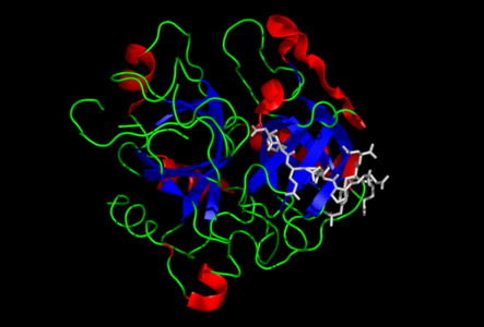 Main image on thrombin. Black background, blue beta-sheets, red alpha-helices, yellow loops, cyan substrate
 -
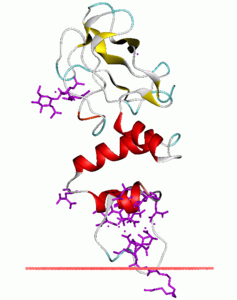 Secondary image on thrombin. Whit background, all differt coloured secondary structure, legend doesn't explain sticks
 -
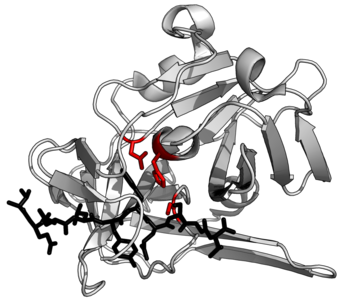 Suggested example protein structure. TEV protease (white) complexed with peptide substrate (black) with active site triad residues (red)


- I suggest that we try to start standardising the protein structures that are attached to pages. Here are a few starting suggestions:
- White background
- 'Cartoon' image to make secondary structure easily visible
- White protein with key features indicated in colour to make it visually clearer
- Perhaps a standardised colour scheme for different features would be useful? (e.g. catalytic residues in red, or allosteric inhibitor in blue, or substrate in black)
- Use Pymol ray_trace_mode, 1, since the outlines make complex structures clearer
|
| Molecular Biology Project‑class | ||||||
| |||||||
Hey, everybody. I threw together this page to create a standard for creating diagrams here at the Molecular and Cellular Biology Wikiproject and the Cell Signaling Wikiproject. It's by no means final. Feel free to add anything or discuss any changes, such as colors for the cellular regions, standard symbols etc. Thanks.-- GAThrawn22 19:03, 8 July 2006 (UTC)
- I like it. I think standardizing images will make them so much more useful and understandable. I will try editing some of my older diagrams to conform. Adenosine | Talk 18:31, 10 July 2006 (UTC)
- Colours - How about adjusting the colours to try and represent amount of energy contained. For instance ATP could be bright red, ADP darker red, and AMP very dark red (or something like such). I like how the number of 'arms' on the stars reduce with amount of energy, but colour is very intuitive. The same could be applied to reducing agents as well, like FADH, NAD+ and NADPH, but in blue or a different colour gradient. Even Phosphate, Pyrophosphate, and H+ could be coloured to represent energy in an archytypical way. just an idea.
Adenosine |
Talk
18:39, 10 July 2006 (UTC)
- I agree, color is very intuitive. It's a great idea. If you have a scheme for colors for the important biomolecules, suggest the colors, and then we can go about implementing them. Right now these are only tentative. I modelled the symbols for the ATP, etc. from you diagrams, Adenosine, since they are really good, and are already being used (you've set the precedence). -- GAThrawn22 00:42, 11 July 2006 (UTC)
The problem with protein images
-
Main image on thrombin. Black background, blue beta-sheets, red alpha-helices, yellow loops, cyan substrate
-
Secondary image on thrombin. Whit background, all differt coloured secondary structure, legend doesn't explain sticks
-
Suggested example protein structure. TEV protease (white) complexed with peptide substrate (black) with active site triad residues (red)
- I suggest that we try to start standardising the protein structures that are attached to pages. Here are a few starting suggestions:
- White background
- 'Cartoon' image to make secondary structure easily visible
- White protein with key features indicated in colour to make it visually clearer
- Perhaps a standardised colour scheme for different features would be useful? (e.g. catalytic residues in red, or allosteric inhibitor in blue, or substrate in black)
- Use Pymol ray_trace_mode, 1, since the outlines make complex structures clearer