This page is an
archive of past discussions. Do not edit the contents of this page. If you wish to start a new discussion or revive an old one, please do so on the
current talk page.
As already mentioned by others it might be a good idea to have some standard color maps for relief altitude coloring. There should best be at least two variants for maps where the main purpose is showing the topography and others where it should not distract too much from other map content. Currently the most widely used color maps for this purpose on Wikipedia seem to be the Demis one (like
Image:Topographic30deg_N0E30.png) which i find not that nice and the one introduced by
User:Captain Blood (like in
Image:Canada_topo.jpg) which is very heavy.
Map projections. Of course this much depends on the map purpose but some general guidelines might be good to introduce.
http://www.radicalcartography.net/?projectionref provides some useful information but is very elaborate. Especially for medium area maps like of continents or larger countries there are lots of possibilites with strongly varying results. I also noticed that a lot of maps do not have any information on the projection used in the description. This is not always necessary but if you know it and it is not self-evident i would encourage everyone to provide this information.
Imagico22:43, 2 January 2007 (UTC)
Very nice Congo maps, though I might add country borders to give more frame of reference. It's been on my list to do for awhile but I never got around to downloading the African datasets. I've had requests to do the Nile as well if you want to take it on. As for the relief coloring I like the Demis one, especially if your adding other content becuase it's light enough not to get in the way.
Kmusser15:00, 3 January 2007 (UTC)
I uploaded an old topographic map I made that is somewhere in between the light and dark examples that you gave. I still have the color ramp I used for this one somewhere if others are interested in using it.
Image:Uspaintedrelief.pngKmusser15:41, 3 January 2007 (UTC)
Yes, that looks quite good (although i am not sure if the use of violet coloring for the high mountains is optimal). But as you said a brighter scheme is less disturbing for secondary use.
Imagico21:26, 3 January 2007 (UTC)
Proposed image for the battle of Châlons. Althoguh it look like a map it cannot deserve the proper title as it holds no true scale. Due to the rarity of informaiton and lack of actual knowledge on the location of the battle I took artistic leave to build the terrain based on Jordanes' dercription.
Thoughts are welcomed.--
Dryzen19:36, 14 January 2007 (UTC)
First, let me commend you for your work: you have spent many hours on this map. Also, I have no problem with the background; until a recognized authority proves where this battle occured, all we can say about the battlefield is what Jordanes says -- that on one side there was a hill of some height and a stream that ran through it. However, there are a few changes I would recommend:
I don't understand why you have the Alans at the far left at the beginning. Jordanes is quite clear that from the beginning of the battle they had been stationed in the middle, between the Romans and the Visigoths, where Aetius and Theodoric could keep an eye on them.
I'd also rename the groups you have called "Germanics". First, I'm not sure that this is the proper term; "German tribes" might be more accurate. However, the Huns had a number of non-German allies at the battle -- Slavic peoples, horse-warrior peoples, & others -- or so many modern historians & nationalists state; I'd rename the group on the Hunnic side to "Hunnic allies" or "Allied people", & avoid the problem entirely.
Related to this is another problem, that you have a lot more information on this map than I would vouch for -- & I have researched this battle fairly thoroughly for my contributions to this article. There are a number of commanders I do not recognize as having participated: Merowig, Ellak, Ardaric, etc. And you provide a lot more details on unit movements than I believe can be documented. I feel the best thing to do is to remove some of the detail you have added. Although I don't like Michael Babcock's book The Night Attila Died for several reasons, I think his simple map & brief notes provide a model worth copying. His portrait of the battle focusses on three actions (to which I have added some notes):
The initial race to sieze the hill between the Huns & the Romano-Gothic Allies, which the Allies won. (Jordanes is unclear here: he places the Visigoths on the right of the Allies lines, yet from his account one could conclude that the Visigoths under Theodoric captured this hill on the allied army left.)
Then Attila led a countercharge into the middle of his opponents' lines, which Babcock claims drove the Alani under Sangiban back. (This may have also been the skirmish where King Theodoric of the Visigoths was killed.)
Attila then fell back to his encampment, where he prepared to fight to his death, with the Visigoths in close persuit. Some, under Theodoric's son Thorismund, apparently pursued the fleeing enemy past Attila's camp, for Jordanes notes Thorismund mistook the Hun's camp for his own & was almost caught while entering it.
Showing more than this borders too close to original research for my taste -- unless your intent is to illustrate how a specific authority interprets the evidence for this battle, which then is fine but you should indicate that this is what you are doing. --
llywrch19:32, 15 January 2007 (UTC)
Not German tribes, that hurts my brain, "Germanic tribes" otherwise the ancient Gauls would be French tribes.
Sorry, but it usage in modern scientific literature to use Germanic tribes as they are Germanic peoples. German is a 16th century creation to distinguish between Dutch people as now the inhabitants of the Netherlands were called Dutch and that of the HRE German.
Wandalstouring00:05, 24 January 2007 (UTC)
"Attila then fell back to his encampment, where he prepared to fight to his death, with the Visigoths in close persuit. Some, under Theodoric's son Thorismund, apparently pursued the fleeing enemy past Attila's camp, for Jordanes notes Thorismund mistook the Hun's camp for his own & was almost caught while entering it."
I think this are two seperate things whether someone follows the enemy in pursuit or mistakes an enemy camp for his own.
The map is source on the map's page. Most of it had been cut off in the re-loading. I've little time so I'll make my reply brief:
I've not read Michael Babcock's book and thus have not seen his map. The extract from Military Magazine only had a similar map as our own article.
Merowig was in charge of the Frankish force that slip of when Ellak Khan's division broke through the Alan lines. This information was taken from a few french source. Most of wich is present at this site
http://mapage.noos.fr/huns/Bataille.html .
As to the Germanics, sadly both the Romans and the Huns had a battle built of numerous different tribes and peoples. I took the names wich I found most often.
Well there was researh I can't deny that, this information didn't come out of nowhere. I tried to show as much of the actions as possible. Such as the multiple Visigoth groups that formed after they had beaten back the Ostrogoths: some charging back into battle others looting and some chasing their earlier opponents. I hope the returning arrow showed Attila's retreat?
Although I did create
a map of what could be called the Chalons campaign, I can't contribute much knowledge concerning the actual battle itself. However, I thought I'd add some thoughts concerning the map:
In general, PNG or SVG will provide sharper detail than JPG.
Perhaps a series of maps would be more understandable than one single map that attempts to show everything. See, for an example, the
Battle of Grunwald article which has four maps that create an easily understood narrative.
Most battle maps represent the forces with rectangles, rather than circles.
The Legend icons for "Dispersal/Raiding" and "Scattering" are difficult to see, even at this large size. Can they be larger?
Yes, "Germanics" is an attempt to make a noun from an adjective. It should be German tribes, or German forces, or even Germans.
I would prefer a plain green background instead of the gradient now used. We should either use a gradient to show some feature (e.g. higher elevation) or not use it at all.
Perhaps a mape that shows the changes like the map of Australia here: The background could use more colors to show the elevation, what about yellow to brown?
Wandalstouring13:40, 26 January 2007 (UTC)
To enumerate the changes:
Use of Germanics or Geman tribes and what about the minor leaders/factiosn?
Use larger icons for dispersal.
Change topology colour: solid or gradiant (Yellow to brown could be done, wasn't done from onset due to prototype image, then I didn't think about it for the finals)
I had rectangles but I found that that gave too much of a size and organisation impression. It hard to know how large where the battles (divisions) and what form they where organized in. But I can change it back to rectangles.
And the sources? I didn't really get a good reply on that point.
Series or Animated?
I'll see about exporting into another format. Will depend on the above as well.
Can anyone help and create some maps of the troop movement in the
Roman-Spartan War? If you need some help on how it should look like and what happened, etc. post it on the article's talk page. Thank you very much.
Wandalstouring20:36, 14 January 2007 (UTC)
Comments requested
Could you take a peek at the map on the right, and let me know how it can be improved? It's the old townships of Manchester, taken from a 1905 history of Lancashire. There's an online version of the original
here, and in context
here. Obviously, it needs a title (across the bottom) and a scale (in the space at the lower left?) and the source (in the space at the lower right?) I've used the colours suggested above. My minor breakthrough came when I put the labels at half intensity - pure black just stood out too much. —The preceding
unsigned comment was added by
Mr Stephen (
talk •
contribs)
23:41, 21 January 2007 (UTC).
This is a fine map of the ancient parish, can I add the image to the Manchester page and also on the Manchester (ancient parish) page?
Cwb6118:52, 25 January 2007 (UTC)
Thanks and help yourself, but I will try to make the final additions (as above) over the weekend, so it might change a little bit.
Mr Stephen22:09, 25 January 2007 (UTC)
I also believe this to be a fine map. Yes, I would agree with a title and a scale. Not sure that the source is needed on the map itself, although I would definitely add it to the Image page. If I had to make suggestions, they would be to bring the lower edge of the map up a bit to reduce the space not showing to the city, and to increase the size of the legend on the upper right, for better legibility.
I've been thinking about making maps that show the
Monongahela River basin and its main tributaries. It is a relatively small river system, but a fairly confusing one in terms of the names of the streams. I thought I might be able to make a map or a set of maps about it. At first I thought I might be able to make a single map of the river system, perhaps with letter or numbers next to streams and a key naming them. That is still a possibility, but I've ended up making a few test maps of individual streams in the system. I thought I could post a few here and ask for feedback. There are some tricky aspects to making maps of the Monongahela basin while keeping the maps clear and clean and image sizes around 300-400 pixels wide. First, it seems that you need to show the Allegheny and Ohio rivers, and the city of Pittsburgh, since the Monongahela is so strongly associated with them, no? Second, the streams mostly flow north in meandering ways, and close together, making it hard to label along the stream lines. So for these maps I've tried bolding specific streams, giving them a glow, and naming them both at the bottom and somewhere near the stream itself.
Also, there is one stream in the system,
Black Fork that is very short. I'm curious if the map I made for it is alright, or how it might be better:
Image:Monon-BlackFork.png
Since this basin is a small area, I'm thinking some kind of locator inset map might be needed, showing where in the US this is, don't you think? On the other hand, it is hard to avoid clutter on maps when they are only 400 pixels wide. Finally, my instinct is to make the maps 300 pixels wide rather than closer to 400 as they are here. Does it make sense to reduce them to 300 pixels myself, or let the wiki reduce them automatically? Are they acceptable at 300 pixels, or would it be better to tweak the text. And is it even worth the trouble? Here's a couple 300 pixel reduced maps:
Image:Monon-BlackFork300.png and
Image:Monon-CheatRiver300.png
I think that looks great, even the Black Fork one. You could include a U.S. inset, though if you do zoom out a bit to make room for it, I don't think it's critical though - as long as Pittsburgh is in the map, I think that's a well known enough city that most people would be able to orient themselves. I think the text size is fine. For the image size I started out doing mine 300 pixels wide, but my more recent ones I've done at around 500 and let wiki reduce them and they seem to come out a little better, not a big difference either way though.
Kmusser03:09, 3 February 2007 (UTC)
XML+XSL=SVG
A question. Theorethically, it should be possible to store latitudes and longitudes in a custom
XML file or a proper
GML file, couple it with one ore more
XSL file and generate an SVG map. This would be advantageous because it would decouple the geospatial data and its visual style in the same way today's HTML rely on CSS sytlesheets for their visual appearance. Has anybody looked into this?
manu3d23:15, 6 February 2007 (UTC)
Hi! I was wondering if anyone here have or know of a good high resolution map of Sweden. Please answer at my talk page. Thanks! --
Krm50023:22, 7 February 2007 (UTC)
Airport route map - comments requested
version 2version 3non-hub examplelow volume international example
I thought some of our airport articles would be greatly enhanced by route maps, so I took a crack at making one and would like comments on it.
Kmusser01:13, 21 February 2007 (UTC)
I love the concept. Love. It needs refining but I'm not entirely sure where. Some suggestions, maybe things to toy with:
On the global map, ignore the dots in the United States - it just makes a blob. Or make them tiny or something. This could lead to...
On the USA map, ignore dots that aren't in the United States. This would open up the lower right for...
A map of Europe, which on the global map is just another blob. For airports that focus on other regions - like one that has far more East Asian destinations than European - you could put East Asia there instead.
Then again, then the Caribbean becomes a blob, and that's less easy to resolve. So maybe this is the better option - Show the United States and the neighboring regions on the big one, then the global map, in which case we just have to clean up the global map. So maybe you should ignore 1 and 2. :)
As it is, the map is cutting off south Texas.
I have to remember that this doesn't have to be authoritative, just a helpful illustration to add to the article, so I need to make sure I'm not demanding too much. I'm not demanding anything, just brainstorming.
I love having a different color dot for the anchor airlines of the airport, though personally maybe the dots should be on top of the longitude/latitude lines, instead of under. Did I mention I love the concept? Good show. --
Golbez02:02, 21 February 2007 (UTC)
Nice map. I really like the projection, although perhaps that's just because it's so unusual.
Echoing to some extent Golbez's comments, I don't think that you can have the nearby cities (e.g. US, Canada, Mexico, Caribbean) on the same map with the distant departure cities. It's just a matter of scale. It might work if the secondary (world) map did NOT have the US on it.
In the Legend, "United" should be "United Airlines". I also find it difficult to differentiate between the "Multiple Carriers" and "United".
My concern would be the mercurial and ephemeral nature of the information, subject to change without notice. Because of that, once you start the project, you might get part-way through the project and then start pulling your hair out. You should at least clearly date the maps "as of" so that future updates would be well-understood and differentiated. In places where there are various major carriers, I believe you would need to cite the different major carriers or you might be tagged for POV or advertizing, such as if you solely noted United Airlines in Dulles. I sort of like the concept, but you should address how you will keep up with this as a system of maps over time. --
Petercorless18:34, 21 February 2007 (UTC)
My plan was simply to date them, currently it is dated in the text, but I could add the date directly to the map. It's intended to be a snapshot, not an authoritative map that would be constantly updated. For the carriers, I originally planned to do a different colored dot for each major carrier until I actually made the map and saw that almost 90% of the flights were United. I think which carriers are shown would have to be customized to each airport and that picking out the airlines that use that airport as a hub can be done in a non-POV fashion (usually it's already stated in the article text). For non-hub airports I don't think I'd bother differentiating carriers.
Kmusser19:14, 21 February 2007 (UTC)
(caught in edit conflict) I was going to also suggest a low-volume foreign airport, what would be a good one without *too* many destinations... how about
Sapporo or
Eilat. --
Golbez19:27, 21 February 2007 (UTC)
I have new examples for to look at. I revised the Dulles map, changing the colors a bit, adding a Europe inset, and removing the points that are in the insets so that each destination is only marked once. I tried out making the insets circular, which I think looks cool, but for some reason my mapping program then doesn't display lat/long lines correctly, I'm thinking of just doing away with the lines, it certainly makes the map easier to make. Also added the examples
Golbez asked for - the Ovda destination data was rather dubious, but it does show you what that type of airport would look like.
Kmusser23:03, 21 February 2007 (UTC)
Nice, nice. First of all, I love having the zoom-in and not showing it on the world map, AND showing on the world map which portions are zoomed in. It worked very well. I'm not sure which I prefer, the circle or the square; the circle looks better, but the square is probably more professional. And yeah, we don't NEED the lines, and if it makes this simpler, go for it, nuke 'em. Making the airport a star was also another good idea.
As for the lower-volume airports, that really shows where this shines. Sure, Vegas might be mentioned as a destination in the text, but I never noticed it - but now it's easy and neat to see that, inexplicably, there's a direct flight from Albany, New York, all the way to Las Vegas. And it was nice to have the airport codes there as well; for the lower volume airports that's viable, and obviously not for the higher volume ones (unless you wanted to do a 4x size map... which may not be TOO bad of an idea in some cases, heh) I also think it worked well for Ovda (Except for one minor issue - you're using an old version of the world map, as it still includes Serbia+Montenegro). I can see only one real issue with the projection you're using, and that's Australia. Will you simply have another box for Australia when we run into North American flights heading there? Because as it is, it's simply a strip of nondescript pixels, if that. --
Golbez00:36, 22 February 2007 (UTC)
And perhaps we should tilt the 'inset' maps based on a central city, because I know you're going to hear complaints that Europe is 90 degrees off kilter. ;) And if you have an Australian inset map it will be completely upside-down. --
Golbez00:38, 22 February 2007 (UTC)
I am very impressed! Nicely done with all versions. If I had a vote, I like version two because the circles are in synergy with the global image.
Ronbo7615:22, 22 February 2007 (UTC)
version 4
Made some minor edits, changed the projection for the Europe inset on version 2 and fixed the Montenegro boundary. I don't think I'll run into any projection problems if I don't use the funky projection for insets, there would be if I tried to show something literally going around the globe, but there are no such flights - the Dulles-Singapore route is almost as long as they come. I'm going to try a version of the Dulles map with labels just to see what it looks like as well.
Kmusser15:12, 22 February 2007 (UTC)
Looks good. Have you decided on the round inset instead of square, or did you just test the new projection on the round? --
Golbez19:16, 22 February 2007 (UTC)
Another version with labels added, I'm not sure I like it though, it does add more info, but I think the map is harder to read in thumbnail form.
Kmusser02:08, 23 February 2007 (UTC)
Well done, and it makes it easier to differentiate between the different airports in areas, like ORD and MDW. How are you making these, manually or with a program or what? --
Golbez03:12, 23 February 2007 (UTC)
With a GIS program (ArcGIS), the main work is compiling a list of coordinates for all the destinations, once that's done the GIS mostly does the rest - I'll write up a tutorial when I get a chance.
Kmusser10:59, 23 February 2007 (UTC)
Step one should be How to get your hands on ArcGIS and keep your money. The licence acquisition for Editor and Info are rather difficult for the common mortal. Fine work.--
Dryzen21:25, 23 February 2007 (UTC)
I realize this is late to the conversation, but what if you produced the blank maps and then locator dots were overlayed (such as on {{National_parks_of_the_United_States}}). It might be easier to update for other users in the future. You could use different colored/sized locator dot images and wouldn't need to display the airport ID's -- hovering could popup a label that shows the airport ID + city name. --
MattWright (
talk)
15:31, 4 April 2007 (UTC)
I would say that those maps would be rapidly overwhelmed. Just look at how evil the northeast would be in the Dulles map if it were clickable. --
Golbez16:29, 4 April 2007 (UTC)
I may be misunderstanding your reply, but I wasn't suggesting using the *same* map as the National Parks of the U.S. It could still be a custom map image like has been created for Dulles, just that the dots would be placed using divs and would be clickable/hover labels. It would then be easier to add or remove a single airport if service changes. It may not be a good idea, however. --
MattWright (
talk)
16:58, 4 April 2007 (UTC)
While a neat idea, the amount of work it would take makes my head hurt. If someone wants to try it I could get them a blank Postscript version of one of mine as a base.
Kmusser17:11, 4 April 2007 (UTC)
True, it would be a lot of work, and my hesitation is that it would become outdated, or only partially updated. Do you have a data source you are using to automatically generate these or are you manually tracking down routes and adding dots? If it is something that could be automated, I may be more interested in looking into it. --
MattWright (
talk)
17:18, 4 April 2007 (UTC)
A little of both, I have to manually track down the routes and the lat/long coordinates, but once I have those the dots and labels are automatically generated and if I need to shift the map extent, scale or create insets the dots will move along with the changes. To do the dynamic map I'd need to figure out the appropriate extent and scale first and then place each dot and label manually using image coordinates.
Kmusser17:32, 4 April 2007 (UTC)
What I had envisioned was a single template that is a blank map. This template could then have locator coordinates for every single airport code, so you would call it like {{Airport service| width=200px | base=IAD | DEN=United | MSP=Multiple | ... }}. Then, using these parameters, it would place only those dots that are defined as service airports and use the star at the base airport. Coordinates could be placed as a percentage of map width and therefore would always scale in proper direction depending on how large the map requested is. But it sounds like you are doing a *ton* of manual work already, so I applaud you. I too worry about it getting outdated, so unless there is an automated way to have a bot grab routes and determine serviced airports/airlines, I think a static image that is updated periodically is a better way to go. --
MattWright (
talk)
17:50, 4 April 2007 (UTC)
Yeah, I think that would be unwieldy as a template - if you include every airport with commercial service, that would be over 10,000 airports - if you could pull that information out of a database it might be possible, but that means creating the database as currently it doesn't exist as far as I know.
Kmusser18:06, 4 April 2007 (UTC)
It's a great idea, but I wonder how sustainable it will be, particularly if done for lots of airports. Don't routes change over time? If the maps are presented as showing routes as of a particular date I think it would be fine, but it would be a huge task to try to keep the maps constantly up to date. Perhaps they could be updated periodically in a batch, say every year or half-year. --
ChrisO17:36, 4 April 2007 (UTC)
A while back user
Stevertigo made a new template for tagging map requests;
Template:Mapit. I like that it has a different picture than the photo request (specifically, a map and not that dumb question mark), though I think it needs to have the categories we use built in.
I would stick with
Template:Reqmap and
Template:Reqmapin since that's what most people are using, but if you wanted to edit those to replace the question mark with a map I certainly wouldn't object. You're welcome to make more categories. I had been making one for any country/region that had at least 3-4 requests, but have fallen behind. There are definitely enough for a Middle East category.
Kmusser22:47, 26 February 2007 (UTC)
Definitly need to change the question mark, maybe a rough map (polygons) with questions marks? As to categories I think making some more specific sub-categories a good move to sort out the needs and requests but we should stop ourselves from develloping categories that are too specific or that will be lost within the Cat-tree.--
Dryzen16:04, 28 February 2007 (UTC)
On the others, note that I start showing all of the land, but Mexico started large and got smaller. It would seem kind of insulting to have half of a map of present-day Mexico filled up with the United States. So, how should I go about animating this? Crop them all to the same size? Jump in height like I do? Forego animation altogether? Or, keep Texas and the USA there the entire time? Which I think is simply not an option. Thoughts? --
Golbez19:08, 4 March 2007 (UTC)
This is a common problem when creating a time series of map: the subject changes sizes or focus. I would suggest trying to keep the same scale in all maps, even is it means changing the size of the map. Good luck, 04:08, 5 March 2007 (UTC)
Hrm, but in the case of Mexico, that would mean a good 1/3 of the map would be whitespace. I can change the scale without affecting readability... --
Golbez11:51, 5 March 2007 (UTC)
Hmm I see the dilema, how does it look keeping the smallest scale (i.e. largest territorial extent)? I'm leaning less towards keeping with a window encompassing the current territoiral extend becuse it cuts off an important portion of history and making a mid gif switch can dilude the loss or cause confusion in the readers. Not an easy choice, but the first will definitly have effect, juste like the
Byzantine Map. --
Dryzen15:09, 13 March 2007 (UTC)
Yeah, I'm leaning towards that as well. After all, this isn't a map of Mexico - it's a map of all the land that has become or been a part of Mexico. --
Golbez15:11, 13 March 2007 (UTC)
Whats your take on replacing the dark grey for he united states with a pale grey or white? Currently I think the darker colour steals too much of the readers attention from the light pink of featured territory (Mexico). Either way I think it was the right call to keep the extent.--
Dryzen19:49, 14 March 2007 (UTC)
I don't yet know if I *will* keep the extent; I may make two versions, one for the list, and one for the animated gif. The animated gif has to keep the full extent, but the list doesn't necessarily need to. I might go with pale grey, yeah. --
Golbez23:12, 14 March 2007 (UTC)
How does this one look? I'd have kept going except I forgot to add the dotted line, so I figured I'd throw up this errored one and see what people thing. Note that until this point in history, the foreign countries would still be dark gray; the switch to light gray with the grey words is signifying that this area is now unchanging, this is forever (at least to the present day) gone. --
Golbez23:14, 15 March 2007 (UTC)
Just pointing out the huge
topographic maps series by the US army at the PCL collection.. they are all public domain, and very detailed, although they are a little old (1950s). There are already a few on commons --
Astrokey4401:46, 22 March 2007 (UTC)
Could you help me with their translation? I want to replace the current maps of the article, most of which are old ones, and I am not absolutely sure that their copyright status is solid. I think that by translating them, we can enrich both Wikipedia and Wikicommons with three excellent maps. Thanks in advance!--
Yannismarou19:34, 31 March 2007 (UTC)
I would like to reproduce or create a map of a few streets in Wiesbaden, Germany in connection with an article I'm working on,
Jeremiah Duggan, in order to show Duggan's movements in the period just before his death. The map I want to base it on is
here, which says it's the copyright of Microsoft. The arrows and explanatory boxes were drawn by Duggan's family, and they have no problem with it being used, but I'm assuming they can't release it because it's based on someone else's copyright.
What do I have to do to the map, in terms of adding enough of my own creative work, to be allowed to use this map in the article without having to claim fair use?
SlimVirgin(talk)22:34, 6 April 2007 (UTC)
street maps are a problem because the information in the map itself is probably copyrighted (unlike say a map of the whole of germany where there are numerous public domain satellite photos and maps etc.) I suggest you look for old maps of the city which have fallen into the public domain --
Astrokey4401:17, 7 April 2007 (UTC)
Would it be allowed to use cropped screenshots of Google Maps with, say, a opaque shape overlay as an image/map (like these:
12), assuming that I credit/cite Google for the map? I was interested in creating maps to show the various neighborhoods of the Bronx, eg.
University Heights. Here is Google's
terms of use page, but I'm not sure that it makes it clear if you can use their content with proper references. Thoughts? --
Alheim
No, those images are not free-use. From their license; For individual users, Google Maps, including local search results, maps, and photographic imagery, is made available for your personal, non-commercial use only. --
MattWright (
talk)
01:04, 9 April 2007 (UTC)
Perhaps using it merely to find coastlines and locations is okay. Copy-pasting is obviously illegal, but in the same way that using information from books is legal, so long as it's not the same words (Wikipedia definitely does this), using a satellite photo as a source is not illegal either, especially due to the noncommercial purpose. But the end-result map probably should be significantly different from the photo, e.g. different colors, maybe less information, etc. --
CommKing22:45, 9 May 2007 (UTC)
But Wikipedia is not "personal use", you're publishing it. I'm pretty sure that publishing it under the GFDL would allow people to use it commercially. There is a school of thought in which tracings from a photographic image (i.e. a map traced from an aerial photo) would become a derived work, with the copyright owned by the copyright holder of the image.
You may not copy, reverse engineer, decompile, disassemble, translate, modify or make derivative works of the imagery, in whole or in part. You also may not rent, disclose, publish, sell, assign, lease, sublicense, market, or transfer the imagery or any part thereof or use it in any manner not expressly authorized by this agreement.
Note the "make derivative works, in whole or in part" bit, and the "publish" bit. That would preclude you from using it in wikipedia (publishing) - and creating a map from the aerial photos would be "making derivative works" - even if you use less information (the "in part" bit)
Richard B23:47, 9 May 2007 (UTC)
Fair use may fit for some of this. Using a map which has information from Google Earth (Not directly copied at any stage in its creation), made with information from other sources as well, which does not depreciate the value or market for Google Earth, very little information is used (e.g. less than 100 square miles), and the i constitutes information of little importance. Little importance in this case means not big cities, major landmarks, and well-known places, and does mean little-known, low-profile, remote locations. This probably would qualify as fair use because it reflects an incredibly marginal proportion of Google's product, the information shown is of little value compared to most other similarly-sized parts of the product, and using it will definitely not decrease demand for the product.
Considering that Google Earth would only have information of use to us (Which can't be found elsewhere) on low-profile locations, this would drastically increase our ability to map remote areas. So long as we do this sparingly it's quite likely that it will not only qualify as fair use, but go unnoticed entirely. I'm not recommending the use of Google Earth, but I am suggesting that if we can't get information elsewhere we look into this further. --
CommKing22:12, 11 May 2007 (UTC)
Personally, I'd say it'd be treading a fine line, Particularly if we're using it to "map remote areas" in many locations. I mean, just how many extracts can you take before a fair use claim becomes difficult to justify?
There are free equivalents in some places; maps produced by the US government are public domain, including NASA satellite photos (of anywhere in the world).
OpenStreetMap has some areas covered in some detail, but conversely some areas with little coverage.
OSM has some coverage of Wiesbaden. Maps also go out of copyright after a period of time; in the UK, it's 50 years for OS maps, and the
NPE edition ordnance survey maps are available online - in many cases, street layouts have changed little in 50 years. I'm not saying that small Google Earth extracts are definitely not fair use, but if there are free equivalents, then that's infinitely preferable.
Richard B22:55, 11 May 2007 (UTC)
why is it that when I go to edit a map on openstreetmap the first thing I see is a satellite photo which is "Data Copyright 2006 Navteq, TeleAtlas"? --
Astrokey4402:32, 12 May 2007 (UTC)
Richard B, the answer is very few. We can't take many extracts, which is why we should use it sparingly. As long as we don't do it often and maintain a small number of maps, and ensure that these maps cover very little area and area of little importance, we're probably fine. Beyond that we may risk lawsuits. Openstreetmap should be used whenever possible. Google Earth should be used sparingly. When we can't justify either, several physical atlases and historical text should be sourced. And by no means do I recommend using Google Earth— all I'm saying is that it's not necessarily illegal. --
CommKing17:05, 13 May 2007 (UTC)
VA tech massacre map
There is a truly terrible map at
Virginia Tech Massacre, where someone took a map of
Blacksburg from a source other than Wikipedia and placed a white box over the word "Blacksburg", typing over it with "Virginia Tech". It looks terrible. Further, it may be copyright violation. I'm busy with the
Lamu map...if someone could help out, I would appreciate it.
Here's the map:
It's definitely not a copyright violation, as I recognize that map as being part of the National Atlas, which is PD-gov. --
Golbez15:08, 21 April 2007 (UTC)
European Map
I think that there should be a European map showing the regions of each country: i.e. counties of England, Scotland, Wales, Ireland, Norway, Sweden, Iceland; provinces of France, Spain and Portugal and the states of Italy and Germany etc, but applied to as many european countries as possible. (I would make it myself but I do not have the means). The practical implications for such a map are numerous. — Preceding
unsigned comment added by
SKC (
talk •
contribs)
World map showing Life expectancyPopulation growth rate in percent, as listed on CIA factbook (2006 estimate).Countries by number of internet users.
Hi,
I've spent a lot of time looking, but haven't been able to find info on how it is that maps like the two shown right, are generated.
I realise that they are somehow based on the template
Image:BlankMap-World.png, but could someone tell me what the exact method is?
The reason that I ask is that I have been working on a program to generate these statistics-driven maps. The idea is that you provide this program with a list of country names, country specific data (say literacy rates from the CIA world factbook), and then a colour range, and have it generate an attractive svg, or png map. It still has a lot of work left to go, but you can see some sample output
here.
Assuming a system like this isn't already being used, what would people like to see in one?
what should the default image format be? image size? built in default colour palettes?
I've done a lot of work on this project, and finally have something to show. The project has been done as an
Apollo application, however, Adobe's apollo runtime is still in alpha. You can still see what I've done here though:
The full apollo application allows users to save the generated map as an SVG, or as a PNG of up to 2880x1312 pixels.
To use:
Select an example dat set from the combo-box, OR
Copy and paste data directly from a properly formatted table like the CIA world factbook one found here:
[1] into the box in the bottom left
Specify what data lies in what column if necessary
Click on the "parse data" button
That's it! Now you can now change the colours around, edit the data, and play with the balance slider to improve the image.
I am going to be out of town for the next few days and I plan to work on this as soon as I get back. In the mean time it would be great if people could try it out and give me some feedback.
Also, I wonder if someone would be able to advise me on licensing the images produced. I am considering something like the CC Attribution-ShareAlike licence, however it occurs to me that that might prevent people from using GFDL licensed wikipedia data to generate the maps. Would that be the case?
It looks amazing so far! A couple questions though.. having trouble getting the CIA files to work with it, when I copy paste the data from the page you linked to it doesnt work. I can see that it works by typing them in manually: country, tab, number, but the CIA data seems to have extra spaces. Cant get a macro to remove them because it picks uop spaces between countries with two words. Also, more importantly, the save png and save svg buttons seem to have no effect. If you could get these to work it would be incredibly useful to use on the CIA data, especially as the maps keep needing updates. --
Astrokey4411:24, 9 June 2007 (UTC)
You're fast! Thanks for your feedback, and also the welcome. The CIA world factbook files should work now. Also note that the program works pretty well with data from pages like those on
List of countries by literacy rate, just remember to specify the columns. The problem was due to browser differences. About the save buttons - they only currently work with the offline version, which requires Adobe's apollo runtime, which is currently in (a very stable) alpha. I shall probably put it online as soon as I get back home in a few days anyway. I am also considering the possibility of having the online version being able to save files too, but I need to think about bandwidth. Flash can't save files directly itself, it would need the server to do it and then the user to download from the server, and the generated SVG files are 1.8MB each. The offline version would be a single 2MB download and saved maps would appear instantly on the users desktop. --
Aaaarg16:11, 9 June 2007 (UTC)
Okay, since I updated last, Apollo has been taken out of alpha, and renamed as Adobe AIR - you can download it
here.
Once you have Adobe AIR installed, you can download the app
here.
I have tested on both OS X and windows, so hopefully it should install smoothly. This version allows users to save the generated maps in SVG and PNG form.
Suggestions? What features are missing? A key/legend generator? Try it and tell me what you think!
Also, how should I go about getting this application known on wikipedia?.
--
Aaaarg07:24, 21 June 2007 (UTC)
Its working really well with the CIA files now! But when I installed it, there was an error message when I went to save the file:
Error #2044: Unhandled IOErrorEvent:. text=Error #2038: File I/O Error.
at flash.filesystem::File$/flash.filesystem:File::getFile()[C:\Documents and Settings\acrorel\Local Settings\Temp\aslibc-28157\File.as:1540]
at flash.filesystem::File$/get desktopDirectory()[C:\Documents and Settings\acrorel\Local Settings\Temp\aslibc-28157\File.as:705]
at GunnMap/::savePNG()
at GunnMap/___GunnMap_Button1_click()
I think the best way to get it known would be to include maps made with the program in the articles, and link to it in the image description. There are pages on
Template:Lists of countries without maps which could use them. Also you need to make clear you would allow them to be licenced as GFDL/CC/public domain (if this is what you want). --
Astrokey4408:36, 21 June 2007 (UTC)
Hmm, that's an odd error. I haven't been able to reproduce it here, but I've come up with something that might fix it.
http://gunn.co.nz/map/gunnmap.air now has the new version. If there are more problems, then perhaps e-mailing the would be a better idea? My address is at the bottom right of the app. Thanks for your help! --
Aaaarg09:25, 21 June 2007 (UTC)
Hi! I have just uploaded a newer version of the program, it's available at
http://gunn.co.nz/map/GunnMap.air. It has some significant improvements - a much more attractive colour mixing method, and the ability to add a key (look for the "Show Key/Legend" checkbox) and then manually edit it.
There will likely be a few bugs left, and the interface needs some improvement, however, I think that the quality of the maps it produces are good enough now to start adding them to wikipedia.
My plan now is to do as
Astrokey44 suggested, and add maps to the pages on
Template:Lists of countries without any. I'm going to add them in PNG form, because the key/legend does not get added to the SVGs yet. I've decided to standardise on 1600x728 pixels. I'm planning on licensing the images under a Creative Commons Attribution-ShareAlike 3.0 license, and also making a custom template, to be use in conjunction with the standard wikipedia CC one. Does this all sound sensible? Thanks. --
Aaaarg08:19, 26 June 2007 (UTC)
Wow!! It works perfectly. I mean that is just f*ing brilliant! The SVG files even work in inkscape, with it keeping the country groups together. --
Astrokey4409:54, 28 June 2007 (UTC)
Just a quick update. I have added some options to give more control over the key. I have also modified it so that the SVGs that get produced will display in more viewers, and display in the right proportions on wikipedia.
Request for comment, protected areas in Tanzania
I'd like some comments and suggestions for this map of protected areas in Tanzania
. Are there any major reserves missing and does anybody have a map of the Mnazi-Bay Ruvumba marine park (marked by a circle up to now)? Regards
Bamse09:53, 29 May 2007 (UTC)
Help on map
Good day. I need help on creating an SVG map. I'm using Inkscape and I am trying to use Google Maps or Windows Live Maps where I want to create a road map map of New York City. I'd like to receive assistance on this. Thanks. –
Imdanumber1 (
talk •
contribs •
email)
19:31, 3 June 2007 (UTC)
and it is pretty bad and it was suggested that I come here to request a better one! It is used on all the pages with the Virginia Tech Shootings template. I hear you guys are good at this stuff. That one was only made to be an accurate placeholder map until a better one came along. Thanks!!--
Daveblack20:02, 4 June 2007 (UTC)
I have a description of a region that is defined by a list of coordinates corresponding to the vertices of the region. I want to overlay this boundary onto a map. What tools are available for me to do this? Sancho19:17, 20 June 2007 (UTC)
Fill-in maps of political subdivisions of a U.S. county
I am looking for a set of maps of the political subdivisions of
Delaware County, Pennsylvania-- specifically, I am looking for a set of maps that are of the style shown to the right, but that have a particular political subdivision (township, boro or city) highlighted. The special challenge in this county is that there are enclaves and exclaves all over the place: see the lower right. Also, the source maps in the links to the right use dotted lines to denote census areas as distinct from political subdivisions, and I wouldn't want these to appear on the map at all.
Looks excellent, but I have a couple of corrections and cautionary notes. See link at
here. (the linked map is referred to below as the "External Reference Map"). Specifically:
(1) On your map, the triangular area south of Ridley Park (southeastern part of the map, happens to contain a shield for US Route 13 on the External Reference Map) is actually part of Ridley Township. Ridley Township should kind of snake around Ridley Park on the north, west and south.
(2) On your map, just north of Ridley Park, you have the small municipality of Rutledge separated from Morton and Springfield by what appears to be a very small, long thin area that is separated from Ridley Township and all of the other adjacent areas. That area is actually part of Ridley Township, as the External Reference Map shows: Rutledge should be surrounded by Ridley Township except for the northern corner of Rutledge, which is adjacent to Morton.
(3) On the reference map, Colwyn and part of Darby Township are two separate municipalities that are adjacent to each other. They abut Delaware County's eastern border, north of Tinicum (in Delaware County's southeast corner). On your map, you do not have a line dividing them.
(4) You still have dotted lines around some but not all of the county's external boundary. I would suggest making this a solid line all around.
(5) Some things that are not yet implicated on your map but that you should be aware of if you produce a set of individual maps for the various municipalities:
Millbourne (the smallest municipality in Delaware County; along the county's eastern border and adjacent to Upper Darby) is a distinct municipality. You have it properly distinct from Upper Darby on your map, but be careful not to accidentally merge it with Upper Darby or delete it.
Upper Darby has an exclave, south of Lansdowne (labeled "U.D." on the External Reference Map).
Darby Township (southeastern part of the county) is divided into two non-contiguous areas (both are labeled "Darby Twp." on the External Reference Map).
Springfield Township (center of the county) has an exclave-- it is the small area southeast of Swarthmore, adjacent to Nether Providence and to Ridley Township. This is just south of the circular "320" highway shield on the External Reference Map.
The small area northwest of Rose Valley (west of the circular "252" highway shield on the External Reference Map) is not a separate municipality, it is contiguous to and is part of Nether Providence Township.
With all of these complexities, I would guess that you are beginning to see why these maps would be helpful in the articles for the various municipalities. The work that you've done thus far is marvelous.
Spikebrennan13:34, 27 June 2007 (UTC)
yes they are really complicated. I have updated it based on these suggestions, except that I left the dotted boundary at the bottom which keeps the state border distinguished from the county. Is this correct now? --
Astrokey4415:56, 27 June 2007 (UTC)
Does anyone know where I can get free or low cost shape files describing the political boundaries of every country on Earth at ~1 km scale? Preferably the boundaries should be not more than a few years old and easily exportable to lat/long pairs for the application I have in mind.
Dragons flight02:46, 3 July 2007 (UTC)
here, administrative boundaries by continent - it's in a shapefile, I don't know how easily exportable it is. It's current except for Montenegro (which I end up drawing in on my maps).
Kmusser13:02, 3 July 2007 (UTC)
Sadalmelik suggested that I bring this question here to WikiProject Maps.
I recently made an OMC map of Togo for the
Geography of Togo article and noticed, while consulting other maps, including those already in the article, that there seems to be a disagreement over the alignment of the border between
Togo and
Ghana. The question is about the land inside an oxbow found at 9°38′N 0°18′E (see map).
OMC shows this as part of Togo, as do the relief map in the article and the CIA map in the main Togo article, but GoogleEarth says that it's part of Ghana, with the border cutting across the neck of that bit of territory. This is also what the satellite image shows. GoogleEarth also says that there is a village there called Butoe. Is it Ghanaian or Togolese?
Would anyone happen to know whether this represents an ongoing territorial dispute between Togo and Ghana, or perhaps a recent border change agreement? Or is it simply a mistake made by a mapmaker somewhere? I would appreciate any light that anyone could shed on this question, as I would like to adjust the OMC map accordingly. Also, if one of those political situations that I mentioned actually is the case, I think the Togo and Ghana articles should mention it.
I've just had a look at the fallingrain site myself, and it has
Butoe listed under Ghana, but the closeup map there shows it in Togo!
Kelisi20:18, 26 July 2007 (UTC)
Perhaps the best solution would be to submit the question to Ghanian and Togolese consulates in your country, asking for a verification, and seeing if the answers come out different. :) --
Golbez07:50, 4 September 2007 (UTC)
Projection to use for U.S. County highlight maps...
I am currently considering reworking the Colorado county maps so that they will be colored similar to
Image:Map_of_USA_CO.svg (keeping the SVG format). There seem to be a couple of projections in use, and I am wondering which one would be preferred for this application. Current U.S. County locator maps use a
azimuthal equidistant projection (such as
Image:Map_of_Colorado_counties,_blank.svg which was based on a similar projection from nationalatlas.gov), whereas locator maps being designed for use with automatic placement of pins based on lat/long coords use a
mercator projection (such as
Image:Colorado_Locator_Map.PNG based on a similar projection from census.gov). Do map editors have a suggestion as to which would be most appropriate in this circumstance? I am also going to post this to {{Infobox U.S. County}}. --
MattWright (
talk)
04:38, 31 July 2007 (UTC)
I'm not sure that it matters too much. From looking around, it seems that it usually is just the map creator's preference. I thought that usually the maps used with automatic placement locator maps just used unprojected lat/lon for ease of projection, but I could easily be wrong.
Miller is also a decent projection that doesn't look quite as distorted as Mercator. -
Marvin01 |
talk07:46, 4 September 2007 (UTC)
WikiProject Maps "move" to a Forum shaped "Map Lab"
Hello, I'm the former leader of the several succesful
Graphic Labs (fr ; de ; en ; es), I come here to encourage you strongly to improve your project into a Forum shaped "Map Lab", like the french map-maker team did. It appeared in our french wiki that a Graphic Forum is really more friendly, and so, encourage both graphists to join the project and commons users to ask some maps creation.
Really, please, move on to such Graphic Forum page.
If you do so, please don't forget to make a redirect from
Wikipedia:Graphic Lab/Maps toward your new "Map Lab".
Ooh, that's interesting. It's basically a graphical replacement to what we have on a lot of articles, showing the next towns to the north, south, etc. With some refinement (keeping names from overlapping) it could be useful. Shame about the size, though... --
Golbez04:53, 9 September 2007 (UTC)
OpenStreetMap Mediawiki plugin
I think this is still a proposal (i.e. suffers from a lack of implementation), but may be worth linking to this page: ...?
This page is an
archive of past discussions. Do not edit the contents of this page. If you wish to start a new discussion or revive an old one, please do so on the
current talk page.
This page is an
archive of past discussions. Do not edit the contents of this page. If you wish to start a new discussion or revive an old one, please do so on the
current talk page.
As already mentioned by others it might be a good idea to have some standard color maps for relief altitude coloring. There should best be at least two variants for maps where the main purpose is showing the topography and others where it should not distract too much from other map content. Currently the most widely used color maps for this purpose on Wikipedia seem to be the Demis one (like
Image:Topographic30deg_N0E30.png) which i find not that nice and the one introduced by
User:Captain Blood (like in
Image:Canada_topo.jpg) which is very heavy.
Map projections. Of course this much depends on the map purpose but some general guidelines might be good to introduce.
http://www.radicalcartography.net/?projectionref provides some useful information but is very elaborate. Especially for medium area maps like of continents or larger countries there are lots of possibilites with strongly varying results. I also noticed that a lot of maps do not have any information on the projection used in the description. This is not always necessary but if you know it and it is not self-evident i would encourage everyone to provide this information.
Imagico22:43, 2 January 2007 (UTC)
Very nice Congo maps, though I might add country borders to give more frame of reference. It's been on my list to do for awhile but I never got around to downloading the African datasets. I've had requests to do the Nile as well if you want to take it on. As for the relief coloring I like the Demis one, especially if your adding other content becuase it's light enough not to get in the way.
Kmusser15:00, 3 January 2007 (UTC)
I uploaded an old topographic map I made that is somewhere in between the light and dark examples that you gave. I still have the color ramp I used for this one somewhere if others are interested in using it.
Image:Uspaintedrelief.pngKmusser15:41, 3 January 2007 (UTC)
Yes, that looks quite good (although i am not sure if the use of violet coloring for the high mountains is optimal). But as you said a brighter scheme is less disturbing for secondary use.
Imagico21:26, 3 January 2007 (UTC)
Proposed image for the battle of Châlons. Althoguh it look like a map it cannot deserve the proper title as it holds no true scale. Due to the rarity of informaiton and lack of actual knowledge on the location of the battle I took artistic leave to build the terrain based on Jordanes' dercription.
Thoughts are welcomed.--
Dryzen19:36, 14 January 2007 (UTC)
First, let me commend you for your work: you have spent many hours on this map. Also, I have no problem with the background; until a recognized authority proves where this battle occured, all we can say about the battlefield is what Jordanes says -- that on one side there was a hill of some height and a stream that ran through it. However, there are a few changes I would recommend:
I don't understand why you have the Alans at the far left at the beginning. Jordanes is quite clear that from the beginning of the battle they had been stationed in the middle, between the Romans and the Visigoths, where Aetius and Theodoric could keep an eye on them.
I'd also rename the groups you have called "Germanics". First, I'm not sure that this is the proper term; "German tribes" might be more accurate. However, the Huns had a number of non-German allies at the battle -- Slavic peoples, horse-warrior peoples, & others -- or so many modern historians & nationalists state; I'd rename the group on the Hunnic side to "Hunnic allies" or "Allied people", & avoid the problem entirely.
Related to this is another problem, that you have a lot more information on this map than I would vouch for -- & I have researched this battle fairly thoroughly for my contributions to this article. There are a number of commanders I do not recognize as having participated: Merowig, Ellak, Ardaric, etc. And you provide a lot more details on unit movements than I believe can be documented. I feel the best thing to do is to remove some of the detail you have added. Although I don't like Michael Babcock's book The Night Attila Died for several reasons, I think his simple map & brief notes provide a model worth copying. His portrait of the battle focusses on three actions (to which I have added some notes):
The initial race to sieze the hill between the Huns & the Romano-Gothic Allies, which the Allies won. (Jordanes is unclear here: he places the Visigoths on the right of the Allies lines, yet from his account one could conclude that the Visigoths under Theodoric captured this hill on the allied army left.)
Then Attila led a countercharge into the middle of his opponents' lines, which Babcock claims drove the Alani under Sangiban back. (This may have also been the skirmish where King Theodoric of the Visigoths was killed.)
Attila then fell back to his encampment, where he prepared to fight to his death, with the Visigoths in close persuit. Some, under Theodoric's son Thorismund, apparently pursued the fleeing enemy past Attila's camp, for Jordanes notes Thorismund mistook the Hun's camp for his own & was almost caught while entering it.
Showing more than this borders too close to original research for my taste -- unless your intent is to illustrate how a specific authority interprets the evidence for this battle, which then is fine but you should indicate that this is what you are doing. --
llywrch19:32, 15 January 2007 (UTC)
Not German tribes, that hurts my brain, "Germanic tribes" otherwise the ancient Gauls would be French tribes.
Sorry, but it usage in modern scientific literature to use Germanic tribes as they are Germanic peoples. German is a 16th century creation to distinguish between Dutch people as now the inhabitants of the Netherlands were called Dutch and that of the HRE German.
Wandalstouring00:05, 24 January 2007 (UTC)
"Attila then fell back to his encampment, where he prepared to fight to his death, with the Visigoths in close persuit. Some, under Theodoric's son Thorismund, apparently pursued the fleeing enemy past Attila's camp, for Jordanes notes Thorismund mistook the Hun's camp for his own & was almost caught while entering it."
I think this are two seperate things whether someone follows the enemy in pursuit or mistakes an enemy camp for his own.
The map is source on the map's page. Most of it had been cut off in the re-loading. I've little time so I'll make my reply brief:
I've not read Michael Babcock's book and thus have not seen his map. The extract from Military Magazine only had a similar map as our own article.
Merowig was in charge of the Frankish force that slip of when Ellak Khan's division broke through the Alan lines. This information was taken from a few french source. Most of wich is present at this site
http://mapage.noos.fr/huns/Bataille.html .
As to the Germanics, sadly both the Romans and the Huns had a battle built of numerous different tribes and peoples. I took the names wich I found most often.
Well there was researh I can't deny that, this information didn't come out of nowhere. I tried to show as much of the actions as possible. Such as the multiple Visigoth groups that formed after they had beaten back the Ostrogoths: some charging back into battle others looting and some chasing their earlier opponents. I hope the returning arrow showed Attila's retreat?
Although I did create
a map of what could be called the Chalons campaign, I can't contribute much knowledge concerning the actual battle itself. However, I thought I'd add some thoughts concerning the map:
In general, PNG or SVG will provide sharper detail than JPG.
Perhaps a series of maps would be more understandable than one single map that attempts to show everything. See, for an example, the
Battle of Grunwald article which has four maps that create an easily understood narrative.
Most battle maps represent the forces with rectangles, rather than circles.
The Legend icons for "Dispersal/Raiding" and "Scattering" are difficult to see, even at this large size. Can they be larger?
Yes, "Germanics" is an attempt to make a noun from an adjective. It should be German tribes, or German forces, or even Germans.
I would prefer a plain green background instead of the gradient now used. We should either use a gradient to show some feature (e.g. higher elevation) or not use it at all.
Perhaps a mape that shows the changes like the map of Australia here: The background could use more colors to show the elevation, what about yellow to brown?
Wandalstouring13:40, 26 January 2007 (UTC)
To enumerate the changes:
Use of Germanics or Geman tribes and what about the minor leaders/factiosn?
Use larger icons for dispersal.
Change topology colour: solid or gradiant (Yellow to brown could be done, wasn't done from onset due to prototype image, then I didn't think about it for the finals)
I had rectangles but I found that that gave too much of a size and organisation impression. It hard to know how large where the battles (divisions) and what form they where organized in. But I can change it back to rectangles.
And the sources? I didn't really get a good reply on that point.
Series or Animated?
I'll see about exporting into another format. Will depend on the above as well.
Can anyone help and create some maps of the troop movement in the
Roman-Spartan War? If you need some help on how it should look like and what happened, etc. post it on the article's talk page. Thank you very much.
Wandalstouring20:36, 14 January 2007 (UTC)
Comments requested
Could you take a peek at the map on the right, and let me know how it can be improved? It's the old townships of Manchester, taken from a 1905 history of Lancashire. There's an online version of the original
here, and in context
here. Obviously, it needs a title (across the bottom) and a scale (in the space at the lower left?) and the source (in the space at the lower right?) I've used the colours suggested above. My minor breakthrough came when I put the labels at half intensity - pure black just stood out too much. —The preceding
unsigned comment was added by
Mr Stephen (
talk •
contribs)
23:41, 21 January 2007 (UTC).
This is a fine map of the ancient parish, can I add the image to the Manchester page and also on the Manchester (ancient parish) page?
Cwb6118:52, 25 January 2007 (UTC)
Thanks and help yourself, but I will try to make the final additions (as above) over the weekend, so it might change a little bit.
Mr Stephen22:09, 25 January 2007 (UTC)
I also believe this to be a fine map. Yes, I would agree with a title and a scale. Not sure that the source is needed on the map itself, although I would definitely add it to the Image page. If I had to make suggestions, they would be to bring the lower edge of the map up a bit to reduce the space not showing to the city, and to increase the size of the legend on the upper right, for better legibility.
I've been thinking about making maps that show the
Monongahela River basin and its main tributaries. It is a relatively small river system, but a fairly confusing one in terms of the names of the streams. I thought I might be able to make a map or a set of maps about it. At first I thought I might be able to make a single map of the river system, perhaps with letter or numbers next to streams and a key naming them. That is still a possibility, but I've ended up making a few test maps of individual streams in the system. I thought I could post a few here and ask for feedback. There are some tricky aspects to making maps of the Monongahela basin while keeping the maps clear and clean and image sizes around 300-400 pixels wide. First, it seems that you need to show the Allegheny and Ohio rivers, and the city of Pittsburgh, since the Monongahela is so strongly associated with them, no? Second, the streams mostly flow north in meandering ways, and close together, making it hard to label along the stream lines. So for these maps I've tried bolding specific streams, giving them a glow, and naming them both at the bottom and somewhere near the stream itself.
Also, there is one stream in the system,
Black Fork that is very short. I'm curious if the map I made for it is alright, or how it might be better:
Image:Monon-BlackFork.png
Since this basin is a small area, I'm thinking some kind of locator inset map might be needed, showing where in the US this is, don't you think? On the other hand, it is hard to avoid clutter on maps when they are only 400 pixels wide. Finally, my instinct is to make the maps 300 pixels wide rather than closer to 400 as they are here. Does it make sense to reduce them to 300 pixels myself, or let the wiki reduce them automatically? Are they acceptable at 300 pixels, or would it be better to tweak the text. And is it even worth the trouble? Here's a couple 300 pixel reduced maps:
Image:Monon-BlackFork300.png and
Image:Monon-CheatRiver300.png
I think that looks great, even the Black Fork one. You could include a U.S. inset, though if you do zoom out a bit to make room for it, I don't think it's critical though - as long as Pittsburgh is in the map, I think that's a well known enough city that most people would be able to orient themselves. I think the text size is fine. For the image size I started out doing mine 300 pixels wide, but my more recent ones I've done at around 500 and let wiki reduce them and they seem to come out a little better, not a big difference either way though.
Kmusser03:09, 3 February 2007 (UTC)
XML+XSL=SVG
A question. Theorethically, it should be possible to store latitudes and longitudes in a custom
XML file or a proper
GML file, couple it with one ore more
XSL file and generate an SVG map. This would be advantageous because it would decouple the geospatial data and its visual style in the same way today's HTML rely on CSS sytlesheets for their visual appearance. Has anybody looked into this?
manu3d23:15, 6 February 2007 (UTC)
Hi! I was wondering if anyone here have or know of a good high resolution map of Sweden. Please answer at my talk page. Thanks! --
Krm50023:22, 7 February 2007 (UTC)
Airport route map - comments requested
version 2version 3non-hub examplelow volume international example
I thought some of our airport articles would be greatly enhanced by route maps, so I took a crack at making one and would like comments on it.
Kmusser01:13, 21 February 2007 (UTC)
I love the concept. Love. It needs refining but I'm not entirely sure where. Some suggestions, maybe things to toy with:
On the global map, ignore the dots in the United States - it just makes a blob. Or make them tiny or something. This could lead to...
On the USA map, ignore dots that aren't in the United States. This would open up the lower right for...
A map of Europe, which on the global map is just another blob. For airports that focus on other regions - like one that has far more East Asian destinations than European - you could put East Asia there instead.
Then again, then the Caribbean becomes a blob, and that's less easy to resolve. So maybe this is the better option - Show the United States and the neighboring regions on the big one, then the global map, in which case we just have to clean up the global map. So maybe you should ignore 1 and 2. :)
As it is, the map is cutting off south Texas.
I have to remember that this doesn't have to be authoritative, just a helpful illustration to add to the article, so I need to make sure I'm not demanding too much. I'm not demanding anything, just brainstorming.
I love having a different color dot for the anchor airlines of the airport, though personally maybe the dots should be on top of the longitude/latitude lines, instead of under. Did I mention I love the concept? Good show. --
Golbez02:02, 21 February 2007 (UTC)
Nice map. I really like the projection, although perhaps that's just because it's so unusual.
Echoing to some extent Golbez's comments, I don't think that you can have the nearby cities (e.g. US, Canada, Mexico, Caribbean) on the same map with the distant departure cities. It's just a matter of scale. It might work if the secondary (world) map did NOT have the US on it.
In the Legend, "United" should be "United Airlines". I also find it difficult to differentiate between the "Multiple Carriers" and "United".
My concern would be the mercurial and ephemeral nature of the information, subject to change without notice. Because of that, once you start the project, you might get part-way through the project and then start pulling your hair out. You should at least clearly date the maps "as of" so that future updates would be well-understood and differentiated. In places where there are various major carriers, I believe you would need to cite the different major carriers or you might be tagged for POV or advertizing, such as if you solely noted United Airlines in Dulles. I sort of like the concept, but you should address how you will keep up with this as a system of maps over time. --
Petercorless18:34, 21 February 2007 (UTC)
My plan was simply to date them, currently it is dated in the text, but I could add the date directly to the map. It's intended to be a snapshot, not an authoritative map that would be constantly updated. For the carriers, I originally planned to do a different colored dot for each major carrier until I actually made the map and saw that almost 90% of the flights were United. I think which carriers are shown would have to be customized to each airport and that picking out the airlines that use that airport as a hub can be done in a non-POV fashion (usually it's already stated in the article text). For non-hub airports I don't think I'd bother differentiating carriers.
Kmusser19:14, 21 February 2007 (UTC)
(caught in edit conflict) I was going to also suggest a low-volume foreign airport, what would be a good one without *too* many destinations... how about
Sapporo or
Eilat. --
Golbez19:27, 21 February 2007 (UTC)
I have new examples for to look at. I revised the Dulles map, changing the colors a bit, adding a Europe inset, and removing the points that are in the insets so that each destination is only marked once. I tried out making the insets circular, which I think looks cool, but for some reason my mapping program then doesn't display lat/long lines correctly, I'm thinking of just doing away with the lines, it certainly makes the map easier to make. Also added the examples
Golbez asked for - the Ovda destination data was rather dubious, but it does show you what that type of airport would look like.
Kmusser23:03, 21 February 2007 (UTC)
Nice, nice. First of all, I love having the zoom-in and not showing it on the world map, AND showing on the world map which portions are zoomed in. It worked very well. I'm not sure which I prefer, the circle or the square; the circle looks better, but the square is probably more professional. And yeah, we don't NEED the lines, and if it makes this simpler, go for it, nuke 'em. Making the airport a star was also another good idea.
As for the lower-volume airports, that really shows where this shines. Sure, Vegas might be mentioned as a destination in the text, but I never noticed it - but now it's easy and neat to see that, inexplicably, there's a direct flight from Albany, New York, all the way to Las Vegas. And it was nice to have the airport codes there as well; for the lower volume airports that's viable, and obviously not for the higher volume ones (unless you wanted to do a 4x size map... which may not be TOO bad of an idea in some cases, heh) I also think it worked well for Ovda (Except for one minor issue - you're using an old version of the world map, as it still includes Serbia+Montenegro). I can see only one real issue with the projection you're using, and that's Australia. Will you simply have another box for Australia when we run into North American flights heading there? Because as it is, it's simply a strip of nondescript pixels, if that. --
Golbez00:36, 22 February 2007 (UTC)
And perhaps we should tilt the 'inset' maps based on a central city, because I know you're going to hear complaints that Europe is 90 degrees off kilter. ;) And if you have an Australian inset map it will be completely upside-down. --
Golbez00:38, 22 February 2007 (UTC)
I am very impressed! Nicely done with all versions. If I had a vote, I like version two because the circles are in synergy with the global image.
Ronbo7615:22, 22 February 2007 (UTC)
version 4
Made some minor edits, changed the projection for the Europe inset on version 2 and fixed the Montenegro boundary. I don't think I'll run into any projection problems if I don't use the funky projection for insets, there would be if I tried to show something literally going around the globe, but there are no such flights - the Dulles-Singapore route is almost as long as they come. I'm going to try a version of the Dulles map with labels just to see what it looks like as well.
Kmusser15:12, 22 February 2007 (UTC)
Looks good. Have you decided on the round inset instead of square, or did you just test the new projection on the round? --
Golbez19:16, 22 February 2007 (UTC)
Another version with labels added, I'm not sure I like it though, it does add more info, but I think the map is harder to read in thumbnail form.
Kmusser02:08, 23 February 2007 (UTC)
Well done, and it makes it easier to differentiate between the different airports in areas, like ORD and MDW. How are you making these, manually or with a program or what? --
Golbez03:12, 23 February 2007 (UTC)
With a GIS program (ArcGIS), the main work is compiling a list of coordinates for all the destinations, once that's done the GIS mostly does the rest - I'll write up a tutorial when I get a chance.
Kmusser10:59, 23 February 2007 (UTC)
Step one should be How to get your hands on ArcGIS and keep your money. The licence acquisition for Editor and Info are rather difficult for the common mortal. Fine work.--
Dryzen21:25, 23 February 2007 (UTC)
I realize this is late to the conversation, but what if you produced the blank maps and then locator dots were overlayed (such as on {{National_parks_of_the_United_States}}). It might be easier to update for other users in the future. You could use different colored/sized locator dot images and wouldn't need to display the airport ID's -- hovering could popup a label that shows the airport ID + city name. --
MattWright (
talk)
15:31, 4 April 2007 (UTC)
I would say that those maps would be rapidly overwhelmed. Just look at how evil the northeast would be in the Dulles map if it were clickable. --
Golbez16:29, 4 April 2007 (UTC)
I may be misunderstanding your reply, but I wasn't suggesting using the *same* map as the National Parks of the U.S. It could still be a custom map image like has been created for Dulles, just that the dots would be placed using divs and would be clickable/hover labels. It would then be easier to add or remove a single airport if service changes. It may not be a good idea, however. --
MattWright (
talk)
16:58, 4 April 2007 (UTC)
While a neat idea, the amount of work it would take makes my head hurt. If someone wants to try it I could get them a blank Postscript version of one of mine as a base.
Kmusser17:11, 4 April 2007 (UTC)
True, it would be a lot of work, and my hesitation is that it would become outdated, or only partially updated. Do you have a data source you are using to automatically generate these or are you manually tracking down routes and adding dots? If it is something that could be automated, I may be more interested in looking into it. --
MattWright (
talk)
17:18, 4 April 2007 (UTC)
A little of both, I have to manually track down the routes and the lat/long coordinates, but once I have those the dots and labels are automatically generated and if I need to shift the map extent, scale or create insets the dots will move along with the changes. To do the dynamic map I'd need to figure out the appropriate extent and scale first and then place each dot and label manually using image coordinates.
Kmusser17:32, 4 April 2007 (UTC)
What I had envisioned was a single template that is a blank map. This template could then have locator coordinates for every single airport code, so you would call it like {{Airport service| width=200px | base=IAD | DEN=United | MSP=Multiple | ... }}. Then, using these parameters, it would place only those dots that are defined as service airports and use the star at the base airport. Coordinates could be placed as a percentage of map width and therefore would always scale in proper direction depending on how large the map requested is. But it sounds like you are doing a *ton* of manual work already, so I applaud you. I too worry about it getting outdated, so unless there is an automated way to have a bot grab routes and determine serviced airports/airlines, I think a static image that is updated periodically is a better way to go. --
MattWright (
talk)
17:50, 4 April 2007 (UTC)
Yeah, I think that would be unwieldy as a template - if you include every airport with commercial service, that would be over 10,000 airports - if you could pull that information out of a database it might be possible, but that means creating the database as currently it doesn't exist as far as I know.
Kmusser18:06, 4 April 2007 (UTC)
It's a great idea, but I wonder how sustainable it will be, particularly if done for lots of airports. Don't routes change over time? If the maps are presented as showing routes as of a particular date I think it would be fine, but it would be a huge task to try to keep the maps constantly up to date. Perhaps they could be updated periodically in a batch, say every year or half-year. --
ChrisO17:36, 4 April 2007 (UTC)
A while back user
Stevertigo made a new template for tagging map requests;
Template:Mapit. I like that it has a different picture than the photo request (specifically, a map and not that dumb question mark), though I think it needs to have the categories we use built in.
I would stick with
Template:Reqmap and
Template:Reqmapin since that's what most people are using, but if you wanted to edit those to replace the question mark with a map I certainly wouldn't object. You're welcome to make more categories. I had been making one for any country/region that had at least 3-4 requests, but have fallen behind. There are definitely enough for a Middle East category.
Kmusser22:47, 26 February 2007 (UTC)
Definitly need to change the question mark, maybe a rough map (polygons) with questions marks? As to categories I think making some more specific sub-categories a good move to sort out the needs and requests but we should stop ourselves from develloping categories that are too specific or that will be lost within the Cat-tree.--
Dryzen16:04, 28 February 2007 (UTC)
On the others, note that I start showing all of the land, but Mexico started large and got smaller. It would seem kind of insulting to have half of a map of present-day Mexico filled up with the United States. So, how should I go about animating this? Crop them all to the same size? Jump in height like I do? Forego animation altogether? Or, keep Texas and the USA there the entire time? Which I think is simply not an option. Thoughts? --
Golbez19:08, 4 March 2007 (UTC)
This is a common problem when creating a time series of map: the subject changes sizes or focus. I would suggest trying to keep the same scale in all maps, even is it means changing the size of the map. Good luck, 04:08, 5 March 2007 (UTC)
Hrm, but in the case of Mexico, that would mean a good 1/3 of the map would be whitespace. I can change the scale without affecting readability... --
Golbez11:51, 5 March 2007 (UTC)
Hmm I see the dilema, how does it look keeping the smallest scale (i.e. largest territorial extent)? I'm leaning less towards keeping with a window encompassing the current territoiral extend becuse it cuts off an important portion of history and making a mid gif switch can dilude the loss or cause confusion in the readers. Not an easy choice, but the first will definitly have effect, juste like the
Byzantine Map. --
Dryzen15:09, 13 March 2007 (UTC)
Yeah, I'm leaning towards that as well. After all, this isn't a map of Mexico - it's a map of all the land that has become or been a part of Mexico. --
Golbez15:11, 13 March 2007 (UTC)
Whats your take on replacing the dark grey for he united states with a pale grey or white? Currently I think the darker colour steals too much of the readers attention from the light pink of featured territory (Mexico). Either way I think it was the right call to keep the extent.--
Dryzen19:49, 14 March 2007 (UTC)
I don't yet know if I *will* keep the extent; I may make two versions, one for the list, and one for the animated gif. The animated gif has to keep the full extent, but the list doesn't necessarily need to. I might go with pale grey, yeah. --
Golbez23:12, 14 March 2007 (UTC)
How does this one look? I'd have kept going except I forgot to add the dotted line, so I figured I'd throw up this errored one and see what people thing. Note that until this point in history, the foreign countries would still be dark gray; the switch to light gray with the grey words is signifying that this area is now unchanging, this is forever (at least to the present day) gone. --
Golbez23:14, 15 March 2007 (UTC)
Just pointing out the huge
topographic maps series by the US army at the PCL collection.. they are all public domain, and very detailed, although they are a little old (1950s). There are already a few on commons --
Astrokey4401:46, 22 March 2007 (UTC)
Could you help me with their translation? I want to replace the current maps of the article, most of which are old ones, and I am not absolutely sure that their copyright status is solid. I think that by translating them, we can enrich both Wikipedia and Wikicommons with three excellent maps. Thanks in advance!--
Yannismarou19:34, 31 March 2007 (UTC)
I would like to reproduce or create a map of a few streets in Wiesbaden, Germany in connection with an article I'm working on,
Jeremiah Duggan, in order to show Duggan's movements in the period just before his death. The map I want to base it on is
here, which says it's the copyright of Microsoft. The arrows and explanatory boxes were drawn by Duggan's family, and they have no problem with it being used, but I'm assuming they can't release it because it's based on someone else's copyright.
What do I have to do to the map, in terms of adding enough of my own creative work, to be allowed to use this map in the article without having to claim fair use?
SlimVirgin(talk)22:34, 6 April 2007 (UTC)
street maps are a problem because the information in the map itself is probably copyrighted (unlike say a map of the whole of germany where there are numerous public domain satellite photos and maps etc.) I suggest you look for old maps of the city which have fallen into the public domain --
Astrokey4401:17, 7 April 2007 (UTC)
Would it be allowed to use cropped screenshots of Google Maps with, say, a opaque shape overlay as an image/map (like these:
12), assuming that I credit/cite Google for the map? I was interested in creating maps to show the various neighborhoods of the Bronx, eg.
University Heights. Here is Google's
terms of use page, but I'm not sure that it makes it clear if you can use their content with proper references. Thoughts? --
Alheim
No, those images are not free-use. From their license; For individual users, Google Maps, including local search results, maps, and photographic imagery, is made available for your personal, non-commercial use only. --
MattWright (
talk)
01:04, 9 April 2007 (UTC)
Perhaps using it merely to find coastlines and locations is okay. Copy-pasting is obviously illegal, but in the same way that using information from books is legal, so long as it's not the same words (Wikipedia definitely does this), using a satellite photo as a source is not illegal either, especially due to the noncommercial purpose. But the end-result map probably should be significantly different from the photo, e.g. different colors, maybe less information, etc. --
CommKing22:45, 9 May 2007 (UTC)
But Wikipedia is not "personal use", you're publishing it. I'm pretty sure that publishing it under the GFDL would allow people to use it commercially. There is a school of thought in which tracings from a photographic image (i.e. a map traced from an aerial photo) would become a derived work, with the copyright owned by the copyright holder of the image.
You may not copy, reverse engineer, decompile, disassemble, translate, modify or make derivative works of the imagery, in whole or in part. You also may not rent, disclose, publish, sell, assign, lease, sublicense, market, or transfer the imagery or any part thereof or use it in any manner not expressly authorized by this agreement.
Note the "make derivative works, in whole or in part" bit, and the "publish" bit. That would preclude you from using it in wikipedia (publishing) - and creating a map from the aerial photos would be "making derivative works" - even if you use less information (the "in part" bit)
Richard B23:47, 9 May 2007 (UTC)
Fair use may fit for some of this. Using a map which has information from Google Earth (Not directly copied at any stage in its creation), made with information from other sources as well, which does not depreciate the value or market for Google Earth, very little information is used (e.g. less than 100 square miles), and the i constitutes information of little importance. Little importance in this case means not big cities, major landmarks, and well-known places, and does mean little-known, low-profile, remote locations. This probably would qualify as fair use because it reflects an incredibly marginal proportion of Google's product, the information shown is of little value compared to most other similarly-sized parts of the product, and using it will definitely not decrease demand for the product.
Considering that Google Earth would only have information of use to us (Which can't be found elsewhere) on low-profile locations, this would drastically increase our ability to map remote areas. So long as we do this sparingly it's quite likely that it will not only qualify as fair use, but go unnoticed entirely. I'm not recommending the use of Google Earth, but I am suggesting that if we can't get information elsewhere we look into this further. --
CommKing22:12, 11 May 2007 (UTC)
Personally, I'd say it'd be treading a fine line, Particularly if we're using it to "map remote areas" in many locations. I mean, just how many extracts can you take before a fair use claim becomes difficult to justify?
There are free equivalents in some places; maps produced by the US government are public domain, including NASA satellite photos (of anywhere in the world).
OpenStreetMap has some areas covered in some detail, but conversely some areas with little coverage.
OSM has some coverage of Wiesbaden. Maps also go out of copyright after a period of time; in the UK, it's 50 years for OS maps, and the
NPE edition ordnance survey maps are available online - in many cases, street layouts have changed little in 50 years. I'm not saying that small Google Earth extracts are definitely not fair use, but if there are free equivalents, then that's infinitely preferable.
Richard B22:55, 11 May 2007 (UTC)
why is it that when I go to edit a map on openstreetmap the first thing I see is a satellite photo which is "Data Copyright 2006 Navteq, TeleAtlas"? --
Astrokey4402:32, 12 May 2007 (UTC)
Richard B, the answer is very few. We can't take many extracts, which is why we should use it sparingly. As long as we don't do it often and maintain a small number of maps, and ensure that these maps cover very little area and area of little importance, we're probably fine. Beyond that we may risk lawsuits. Openstreetmap should be used whenever possible. Google Earth should be used sparingly. When we can't justify either, several physical atlases and historical text should be sourced. And by no means do I recommend using Google Earth— all I'm saying is that it's not necessarily illegal. --
CommKing17:05, 13 May 2007 (UTC)
VA tech massacre map
There is a truly terrible map at
Virginia Tech Massacre, where someone took a map of
Blacksburg from a source other than Wikipedia and placed a white box over the word "Blacksburg", typing over it with "Virginia Tech". It looks terrible. Further, it may be copyright violation. I'm busy with the
Lamu map...if someone could help out, I would appreciate it.
Here's the map:
It's definitely not a copyright violation, as I recognize that map as being part of the National Atlas, which is PD-gov. --
Golbez15:08, 21 April 2007 (UTC)
European Map
I think that there should be a European map showing the regions of each country: i.e. counties of England, Scotland, Wales, Ireland, Norway, Sweden, Iceland; provinces of France, Spain and Portugal and the states of Italy and Germany etc, but applied to as many european countries as possible. (I would make it myself but I do not have the means). The practical implications for such a map are numerous. — Preceding
unsigned comment added by
SKC (
talk •
contribs)
World map showing Life expectancyPopulation growth rate in percent, as listed on CIA factbook (2006 estimate).Countries by number of internet users.
Hi,
I've spent a lot of time looking, but haven't been able to find info on how it is that maps like the two shown right, are generated.
I realise that they are somehow based on the template
Image:BlankMap-World.png, but could someone tell me what the exact method is?
The reason that I ask is that I have been working on a program to generate these statistics-driven maps. The idea is that you provide this program with a list of country names, country specific data (say literacy rates from the CIA world factbook), and then a colour range, and have it generate an attractive svg, or png map. It still has a lot of work left to go, but you can see some sample output
here.
Assuming a system like this isn't already being used, what would people like to see in one?
what should the default image format be? image size? built in default colour palettes?
I've done a lot of work on this project, and finally have something to show. The project has been done as an
Apollo application, however, Adobe's apollo runtime is still in alpha. You can still see what I've done here though:
The full apollo application allows users to save the generated map as an SVG, or as a PNG of up to 2880x1312 pixels.
To use:
Select an example dat set from the combo-box, OR
Copy and paste data directly from a properly formatted table like the CIA world factbook one found here:
[1] into the box in the bottom left
Specify what data lies in what column if necessary
Click on the "parse data" button
That's it! Now you can now change the colours around, edit the data, and play with the balance slider to improve the image.
I am going to be out of town for the next few days and I plan to work on this as soon as I get back. In the mean time it would be great if people could try it out and give me some feedback.
Also, I wonder if someone would be able to advise me on licensing the images produced. I am considering something like the CC Attribution-ShareAlike licence, however it occurs to me that that might prevent people from using GFDL licensed wikipedia data to generate the maps. Would that be the case?
It looks amazing so far! A couple questions though.. having trouble getting the CIA files to work with it, when I copy paste the data from the page you linked to it doesnt work. I can see that it works by typing them in manually: country, tab, number, but the CIA data seems to have extra spaces. Cant get a macro to remove them because it picks uop spaces between countries with two words. Also, more importantly, the save png and save svg buttons seem to have no effect. If you could get these to work it would be incredibly useful to use on the CIA data, especially as the maps keep needing updates. --
Astrokey4411:24, 9 June 2007 (UTC)
You're fast! Thanks for your feedback, and also the welcome. The CIA world factbook files should work now. Also note that the program works pretty well with data from pages like those on
List of countries by literacy rate, just remember to specify the columns. The problem was due to browser differences. About the save buttons - they only currently work with the offline version, which requires Adobe's apollo runtime, which is currently in (a very stable) alpha. I shall probably put it online as soon as I get back home in a few days anyway. I am also considering the possibility of having the online version being able to save files too, but I need to think about bandwidth. Flash can't save files directly itself, it would need the server to do it and then the user to download from the server, and the generated SVG files are 1.8MB each. The offline version would be a single 2MB download and saved maps would appear instantly on the users desktop. --
Aaaarg16:11, 9 June 2007 (UTC)
Okay, since I updated last, Apollo has been taken out of alpha, and renamed as Adobe AIR - you can download it
here.
Once you have Adobe AIR installed, you can download the app
here.
I have tested on both OS X and windows, so hopefully it should install smoothly. This version allows users to save the generated maps in SVG and PNG form.
Suggestions? What features are missing? A key/legend generator? Try it and tell me what you think!
Also, how should I go about getting this application known on wikipedia?.
--
Aaaarg07:24, 21 June 2007 (UTC)
Its working really well with the CIA files now! But when I installed it, there was an error message when I went to save the file:
Error #2044: Unhandled IOErrorEvent:. text=Error #2038: File I/O Error.
at flash.filesystem::File$/flash.filesystem:File::getFile()[C:\Documents and Settings\acrorel\Local Settings\Temp\aslibc-28157\File.as:1540]
at flash.filesystem::File$/get desktopDirectory()[C:\Documents and Settings\acrorel\Local Settings\Temp\aslibc-28157\File.as:705]
at GunnMap/::savePNG()
at GunnMap/___GunnMap_Button1_click()
I think the best way to get it known would be to include maps made with the program in the articles, and link to it in the image description. There are pages on
Template:Lists of countries without maps which could use them. Also you need to make clear you would allow them to be licenced as GFDL/CC/public domain (if this is what you want). --
Astrokey4408:36, 21 June 2007 (UTC)
Hmm, that's an odd error. I haven't been able to reproduce it here, but I've come up with something that might fix it.
http://gunn.co.nz/map/gunnmap.air now has the new version. If there are more problems, then perhaps e-mailing the would be a better idea? My address is at the bottom right of the app. Thanks for your help! --
Aaaarg09:25, 21 June 2007 (UTC)
Hi! I have just uploaded a newer version of the program, it's available at
http://gunn.co.nz/map/GunnMap.air. It has some significant improvements - a much more attractive colour mixing method, and the ability to add a key (look for the "Show Key/Legend" checkbox) and then manually edit it.
There will likely be a few bugs left, and the interface needs some improvement, however, I think that the quality of the maps it produces are good enough now to start adding them to wikipedia.
My plan now is to do as
Astrokey44 suggested, and add maps to the pages on
Template:Lists of countries without any. I'm going to add them in PNG form, because the key/legend does not get added to the SVGs yet. I've decided to standardise on 1600x728 pixels. I'm planning on licensing the images under a Creative Commons Attribution-ShareAlike 3.0 license, and also making a custom template, to be use in conjunction with the standard wikipedia CC one. Does this all sound sensible? Thanks. --
Aaaarg08:19, 26 June 2007 (UTC)
Wow!! It works perfectly. I mean that is just f*ing brilliant! The SVG files even work in inkscape, with it keeping the country groups together. --
Astrokey4409:54, 28 June 2007 (UTC)
Just a quick update. I have added some options to give more control over the key. I have also modified it so that the SVGs that get produced will display in more viewers, and display in the right proportions on wikipedia.
Request for comment, protected areas in Tanzania
I'd like some comments and suggestions for this map of protected areas in Tanzania
. Are there any major reserves missing and does anybody have a map of the Mnazi-Bay Ruvumba marine park (marked by a circle up to now)? Regards
Bamse09:53, 29 May 2007 (UTC)
Help on map
Good day. I need help on creating an SVG map. I'm using Inkscape and I am trying to use Google Maps or Windows Live Maps where I want to create a road map map of New York City. I'd like to receive assistance on this. Thanks. –
Imdanumber1 (
talk •
contribs •
email)
19:31, 3 June 2007 (UTC)
and it is pretty bad and it was suggested that I come here to request a better one! It is used on all the pages with the Virginia Tech Shootings template. I hear you guys are good at this stuff. That one was only made to be an accurate placeholder map until a better one came along. Thanks!!--
Daveblack20:02, 4 June 2007 (UTC)
I have a description of a region that is defined by a list of coordinates corresponding to the vertices of the region. I want to overlay this boundary onto a map. What tools are available for me to do this? Sancho19:17, 20 June 2007 (UTC)
Fill-in maps of political subdivisions of a U.S. county
I am looking for a set of maps of the political subdivisions of
Delaware County, Pennsylvania-- specifically, I am looking for a set of maps that are of the style shown to the right, but that have a particular political subdivision (township, boro or city) highlighted. The special challenge in this county is that there are enclaves and exclaves all over the place: see the lower right. Also, the source maps in the links to the right use dotted lines to denote census areas as distinct from political subdivisions, and I wouldn't want these to appear on the map at all.
Looks excellent, but I have a couple of corrections and cautionary notes. See link at
here. (the linked map is referred to below as the "External Reference Map"). Specifically:
(1) On your map, the triangular area south of Ridley Park (southeastern part of the map, happens to contain a shield for US Route 13 on the External Reference Map) is actually part of Ridley Township. Ridley Township should kind of snake around Ridley Park on the north, west and south.
(2) On your map, just north of Ridley Park, you have the small municipality of Rutledge separated from Morton and Springfield by what appears to be a very small, long thin area that is separated from Ridley Township and all of the other adjacent areas. That area is actually part of Ridley Township, as the External Reference Map shows: Rutledge should be surrounded by Ridley Township except for the northern corner of Rutledge, which is adjacent to Morton.
(3) On the reference map, Colwyn and part of Darby Township are two separate municipalities that are adjacent to each other. They abut Delaware County's eastern border, north of Tinicum (in Delaware County's southeast corner). On your map, you do not have a line dividing them.
(4) You still have dotted lines around some but not all of the county's external boundary. I would suggest making this a solid line all around.
(5) Some things that are not yet implicated on your map but that you should be aware of if you produce a set of individual maps for the various municipalities:
Millbourne (the smallest municipality in Delaware County; along the county's eastern border and adjacent to Upper Darby) is a distinct municipality. You have it properly distinct from Upper Darby on your map, but be careful not to accidentally merge it with Upper Darby or delete it.
Upper Darby has an exclave, south of Lansdowne (labeled "U.D." on the External Reference Map).
Darby Township (southeastern part of the county) is divided into two non-contiguous areas (both are labeled "Darby Twp." on the External Reference Map).
Springfield Township (center of the county) has an exclave-- it is the small area southeast of Swarthmore, adjacent to Nether Providence and to Ridley Township. This is just south of the circular "320" highway shield on the External Reference Map.
The small area northwest of Rose Valley (west of the circular "252" highway shield on the External Reference Map) is not a separate municipality, it is contiguous to and is part of Nether Providence Township.
With all of these complexities, I would guess that you are beginning to see why these maps would be helpful in the articles for the various municipalities. The work that you've done thus far is marvelous.
Spikebrennan13:34, 27 June 2007 (UTC)
yes they are really complicated. I have updated it based on these suggestions, except that I left the dotted boundary at the bottom which keeps the state border distinguished from the county. Is this correct now? --
Astrokey4415:56, 27 June 2007 (UTC)
Does anyone know where I can get free or low cost shape files describing the political boundaries of every country on Earth at ~1 km scale? Preferably the boundaries should be not more than a few years old and easily exportable to lat/long pairs for the application I have in mind.
Dragons flight02:46, 3 July 2007 (UTC)
here, administrative boundaries by continent - it's in a shapefile, I don't know how easily exportable it is. It's current except for Montenegro (which I end up drawing in on my maps).
Kmusser13:02, 3 July 2007 (UTC)
Sadalmelik suggested that I bring this question here to WikiProject Maps.
I recently made an OMC map of Togo for the
Geography of Togo article and noticed, while consulting other maps, including those already in the article, that there seems to be a disagreement over the alignment of the border between
Togo and
Ghana. The question is about the land inside an oxbow found at 9°38′N 0°18′E (see map).
OMC shows this as part of Togo, as do the relief map in the article and the CIA map in the main Togo article, but GoogleEarth says that it's part of Ghana, with the border cutting across the neck of that bit of territory. This is also what the satellite image shows. GoogleEarth also says that there is a village there called Butoe. Is it Ghanaian or Togolese?
Would anyone happen to know whether this represents an ongoing territorial dispute between Togo and Ghana, or perhaps a recent border change agreement? Or is it simply a mistake made by a mapmaker somewhere? I would appreciate any light that anyone could shed on this question, as I would like to adjust the OMC map accordingly. Also, if one of those political situations that I mentioned actually is the case, I think the Togo and Ghana articles should mention it.
I've just had a look at the fallingrain site myself, and it has
Butoe listed under Ghana, but the closeup map there shows it in Togo!
Kelisi20:18, 26 July 2007 (UTC)
Perhaps the best solution would be to submit the question to Ghanian and Togolese consulates in your country, asking for a verification, and seeing if the answers come out different. :) --
Golbez07:50, 4 September 2007 (UTC)
Projection to use for U.S. County highlight maps...
I am currently considering reworking the Colorado county maps so that they will be colored similar to
Image:Map_of_USA_CO.svg (keeping the SVG format). There seem to be a couple of projections in use, and I am wondering which one would be preferred for this application. Current U.S. County locator maps use a
azimuthal equidistant projection (such as
Image:Map_of_Colorado_counties,_blank.svg which was based on a similar projection from nationalatlas.gov), whereas locator maps being designed for use with automatic placement of pins based on lat/long coords use a
mercator projection (such as
Image:Colorado_Locator_Map.PNG based on a similar projection from census.gov). Do map editors have a suggestion as to which would be most appropriate in this circumstance? I am also going to post this to {{Infobox U.S. County}}. --
MattWright (
talk)
04:38, 31 July 2007 (UTC)
I'm not sure that it matters too much. From looking around, it seems that it usually is just the map creator's preference. I thought that usually the maps used with automatic placement locator maps just used unprojected lat/lon for ease of projection, but I could easily be wrong.
Miller is also a decent projection that doesn't look quite as distorted as Mercator. -
Marvin01 |
talk07:46, 4 September 2007 (UTC)
WikiProject Maps "move" to a Forum shaped "Map Lab"
Hello, I'm the former leader of the several succesful
Graphic Labs (fr ; de ; en ; es), I come here to encourage you strongly to improve your project into a Forum shaped "Map Lab", like the french map-maker team did. It appeared in our french wiki that a Graphic Forum is really more friendly, and so, encourage both graphists to join the project and commons users to ask some maps creation.
Really, please, move on to such Graphic Forum page.
If you do so, please don't forget to make a redirect from
Wikipedia:Graphic Lab/Maps toward your new "Map Lab".
Ooh, that's interesting. It's basically a graphical replacement to what we have on a lot of articles, showing the next towns to the north, south, etc. With some refinement (keeping names from overlapping) it could be useful. Shame about the size, though... --
Golbez04:53, 9 September 2007 (UTC)
OpenStreetMap Mediawiki plugin
I think this is still a proposal (i.e. suffers from a lack of implementation), but may be worth linking to this page: ...?
This page is an
archive of past discussions. Do not edit the contents of this page. If you wish to start a new discussion or revive an old one, please do so on the
current talk page.


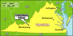


