| SOPA Initiative pages |
|---|
| Activities |
| Activities at regional chapters and sister projects |
| Information and resources - please update |
| Archives |
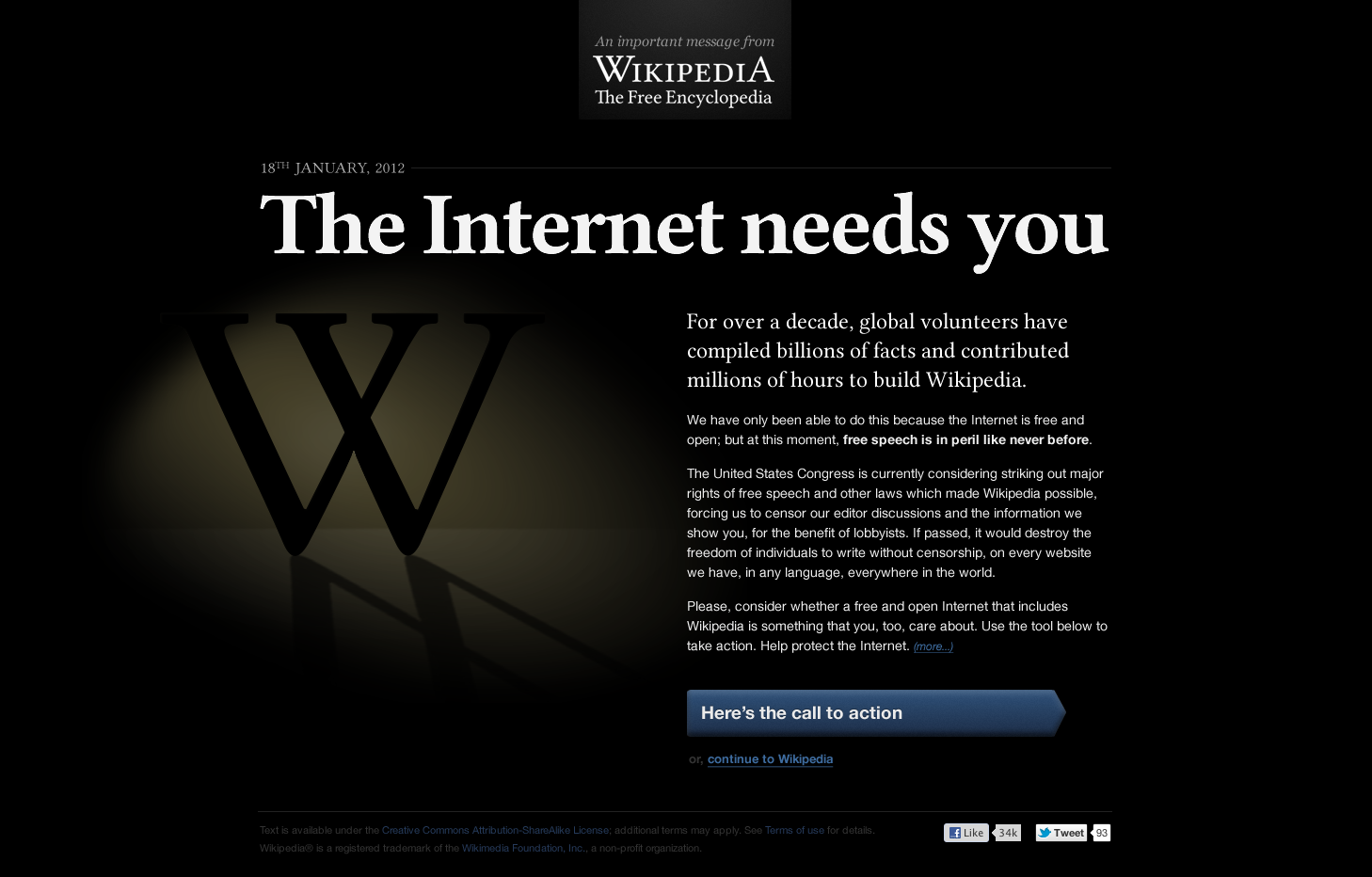
| Thank you for your help and input on this. Technical implementation has been in progress for a couple of days, so the design is fairly far in at this point. For lack of time, we're going to use the Foundation's dark version, which includes the branding guidelines set out by the communications and legal team. Copy is in progress at this point as well. Thank you. Philippe Beaudette, Wikimedia Foundation ( talk) 19:23, 17 January 2012 (UTC) |
Call for comment from the community
| This discussion is being opened by the Wikimedia Foundation to determine how it can support the English Wikipedia community on its decision (if any) relating to the protest of the WP:SOPA Act. The purpose of this discussion is to gauge whether consensus is emerging for action, and if so to clarify what action the community wishes to take. The WMF is posting this call for comment to ensure that we have the necessary time to develop technology to support any action the community may decide to take.' This discussion is focused around design style of the interstitial "blackout" images shown to users if, and only if, the Wikipedia community elects to "black out" in response to the SOPA and PIPA acts.-- Jorm (WMF) ( talk) 07:38, 14 January 2012 (UTC) |
Summary
Since development time surrounding any action involving SOPA and/or PIPA requires some lead, thought has been given to the design of the interstitial blackout pages. This page is what will be shown to users who visit Wikipedia during the "blackout period".
The following elements should be taken as given, for the sake of discussion:
- Copy is not finalized. This should be considered placeholder at best.
- Images are mockups. Production-quality artwork has not been created, so minor errors may exist.
The following design requirements were taken into effect:
- The screen must be iconic. This image will be used in screen shots in the media and elsewhere.
- The screen must be simple. While the issues presented are complex, they must be boiled down to easy-to-understand concepts, with room for expansion.
- The screen must be symbolic. This is potentially a historical event.
The following design considerations were taken into effect:
- The Wikipedia "puzzle globe" image is a "busy" icon, and not appropriate for the type of statement required.
- Simplicity over complexity.
- Seriousness over frivolity.
- The Wikipedia wordmark was deemed important to include.
Additional comments:
- The "light" version is closer to the current Wikipedia design and would be less shocking.
- The "dark" version is more symbolic (an encroaching darkness), but may be unsettling to community members.
Please note that these images are "first run" attempts. Comments are appreciated.
Open Questions
Please indicate your preference.
Remember to focus on visual considerations only, as all wording and campaign mechanics are subject to discussion elsewhere.
To avoid clutter, please Support only your favorite option (do not Oppose), and if you wish state your feelings about other options in your response, referring to them by number.
Style
Color scheme
15:1 support for a dark background; closing discussion so that resources can be better invested into other design aspects. —
C M B J 05:54, 15 January 2012 (UTC)
|
|---|
 
|
Visual prototypes


- Note: these need to link to http://www.senate.gov/general/contact_information/senators_cfm.cfm ("senators") and http://www.house.gov/representatives/ ("congressperson"). Selery ( talk) 23:25, 16 January 2012 (UTC)
Foundation design (prototype 1)
- Support though not sure about the elongated reverse "W" shadow in the foreground. What does it look like without that? FT2 ( Talk | email) 05:02, 15 January 2012 (UTC)
- Question: I wonder whether the "W" logo is actually needed at all if we are trying to highlight what the internet would look like if SOPA passed? Maybe centre the white text and put the "WIKIPEDIA" at the bottom? -- Marianian( talk) 07:43, 15 January 2012 (UTC)
- Support - Short and simple, gets the point across. The others are way too detailed, and have links to Facebook/Twitter, which I find pointless. -- Seahorseruler (Talk Page) (Contribs) ( Report a Vandal) 01:01, 17 January 2012 (UTC)
- Support - The design and the short and simple (cit.: Seahorseruler) form, IMHO, "take the effect". -- Dэя- Бøяg 01:59, 17 January 2012 (UTC)
- Oppose - Proportions seem skewed to me and the elongated reverse "W" is just distracting. Overall, does not communicate a professional appearance. Zachlipton ( talk) 17:39, 17 January 2012 (UTC)
Pretzels' design (prototype 2)
OpposeThinking. Visual impact and text now workable on this version.Sorry, fundraiser experience shows such wording must be kept simple, easy, and direct. This concept isn't it.FT2 ( Talk | email) 06:09, 15 January 2012 (UTC)- Keep in mind that the visual prototype is what's being debated in this specific poll, as opposed to the textual content. —
C M B J 06:14, 15 January 2012 (UTC)
- Exactly. Visually it's way too cluttered, the text doesn't look in the right position visually, I am fine with the graphic effect - if the oval were moved a little up and left and the text positioned as the original, it might look better. Any chance of seeing how that works?
FT2 (
Talk |
email) 06:21, 15 January 2012 (UTC)
- As a matter of opinion, I actually think that the text positioning in prototype 1 is far less effective in conveying its message to me as a reader. At first glance, I mentally associated the layout with a server error and didn't even consider evaluating its content. The second prototype's text caught my attention very quickly and I personally think it's much more in line with layouts that typically contain meaningful content. —
C M B J 06:30, 15 January 2012 (UTC)
- Then can you mock up the 2nd version, with the text of the first (and so far as possible comparable text layout)? Our in-house experience of attention-getting images and text emphatically say it's far too wordy and too "wall of text"-y, not nearly eye-catchy enough. Buttons at the bottom are ok. I'd like to see what changing text and text layout does. Feel free to put it on Imgur, no need to add it to this page right now, but I'd like a look.
FT2 (
Talk |
email) 06:39, 15 January 2012 (UTC)
-
Here you are. —
C M B J 07:15, 15 January 2012 (UTC)
- Much improved in terms of visual impact and also wording. Suggest updating the version on this page. Somehow the big blue button or its text jars, although it's a common enough way to highlight "action" buttons. Clashes with the style of the rest? Prototype 1 might offer ideas. "Continue" text should also be muted as prototype 1, not blue.
FT2 (
Talk |
email) 07:51, 15 January 2012 (UTC)
- I don't think this line of discussion is helpful; the text content will be decided at Wikipedia:SOPA initiative/Proposed Messages anyway and could vary up to the last minute. It would be very bad practice to have links not visually differentiated from regular text, hence the blue. There may be a better way to style the button, although the shade of blue is "Vector article link blue". — Pretzels Hii! 12:59, 15 January 2012 (UTC)
- Much improved in terms of visual impact and also wording. Suggest updating the version on this page. Somehow the big blue button or its text jars, although it's a common enough way to highlight "action" buttons. Clashes with the style of the rest? Prototype 1 might offer ideas. "Continue" text should also be muted as prototype 1, not blue.
FT2 (
Talk |
email) 07:51, 15 January 2012 (UTC)
-
Here you are. —
C M B J 07:15, 15 January 2012 (UTC)
- Then can you mock up the 2nd version, with the text of the first (and so far as possible comparable text layout)? Our in-house experience of attention-getting images and text emphatically say it's far too wordy and too "wall of text"-y, not nearly eye-catchy enough. Buttons at the bottom are ok. I'd like to see what changing text and text layout does. Feel free to put it on Imgur, no need to add it to this page right now, but I'd like a look.
FT2 (
Talk |
email) 06:39, 15 January 2012 (UTC)
- As a matter of opinion, I actually think that the text positioning in prototype 1 is far less effective in conveying its message to me as a reader. At first glance, I mentally associated the layout with a server error and didn't even consider evaluating its content. The second prototype's text caught my attention very quickly and I personally think it's much more in line with layouts that typically contain meaningful content. —
C M B J 06:30, 15 January 2012 (UTC)
- Exactly. Visually it's way too cluttered, the text doesn't look in the right position visually, I am fine with the graphic effect - if the oval were moved a little up and left and the text positioned as the original, it might look better. Any chance of seeing how that works?
FT2 (
Talk |
email) 06:21, 15 January 2012 (UTC)
- Keep in mind that the visual prototype is what's being debated in this specific poll, as opposed to the textual content. —
C M B J 06:14, 15 January 2012 (UTC)
- Support looks great; like the Facebook/Twitter connections too. -- Rs chen 7754 08:06, 15 January 2012 (UTC)
- Accept: but is there is a way for non-US citizens to take action as well? The americancensorship.org website has a non-American option. -- Marianian( talk) 08:23, 15 January 2012 (UTC)
- Comment, Twitter and FB are supposedly to be offline as well, so what's the point in putting the FB/Twitter links in there? – Plarem ( User talk) 11:00, 15 January 2012 (UTC)
- Comment, The links to Twitter and FB are great. If those sites also go dark that will only reinforce the message. I see these links as an indication of solidarity, not necessarily support (for commercial sites).
Cedarviola (
talk) 19:41, 16 January 2012 (UTC)
- How do these links to Facebook and Twitter work? Could we use them in the Wikipedia too? -- Liberaler Humanist ( talk) 12:21, 15 January 2012 (UTC)
- Support, but prefer the first text selection. (The alternate text seems less informative) Design-wise, it's great and looks better than prototype 1, and IMO carries the message across much more effectively. ~ Bioran
- Support option 1; darker and definitely attention-grabbing.
Hurricanefan25 (
talk ·
contribs) 13:26, 15 January 2012 (UTC)
- Can someone give me the planned "div" tag for this blackout/notice thing?
Hurricanefan25 (
talk ·
contribs) 13:30, 15 January 2012 (UTC)
- Also, the "bubbly arrow" is ugly. I'd rather prefer the same arrow except with a plain left-to-right gradient.
Hurricanefan25 (
talk ·
contribs) 14:13, 15 January 2012 (UTC)
- There shouldn't be a "continue to Wikipedia" link. It defeats the purpose.
Hurricanefan25 (
talk ·
contribs) 14:14, 15 January 2012 (UTC)
- Glad you like it. There is no "div" tag as yet, but it's a simple design which will not require complicated code. You're right about the call to action button - it's not quite right yet. It's difficult because there are no styled buttons on Wikipedia itself to base it on, plus it has to be eye-catching. The "continue to Wikipedia" link is an example, discussions are still ongoing about whether this page will be a blackout or an interstitial. — Pretzels Hii! 19:51, 15 January 2012 (UTC)
- There shouldn't be a "continue to Wikipedia" link. It defeats the purpose.
Hurricanefan25 (
talk ·
contribs) 14:14, 15 January 2012 (UTC)
- Also, the "bubbly arrow" is ugly. I'd rather prefer the same arrow except with a plain left-to-right gradient.
Hurricanefan25 (
talk ·
contribs) 14:13, 15 January 2012 (UTC)
- Can someone give me the planned "div" tag for this blackout/notice thing?
Hurricanefan25 (
talk ·
contribs) 13:30, 15 January 2012 (UTC)
- Comment – I feel that this image would be better if the block of text was narrow in width like File:Wikipedia_SOPA_Blackout_Design.png. -- Michaeldsuarez ( talk) 14:06, 15 January 2012 (UTC)
- Support - looks great. - ryan d 19:52, 15 January 2012 (UTC)
- Support Andrewmc 123 14:15, 15 January 2012 (UTC) This looks much more impressive design-wise than option 1
- Support — also, I subscribe Marianian's remark: there should be an option for the international audience as well. -- Waldir talk 19:56, 15 January 2012 (UTC)
- Support. Axl ¤ [Talk] 20:49, 15 January 2012 (UTC)
- Love the visuals, but I think it's a bit too much text. TL;DR might become a problem. — TheDJ ( talk • contribs) 20:58, 15 January 2012 (UTC)
- Support this design; although I feel like having the puzzle-globe logo somewhere would be less likely to cause casual users to assume they'd arrived somewhere they didn't intend. -- Tim Parenti ( talk) 21:06, 15 January 2012 (UTC)
- Support -- BohemianRhapsody ( talk) 22:19, 15 January 2012 (UTC)
- Support. Powergate92 Talk 22:56, 15 January 2012 (UTC)
- Support either version of Prototype 2. Haseo9999 ( talk) 23:30, 15 January 2012 (UTC)
- Support. - EmJayCrawford ( talk) 23:34, 15 January 2012 (UTC)
- Support. We're trying to make a point. The cleaner text reads much better and is more likely to spur people to action. Geoff ( talk) 01:57, 16 January 2012 (UTC)
- Support - it looks suitably grim and foreboding which fits in with the message. ŞůṜīΣĻ¹98¹ Speak 06:21, 16 January 2012 (UTC)
- Support Good, wonderful soft blackout proposal. I think the "continue to Wikipedia" needs to be just a tiny bit more prominent. Otherwise, I like it. haha169 ( talk) 06:58, 16 January 2012 (UTC)
- Support, fantastic design, and more importantly the "contact a representative" button must be BIGGER than the continue button to prevent easy skipping. - Mailer Diablo 07:32, 16 January 2012 (UTC)
- Strongly Oppose the twitter and facebook tracking bugs: Those twitter and facebook live links are used by those companies to collect behavioral data on people's private browsing habbits for commercial gain. Adding them to the site is not something permitted by privacy policy. Please don't do that. Otherwise, I really like the revised design and text, especially reducing some of the assumptions that the reader is an American (even if it's geotargeted the targeting isn't always right), the representative button could use a little of that assumption reduction too. --
Gmaxwell (
talk) 08:18, 16 January 2012 (UTC)
- Heise's 'Two Clicks For More Privacy' — C M B J 08:33, 16 January 2012 (UTC)
- I agree. There is no need for such links. Maybe it is a good idea to place also a link for the Avaaz's "Save the Internet!" campaign or the Electronic Frontier Foundation's campaign for the same purpose. If there are other similar campaigns from other well reputed non-profit organizations, they may also have links. That is, instead of links to commercial sites as Facebook or Twitter. Excepting this issue, I support the design of the Prototype 2 with alternate text. Dimtsit ( talk) 12:32, 16 January 2012 (UTC)
- comment the space on the right side in the original should be maintained for symmetry and impact. sonia♫ 10:19, 16 January 2012 (UTC)
- Oppose links to Twitter and Facebook. Wikipedia has no reason to support these companies. -- a3_nm ( talk) 11:29, 16 January 2012 (UTC)
- Support - We need some way for international visitors to take action as well, especially if we end up with a global blackout - perhaps a list of contact information for their local U.S. Embassy or consulate? Otebig ( talk) 12:24, 16 January 2012 (UTC)
- Support. For Prototype 2 with alternate text. Ltr,ftw ( talk) 14:34, 16 January 2012 (UTC)
- Support With alternate text ~ Feedintm Parley 17:22, 16 January 2012 (UTC)
- Support I like the alternate text because it is more official-looking. Alexroller ( talk) 17:51, 16 January 2012 (UTC)
- Support Either version of prototype 2 Ben (Major Bloodnok) ( talk) 20:22, 16 January 2012 (UTC)
- Support design, but the sheer length of text -- and amount you have to read before you get that this is about SOPA/PIPA -- makes this look like a call for donations that users might ignore given the historical extent of fundraising efforts on Wikipedia. » K i G O E | talk 20:44, 16 January 2012 (UTC)
- Support either version of prototype 2, but STRONGLY oppose the twitter and facebook bullshit. Facebook is pure evil concentrate—especially its CEO—and I block it at HOSTS and in other ways. Twitter doesn't seem as evil, but why use a site with less capabilities than, say, Blogger or Tumblr anyway? Let's not be merely *clears throat* like so many other companies when we can do better than them. -- an odd name 20:46, 16 January 2012 (UTC)
- Support Looks sharp, is concise, and gets the point across. 12.219.104.98 ( talk) 20:50, 16 January 2012 (UTC)
- Support First version of Prototype 2. It has an awesome look, and is definitely emotionally appealing. Joyson Prabhu Holla at me! 22:40, 16 January 2012 (UTC)
- Support. 142.244.125.240 ( talk) 23:37, 16 January 2012 (UTC) Prototype 2 is good, but less bluring of Wikipedia logo/shadowing.
- Oppose. It looks too much like a fundraiser, prompting people to just ignore it. SOPA needs to be one of the first things mentioned, or the paragraph that talks about it needs to be larger. The first paragraph and title are way too big, both lengthwise and text-size wise, and don't get to the point. -- Seahorseruler (Talk Page) (Contribs) ( Report a Vandal) 00:59, 17 January 2012 (UTC)
- Support. I like either of the lower two designs for the 2nd prototype. Somehow having them darker than the original prototype is appropriate. I don't see this as similar to the fundraising, as that is a huge banner at the top that seems annoying, in my opinion. Even with the long text, it works. Thegreatdr ( talk) 01:21, 17 January 2012 (UTC)
- Support. Certainly the best one. -- Braniff747SP ( talk) 01:44, 17 January 2012 (UTC)
- Support. Thank you Pretzels. -- FormerIP ( talk) 02:01, 17 January 2012 (UTC)
- Support. But STRONGLY OPPOSE links to social media. Fix the font size of the white text - I had to expand the prototype to almost a full Acer X233H monitor to read it with comfort. Kudpung กุดผึ้ง ( talk) 02:46, 17 January 2012 (UTC)
- Love with the design. In principle I'm against a social media element to Wikipedia, but the simple fact is that we need to use them in this specific instance. — WFC— 03:28, 17 January 2012 (UTC)
- Support. Overall, I think it's a great design. Some little things that could be improved... The grey box behind the "An important message..." header seems unnecessary. Since this is mainly an American thing, should the American date format be used? And since ordinal suffixes aren't used on Wikipedia, should the "TH" be dropped? Is the date even necessary? I think the image should be a bit lower and possibly a bit more to the right. The "We have only been able..." text (excluding the bold "free speech is..." part) should be more grey (darker). I think even though it isn't the Wikipedia style, the "Read more →" is more effective than "(more)". The "(more...)" should be bold at least. Justifying the whole block of text might work better. Lastly, if we don't want to seem like we are favoring Facebook and Twitter, we could use an AddThis button. - Kollision ( talk) 04:04, 17 January 2012 (UTC)
- Support. The main message appears clearer and more direct and linked to the main reason of the action. FkpCascais ( talk) 04:08, 17 January 2012 (UTC)
- Support. Excellent design, minus the social media though, and I think that we should keep the page short for a better effect. Gsingh ( talk) 05:36, 17 January 2012 (UTC)
- Support Better than the prototype 1 as it has a more "serious" look and the message is clearly observed at a glance. We have the global blackout now so we can remove "continue the Wikipedia" part.-- Chetanshaw ( talk) 06:32, 17 January 2012 (UTC)
- Support I also believe that we should remove the social media links. Excellent design though. Lourie Pieterse 06:46, 17 January 2012 (UTC)
- Support the alternate text, however, it should be more clear what we want from this. We don't just want people thinking that this is an advertisement for something. Also, the Facebook and Twitter links don't fit. The 'action' button should be more plain, but the continue button can look the same, it makes it more inconspicuous, so that less people would just skip everything. - Laurelenril ( talk)07:15, 17 January 2012 (UTC)
- Support. No strong feelings either way on social media links. — OwenBlacker ( Talk) 12:32, 17 January 2012 (UTC)
- Strong Support It's a great design. When the database is going to be locked, I would be preferring on this one. The texts are also fine, so a strong support from my way - Dipankan In the woods? 15:26, 17 January 2012 (UTC)
- Support with original text. Somber, informative and attention-grabbing. The alternative text is weaker and I would say stick with what prototype 2 shows. — Hex (❝?!❞) 00:06, 18 January 2012 (UTC)
Tag line
I'm not sure this is our best shot for a tag line. "Free" has multiple meanings and ostensibly SOPA targets piracy only, so it's not at all clear the internet wouldn't be "free". Try these:
- "The internet must protect free speech"
- "The internet needs you to protect free speech"
- "The internet needs your help to protect free speech"
- Everyone can immediately relate – they all post on social sites or email, or chat;
- Accuracy – all SOPA issues come down to impact on free speech;
- Blatant obvious relevance – anyone can see how harming free speech harms Wikipedia;
- People care massively about that right, and it taps into that mass support;
-
FT2
(also crossposted to
Proposed Messages#Tag line)
- This page is for visual design discussion - it would really be helpful to leave the text to the other page for now. — Pretzels Hii! 12:59, 15 January 2012 (UTC)
- Comments
- I like this. It seems to match what we're trying to say better and is more accurate.-- Jorm (WMF) ( talk) 05:31, 15 January 2012 (UTC)
- The Internet needs a capital I. Jolly Ω Janner 23:20, 15 January 2012 (UTC)
- Free as in freedom. I like the emphasis on free speech. Braincricket ( talk) 06:20, 16 January 2012 (UTC)
- I strongly recommend some sort of link to further information. To someone with no knowledge of SOPA/PIPA, the current text might seem quite arbitrary. I recommend adding a link to additional information, which opens in a new tab, or reforming the button to suggest that clicking it will also lead to further information. Commander Ziltoid ( speak) 20:40, 16 January 2012 (UTC)
- What about a more active connection to the blackout? “This is what censorship looks like: Help protect free speech on the Internet” or something » K i G O E | talk 20:47, 16 January 2012 (UTC)
- Support of Commander Ziltoid proposal of further links for less informed ones. Kigoe´s idea is also very interesting. FkpCascais ( talk) 04:13, 17 January 2012 (UTC)
Comments
- I'd like to see "integrity" substituted for "very fiber" which could come off as hyperbolic. Selery ( talk) 16:34, 14 January 2012 (UTC)
- I'd like to see a second sentence that states WHY the act is harmful. Altho I'd agree this would open up a Wikipedia boiling pot of discussion, so maybe not. Kyle Andrew Brown ( talk) 19:33, 14 January 2012 (UTC)
- These are mockups for the "click through" blackout. Could we see mockups for full blackouts, hopefully with information showing how long our blackout is and what we hope to accomplish by restricting access to wikipedia? Dkreisst ( talk) 22:12, 14 January 2012 (UTC)
- They would be the same thing, only without a "continue to wikipedia" link.--
Jorm (WMF) (
talk) 22:41, 14 January 2012 (UTC)
- Wouldn't it be important for them to have information on them about how long the blackout will be in effect?
209.193.40.253 (
talk) 01:00, 15 January 2012 (UTC)
- I believe the actual message intended to go on this design is being drafted at Wikipedia:SOPA_initiative/Proposed_Messages. I think the image just features a placeholder/example. -- Errant ( chat!) 02:12, 15 January 2012 (UTC)
- Wouldn't it be important for them to have information on them about how long the blackout will be in effect?
209.193.40.253 (
talk) 01:00, 15 January 2012 (UTC)
- They would be the same thing, only without a "continue to wikipedia" link.--
Jorm (WMF) (
talk) 22:41, 14 January 2012 (UTC)
- Since full blackout is quickly gaining support, there should be a version that does not say "Continue to Wikipedia". Badon ( talk) 03:41, 15 January 2012 (UTC)
- I've posted a smartened-up version of this concept above - it may be worth making the light source pale blue, or deep red, depending on the mood we are meaning to convey. —
Pretzels
Hii! 04:28, 15 January 2012 (UTC)
- I'm not sure that the addition of color adds anything at this stage of the image. This seems overcomplicated and frenetic to me, based on what is trying to be said.-- Jorm (WMF) ( talk) 04:58, 15 January 2012 (UTC)
- What does the first dark style look like without the elongated "W" shadow in the foreground? Any chance of posting that up to compare? FT2 ( Talk | email) 05:04, 15 January 2012 (UTC)
- Does anyone else feel that the message would look better without the giant W taken up half of the space? Of course, we should still include something in there that'll make visitors aware that they didn't accidentally stumble across a website that isn't Wikipedia, but the "W" doesn't scream "Wikipedia" in my opinion. I think the "An important message from<br/>Wikipedia<br/>The Free Encyclopedia" message seen on the top of File:Wikipedia_SOPA_Blackout_Design.png would be enough. The width of the block with text should have a narrow width, and I feel that that block would look fine in the center of the page without anything to its sides. The giant W is silly. If we were using a light background, I would prefer an image of Wikipe-tan or Santa Claus to a giant W. -- Michaeldsuarez ( talk) 13:59, 15 January 2012 (UTC)
- What if something was done with the big W? Perhaps something like this. This could also be taken further by making the X red, or made to look like that little red x that appears in the cornor of images when they won't load. You could also take the shadow of the W in one of the above posted designs and turn it into an X. This may enforce the theme of restriction and be a possible iconic representation of this negative situation. Just throwing an idea out there -- AmyF.G. ( talk) 19:50, 15 January 2012
- I have created a Facebook, Twitter, or any other website-friendly image here, based on Pretzel's fourth mockup version. Kevin Rutherford ( talk) 06:06, 17 January 2012 (UTC)
Mobile version
We're going to need some sort of plan for http://en.m.wikipedia.org, too. — C M B J 00:58, 16 January 2012 (UTC)
- The mobile site is not going to be affected by the blackout, so this isn't necessary.--
Jorm (WMF) (
talk) 04:11, 16 January 2012 (UTC)
- A cursory review of Wikipedia:SOPA initiative/Proposals workshop and Wikipedia:SOPA initiative/Action indicates that consensus (currently) favors a full lockout of the English project with global effect, which would presumably entail disabling the mobile site as well. Is there a technical or logistical reason why that would be a comparatively undesirable action? — C M B J 08:05, 16 January 2012 (UTC)
- Then users would just simply circumvent the blackout (if its full) by going to their mobile phones instead. A mobile implementation would also have the benefit of mobile users using that same phone to call the congressman right away. - Mailer Diablo 14:44, 16 January 2012 (UTC)
- I'm not the best web designer nor do I claim to be, but Wednesday is approaching fast and I saw that nobody has jumped on this yet. I've created a simple design for the mobile blackout page
on my website. All comments and criticisms are welcome. (Looks better on the mobile device, but that should go without saying.)
Sean "esqew" Quinn (
talk) 22:11, 16 January 2012 (UTC)
- Looks great, but you need the congressional switchboard: +1-202-224-3121
Selery (
talk) 23:22, 16 January 2012 (UTC)
- Thanks, that's exactly the number I needed. Added in as a tel link (conforming to RFC 2806).
Sean "esqew" Quinn (
talk) 23:27, 16 January 2012 (UTC)
- Thank you! You might consider adding "(202) 224-3121" to the text for e.g. iPod Touches and the like.
Selery (
talk) 23:31, 16 January 2012 (UTC)
- And that's why I should think over these things before going and posting them. Thanks again! Added.
Sean "esqew" Quinn (
talk) 01:54, 17 January 2012 (UTC)
- Another quick note, I edited the page again to add the links for the words "Representative" and "Senator" conforming to Selery's spec above.
- Great suggestions but were just not going to be able to get the geo located notices in place before the blackout. None of the central notice infrastructure is in place for mobile. What we can do is to use a big mobile banner instead. Copy is being finalized and I'll post a link as soon as its ready. Tfinc ( talk) 01:30, 18 January 2012 (UTC)
- Another quick note, I edited the page again to add the links for the words "Representative" and "Senator" conforming to Selery's spec above.
- And that's why I should think over these things before going and posting them. Thanks again! Added.
Sean "esqew" Quinn (
talk) 01:54, 17 January 2012 (UTC)
- Thank you! You might consider adding "(202) 224-3121" to the text for e.g. iPod Touches and the like.
Selery (
talk) 23:31, 16 January 2012 (UTC)
- Thanks, that's exactly the number I needed. Added in as a tel link (conforming to RFC 2806).
Sean "esqew" Quinn (
talk) 23:27, 16 January 2012 (UTC)
- Looks great, but you need the congressional switchboard: +1-202-224-3121
Selery (
talk) 23:22, 16 January 2012 (UTC)
Comments
- Support
Sean's mobile mockup
on the condition "+1-202-224-3121" isadded. Selery ( talk) 23:20, 16 January 2012 (UTC) - I also support. But can we confirm if mobile site does get blacked out as well? OhanaUnited Talk page 14:42, 17 January 2012 (UTC)
- I would think that at this point a global blackout and banner alongside a blackout of all services including reading and editing would include the mobile site as well. However, this hasn't been very specific and I hope we do get some clarification in the coming hours. Sean "esqew" Quinn ( talk) 16:04, 17 January 2012 (UTC)
- Which individual could provide a definite answer? And have you contacted that person yet? Also, for the telephone, maybe we should state that the phone number is for USA people so mobile users from other countries know that number's for United States. OhanaUnited Talk page 19:15, 17 January 2012 (UTC)
- Support: We do need a mobile version. About 50% of my internet time is spent browsing on my android phone. --Ne0Freedom 16:00, 17 January 2012 (UTC)
- Support: Blackout needs to affect all "editions" of the English Wikipedia, not just the full version — Johnl 1479 17:33, 17 January 2012 (UTC)
- Support: Yes, global is global, and the button to call your representative sounds like a very good idea (except of course for those who don't live in the US ;-) benzband ( talk) 18:25, 17 January 2012 (UTC)
- Support, but is it technically feasible? -- Luk talk 18:43, 17 January 2012 (UTC)
Narrowing things down on Monday
Hi folks - some quick input on how things are proceeding from the WMF side. Based on the fact that it's pretty clearly looking like a protest is on, we're going to start narrowing the designs and approach. On Monday Jan 16 the WMF SOPA team is coming together for a big meeting in our offices to piece all of the major parts of the effort together. That includes the tech, communications, outreach, creative and other planning. Jorm/Brandon from WMF is leading the concept development around the main splash screen (per above) and right now I know he's looking at all of the suggestions and planning to take everything into account. From my perspective, I'd like to encourage we don't do anything too radical or strange with the Wikipedia identity - whether the W or other pieces. The brand needs to be recognizable to the visitors - millions may not understand what's going on, and we don't want their initial reactions to be that the site has been overtaken by hackers etc. The dramatic tone helps the strongness of the message, imho, but we need to be careful to make sure it doesn't appear we've let another org take over.
More importantly, I wanted to note that we'll narrow down the design options based partially on the technical requirements and the final consensus of the RfC. SO that means some of the aspects suggested above will need to adapt - javascript, page directs etc. There are a lot of moving pieces, and it will take some work just to get everything working in time. So bear with us if the outcome isn't exactly what's specified on this page.
I'd also encourage everyone to expect the copy and design to come together independently (there's a bit of comingling going on right now). We're working on the copy on that specific project page, and the effort is simply to get that as absolutely concise, short, and effective as possible. The design knows what the copy needs to accomplish, and ultimately the efforts will have to come together tomorrow. I know we'll share the ultimate mockups asap so everyone can see the work as it stands - hopefully we'll have time for one last set of revisions, but it will be dependent on time. I think we'll have a SOPA IRC channel launched tomorrow by 1PST, so keep an eye out and take part in the chat there. JayWalsh ( talk) 04:05, 16 January 2012 (UTC)
- A question for when you convene — have we evaluated the effects of pulling the plug for an extended period; moreover, will we seek to take any measures (i.e., pause search engine crawling of the site) to prevent ill effects in the short- or long-term? — C M B J 08:40, 16 January 2012 (UTC)
Language and design
I'd rather a volume of text closer to the Foundation's than to Pretzel's. The Foundation's is much more effective in this respect, but Pretzel's larger text for the main message-line is essential. I also prefer his W design (the Foundation's mirror-image idea is a bit messy, IMO). Can the good in both attempts be integrated?
I have no problem with "the very fiber".
I suggest you make the second sentence, "Without ...", a new paragraph—three paras in all, not two.
"Read more" could be positioned just a little further down.
I'd make the text one point larger and let it extend down further vertically.
Do alter it if the banner is to be displayed beyond the US, of course. (e.g., clarify where the law is being considered: "the US Congress" ... will inevitably have worldwide effects").
Is "Congressperson" a standard word? It seems ungainly, but no big deal if "Call your Representative or Senator" is too much text.
- Yes, it's standard.
The black is good. Tony (talk) 13:44, 16 January 2012 (UTC)
Updated mockup
Hi all, I have posted the latest version of the design above ( File:Pretzels SOPA Blackout Mockup v4.png). As time is becoming tight, there are things we need to agree on urgently:
- Are we to include Facebook & Twitter share buttons? How do previous discussions on including these on the main site affect this? Is this a worthy exemption? Permitted under WMF Privacy Policy?
- No Facebook/Twitter; opens a can of worms about which site buttons should be added; their being missing reinforces what is being lost for those who use those sites. Sallijane ( talk) 04:56, 17 January 2012 (UTC)
- Whether we like these mediums or not, they're what most people use to communicate online and the effectiveness of the protest depends directly upon our capacity to disseminate knowledge to laypeople. Privacy concerns can likely be avoided as per above discussion, and there is no logical reason why major open alternatives like Diaspora must be excluded. — C M B J 05:37, 17 January 2012 (UTC)
- What is our call to action button text? As we've no resources to test different lines, does anyone with experience from the fundraising wiki have some advice?
- Copy needs to be finalised, I've truncated the lengthy headline in the latest mockup as it didn't work well visually - thoughts on this?
— Pretzels Hii! 22:24, 16 January 2012 (UTC)
- What is our call to action button text? : Take Action NOW - Contact your Congressman! - Mailer Diablo 22:52, 16 January 2012 (UTC)
- I'd go with 'Congressperson' in favor of 'Congressman'. The US Government does use the term in some instances. Otherwise, I'd go with 'Take action NOW! Contact your Senator and Representative' or even just 'Contact your [Congressperson/Senator and Representative] now!. BobAmnertiopsis ∴ ChatMe! 03:44, 17 January 2012 (UTC)
- Actually, come to think of it, since we're encouraging people to contact both their Senator and their Representative, it'd have to be 'Congresspeople'. 'Contact your Congresspeople now!' That's decent and concise. BobAmnertiopsis ∴ ChatMe! 03:48, 17 January 2012 (UTC)
- Kind of prefer 'now' in CAPS. - Mailer Diablo 05:36, 17 January 2012 (UTC)
- If we can do Twitter and Facebook, we should ad a +1 button too... -- Braniff747SP ( talk) 01:51, 17 January 2012 (UTC)
-
- Agree that we shouldn't be including, and therefore implicitly endorsing external companies (especially now Twitter's head didn't have nice words towards our action). - Mailer Diablo 05:36, 17 January 2012 (UTC)
- Costolo's remarks may have been flippant, but unless he was suggesting that Wikipedia is a business then it would appear some of those reporting on him accidentally took his words somewhat out of context. The associated statement came in response to inquiries specifically about Twitter's plans and more plausibly referred to their internal corporate strategy. He subsequently reaffirmed Twitter's continued opposition to the legislation through other means and later clarified his intent when pressed. — C M B J 06:50, 17 January 2012 (UTC)
- How about not supporting any corporate interests at all as opposed to backing Twitter's interests against, say, Universal Studios'? If we absolutely have to link to any for-profit or closed source entity that how about billing them for the advertising?-- Brian Dell ( talk) 18:56, 17 January 2012 (UTC)
- It would be easier to offer commentary or make suggestions about the text if it were available somewhere other than the graphic; apologies if it is and I am out of the loop.
- In the second paragraph, the semicolon should be replaced with a period. It doesn't work with the conjunction "but" between what should be two independent clauses. Some people might be irritated if we leave "but" as the first word in a new sentence but I'm okay with it being done sparingly and for effect.
- I don't understand what the first sentence in the third paragraph is trying to say. Is it missing a verb? Are we really saying that Congress is considering striking out rights AND striking out laws? And why is it major rights of free speech? Further, why is is rights of free speech and not the simpler free speech rights?
- The second sentence of the third paragraph has the singular subject "it." Aren't we talking about (at least) two bills, SOPA and PIPA?
- In the fourth paragraph, the comma after the initial word "please" should be removed.
- The word "too" in the fourth paragraph's first sentence should be removed. I imagine that it's there to try to get the reader to join us in this effort but we haven't set that up so it's distracting. We could lead up to it properly but we'd have to rewrite earlier portions of the text and I don't know if it would be worth the payoff.
- Before this goes live, please employ the services of one or more experienced copy editors. ElKevbo ( talk) 10:14, 17 January 2012 (UTC)
UK petition?
There's been talk of putting together a petition to the UK government, which would be linked to from the banners - see Wikipedia:SOPA initiative/Action/UK petition for more. Mike Peel ( talk) 17:21, 17 January 2012 (UTC)
Europe and Australia?
| SOPA Initiative pages |
|---|
| Activities |
| Activities at regional chapters and sister projects |
| Information and resources - please update |
| Archives |
| Thank you for your help and input on this. Technical implementation has been in progress for a couple of days, so the design is fairly far in at this point. For lack of time, we're going to use the Foundation's dark version, which includes the branding guidelines set out by the communications and legal team. Copy is in progress at this point as well. Thank you. Philippe Beaudette, Wikimedia Foundation ( talk) 19:23, 17 January 2012 (UTC) |
Call for comment from the community
| This discussion is being opened by the Wikimedia Foundation to determine how it can support the English Wikipedia community on its decision (if any) relating to the protest of the WP:SOPA Act. The purpose of this discussion is to gauge whether consensus is emerging for action, and if so to clarify what action the community wishes to take. The WMF is posting this call for comment to ensure that we have the necessary time to develop technology to support any action the community may decide to take.' This discussion is focused around design style of the interstitial "blackout" images shown to users if, and only if, the Wikipedia community elects to "black out" in response to the SOPA and PIPA acts.-- Jorm (WMF) ( talk) 07:38, 14 January 2012 (UTC) |
Summary
Since development time surrounding any action involving SOPA and/or PIPA requires some lead, thought has been given to the design of the interstitial blackout pages. This page is what will be shown to users who visit Wikipedia during the "blackout period".
The following elements should be taken as given, for the sake of discussion:
- Copy is not finalized. This should be considered placeholder at best.
- Images are mockups. Production-quality artwork has not been created, so minor errors may exist.
The following design requirements were taken into effect:
- The screen must be iconic. This image will be used in screen shots in the media and elsewhere.
- The screen must be simple. While the issues presented are complex, they must be boiled down to easy-to-understand concepts, with room for expansion.
- The screen must be symbolic. This is potentially a historical event.
The following design considerations were taken into effect:
- The Wikipedia "puzzle globe" image is a "busy" icon, and not appropriate for the type of statement required.
- Simplicity over complexity.
- Seriousness over frivolity.
- The Wikipedia wordmark was deemed important to include.
Additional comments:
- The "light" version is closer to the current Wikipedia design and would be less shocking.
- The "dark" version is more symbolic (an encroaching darkness), but may be unsettling to community members.
Please note that these images are "first run" attempts. Comments are appreciated.
Open Questions
Please indicate your preference.
Remember to focus on visual considerations only, as all wording and campaign mechanics are subject to discussion elsewhere.
To avoid clutter, please Support only your favorite option (do not Oppose), and if you wish state your feelings about other options in your response, referring to them by number.
Style
Color scheme
15:1 support for a dark background; closing discussion so that resources can be better invested into other design aspects. —
C M B J 05:54, 15 January 2012 (UTC)
|
|---|
|
Visual prototypes
- Note: these need to link to http://www.senate.gov/general/contact_information/senators_cfm.cfm ("senators") and http://www.house.gov/representatives/ ("congressperson"). Selery ( talk) 23:25, 16 January 2012 (UTC)
Foundation design (prototype 1)
- Support though not sure about the elongated reverse "W" shadow in the foreground. What does it look like without that? FT2 ( Talk | email) 05:02, 15 January 2012 (UTC)
- Question: I wonder whether the "W" logo is actually needed at all if we are trying to highlight what the internet would look like if SOPA passed? Maybe centre the white text and put the "WIKIPEDIA" at the bottom? -- Marianian( talk) 07:43, 15 January 2012 (UTC)
- Support - Short and simple, gets the point across. The others are way too detailed, and have links to Facebook/Twitter, which I find pointless. -- Seahorseruler (Talk Page) (Contribs) ( Report a Vandal) 01:01, 17 January 2012 (UTC)
- Support - The design and the short and simple (cit.: Seahorseruler) form, IMHO, "take the effect". -- Dэя- Бøяg 01:59, 17 January 2012 (UTC)
- Oppose - Proportions seem skewed to me and the elongated reverse "W" is just distracting. Overall, does not communicate a professional appearance. Zachlipton ( talk) 17:39, 17 January 2012 (UTC)
Pretzels' design (prototype 2)
OpposeThinking. Visual impact and text now workable on this version.Sorry, fundraiser experience shows such wording must be kept simple, easy, and direct. This concept isn't it.FT2 ( Talk | email) 06:09, 15 January 2012 (UTC)- Keep in mind that the visual prototype is what's being debated in this specific poll, as opposed to the textual content. —
C M B J 06:14, 15 January 2012 (UTC)
- Exactly. Visually it's way too cluttered, the text doesn't look in the right position visually, I am fine with the graphic effect - if the oval were moved a little up and left and the text positioned as the original, it might look better. Any chance of seeing how that works?
FT2 (
Talk |
email) 06:21, 15 January 2012 (UTC)
- As a matter of opinion, I actually think that the text positioning in prototype 1 is far less effective in conveying its message to me as a reader. At first glance, I mentally associated the layout with a server error and didn't even consider evaluating its content. The second prototype's text caught my attention very quickly and I personally think it's much more in line with layouts that typically contain meaningful content. —
C M B J 06:30, 15 January 2012 (UTC)
- Then can you mock up the 2nd version, with the text of the first (and so far as possible comparable text layout)? Our in-house experience of attention-getting images and text emphatically say it's far too wordy and too "wall of text"-y, not nearly eye-catchy enough. Buttons at the bottom are ok. I'd like to see what changing text and text layout does. Feel free to put it on Imgur, no need to add it to this page right now, but I'd like a look.
FT2 (
Talk |
email) 06:39, 15 January 2012 (UTC)
-
Here you are. —
C M B J 07:15, 15 January 2012 (UTC)
- Much improved in terms of visual impact and also wording. Suggest updating the version on this page. Somehow the big blue button or its text jars, although it's a common enough way to highlight "action" buttons. Clashes with the style of the rest? Prototype 1 might offer ideas. "Continue" text should also be muted as prototype 1, not blue.
FT2 (
Talk |
email) 07:51, 15 January 2012 (UTC)
- I don't think this line of discussion is helpful; the text content will be decided at Wikipedia:SOPA initiative/Proposed Messages anyway and could vary up to the last minute. It would be very bad practice to have links not visually differentiated from regular text, hence the blue. There may be a better way to style the button, although the shade of blue is "Vector article link blue". — Pretzels Hii! 12:59, 15 January 2012 (UTC)
- Much improved in terms of visual impact and also wording. Suggest updating the version on this page. Somehow the big blue button or its text jars, although it's a common enough way to highlight "action" buttons. Clashes with the style of the rest? Prototype 1 might offer ideas. "Continue" text should also be muted as prototype 1, not blue.
FT2 (
Talk |
email) 07:51, 15 January 2012 (UTC)
-
Here you are. —
C M B J 07:15, 15 January 2012 (UTC)
- Then can you mock up the 2nd version, with the text of the first (and so far as possible comparable text layout)? Our in-house experience of attention-getting images and text emphatically say it's far too wordy and too "wall of text"-y, not nearly eye-catchy enough. Buttons at the bottom are ok. I'd like to see what changing text and text layout does. Feel free to put it on Imgur, no need to add it to this page right now, but I'd like a look.
FT2 (
Talk |
email) 06:39, 15 January 2012 (UTC)
- As a matter of opinion, I actually think that the text positioning in prototype 1 is far less effective in conveying its message to me as a reader. At first glance, I mentally associated the layout with a server error and didn't even consider evaluating its content. The second prototype's text caught my attention very quickly and I personally think it's much more in line with layouts that typically contain meaningful content. —
C M B J 06:30, 15 January 2012 (UTC)
- Exactly. Visually it's way too cluttered, the text doesn't look in the right position visually, I am fine with the graphic effect - if the oval were moved a little up and left and the text positioned as the original, it might look better. Any chance of seeing how that works?
FT2 (
Talk |
email) 06:21, 15 January 2012 (UTC)
- Keep in mind that the visual prototype is what's being debated in this specific poll, as opposed to the textual content. —
C M B J 06:14, 15 January 2012 (UTC)
- Support looks great; like the Facebook/Twitter connections too. -- Rs chen 7754 08:06, 15 January 2012 (UTC)
- Accept: but is there is a way for non-US citizens to take action as well? The americancensorship.org website has a non-American option. -- Marianian( talk) 08:23, 15 January 2012 (UTC)
- Comment, Twitter and FB are supposedly to be offline as well, so what's the point in putting the FB/Twitter links in there? – Plarem ( User talk) 11:00, 15 January 2012 (UTC)
- Comment, The links to Twitter and FB are great. If those sites also go dark that will only reinforce the message. I see these links as an indication of solidarity, not necessarily support (for commercial sites).
Cedarviola (
talk) 19:41, 16 January 2012 (UTC)
- How do these links to Facebook and Twitter work? Could we use them in the Wikipedia too? -- Liberaler Humanist ( talk) 12:21, 15 January 2012 (UTC)
- Support, but prefer the first text selection. (The alternate text seems less informative) Design-wise, it's great and looks better than prototype 1, and IMO carries the message across much more effectively. ~ Bioran
- Support option 1; darker and definitely attention-grabbing.
Hurricanefan25 (
talk ·
contribs) 13:26, 15 January 2012 (UTC)
- Can someone give me the planned "div" tag for this blackout/notice thing?
Hurricanefan25 (
talk ·
contribs) 13:30, 15 January 2012 (UTC)
- Also, the "bubbly arrow" is ugly. I'd rather prefer the same arrow except with a plain left-to-right gradient.
Hurricanefan25 (
talk ·
contribs) 14:13, 15 January 2012 (UTC)
- There shouldn't be a "continue to Wikipedia" link. It defeats the purpose.
Hurricanefan25 (
talk ·
contribs) 14:14, 15 January 2012 (UTC)
- Glad you like it. There is no "div" tag as yet, but it's a simple design which will not require complicated code. You're right about the call to action button - it's not quite right yet. It's difficult because there are no styled buttons on Wikipedia itself to base it on, plus it has to be eye-catching. The "continue to Wikipedia" link is an example, discussions are still ongoing about whether this page will be a blackout or an interstitial. — Pretzels Hii! 19:51, 15 January 2012 (UTC)
- There shouldn't be a "continue to Wikipedia" link. It defeats the purpose.
Hurricanefan25 (
talk ·
contribs) 14:14, 15 January 2012 (UTC)
- Also, the "bubbly arrow" is ugly. I'd rather prefer the same arrow except with a plain left-to-right gradient.
Hurricanefan25 (
talk ·
contribs) 14:13, 15 January 2012 (UTC)
- Can someone give me the planned "div" tag for this blackout/notice thing?
Hurricanefan25 (
talk ·
contribs) 13:30, 15 January 2012 (UTC)
- Comment – I feel that this image would be better if the block of text was narrow in width like File:Wikipedia_SOPA_Blackout_Design.png. -- Michaeldsuarez ( talk) 14:06, 15 January 2012 (UTC)
- Support - looks great. - ryan d 19:52, 15 January 2012 (UTC)
- Support Andrewmc 123 14:15, 15 January 2012 (UTC) This looks much more impressive design-wise than option 1
- Support — also, I subscribe Marianian's remark: there should be an option for the international audience as well. -- Waldir talk 19:56, 15 January 2012 (UTC)
- Support. Axl ¤ [Talk] 20:49, 15 January 2012 (UTC)
- Love the visuals, but I think it's a bit too much text. TL;DR might become a problem. — TheDJ ( talk • contribs) 20:58, 15 January 2012 (UTC)
- Support this design; although I feel like having the puzzle-globe logo somewhere would be less likely to cause casual users to assume they'd arrived somewhere they didn't intend. -- Tim Parenti ( talk) 21:06, 15 January 2012 (UTC)
- Support -- BohemianRhapsody ( talk) 22:19, 15 January 2012 (UTC)
- Support. Powergate92 Talk 22:56, 15 January 2012 (UTC)
- Support either version of Prototype 2. Haseo9999 ( talk) 23:30, 15 January 2012 (UTC)
- Support. - EmJayCrawford ( talk) 23:34, 15 January 2012 (UTC)
- Support. We're trying to make a point. The cleaner text reads much better and is more likely to spur people to action. Geoff ( talk) 01:57, 16 January 2012 (UTC)
- Support - it looks suitably grim and foreboding which fits in with the message. ŞůṜīΣĻ¹98¹ Speak 06:21, 16 January 2012 (UTC)
- Support Good, wonderful soft blackout proposal. I think the "continue to Wikipedia" needs to be just a tiny bit more prominent. Otherwise, I like it. haha169 ( talk) 06:58, 16 January 2012 (UTC)
- Support, fantastic design, and more importantly the "contact a representative" button must be BIGGER than the continue button to prevent easy skipping. - Mailer Diablo 07:32, 16 January 2012 (UTC)
- Strongly Oppose the twitter and facebook tracking bugs: Those twitter and facebook live links are used by those companies to collect behavioral data on people's private browsing habbits for commercial gain. Adding them to the site is not something permitted by privacy policy. Please don't do that. Otherwise, I really like the revised design and text, especially reducing some of the assumptions that the reader is an American (even if it's geotargeted the targeting isn't always right), the representative button could use a little of that assumption reduction too. --
Gmaxwell (
talk) 08:18, 16 January 2012 (UTC)
- Heise's 'Two Clicks For More Privacy' — C M B J 08:33, 16 January 2012 (UTC)
- I agree. There is no need for such links. Maybe it is a good idea to place also a link for the Avaaz's "Save the Internet!" campaign or the Electronic Frontier Foundation's campaign for the same purpose. If there are other similar campaigns from other well reputed non-profit organizations, they may also have links. That is, instead of links to commercial sites as Facebook or Twitter. Excepting this issue, I support the design of the Prototype 2 with alternate text. Dimtsit ( talk) 12:32, 16 January 2012 (UTC)
- comment the space on the right side in the original should be maintained for symmetry and impact. sonia♫ 10:19, 16 January 2012 (UTC)
- Oppose links to Twitter and Facebook. Wikipedia has no reason to support these companies. -- a3_nm ( talk) 11:29, 16 January 2012 (UTC)
- Support - We need some way for international visitors to take action as well, especially if we end up with a global blackout - perhaps a list of contact information for their local U.S. Embassy or consulate? Otebig ( talk) 12:24, 16 January 2012 (UTC)
- Support. For Prototype 2 with alternate text. Ltr,ftw ( talk) 14:34, 16 January 2012 (UTC)
- Support With alternate text ~ Feedintm Parley 17:22, 16 January 2012 (UTC)
- Support I like the alternate text because it is more official-looking. Alexroller ( talk) 17:51, 16 January 2012 (UTC)
- Support Either version of prototype 2 Ben (Major Bloodnok) ( talk) 20:22, 16 January 2012 (UTC)
- Support design, but the sheer length of text -- and amount you have to read before you get that this is about SOPA/PIPA -- makes this look like a call for donations that users might ignore given the historical extent of fundraising efforts on Wikipedia. » K i G O E | talk 20:44, 16 January 2012 (UTC)
- Support either version of prototype 2, but STRONGLY oppose the twitter and facebook bullshit. Facebook is pure evil concentrate—especially its CEO—and I block it at HOSTS and in other ways. Twitter doesn't seem as evil, but why use a site with less capabilities than, say, Blogger or Tumblr anyway? Let's not be merely *clears throat* like so many other companies when we can do better than them. -- an odd name 20:46, 16 January 2012 (UTC)
- Support Looks sharp, is concise, and gets the point across. 12.219.104.98 ( talk) 20:50, 16 January 2012 (UTC)
- Support First version of Prototype 2. It has an awesome look, and is definitely emotionally appealing. Joyson Prabhu Holla at me! 22:40, 16 January 2012 (UTC)
- Support. 142.244.125.240 ( talk) 23:37, 16 January 2012 (UTC) Prototype 2 is good, but less bluring of Wikipedia logo/shadowing.
- Oppose. It looks too much like a fundraiser, prompting people to just ignore it. SOPA needs to be one of the first things mentioned, or the paragraph that talks about it needs to be larger. The first paragraph and title are way too big, both lengthwise and text-size wise, and don't get to the point. -- Seahorseruler (Talk Page) (Contribs) ( Report a Vandal) 00:59, 17 January 2012 (UTC)
- Support. I like either of the lower two designs for the 2nd prototype. Somehow having them darker than the original prototype is appropriate. I don't see this as similar to the fundraising, as that is a huge banner at the top that seems annoying, in my opinion. Even with the long text, it works. Thegreatdr ( talk) 01:21, 17 January 2012 (UTC)
- Support. Certainly the best one. -- Braniff747SP ( talk) 01:44, 17 January 2012 (UTC)
- Support. Thank you Pretzels. -- FormerIP ( talk) 02:01, 17 January 2012 (UTC)
- Support. But STRONGLY OPPOSE links to social media. Fix the font size of the white text - I had to expand the prototype to almost a full Acer X233H monitor to read it with comfort. Kudpung กุดผึ้ง ( talk) 02:46, 17 January 2012 (UTC)
- Love with the design. In principle I'm against a social media element to Wikipedia, but the simple fact is that we need to use them in this specific instance. — WFC— 03:28, 17 January 2012 (UTC)
- Support. Overall, I think it's a great design. Some little things that could be improved... The grey box behind the "An important message..." header seems unnecessary. Since this is mainly an American thing, should the American date format be used? And since ordinal suffixes aren't used on Wikipedia, should the "TH" be dropped? Is the date even necessary? I think the image should be a bit lower and possibly a bit more to the right. The "We have only been able..." text (excluding the bold "free speech is..." part) should be more grey (darker). I think even though it isn't the Wikipedia style, the "Read more →" is more effective than "(more)". The "(more...)" should be bold at least. Justifying the whole block of text might work better. Lastly, if we don't want to seem like we are favoring Facebook and Twitter, we could use an AddThis button. - Kollision ( talk) 04:04, 17 January 2012 (UTC)
- Support. The main message appears clearer and more direct and linked to the main reason of the action. FkpCascais ( talk) 04:08, 17 January 2012 (UTC)
- Support. Excellent design, minus the social media though, and I think that we should keep the page short for a better effect. Gsingh ( talk) 05:36, 17 January 2012 (UTC)
- Support Better than the prototype 1 as it has a more "serious" look and the message is clearly observed at a glance. We have the global blackout now so we can remove "continue the Wikipedia" part.-- Chetanshaw ( talk) 06:32, 17 January 2012 (UTC)
- Support I also believe that we should remove the social media links. Excellent design though. Lourie Pieterse 06:46, 17 January 2012 (UTC)
- Support the alternate text, however, it should be more clear what we want from this. We don't just want people thinking that this is an advertisement for something. Also, the Facebook and Twitter links don't fit. The 'action' button should be more plain, but the continue button can look the same, it makes it more inconspicuous, so that less people would just skip everything. - Laurelenril ( talk)07:15, 17 January 2012 (UTC)
- Support. No strong feelings either way on social media links. — OwenBlacker ( Talk) 12:32, 17 January 2012 (UTC)
- Strong Support It's a great design. When the database is going to be locked, I would be preferring on this one. The texts are also fine, so a strong support from my way - Dipankan In the woods? 15:26, 17 January 2012 (UTC)
- Support with original text. Somber, informative and attention-grabbing. The alternative text is weaker and I would say stick with what prototype 2 shows. — Hex (❝?!❞) 00:06, 18 January 2012 (UTC)
Tag line
I'm not sure this is our best shot for a tag line. "Free" has multiple meanings and ostensibly SOPA targets piracy only, so it's not at all clear the internet wouldn't be "free". Try these:
- "The internet must protect free speech"
- "The internet needs you to protect free speech"
- "The internet needs your help to protect free speech"
- Everyone can immediately relate – they all post on social sites or email, or chat;
- Accuracy – all SOPA issues come down to impact on free speech;
- Blatant obvious relevance – anyone can see how harming free speech harms Wikipedia;
- People care massively about that right, and it taps into that mass support;
-
FT2
(also crossposted to
Proposed Messages#Tag line)
- This page is for visual design discussion - it would really be helpful to leave the text to the other page for now. — Pretzels Hii! 12:59, 15 January 2012 (UTC)
- Comments
- I like this. It seems to match what we're trying to say better and is more accurate.-- Jorm (WMF) ( talk) 05:31, 15 January 2012 (UTC)
- The Internet needs a capital I. Jolly Ω Janner 23:20, 15 January 2012 (UTC)
- Free as in freedom. I like the emphasis on free speech. Braincricket ( talk) 06:20, 16 January 2012 (UTC)
- I strongly recommend some sort of link to further information. To someone with no knowledge of SOPA/PIPA, the current text might seem quite arbitrary. I recommend adding a link to additional information, which opens in a new tab, or reforming the button to suggest that clicking it will also lead to further information. Commander Ziltoid ( speak) 20:40, 16 January 2012 (UTC)
- What about a more active connection to the blackout? “This is what censorship looks like: Help protect free speech on the Internet” or something » K i G O E | talk 20:47, 16 January 2012 (UTC)
- Support of Commander Ziltoid proposal of further links for less informed ones. Kigoe´s idea is also very interesting. FkpCascais ( talk) 04:13, 17 January 2012 (UTC)
Comments
- I'd like to see "integrity" substituted for "very fiber" which could come off as hyperbolic. Selery ( talk) 16:34, 14 January 2012 (UTC)
- I'd like to see a second sentence that states WHY the act is harmful. Altho I'd agree this would open up a Wikipedia boiling pot of discussion, so maybe not. Kyle Andrew Brown ( talk) 19:33, 14 January 2012 (UTC)
- These are mockups for the "click through" blackout. Could we see mockups for full blackouts, hopefully with information showing how long our blackout is and what we hope to accomplish by restricting access to wikipedia? Dkreisst ( talk) 22:12, 14 January 2012 (UTC)
- They would be the same thing, only without a "continue to wikipedia" link.--
Jorm (WMF) (
talk) 22:41, 14 January 2012 (UTC)
- Wouldn't it be important for them to have information on them about how long the blackout will be in effect?
209.193.40.253 (
talk) 01:00, 15 January 2012 (UTC)
- I believe the actual message intended to go on this design is being drafted at Wikipedia:SOPA_initiative/Proposed_Messages. I think the image just features a placeholder/example. -- Errant ( chat!) 02:12, 15 January 2012 (UTC)
- Wouldn't it be important for them to have information on them about how long the blackout will be in effect?
209.193.40.253 (
talk) 01:00, 15 January 2012 (UTC)
- They would be the same thing, only without a "continue to wikipedia" link.--
Jorm (WMF) (
talk) 22:41, 14 January 2012 (UTC)
- Since full blackout is quickly gaining support, there should be a version that does not say "Continue to Wikipedia". Badon ( talk) 03:41, 15 January 2012 (UTC)
- I've posted a smartened-up version of this concept above - it may be worth making the light source pale blue, or deep red, depending on the mood we are meaning to convey. —
Pretzels
Hii! 04:28, 15 January 2012 (UTC)
- I'm not sure that the addition of color adds anything at this stage of the image. This seems overcomplicated and frenetic to me, based on what is trying to be said.-- Jorm (WMF) ( talk) 04:58, 15 January 2012 (UTC)
- What does the first dark style look like without the elongated "W" shadow in the foreground? Any chance of posting that up to compare? FT2 ( Talk | email) 05:04, 15 January 2012 (UTC)
- Does anyone else feel that the message would look better without the giant W taken up half of the space? Of course, we should still include something in there that'll make visitors aware that they didn't accidentally stumble across a website that isn't Wikipedia, but the "W" doesn't scream "Wikipedia" in my opinion. I think the "An important message from<br/>Wikipedia<br/>The Free Encyclopedia" message seen on the top of File:Wikipedia_SOPA_Blackout_Design.png would be enough. The width of the block with text should have a narrow width, and I feel that that block would look fine in the center of the page without anything to its sides. The giant W is silly. If we were using a light background, I would prefer an image of Wikipe-tan or Santa Claus to a giant W. -- Michaeldsuarez ( talk) 13:59, 15 January 2012 (UTC)
- What if something was done with the big W? Perhaps something like this. This could also be taken further by making the X red, or made to look like that little red x that appears in the cornor of images when they won't load. You could also take the shadow of the W in one of the above posted designs and turn it into an X. This may enforce the theme of restriction and be a possible iconic representation of this negative situation. Just throwing an idea out there -- AmyF.G. ( talk) 19:50, 15 January 2012
- I have created a Facebook, Twitter, or any other website-friendly image here, based on Pretzel's fourth mockup version. Kevin Rutherford ( talk) 06:06, 17 January 2012 (UTC)
Mobile version
We're going to need some sort of plan for http://en.m.wikipedia.org, too. — C M B J 00:58, 16 January 2012 (UTC)
- The mobile site is not going to be affected by the blackout, so this isn't necessary.--
Jorm (WMF) (
talk) 04:11, 16 January 2012 (UTC)
- A cursory review of Wikipedia:SOPA initiative/Proposals workshop and Wikipedia:SOPA initiative/Action indicates that consensus (currently) favors a full lockout of the English project with global effect, which would presumably entail disabling the mobile site as well. Is there a technical or logistical reason why that would be a comparatively undesirable action? — C M B J 08:05, 16 January 2012 (UTC)
- Then users would just simply circumvent the blackout (if its full) by going to their mobile phones instead. A mobile implementation would also have the benefit of mobile users using that same phone to call the congressman right away. - Mailer Diablo 14:44, 16 January 2012 (UTC)
- I'm not the best web designer nor do I claim to be, but Wednesday is approaching fast and I saw that nobody has jumped on this yet. I've created a simple design for the mobile blackout page
on my website. All comments and criticisms are welcome. (Looks better on the mobile device, but that should go without saying.)
Sean "esqew" Quinn (
talk) 22:11, 16 January 2012 (UTC)
- Looks great, but you need the congressional switchboard: +1-202-224-3121
Selery (
talk) 23:22, 16 January 2012 (UTC)
- Thanks, that's exactly the number I needed. Added in as a tel link (conforming to RFC 2806).
Sean "esqew" Quinn (
talk) 23:27, 16 January 2012 (UTC)
- Thank you! You might consider adding "(202) 224-3121" to the text for e.g. iPod Touches and the like.
Selery (
talk) 23:31, 16 January 2012 (UTC)
- And that's why I should think over these things before going and posting them. Thanks again! Added.
Sean "esqew" Quinn (
talk) 01:54, 17 January 2012 (UTC)
- Another quick note, I edited the page again to add the links for the words "Representative" and "Senator" conforming to Selery's spec above.
- Great suggestions but were just not going to be able to get the geo located notices in place before the blackout. None of the central notice infrastructure is in place for mobile. What we can do is to use a big mobile banner instead. Copy is being finalized and I'll post a link as soon as its ready. Tfinc ( talk) 01:30, 18 January 2012 (UTC)
- Another quick note, I edited the page again to add the links for the words "Representative" and "Senator" conforming to Selery's spec above.
- And that's why I should think over these things before going and posting them. Thanks again! Added.
Sean "esqew" Quinn (
talk) 01:54, 17 January 2012 (UTC)
- Thank you! You might consider adding "(202) 224-3121" to the text for e.g. iPod Touches and the like.
Selery (
talk) 23:31, 16 January 2012 (UTC)
- Thanks, that's exactly the number I needed. Added in as a tel link (conforming to RFC 2806).
Sean "esqew" Quinn (
talk) 23:27, 16 January 2012 (UTC)
- Looks great, but you need the congressional switchboard: +1-202-224-3121
Selery (
talk) 23:22, 16 January 2012 (UTC)
Comments
- Support
Sean's mobile mockup
on the condition "+1-202-224-3121" isadded. Selery ( talk) 23:20, 16 January 2012 (UTC) - I also support. But can we confirm if mobile site does get blacked out as well? OhanaUnited Talk page 14:42, 17 January 2012 (UTC)
- I would think that at this point a global blackout and banner alongside a blackout of all services including reading and editing would include the mobile site as well. However, this hasn't been very specific and I hope we do get some clarification in the coming hours. Sean "esqew" Quinn ( talk) 16:04, 17 January 2012 (UTC)
- Which individual could provide a definite answer? And have you contacted that person yet? Also, for the telephone, maybe we should state that the phone number is for USA people so mobile users from other countries know that number's for United States. OhanaUnited Talk page 19:15, 17 January 2012 (UTC)
- Support: We do need a mobile version. About 50% of my internet time is spent browsing on my android phone. --Ne0Freedom 16:00, 17 January 2012 (UTC)
- Support: Blackout needs to affect all "editions" of the English Wikipedia, not just the full version — Johnl 1479 17:33, 17 January 2012 (UTC)
- Support: Yes, global is global, and the button to call your representative sounds like a very good idea (except of course for those who don't live in the US ;-) benzband ( talk) 18:25, 17 January 2012 (UTC)
- Support, but is it technically feasible? -- Luk talk 18:43, 17 January 2012 (UTC)
Narrowing things down on Monday
Hi folks - some quick input on how things are proceeding from the WMF side. Based on the fact that it's pretty clearly looking like a protest is on, we're going to start narrowing the designs and approach. On Monday Jan 16 the WMF SOPA team is coming together for a big meeting in our offices to piece all of the major parts of the effort together. That includes the tech, communications, outreach, creative and other planning. Jorm/Brandon from WMF is leading the concept development around the main splash screen (per above) and right now I know he's looking at all of the suggestions and planning to take everything into account. From my perspective, I'd like to encourage we don't do anything too radical or strange with the Wikipedia identity - whether the W or other pieces. The brand needs to be recognizable to the visitors - millions may not understand what's going on, and we don't want their initial reactions to be that the site has been overtaken by hackers etc. The dramatic tone helps the strongness of the message, imho, but we need to be careful to make sure it doesn't appear we've let another org take over.
More importantly, I wanted to note that we'll narrow down the design options based partially on the technical requirements and the final consensus of the RfC. SO that means some of the aspects suggested above will need to adapt - javascript, page directs etc. There are a lot of moving pieces, and it will take some work just to get everything working in time. So bear with us if the outcome isn't exactly what's specified on this page.
I'd also encourage everyone to expect the copy and design to come together independently (there's a bit of comingling going on right now). We're working on the copy on that specific project page, and the effort is simply to get that as absolutely concise, short, and effective as possible. The design knows what the copy needs to accomplish, and ultimately the efforts will have to come together tomorrow. I know we'll share the ultimate mockups asap so everyone can see the work as it stands - hopefully we'll have time for one last set of revisions, but it will be dependent on time. I think we'll have a SOPA IRC channel launched tomorrow by 1PST, so keep an eye out and take part in the chat there. JayWalsh ( talk) 04:05, 16 January 2012 (UTC)
- A question for when you convene — have we evaluated the effects of pulling the plug for an extended period; moreover, will we seek to take any measures (i.e., pause search engine crawling of the site) to prevent ill effects in the short- or long-term? — C M B J 08:40, 16 January 2012 (UTC)
Language and design
I'd rather a volume of text closer to the Foundation's than to Pretzel's. The Foundation's is much more effective in this respect, but Pretzel's larger text for the main message-line is essential. I also prefer his W design (the Foundation's mirror-image idea is a bit messy, IMO). Can the good in both attempts be integrated?
I have no problem with "the very fiber".
I suggest you make the second sentence, "Without ...", a new paragraph—three paras in all, not two.
"Read more" could be positioned just a little further down.
I'd make the text one point larger and let it extend down further vertically.
Do alter it if the banner is to be displayed beyond the US, of course. (e.g., clarify where the law is being considered: "the US Congress" ... will inevitably have worldwide effects").
Is "Congressperson" a standard word? It seems ungainly, but no big deal if "Call your Representative or Senator" is too much text.
- Yes, it's standard.
The black is good. Tony (talk) 13:44, 16 January 2012 (UTC)
Updated mockup
Hi all, I have posted the latest version of the design above ( File:Pretzels SOPA Blackout Mockup v4.png). As time is becoming tight, there are things we need to agree on urgently:
- Are we to include Facebook & Twitter share buttons? How do previous discussions on including these on the main site affect this? Is this a worthy exemption? Permitted under WMF Privacy Policy?
- No Facebook/Twitter; opens a can of worms about which site buttons should be added; their being missing reinforces what is being lost for those who use those sites. Sallijane ( talk) 04:56, 17 January 2012 (UTC)
- Whether we like these mediums or not, they're what most people use to communicate online and the effectiveness of the protest depends directly upon our capacity to disseminate knowledge to laypeople. Privacy concerns can likely be avoided as per above discussion, and there is no logical reason why major open alternatives like Diaspora must be excluded. — C M B J 05:37, 17 January 2012 (UTC)
- What is our call to action button text? As we've no resources to test different lines, does anyone with experience from the fundraising wiki have some advice?
- Copy needs to be finalised, I've truncated the lengthy headline in the latest mockup as it didn't work well visually - thoughts on this?
— Pretzels Hii! 22:24, 16 January 2012 (UTC)
- What is our call to action button text? : Take Action NOW - Contact your Congressman! - Mailer Diablo 22:52, 16 January 2012 (UTC)
- I'd go with 'Congressperson' in favor of 'Congressman'. The US Government does use the term in some instances. Otherwise, I'd go with 'Take action NOW! Contact your Senator and Representative' or even just 'Contact your [Congressperson/Senator and Representative] now!. BobAmnertiopsis ∴ ChatMe! 03:44, 17 January 2012 (UTC)
- Actually, come to think of it, since we're encouraging people to contact both their Senator and their Representative, it'd have to be 'Congresspeople'. 'Contact your Congresspeople now!' That's decent and concise. BobAmnertiopsis ∴ ChatMe! 03:48, 17 January 2012 (UTC)
- Kind of prefer 'now' in CAPS. - Mailer Diablo 05:36, 17 January 2012 (UTC)
- If we can do Twitter and Facebook, we should ad a +1 button too... -- Braniff747SP ( talk) 01:51, 17 January 2012 (UTC)
-
- Agree that we shouldn't be including, and therefore implicitly endorsing external companies (especially now Twitter's head didn't have nice words towards our action). - Mailer Diablo 05:36, 17 January 2012 (UTC)
- Costolo's remarks may have been flippant, but unless he was suggesting that Wikipedia is a business then it would appear some of those reporting on him accidentally took his words somewhat out of context. The associated statement came in response to inquiries specifically about Twitter's plans and more plausibly referred to their internal corporate strategy. He subsequently reaffirmed Twitter's continued opposition to the legislation through other means and later clarified his intent when pressed. — C M B J 06:50, 17 January 2012 (UTC)
- How about not supporting any corporate interests at all as opposed to backing Twitter's interests against, say, Universal Studios'? If we absolutely have to link to any for-profit or closed source entity that how about billing them for the advertising?-- Brian Dell ( talk) 18:56, 17 January 2012 (UTC)
- It would be easier to offer commentary or make suggestions about the text if it were available somewhere other than the graphic; apologies if it is and I am out of the loop.
- In the second paragraph, the semicolon should be replaced with a period. It doesn't work with the conjunction "but" between what should be two independent clauses. Some people might be irritated if we leave "but" as the first word in a new sentence but I'm okay with it being done sparingly and for effect.
- I don't understand what the first sentence in the third paragraph is trying to say. Is it missing a verb? Are we really saying that Congress is considering striking out rights AND striking out laws? And why is it major rights of free speech? Further, why is is rights of free speech and not the simpler free speech rights?
- The second sentence of the third paragraph has the singular subject "it." Aren't we talking about (at least) two bills, SOPA and PIPA?
- In the fourth paragraph, the comma after the initial word "please" should be removed.
- The word "too" in the fourth paragraph's first sentence should be removed. I imagine that it's there to try to get the reader to join us in this effort but we haven't set that up so it's distracting. We could lead up to it properly but we'd have to rewrite earlier portions of the text and I don't know if it would be worth the payoff.
- Before this goes live, please employ the services of one or more experienced copy editors. ElKevbo ( talk) 10:14, 17 January 2012 (UTC)
UK petition?
There's been talk of putting together a petition to the UK government, which would be linked to from the banners - see Wikipedia:SOPA initiative/Action/UK petition for more. Mike Peel ( talk) 17:21, 17 January 2012 (UTC)