
 | This page, part of the
Graphics Lab Wikiproject, is an
archive of requests for August 2007. Please do not edit the contents of this page. You can submit new requests here. |
 Done The War: Defence of Paris - Students Going to Man the Fortifications
Article(s): Franco-Prussian War, Les Miserables (based on the Franco-Prussian War and Paris Commune, after all)
Request: -- Please stitch these two images together! It's too big for me to scan in one go. I've scanned them quite large - 400dpi when 300 dpi is usually quite sufficient, so you may want to shrink them a tiny bit, although I wouldn't do so excessively, much under 300dpi and you get Moire and loss of details. And, yes, I know: I named them funny, with that Image- at the start. Lose that in the final version. Sorry! Adam Cuerden talk 21:52, 1 August 2007 (UTC)
Graphist opinion: Okay Right on it > Rugby471 talk ⚔ 07:09, 2 August 2007 (UTC)
- Thanks! Adam Cuerden talk 13:37, 2 August 2007 (UTC)

- Sorry, got a little tired of waiting. There's my attempt to the right. Tell me what you think. -- VegitaU 14:10, 2 August 2007 (UTC)
- Hmm. Looks good, though we're going to have to downsample it to about 3/4ths the original size for use on Wikipedia, thanks to that thumbnail bug. It's a little tilted - Probably in my original scans, since I was trying to get them to line up well with each other, not necessarily with the edges of the paper. Could possibly up the contrast a tiny bit to make the background pure white. Stitching is very good:I can't spot the stitch, so =) Adam Cuerden talk 17:52, 2 August 2007 (UTC)
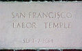
Done Image help - Redstone's cornerstone jpeg
-
 VegitaU's attempt
Article(s):
Request: Great image but doesn't read well in article(s). Could be cropped a bit a the top (keeping some of the redstone brick visible) and is there anything to make the engraved text "pop" more? Any help appreciated. Benjiboi 11:08, 6 August 2007 (UTC)
Graphist opinion: I'm on it... see what a little Photoshop will do. -- VegitaU 11:46, 6 August 2007 (UTC)

- All right, done. -- VegitaU 12:38, 6 August 2007 (UTC)
Done Rotate

Article(s): none yet
Request: This will probably take a Wikigraphist about five minutes once they stop laughing at how simple it is, but I can't figure out how to rotate this picture. I can rotate it in my image viewer on my computer, but images aren't really my thing and I don't know how to modify the actual file. I don't have any image software so, even if I did know how, I probably don't have the right tools.-- Natalie 00:16, 7 August 2007 (UTC)
Graphist opinion: I got this, don't worry. -- VegitaU 00:17, 7 August 2007 (UTC)
- Done! -- VegitaU 00:24, 7 August 2007 (UTC)
- Redone losslessly, using XnView. (Smaller file size; no loss of image quality) CountingPine 14:41, 8 August 2007 (UTC)
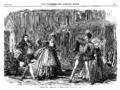
Done Franco-Prussian War - Cafe
Image:Franco-Prussian_War-_Illustrated_London_News,_September_17,_1870_-_Discussing_the_War_in_a_Paris_Café - right.PNG Image:Franco-Prussian_War-_Illustrated_London_News,_September_17,_1870_-_Discussing_the_War_in_a_Paris_Café - left.PNG
Article(s):
Franco-Prussian War,
Siege of Paris, etc.
Request: Another simple piece-together that I just don't have the software for. I don't think it'll be too difficult, and I feel a right idiot for having to ask. Sorry! It might benefit a bit from straightening, though it's not too far off. Also, it might need shrunk down a tiny bit to get it within size limits - probably not too much, though, as this one isn't full-page like the last one: it was surrounded by a discussion of T.H. Huxley, of all things. -- Adam Cuerden talk 08:09, 7 August 2007 (UTC)
Graphist opinion: I'll get on this. vlad§inger tlk 11:29, 7 August 2007 (UTC)
- Okay, I think I got it. I can't upload it just yet though, I have to leave the house. I'll get it up around one pm eastern time. vlad§inger tlk 11:35, 7 August 2007 (UTC)

- I get tired of waiting; sorry. Here's the upload to the right. Let me know what ye think. --
VegitaU 14:41, 7 August 2007 (UTC)
- Heh. Next time, I'm going to have to upload several of these at once: You lads tend to trip over each other a bit =) It looks good. I cleaned up some dirt on the image and re-uploaded, but that's a fault of the original scans (hard to clean up something in two halves) Adam Cuerden talk 14:55, 7 August 2007 (UTC)
- I did mine first! :). Do you have any more of these?
vlad§inger
tlk 18:37, 7 August 2007 (UTC)
- Heh. Only a couple reams. It's fun being an amateur scholar. Adam Cuerden talk 01:16, 8 August 2007 (UTC)
Done A map of
Goree


Articles: Goree
Request: If possible, an SVG map of the place, if not, something less pixelated or of higher resolution. If absolutely nothing else, a better scale marking that doesn't equate 500 yards with 500 meters! 68.39.174.238 16:48, 7 August 2007 (UTC)
Opinion: I'm nearly done with this. vlad§inger tlk 18:38, 7 August 2007 (UTC)
- Uploading...
vlad§inger
tlk 18:52, 7 August 2007 (UTC)
- There! How's that?
vlad§inger
tlk 18:58, 7 August 2007 (UTC)
- Hmm. Maybe just a tiny bit more whitespace on the left? "Bandstand" runs a bit close to the left border. Also, the Bandstand line could be a bit more horizontal, I suppose. But don't worry about me. I don't even know what Goree is. Adam Cuerden talk 01:19, 8 August 2007 (UTC)
- There! How's that?
vlad§inger
tlk 18:58, 7 August 2007 (UTC)
- Excellent!
68.39.174.238 16:44, 8 August 2007 (UTC)
- I didn't know what
Goree was either before this. :). I'll add a little white on the left, reupload, add the "done" tag, and switch out the image in the article.
vlad§inger
tlk 17:21, 8 August 2007 (UTC)
- I think I'll put this on Commons instead. When the Wikipedia copy is deleted, the latest rev. should show up in the article.
vlad§inger
tlk 17:38, 8 August 2007 (UTC)
- Looks very good, in any case =) Adam Cuerden talk 17:58, 8 August 2007 (UTC)
- I think I'll put this on Commons instead. When the Wikipedia copy is deleted, the latest rev. should show up in the article.
vlad§inger
tlk 17:38, 8 August 2007 (UTC)
- I didn't know what
Goree was either before this. :). I'll add a little white on the left, reupload, add the "done" tag, and switch out the image in the article.
vlad§inger
tlk 17:21, 8 August 2007 (UTC)
- Excellent!
68.39.174.238 16:44, 8 August 2007 (UTC)
Done Strasbourg Aftermath
- Image:Franco-Prussian War - Strausbourg - October 15 1870 - left004.PNG
- Image:Franco-Prussian War - Strausbourg - October 15 1870 - right003.PNG
Article(s): Siege of Strasbourg, which doesn't currently have an image.
Request: Another basic piece-together and straightening, I fear. Forgive the typo in the upload name (Strasbourg, not Strausbourg). By the way, I'm told that JPEGs don't suffer the thumbnail problem, so use that if you think it worth it.
Please, please tell me if I'm asking for too many of these. I don't want to be a pain. -- Adam Cuerden talk 15:04, 8 August 2007 (UTC)

Graphist opinion: I got this. -- VegitaU 15:19, 8 August 2007 (UTC)
- Done. PNGs seem to save filespace; at least in this case, and, as long as they aren't enormous, don't have a thumbnail problem. --
VegitaU 15:33, 8 August 2007 (UTC)
- My god, that was fast! Great work as always! Adam Cuerden talk 16:05, 8 August 2007 (UTC)
Done Henry Wadsworth Longfellow
Image:HWLongfellow001.PNG Image:HWLongfellow002.PNG
Article(s): Have a guess ;)
Request: Another stitch-together. But we ought to have a good image of him, and this is better than any we have. If you're feeling ambitious, remove the minor printing error that created a white line about three-fourths down. (And mark the modification on the image page: They get cranky over there if you don't) -- Adam Cuerden talk 17:33, 8 August 2007 (UTC)

Graphist opinion: Okay, done. This was a little harder; the pictures didn't stitch as seamlessly as before and a lot of the features were at odd angles. I tried to fix all these problems and that line. -- VegitaU 21:28, 8 August 2007 (UTC)
- Sorry, I did try to get them straight, but had some trouble getting everything needed in without going to three scans. Adam Cuerden talk 04:22, 9 August 2007 (UTC)
- Forgive me, I have flu, and I become very stream of consciousness when I'm ill.
- Wow, I didn't even notice the thumbnail bug. I'll shrink it and straighten it up for you. Feel better. -- VegitaU 18:02, 2 August 2007 (UTC)
- Forgive me, I have flu, and I become very stream of consciousness when I'm ill.
(unindent)What's up with that thumbnail bug? That's confusing. -- VegitaU 18:40, 2 August 2007 (UTC)
- Well, I straightened the picture out with Rugby471's help. And it looks like that weird bug is gone. Whatever THAT was about. --
VegitaU 18:59, 2 August 2007 (UTC)
- That's lovely! Thanks! Adam Cuerden talk 23:57, 2 August 2007 (UTC)
Hey, just wanted to ask before I started uploading everywhere: Would you mind stitching together a few more? I have several images at about this size that would make good illustrations for various things...
Adam Cuerden
talk 13:26, 5 August 2007 (UTC)
..Well, if this one is done, why don't we delete the two halves? vlad§inger tlk 02:37, 7 August 2007 (UTC)
- I think mainly because I don't have a commons admin account. Probably should upload to en. next time. Adam Cuerden talk 07:56, 7 August 2007 (UTC)
Done Coat of arms of Laos
-
 b/w variant
 -
colors are more garish, but show how temple is colored
-
 fifth upload with text in Laos script, rather than a tracing


Article(s): Coat of arms of Laos
Request: In looking for information on the above Laos Scout emblem (thanks so much, guys), I found that we have a black-and-white coat of arms rather than a colored one. I would like it colored. Chris 05:06, 20 July 2007 (UTC)
Graphist opinion: I imagine you'd want an SVG? If so I'll have a go but I might mess up: that's all I seem to have done recently. -- Dave the Rave (DTR) talk 15:13, 22 July 2007 (UTC)
- I'm sure you'll do just fine, Dave, and thank you for your hard work and contributions! Chris 18:30, 22 July 2007 (UTC)
:) Here's a first upload: I did the bottom half of the image and the temple accurately, but I did a rough version of everything else so you can get an idea of the colours and the finished image. I didn't trace the text, however, as I didn't think a trace would look good. If someone could help with this I'd appreciate this. -- Dave the Rave (DTR) talk 10:19, 23 July 2007 (UTC)
- I had to blow this up, it's so nice! You have a great eye for detail! It's great! Maybe some of those that helped with the language requests on the Laotian Scout emblem can be persuaded to help with the text?
Chris 20:04, 23 July 2007 (UTC)
- Thanks for that! I'll start on detailing the areas at the sides (I think it's Maize?) tomorrow. If someone could create an SVG similar to this one made for the Burma Scouting request it would help a lot.--
Dave the Rave (DTR)
talk 22:24, 23 July 2007 (UTC)
- The article about the symbol states that the crop depicted is ears of ripe rice. Valentinian T / C 23:54, 23 July 2007 (UTC)
- Thanks for that! I'll start on detailing the areas at the sides (I think it's Maize?) tomorrow. If someone could create an SVG similar to this one made for the Burma Scouting request it would help a lot.--
Dave the Rave (DTR)
talk 22:24, 23 July 2007 (UTC)
- I've added the ears of rice, and most of the rest of the stuff that I did roughly. Any comments? I had some difficulty making out the smaller details. The next thing to do will be changing the trees on the right to the design on the b/w version (rather than that of the PNG above). -- Dave the Rave (DTR) talk 20:41, 24 July 2007 (UTC). Also, some of the parts of the rice may need tweaking. -- Dave the Rave (DTR) talk 20:42, 24 July 2007 (UTC)
- I went ahead and refined it some more. I did the trees properly, and added the text, but I'm not sure if it looks the part. Any Thoughts? --
Dave the Rave (DTR)
talk 16:19, 25 July 2007 (UTC)
- Very nice! Can the text be thickened at all? Chris 21:17, 25 July 2007 (UTC)
- Very good job. Agree with Chris that the lettering could need some thickening. Btw, the fair use image shows a multicoloured tree. Not sure what type it is though. Valentinian T / C 21:36, 25 July 2007 (UTC)
- I went ahead and refined it some more. I did the trees properly, and added the text, but I'm not sure if it looks the part. Any Thoughts? --
Dave the Rave (DTR)
talk 16:19, 25 July 2007 (UTC)
It's on my to-do list! -- Dave the Rave (DTR) talk 21:46, 25 July 2007 (UTC)
- ps-once you get the text nailed, can you also add it to the Commons image Image:Laos coa.png, as the same text is supposed to be on there, and will then make it a Wikipedia image and not a copyrighted version. Chris 04:39, 26 July 2007 (UTC)
- Here's some Thickened Text, and a Multi-coloured tree. If I have chance I'll try to add the text to the png image but I'm going on holiday tomorrow and I'm a little bit busy, so I probably won't have time. If the text needs more thickening, or something else needs changing, I'd request that someone else modifies the image. -- Dave the Rave (DTR) talk 12:56, 26 July 2007 (UTC)
- I'm back! However, I'm not sure adding the text from the SVG to The vector-images.com PNG would be okay as far as licenses are concerned, and commons:Template_talk:Vector-Images.com has only confused me. I'd appreciate it if someone could confirm that modifying Image:Laos coa.png be ok. -- Dave the Rave (DTR) talk 17:18, 4 August 2007 (UTC)
- Unfortunately, the images from Vector-images have become something of a problem. As I understand the situation: a representative for this company has accepted that Wikipedia and others use and modify their raster images as long as we don't do the same with the company's own vector images, so the raster images are freebie images but the company's own vector images aren't. So the problem isn't the company in Russia - as long as you base your work on a raster image, you're in the clear. The remaining problem is determining the copyright status of an official insignia of Laos, as it is in the country itself, and finding a copy of the Laotian copyright law (if such a law actually exists) is rather difficult. Laos is not a member of the Berne convention and the only small pieces of information I can dig up seem to suggest that copyright protection in Laos is very weak; no law as such seems to exist, only a ministerial decree from 1995 (possibly the one about trademarks?). [1]. The trademark decreee is no help, although § 12 specifies that a trademark cannot be registered if it contains a flag, coat of arms or similar. [2]. In any case, a thorough description of the insignia is specified in the Laotian constitution § 90 [3] so this description must be PD like any other law I can think of. Respecting copyright and all that, I think we're in the clear here, e.g. Heather Meeker has described Laos as a country with no copyright law at all. [4] Valentinian T / C 20:34, 4 August 2007 (UTC)
Wow, that's fantastic research, that really helps a lot! I agree, the image looks like a PD image, but which image tag do you think would be best? I looked in WP:ICT for PD tags, but I couldn't find a specific tag that would be appropriate, apart from {{ PD-because}}. I checked Image:Flag of Laos.svg, which is tagged with {{ Insignia}} and {{{ PD-Self}}. DO you think the the same should be done for the coat-of-arms, or should a new tag be made (for Laos COA and flags)?
On another note, on one of the links Valentinian had a link to the font for the Laos script. I'll use this to generate the text instead of just tracing it as soon as I can. -- Dave the Rave (DTR) talk 08:37, 5 August 2007 (UTC)
- I would suggest going with the same solution as used on the flag. Normally, I don't like it, but it seems appropriate here. I like the idea about creating a {{
PD-Laos-exempt}} template, but we should wait until we've analysed the situation more thoroughly. Just in case anybody wondered what applies to the seal of Astana (also on this page), that one is covered by
commons:template:PD-KZ-exempt, and I've compiled a list of mostly East European countries where I've checked if official heraldry is PD or not, see:
User:Valentinian/Heraldry.
Valentinian
T /
C 09:21, 5 August 2007 (UTC)
- Update: Laos indeed has no copyright law at the moment, but it is expected to introduce an intellectual property decree in the future. [5] (page 39 in the original, page 41 in the file). The relevant text has apparently been drafted, but not yet signed into law. We should probably wait with a template until the new law becomes publicised. Valentinian T / C 09:36, 5 August 2007 (UTC)
- I uploaded with licenses as per the flag. Text is in the Laos Script font, so it looks better than the simple tracing of the text. Is it okay? Also, thanks very much for all the help with he licensing, Valentinian, it's really helped. User:Valentinian/Heraldry looks like it'll be really useful too. -- Dave the Rave (DTR) talk 14:42, 5 August 2007 (UTC)
- I finally got round to adding the text to Image:Laos_coa.png, but I haven't uploaded yet, as I'm not sure the result is any good (I'm not so good with raster graphics, and the image is quite small). You can see the image here, and if it's any good then it can be uploaded. If not, then maybe some GIMP/Photoshop expert can help. -- Dave the Rave (DTR) talk 08:36, 8 August 2007 (UTC)
- Image uploaded to Commons, and replaced in article. --
Dave the Rave (DTR)
talk 13:50, 12 August 2007 (UTC)
- Dave, they're both great, thank you! This one is done! I notice Coat of arms of Myanmar has been deleted from Commons, maybe that one should be tackled? Chris 19:06, 12 August 2007 (UTC)
Astana Done
-

-
 This flag image should be recreated using vector graphics as an SVG file
 -

-


Article(s):
Astana
Request: As the new capital of a large post-Soviet republic, this article should have a better coat of arms than one cropped from one of my photos. Help? Chris 19:14, 21 July 2007 (UTC)
Graphist opinion: Darn... this one looks fun. I will be on vacation though so I can't promise anything-- Cronholm 144 19:20, 21 July 2007 (UTC)
- If anyone does it,
Image:Flag of Astana.png would be easy as it's just the CoA on a colored field.
68.39.174.238 01:19, 22 July 2007 (UTC)
- Cool, that wasn't around when I uploaded mine. That also will help, plus the large version of mine. Chris 01:27, 24 July 2007 (UTC)
Hey Chris, here is a rough start. More to come, just wanted to get the upload done. -- Cronholm 144 12:56, 5 August 2007 (UTC)
- Great! Now just the arms without the blue field? :)
Chris 02:45, 8 August 2007 (UTC)
- That won't take long at all, but I need to adjust the symbol on the top and figure out how to set the mediawiki rendering engine on fire so that it will never trouble us again (Text won't render, I might end up drawing the letters from scratch).--
Cronholm
144 21:24, 8 August 2007 (UTC)
- Is that text-on-path? The easiest way to get round that is to convert the text to a path, that should render. -- Dave the Rave (DTR) talk 22:14, 8 August 2007 (UTC)
- That won't take long at all, but I need to adjust the symbol on the top and figure out how to set the mediawiki rendering engine on fire so that it will never trouble us again (Text won't render, I might end up drawing the letters from scratch).--
Cronholm
144 21:24, 8 August 2007 (UTC)
Thanks DTR! Comments on current revision?— Cronholm 144 17:47, 12 August 2007 (UTC)
- Very good, I say time to retire my old photo! Chris 19:08, 12 August 2007 (UTC)
If your okay with it so am I.— Cronholm 144 19:44, 12 August 2007 (UTC)
SVGification and correction Done


Articles: United States gubernatorial elections, 2010
Request: 1st, to SVGify, if possible. Second, the following changes:
- Alabama should be light red,
- Maine should be light blue, 68.39.174.238 19:39, 11 August 2007 (UTC)
Opinion:Why do you always misspell opinion(I normally wouldn't ask but this is the 5th time)? Anyway, we already have a US map svg so this is really just a colouring project.-- Cronholm 144 19:45, 11 August 2007 (UTC)
- Oops, I forgot about that (The extant SVG map), despite the fact that I've seen it in use before. 68.39.174.238 21:41, 11 August 2007 (UTC)
Done— Cronholm 144 17:54, 12 August 2007 (UTC)
- Cronholm, you do some really nice crisp work with maps, may I put forward others in need of help? Chris 19:11, 12 August 2007 (UTC)
Of course...but all I did was click and fill. I find that I am pretty good with maps but I find them tedious, so one at a time would be appreciated. Cheers— Cronholm 144 19:28, 12 August 2007 (UTC)
Central Citylink map
This a map for the Central Citylink page, a rail brand in the UK. The map I originally uploaded was deemed unsuitable, and I was advised to come to this page. A copy of the map is below. Could you make a version appropriate for Wikipedia? Many thanks, Dewarw 15:51, 7 July 2007 (UTC)
Graphist opinion:No prob. I'm on it.
- Okay... I made a PNG version of the route map. Let me know what you think -- VegitaU 17:22, 7 July 2007 (UTC)
Since I deleted the original on request of the uploader, here is a link to it [6]. - Andrew c [talk] 15:07, 9 July 2007 (UTC)
-
The original Central Citylink Route Map
-
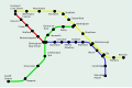 reworked SVG
 -
 version by Time3000 Mark II


Thanks a lot! The map is excellent- it will improve certin pages tremendously! Thanks again!
Dewarw 17:35, 7 July 2007 (UTC)
I've done an SVG version of the map, which is smaller (in terms of filesize) than the PNG and is also scalable. Apart from that, there's not much difference. Time3000 15:01, 9 July 2007 (UTC)
- I'm concerned that the redrawn versions are still copyright violations of the original. Could a version be made that isn't a tracing of the original, with unique colors as well. I understand that for geography, it is hard to get around tracing (like the state of Florida is always going to look like a panhandle penisula). But this is a heavily stylized, not drawn to scale graphic of a transportation route map. Therefore, we could easily create one that doesn't impose on the copyright of the existing map.- Andrew c [talk] 15:07, 9 July 2007 (UTC)
- OK, I've made a version with a different layout and slightly different colours; any major changes to the colours would just be confusing. The layout doesn't look quite as good and it takes up more space (in dimensions) than the other versions, but it does avoid the copyright problem. Time3000 15:37, 10 July 2007 (UTC)
I do not like this new version, the SVG version is the best so far. Dewarw 17:42, 10 July 2007 (UTC)
It might be good to follow the geography a bit closer. For example, Cardiff is in Wales, which is off the west hand side of England. If it's any help, I've plotted all the stations on a map and joined them up. Perhaps a map can be made to roughly follow that: http://img244.imageshack.us/img244/8906/citylinklc9.png CountingPine 22:01, 10 July 2007 (UTC)
Why has the map been deleted? please return an image soon as the pages are reduced in quality! Dewarw 17:39, 12 July 2007 (UTC)
I'm working on an SVG version which won't be subject to copyright (and will be a bit better than the current version when it's finished). It should be done in a couple of days. Time3000 09:33, 13 July 2007 (UTC)
I've uploaded a version of my own. Unfortunately, the circular station markers are being displayed funny. If anyone can find a simple fix, that would be appreciated. CountingPine 02:21, 21 July 2007 (UTC)
Dots added-- Cronholm 144 19:09, 21 July 2007 (UTC)
I've finished the version I was working on - it follows the geography reasonably well (from CountingPine's map). Time3000 11:26, 24 July 2007 (UTC)
DoneIran Scout Organization
-
 Third Edit
 -
straightened and trimmed just to get area of wings and below
-
I can't get it to scan right, it's on satin, but it gives a rough idea
-
I am so sorry to all of you for this-shows Rugby what I am driving at, color scheme and basic designI am so sorry to all of you for this-shows Rugby what I am driving at, color scheme and basic design
-
this one I would like to ask to be made larger to show detail (background design is that of Image:Flag of Iran.svg)
-
 based on Akiramenai's
 -
more recent variant for shape (scroll only), not really better for details, sorry
-
 Added the unreadable persian text.
Article(s): Iran Scout Organization
Request:
- For the red emblem I would like to ask for a line-drawing or clearer variant; the badge is quite worn.
- The red-white-green emblem I would like to ask to be made larger to show detail. Chris 05:56, 27 June 2007 (UTC)
Graphist opinion:
Done Red Emblem

Okay, i'll get to work on a vector. > Rugby471 talk ⚔ 16:57, 28 June 2007 (UTC)
- Okay, I know it isn't much, but I've started the line drawing, i have done the outline and a few of the features inside, is this okay so far ? >
Rugby471
talk ⚔ 17:12, 28 June 2007 (UTC)
- Actually that's a great start and way better than I could do! I have added the Image:Faravahar.png because I believe it is the concept they're driving at. Besides, I didn't have a Journey album handy. ;) Also, check out The Lion and Sun for ideas on those themes. (weird, that flag shares a lot in common with Ethiopia) And thanks again! Chris 08:15, 29 June 2007 (UTC)
Second Edit, looking okay ? > Rugby471 talk ⚔ 16:52, 29 June 2007 (UTC)
- It is looking great, thanks! If you put the red and the r/w/g/ emblems side by side, proportionally and shape wise the scroll and even the emblem shape are the same, it's just the red one was cast in aluminum so it doesn't have the sharp points the r/w/g one has. If you want to use the r/w/g emblem for an outline shape, I hope it would help and not hinder your great work. I have added Image:Iran Scout Organization membership badge.png to show a more recent variant, unfortunately it is the same small size in terms of detail. Chris 07:59, 30 June 2007 (UTC)
- More like this ? >
Rugby471
talk ⚔ 10:19, 30 June 2007 (UTC)
- Actually, I meant the outer shaping of the emblem itself. If possible, could the outer edges be made a single thin line, rather than two basically parallel lines with a hollow between? Bear in mind that this was an aluminum casting and not strictly faithful to the design, because of the thickness they had to use to show detail and still have the cloisonné work out. You've got great detail, and I appreciate your work on our behalf. Your last iteration before this, with the upturned, fuller wings squares with the way it should be. I only put Image:Faravahar.png on here to show what the otherwise-difficult to see image should be; but the fuller version you had is closer than the now-thin one. Also, can you incorporate the scroll (basic shape and text) that Akiramenai and Cronholm are using on the r/w/g variant? Thank you for all your hard work! Chris 08:26, 1 July 2007 (UTC)
Okay i think i've done what you intended now, but before I put in the scroll, we need to decide on the head on the badge, what do you want me to do with that (on the SVG is the exact thing that is on the photo) > Rugby471 talk ⚔ 09:35, 1 July 2007 (UTC)
- The face is that of an anthropomorphized lion, like on the old flag Image:Iran flag with emblem 1964-1979.png. I really appreciate your working on this-I imagine of the five emblems requested, this one is the most troublesome. Chris 20:42, 1 July 2007 (UTC)
- Is there a better quality image of this Lion, or a name for it so I can search for a better quality one, as this really is quite hard to do with the current supplied image >
Rugby471
talk ⚔ 17:05, 2 July 2007 (UTC)
- The name is "The Lion and Sun", "shir o khorshid" in Persian. Hope that helps. Chris 05:12, 3 July 2007 (UTC)
- Is there a better quality image of this Lion, or a name for it so I can search for a better quality one, as this really is quite hard to do with the current supplied image >
Rugby471
talk ⚔ 17:05, 2 July 2007 (UTC)
|
Fair Use Image Discussion
|
Okay, I searched on Google for a better image and found one ( luckily
![]() ) and have created a vector of the Lion's face
) and have created a vector of the Lion's face
1) Is the lions face okay?
2) I shall now go onto the color, either you can specify a color scheme or I can make a guess on it according to the photograph you gave
3) Do you wish me to include the text like in the r/w/g emblem, at the bottom in the 'banner-like' shape?
- The lion's face is great! The mane itself should be a little symmetrical for the shape of the badge.
- The color scheme should be red and gold, so fairly similar to the red and aluminum pattern of the original. The gold of the lion's face is a great shade!
- Yes, please include the scroll and text directly from the RWG emblem.
- Thank you so much once again for your hard work! Chris 21:26, 3 July 2007 (UTC)
- It's getting there now, but the red has overwhelmed your gold detailing. If possible, could the outer edges be made a single thin line, rather than two basically parallel lines with a hollow between? Thanks again! Chris 06:59, 5 July 2007 (UTC)
- ps-can you use the shape of the emblem, and the scroll as a whole, from the other image, as both are correct proportions? Thx, Chris 07:01, 5 July 2007 (UTC)
- Rugby, thank you so much for being patient with me. My very crude example (sorry about that, my poor artwork is way ugly, I know; I do much better on paper) is actually very close to what I intend for the red emblem, the basic shape and coloration and so on. This is the top-right corner image. I will try and explain as best I can what is called for.
- Don't treat the emblem as though the whole thing is a silhouette or perfect recreation of the aluminum badge. At this point, all you need from the aluminum badge is the sun, the winged emblem, and the lion's head, which you have already done. Maybe revisit it just for the detailing inside the wingspan, but there is also the Faravahar emblem on this page to use for detail on that.
- Now discard the fact that the aluminum badge exists. For our purposes the red aluminum badge is now a non-issue, you've already got what you need from it. The new emblem should not look like a cookie-cutter encompassing all hollow spaces in the emblem, it needs white space where there are hollows between the scroll and emblem.
- Take the collaborative emblem that Akira and Cronholm have developed, and borrow the outline of the emblem, and the scroll in its entirety (if you are allowed to, unless there is something that precludes you form doing so-Cronholm did say something about "using forbidden techniques..." but I was unsure what was meant). Their shape is right, and their scroll is right.
- At present the vast amount of red washes out the gold details. Using the basic tracing you already made, make the sun-wing-lion elements the center of an emblem with the exact shape and the exact scroll of the r/w/g emblem, but in gold instead of the black they use. Leave the red out for now-put it in once you have got the central elements down pat.
- Change the colors of the details of the lion's face-that is perfect and doesn't need re-detailing from anything-make the presently black parts gold, and make the presently gold parts red.
- I really thank you for this, and for being patient with me.
Chris 07:34, 6 July 2007 (UTC)
- You've gone quiet, I really hope I have not offended. I stand in awe of the great work you folks do. Thank you so much. Chris 06:58, 7 July 2007 (UTC)
- No, no no don't worry, it is that last night my Mum told me with two minutes to go to when we leave, that we are going to a circus performance for 3 hours ! I never get offended by these things ( even if it does look like it ) you are here to specify what you want and we are here to deliver. Anyway concerning the image now, thankyou for your instructions, I now see what you mean and so have done that. Do you also want me to color the border/scroll elements in the gold ? > Rugby471 talk ⚔ 07:54, 7 July 2007 (UTC)
- Yeah! You got it! (I'm sorry, I've been confusing people lately) Yes, please make the border and scroll details gold as well, and fill in the rays of the sun in gold, leaving the center circle red. Now all we're down to is the winged-thingamabob. You rock! Chris 09:10, 7 July 2007 (UTC)
Done, awaiting your advice on the 'winged-thingamabob' as you put it :-) > Rugby471 talk ⚔ 10:18, 7 July 2007 (UTC)
- Okay, I don't know if you graphic gurus have the ability to curve an existing shape. My ideas are this. On the wings on the Faravahar.png (which are, probably incorrectly, one degree counterclockwise from horizontal), can you warp up the ends so it will look swooping, like in the Scout badge itself? I don't think the proportions are right for it, but it's an idea.
- Failing that, can you take the central portion of the wings of Faravahar.png, incorporate them into your winged portion, and simply extend the feather pattern out to the curved edges? Chris 20:54, 8 July 2007 (UTC)
Okay I understand everything except for the first part about the 'warping' I'll get on this as soon as possible however i've hurt my neck and so it's not so good for me to be on the pc, at the very latest i'll be back on two days from now. Sorry for any inconvenience. > Rugby471 talk ⚔ 16:15, 9 July 2007 (UTC)
- Never an inconvenience, I so appreciate the work you do, take your time and take care of yourself, feel better!
Chris 21:12, 9 July 2007 (UTC)
- What I mean is I have seen graphics programs where someone can bend and stretch an existing image to not be in the shape it is, say to curve a line of text or something. Chris 21:14, 9 July 2007 (UTC)
- I don't know which package you used to create these SVGs, but I think the closest you'll get to such an effect in Inkscape is a very simple use of Pattern along Path (see
this link on inkscape.org). --
Dave the Rave (DTR)
talk 16:24, 10 July 2007 (UTC)
- Not familiar with it, but that should do the trick. Can you help? Chris 08:16, 13 July 2007 (UTC)
Okay I'm back !! I'll get to work doing the feather pattern oon the image, however on the warping thing, do you mean on the Faravhar.png image and not the SVG i'm working on ? > Rugby471 talk ⚔ 09:14, 14 July 2007 (UTC)
Half way through the feathers, however I need someone to change the shape of the feathers to fit the emblem. Anyone ? > Rugby471 talk ⚔ 10:04, 14 July 2007 (UTC)
On it, may take me an hour or two though.-- Cronholm 144 10:45, 14 July 2007 (UTC)
- I had an experiment with Pattern Along Path: see Image:Test PaP.svg. Is this the sort of thing you're looking for? -- Dave the Rave (DTR) talk 10:50, 14 July 2007 (UTC)
I made the wings and individual feathers editable as separate svgs in inkscape, I didn't fiddle with anything else. I can if you want though.-- Cronholm 144 12:24, 14 July 2007 (UTC)
- Great start! Thanks, all! Chris 05:28, 15 July 2007 (UTC)
Does that look ok? I didn't have anything to base it off of...-- Cronholm 144 06:47, 15 July 2007 (UTC)
Also, this needs to be uploaded at commons not WP once we are finished.-- Cronholm 144 07:03, 15 July 2007 (UTC)
Yeah that looks great thanks ! And about Commons, I acknowledge that, it's just that I didn't know the copyright status at the beginning of the request and so I uploaded it to Wikpedia so it would be safe from deletion if there was still copyright standing. Anything else to do Chris ? > Rugby471 talk ⚔ 08:04, 15 July 2007 (UTC)
- God that's pretty! You guys are amazing! Two last things-
- please make the outer edge of the whole winged device thicker, so it stands out like the sun and the lion do.
- for the center of the winged device, please connect the upward two "prongs" as remaining solid gold sun rays, please make the "body" solid gold around that red circle, please fill the (legs? kickstands?) in gold, and please apply the wing-feather pattern to the "tail" area, rounding the bottom as in the "farvahar" device.
Thank you again so much! Chris 17:47, 15 July 2007 (UTC)
kickstands?! Anyway I have made some preliminary changes. I am not sure if they are what you wanted though.-- Cronholm 144 13:39, 16 July 2007 (UTC)
- Okay, they looked like kickstands to me... :} This is brilliant, now just a bit of a thicker border on the winged object, and make the scroll background red, and we're set! Thank you! Chris 21:33, 16 July 2007 (UTC)
- You, sir, are a god, and people will write songs lauding you, and clean ones this time! :) Thank you so much! Chris 21:46, 17 July 2007 (UTC)
- I like that idea, yes please. And please bring the top sun ray to a point, if you can. :) Chris 02:18, 18 July 2007 (UTC)
Point done, now all that remians is the feathers :-) > Rugby471 talk ⚔ 17:18, 18 July 2007 (UTC)
- You do beautiful work, by the way! Chris 21:47, 19 July 2007 (UTC)
I will have to get an older version to edit the feathers and I am about to go on wikibreak(vacation), so this might have to go on hold for a week-- Cronholm 144 13:02, 20 July 2007 (UTC)
- Back yet? I hope you guys aren't fed up with me! ;) Chris 07:49, 30 July 2007 (UTC)
- Ack, we're back to the white scroll! :( Is that to thicken the text? Also, what were you wanting to do with those wings? Chris 09:22, 6 August 2007 (UTC)
White??? I'm confused. All I did was spread the feathers, but I started from an earlier version. -- Cronholm 144 10:14, 6 August 2007 (UTC)
- Ah, sorry, it showed me the old version with the white scroll, when I saw your edit history, it looked like you tried to revert, so I did. Chris 21:11, 6 August 2007 (UTC)
Well, it is saved in the history in any case. What would you like done?-- Cronholm 144 01:28, 7 August 2007 (UTC)
- At this point, if you could make the text thicker so it will show up on the red background, as well as the parallel yellow lines on the scroll, maybe do your feather spreading, I would be happy and we could close this and get it out of your very patient and kind to-do list. :) Chris 02:06, 7 August 2007 (UTC)
I'm not gone, and I suppose that I'm it... I'll try to fix everything today.-- Cronholm 144 17:38, 11 August 2007 (UTC)
- If I messed up your fixes when I reverted away from the white scroll, I do apologize. Chris 20:07, 11 August 2007 (UTC)
No it's fine. I did everything but thicken the text, which I don't feel qualified to do.— Cronholm 144 17:44, 12 August 2007 (UTC)
- I haven't seen Akiramenai on for a while, who would be eminently qualified to do that. Chris 18:57, 12 August 2007 (UTC)
Done Red-White-Green Emblem

I need the script I can't make it out.-- Cronholm 144 03:37, 28 June 2007 (UTC)
- User:Akiramenai of the Wikipedia:Graphic Lab here has on their user page that they are a speaker of Farsi, perhaps that will help? Maybe making the image perhaps double or triple size will allow the text to be put in easily. Image:Laos.jpg above, at 167 × 219 pixels, 100px, is a really good size to show details. Chris 04:43, 28 June 2007 (UTC)
Size doesn't matter with svgs I can make them as large or as small as I want. What I need is a legible copy of the text.-- Cronholm 144 13:33, 29 June 2007 (UTC)
- Yes Chris, the persian text says: amade bash, which means "be ready/prepared".
- I will try to make time to finish the vector version.
- thumbs up to the teamwork here* Akiramenai 15:31, 29 June 2007 (UTC)
- Perhaps Akiramenai can provide the Farsi script?; if not, I would be happy to put in a similar language request to every user at Category:User fa-N for their help with the text on the scroll. (there are many more speakers of Farsi on the 'pedia than there are Lao and Amharic) Thanks again, all! Chris 07:59, 30 June 2007 (UTC)
What about the red-white-green emblem? I have uploaded my version(I still have the lossless file so if you think I can improve it somehow please say so) Is this emblem free of copyright or is there a way to post it anyway? I am very bad at copyright rules and I think I may have uploaded my version of the emblem with the wrong copyright rules. But I really need to know what I should change about the image to comply with the rules and keep the quality good at the same time. Akiramenai 18:52, 30 June 2007 (UTC) Any suggestions?
- I reuploaded based on yours and made some tweaks. I added lines to your banner and two shadows to created the illusion added a lanyard and softened the letters and added a triangle thing. I know I have gaping white wholes in my pic, I forgot to take them out.--
Cronholm
144 20:24, 30 June 2007 (UTC)
- It actually is starting to look nice, what do you mean "triangle thing"? I don't see it. Also, there seems to be a small bit of color in the lanyard itself, what does it represent? Thanks to all, again! Chris 08:26, 1 July 2007 (UTC)
- I think he means the yellow object at the far bottom of the image.
- I can't make out what it is.
- Anyway, added some more shading. I didn't notice the sign was overlapping itself, thanks for the sharp eye Cronholm. Akiramenai 09:35, 1 July 2007 (UTC)
- Also the last letter in the original image is slightly different from what you use in everyday Persian so I edited that in the svg version. Akiramenai 11:38, 1 July 2007 (UTC)
You folks really work well together! WikiProjects should all take lessons! Some thoughts:
- The scroll and all outer edges of the emblems should be symmetrical
- As to the yellow object at the far bottom of the image, again we don't want to use colors we can't really verify. The emblem itself was only produced in red, green and black on white.
- Now that the text has been modified, please center it left to right on the scroll
- Also, now that I have blown this up, there is supposed to be fimbriation on the red and green edges, geometric Farsi text that reads like Image:Flag of Iran.svg
Thanks! Chris 20:42, 1 July 2007 (UTC)
@Akiramenai, Do you know how to use Bezier curves in Inkscape? You seem to use multiple nodes where it is not always advantageous to do so.-- Cronholm 144 22:06, 1 July 2007 (UTC)
I think that my work should be used to compliment Akiramenai's. For example, I have smoothed out some of the curves on both the scroll and the large lettering using beziering and I have tried to add that @%$# knot but to no avail. I also adjusted the alignment of the center stroke (look closely) of the large letters, it is off kilter in Akiramenai's. If these changes can be incorporated into his then we will be very close.-- Cronholm 144 22:30, 1 July 2007 (UTC)
- However you folks want to do this is fine with me. However, the edging on Image:Iran1980s.svg is cleaner and doesn't tuck up behind the scroll at the bottom, and the non-shadowed emblem shape is preferable. In addition, your "@%$# knot" ;) needs to be added to it, as well as to Rugby's version. Chris 22:45, 1 July 2007 (UTC)
Using forbidden techniques, I have synthesized the images. All that is left is the knot..... sigh-- Cronholm 144 23:54, 1 July 2007 (UTC)
- The one you had was great, just black-and-white if you still have it. Can Rugby also use the scroll you have created, as it is the same scroll? Chris 05:20, 2 July 2007 (UTC)
@Cron, Unfortunately I find it easier to use macromedia flash than Inkscape. I only use Inkscape to convert metafiles from Flash to SVG. Please Please Please, if you think you can improve my images by smoothing etc. do so. If SVG is lossless it shouldn't be a big problem, otherwise I can send the metafiles in some way. Akiramenai 09:42, 2 July 2007 (UTC) Akiramenai By the way, the scout logo looks much better now at the top (much smoother). Thank you CRonholm. But the shading I added is gone now ??? :( Akiramenai 09:44, 2 July 2007 (UTC)
Sorry bout that, but Chris said he didn't want it (I realize that it probably took awhile) @Chris and Rugby sure thats fine with me...but I didn't draw it... Akiramenai did.-- Cronholm 144 12:25, 2 July 2007 (UTC)
Oh ok, It's all good then. All that is left is...."The knot". I'd leave it as it is though. Akiramenai 14:01, 2 July 2007 (UTC)
- This is great! The only other thing I might suggest is that the fimbriation on the red and green edges, geometric Farsi text that reads like
Image:Flag of Iran.svg, should be more pronounced.
Chris 21:28, 3 July 2007 (UTC)
- You guys will hate me-the knot should be centered beneath the bottom point of the fleur-de-lis. Chris 02:21, 4 July 2007 (UTC)
I'll get on it.-- Cronholm 144 21:40, 4 July 2007 (UTC)
Uhh... I changed the image a while back... comments?-- Cronholm 144 07:00, 7 July 2007 (UTC)
- Oh, duh, totally escaped me, thank you! I saw it and meant to respond. The mind is a terrible thing to waste... That is perfect, I am totally happy with it, thank you. Can you follow where I am trying to go with Rugby's red emblem? I think that's the toughest one of the batch, and my explanations seem to make things worse. Thanks again. Chris 07:47, 7 July 2007 (UTC)
I was going to leave that one to Rugby... but I will take a look at it.-- Cronholm 144 07:55, 7 July 2007 (UTC)
- I just wanted to make sure I was understandable, was seeking second-party verification. At work of late it seems I confuse people. Chris 09:06, 7 July 2007 (UTC)
{ Done copyright?
Just a slight warning here - the logos are copyright (by the templates on the original images) so creating SVGs with too high a level of detail could be seen to go beyond fair use (see Wikipedia:Logos). It might be best to create SVGs and then render those as PNGs at 300x400 resolution, which is probably low enough. Since SVGs are vector, not raster, they potentially have any resolution (within reason) so PNGs would be better, although SVGs with a relatively low level of detail should also be OK. Time3000 08:08, 30 June 2007 (UTC)
- Then I should suggest to the Scouting Wikiproject to make a modification to the {{ Scoutlogo}} template, for defunct Scouting insignia-these (with exceptions of a later upload) are between 20 and 45 years out of use, so they may actually not have copyright holders any longer. Chris 08:18, 30 June 2007 (UTC)
- Iranian copyright seems to expire after 30 years when it's held by an organisation (
|http://www.parstimes.com/law/copyright_law.html), so you're probably OK there. If it's expired, it might be better to use
Template:PD-Iran as the copyright tag.
Time3000 14:07, 30 June 2007 (UTC)
- We're about two years shy on the red one for that tag to be applicable; thank you for the great research! Chris 17:04, 30 June 2007 (UTC)
- Iranian copyright seems to expire after 30 years when it's held by an organisation (
|http://www.parstimes.com/law/copyright_law.html), so you're probably OK there. If it's expired, it might be better to use
Template:PD-Iran as the copyright tag.
Time3000 14:07, 30 June 2007 (UTC)
DoneImage Sharpening
-
-
 VegitaU's attempt


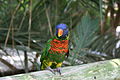
Article(s): No one yet, but I would like it to be a Featured Picture at Commons. It's a Rainbow Lorikeet, and I'll put it in the article when it's fixed. The picture is good and has great potencial, and I'd like it to be featured.
Request: The picture is a little unsharp around the head area on the bird, the tail, and the right leg (the bird's left). Please make those areas sharper. Thank you! — H92 ( t · c · no) 21:20, 6 August 2007 (UTC)
Graphist opinion: This is a very good quality picture to begin with, but I'll see what I can do. -- VegitaU 21:28, 6 August 2007 (UTC)
- Alrighty. Tell me what you think. -- VegitaU 21:39, 6 August 2007 (UTC)
- The color is very good. I don't know how, but it seems like the whole image is blown up from a smaller size. Is there any way to fix this? —
H92 (
t ·
c ·
no) 23:51, 6 August 2007 (UTC)
- Not sure what you mean. Do mean the grainy look in the background? I just noticed it, looking closely. Is that it? --
VegitaU 23:56, 6 August 2007 (UTC)
- JPEG artifacts, right? vlad§inger tlk 02:42, 7 August 2007 (UTC)
- Not sure what you mean. Do mean the grainy look in the background? I just noticed it, looking closely. Is that it? --
VegitaU 23:56, 6 August 2007 (UTC)
- The color is very good. I don't know how, but it seems like the whole image is blown up from a smaller size. Is there any way to fix this? —
H92 (
t ·
c ·
no) 23:51, 6 August 2007 (UTC)
(unindent)Not sure, but I tried to fix the problems and uploaded a new version. It's in 4:3 perspective. -- VegitaU 14:28, 7 August 2007 (UTC)
- Well, now that it looks better, why not list it on Wikipedia:Featured picture candidates or at least Wikipedia:Picture peer review to get some second opinions? vlad§inger tlk 19:11, 7 August 2007 (UTC)
DoneZhou Tong (archer)
-
 tracing of Zhou Tong
 -
 first upload
 -
 version with Ghostexorcist's comments taken into account


Article(s): Zhou Tong (archer)
Request: This request is not directly about this image. Rather, this featured article lacks a freely licensed lead image of decent quality. A suggestion was made to trace the figure of Zhou Tong (the old man seated on the rock) from the public domain image above, and use that for the lead, instead of this portion of a copyrighted work which replaced an awful crop of the above image.
I made an attempt to trace this with Inkscape, but owing to my lack of time, and also lack of experience, I didn't get too far. Note also that Zhou Tong's face is quite blurry due to some camera shake, making that portion rather difficult.
So, I would like somebody to use this image and the others in the article to create a servicable lead image suited to an article of such quality. It shouldn't be a great challenge to somebody who knows what he/she is doing. Thanks. vlad§inger tlk 02:07, 7 August 2007 (UTC)
Graphist opinion: I added an outline that I made, by no means my best work. People can use it as a springboard.-- Cronholm 144 13:55, 7 August 2007 (UTC)
- If I get chance I'll have a go, but someone might beat me to it... --
Dave the Rave (DTR)
talk 18:53, 7 August 2007 (UTC)
- How's that? --
Dave the Rave (DTR)
talk 20:14, 8 August 2007 (UTC)
- Nice, but there seems to be a problem with the eyes. They're on
the raw image, but they disappear on
the image page or on any article displaying the image. I'm not sure what the source of that problem could be. Also, it would probably be best if we used one skin tone for the face and the hands.--
Pharos 20:34, 8 August 2007 (UTC)
- Yeah, I noticed that too, MediaWik's being awkward again. I'll try to fix it, and the skin tones as well. If that doesn't work, the SVG could be rasterised as a PNG, but we'll have to see what vlad§inger says about that. -- Dave the Rave (DTR) talk 22:08, 8 August 2007 (UTC)
- Nice, but there seems to be a problem with the eyes. They're on
the raw image, but they disappear on
the image page or on any article displaying the image. I'm not sure what the source of that problem could be. Also, it would probably be best if we used one skin tone for the face and the hands.--
Pharos 20:34, 8 August 2007 (UTC)
- How's that? --
Dave the Rave (DTR)
talk 20:14, 8 August 2007 (UTC)
I am the author of the
Zhou Tong (archer) page, so I would like to comment on the work so far. The overall shape and body is excellent, but (as mentioned above) the face structure needs to be established and skin tone needs to be uniform. I think the tanning of his highest hand most closely matches that of the original painting (but maybe cut back on the color a little). A famous folklore describes him as having "a golden tan" anyways. The belt needs to be rendered differently as well. If you look closely, the belt is actually a gold-toned rope with frills at the end.
I fiddled around with the pic on the old window's paint program and drew in a face. Here is a comparison of the two. It's not my best work, but it looks better than the original. I made the skin color uniform as best I could, but I wasn't able to change the shading on the ears or bottom hand (I don't have any rendering software). This serves only as an example that someone can work off of. -- Ghostexorcist 23:42, 10 August 2007 (UTC)
- The reason the eyes wouldn't display properly was because of the blur attribute the eyes had, I removed the blur and the SVG displayed properly, however, the attempt by Ghostexorcist, is better to work off of. I have uploaded the original without blurring and then DTR, maybe you would like to vectorize Ghostexorcist's PNG and then we can choose which one we want > Rugby471 talk ⚔ 08:50, 11 August 2007 (UTC)

- I'll start ASAP. BTW, I think there was also some blurring on the lower hand as well. The face on Ghostexorcist's image is much better than mine, I'm not very good at SVG faces. -- Dave the Rave (DTR) talk 09:23, 11 August 2007 (UTC)
- All I did to improve the face was paste the original traditional painting into windows paint program and zoomed in. Then I traced a rough outline of his facial features and dragged it over to the svg version. Then I took some liberties matching the facial expression to the svg's head. After smoothing out the lines and adding a dash of color from the upper hand, it was ready to go.
- I have
improved the ear and mouth ever so slightly, but the hands are just too blurry. I could draw some from scratch, but I don't know if I have the time. --
Ghostexorcist 11:14, 11 August 2007 (UTC)
- I can't view that Image... But, I'm working on the SVG -- Dave the Rave (DTR) talk 15:12, 11 August 2007 (UTC) ... Which I've just uploaded. -- Dave the Rave (DTR) talk 16:10, 11 August 2007 (UTC)
- I have
improved the ear and mouth ever so slightly, but the hands are just too blurry. I could draw some from scratch, but I don't know if I have the time. --
Ghostexorcist 11:14, 11 August 2007 (UTC)
Does anyone think that Zhou looks a little bit sinister? I have no experience with faces but is there any way to introduce a little bit of cheer?-- Cronholm 144 17:35, 11 August 2007 (UTC)
- My thoughts exactly, but faces are not my strong point either (which is why Zhou looks so... creepy). Rugby, is there anything you can do? -- Dave the Rave (DTR) talk 17:50, 11 August 2007 (UTC)
- When I did the ear and mouth, I also softened his expression and made him look happier (with his eyes looking at the viewer and not off to the side). I also connected his beard to his side burn to make it look more natural. I wonder why you can't view the image? Does inkscan have an option where you can zoom into an image down to the bitmap like windows paint? If so, you should be able to trace the face expression click-by-click with your mouse.
- I had the same problem with the eyes looking creepy the first time I drew the face. But instead of making them oval shaped, I just made them slivers. One thing you have to think about is that people tend to squint when they smile, coupled with the fact the guy was Chinese. -- Ghostexorcist 18:49, 11 August 2007 (UTC)
Well, this is a fantastic response so far. It is a pity that the face was so blurry in the original image.
- I would like to see a slightly less stylistic approach to his mouth though. It seems somewhat oversimplified.
- Also, his left hand seems a bit odd, since the lines dividing the fingers don't seem to match up to the fingertips...right now, he seems to have six fingers including the thumb which one must infer to be behind his beard. The other hand is better, but once again, the lines don't match up with the outline of the fist.
- Beyond that, there are some places were the ends of lines representing folds in his garment overlap the ones marking the edge. Also, if somebody is up to it, his beard could be detailed with some fine lines.
Besides that, this is very satisfactory. None of these are major issues, especially when one considers the intended size of the image in the article. vlad§inger tlk 23:33, 11 August 2007 (UTC)
- Based on Vlad's request and a closer study of the traditional painting. I have made more improvements on the face. I made the mouth bigger and only showed the upper row of teeth as this is how they are in the painting. I put lines in the beard, but someone with inkscape might be able to soften them or add more. The area around the cheeks and mustache did not stretch down as far as the painting, so I fixed that. Tell me what you think. -- Ghostexorcist 00:18, 12 August 2007 (UTC)
- Something else I noticed: there should be a space between the back of his neck and the "tail" of his cap, but their isn't.-- Pharos 03:28, 12 August 2007 (UTC)
How's this [7] ? > Rugby471 talk ⚔ 08:57, 12 August 2007 (UTC)
- That looks really good. But as Pharos pointed out, there should be blank space between his neck and tail of his cap (instead of the gray loop shape). Also, his lower hand is actually a fist and not lying flat palm down. I suggest shortening all of the fingers to a uniform length and then add a short rectangular shape that runs across the bottom of the first two fingers (right to left) for a simple thumb. After these minor problems are fixed, I think the image should be added to the article a.s.a.p. -- Ghostexorcist 10:05, 12 August 2007 (UTC)
- I've put a high-res version at my sandbox, might help for picking out the details. -- Dave the Rave (DTR) talk 10:14, 12 August 2007 (UTC)
- Well, once the hands are tweaked to everyone's satisfaction, this seems like it would be done, right?
vlad§inger
tlk 17:38, 12 August 2007 (UTC)
- I made two tweaks, one to the right hand and one to the gray thing. All that is left is the left hand. —
Cronholm
144 17:49, 12 August 2007 (UTC)
- Thanks for fixing the hands and the loop. The last thing I think that needs to be done is the belt. The frills at the end need to be moved down where they are not being over lapped by the criss-crossing lines that make up the rope (ie. the top of the cone-shape needs to be at the bottom). The rope width can possible be made smaller or at least crimped at the end to better mesh with the top of the cone. The size of the rope around his waist could serve as a reference. Also, there should be a knot in place of the cone shape at his waist. Look at a high-res version to see what I'm talking about. Lastly, I want to commend this project for its amazing work! -- Ghostexorcist 18:42, 12 August 2007 (UTC)
- I made two tweaks, one to the right hand and one to the gray thing. All that is left is the left hand. —
Cronholm
144 17:49, 12 August 2007 (UTC)
Looking at it I think that the teeth should be made a touch more visible (I am stepping back for now...too much to do)— Cronholm 144 19:31, 12 August 2007 (UTC)
- I'm working on it.
Dave the Rave (DTR)
talk 20:08, 14 August 2007 (UTC)
- I've changed everything apart from the knot and some of the belt: I had some difficulty with that. Dave the Rave (DTR) talk 13:26, 15 August 2007 (UTC)
- It looks pretty good. If no one has any objections, I would like to add it to the article. Could someone contact an admin to delete the current photo of him holding the spear? -- Ghostexorcist 20:45, 16 August 2007 (UTC)
- I'd like to see the facial details a smidgen darker, they disappear at low-resolutions. But it's good enough for use in the article. Adam Cuerden talk 02:24, 17 August 2007 (UTC)
- Okay, I tagged the present image for deletion. Is this the final image then? Because I'm adding it to the article, and marking this DONE. vlad§inger tlk 15:50, 17 August 2007 (UTC)
Done Rotation of an Image

Articles: A ton, including everything the "Public Finance" template touches.
Request: Rotation so that the square edges of the bill agree with the square edges of the image. 68.39.174.238 23:08, 10 August 2007 (UTC)
Opinion: Wow, big-impact project. I'll get on it. -- VegitaU 23:24, 10 August 2007 (UTC)
- Done. I straightened it out and uploaded it straight over the previous file since there was no major alterations. I don't see why we need a 17 Mb picture of a dollar bill the size of Manhattan. --
VegitaU 23:41, 10 August 2007 (UTC)
- This is actually the type of thing that some people would like to see at huge size, I think.--
Pharos 14:52, 12 August 2007 (UTC)
- Maybe a mint dollar bill. This one has some fibers stuck to it, and is a bit dirty.
vlad§inger
tlk 17:51, 12 August 2007 (UTC)
- It's supposed to have red and blue fibres - they're part of the anti-counterfitting thingies.
Adam Cuerden
talk 01:47, 17 August 2007 (UTC)
- What, really? Those things that look like small bits of string? I learn something new every day. :) vlad§inger tlk 16:00, 17 August 2007 (UTC)
- It's supposed to have red and blue fibres - they're part of the anti-counterfitting thingies.
Adam Cuerden
talk 01:47, 17 August 2007 (UTC)
- I think it's big enough. The five-dollar bill is at an even smaller resolution. -- VegitaU 17:53, 12 August 2007 (UTC)
- Maybe a mint dollar bill. This one has some fibers stuck to it, and is a bit dirty.
vlad§inger
tlk 17:51, 12 August 2007 (UTC)
- This is actually the type of thing that some people would like to see at huge size, I think.--
Pharos 14:52, 12 August 2007 (UTC)
Done 3D description of names (Creation request)
-
 this sort of thing might be useful
 -

-


Used in: Zenith, Nadir, Horizon and possibly others.
Request: A simple SVG of a spherical area that shows the relative locations of the above names.

Graphist Opinion: Do you think you could be more specific? For the horizon do you just want the tangent lines? -- Cronholm 144 19:21, 11 August 2007 (UTC)
- I'm not so sure, I'm just suggesting this as other people have suggested it on the talk pages, which (obviously) got nowhere. 68.39.174.238 19:34, 11 August 2007 (UTC)
- Can you include both true and astronomical? 68.39.174.238 19:36, 11 August 2007 (UTC)
I will get to this eventually, if anyone else wants to help...— Cronholm 144 17:19, 12 August 2007 (UTC)
- I might have a go, is
Image:Horizons.svg the sort of thing you're on about? --
Dave the Rave (DTR)
talk 15:30, 13 August 2007 (UTC)
- There you go. Any thoughts? -- Dave the Rave (DTR) talk 16:59, 13 August 2007 (UTC)
He said he wanted 3-d, so I added an old sphere I did to the gallery, Maybe we could combine them for a more 3-d feel. Anyways, I think yours looks fine DTR, so let's just wait and see what 68 has to say.— Cronholm 144 20:01, 13 August 2007 (UTC)
Sorry for being so unspecific, the one with the dude standing on the earth looks fine to me, I didn't realize that they could all be shown on a single plane. 68.39.174.238 21:59, 15 August 2007 (UTC)
I could add in the visible horizon as well, but other than that I think this request is done. -- Dave the Rave (DTR) talk 21:28, 16 August 2007 (UTC)
- I'll add it to the articles. -- Dave the Rave (DTR) talk 16:55, 17 August 2007 (UTC)
Done Governor of Gibraltar Mason MacFarlane with Prime Minister Winston Churchill
-
Blurred to remove halftone pattern
Article(s): Military history of Gibraltar during World War II
Request: Could someone help remove the halftoning or whatever those hideous speckled dots are! -- Chris.B 08:58, 13 August 2007 (UTC)
Graphist opinion:
- I applied a 1.2 pixel Gaussian blur to the image, it got rid of much of the halftone, and the artefacts now look more like film grain. -- Canley 13:00, 13 August 2007 (UTC)
- Yes, that's much better now.
 Thanks --
Chris.B 08:08, 16 August 2007 (UTC)
Thanks --
Chris.B 08:08, 16 August 2007 (UTC)
- Yes, that's much better now.
Bold text
Done GA on hold


Article(s): {{ GAonhold}}
Request: I need the gray clock on the 2nd picture replaced with the purple clock. Panoptical 19:13, 19 August 2007 (UTC)
Graphist opinion: Done. OK? — Ilmari Karonen ( talk) 19:56, 19 August 2007 (UTC)
- Sure, looks good, thanks! Panoptical 19:58, 19 August 2007 (UTC)
Done 1882 Kingston Fire
Image:1882 Kingston Fire top.png Image:1882 Kingston Fire bottom.png
-
 Stiched in hugin by Ilmari Karonen

Article(s): Kingston, Jamaica
Request: Another stitch-together. I think they're pretty much lined up. If there's any problems, I can re-scan. -- Adam Cuerden talk 18:30, 16 August 2007 (UTC)
Graphist opinion: Okay > Rugby471 talk ⚔
Right just done it, two points:
1) The final size (after some cropping) is 3808 x 5104, what size do you want me to upload it at on Commons?
2) Due to some inaccuracy (who knows what) the bottom image is about 4 pixels more stretched than the top. Now for what we need it for, you can't really spot anything, it is only when you zoom in pixel for pixel that you see any misalignment. Do you want me to try and scale it so it is exactly correct?
> Rugby471 talk ⚔ 19:11, 16 August 2007 (UTC)
- I think it's best to leave judgement on those two issues to you. Do what you think best =) Adam Cuerden talk 19:41, 16 August 2007 (UTC)
As for the file size, I'd probably go in the region of 1800 x 2000. And for the aligning , i've just realised that it is quite bad, you can see it looking at the image normally, not just pixel for pixel. Could you try and scan them again maybe? > Rugby471 talk ⚔ 07:08, 17 August 2007 (UTC)
- Okay. I'm not sure what happened, though.
Adam Cuerden
talk 13:15, 17 August 2007 (UTC)
- Sorry, I never got a chance today: I'll do it tomorrow Adam Cuerden talk 01:58, 18 August 2007 (UTC)
I think I've got it. How's it look to you? — Ilmari Karonen ( talk) 23:45, 18 August 2007 (UTC)
Yep that's done, just for reference though, how did you do that ? >
Rugby471
talk ⚔ 07:15, 19 August 2007 (UTC)
- I just loaded the images in
hugin and set some control points. As it turns out, the biggest difficulty was convincing hugin not to do any perspective corrections, since these are scanned pages and not photos. The solution was to select "Custom" in the optimizer and to check only "roll", "x shift" and "y shift" for the second image and "view" for both. I then manually adjusted the roll and shifts for the first image to be -0.5 times those of the second image and reran the optimizer, so that the resulting image was nicely centered. I then exported a high-resolution TIFF with smart blending and converted it to PNG with the
GIMP. Of course, usual panorama tips, such as discarding badly matched control points after the first optimizer run, also apply. —
Ilmari Karonen (
talk) 11:43, 19 August 2007 (UTC)
- Aye, that looks great - sorry, I've been rather ill, or I'd have rescanned by now. Adam Cuerden talk 02:44, 20 August 2007 (UTC)
Done Billingham Forum
-
 version 1 - original version 2 - colour balance
 -
Improvement?
-
Improved improvement?

Article(s): Both Billingham and Billingham Forum, hopefully/eventually
Request: I know this isn't a brilliant image, particularly because there's a big while blob at the top. Would it be possible to remove or un-emphasise this blob? I'd also appreciate any other improvements to the image. -- Dave the Rave (DTR) talk 20:11, 20 August 2007 (UTC)
Graphist Opinion: I'm on it. vlad§inger tlk 22:14, 20 August 2007 (UTC)
Okay, done. Uploading...
- Okay. Not perfect, but hopefully a bit better... also bumped contrast a touch. vlad§inger tlk 22:41, 20 August 2007 (UTC)
- Wow, that was quick! I have to say that I agree with Rugby, however, could you maybe fix that? Other than that it looks fine - Thanks very much! -- Dave the Rave (DTR) talk 08:03, 21 August 2007 (UTC)
- Hmm. You mean on the top edge of the roof? Is this better? I'm not exactly sure what you mean if it isn't...
vlad§inger
tlk 12:55, 21 August 2007 (UTC)
- You're right about the lighting...it does look a bit blue and flat...
vlad§inger
tlk 12:58, 21 August 2007 (UTC)
- Thanks, that looks better. Fixing the lighting would be brilliant. --
Dave the Rave (DTR)
talk 13:35, 21 August 2007 (UTC)
- A simple white balance correction might help, but at some point you just have to decide that the sow's ear is as close to a silk purse as it's going to get. Anyway, I tried to look for reference image to see what the building actually looks like, but, well... see for yourself. It almost seems as if we might have to consider the overexposed sky an actual feature of the location. — Ilmari Karonen ( talk) 14:00, 21 August 2007 (UTC)
- Thanks, that looks better. Fixing the lighting would be brilliant. --
Dave the Rave (DTR)
talk 13:35, 21 August 2007 (UTC)
- You're right about the lighting...it does look a bit blue and flat...
vlad§inger
tlk 12:58, 21 August 2007 (UTC)
- Yeah thats better Vlad§inger, I just adjusted the lighting and colour balance, how's this ? (bearing in mind that this building has been voted Britains 2nd ugliest building :-) ) >
Rugby471
talk ⚔ 16:10, 21 August 2007 (UTC)
- That's brilliant. Unless there's anything else, I'm marking this Done done. Thanks to all for making Britain's 2nd Ugliest building (and my home town at that) a little less ugly. :) --
Dave the Rave (DTR)
talk
- Yay us! vlad§inger tlk 17:33, 21 August 2007 (UTC)
- That's brilliant. Unless there's anything else, I'm marking this
Done Dykes On Bikes photo cropping
-
 Original
 -
 Improved?

Article(s): for Dykes On Bikes article (should go up within a day or so) although I imagine others will be interested as well
Request: This lovely photo doesn't read well as it's a bit panoramic and shoots action down a street at a too broad angle. If the two motorcyclists on the right side of the photo could be cropped closely I think the resulting image could convey more clearly the riders, costuming and decoration and thus the spirit of the riders as the turn onto the parade route. As is, all the Dykes On Bikes aren't that visible so the photo is less than exciting and less usable. Other touch ups might be good but that's your call. All help appreciated. Benjiboi 13:32, 19 August 2007 (UTC)
Graphist opinion: I cropped as you asked (I think), adjust the colour balance, brightened, contrasted and sharpened. Is this any better? > Rugby471 talk ⚔ 09:20, 22 August 2007 (UTC)
- That's wonderful! I want to use it as the lede photo per the name being plural and the next best photo I have is of one person on a bike. Thank you so much!
Done Bristol - 1873
Image:Bristol 1873 - Top half.png Image:Bristol 1873 - Bottom half.png
-
 Full stiched image
 -
 Colston Hall
 -
 Colston Hall exterior (retouched)
 -
 Colston Hall staircase (retouched)
 -
 Bristol Cathedral
 -
 Berkley Tombs
 -
 Blackfriars Priory


Articles: Bristol, History of Bristol, Colston Hall, Bristol Cathedral, Blackfriars, Gloucester
Request: Two requests: First, can you stitch these images together, secondly, can you break up the images so that
- the two images of Colston Hall (probably easier to give them as one image, given the shield'd probably have to be included)
- Bristol Cathedral in the centre of the third row down,
- The Berkley Tombs, bottom row left (They're in the cathedral),
and
- Blackfriars Priory in the bottom row, centre
can be used to illustrate the relevant articles?
Note the combined image will probably have to be a jpg, or shrunk a bit to be displayed.
Adam Cuerden talk 22:42, 22 August 2007 (UTC)
- I've managed to produce a reasonably good stitched version. There was a minor problem in that, apparently, one of the halves has a slightly different aspect ratio than the other, and hugin can't correct this: when the images are scaled so that they have the same width, it's obvious that features that should be identical end up with different heights. This also caused the smart blender to make a real mess of horizontal lines, since it couldn't decide which image to follow. I suppose I could've calculated the necessary scaling factor and applied it in advance, but what I ended up doing was simply blending the images by hand, mostly running the border along the white areas of sky where the mismatch isn't visible. — Ilmari Karonen ( talk) 12:44, 23 August 2007 (UTC)
- ...and here are the crops. These are straight from the original scans, not from the stitched version. I adjusted the color levels a bit to make the background truly white. I even managed to retouch the crest out of the Colston Hall images, although I also uploaded a combined version with the crest intact. The Berkley Tombs image looks a bit washed out, but then, it does so in the original too. Hope you like them. — Ilmari Karonen ( talk) 15:18, 23 August 2007 (UTC)
- Lovely! And a whole swathe of Bristol-related articles now have useful images.
Adam Cuerden
talk 20:14, 23 August 2007 (UTC)
- Also, sorry about the aspect ratio thing: I didn't realise it was important to maintain it, so I just cropped to the relevant parts, trying to keep the width the same.
Adam Cuerden
talk 20:20, 23 August 2007 (UTC)
- I was perhaps unclear about the aspect ratio thing: the problem wasn't the dimensions of the images, but the fact that at least one of the images was slightly stretched or squashed along at least one axis, such that, for example, a shape that would've been a perfect circle in one image would've been a slightly flattened ellipse in the other.
- Actually, I just checked and the issue is even more complicated than that, with measurements from different parts of the overlapping area giving almost identical widths for both images, but with the heights varying by up to 5% in either direction between the two images. I'd suspect the cause to be either not-quite-perfect scanner calibration or simply the paper slipping slightly as it was scanned. Anyway, it's not a major issue, just an unexpected twist in the process. —
Ilmari Karonen (
talk) 22:30, 23 August 2007 (UTC)
- How odd. I'm not sure what would cause that. Adam Cuerden talk 22:43, 23 August 2007 (UTC)
- Also, sorry about the aspect ratio thing: I didn't realise it was important to maintain it, so I just cropped to the relevant parts, trying to keep the width the same.
Adam Cuerden
talk 20:20, 23 August 2007 (UTC)
- Lovely! And a whole swathe of Bristol-related articles now have useful images.
Adam Cuerden
talk 20:14, 23 August 2007 (UTC)
Done Ju-ju house

Article(s): Juju
Request: I'd like some opinions on this image. It's not bad as an engraving, but I'm worried it may not accurately reflect reality, since the accompanying text is very sensational (as noted on the image description page). Can you have a look and give your opinions? If it is encyclopædic, it could use straightening. -- Adam Cuerden talk 21:54, 22 August 2007 (UTC)
Graphist opinion:
- Rotated & cropped. This is an interesting historic artifact, but I doubt that it accurately depicts anything other than antiquated cultural bias. ˉˉ anetode ╦╩ 22:10, 22 August 2007 (UTC)
- That article could use some Wikifying. It needs a standard intro section, and the two sections don't seem to have much to do with each other...
vlad§inger
tlk 23:38, 22 August 2007 (UTC)
- Aye, but, well, to be honest, I added the image because I had it, not because I really know much about the subject. That's why I'm holding off on closing this - in case this image is horribly inappropriate, I want to know.
Adam Cuerden
talk 23:43, 22 August 2007 (UTC)
- Well, it's been a few days. I've asked on Wikiproject Africa... I suppose might as well archive this. Adam Cuerden talk 21:55, 24 August 2007 (UTC)
- Aye, but, well, to be honest, I added the image because I had it, not because I really know much about the subject. That's why I'm holding off on closing this - in case this image is horribly inappropriate, I want to know.
Adam Cuerden
talk 23:43, 22 August 2007 (UTC)
Done Ages Ago
-
 Tilt corrected, wrinkle removed as well as I could, white lines retouched away

Article(s): Ages Ago, Royal Gallery of Illustration, Frederic Clay, potential use in various others
Request: Can you correct the tilt, and, if possible, remove that ugly wrinkle near the top of it? There's a couple other minor printing errors, like the white line below Cherry Maybud's dress, or the one through Lady Maud's arm (the lady on the far right) but they don't matter so much. If you don't mind, I'll also send the corrected version over to the Gilbert and Sullivan Archive-- Adam Cuerden talk 21:15, 24 August 2007 (UTC)
Graphist opinion: Done. This actually turned out better than I'd hoped. I thought the wrinkle was going to be just about impossible to deal with using the software I had, given the nonlinear distortion of the part above and to the left of it, but then I got the idea of cutting the image into two pieces along the wrinkle, with some overlap to the bottom left of it, and stitching those back together in hugin with barrel distortion correction applied to the upper part. That was an ugly hack, but it seems to have worked. I had to play with resynthesizer quite a bit to correct the resulting gaps along the wrinkle line, so I went ahead and corrected some of those white lines too. I could've perhaps done even more retouching, but I didn't want to alter the original too much. — Ilmari Karonen ( talk) 00:51, 25 August 2007 (UTC)
- That's fantastic! Thanks! Adam Cuerden talk 01:35, 25 August 2007 (UTC)
Sinhala letters


Articles:
Sinhala alphabet
Request: The red parts mark the diacritics, the black parts are the 'main' letter (lu and luu are wholly red, that's OK and intended). I converted the original *ps to *png to colorize, but the edges are now smudgy. So the request is to produce a file with neat edges and colorized as indicated. I can also provide the *ps, but wp does not allow the upload, so I converted them to *pdf. The pdf files contains material for both images. Other formats like svg would also be fine. Jasy jatere 20:48, 23 July 2007 (UTC)
Graphist's Opinion:
Conversion of PDF to SVG isn't hard, but the PC I'm on at the moment doesn't have the right software. I'll do it probably tomorrow unless someone beats me to it. Time3000 11:35, 24 July 2007 (UTC)
- no problem, take your time. Thank you Jasy jatere 12:49, 24 July 2007 (UTC)
- Comment: Would it be possible to have an illustration of the whole alphabet? The article as much as admits that support for the alphabet is very patchy, but uses only unicode to show the letters.... Adam Cuerden talk 13:27, 5 August 2007 (UTC)
Done Image:Como_Conservatory_Center_Garden.JPG
-
-
 denoised, not blurred
 -
 denoised, blurred


Article(s): Harriet Whitney Frishmuth
Request: Is it possible to bring out the statue in the center? Right now it kind of blends in with the background, and I would like it if the statue popped out a bit more. -- Natalie 23:00, 15 August 2007 (UTC)
Graphist opinion:
Okay i'll see what I can do >
Rugby471
talk ⚔ 06:58, 16 August 2007 (UTC)
- This okay ? >
Rugby471
talk ⚔ 07:39, 16 August 2007 (UTC)
- Could you leave the stone fountain part sharp? Just blur the background, otherwise the focus seems quite unnatural, in my opinion. vlad§inger tlk 16:07, 17 August 2007 (UTC)
To be honest, I wasn't sure whether I should or shouldn't in the first place. I've uploaded it with the fountain left sharp. > Rugby471 talk ⚔ 17:09, 17 August 2007 (UTC)
- I think that's better. What does
Natalie think?
vlad§inger
tlk 14:28, 18 August 2007 (UTC)
- P.S. There should also be some sort of note on the image page saying that it has been through significant digital modification.
- That looks a lot better. Thanks graphicists! Natalie 21:08, 18 August 2007 (UTC)
- P.S. There should also be some sort of note on the image page saying that it has been through significant digital modification.
This is pretty good, but I'd like to try and see if I can't make it just a little bit better: the sharp areas could use some denoising, and the borders of the blurred area don't quite match those of the statue. Let's not archive this just yet. — Ilmari Karonen ( talk) 11:47, 19 August 2007 (UTC)
- Hmm. Any way to remove the chromatic distortion on the statue?
Adam Cuerden
talk 03:55, 25 August 2007 (UTC)
- I've uploaded a denoised, non-blurred version of the photo to Commons. Still working on a denoised version with a blurred background (tracing the outline perfectly is hard, particularly in a few places where it's actually hard to tell where the statue ends and the background begins). —
Ilmari Karonen (
talk) 17:05, 26 August 2007 (UTC)
- ...and it's done! All I can say is, never again! Having proven myself that I can indeed do this, I think I'll stick to the lower-hanging fruit from now on. — Ilmari Karonen ( talk) 23:54, 26 August 2007 (UTC)
- I've uploaded a denoised, non-blurred version of the photo to Commons. Still working on a denoised version with a blurred background (tracing the outline perfectly is hard, particularly in a few places where it's actually hard to tell where the statue ends and the background begins). —
Ilmari Karonen (
talk) 17:05, 26 August 2007 (UTC)
Done Darkness / Brightness of a Building
-
-
 VegitaU's attempt
 -
 Lycaons's 5 €-cent
 -
 Time3000's attempt


.jpg)

Article(s):
Request:
- Please optimize the darkness, esp. at the stairs.
- Could there some other work be done like the perspective and the centering? -- 88.64.73.240 19:40, 8 August 2007 (UTC)
Graphist opinion: I'll get right to it. -- VegitaU 20:45, 8 August 2007 (UTC)
- Finished. The main problem for this picture is that it is not centered relative to the staircase against the building.
- Nice, looks a lot better THANX
84.56.41.66 22:22, 8 August 2007 (UTC)
- Hmm. Sky looks a bit washed out, though. Is there any way to restore it without artefacts? Adam Cuerden talk 06:34, 9 August 2007 (UTC)
- Nice, looks a lot better THANX
84.56.41.66 22:22, 8 August 2007 (UTC)
- I did another attempt.
Lycaon 08:25, 9 August 2007 (UTC)
- IMO, Lycaon's version is slightly over-bright, so I've done yet another version. I've also corrected the vertical perspective a bit, but there isn't much that can be done about the centring - the photo wasn't taken directly head-on, so there's no way of correcting that. BTW, I've moved all the images to the gallery as the section was getting a bit long.
Time3000 14:16, 9 August 2007 (UTC)
- Why's there a pink blotch in the sky?
Adam Cuerden
talk 05:56, 10 August 2007 (UTC)
- Yeah, thanks for pointing that out. I'm not entirely certain to be honest, but I was doing some fairly drastic curve adjustment at high values (doubling the line back on itself, etc.) so presumably the red channel was low enough to get a boost but the green and blue were high enough to be reduced. I was using the Gimp though, which is supposed to apply it to luminosity, so it's probably a bug. Anyway, I've redone it without the pink sky. Time3000 12:02, 10 August 2007 (UTC)
- Why's there a pink blotch in the sky?
Adam Cuerden
talk 05:56, 10 August 2007 (UTC)
- IMO, Lycaon's version is slightly over-bright, so I've done yet another version. I've also corrected the vertical perspective a bit, but there isn't much that can be done about the centring - the photo wasn't taken directly head-on, so there's no way of correcting that. BTW, I've moved all the images to the gallery as the section was getting a bit long.
Time3000 14:16, 9 August 2007 (UTC)
DoneChinese language tree
-

-

-
 Final?
 -
 Final?


Article(s): Mandarin (linguistics), Northeastern Mandarin
Request: SVG plz, sans ugly colors ˉˉ anetode ╦╩ 18:52, 22 August 2007 (UTC)
Graphist opinion:
- I'm going to make an attempt at the first image. vlad§inger tlk 22:15, 22 August 2007 (UTC)
Anyway, here's a first b&w draft over at Commons for the first image. Please check for accuracy, and give me some input on design. After that, I'll make some aesthetic improvements. vlad§inger tlk 23:35, 22 August 2007 (UTC)
- Suggestions on how to approach the second image would also be appreciated.
vlad§inger
tlk 23:43, 22 August 2007 (UTC)
- Isn't it just the top left-corner of the first image? --
Dave the Rave (DTR)
talk 14:53, 23 August 2007 (UTC)
- Shall I just copy the text verbatim then? And what do you think of my effort so far?
vlad§inger
tlk 15:22, 23 August 2007 (UTC)
- Also, is the hierarchy like this?
- Shall I just copy the text verbatim then? And what do you think of my effort so far?
vlad§inger
tlk 15:22, 23 August 2007 (UTC)
- Isn't it just the top left-corner of the first image? --
Dave the Rave (DTR)
talk 14:53, 23 August 2007 (UTC)
- Suggestions on how to approach the second image would also be appreciated.
vlad§inger
tlk 23:43, 22 August 2007 (UTC)
| Northern (Mandarin) = Language | ||
| Jin = Dialect | Bei = Dialect | Dungan = Dialect |
| Lots of subdialects | ||
According to Mandarin dialects there are eight (nine if one includes Jin, largely considered to be a language equal to Mandarin) dialects of Mandarin. vlad§inger tlk 15:51, 23 August 2007 (UTC)
I would make a seperate SVG, as the first image is a comparison of languages, whereas the second is a comparison of dialects. I think the SVG might be better if you spread out some of the information, it looks a bit cramped to me. BTW, your heirachy look right to me. -- Dave the Rave (DTR) talk 16:00, 23 August 2007 (UTC)
- Bigger image to make it less cramped? Okay... vlad§inger tlk 16:16, 23 August 2007 (UTC)
Argh! Why is Jin on there twice? vlad§inger tlk 16:18, 23 August 2007 (UTC)
- Label it as Jin (dialect)? -- Dave the Rave (DTR) talk 16:44, 23 August 2007 (UTC)
...I would love an expert on this to review the information once this is done. :P vlad§inger tlk 16:54, 23 August 2007 (UTC)
- Draft 2 is up vlad§inger tlk 17:06, 23 August 2007 (UTC)
- Image 2 is up. vlad§inger tlk 17:39, 23 August 2007 (UTC)
I worry that these image is quite inaccurate, and far too simplified. The subject itself is under heavy dispute, anyway. Look at the talk page of the first image. There are issues raised that have not been resolved. vlad§inger tlk 17:51, 23 August 2007 (UTC)
Nice job on the images so far, Vladsinger! The hierarchy is very complex and subject to some dispute, that's why I thought that a more utilitarian and flexible format like SVG should be used to present such density of information. I'm no expert on Mandarin dialects, but as long as the layout is consistent with the original image, there will be a good basis for addressing future concerns, such as the ones brought up at the talk page. The layout of the first image should remain unobtrusive, all the information should be preserved with minimal stylistic addition. The color scheme does play a small role, so perhaps you should change the connecting lines to reflect that. The second image in particular appears to be an improvement, it is now legible and focuses entirely on offshoots of Mandarin. ˉˉ anetode ╦╩ 19:32, 23 August 2007 (UTC)
- Yes, I was going to add color after the issues were cleared up. Thank you.
vlad§inger
tlk 14:27, 24 August 2007 (UTC)
- How are these for final images? vlad§inger tlk 16:15, 24 August 2007 (UTC)
- Since that was fixed, and nothing else was raised, I'm marking this Done and replacing in articles.
vlad§inger
tlk 19:38, 29 August 2007 (UTC)
Done Tilt, again
-
 Fixed!

Articles: The Princess (play), Princess Ida, etc.
Request: I know, it's stupid, but I don't have any image editing software but M.S.Paint (still, I think I did pretty well with my retouching work). Could you adjust the tilt on this? Adam Cuerden talk 02:38, 25 August 2007 (UTC)
- The
GIMP is free image-editing software, if you're interested. --
Dave the Rave (DTR)
talk 08:23, 25 August 2007 (UTC)
- Arr, I should give that another try. I wasn't able to get it set up the first time I tried it for some reason, and never got around to another try on the new computer.
Adam Cuerden
talk 08:49, 25 August 2007 (UTC)
- If you use Windows, just be sure to install the GTK library before installing the actual programme. You can find both on
http://gimp-win.sourceforge.net/stable.html
Valentinian
T /
C 09:05, 25 August 2007 (UTC)
- Right. GIMP is new and scary, but I can at least figure out the rotation tool. Think I've got it. In any case, that was embarrassing: I spent about 6 hours fixing all the numerous printing errors - and there were tons - and then couldn't correct the tilt, probably the easiest part.
Adam Cuerden
talk 10:04, 25 August 2007 (UTC)
- If you're installing GIMP, consider downloading the Resynthesizer plugin too. It's what I usually use to clean up flaws in images. It does take some practice (the "smart remove selection" tool works sometimes, but often you need to pick the texture source manually and tweak the matching radius and thoroughness for best results), and it won't replace the good ol' clone tool in every case, but when it works the results can be well worth it. — Ilmari Karonen ( talk) 12:28, 25 August 2007 (UTC)
- Right. GIMP is new and scary, but I can at least figure out the rotation tool. Think I've got it. In any case, that was embarrassing: I spent about 6 hours fixing all the numerous printing errors - and there were tons - and then couldn't correct the tilt, probably the easiest part.
Adam Cuerden
talk 10:04, 25 August 2007 (UTC)
- If you use Windows, just be sure to install the GTK library before installing the actual programme. You can find both on
http://gimp-win.sourceforge.net/stable.html
Valentinian
T /
C 09:05, 25 August 2007 (UTC)
- Arr, I should give that another try. I wasn't able to get it set up the first time I tried it for some reason, and never got around to another try on the new computer.
Adam Cuerden
talk 08:49, 25 August 2007 (UTC)
*sigh*, I just noticed that Gimp's de-tilt added loads and loads of artefacts - you can easily make out where it was shifted. Can someone have another go with a different program? Adam Cuerden talk 23:31, 25 August 2007 (UTC)
- If anybody knows a good solution to this one, I'm all ears. I've stopped rotating images unless the the angle in question is a multiple of 90 degrees. See e.g. the edit history of image:Christian den Førstes sekret 1457-1460.png and image:Christian den Førstes sekret 1449.png. Any tips would be great. Valentinian T / C 23:51, 25 August 2007 (UTC)
- I had a look at the JPG article, which says that there is somthing called libjpeg which is supposed to 'losslessly' rotate jpegs. Migh be useful. -- Dave the Rave (DTR) talk 08:03, 26 August 2007 (UTC)
- Alas, the lossless JPEG rotation only works for 90° angles as well. It is useful when you need that particular feature, though. For general rotation, as well as other related things such as perspective correction, I've found hugin (which is a front-end to panotools) to be useful; there's no way to rotate a raster image by an arbitrary amount without some artifacts, but hugin seems to produce results that are about as good as they get. (BTW, did you remember to convert the image to grayscale before rotating it in the GIMP? If not, that may be the reason for some of the artifacts, since I don't think GIMP is smart enough to interpolate colors in an indexed image.) — Ilmari Karonen ( talk) 09:16, 26 August 2007 (UTC)
- To rotate by (a multiple of) 90° we need only shuffle pixels. To rotate by other angles we must resample. In particular, we must create values between those of the original pixels. It's easy to do this badly; and even when it's done well, there may be visible artifacts. Suppose, for example, we begin with a 4×4 image with a centered check pattern:
Okay, I've got it: I stretched the image up by a factor of 500% (or 2500% if you'd rather go by area), THEN applied the tilt, then I could reshrink it. This protects the lines, but takes bloody ages. Adam Cuerden talk 03:26, 27 August 2007 (UTC) Insert non-formatted text here
Done Antelope Canyon too noisy
-

-
 With S&P filter


Articles: Antelope Canyon, Featured pictures candidates
Request: The picture is a bit too noisy. If possible, you should reduce the noise. -- Lucas Löffler 10:09, 11 August 2007 (UTC)
- Why does nobody do it? Isn´t it possible? --
Lucas Löffler 13:22, 11 August 2007 (UTC)
- Whoa, give people chance. Someone will respond, just have patience. -- Dave the Rave (DTR) talk 13:57, 11 August 2007 (UTC)
Graphist opinion:
I've applied a salt and pepper filter to it, which has worked well; there's still some noise, but I can't get rid of that without introducing faceting. Time3000 17:21, 11 August 2007 (UTC)
DoneYue Fei image
Article(s): Yue Fei , Zhou Tong (archer) , Northern Praying Mantis (martial art) , Han Shizhong , Chinese painting
Request: Can someone please make the painting look crisper. It is just too faded and choppy looking -- Ghostexorcist 08:28, 13 August 2007 (UTC)
Graphist opinion: That's an eight hundred year-old painting, of course it looks faded. To edit that, I'd be altering what the artist's intentions were for the painting. I'm not a professional restorer and, if I were, I'd have to work on the painting itself, not a copy of it. -- VegitaU 17:07, 13 August 2007 (UTC)
- Yes, but it can at least be smoothed out and the black lines can be sharpened. I'm not asking for someone to repaint the entire thing from scratch. A note can be left on the image's page stating that it has been enhanced. -- Ghostexorcist 17:36, 13 August 2007 (UTC)
I've made it less orange, increased the contrast and uploaded it to the commons - see commons:Image:Four_Generals_of_Song.jpg. Time3000 13:35, 19 August 2007 (UTC)
Done A bad scan
-
better scan, from here
Articles: Principia Mathematica
Request: That this awful scan be redone, maybe as an SVG? Note that the scanned image should probably be kept as a source or something, but not displayed on the page as it looks horrible. (Note that the book was published in 1912 US ... PD-US. 68.39.174.238 22:46, 24 August 2007 (UTC)
Opinion:
- Couldn't it be done just using the pre-extant mathematics displays and a side-box? Adam Cuerden talk 23:30, 24 August 2007 (UTC)
Something like...
54-43. :.


etc. Adam Cuerden talk 00:55, 25 August 2007 (UTC)
- I think more like But I think the point is more showing an example of what the contents of the book looks like than actually displaying that particular fragmentary lemma. Alas, the only good way I can think of to accomplish that would be to get a better scan. —
Ilmari Karonen (
talk) 01:36, 25 August 2007 (UTC)
- Aye, sorry, I've never used LaTex before, and it's hard to read the page at all. But I'm not sure what we can do, if just reproducing the lemma is insufficient.
Adam Cuerden
talk 02:29, 25 August 2007 (UTC)
- I tried to check if my university library might have the book. It seems they do have several copies of the second edition, but their web catalog crashes every time I try to view the details (such as where they're kept). Still, it's at least possible that I might be able to obtain a new scan sometime next week. —
Ilmari Karonen (
talk) 02:42, 25 August 2007 (UTC)
- Hmm. I'll have a poke tomorrow, if I head into the library again. Adam Cuerden talk 03:50, 25 August 2007 (UTC)
- I tried to check if my university library might have the book. It seems they do have several copies of the second edition, but their web catalog crashes every time I try to view the details (such as where they're kept). Still, it's at least possible that I might be able to obtain a new scan sometime next week. —
Ilmari Karonen (
talk) 02:42, 25 August 2007 (UTC)
- Aye, sorry, I've never used LaTex before, and it's hard to read the page at all. But I'm not sure what we can do, if just reproducing the lemma is insufficient.
Adam Cuerden
talk 02:29, 25 August 2007 (UTC)

- I hadn't even thought of that... Alright. 68.39.174.238 18:22, 25 August 2007 (UTC)
- Actually, there's a very good scan of the lemma in question
here, though for some reason I can't extract it. Anyway, it'll need tilt correction and I can't do that.
Adam Cuerden
talk 16:00, 26 August 2007 (UTC)
- Thanks, nice find! I've extracted a high-resolution PNG version, with tilt correction, from that page. — Ilmari Karonen ( talk) 01:08, 28 August 2007 (UTC)
- Actually, there's a very good scan of the lemma in question
here, though for some reason I can't extract it. Anyway, it'll need tilt correction and I can't do that.
Adam Cuerden
talk 16:00, 26 August 2007 (UTC)
Ps. Getting the scanned image out of the PDF file was indeed somewhat difficult, since couldn't find a program that could do it. My eventual solution was to convert the PDF to PostScript, extract the first page only (with
psutils) and to add the following line to the PostScript code before %%EndPageSetup:
/image {(P4 ) print 4 index = 3 index = {dup 1024 string readstring exch print not {exit} if} loop 5 {pop} repeat} bind def
This very ugly kluge will, assuming the image is a 2-color bitmap and supplied as a file object, print it out as a valid
PBM file instead of rendering it when run through a postscript renderer like
gs -q -dNODISPLAY - <input.ps >output.pbm. —
Ilmari Karonen (
talk) 01:08, 28 August 2007 (UTC) —
Ilmari Karonen (
talk) 02:14, 28 August 2007 (UTC)
Done Boy Scouts of America regional map
-
original copyvio image
-
 use this one as base
 -
 or this one
 -
 SVG Base


.svg)
Article(s): Boy Scouts of America
Request: This a map for the Boy Scouts of America page, which has been brought to my attention as a copyvio, a situation I never want. The map I originally uploaded (Image:RegionMap copy.jpg) was deemed unsuitable. I was planning to leave you guys alone for a while ;), but this is important. Could you make a version appropriate for Wikipedia, perhaps lighten the colors to pastel, or change them for legibility? Thanks, Chris 12:07, 10 July 2007 (UTC)
- Please hold off on correcting this image. I have already tagged for deletion, as I am the creator of this work (which my identifing info and copyright notice was edited out, and was converted from gif to jpg). When the smoke clears from all this, I may create a new image specifically for that article. For right now, please ignore the request. Robhmac 14:20, 10 July 2007 (UTC)
- withdraw request at request of Robhmac.
Chris 15:32, 10 July 2007 (UTC)
- The information in the image is not subject to copyright since it is a simple compilation of public facts, so there shouldn't be any issue with recreating it from a free base map. Mike Dillon 15:39, 10 July 2007 (UTC)
- withdraw request at request of Robhmac.
Chris 15:32, 10 July 2007 (UTC)
Graphist opinion:
- I'll get to work on this if I have time. Anyone is free to beat me to it, shouldn't take long if using that SVG base. -- BsayUSD [Talk] [contribs] 14:53, 12 July 2007 (UTC)
- Looks like I'm too slow, the older version looks deleted. Does anyone know which states go in which regions? -- BsayUSD [Talk] [contribs] 16:05, 16 July 2007 (UTC)
- http://www.nerbsa.org/ North East Region
- http://srbsa.org/ Southern Region
- I couldn't find sites for the Western Region and Central Region :( Chris 21:39, 16 July 2007 (UTC)
- According to http://dmoz.org/Recreation/Scouting/Organizations/Boy_Scouts_of_America/Councils/desc.html
Councils will be listed by Region according to the BSA division of 1992.
Central Region The BSA Central Region covers all or parts of the following US States: IA IL IN KS MI MN MO NE ND OH SD VA WI WV
Northeast Region The BSA Northeast Region covers all or parts of the following US States: CT DC DE MA MD ME NH NJ NY PA RI VA VT and Puerto Rico, Germany, and the Virgin Islands.
Southern Region The BSA Southern Region covers all or parts of the following US States: AL AR FL GA IL KY LA MS NC OK SC TN TX VA
Western Region The BSA Western Region covers all or parts of the following US States: AK AZ CA CO HI ID MT NE NM NV OR SD TX UT WA WY and Japan and Guam.
Note, some of those on the borders are split between two regions. Chris 01:59, 17 July 2007 (UTC)
- The deleted image appears similar to the map at http://www.oasections.com/ Chris 02:03, 17 July 2007 (UTC)
- If they are split, someone will need an accurate source to create this map. Otherwise, it's just another piece of original research. Mike Dillon 02:04, 17 July 2007 (UTC)
The splitting is what worries me here. Is there no free version available? -- BsayUSD [Talk] [contribs] 17:23, 18 July 2007 (UTC)
All of Montana lies within Western Region, except for Daniels and Sheridan counties, as part of Central Region.
All of South Dakota lies within Central Region, except for Harding, Butte, Lawrence, Pennington, Custer, Fall River, Meade, Shannon, Haakon, Jackson and Bennett counties, as part of Western Region.
All of Nebraska lies within Central Region, except for Sioux, Scotts Bluff, Banner, Kimball, Cheyenne, Dawes, Box Butte, Morrill, Cheyenne, Sheridan, Garden, Deuel and Grant counties, as part of Western Region.
- List of counties in Texas El Paso County, Texas Hudspeth County, Texas Parmer County, Texas
All of Texas lies within Southern Region, except for El Paso, Hudspeth and Parmer counties, as part of Western Region.
All of Indiana lies within Central Region, except for Jefferson, Clark, Scott, Floyd and Washington counties, as part of Southern Region.
All of Kentucky lies within Southern Region, except for Kenton, Pendleton, Campbell, Bracken, Mason, Robertson, Lewis and Greenup counties, as part of Central Region.
All of Virginia lies within Southern Region, except for Tazewell, Bland and Giles counties, as part of Central Region, and Loudoun, Fairfax, Stafford, Prince William, King George, Westmoreland and Northumberland counties, as part of Northeast Region.
All of West Virginia lies within Central Region, except for Pendleton County, as part of Southern Region, and Grant, Mineral, Hardy, Hampshire, Morgan, Berkeley and Jefferson counties, as part of Northeast Region.
All of Maryland lies within Northeast Region, except for Frederick County, as part of Southern Region.
- Can you identify the source for this information that can be cited when constucting the image? It doesn't have to be an online source necessarily, it just needs to be a reliable published source. Mike Dillon 01:11, 22 July 2007 (UTC)
Clinton approval rating

.jpg&action=edit&redlink=1)
![[7]](/info/en/?search=Image:Zhou_Tong_GR.svg)
Article(s): Bill Clinton
Request: In line with discussion at Wikipedia:Peer review/Bill Clinton it would be helpful to get the image recreated as an SVG file. I would greatly appreciate anyone with the skills to please convert it. Thank you! LordHarris 22:45, 20 July 2007 (UTC)
Graphist opinion:
Wow, boring request(no offense but dry graphs are no fun)...I will take this one if no one steps up for a day or so...-- Cronholm 144 01:40, 21 July 2007 (UTC)
- Thanks! Sorry its boring!
LordHarris 13:26, 21 July 2007 (UTC)
- Just so you know, Wikipedia:Collaboration_to_convert_graphs_to_SVG might be useful. They ask that Graph SVGs are created in a text editor.
Umm... are we still needed?— Cronholm 144 17:46, 12 August 2007 (UTC)
|
| This page, part of the
Graphics Lab Wikiproject, is an
archive of requests for August 2007. Please do not edit the contents of this page. You can submit new requests here. |
Done The War: Defence of Paris - Students Going to Man the Fortifications
Article(s): Franco-Prussian War, Les Miserables (based on the Franco-Prussian War and Paris Commune, after all)
Request: -- Please stitch these two images together! It's too big for me to scan in one go. I've scanned them quite large - 400dpi when 300 dpi is usually quite sufficient, so you may want to shrink them a tiny bit, although I wouldn't do so excessively, much under 300dpi and you get Moire and loss of details. And, yes, I know: I named them funny, with that Image- at the start. Lose that in the final version. Sorry! Adam Cuerden talk 21:52, 1 August 2007 (UTC)
Graphist opinion: Okay Right on it > Rugby471 talk ⚔ 07:09, 2 August 2007 (UTC)
- Thanks! Adam Cuerden talk 13:37, 2 August 2007 (UTC)
- Sorry, got a little tired of waiting. There's my attempt to the right. Tell me what you think. -- VegitaU 14:10, 2 August 2007 (UTC)
- Hmm. Looks good, though we're going to have to downsample it to about 3/4ths the original size for use on Wikipedia, thanks to that thumbnail bug. It's a little tilted - Probably in my original scans, since I was trying to get them to line up well with each other, not necessarily with the edges of the paper. Could possibly up the contrast a tiny bit to make the background pure white. Stitching is very good:I can't spot the stitch, so =) Adam Cuerden talk 17:52, 2 August 2007 (UTC)
Done Image help - Redstone's cornerstone jpeg
-
VegitaU's attempt
Article(s):
Request: Great image but doesn't read well in article(s). Could be cropped a bit a the top (keeping some of the redstone brick visible) and is there anything to make the engraved text "pop" more? Any help appreciated. Benjiboi 11:08, 6 August 2007 (UTC)
Graphist opinion: I'm on it... see what a little Photoshop will do. -- VegitaU 11:46, 6 August 2007 (UTC)
- All right, done. -- VegitaU 12:38, 6 August 2007 (UTC)
Done Rotate
Article(s): none yet
Request: This will probably take a Wikigraphist about five minutes once they stop laughing at how simple it is, but I can't figure out how to rotate this picture. I can rotate it in my image viewer on my computer, but images aren't really my thing and I don't know how to modify the actual file. I don't have any image software so, even if I did know how, I probably don't have the right tools.-- Natalie 00:16, 7 August 2007 (UTC)
Graphist opinion: I got this, don't worry. -- VegitaU 00:17, 7 August 2007 (UTC)
- Done! -- VegitaU 00:24, 7 August 2007 (UTC)
- Redone losslessly, using XnView. (Smaller file size; no loss of image quality) CountingPine 14:41, 8 August 2007 (UTC)
Done Franco-Prussian War - Cafe
Image:Franco-Prussian_War-_Illustrated_London_News,_September_17,_1870_-_Discussing_the_War_in_a_Paris_Café - right.PNG Image:Franco-Prussian_War-_Illustrated_London_News,_September_17,_1870_-_Discussing_the_War_in_a_Paris_Café - left.PNG
Article(s):
Franco-Prussian War,
Siege of Paris, etc.
Request: Another simple piece-together that I just don't have the software for. I don't think it'll be too difficult, and I feel a right idiot for having to ask. Sorry! It might benefit a bit from straightening, though it's not too far off. Also, it might need shrunk down a tiny bit to get it within size limits - probably not too much, though, as this one isn't full-page like the last one: it was surrounded by a discussion of T.H. Huxley, of all things. -- Adam Cuerden talk 08:09, 7 August 2007 (UTC)
Graphist opinion: I'll get on this. vlad§inger tlk 11:29, 7 August 2007 (UTC)
- Okay, I think I got it. I can't upload it just yet though, I have to leave the house. I'll get it up around one pm eastern time. vlad§inger tlk 11:35, 7 August 2007 (UTC)
- I get tired of waiting; sorry. Here's the upload to the right. Let me know what ye think. --
VegitaU 14:41, 7 August 2007 (UTC)
- Heh. Next time, I'm going to have to upload several of these at once: You lads tend to trip over each other a bit =) It looks good. I cleaned up some dirt on the image and re-uploaded, but that's a fault of the original scans (hard to clean up something in two halves) Adam Cuerden talk 14:55, 7 August 2007 (UTC)
- I did mine first! :). Do you have any more of these?
vlad§inger
tlk 18:37, 7 August 2007 (UTC)
- Heh. Only a couple reams. It's fun being an amateur scholar. Adam Cuerden talk 01:16, 8 August 2007 (UTC)
Done A map of
Goree
Articles: Goree
Request: If possible, an SVG map of the place, if not, something less pixelated or of higher resolution. If absolutely nothing else, a better scale marking that doesn't equate 500 yards with 500 meters! 68.39.174.238 16:48, 7 August 2007 (UTC)
Opinion: I'm nearly done with this. vlad§inger tlk 18:38, 7 August 2007 (UTC)
- Uploading...
vlad§inger
tlk 18:52, 7 August 2007 (UTC)
- There! How's that?
vlad§inger
tlk 18:58, 7 August 2007 (UTC)
- Hmm. Maybe just a tiny bit more whitespace on the left? "Bandstand" runs a bit close to the left border. Also, the Bandstand line could be a bit more horizontal, I suppose. But don't worry about me. I don't even know what Goree is. Adam Cuerden talk 01:19, 8 August 2007 (UTC)
- There! How's that?
vlad§inger
tlk 18:58, 7 August 2007 (UTC)
- Excellent!
68.39.174.238 16:44, 8 August 2007 (UTC)
- I didn't know what
Goree was either before this. :). I'll add a little white on the left, reupload, add the "done" tag, and switch out the image in the article.
vlad§inger
tlk 17:21, 8 August 2007 (UTC)
- I think I'll put this on Commons instead. When the Wikipedia copy is deleted, the latest rev. should show up in the article.
vlad§inger
tlk 17:38, 8 August 2007 (UTC)
- Looks very good, in any case =) Adam Cuerden talk 17:58, 8 August 2007 (UTC)
- I think I'll put this on Commons instead. When the Wikipedia copy is deleted, the latest rev. should show up in the article.
vlad§inger
tlk 17:38, 8 August 2007 (UTC)
- I didn't know what
Goree was either before this. :). I'll add a little white on the left, reupload, add the "done" tag, and switch out the image in the article.
vlad§inger
tlk 17:21, 8 August 2007 (UTC)
- Excellent!
68.39.174.238 16:44, 8 August 2007 (UTC)
Done Strasbourg Aftermath
- Image:Franco-Prussian War - Strausbourg - October 15 1870 - left004.PNG
- Image:Franco-Prussian War - Strausbourg - October 15 1870 - right003.PNG
Article(s): Siege of Strasbourg, which doesn't currently have an image.
Request: Another basic piece-together and straightening, I fear. Forgive the typo in the upload name (Strasbourg, not Strausbourg). By the way, I'm told that JPEGs don't suffer the thumbnail problem, so use that if you think it worth it.
Please, please tell me if I'm asking for too many of these. I don't want to be a pain. -- Adam Cuerden talk 15:04, 8 August 2007 (UTC)
Graphist opinion: I got this. -- VegitaU 15:19, 8 August 2007 (UTC)
- Done. PNGs seem to save filespace; at least in this case, and, as long as they aren't enormous, don't have a thumbnail problem. --
VegitaU 15:33, 8 August 2007 (UTC)
- My god, that was fast! Great work as always! Adam Cuerden talk 16:05, 8 August 2007 (UTC)
Done Henry Wadsworth Longfellow
Image:HWLongfellow001.PNG Image:HWLongfellow002.PNG
Article(s): Have a guess ;)
Request: Another stitch-together. But we ought to have a good image of him, and this is better than any we have. If you're feeling ambitious, remove the minor printing error that created a white line about three-fourths down. (And mark the modification on the image page: They get cranky over there if you don't) -- Adam Cuerden talk 17:33, 8 August 2007 (UTC)
Graphist opinion: Okay, done. This was a little harder; the pictures didn't stitch as seamlessly as before and a lot of the features were at odd angles. I tried to fix all these problems and that line. -- VegitaU 21:28, 8 August 2007 (UTC)
- Sorry, I did try to get them straight, but had some trouble getting everything needed in without going to three scans. Adam Cuerden talk 04:22, 9 August 2007 (UTC)
- Forgive me, I have flu, and I become very stream of consciousness when I'm ill.
- Wow, I didn't even notice the thumbnail bug. I'll shrink it and straighten it up for you. Feel better. -- VegitaU 18:02, 2 August 2007 (UTC)
- Forgive me, I have flu, and I become very stream of consciousness when I'm ill.
(unindent)What's up with that thumbnail bug? That's confusing. -- VegitaU 18:40, 2 August 2007 (UTC)
- Well, I straightened the picture out with Rugby471's help. And it looks like that weird bug is gone. Whatever THAT was about. --
VegitaU 18:59, 2 August 2007 (UTC)
- That's lovely! Thanks! Adam Cuerden talk 23:57, 2 August 2007 (UTC)
Hey, just wanted to ask before I started uploading everywhere: Would you mind stitching together a few more? I have several images at about this size that would make good illustrations for various things...
Adam Cuerden
talk 13:26, 5 August 2007 (UTC)
..Well, if this one is done, why don't we delete the two halves? vlad§inger tlk 02:37, 7 August 2007 (UTC)
- I think mainly because I don't have a commons admin account. Probably should upload to en. next time. Adam Cuerden talk 07:56, 7 August 2007 (UTC)
Done Coat of arms of Laos
-
b/w variant
-
colors are more garish, but show how temple is colored
-
fifth upload with text in Laos script, rather than a tracing
Article(s): Coat of arms of Laos
Request: In looking for information on the above Laos Scout emblem (thanks so much, guys), I found that we have a black-and-white coat of arms rather than a colored one. I would like it colored. Chris 05:06, 20 July 2007 (UTC)
Graphist opinion: I imagine you'd want an SVG? If so I'll have a go but I might mess up: that's all I seem to have done recently. -- Dave the Rave (DTR) talk 15:13, 22 July 2007 (UTC)
- I'm sure you'll do just fine, Dave, and thank you for your hard work and contributions! Chris 18:30, 22 July 2007 (UTC)
:) Here's a first upload: I did the bottom half of the image and the temple accurately, but I did a rough version of everything else so you can get an idea of the colours and the finished image. I didn't trace the text, however, as I didn't think a trace would look good. If someone could help with this I'd appreciate this. -- Dave the Rave (DTR) talk 10:19, 23 July 2007 (UTC)
- I had to blow this up, it's so nice! You have a great eye for detail! It's great! Maybe some of those that helped with the language requests on the Laotian Scout emblem can be persuaded to help with the text?
Chris 20:04, 23 July 2007 (UTC)
- Thanks for that! I'll start on detailing the areas at the sides (I think it's Maize?) tomorrow. If someone could create an SVG similar to this one made for the Burma Scouting request it would help a lot.--
Dave the Rave (DTR)
talk 22:24, 23 July 2007 (UTC)
- The article about the symbol states that the crop depicted is ears of ripe rice. Valentinian T / C 23:54, 23 July 2007 (UTC)
- Thanks for that! I'll start on detailing the areas at the sides (I think it's Maize?) tomorrow. If someone could create an SVG similar to this one made for the Burma Scouting request it would help a lot.--
Dave the Rave (DTR)
talk 22:24, 23 July 2007 (UTC)
- I've added the ears of rice, and most of the rest of the stuff that I did roughly. Any comments? I had some difficulty making out the smaller details. The next thing to do will be changing the trees on the right to the design on the b/w version (rather than that of the PNG above). -- Dave the Rave (DTR) talk 20:41, 24 July 2007 (UTC). Also, some of the parts of the rice may need tweaking. -- Dave the Rave (DTR) talk 20:42, 24 July 2007 (UTC)
- I went ahead and refined it some more. I did the trees properly, and added the text, but I'm not sure if it looks the part. Any Thoughts? --
Dave the Rave (DTR)
talk 16:19, 25 July 2007 (UTC)
- Very nice! Can the text be thickened at all? Chris 21:17, 25 July 2007 (UTC)
- Very good job. Agree with Chris that the lettering could need some thickening. Btw, the fair use image shows a multicoloured tree. Not sure what type it is though. Valentinian T / C 21:36, 25 July 2007 (UTC)
- I went ahead and refined it some more. I did the trees properly, and added the text, but I'm not sure if it looks the part. Any Thoughts? --
Dave the Rave (DTR)
talk 16:19, 25 July 2007 (UTC)
It's on my to-do list! -- Dave the Rave (DTR) talk 21:46, 25 July 2007 (UTC)
- ps-once you get the text nailed, can you also add it to the Commons image Image:Laos coa.png, as the same text is supposed to be on there, and will then make it a Wikipedia image and not a copyrighted version. Chris 04:39, 26 July 2007 (UTC)
- Here's some Thickened Text, and a Multi-coloured tree. If I have chance I'll try to add the text to the png image but I'm going on holiday tomorrow and I'm a little bit busy, so I probably won't have time. If the text needs more thickening, or something else needs changing, I'd request that someone else modifies the image. -- Dave the Rave (DTR) talk 12:56, 26 July 2007 (UTC)
- I'm back! However, I'm not sure adding the text from the SVG to The vector-images.com PNG would be okay as far as licenses are concerned, and commons:Template_talk:Vector-Images.com has only confused me. I'd appreciate it if someone could confirm that modifying Image:Laos coa.png be ok. -- Dave the Rave (DTR) talk 17:18, 4 August 2007 (UTC)
- Unfortunately, the images from Vector-images have become something of a problem. As I understand the situation: a representative for this company has accepted that Wikipedia and others use and modify their raster images as long as we don't do the same with the company's own vector images, so the raster images are freebie images but the company's own vector images aren't. So the problem isn't the company in Russia - as long as you base your work on a raster image, you're in the clear. The remaining problem is determining the copyright status of an official insignia of Laos, as it is in the country itself, and finding a copy of the Laotian copyright law (if such a law actually exists) is rather difficult. Laos is not a member of the Berne convention and the only small pieces of information I can dig up seem to suggest that copyright protection in Laos is very weak; no law as such seems to exist, only a ministerial decree from 1995 (possibly the one about trademarks?). [1]. The trademark decreee is no help, although § 12 specifies that a trademark cannot be registered if it contains a flag, coat of arms or similar. [2]. In any case, a thorough description of the insignia is specified in the Laotian constitution § 90 [3] so this description must be PD like any other law I can think of. Respecting copyright and all that, I think we're in the clear here, e.g. Heather Meeker has described Laos as a country with no copyright law at all. [4] Valentinian T / C 20:34, 4 August 2007 (UTC)
Wow, that's fantastic research, that really helps a lot! I agree, the image looks like a PD image, but which image tag do you think would be best? I looked in WP:ICT for PD tags, but I couldn't find a specific tag that would be appropriate, apart from {{ PD-because}}. I checked Image:Flag of Laos.svg, which is tagged with {{ Insignia}} and {{{ PD-Self}}. DO you think the the same should be done for the coat-of-arms, or should a new tag be made (for Laos COA and flags)?
On another note, on one of the links Valentinian had a link to the font for the Laos script. I'll use this to generate the text instead of just tracing it as soon as I can. -- Dave the Rave (DTR) talk 08:37, 5 August 2007 (UTC)
- I would suggest going with the same solution as used on the flag. Normally, I don't like it, but it seems appropriate here. I like the idea about creating a {{
PD-Laos-exempt}} template, but we should wait until we've analysed the situation more thoroughly. Just in case anybody wondered what applies to the seal of Astana (also on this page), that one is covered by
commons:template:PD-KZ-exempt, and I've compiled a list of mostly East European countries where I've checked if official heraldry is PD or not, see:
User:Valentinian/Heraldry.
Valentinian
T /
C 09:21, 5 August 2007 (UTC)
- Update: Laos indeed has no copyright law at the moment, but it is expected to introduce an intellectual property decree in the future. [5] (page 39 in the original, page 41 in the file). The relevant text has apparently been drafted, but not yet signed into law. We should probably wait with a template until the new law becomes publicised. Valentinian T / C 09:36, 5 August 2007 (UTC)
- I uploaded with licenses as per the flag. Text is in the Laos Script font, so it looks better than the simple tracing of the text. Is it okay? Also, thanks very much for all the help with he licensing, Valentinian, it's really helped. User:Valentinian/Heraldry looks like it'll be really useful too. -- Dave the Rave (DTR) talk 14:42, 5 August 2007 (UTC)
- I finally got round to adding the text to Image:Laos_coa.png, but I haven't uploaded yet, as I'm not sure the result is any good (I'm not so good with raster graphics, and the image is quite small). You can see the image here, and if it's any good then it can be uploaded. If not, then maybe some GIMP/Photoshop expert can help. -- Dave the Rave (DTR) talk 08:36, 8 August 2007 (UTC)
- Image uploaded to Commons, and replaced in article. --
Dave the Rave (DTR)
talk 13:50, 12 August 2007 (UTC)
- Dave, they're both great, thank you! This one is done! I notice Coat of arms of Myanmar has been deleted from Commons, maybe that one should be tackled? Chris 19:06, 12 August 2007 (UTC)
Astana Done
-
-
This flag image should be recreated using vector graphics as an SVG file
-
-
Article(s):
Astana
Request: As the new capital of a large post-Soviet republic, this article should have a better coat of arms than one cropped from one of my photos. Help? Chris 19:14, 21 July 2007 (UTC)
Graphist opinion: Darn... this one looks fun. I will be on vacation though so I can't promise anything-- Cronholm 144 19:20, 21 July 2007 (UTC)
- If anyone does it,
Image:Flag of Astana.png would be easy as it's just the CoA on a colored field.
68.39.174.238 01:19, 22 July 2007 (UTC)
- Cool, that wasn't around when I uploaded mine. That also will help, plus the large version of mine. Chris 01:27, 24 July 2007 (UTC)
Hey Chris, here is a rough start. More to come, just wanted to get the upload done. -- Cronholm 144 12:56, 5 August 2007 (UTC)
- Great! Now just the arms without the blue field? :)
Chris 02:45, 8 August 2007 (UTC)
- That won't take long at all, but I need to adjust the symbol on the top and figure out how to set the mediawiki rendering engine on fire so that it will never trouble us again (Text won't render, I might end up drawing the letters from scratch).--
Cronholm
144 21:24, 8 August 2007 (UTC)
- Is that text-on-path? The easiest way to get round that is to convert the text to a path, that should render. -- Dave the Rave (DTR) talk 22:14, 8 August 2007 (UTC)
- That won't take long at all, but I need to adjust the symbol on the top and figure out how to set the mediawiki rendering engine on fire so that it will never trouble us again (Text won't render, I might end up drawing the letters from scratch).--
Cronholm
144 21:24, 8 August 2007 (UTC)
Thanks DTR! Comments on current revision?— Cronholm 144 17:47, 12 August 2007 (UTC)
- Very good, I say time to retire my old photo! Chris 19:08, 12 August 2007 (UTC)
If your okay with it so am I.— Cronholm 144 19:44, 12 August 2007 (UTC)
SVGification and correction Done
Articles: United States gubernatorial elections, 2010
Request: 1st, to SVGify, if possible. Second, the following changes:
- Alabama should be light red,
- Maine should be light blue, 68.39.174.238 19:39, 11 August 2007 (UTC)
Opinion:Why do you always misspell opinion(I normally wouldn't ask but this is the 5th time)? Anyway, we already have a US map svg so this is really just a colouring project.-- Cronholm 144 19:45, 11 August 2007 (UTC)
- Oops, I forgot about that (The extant SVG map), despite the fact that I've seen it in use before. 68.39.174.238 21:41, 11 August 2007 (UTC)
Done— Cronholm 144 17:54, 12 August 2007 (UTC)
- Cronholm, you do some really nice crisp work with maps, may I put forward others in need of help? Chris 19:11, 12 August 2007 (UTC)
Of course...but all I did was click and fill. I find that I am pretty good with maps but I find them tedious, so one at a time would be appreciated. Cheers— Cronholm 144 19:28, 12 August 2007 (UTC)
Central Citylink map
This a map for the Central Citylink page, a rail brand in the UK. The map I originally uploaded was deemed unsuitable, and I was advised to come to this page. A copy of the map is below. Could you make a version appropriate for Wikipedia? Many thanks, Dewarw 15:51, 7 July 2007 (UTC)
Graphist opinion:No prob. I'm on it.
- Okay... I made a PNG version of the route map. Let me know what you think -- VegitaU 17:22, 7 July 2007 (UTC)
Since I deleted the original on request of the uploader, here is a link to it [6]. - Andrew c [talk] 15:07, 9 July 2007 (UTC)
-
The original Central Citylink Route Map
-
reworked SVG
-
version by Time3000 Mark II
Thanks a lot! The map is excellent- it will improve certin pages tremendously! Thanks again!
Dewarw 17:35, 7 July 2007 (UTC)
I've done an SVG version of the map, which is smaller (in terms of filesize) than the PNG and is also scalable. Apart from that, there's not much difference. Time3000 15:01, 9 July 2007 (UTC)
- I'm concerned that the redrawn versions are still copyright violations of the original. Could a version be made that isn't a tracing of the original, with unique colors as well. I understand that for geography, it is hard to get around tracing (like the state of Florida is always going to look like a panhandle penisula). But this is a heavily stylized, not drawn to scale graphic of a transportation route map. Therefore, we could easily create one that doesn't impose on the copyright of the existing map.- Andrew c [talk] 15:07, 9 July 2007 (UTC)
- OK, I've made a version with a different layout and slightly different colours; any major changes to the colours would just be confusing. The layout doesn't look quite as good and it takes up more space (in dimensions) than the other versions, but it does avoid the copyright problem. Time3000 15:37, 10 July 2007 (UTC)
I do not like this new version, the SVG version is the best so far. Dewarw 17:42, 10 July 2007 (UTC)
It might be good to follow the geography a bit closer. For example, Cardiff is in Wales, which is off the west hand side of England. If it's any help, I've plotted all the stations on a map and joined them up. Perhaps a map can be made to roughly follow that: http://img244.imageshack.us/img244/8906/citylinklc9.png CountingPine 22:01, 10 July 2007 (UTC)
Why has the map been deleted? please return an image soon as the pages are reduced in quality! Dewarw 17:39, 12 July 2007 (UTC)
I'm working on an SVG version which won't be subject to copyright (and will be a bit better than the current version when it's finished). It should be done in a couple of days. Time3000 09:33, 13 July 2007 (UTC)
I've uploaded a version of my own. Unfortunately, the circular station markers are being displayed funny. If anyone can find a simple fix, that would be appreciated. CountingPine 02:21, 21 July 2007 (UTC)
Dots added-- Cronholm 144 19:09, 21 July 2007 (UTC)
I've finished the version I was working on - it follows the geography reasonably well (from CountingPine's map). Time3000 11:26, 24 July 2007 (UTC)
DoneIran Scout Organization
-
Third Edit
-
straightened and trimmed just to get area of wings and below
-
I can't get it to scan right, it's on satin, but it gives a rough idea
-
I am so sorry to all of you for this-shows Rugby what I am driving at, color scheme and basic designI am so sorry to all of you for this-shows Rugby what I am driving at, color scheme and basic design
-
this one I would like to ask to be made larger to show detail (background design is that of Image:Flag of Iran.svg)
-
based on Akiramenai's
-
more recent variant for shape (scroll only), not really better for details, sorry
-
Added the unreadable persian text.
Article(s): Iran Scout Organization
Request:
- For the red emblem I would like to ask for a line-drawing or clearer variant; the badge is quite worn.
- The red-white-green emblem I would like to ask to be made larger to show detail. Chris 05:56, 27 June 2007 (UTC)
Graphist opinion:
Done Red Emblem
Okay, i'll get to work on a vector. > Rugby471 talk ⚔ 16:57, 28 June 2007 (UTC)
- Okay, I know it isn't much, but I've started the line drawing, i have done the outline and a few of the features inside, is this okay so far ? >
Rugby471
talk ⚔ 17:12, 28 June 2007 (UTC)
- Actually that's a great start and way better than I could do! I have added the Image:Faravahar.png because I believe it is the concept they're driving at. Besides, I didn't have a Journey album handy. ;) Also, check out The Lion and Sun for ideas on those themes. (weird, that flag shares a lot in common with Ethiopia) And thanks again! Chris 08:15, 29 June 2007 (UTC)
Second Edit, looking okay ? > Rugby471 talk ⚔ 16:52, 29 June 2007 (UTC)
- It is looking great, thanks! If you put the red and the r/w/g/ emblems side by side, proportionally and shape wise the scroll and even the emblem shape are the same, it's just the red one was cast in aluminum so it doesn't have the sharp points the r/w/g one has. If you want to use the r/w/g emblem for an outline shape, I hope it would help and not hinder your great work. I have added Image:Iran Scout Organization membership badge.png to show a more recent variant, unfortunately it is the same small size in terms of detail. Chris 07:59, 30 June 2007 (UTC)
- More like this ? >
Rugby471
talk ⚔ 10:19, 30 June 2007 (UTC)
- Actually, I meant the outer shaping of the emblem itself. If possible, could the outer edges be made a single thin line, rather than two basically parallel lines with a hollow between? Bear in mind that this was an aluminum casting and not strictly faithful to the design, because of the thickness they had to use to show detail and still have the cloisonné work out. You've got great detail, and I appreciate your work on our behalf. Your last iteration before this, with the upturned, fuller wings squares with the way it should be. I only put Image:Faravahar.png on here to show what the otherwise-difficult to see image should be; but the fuller version you had is closer than the now-thin one. Also, can you incorporate the scroll (basic shape and text) that Akiramenai and Cronholm are using on the r/w/g variant? Thank you for all your hard work! Chris 08:26, 1 July 2007 (UTC)
Okay i think i've done what you intended now, but before I put in the scroll, we need to decide on the head on the badge, what do you want me to do with that (on the SVG is the exact thing that is on the photo) > Rugby471 talk ⚔ 09:35, 1 July 2007 (UTC)
- The face is that of an anthropomorphized lion, like on the old flag Image:Iran flag with emblem 1964-1979.png. I really appreciate your working on this-I imagine of the five emblems requested, this one is the most troublesome. Chris 20:42, 1 July 2007 (UTC)
- Is there a better quality image of this Lion, or a name for it so I can search for a better quality one, as this really is quite hard to do with the current supplied image >
Rugby471
talk ⚔ 17:05, 2 July 2007 (UTC)
- The name is "The Lion and Sun", "shir o khorshid" in Persian. Hope that helps. Chris 05:12, 3 July 2007 (UTC)
- Is there a better quality image of this Lion, or a name for it so I can search for a better quality one, as this really is quite hard to do with the current supplied image >
Rugby471
talk ⚔ 17:05, 2 July 2007 (UTC)
|
Fair Use Image Discussion
|
Okay, I searched on Google for a better image and found one ( luckily
![]() ) and have created a vector of the Lion's face
) and have created a vector of the Lion's face
1) Is the lions face okay?
2) I shall now go onto the color, either you can specify a color scheme or I can make a guess on it according to the photograph you gave
3) Do you wish me to include the text like in the r/w/g emblem, at the bottom in the 'banner-like' shape?
- The lion's face is great! The mane itself should be a little symmetrical for the shape of the badge.
- The color scheme should be red and gold, so fairly similar to the red and aluminum pattern of the original. The gold of the lion's face is a great shade!
- Yes, please include the scroll and text directly from the RWG emblem.
- Thank you so much once again for your hard work! Chris 21:26, 3 July 2007 (UTC)
- It's getting there now, but the red has overwhelmed your gold detailing. If possible, could the outer edges be made a single thin line, rather than two basically parallel lines with a hollow between? Thanks again! Chris 06:59, 5 July 2007 (UTC)
- ps-can you use the shape of the emblem, and the scroll as a whole, from the other image, as both are correct proportions? Thx, Chris 07:01, 5 July 2007 (UTC)
- Rugby, thank you so much for being patient with me. My very crude example (sorry about that, my poor artwork is way ugly, I know; I do much better on paper) is actually very close to what I intend for the red emblem, the basic shape and coloration and so on. This is the top-right corner image. I will try and explain as best I can what is called for.
- Don't treat the emblem as though the whole thing is a silhouette or perfect recreation of the aluminum badge. At this point, all you need from the aluminum badge is the sun, the winged emblem, and the lion's head, which you have already done. Maybe revisit it just for the detailing inside the wingspan, but there is also the Faravahar emblem on this page to use for detail on that.
- Now discard the fact that the aluminum badge exists. For our purposes the red aluminum badge is now a non-issue, you've already got what you need from it. The new emblem should not look like a cookie-cutter encompassing all hollow spaces in the emblem, it needs white space where there are hollows between the scroll and emblem.
- Take the collaborative emblem that Akira and Cronholm have developed, and borrow the outline of the emblem, and the scroll in its entirety (if you are allowed to, unless there is something that precludes you form doing so-Cronholm did say something about "using forbidden techniques..." but I was unsure what was meant). Their shape is right, and their scroll is right.
- At present the vast amount of red washes out the gold details. Using the basic tracing you already made, make the sun-wing-lion elements the center of an emblem with the exact shape and the exact scroll of the r/w/g emblem, but in gold instead of the black they use. Leave the red out for now-put it in once you have got the central elements down pat.
- Change the colors of the details of the lion's face-that is perfect and doesn't need re-detailing from anything-make the presently black parts gold, and make the presently gold parts red.
- I really thank you for this, and for being patient with me.
Chris 07:34, 6 July 2007 (UTC)
- You've gone quiet, I really hope I have not offended. I stand in awe of the great work you folks do. Thank you so much. Chris 06:58, 7 July 2007 (UTC)
- No, no no don't worry, it is that last night my Mum told me with two minutes to go to when we leave, that we are going to a circus performance for 3 hours ! I never get offended by these things ( even if it does look like it ) you are here to specify what you want and we are here to deliver. Anyway concerning the image now, thankyou for your instructions, I now see what you mean and so have done that. Do you also want me to color the border/scroll elements in the gold ? > Rugby471 talk ⚔ 07:54, 7 July 2007 (UTC)
- Yeah! You got it! (I'm sorry, I've been confusing people lately) Yes, please make the border and scroll details gold as well, and fill in the rays of the sun in gold, leaving the center circle red. Now all we're down to is the winged-thingamabob. You rock! Chris 09:10, 7 July 2007 (UTC)
Done, awaiting your advice on the 'winged-thingamabob' as you put it :-) > Rugby471 talk ⚔ 10:18, 7 July 2007 (UTC)
- Okay, I don't know if you graphic gurus have the ability to curve an existing shape. My ideas are this. On the wings on the Faravahar.png (which are, probably incorrectly, one degree counterclockwise from horizontal), can you warp up the ends so it will look swooping, like in the Scout badge itself? I don't think the proportions are right for it, but it's an idea.
- Failing that, can you take the central portion of the wings of Faravahar.png, incorporate them into your winged portion, and simply extend the feather pattern out to the curved edges? Chris 20:54, 8 July 2007 (UTC)
Okay I understand everything except for the first part about the 'warping' I'll get on this as soon as possible however i've hurt my neck and so it's not so good for me to be on the pc, at the very latest i'll be back on two days from now. Sorry for any inconvenience. > Rugby471 talk ⚔ 16:15, 9 July 2007 (UTC)
- Never an inconvenience, I so appreciate the work you do, take your time and take care of yourself, feel better!
Chris 21:12, 9 July 2007 (UTC)
- What I mean is I have seen graphics programs where someone can bend and stretch an existing image to not be in the shape it is, say to curve a line of text or something. Chris 21:14, 9 July 2007 (UTC)
- I don't know which package you used to create these SVGs, but I think the closest you'll get to such an effect in Inkscape is a very simple use of Pattern along Path (see
this link on inkscape.org). --
Dave the Rave (DTR)
talk 16:24, 10 July 2007 (UTC)
- Not familiar with it, but that should do the trick. Can you help? Chris 08:16, 13 July 2007 (UTC)
Okay I'm back !! I'll get to work doing the feather pattern oon the image, however on the warping thing, do you mean on the Faravhar.png image and not the SVG i'm working on ? > Rugby471 talk ⚔ 09:14, 14 July 2007 (UTC)
Half way through the feathers, however I need someone to change the shape of the feathers to fit the emblem. Anyone ? > Rugby471 talk ⚔ 10:04, 14 July 2007 (UTC)
On it, may take me an hour or two though.-- Cronholm 144 10:45, 14 July 2007 (UTC)
- I had an experiment with Pattern Along Path: see Image:Test PaP.svg. Is this the sort of thing you're looking for? -- Dave the Rave (DTR) talk 10:50, 14 July 2007 (UTC)
I made the wings and individual feathers editable as separate svgs in inkscape, I didn't fiddle with anything else. I can if you want though.-- Cronholm 144 12:24, 14 July 2007 (UTC)
- Great start! Thanks, all! Chris 05:28, 15 July 2007 (UTC)
Does that look ok? I didn't have anything to base it off of...-- Cronholm 144 06:47, 15 July 2007 (UTC)
Also, this needs to be uploaded at commons not WP once we are finished.-- Cronholm 144 07:03, 15 July 2007 (UTC)
Yeah that looks great thanks ! And about Commons, I acknowledge that, it's just that I didn't know the copyright status at the beginning of the request and so I uploaded it to Wikpedia so it would be safe from deletion if there was still copyright standing. Anything else to do Chris ? > Rugby471 talk ⚔ 08:04, 15 July 2007 (UTC)
- God that's pretty! You guys are amazing! Two last things-
- please make the outer edge of the whole winged device thicker, so it stands out like the sun and the lion do.
- for the center of the winged device, please connect the upward two "prongs" as remaining solid gold sun rays, please make the "body" solid gold around that red circle, please fill the (legs? kickstands?) in gold, and please apply the wing-feather pattern to the "tail" area, rounding the bottom as in the "farvahar" device.
Thank you again so much! Chris 17:47, 15 July 2007 (UTC)
kickstands?! Anyway I have made some preliminary changes. I am not sure if they are what you wanted though.-- Cronholm 144 13:39, 16 July 2007 (UTC)
- Okay, they looked like kickstands to me... :} This is brilliant, now just a bit of a thicker border on the winged object, and make the scroll background red, and we're set! Thank you! Chris 21:33, 16 July 2007 (UTC)
- You, sir, are a god, and people will write songs lauding you, and clean ones this time! :) Thank you so much! Chris 21:46, 17 July 2007 (UTC)
- I like that idea, yes please. And please bring the top sun ray to a point, if you can. :) Chris 02:18, 18 July 2007 (UTC)
Point done, now all that remians is the feathers :-) > Rugby471 talk ⚔ 17:18, 18 July 2007 (UTC)
- You do beautiful work, by the way! Chris 21:47, 19 July 2007 (UTC)
I will have to get an older version to edit the feathers and I am about to go on wikibreak(vacation), so this might have to go on hold for a week-- Cronholm 144 13:02, 20 July 2007 (UTC)
- Back yet? I hope you guys aren't fed up with me! ;) Chris 07:49, 30 July 2007 (UTC)
- Ack, we're back to the white scroll! :( Is that to thicken the text? Also, what were you wanting to do with those wings? Chris 09:22, 6 August 2007 (UTC)
White??? I'm confused. All I did was spread the feathers, but I started from an earlier version. -- Cronholm 144 10:14, 6 August 2007 (UTC)
- Ah, sorry, it showed me the old version with the white scroll, when I saw your edit history, it looked like you tried to revert, so I did. Chris 21:11, 6 August 2007 (UTC)
Well, it is saved in the history in any case. What would you like done?-- Cronholm 144 01:28, 7 August 2007 (UTC)
- At this point, if you could make the text thicker so it will show up on the red background, as well as the parallel yellow lines on the scroll, maybe do your feather spreading, I would be happy and we could close this and get it out of your very patient and kind to-do list. :) Chris 02:06, 7 August 2007 (UTC)
I'm not gone, and I suppose that I'm it... I'll try to fix everything today.-- Cronholm 144 17:38, 11 August 2007 (UTC)
- If I messed up your fixes when I reverted away from the white scroll, I do apologize. Chris 20:07, 11 August 2007 (UTC)
No it's fine. I did everything but thicken the text, which I don't feel qualified to do.— Cronholm 144 17:44, 12 August 2007 (UTC)
- I haven't seen Akiramenai on for a while, who would be eminently qualified to do that. Chris 18:57, 12 August 2007 (UTC)
Done Red-White-Green Emblem
I need the script I can't make it out.-- Cronholm 144 03:37, 28 June 2007 (UTC)
- User:Akiramenai of the Wikipedia:Graphic Lab here has on their user page that they are a speaker of Farsi, perhaps that will help? Maybe making the image perhaps double or triple size will allow the text to be put in easily. Image:Laos.jpg above, at 167 × 219 pixels, 100px, is a really good size to show details. Chris 04:43, 28 June 2007 (UTC)
Size doesn't matter with svgs I can make them as large or as small as I want. What I need is a legible copy of the text.-- Cronholm 144 13:33, 29 June 2007 (UTC)
- Yes Chris, the persian text says: amade bash, which means "be ready/prepared".
- I will try to make time to finish the vector version.
- thumbs up to the teamwork here* Akiramenai 15:31, 29 June 2007 (UTC)
- Perhaps Akiramenai can provide the Farsi script?; if not, I would be happy to put in a similar language request to every user at Category:User fa-N for their help with the text on the scroll. (there are many more speakers of Farsi on the 'pedia than there are Lao and Amharic) Thanks again, all! Chris 07:59, 30 June 2007 (UTC)
What about the red-white-green emblem? I have uploaded my version(I still have the lossless file so if you think I can improve it somehow please say so) Is this emblem free of copyright or is there a way to post it anyway? I am very bad at copyright rules and I think I may have uploaded my version of the emblem with the wrong copyright rules. But I really need to know what I should change about the image to comply with the rules and keep the quality good at the same time. Akiramenai 18:52, 30 June 2007 (UTC) Any suggestions?
- I reuploaded based on yours and made some tweaks. I added lines to your banner and two shadows to created the illusion added a lanyard and softened the letters and added a triangle thing. I know I have gaping white wholes in my pic, I forgot to take them out.--
Cronholm
144 20:24, 30 June 2007 (UTC)
- It actually is starting to look nice, what do you mean "triangle thing"? I don't see it. Also, there seems to be a small bit of color in the lanyard itself, what does it represent? Thanks to all, again! Chris 08:26, 1 July 2007 (UTC)
- I think he means the yellow object at the far bottom of the image.
- I can't make out what it is.
- Anyway, added some more shading. I didn't notice the sign was overlapping itself, thanks for the sharp eye Cronholm. Akiramenai 09:35, 1 July 2007 (UTC)
- Also the last letter in the original image is slightly different from what you use in everyday Persian so I edited that in the svg version. Akiramenai 11:38, 1 July 2007 (UTC)
You folks really work well together! WikiProjects should all take lessons! Some thoughts:
- The scroll and all outer edges of the emblems should be symmetrical
- As to the yellow object at the far bottom of the image, again we don't want to use colors we can't really verify. The emblem itself was only produced in red, green and black on white.
- Now that the text has been modified, please center it left to right on the scroll
- Also, now that I have blown this up, there is supposed to be fimbriation on the red and green edges, geometric Farsi text that reads like Image:Flag of Iran.svg
Thanks! Chris 20:42, 1 July 2007 (UTC)
@Akiramenai, Do you know how to use Bezier curves in Inkscape? You seem to use multiple nodes where it is not always advantageous to do so.-- Cronholm 144 22:06, 1 July 2007 (UTC)
I think that my work should be used to compliment Akiramenai's. For example, I have smoothed out some of the curves on both the scroll and the large lettering using beziering and I have tried to add that @%$# knot but to no avail. I also adjusted the alignment of the center stroke (look closely) of the large letters, it is off kilter in Akiramenai's. If these changes can be incorporated into his then we will be very close.-- Cronholm 144 22:30, 1 July 2007 (UTC)
- However you folks want to do this is fine with me. However, the edging on Image:Iran1980s.svg is cleaner and doesn't tuck up behind the scroll at the bottom, and the non-shadowed emblem shape is preferable. In addition, your "@%$# knot" ;) needs to be added to it, as well as to Rugby's version. Chris 22:45, 1 July 2007 (UTC)
Using forbidden techniques, I have synthesized the images. All that is left is the knot..... sigh-- Cronholm 144 23:54, 1 July 2007 (UTC)
- The one you had was great, just black-and-white if you still have it. Can Rugby also use the scroll you have created, as it is the same scroll? Chris 05:20, 2 July 2007 (UTC)
@Cron, Unfortunately I find it easier to use macromedia flash than Inkscape. I only use Inkscape to convert metafiles from Flash to SVG. Please Please Please, if you think you can improve my images by smoothing etc. do so. If SVG is lossless it shouldn't be a big problem, otherwise I can send the metafiles in some way. Akiramenai 09:42, 2 July 2007 (UTC) Akiramenai By the way, the scout logo looks much better now at the top (much smoother). Thank you CRonholm. But the shading I added is gone now ??? :( Akiramenai 09:44, 2 July 2007 (UTC)
Sorry bout that, but Chris said he didn't want it (I realize that it probably took awhile) @Chris and Rugby sure thats fine with me...but I didn't draw it... Akiramenai did.-- Cronholm 144 12:25, 2 July 2007 (UTC)
Oh ok, It's all good then. All that is left is...."The knot". I'd leave it as it is though. Akiramenai 14:01, 2 July 2007 (UTC)
- This is great! The only other thing I might suggest is that the fimbriation on the red and green edges, geometric Farsi text that reads like
Image:Flag of Iran.svg, should be more pronounced.
Chris 21:28, 3 July 2007 (UTC)
- You guys will hate me-the knot should be centered beneath the bottom point of the fleur-de-lis. Chris 02:21, 4 July 2007 (UTC)
I'll get on it.-- Cronholm 144 21:40, 4 July 2007 (UTC)
Uhh... I changed the image a while back... comments?-- Cronholm 144 07:00, 7 July 2007 (UTC)
- Oh, duh, totally escaped me, thank you! I saw it and meant to respond. The mind is a terrible thing to waste... That is perfect, I am totally happy with it, thank you. Can you follow where I am trying to go with Rugby's red emblem? I think that's the toughest one of the batch, and my explanations seem to make things worse. Thanks again. Chris 07:47, 7 July 2007 (UTC)
I was going to leave that one to Rugby... but I will take a look at it.-- Cronholm 144 07:55, 7 July 2007 (UTC)
- I just wanted to make sure I was understandable, was seeking second-party verification. At work of late it seems I confuse people. Chris 09:06, 7 July 2007 (UTC)
{ Done copyright?
Just a slight warning here - the logos are copyright (by the templates on the original images) so creating SVGs with too high a level of detail could be seen to go beyond fair use (see Wikipedia:Logos). It might be best to create SVGs and then render those as PNGs at 300x400 resolution, which is probably low enough. Since SVGs are vector, not raster, they potentially have any resolution (within reason) so PNGs would be better, although SVGs with a relatively low level of detail should also be OK. Time3000 08:08, 30 June 2007 (UTC)
- Then I should suggest to the Scouting Wikiproject to make a modification to the {{ Scoutlogo}} template, for defunct Scouting insignia-these (with exceptions of a later upload) are between 20 and 45 years out of use, so they may actually not have copyright holders any longer. Chris 08:18, 30 June 2007 (UTC)
- Iranian copyright seems to expire after 30 years when it's held by an organisation (
|http://www.parstimes.com/law/copyright_law.html), so you're probably OK there. If it's expired, it might be better to use
Template:PD-Iran as the copyright tag.
Time3000 14:07, 30 June 2007 (UTC)
- We're about two years shy on the red one for that tag to be applicable; thank you for the great research! Chris 17:04, 30 June 2007 (UTC)
- Iranian copyright seems to expire after 30 years when it's held by an organisation (
|http://www.parstimes.com/law/copyright_law.html), so you're probably OK there. If it's expired, it might be better to use
Template:PD-Iran as the copyright tag.
Time3000 14:07, 30 June 2007 (UTC)
DoneImage Sharpening
-
-
VegitaU's attempt
Article(s): No one yet, but I would like it to be a Featured Picture at Commons. It's a Rainbow Lorikeet, and I'll put it in the article when it's fixed. The picture is good and has great potencial, and I'd like it to be featured.
Request: The picture is a little unsharp around the head area on the bird, the tail, and the right leg (the bird's left). Please make those areas sharper. Thank you! — H92 ( t · c · no) 21:20, 6 August 2007 (UTC)
Graphist opinion: This is a very good quality picture to begin with, but I'll see what I can do. -- VegitaU 21:28, 6 August 2007 (UTC)
- Alrighty. Tell me what you think. -- VegitaU 21:39, 6 August 2007 (UTC)
- The color is very good. I don't know how, but it seems like the whole image is blown up from a smaller size. Is there any way to fix this? —
H92 (
t ·
c ·
no) 23:51, 6 August 2007 (UTC)
- Not sure what you mean. Do mean the grainy look in the background? I just noticed it, looking closely. Is that it? --
VegitaU 23:56, 6 August 2007 (UTC)
- JPEG artifacts, right? vlad§inger tlk 02:42, 7 August 2007 (UTC)
- Not sure what you mean. Do mean the grainy look in the background? I just noticed it, looking closely. Is that it? --
VegitaU 23:56, 6 August 2007 (UTC)
- The color is very good. I don't know how, but it seems like the whole image is blown up from a smaller size. Is there any way to fix this? —
H92 (
t ·
c ·
no) 23:51, 6 August 2007 (UTC)
(unindent)Not sure, but I tried to fix the problems and uploaded a new version. It's in 4:3 perspective. -- VegitaU 14:28, 7 August 2007 (UTC)
- Well, now that it looks better, why not list it on Wikipedia:Featured picture candidates or at least Wikipedia:Picture peer review to get some second opinions? vlad§inger tlk 19:11, 7 August 2007 (UTC)
DoneZhou Tong (archer)
-
tracing of Zhou Tong
-
first upload
-
version with Ghostexorcist's comments taken into account
Article(s): Zhou Tong (archer)
Request: This request is not directly about this image. Rather, this featured article lacks a freely licensed lead image of decent quality. A suggestion was made to trace the figure of Zhou Tong (the old man seated on the rock) from the public domain image above, and use that for the lead, instead of this portion of a copyrighted work which replaced an awful crop of the above image.
I made an attempt to trace this with Inkscape, but owing to my lack of time, and also lack of experience, I didn't get too far. Note also that Zhou Tong's face is quite blurry due to some camera shake, making that portion rather difficult.
So, I would like somebody to use this image and the others in the article to create a servicable lead image suited to an article of such quality. It shouldn't be a great challenge to somebody who knows what he/she is doing. Thanks. vlad§inger tlk 02:07, 7 August 2007 (UTC)
Graphist opinion: I added an outline that I made, by no means my best work. People can use it as a springboard.-- Cronholm 144 13:55, 7 August 2007 (UTC)
- If I get chance I'll have a go, but someone might beat me to it... --
Dave the Rave (DTR)
talk 18:53, 7 August 2007 (UTC)
- How's that? --
Dave the Rave (DTR)
talk 20:14, 8 August 2007 (UTC)
- Nice, but there seems to be a problem with the eyes. They're on
the raw image, but they disappear on
the image page or on any article displaying the image. I'm not sure what the source of that problem could be. Also, it would probably be best if we used one skin tone for the face and the hands.--
Pharos 20:34, 8 August 2007 (UTC)
- Yeah, I noticed that too, MediaWik's being awkward again. I'll try to fix it, and the skin tones as well. If that doesn't work, the SVG could be rasterised as a PNG, but we'll have to see what vlad§inger says about that. -- Dave the Rave (DTR) talk 22:08, 8 August 2007 (UTC)
- Nice, but there seems to be a problem with the eyes. They're on
the raw image, but they disappear on
the image page or on any article displaying the image. I'm not sure what the source of that problem could be. Also, it would probably be best if we used one skin tone for the face and the hands.--
Pharos 20:34, 8 August 2007 (UTC)
- How's that? --
Dave the Rave (DTR)
talk 20:14, 8 August 2007 (UTC)
I am the author of the
Zhou Tong (archer) page, so I would like to comment on the work so far. The overall shape and body is excellent, but (as mentioned above) the face structure needs to be established and skin tone needs to be uniform. I think the tanning of his highest hand most closely matches that of the original painting (but maybe cut back on the color a little). A famous folklore describes him as having "a golden tan" anyways. The belt needs to be rendered differently as well. If you look closely, the belt is actually a gold-toned rope with frills at the end.
I fiddled around with the pic on the old window's paint program and drew in a face. Here is a comparison of the two. It's not my best work, but it looks better than the original. I made the skin color uniform as best I could, but I wasn't able to change the shading on the ears or bottom hand (I don't have any rendering software). This serves only as an example that someone can work off of. -- Ghostexorcist 23:42, 10 August 2007 (UTC)
- The reason the eyes wouldn't display properly was because of the blur attribute the eyes had, I removed the blur and the SVG displayed properly, however, the attempt by Ghostexorcist, is better to work off of. I have uploaded the original without blurring and then DTR, maybe you would like to vectorize Ghostexorcist's PNG and then we can choose which one we want > Rugby471 talk ⚔ 08:50, 11 August 2007 (UTC)
- I'll start ASAP. BTW, I think there was also some blurring on the lower hand as well. The face on Ghostexorcist's image is much better than mine, I'm not very good at SVG faces. -- Dave the Rave (DTR) talk 09:23, 11 August 2007 (UTC)
- All I did to improve the face was paste the original traditional painting into windows paint program and zoomed in. Then I traced a rough outline of his facial features and dragged it over to the svg version. Then I took some liberties matching the facial expression to the svg's head. After smoothing out the lines and adding a dash of color from the upper hand, it was ready to go.
- I have
improved the ear and mouth ever so slightly, but the hands are just too blurry. I could draw some from scratch, but I don't know if I have the time. --
Ghostexorcist 11:14, 11 August 2007 (UTC)
- I can't view that Image... But, I'm working on the SVG -- Dave the Rave (DTR) talk 15:12, 11 August 2007 (UTC) ... Which I've just uploaded. -- Dave the Rave (DTR) talk 16:10, 11 August 2007 (UTC)
- I have
improved the ear and mouth ever so slightly, but the hands are just too blurry. I could draw some from scratch, but I don't know if I have the time. --
Ghostexorcist 11:14, 11 August 2007 (UTC)
Does anyone think that Zhou looks a little bit sinister? I have no experience with faces but is there any way to introduce a little bit of cheer?-- Cronholm 144 17:35, 11 August 2007 (UTC)
- My thoughts exactly, but faces are not my strong point either (which is why Zhou looks so... creepy). Rugby, is there anything you can do? -- Dave the Rave (DTR) talk 17:50, 11 August 2007 (UTC)
- When I did the ear and mouth, I also softened his expression and made him look happier (with his eyes looking at the viewer and not off to the side). I also connected his beard to his side burn to make it look more natural. I wonder why you can't view the image? Does inkscan have an option where you can zoom into an image down to the bitmap like windows paint? If so, you should be able to trace the face expression click-by-click with your mouse.
- I had the same problem with the eyes looking creepy the first time I drew the face. But instead of making them oval shaped, I just made them slivers. One thing you have to think about is that people tend to squint when they smile, coupled with the fact the guy was Chinese. -- Ghostexorcist 18:49, 11 August 2007 (UTC)
Well, this is a fantastic response so far. It is a pity that the face was so blurry in the original image.
- I would like to see a slightly less stylistic approach to his mouth though. It seems somewhat oversimplified.
- Also, his left hand seems a bit odd, since the lines dividing the fingers don't seem to match up to the fingertips...right now, he seems to have six fingers including the thumb which one must infer to be behind his beard. The other hand is better, but once again, the lines don't match up with the outline of the fist.
- Beyond that, there are some places were the ends of lines representing folds in his garment overlap the ones marking the edge. Also, if somebody is up to it, his beard could be detailed with some fine lines.
Besides that, this is very satisfactory. None of these are major issues, especially when one considers the intended size of the image in the article. vlad§inger tlk 23:33, 11 August 2007 (UTC)
- Based on Vlad's request and a closer study of the traditional painting. I have made more improvements on the face. I made the mouth bigger and only showed the upper row of teeth as this is how they are in the painting. I put lines in the beard, but someone with inkscape might be able to soften them or add more. The area around the cheeks and mustache did not stretch down as far as the painting, so I fixed that. Tell me what you think. -- Ghostexorcist 00:18, 12 August 2007 (UTC)
- Something else I noticed: there should be a space between the back of his neck and the "tail" of his cap, but their isn't.-- Pharos 03:28, 12 August 2007 (UTC)
How's this [7] ? > Rugby471 talk ⚔ 08:57, 12 August 2007 (UTC)
- That looks really good. But as Pharos pointed out, there should be blank space between his neck and tail of his cap (instead of the gray loop shape). Also, his lower hand is actually a fist and not lying flat palm down. I suggest shortening all of the fingers to a uniform length and then add a short rectangular shape that runs across the bottom of the first two fingers (right to left) for a simple thumb. After these minor problems are fixed, I think the image should be added to the article a.s.a.p. -- Ghostexorcist 10:05, 12 August 2007 (UTC)
- I've put a high-res version at my sandbox, might help for picking out the details. -- Dave the Rave (DTR) talk 10:14, 12 August 2007 (UTC)
- Well, once the hands are tweaked to everyone's satisfaction, this seems like it would be done, right?
vlad§inger
tlk 17:38, 12 August 2007 (UTC)
- I made two tweaks, one to the right hand and one to the gray thing. All that is left is the left hand. —
Cronholm
144 17:49, 12 August 2007 (UTC)
- Thanks for fixing the hands and the loop. The last thing I think that needs to be done is the belt. The frills at the end need to be moved down where they are not being over lapped by the criss-crossing lines that make up the rope (ie. the top of the cone-shape needs to be at the bottom). The rope width can possible be made smaller or at least crimped at the end to better mesh with the top of the cone. The size of the rope around his waist could serve as a reference. Also, there should be a knot in place of the cone shape at his waist. Look at a high-res version to see what I'm talking about. Lastly, I want to commend this project for its amazing work! -- Ghostexorcist 18:42, 12 August 2007 (UTC)
- I made two tweaks, one to the right hand and one to the gray thing. All that is left is the left hand. —
Cronholm
144 17:49, 12 August 2007 (UTC)
Looking at it I think that the teeth should be made a touch more visible (I am stepping back for now...too much to do)— Cronholm 144 19:31, 12 August 2007 (UTC)
- I'm working on it.
Dave the Rave (DTR)
talk 20:08, 14 August 2007 (UTC)
- I've changed everything apart from the knot and some of the belt: I had some difficulty with that. Dave the Rave (DTR) talk 13:26, 15 August 2007 (UTC)
- It looks pretty good. If no one has any objections, I would like to add it to the article. Could someone contact an admin to delete the current photo of him holding the spear? -- Ghostexorcist 20:45, 16 August 2007 (UTC)
- I'd like to see the facial details a smidgen darker, they disappear at low-resolutions. But it's good enough for use in the article. Adam Cuerden talk 02:24, 17 August 2007 (UTC)
- Okay, I tagged the present image for deletion. Is this the final image then? Because I'm adding it to the article, and marking this DONE. vlad§inger tlk 15:50, 17 August 2007 (UTC)
Done Rotation of an Image
Articles: A ton, including everything the "Public Finance" template touches.
Request: Rotation so that the square edges of the bill agree with the square edges of the image. 68.39.174.238 23:08, 10 August 2007 (UTC)
Opinion: Wow, big-impact project. I'll get on it. -- VegitaU 23:24, 10 August 2007 (UTC)
- Done. I straightened it out and uploaded it straight over the previous file since there was no major alterations. I don't see why we need a 17 Mb picture of a dollar bill the size of Manhattan. --
VegitaU 23:41, 10 August 2007 (UTC)
- This is actually the type of thing that some people would like to see at huge size, I think.--
Pharos 14:52, 12 August 2007 (UTC)
- Maybe a mint dollar bill. This one has some fibers stuck to it, and is a bit dirty.
vlad§inger
tlk 17:51, 12 August 2007 (UTC)
- It's supposed to have red and blue fibres - they're part of the anti-counterfitting thingies.
Adam Cuerden
talk 01:47, 17 August 2007 (UTC)
- What, really? Those things that look like small bits of string? I learn something new every day. :) vlad§inger tlk 16:00, 17 August 2007 (UTC)
- It's supposed to have red and blue fibres - they're part of the anti-counterfitting thingies.
Adam Cuerden
talk 01:47, 17 August 2007 (UTC)
- I think it's big enough. The five-dollar bill is at an even smaller resolution. -- VegitaU 17:53, 12 August 2007 (UTC)
- Maybe a mint dollar bill. This one has some fibers stuck to it, and is a bit dirty.
vlad§inger
tlk 17:51, 12 August 2007 (UTC)
- This is actually the type of thing that some people would like to see at huge size, I think.--
Pharos 14:52, 12 August 2007 (UTC)
Done 3D description of names (Creation request)
-
this sort of thing might be useful
-
-
Used in: Zenith, Nadir, Horizon and possibly others.
Request: A simple SVG of a spherical area that shows the relative locations of the above names.
Graphist Opinion: Do you think you could be more specific? For the horizon do you just want the tangent lines? -- Cronholm 144 19:21, 11 August 2007 (UTC)
- I'm not so sure, I'm just suggesting this as other people have suggested it on the talk pages, which (obviously) got nowhere. 68.39.174.238 19:34, 11 August 2007 (UTC)
- Can you include both true and astronomical? 68.39.174.238 19:36, 11 August 2007 (UTC)
I will get to this eventually, if anyone else wants to help...— Cronholm 144 17:19, 12 August 2007 (UTC)
- I might have a go, is
Image:Horizons.svg the sort of thing you're on about? --
Dave the Rave (DTR)
talk 15:30, 13 August 2007 (UTC)
- There you go. Any thoughts? -- Dave the Rave (DTR) talk 16:59, 13 August 2007 (UTC)
He said he wanted 3-d, so I added an old sphere I did to the gallery, Maybe we could combine them for a more 3-d feel. Anyways, I think yours looks fine DTR, so let's just wait and see what 68 has to say.— Cronholm 144 20:01, 13 August 2007 (UTC)
Sorry for being so unspecific, the one with the dude standing on the earth looks fine to me, I didn't realize that they could all be shown on a single plane. 68.39.174.238 21:59, 15 August 2007 (UTC)
I could add in the visible horizon as well, but other than that I think this request is done. -- Dave the Rave (DTR) talk 21:28, 16 August 2007 (UTC)
- I'll add it to the articles. -- Dave the Rave (DTR) talk 16:55, 17 August 2007 (UTC)
Done Governor of Gibraltar Mason MacFarlane with Prime Minister Winston Churchill
-
Blurred to remove halftone pattern
Article(s): Military history of Gibraltar during World War II
Request: Could someone help remove the halftoning or whatever those hideous speckled dots are! -- Chris.B 08:58, 13 August 2007 (UTC)
Graphist opinion:
- I applied a 1.2 pixel Gaussian blur to the image, it got rid of much of the halftone, and the artefacts now look more like film grain. -- Canley 13:00, 13 August 2007 (UTC)
- Yes, that's much better now. Thanks --
Chris.B 08:08, 16 August 2007 (UTC)
- Yes, that's much better now.
Bold text
Done GA on hold
Article(s): {{ GAonhold}}
Request: I need the gray clock on the 2nd picture replaced with the purple clock. Panoptical 19:13, 19 August 2007 (UTC)
Graphist opinion: Done. OK? — Ilmari Karonen ( talk) 19:56, 19 August 2007 (UTC)
- Sure, looks good, thanks! Panoptical 19:58, 19 August 2007 (UTC)
Done 1882 Kingston Fire
Image:1882 Kingston Fire top.png Image:1882 Kingston Fire bottom.png
-
Stiched in hugin by Ilmari Karonen
Article(s): Kingston, Jamaica
Request: Another stitch-together. I think they're pretty much lined up. If there's any problems, I can re-scan. -- Adam Cuerden talk 18:30, 16 August 2007 (UTC)
Graphist opinion: Okay > Rugby471 talk ⚔
Right just done it, two points:
1) The final size (after some cropping) is 3808 x 5104, what size do you want me to upload it at on Commons?
2) Due to some inaccuracy (who knows what) the bottom image is about 4 pixels more stretched than the top. Now for what we need it for, you can't really spot anything, it is only when you zoom in pixel for pixel that you see any misalignment. Do you want me to try and scale it so it is exactly correct?
> Rugby471 talk ⚔ 19:11, 16 August 2007 (UTC)
- I think it's best to leave judgement on those two issues to you. Do what you think best =) Adam Cuerden talk 19:41, 16 August 2007 (UTC)
As for the file size, I'd probably go in the region of 1800 x 2000. And for the aligning , i've just realised that it is quite bad, you can see it looking at the image normally, not just pixel for pixel. Could you try and scan them again maybe? > Rugby471 talk ⚔ 07:08, 17 August 2007 (UTC)
- Okay. I'm not sure what happened, though.
Adam Cuerden
talk 13:15, 17 August 2007 (UTC)
- Sorry, I never got a chance today: I'll do it tomorrow Adam Cuerden talk 01:58, 18 August 2007 (UTC)
I think I've got it. How's it look to you? — Ilmari Karonen ( talk) 23:45, 18 August 2007 (UTC)
Yep that's done, just for reference though, how did you do that ? >
Rugby471
talk ⚔ 07:15, 19 August 2007 (UTC)
- I just loaded the images in
hugin and set some control points. As it turns out, the biggest difficulty was convincing hugin not to do any perspective corrections, since these are scanned pages and not photos. The solution was to select "Custom" in the optimizer and to check only "roll", "x shift" and "y shift" for the second image and "view" for both. I then manually adjusted the roll and shifts for the first image to be -0.5 times those of the second image and reran the optimizer, so that the resulting image was nicely centered. I then exported a high-resolution TIFF with smart blending and converted it to PNG with the
GIMP. Of course, usual panorama tips, such as discarding badly matched control points after the first optimizer run, also apply. —
Ilmari Karonen (
talk) 11:43, 19 August 2007 (UTC)
- Aye, that looks great - sorry, I've been rather ill, or I'd have rescanned by now. Adam Cuerden talk 02:44, 20 August 2007 (UTC)
Done Billingham Forum
-
version 1 - original version 2 - colour balance
-
Improvement?
-
Improved improvement?
Article(s): Both Billingham and Billingham Forum, hopefully/eventually
Request: I know this isn't a brilliant image, particularly because there's a big while blob at the top. Would it be possible to remove or un-emphasise this blob? I'd also appreciate any other improvements to the image. -- Dave the Rave (DTR) talk 20:11, 20 August 2007 (UTC)
Graphist Opinion: I'm on it. vlad§inger tlk 22:14, 20 August 2007 (UTC)
Okay, done. Uploading...
- Okay. Not perfect, but hopefully a bit better... also bumped contrast a touch. vlad§inger tlk 22:41, 20 August 2007 (UTC)
- Wow, that was quick! I have to say that I agree with Rugby, however, could you maybe fix that? Other than that it looks fine - Thanks very much! -- Dave the Rave (DTR) talk 08:03, 21 August 2007 (UTC)
- Hmm. You mean on the top edge of the roof? Is this better? I'm not exactly sure what you mean if it isn't...
vlad§inger
tlk 12:55, 21 August 2007 (UTC)
- You're right about the lighting...it does look a bit blue and flat...
vlad§inger
tlk 12:58, 21 August 2007 (UTC)
- Thanks, that looks better. Fixing the lighting would be brilliant. --
Dave the Rave (DTR)
talk 13:35, 21 August 2007 (UTC)
- A simple white balance correction might help, but at some point you just have to decide that the sow's ear is as close to a silk purse as it's going to get. Anyway, I tried to look for reference image to see what the building actually looks like, but, well... see for yourself. It almost seems as if we might have to consider the overexposed sky an actual feature of the location. — Ilmari Karonen ( talk) 14:00, 21 August 2007 (UTC)
- Thanks, that looks better. Fixing the lighting would be brilliant. --
Dave the Rave (DTR)
talk 13:35, 21 August 2007 (UTC)
- You're right about the lighting...it does look a bit blue and flat...
vlad§inger
tlk 12:58, 21 August 2007 (UTC)
- Yeah thats better Vlad§inger, I just adjusted the lighting and colour balance, how's this ? (bearing in mind that this building has been voted Britains 2nd ugliest building :-) ) >
Rugby471
talk ⚔ 16:10, 21 August 2007 (UTC)
- That's brilliant. Unless there's anything else, I'm marking this Done done. Thanks to all for making Britain's 2nd Ugliest building (and my home town at that) a little less ugly. :) --
Dave the Rave (DTR)
talk
- Yay us! vlad§inger tlk 17:33, 21 August 2007 (UTC)
- That's brilliant. Unless there's anything else, I'm marking this
Done Dykes On Bikes photo cropping
-
Original
-
Improved?
Article(s): for Dykes On Bikes article (should go up within a day or so) although I imagine others will be interested as well
Request: This lovely photo doesn't read well as it's a bit panoramic and shoots action down a street at a too broad angle. If the two motorcyclists on the right side of the photo could be cropped closely I think the resulting image could convey more clearly the riders, costuming and decoration and thus the spirit of the riders as the turn onto the parade route. As is, all the Dykes On Bikes aren't that visible so the photo is less than exciting and less usable. Other touch ups might be good but that's your call. All help appreciated. Benjiboi 13:32, 19 August 2007 (UTC)
Graphist opinion: I cropped as you asked (I think), adjust the colour balance, brightened, contrasted and sharpened. Is this any better? > Rugby471 talk ⚔ 09:20, 22 August 2007 (UTC)
- That's wonderful! I want to use it as the lede photo per the name being plural and the next best photo I have is of one person on a bike. Thank you so much!
Done Bristol - 1873
Image:Bristol 1873 - Top half.png Image:Bristol 1873 - Bottom half.png
-
Full stiched image
-
Colston Hall
-
Colston Hall exterior (retouched)
-
Colston Hall staircase (retouched)
-
Bristol Cathedral
-
Berkley Tombs
-
Blackfriars Priory
Articles: Bristol, History of Bristol, Colston Hall, Bristol Cathedral, Blackfriars, Gloucester
Request: Two requests: First, can you stitch these images together, secondly, can you break up the images so that
- the two images of Colston Hall (probably easier to give them as one image, given the shield'd probably have to be included)
- Bristol Cathedral in the centre of the third row down,
- The Berkley Tombs, bottom row left (They're in the cathedral),
and
- Blackfriars Priory in the bottom row, centre
can be used to illustrate the relevant articles?
Note the combined image will probably have to be a jpg, or shrunk a bit to be displayed.
Adam Cuerden talk 22:42, 22 August 2007 (UTC)
- I've managed to produce a reasonably good stitched version. There was a minor problem in that, apparently, one of the halves has a slightly different aspect ratio than the other, and hugin can't correct this: when the images are scaled so that they have the same width, it's obvious that features that should be identical end up with different heights. This also caused the smart blender to make a real mess of horizontal lines, since it couldn't decide which image to follow. I suppose I could've calculated the necessary scaling factor and applied it in advance, but what I ended up doing was simply blending the images by hand, mostly running the border along the white areas of sky where the mismatch isn't visible. — Ilmari Karonen ( talk) 12:44, 23 August 2007 (UTC)
- ...and here are the crops. These are straight from the original scans, not from the stitched version. I adjusted the color levels a bit to make the background truly white. I even managed to retouch the crest out of the Colston Hall images, although I also uploaded a combined version with the crest intact. The Berkley Tombs image looks a bit washed out, but then, it does so in the original too. Hope you like them. — Ilmari Karonen ( talk) 15:18, 23 August 2007 (UTC)
- Lovely! And a whole swathe of Bristol-related articles now have useful images.
Adam Cuerden
talk 20:14, 23 August 2007 (UTC)
- Also, sorry about the aspect ratio thing: I didn't realise it was important to maintain it, so I just cropped to the relevant parts, trying to keep the width the same.
Adam Cuerden
talk 20:20, 23 August 2007 (UTC)
- I was perhaps unclear about the aspect ratio thing: the problem wasn't the dimensions of the images, but the fact that at least one of the images was slightly stretched or squashed along at least one axis, such that, for example, a shape that would've been a perfect circle in one image would've been a slightly flattened ellipse in the other.
- Actually, I just checked and the issue is even more complicated than that, with measurements from different parts of the overlapping area giving almost identical widths for both images, but with the heights varying by up to 5% in either direction between the two images. I'd suspect the cause to be either not-quite-perfect scanner calibration or simply the paper slipping slightly as it was scanned. Anyway, it's not a major issue, just an unexpected twist in the process. —
Ilmari Karonen (
talk) 22:30, 23 August 2007 (UTC)
- How odd. I'm not sure what would cause that. Adam Cuerden talk 22:43, 23 August 2007 (UTC)
- Also, sorry about the aspect ratio thing: I didn't realise it was important to maintain it, so I just cropped to the relevant parts, trying to keep the width the same.
Adam Cuerden
talk 20:20, 23 August 2007 (UTC)
- Lovely! And a whole swathe of Bristol-related articles now have useful images.
Adam Cuerden
talk 20:14, 23 August 2007 (UTC)
Done Ju-ju house
Article(s): Juju
Request: I'd like some opinions on this image. It's not bad as an engraving, but I'm worried it may not accurately reflect reality, since the accompanying text is very sensational (as noted on the image description page). Can you have a look and give your opinions? If it is encyclopædic, it could use straightening. -- Adam Cuerden talk 21:54, 22 August 2007 (UTC)
Graphist opinion:
- Rotated & cropped. This is an interesting historic artifact, but I doubt that it accurately depicts anything other than antiquated cultural bias. ˉˉ anetode ╦╩ 22:10, 22 August 2007 (UTC)
- That article could use some Wikifying. It needs a standard intro section, and the two sections don't seem to have much to do with each other...
vlad§inger
tlk 23:38, 22 August 2007 (UTC)
- Aye, but, well, to be honest, I added the image because I had it, not because I really know much about the subject. That's why I'm holding off on closing this - in case this image is horribly inappropriate, I want to know.
Adam Cuerden
talk 23:43, 22 August 2007 (UTC)
- Well, it's been a few days. I've asked on Wikiproject Africa... I suppose might as well archive this. Adam Cuerden talk 21:55, 24 August 2007 (UTC)
- Aye, but, well, to be honest, I added the image because I had it, not because I really know much about the subject. That's why I'm holding off on closing this - in case this image is horribly inappropriate, I want to know.
Adam Cuerden
talk 23:43, 22 August 2007 (UTC)
Done Ages Ago
-
Tilt corrected, wrinkle removed as well as I could, white lines retouched away
Article(s): Ages Ago, Royal Gallery of Illustration, Frederic Clay, potential use in various others
Request: Can you correct the tilt, and, if possible, remove that ugly wrinkle near the top of it? There's a couple other minor printing errors, like the white line below Cherry Maybud's dress, or the one through Lady Maud's arm (the lady on the far right) but they don't matter so much. If you don't mind, I'll also send the corrected version over to the Gilbert and Sullivan Archive-- Adam Cuerden talk 21:15, 24 August 2007 (UTC)
Graphist opinion: Done. This actually turned out better than I'd hoped. I thought the wrinkle was going to be just about impossible to deal with using the software I had, given the nonlinear distortion of the part above and to the left of it, but then I got the idea of cutting the image into two pieces along the wrinkle, with some overlap to the bottom left of it, and stitching those back together in hugin with barrel distortion correction applied to the upper part. That was an ugly hack, but it seems to have worked. I had to play with resynthesizer quite a bit to correct the resulting gaps along the wrinkle line, so I went ahead and corrected some of those white lines too. I could've perhaps done even more retouching, but I didn't want to alter the original too much. — Ilmari Karonen ( talk) 00:51, 25 August 2007 (UTC)
- That's fantastic! Thanks! Adam Cuerden talk 01:35, 25 August 2007 (UTC)
Sinhala letters
Articles:
Sinhala alphabet
Request: The red parts mark the diacritics, the black parts are the 'main' letter (lu and luu are wholly red, that's OK and intended). I converted the original *ps to *png to colorize, but the edges are now smudgy. So the request is to produce a file with neat edges and colorized as indicated. I can also provide the *ps, but wp does not allow the upload, so I converted them to *pdf. The pdf files contains material for both images. Other formats like svg would also be fine. Jasy jatere 20:48, 23 July 2007 (UTC)
Graphist's Opinion:
Conversion of PDF to SVG isn't hard, but the PC I'm on at the moment doesn't have the right software. I'll do it probably tomorrow unless someone beats me to it. Time3000 11:35, 24 July 2007 (UTC)
- no problem, take your time. Thank you Jasy jatere 12:49, 24 July 2007 (UTC)
- Comment: Would it be possible to have an illustration of the whole alphabet? The article as much as admits that support for the alphabet is very patchy, but uses only unicode to show the letters.... Adam Cuerden talk 13:27, 5 August 2007 (UTC)
Done Image:Como_Conservatory_Center_Garden.JPG
-
-
denoised, not blurred
-
denoised, blurred
Article(s): Harriet Whitney Frishmuth
Request: Is it possible to bring out the statue in the center? Right now it kind of blends in with the background, and I would like it if the statue popped out a bit more. -- Natalie 23:00, 15 August 2007 (UTC)
Graphist opinion:
Okay i'll see what I can do >
Rugby471
talk ⚔ 06:58, 16 August 2007 (UTC)
- This okay ? >
Rugby471
talk ⚔ 07:39, 16 August 2007 (UTC)
- Could you leave the stone fountain part sharp? Just blur the background, otherwise the focus seems quite unnatural, in my opinion. vlad§inger tlk 16:07, 17 August 2007 (UTC)
To be honest, I wasn't sure whether I should or shouldn't in the first place. I've uploaded it with the fountain left sharp. > Rugby471 talk ⚔ 17:09, 17 August 2007 (UTC)
- I think that's better. What does
Natalie think?
vlad§inger
tlk 14:28, 18 August 2007 (UTC)
- P.S. There should also be some sort of note on the image page saying that it has been through significant digital modification.
- That looks a lot better. Thanks graphicists! Natalie 21:08, 18 August 2007 (UTC)
- P.S. There should also be some sort of note on the image page saying that it has been through significant digital modification.
This is pretty good, but I'd like to try and see if I can't make it just a little bit better: the sharp areas could use some denoising, and the borders of the blurred area don't quite match those of the statue. Let's not archive this just yet. — Ilmari Karonen ( talk) 11:47, 19 August 2007 (UTC)
- Hmm. Any way to remove the chromatic distortion on the statue?
Adam Cuerden
talk 03:55, 25 August 2007 (UTC)
- I've uploaded a denoised, non-blurred version of the photo to Commons. Still working on a denoised version with a blurred background (tracing the outline perfectly is hard, particularly in a few places where it's actually hard to tell where the statue ends and the background begins). —
Ilmari Karonen (
talk) 17:05, 26 August 2007 (UTC)
- ...and it's done! All I can say is, never again! Having proven myself that I can indeed do this, I think I'll stick to the lower-hanging fruit from now on. — Ilmari Karonen ( talk) 23:54, 26 August 2007 (UTC)
- I've uploaded a denoised, non-blurred version of the photo to Commons. Still working on a denoised version with a blurred background (tracing the outline perfectly is hard, particularly in a few places where it's actually hard to tell where the statue ends and the background begins). —
Ilmari Karonen (
talk) 17:05, 26 August 2007 (UTC)
Done Darkness / Brightness of a Building
-
-
VegitaU's attempt
-
Lycaons's 5 €-cent
-
Time3000's attempt
Article(s):
Request:
- Please optimize the darkness, esp. at the stairs.
- Could there some other work be done like the perspective and the centering? -- 88.64.73.240 19:40, 8 August 2007 (UTC)
Graphist opinion: I'll get right to it. -- VegitaU 20:45, 8 August 2007 (UTC)
- Finished. The main problem for this picture is that it is not centered relative to the staircase against the building.
- Nice, looks a lot better THANX
84.56.41.66 22:22, 8 August 2007 (UTC)
- Hmm. Sky looks a bit washed out, though. Is there any way to restore it without artefacts? Adam Cuerden talk 06:34, 9 August 2007 (UTC)
- Nice, looks a lot better THANX
84.56.41.66 22:22, 8 August 2007 (UTC)
- I did another attempt.
Lycaon 08:25, 9 August 2007 (UTC)
- IMO, Lycaon's version is slightly over-bright, so I've done yet another version. I've also corrected the vertical perspective a bit, but there isn't much that can be done about the centring - the photo wasn't taken directly head-on, so there's no way of correcting that. BTW, I've moved all the images to the gallery as the section was getting a bit long.
Time3000 14:16, 9 August 2007 (UTC)
- Why's there a pink blotch in the sky?
Adam Cuerden
talk 05:56, 10 August 2007 (UTC)
- Yeah, thanks for pointing that out. I'm not entirely certain to be honest, but I was doing some fairly drastic curve adjustment at high values (doubling the line back on itself, etc.) so presumably the red channel was low enough to get a boost but the green and blue were high enough to be reduced. I was using the Gimp though, which is supposed to apply it to luminosity, so it's probably a bug. Anyway, I've redone it without the pink sky. Time3000 12:02, 10 August 2007 (UTC)
- Why's there a pink blotch in the sky?
Adam Cuerden
talk 05:56, 10 August 2007 (UTC)
- IMO, Lycaon's version is slightly over-bright, so I've done yet another version. I've also corrected the vertical perspective a bit, but there isn't much that can be done about the centring - the photo wasn't taken directly head-on, so there's no way of correcting that. BTW, I've moved all the images to the gallery as the section was getting a bit long.
Time3000 14:16, 9 August 2007 (UTC)
DoneChinese language tree
-
-
-
Final?
-
Final?
Article(s): Mandarin (linguistics), Northeastern Mandarin
Request: SVG plz, sans ugly colors ˉˉ anetode ╦╩ 18:52, 22 August 2007 (UTC)
Graphist opinion:
- I'm going to make an attempt at the first image. vlad§inger tlk 22:15, 22 August 2007 (UTC)
Anyway, here's a first b&w draft over at Commons for the first image. Please check for accuracy, and give me some input on design. After that, I'll make some aesthetic improvements. vlad§inger tlk 23:35, 22 August 2007 (UTC)
- Suggestions on how to approach the second image would also be appreciated.
vlad§inger
tlk 23:43, 22 August 2007 (UTC)
- Isn't it just the top left-corner of the first image? --
Dave the Rave (DTR)
talk 14:53, 23 August 2007 (UTC)
- Shall I just copy the text verbatim then? And what do you think of my effort so far?
vlad§inger
tlk 15:22, 23 August 2007 (UTC)
- Also, is the hierarchy like this?
- Shall I just copy the text verbatim then? And what do you think of my effort so far?
vlad§inger
tlk 15:22, 23 August 2007 (UTC)
- Isn't it just the top left-corner of the first image? --
Dave the Rave (DTR)
talk 14:53, 23 August 2007 (UTC)
- Suggestions on how to approach the second image would also be appreciated.
vlad§inger
tlk 23:43, 22 August 2007 (UTC)
| Northern (Mandarin) = Language | ||
| Jin = Dialect | Bei = Dialect | Dungan = Dialect |
| Lots of subdialects | ||
According to Mandarin dialects there are eight (nine if one includes Jin, largely considered to be a language equal to Mandarin) dialects of Mandarin. vlad§inger tlk 15:51, 23 August 2007 (UTC)
I would make a seperate SVG, as the first image is a comparison of languages, whereas the second is a comparison of dialects. I think the SVG might be better if you spread out some of the information, it looks a bit cramped to me. BTW, your heirachy look right to me. -- Dave the Rave (DTR) talk 16:00, 23 August 2007 (UTC)
- Bigger image to make it less cramped? Okay... vlad§inger tlk 16:16, 23 August 2007 (UTC)
Argh! Why is Jin on there twice? vlad§inger tlk 16:18, 23 August 2007 (UTC)
- Label it as Jin (dialect)? -- Dave the Rave (DTR) talk 16:44, 23 August 2007 (UTC)
...I would love an expert on this to review the information once this is done. :P vlad§inger tlk 16:54, 23 August 2007 (UTC)
- Draft 2 is up vlad§inger tlk 17:06, 23 August 2007 (UTC)
- Image 2 is up. vlad§inger tlk 17:39, 23 August 2007 (UTC)
I worry that these image is quite inaccurate, and far too simplified. The subject itself is under heavy dispute, anyway. Look at the talk page of the first image. There are issues raised that have not been resolved. vlad§inger tlk 17:51, 23 August 2007 (UTC)
Nice job on the images so far, Vladsinger! The hierarchy is very complex and subject to some dispute, that's why I thought that a more utilitarian and flexible format like SVG should be used to present such density of information. I'm no expert on Mandarin dialects, but as long as the layout is consistent with the original image, there will be a good basis for addressing future concerns, such as the ones brought up at the talk page. The layout of the first image should remain unobtrusive, all the information should be preserved with minimal stylistic addition. The color scheme does play a small role, so perhaps you should change the connecting lines to reflect that. The second image in particular appears to be an improvement, it is now legible and focuses entirely on offshoots of Mandarin. ˉˉ anetode ╦╩ 19:32, 23 August 2007 (UTC)
- Yes, I was going to add color after the issues were cleared up. Thank you.
vlad§inger
tlk 14:27, 24 August 2007 (UTC)
- How are these for final images? vlad§inger tlk 16:15, 24 August 2007 (UTC)
- Since that was fixed, and nothing else was raised, I'm marking this Done and replacing in articles.
vlad§inger
tlk 19:38, 29 August 2007 (UTC)
Done Tilt, again
-
Fixed!
Articles: The Princess (play), Princess Ida, etc.
Request: I know, it's stupid, but I don't have any image editing software but M.S.Paint (still, I think I did pretty well with my retouching work). Could you adjust the tilt on this? Adam Cuerden talk 02:38, 25 August 2007 (UTC)
- The
GIMP is free image-editing software, if you're interested. --
Dave the Rave (DTR)
talk 08:23, 25 August 2007 (UTC)
- Arr, I should give that another try. I wasn't able to get it set up the first time I tried it for some reason, and never got around to another try on the new computer.
Adam Cuerden
talk 08:49, 25 August 2007 (UTC)
- If you use Windows, just be sure to install the GTK library before installing the actual programme. You can find both on
http://gimp-win.sourceforge.net/stable.html
Valentinian
T /
C 09:05, 25 August 2007 (UTC)
- Right. GIMP is new and scary, but I can at least figure out the rotation tool. Think I've got it. In any case, that was embarrassing: I spent about 6 hours fixing all the numerous printing errors - and there were tons - and then couldn't correct the tilt, probably the easiest part.
Adam Cuerden
talk 10:04, 25 August 2007 (UTC)
- If you're installing GIMP, consider downloading the Resynthesizer plugin too. It's what I usually use to clean up flaws in images. It does take some practice (the "smart remove selection" tool works sometimes, but often you need to pick the texture source manually and tweak the matching radius and thoroughness for best results), and it won't replace the good ol' clone tool in every case, but when it works the results can be well worth it. — Ilmari Karonen ( talk) 12:28, 25 August 2007 (UTC)
- Right. GIMP is new and scary, but I can at least figure out the rotation tool. Think I've got it. In any case, that was embarrassing: I spent about 6 hours fixing all the numerous printing errors - and there were tons - and then couldn't correct the tilt, probably the easiest part.
Adam Cuerden
talk 10:04, 25 August 2007 (UTC)
- If you use Windows, just be sure to install the GTK library before installing the actual programme. You can find both on
http://gimp-win.sourceforge.net/stable.html
Valentinian
T /
C 09:05, 25 August 2007 (UTC)
- Arr, I should give that another try. I wasn't able to get it set up the first time I tried it for some reason, and never got around to another try on the new computer.
Adam Cuerden
talk 08:49, 25 August 2007 (UTC)
*sigh*, I just noticed that Gimp's de-tilt added loads and loads of artefacts - you can easily make out where it was shifted. Can someone have another go with a different program? Adam Cuerden talk 23:31, 25 August 2007 (UTC)
- If anybody knows a good solution to this one, I'm all ears. I've stopped rotating images unless the the angle in question is a multiple of 90 degrees. See e.g. the edit history of image:Christian den Førstes sekret 1457-1460.png and image:Christian den Førstes sekret 1449.png. Any tips would be great. Valentinian T / C 23:51, 25 August 2007 (UTC)
- I had a look at the JPG article, which says that there is somthing called libjpeg which is supposed to 'losslessly' rotate jpegs. Migh be useful. -- Dave the Rave (DTR) talk 08:03, 26 August 2007 (UTC)
- Alas, the lossless JPEG rotation only works for 90° angles as well. It is useful when you need that particular feature, though. For general rotation, as well as other related things such as perspective correction, I've found hugin (which is a front-end to panotools) to be useful; there's no way to rotate a raster image by an arbitrary amount without some artifacts, but hugin seems to produce results that are about as good as they get. (BTW, did you remember to convert the image to grayscale before rotating it in the GIMP? If not, that may be the reason for some of the artifacts, since I don't think GIMP is smart enough to interpolate colors in an indexed image.) — Ilmari Karonen ( talk) 09:16, 26 August 2007 (UTC)
- To rotate by (a multiple of) 90° we need only shuffle pixels. To rotate by other angles we must resample. In particular, we must create values between those of the original pixels. It's easy to do this badly; and even when it's done well, there may be visible artifacts. Suppose, for example, we begin with a 4×4 image with a centered check pattern:
Okay, I've got it: I stretched the image up by a factor of 500% (or 2500% if you'd rather go by area), THEN applied the tilt, then I could reshrink it. This protects the lines, but takes bloody ages. Adam Cuerden talk 03:26, 27 August 2007 (UTC) Insert non-formatted text here
Done Antelope Canyon too noisy
-
-
With S&P filter
Articles: Antelope Canyon, Featured pictures candidates
Request: The picture is a bit too noisy. If possible, you should reduce the noise. -- Lucas Löffler 10:09, 11 August 2007 (UTC)
- Why does nobody do it? Isn´t it possible? --
Lucas Löffler 13:22, 11 August 2007 (UTC)
- Whoa, give people chance. Someone will respond, just have patience. -- Dave the Rave (DTR) talk 13:57, 11 August 2007 (UTC)
Graphist opinion:
I've applied a salt and pepper filter to it, which has worked well; there's still some noise, but I can't get rid of that without introducing faceting. Time3000 17:21, 11 August 2007 (UTC)
DoneYue Fei image
Article(s): Yue Fei , Zhou Tong (archer) , Northern Praying Mantis (martial art) , Han Shizhong , Chinese painting
Request: Can someone please make the painting look crisper. It is just too faded and choppy looking -- Ghostexorcist 08:28, 13 August 2007 (UTC)
Graphist opinion: That's an eight hundred year-old painting, of course it looks faded. To edit that, I'd be altering what the artist's intentions were for the painting. I'm not a professional restorer and, if I were, I'd have to work on the painting itself, not a copy of it. -- VegitaU 17:07, 13 August 2007 (UTC)
- Yes, but it can at least be smoothed out and the black lines can be sharpened. I'm not asking for someone to repaint the entire thing from scratch. A note can be left on the image's page stating that it has been enhanced. -- Ghostexorcist 17:36, 13 August 2007 (UTC)
I've made it less orange, increased the contrast and uploaded it to the commons - see commons:Image:Four_Generals_of_Song.jpg. Time3000 13:35, 19 August 2007 (UTC)
Done A bad scan
-
better scan, from here
Articles: Principia Mathematica
Request: That this awful scan be redone, maybe as an SVG? Note that the scanned image should probably be kept as a source or something, but not displayed on the page as it looks horrible. (Note that the book was published in 1912 US ... PD-US. 68.39.174.238 22:46, 24 August 2007 (UTC)
Opinion:
- Couldn't it be done just using the pre-extant mathematics displays and a side-box? Adam Cuerden talk 23:30, 24 August 2007 (UTC)
Something like...
54-43. :.
etc. Adam Cuerden talk 00:55, 25 August 2007 (UTC)
- I think more like But I think the point is more showing an example of what the contents of the book looks like than actually displaying that particular fragmentary lemma. Alas, the only good way I can think of to accomplish that would be to get a better scan. —
Ilmari Karonen (
talk) 01:36, 25 August 2007 (UTC)
- Aye, sorry, I've never used LaTex before, and it's hard to read the page at all. But I'm not sure what we can do, if just reproducing the lemma is insufficient.
Adam Cuerden
talk 02:29, 25 August 2007 (UTC)
- I tried to check if my university library might have the book. It seems they do have several copies of the second edition, but their web catalog crashes every time I try to view the details (such as where they're kept). Still, it's at least possible that I might be able to obtain a new scan sometime next week. —
Ilmari Karonen (
talk) 02:42, 25 August 2007 (UTC)
- Hmm. I'll have a poke tomorrow, if I head into the library again. Adam Cuerden talk 03:50, 25 August 2007 (UTC)
- I tried to check if my university library might have the book. It seems they do have several copies of the second edition, but their web catalog crashes every time I try to view the details (such as where they're kept). Still, it's at least possible that I might be able to obtain a new scan sometime next week. —
Ilmari Karonen (
talk) 02:42, 25 August 2007 (UTC)
- Aye, sorry, I've never used LaTex before, and it's hard to read the page at all. But I'm not sure what we can do, if just reproducing the lemma is insufficient.
Adam Cuerden
talk 02:29, 25 August 2007 (UTC)
- I hadn't even thought of that... Alright. 68.39.174.238 18:22, 25 August 2007 (UTC)
- Actually, there's a very good scan of the lemma in question
here, though for some reason I can't extract it. Anyway, it'll need tilt correction and I can't do that.
Adam Cuerden
talk 16:00, 26 August 2007 (UTC)
- Thanks, nice find! I've extracted a high-resolution PNG version, with tilt correction, from that page. — Ilmari Karonen ( talk) 01:08, 28 August 2007 (UTC)
- Actually, there's a very good scan of the lemma in question
here, though for some reason I can't extract it. Anyway, it'll need tilt correction and I can't do that.
Adam Cuerden
talk 16:00, 26 August 2007 (UTC)
Ps. Getting the scanned image out of the PDF file was indeed somewhat difficult, since couldn't find a program that could do it. My eventual solution was to convert the PDF to PostScript, extract the first page only (with
psutils) and to add the following line to the PostScript code before %%EndPageSetup:
/image {(P4 ) print 4 index = 3 index = {dup 1024 string readstring exch print not {exit} if} loop 5 {pop} repeat} bind def
This very ugly kluge will, assuming the image is a 2-color bitmap and supplied as a file object, print it out as a valid
PBM file instead of rendering it when run through a postscript renderer like
gs -q -dNODISPLAY - <input.ps >output.pbm. —
Ilmari Karonen (
talk) 01:08, 28 August 2007 (UTC) —
Ilmari Karonen (
talk) 02:14, 28 August 2007 (UTC)
Done Boy Scouts of America regional map
-
original copyvio image
-
use this one as base
-
or this one
-
SVG Base
Article(s): Boy Scouts of America
Request: This a map for the Boy Scouts of America page, which has been brought to my attention as a copyvio, a situation I never want. The map I originally uploaded (Image:RegionMap copy.jpg) was deemed unsuitable. I was planning to leave you guys alone for a while ;), but this is important. Could you make a version appropriate for Wikipedia, perhaps lighten the colors to pastel, or change them for legibility? Thanks, Chris 12:07, 10 July 2007 (UTC)
- Please hold off on correcting this image. I have already tagged for deletion, as I am the creator of this work (which my identifing info and copyright notice was edited out, and was converted from gif to jpg). When the smoke clears from all this, I may create a new image specifically for that article. For right now, please ignore the request. Robhmac 14:20, 10 July 2007 (UTC)
- withdraw request at request of Robhmac.
Chris 15:32, 10 July 2007 (UTC)
- The information in the image is not subject to copyright since it is a simple compilation of public facts, so there shouldn't be any issue with recreating it from a free base map. Mike Dillon 15:39, 10 July 2007 (UTC)
- withdraw request at request of Robhmac.
Chris 15:32, 10 July 2007 (UTC)
Graphist opinion:
- I'll get to work on this if I have time. Anyone is free to beat me to it, shouldn't take long if using that SVG base. -- BsayUSD [Talk] [contribs] 14:53, 12 July 2007 (UTC)
- Looks like I'm too slow, the older version looks deleted. Does anyone know which states go in which regions? -- BsayUSD [Talk] [contribs] 16:05, 16 July 2007 (UTC)
- http://www.nerbsa.org/ North East Region
- http://srbsa.org/ Southern Region
- I couldn't find sites for the Western Region and Central Region :( Chris 21:39, 16 July 2007 (UTC)
- According to http://dmoz.org/Recreation/Scouting/Organizations/Boy_Scouts_of_America/Councils/desc.html
Councils will be listed by Region according to the BSA division of 1992.
Central Region The BSA Central Region covers all or parts of the following US States: IA IL IN KS MI MN MO NE ND OH SD VA WI WV
Northeast Region The BSA Northeast Region covers all or parts of the following US States: CT DC DE MA MD ME NH NJ NY PA RI VA VT and Puerto Rico, Germany, and the Virgin Islands.
Southern Region The BSA Southern Region covers all or parts of the following US States: AL AR FL GA IL KY LA MS NC OK SC TN TX VA
Western Region The BSA Western Region covers all or parts of the following US States: AK AZ CA CO HI ID MT NE NM NV OR SD TX UT WA WY and Japan and Guam.
Note, some of those on the borders are split between two regions. Chris 01:59, 17 July 2007 (UTC)
- The deleted image appears similar to the map at http://www.oasections.com/ Chris 02:03, 17 July 2007 (UTC)
- If they are split, someone will need an accurate source to create this map. Otherwise, it's just another piece of original research. Mike Dillon 02:04, 17 July 2007 (UTC)
The splitting is what worries me here. Is there no free version available? -- BsayUSD [Talk] [contribs] 17:23, 18 July 2007 (UTC)
All of Montana lies within Western Region, except for Daniels and Sheridan counties, as part of Central Region.
All of South Dakota lies within Central Region, except for Harding, Butte, Lawrence, Pennington, Custer, Fall River, Meade, Shannon, Haakon, Jackson and Bennett counties, as part of Western Region.
All of Nebraska lies within Central Region, except for Sioux, Scotts Bluff, Banner, Kimball, Cheyenne, Dawes, Box Butte, Morrill, Cheyenne, Sheridan, Garden, Deuel and Grant counties, as part of Western Region.
- List of counties in Texas El Paso County, Texas Hudspeth County, Texas Parmer County, Texas
All of Texas lies within Southern Region, except for El Paso, Hudspeth and Parmer counties, as part of Western Region.
All of Indiana lies within Central Region, except for Jefferson, Clark, Scott, Floyd and Washington counties, as part of Southern Region.
All of Kentucky lies within Southern Region, except for Kenton, Pendleton, Campbell, Bracken, Mason, Robertson, Lewis and Greenup counties, as part of Central Region.
All of Virginia lies within Southern Region, except for Tazewell, Bland and Giles counties, as part of Central Region, and Loudoun, Fairfax, Stafford, Prince William, King George, Westmoreland and Northumberland counties, as part of Northeast Region.
All of West Virginia lies within Central Region, except for Pendleton County, as part of Southern Region, and Grant, Mineral, Hardy, Hampshire, Morgan, Berkeley and Jefferson counties, as part of Northeast Region.
All of Maryland lies within Northeast Region, except for Frederick County, as part of Southern Region.
- Can you identify the source for this information that can be cited when constucting the image? It doesn't have to be an online source necessarily, it just needs to be a reliable published source. Mike Dillon 01:11, 22 July 2007 (UTC)
Clinton approval rating
Article(s): Bill Clinton
Request: In line with discussion at Wikipedia:Peer review/Bill Clinton it would be helpful to get the image recreated as an SVG file. I would greatly appreciate anyone with the skills to please convert it. Thank you! LordHarris 22:45, 20 July 2007 (UTC)
Graphist opinion:
Wow, boring request(no offense but dry graphs are no fun)...I will take this one if no one steps up for a day or so...-- Cronholm 144 01:40, 21 July 2007 (UTC)
- Thanks! Sorry its boring!
LordHarris 13:26, 21 July 2007 (UTC)
- Just so you know, Wikipedia:Collaboration_to_convert_graphs_to_SVG might be useful. They ask that Graph SVGs are created in a text editor.
Umm... are we still needed?— Cronholm 144 17:46, 12 August 2007 (UTC)