Stale Information
-
 Alexander W. Monroe

Article(s): Alexander W. Monroe and The Virginia Argus and Hampshire Advertiser
Request: The above image was taken in 1875 of Alexander W. Monroe and was retrieved from the West Virginia Division of History and Culture website. If there are any techniques you amazing graphists could utilize to make this image more sharp or clear, it wold be greatly appreciated as always! -- Caponer ( talk) 18:32, 10 February 2013 (UTC)
Graphist opinion(s):Interim restoration (Not marked as either "Done" or "Resolved" as it is subject to being deleted and overwritten by another user as inadequate.)
Centpacrr (
talk) 20:09, 10 February 2013 (UTC) superseded 2/20/13 additional restoration superseded 2/23/2013 (remains Unresolved)
![]() Done
nagualdesign (
talk) 01:17, 20 February 2013 (UTC)
Done
nagualdesign (
talk) 01:17, 20 February 2013 (UTC)
*Long sigh...* Centpacrr, I seriously think that you need to check your monitor profile. In this image (and not for the first time) I can clearly see every brushstroke that you've made. The adjustment isn't subtle and it's quite hard edged. Moreover, that kind of heavy lightening of the shadows seems entirely unnecessary to me as I can clearly make out every detail in the blacks on my screen. Try this. (The first 3 squares all look black on my screen.) I'm loathed to revert your edit as you'd previously laid the groundwork for a flounce in your 'interim' edit 2 weeks ago with the smallprint above, and I wouldn't want to be seen as trying to WP:OWN my edit. nagualdesign ( talk) 02:19, 23 February 2013 (UTC)
- For the benefit of the discussion please note that Centpacrr has now reverted this image back to square one with the summary, "Actually the original appears better than any later version". I'm interested to know by what rationale you deem the original to be better, Centpacrr? Because the original is very dark, isn't it? And your edits were quite a lot lighter. (Mine was somewhere in between.) So does the image need lightening or not? I would certainly think so. RSVP. nagualdesign ( talk) 02:54, 23 February 2013 (UTC)
I reverted to the last by Nagualdesign. – JBarta ( talk) 08:05, 23 February 2013 (UTC)
.jpg)
Article(s): Адольф Кун
Request: Anyone care to take a shot at improving this? – JBarta ( talk) 19:28, 12 February 2013 (UTC)
Graphist opinion(s): ![]() Done How's that?
nagualdesign (
talk) 01:58, 20 February 2013 (UTC)
Done How's that?
nagualdesign (
talk) 01:58, 20 February 2013 (UTC)
- Well it's smoother... and darker. Is it an improvement? A little maybe. Could stand to be a little less dark in areas. –
JBarta (
talk) 02:09, 20 February 2013 (UTC)
- When I reduced the high-frequency noise the picture looked a little flat, so I tried to up the contrast as though it were the original minus the white 'snow'. I was concentrating more on keeping what little detail remained in his black (?) suit, but maybe I took it too far. I'll try lightening it and reduce the filesize. nagualdesign ( talk) 02:28, 20 February 2013 (UTC)
 Done ...Better? I've put a little texture back too. That's about my limit really.
nagualdesign (
talk) 02:45, 20 February 2013 (UTC)
Done ...Better? I've put a little texture back too. That's about my limit really.
nagualdesign (
talk) 02:45, 20 February 2013 (UTC)
- That last is better. Good job. –
JBarta (
talk) 03:35, 20 February 2013 (UTC)
- Centpacrr, to be honest, I'm really not liking your edit. The background is too smooth... doesn't match the guy. Looks like a cutout. Your background efforts bled onto the shoulders as well. I know it's a bad image to start with, but I think the smooth background isn't the way to go. Anyhow, I uploaded another attempt building on Nagualdesign's last. I darkened bits of his beard and mustache and manually killed some spots thoughout. Also a little lighter. – JBarta ( talk) 08:41, 20 February 2013 (UTC)
- That's a little bit better. I see I'd left a smudge on his beard. Oops! What about those 2 vertical scratches over his jacket? I'm pretty sure they're not supposed to be there but wasn't sure whether to remove them or not.
nagualdesign (
talk) 18:41, 20 February 2013 (UTC)
- I sort of though those vertical "scratches" were part of the coat or maybe lines of his shirt pushing through. Maybe not. I don't know. –
JBarta (
talk) 20:19, 20 February 2013 (UTC)
- Yes, the scratches make it look as if he's wearing an open jacket over a waistcoat (over shirt and tie), but if you look closely you can see that the shadows underneath his lapels (do waistcoats have lapels?) extend through the scratches. There's no over-under going on.
nagualdesign (
talk) 00:10, 21 February 2013 (UTC)
- Smoothed out the scratches and a few more spots. –
JBarta (
talk) 01:34, 21 February 2013 (UTC)
- Sorry JB, but I'm not keen on your last edit at all. Maybe his beard looks better but you've removed his lapels altogether!
nagualdesign (
talk) 05:56, 21 February 2013 (UTC)
- Redone, but a little more gentle on the jacket. –
JBarta (
talk) 08:17, 21 February 2013 (UTC)
- Much better. Now the V-shapes of the edges of his lapels are visible. The parallel lines were distracting. Although you've let the filesize run away a little, but that hardly matters.
nagualdesign (
talk) 00:16, 22 February 2013 (UTC)
- If it hardly matters, why did you bring it up?
 –
JBarta (
talk) 01:17, 22 February 2013 (UTC)
–
JBarta (
talk) 01:17, 22 February 2013 (UTC)
- Because it does matter a little bit. ;-) nagualdesign ( talk) 02:30, 22 February 2013 (UTC)
- If it hardly matters, why did you bring it up?
- Much better. Now the V-shapes of the edges of his lapels are visible. The parallel lines were distracting. Although you've let the filesize run away a little, but that hardly matters.
nagualdesign (
talk) 00:16, 22 February 2013 (UTC)
- Redone, but a little more gentle on the jacket. –
JBarta (
talk) 08:17, 21 February 2013 (UTC)
- Sorry JB, but I'm not keen on your last edit at all. Maybe his beard looks better but you've removed his lapels altogether!
nagualdesign (
talk) 05:56, 21 February 2013 (UTC)
- Smoothed out the scratches and a few more spots. –
JBarta (
talk) 01:34, 21 February 2013 (UTC)
- Yes, the scratches make it look as if he's wearing an open jacket over a waistcoat (over shirt and tie), but if you look closely you can see that the shadows underneath his lapels (do waistcoats have lapels?) extend through the scratches. There's no over-under going on.
nagualdesign (
talk) 00:10, 21 February 2013 (UTC)
- I sort of though those vertical "scratches" were part of the coat or maybe lines of his shirt pushing through. Maybe not. I don't know. –
JBarta (
talk) 20:19, 20 February 2013 (UTC)
- That last is better. Good job. –
JBarta (
talk) 03:35, 20 February 2013 (UTC)
Article(s): Nordicism
Request: Three things-1) fix orangy tinting. 2) remove three-sided border since 4th is missing. 3) is this one eligible for copytoCommons? Looks like it may be. Kintetsubuffalo ( talk) 08:26, 25 February 2013 (UTC)
Graphist opinion(s):
Image will remain under copyright 70 years after the death of Ewald Banse. He died in 1953 so it's non-free until 2024. It can however be used on individual wikis with certain limitations. To answer your question specifically, no it cannot be coped to Commons. Further, unless it's used within WP non-free content rules, it will be deleted from here as well. I might add that the only legitimate use of the map here on en:WP is an article about the map specifically. None of the articles it's currently used in satisfies that rule. I'll add even further that a user-created map somewhat based on this map (and even others) (as long as it's not a direct copy) could be freely licensed and uploaded to Commons. If it were done in the SVG format it could also be customised to different languages. So all is not lost... you just cannot use that image. – JBarta ( talk) 15:52, 25 February 2013 (UTC)
Resolved Information
For use on Cysts of the jaws, and possibly also odontogenic cyst.
Lesions on X-rays traditionally marked with a contrasting arrow (solid black or white, I feel white better here). The cyst is the black area surrounding the tooth in the bottom left of the image - the one which is tilting off to the left and the cyst is immediately to the left of this tooth. Please mark the edge of black area and not the tooth, maybe two arrows are better to show the outline...Thank you! Lesion ( talk) 18:36, 27 February 2013 (UTC)
![]() Done –
JBarta (
talk) 18:47, 27 February 2013 (UTC)
Done –
JBarta (
talk) 18:47, 27 February 2013 (UTC)
-
 Ken Griffey, Jr.
 -
 Mike Harkey
 -
 Jack McDowell
 -
 Mike Remlinger
 -


Article(s): 1987 Major League Baseball Draft
Request: Can someone create a compilation of the four images for the infobox in 1987 Major League Baseball Draft? The order would be: top left: Griffey, Jr. Top right: Harkey. Bottom left: McDowell. Bottom right: Remlinger. Thank you. Albacore ( talk) 14:42, 24 February 2013 (UTC)
Graphist opinion(s):
![]() Request taken by
Centpacrr (
talk).
Request taken by
Centpacrr (
talk).
![]() Done –
JBarta (
talk) 15:34, 24 February 2013 (UTC)
Done –
JBarta (
talk) 15:34, 24 February 2013 (UTC)
NOTE: When a request is marked "Request Taken" that means that somebody is already working on it. Centpacrr ( talk) 15:43, 24 February 2013 (UTC)
- I find that a bit questionable as well, doing a task marked "request taken" by another editor. Albacore ( talk) 15:44, 24 February 2013 (UTC)

Article(s): Boeotia
Request: flatten... Kintetsubuffalo ( talk) 14:22, 27 February 2013 (UTC)
Graphist opinion(s):![]() Done
Done
- Thank you!-- Kintetsubuffalo ( talk) 10:55, 28 February 2013 (UTC)
Article(s): Heidi Brühl
Request: Remove watermark. Please remove watermark from unaltered photo first so we have a clean copy. Then make any other changes you see fit. – JBarta ( talk) 11:17, 27 February 2013 (UTC)
Copyright question
|
|---|
|
The following discussion is closed. Please do not modify it. Subsequent comments should be made on the appropriate discussion page. No further edits should be made to this discussion. Graphist opinion(s):This appears to be a copyrighted image under the terms and conditions of the Keystone Press Agency, Ltd and also no proof has been provided that this image was never published anywhere without a claim of copyright. Centpacrr ( talk) 13:04, 27 February 2013 (UTC)
This discussion moved to image talk page. Continue the copyright question there. – JBarta ( talk) 17:08, 27 February 2013 (UTC) The discussion above is closed. Please do not modify it. Subsequent comments should be made on the appropriate discussion page. No further edits should be made to this discussion.
|
For now this request is on hold until a DR plays out. I believe at the moment editing the image or image description page has been blocked. – JBarta ( talk) 21:15, 27 February 2013 (UTC)
- Update... the image will almost certainly be deleted from Commons due to being unfree in the UK where it was taken. I misunderstood Commons licensing policy in that even if we accept that the image is free in the US, it must also be free in the source country (UK) which it is not. The UK does not recognise the U.S. copyright idea of "published between 1923 and 1977 without a copyright notice". I've since found another non-free image to use as fair use in the article. – JBarta ( talk) 16:50, 2 March 2013 (UTC)
- For reasons stated in the Commons DR for this image, there is also no evidence to support that it is "free" in the US either, nor, for that matter, that it was ever published in the US under any circumstances at all. Centpacrr ( talk) 17:23, 2 March 2013 (UTC)
- The acknowledged copyright holder of the image is clearly the Keystone Press Agency as indicated by the backstamps contemporaneously applied to the photographic print. Keystone, however, does not "publish" images but instead licenses them for publication by its clients with limitations for a fee. Entities that license an image from Keystone for publication do so on a "ONE TIME ONLY" basis under Keystone's stated contractual terms and conditions that provide that such licensees also may not do anything to "permit the unauthorized republication, transfer, or any other use, private or commercial, of the image." Keystone thus makes it very clear that it retains the exclusive copyright to its images. The failure (if any) by a limited licensee to meet the terms of its contract with the copyright holder by publishing the image without a cutline or other copyright notice thus does not mean that such a violation would cause Keystone to involuntarily waive and/or lose its copyright of the image because of the negligence of the licensee.
- That being said, there is nonetheless no actual evidence (or even an affirmative reason to believe) that this particular image of a German pop singer arriving at LHR in London, England, in 1969 to promote a record of her's being released in the UK two days later has ever published in the United States in any form -- let alone "between 1923 and 1977 without a copyright notice" -- but whether or not it was is really irrelevant as to Keystone's retaining the ownership of (and ability to enforce) its copyright. The unsourced and uncorroborated speculation as to such alleged "publication" made in this case is just not evidence of anything.
- To posit, therefore, that any time the copyright of an image is violated by a third party that is not the copyright holder such as "publishing without a copyright notice" permanently releases the image to the Public Domain and voids the owner's copyright claims just defies both logic and all tenants of copyright protection. (See 17 U.S.C. § 201(e)) The use on Wikipedia of this or any other similarly copyright protected image on that basis suggested by the uploader it is PD would be and is disallowed as a "copyvio" prohibited by WP Policy, copyright law in the US, UK, and elsewhere, and the Berne Convention. The uploader of the image here I guess is free to disagree with that, but that does not make him correct. Centpacrr ( talk) 19:18, 2 March 2013 (UTC)
I've started an RFC to discuss a couple of the differences of opinion expressed in the discussion above and the DR. Comments are welcome. – JBarta ( talk) 22:36, 2 March 2013 (UTC)
- The difference between the "Brühl" image that led to the DR discussion here as compared to those in the gallery of "examples" posted in the DR is that the those four are "publicity" photos distributed for free and in very large numbers by the organization that produced them seeking that they be published to promote the individuals or shows depicted in them. Unlike those widely distributed free publicity photos, as a news agency Keystone would make only enough prints for its paid media subscribers (usually 25 to 50), retain the copyright, did not distribute its images for free or to promote itself, and did not release them to the Public Domain. An example of a Keystone photograph with its full copyright and image reproduction limitation and terms notice backstamped on it by the company's Paris bureau can be viewed here. Centpacrr ( talk) 00:41, 3 March 2013 (UTC)

Article(s): Clovelly
Request: The lighting is extremely harsh in this image. Is it possible to reduce the contrast and let the actually colors of the scene show through better? Currently the image looks almost like a black and white shot. In reality Clovelly is a very pretty place, but here it looks dark, bleak and foreboding. Thanks for anything you can do to improve this image. Invertzoo ( talk) 14:09, 28 February 2013 (UTC)
Graphist opinion(s):![]() Done
Done
- Wow, that's a rather garish edit, Centpacrr! I've never seen trees that actually look that green. Have you? Letting the colours of the scene 'show through better' does not imply whacking the saturation up to the max. And even if the requester had asked for the saturation to be upped to ludicrous proportions it wouldn't have made it the right thing to do. Perhaps the vibrance (as Photoshop calls it) could be pushed up while keeping the saturation (of already saturated areas) in check? Just a thought. ..In fact I may just have a play with it myself. Please don't be offended if I upload my efforts. And as JB said, check your monitor calibration for Christ's sake!
nagualdesign (
talk) 17:33, 28 February 2013 (UTC)
- Nagualdesign, I think your least edit is a little too saturated, though within reason. It just doesn't look entirely natural. (Centpacrr's was WAY out there, but there will be no convincing him of that.) –
JBarta (
talk) 19:02, 28 February 2013 (UTC)
- I agree that mine was a wee bit too saturated. I think I was succumbing to peer pressure! :-D nagualdesign ( talk) 23:11, 28 February 2013 (UTC)
- Nagualdesign, I think your least edit is a little too saturated, though within reason. It just doesn't look entirely natural. (Centpacrr's was WAY out there, but there will be no convincing him of that.) –
JBarta (
talk) 19:02, 28 February 2013 (UTC)
@Invertzoo, please compare the last 3 edits ( 1 2 3) and let us know what you think. Regards, nagualdesign ( talk) 18:21, 28 February 2013 (UTC)
Well, 3 looks pretty good to me, but I am not an expert. Maybe it is a little tiny bit too color saturated still? Could the image be made a smidgen less color saturated but overall a tiny bit lighter and a tiny bit less contrasty? Invertzoo ( talk) 22:33, 28 February 2013 (UTC)
- You mean like #1? ;-) – JBarta ( talk) 22:42, 28 February 2013 (UTC)
- Uploaded another edit.. this one a smidgen brighter with a little more color. – JBarta ( talk) 23:02, 28 February 2013 (UTC)
- The contrast on my edit was intentional as that's kinda what you get on a sunny day. Like JBarta says, his edit (#1) would seem to fit the bill. Perhaps just a touch of warm photo filter would help? I'll leave it to him to do the final edit/revert. Thanks for the feedback. Regards,
nagualdesign (
talk) 23:11, 28 February 2013 (UTC)
- Spotted a bit of a mess in the sky on your last edit, JB, so I replaced the sky with that from your previous upload. Looks okay? nagualdesign ( talk) 23:34, 28 February 2013 (UTC)
- Jeez guys, please don't overdo the editing on original files? (See commons:Commons:Overwriting existing files) If its more than a minor tweak it should be on a new file; certainly ramping up the colour to high (and unnatural) levels is a major change.
- I wonder if it was worth all the effort in any case: The photo has poor light, hence the original complaint. There are similar images on Commons with much better light
File:Clovelly - Harbour02.jpg, might have just been easier to change the file as opposed to reaching for photoshop to salvage that one?--
Nilf
anion (
talk) 23:45, 28 February 2013 (UTC)
- The downside to creating new files is that you have files scattered all over. Not good. For minor edits (and this was a minor edit) overwriting is usually preferred. And yes, your alternative photo is a good suggestion. Was it worth the effort? Is anything worth the effort around here? Sure, why not. –
JBarta (
talk) 00:01, 1 March 2013 (UTC)
- Yes, but I'd rather have multiple files than edit wars. If someone wants a version with ridiculously high saturation for instance - why not? It wouldn't be much use for an article, but may still be useful. But when 10 new versions of a file are uploaded, with a bit of revert warring, something is wrong.--
Nilf
anion (
talk) 00:11, 1 March 2013 (UTC)
- Well, for the most part it's not revert warring... it's more like collaborative fine tuning. (Centpacrr on the other hand wouldn't agree. He does get reverted a lot and doesn't take too kindly to it. Though you can see by his edit why this happens.) In the end the result is usually the best possible improvement with input from multiple editors. – JBarta ( talk) 00:19, 1 March 2013 (UTC)
- I'd rather have neither multiple files nor edit wars. In answer to your question, the reason not to have a separate upload with ridiculously high saturation is because it's ridiculous. And useless. Oftentimes the intermediate edits are deleted afterwards so all's well again. Like JB says, it's a collaborative effort, just as with articles.
nagualdesign (
talk) 00:55, 1 March 2013 (UTC)
- Actually, intermediate edits are NOT generally deleted. Certainly not on Commons unless the file itself is deleted. Wikipedia fair-use files however may have all but the latest version deleted. These fair-use files are a small minority and very few pass through the Graphics Lab. – JBarta ( talk) 01:39, 1 March 2013 (UTC)
- Yes, but I'd rather have multiple files than edit wars. If someone wants a version with ridiculously high saturation for instance - why not? It wouldn't be much use for an article, but may still be useful. But when 10 new versions of a file are uploaded, with a bit of revert warring, something is wrong.--
Nilf
anion (
talk) 00:11, 1 March 2013 (UTC)
- The downside to creating new files is that you have files scattered all over. Not good. For minor edits (and this was a minor edit) overwriting is usually preferred. And yes, your alternative photo is a good suggestion. Was it worth the effort? Is anything worth the effort around here? Sure, why not. –
JBarta (
talk) 00:01, 1 March 2013 (UTC)
Sorry to have caused a fuss over one not very good image! Certainly it is now a lot better than it was, and the framing of the scene is good because it shows virtually the whole of the village as it fronts on the sea. However, the other Clovelly image that Nilfanion found is far better lit, so maybe I should use that... or both. Sorry again and thanks again everyone! Invertzoo ( talk) 00:05, 1 March 2013 (UTC)
- Invertzoo, you might want to have a quick scan through commons:Category:Clovelly and its commons:Category:Clovelly harbour. I'd suggest against using both files mentioned here, as they are very similar and having both doesn't add much.-- Nilf anion ( talk) 00:11, 1 March 2013 (UTC)
Thanks so much, it turns out there are some nice images of all various kinds that could be used in the article. Invertzoo ( talk) 02:02, 1 March 2013 (UTC)

Article(s): Joe DeRosa (referee)
Request: Remove bit of black shirt from other person at lower right. – JBarta ( talk) 04:15, 5 March 2013 (UTC)
Graphist opinion(s):
- I gave it a quick try. Better than before, but .. a quick patch. His face color looks too pale, but a proper photo would be needed for tweaking that. Materialscientist ( talk) 05:06, 5 March 2013 (UTC)
-
 Dred Scott
.jpg)
Article(s): Dred Scott
Request: Remove watermark. Barnstar for anyone who restores it too. — Crisco 1492 ( talk) 02:58, 4 March 2013 (UTC)
Graphist opinion(s):
- Done
Materialscientist (
talk) 00:18, 5 March 2013 (UTC)
- Awesome, thanks all. — Crisco 1492 ( talk) 08:05, 5 March 2013 (UTC)

Article(s): David Price (boxer)
Request: In my opinion, the photo's quality is quite poor at the moment. It is difficult to make out Price's face, for instance. I would request that you make it less dark and less grainy. It Is Me Here t / c 13:23, 13 February 2013 (UTC)
Graphist opinion(s):
That is one awful picture. Lightened and color adjusted it to some semblance of normal. The graininess is here to stay unless you want to blur it (which is not an improvement IMO). Anyone else is of course welcome to give it a shot. – JBarta ( talk) 17:44, 13 February 2013 (UTC)
- Might I suggest cropping? The brighter areas above and to the left of the subject's head are distracting.
Andy Mabbett (Pigsonthewing);
Talk to Andy;
Andy's edits 11:44, 19 February 2013 (UTC)
- Good suggestion. –
JBarta (
talk) 12:21, 19 February 2013 (UTC)
- Much better!
Andy Mabbett (Pigsonthewing);
Talk to Andy;
Andy's edits 18:16, 19 February 2013 (UTC)
- It's never going to be perfect however I have tweaked it a little further to reduce the colour noise, think this is about as good as it is going to get! Kind regards,
Fallschirmjäger
✉ 22:01, 2 March 2013 (UTC)
- Nice. Considering how bad it was when first uploaded I think there's been a marked improvement. A well polished turd as Nagualdesign might say. –
JBarta (
talk) 22:13, 3 March 2013 (UTC)
- Yep.
 nagualdesign (
talk) 22:43, 3 March 2013 (UTC)
nagualdesign (
talk) 22:43, 3 March 2013 (UTC)
- Yep.
- Nice. Considering how bad it was when first uploaded I think there's been a marked improvement. A well polished turd as Nagualdesign might say. –
JBarta (
talk) 22:13, 3 March 2013 (UTC)
- It's never going to be perfect however I have tweaked it a little further to reduce the colour noise, think this is about as good as it is going to get! Kind regards,
Fallschirmjäger
✉ 22:01, 2 March 2013 (UTC)
- Much better!
Andy Mabbett (Pigsonthewing);
Talk to Andy;
Andy's edits 18:16, 19 February 2013 (UTC)
- Good suggestion. –
JBarta (
talk) 12:21, 19 February 2013 (UTC)
-
 Interior of St Stephen's Cathedral in Vienna

Article(s): Peter Planyavsky
Request: The camera must not have been horizontal. Can we get a wee tweek to straighten out the image? Plus any clean-up you might find to do at your discretion. Thank you! Dianna ( talk) 01:11, 6 March 2013 (UTC)
Graphist opinion(s):
![]() Tweeked –
JBarta (
talk) 01:24, 6 March 2013 (UTC)
Tweeked –
JBarta (
talk) 01:24, 6 March 2013 (UTC)
- Thank you! That is very nice. --
Dianna (
talk) 01:51, 6 March 2013 (UTC)
- I did some more work to reduce noise, increase dynamic range, improve colour and sharpen details. Let me know if it's OTT. I realize that some of the people look a little puce but I was trying to stick to global changes and concentrated more on the building. nagualdesign ( talk) 03:55, 6 March 2013 (UTC)
-
 Linsly Institute Building and First West Virginia State Capitol Building

Article(s): Howard Hille Johnson, History of West Virginia, Linsly School
Request: This black and white photograph of the Linsly Institute was created and published before 1923, thus releasing it into the public domain. It was retrieved from the West Virginia Division of Culture and History website. The request is to remove the "West Virginia State Archives" tag placed on the image's upper lefthand corner. Any other techniques that can be utilized to improve the image's clarity and overall visual quality would be nice, too. Thanks again! -- Caponer ( talk) 17:29, 6 March 2013 (UTC)
Graphist opinion(s):
![]() Done –
JBarta (
talk) 18:59, 6 March 2013 (UTC)
Done –
JBarta (
talk) 18:59, 6 March 2013 (UTC)
- Thank you, as always, for your incredible work! Your contributions to these images are greatly appreciated! -- Caponer ( talk) 23:24, 6 March 2013 (UTC)

Article(s): John Hubler Stover
Request: Clean up. (Don't reduce in size, don't cut out the guy or replace the background... just lovingly clean up the blemishes) – JBarta ( talk) 17:33, 7 March 2013 (UTC)
Graphist opinion(s): ![]() Done
nagualdesign (
talk) 18:44, 7 March 2013 (UTC)
Done
nagualdesign (
talk) 18:44, 7 March 2013 (UTC)
Perfect. – JBarta ( talk) 00:15, 8 March 2013 (UTC)
- Oooh.. High praise indeed! Though I tend to agree.
 nagualdesign (
talk) 00:39, 9 March 2013 (UTC)
nagualdesign (
talk) 00:39, 9 March 2013 (UTC)
JB, I think you may have inadvertantly removed a mole/freckle on his cheek. nagualdesign ( talk) 02:03, 9 March 2013 (UTC)
- That wasn't inadvertant. I thought about it before removing it and figured it was either a blemish on the photo and I didn't mind removing it, or it was a blemish on his face and he wouldn't mind removing it. I leaned toward blemish on the photo and removed it. Either way it stuck out like a sore thumb and I figured only the most diehard purist would leave it. I'm a purist... but not that much so... –
JBarta (
talk) 02:28, 9 March 2013 (UTC)
- The original tif image at the LOC contains two images. The blemish is on one, but not the other. So, the blemish is on the photo rather than on the face. –
JBarta (
talk) 02:37, 9 March 2013 (UTC)
- Oh good. I once inadvertantly removed a prominent mole. She was a paying client and she wasn't amused. Think she took it as a slight. Ooops! nagualdesign ( talk) 02:50, 9 March 2013 (UTC)
- The original tif image at the LOC contains two images. The blemish is on one, but not the other. So, the blemish is on the photo rather than on the face. –
JBarta (
talk) 02:37, 9 March 2013 (UTC)

Article(s): Harold Wilson
Request: Please remove all of the white marks and blemishes and sharpen/clear up the image. Thanks -- Hazhk Talk to me 19:03, 6 March 2013 (UTC)
Graphist opinion(s): Image has been "flyspecked" as requested. — Preceding unsigned comment added by Centpacrr ( talk • contribs) 22:08, 6 March 2013 (UTC)

Article(s): Susanna Kallur
Request: I cropped and color adjusted this photo, but I'm not entirely happy with the result. If anyone else wants to take a whack at it... – JBarta ( talk) 22:33, 7 March 2013 (UTC)
Graphist opinion(s): ![]() Done I did a really straightforward edit that effectively colour adjusted the photo with a single click! (See image description) I chose the white area right next to the number 2 for the sample.
nagualdesign (
talk) 00:45, 9 March 2013 (UTC)
Done I did a really straightforward edit that effectively colour adjusted the photo with a single click! (See image description) I chose the white area right next to the number 2 for the sample.
nagualdesign (
talk) 00:45, 9 March 2013 (UTC)
- Nagualdesign, she still has a bit of that Oompa-Loompa orange glow (except for her palm)... or am I seeing things? Maybe that's just how her skin looks? Maybe that's as good as it's going to get? –
JBarta (
talk) 00:46, 9 March 2013 (UTC)
- I think that probably came out of a
bottle. I think if the whites are white we have to accept that that's a fairly accurate representation of her skin colour (and that something to her right is reflecting red light onto her). There is a little latitude; the white of the signage in the background is now cyan (4~5% saturated). However, if we adjust for that she gets more orangy. I suppose you could make local adjustments, but then you're moving into artistic territory.
nagualdesign (
talk) 01:04, 9 March 2013 (UTC)
- I tried dropping the saturation but it strongly affected the colours of the signage, the hi-viz jacket and the blue ribbon, so I took the areas most affected as a mask, inverted it, then drastically reduced the vibrance of the image using the mask, increased the saturation slightly to preserve the original saturation range, and increased the overall contrast to avoid flattening. So the adjustment is local but the mask is created naturally, rather than just painting her skin. Looks better, eh? nagualdesign ( talk) 01:31, 9 March 2013 (UTC)
- [In English] Basically, this time I didn't affect the hue at all, I just reduced the saturation. It's remarkable how much that affected the overall skin colour really. nagualdesign ( talk) 01:42, 9 March 2013 (UTC)
- I think that probably came out of a
bottle. I think if the whites are white we have to accept that that's a fairly accurate representation of her skin colour (and that something to her right is reflecting red light onto her). There is a little latitude; the white of the signage in the background is now cyan (4~5% saturated). However, if we adjust for that she gets more orangy. I suppose you could make local adjustments, but then you're moving into artistic territory.
nagualdesign (
talk) 01:04, 9 March 2013 (UTC)
-
 The PLA attacks Jinzhou, Manchuria in 1948 Done
 -
 The Battle of Solferino Done


Article(s): Battle of Jinzhou, Battle of Solferino
Request: Remove watermarks and signatures. Andres rojas22 ( talk) 21:06, 9 March 2013 (UTC)
Graphist opinion(s):
![]() Request taken by
Centpacrr (
talk) 21:48, 9 March 2013 (UTC).
Request taken by
Centpacrr (
talk) 21:48, 9 March 2013 (UTC).
![]() Done
Centpacrr (
talk) 23:04, 9 March 2013 (UTC)
Done
Centpacrr (
talk) 23:04, 9 March 2013 (UTC)
NOTE: Again, for the second time in a week now when a request is marked "
![]() Request taken." that means that it has been accepted and is being worked on by an editor, and that there may well be interim versions posted by that editor during that process which are not intended to be the final edit. That also means that it is inappropriate for other editors to start posting other versions over the interim studies and instead that they would wait until the editor who accepted the request posts a "
Request taken." that means that it has been accepted and is being worked on by an editor, and that there may well be interim versions posted by that editor during that process which are not intended to be the final edit. That also means that it is inappropriate for other editors to start posting other versions over the interim studies and instead that they would wait until the editor who accepted the request posts a "![]() Done" tag meaning that he or she has finished before any other editor offers another version for consideration. This is only common courtesy and avoids wasted effort.
Done" tag meaning that he or she has finished before any other editor offers another version for consideration. This is only common courtesy and avoids wasted effort.
- First, in between the time I uploaded the repaired image and marked it done, you came along and marked it taken. Given the number of these small image edits, that's going to happen sometimes. One solution is for everyone to start using the "I take" template for every little request. Tedious if you ask me. That said I do feel your pain. As far as "interim edits".. that's a nonsensical excuse for simply bad work. Anyone can overwrite a file at any time, ideally with a version that is at least as good... if not better than the previous. Your version was sloppy and hurried. If you got overwritten, then do a better job (as I know you're capable of). And your current version is still sloppy so I'm overwriting that as well. It's only a 3 or 4 minute edit, but if you need to take longer to do a good job, then do so. – JBarta ( talk) 23:25, 9 March 2013 (UTC)
- Edit confict] So.. Are you done now Centpacrr? Is it safe to say that you've done a poor job yet? Because if you flick between the original and your latest edit you can see the soldier's arm get shorter by a noticeable amount. What you should see (which is what JBarta did) is the watermark disappear and nothing else. You managed that on the second image.
nagualdesign (
talk) 23:27, 9 March 2013 (UTC)
- Regarding 'interim edits', it's only necessary (or useful) to upload interim edits if they can be used by other editors in a collaborative fashion. The Commons is not a repository of half-done edits, which would be better simply left on your own hard drive.
nagualdesign (
talk) 23:31, 9 March 2013 (UTC)
- That, however, is not the point which is unless and until the editor who accepts the request indicates that he is is finished other editors should respect that and have the courtesy to allow that editor to do his work. Also as for your position on "interim" versions I note, for instance, that you posted three such versions of "Affiche-troupes-coloniales-IMG_0929.jpg" just yesterday so that is really a pretty empty argument. As for the instant case, however, I was not even given that courtesy as the offending editor posted his edit after I accepted and posted the
 Request taken. tag, but also before I posted any edit at all of my own thus completely ignoring that the request had been taken. I also see that he/she has also now again reverted my final version back to his/her version calling mine "inferior" but giving no reason why it is so. If he/she thinks it is "inferior" I would at least appreciate some explanation as to why.
Centpacrr (
talk) 00:04, 10 March 2013 (UTC)
Request taken. tag, but also before I posted any edit at all of my own thus completely ignoring that the request had been taken. I also see that he/she has also now again reverted my final version back to his/her version calling mine "inferior" but giving no reason why it is so. If he/she thinks it is "inferior" I would at least appreciate some explanation as to why.
Centpacrr (
talk) 00:04, 10 March 2013 (UTC)
- Compare the original to yours. (for an even more graphic comparision, compare my edit with (any of) yours) The reason is quite evident. This is something you should do for yourself to answer your own question... not to mention Nagualdesign mentioned it above. – JBarta ( talk) 00:08, 10 March 2013 (UTC)
- And all this nonsense about letting you "do (your) work" as if those sloppy edits you uploaded were part of some "work flow" that just needed to be finished before they weren't sloppy anymore. C'mon Centpacrr, you may sling it, but that doen't mean anyone buys it. It was a simple watermark removal for gosh sake. Fess up... your edits were sloppy and you got called on it. –
JBarta (
talk) 00:14, 10 March 2013 (UTC)
- Centpacrr, the edits I made to "Affiche-troupes-coloniales-IMG_0929.jpg" were as follows: First I uploaded 2 versions in quick succession, one to straighten the image, the other having done some cleaning. I stated quite clearly that I was not happy with my (second) edit, and thought the 2 edits I uploaded would be useful to anyone wishing to take the baton and run with it, building on the work I had put in if they wished. Finally I uploaded the current version, which was a reworking of my second edit. I'd say that pretty much exemplifies what I was saying about the efficacy of interim edits.
- Without wishing to speak on behalf of JBarta, the 'offending' editor, you may note that his revert explanation was, "Revert awful watermark removal. C'mon Centpacrr, you can do better than that." That's pretty explanatory if you put your mind to it (and your ego to oneside). Also, JBarta is a man. He's very obviously a man. Referring to him as him/her is just plain childish. What do you want, a resume?!
nagualdesign (
talk) 00:21, 10 March 2013 (UTC)
- Also, look at the timestamps. Do you honestly believe that JBarta had seen the request was taken, edited the image then uploaded it all in the space of 5 minutes just to wind you up? Is it not highly likely that he 'took' the request before you, did the job, uploaded then returned here only to find that you had posted a 'request taken', by which point the proverbial horse had already bolted? Two words:
Occam's razor.
nagualdesign (
talk) 00:32, 10 March 2013 (UTC)
- Again you have both completely missed the point. I posted the "
Request taken." template at
16:48 which was five minutes before you posted your version of the image at
16/21:53 and six minutes before you added a
Done tag (also in the wrong place) to this page at
16:54. So your statement that "First, in between the time I uploaded the repaired image and marked it done, you came along and marked it taken." is incorrect. So again, if you plan to take a request then mark it
Request taken. before you start so that other editors don't end up wasting their time.
Centpacrr (
talk) 00:34, 10 March 2013 (UTC)
- I will say this, the "request taken slight" aside, there's a pretty good chance the sloppy edit would have been reverted anyway... and that's the real issue here. –
JBarta (
talk) 00:39, 10 March 2013 (UTC)
- Centpacrr you really are incorrigible! I may as well be talking to a brick wall, but I will say this; It's hardly worth using the 'request taken' tag unless you expect the edit to take a while. My edit to "John Hubler Stover" for instance took ~45minutes and so I was mindful of not wasting my time or anyone else's. Watermarks like this, on the other hand, are a quick job. And as JB said, if 2 editors happen to work on the same image and one isn't very good it should be obvious which one gets the chop.
nagualdesign (
talk) 00:43, 10 March 2013 (UTC)
- Yeah, I would only use it for an edit that will take a bit of work, not for this piddly stuff. Personally I think Centpacrr's getting his undies in a bunch over nothing and is more pissed off that he got reverted than anything else. He's worried about wasting time, yet he spends gobs of time arguing endlessly all over Wikipedia. – JBarta ( talk) 00:52, 10 March 2013 (UTC)
- Centpacrr you really are incorrigible! I may as well be talking to a brick wall, but I will say this; It's hardly worth using the 'request taken' tag unless you expect the edit to take a while. My edit to "John Hubler Stover" for instance took ~45minutes and so I was mindful of not wasting my time or anyone else's. Watermarks like this, on the other hand, are a quick job. And as JB said, if 2 editors happen to work on the same image and one isn't very good it should be obvious which one gets the chop.
nagualdesign (
talk) 00:43, 10 March 2013 (UTC)
- And just to be clear, I saw the request, did the image, uploaded new, came back here and did see in the meantime Centpacrr marked it taken. I had a choice to make. I chose marking it done. Sorry Centpacrr. –
JBarta (
talk) 00:45, 10 March 2013 (UTC)
- If you plan to take a request then mark it "
Request taken." before you start so that other editors don't end up wasting their time. Unless and until the "
Request taken." tag is actually posted I assume that the request is not being worked on and thus as soon as I (or anyone else) posts such a tag there is not conflict. As soon as the tag is posted, however, then the editor who posts it has taken the request and should be allowed to work on it without interference. Any work an editor does before posting the "
Request taken." is as their own risk of being overwritten for failure to give notice to taking the request. This is the second time in a week that this has happened and it is really leads to a tremendous waste of time.
Centpacrr (
talk) 00:47, 10 March 2013 (UTC)
- Tremendous waste of time?! PMSL! Right-o.
 It took you over an hour to remove a simple watermark and you still did a half arsed job!
nagualdesign (
talk) 01:06, 10 March 2013 (UTC)
It took you over an hour to remove a simple watermark and you still did a half arsed job!
nagualdesign (
talk) 01:06, 10 March 2013 (UTC)
- Technically Centpacrr is correct in that always using "request taken" is the proper way to go about these requests and will cut down on the sort of slight he's upset about. I might mention for the sake of anyone else reading this that Centpacrr, for most of the time he's been frequenting here has largely NOT used the request taken template. His insistance on its use is largely a new thing. Fair enough. This doesn't mean that *I'm* going to start using it all the time. But at least I'm aware of Centpacrr's newfound sensitivity to the issue and will keep that in mind. – JBarta ( talk) 01:14, 10 March 2013 (UTC)
- Tremendous waste of time?! PMSL! Right-o.
- If you plan to take a request then mark it "
- I will say this, the "request taken slight" aside, there's a pretty good chance the sloppy edit would have been reverted anyway... and that's the real issue here. –
JBarta (
talk) 00:39, 10 March 2013 (UTC)
- Again you have both completely missed the point. I posted the "
- Also, look at the timestamps. Do you honestly believe that JBarta had seen the request was taken, edited the image then uploaded it all in the space of 5 minutes just to wind you up? Is it not highly likely that he 'took' the request before you, did the job, uploaded then returned here only to find that you had posted a 'request taken', by which point the proverbial horse had already bolted? Two words:
Occam's razor.
nagualdesign (
talk) 00:32, 10 March 2013 (UTC)
- I have not always used "
Request taken." tag in the past, but when I didn't it was always with the clear understanding that I was doing so at my own risk and have only started using it now to avoid exactly this kind of issue which has begun to arise recently. Now as for why it took longer than usual tonight was that I was interrupted for a time to see if I could photograph
Comet Pan-STARRS which was only visible here for a very few minutes. That being said, I would ask both of you to avoid always acting as if you assume whatever I do or say is done so in bad faith (which it isn't) and to avoid the constant use of snarky and/or personally demeaning language which I really find to be unhelpful and unnecessarily provocative. That being said, have a nice day and let's see if we can't get along better in the future by being mutually respectful or each others' views and sensitivities.
Centpacrr (
talk) 01:37, 10 March 2013 (UTC)
- I didn't wish to continue this conversation as I thought it rather pointless, but since you've returned after 21 hours to amend your comment with more claptrap I will add this; I do not always act as if I assume whatever you do or say is done so in bad faith, nor do I constantly use snarky or personally demeaning language. In fact I consider myself to be extremely polite. The truth is that you often get tied up in feeling offended rather than taking things onboard. For instance, you were annoyed on this occasion at having suffered a "tremendous waste of time" (due to JBarta simply getting some work done!) and yet it turns out that you were actually outside skywatching. You refused to listen when a perfectly valid and reasonable explanation was given, prefering instead to act the victim. And as far as using the 'request taken' tag is concerned, you say that you "only started using it now to avoid exactly this kind of issue which has begun to arise recently" when in fact this issue arose due to you recently starting to use it. The fact that you can't see this, or prefer to play dumb, beggars belief. Frankly I lose a little respect for you with every flounce, every question you sidestep and every petty squabble, but I still treat you with common decency. Please don't pretend otherwise. nagualdesign ( talk) 04:11, 11 March 2013 (UTC)
- That, however, is not the point which is unless and until the editor who accepts the request indicates that he is is finished other editors should respect that and have the courtesy to allow that editor to do his work. Also as for your position on "interim" versions I note, for instance, that you posted three such versions of "Affiche-troupes-coloniales-IMG_0929.jpg" just yesterday so that is really a pretty empty argument. As for the instant case, however, I was not even given that courtesy as the offending editor posted his edit after I accepted and posted the
- Regarding 'interim edits', it's only necessary (or useful) to upload interim edits if they can be used by other editors in a collaborative fashion. The Commons is not a repository of half-done edits, which would be better simply left on your own hard drive.
nagualdesign (
talk) 23:31, 9 March 2013 (UTC)

Article(s): Niijima Yae
Request: umm... where to start? intensify, remove excess blank space, as you see fit Kintetsubuffalo ( talk) 14:52, 11 March 2013 (UTC)
Graphist opinion(s):![]() Done (crop; reduce noise)
Done (crop; reduce noise)
- Don't forget to sign your work, Centpacrr.
nagualdesign (
talk) 17:15, 11 March 2013 (UTC)
- Better, but can we center her within the image space?-- Kintetsubuffalo ( talk) 10:52, 12 March 2013 (UTC)
- Thanks!-- Kintetsubuffalo ( talk) 21:30, 12 March 2013 (UTC)

Article(s): Atom Heart Mother
Request: Please remove watermark. Andy Mabbett (Pigsonthewing); Talk to Andy; Andy's edits 17:05, 11 March 2013 (UTC)
Graphist opinion(s):
new version uploaded (May not be immediately displayed owing to known intermittent WP server lag issue.)![]() Done
Done
Any image can be seen in its current version regardless of any thumbnail generation issues by appending ?action=purge to the filename...
-
http://upload.wikimedia.org/wikipedia/commons/2/2b/Expo_Pink_Floyd_-_Organ.jpg?action=purge
- I have tried three times now to remove a now obsolete
dead link from a comment I posted above which is to a page that no longer exists and then added a note saying that this was done because the issue it refers to (a WP server lag) spontaneously resolved. Another editor, however, keeps reverting this correction apparently without reading the edit summary that explains it. That being the case, I am posting here the correct information which the other user keeps deleting in the hopes (probably in vain) that he/she will not delete this comment of mine as well:
- "New version uploaded
(May not be immediately displayed owing to known intermittent WP server lag issue.) Done (Delayed display issue appears to have spontaneously resolved. Centpacrr) "
- "New version uploaded
- The original now obsolete note and dead link that the other editor keeps restoring above can and should be ignored. I also do not intend to post any further comments in this section.
Centpacrr (
talk) 21:44, 11 March 2013 (UTC)
- For the sake of anyone else reading this and who may not have followed the edit summaries, Centpacrr has a bad habit of editing his comments after they have been responded to. Not only very bad form, but against WP guidelines. As was pointed out to him several times in the past (and again today), comments that have been responded to should remain intact. If an editor wishes, he may strike them out using <s></s>, but adding, editing, removing etc should be avoided. This is basic stuff and Centpacrr is fully aware of how it works. – JBarta ( talk) 22:03, 11 March 2013 (UTC)
- I have tried three times now to remove a now obsolete
dead link from a comment I posted above which is to a page that no longer exists and then added a note saying that this was done because the issue it refers to (a WP server lag) spontaneously resolved. Another editor, however, keeps reverting this correction apparently without reading the edit summary that explains it. That being the case, I am posting here the correct information which the other user keeps deleting in the hopes (probably in vain) that he/she will not delete this comment of mine as well:
- Thank you. Andy Mabbett (Pigsonthewing); Talk to Andy; Andy's edits 13:35, 12 March 2013 (UTC)


Article(s): Colonial troops, French Colonial Forces
Request: Straighten, reduce shading differences, reduce squiggly lines (reflections?) – JBarta ( talk) 22:41, 6 March 2013 (UTC)
Graphist opinion(s): Uploaded a couple of edits. The latest is by no means finished (and not even very good, IMO) but I ran out of steam after a while. This is a hard nut to crack! Feel free to improve on my edit/start from scratch. I may continue tomorrow. Regards, nagualdesign ( talk) 03:34, 7 March 2013 (UTC)
- ...The difficulty lies in choosing what colour the paper ought to be. I tried to match it to about half-way down the original, away from any reflection. Looks a bit cartoony, eh? Maybe a different approach altogether's required. I'd also crop the frame from the final image but thought I'd leave it for now as it makes it easier to compare versions. Night night.
nagualdesign (
talk) 03:38, 7 March 2013 (UTC)
- I think the colors in the original image are artificially orange. It's more drastic than I had in mind at first, but I think Centpacrr has picked a good route to go and is on the right track. –
JBarta (
talk) 03:48, 7 March 2013 (UTC)
- The problem there is that the smallprint at the bottom is barely legible. Perhaps, starting with the straightened image, each problem could be addressed individually; remove the 'striping' with cloning/healing, reduce the specular reflection on the right, remove the fading toward the bottom, alter the colour of the lighting... Ideally it should look either natural (which mine doesn't) or 'artificial', like Centpacrr's. I'd be impressed to see the former accomplished. nagualdesign ( talk) 03:57, 7 March 2013 (UTC)
- I think the colors in the original image are artificially orange. It's more drastic than I had in mind at first, but I think Centpacrr has picked a good route to go and is on the right track. –
JBarta (
talk) 03:48, 7 March 2013 (UTC)
Centpacrr, why do you keep reverting yourself? What goes on in that brain of yours?? – JBarta ( talk) 04:19, 7 March 2013 (UTC)
- Study withdrawn because the approach appeared to be rejected by Mr. Haythornthwaite.
Centpacrr (
talk) 04:37, 7 March 2013 (UTC)
- Yet other times you persist and persist and and keep coming back like a bad penny, and now one little peep of criticism and you're packing your crayons and going home? That about right? It's your call I suppose, but sometimes working together good things can be accomplished. – JBarta ( talk) 05:00, 7 March 2013 (UTC)
- That's okay, Mr. Cooper.
Little by little we make progress... I've had another go at a more naturalistic rendering. I've only given it a delicate restoring, leaving many of the crinkly edges and such, so the finished image is still a photograph (of sorts) of the poster in its display case, as it would look in real life. Obviously having had so much work done it's no longer a photograph at all, and more an artistic rendering, but the idea (in my mind) is that people see it and can instantly see that it's an old poster. As long as the image description says that it's had work done it's still encyclopedic, IMO. A derivative file could also be uploaded of the cropped black and white version for other purposes.
nagualdesign (
talk) 05:31, 7 March 2013 (UTC)
- You have to ask yourself... is it an image that is supposed to show the document or is it an image that's supposed to show a photo of the document. I think it's the former. –
JBarta (
talk) 05:54, 7 March 2013 (UTC)
- That's precisely the right question! I think we should have both, then leave others to decide where to employ either one. Of course another question would be, is my version authentic/encyclopedic or does it go too far to be considered realistic? If it's OTT it shouldn't be used, but if it looks okay then keep both. (Upload one or the other as a derivative.)
nagualdesign (
talk) 06:03, 7 March 2013 (UTC)
- Well both is an option of course... but I can't imagine anyone would turn down a cleaned copy for that bad photo. Your latest is good. Centpacrr's is good too. Maybe the ideal is somewhere in the middle. –
JBarta (
talk) 06:18, 7 March 2013 (UTC)
- I think it has more of a flavour of a museum exhibit, which it may well be. And if the image is of good quality (and I'm not saying mine is!) then it looks quite good on a page when it's displayed frameless. Ultimately it's just me not being fond of Wikipedia showing mostly small thumbnails everywhere, but I realize I may be going against the grain. nagualdesign ( talk) 06:37, 7 March 2013 (UTC)
- ...I've made a
bold edit to
Colonial troops to show you what I mean. Perhaps it's not the best example, but I think that using images like that can make WP look more interesting. I know I'm probably breaking all the guidelines, right? But how does it look? (Be as brutal as you like!
)
nagualdesign (
talk) 07:03, 7 March 2013 (UTC)
- I took Centpacrr's last upload, cropped the frame off and uploaded it as an alternate version. I'll put it into French Colonial Forces and see how it looks... nagualdesign ( talk) 07:19, 7 March 2013 (UTC)
- Well both is an option of course... but I can't imagine anyone would turn down a cleaned copy for that bad photo. Your latest is good. Centpacrr's is good too. Maybe the ideal is somewhere in the middle. –
JBarta (
talk) 06:18, 7 March 2013 (UTC)
- That's precisely the right question! I think we should have both, then leave others to decide where to employ either one. Of course another question would be, is my version authentic/encyclopedic or does it go too far to be considered realistic? If it's OTT it shouldn't be used, but if it looks okay then keep both. (Upload one or the other as a derivative.)
nagualdesign (
talk) 06:03, 7 March 2013 (UTC)
- You have to ask yourself... is it an image that is supposed to show the document or is it an image that's supposed to show a photo of the document. I think it's the former. –
JBarta (
talk) 05:54, 7 March 2013 (UTC)
@Centpacrr, just to be clear, nobody reverted any of your contributions to this image apart from yourself. You uploaded, reverted, uploaded then reverted, leaving the original. I uploaded a straightened version and an adjusted version in quick succession. You then reverted my edit back to one of your previous edits (which you'd previously reverted), then reverted again leaving us back at square one. And finally I uploaded my final edit. That's as clear as mud, right? So when you said, "Study withdrawn because the approach appeared to be rejected by Mr. Haythornthwaite", (emphasis mine) I'm not sure where you got that impression. To be honest I think you were ready to revert me come what may because you feel so often rejected, and the explanation you gave spoke volumes. I'm sorry if you feel that way. I only ever wish to make constructive criticism, and that may come across as victimisation given the frequency of reverts you get on here. I assure you that's not the case. Having said that please take this onboard; 4 out of the 9 changes to this image file were reverts, without any explanation as to why, and that is not an effective way to collaborate. nagualdesign ( talk) 11:39, 7 March 2013 (UTC)
- ..Oh wait, was it because I said the smallprint at the bottom [of your edit] is barely legible? Well it is! Use your own eyes if you don't believe me. The sensible thing for you to do would have been to address the issue rather than abandoning it. And as you'd used your own resizing settings anybody else would have to start from scratch. Ideally you'd have had one of your interim edits to use to address the smallprint issue.
nagualdesign (
talk) 11:56, 7 March 2013 (UTC)
- If you now believe that this study may now be useful in some way after all then feel free to play with it any manner you care to.
Centpacrr (
talk) 14:45, 7 March 2013 (UTC)
- Chin up, Scoop. I also said Ideally it should look ... like Centpacrr's, but you seem to have glossed over that bit. nagualdesign ( talk) 16:42, 7 March 2013 (UTC)
- If you now believe that this study may now be useful in some way after all then feel free to play with it any manner you care to.
Centpacrr (
talk) 14:45, 7 March 2013 (UTC)
I changed the article back to the way it was, though still left the image a bit bigger. It was an interesting thought, but fell quite outside the norm for no good reason. People need to see the full size version to read it anyway so bumping it up to 350px won't do much in that regard. The two versions above are better than I imagined when I posted this request, so from my perspective you both did a great job and not only do we have a respectable version of the photo, we also have a copy of the document as it was probably printed. Folks may do with them as they may. I won't mark it resolved just yet in case you guys or anyone else wants to fiddle with them a little more. – JBarta ( talk) 15:09, 7 March 2013 (UTC)
- Fair comments. nagualdesign ( talk) 16:42, 7 March 2013 (UTC)
-
 A selection of bat'leths
 -
 Crop
Crop


Article(s): Bat'leth
Request: Per the comment in this peer review, I would like to ask if the image can be cropped to focus on the bat'leths. The C of E God Save the Queen! ( talk) 10:12, 11 March 2013 (UTC)
Graphist opinion(s):
![]() Done - Focused on the bat'leths and also colour corrected. Kind regards,
Fallschirmjäger
✉ 12:16, 11 March 2013 (UTC)
Done - Focused on the bat'leths and also colour corrected. Kind regards,
Fallschirmjäger
✉ 12:16, 11 March 2013 (UTC)
- Is that not too tight of a crop? What about the stuff on top? – JBarta ( talk) 16:24, 11 March 2013 (UTC)
- When cropping heavily, please create a new image, don't overwrite the original.
Andy Mabbett (Pigsonthewing);
Talk to Andy;
Andy's edits 17:07, 11 March 2013 (UTC)
- Yeah I normally do but didn't think there was much worth keeping in background, however have created new image.
Fallschirmjäger
✉ 18:53, 11 March 2013 (UTC)
- I'm still wondering why crop off parts of the weapons at the top? –
JBarta (
talk) 18:59, 11 March 2013 (UTC)
- Because those red and black spear/staff things aren't relevant to the article in question the image is used in. Having other weapons in the lead image for the article isn't ideal and may confuse readers as to which is being identified, cutting off the other weapons makes it perfectly clear what the focus is. Besides the crop, while it isn't perfect cutting off the other weapon I know, could have been even tighter following suggestions in the linked peer review.
Fallschirmjäger
✉ 21:36, 11 March 2013 (UTC)
- Fair enough. Though if that's the case, one might go even further and retouch the image to remove parts of the non-relevant weapons that are still in the picture. –
JBarta (
talk) 21:53, 11 March 2013 (UTC)
- I went and did this. The result is a little better I think. –
JBarta (
talk) 00:15, 13 March 2013 (UTC)
- I agree that it looks better. Much less busy. I've also now removed the post/chains from the foreground. nagualdesign ( talk) 01:27, 13 March 2013 (UTC)
- I went and did this. The result is a little better I think. –
JBarta (
talk) 00:15, 13 March 2013 (UTC)
- Fair enough. Though if that's the case, one might go even further and retouch the image to remove parts of the non-relevant weapons that are still in the picture. –
JBarta (
talk) 21:53, 11 March 2013 (UTC)
- Because those red and black spear/staff things aren't relevant to the article in question the image is used in. Having other weapons in the lead image for the article isn't ideal and may confuse readers as to which is being identified, cutting off the other weapons makes it perfectly clear what the focus is. Besides the crop, while it isn't perfect cutting off the other weapon I know, could have been even tighter following suggestions in the linked peer review.
Fallschirmjäger
✉ 21:36, 11 March 2013 (UTC)
- I'm still wondering why crop off parts of the weapons at the top? –
JBarta (
talk) 18:59, 11 March 2013 (UTC)
- Yeah I normally do but didn't think there was much worth keeping in background, however have created new image.
Fallschirmjäger
✉ 18:53, 11 March 2013 (UTC)
The images in that article are pretty poor IMO. I know someone who owns a bat'leth (don't ask!) so I'll see if I can get a decent photograph next time I see him. There's somewhere on Wikipedia where you can request photographs, if I'm not mistaken, and the world is full of Trekkies, so perhaps it's worth putting in a request? nagualdesign ( talk) 23:15, 11 March 2013 (UTC)
- Unfortunately it turns out that my friend's bat'leth is matte black and doesn't have any grips/bindings, so didn't make for a very good photo either. Oh well. nagualdesign ( talk) 23:34, 15 March 2013 (UTC)

Article(s): Animated cartoon, Dance, Waltz, et al
Request: I want to point out that the image is reversed and the couple is dancing from end to beginning. Any couple dancer can verify this. I have brought this issue up on the talk page of the article where it is being used, as instructed in Wiki help. Solution: the image should be flipped so that the man is holding her right hand in his left. You can easily see the reversal by looking at the text on the disc, e.g. the year 1893 is now written backwards. The couple is thus also dancing backwards, which is a little awkward for a fine picture like this. Thank you for your help. Shiokumi 23:10, 11 March 2013 (UTC)
Graphist opinion(s):
![]() Done - Check and make sure the result is correct. If the image hasn't updated yet, check it through
this link.
Done - Check and make sure the result is correct. If the image hasn't updated yet, check it through
this link.
- Done I've completed the request but when I went to upload I discovered that this version is marked as a 'mirror simulation'.
I'll probably just upload it anyway and let others work out whether to revert.Seems like you ought to just use the other version, no? nagualdesign ( talk) 23:44, 11 March 2013 (UTC)- The two (
1,
2) are completely different images. That said, it is odd that the one above is labeled "mirror simulation". Why would one want an animation that is deliberately backwards? Maybe my upload "fixing" the problem wasn't such a good idea. To the requester (Shiokumi), can you point to the article talk page you mention where the discussion took place? –
JBarta (
talk) 23:53, 11 March 2013 (UTC)
- I've reverted the image back to the original until we get this sorted out. –
JBarta (
talk) 23:57, 11 March 2013 (UTC)
- I'm not sure what you mean by "completely different images", JB. One is a mirror image of the other, with the addition of some slot-like aperture (the dark borders) which I assume is meant to simulate looking through the slots. nagualdesign ( talk) 01:35, 12 March 2013 (UTC)
- I've reverted the image back to the original until we get this sorted out. –
JBarta (
talk) 23:57, 11 March 2013 (UTC)
- The two (
1,
2) are completely different images. That said, it is odd that the one above is labeled "mirror simulation". Why would one want an animation that is deliberately backwards? Maybe my upload "fixing" the problem wasn't such a good idea. To the requester (Shiokumi), can you point to the article talk page you mention where the discussion took place? –
JBarta (
talk) 23:53, 11 March 2013 (UTC)
A quick search
shows that the gentleman uses his left hand to hold the lady's right hand while waltzing, therefore the original 'mirror simulation' is correct (and Shiokumi is mistaken). The way a
phenakistoscope works is that the viewer looks through the moving slots from the rear of the plate, viewing the image face (in reverse) through a mirror. The text is not intended to be read through the slots at all, save for perhaps using the arrow to check that the spin direction is correct. Therefore the request is invalid.
nagualdesign (
talk) 00:09, 12 March 2013 (UTC)
- I've left
a note for Shiokumi,
who appears to have gotten his/her left and right mixed up!The fact that the dancers are turning anti-clockwise (as viewed from above) is by the by. Having watched a few videos it looks like dancers turn in both directions during a waltz. The animation doesn't show the basic box step either, but there's only so much movement you can show in 13 frames.Their hands are correctand the arrow indicating the direction the disk turns is correct.Case closed. nagualdesign ( talk) 01:31, 12 March 2013 (UTC)- Duh.. hang on, now I'm getting my left and right mixed up, looking at different animations! Shiokumi is correct. I think. Oh, I give up. nagualdesign ( talk) 01:55, 12 March 2013 (UTC)
Well, it seems (to me at least) that Eadweard Muybridge made the mistake in 1893 of not reversing the images on the phenakistoscope disk. I'd recommend leaving it as it is, which is historically correct, and using the non-mirrored version in the article(s) as necessary. nagualdesign ( talk) 02:04, 12 March 2013 (UTC)
- So where are we now? Leave it as it is? –
JBarta (
talk) 00:18, 13 March 2013 (UTC)
- I swapped out the image used in the Waltz article. That's solved the problem highlighted by Shiokumi. I don't think there's anything else to do. nagualdesign ( talk) 01:25, 13 March 2013 (UTC)
-
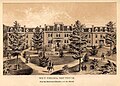 West Virginia Schools for the Deaf and Blind Administration Building in 1880

Article(s): Henry Bell Gilkeson, Howard Hille Johnson, John Collins Covell, West Virginia Schools for the Deaf and Blind
Request: The above image is a scan of a 1880 engraving of the West Virginia Schools for the Deaf and Blind, Would it be possible to "straighten" this image, sharpen its overall appearance, and make any other edits or fixes to improve overall aesthetics. Thank you in advance! -- Caponer ( talk) 01:53, 12 March 2013 (UTC)
Graphist opinion(s):
It's a low resolution image so the potential for improvement is limited. And it seems pretty straight to me (maybe not perfectly, but straight for all practical purposes.) As far as cleanup, the splotchy sky comes to mind, but maybe that's supposed to be clouds. I'm not feeling anything needs to be done here. – JBarta ( talk) 02:16, 12 March 2013 (UTC)
- JBarta, thanks for taking a look at it. I assumed as much but wanted to post it here just in case it was a fixer-upper! Thanks again! -- Caponer ( talk) 02:21, 12 March 2013 (UTC)
I also find it amusing that nowhere but the caption of the picture does one find "the Deaf and Dumb, and the Blind." God forbid we repeat such a thing or we'll blow up and be deposited straight into hell... – JBarta ( talk) 02:23, 12 March 2013 (UTC)
- I think that the caption is referring to
muteness, rather than
stupidity.
nagualdesign (
talk) 02:30, 12 March 2013 (UTC)
- Back in the day people thought that a deaf person was (sometimes? usually? always?) "dumb" too... hence the term "deaf and dumb". Of course we now know this is usually not true and the term is not used anymore. That said, in every reference to the hospital and this image, the word "dumb" is gone. Wiped away. Cleansed. Purged. I simply find that amusing. – JBarta ( talk) 03:17, 12 March 2013 (UTC)
- Maybe I'm misinformed and "deaf and dumb" was used to describe "deaf and mute". Either way.... –
JBarta (
talk) 03:31, 12 March 2013 (UTC)
- The
Deaf-mute article makes for interesting reading. ..I'll never forget a dinner lady we had at junior school who frequently asked, "Are you deaf, daft or dumb?", if you didn't speak up when spoken to. Even as a child I found that odd.
nagualdesign (
talk) 03:49, 12 March 2013 (UTC)
- Yes, "
dumb" is an archaic word for "mute" and it fell into disuse as describing someone with muteness in the 1870s and 1880s. Mute students attended the School for the Deaf at the institution, hence why it was stricken from the institution's title. The original institution name is not used in most articles for the sake of standardization and simplicity and for no other reason. --
Caponer (
talk) 12:35, 12 March 2013 (UTC)
- I'll bet if it was "the Deaf and Gifted, and the Blind" it wouldn't be so "standardized". I know, I'm just being argumentative. Pay me no mind. –
JBarta (
talk) 12:49, 12 March 2013 (UTC)
- It fell into disuse in the 19th century?! Wow, that puts my little backwater (Northern England) to shame! The word was still in fairly common use, or at least commonly understood, in the 1980s. And words like Dumbstruck are still widely understood everywhere, I thought. I'm not sure about Gifted, JB, but certainly words like Special fall in the firing line. I suppose any word that gets co-opted as a pejorative term stands a chance of being cast into the Dustbin of History. nagualdesign ( talk) 22:42, 12 March 2013 (UTC)
- I'll bet if it was "the Deaf and Gifted, and the Blind" it wouldn't be so "standardized". I know, I'm just being argumentative. Pay me no mind. –
JBarta (
talk) 12:49, 12 March 2013 (UTC)
- Yes, "
dumb" is an archaic word for "mute" and it fell into disuse as describing someone with muteness in the 1870s and 1880s. Mute students attended the School for the Deaf at the institution, hence why it was stricken from the institution's title. The original institution name is not used in most articles for the sake of standardization and simplicity and for no other reason. --
Caponer (
talk) 12:35, 12 March 2013 (UTC)
- The
Deaf-mute article makes for interesting reading. ..I'll never forget a dinner lady we had at junior school who frequently asked, "Are you deaf, daft or dumb?", if you didn't speak up when spoken to. Even as a child I found that odd.
nagualdesign (
talk) 03:49, 12 March 2013 (UTC)
-
 Camila O'Gorman

Article(s): Camila O'Gorman
Request: Please, remove the photographic case and add a translucid background in a new png file. -- Lecen ( talk) 04:33, 12 March 2013 (UTC) Lecen ( talk) 04:33, 12 March 2013 (UTC)
Graphist opinion(s):
![]() Request taken. (Although I'm not going to make the background transparent.)
nagualdesign (
talk) 05:07, 12 March 2013 (UTC)
Request taken. (Although I'm not going to make the background transparent.)
nagualdesign (
talk) 05:07, 12 March 2013 (UTC)
- Done I didn't bother making a derivative file as the original was rubbish anyway. Took a few liberties with the image corners too. Hope you like it.
nagualdesign (
talk) 06:05, 12 March 2013 (UTC)
- Did a couple more adjustments. Delete as applicable. Night night. nagualdesign ( talk) 06:33, 12 March 2013 (UTC)
-
 JS Akizuki
_-_starboard_view.jpg)
Article(s): http://commons.wikimedia.org/wiki/Category:JS_Akizuki_%28DD-115%29
Request: There are six images in this category that if bumped in brightness and hue, would become usable. This is the worst of them. Corella ( talk) 03:07, 17 March 2013 (UTC)
Graphist opinion(s): agma x4
-
Casey Bond at the ESPYs
Article(s): Casey Bond
Request: Can someone please rotate and crop this image so it's not on a weird diagonal? Much appreciated, – Muboshgu ( talk) 18:21, 17 March 2013 (UTC)
Graphist opinion(s):
![]() Done –
JBarta (
talk) 18:37, 17 March 2013 (UTC)
Done –
JBarta (
talk) 18:37, 17 March 2013 (UTC)

Article(s): James A. Farrell
Request: Crop edges & clean up. Plus it's a little bright, especially around his face. – JBarta ( talk) 22:25, 17 March 2013 (UTC)
Graphist opinion(s): crp; agma (Requesters: If you are planning to do an image yourself, then there is really no point in posting a request to fix it in here as well.
Centpacrr (
talk) 01:10, 19 March 2013 (UTC))
I posted it here because I thought someone might like to do it. You took it, but I thought your edit a poor job. I waited a little while but no one else did anything with it, so I did it myself and transferred it to Commons. Had you done a better job I wouldn't have felt the need to do it over. – JBarta ( talk) 01:52, 19 March 2013 (UTC)
- ... unless of course it was an "interim edit" or a "study"... all part of a grand work flow... then possibly I may have acted prematurely... – JBarta ( talk) 02:10, 19 March 2013 (UTC)
- Frankly, sir (or madame), that's really weak and rather transparent. I did exactly to this image what was asked, i.e. "Crop edges & clean up. Plus it's a little bright, especially around his face". If you didn't "like" it well I suppose that's fine, but I can really do without the standard gratuitous "your edit was a poor job" which (as usual) was offered without being specific what was "poor" about it. All I did was crop the image, heal a couple of very minor defects, and slightly darken the face which is what was requested, nothing else. (Actually I fully expected this is exactly what you were planning to do no matter what I did to the image, but I thought I would give you the benefit of assuming good faith and see if you would meet the test.)
- So as I say if you are going to post a request and then just do it yourself I really don't see the point you are trying to make other what I said right above. I'm sure that no matter what I did to the image (even if it was nothing) would have been declared "unsatisfactory" and "redone". In the future, therefore, I will ignore any future "requests" you post in here, leave them to "someone (who) might like to do it", and then let you redo their efforts as inferior without ever saying why. Centpacrr ( talk) 03:41, 19 March 2013 (UTC) (NOTE: I reserve the option in advance to make modifications to this comment if I feel it would be useful whether or not it is "responded to" in the interim although no such response is either necessary or expected.)
- I'll respond to this... as far as being a poor edit. First though, I've learned from long experience that any sort of criticism of your work goes over like a lead balloon. It's an exercise in pissing in the wind. Many many times I and others have tried to explain where your edits might be lacking and such efforts are met with large amounts of rambling nonsense with zero effort on your part to accept that you could have done better. After a while, one just sort of realizes the futility of trying to constructively converse with you and simply gives up. That said, my issues with your edit was leaving his nose darkened as if he were a longtime drunk, cropping excessively because you wished to avoid removing the markings, and even then failing to remove all the markings that were left. I also thought he could be a little darker. It seemed the better choice was to start from scratch rather than continue with your edit. – JBarta ( talk) 05:25, 19 March 2013 (UTC)
- I gather from both your overall actions here in general and your comments above, that you are of the belief that if any image request posted in here is not done exactly the way you personally and specifically approve of, that any such versions are to be considered to be "unacceptable" because by definition there is always one and only one correct method to do any project, and that you are apparently the exclusive judge as to what that is. As opposed to this narrow view, however, I believe that WP policy and guidelines accepts there are always a wide variety of acceptable ways to edit images as far as, for instance, how to adjust their gamma, cropping, sharpness and/or blurring, toning, hue, texture, framing, shading, and dozens of other elements.
- The purpose of this graphics project is, as I understand it, to provide a place for those WP editors and contributors who do not have the technical facility, ability, and/or requisite skill themselves to adjust images to make them more suitable for use on Wikipedia to request the assistance of other volunteer editors to help them do so. As elsewhere in WP, however, it is also my understanding that WP does not provide for any single self (or otherwise) designated "final and absolute arbiters" who pass on how each image request posted in here is to be done. Instead for every such request WP guidelines envision that there are multiple ways that it can be adjusted that would conform with both the project's broadly subjective standards as well as would meet the original posters' acceptance that his/her request has been "resolved" to their satisfaction as the one who requested the adjustment.
- That being said, as you were certainly capable of easily and quickly "fixing" the subject image exactly the way you wanted it to be, it wonders me why you didn't just do so instead of seeking to create yet another unnecessary artificial controversy because another editor might not do it exactly the way you knew how you wanted it done to begin with. I expect that you would agree (although maybe you don't) that each individual WP editor/contributor (yourself included) has his or her own preferred approaches and methods of how they edit image files as well as own views (or "taste") as to how they think this will produce the "best" finished product they can produce. I am happy to respect how each and every image editor (again including yourself) who contributes in here does so, but that does not mean that there is only one "right" way an image can be adjusted to the exclusion of all others. I certainly do not accept, however, any implied contention that WP policy and guidelines envisions that there is to be any self designated final arbiter who determines the only acceptable criteria for how any image is to be modified for use on WP. That would hardly represent the collaborative methodology to which WP aspires. Editing images in the "Graphics Lab" is not a "zero sum" process, and just because I or any other editor does it differently than how you would does not make my and/or any other editor's version(s) objectively (in your view) "wrong", "inferior", "unacceptable" or "poor" and only yours "right".
Centpacrr (
talk) 09:53, 19 March 2013 (UTC) (NOTE: I reserve the option in advance to make modifications to this comment if I feel it would be useful for clarity whether or not it has been "responded to" in the interim.)
- Wow Centpacrr, you spent over an hour titting about editing your comments above, nine and a half hours after you made your point! Do you suppose if you put as much effort into all your image edits as you do into prattling on you might not have half as many edits reverted? Just a thought.
nagualdesign (
talk) 21:03, 19 March 2013 (UTC)
- I first wrote the above very late at night when I was tired and upon rereading it much later after being rested I decided that there were some language that was awkward, unclear, or subject to potential misinterpretation and so corrected it. I do not consider discussing matters of principle to be "prattling", however, so if you (or anybody else) has something to contribute here why not address the actual subject and points I raised as opposed to how I might have said them? Centpacrr ( talk) 21:35, 19 March 2013 (UTC) (NOTE: I reserve the option in advance to make modifications to this comment if I feel it would be useful for clarity whether or not it has been "responded to" in the interim.)
- Wow Centpacrr, you spent over an hour titting about editing your comments above, nine and a half hours after you made your point! Do you suppose if you put as much effort into all your image edits as you do into prattling on you might not have half as many edits reverted? Just a thought.
-
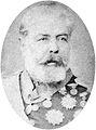 The Marquis of Erval

Article(s): Manuel Luís Osório, Marquis of Erval
Request: Hi, first, pleae upload over the present file another version with a white background. After that, create a new file in PNG format with translucid background. Regards, Lecen ( talk) 22:32, 14 March 2013 (UTC)
Graphist opinion(s):
Gave it a white background. I didn't make a PNG version because I don't wish to support you in littering articles with poorly rendered PNG images just so you can say the background is transparent. I suppose one day the wiki-software might do a better job resizing PNG images, but until that day, JPG is a better choice. Of course if it's a special situation where a transparent background is clearly advantageous, I understand. But from what I can see, you're simply using them in articles. – JBarta ( talk) 23:25, 14 March 2013 (UTC)
-
 John Grant.jpg
 -
 John Grant at Meltdown Festival.jpg
 -
 John Grant at Meltdown Festival (cropped).jpg


.jpg)
Article(s): John Grant (musician)
Request: Here's an interesting one, for anyone who's interested. How might this image be improved? (
![]() )
nagualdesign (
talk) 17:16, 17 March 2013 (UTC)
)
nagualdesign (
talk) 17:16, 17 March 2013 (UTC)
Graphist opinion(s):Created derivative (see above) for potential infobox use ( Centpacrr?)
It's too far gone to be improved. We should just make it comfortable. – JBarta ( talk) 17:42, 17 March 2013 (UTC)
Flickr has a bunch of usable (suitable for upload to Commons) images of this guy... nearly all of which are better than the purple mess above. – JBarta ( talk) 18:46, 17 March 2013 (UTC)
- I took your advice and uploaded (
a derivative of) an image I found on Flickr. Unfortunately I stupidly gave it the same filename as the original on en:wp so I've requested a move/rename. Please don't remove the (missing) image from above. When it shows up I'll mark this as resolved and pop the new image in the article infobox. Cheers. ..Oh, and if you wouldn't mind checking my work that'd be great. I know there are probably categories and such to fill out but it's not really my area of expertise. I made sure that the copyright stuff was filled out properly though. I think.
nagualdesign (
talk) 01:37, 18 March 2013 (UTC)
- Because the new image and old image are both named "John Grant.jpg" we have to wait until the Wikipedia version of John Grant.jpg is deleted (file was transferred to Commons under a different name). When that happens, John Grant.jpg will point to the new image on Commons and we can change the article accordingly. –
JBarta (
talk) 06:58, 18 March 2013 (UTC)
- Edited the gallery above. The first is "John Grant.jpg", and when the en:WP version is deleted, the
new version will show up above. The second and third image is the original and cropped purple version... now both residing on Commons. –
JBarta (
talk) 03:01, 19 March 2013 (UTC)
- Good one.
nagualdesign (
talk) 03:17, 19 March 2013 (UTC)
- Old John_Grant.jpg deleted, new one showing up. Article changed to new image. I think we're done here. –
JBarta (
talk) 15:43, 21 March 2013 (UTC)
- Job's a good un. nagualdesign ( talk) 23:33, 21 March 2013 (UTC)
- Old John_Grant.jpg deleted, new one showing up. Article changed to new image. I think we're done here. –
JBarta (
talk) 15:43, 21 March 2013 (UTC)
- Good one.
nagualdesign (
talk) 03:17, 19 March 2013 (UTC)
- Edited the gallery above. The first is "John Grant.jpg", and when the en:WP version is deleted, the
new version will show up above. The second and third image is the original and cropped purple version... now both residing on Commons. –
JBarta (
talk) 03:01, 19 March 2013 (UTC)
- Because the new image and old image are both named "John Grant.jpg" we have to wait until the Wikipedia version of John Grant.jpg is deleted (file was transferred to Commons under a different name). When that happens, John Grant.jpg will point to the new image on Commons and we can change the article accordingly. –
JBarta (
talk) 06:58, 18 March 2013 (UTC)
BTW, I appreciate the effort, Centpacrr. That's about what I'd have done with it. I'm guessing the original was that size at some point anyway. nagualdesign ( talk) 02:17, 18 March 2013 (UTC)
-

-

-
 For comparison


Article(s): Trade Dollar
Request: make a png transparent version, coins only, please straighten... Kintetsubuffalo ( talk) 13:59, 18 March 2013 (UTC)
Graphist opinion(s):
![]() Done –
JBarta (
talk) 02:39, 19 March 2013 (UTC)
Done –
JBarta (
talk) 02:39, 19 March 2013 (UTC)
- Done Oops, sorry JB. I decided not to do a transparent version and uploaded over the original. (It isn't showing up yet.) I fixed the spacing, put the coins on a white background and straightened the 'tails' side. I also added a drop shadow. Unorthodox, I know, but silver coins on a white background are easier to see with a drop shadow. I also did the Yen (from the same article) at the same time so that they match.
nagualdesign (
talk) 02:55, 19 March 2013 (UTC)
- Well, not being a fan of PNGs, I'll have to admit your edit of the JPG version looks great... dare I say the superior of the two ;-) –
JBarta (
talk) 03:06, 19 March 2013 (UTC)
- Now that I've redone it, remembering to crop the display case! And then redone it again, remembering to have antialiasing ticked on the marquee tool!! Ooops. nagualdesign ( talk) 03:19, 19 March 2013 (UTC)
- Well, not being a fan of PNGs, I'll have to admit your edit of the JPG version looks great... dare I say the superior of the two ;-) –
JBarta (
talk) 03:06, 19 March 2013 (UTC)
I notice that you've moved the British coins over to Commons but the edits I did were not carried. Should the latest be uploaded there or will it be copied automatically? nagualdesign ( talk) 03:55, 19 March 2013 (UTC)
- Scratch that. I just uploaded the latest to Commons rather than wait and wonder. I'm off to bed now. Night night. nagualdesign ( talk) 04:00, 19 March 2013 (UTC)
- Very cool, thanks all!-- Kintetsubuffalo ( talk) 13:10, 21 March 2013 (UTC)
 |
Article(s): 147 Squadron (Israel)
Request: Make background white. Brighten/contrast colors a little. – JBarta ( talk) 04:43, 21 March 2013 (UTC)
Graphist opinion(s): This image is of an almost certainly copyright protected logo and thus non-free. I have therefore uploaded a lo res gif of this logo ( File:The_Goring_Ram_Squadron.gif), properly licensed it including non-free rationale for its use on WP, and replaced the incorrectly licensed image in the infobox for the 147 Squadron (Israel) article and in the chart for this unit in the List of Israeli Air Force aircraft squadrons. The image "Goring Ram A-4 Hatzerim 201206.jpg" should probably now be nominated for deletion as both a copyvio and an "orphan" non-free file. Centpacrr ( talk) 06:05, 21 March 2013 (UTC)
- Fair enough, but three questions....
- 1) Why would it not instead be PD-IsraelGov?
- 2) Why did you make it so small given that a non-free image can be up to .1 megapixels (316x316)?
- 3) Is the drop shadow really necessary?
- – JBarta ( talk) 06:29, 21 March 2013 (UTC)
- The drop shadow is included in the original source image which I downloaded without altering its size or any other element from the website of
Israeli Air Force. I used as a template for this new file's page and licensing the page for the
"The Scorpion Squadron.gif" which also acquired that squadron's logo from the same IAF source.
Centpacrr (
talk) 06:45, 21 March 2013 (UTC)
- Ah, ok. Though I think a better image can be had from the one we have. That said, what are your thoughts on the most important point... that it may be
PD-IsraelGov? –
JBarta (
talk) 06:50, 21 March 2013 (UTC)
- The
License Agreement on the Israeli Air Force website (from which this image comes) states: "According to copyright laws, including the Israeli court as well as international treaties, the copyright of IAF publications, including all information published in this service (i.e., the web site) belong to the Department of Security and Israeli Defense Force. These copyrights also apply to text, images, illustrations, maps, sound samples, video or audio bits, graphics, "Flash" applets and software applications ("The protected material")." As the copyright notice specifically includes "images", "illustrations", and "graphics" that would indicate that this logo is under copyright and only eligible for use on WP as a non-free "fair use" illustration.
Centpacrr (
talk) 07:19, 21 March 2013 (UTC)
- Well, quite honestly, as you might have (should have) taken away from the
Keystone kerfuffle, it matters less what an entity says on their website and more what the copyright law says. I think the only legitimate issue here is whether the Israeli Air Force is part of the Israeli Government. I would say it is. What I'll do is change the license of the image to PD-IsraelGov and you are welcome to nominate it for deletion (regular deletion not speedy deletion as the deletion is contested) making your case as you wish. –
JBarta (
talk) 07:32, 21 March 2013 (UTC)
- You know I really wish that we could have one interaction in here where you don't end up going away mad. The IAF website clearly says that everything there (including the logo) is copyrighted, and all the other logos taken from that site that are used on WP respect that and are licensed as non-free fair use. I simply followed that precedent and licensed and used this logo the same way. This has nothing whatever to do with the Keystone Press Agency user agreement and copyright of their images so I have no idea why you are bringing that up except that the image in question you had uploaded was deleted as a copyvio.
- The logo now in use on the 147 Squadron (Israel) and List of Israeli Air Force aircraft squadrons pages conforms to WP policy and guidelines for non-free fair use. I really don't know what else it will take to please you, but if you want to go start another "kerfuffle" about your interpretation of international copyright law I guess that's your right. I tired to answer your questions respectfully and objectively, and provided you with links to where I found the image and the copyright notice ("All rights reserved to the state of Israel. Department of Security ©2003") provided by its rights holder. It seems to me that WP policy and guidelines require that such a published notice be accepted as valid and respected as binding and thus use the logo only as non-free fair use.
- The published notice that the IAF owns the rights to its squadron logos would thus seem to invalidate any use of PD-IsraelGov for
"Goring Ram A-4 Hatzerim 201206.jpg", but I do not intend to do anything further with regard to this file as it is now an orphan and no longer in use on any pages. As for
File:The_Goring_Ram_Squadron.gif, as you suggested I have also removed the drop shadow, recreated the black circle and orange disk background for clarity, and enlarged the image to 150x150px, a size which is more than adequate for the two uses to which it is being put on en:WP.
Centpacrr (
talk) 08:23, 21 March 2013 (UTC) (NOTE: I reserve the option in advance to make modifications to this comment if I feel it would be useful for clarity whether or not it has been "responded to" in the interim.)
- *I* go away mad? Now that's funny. Anyhow, I'm not mad, here we simply disagree. Whether this image is PD or not also affects many similar images. If you really think you have a case for deletion, nominate it and make your case. As I said, I think your case as you make it above is bunk and you'd be better off raising the IAF/Govt issue, but that's your choice. Personally I think you should raise it because as it stands now, half these type of images are licensed as non-free logos and the other half as free something else. Personally I think any Israeli govt logo arguably made before 1962 should be PD. It might be helpful to hash this out and settle it in a deletion request. – JBarta ( talk) 15:41, 21 March 2013 (UTC)
- For the moment, I've changed back the image in
147 Squadron (Israel) to the larger image. If a deletion request does find it a copyright violation, we can change it back to the non-free licensed image. I've left the one in
List of Israeli Air Force aircraft squadrons for now because it matches the other images in the list. If and when we get a nice copy from the one above, we'll swap it in. –
JBarta (
talk) 15:54, 21 March 2013 (UTC)
- Actually I've already made "my case" which is really just the copyright holder's case. The Israeli government has published a notice ("All rights reserved to the state of Israel. Department of Security ©2003") that this and other similar IAF logos are copyright protected as non-free, a position which the community has acknowledged and accepted by precedent over the years as shown by the way it has licensed and used them only under WP's "fair use" guidelines. You apparently reject the community's position "as bunk" and have unilaterally reverted my good faith efforts to conform the use of the logo to the long established and agreed upon WP policy and guidelines which I did by creating and substituting the properly licensed (non-free fair use) "The Goring Ram Squadron.gif" for "Goring Ram A-4 Hatzerim 201206.jpg" which you have now questionably relicensed after the fact as PD.
- Well, quite honestly, as you might have (should have) taken away from the
Keystone kerfuffle, it matters less what an entity says on their website and more what the copyright law says. I think the only legitimate issue here is whether the Israeli Air Force is part of the Israeli Government. I would say it is. What I'll do is change the license of the image to PD-IsraelGov and you are welcome to nominate it for deletion (regular deletion not speedy deletion as the deletion is contested) making your case as you wish. –
JBarta (
talk) 07:32, 21 March 2013 (UTC)
- The
License Agreement on the Israeli Air Force website (from which this image comes) states: "According to copyright laws, including the Israeli court as well as international treaties, the copyright of IAF publications, including all information published in this service (i.e., the web site) belong to the Department of Security and Israeli Defense Force. These copyrights also apply to text, images, illustrations, maps, sound samples, video or audio bits, graphics, "Flash" applets and software applications ("The protected material")." As the copyright notice specifically includes "images", "illustrations", and "graphics" that would indicate that this logo is under copyright and only eligible for use on WP as a non-free "fair use" illustration.
Centpacrr (
talk) 07:19, 21 March 2013 (UTC)
- Ah, ok. Though I think a better image can be had from the one we have. That said, what are your thoughts on the most important point... that it may be
PD-IsraelGov? –
JBarta (
talk) 06:50, 21 March 2013 (UTC)
- The drop shadow is included in the original source image which I downloaded without altering its size or any other element from the website of
Israeli Air Force. I used as a template for this new file's page and licensing the page for the
"The Scorpion Squadron.gif" which also acquired that squadron's logo from the same IAF source.
Centpacrr (
talk) 06:45, 21 March 2013 (UTC)
- That being said, I am not, quite frankly, really interested in starting another international copyright law "kerfuffle" over this which no matter how it is resolved will then presumably be held against me as has the Keystone Press Agency matter you raised again here in which a similar position on copyright law of yours did not prevail and the image you posted was deleted as copyvio. For that reason I'm just going to pass on doing anything further and leave the resolution of this issue up to you. (See also my comments in the James A. Farrell section above which remain unresponded to as an additional reason that I am passing on doing anything further on this issue.) The ball, therefore, is now completely in your court. Centpacrr ( talk) 19:55, 21 March 2013 (UTC) (NOTE: I reserve the option in advance to make modifications to this comment if I feel it would be useful for clarity whether or not it has been "responded to" in the interim.)
- I've posted a question over at Commons:Village_pump/Copyright attempting to get some further opinions on the copyright status of this and similar files. You (and anyone else) are welcome to add your input. – JBarta ( talk) 22:46, 21 March 2013 (UTC)
Israeli government copyright would not expire until 2028 or later under §42 of the Israeli Copyright Act of 2007
- All available evidence indicates that this particular logo was not "created before 1962" but instead no earlier than 1978 as it clearly depicts a swept wing A-4 Skyhawk, a type that this unit did not operate until it was reactivated at Hatzerim in August 1978 as "the IAF's eighth and last A-4 Skyhawk squadron." During Squadron 147's two previous brief active periods if flew the Boeing-Stearman Kaydet, a 1930's radial engine prop bi-wing trainer, in 1956, and the French built Fouga Magister, a straight wing V-tail jet trainer, during its brief six-day war activation in 1967. That being the case, under the provisions of §42 of the Israeli Copyright Act of 2007 the Israeli government's copyright protection of this design would not expire any earlier than 2028 and thus this file would not qualify to be licensed as PD-IsraelGov. In an abbundnace of caution, I have therefore restored File:The_Goring_Ram_Squadron.gif to the 147 Squadron (Israel) article. Centpacrr ( talk) 00:41, 22 March 2013 (UTC)
- Unless anyone has more to add, I'll consider this resolved per Commons:Village_pump/Copyright. – JBarta ( talk) 02:13, 22 March 2013 (UTC)

Article(s): Siege of Yorktown, Auguste Couder, etc, etc
Request: Anyone want to try and get rid of the flash glare on the right side of the image? – JBarta ( talk) 08:16, 22 March 2013 (UTC)
Graphist opinion(s):
(Request was done by Centpacrr) Not bad Centpacrr. Perfect. – JBarta ( talk) 17:25, 22 March 2013 (UTC)
- Nice work Centpacrr! I just tweaked it slightly to add back in the guy's belt on the right hand side. :) - Fallschirmjäger ✉ 13:23, 23 March 2013 (UTC)

Article(s): John Milton (Florida politician)
Request: Crop (rectangular), clean up. (slightly larger version available from source) – JBarta ( talk) 10:40, 23 March 2013 (UTC)
Graphist opinion(s):
(Request was done by Centpacrr) Looks good. I fiddled with it a little more. – JBarta ( talk) 17:54, 23 March 2013 (UTC)
-

-
Restoration by Jdcollins13 (marked for deletion)

Article(s): Michael Corcoran
Request: Clean up blemishes. (Please don't reduce the resolution, cut out or create a new background or edit excessively. Just apply some TLC and gently remove the blemishes.) – JBarta ( talk) 14:36, 25 March 2013 (UTC)
Graphist opinion(s):
Centpacrr took it, but quite honestly it could easily be better. I'll consider it still open if anyone else want's to give it a whirl, or if Centpacrr wants to clean it up more. – JBarta ( talk) 20:17, 25 March 2013 (UTC)
- Again I did exactly what was requested above but apparently there is no way that I can ever please this requester (although again no specifics were provided as to what he/she found "could easily be better") so I have withdrawn my restoration and will not waste my time further attempting to meet the mysterious, arbitrary and unspecified standards of this user. (See my unresponded to comments and questions made to him/her here with regard to this same issue in an earlier apparently specious "request".) Now of course I fully expect he/she will use my comment as an excuse to again accuse me of being "overly sensitive to criticism" and just "going away mad" but that is not the case. Again I restored this image in "good faith" exactly as was requested and am again left just truly puzzled by what the issue is here.
- As this is hardly the first time this has happened to me and others with this user, in order to avoid wasting my time again on any other of his/her "requests" in the future, I will simply pass on working on any of his/her postings in either this project or the same one on Commons and instead "leave them to others" to attempt to read his/her mind if they care to take the chance. Centpacrr ( talk) 21:12, 25 March 2013 (UTC) (NOTE: I reserve the option in advance to make modifications to this comment if I feel it would be useful for clarity whether or not it has been "responded to" in the interim.)
Took a crack at it. Please let me know what you think. — Jdcollins13 ( talk) 18:32, 26 March 2013 (UTC)
- Now that is fine work. I would suggest you upload that over the original, then request deletion of your upload as a
duplicate. (In this case I don't think there is need for a derivative and changing all the links.) –
JBarta (
talk) 18:55, 26 March 2013 (UTC)
- Much appreciated, will do. —
Jdcollins13 (
talk) 19:10, 26 March 2013 (UTC) Done
- Much appreciated, will do. —
Jdcollins13 (
talk) 19:10, 26 March 2013 (UTC)
-
 Original
 -
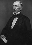 Jdcollins13 edit
 -
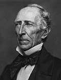 Crop of Jdcollins13 edit

.jpg)
.jpg)
.jpg)
.jpg)
.jpg)
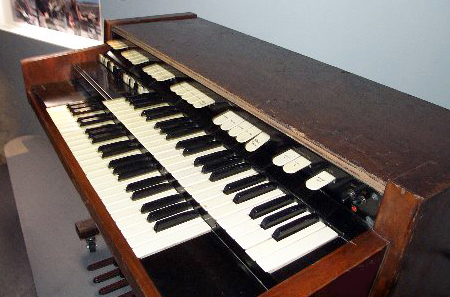
Article(s): John Tyler
Request: As this is the main image used in the John Tyler articles, I think having a clean version would be nice. If someone wants to clean it up and upload as a derivative. Also maybe crop a headshot like this after it's cleaned up and upload that as a derivative as well. The original appears to be from PictureHistory.com if you'd rather start with that. – JBarta ( talk) 04:38, 26 March 2013 (UTC)
Graphist opinion(s):
![]() Request taken. please let me know if theses are satisfactory. —
Jdcollins13 (
talk) 15:57, 27 March 2013 (UTC)
Request taken. please let me know if theses are satisfactory. —
Jdcollins13 (
talk) 15:57, 27 March 2013 (UTC)
Outstanding. I swapped in your restoration in John Tyler and may do the same for a few others. – JBarta ( talk) 20:12, 27 March 2013 (UTC)
- Great. I'm glad to be of service. — Jdcollins13 ( talk) 12:03, 28 March 2013 (UTC)
Stale Information
-
Alexander W. Monroe
Article(s): Alexander W. Monroe and The Virginia Argus and Hampshire Advertiser
Request: The above image was taken in 1875 of Alexander W. Monroe and was retrieved from the West Virginia Division of History and Culture website. If there are any techniques you amazing graphists could utilize to make this image more sharp or clear, it wold be greatly appreciated as always! -- Caponer ( talk) 18:32, 10 February 2013 (UTC)
Graphist opinion(s):Interim restoration (Not marked as either "Done" or "Resolved" as it is subject to being deleted and overwritten by another user as inadequate.)
Centpacrr (
talk) 20:09, 10 February 2013 (UTC) superseded 2/20/13 additional restoration superseded 2/23/2013 (remains Unresolved)
![]() Done
nagualdesign (
talk) 01:17, 20 February 2013 (UTC)
Done
nagualdesign (
talk) 01:17, 20 February 2013 (UTC)
*Long sigh...* Centpacrr, I seriously think that you need to check your monitor profile. In this image (and not for the first time) I can clearly see every brushstroke that you've made. The adjustment isn't subtle and it's quite hard edged. Moreover, that kind of heavy lightening of the shadows seems entirely unnecessary to me as I can clearly make out every detail in the blacks on my screen. Try this. (The first 3 squares all look black on my screen.) I'm loathed to revert your edit as you'd previously laid the groundwork for a flounce in your 'interim' edit 2 weeks ago with the smallprint above, and I wouldn't want to be seen as trying to WP:OWN my edit. nagualdesign ( talk) 02:19, 23 February 2013 (UTC)
- For the benefit of the discussion please note that Centpacrr has now reverted this image back to square one with the summary, "Actually the original appears better than any later version". I'm interested to know by what rationale you deem the original to be better, Centpacrr? Because the original is very dark, isn't it? And your edits were quite a lot lighter. (Mine was somewhere in between.) So does the image need lightening or not? I would certainly think so. RSVP. nagualdesign ( talk) 02:54, 23 February 2013 (UTC)
I reverted to the last by Nagualdesign. – JBarta ( talk) 08:05, 23 February 2013 (UTC)
Article(s): Адольф Кун
Request: Anyone care to take a shot at improving this? – JBarta ( talk) 19:28, 12 February 2013 (UTC)
Graphist opinion(s): ![]() Done How's that?
nagualdesign (
talk) 01:58, 20 February 2013 (UTC)
Done How's that?
nagualdesign (
talk) 01:58, 20 February 2013 (UTC)
- Well it's smoother... and darker. Is it an improvement? A little maybe. Could stand to be a little less dark in areas. –
JBarta (
talk) 02:09, 20 February 2013 (UTC)
- When I reduced the high-frequency noise the picture looked a little flat, so I tried to up the contrast as though it were the original minus the white 'snow'. I was concentrating more on keeping what little detail remained in his black (?) suit, but maybe I took it too far. I'll try lightening it and reduce the filesize. nagualdesign ( talk) 02:28, 20 February 2013 (UTC)
- Done ...Better? I've put a little texture back too. That's about my limit really.
nagualdesign (
talk) 02:45, 20 February 2013 (UTC)
- That last is better. Good job. –
JBarta (
talk) 03:35, 20 February 2013 (UTC)
- Centpacrr, to be honest, I'm really not liking your edit. The background is too smooth... doesn't match the guy. Looks like a cutout. Your background efforts bled onto the shoulders as well. I know it's a bad image to start with, but I think the smooth background isn't the way to go. Anyhow, I uploaded another attempt building on Nagualdesign's last. I darkened bits of his beard and mustache and manually killed some spots thoughout. Also a little lighter. – JBarta ( talk) 08:41, 20 February 2013 (UTC)
- That's a little bit better. I see I'd left a smudge on his beard. Oops! What about those 2 vertical scratches over his jacket? I'm pretty sure they're not supposed to be there but wasn't sure whether to remove them or not.
nagualdesign (
talk) 18:41, 20 February 2013 (UTC)
- I sort of though those vertical "scratches" were part of the coat or maybe lines of his shirt pushing through. Maybe not. I don't know. –
JBarta (
talk) 20:19, 20 February 2013 (UTC)
- Yes, the scratches make it look as if he's wearing an open jacket over a waistcoat (over shirt and tie), but if you look closely you can see that the shadows underneath his lapels (do waistcoats have lapels?) extend through the scratches. There's no over-under going on.
nagualdesign (
talk) 00:10, 21 February 2013 (UTC)
- Smoothed out the scratches and a few more spots. –
JBarta (
talk) 01:34, 21 February 2013 (UTC)
- Sorry JB, but I'm not keen on your last edit at all. Maybe his beard looks better but you've removed his lapels altogether!
nagualdesign (
talk) 05:56, 21 February 2013 (UTC)
- Redone, but a little more gentle on the jacket. –
JBarta (
talk) 08:17, 21 February 2013 (UTC)
- Much better. Now the V-shapes of the edges of his lapels are visible. The parallel lines were distracting. Although you've let the filesize run away a little, but that hardly matters.
nagualdesign (
talk) 00:16, 22 February 2013 (UTC)
- If it hardly matters, why did you bring it up?
–
JBarta (
talk) 01:17, 22 February 2013 (UTC)
- Because it does matter a little bit. ;-) nagualdesign ( talk) 02:30, 22 February 2013 (UTC)
- If it hardly matters, why did you bring it up?
- Much better. Now the V-shapes of the edges of his lapels are visible. The parallel lines were distracting. Although you've let the filesize run away a little, but that hardly matters.
nagualdesign (
talk) 00:16, 22 February 2013 (UTC)
- Redone, but a little more gentle on the jacket. –
JBarta (
talk) 08:17, 21 February 2013 (UTC)
- Sorry JB, but I'm not keen on your last edit at all. Maybe his beard looks better but you've removed his lapels altogether!
nagualdesign (
talk) 05:56, 21 February 2013 (UTC)
- Smoothed out the scratches and a few more spots. –
JBarta (
talk) 01:34, 21 February 2013 (UTC)
- Yes, the scratches make it look as if he's wearing an open jacket over a waistcoat (over shirt and tie), but if you look closely you can see that the shadows underneath his lapels (do waistcoats have lapels?) extend through the scratches. There's no over-under going on.
nagualdesign (
talk) 00:10, 21 February 2013 (UTC)
- I sort of though those vertical "scratches" were part of the coat or maybe lines of his shirt pushing through. Maybe not. I don't know. –
JBarta (
talk) 20:19, 20 February 2013 (UTC)
- That last is better. Good job. –
JBarta (
talk) 03:35, 20 February 2013 (UTC)
Article(s): Nordicism
Request: Three things-1) fix orangy tinting. 2) remove three-sided border since 4th is missing. 3) is this one eligible for copytoCommons? Looks like it may be. Kintetsubuffalo ( talk) 08:26, 25 February 2013 (UTC)
Graphist opinion(s):
Image will remain under copyright 70 years after the death of Ewald Banse. He died in 1953 so it's non-free until 2024. It can however be used on individual wikis with certain limitations. To answer your question specifically, no it cannot be coped to Commons. Further, unless it's used within WP non-free content rules, it will be deleted from here as well. I might add that the only legitimate use of the map here on en:WP is an article about the map specifically. None of the articles it's currently used in satisfies that rule. I'll add even further that a user-created map somewhat based on this map (and even others) (as long as it's not a direct copy) could be freely licensed and uploaded to Commons. If it were done in the SVG format it could also be customised to different languages. So all is not lost... you just cannot use that image. – JBarta ( talk) 15:52, 25 February 2013 (UTC)
Resolved Information
For use on Cysts of the jaws, and possibly also odontogenic cyst.
Lesions on X-rays traditionally marked with a contrasting arrow (solid black or white, I feel white better here). The cyst is the black area surrounding the tooth in the bottom left of the image - the one which is tilting off to the left and the cyst is immediately to the left of this tooth. Please mark the edge of black area and not the tooth, maybe two arrows are better to show the outline...Thank you! Lesion ( talk) 18:36, 27 February 2013 (UTC)
![]() Done –
JBarta (
talk) 18:47, 27 February 2013 (UTC)
Done –
JBarta (
talk) 18:47, 27 February 2013 (UTC)
-
Ken Griffey, Jr.
-
Mike Harkey
-
Jack McDowell
-
Mike Remlinger
-
Article(s): 1987 Major League Baseball Draft
Request: Can someone create a compilation of the four images for the infobox in 1987 Major League Baseball Draft? The order would be: top left: Griffey, Jr. Top right: Harkey. Bottom left: McDowell. Bottom right: Remlinger. Thank you. Albacore ( talk) 14:42, 24 February 2013 (UTC)
Graphist opinion(s):
![]() Request taken by
Centpacrr (
talk).
Request taken by
Centpacrr (
talk).
![]() Done –
JBarta (
talk) 15:34, 24 February 2013 (UTC)
Done –
JBarta (
talk) 15:34, 24 February 2013 (UTC)
NOTE: When a request is marked "Request Taken" that means that somebody is already working on it. Centpacrr ( talk) 15:43, 24 February 2013 (UTC)
- I find that a bit questionable as well, doing a task marked "request taken" by another editor. Albacore ( talk) 15:44, 24 February 2013 (UTC)
Article(s): Boeotia
Request: flatten... Kintetsubuffalo ( talk) 14:22, 27 February 2013 (UTC)
Graphist opinion(s):![]() Done
Done
- Thank you!-- Kintetsubuffalo ( talk) 10:55, 28 February 2013 (UTC)
Article(s): Heidi Brühl
Request: Remove watermark. Please remove watermark from unaltered photo first so we have a clean copy. Then make any other changes you see fit. – JBarta ( talk) 11:17, 27 February 2013 (UTC)
Copyright question
|
|---|
|
The following discussion is closed. Please do not modify it. Subsequent comments should be made on the appropriate discussion page. No further edits should be made to this discussion. Graphist opinion(s):This appears to be a copyrighted image under the terms and conditions of the Keystone Press Agency, Ltd and also no proof has been provided that this image was never published anywhere without a claim of copyright. Centpacrr ( talk) 13:04, 27 February 2013 (UTC)
This discussion moved to image talk page. Continue the copyright question there. – JBarta ( talk) 17:08, 27 February 2013 (UTC) The discussion above is closed. Please do not modify it. Subsequent comments should be made on the appropriate discussion page. No further edits should be made to this discussion.
|
For now this request is on hold until a DR plays out. I believe at the moment editing the image or image description page has been blocked. – JBarta ( talk) 21:15, 27 February 2013 (UTC)
- Update... the image will almost certainly be deleted from Commons due to being unfree in the UK where it was taken. I misunderstood Commons licensing policy in that even if we accept that the image is free in the US, it must also be free in the source country (UK) which it is not. The UK does not recognise the U.S. copyright idea of "published between 1923 and 1977 without a copyright notice". I've since found another non-free image to use as fair use in the article. – JBarta ( talk) 16:50, 2 March 2013 (UTC)
- For reasons stated in the Commons DR for this image, there is also no evidence to support that it is "free" in the US either, nor, for that matter, that it was ever published in the US under any circumstances at all. Centpacrr ( talk) 17:23, 2 March 2013 (UTC)
- The acknowledged copyright holder of the image is clearly the Keystone Press Agency as indicated by the backstamps contemporaneously applied to the photographic print. Keystone, however, does not "publish" images but instead licenses them for publication by its clients with limitations for a fee. Entities that license an image from Keystone for publication do so on a "ONE TIME ONLY" basis under Keystone's stated contractual terms and conditions that provide that such licensees also may not do anything to "permit the unauthorized republication, transfer, or any other use, private or commercial, of the image." Keystone thus makes it very clear that it retains the exclusive copyright to its images. The failure (if any) by a limited licensee to meet the terms of its contract with the copyright holder by publishing the image without a cutline or other copyright notice thus does not mean that such a violation would cause Keystone to involuntarily waive and/or lose its copyright of the image because of the negligence of the licensee.
- That being said, there is nonetheless no actual evidence (or even an affirmative reason to believe) that this particular image of a German pop singer arriving at LHR in London, England, in 1969 to promote a record of her's being released in the UK two days later has ever published in the United States in any form -- let alone "between 1923 and 1977 without a copyright notice" -- but whether or not it was is really irrelevant as to Keystone's retaining the ownership of (and ability to enforce) its copyright. The unsourced and uncorroborated speculation as to such alleged "publication" made in this case is just not evidence of anything.
- To posit, therefore, that any time the copyright of an image is violated by a third party that is not the copyright holder such as "publishing without a copyright notice" permanently releases the image to the Public Domain and voids the owner's copyright claims just defies both logic and all tenants of copyright protection. (See 17 U.S.C. § 201(e)) The use on Wikipedia of this or any other similarly copyright protected image on that basis suggested by the uploader it is PD would be and is disallowed as a "copyvio" prohibited by WP Policy, copyright law in the US, UK, and elsewhere, and the Berne Convention. The uploader of the image here I guess is free to disagree with that, but that does not make him correct. Centpacrr ( talk) 19:18, 2 March 2013 (UTC)
I've started an RFC to discuss a couple of the differences of opinion expressed in the discussion above and the DR. Comments are welcome. – JBarta ( talk) 22:36, 2 March 2013 (UTC)
- The difference between the "Brühl" image that led to the DR discussion here as compared to those in the gallery of "examples" posted in the DR is that the those four are "publicity" photos distributed for free and in very large numbers by the organization that produced them seeking that they be published to promote the individuals or shows depicted in them. Unlike those widely distributed free publicity photos, as a news agency Keystone would make only enough prints for its paid media subscribers (usually 25 to 50), retain the copyright, did not distribute its images for free or to promote itself, and did not release them to the Public Domain. An example of a Keystone photograph with its full copyright and image reproduction limitation and terms notice backstamped on it by the company's Paris bureau can be viewed here. Centpacrr ( talk) 00:41, 3 March 2013 (UTC)
Article(s): Clovelly
Request: The lighting is extremely harsh in this image. Is it possible to reduce the contrast and let the actually colors of the scene show through better? Currently the image looks almost like a black and white shot. In reality Clovelly is a very pretty place, but here it looks dark, bleak and foreboding. Thanks for anything you can do to improve this image. Invertzoo ( talk) 14:09, 28 February 2013 (UTC)
Graphist opinion(s):![]() Done
Done
- Wow, that's a rather garish edit, Centpacrr! I've never seen trees that actually look that green. Have you? Letting the colours of the scene 'show through better' does not imply whacking the saturation up to the max. And even if the requester had asked for the saturation to be upped to ludicrous proportions it wouldn't have made it the right thing to do. Perhaps the vibrance (as Photoshop calls it) could be pushed up while keeping the saturation (of already saturated areas) in check? Just a thought. ..In fact I may just have a play with it myself. Please don't be offended if I upload my efforts. And as JB said, check your monitor calibration for Christ's sake!
nagualdesign (
talk) 17:33, 28 February 2013 (UTC)
- Nagualdesign, I think your least edit is a little too saturated, though within reason. It just doesn't look entirely natural. (Centpacrr's was WAY out there, but there will be no convincing him of that.) –
JBarta (
talk) 19:02, 28 February 2013 (UTC)
- I agree that mine was a wee bit too saturated. I think I was succumbing to peer pressure! :-D nagualdesign ( talk) 23:11, 28 February 2013 (UTC)
- Nagualdesign, I think your least edit is a little too saturated, though within reason. It just doesn't look entirely natural. (Centpacrr's was WAY out there, but there will be no convincing him of that.) –
JBarta (
talk) 19:02, 28 February 2013 (UTC)
@Invertzoo, please compare the last 3 edits ( 1 2 3) and let us know what you think. Regards, nagualdesign ( talk) 18:21, 28 February 2013 (UTC)
Well, 3 looks pretty good to me, but I am not an expert. Maybe it is a little tiny bit too color saturated still? Could the image be made a smidgen less color saturated but overall a tiny bit lighter and a tiny bit less contrasty? Invertzoo ( talk) 22:33, 28 February 2013 (UTC)
- You mean like #1? ;-) – JBarta ( talk) 22:42, 28 February 2013 (UTC)
- Uploaded another edit.. this one a smidgen brighter with a little more color. – JBarta ( talk) 23:02, 28 February 2013 (UTC)
- The contrast on my edit was intentional as that's kinda what you get on a sunny day. Like JBarta says, his edit (#1) would seem to fit the bill. Perhaps just a touch of warm photo filter would help? I'll leave it to him to do the final edit/revert. Thanks for the feedback. Regards,
nagualdesign (
talk) 23:11, 28 February 2013 (UTC)
- Spotted a bit of a mess in the sky on your last edit, JB, so I replaced the sky with that from your previous upload. Looks okay? nagualdesign ( talk) 23:34, 28 February 2013 (UTC)
- Jeez guys, please don't overdo the editing on original files? (See commons:Commons:Overwriting existing files) If its more than a minor tweak it should be on a new file; certainly ramping up the colour to high (and unnatural) levels is a major change.
- I wonder if it was worth all the effort in any case: The photo has poor light, hence the original complaint. There are similar images on Commons with much better light
File:Clovelly - Harbour02.jpg, might have just been easier to change the file as opposed to reaching for photoshop to salvage that one?--
Nilf
anion (
talk) 23:45, 28 February 2013 (UTC)
- The downside to creating new files is that you have files scattered all over. Not good. For minor edits (and this was a minor edit) overwriting is usually preferred. And yes, your alternative photo is a good suggestion. Was it worth the effort? Is anything worth the effort around here? Sure, why not. –
JBarta (
talk) 00:01, 1 March 2013 (UTC)
- Yes, but I'd rather have multiple files than edit wars. If someone wants a version with ridiculously high saturation for instance - why not? It wouldn't be much use for an article, but may still be useful. But when 10 new versions of a file are uploaded, with a bit of revert warring, something is wrong.--
Nilf
anion (
talk) 00:11, 1 March 2013 (UTC)
- Well, for the most part it's not revert warring... it's more like collaborative fine tuning. (Centpacrr on the other hand wouldn't agree. He does get reverted a lot and doesn't take too kindly to it. Though you can see by his edit why this happens.) In the end the result is usually the best possible improvement with input from multiple editors. – JBarta ( talk) 00:19, 1 March 2013 (UTC)
- I'd rather have neither multiple files nor edit wars. In answer to your question, the reason not to have a separate upload with ridiculously high saturation is because it's ridiculous. And useless. Oftentimes the intermediate edits are deleted afterwards so all's well again. Like JB says, it's a collaborative effort, just as with articles.
nagualdesign (
talk) 00:55, 1 March 2013 (UTC)
- Actually, intermediate edits are NOT generally deleted. Certainly not on Commons unless the file itself is deleted. Wikipedia fair-use files however may have all but the latest version deleted. These fair-use files are a small minority and very few pass through the Graphics Lab. – JBarta ( talk) 01:39, 1 March 2013 (UTC)
- Yes, but I'd rather have multiple files than edit wars. If someone wants a version with ridiculously high saturation for instance - why not? It wouldn't be much use for an article, but may still be useful. But when 10 new versions of a file are uploaded, with a bit of revert warring, something is wrong.--
Nilf
anion (
talk) 00:11, 1 March 2013 (UTC)
- The downside to creating new files is that you have files scattered all over. Not good. For minor edits (and this was a minor edit) overwriting is usually preferred. And yes, your alternative photo is a good suggestion. Was it worth the effort? Is anything worth the effort around here? Sure, why not. –
JBarta (
talk) 00:01, 1 March 2013 (UTC)
Sorry to have caused a fuss over one not very good image! Certainly it is now a lot better than it was, and the framing of the scene is good because it shows virtually the whole of the village as it fronts on the sea. However, the other Clovelly image that Nilfanion found is far better lit, so maybe I should use that... or both. Sorry again and thanks again everyone! Invertzoo ( talk) 00:05, 1 March 2013 (UTC)
- Invertzoo, you might want to have a quick scan through commons:Category:Clovelly and its commons:Category:Clovelly harbour. I'd suggest against using both files mentioned here, as they are very similar and having both doesn't add much.-- Nilf anion ( talk) 00:11, 1 March 2013 (UTC)
Thanks so much, it turns out there are some nice images of all various kinds that could be used in the article. Invertzoo ( talk) 02:02, 1 March 2013 (UTC)
Article(s): Joe DeRosa (referee)
Request: Remove bit of black shirt from other person at lower right. – JBarta ( talk) 04:15, 5 March 2013 (UTC)
Graphist opinion(s):
- I gave it a quick try. Better than before, but .. a quick patch. His face color looks too pale, but a proper photo would be needed for tweaking that. Materialscientist ( talk) 05:06, 5 March 2013 (UTC)
-
Dred Scott
Article(s): Dred Scott
Request: Remove watermark. Barnstar for anyone who restores it too. — Crisco 1492 ( talk) 02:58, 4 March 2013 (UTC)
Graphist opinion(s):
- Done
Materialscientist (
talk) 00:18, 5 March 2013 (UTC)
- Awesome, thanks all. — Crisco 1492 ( talk) 08:05, 5 March 2013 (UTC)
Article(s): David Price (boxer)
Request: In my opinion, the photo's quality is quite poor at the moment. It is difficult to make out Price's face, for instance. I would request that you make it less dark and less grainy. It Is Me Here t / c 13:23, 13 February 2013 (UTC)
Graphist opinion(s):
That is one awful picture. Lightened and color adjusted it to some semblance of normal. The graininess is here to stay unless you want to blur it (which is not an improvement IMO). Anyone else is of course welcome to give it a shot. – JBarta ( talk) 17:44, 13 February 2013 (UTC)
- Might I suggest cropping? The brighter areas above and to the left of the subject's head are distracting.
Andy Mabbett (Pigsonthewing);
Talk to Andy;
Andy's edits 11:44, 19 February 2013 (UTC)
- Good suggestion. –
JBarta (
talk) 12:21, 19 February 2013 (UTC)
- Much better!
Andy Mabbett (Pigsonthewing);
Talk to Andy;
Andy's edits 18:16, 19 February 2013 (UTC)
- It's never going to be perfect however I have tweaked it a little further to reduce the colour noise, think this is about as good as it is going to get! Kind regards,
Fallschirmjäger
✉ 22:01, 2 March 2013 (UTC)
- Nice. Considering how bad it was when first uploaded I think there's been a marked improvement. A well polished turd as Nagualdesign might say. –
JBarta (
talk) 22:13, 3 March 2013 (UTC)
- Yep.
nagualdesign (
talk) 22:43, 3 March 2013 (UTC)
- Yep.
- Nice. Considering how bad it was when first uploaded I think there's been a marked improvement. A well polished turd as Nagualdesign might say. –
JBarta (
talk) 22:13, 3 March 2013 (UTC)
- It's never going to be perfect however I have tweaked it a little further to reduce the colour noise, think this is about as good as it is going to get! Kind regards,
Fallschirmjäger
✉ 22:01, 2 March 2013 (UTC)
- Much better!
Andy Mabbett (Pigsonthewing);
Talk to Andy;
Andy's edits 18:16, 19 February 2013 (UTC)
- Good suggestion. –
JBarta (
talk) 12:21, 19 February 2013 (UTC)
-
Interior of St Stephen's Cathedral in Vienna
Article(s): Peter Planyavsky
Request: The camera must not have been horizontal. Can we get a wee tweek to straighten out the image? Plus any clean-up you might find to do at your discretion. Thank you! Dianna ( talk) 01:11, 6 March 2013 (UTC)
Graphist opinion(s):
![]() Tweeked –
JBarta (
talk) 01:24, 6 March 2013 (UTC)
Tweeked –
JBarta (
talk) 01:24, 6 March 2013 (UTC)
- Thank you! That is very nice. --
Dianna (
talk) 01:51, 6 March 2013 (UTC)
- I did some more work to reduce noise, increase dynamic range, improve colour and sharpen details. Let me know if it's OTT. I realize that some of the people look a little puce but I was trying to stick to global changes and concentrated more on the building. nagualdesign ( talk) 03:55, 6 March 2013 (UTC)
-
Linsly Institute Building and First West Virginia State Capitol Building
Article(s): Howard Hille Johnson, History of West Virginia, Linsly School
Request: This black and white photograph of the Linsly Institute was created and published before 1923, thus releasing it into the public domain. It was retrieved from the West Virginia Division of Culture and History website. The request is to remove the "West Virginia State Archives" tag placed on the image's upper lefthand corner. Any other techniques that can be utilized to improve the image's clarity and overall visual quality would be nice, too. Thanks again! -- Caponer ( talk) 17:29, 6 March 2013 (UTC)
Graphist opinion(s):
![]() Done –
JBarta (
talk) 18:59, 6 March 2013 (UTC)
Done –
JBarta (
talk) 18:59, 6 March 2013 (UTC)
- Thank you, as always, for your incredible work! Your contributions to these images are greatly appreciated! -- Caponer ( talk) 23:24, 6 March 2013 (UTC)
Article(s): John Hubler Stover
Request: Clean up. (Don't reduce in size, don't cut out the guy or replace the background... just lovingly clean up the blemishes) – JBarta ( talk) 17:33, 7 March 2013 (UTC)
Graphist opinion(s): ![]() Done
nagualdesign (
talk) 18:44, 7 March 2013 (UTC)
Done
nagualdesign (
talk) 18:44, 7 March 2013 (UTC)
Perfect. – JBarta ( talk) 00:15, 8 March 2013 (UTC)
- Oooh.. High praise indeed! Though I tend to agree.
nagualdesign (
talk) 00:39, 9 March 2013 (UTC)
JB, I think you may have inadvertantly removed a mole/freckle on his cheek. nagualdesign ( talk) 02:03, 9 March 2013 (UTC)
- That wasn't inadvertant. I thought about it before removing it and figured it was either a blemish on the photo and I didn't mind removing it, or it was a blemish on his face and he wouldn't mind removing it. I leaned toward blemish on the photo and removed it. Either way it stuck out like a sore thumb and I figured only the most diehard purist would leave it. I'm a purist... but not that much so... –
JBarta (
talk) 02:28, 9 March 2013 (UTC)
- The original tif image at the LOC contains two images. The blemish is on one, but not the other. So, the blemish is on the photo rather than on the face. –
JBarta (
talk) 02:37, 9 March 2013 (UTC)
- Oh good. I once inadvertantly removed a prominent mole. She was a paying client and she wasn't amused. Think she took it as a slight. Ooops! nagualdesign ( talk) 02:50, 9 March 2013 (UTC)
- The original tif image at the LOC contains two images. The blemish is on one, but not the other. So, the blemish is on the photo rather than on the face. –
JBarta (
talk) 02:37, 9 March 2013 (UTC)
Article(s): Harold Wilson
Request: Please remove all of the white marks and blemishes and sharpen/clear up the image. Thanks -- Hazhk Talk to me 19:03, 6 March 2013 (UTC)
Graphist opinion(s): Image has been "flyspecked" as requested. — Preceding unsigned comment added by Centpacrr ( talk • contribs) 22:08, 6 March 2013 (UTC)
Article(s): Susanna Kallur
Request: I cropped and color adjusted this photo, but I'm not entirely happy with the result. If anyone else wants to take a whack at it... – JBarta ( talk) 22:33, 7 March 2013 (UTC)
Graphist opinion(s): ![]() Done I did a really straightforward edit that effectively colour adjusted the photo with a single click! (See image description) I chose the white area right next to the number 2 for the sample.
nagualdesign (
talk) 00:45, 9 March 2013 (UTC)
Done I did a really straightforward edit that effectively colour adjusted the photo with a single click! (See image description) I chose the white area right next to the number 2 for the sample.
nagualdesign (
talk) 00:45, 9 March 2013 (UTC)
- Nagualdesign, she still has a bit of that Oompa-Loompa orange glow (except for her palm)... or am I seeing things? Maybe that's just how her skin looks? Maybe that's as good as it's going to get? –
JBarta (
talk) 00:46, 9 March 2013 (UTC)
- I think that probably came out of a
bottle. I think if the whites are white we have to accept that that's a fairly accurate representation of her skin colour (and that something to her right is reflecting red light onto her). There is a little latitude; the white of the signage in the background is now cyan (4~5% saturated). However, if we adjust for that she gets more orangy. I suppose you could make local adjustments, but then you're moving into artistic territory.
nagualdesign (
talk) 01:04, 9 March 2013 (UTC)
- I tried dropping the saturation but it strongly affected the colours of the signage, the hi-viz jacket and the blue ribbon, so I took the areas most affected as a mask, inverted it, then drastically reduced the vibrance of the image using the mask, increased the saturation slightly to preserve the original saturation range, and increased the overall contrast to avoid flattening. So the adjustment is local but the mask is created naturally, rather than just painting her skin. Looks better, eh? nagualdesign ( talk) 01:31, 9 March 2013 (UTC)
- [In English] Basically, this time I didn't affect the hue at all, I just reduced the saturation. It's remarkable how much that affected the overall skin colour really. nagualdesign ( talk) 01:42, 9 March 2013 (UTC)
- I think that probably came out of a
bottle. I think if the whites are white we have to accept that that's a fairly accurate representation of her skin colour (and that something to her right is reflecting red light onto her). There is a little latitude; the white of the signage in the background is now cyan (4~5% saturated). However, if we adjust for that she gets more orangy. I suppose you could make local adjustments, but then you're moving into artistic territory.
nagualdesign (
talk) 01:04, 9 March 2013 (UTC)
-
The PLA attacks Jinzhou, Manchuria in 1948 Done
-
The Battle of Solferino Done
Article(s): Battle of Jinzhou, Battle of Solferino
Request: Remove watermarks and signatures. Andres rojas22 ( talk) 21:06, 9 March 2013 (UTC)
Graphist opinion(s):
![]() Request taken by
Centpacrr (
talk) 21:48, 9 March 2013 (UTC).
Request taken by
Centpacrr (
talk) 21:48, 9 March 2013 (UTC).
![]() Done
Centpacrr (
talk) 23:04, 9 March 2013 (UTC)
Done
Centpacrr (
talk) 23:04, 9 March 2013 (UTC)
NOTE: Again, for the second time in a week now when a request is marked "
![]() Request taken." that means that it has been accepted and is being worked on by an editor, and that there may well be interim versions posted by that editor during that process which are not intended to be the final edit. That also means that it is inappropriate for other editors to start posting other versions over the interim studies and instead that they would wait until the editor who accepted the request posts a "
Request taken." that means that it has been accepted and is being worked on by an editor, and that there may well be interim versions posted by that editor during that process which are not intended to be the final edit. That also means that it is inappropriate for other editors to start posting other versions over the interim studies and instead that they would wait until the editor who accepted the request posts a "![]() Done" tag meaning that he or she has finished before any other editor offers another version for consideration. This is only common courtesy and avoids wasted effort.
Done" tag meaning that he or she has finished before any other editor offers another version for consideration. This is only common courtesy and avoids wasted effort.
- First, in between the time I uploaded the repaired image and marked it done, you came along and marked it taken. Given the number of these small image edits, that's going to happen sometimes. One solution is for everyone to start using the "I take" template for every little request. Tedious if you ask me. That said I do feel your pain. As far as "interim edits".. that's a nonsensical excuse for simply bad work. Anyone can overwrite a file at any time, ideally with a version that is at least as good... if not better than the previous. Your version was sloppy and hurried. If you got overwritten, then do a better job (as I know you're capable of). And your current version is still sloppy so I'm overwriting that as well. It's only a 3 or 4 minute edit, but if you need to take longer to do a good job, then do so. – JBarta ( talk) 23:25, 9 March 2013 (UTC)
- Edit confict] So.. Are you done now Centpacrr? Is it safe to say that you've done a poor job yet? Because if you flick between the original and your latest edit you can see the soldier's arm get shorter by a noticeable amount. What you should see (which is what JBarta did) is the watermark disappear and nothing else. You managed that on the second image.
nagualdesign (
talk) 23:27, 9 March 2013 (UTC)
- Regarding 'interim edits', it's only necessary (or useful) to upload interim edits if they can be used by other editors in a collaborative fashion. The Commons is not a repository of half-done edits, which would be better simply left on your own hard drive.
nagualdesign (
talk) 23:31, 9 March 2013 (UTC)
- That, however, is not the point which is unless and until the editor who accepts the request indicates that he is is finished other editors should respect that and have the courtesy to allow that editor to do his work. Also as for your position on "interim" versions I note, for instance, that you posted three such versions of "Affiche-troupes-coloniales-IMG_0929.jpg" just yesterday so that is really a pretty empty argument. As for the instant case, however, I was not even given that courtesy as the offending editor posted his edit after I accepted and posted the
Request taken. tag, but also before I posted any edit at all of my own thus completely ignoring that the request had been taken. I also see that he/she has also now again reverted my final version back to his/her version calling mine "inferior" but giving no reason why it is so. If he/she thinks it is "inferior" I would at least appreciate some explanation as to why.
Centpacrr (
talk) 00:04, 10 March 2013 (UTC)
- Compare the original to yours. (for an even more graphic comparision, compare my edit with (any of) yours) The reason is quite evident. This is something you should do for yourself to answer your own question... not to mention Nagualdesign mentioned it above. – JBarta ( talk) 00:08, 10 March 2013 (UTC)
- And all this nonsense about letting you "do (your) work" as if those sloppy edits you uploaded were part of some "work flow" that just needed to be finished before they weren't sloppy anymore. C'mon Centpacrr, you may sling it, but that doen't mean anyone buys it. It was a simple watermark removal for gosh sake. Fess up... your edits were sloppy and you got called on it. –
JBarta (
talk) 00:14, 10 March 2013 (UTC)
- Centpacrr, the edits I made to "Affiche-troupes-coloniales-IMG_0929.jpg" were as follows: First I uploaded 2 versions in quick succession, one to straighten the image, the other having done some cleaning. I stated quite clearly that I was not happy with my (second) edit, and thought the 2 edits I uploaded would be useful to anyone wishing to take the baton and run with it, building on the work I had put in if they wished. Finally I uploaded the current version, which was a reworking of my second edit. I'd say that pretty much exemplifies what I was saying about the efficacy of interim edits.
- Without wishing to speak on behalf of JBarta, the 'offending' editor, you may note that his revert explanation was, "Revert awful watermark removal. C'mon Centpacrr, you can do better than that." That's pretty explanatory if you put your mind to it (and your ego to oneside). Also, JBarta is a man. He's very obviously a man. Referring to him as him/her is just plain childish. What do you want, a resume?!
nagualdesign (
talk) 00:21, 10 March 2013 (UTC)
- Also, look at the timestamps. Do you honestly believe that JBarta had seen the request was taken, edited the image then uploaded it all in the space of 5 minutes just to wind you up? Is it not highly likely that he 'took' the request before you, did the job, uploaded then returned here only to find that you had posted a 'request taken', by which point the proverbial horse had already bolted? Two words:
Occam's razor.
nagualdesign (
talk) 00:32, 10 March 2013 (UTC)
- Again you have both completely missed the point. I posted the "
Request taken." template at
16:48 which was five minutes before you posted your version of the image at
16/21:53 and six minutes before you added a
Done tag (also in the wrong place) to this page at
16:54. So your statement that "First, in between the time I uploaded the repaired image and marked it done, you came along and marked it taken." is incorrect. So again, if you plan to take a request then mark it
Request taken. before you start so that other editors don't end up wasting their time.
Centpacrr (
talk) 00:34, 10 March 2013 (UTC)
- I will say this, the "request taken slight" aside, there's a pretty good chance the sloppy edit would have been reverted anyway... and that's the real issue here. –
JBarta (
talk) 00:39, 10 March 2013 (UTC)
- Centpacrr you really are incorrigible! I may as well be talking to a brick wall, but I will say this; It's hardly worth using the 'request taken' tag unless you expect the edit to take a while. My edit to "John Hubler Stover" for instance took ~45minutes and so I was mindful of not wasting my time or anyone else's. Watermarks like this, on the other hand, are a quick job. And as JB said, if 2 editors happen to work on the same image and one isn't very good it should be obvious which one gets the chop.
nagualdesign (
talk) 00:43, 10 March 2013 (UTC)
- Yeah, I would only use it for an edit that will take a bit of work, not for this piddly stuff. Personally I think Centpacrr's getting his undies in a bunch over nothing and is more pissed off that he got reverted than anything else. He's worried about wasting time, yet he spends gobs of time arguing endlessly all over Wikipedia. – JBarta ( talk) 00:52, 10 March 2013 (UTC)
- Centpacrr you really are incorrigible! I may as well be talking to a brick wall, but I will say this; It's hardly worth using the 'request taken' tag unless you expect the edit to take a while. My edit to "John Hubler Stover" for instance took ~45minutes and so I was mindful of not wasting my time or anyone else's. Watermarks like this, on the other hand, are a quick job. And as JB said, if 2 editors happen to work on the same image and one isn't very good it should be obvious which one gets the chop.
nagualdesign (
talk) 00:43, 10 March 2013 (UTC)
- And just to be clear, I saw the request, did the image, uploaded new, came back here and did see in the meantime Centpacrr marked it taken. I had a choice to make. I chose marking it done. Sorry Centpacrr. –
JBarta (
talk) 00:45, 10 March 2013 (UTC)
- If you plan to take a request then mark it "
Request taken." before you start so that other editors don't end up wasting their time. Unless and until the "
Request taken." tag is actually posted I assume that the request is not being worked on and thus as soon as I (or anyone else) posts such a tag there is not conflict. As soon as the tag is posted, however, then the editor who posts it has taken the request and should be allowed to work on it without interference. Any work an editor does before posting the "
Request taken." is as their own risk of being overwritten for failure to give notice to taking the request. This is the second time in a week that this has happened and it is really leads to a tremendous waste of time.
Centpacrr (
talk) 00:47, 10 March 2013 (UTC)
- Tremendous waste of time?! PMSL! Right-o.
It took you over an hour to remove a simple watermark and you still did a half arsed job!
nagualdesign (
talk) 01:06, 10 March 2013 (UTC)
- Technically Centpacrr is correct in that always using "request taken" is the proper way to go about these requests and will cut down on the sort of slight he's upset about. I might mention for the sake of anyone else reading this that Centpacrr, for most of the time he's been frequenting here has largely NOT used the request taken template. His insistance on its use is largely a new thing. Fair enough. This doesn't mean that *I'm* going to start using it all the time. But at least I'm aware of Centpacrr's newfound sensitivity to the issue and will keep that in mind. – JBarta ( talk) 01:14, 10 March 2013 (UTC)
- Tremendous waste of time?! PMSL! Right-o.
- If you plan to take a request then mark it "
- I will say this, the "request taken slight" aside, there's a pretty good chance the sloppy edit would have been reverted anyway... and that's the real issue here. –
JBarta (
talk) 00:39, 10 March 2013 (UTC)
- Again you have both completely missed the point. I posted the "
- Also, look at the timestamps. Do you honestly believe that JBarta had seen the request was taken, edited the image then uploaded it all in the space of 5 minutes just to wind you up? Is it not highly likely that he 'took' the request before you, did the job, uploaded then returned here only to find that you had posted a 'request taken', by which point the proverbial horse had already bolted? Two words:
Occam's razor.
nagualdesign (
talk) 00:32, 10 March 2013 (UTC)
- I have not always used "
Request taken." tag in the past, but when I didn't it was always with the clear understanding that I was doing so at my own risk and have only started using it now to avoid exactly this kind of issue which has begun to arise recently. Now as for why it took longer than usual tonight was that I was interrupted for a time to see if I could photograph
Comet Pan-STARRS which was only visible here for a very few minutes. That being said, I would ask both of you to avoid always acting as if you assume whatever I do or say is done so in bad faith (which it isn't) and to avoid the constant use of snarky and/or personally demeaning language which I really find to be unhelpful and unnecessarily provocative. That being said, have a nice day and let's see if we can't get along better in the future by being mutually respectful or each others' views and sensitivities.
Centpacrr (
talk) 01:37, 10 March 2013 (UTC)
- I didn't wish to continue this conversation as I thought it rather pointless, but since you've returned after 21 hours to amend your comment with more claptrap I will add this; I do not always act as if I assume whatever you do or say is done so in bad faith, nor do I constantly use snarky or personally demeaning language. In fact I consider myself to be extremely polite. The truth is that you often get tied up in feeling offended rather than taking things onboard. For instance, you were annoyed on this occasion at having suffered a "tremendous waste of time" (due to JBarta simply getting some work done!) and yet it turns out that you were actually outside skywatching. You refused to listen when a perfectly valid and reasonable explanation was given, prefering instead to act the victim. And as far as using the 'request taken' tag is concerned, you say that you "only started using it now to avoid exactly this kind of issue which has begun to arise recently" when in fact this issue arose due to you recently starting to use it. The fact that you can't see this, or prefer to play dumb, beggars belief. Frankly I lose a little respect for you with every flounce, every question you sidestep and every petty squabble, but I still treat you with common decency. Please don't pretend otherwise. nagualdesign ( talk) 04:11, 11 March 2013 (UTC)
- That, however, is not the point which is unless and until the editor who accepts the request indicates that he is is finished other editors should respect that and have the courtesy to allow that editor to do his work. Also as for your position on "interim" versions I note, for instance, that you posted three such versions of "Affiche-troupes-coloniales-IMG_0929.jpg" just yesterday so that is really a pretty empty argument. As for the instant case, however, I was not even given that courtesy as the offending editor posted his edit after I accepted and posted the
- Regarding 'interim edits', it's only necessary (or useful) to upload interim edits if they can be used by other editors in a collaborative fashion. The Commons is not a repository of half-done edits, which would be better simply left on your own hard drive.
nagualdesign (
talk) 23:31, 9 March 2013 (UTC)
Article(s): Niijima Yae
Request: umm... where to start? intensify, remove excess blank space, as you see fit Kintetsubuffalo ( talk) 14:52, 11 March 2013 (UTC)
Graphist opinion(s):![]() Done (crop; reduce noise)
Done (crop; reduce noise)
- Don't forget to sign your work, Centpacrr.
nagualdesign (
talk) 17:15, 11 March 2013 (UTC)
- Better, but can we center her within the image space?-- Kintetsubuffalo ( talk) 10:52, 12 March 2013 (UTC)
- Thanks!-- Kintetsubuffalo ( talk) 21:30, 12 March 2013 (UTC)
Article(s): Atom Heart Mother
Request: Please remove watermark. Andy Mabbett (Pigsonthewing); Talk to Andy; Andy's edits 17:05, 11 March 2013 (UTC)
Graphist opinion(s):
new version uploaded (May not be immediately displayed owing to known intermittent WP server lag issue.)![]() Done
Done
Any image can be seen in its current version regardless of any thumbnail generation issues by appending ?action=purge to the filename...
-
http://upload.wikimedia.org/wikipedia/commons/2/2b/Expo_Pink_Floyd_-_Organ.jpg?action=purge
- I have tried three times now to remove a now obsolete
dead link from a comment I posted above which is to a page that no longer exists and then added a note saying that this was done because the issue it refers to (a WP server lag) spontaneously resolved. Another editor, however, keeps reverting this correction apparently without reading the edit summary that explains it. That being the case, I am posting here the correct information which the other user keeps deleting in the hopes (probably in vain) that he/she will not delete this comment of mine as well:
- "New version uploaded
(May not be immediately displayed owing to known intermittent WP server lag issue.) Done (Delayed display issue appears to have spontaneously resolved. Centpacrr) "
- "New version uploaded
- The original now obsolete note and dead link that the other editor keeps restoring above can and should be ignored. I also do not intend to post any further comments in this section.
Centpacrr (
talk) 21:44, 11 March 2013 (UTC)
- For the sake of anyone else reading this and who may not have followed the edit summaries, Centpacrr has a bad habit of editing his comments after they have been responded to. Not only very bad form, but against WP guidelines. As was pointed out to him several times in the past (and again today), comments that have been responded to should remain intact. If an editor wishes, he may strike them out using <s></s>, but adding, editing, removing etc should be avoided. This is basic stuff and Centpacrr is fully aware of how it works. – JBarta ( talk) 22:03, 11 March 2013 (UTC)
- I have tried three times now to remove a now obsolete
dead link from a comment I posted above which is to a page that no longer exists and then added a note saying that this was done because the issue it refers to (a WP server lag) spontaneously resolved. Another editor, however, keeps reverting this correction apparently without reading the edit summary that explains it. That being the case, I am posting here the correct information which the other user keeps deleting in the hopes (probably in vain) that he/she will not delete this comment of mine as well:
- Thank you. Andy Mabbett (Pigsonthewing); Talk to Andy; Andy's edits 13:35, 12 March 2013 (UTC)
Article(s): Colonial troops, French Colonial Forces
Request: Straighten, reduce shading differences, reduce squiggly lines (reflections?) – JBarta ( talk) 22:41, 6 March 2013 (UTC)
Graphist opinion(s): Uploaded a couple of edits. The latest is by no means finished (and not even very good, IMO) but I ran out of steam after a while. This is a hard nut to crack! Feel free to improve on my edit/start from scratch. I may continue tomorrow. Regards, nagualdesign ( talk) 03:34, 7 March 2013 (UTC)
- ...The difficulty lies in choosing what colour the paper ought to be. I tried to match it to about half-way down the original, away from any reflection. Looks a bit cartoony, eh? Maybe a different approach altogether's required. I'd also crop the frame from the final image but thought I'd leave it for now as it makes it easier to compare versions. Night night.
nagualdesign (
talk) 03:38, 7 March 2013 (UTC)
- I think the colors in the original image are artificially orange. It's more drastic than I had in mind at first, but I think Centpacrr has picked a good route to go and is on the right track. –
JBarta (
talk) 03:48, 7 March 2013 (UTC)
- The problem there is that the smallprint at the bottom is barely legible. Perhaps, starting with the straightened image, each problem could be addressed individually; remove the 'striping' with cloning/healing, reduce the specular reflection on the right, remove the fading toward the bottom, alter the colour of the lighting... Ideally it should look either natural (which mine doesn't) or 'artificial', like Centpacrr's. I'd be impressed to see the former accomplished. nagualdesign ( talk) 03:57, 7 March 2013 (UTC)
- I think the colors in the original image are artificially orange. It's more drastic than I had in mind at first, but I think Centpacrr has picked a good route to go and is on the right track. –
JBarta (
talk) 03:48, 7 March 2013 (UTC)
Centpacrr, why do you keep reverting yourself? What goes on in that brain of yours?? – JBarta ( talk) 04:19, 7 March 2013 (UTC)
- Study withdrawn because the approach appeared to be rejected by Mr. Haythornthwaite.
Centpacrr (
talk) 04:37, 7 March 2013 (UTC)
- Yet other times you persist and persist and and keep coming back like a bad penny, and now one little peep of criticism and you're packing your crayons and going home? That about right? It's your call I suppose, but sometimes working together good things can be accomplished. – JBarta ( talk) 05:00, 7 March 2013 (UTC)
- That's okay, Mr. Cooper.
Little by little we make progress... I've had another go at a more naturalistic rendering. I've only given it a delicate restoring, leaving many of the crinkly edges and such, so the finished image is still a photograph (of sorts) of the poster in its display case, as it would look in real life. Obviously having had so much work done it's no longer a photograph at all, and more an artistic rendering, but the idea (in my mind) is that people see it and can instantly see that it's an old poster. As long as the image description says that it's had work done it's still encyclopedic, IMO. A derivative file could also be uploaded of the cropped black and white version for other purposes.
nagualdesign (
talk) 05:31, 7 March 2013 (UTC)
- You have to ask yourself... is it an image that is supposed to show the document or is it an image that's supposed to show a photo of the document. I think it's the former. –
JBarta (
talk) 05:54, 7 March 2013 (UTC)
- That's precisely the right question! I think we should have both, then leave others to decide where to employ either one. Of course another question would be, is my version authentic/encyclopedic or does it go too far to be considered realistic? If it's OTT it shouldn't be used, but if it looks okay then keep both. (Upload one or the other as a derivative.)
nagualdesign (
talk) 06:03, 7 March 2013 (UTC)
- Well both is an option of course... but I can't imagine anyone would turn down a cleaned copy for that bad photo. Your latest is good. Centpacrr's is good too. Maybe the ideal is somewhere in the middle. –
JBarta (
talk) 06:18, 7 March 2013 (UTC)
- I think it has more of a flavour of a museum exhibit, which it may well be. And if the image is of good quality (and I'm not saying mine is!) then it looks quite good on a page when it's displayed frameless. Ultimately it's just me not being fond of Wikipedia showing mostly small thumbnails everywhere, but I realize I may be going against the grain. nagualdesign ( talk) 06:37, 7 March 2013 (UTC)
- ...I've made a
bold edit to
Colonial troops to show you what I mean. Perhaps it's not the best example, but I think that using images like that can make WP look more interesting. I know I'm probably breaking all the guidelines, right? But how does it look? (Be as brutal as you like!
)
nagualdesign (
talk) 07:03, 7 March 2013 (UTC)
- I took Centpacrr's last upload, cropped the frame off and uploaded it as an alternate version. I'll put it into French Colonial Forces and see how it looks... nagualdesign ( talk) 07:19, 7 March 2013 (UTC)
- Well both is an option of course... but I can't imagine anyone would turn down a cleaned copy for that bad photo. Your latest is good. Centpacrr's is good too. Maybe the ideal is somewhere in the middle. –
JBarta (
talk) 06:18, 7 March 2013 (UTC)
- That's precisely the right question! I think we should have both, then leave others to decide where to employ either one. Of course another question would be, is my version authentic/encyclopedic or does it go too far to be considered realistic? If it's OTT it shouldn't be used, but if it looks okay then keep both. (Upload one or the other as a derivative.)
nagualdesign (
talk) 06:03, 7 March 2013 (UTC)
- You have to ask yourself... is it an image that is supposed to show the document or is it an image that's supposed to show a photo of the document. I think it's the former. –
JBarta (
talk) 05:54, 7 March 2013 (UTC)
@Centpacrr, just to be clear, nobody reverted any of your contributions to this image apart from yourself. You uploaded, reverted, uploaded then reverted, leaving the original. I uploaded a straightened version and an adjusted version in quick succession. You then reverted my edit back to one of your previous edits (which you'd previously reverted), then reverted again leaving us back at square one. And finally I uploaded my final edit. That's as clear as mud, right? So when you said, "Study withdrawn because the approach appeared to be rejected by Mr. Haythornthwaite", (emphasis mine) I'm not sure where you got that impression. To be honest I think you were ready to revert me come what may because you feel so often rejected, and the explanation you gave spoke volumes. I'm sorry if you feel that way. I only ever wish to make constructive criticism, and that may come across as victimisation given the frequency of reverts you get on here. I assure you that's not the case. Having said that please take this onboard; 4 out of the 9 changes to this image file were reverts, without any explanation as to why, and that is not an effective way to collaborate. nagualdesign ( talk) 11:39, 7 March 2013 (UTC)
- ..Oh wait, was it because I said the smallprint at the bottom [of your edit] is barely legible? Well it is! Use your own eyes if you don't believe me. The sensible thing for you to do would have been to address the issue rather than abandoning it. And as you'd used your own resizing settings anybody else would have to start from scratch. Ideally you'd have had one of your interim edits to use to address the smallprint issue.
nagualdesign (
talk) 11:56, 7 March 2013 (UTC)
- If you now believe that this study may now be useful in some way after all then feel free to play with it any manner you care to.
Centpacrr (
talk) 14:45, 7 March 2013 (UTC)
- Chin up, Scoop. I also said Ideally it should look ... like Centpacrr's, but you seem to have glossed over that bit. nagualdesign ( talk) 16:42, 7 March 2013 (UTC)
- If you now believe that this study may now be useful in some way after all then feel free to play with it any manner you care to.
Centpacrr (
talk) 14:45, 7 March 2013 (UTC)
I changed the article back to the way it was, though still left the image a bit bigger. It was an interesting thought, but fell quite outside the norm for no good reason. People need to see the full size version to read it anyway so bumping it up to 350px won't do much in that regard. The two versions above are better than I imagined when I posted this request, so from my perspective you both did a great job and not only do we have a respectable version of the photo, we also have a copy of the document as it was probably printed. Folks may do with them as they may. I won't mark it resolved just yet in case you guys or anyone else wants to fiddle with them a little more. – JBarta ( talk) 15:09, 7 March 2013 (UTC)
- Fair comments. nagualdesign ( talk) 16:42, 7 March 2013 (UTC)
-
A selection of bat'leths
-
Crop
Article(s): Bat'leth
Request: Per the comment in this peer review, I would like to ask if the image can be cropped to focus on the bat'leths. The C of E God Save the Queen! ( talk) 10:12, 11 March 2013 (UTC)
Graphist opinion(s):
![]() Done - Focused on the bat'leths and also colour corrected. Kind regards,
Fallschirmjäger
✉ 12:16, 11 March 2013 (UTC)
Done - Focused on the bat'leths and also colour corrected. Kind regards,
Fallschirmjäger
✉ 12:16, 11 March 2013 (UTC)
- Is that not too tight of a crop? What about the stuff on top? – JBarta ( talk) 16:24, 11 March 2013 (UTC)
- When cropping heavily, please create a new image, don't overwrite the original.
Andy Mabbett (Pigsonthewing);
Talk to Andy;
Andy's edits 17:07, 11 March 2013 (UTC)
- Yeah I normally do but didn't think there was much worth keeping in background, however have created new image.
Fallschirmjäger
✉ 18:53, 11 March 2013 (UTC)
- I'm still wondering why crop off parts of the weapons at the top? –
JBarta (
talk) 18:59, 11 March 2013 (UTC)
- Because those red and black spear/staff things aren't relevant to the article in question the image is used in. Having other weapons in the lead image for the article isn't ideal and may confuse readers as to which is being identified, cutting off the other weapons makes it perfectly clear what the focus is. Besides the crop, while it isn't perfect cutting off the other weapon I know, could have been even tighter following suggestions in the linked peer review.
Fallschirmjäger
✉ 21:36, 11 March 2013 (UTC)
- Fair enough. Though if that's the case, one might go even further and retouch the image to remove parts of the non-relevant weapons that are still in the picture. –
JBarta (
talk) 21:53, 11 March 2013 (UTC)
- I went and did this. The result is a little better I think. –
JBarta (
talk) 00:15, 13 March 2013 (UTC)
- I agree that it looks better. Much less busy. I've also now removed the post/chains from the foreground. nagualdesign ( talk) 01:27, 13 March 2013 (UTC)
- I went and did this. The result is a little better I think. –
JBarta (
talk) 00:15, 13 March 2013 (UTC)
- Fair enough. Though if that's the case, one might go even further and retouch the image to remove parts of the non-relevant weapons that are still in the picture. –
JBarta (
talk) 21:53, 11 March 2013 (UTC)
- Because those red and black spear/staff things aren't relevant to the article in question the image is used in. Having other weapons in the lead image for the article isn't ideal and may confuse readers as to which is being identified, cutting off the other weapons makes it perfectly clear what the focus is. Besides the crop, while it isn't perfect cutting off the other weapon I know, could have been even tighter following suggestions in the linked peer review.
Fallschirmjäger
✉ 21:36, 11 March 2013 (UTC)
- I'm still wondering why crop off parts of the weapons at the top? –
JBarta (
talk) 18:59, 11 March 2013 (UTC)
- Yeah I normally do but didn't think there was much worth keeping in background, however have created new image.
Fallschirmjäger
✉ 18:53, 11 March 2013 (UTC)
The images in that article are pretty poor IMO. I know someone who owns a bat'leth (don't ask!) so I'll see if I can get a decent photograph next time I see him. There's somewhere on Wikipedia where you can request photographs, if I'm not mistaken, and the world is full of Trekkies, so perhaps it's worth putting in a request? nagualdesign ( talk) 23:15, 11 March 2013 (UTC)
- Unfortunately it turns out that my friend's bat'leth is matte black and doesn't have any grips/bindings, so didn't make for a very good photo either. Oh well. nagualdesign ( talk) 23:34, 15 March 2013 (UTC)
Article(s): Animated cartoon, Dance, Waltz, et al
Request: I want to point out that the image is reversed and the couple is dancing from end to beginning. Any couple dancer can verify this. I have brought this issue up on the talk page of the article where it is being used, as instructed in Wiki help. Solution: the image should be flipped so that the man is holding her right hand in his left. You can easily see the reversal by looking at the text on the disc, e.g. the year 1893 is now written backwards. The couple is thus also dancing backwards, which is a little awkward for a fine picture like this. Thank you for your help. Shiokumi 23:10, 11 March 2013 (UTC)
Graphist opinion(s):
![]() Done - Check and make sure the result is correct. If the image hasn't updated yet, check it through
this link.
Done - Check and make sure the result is correct. If the image hasn't updated yet, check it through
this link.
- Done I've completed the request but when I went to upload I discovered that this version is marked as a 'mirror simulation'.
I'll probably just upload it anyway and let others work out whether to revert.Seems like you ought to just use the other version, no? nagualdesign ( talk) 23:44, 11 March 2013 (UTC)- The two (
1,
2) are completely different images. That said, it is odd that the one above is labeled "mirror simulation". Why would one want an animation that is deliberately backwards? Maybe my upload "fixing" the problem wasn't such a good idea. To the requester (Shiokumi), can you point to the article talk page you mention where the discussion took place? –
JBarta (
talk) 23:53, 11 March 2013 (UTC)
- I've reverted the image back to the original until we get this sorted out. –
JBarta (
talk) 23:57, 11 March 2013 (UTC)
- I'm not sure what you mean by "completely different images", JB. One is a mirror image of the other, with the addition of some slot-like aperture (the dark borders) which I assume is meant to simulate looking through the slots. nagualdesign ( talk) 01:35, 12 March 2013 (UTC)
- I've reverted the image back to the original until we get this sorted out. –
JBarta (
talk) 23:57, 11 March 2013 (UTC)
- The two (
1,
2) are completely different images. That said, it is odd that the one above is labeled "mirror simulation". Why would one want an animation that is deliberately backwards? Maybe my upload "fixing" the problem wasn't such a good idea. To the requester (Shiokumi), can you point to the article talk page you mention where the discussion took place? –
JBarta (
talk) 23:53, 11 March 2013 (UTC)
A quick search
shows that the gentleman uses his left hand to hold the lady's right hand while waltzing, therefore the original 'mirror simulation' is correct (and Shiokumi is mistaken). The way a
phenakistoscope works is that the viewer looks through the moving slots from the rear of the plate, viewing the image face (in reverse) through a mirror. The text is not intended to be read through the slots at all, save for perhaps using the arrow to check that the spin direction is correct. Therefore the request is invalid.
nagualdesign (
talk) 00:09, 12 March 2013 (UTC)
- I've left
a note for Shiokumi,
who appears to have gotten his/her left and right mixed up!The fact that the dancers are turning anti-clockwise (as viewed from above) is by the by. Having watched a few videos it looks like dancers turn in both directions during a waltz. The animation doesn't show the basic box step either, but there's only so much movement you can show in 13 frames.Their hands are correctand the arrow indicating the direction the disk turns is correct.Case closed. nagualdesign ( talk) 01:31, 12 March 2013 (UTC)- Duh.. hang on, now I'm getting my left and right mixed up, looking at different animations! Shiokumi is correct. I think. Oh, I give up. nagualdesign ( talk) 01:55, 12 March 2013 (UTC)
Well, it seems (to me at least) that Eadweard Muybridge made the mistake in 1893 of not reversing the images on the phenakistoscope disk. I'd recommend leaving it as it is, which is historically correct, and using the non-mirrored version in the article(s) as necessary. nagualdesign ( talk) 02:04, 12 March 2013 (UTC)
- So where are we now? Leave it as it is? –
JBarta (
talk) 00:18, 13 March 2013 (UTC)
- I swapped out the image used in the Waltz article. That's solved the problem highlighted by Shiokumi. I don't think there's anything else to do. nagualdesign ( talk) 01:25, 13 March 2013 (UTC)
-
West Virginia Schools for the Deaf and Blind Administration Building in 1880
Article(s): Henry Bell Gilkeson, Howard Hille Johnson, John Collins Covell, West Virginia Schools for the Deaf and Blind
Request: The above image is a scan of a 1880 engraving of the West Virginia Schools for the Deaf and Blind, Would it be possible to "straighten" this image, sharpen its overall appearance, and make any other edits or fixes to improve overall aesthetics. Thank you in advance! -- Caponer ( talk) 01:53, 12 March 2013 (UTC)
Graphist opinion(s):
It's a low resolution image so the potential for improvement is limited. And it seems pretty straight to me (maybe not perfectly, but straight for all practical purposes.) As far as cleanup, the splotchy sky comes to mind, but maybe that's supposed to be clouds. I'm not feeling anything needs to be done here. – JBarta ( talk) 02:16, 12 March 2013 (UTC)
- JBarta, thanks for taking a look at it. I assumed as much but wanted to post it here just in case it was a fixer-upper! Thanks again! -- Caponer ( talk) 02:21, 12 March 2013 (UTC)
I also find it amusing that nowhere but the caption of the picture does one find "the Deaf and Dumb, and the Blind." God forbid we repeat such a thing or we'll blow up and be deposited straight into hell... – JBarta ( talk) 02:23, 12 March 2013 (UTC)
- I think that the caption is referring to
muteness, rather than
stupidity.
nagualdesign (
talk) 02:30, 12 March 2013 (UTC)
- Back in the day people thought that a deaf person was (sometimes? usually? always?) "dumb" too... hence the term "deaf and dumb". Of course we now know this is usually not true and the term is not used anymore. That said, in every reference to the hospital and this image, the word "dumb" is gone. Wiped away. Cleansed. Purged. I simply find that amusing. – JBarta ( talk) 03:17, 12 March 2013 (UTC)
- Maybe I'm misinformed and "deaf and dumb" was used to describe "deaf and mute". Either way.... –
JBarta (
talk) 03:31, 12 March 2013 (UTC)
- The
Deaf-mute article makes for interesting reading. ..I'll never forget a dinner lady we had at junior school who frequently asked, "Are you deaf, daft or dumb?", if you didn't speak up when spoken to. Even as a child I found that odd.
nagualdesign (
talk) 03:49, 12 March 2013 (UTC)
- Yes, "
dumb" is an archaic word for "mute" and it fell into disuse as describing someone with muteness in the 1870s and 1880s. Mute students attended the School for the Deaf at the institution, hence why it was stricken from the institution's title. The original institution name is not used in most articles for the sake of standardization and simplicity and for no other reason. --
Caponer (
talk) 12:35, 12 March 2013 (UTC)
- I'll bet if it was "the Deaf and Gifted, and the Blind" it wouldn't be so "standardized". I know, I'm just being argumentative. Pay me no mind. –
JBarta (
talk) 12:49, 12 March 2013 (UTC)
- It fell into disuse in the 19th century?! Wow, that puts my little backwater (Northern England) to shame! The word was still in fairly common use, or at least commonly understood, in the 1980s. And words like Dumbstruck are still widely understood everywhere, I thought. I'm not sure about Gifted, JB, but certainly words like Special fall in the firing line. I suppose any word that gets co-opted as a pejorative term stands a chance of being cast into the Dustbin of History. nagualdesign ( talk) 22:42, 12 March 2013 (UTC)
- I'll bet if it was "the Deaf and Gifted, and the Blind" it wouldn't be so "standardized". I know, I'm just being argumentative. Pay me no mind. –
JBarta (
talk) 12:49, 12 March 2013 (UTC)
- Yes, "
dumb" is an archaic word for "mute" and it fell into disuse as describing someone with muteness in the 1870s and 1880s. Mute students attended the School for the Deaf at the institution, hence why it was stricken from the institution's title. The original institution name is not used in most articles for the sake of standardization and simplicity and for no other reason. --
Caponer (
talk) 12:35, 12 March 2013 (UTC)
- The
Deaf-mute article makes for interesting reading. ..I'll never forget a dinner lady we had at junior school who frequently asked, "Are you deaf, daft or dumb?", if you didn't speak up when spoken to. Even as a child I found that odd.
nagualdesign (
talk) 03:49, 12 March 2013 (UTC)
-
Camila O'Gorman
Article(s): Camila O'Gorman
Request: Please, remove the photographic case and add a translucid background in a new png file. -- Lecen ( talk) 04:33, 12 March 2013 (UTC) Lecen ( talk) 04:33, 12 March 2013 (UTC)
Graphist opinion(s):
![]() Request taken. (Although I'm not going to make the background transparent.)
nagualdesign (
talk) 05:07, 12 March 2013 (UTC)
Request taken. (Although I'm not going to make the background transparent.)
nagualdesign (
talk) 05:07, 12 March 2013 (UTC)
- Done I didn't bother making a derivative file as the original was rubbish anyway. Took a few liberties with the image corners too. Hope you like it.
nagualdesign (
talk) 06:05, 12 March 2013 (UTC)
- Did a couple more adjustments. Delete as applicable. Night night. nagualdesign ( talk) 06:33, 12 March 2013 (UTC)
-
JS Akizuki
Article(s): http://commons.wikimedia.org/wiki/Category:JS_Akizuki_%28DD-115%29
Request: There are six images in this category that if bumped in brightness and hue, would become usable. This is the worst of them. Corella ( talk) 03:07, 17 March 2013 (UTC)
Graphist opinion(s): agma x4
-
Casey Bond at the ESPYs
Article(s): Casey Bond
Request: Can someone please rotate and crop this image so it's not on a weird diagonal? Much appreciated, – Muboshgu ( talk) 18:21, 17 March 2013 (UTC)
Graphist opinion(s):
![]() Done –
JBarta (
talk) 18:37, 17 March 2013 (UTC)
Done –
JBarta (
talk) 18:37, 17 March 2013 (UTC)
Article(s): James A. Farrell
Request: Crop edges & clean up. Plus it's a little bright, especially around his face. – JBarta ( talk) 22:25, 17 March 2013 (UTC)
Graphist opinion(s): crp; agma (Requesters: If you are planning to do an image yourself, then there is really no point in posting a request to fix it in here as well.
Centpacrr (
talk) 01:10, 19 March 2013 (UTC))
I posted it here because I thought someone might like to do it. You took it, but I thought your edit a poor job. I waited a little while but no one else did anything with it, so I did it myself and transferred it to Commons. Had you done a better job I wouldn't have felt the need to do it over. – JBarta ( talk) 01:52, 19 March 2013 (UTC)
- ... unless of course it was an "interim edit" or a "study"... all part of a grand work flow... then possibly I may have acted prematurely... – JBarta ( talk) 02:10, 19 March 2013 (UTC)
- Frankly, sir (or madame), that's really weak and rather transparent. I did exactly to this image what was asked, i.e. "Crop edges & clean up. Plus it's a little bright, especially around his face". If you didn't "like" it well I suppose that's fine, but I can really do without the standard gratuitous "your edit was a poor job" which (as usual) was offered without being specific what was "poor" about it. All I did was crop the image, heal a couple of very minor defects, and slightly darken the face which is what was requested, nothing else. (Actually I fully expected this is exactly what you were planning to do no matter what I did to the image, but I thought I would give you the benefit of assuming good faith and see if you would meet the test.)
- So as I say if you are going to post a request and then just do it yourself I really don't see the point you are trying to make other what I said right above. I'm sure that no matter what I did to the image (even if it was nothing) would have been declared "unsatisfactory" and "redone". In the future, therefore, I will ignore any future "requests" you post in here, leave them to "someone (who) might like to do it", and then let you redo their efforts as inferior without ever saying why. Centpacrr ( talk) 03:41, 19 March 2013 (UTC) (NOTE: I reserve the option in advance to make modifications to this comment if I feel it would be useful whether or not it is "responded to" in the interim although no such response is either necessary or expected.)
- I'll respond to this... as far as being a poor edit. First though, I've learned from long experience that any sort of criticism of your work goes over like a lead balloon. It's an exercise in pissing in the wind. Many many times I and others have tried to explain where your edits might be lacking and such efforts are met with large amounts of rambling nonsense with zero effort on your part to accept that you could have done better. After a while, one just sort of realizes the futility of trying to constructively converse with you and simply gives up. That said, my issues with your edit was leaving his nose darkened as if he were a longtime drunk, cropping excessively because you wished to avoid removing the markings, and even then failing to remove all the markings that were left. I also thought he could be a little darker. It seemed the better choice was to start from scratch rather than continue with your edit. – JBarta ( talk) 05:25, 19 March 2013 (UTC)
- I gather from both your overall actions here in general and your comments above, that you are of the belief that if any image request posted in here is not done exactly the way you personally and specifically approve of, that any such versions are to be considered to be "unacceptable" because by definition there is always one and only one correct method to do any project, and that you are apparently the exclusive judge as to what that is. As opposed to this narrow view, however, I believe that WP policy and guidelines accepts there are always a wide variety of acceptable ways to edit images as far as, for instance, how to adjust their gamma, cropping, sharpness and/or blurring, toning, hue, texture, framing, shading, and dozens of other elements.
- The purpose of this graphics project is, as I understand it, to provide a place for those WP editors and contributors who do not have the technical facility, ability, and/or requisite skill themselves to adjust images to make them more suitable for use on Wikipedia to request the assistance of other volunteer editors to help them do so. As elsewhere in WP, however, it is also my understanding that WP does not provide for any single self (or otherwise) designated "final and absolute arbiters" who pass on how each image request posted in here is to be done. Instead for every such request WP guidelines envision that there are multiple ways that it can be adjusted that would conform with both the project's broadly subjective standards as well as would meet the original posters' acceptance that his/her request has been "resolved" to their satisfaction as the one who requested the adjustment.
- That being said, as you were certainly capable of easily and quickly "fixing" the subject image exactly the way you wanted it to be, it wonders me why you didn't just do so instead of seeking to create yet another unnecessary artificial controversy because another editor might not do it exactly the way you knew how you wanted it done to begin with. I expect that you would agree (although maybe you don't) that each individual WP editor/contributor (yourself included) has his or her own preferred approaches and methods of how they edit image files as well as own views (or "taste") as to how they think this will produce the "best" finished product they can produce. I am happy to respect how each and every image editor (again including yourself) who contributes in here does so, but that does not mean that there is only one "right" way an image can be adjusted to the exclusion of all others. I certainly do not accept, however, any implied contention that WP policy and guidelines envisions that there is to be any self designated final arbiter who determines the only acceptable criteria for how any image is to be modified for use on WP. That would hardly represent the collaborative methodology to which WP aspires. Editing images in the "Graphics Lab" is not a "zero sum" process, and just because I or any other editor does it differently than how you would does not make my and/or any other editor's version(s) objectively (in your view) "wrong", "inferior", "unacceptable" or "poor" and only yours "right".
Centpacrr (
talk) 09:53, 19 March 2013 (UTC) (NOTE: I reserve the option in advance to make modifications to this comment if I feel it would be useful for clarity whether or not it has been "responded to" in the interim.)
- Wow Centpacrr, you spent over an hour titting about editing your comments above, nine and a half hours after you made your point! Do you suppose if you put as much effort into all your image edits as you do into prattling on you might not have half as many edits reverted? Just a thought.
nagualdesign (
talk) 21:03, 19 March 2013 (UTC)
- I first wrote the above very late at night when I was tired and upon rereading it much later after being rested I decided that there were some language that was awkward, unclear, or subject to potential misinterpretation and so corrected it. I do not consider discussing matters of principle to be "prattling", however, so if you (or anybody else) has something to contribute here why not address the actual subject and points I raised as opposed to how I might have said them? Centpacrr ( talk) 21:35, 19 March 2013 (UTC) (NOTE: I reserve the option in advance to make modifications to this comment if I feel it would be useful for clarity whether or not it has been "responded to" in the interim.)
- Wow Centpacrr, you spent over an hour titting about editing your comments above, nine and a half hours after you made your point! Do you suppose if you put as much effort into all your image edits as you do into prattling on you might not have half as many edits reverted? Just a thought.
-
The Marquis of Erval
Article(s): Manuel Luís Osório, Marquis of Erval
Request: Hi, first, pleae upload over the present file another version with a white background. After that, create a new file in PNG format with translucid background. Regards, Lecen ( talk) 22:32, 14 March 2013 (UTC)
Graphist opinion(s):
Gave it a white background. I didn't make a PNG version because I don't wish to support you in littering articles with poorly rendered PNG images just so you can say the background is transparent. I suppose one day the wiki-software might do a better job resizing PNG images, but until that day, JPG is a better choice. Of course if it's a special situation where a transparent background is clearly advantageous, I understand. But from what I can see, you're simply using them in articles. – JBarta ( talk) 23:25, 14 March 2013 (UTC)
-
John Grant.jpg
-
John Grant at Meltdown Festival.jpg
-
John Grant at Meltdown Festival (cropped).jpg
Article(s): John Grant (musician)
Request: Here's an interesting one, for anyone who's interested. How might this image be improved? (
![]() )
nagualdesign (
talk) 17:16, 17 March 2013 (UTC)
)
nagualdesign (
talk) 17:16, 17 March 2013 (UTC)
Graphist opinion(s):Created derivative (see above) for potential infobox use ( Centpacrr?)
It's too far gone to be improved. We should just make it comfortable. – JBarta ( talk) 17:42, 17 March 2013 (UTC)
Flickr has a bunch of usable (suitable for upload to Commons) images of this guy... nearly all of which are better than the purple mess above. – JBarta ( talk) 18:46, 17 March 2013 (UTC)
- I took your advice and uploaded (
a derivative of) an image I found on Flickr. Unfortunately I stupidly gave it the same filename as the original on en:wp so I've requested a move/rename. Please don't remove the (missing) image from above. When it shows up I'll mark this as resolved and pop the new image in the article infobox. Cheers. ..Oh, and if you wouldn't mind checking my work that'd be great. I know there are probably categories and such to fill out but it's not really my area of expertise. I made sure that the copyright stuff was filled out properly though. I think.
nagualdesign (
talk) 01:37, 18 March 2013 (UTC)
- Because the new image and old image are both named "John Grant.jpg" we have to wait until the Wikipedia version of John Grant.jpg is deleted (file was transferred to Commons under a different name). When that happens, John Grant.jpg will point to the new image on Commons and we can change the article accordingly. –
JBarta (
talk) 06:58, 18 March 2013 (UTC)
- Edited the gallery above. The first is "John Grant.jpg", and when the en:WP version is deleted, the
new version will show up above. The second and third image is the original and cropped purple version... now both residing on Commons. –
JBarta (
talk) 03:01, 19 March 2013 (UTC)
- Good one.
nagualdesign (
talk) 03:17, 19 March 2013 (UTC)
- Old John_Grant.jpg deleted, new one showing up. Article changed to new image. I think we're done here. –
JBarta (
talk) 15:43, 21 March 2013 (UTC)
- Job's a good un. nagualdesign ( talk) 23:33, 21 March 2013 (UTC)
- Old John_Grant.jpg deleted, new one showing up. Article changed to new image. I think we're done here. –
JBarta (
talk) 15:43, 21 March 2013 (UTC)
- Good one.
nagualdesign (
talk) 03:17, 19 March 2013 (UTC)
- Edited the gallery above. The first is "John Grant.jpg", and when the en:WP version is deleted, the
new version will show up above. The second and third image is the original and cropped purple version... now both residing on Commons. –
JBarta (
talk) 03:01, 19 March 2013 (UTC)
- Because the new image and old image are both named "John Grant.jpg" we have to wait until the Wikipedia version of John Grant.jpg is deleted (file was transferred to Commons under a different name). When that happens, John Grant.jpg will point to the new image on Commons and we can change the article accordingly. –
JBarta (
talk) 06:58, 18 March 2013 (UTC)
BTW, I appreciate the effort, Centpacrr. That's about what I'd have done with it. I'm guessing the original was that size at some point anyway. nagualdesign ( talk) 02:17, 18 March 2013 (UTC)
-
-
-
For comparison
Article(s): Trade Dollar
Request: make a png transparent version, coins only, please straighten... Kintetsubuffalo ( talk) 13:59, 18 March 2013 (UTC)
Graphist opinion(s):
![]() Done –
JBarta (
talk) 02:39, 19 March 2013 (UTC)
Done –
JBarta (
talk) 02:39, 19 March 2013 (UTC)
- Done Oops, sorry JB. I decided not to do a transparent version and uploaded over the original. (It isn't showing up yet.) I fixed the spacing, put the coins on a white background and straightened the 'tails' side. I also added a drop shadow. Unorthodox, I know, but silver coins on a white background are easier to see with a drop shadow. I also did the Yen (from the same article) at the same time so that they match.
nagualdesign (
talk) 02:55, 19 March 2013 (UTC)
- Well, not being a fan of PNGs, I'll have to admit your edit of the JPG version looks great... dare I say the superior of the two ;-) –
JBarta (
talk) 03:06, 19 March 2013 (UTC)
- Now that I've redone it, remembering to crop the display case! And then redone it again, remembering to have antialiasing ticked on the marquee tool!! Ooops. nagualdesign ( talk) 03:19, 19 March 2013 (UTC)
- Well, not being a fan of PNGs, I'll have to admit your edit of the JPG version looks great... dare I say the superior of the two ;-) –
JBarta (
talk) 03:06, 19 March 2013 (UTC)
I notice that you've moved the British coins over to Commons but the edits I did were not carried. Should the latest be uploaded there or will it be copied automatically? nagualdesign ( talk) 03:55, 19 March 2013 (UTC)
- Scratch that. I just uploaded the latest to Commons rather than wait and wonder. I'm off to bed now. Night night. nagualdesign ( talk) 04:00, 19 March 2013 (UTC)
- Very cool, thanks all!-- Kintetsubuffalo ( talk) 13:10, 21 March 2013 (UTC)
|
Article(s): 147 Squadron (Israel)
Request: Make background white. Brighten/contrast colors a little. – JBarta ( talk) 04:43, 21 March 2013 (UTC)
Graphist opinion(s): This image is of an almost certainly copyright protected logo and thus non-free. I have therefore uploaded a lo res gif of this logo ( File:The_Goring_Ram_Squadron.gif), properly licensed it including non-free rationale for its use on WP, and replaced the incorrectly licensed image in the infobox for the 147 Squadron (Israel) article and in the chart for this unit in the List of Israeli Air Force aircraft squadrons. The image "Goring Ram A-4 Hatzerim 201206.jpg" should probably now be nominated for deletion as both a copyvio and an "orphan" non-free file. Centpacrr ( talk) 06:05, 21 March 2013 (UTC)
- Fair enough, but three questions....
- 1) Why would it not instead be PD-IsraelGov?
- 2) Why did you make it so small given that a non-free image can be up to .1 megapixels (316x316)?
- 3) Is the drop shadow really necessary?
- – JBarta ( talk) 06:29, 21 March 2013 (UTC)
- The drop shadow is included in the original source image which I downloaded without altering its size or any other element from the website of
Israeli Air Force. I used as a template for this new file's page and licensing the page for the
"The Scorpion Squadron.gif" which also acquired that squadron's logo from the same IAF source.
Centpacrr (
talk) 06:45, 21 March 2013 (UTC)
- Ah, ok. Though I think a better image can be had from the one we have. That said, what are your thoughts on the most important point... that it may be
PD-IsraelGov? –
JBarta (
talk) 06:50, 21 March 2013 (UTC)
- The
License Agreement on the Israeli Air Force website (from which this image comes) states: "According to copyright laws, including the Israeli court as well as international treaties, the copyright of IAF publications, including all information published in this service (i.e., the web site) belong to the Department of Security and Israeli Defense Force. These copyrights also apply to text, images, illustrations, maps, sound samples, video or audio bits, graphics, "Flash" applets and software applications ("The protected material")." As the copyright notice specifically includes "images", "illustrations", and "graphics" that would indicate that this logo is under copyright and only eligible for use on WP as a non-free "fair use" illustration.
Centpacrr (
talk) 07:19, 21 March 2013 (UTC)
- Well, quite honestly, as you might have (should have) taken away from the
Keystone kerfuffle, it matters less what an entity says on their website and more what the copyright law says. I think the only legitimate issue here is whether the Israeli Air Force is part of the Israeli Government. I would say it is. What I'll do is change the license of the image to PD-IsraelGov and you are welcome to nominate it for deletion (regular deletion not speedy deletion as the deletion is contested) making your case as you wish. –
JBarta (
talk) 07:32, 21 March 2013 (UTC)
- You know I really wish that we could have one interaction in here where you don't end up going away mad. The IAF website clearly says that everything there (including the logo) is copyrighted, and all the other logos taken from that site that are used on WP respect that and are licensed as non-free fair use. I simply followed that precedent and licensed and used this logo the same way. This has nothing whatever to do with the Keystone Press Agency user agreement and copyright of their images so I have no idea why you are bringing that up except that the image in question you had uploaded was deleted as a copyvio.
- The logo now in use on the 147 Squadron (Israel) and List of Israeli Air Force aircraft squadrons pages conforms to WP policy and guidelines for non-free fair use. I really don't know what else it will take to please you, but if you want to go start another "kerfuffle" about your interpretation of international copyright law I guess that's your right. I tired to answer your questions respectfully and objectively, and provided you with links to where I found the image and the copyright notice ("All rights reserved to the state of Israel. Department of Security ©2003") provided by its rights holder. It seems to me that WP policy and guidelines require that such a published notice be accepted as valid and respected as binding and thus use the logo only as non-free fair use.
- The published notice that the IAF owns the rights to its squadron logos would thus seem to invalidate any use of PD-IsraelGov for
"Goring Ram A-4 Hatzerim 201206.jpg", but I do not intend to do anything further with regard to this file as it is now an orphan and no longer in use on any pages. As for
File:The_Goring_Ram_Squadron.gif, as you suggested I have also removed the drop shadow, recreated the black circle and orange disk background for clarity, and enlarged the image to 150x150px, a size which is more than adequate for the two uses to which it is being put on en:WP.
Centpacrr (
talk) 08:23, 21 March 2013 (UTC) (NOTE: I reserve the option in advance to make modifications to this comment if I feel it would be useful for clarity whether or not it has been "responded to" in the interim.)
- *I* go away mad? Now that's funny. Anyhow, I'm not mad, here we simply disagree. Whether this image is PD or not also affects many similar images. If you really think you have a case for deletion, nominate it and make your case. As I said, I think your case as you make it above is bunk and you'd be better off raising the IAF/Govt issue, but that's your choice. Personally I think you should raise it because as it stands now, half these type of images are licensed as non-free logos and the other half as free something else. Personally I think any Israeli govt logo arguably made before 1962 should be PD. It might be helpful to hash this out and settle it in a deletion request. – JBarta ( talk) 15:41, 21 March 2013 (UTC)
- For the moment, I've changed back the image in
147 Squadron (Israel) to the larger image. If a deletion request does find it a copyright violation, we can change it back to the non-free licensed image. I've left the one in
List of Israeli Air Force aircraft squadrons for now because it matches the other images in the list. If and when we get a nice copy from the one above, we'll swap it in. –
JBarta (
talk) 15:54, 21 March 2013 (UTC)
- Actually I've already made "my case" which is really just the copyright holder's case. The Israeli government has published a notice ("All rights reserved to the state of Israel. Department of Security ©2003") that this and other similar IAF logos are copyright protected as non-free, a position which the community has acknowledged and accepted by precedent over the years as shown by the way it has licensed and used them only under WP's "fair use" guidelines. You apparently reject the community's position "as bunk" and have unilaterally reverted my good faith efforts to conform the use of the logo to the long established and agreed upon WP policy and guidelines which I did by creating and substituting the properly licensed (non-free fair use) "The Goring Ram Squadron.gif" for "Goring Ram A-4 Hatzerim 201206.jpg" which you have now questionably relicensed after the fact as PD.
- Well, quite honestly, as you might have (should have) taken away from the
Keystone kerfuffle, it matters less what an entity says on their website and more what the copyright law says. I think the only legitimate issue here is whether the Israeli Air Force is part of the Israeli Government. I would say it is. What I'll do is change the license of the image to PD-IsraelGov and you are welcome to nominate it for deletion (regular deletion not speedy deletion as the deletion is contested) making your case as you wish. –
JBarta (
talk) 07:32, 21 March 2013 (UTC)
- The
License Agreement on the Israeli Air Force website (from which this image comes) states: "According to copyright laws, including the Israeli court as well as international treaties, the copyright of IAF publications, including all information published in this service (i.e., the web site) belong to the Department of Security and Israeli Defense Force. These copyrights also apply to text, images, illustrations, maps, sound samples, video or audio bits, graphics, "Flash" applets and software applications ("The protected material")." As the copyright notice specifically includes "images", "illustrations", and "graphics" that would indicate that this logo is under copyright and only eligible for use on WP as a non-free "fair use" illustration.
Centpacrr (
talk) 07:19, 21 March 2013 (UTC)
- Ah, ok. Though I think a better image can be had from the one we have. That said, what are your thoughts on the most important point... that it may be
PD-IsraelGov? –
JBarta (
talk) 06:50, 21 March 2013 (UTC)
- The drop shadow is included in the original source image which I downloaded without altering its size or any other element from the website of
Israeli Air Force. I used as a template for this new file's page and licensing the page for the
"The Scorpion Squadron.gif" which also acquired that squadron's logo from the same IAF source.
Centpacrr (
talk) 06:45, 21 March 2013 (UTC)
- That being said, I am not, quite frankly, really interested in starting another international copyright law "kerfuffle" over this which no matter how it is resolved will then presumably be held against me as has the Keystone Press Agency matter you raised again here in which a similar position on copyright law of yours did not prevail and the image you posted was deleted as copyvio. For that reason I'm just going to pass on doing anything further and leave the resolution of this issue up to you. (See also my comments in the James A. Farrell section above which remain unresponded to as an additional reason that I am passing on doing anything further on this issue.) The ball, therefore, is now completely in your court. Centpacrr ( talk) 19:55, 21 March 2013 (UTC) (NOTE: I reserve the option in advance to make modifications to this comment if I feel it would be useful for clarity whether or not it has been "responded to" in the interim.)
- I've posted a question over at Commons:Village_pump/Copyright attempting to get some further opinions on the copyright status of this and similar files. You (and anyone else) are welcome to add your input. – JBarta ( talk) 22:46, 21 March 2013 (UTC)
Israeli government copyright would not expire until 2028 or later under §42 of the Israeli Copyright Act of 2007
- All available evidence indicates that this particular logo was not "created before 1962" but instead no earlier than 1978 as it clearly depicts a swept wing A-4 Skyhawk, a type that this unit did not operate until it was reactivated at Hatzerim in August 1978 as "the IAF's eighth and last A-4 Skyhawk squadron." During Squadron 147's two previous brief active periods if flew the Boeing-Stearman Kaydet, a 1930's radial engine prop bi-wing trainer, in 1956, and the French built Fouga Magister, a straight wing V-tail jet trainer, during its brief six-day war activation in 1967. That being the case, under the provisions of §42 of the Israeli Copyright Act of 2007 the Israeli government's copyright protection of this design would not expire any earlier than 2028 and thus this file would not qualify to be licensed as PD-IsraelGov. In an abbundnace of caution, I have therefore restored File:The_Goring_Ram_Squadron.gif to the 147 Squadron (Israel) article. Centpacrr ( talk) 00:41, 22 March 2013 (UTC)
- Unless anyone has more to add, I'll consider this resolved per Commons:Village_pump/Copyright. – JBarta ( talk) 02:13, 22 March 2013 (UTC)
Article(s): Siege of Yorktown, Auguste Couder, etc, etc
Request: Anyone want to try and get rid of the flash glare on the right side of the image? – JBarta ( talk) 08:16, 22 March 2013 (UTC)
Graphist opinion(s):
(Request was done by Centpacrr) Not bad Centpacrr. Perfect. – JBarta ( talk) 17:25, 22 March 2013 (UTC)
- Nice work Centpacrr! I just tweaked it slightly to add back in the guy's belt on the right hand side. :) - Fallschirmjäger ✉ 13:23, 23 March 2013 (UTC)
Article(s): John Milton (Florida politician)
Request: Crop (rectangular), clean up. (slightly larger version available from source) – JBarta ( talk) 10:40, 23 March 2013 (UTC)
Graphist opinion(s):
(Request was done by Centpacrr) Looks good. I fiddled with it a little more. – JBarta ( talk) 17:54, 23 March 2013 (UTC)
-
-
Restoration by Jdcollins13 (marked for deletion)
Article(s): Michael Corcoran
Request: Clean up blemishes. (Please don't reduce the resolution, cut out or create a new background or edit excessively. Just apply some TLC and gently remove the blemishes.) – JBarta ( talk) 14:36, 25 March 2013 (UTC)
Graphist opinion(s):
Centpacrr took it, but quite honestly it could easily be better. I'll consider it still open if anyone else want's to give it a whirl, or if Centpacrr wants to clean it up more. – JBarta ( talk) 20:17, 25 March 2013 (UTC)
- Again I did exactly what was requested above but apparently there is no way that I can ever please this requester (although again no specifics were provided as to what he/she found "could easily be better") so I have withdrawn my restoration and will not waste my time further attempting to meet the mysterious, arbitrary and unspecified standards of this user. (See my unresponded to comments and questions made to him/her here with regard to this same issue in an earlier apparently specious "request".) Now of course I fully expect he/she will use my comment as an excuse to again accuse me of being "overly sensitive to criticism" and just "going away mad" but that is not the case. Again I restored this image in "good faith" exactly as was requested and am again left just truly puzzled by what the issue is here.
- As this is hardly the first time this has happened to me and others with this user, in order to avoid wasting my time again on any other of his/her "requests" in the future, I will simply pass on working on any of his/her postings in either this project or the same one on Commons and instead "leave them to others" to attempt to read his/her mind if they care to take the chance. Centpacrr ( talk) 21:12, 25 March 2013 (UTC) (NOTE: I reserve the option in advance to make modifications to this comment if I feel it would be useful for clarity whether or not it has been "responded to" in the interim.)
Took a crack at it. Please let me know what you think. — Jdcollins13 ( talk) 18:32, 26 March 2013 (UTC)
- Now that is fine work. I would suggest you upload that over the original, then request deletion of your upload as a
duplicate. (In this case I don't think there is need for a derivative and changing all the links.) –
JBarta (
talk) 18:55, 26 March 2013 (UTC)
- Much appreciated, will do. —
Jdcollins13 (
talk) 19:10, 26 March 2013 (UTC) Done
- Much appreciated, will do. —
Jdcollins13 (
talk) 19:10, 26 March 2013 (UTC)
-
Original
-
Jdcollins13 edit
-
Crop of Jdcollins13 edit
Article(s): John Tyler
Request: As this is the main image used in the John Tyler articles, I think having a clean version would be nice. If someone wants to clean it up and upload as a derivative. Also maybe crop a headshot like this after it's cleaned up and upload that as a derivative as well. The original appears to be from PictureHistory.com if you'd rather start with that. – JBarta ( talk) 04:38, 26 March 2013 (UTC)
Graphist opinion(s):
![]() Request taken. please let me know if theses are satisfactory. —
Jdcollins13 (
talk) 15:57, 27 March 2013 (UTC)
Request taken. please let me know if theses are satisfactory. —
Jdcollins13 (
talk) 15:57, 27 March 2013 (UTC)
Outstanding. I swapped in your restoration in John Tyler and may do the same for a few others. – JBarta ( talk) 20:12, 27 March 2013 (UTC)
- Great. I'm glad to be of service. — Jdcollins13 ( talk) 12:03, 28 March 2013 (UTC)