
 | This page, part of the
Graphics Lab Wikiproject, is an
archive of requests for 2020. Please do not edit the contents of this page. You can submit new requests here. |

Request: Anglican Church
-
 Anglican Church (The Bottom)

- Article(s)
- The Bottom
- Request
- Please remove irregularities (if possible). Vysotsky ( talk) 19:56, 3 May 2020 (UTC)
- Discussion
![]() Done
PawełMM (
talk)
21:26, 3 May 2020 (UTC)
Done
PawełMM (
talk)
21:26, 3 May 2020 (UTC)
- Thanks! Vysotsky ( talk) 20:58, 4 May 2020 (UTC) {{ resolved}}
Request: Peggy Ashcroft

- Article(s)
- Peggy Ashcroft
- Request
- Please remove watermarking, if possible. Vysotsky ( talk) 10:49, 5 May 2020 (UTC)
- Discussion
![]() Done
PawełMM (
talk)
12:41, 5 May 2020 (UTC)
Done
PawełMM (
talk)
12:41, 5 May 2020 (UTC)
- Good job. Thank you! Vysotsky ( talk) 15:36, 6 May 2020 (UTC) {{ resolved}}
Request: Rosa King
-
 Rosa King

- Article(s)
- Rosa King
- Request
- Please remove number plate (down rigth), if possible. PS: I like the white frame. Vysotsky ( talk) 22:13, 8 May 2020 (UTC)
- Discussion
![]() Done
PawełMM (
talk)
22:27, 8 May 2020 (UTC)
Done
PawełMM (
talk)
22:27, 8 May 2020 (UTC)
- Quick and efficient. Thanks! Vysotsky ( talk) 22:46, 8 May 2020 (UTC) {{ resolved}}
Stitch
{{ resolved}}
-

-

-

-
 panorama


.jpg)


- Article(s)
- Ikebana
- Request
- Please stitch, but without a noticeable curve if possible. The black pedestal at the bottom should be straight, retouch ceiling to make uniform white/grey, it should essentially appear like in this image [1]. Thank you. -- Gryffindor ( talk) 16:57, 19 April 2020 (UTC)
- Discussion
@ Gryffindor: In my opinion, the connection can not be made correct because the next photos were taken from different places. A correct connection would be possible if a tripod with a movable head was used. PawełMM ( talk) 07:02, 20 April 2020 (UTC)
- @
Gryffindor:
 Done
PawełMM (
talk)
12:42, 20 April 2020 (UTC)
Done
PawełMM (
talk)
12:42, 20 April 2020 (UTC)
- There is a white line at the top part in front of the green, are you able to remove it?
Gryffindor (
talk)
21:42, 20 April 2020 (UTC)
- @
Gryffindor: Done as requested.
PawełMM (
talk)
21:54, 20 April 2020 (UTC)
- Thank you. Gryffindor ( talk) 23:31, 22 April 2020 (UTC)
- @
Gryffindor: Done as requested.
PawełMM (
talk)
21:54, 20 April 2020 (UTC)
- There is a white line at the top part in front of the green, are you able to remove it?
Gryffindor (
talk)
21:42, 20 April 2020 (UTC)
John Warren Davis (college president)
{{ resolved}}

-
 Portrait of Davis (1919)
 -
 Portrait of Davis (1923)


- Article(s)
- John Warren Davis (college president), possibly West Virginia State University
- Request
- I kindly request for the esteemed graphists to sharpen and make me more clear the two public domain portraits of Davis from 1919 and 1923, and to the furthest extent allowable, the fair use portrait from 1968. Please let me know if you have any questions for me in the meantime, or require further information. The original PDF files for the two PD portraits are linked on the portraits' respective Wikimedia Commons pages. -- West Virginian (talk) 15:02, 22 April 2020 (UTC)
- Discussion
![]() Done
PawełMM (
talk)
17:50, 22 April 2020 (UTC)
Done
PawełMM (
talk)
17:50, 22 April 2020 (UTC)
- Thank you tremendously, as always, PawełMM! -- West Virginian (talk) 18:06, 22 April 2020 (UTC)
Background
{{ resolved}}


- Article(s)
- Edo Castle
- Request
- Please remove background, either in white, grey or black, whatever looks best. -- Gryffindor ( talk) 23:33, 22 April 2020 (UTC)
- Discussion
![]() Done
PawełMM (
talk)
04:47, 23 April 2020 (UTC)
Done
PawełMM (
talk)
04:47, 23 April 2020 (UTC)
Ethel McGhee Davis
{{ resolved}}

- Article(s)
- Ethel McGhee Davis
- Request
- I would like to humbly request for the graphists to please improve the quality of this fair use image, as much as is appropriate. I really appreciate you taking the time to improve the clarity of Mrs. Davis' portrait. -- West Virginian (talk) 23:28, 23 April 2020 (UTC)
- Discussion
![]() Done (
Hohum
@)
00:20, 24 April 2020 (UTC)
Done (
Hohum
@)
00:20, 24 April 2020 (UTC)
- Hohum, thank you! -- West Virginian (talk) 00:24, 24 April 2020 (UTC)
Milton Bradley
{{ resolved}}
-
 Milton Bradley

- Article(s)
- Milton Bradley (baseball)
- Request
- Can someone crop the left-side of the image to his suit? Thanks. -- Therapyisgood ( talk) 05:53, 24 April 2020 (UTC)
- Discussion
![]() Done
PawełMM (
talk)
06:09, 24 April 2020 (UTC)
Done
PawełMM (
talk)
06:09, 24 April 2020 (UTC)
Dimple Kapadia
{{ resolved}}
-
 Actress Dimple Kapadia
 -

-

-


.jpg)

.jpg)
- Article(s)
- Dimple Kapadia
- Request
- Hope I'm in the right place. I'm so bad at image cropping, and I need the first image to be cropped so that it could be used as a portrait for the article (one of the requests at FAC), without looking blurry if possible. The second one is also quite wide and if something could be done with it, I'd grateful. -- Shahid • Talk2me 17:29, 26 April 2020 (UTC)
- Discussion
- @
Shshshsh: Something like
this one cropped thinner, and
this one for the portrait?
——
SN
54129
17:50, 26 April 2020 (UTC)
- Done
PawełMM (
talk)
17:59, 26 April 2020 (UTC)
- Thank you guys, so much. Shahid • Talk2me 18:12, 26 April 2020 (UTC)
Dimple Kapadia second
{{ resolved}}
-
 Dimple Kapadia1
 -

-
 Dimple Kapadia2
 -


.jpg)

.png)
- Article(s)
- Dimple Kapadia
- Request
- I'm not sure it's possible to remove the watermarks, but please do if you can. Anyway, if you can't maybe you could crop it just enough for a portrait. Thanks, -- Shahid • Talk2me 23:06, 26 April 2020 (UTC)
- Discussion
![]() Done
PawełMM (
talk)
05:35, 27 April 2020 (UTC)
Done
PawełMM (
talk)
05:35, 27 April 2020 (UTC)
Ospedale di San Carlo
{{ resolved}}
-
 Ospedale di San Carlo in Rome

- Article(s)
- Ospedale di San Carlo (Rome)
- Request
- Good Morning, would be possible to remove the watermarks? Thanks! -- Alex2006 ( talk) 07:56, 1 May 2020 (UTC)
- Discussion
![]() Done
PawełMM (
talk)
08:24, 1 May 2020 (UTC)
Done
PawełMM (
talk)
08:24, 1 May 2020 (UTC)
- It's okay that today is workers' day, but this was fast! :-) Thanks! Alex2006 ( talk) 09:48, 1 May 2020 (UTC)
Request: Geert Dales

- Article(s)
- Geert Dales
- Request
- Please remove white and red symbols up left and right, if possible. Vysotsky ( talk) 10:21, 22 May 2020 (UTC)
- Discussion
![]() Done
PawełMM (
talk)
11:01, 22 May 2020 (UTC)
Done
PawełMM (
talk)
11:01, 22 May 2020 (UTC)
- Great. Quick as always. Thanks! Vysotsky ( talk) 11:24, 22 May 2020 (UTC) {{ resolved}}
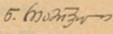
Constantine II of Georgia
{{ resolved}}
-
 Signature of Constantine II of Georgia
 -
 vector version
- Article(s)
- Constantine II of Georgia
- Request
- Please SVG the signature. Thank you! Emperor of Emperors ( talk) 18:24, 8 May 2020 (UTC)
- Discussion
![]() Done
PawełMM (
talk)
21:22, 8 May 2020 (UTC)
Done
PawełMM (
talk)
21:22, 8 May 2020 (UTC)
- Thanks a lot PawelMM! Can you please connect the lines at the very far left circle and long line on the right? Gratefully.
Emperor of Emperors (
talk)
21:30, 8 May 2020 (UTC)
- @
Emperor of Emperors: The lines you are talking about are like the original. Probably in this way the author ran the pen and this caused gaps in the line. I think it should be left as it is. Retouch would not look natural.
PawełMM (
talk)
07:02, 9 May 2020 (UTC)
- Not a problem. Thanks. Gratefully. Emperor of Emperors ( talk) 07:28, 9 May 2020 (UTC)
- @
Emperor of Emperors: The lines you are talking about are like the original. Probably in this way the author ran the pen and this caused gaps in the line. I think it should be left as it is. Retouch would not look natural.
PawełMM (
talk)
07:02, 9 May 2020 (UTC)
- Thanks a lot PawelMM! Can you please connect the lines at the very far left circle and long line on the right? Gratefully.
Emperor of Emperors (
talk)
21:30, 8 May 2020 (UTC)
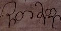
Noe Ramishvili
{{ resolved}}
-
 Signature
 -
 vector version
- Article(s)
- Noe Ramishvili
- Request
- Please SVG the signature. Thank you. Emperor of Emperors ( talk) 04:56, 9 May 2020 (UTC)
- Discussion
![]() Done
PawełMM (
talk)
06:20, 9 May 2020 (UTC)
Done
PawełMM (
talk)
06:20, 9 May 2020 (UTC)
- Thanks a lot PawelMM. Gratefully. Emperor of Emperors ( talk) 07:26, 9 May 2020 (UTC)
Archil Talakvadze
{{ resolved}}
-
 Signature
 -
 vector version
- Article(s)
- Archil Talakvadze
- Request
- Please SVG the signature. Thank you. Emperor of Emperors ( talk) 07:59, 9 May 2020 (UTC)
- Discussion
![]() Done
PawełMM (
talk)
09:56, 9 May 2020 (UTC)
Done
PawełMM (
talk)
09:56, 9 May 2020 (UTC)
- Thank you PawelMM. Gratefully. Emperor of Emperors ( talk) 15:33, 9 May 2020 (UTC)
Giorgi Gakharia
{{ resolved}}
-
 Signature
 -
 vector version

.svg)
- Article(s)
- Giorgi Gakharia
- Request
- Please SVG the signature and remove the remaining stamp too. Thank you. Gratefully. Emperor of Emperors ( talk) 19:45, 9 May 2020 (UTC)
- Discussion
![]() Done
PawełMM (
talk)
20:43, 9 May 2020 (UTC)
Done
PawełMM (
talk)
20:43, 9 May 2020 (UTC)
- PawelMM, thanks a lot. Gratefully. Emperor of Emperors ( talk) 21:30, 9 May 2020 (UTC)
Iakob Gogebashvili
{{ resolved}}
-
 Signature
 -
 vector version
- Article(s)
- Iakob Gogebashvili
- Request
- Please SVG the signature. Thank you. Gratefully. Emperor of Emperors ( talk) 00:14, 11 May 2020 (UTC)
- Discussion
![]() Done
PawełMM (
talk)
05:59, 11 May 2020 (UTC)
Done
PawełMM (
talk)
05:59, 11 May 2020 (UTC)
- Thank you PawelMM. Emperor of Emperors ( talk) 16:01, 11 May 2020 (UTC)
Nikolay Chkheidze
{{ resolved}}
-
 Signature
 -
 vector version

.svg)
- Article(s)
- Nikolay Chkheidze
- Request
- Please SVG the signature. Thank you! Emperor of Emperors ( talk) 03:34, 13 May 2020 (UTC)
- Discussion
![]() Done
PawełMM (
talk)
05:14, 13 May 2020 (UTC)
Done
PawełMM (
talk)
05:14, 13 May 2020 (UTC)
- Many thanks PawelMM. Emperor of Emperors ( talk) 05:32, 13 May 2020 (UTC)
Besiki
{{ resolved}}
-
 Signature
 -
 vector version
- Article(s)
- Besiki
- Request
- Please SVG the signature. Thank you! Emperor of Emperors ( talk) 17:24, 13 May 2020 (UTC)
- Discussion
![]() Done
PawełMM (
talk)
19:49, 13 May 2020 (UTC)
Done
PawełMM (
talk)
19:49, 13 May 2020 (UTC)
- Thank you! Gratefully. Emperor of Emperors ( talk) 21:01, 13 May 2020 (UTC)
Mariam Tsitsishvili
{{ resolved}}
-
 Signature
 -
 vector version
- Article(s)
- Mariam Tsitsishvili
- Request
- Please SVG the signature. Thank you. Emperor of Emperors ( talk) 21:06, 13 May 2020 (UTC)
- Discussion
![]() Done
PawełMM (
talk)
22:09, 13 May 2020 (UTC)
Done
PawełMM (
talk)
22:09, 13 May 2020 (UTC)
- Thanks PawelMM again. Gratefully. Emperor of Emperors ( talk) 23:05, 13 May 2020 (UTC)
Rusudan of Georgia
{{ resolved}}
-
 Signature
 -
 vector version


- Article(s)
- Rusudan of Georgia
- Request
- Please SVG the signature. Thank you. Emperor of Emperors ( talk) 23:40, 14 May 2020 (UTC)
- Discussion
![]() Done
PawełMM (
talk)
05:57, 15 May 2020 (UTC)
Done
PawełMM (
talk)
05:57, 15 May 2020 (UTC)
- Thank you. Gratefully. Can you please make the lines a bit smoother as they are in the original signature? And connect the third letter to the fourth as well?
Emperor of Emperors (
talk)
12:50, 15 May 2020 (UTC)
- @
Emperor of Emperors: The letters have been combined. Improving the thickness of the line would require tedious manual retouching. The original background is very dark and has a weak contrast, making it difficult to extract thin signature lines.
PawełMM (
talk)
04:56, 17 May 2020 (UTC)
- Thanks again! Emperor of Emperors ( talk) 05:59, 17 May 2020 (UTC)
- @
Emperor of Emperors: The letters have been combined. Improving the thickness of the line would require tedious manual retouching. The original background is very dark and has a weak contrast, making it difficult to extract thin signature lines.
PawełMM (
talk)
04:56, 17 May 2020 (UTC)
- Thank you. Gratefully. Can you please make the lines a bit smoother as they are in the original signature? And connect the third letter to the fourth as well?
Emperor of Emperors (
talk)
12:50, 15 May 2020 (UTC)
Bagrat VII of Kartli
{{ resolved}}
-
 Signature
 -
 vector version

.svg)
- Article(s)
- Bagrat VII of Kartli
- Request
- Please SVG the signature. Thank you… -- Emperor of Emperors ( talk) 19:30, 15 May 2020 (UTC)
- Discussion
![]() Done
PawełMM (
talk)
22:17, 15 May 2020 (UTC)
Done
PawełMM (
talk)
22:17, 15 May 2020 (UTC)
- Thanks PawelMM. Gratefully. Emperor of Emperors ( talk) 23:47, 15 May 2020 (UTC)
David VI of Georgia
{{ resolved}}
-
 Signature
 -
 vector version

.svg)
- Article(s)
- David VI of Georgia
- Request
- Please SVG the signature. Thank you. Emperor of Emperors ( talk) 18:48, 16 May 2020 (UTC)
- Discussion
![]() Done
PawełMM (
talk)
21:24, 16 May 2020 (UTC)
Done
PawełMM (
talk)
21:24, 16 May 2020 (UTC)
- Thank you. gratefully. Emperor of Emperors ( talk) 22:10, 16 May 2020 (UTC)
Giorgi X
{{ resolved}}
-
 Signature
 -


.svg)
|vector version
- Article(s)
- Giorgi X
- Request
- Please SVG the signature. Thank you. Emperor of Emperors ( talk) 05:58, 17 May 2020 (UTC)
- Discussion
![]() Done
PawełMM (
talk)
07:02, 17 May 2020 (UTC)
Done
PawełMM (
talk)
07:02, 17 May 2020 (UTC)
- Thank you. gratefully. Emperor of Emperors ( talk) 08:12, 17 May 2020 (UTC)
King Jesse
{{ resolved}}
-
 Signature
 -
 vector version

- Article(s)
- Jesse of Kartli
- Request
- Please SVG the signature. Thank you. Emperor of Emperors ( talk) 08:14, 17 May 2020 (UTC)
- Discussion
![]() Done
PawełMM (
talk)
09:16, 17 May 2020 (UTC)
Done
PawełMM (
talk)
09:16, 17 May 2020 (UTC)
- Thank you!!! gratefully. Emperor of Emperors ( talk) 09:52, 17 May 2020 (UTC)
Mariam Dadiani
{{ resolved}}
-
 Signature
 -
 vector ersion

.svg)
- Article(s)
- Mariam Dadiani (1783–1841)
- Request
- Please SVG the signature. Thank you. Emperor of Emperors ( talk) 05:17, 18 May 2020 (UTC)
- Discussion
![]() Done
PawełMM (
talk)
12:11, 18 May 2020 (UTC)
Done
PawełMM (
talk)
12:11, 18 May 2020 (UTC)
- Thanks a lot PawelMM. Gratefully. Emperor of Emperors ( talk) 15:08, 18 May 2020 (UTC)
Domentius III of Georgia
{{ resolved}}
-
 Signature
 -
 vector version

.svg)
- Article(s)
- Domentius III of Georgia
- Request
- Please SVG the signature. Thank you. -- Emperor of Emperors ( talk) 17:52, 18 May 2020 (UTC)
- Discussion
![]() Done
PawełMM (
talk)
21:09, 18 May 2020 (UTC)
Done
PawełMM (
talk)
21:09, 18 May 2020 (UTC)
- Thank you. gratefully. Emperor of Emperors ( talk) 21:21, 18 May 2020 (UTC)
Prince Datuna
{{ resolved}}
-
 Signature
 -
 vector version

.svg)
- Article(s)
- Prince David of Kakheti
- Request
- Please SVG the signature. Thank you… -- Emperor of Emperors ( talk) 17:18, 21 May 2020 (UTC)
- Discussion
![]() Done
PawełMM (
talk)
20:50, 21 May 2020 (UTC)
Done
PawełMM (
talk)
20:50, 21 May 2020 (UTC)
- @
PawełMM: Can you please make it transparent SVG?
Emperor of Emperors (
talk)
01:52, 22 May 2020 (UTC)
- @
Emperor of Emperors: Redone, it is transparent now.
PawełMM (
talk)
05:01, 22 May 2020 (UTC)
- Thank you. Gratefully. An emperor 05:16, 22 May 2020 (UTC)
- @
Emperor of Emperors: Redone, it is transparent now.
PawełMM (
talk)
05:01, 22 May 2020 (UTC)
- @
PawełMM: Can you please make it transparent SVG?
Emperor of Emperors (
talk)
01:52, 22 May 2020 (UTC)
Levan of Kakheti
{{ resolved}}
-
 Signature
 -
 vector version

.svg)
- Article(s)
- Levan of Kakheti
- Request
- Please SVG the signature. Thank you… -- An emperor 06:48, 22 May 2020 (UTC)
- Discussion
![]() Done
PawełMM (
talk)
13:19, 22 May 2020 (UTC)
Done
PawełMM (
talk)
13:19, 22 May 2020 (UTC)
- Thank you. Gratefully. An emperor 14:30, 22 May 2020 (UTC)
Birmingham Free Church
{{ resolved}}
-

-
 retouched version
 -
 ticket only
.jpg)
_retouched.jpg)
_retouched_(cropped).jpg)
- Article(s)
- St Paul's Church, Birmingham
- Request
- Please extract, rotate slightly (to vertical), rectify, and if necessary clean up the "Birmingham Free Church" ticket (middle row, right). Andy Mabbett (Pigsonthewing); Talk to Andy; Andy's edits 10:12, 22 May 2020 (UTC)
- Discussion
![]() Done
PawełMM (
talk)
11:34, 22 May 2020 (UTC)
Done
PawełMM (
talk)
11:34, 22 May 2020 (UTC)
- @
PawełMM: Thank you; but that's not what I meant. I need just that one ticket.
Andy Mabbett (Pigsonthewing);
Talk to Andy;
Andy's edits
12:28, 22 May 2020 (UTC)
- @
Pigsonthewing: No problem.
PawełMM (
talk)
12:44, 22 May 2020 (UTC)
- @ PawełMM: That's just the job; thank you again. Andy Mabbett (Pigsonthewing); Talk to Andy; Andy's edits 18:33, 22 May 2020 (UTC)
- @
Pigsonthewing: No problem.
PawełMM (
talk)
12:44, 22 May 2020 (UTC)
Queen Tinatin
{{ resolved}}
-
 Signature
 -
 vector ersion

.svg)
- Article(s)
- Tinatin Gurieli
- Request
- Please SVG the signature. Thank you… -- An emperor 14:57, 22 May 2020 (UTC)
- Discussion
![]() Done
PawełMM (
talk)
17:04, 22 May 2020 (UTC)
Done
PawełMM (
talk)
17:04, 22 May 2020 (UTC)
- Thank you. Gratefully. An emperor 17:19, 22 May 2020 (UTC)
Ekvtime Takaishvili
{{ resolved}}
-
 Signature
 -
 vector version
- Article(s)
- Ekvtime Takaishvili
- Request
- Please SVG the signature. Thank you… -- An emperor /// Ave 19:12, 23 May 2020 (UTC)
- Discussion
![]() Done
PawełMM (
talk)
05:56, 24 May 2020 (UTC)
Done
PawełMM (
talk)
05:56, 24 May 2020 (UTC)
- Thank you. gratefully. An emperor /// Ave 06:27, 24 May 2020 (UTC)
Terenti Graneli
{{ resolved}}
-
 Signature
 -
 vector veersion

.svg)
- Article(s)
- Terenti Graneli
- Request
- Please SVG the signature. Thank you. An emperor /// Ave 20:59, 24 May 2020 (UTC)
- Discussion
![]() Done
PawełMM (
talk)
06:02, 25 May 2020 (UTC)
Done
PawełMM (
talk)
06:02, 25 May 2020 (UTC)
- Thank you PawelMM. gratefully. An emperor /// Ave 15:46, 25 May 2020 (UTC)
Les moeurs et fachons de faire de Turcs
{{ resolved}}
-
 Les moeurs et fachons de faire de Turcs
 -
higher resolution
- Article(s)
- Turkish people, and others
- Request
- Please can someone recreate the above, which is quite low resolution, using the eight individual, higher-resolution fragments in Commons:Category:Les moeurs et fachons de faire de Turcs (BM E,6.1-7)? Note that those fragments are named out-of-squence. -- Andy Mabbett (Pigsonthewing); Talk to Andy; Andy's edits 18:29, 25 May 2020 (UTC)
- Discussion
![]() Done
PawełMM (
talk)
21:39, 25 May 2020 (UTC)
Done
PawełMM (
talk)
21:39, 25 May 2020 (UTC)
Carter G. Woodson
{{ resolved}}
-
 Portrait of Woodson

- Article(s)
- Carter G. Woodson
- Request
- I would like to kindly request for the graphists to improve the overall quality of this image, which was taken from this source. I appreciate all your assistance, and please let me know if you have any questions or require additional information in the meantime. -- West Virginian (talk) 20:39, 26 May 2020 (UTC)
- Discussion
@
West Virginian: ![]() Done Better resolution loaded, white balanced.
PawełMM (
talk)
05:37, 27 May 2020 (UTC)
Done Better resolution loaded, white balanced.
PawełMM (
talk)
05:37, 27 May 2020 (UTC)
- PawełMM, thank you so much for loading a better resolution and for the balancing and other edits. The new photograph looks amazing, and I appreciate you taking the time to make these changes for improvement! Thanks again! -- West Virginian (talk) 13:40, 27 May 2020 (UTC)
Quick rotate and crop
{{ resolved}}
-
 Distant view of buildings
 -
 cropped & retouched
by PawełMM

![[1]](https://pic2.zhimg.com/80/v2-d4a8e42d87ec9333f91edf16151e6ebd_1440w.jpg)
.png)
- Article(s)
- North Central Correctional Complex
- Request
- Hi, could you give this a quick rotation, and then crop out much of the sky and guardrail? I can crop it myself, but no point in doing that until it's been properly rotated. Thanks! Nyttend ( talk) 14:11, 3 May 2020 (UTC)
- Discussion
@ Nyttend: can you clarify, rotate? You would prefer it in portrait mode? —— SN 54129 14:32, 3 May 2020 (UTC)
- Oh, no, sorry. I think the image isn't very straight, as in if you rotated it a few degrees clockwise it would be a better image. If I'm wrong on that, just tell me "you're wrong" and I'll be satisfied :-)
Nyttend (
talk)
14:34, 3 May 2020 (UTC)
- @
Nyttend: I know what you mean; perhaps the photographer had the ol' Sunday morning wobbles :)
is this any better? I took the liberty of cropping the truck too, but perhaps you'd prefer that in?
——
SN
54129
14:57, 3 May 2020 (UTC)
- I strongly doubt it — I took the picture on Saturday :-) Yes, the rotation, the vertical crop, and the horizontal crop are all good. Would you mind uploading it on top of the original image, instead of having it as a separate file? Nyttend ( talk) 15:06, 3 May 2020 (UTC)
- @ Nyttend and Serial Number 54129: I tried. PawełMM ( talk) 15:58, 3 May 2020 (UTC)
- @
Nyttend: I know what you mean; perhaps the photographer had the ol' Sunday morning wobbles :)
is this any better? I took the liberty of cropping the truck too, but perhaps you'd prefer that in?
——
SN
54129
14:57, 3 May 2020 (UTC)
.png)
Salem Bland
{{ resolved}}

- Article(s)
- Salem Bland
- Request
- There appears to be some white space on the left-hand side of the photograph. I'm not sure if (a) it's just a matter of cropping it, (b) the image is actually slightly askew and in need of tilting, or (c) there's not anything that can practically be done here. 207.161.86.162 ( talk) 22:07, 10 May 2020 (UTC)
- Discussion
![]() Done Cropped 2 px on the left-hand side.
PawełMM (
talk)
05:17, 11 May 2020 (UTC)
Done Cropped 2 px on the left-hand side.
PawełMM (
talk)
05:17, 11 May 2020 (UTC)
|
| This page, part of the
Graphics Lab Wikiproject, is an
archive of requests for 2020. Please do not edit the contents of this page. You can submit new requests here. |
Request: Anglican Church
-
Anglican Church (The Bottom)
- Article(s)
- The Bottom
- Request
- Please remove irregularities (if possible). Vysotsky ( talk) 19:56, 3 May 2020 (UTC)
- Discussion
![]() Done
PawełMM (
talk)
21:26, 3 May 2020 (UTC)
Done
PawełMM (
talk)
21:26, 3 May 2020 (UTC)
- Thanks! Vysotsky ( talk) 20:58, 4 May 2020 (UTC) {{ resolved}}
Request: Peggy Ashcroft
- Article(s)
- Peggy Ashcroft
- Request
- Please remove watermarking, if possible. Vysotsky ( talk) 10:49, 5 May 2020 (UTC)
- Discussion
![]() Done
PawełMM (
talk)
12:41, 5 May 2020 (UTC)
Done
PawełMM (
talk)
12:41, 5 May 2020 (UTC)
- Good job. Thank you! Vysotsky ( talk) 15:36, 6 May 2020 (UTC) {{ resolved}}
Request: Rosa King
-
Rosa King
- Article(s)
- Rosa King
- Request
- Please remove number plate (down rigth), if possible. PS: I like the white frame. Vysotsky ( talk) 22:13, 8 May 2020 (UTC)
- Discussion
![]() Done
PawełMM (
talk)
22:27, 8 May 2020 (UTC)
Done
PawełMM (
talk)
22:27, 8 May 2020 (UTC)
- Quick and efficient. Thanks! Vysotsky ( talk) 22:46, 8 May 2020 (UTC) {{ resolved}}
Stitch
{{ resolved}}
-
-
-
-
panorama
- Article(s)
- Ikebana
- Request
- Please stitch, but without a noticeable curve if possible. The black pedestal at the bottom should be straight, retouch ceiling to make uniform white/grey, it should essentially appear like in this image [1]. Thank you. -- Gryffindor ( talk) 16:57, 19 April 2020 (UTC)
- Discussion
@ Gryffindor: In my opinion, the connection can not be made correct because the next photos were taken from different places. A correct connection would be possible if a tripod with a movable head was used. PawełMM ( talk) 07:02, 20 April 2020 (UTC)
- @
Gryffindor: Done
PawełMM (
talk)
12:42, 20 April 2020 (UTC)
- There is a white line at the top part in front of the green, are you able to remove it?
Gryffindor (
talk)
21:42, 20 April 2020 (UTC)
- @
Gryffindor: Done as requested.
PawełMM (
talk)
21:54, 20 April 2020 (UTC)
- Thank you. Gryffindor ( talk) 23:31, 22 April 2020 (UTC)
- @
Gryffindor: Done as requested.
PawełMM (
talk)
21:54, 20 April 2020 (UTC)
- There is a white line at the top part in front of the green, are you able to remove it?
Gryffindor (
talk)
21:42, 20 April 2020 (UTC)
John Warren Davis (college president)
{{ resolved}}
-
Portrait of Davis (1919)
-
Portrait of Davis (1923)
- Article(s)
- John Warren Davis (college president), possibly West Virginia State University
- Request
- I kindly request for the esteemed graphists to sharpen and make me more clear the two public domain portraits of Davis from 1919 and 1923, and to the furthest extent allowable, the fair use portrait from 1968. Please let me know if you have any questions for me in the meantime, or require further information. The original PDF files for the two PD portraits are linked on the portraits' respective Wikimedia Commons pages. -- West Virginian (talk) 15:02, 22 April 2020 (UTC)
- Discussion
![]() Done
PawełMM (
talk)
17:50, 22 April 2020 (UTC)
Done
PawełMM (
talk)
17:50, 22 April 2020 (UTC)
- Thank you tremendously, as always, PawełMM! -- West Virginian (talk) 18:06, 22 April 2020 (UTC)
Background
{{ resolved}}
- Article(s)
- Edo Castle
- Request
- Please remove background, either in white, grey or black, whatever looks best. -- Gryffindor ( talk) 23:33, 22 April 2020 (UTC)
- Discussion
![]() Done
PawełMM (
talk)
04:47, 23 April 2020 (UTC)
Done
PawełMM (
talk)
04:47, 23 April 2020 (UTC)
Ethel McGhee Davis
{{ resolved}}
- Article(s)
- Ethel McGhee Davis
- Request
- I would like to humbly request for the graphists to please improve the quality of this fair use image, as much as is appropriate. I really appreciate you taking the time to improve the clarity of Mrs. Davis' portrait. -- West Virginian (talk) 23:28, 23 April 2020 (UTC)
- Discussion
![]() Done (
Hohum
@)
00:20, 24 April 2020 (UTC)
Done (
Hohum
@)
00:20, 24 April 2020 (UTC)
- Hohum, thank you! -- West Virginian (talk) 00:24, 24 April 2020 (UTC)
Milton Bradley
{{ resolved}}
-
Milton Bradley
- Article(s)
- Milton Bradley (baseball)
- Request
- Can someone crop the left-side of the image to his suit? Thanks. -- Therapyisgood ( talk) 05:53, 24 April 2020 (UTC)
- Discussion
![]() Done
PawełMM (
talk)
06:09, 24 April 2020 (UTC)
Done
PawełMM (
talk)
06:09, 24 April 2020 (UTC)
Dimple Kapadia
{{ resolved}}
-
Actress Dimple Kapadia
-
-
-
- Article(s)
- Dimple Kapadia
- Request
- Hope I'm in the right place. I'm so bad at image cropping, and I need the first image to be cropped so that it could be used as a portrait for the article (one of the requests at FAC), without looking blurry if possible. The second one is also quite wide and if something could be done with it, I'd grateful. -- Shahid • Talk2me 17:29, 26 April 2020 (UTC)
- Discussion
- @
Shshshsh: Something like
this one cropped thinner, and
this one for the portrait?
——
SN
54129
17:50, 26 April 2020 (UTC)
- Done
PawełMM (
talk)
17:59, 26 April 2020 (UTC)
- Thank you guys, so much. Shahid • Talk2me 18:12, 26 April 2020 (UTC)
Dimple Kapadia second
{{ resolved}}
-
Dimple Kapadia1
-
-
Dimple Kapadia2
-
- Article(s)
- Dimple Kapadia
- Request
- I'm not sure it's possible to remove the watermarks, but please do if you can. Anyway, if you can't maybe you could crop it just enough for a portrait. Thanks, -- Shahid • Talk2me 23:06, 26 April 2020 (UTC)
- Discussion
![]() Done
PawełMM (
talk)
05:35, 27 April 2020 (UTC)
Done
PawełMM (
talk)
05:35, 27 April 2020 (UTC)
Ospedale di San Carlo
{{ resolved}}
-
Ospedale di San Carlo in Rome
- Article(s)
- Ospedale di San Carlo (Rome)
- Request
- Good Morning, would be possible to remove the watermarks? Thanks! -- Alex2006 ( talk) 07:56, 1 May 2020 (UTC)
- Discussion
![]() Done
PawełMM (
talk)
08:24, 1 May 2020 (UTC)
Done
PawełMM (
talk)
08:24, 1 May 2020 (UTC)
- It's okay that today is workers' day, but this was fast! :-) Thanks! Alex2006 ( talk) 09:48, 1 May 2020 (UTC)
Request: Geert Dales
- Article(s)
- Geert Dales
- Request
- Please remove white and red symbols up left and right, if possible. Vysotsky ( talk) 10:21, 22 May 2020 (UTC)
- Discussion
![]() Done
PawełMM (
talk)
11:01, 22 May 2020 (UTC)
Done
PawełMM (
talk)
11:01, 22 May 2020 (UTC)
- Great. Quick as always. Thanks! Vysotsky ( talk) 11:24, 22 May 2020 (UTC) {{ resolved}}
Constantine II of Georgia
{{ resolved}}
-
Signature of Constantine II of Georgia
-
vector version
- Article(s)
- Constantine II of Georgia
- Request
- Please SVG the signature. Thank you! Emperor of Emperors ( talk) 18:24, 8 May 2020 (UTC)
- Discussion
![]() Done
PawełMM (
talk)
21:22, 8 May 2020 (UTC)
Done
PawełMM (
talk)
21:22, 8 May 2020 (UTC)
- Thanks a lot PawelMM! Can you please connect the lines at the very far left circle and long line on the right? Gratefully.
Emperor of Emperors (
talk)
21:30, 8 May 2020 (UTC)
- @
Emperor of Emperors: The lines you are talking about are like the original. Probably in this way the author ran the pen and this caused gaps in the line. I think it should be left as it is. Retouch would not look natural.
PawełMM (
talk)
07:02, 9 May 2020 (UTC)
- Not a problem. Thanks. Gratefully. Emperor of Emperors ( talk) 07:28, 9 May 2020 (UTC)
- @
Emperor of Emperors: The lines you are talking about are like the original. Probably in this way the author ran the pen and this caused gaps in the line. I think it should be left as it is. Retouch would not look natural.
PawełMM (
talk)
07:02, 9 May 2020 (UTC)
- Thanks a lot PawelMM! Can you please connect the lines at the very far left circle and long line on the right? Gratefully.
Emperor of Emperors (
talk)
21:30, 8 May 2020 (UTC)
Noe Ramishvili
{{ resolved}}
-
Signature
-
vector version
- Article(s)
- Noe Ramishvili
- Request
- Please SVG the signature. Thank you. Emperor of Emperors ( talk) 04:56, 9 May 2020 (UTC)
- Discussion
![]() Done
PawełMM (
talk)
06:20, 9 May 2020 (UTC)
Done
PawełMM (
talk)
06:20, 9 May 2020 (UTC)
- Thanks a lot PawelMM. Gratefully. Emperor of Emperors ( talk) 07:26, 9 May 2020 (UTC)
Archil Talakvadze
{{ resolved}}
-
Signature
-
vector version
- Article(s)
- Archil Talakvadze
- Request
- Please SVG the signature. Thank you. Emperor of Emperors ( talk) 07:59, 9 May 2020 (UTC)
- Discussion
![]() Done
PawełMM (
talk)
09:56, 9 May 2020 (UTC)
Done
PawełMM (
talk)
09:56, 9 May 2020 (UTC)
- Thank you PawelMM. Gratefully. Emperor of Emperors ( talk) 15:33, 9 May 2020 (UTC)
Giorgi Gakharia
{{ resolved}}
-
Signature
-
vector version
- Article(s)
- Giorgi Gakharia
- Request
- Please SVG the signature and remove the remaining stamp too. Thank you. Gratefully. Emperor of Emperors ( talk) 19:45, 9 May 2020 (UTC)
- Discussion
![]() Done
PawełMM (
talk)
20:43, 9 May 2020 (UTC)
Done
PawełMM (
talk)
20:43, 9 May 2020 (UTC)
- PawelMM, thanks a lot. Gratefully. Emperor of Emperors ( talk) 21:30, 9 May 2020 (UTC)
Iakob Gogebashvili
{{ resolved}}
-
Signature
-
vector version
- Article(s)
- Iakob Gogebashvili
- Request
- Please SVG the signature. Thank you. Gratefully. Emperor of Emperors ( talk) 00:14, 11 May 2020 (UTC)
- Discussion
![]() Done
PawełMM (
talk)
05:59, 11 May 2020 (UTC)
Done
PawełMM (
talk)
05:59, 11 May 2020 (UTC)
- Thank you PawelMM. Emperor of Emperors ( talk) 16:01, 11 May 2020 (UTC)
Nikolay Chkheidze
{{ resolved}}
-
Signature
-
vector version
- Article(s)
- Nikolay Chkheidze
- Request
- Please SVG the signature. Thank you! Emperor of Emperors ( talk) 03:34, 13 May 2020 (UTC)
- Discussion
![]() Done
PawełMM (
talk)
05:14, 13 May 2020 (UTC)
Done
PawełMM (
talk)
05:14, 13 May 2020 (UTC)
- Many thanks PawelMM. Emperor of Emperors ( talk) 05:32, 13 May 2020 (UTC)
Besiki
{{ resolved}}
-
Signature
-
vector version
- Article(s)
- Besiki
- Request
- Please SVG the signature. Thank you! Emperor of Emperors ( talk) 17:24, 13 May 2020 (UTC)
- Discussion
![]() Done
PawełMM (
talk)
19:49, 13 May 2020 (UTC)
Done
PawełMM (
talk)
19:49, 13 May 2020 (UTC)
- Thank you! Gratefully. Emperor of Emperors ( talk) 21:01, 13 May 2020 (UTC)
Mariam Tsitsishvili
{{ resolved}}
-
Signature
-
vector version
- Article(s)
- Mariam Tsitsishvili
- Request
- Please SVG the signature. Thank you. Emperor of Emperors ( talk) 21:06, 13 May 2020 (UTC)
- Discussion
![]() Done
PawełMM (
talk)
22:09, 13 May 2020 (UTC)
Done
PawełMM (
talk)
22:09, 13 May 2020 (UTC)
- Thanks PawelMM again. Gratefully. Emperor of Emperors ( talk) 23:05, 13 May 2020 (UTC)
Rusudan of Georgia
{{ resolved}}
-
Signature
-
vector version
- Article(s)
- Rusudan of Georgia
- Request
- Please SVG the signature. Thank you. Emperor of Emperors ( talk) 23:40, 14 May 2020 (UTC)
- Discussion
![]() Done
PawełMM (
talk)
05:57, 15 May 2020 (UTC)
Done
PawełMM (
talk)
05:57, 15 May 2020 (UTC)
- Thank you. Gratefully. Can you please make the lines a bit smoother as they are in the original signature? And connect the third letter to the fourth as well?
Emperor of Emperors (
talk)
12:50, 15 May 2020 (UTC)
- @
Emperor of Emperors: The letters have been combined. Improving the thickness of the line would require tedious manual retouching. The original background is very dark and has a weak contrast, making it difficult to extract thin signature lines.
PawełMM (
talk)
04:56, 17 May 2020 (UTC)
- Thanks again! Emperor of Emperors ( talk) 05:59, 17 May 2020 (UTC)
- @
Emperor of Emperors: The letters have been combined. Improving the thickness of the line would require tedious manual retouching. The original background is very dark and has a weak contrast, making it difficult to extract thin signature lines.
PawełMM (
talk)
04:56, 17 May 2020 (UTC)
- Thank you. Gratefully. Can you please make the lines a bit smoother as they are in the original signature? And connect the third letter to the fourth as well?
Emperor of Emperors (
talk)
12:50, 15 May 2020 (UTC)
Bagrat VII of Kartli
{{ resolved}}
-
Signature
-
vector version
- Article(s)
- Bagrat VII of Kartli
- Request
- Please SVG the signature. Thank you… -- Emperor of Emperors ( talk) 19:30, 15 May 2020 (UTC)
- Discussion
![]() Done
PawełMM (
talk)
22:17, 15 May 2020 (UTC)
Done
PawełMM (
talk)
22:17, 15 May 2020 (UTC)
- Thanks PawelMM. Gratefully. Emperor of Emperors ( talk) 23:47, 15 May 2020 (UTC)
David VI of Georgia
{{ resolved}}
-
Signature
-
vector version
- Article(s)
- David VI of Georgia
- Request
- Please SVG the signature. Thank you. Emperor of Emperors ( talk) 18:48, 16 May 2020 (UTC)
- Discussion
![]() Done
PawełMM (
talk)
21:24, 16 May 2020 (UTC)
Done
PawełMM (
talk)
21:24, 16 May 2020 (UTC)
- Thank you. gratefully. Emperor of Emperors ( talk) 22:10, 16 May 2020 (UTC)
Giorgi X
{{ resolved}}
-
Signature
-
|vector version
- Article(s)
- Giorgi X
- Request
- Please SVG the signature. Thank you. Emperor of Emperors ( talk) 05:58, 17 May 2020 (UTC)
- Discussion
![]() Done
PawełMM (
talk)
07:02, 17 May 2020 (UTC)
Done
PawełMM (
talk)
07:02, 17 May 2020 (UTC)
- Thank you. gratefully. Emperor of Emperors ( talk) 08:12, 17 May 2020 (UTC)
King Jesse
{{ resolved}}
-
Signature
-
vector version
- Article(s)
- Jesse of Kartli
- Request
- Please SVG the signature. Thank you. Emperor of Emperors ( talk) 08:14, 17 May 2020 (UTC)
- Discussion
![]() Done
PawełMM (
talk)
09:16, 17 May 2020 (UTC)
Done
PawełMM (
talk)
09:16, 17 May 2020 (UTC)
- Thank you!!! gratefully. Emperor of Emperors ( talk) 09:52, 17 May 2020 (UTC)
Mariam Dadiani
{{ resolved}}
-
Signature
-
vector ersion
- Article(s)
- Mariam Dadiani (1783–1841)
- Request
- Please SVG the signature. Thank you. Emperor of Emperors ( talk) 05:17, 18 May 2020 (UTC)
- Discussion
![]() Done
PawełMM (
talk)
12:11, 18 May 2020 (UTC)
Done
PawełMM (
talk)
12:11, 18 May 2020 (UTC)
- Thanks a lot PawelMM. Gratefully. Emperor of Emperors ( talk) 15:08, 18 May 2020 (UTC)
Domentius III of Georgia
{{ resolved}}
-
Signature
-
vector version
- Article(s)
- Domentius III of Georgia
- Request
- Please SVG the signature. Thank you. -- Emperor of Emperors ( talk) 17:52, 18 May 2020 (UTC)
- Discussion
![]() Done
PawełMM (
talk)
21:09, 18 May 2020 (UTC)
Done
PawełMM (
talk)
21:09, 18 May 2020 (UTC)
- Thank you. gratefully. Emperor of Emperors ( talk) 21:21, 18 May 2020 (UTC)
Prince Datuna
{{ resolved}}
-
Signature
-
vector version
- Article(s)
- Prince David of Kakheti
- Request
- Please SVG the signature. Thank you… -- Emperor of Emperors ( talk) 17:18, 21 May 2020 (UTC)
- Discussion
![]() Done
PawełMM (
talk)
20:50, 21 May 2020 (UTC)
Done
PawełMM (
talk)
20:50, 21 May 2020 (UTC)
- @
PawełMM: Can you please make it transparent SVG?
Emperor of Emperors (
talk)
01:52, 22 May 2020 (UTC)
- @
Emperor of Emperors: Redone, it is transparent now.
PawełMM (
talk)
05:01, 22 May 2020 (UTC)
- Thank you. Gratefully. An emperor 05:16, 22 May 2020 (UTC)
- @
Emperor of Emperors: Redone, it is transparent now.
PawełMM (
talk)
05:01, 22 May 2020 (UTC)
- @
PawełMM: Can you please make it transparent SVG?
Emperor of Emperors (
talk)
01:52, 22 May 2020 (UTC)
Levan of Kakheti
{{ resolved}}
-
Signature
-
vector version
- Article(s)
- Levan of Kakheti
- Request
- Please SVG the signature. Thank you… -- An emperor 06:48, 22 May 2020 (UTC)
- Discussion
![]() Done
PawełMM (
talk)
13:19, 22 May 2020 (UTC)
Done
PawełMM (
talk)
13:19, 22 May 2020 (UTC)
- Thank you. Gratefully. An emperor 14:30, 22 May 2020 (UTC)
Birmingham Free Church
{{ resolved}}
-
-
retouched version
-
ticket only
- Article(s)
- St Paul's Church, Birmingham
- Request
- Please extract, rotate slightly (to vertical), rectify, and if necessary clean up the "Birmingham Free Church" ticket (middle row, right). Andy Mabbett (Pigsonthewing); Talk to Andy; Andy's edits 10:12, 22 May 2020 (UTC)
- Discussion
![]() Done
PawełMM (
talk)
11:34, 22 May 2020 (UTC)
Done
PawełMM (
talk)
11:34, 22 May 2020 (UTC)
- @
PawełMM: Thank you; but that's not what I meant. I need just that one ticket.
Andy Mabbett (Pigsonthewing);
Talk to Andy;
Andy's edits
12:28, 22 May 2020 (UTC)
- @
Pigsonthewing: No problem.
PawełMM (
talk)
12:44, 22 May 2020 (UTC)
- @ PawełMM: That's just the job; thank you again. Andy Mabbett (Pigsonthewing); Talk to Andy; Andy's edits 18:33, 22 May 2020 (UTC)
- @
Pigsonthewing: No problem.
PawełMM (
talk)
12:44, 22 May 2020 (UTC)
Queen Tinatin
{{ resolved}}
-
Signature
-
vector ersion
- Article(s)
- Tinatin Gurieli
- Request
- Please SVG the signature. Thank you… -- An emperor 14:57, 22 May 2020 (UTC)
- Discussion
![]() Done
PawełMM (
talk)
17:04, 22 May 2020 (UTC)
Done
PawełMM (
talk)
17:04, 22 May 2020 (UTC)
- Thank you. Gratefully. An emperor 17:19, 22 May 2020 (UTC)
Ekvtime Takaishvili
{{ resolved}}
-
Signature
-
vector version
- Article(s)
- Ekvtime Takaishvili
- Request
- Please SVG the signature. Thank you… -- An emperor /// Ave 19:12, 23 May 2020 (UTC)
- Discussion
![]() Done
PawełMM (
talk)
05:56, 24 May 2020 (UTC)
Done
PawełMM (
talk)
05:56, 24 May 2020 (UTC)
- Thank you. gratefully. An emperor /// Ave 06:27, 24 May 2020 (UTC)
Terenti Graneli
{{ resolved}}
-
Signature
-
vector veersion
- Article(s)
- Terenti Graneli
- Request
- Please SVG the signature. Thank you. An emperor /// Ave 20:59, 24 May 2020 (UTC)
- Discussion
![]() Done
PawełMM (
talk)
06:02, 25 May 2020 (UTC)
Done
PawełMM (
talk)
06:02, 25 May 2020 (UTC)
- Thank you PawelMM. gratefully. An emperor /// Ave 15:46, 25 May 2020 (UTC)
Les moeurs et fachons de faire de Turcs
{{ resolved}}
-
Les moeurs et fachons de faire de Turcs
-
higher resolution
- Article(s)
- Turkish people, and others
- Request
- Please can someone recreate the above, which is quite low resolution, using the eight individual, higher-resolution fragments in Commons:Category:Les moeurs et fachons de faire de Turcs (BM E,6.1-7)? Note that those fragments are named out-of-squence. -- Andy Mabbett (Pigsonthewing); Talk to Andy; Andy's edits 18:29, 25 May 2020 (UTC)
- Discussion
![]() Done
PawełMM (
talk)
21:39, 25 May 2020 (UTC)
Done
PawełMM (
talk)
21:39, 25 May 2020 (UTC)
Carter G. Woodson
{{ resolved}}
-
Portrait of Woodson
- Article(s)
- Carter G. Woodson
- Request
- I would like to kindly request for the graphists to improve the overall quality of this image, which was taken from this source. I appreciate all your assistance, and please let me know if you have any questions or require additional information in the meantime. -- West Virginian (talk) 20:39, 26 May 2020 (UTC)
- Discussion
@
West Virginian: ![]() Done Better resolution loaded, white balanced.
PawełMM (
talk)
05:37, 27 May 2020 (UTC)
Done Better resolution loaded, white balanced.
PawełMM (
talk)
05:37, 27 May 2020 (UTC)
- PawełMM, thank you so much for loading a better resolution and for the balancing and other edits. The new photograph looks amazing, and I appreciate you taking the time to make these changes for improvement! Thanks again! -- West Virginian (talk) 13:40, 27 May 2020 (UTC)
Quick rotate and crop
{{ resolved}}
-
Distant view of buildings
-
cropped & retouched
by PawełMM
- Article(s)
- North Central Correctional Complex
- Request
- Hi, could you give this a quick rotation, and then crop out much of the sky and guardrail? I can crop it myself, but no point in doing that until it's been properly rotated. Thanks! Nyttend ( talk) 14:11, 3 May 2020 (UTC)
- Discussion
@ Nyttend: can you clarify, rotate? You would prefer it in portrait mode? —— SN 54129 14:32, 3 May 2020 (UTC)
- Oh, no, sorry. I think the image isn't very straight, as in if you rotated it a few degrees clockwise it would be a better image. If I'm wrong on that, just tell me "you're wrong" and I'll be satisfied :-)
Nyttend (
talk)
14:34, 3 May 2020 (UTC)
- @
Nyttend: I know what you mean; perhaps the photographer had the ol' Sunday morning wobbles :)
is this any better? I took the liberty of cropping the truck too, but perhaps you'd prefer that in?
——
SN
54129
14:57, 3 May 2020 (UTC)
- I strongly doubt it — I took the picture on Saturday :-) Yes, the rotation, the vertical crop, and the horizontal crop are all good. Would you mind uploading it on top of the original image, instead of having it as a separate file? Nyttend ( talk) 15:06, 3 May 2020 (UTC)
- @ Nyttend and Serial Number 54129: I tried. PawełMM ( talk) 15:58, 3 May 2020 (UTC)
- @
Nyttend: I know what you mean; perhaps the photographer had the ol' Sunday morning wobbles :)
is this any better? I took the liberty of cropping the truck too, but perhaps you'd prefer that in?
——
SN
54129
14:57, 3 May 2020 (UTC)
Salem Bland
{{ resolved}}
- Article(s)
- Salem Bland
- Request
- There appears to be some white space on the left-hand side of the photograph. I'm not sure if (a) it's just a matter of cropping it, (b) the image is actually slightly askew and in need of tilting, or (c) there's not anything that can practically be done here. 207.161.86.162 ( talk) 22:07, 10 May 2020 (UTC)
- Discussion
![]() Done Cropped 2 px on the left-hand side.
PawełMM (
talk)
05:17, 11 May 2020 (UTC)
Done Cropped 2 px on the left-hand side.
PawełMM (
talk)
05:17, 11 May 2020 (UTC)