
 | This page, part of the
Graphics Lab Wikiproject, is an
archive of requests for 2021. Please do not edit the contents of this page. You can submit new requests here. |

2021 Japanese general election graphs

.png)
- Article(s)
- 2021 Japanese general election and Opinion polling for the next Japanese general election
- Request
- Both of these graphs need updating with the latest opinion polling information given in the tables on Opinion polling for the next Japanese general election. Helper201 ( talk) 21:53, 24 May 2021 (UTC)
- Discussion
- Pinging
BSMIsEditing, in case they still have the appropriate files and are willing.
Pbrks (
talk) 03:44, 7 June 2021 (UTC)
- @ Pbrks: It is on Plotly, but I will start updating them again. — Preceding unsigned comment added by BSMIsEditing ( talk • contribs)
Chart of greenhouse gas emissions with LULUCF per person by country
-
 2019 AQAL Capital and Tom Schulz variwide chart "Worldwide Co2 emissions"
 -
 20210626 Variwide chart of greenhouse gas emissions per capita by country.svg ——
SVG as requested -
 20210703 Variwide chart of greenhouse gas emissions per capita by country (includes OTHER).svg


.svg)
- Article(s)
- Greenhouse gas emissions and List of countries by greenhouse gas emissions
- Request
- Make a chart similar to this but for all greenhouse gases (INCLUDING LULUCF) not just carbon dioxide.
2018 ghg data is at https://www.climatewatchdata.org/ghg-emissions?chartType=percentage and population at List of countries and dependencies by population
If you don't know how to do this I may be able to advise how to do it with python matplotlib - but I am not physically capable of doing it myself at the moment. If difficult it could just be the top 10 or top 20 countries.
The CO2 only chart is used on fr:Émission de dioxyde de carbone but I think showing all greenhouse gases is a fairer comparison.
Although there is no completely fair graphic this is fairer than the many existing pie charts which give no idea of population. I realise this could be a lot of work but I think it would improve public understanding for a lot of readers before COP26
If you accept this task please could you make it easy to update when new figures are published and easy to translate the legend.
Thanks for considering Chidgk1 ( talk) 12:36, 25 June 2021 (UTC)
- Discussion
- Hello again, Chidgk1. I notice that File:Total CO2 by Region.svg and File:Per Capita CO2 by Region.svg (in Climate change convey much the same information—though only for the biggest contributors.
- I think 35 countries/regions is too many—not "friendly" for readers. I suggest the ~ten highest-emitting countries only.
- I can manually make an SVG diagram; I don't know Python/Matlab at all. It may take me a few days to produce. It won't be "automatic" to update as new figures come out each year, but anyone who knows SVG will be able to edit it manually (basic algebra; not rocket science).
- What do you think? — RCraig09 ( talk) 02:20, 26 June 2021 (UTC)
- RCraig09 Those charts are very good but they only show CO2. And they are a time series whereas Tom Schulz "variwide" is showing the absolute size (area) and per person (height) in one chart which I think gets across important points clearly. You are absolutely right that 35 is too many. I think minimum 6 biggest GhG emitters so that Brazil deforestation can be mentioned in text. If not too cluttered 8 to include Iran (fuel subsidies). Not sure how "rest of world" would look with 8 countries in variwide style. Maybe EU should be shown as one rectangle? Chidgk1 ( talk) 06:39, 26 June 2021 (UTC)
- @
Chidgk1: I will do an SVG chart with at least 8 countries. This may take a few days.
 Request taken. —
RCraig09 (
talk) 11:54, 26 June 2021 (UTC)
Request taken. —
RCraig09 (
talk) 11:54, 26 June 2021 (UTC) - @
Chidgk1:
- I was able to finish this today. It's a nice, compact SVG covering ten countries. Let me know if changes are needed.
- I used a spreadsheet to generate the SVG code; I plan to post a (Dropbox?) link to the spreadsheet so others can adapt to new data in future years, though I'm afraid updating is not an "automatic" task.
 Done —
RCraig09 (
talk) 21:28, 26 June 2021 (UTC)
Done —
RCraig09 (
talk) 21:28, 26 June 2021 (UTC)
- @
Chidgk1: I will do an SVG chart with at least 8 countries. This may take a few days.
I've added instructions to the file description page. Also, since the result is a text file in SVG format, it should be very simple to use a text editor to convert to other languages. RCraig09 ( talk) 22:12, 27 June 2021 (UTC)— RCraig09 ( talk) 22:12, 27 June 2021 (UTC)
- @ RCraig09: thanks - this request can be closed as completed excellent -continueing conversation at https://commons.wikimedia.org/wiki/File_talk:20210626_Variwide_chart_of_greenhouse_gas_emissions_per_capita_by_country.svg Chidgk1 ( talk) 05:21, 28 June 2021 (UTC)
{{ resolved}}
Signature of Libuše Šafránková
- Article(s)
- Libuše Šafránková
- Request
- Please vectorize this signature that came to my attention after the recent death of this actress. -- Pakeha ( talk) 19:36, 13 June 2021 (UTC)
- Discussion
Republic of China (Taiwan) passport emblem
-
 The national emblem of the Republic of China (Taiwan)
 -
 Taiwanese passport with standard national emblem (issued from 2008 to 2020)
 -
 Taiwanese passport with variant national emblem (issued from 2021 onwards)
 -
 Vector version of the seal on the cover of the passport from the Republic of China (Taiwan), 2021+


_Passport_2021.png)

- Article(s)
- Blue Sky with a White Sun
- Request
- Hi, there is a new variant of the Republic of China (Taiwan) national emblem on the Taiwanese passport issued from 2021 onwards. The new passport reduces the prominence of the words "Republic of China" (the country's official name) by depicting it in a border surrounding the emblem. The Taiwanese Ministry of Foreign Affairs cannot completely remove the name from its passports as doing so is considered an act of separatism by the People's Republic of China (PRC) on the mainland and threatens to invade Taiwan if it changes its official name or its national symbols (though this new design doesn't seem to annoy the PRC as the variant depicts the official name and is only used on passports). The Taiwanese passport (both before and after 2021) depicts the emblem in green and yellow when normally, the emblem is blue and white. When comparing the passport emblem to the standard emblem, it seems that the words and borders are in white and the background is in blue. Can someone kindly please make an SVG version of the passport variant of the emblem? Thanks in advance. -- 109.78.53.86 ( talk) 14:21, 4 June 2021 (UTC)
- Discussion
- Done - see above. Cheers,
Mliu92 (
talk) 00:46, 16 June 2021 (UTC)
Resize logo request
-
 Wikipedia in the Tachelhit Language
- Article(s)
- Wikipedia:Slogans
- Request
- Is there someone that can kindly resize logo to 135 × 155? Many thanks in advance!!! -- 2001:B07:6442:8903:594:8303:2E25:E570 ( talk) 13:45, 16 June 2021 (UTC)
- Discussion
![]() Done —
Pbrks (
talk) 15:16, 16 June 2021 (UTC)
Done —
Pbrks (
talk) 15:16, 16 June 2021 (UTC)
National Labor Relations Board Logo
-

-
 Vectorized

- Article(s)
- Political appointments by Donald Trump and Political appointments by Joe Biden
- Request
- Hi, could you make this National Labor Relations Board logo in svg format. The current image is in low resolution. Stalin990 ( talk) 16:14, 27 May 2021 (UTC)
- Discussion
![]() Done @
Stalin990: --
Sodacan (
talk) 01:40, 29 May 2021 (UTC)
Done @
Stalin990: --
Sodacan (
talk) 01:40, 29 May 2021 (UTC)
Flag of Mārahau
- Article(s)
- Mārahau
- Request
- Please make the flag of Marahau ( https://ourrelationshipwithnature.com/wp-content/uploads/2020/03/IMG_2554-1152x1536.jpg). -- SpinnerLaserzthe2nd ( talk) 21:43, 26 June 2021 (UTC)
- Discussion
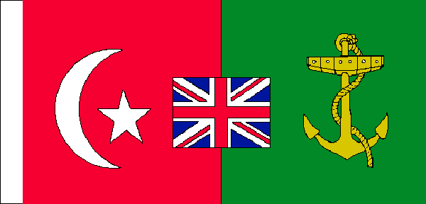
Cape to Cairo flag of Cecil Rhodes
-
 Crescent and star
 -
 Union Jack
 -
 Anchor
.svg)

.svg)
- Article(s)
- Cecil Rhodes
- Request
- Can a version of Cecil Rhodes' Cape to Cairo flag be created using the above elements (With the anchor's field changed to green) as seen here please? The C of E God Save the Queen! ( talk) 08:12, 28 June 2021 (UTC)
- Discussion
- Done
The C of E, see
File:Flag of Cecil Rhodes' Cape to Cairo.svg. I didn't really have any specifications to go off, it was entirely of that image, so it isn't 100% accurate. Feel free to suggest any changes. —
Berrely •
Talk∕
Contribs 10:37, 28 June 2021 (UTC)
|
| This page, part of the
Graphics Lab Wikiproject, is an
archive of requests for 2021. Please do not edit the contents of this page. You can submit new requests here. |
2021 Japanese general election graphs
- Article(s)
- 2021 Japanese general election and Opinion polling for the next Japanese general election
- Request
- Both of these graphs need updating with the latest opinion polling information given in the tables on Opinion polling for the next Japanese general election. Helper201 ( talk) 21:53, 24 May 2021 (UTC)
- Discussion
- Pinging
BSMIsEditing, in case they still have the appropriate files and are willing.
Pbrks (
talk) 03:44, 7 June 2021 (UTC)
- @ Pbrks: It is on Plotly, but I will start updating them again. — Preceding unsigned comment added by BSMIsEditing ( talk • contribs)
Chart of greenhouse gas emissions with LULUCF per person by country
-
2019 AQAL Capital and Tom Schulz variwide chart "Worldwide Co2 emissions"
-
20210626 Variwide chart of greenhouse gas emissions per capita by country.svg ——
SVG as requested -
20210703 Variwide chart of greenhouse gas emissions per capita by country (includes OTHER).svg
- Article(s)
- Greenhouse gas emissions and List of countries by greenhouse gas emissions
- Request
- Make a chart similar to this but for all greenhouse gases (INCLUDING LULUCF) not just carbon dioxide.
2018 ghg data is at https://www.climatewatchdata.org/ghg-emissions?chartType=percentage and population at List of countries and dependencies by population
If you don't know how to do this I may be able to advise how to do it with python matplotlib - but I am not physically capable of doing it myself at the moment. If difficult it could just be the top 10 or top 20 countries.
The CO2 only chart is used on fr:Émission de dioxyde de carbone but I think showing all greenhouse gases is a fairer comparison.
Although there is no completely fair graphic this is fairer than the many existing pie charts which give no idea of population. I realise this could be a lot of work but I think it would improve public understanding for a lot of readers before COP26
If you accept this task please could you make it easy to update when new figures are published and easy to translate the legend.
Thanks for considering Chidgk1 ( talk) 12:36, 25 June 2021 (UTC)
- Discussion
- Hello again, Chidgk1. I notice that File:Total CO2 by Region.svg and File:Per Capita CO2 by Region.svg (in Climate change convey much the same information—though only for the biggest contributors.
- I think 35 countries/regions is too many—not "friendly" for readers. I suggest the ~ten highest-emitting countries only.
- I can manually make an SVG diagram; I don't know Python/Matlab at all. It may take me a few days to produce. It won't be "automatic" to update as new figures come out each year, but anyone who knows SVG will be able to edit it manually (basic algebra; not rocket science).
- What do you think? — RCraig09 ( talk) 02:20, 26 June 2021 (UTC)
- RCraig09 Those charts are very good but they only show CO2. And they are a time series whereas Tom Schulz "variwide" is showing the absolute size (area) and per person (height) in one chart which I think gets across important points clearly. You are absolutely right that 35 is too many. I think minimum 6 biggest GhG emitters so that Brazil deforestation can be mentioned in text. If not too cluttered 8 to include Iran (fuel subsidies). Not sure how "rest of world" would look with 8 countries in variwide style. Maybe EU should be shown as one rectangle? Chidgk1 ( talk) 06:39, 26 June 2021 (UTC)
- @
Chidgk1: I will do an SVG chart with at least 8 countries. This may take a few days.
Request taken. —
RCraig09 (
talk) 11:54, 26 June 2021 (UTC)
- @
Chidgk1:
- I was able to finish this today. It's a nice, compact SVG covering ten countries. Let me know if changes are needed.
- I used a spreadsheet to generate the SVG code; I plan to post a (Dropbox?) link to the spreadsheet so others can adapt to new data in future years, though I'm afraid updating is not an "automatic" task. Done —
RCraig09 (
talk) 21:28, 26 June 2021 (UTC)
- @
Chidgk1: I will do an SVG chart with at least 8 countries. This may take a few days.
I've added instructions to the file description page. Also, since the result is a text file in SVG format, it should be very simple to use a text editor to convert to other languages. RCraig09 ( talk) 22:12, 27 June 2021 (UTC)— RCraig09 ( talk) 22:12, 27 June 2021 (UTC)
- @ RCraig09: thanks - this request can be closed as completed excellent -continueing conversation at https://commons.wikimedia.org/wiki/File_talk:20210626_Variwide_chart_of_greenhouse_gas_emissions_per_capita_by_country.svg Chidgk1 ( talk) 05:21, 28 June 2021 (UTC)
{{ resolved}}
Signature of Libuše Šafránková
- Article(s)
- Libuše Šafránková
- Request
- Please vectorize this signature that came to my attention after the recent death of this actress. -- Pakeha ( talk) 19:36, 13 June 2021 (UTC)
- Discussion
Republic of China (Taiwan) passport emblem
-
The national emblem of the Republic of China (Taiwan)
-
Taiwanese passport with standard national emblem (issued from 2008 to 2020)
-
Taiwanese passport with variant national emblem (issued from 2021 onwards)
-
Vector version of the seal on the cover of the passport from the Republic of China (Taiwan), 2021+
- Article(s)
- Blue Sky with a White Sun
- Request
- Hi, there is a new variant of the Republic of China (Taiwan) national emblem on the Taiwanese passport issued from 2021 onwards. The new passport reduces the prominence of the words "Republic of China" (the country's official name) by depicting it in a border surrounding the emblem. The Taiwanese Ministry of Foreign Affairs cannot completely remove the name from its passports as doing so is considered an act of separatism by the People's Republic of China (PRC) on the mainland and threatens to invade Taiwan if it changes its official name or its national symbols (though this new design doesn't seem to annoy the PRC as the variant depicts the official name and is only used on passports). The Taiwanese passport (both before and after 2021) depicts the emblem in green and yellow when normally, the emblem is blue and white. When comparing the passport emblem to the standard emblem, it seems that the words and borders are in white and the background is in blue. Can someone kindly please make an SVG version of the passport variant of the emblem? Thanks in advance. -- 109.78.53.86 ( talk) 14:21, 4 June 2021 (UTC)
- Discussion
- Done - see above. Cheers,
Mliu92 (
talk) 00:46, 16 June 2021 (UTC)
Resize logo request
-
Wikipedia in the Tachelhit Language
- Article(s)
- Wikipedia:Slogans
- Request
- Is there someone that can kindly resize logo to 135 × 155? Many thanks in advance!!! -- 2001:B07:6442:8903:594:8303:2E25:E570 ( talk) 13:45, 16 June 2021 (UTC)
- Discussion
![]() Done —
Pbrks (
talk) 15:16, 16 June 2021 (UTC)
Done —
Pbrks (
talk) 15:16, 16 June 2021 (UTC)
National Labor Relations Board Logo
-
-
Vectorized
- Article(s)
- Political appointments by Donald Trump and Political appointments by Joe Biden
- Request
- Hi, could you make this National Labor Relations Board logo in svg format. The current image is in low resolution. Stalin990 ( talk) 16:14, 27 May 2021 (UTC)
- Discussion
![]() Done @
Stalin990: --
Sodacan (
talk) 01:40, 29 May 2021 (UTC)
Done @
Stalin990: --
Sodacan (
talk) 01:40, 29 May 2021 (UTC)
Flag of Mārahau
- Article(s)
- Mārahau
- Request
- Please make the flag of Marahau ( https://ourrelationshipwithnature.com/wp-content/uploads/2020/03/IMG_2554-1152x1536.jpg). -- SpinnerLaserzthe2nd ( talk) 21:43, 26 June 2021 (UTC)
- Discussion
Cape to Cairo flag of Cecil Rhodes
-
Crescent and star
-
Union Jack
-
Anchor
- Article(s)
- Cecil Rhodes
- Request
- Can a version of Cecil Rhodes' Cape to Cairo flag be created using the above elements (With the anchor's field changed to green) as seen here please? The C of E God Save the Queen! ( talk) 08:12, 28 June 2021 (UTC)
- Discussion
- Done
The C of E, see
File:Flag of Cecil Rhodes' Cape to Cairo.svg. I didn't really have any specifications to go off, it was entirely of that image, so it isn't 100% accurate. Feel free to suggest any changes. —
Berrely •
Talk∕
Contribs 10:37, 28 June 2021 (UTC)