This page makes the case for choropleth maps on Wikipedia election articles. "Choropleth" means "cluster zones". A Choropleth map is a map that uses different hues of the same color, for the clustered variable.
- In the first part, we argue why Wikipedians should embrace this type of map for most areas.
- In the second part, we provide an almost comprehensive, and up-to-date gallery of choropleth maps used on Wikipedia, and a commentary of each author's methods.
The problem, the examples, the solutions
What is the problem on Wikipedia?
Typically, election maps on Wikimedia Commons and Wikipedia display the jurisdiction's constituencies ("districts", "ridings", "wards", etc.) colored by the party that won it. This makes perfect sense: under Plurality (First-past-the-post), whoever tops the district, gets the seat.
However, under the various forms of Proportional Representation, no-one "wins" a district: districts are multi-member, and coming first is no more meaningful than coming second, only the share of votes is (which by design gives the share of seats).
As a reminder, PR methods are in use in:
- almost all of continental Europe and Latin America, in elections of legislative assemblies (exceptions: the French Parliament, the Polish and Czech Senates, and a number of countries using FPTP in parallel with PR seats).
- in English-speaking countries, this includes: the lower houses of Ireland, Northern Ireland (STV), New Zealand, Scotland, Wales (MMP), and the upper houses of Australia.
(That is, in summary, most liberal democracies and jurisdictions!)
As the examples below show, using maps of district winners for PR elections has many shortcomings:
- lack of information provided:
- in a two-party system, a big *victory for one party is a big loss for the other ; but in a multi-party PR system, it is impossible to tell with a district winner map, areas in which the party came second, from areas where it is completely excluded
- in PR, district victory is arbitrary: the party coming first may have received as little as 20%, and may be followed by a series of like-minded parties that collectively outweigh the first party in the district
- meaninglessness:
- due to Duverger's Law, PR methods tend to increase the number of parties in competition, division being much less detrimental ; but this doesn't mean there can't be pre-declared left-right alliances, which in this case is the meaningful division to show
- under FPTP, parties tend to be catch-all parties ; under PR, coalitions may be formed after the election and can aggregate catch-all parties with smaller parties appealing to a fraction of the electorate, and sometimes one-issue parties
- lack of legibility:
- the number of colors needed in a multi-party system makes maps uneasy to read and of little use
Illustrating the absurdity
Most electoral maps on Wikipedia show district winners even under Proportional Representation, despite it is in such case meaningless, potentially deceptive for election analyses, and illegible overall:
-
 1972 Dutch general election, 7 parties shown out of 14, missing the meaningful left (PvdA-PPR-D66) and right (KVP-APR-CHU) alliances
 -
 2018 Latvian parliamentary election, with 7 different parties
 -
 2019 Belgian regional elections, with 8 parties and unnecessary hues
 -
 2019 Moldovan parliamentary election, 4 parties
 -
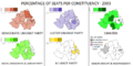
 2021 Scottish Parliament election, 4 parties with unnecessary hues for constituencies, but would've been very useful in a map of the regional vote
 -
 2022 Finnish county elections, 11 parties of which 8 top at least one district, with 7 hues each. Only problem is that these districts do not matter at all.
 -
 2007 Estonian parliamentary election, 5 parties with 4 to 6 hues each


Some designers prefer to color small dots or squares representing seats, instead of representing zones. Their legibility is questionable:
-
 2022 Finnish county elections, 1379 squares, with colors for 7 middle parties, 2 minor parties + 1 locally major one
 -
 2016 Irish general election, 158 dots
 -
 2015 Polish parliamentary election, 460 dots -- can you distinguish Poland A and B?
 -
 1998 Northern Ireland Assembly election, 108 dots -- at which size can you distinguish the clear-cut sectarian boundaries?
 -
 2018 Slovenian parliamentary election, 88 dots -- can you guess where's Ljubljana and where's the countryside?


Solutions
If one wants to analyze an election under PR, then one should better use party-specific choropleth maps, which use hue progression to show the varying degrees of success in the various districts. The degrees should be divided in 4 or 5 natural breaks (Jenks): this method allows readers to extract the most meaning (unlike arbitrary intervals, or standard deviation) while staying very close to the distribution of data.
I have often seen these maps in use by political pundits, " psephologist"s, and sociologists in continental Europe, in particular France and Germany. The English Wikipedia is largely written by users who do not live in countries using PR, and this probably explains why it hasn't caught up on that particular custom of political science in non-English-speaking countries.
As a sidenote, it could be argued that chorochromatic maps would be more accurate than choropleth ones, especially when a state has districts with largely unpopulated areas, such as the Australian Outback (for upper house elections), the Scandinavian polar circle, the Kazakh Steppe, Russian Siberia etc.
Gallery of choropleth maps
Here's a list of choropleth election maps posted on Wikimedia:
Bulgaria
An outstanding map made in 2021 by User:Ivonster04. Uses 5 hues with a rough clustering adapted to each party, that works very well. With maps like this you can understand Bulgarian politics very quickly!

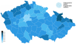
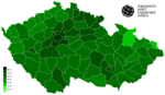
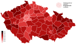
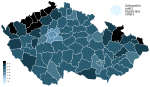
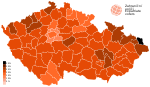
Czechia
Czech Wikipedia User MrGreg has created about a hundred maps, solely for Czech elections (legislative since 1992, presidential runoffs since 2013).
- For legislative elections, he always uses the same scale of 8 hues, each corresponding to 5% intervals (range [0-5;35-40]). In some cases he has to manually label districts that are above 40%.
- For presidential run-off elections, he also uses 8 hues but with a larger interval of 10% (range [<20;>80]).
He also has two maps of district turnout variations, using 9 hues corresponding to 2.5% intervals [<-10;>10], and two maps of district turnout, using the range of presidential run-off elections.
All in all, they are very legible, and provide immediate insight of each party's strong areas.
-
 Andrej Babiš 2023
 -
 Petr Pavel 2023
 -
 Miloš Zeman 2018
 -
 Jiří Drahoš 2018
 -
 SPOLU 2021
 -
 ANO 2021
 -
 PirSTAN 2021
 -
 SPD 2021
 -
 Přísaha 2021
 -
 KSČM 2021
 -
 ČSSD 2021
 -
 ČSSD 2017
 -
 ČSSD 2013
 -
 ČSSD 2010


Complete gallery of MrGreg's maps
|
|---|
Presidential elections
Legislative electionsVolby 2021
Volby 2017
Volby 2013Volby 2010Volby 2006Volby 2002Volby 1998
Volby 1996Volby 1992 |


.svg)

.svg)


Finland
Made by commons:User:Stadscykel in 2011. Used 5% intervals (except for the first 10 percent, and the last interval), which means there were from 7 to 10 hues for the 4 bigger parties. Did not contribute later. PS 2015 was made by commons:User:URunICon.


See also: commons:Maps of Finland - general elections by year and party.
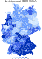
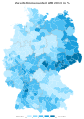
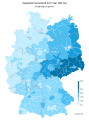
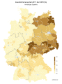
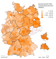
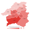
Germany
de:User:Wahlatlas, apparently the owner of the website of the same name, made these wonderful maps, with 5 degrees and (seemingly) natural breaks.
-
 CDU-CSU 2013
 -
 SPD 2013
 -
 Grüne 2013
 -
 Linke 2013
 -
 FDP 2013
 -
 AfD 2013
 -
 Piraten 2013
 -
 NPD 2013


-
 CDU-CSU 2017
 -
 SPD 2017
 -
 AfD 2017
 -
 Grüne 2017
 -
 FDP 2017
 -
 Linke 2017
 -
 NPD 2017
 -
 Turnout 2017


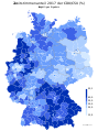
User:Furfur made these maps for the 2009 election. The number of intervals range from 4 to 9 (!) because of the 5%-interval chosen arbitrarily.
-
 CDU-CSU 2009
 -
 SPD 2009
 -
 FDP 2009
 -
 Grüne 2009
 -
 Linke 2009
 -
 Piraten 2009


User:Hilarus von Baerenstein uploaded just one beautiful map, with 6 intervals adapted to each party chosen manually:
-
 1990 Volkskammer election

Here, the use of hues for different intervals provides many clues to our understanding of Germany before WWII:
-
 NSDAP 1933, by User:Korny78 in 2007
 -
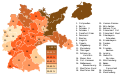 NSDAP 1933, by User:Dove in 2008, re-colored by User:Furfur in 2015


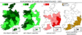
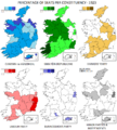
Ireland (Republic of)
Outstanding maps were made by User:JandK87 for Ireland's Dail elections (since 1921) and Northern Assembly (since 1973). However, he stopped editing after 2011, came back for the 2016 election, and never edited again. It turns out that another user made and imposed his own maps starting in 2011, where seats won are shown as tiny dots on a dark grey map. see Category:Election maps of the Republic of Ireland on Commons
-
 1921
1921 -
 1922
1922 -
 1923
1923 -
 Jun 1927
 -
 Sep 1927
 -
 1932
1932 -
 1933
1933 -
 1937
1937 -
 1938
1938 -
 1943
1943 -
 1944
1944 -
 1948
1948 -
 1951
1951 -
 1954
1954 -
 1957
1957 -
 1961
1961 -
 1965
1965 -
 1969
1969 -
 1973
1973 -
 1977
1977 -
 1981
1981 -
 Feb 1982
 -
 Nov 1982
 -
 1987
1987 -
 1989
1989 -
 1992
1992 -
 1997
1997 -
 2007
2007 -
![2011 (not used) [1]](https://upload.wikimedia.org/wikipedia/commons/thumb/f/ff/Irish_general_election_2011.png/108px-Irish_general_election_2011.png) 2011 (not used) [1]
2011 (not used) [1] -
![2016 (not used) [2]](https://upload.wikimedia.org/wikipedia/commons/thumb/b/be/Irish_general_election%2C_2016.png/108px-Irish_general_election%2C_2016.png) 2016 (not used) [2]
2016 (not used) [2] -
 2020 (missing)


![2011 (not used) [1]](/info/en/?search=File:Irish_general_election_2011.png)
![2016 (not used) [2]](/info/en/?search=File:Irish_general_election,_2016.png)

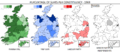
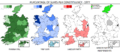
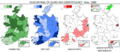
Ireland (Northern)
-
 1973
1973 -
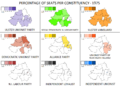 1975 (Constitutional Convention)
 -
 1982
1982 -
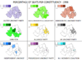 1998
1998 -
 2003
2003 -
 2007
2007 -
 2011
2011 -
 2016
2016 -
 2016 (by commons:User:沁水湾)
 -
 2017
2017 -


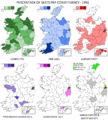
Made by User:RaviC:
-
 Northern Ireland Conservatives in 2015
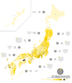
Japan
commons:User:沁水湾 made many electoral maps, including one that defines as a choropleth map using 5 hues:
-
 1942 Japanese general election: Taisei Yokusankai

In 2022, she crafted 7 maps for the 2021 Japanese general election, one for each party that won seats through the PR method:
-
 Liberal Democratic Party, PR vote share 2021
 -
 Constitutional Democratic Party, PR vote share 2021
 -
 Nippon Ishin no Kai, PR vote share 2021
 -
 Kōmeitō, PR vote share 2021
 -
 Japanese Communist Party, PR vote share 2021
 -
 Democratic Party for the People, PR vote share 2021
 -
 Reiwa Shinsengumi, PR vote share 2021
...she even added them on the election page with a switcher!
-2021.svg)


Kazakhstan
commons:User:ShadZ01 recently produced these awesome maps of the most recent Kazakh elections (2019 and 2021). There are 4 intervals for the minor parties and 5 for the dominant party, which makes sense. The ranges do not seem to be broken with a statistical tool, but rather manually. No legend whatsoever is included; it has to be written somewhere else.
.jpg)


2021 Kazakh legislative election:
.svg)
.svg)
8–10% 10–12% 12–14%
14–16%
.svg)
0–5% 5–10% 10–15%
15–17%
.svg)
0–4% 4–8% 8–12%
12–13%
.svg)
Korea (Republic of)
made by commons:User:沁水湾
-
 Sim Sang-jung 2022 (2.38%), using 12 hues (!)

Netherlands
-
 Areas where the Dutch Christian right Reformed Political Party (SGP) received a significant number of votes in 2010, largely co-extensive with the Dutch Bible Belt.
 -
 SGP 2003, using 5%-intervals (7 in total)


Nepal
Made by commons:User:Vanished user 1932142 in 2020. Used 6 hues, corresponding to 3-percent-intervals:

Poland
Made by Robert Wielgórski, known by the username Barry Kent (commons) (also wp:pl wp:en) right after the 2007 elections. He made use of varying interval numbers and lengths for each party.
-

-

-
 PO+PSL 2007
 -
 PK 2007
 -
 Turnout 2007
 -
 Wahlkomitee in the Voivodeship of Opole


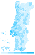
Portugal
-
 CDU 2005 (jpg)
 -
 CDU 2005 (svg)
 -
 2019 Portuguese legislative election: parties to the left of PS (BE, CDU, LIVRE)
 -
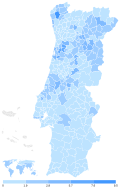
 PS 2022 (de facto a party-specific chropleth map, except for Azores)


User:Welkend ( commons) has just made awesome maps for the 2022 Portuguese legislative election, using 5 intervals for each party. Intervals are all of equal size (except PS's first one?) which highlights voter concentration:
-
 Share of the Socialist Party (PS) by municipality
 -
 Share of the Social Democratic Party (PSD) by municipality
 -
 Share of CHEGA (CH) by municipality
 -
 Share of the Liberal Initiative (IL) by municipality
 -
 Share of the Left Bloc (BE) by municipality
 -
 Share of the Unitary Democratic Coalition (CDU) by municipality
 -
 Share of the CDS-People's Party (CDS-PP) by municipality
 -
 Share of the People–Animals–Nature (PAN) by municipality
 -
 Share of the Livre (L) by municipality


Sweden
Several interesting maps were done by User:Avopeas who was mostly active in 2017, and blanked his talk page in 2019. He is still active on commons (User page) where he updates average polling graphs for Scandinavian countries.
.svg)
- (+) we can clearly see the best and worst areas for each party
- (-) All the maps use the same orange tone.
- (-) More problematic, the maps use 14 equal intervals and different hues! Impossible to process quickly.
- (-) the equal intervals are not adapted to each party (ranges are too large for smaller parties, too small for larger ones)
The author did much better with this map of population density, although the intervals are quite arbitrary.
2014 Swedish general election § Results by municipality
-
 Social Democratic
 -
 Moderate
 -
 Sweden Democrats
 -
 Green
Green -
 Centre
 -
 Left
Left -
 Liberal People's Party
 -
 Christian Democrats
 -
 Feminist Initiative
 -
 Shaded, red (S+V+MP) to blue (M+C+FP+KD)
.svg)
.svg)
.svg)
.svg)
.svg)
.svg)
.svg)
.svg)

Results of the 2018 Swedish general election
-
 Social Democratic
 -
 Moderate Party
 -
 Sweden Democrats
 -
 Centre Party
 -
 Left Party
 -
 Christian Democrats
 -
 Liberals
 -
 Green
Green -
 Shaded, red (S+V+MP) to blue (M+C+KD+L)
.svg)
.svg)
.svg)
.svg)
.svg)
.svg)
.svg)
.svg)

2002 Swedish general election and 2006 Swedish general election (the two blocs received >97%):
-
 Votes by municipality as a scale from red/Left-wing bloc to blue/Centre-right bloc.
 -
 Votes by municipality as a scale from red/Red-green bloc to blue/Alliance for Sweden.


Feminist Initiative and Sweden Democrats:
-
 FI 2014-6
 -
 FI 2014-9
 -
 SD 2002
 -
 SD 2006
 -
 SD 2010
 -
SD 2014
-
SD 2018


.svg)
.svg)
.svg)
Norway
2017 Norwegian parliamentary election.
-
 Labour
 -
 Conservative
 -
 Progress
 -
 Centre
 -
 Socialist
 -
 Liberal
 -
 Christian
 -
 Green
Green -
 Red
Red


2021 Norwegian parliamentary election.
-
 Labour
 -
 Conservative
 -
 Centre
 -
 Progress
 -
 Socialist Left
 -
 Red
Red -
 Liberal
 -
 Green
Green -
 Christian Democratic
 -
 Patient Focus


Denmark
_to_blue_(CIKOV).png)
User:Gust Justice made these maps for the 2022 Danish general election. It was embedded in the main page using a switcher template. His work is remarkable
- it is comprehensive: all 14 registered parties, have got a map of their own, as well as independent candidates. (At this point the only missing map is the turnout rate, which brings hidden clues to light about the unspoken.)
- there is a limited and regular number of hues: always set to 5.
The clustering algorithm is unknown but the result appears to be balanced, except.
               |
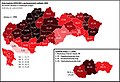
Slovakia and others
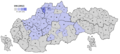
Australian User:Erinthecute, who has made countless illustration maps for election pages on Wikipedia, recently began to notice the usefulness of choropleth maps, beginning with Slovakia, the city of Graz (see § Cities) and Portugal. She is using 4 to 6 hues by party, usually 5:


commons:User:Liqid1010 made a handful of maps following the 2020 Slovak parliamentary election, using nine 5%-intervals.
-
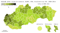 OĽaNO & allies 2020 (25.03%)
 -
 SMER-SD 2020 (18.29%)
 -
 Sme Rodina 2020 (8.24%)
 -
 ĽSNS 2020 (7.97%)
 -
 PS-SPOLU 2020 (6.97%)
 -
 SaS 2020 (6.22%)
 -
 ZĽ 2020 (5.77%)
 -
 MKS 2020 (3.91%)


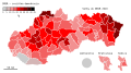
sk:User:Mikulas1 crafted many maps in 2017, but sadly, stopped contributing. His maps, using for each party a variable number of (mostly) 5%-intervals, have not yet been integrated into Wikipedia's English articles on Slovak parties and elections:
-
 SMER-SD 2010 (18.29%)
 -
 SDKÚ-DS 2010 (15.42%)
 -
 SaS 2010 (12.15%)
 -

-
 Most-Híd 2010 (8.13%)
 -
 SNS 2010 (5.08%)
 -
 SMER-SD 2012 (44.42%)
 -

-
 SaS 2012 (8.56%)
 -
 Most-Híd 2012 (6.90%)
 -
 SDKÚ-DS 2012 (6.10%)
 -
 OĽaNO 2012 (5.88%)
 -
 SNS 2012 (4.56%)
 -
 SMER-SD 2016 (28.28%)
 -
 SaS 2016 (12.10%)
 -
 OĽaNO-NOVA 2016 (11.03%)
 -
 SNS 2016 (8.64%)
 -
 ĽSNS 2016 (8.04%)
 -
 Sme Rodina 2016 (6.63%)
 -
 Most-Híd 2016 (6.50%)
 -
 #SIEŤ 2016 (5.61%)
 -


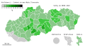
Other choropleth maps of elections in Slovakia found:
-

-

-
 KSČ 1946 (31% statewide)
 -

-
 HZDS-RSS 1994 (34.97%)
 -
 2015 referendum (94.50% for man-woman marriage) (by sk:User:Belisarius~skwiki)
 -
 KDH 2019 (9.70%)


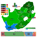
South Africa
commons:User:沁水湾 attempted to mix two types of maps, one large with bullet points for seats, the others are small party-specific choropleth maps with number. I am not sure the first one is necessary at all, and removing it would increase the size of choropleth maps, making the numbers legible.
-
 1994 General Election
 -
 1999 General Election
 -
 2004 General Election
 -
 2009 General Election
 -
 2014 General Election
 -
 2019 General Election


Spain
Made by es:User:Adaklein, who did just a few dozen contributions to Wikipedia, and this is his only map posted on Mediawiki. Uses 6 hues. Quite legible (except the legend's police font).

Turkey
Turkish User:Nub Cake made these choropleth maps of the performance of Turkish political parties over the recent years. There are 7 hues, but the margins are not provided:


.png)


.png)
With the help of User:Nub Cake, User:Mondolkiri, who is now banned from editing, made these maps using 10% intervals:


Previously, User:Emreculha made other maps for Turkish parties' performance, using a wide palette of hues, representing 5% intervals (which leads to similar legibility issues as for Swedish/Norwegian maps).


User:QuartierLatin1968 made these maps in 2007 using a color gradient instead of discrete hues. The result is more legible than 10 or 20 hues. The user is still contributing to Wikipedia projects.


User:MustafaKurt and User:Bibilili


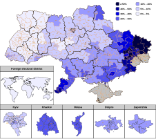
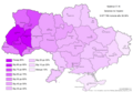
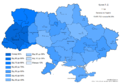
Ukraine
Made by commons:User:Tohaomg (also uk:Користувач:Tohaomg) following the 2019 snap elections. The number of intervals varies between 5 and 9. The ranges are ad hoc. On the one hand, it quickly conveys where parties are strong and weak. On the other hand, the hues are not, however, standardized -- leaving the impression that the 3rd party came in front of the 1st.
-
 Servant of the People (SN) 2019 (43.16%)
 -
 Opposition Platform — For Life 2019 (13.05%)
 -
 Fatherland 2019 (8.18%)
 -
 European Solidarity 2019 (8.10%)
 -
 Voice 2019 (5.82%)
 -
 Turnout 2019


The first modern Ukrainian election per se:

Maps for the period between 1994 and 2002 (besides turnout) were made by commons:User:Nazar.galitskyj in 2013-14 and 2019. Uses few hues, but very informative:
-
 Turnout 2002 (Rada)
 -
 Turnout 2006 (Rada)
 -
 Turnout 2007 (Rada)
 -
 Turnout 2012 (Rada)
 -
 Turnout 2014 (Rada)
 -
 Turnout 2019 (Presidential, 2nd round)
 -
-

-

-

-

-

-

-

-

-

-

-

-

-
-

-

-
 Nasha Ukrayina 2002 (23.57%)
 -

-
 Kuchma's alliance 2002 (11.78%)
 -
 Tymoshenko's Bloc 2002 (7.26%)
 -
 SPU 2002 (6.87%)


.PNG)


commons:User:DemocracyATwork contributed solely to Wikipedia between 2008 and 2010 to upload content about Ukrainian elections:
-
 Yushchenko 2004, 1st round (39.90%)
 -
 Yanukovych 2004, 1st round (39.26%)
 -

-
 Yanukovych 2004, 2nd round
 -
 Yanukovych 2004, 2nd round re-run
 -
 Yushchenko 2004, 2nd round
 -
 Yushchenko 2004, 2nd round re-run
 -
 Yanukovych 2010, 1st round (35.32%)
 -
 Tymoshenko 2010, 1st round (25.05%)
 -
 Serhiy Tihipko 2010, 1st round (13.05%)
 -

-
 Yanukovych 2010, 2nd round (45.47%)
 -
 Yanukovych 2010, 2nd round (48.95%)
.png)
.png)
.png)
.png)
.png)
.png)
.png)
.png)
.png)
.png)
.png)
.png)
.png)
Well-done maps at the district level were made back in 2006 by User:Olegzima:


commons:User:DemocracyATwork made the same maps twice -- one highlighting regional strongholds (using the shares of the parties' nationwide votes), the other showing regional success (relative to other parties in the region):
a.PNG) |
a.PNG) |
a.PNG) |
a.PNG) |
a.PNG) |
a.PNG) |
.PNG) |
.PNG) |
.PNG) |
.PNG) |
.PNG) |
.PNG) |
User:Green Zero ( commons:User:Green Zero) made these maps for the 2014 Ukrainian presidential election:
.png) |
.png) |
.png) |
|||
| ↑ Порошенко Petro Poroshenko (54.70%) | ↑ Тимошенко Yulia Tymoshenko (12.81%) | ↑ Ляшко Oleh Liashko (8.32%) | |||
.png) |
.png) |
.png) |
|||
| ↑ Гриценко Anatoliy Hrytsenko (5.48%) | ↑ Тігіпко Serhiy Tihipko (5.23%) | ↑ Добкін Mykhailo Dobkin (3.03%) | |||
.png) |
.png) |
.png) |
|||
| ↑ Рабінович Vadim Rabinovich (2.25%) | ↑ Богомолець Olga Bogomolets (1.91%) | ↑ Симоненко Petro Symonenko (1.51%) | |||
.png) |
.png) |
.png) |
|||
| ↑ Тягнибок Oleh Tyahnybok (1.16%) | ↑ Ярош (0.70%) | ↑ Гриненко (0.40%) | |||
.png) |
.png) |
.png) |
|||
| ↑ Коновалюк (0.38%) | ↑ Бойко (0.19%) | ↑ Маломуж (0.13%) | |||
.png) |
.png) |
.png) |
|||
| ↑ Кузьмін (0.10%) | ↑ Куйбіда (0.06%) | ↑ Клименко (0.05%) | |||
.png) |
.png) |
.png) |
|||
| ↑ Цушко (0.05%) | ↑ Саранов (0.03%) | ↑ Шкіряк (0.02%) |
United Kingdom
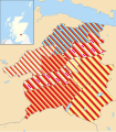
Scotland
commons:User:Brythones and commons:User:MrPenguin20 made these maps in 2016-2017, using 5% or 2.5% intervals:
-
 2016 Conservatives (22.9%)
 -
 2016 Conservatives swing (+10.6%)
 -
 EU membership referendum Remain vote (62.00%)

_by_constituency.svg)
.svg)
commons:User:沁水湾 just made these pretty maps, using 5% intervals, which in this case works very fine:
-
 2014 Scottish independence referendum "No" vote (55.30%)
 -
 Glasgow SNP 2017 (41.0%, 39)
 -
 Glasgow Labour 2017 (30.2%, 31)
 -
 Glasgow Conservative 2017 (14.6%, 8)
 -
 Glasgow Green 2017 (8.7%, 7)
 -
 West Lothian SNP 2017 (37.3%, 13)
 -
 West Lothian SNP 2022 (37.9%, 15)
 -
 West Lothian Labour 2017 (29.0%, 12)
 -
 West Lothian Labour 2022 (28.6%, 12)
 -
 West Lothian Conservative 2017 (23.2%, 7)
 -
 West Lothian Conservative 2022 (15.9%, 4)


United States
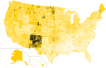
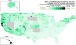
Although you would think that the USA, not using Proportional Representation in any circumstance, do not need choropleth maps, commons:User:沁水湾 has found a very good use, with multi-candidate primaries. She uses 5% intervals, which makes extremes very legible:

Similarly, User:MisterElection2001 made choropleth maps for minor presidential candidates, by county:
-
 1972 presidential election - Percentage of votes cast for John Schmitz by county
 -
 2016 presidential election - Percentage of votes cast for Gary Johnson by county
 -
 2016 presidential election - Percentage of votes cast for Jill Stein by county


Cities


Other interesting uses and types
-
 Poland's most denser gminy (by commons:User:Klarigi a.k.a. NerdyMaps)
 -
 Austria
 -
 Ukraine
 -
 Italy
Italy -
 Hungary
 -
 Switzerland
 -
 Germany
 -
 Belgium
 -
 The Netherlands
 -
 Central Europe


Multi-colored areas
Mostly used on Wikipedia for the United Kingdom local elections (as each ward has multiple seats)
-
 Northern Ireland 1999
 -
 West Lothian 2007
 -
 Glasgow City 2007
.svg)


Cartograms ( anamorphosis)
-
 2002 Cartogram with each municipality rescaled to the number of valid votes cast. The municipalities are the color of the party that got the most votes within the coalition that won relative majority.
 -
 2002 Cartogram of vote with each municipality rescaled in proportion to number of valid votes cast. Deeper blue represents a relative majority for the centre-right coalition, brighter red represents a relative majority for the left-wing coalition.
 -
 2006 Cartogram of the vote with each municipality rescaled in proportion to the number of valid votes. Deeper blue represents a relative majority for Alliance for Sweden, brighter red represents a relative majority for the Red-Green bloc.
 -
 Map showing the voting shifts from the 2002 to the 2006 election. Darker blue indicates a municipality voted more towards the parties that form Alliance for Sweden. Darker red indicates a municipality voted more towards the parties that form the red-green bloc.
 -
2002 Votes by municipality as a scale from red/Left-wing bloc to blue/Centre-right bloc.


Various
commons:User:Magog the Ogre/Political maps
See also
also see
This page makes the case for choropleth maps on Wikipedia election articles. "Choropleth" means "cluster zones". A Choropleth map is a map that uses different hues of the same color, for the clustered variable.
- In the first part, we argue why Wikipedians should embrace this type of map for most areas.
- In the second part, we provide an almost comprehensive, and up-to-date gallery of choropleth maps used on Wikipedia, and a commentary of each author's methods.
The problem, the examples, the solutions
What is the problem on Wikipedia?
Typically, election maps on Wikimedia Commons and Wikipedia display the jurisdiction's constituencies ("districts", "ridings", "wards", etc.) colored by the party that won it. This makes perfect sense: under Plurality (First-past-the-post), whoever tops the district, gets the seat.
However, under the various forms of Proportional Representation, no-one "wins" a district: districts are multi-member, and coming first is no more meaningful than coming second, only the share of votes is (which by design gives the share of seats).
As a reminder, PR methods are in use in:
- almost all of continental Europe and Latin America, in elections of legislative assemblies (exceptions: the French Parliament, the Polish and Czech Senates, and a number of countries using FPTP in parallel with PR seats).
- in English-speaking countries, this includes: the lower houses of Ireland, Northern Ireland (STV), New Zealand, Scotland, Wales (MMP), and the upper houses of Australia.
(That is, in summary, most liberal democracies and jurisdictions!)
As the examples below show, using maps of district winners for PR elections has many shortcomings:
- lack of information provided:
- in a two-party system, a big *victory for one party is a big loss for the other ; but in a multi-party PR system, it is impossible to tell with a district winner map, areas in which the party came second, from areas where it is completely excluded
- in PR, district victory is arbitrary: the party coming first may have received as little as 20%, and may be followed by a series of like-minded parties that collectively outweigh the first party in the district
- meaninglessness:
- due to Duverger's Law, PR methods tend to increase the number of parties in competition, division being much less detrimental ; but this doesn't mean there can't be pre-declared left-right alliances, which in this case is the meaningful division to show
- under FPTP, parties tend to be catch-all parties ; under PR, coalitions may be formed after the election and can aggregate catch-all parties with smaller parties appealing to a fraction of the electorate, and sometimes one-issue parties
- lack of legibility:
- the number of colors needed in a multi-party system makes maps uneasy to read and of little use
Illustrating the absurdity
Most electoral maps on Wikipedia show district winners even under Proportional Representation, despite it is in such case meaningless, potentially deceptive for election analyses, and illegible overall:
-
1972 Dutch general election, 7 parties shown out of 14, missing the meaningful left (PvdA-PPR-D66) and right (KVP-APR-CHU) alliances
-
2018 Latvian parliamentary election, with 7 different parties
-
2019 Belgian regional elections, with 8 parties and unnecessary hues
-
2019 Moldovan parliamentary election, 4 parties
-
2021 Scottish Parliament election, 4 parties with unnecessary hues for constituencies, but would've been very useful in a map of the regional vote
-
2022 Finnish county elections, 11 parties of which 8 top at least one district, with 7 hues each. Only problem is that these districts do not matter at all.
-
2007 Estonian parliamentary election, 5 parties with 4 to 6 hues each
Some designers prefer to color small dots or squares representing seats, instead of representing zones. Their legibility is questionable:
-
2022 Finnish county elections, 1379 squares, with colors for 7 middle parties, 2 minor parties + 1 locally major one
-
2016 Irish general election, 158 dots
-
2015 Polish parliamentary election, 460 dots -- can you distinguish Poland A and B?
-
1998 Northern Ireland Assembly election, 108 dots -- at which size can you distinguish the clear-cut sectarian boundaries?
-
2018 Slovenian parliamentary election, 88 dots -- can you guess where's Ljubljana and where's the countryside?
Solutions
If one wants to analyze an election under PR, then one should better use party-specific choropleth maps, which use hue progression to show the varying degrees of success in the various districts. The degrees should be divided in 4 or 5 natural breaks (Jenks): this method allows readers to extract the most meaning (unlike arbitrary intervals, or standard deviation) while staying very close to the distribution of data.
I have often seen these maps in use by political pundits, " psephologist"s, and sociologists in continental Europe, in particular France and Germany. The English Wikipedia is largely written by users who do not live in countries using PR, and this probably explains why it hasn't caught up on that particular custom of political science in non-English-speaking countries.
As a sidenote, it could be argued that chorochromatic maps would be more accurate than choropleth ones, especially when a state has districts with largely unpopulated areas, such as the Australian Outback (for upper house elections), the Scandinavian polar circle, the Kazakh Steppe, Russian Siberia etc.
Gallery of choropleth maps
Here's a list of choropleth election maps posted on Wikimedia:
Bulgaria
An outstanding map made in 2021 by User:Ivonster04. Uses 5 hues with a rough clustering adapted to each party, that works very well. With maps like this you can understand Bulgarian politics very quickly!
Czechia
Czech Wikipedia User MrGreg has created about a hundred maps, solely for Czech elections (legislative since 1992, presidential runoffs since 2013).
- For legislative elections, he always uses the same scale of 8 hues, each corresponding to 5% intervals (range [0-5;35-40]). In some cases he has to manually label districts that are above 40%.
- For presidential run-off elections, he also uses 8 hues but with a larger interval of 10% (range [<20;>80]).
He also has two maps of district turnout variations, using 9 hues corresponding to 2.5% intervals [<-10;>10], and two maps of district turnout, using the range of presidential run-off elections.
All in all, they are very legible, and provide immediate insight of each party's strong areas.
-
Andrej Babiš 2023
-
Petr Pavel 2023
-
Miloš Zeman 2018
-
Jiří Drahoš 2018
-
SPOLU 2021
-
ANO 2021
-
PirSTAN 2021
-
SPD 2021
-
Přísaha 2021
-
KSČM 2021
-
ČSSD 2021
-
ČSSD 2017
-
ČSSD 2013
-
ČSSD 2010
Complete gallery of MrGreg's maps
|
|---|
Presidential elections
Legislative electionsVolby 2021
Volby 2017
Volby 2013Volby 2010Volby 2006Volby 2002Volby 1998
Volby 1996Volby 1992 |
Finland
Made by commons:User:Stadscykel in 2011. Used 5% intervals (except for the first 10 percent, and the last interval), which means there were from 7 to 10 hues for the 4 bigger parties. Did not contribute later. PS 2015 was made by commons:User:URunICon.
See also: commons:Maps of Finland - general elections by year and party.
Germany
de:User:Wahlatlas, apparently the owner of the website of the same name, made these wonderful maps, with 5 degrees and (seemingly) natural breaks.
-
CDU-CSU 2013
-
SPD 2013
-
Grüne 2013
-
Linke 2013
-
FDP 2013
-
AfD 2013
-
Piraten 2013
-
NPD 2013
-
CDU-CSU 2017
-
SPD 2017
-
AfD 2017
-
Grüne 2017
-
FDP 2017
-
Linke 2017
-
NPD 2017
-
Turnout 2017
User:Furfur made these maps for the 2009 election. The number of intervals range from 4 to 9 (!) because of the 5%-interval chosen arbitrarily.
-
CDU-CSU 2009
-
SPD 2009
-
FDP 2009
-
Grüne 2009
-
Linke 2009
-
Piraten 2009
User:Hilarus von Baerenstein uploaded just one beautiful map, with 6 intervals adapted to each party chosen manually:
-
1990 Volkskammer election
Here, the use of hues for different intervals provides many clues to our understanding of Germany before WWII:
-
NSDAP 1933, by User:Korny78 in 2007
-
NSDAP 1933, by User:Dove in 2008, re-colored by User:Furfur in 2015
Ireland (Republic of)
Outstanding maps were made by User:JandK87 for Ireland's Dail elections (since 1921) and Northern Assembly (since 1973). However, he stopped editing after 2011, came back for the 2016 election, and never edited again. It turns out that another user made and imposed his own maps starting in 2011, where seats won are shown as tiny dots on a dark grey map. see Category:Election maps of the Republic of Ireland on Commons
-
1921
-
1922
-
1923
-
Jun 1927
-
Sep 1927
-
1932
-
1933
-
1937
-
1938
-
1943
-
1944
-
1948
-
1951
-
1954
-
1957
-
1961
-
1965
-
1969
-
1973
-
1977
-
1981
-
Feb 1982
-
Nov 1982
-
1987
-
1989
-
1992
-
1997
-
2007
-
2011 (not used) [1]
-
2016 (not used) [2]
-
2020 (missing)
Ireland (Northern)
-
1973
-
1975 (Constitutional Convention)
-
1982
-
1998
-
2003
-
2007
-
2011
-
2016
-
2016 (by commons:User:沁水湾)
-
2017
-
Made by User:RaviC:
-
Northern Ireland Conservatives in 2015
Japan
commons:User:沁水湾 made many electoral maps, including one that defines as a choropleth map using 5 hues:
-
1942 Japanese general election: Taisei Yokusankai
In 2022, she crafted 7 maps for the 2021 Japanese general election, one for each party that won seats through the PR method:
-
Liberal Democratic Party, PR vote share 2021
-
Constitutional Democratic Party, PR vote share 2021
-
Nippon Ishin no Kai, PR vote share 2021
-
Kōmeitō, PR vote share 2021
-
Japanese Communist Party, PR vote share 2021
-
Democratic Party for the People, PR vote share 2021
-
Reiwa Shinsengumi, PR vote share 2021
...she even added them on the election page with a switcher!
Kazakhstan
commons:User:ShadZ01 recently produced these awesome maps of the most recent Kazakh elections (2019 and 2021). There are 4 intervals for the minor parties and 5 for the dominant party, which makes sense. The ranges do not seem to be broken with a statistical tool, but rather manually. No legend whatsoever is included; it has to be written somewhere else.
2021 Kazakh legislative election:
8–10% 10–12% 12–14%
14–16%
0–5% 5–10% 10–15%
15–17%
0–4% 4–8% 8–12%
12–13%
Korea (Republic of)
made by commons:User:沁水湾
-
Sim Sang-jung 2022 (2.38%), using 12 hues (!)
Netherlands
-
Areas where the Dutch Christian right Reformed Political Party (SGP) received a significant number of votes in 2010, largely co-extensive with the Dutch Bible Belt.
-
SGP 2003, using 5%-intervals (7 in total)
Nepal
Made by commons:User:Vanished user 1932142 in 2020. Used 6 hues, corresponding to 3-percent-intervals:
Poland
Made by Robert Wielgórski, known by the username Barry Kent (commons) (also wp:pl wp:en) right after the 2007 elections. He made use of varying interval numbers and lengths for each party.
-
-
-
PO+PSL 2007
-
PK 2007
-
Turnout 2007
-
Wahlkomitee in the Voivodeship of Opole
Portugal
-
CDU 2005 (jpg)
-
CDU 2005 (svg)
-
2019 Portuguese legislative election: parties to the left of PS (BE, CDU, LIVRE)
-
PS 2022 (de facto a party-specific chropleth map, except for Azores)
User:Welkend ( commons) has just made awesome maps for the 2022 Portuguese legislative election, using 5 intervals for each party. Intervals are all of equal size (except PS's first one?) which highlights voter concentration:
-
Share of the Socialist Party (PS) by municipality
-
Share of the Social Democratic Party (PSD) by municipality
-
Share of CHEGA (CH) by municipality
-
Share of the Liberal Initiative (IL) by municipality
-
Share of the Left Bloc (BE) by municipality
-
Share of the Unitary Democratic Coalition (CDU) by municipality
-
Share of the CDS-People's Party (CDS-PP) by municipality
-
Share of the People–Animals–Nature (PAN) by municipality
-
Share of the Livre (L) by municipality
Sweden
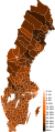
Several interesting maps were done by User:Avopeas who was mostly active in 2017, and blanked his talk page in 2019. He is still active on commons (User page) where he updates average polling graphs for Scandinavian countries.
- (+) we can clearly see the best and worst areas for each party
- (-) All the maps use the same orange tone.
- (-) More problematic, the maps use 14 equal intervals and different hues! Impossible to process quickly.
- (-) the equal intervals are not adapted to each party (ranges are too large for smaller parties, too small for larger ones)
The author did much better with this map of population density, although the intervals are quite arbitrary.
2014 Swedish general election § Results by municipality
-
Social Democratic
-
Moderate
-
Sweden Democrats
-
Green
-
Centre
-
Left
-
Liberal People's Party
-
Christian Democrats
-
Feminist Initiative
-
Shaded, red (S+V+MP) to blue (M+C+FP+KD)
Results of the 2018 Swedish general election
-
Social Democratic
-
Moderate Party
-
Sweden Democrats
-
Centre Party
-
Left Party
-
Christian Democrats
-
Liberals
-
Green
-
Shaded, red (S+V+MP) to blue (M+C+KD+L)
2002 Swedish general election and 2006 Swedish general election (the two blocs received >97%):
-
Votes by municipality as a scale from red/Left-wing bloc to blue/Centre-right bloc.
-
Votes by municipality as a scale from red/Red-green bloc to blue/Alliance for Sweden.
Feminist Initiative and Sweden Democrats:
-
FI 2014-6
-
FI 2014-9
-
SD 2002
-
SD 2006
-
SD 2010
-
SD 2014
-
SD 2018
Norway
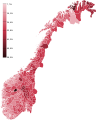
2017 Norwegian parliamentary election.
-
Labour
-
Conservative
-
Progress
-
Centre
-
Socialist
-
Liberal
-
Christian
-
Green
-
Red
2021 Norwegian parliamentary election.
-
Labour
-
Conservative
-
Centre
-
Progress
-
Socialist Left
-
Red
-
Liberal
-
Green
-
Christian Democratic
-
Patient Focus
Denmark
User:Gust Justice made these maps for the 2022 Danish general election. It was embedded in the main page using a switcher template. His work is remarkable
- it is comprehensive: all 14 registered parties, have got a map of their own, as well as independent candidates. (At this point the only missing map is the turnout rate, which brings hidden clues to light about the unspoken.)
- there is a limited and regular number of hues: always set to 5.
The clustering algorithm is unknown but the result appears to be balanced, except.
|
Slovakia and others
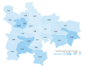
Australian User:Erinthecute, who has made countless illustration maps for election pages on Wikipedia, recently began to notice the usefulness of choropleth maps, beginning with Slovakia, the city of Graz (see § Cities) and Portugal. She is using 4 to 6 hues by party, usually 5:
commons:User:Liqid1010 made a handful of maps following the 2020 Slovak parliamentary election, using nine 5%-intervals.
-
OĽaNO & allies 2020 (25.03%)
-
SMER-SD 2020 (18.29%)
-
Sme Rodina 2020 (8.24%)
-
ĽSNS 2020 (7.97%)
-
PS-SPOLU 2020 (6.97%)
-
SaS 2020 (6.22%)
-
ZĽ 2020 (5.77%)
-
MKS 2020 (3.91%)
sk:User:Mikulas1 crafted many maps in 2017, but sadly, stopped contributing. His maps, using for each party a variable number of (mostly) 5%-intervals, have not yet been integrated into Wikipedia's English articles on Slovak parties and elections:
-
SMER-SD 2010 (18.29%)
-
SDKÚ-DS 2010 (15.42%)
-
SaS 2010 (12.15%)
-
-
Most-Híd 2010 (8.13%)
-
SNS 2010 (5.08%)
-
SMER-SD 2012 (44.42%)
-
-
SaS 2012 (8.56%)
-
Most-Híd 2012 (6.90%)
-
SDKÚ-DS 2012 (6.10%)
-
OĽaNO 2012 (5.88%)
-
SNS 2012 (4.56%)
-
SMER-SD 2016 (28.28%)
-
SaS 2016 (12.10%)
-
OĽaNO-NOVA 2016 (11.03%)
-
SNS 2016 (8.64%)
-
ĽSNS 2016 (8.04%)
-
Sme Rodina 2016 (6.63%)
-
Most-Híd 2016 (6.50%)
-
#SIEŤ 2016 (5.61%)
-
Other choropleth maps of elections in Slovakia found:
-
-
-
KSČ 1946 (31% statewide)
-
-
HZDS-RSS 1994 (34.97%)
-
2015 referendum (94.50% for man-woman marriage) (by sk:User:Belisarius~skwiki)
-
KDH 2019 (9.70%)
South Africa
commons:User:沁水湾 attempted to mix two types of maps, one large with bullet points for seats, the others are small party-specific choropleth maps with number. I am not sure the first one is necessary at all, and removing it would increase the size of choropleth maps, making the numbers legible.
-
1994 General Election
-
1999 General Election
-
2004 General Election
-
2009 General Election
-
2014 General Election
-
2019 General Election
Spain
Made by es:User:Adaklein, who did just a few dozen contributions to Wikipedia, and this is his only map posted on Mediawiki. Uses 6 hues. Quite legible (except the legend's police font).
Turkey
Turkish User:Nub Cake made these choropleth maps of the performance of Turkish political parties over the recent years. There are 7 hues, but the margins are not provided:
With the help of User:Nub Cake, User:Mondolkiri, who is now banned from editing, made these maps using 10% intervals:
Previously, User:Emreculha made other maps for Turkish parties' performance, using a wide palette of hues, representing 5% intervals (which leads to similar legibility issues as for Swedish/Norwegian maps).
User:QuartierLatin1968 made these maps in 2007 using a color gradient instead of discrete hues. The result is more legible than 10 or 20 hues. The user is still contributing to Wikipedia projects.
User:MustafaKurt and User:Bibilili
Ukraine
Made by commons:User:Tohaomg (also uk:Користувач:Tohaomg) following the 2019 snap elections. The number of intervals varies between 5 and 9. The ranges are ad hoc. On the one hand, it quickly conveys where parties are strong and weak. On the other hand, the hues are not, however, standardized -- leaving the impression that the 3rd party came in front of the 1st.
-
Servant of the People (SN) 2019 (43.16%)
-
Opposition Platform — For Life 2019 (13.05%)
-
Fatherland 2019 (8.18%)
-
European Solidarity 2019 (8.10%)
-
Voice 2019 (5.82%)
-
Turnout 2019
The first modern Ukrainian election per se:
Maps for the period between 1994 and 2002 (besides turnout) were made by commons:User:Nazar.galitskyj in 2013-14 and 2019. Uses few hues, but very informative:
-
Turnout 2002 (Rada)
-
Turnout 2006 (Rada)
-
Turnout 2007 (Rada)
-
Turnout 2012 (Rada)
-
Turnout 2014 (Rada)
-
Turnout 2019 (Presidential, 2nd round)
-
-
-
-
-
-
-
-
-
-
-
-
-
-
-
-
-
Nasha Ukrayina 2002 (23.57%)
-
-
Kuchma's alliance 2002 (11.78%)
-
Tymoshenko's Bloc 2002 (7.26%)
-
SPU 2002 (6.87%)
commons:User:DemocracyATwork contributed solely to Wikipedia between 2008 and 2010 to upload content about Ukrainian elections:
-
Yushchenko 2004, 1st round (39.90%)
-
Yanukovych 2004, 1st round (39.26%)
-
-
Yanukovych 2004, 2nd round
-
Yanukovych 2004, 2nd round re-run
-
Yushchenko 2004, 2nd round
-
Yushchenko 2004, 2nd round re-run
-
Yanukovych 2010, 1st round (35.32%)
-
Tymoshenko 2010, 1st round (25.05%)
-
Serhiy Tihipko 2010, 1st round (13.05%)
-
-
Yanukovych 2010, 2nd round (45.47%)
-
Yanukovych 2010, 2nd round (48.95%)
Well-done maps at the district level were made back in 2006 by User:Olegzima:
commons:User:DemocracyATwork made the same maps twice -- one highlighting regional strongholds (using the shares of the parties' nationwide votes), the other showing regional success (relative to other parties in the region):
|
|
|
|
|
|
|
|
|
|
|
|
User:Green Zero ( commons:User:Green Zero) made these maps for the 2014 Ukrainian presidential election:
|
|
|
|||
| ↑ Порошенко Petro Poroshenko (54.70%) | ↑ Тимошенко Yulia Tymoshenko (12.81%) | ↑ Ляшко Oleh Liashko (8.32%) | |||
|
|
|
|||
| ↑ Гриценко Anatoliy Hrytsenko (5.48%) | ↑ Тігіпко Serhiy Tihipko (5.23%) | ↑ Добкін Mykhailo Dobkin (3.03%) | |||
|
|
|
|||
| ↑ Рабінович Vadim Rabinovich (2.25%) | ↑ Богомолець Olga Bogomolets (1.91%) | ↑ Симоненко Petro Symonenko (1.51%) | |||
|
|
|
|||
| ↑ Тягнибок Oleh Tyahnybok (1.16%) | ↑ Ярош (0.70%) | ↑ Гриненко (0.40%) | |||
|
|
|
|||
| ↑ Коновалюк (0.38%) | ↑ Бойко (0.19%) | ↑ Маломуж (0.13%) | |||
|
|
|
|||
| ↑ Кузьмін (0.10%) | ↑ Куйбіда (0.06%) | ↑ Клименко (0.05%) | |||
|
|
|
|||
| ↑ Цушко (0.05%) | ↑ Саранов (0.03%) | ↑ Шкіряк (0.02%) |
United Kingdom
Scotland
commons:User:Brythones and commons:User:MrPenguin20 made these maps in 2016-2017, using 5% or 2.5% intervals:
-
2016 Conservatives (22.9%)
-
2016 Conservatives swing (+10.6%)
-
EU membership referendum Remain vote (62.00%)
commons:User:沁水湾 just made these pretty maps, using 5% intervals, which in this case works very fine:
-
2014 Scottish independence referendum "No" vote (55.30%)
-
Glasgow SNP 2017 (41.0%, 39)
-
Glasgow Labour 2017 (30.2%, 31)
-
Glasgow Conservative 2017 (14.6%, 8)
-
Glasgow Green 2017 (8.7%, 7)
-
West Lothian SNP 2017 (37.3%, 13)
-
West Lothian SNP 2022 (37.9%, 15)
-
West Lothian Labour 2017 (29.0%, 12)
-
West Lothian Labour 2022 (28.6%, 12)
-
West Lothian Conservative 2017 (23.2%, 7)
-
West Lothian Conservative 2022 (15.9%, 4)
United States
Although you would think that the USA, not using Proportional Representation in any circumstance, do not need choropleth maps, commons:User:沁水湾 has found a very good use, with multi-candidate primaries. She uses 5% intervals, which makes extremes very legible:
Similarly, User:MisterElection2001 made choropleth maps for minor presidential candidates, by county:
-
1972 presidential election - Percentage of votes cast for John Schmitz by county
-
2016 presidential election - Percentage of votes cast for Gary Johnson by county
-
2016 presidential election - Percentage of votes cast for Jill Stein by county
Cities
Other interesting uses and types
-
Poland's most denser gminy (by commons:User:Klarigi a.k.a. NerdyMaps)
-
Austria
-
Ukraine
-
Italy
-
Hungary
-
Switzerland
-
Germany
-
Belgium
-
The Netherlands
-
Central Europe
Multi-colored areas
Mostly used on Wikipedia for the United Kingdom local elections (as each ward has multiple seats)
-
Northern Ireland 1999
-
West Lothian 2007
-
Glasgow City 2007
Cartograms ( anamorphosis)
-
2002 Cartogram with each municipality rescaled to the number of valid votes cast. The municipalities are the color of the party that got the most votes within the coalition that won relative majority.
-
2002 Cartogram of vote with each municipality rescaled in proportion to number of valid votes cast. Deeper blue represents a relative majority for the centre-right coalition, brighter red represents a relative majority for the left-wing coalition.
-
2006 Cartogram of the vote with each municipality rescaled in proportion to the number of valid votes. Deeper blue represents a relative majority for Alliance for Sweden, brighter red represents a relative majority for the Red-Green bloc.
-
Map showing the voting shifts from the 2002 to the 2006 election. Darker blue indicates a municipality voted more towards the parties that form Alliance for Sweden. Darker red indicates a municipality voted more towards the parties that form the red-green bloc.
-
2002 Votes by municipality as a scale from red/Left-wing bloc to blue/Centre-right bloc.
Various
commons:User:Magog the Ogre/Political maps
See also
also see