| This is an archive of past discussions. Do not edit the contents of this page. If you wish to start a new discussion or revive an old one, please do so on the current talk page. |
| Archive 1 | Archive 2 |
map
The map does not match with the polls, I think? 83.80.208.22 ( talk) 17:24, 19 February 2015 (UTC)
Vermont
Is Vermont with 46% Clinton en 42% Sanders not shared? 83.80.208.22 ( talk) 12:00, 24 February 2015 (UTC)
- Nope. Not when the poll's only between the 2 candidates. Also, we don't know what the margin of error is.
Tiller54 (
talk) 18:13, 24 February 2015 (UTC)
- Here (
http://www.castleton.edu/about-castleton/the-castleton-polling-institute/poll-results/vermont-election-poll-2014/) is the margin of error of the poll and its number of people polled. I have already added the information to the article.
Nitroxium (
talk) 22:43, 1 May 2015 (UTC)
- According to this site [
[1]], Vermont has an open primary; I think that it be more accurate to have the overall percentage (36-29 in favor of Bernie Sanders) rather than just among Democrats. Vermont also lacks party registration as seen on my previous link, which makes "Democrats" a rather vague classification. The Castleton polling link that was previously mentioned has the full data in a PDF (see page 16 in the PDF) that is available on the site.
Teak the Kiwi (
talk) 20:50, 3 May 2015 (UTC)
- I agree, actually. If it's an open primary, then leaving out the independents would be unrealistic.
Nitroxium (
talk) 01:32, 4 May 2015 (UTC)
- The problem is that the poll does not narrow it down to "independents who plan to vote in the Democratic primary" or even "Democratic-leaning independents", but simply independents as a whole, which includes many people who will not be voting in the Democratic primary. Unless a poll specifically includes one of those two phrases, it's safer to just use the results among Democrats only. Additionally, there's no results among just Democrats and independents combined, the only cumulative results are among Democrats, independents, AND Republicans combined, which is obviously not a relevant result for a Democratic primary.
Robryant1 (
talk) 19:49, 4 May 2015 (UTC)
- The poll gives an option for "not voting in the Democratic primary" which 1% of Republicans and 1% of Independents mark. Does that mean the ones that didn't mark this option are voting in the Democratic primary? I say we either show that Sanders is ahead 36-29 or we shouldn't use the poll at all if it's too inaccurate! Prcc27 ( talk) 14:00, 28 July 2015 (UTC)
- @ Nitroxium: Before you re-revert I just want to make sure that you read what I said above. Saying that Clinton has a lead in Vermont is misleading especially when Independents favor Sanders over Clinton and anyone (including Republicans) can vote in the Democratic primary. Since the poll gives the option "not voting in the Democratic primary" and the people surveyed could have marked that option if that was the case- I'd say it's safe to say Sanders has the lead in Vermont. Prcc27 ( talk) 20:54, 28 July 2015 (UTC)
- The problem is that the poll does not narrow it down to "independents who plan to vote in the Democratic primary" or even "Democratic-leaning independents", but simply independents as a whole, which includes many people who will not be voting in the Democratic primary. Unless a poll specifically includes one of those two phrases, it's safer to just use the results among Democrats only. Additionally, there's no results among just Democrats and independents combined, the only cumulative results are among Democrats, independents, AND Republicans combined, which is obviously not a relevant result for a Democratic primary.
Robryant1 (
talk) 19:49, 4 May 2015 (UTC)
- I agree, actually. If it's an open primary, then leaving out the independents would be unrealistic.
Nitroxium (
talk) 01:32, 4 May 2015 (UTC)
- According to this site [
[1]], Vermont has an open primary; I think that it be more accurate to have the overall percentage (36-29 in favor of Bernie Sanders) rather than just among Democrats. Vermont also lacks party registration as seen on my previous link, which makes "Democrats" a rather vague classification. The Castleton polling link that was previously mentioned has the full data in a PDF (see page 16 in the PDF) that is available on the site.
Teak the Kiwi (
talk) 20:50, 3 May 2015 (UTC)
- Here (
http://www.castleton.edu/about-castleton/the-castleton-polling-institute/poll-results/vermont-election-poll-2014/) is the margin of error of the poll and its number of people polled. I have already added the information to the article.
Nitroxium (
talk) 22:43, 1 May 2015 (UTC)
Fix the map
Clinton has a weak lead in Washington according to the map, but the poll we're using to justify this was taken a day after another poll indicated Clinton has a strong lead. I think we should stripe states that have conflicting percentages within a 3 month time. We would probably need to use an svg text editable map which isn't actually a bad idea. Also, IMHO there only needs to be three shades of green at the most! I think we should consolidate the two darkest shades of green. Prcc27 ( talk) 16:03, 28 July 2015 (UTC) @ Nitroxium: Sorry to ping you and revert you again.. But per above the other map was problematic and inaccurate. the Public opinion of same-sex marriage USA map uses the striping system for conflicting polls just like the map I made. And the GOP map is way more cluttered than the Democrat map and I'm pretty sure the Democrat map won't get as bad especially since there are a lot of states that haven't even been polled/aren't polled that often. It's usually the early voting states that get polled the most. The reason why I picked the 3 month time period is because public opinion isn't likely to change too much in that amount of time and just because the most recent poll says something doesn't mean it's necessarily true. I might be willing to decrease it to 2 months- 1 month would be pushing it IMO. But the current system will not work because it's absolutely bogus to think that Clinton had a 33% lead in Washington one day, and then the very next day all of the sudden she only has a 9% lead. Prcc27 ( talk) 08:33, 29 July 2015 (UTC)
- There are way too many cases of a presidential primary or general election that can show you that 3 months are way too much time to clump together, since even in just one month or even in two weeks big changes can happen. The solution to the case is to use aggregates by RealClearPolitics or HuffingtonPost, but it is expected right now that the map won't be perfect, considering we are early in the primaries and polls aren't coming out as often. People have the reading capability to scroll down and see the polls for themselves. The same Republican primaries map you show updates as new polls come out as well, and it won't be long until a new Washington poll comes out.
Nitroxium (
talk) 15:48, 29 July 2015 (UTC)
- Beyond that, different shades of green gives more information to the reader.
Nitroxium (
talk) 15:53, 29 July 2015 (UTC)
- @
Nitroxium: It's a little
WP:CRYSTAL to speculate that Washington will come out with a new poll soon especially since many states haven't even been polled yet. If we change the time period to 1 month then NH would be double striped instead of triple striped (which is good and would make the map easier to read). Also, many people just look at the map without going through every single table on the article because it's quicker that way. For the many people that do do that- they are being mislead. The newest poll isn't anything special if it was done the same month or even 1 day after like Washington. If we aren't going to use striping, then there needs to be a new color added that says "conflicting poll results within a 1 month period of time". As for the percentages... the GOP doesn't have them on there map and anyone with a 30% lead is doing well in the state regardless of how high they're lead is. Having an extra color for 3 states is unnecessary because the other states above 30% are pretty strong leads for Clinton too. It might have been needed when this was a one woman's race (well, not really), but now that Vermont is fixed there are one too many extra colors.
Prcc27 (
talk) 19:43, 29 July 2015 (UTC)
- Well, you are making the assumption that people come into the article and only look at the map, which is not a sourced claim. I assume you haven't been on this page ever since its creation, but before there was a 69+ color and has since disappeared, so there's the same amount of colors as there always has been. What matters isn't that Clinton is strong or not, but how strong she is. Finally, we can't surely affirm 100% that they are conflicting polls, though I understand your point. Like I said before, our best bet would be an aggregate from RCP or HuffPost or one of our own following the same rules they apply.
Nitroxium (
talk) 22:27, 29 July 2015 (UTC)
- Maybe people do, maybe people don't. But the purpose of the map is to sum up the article at a mere glance and the map is misleading and leaving out the conflicting polls. Does the GOP Primary map have percentages? No, the most important thing about any primary map is to show what states a candidate is leading in. Since the Democratic Primary isn't as competitive some percentages may be necessary to provide sufficient information. But the main reason the percentages could be necessary is to show how much the other candidates need to catch up in order to lead the state. If a candidate leads by less than 10% then it should be fairly easy for the other candidate(s) to catch up; 10%-29%- somewhat difficult; but 30%+ is very difficult for the other candidates to catch up whether it's a 30% lead or a 50% lead. But having any type of percentage map is difficult because it doesn't take into account the margin of error which means in reality a state could fall under 2 or more colors. Anyways, I only weakly oppose the 50%-69% color, but I strongly oppose having states with different poll results within a month colored a solid color. "we can't surely affirm 100% that they are conflicting polls". What do you mean? It is very clear that the polls have contradictory results. The most recent Washington poll says Clinton has a 9% lead but a poll taken the day before says she has a 33% lead. And you don't think it's misleading to only color Washington "Clinton ahead, <10%"..? I don't know what RCP and HuffPost have anything to do with our conversation because neither Washington, Iowa, nor New Hampshire were polled by either one of them! Prcc27 ( talk) 23:06, 29 July 2015 (UTC)
- Oh okay, just looked up the definition of aggregate so now I understand what you mean... That might work Idk if they have one for some of the states. It'd be inconsistent if we don't use aggregates on all states. Furthermore, aggregates use older polling data which doesn't take into account that a candidate might be on a trend, and any polls that are older by 3 months+ than the most recent poll are irrelevant to the current opinion of a candidate. Prcc27 ( talk) 23:25, 29 July 2015 (UTC)
- There are aggregates on any state that has several polls on them and they are based on recent polls. They are very useful tools in case you want to see trends. I would use them or create our own aggregates, making our own rules on this very talk page (preferably based on the rules RCP or HuffPost use). I wanted to save stripes for whenever there is a virtual tie, just like the Republicans are doing, in order to keep more of a consistent format all along the elections articles. (Even though their primary is a much different situation, it's very possible we'll get virtual ties in the future.) Concerning your last sentence, you are right in saying that old polls do little in giving information, hence why I added the footnote at the end of the legends.
Nitroxium (
talk) 02:03, 30 July 2015 (UTC)
- Sounds great, but I can't find an aggregate for Washington. Prcc27 ( talk) 03:50, 30 July 2015 (UTC)
- I propose we create our own then, RCP keeps it really simple by making averages of the polls. We could keep it as an average of polls within a timeframe of a month. Clearly, not all states will require aggregates since some have only one poll or only one recent poll within a timeframe of a month.
Nitroxium (
talk) 04:25, 30 July 2015 (UTC)
- How do we make one? I feel like in order to not violate WP:OR we have to use an aggregate from a reliable source. If you can link me to an aggregate that would be nice! Prcc27 ( talk) 04:29, 30 July 2015 (UTC)
- I know RCP has aggregates on all states, though not all of them are easily accesible. Let me try to find a way to access them.
Nitroxium (
talk) 04:49, 30 July 2015 (UTC)
- I noticed that when you try to average the polls within a certain time frame- it just shows the average for all polls every taken. I can only support not striping and using aggregates if it actually averages only certain polls- not all of them. But if you can tell me how to do it that would be great. And hopefully you find the one for Washington.. Prcc27 ( talk) 10:03, 30 July 2015 (UTC)
- Let me ask you a question, are the WA polls the only ones you consider conflicting?
Nitroxium (
talk) 14:54, 30 July 2015 (UTC)
- No, less than one month isn't really enough time to confidentially say a candidate is on a trend. If there are polls with different results within 30 days then they are conflicting. So I'd stripe Iowa and New Hampshire too. Prcc27 ( talk) 20:58, 30 July 2015 (UTC)
- See, that's completely borderline
WP:OR. You are making your own conclusions about the polls when there are many possibilities about them. Iowa and New Hampshire are states that are more immersed in the process than other states and as such, their numbers will change more rapidly at this stage. Another example is if some event happens that changes people's opinions of a candidate in a short amount of time. You can't say they are conflicting polls, as many factors come into play. In Washington, Clinton could have gone down 1 point and Sanders could have gone up 1 point during the weekend and the two polls wouldn't contradict each other within the margin of error.
- Fair enough, but Washington wasn't within the margin of error. Clinton's lead dropped 24% in 1 day, that's 18% outside the margin of error! Did some event happen the day after the Public Policy Polling that caused Clinton's lead to plummet drastically? I highly doubt it. Idk where you got that 1% difference idea from because that was not the case in Washington... I stand by my opinion that Washington is conflicting. Prcc27 ( talk) 23:32, 30 July 2015 (UTC)
- First, you can't compare the results in PPP with the polls for Gravis including Elizabeth Warren. People could very easily switch from Clinton to Warren if she was an option in the primaries and there is absolutely no conflict there. Therefore, we must compare the results of PPP with the Gravis results WITHOUT Warren. In the PPP poll, she has 57% with a margin of error of 5%, meaning it could be a support of 52%. In the Gravis poll, she has a support of 45% with a margin of error of 6%, meaning it could be 51%. Likewise with Sanders, in PPP he has 24% which could be 29% and in Gravis he has 36% which could be 30%. Hence why if there was a change of 1% of support from Clinton to Sanders during the next few days (which is completely plausible), these two polls are not conflicting. Nitroxium ( talk) 02:39, 31 July 2015 (UTC)
- I must add, the Gravis poll without Warren still includes De Blasio, which means there doesn't even have to be a 1% change of support in the next days. Clinton could have lost 2% to De Blasio in the Gravis poll. There's many possibilities.
Nitroxium (
talk) 02:56, 31 July 2015 (UTC)
- It doesn't matter, why only color Washington with the most recent poll? The poll the day before is just as reliable as the one that's more recent only by a day. I didn't say the more recent poll isn't reliable, what I'm saying is that since these polls happened almost on the same day they should both be used. Both polls are accurate but they have different results that deserve to be represented on the map to give an accurate reflection of the situation. So if the PPP poll was conducted the day after the Gravis poll does that mean Washington would be colored medium green instead of light green? What happens if a poll is conducted on the same exact day; which poll would we have used if this was the case? Either way the fact that the map doesn't take into account the margin of error means it's very inaccurate. I think we should get a third opinion to settle this once and for all! Prcc27 ( talk) 03:27, 31 July 2015 (UTC)
- This has been the rule for the republicans and for the democrats since day one of making this wikipedia page. Yes, if the PPP poll were to have come out a day after, it would be medium green currently. I don't think people should be limited in their reading comprehension to the map and stripes are limited to virtual ties. The map does take into account margin of error, though; the footnote you provided touches the very same problem you present, you point out that the map is not completely accurate due to margin of errors. That is unfortunately not our problem, but a problem of statistics and polling as a whole. They will never be 100% reliable. Us saying that the polls are contradicting or mixing them up in a map when they aren't from the same polling firms and don't even have the same candidates on each poll would definitely be
WP:OR.
Nitroxium (
talk) 03:43, 31 July 2015 (UTC)
- Using your logic, Washington is colored wrong! You said that taking the margin of error into account Clinton could either have a 51% or 52% lead while Sanders could either have a 29% or 30% lead. 51% minus 30% doesn't equal a 10% or less lead for Clinton (which is currently what Washington is colored for)- it equals 21%. So yes, the most recent poll is very close to accurate if and only if you adjust the margin of error so that Clinton has 51% and Sanders has a 30%. But that means that the poll's claim that Clinton has a 45% lead and Sanders has a 36% lead is not accurate when you take into account the poll taken the day before, so Washington should definitely not be colored light green! Prcc27 ( talk) 05:46, 31 July 2015 (UTC)
- Yes, but we can only work with what we're given. We can't change the numbers around and make our own conclusions as per
WP:OR.
Nitroxium (
talk) 23:32, 31 July 2015 (UTC)
- Yes, but that's why we should include both colors. That way the readers can make their own conclusions if they see fit. If the readers only see one color for Washington they will think that all recent polls indicate that Clinton has a 10% or less lead when another very recent poll indicates she has a 30%-49% lead. It isn't WP:OR to include all polls that were done almost the same day as each other. The PPP poll is just as reliable as the Gravis poll so both should be used. Also, I'm starting to think that Florida should be striped too since the dates the polls were taken overlap. Prcc27 ( talk) 07:16, 1 August 2015 (UTC)
- By including both colors, you are coming to the conclusion that they are conflicting polls and that is WP:OR. By reading the footnote about margins of error, readers will scroll down to see the polls for themselves. You cannot come to the conclusion that they are conflicting polls, there is no 100% certainty of that. Nitroxium ( talk) 03:37, 2 August 2015 (UTC)
- Yes, but we can only work with what we're given. We can't change the numbers around and make our own conclusions as per
WP:OR.
Nitroxium (
talk) 23:32, 31 July 2015 (UTC)
- This has been the rule for the republicans and for the democrats since day one of making this wikipedia page. Yes, if the PPP poll were to have come out a day after, it would be medium green currently. I don't think people should be limited in their reading comprehension to the map and stripes are limited to virtual ties. The map does take into account margin of error, though; the footnote you provided touches the very same problem you present, you point out that the map is not completely accurate due to margin of errors. That is unfortunately not our problem, but a problem of statistics and polling as a whole. They will never be 100% reliable. Us saying that the polls are contradicting or mixing them up in a map when they aren't from the same polling firms and don't even have the same candidates on each poll would definitely be
WP:OR.
Nitroxium (
talk) 03:43, 31 July 2015 (UTC)
- See, that's completely borderline
WP:OR. You are making your own conclusions about the polls when there are many possibilities about them. Iowa and New Hampshire are states that are more immersed in the process than other states and as such, their numbers will change more rapidly at this stage. Another example is if some event happens that changes people's opinions of a candidate in a short amount of time. You can't say they are conflicting polls, as many factors come into play. In Washington, Clinton could have gone down 1 point and Sanders could have gone up 1 point during the weekend and the two polls wouldn't contradict each other within the margin of error.
- I know RCP has aggregates on all states, though not all of them are easily accesible. Let me try to find a way to access them.
Nitroxium (
talk) 04:49, 30 July 2015 (UTC)
- There are aggregates on any state that has several polls on them and they are based on recent polls. They are very useful tools in case you want to see trends. I would use them or create our own aggregates, making our own rules on this very talk page (preferably based on the rules RCP or HuffPost use). I wanted to save stripes for whenever there is a virtual tie, just like the Republicans are doing, in order to keep more of a consistent format all along the elections articles. (Even though their primary is a much different situation, it's very possible we'll get virtual ties in the future.) Concerning your last sentence, you are right in saying that old polls do little in giving information, hence why I added the footnote at the end of the legends.
Nitroxium (
talk) 02:03, 30 July 2015 (UTC)
- Well, you are making the assumption that people come into the article and only look at the map, which is not a sourced claim. I assume you haven't been on this page ever since its creation, but before there was a 69+ color and has since disappeared, so there's the same amount of colors as there always has been. What matters isn't that Clinton is strong or not, but how strong she is. Finally, we can't surely affirm 100% that they are conflicting polls, though I understand your point. Like I said before, our best bet would be an aggregate from RCP or HuffPost or one of our own following the same rules they apply.
Nitroxium (
talk) 22:27, 29 July 2015 (UTC)
- @
Nitroxium: It's a little
WP:CRYSTAL to speculate that Washington will come out with a new poll soon especially since many states haven't even been polled yet. If we change the time period to 1 month then NH would be double striped instead of triple striped (which is good and would make the map easier to read). Also, many people just look at the map without going through every single table on the article because it's quicker that way. For the many people that do do that- they are being mislead. The newest poll isn't anything special if it was done the same month or even 1 day after like Washington. If we aren't going to use striping, then there needs to be a new color added that says "conflicting poll results within a 1 month period of time". As for the percentages... the GOP doesn't have them on there map and anyone with a 30% lead is doing well in the state regardless of how high they're lead is. Having an extra color for 3 states is unnecessary because the other states above 30% are pretty strong leads for Clinton too. It might have been needed when this was a one woman's race (well, not really), but now that Vermont is fixed there are one too many extra colors.
Prcc27 (
talk) 19:43, 29 July 2015 (UTC)
- Beyond that, different shades of green gives more information to the reader.
Nitroxium (
talk) 15:53, 29 July 2015 (UTC)
You already explained to me that both polls are accurate with each other within 1%, but that's if and only if Clinton has a 21% lead which the map does have Washington colored as. And it's not the polls that are conflicting, it's that the map doesn't take into account the margin of error and quite frankly a footnote isn't enough. If readers see Washington striped with two colors and they see the margin of error footnote- they will be more likely to scroll down to find out why Washington is striped and to find out what those margin of errors for Washington are. Then they will be able to come to the conclusion that Clinton has about a 21% lead (which is pretty much what you concluded from the polls yourself) or they could come to the conclusion that Clinton does in fact have a less than 10% lead because the poll that says so is more recent. Regardless, purposely leaving out information on the map adds WP:UNDUE bias and may be fraudulent. Prcc27 ( talk) 04:14, 2 August 2015 (UTC)
- We are not leaving out any information, we are avoiding
WP:OR. As per
WP:OR, it is permitted in talk pages and I am allowed to make my own interpretation of the data but that should not be reflected on the article itself.
Nitroxium (
talk) 08:12, 2 August 2015 (UTC)
- Okay, assuming what you said about WP:OR is true, I am also allowed to make my own interpretation of the data that should not be reflected on the article. "By including both colors, you are coming to the conclusion that they are conflicting polls and that is WP:OR." Well personally I might feel that way, but that's only my interpretation and that's not the reason why I'd change the map. Maybe the polls are conflicting or maybe they aren't when you take the margin of error into account (I actually agree with both statements). It doesn't matter, the point is we have two reliable and recent polls that qualify for two different colors not because they are conflicting, but because just like any poll there is a margin of error. Including all recent polls instead of giving WP:UNDUE WEIGHT to the ones that are more recent only by a day or two does not violate Wikipedia policy and it certainly doesn't violate WP:OR. I don't think it makes sense to argue whether or not the polls are conflicting, because the real argument is should we include the most recent poll or should we also include polls that were taken a day or two before the most recent poll too? It isn't right to cherry pick which polls we use on the map when it's obvious that both are equally or about equally WP:RELIABLE. Prcc27 ( talk) 09:59, 2 August 2015 (UTC)
- We aren't cherry picking and we aren't lying about anything. It's clear that we are only putting the very most recent poll on the map and that people must read the section of states in order to get a complete view of the situation. By showing both colors we are coming to the conclusion that one poll by itself is not reliable and that they are conflicting. The only thing we can say about reliability of a poll is that it has a margin of error that may not be represented fully in the map.
Nitroxium (
talk) 21:20, 3 August 2015 (UTC)
- Just as North of Eden said on the Dispute resolution it isn't original research to summarize an obvious truth. By only showing one color on the map it makes it seem like only one poll itself is reliable and the other one taken 1 day before isn't as reliable. Both are just as reliable and striping the map would show that. Prcc27 ( talk) 23:26, 3 August 2015 (UTC)
- We aren't cherry picking and we aren't lying about anything. It's clear that we are only putting the very most recent poll on the map and that people must read the section of states in order to get a complete view of the situation. By showing both colors we are coming to the conclusion that one poll by itself is not reliable and that they are conflicting. The only thing we can say about reliability of a poll is that it has a margin of error that may not be represented fully in the map.
Nitroxium (
talk) 21:20, 3 August 2015 (UTC)
Get rid of the percentages
I fell like it's time to get rid of the percentages on the map. They are not used on the GOP primary article, and they were not used on the 2008 Democratic primary article even though in August 2007 Clinton had just as much of a commanding lead as she does now in 2015. She had a lead in 29 states compared to her current lead in 28 states. I think it would be smart to be consistent throughout the articles. If a map without percentages can be used in 2007 when she had a commanding lead- a map like that can also be used now since Clinton's situation is as similar then as it is now! We should only have three colors (unless other candidates start to lead in states): "Clinton lead", "Clinton/Sanders tied", and "Sanders lead". Since there are three states that Sanders leads or ties in- the percentages are no longer needed. The reason why the map had them in the first place is because Clinton used to lead in every single state (except for Vermont which was incorrectly colored in her favor). But now we have two candidates that are leading in states instead of one. Prcc27 ( talk) 04:05, 11 August 2015 (UTC)
New poll by RKM Research shows Bernie up on Hillary (44% Bernie, 37% Hillary)
Please update this page with the poll results here: http://www.wcvb.com/politics/new-poll-shows-sanders-ahead-of-clinton-in-new-hampshire/34665480
Please additionally update the count of states Bernie is winning in to TWO. — Preceding unsigned comment added by 74.107.74.186 ( talk) 03:30, 12 August 2015 (UTC)
Note on margins of errors and statistical ties
To pre-empt any dispute on how these work, refer to this discussion Ramaksoud2000 ( Talk to me) 07:00, 13 August 2015 (UTC)
Please update Iowa -- Hillary 37% Bernie 30% and within margin of erorr AKA a statistical tie.
Poll results here: www.desmoinesregister.com/story/news/politics/iowa-poll/2015/08/29/iowa-poll-democrats-august/71387664/ — Preceding unsigned comment added by 74.107.74.186 ( talk • contribs) 22:26, 29 August 2015 (UTC)
The map states that there are 3 states shared between Hillary and Sanders. First of all, I don't believe that these states do exist. And if they do, they need to be reflected in the map so people wouldn't be guessing. Also, if these are Oregon, Iowa and West Virginia, then I would be very disappointed. Only Oregon qualifies, but the other two don't (Iowa and West Virginia). They are NOT within the margin of error as I explained before. In Iowa, Hillary is up by 7% and the margin is 4.9%. We have to be unbiased in Wikipedia. Finally, when a state is shared, the two results should be highlighted as blue to make it clear to the reader. All4peace ( talk) 05:19, 30 August 2015 (UTC)
- @ All4peace: In Iowa the margin of error is ± 4.9% meaning that you can either add or subtract that number and be within the margin of error. Clinton could have as low as 32.1% support and Sanders could have as high as 34.9% which means it's possible that Sanders is actually leading in that state. I think Iowa, West Virginia, New Hampshire, Oregon, Wisconsin, and Washington should all be striped! Prcc27 ( talk) 08:49, 30 August 2015 (UTC)
- @
Prcc27:This is exactly why the chart said 3 states. Please revert back to that change. In regards to the map, whoever made the map graphic will have to do it. Reach out to that user.
- You need to gain consensus through discussion first. Please share your thoughts pertaining to the margin of error so we can have a thorough discussion. This is also being discussed here. And actually All4peace made a good point on that talk page "if candidate A went down by 2%, and candidate B went up by 2%, that's a total change of 4%" so I changed my mind and I oppose striping Iowa, West Virginia, New Hampshire, Oregon, Wisconsin, and Washington. Prcc27 ( talk) 18:27, 30 August 2015 (UTC)
- @ Prcc27:Margins of error work both ways. You are correct in your original estimation that Hillary could be as low as 32, and Sanders as high as 34 / 35. I change my mind about West Virginia because we'd need more polling to determine a better idea. As for Oregon, I would apply the same ruling as in Iowa. For Washington, I haven't seen polls so I cannot comment. For what it's worth, NY Times uses this logic for when they call something a 'statistical tie.' Reporter Alan Rapperport confirmed this to me via email. In addition, Morning Joe confirmed Monday morning their belief the Iowa poll is within the margin of error. I support striping Iowa, but not striping Oregon, Washington, West Virginia, or Oregon.
- @
Prcc27:This is exactly why the chart said 3 states. Please revert back to that change. In regards to the map, whoever made the map graphic will have to do it. Reach out to that user.
New poll from West Virginia shows statistical tie.
http://www.wvgazettemail.com/article/20150826/GZ01/150829633
3.21% + or -, 36 for Hillary vs 32 for Bernie.
Please update the map to reflect this. — Preceding unsigned comment added by 74.107.74.186 ( talk) 17:49, 28 August 2015 (UTC)
- Once Hillary begins to lose more states, the Inevitable's surrogates will talk among themselves and change the map criteria again as to keep in tune with HRC's campaign of foreign FB friends, fake Twitter followers, and Wikipedia manipulation.
JaskaPDX (
talk) 07:49, 29 August 2015 (UTC)
- We had some on the endorsement article and it was simply ignored. This needs some formal mediation and I don't know Wikipedia enough to go through the process. If someone wants to lend a hand I can provide all the pertinent information and then they could format the request for mediation. IMO, both these articles need to be locked down so only long-standing Wikipedia editors can edit that page. I don't even know if this is possible. If someone wants to lend a hand, I'm happy to provide the brief of what has occurred (instances of manipulation, talk page discussions, informal mediation by other editors that was then completely ignored, etc.). Trust me, if I knew Wikipedia better, I'd have done this months ago. Until then, I'll keep calling out it out once in a while. I don't hide that I support Clinton's opponent and that certainly turned me on to this issue, but it's dishonest politics at it's core and they shouldn't be manipulating Wikipedia as part of their paper tiger campaigning. JaskaPDX ( talk) 00:17, 8 September 2015 (UTC)
- Once Hillary begins to lose more states, the Inevitable's surrogates will talk among themselves and change the map criteria again as to keep in tune with HRC's campaign of foreign FB friends, fake Twitter followers, and Wikipedia manipulation.
JaskaPDX (
talk) 07:49, 29 August 2015 (UTC)
6 Month Old Polls May Not Accurately Reflect Current Polling Opinions
Polls that are nearing 6 months old are not likely very accurate to the current opinions held in each state. Perhaps 6 months is too long a period to wait before removing polls from the map. 3 or 4 months may be more accurate. However, I do understand that the map will likely look very empty at this stage in the election cycle if we were to make this change. Maybe a significantly darker shade for older polls? Of course, this would also be unlike the current Republican polling map and I understand you wish to keep those similar. In any case, the last poll for Connecticut occurred 6 months ago (March 6-9), so that should be altered. 2ft7Ninja ( talk) 20:05, 9 September 2015 (UTC)
- I agree with you that polls that are about 4 or 5 months old may be too old to include on the map. For this reason I proposed
having a lighter color for polls prior to the candidate's official campaign launch, but it was reverted. In any case, I removed Connecticut's color (I didn't need to change the numbers since Georgia's addition was not reflected in the legend). Next to remove will be Massachussetts on September 19th.
SPQRobin (
talk) 22:17, 9 September 2015 (UTC)
- If it isn't a problem on the GOP map it shouldn't be a problem on the Democratic map. Otherwise, we should have a similar discussion about shading on the GOP talk page. Btw, If we do make the change I'd prefer a lighter shade for older polls but only if we do the same on the GOP map. I think we should wait until tomorrow before removing Connecticut since the poll was taken 6 months ago: not yet outside the 6 month period.
Prcc27 (
talk) 00:10, 10 September 2015 (UTC)
- Well, both primaries are fundamentally different: the Democratic one had a clear frontrunner since the very first poll whereas the Republican one includes many candidates (with only a recent frontrunner) so it makes sense to adapt the respective maps to this reality if necessary. We don't need to have 100% identical maps just for the sake of it. As for Connecticut, did you really revert its removal just for these few remaining hours? That is really nitpicking imho.
SPQRobin (
talk) 02:16, 10 September 2015 (UTC)
- But what does the Democrats having a front runner have to do with whether or not a 4 month old poll is accurate? Obviously it won't work on the GOP map, but if a 4 month old poll is reliable enough for that map it's reliable enough for this map. So even though it's easier to do different shading for polls for 4-6 months old on the DEM map- if the GOP map can survive without out it so can the DEM map. I honestly don't think it would do any good. Yes a lot can change in 4 months and the momentum can switch from one candidate to the other in that time but tbh the same could be done in 2 months or even 1 month. And if the Democrats have had a clear front runner since the very first poll like you suggest then why do you expect the poll results to be any different now than from 4 months ago? Prcc27 ( talk) 03:27, 10 September 2015 (UTC)
- I'm not going to go in details or argue further about this, but my point was mostly that (imho) there are two separate situations and therefore it might be necessary to treat them differently i.e. we don't necessarily need to have an identical system for the two maps. SPQRobin ( talk) 16:07, 10 September 2015 (UTC)
- Well, both primaries are fundamentally different: the Democratic one had a clear frontrunner since the very first poll whereas the Republican one includes many candidates (with only a recent frontrunner) so it makes sense to adapt the respective maps to this reality if necessary. We don't need to have 100% identical maps just for the sake of it. As for Connecticut, did you really revert its removal just for these few remaining hours? That is really nitpicking imho.
SPQRobin (
talk) 02:16, 10 September 2015 (UTC)
- If it isn't a problem on the GOP map it shouldn't be a problem on the Democratic map. Otherwise, we should have a similar discussion about shading on the GOP talk page. Btw, If we do make the change I'd prefer a lighter shade for older polls but only if we do the same on the GOP map. I think we should wait until tomorrow before removing Connecticut since the poll was taken 6 months ago: not yet outside the 6 month period.
Prcc27 (
talk) 00:10, 10 September 2015 (UTC)
Iowa now belongs to Bernie Sanders per new CBS poll confirming Quinnipiac's findings - please update map
New poll from CBS today. Results: Bernie 43% Clinton 33% Biden 10%
Here: https://d25d2506sfb94s.cloudfront.net/cumulus_uploads/document/3zimki4xtx/Iowa_Release_20150913.pdf — Preceding unsigned comment added by 74.107.74.186 ( talk) 17:20, 13 September 2015 (UTC)
Better Map
Could we change the map such as the gop map?

*AR, CO, KS, MD, VT based on polls over six months old. Please note that some states have polls with margin of errors that may not be reflected accurately on this map.
|
2016 U.S. presidential election | |
|---|---|
| Republican Party | |
| Democratic Party | |
| Third parties | |
| Related races | |
| |
83.80.208.22 ( talk) 09:34, 12 August 2015 (UTC)
- I have preferred the system we have right now. — Preceding
unsigned comment added by
186.176.169.49 (
talk) 23:28, 12 August 2015 (UTC)
- Support getting rid of percentages per "Get rid of the percentages" section above! Prcc27 ( talk) 23:31, 12 August 2015 (UTC)
- For the record, Ramaksoud2000 mentioned on the commons talk page that they agree with me and Nitroxium mentioned on the dispute resolution that they disagree with me. The current !vote right now is keep percentages 1 vote (since Nitroxium accidentally used an i.p.) , get rid of percentages 3 votes. Prcc27 ( talk) 23:35, 12 August 2015 (UTC)
- And
here is what the map would look like...
Prcc27 (
talk) 07:46, 13 August 2015 (UTC)
- Paging Leo Chapin III and Tiller54 who originally worked on the map and Neutrality who had some disagreements about the map earlier. Nitroxium ( talk) 19:37, 13 August 2015 (UTC)
- I reiterate my earlier position that the map should go entirely. It feels very
WP:OR to me, and I think it has a tendency to mislead since (1) polling is of highly variable quality and (2) some polls are much older than others.
Neutrality
talk 19:54, 13 August 2015 (UTC)
- @
Neutrality: There's an easy solution to #2. We could color states with polls older than 6 states gray (which is what is done on the GOP map)! But assuming the map stays, which sounds better: showing which candidate leads and what percentages they lead by, or just showing which candidate leads?
Prcc27 (
talk) 20:31, 13 August 2015 (UTC)
- After all the discussions that have happened, it has occured to me that the map has and always will continue making cotroversies due to there being many ways of interpreting its coloring. In this sense,
Neutrality is right in that it feels
WP:OR, since it has many interpretations to it. There will be no other way of resolving the "conflicting polls" issue that Prcc27 has pointed out than removing the map. I would agree with removing the map entirely.
Nitroxium (
talk) 20:37, 13 August 2015 (UTC)
- But if we want to be consistent with the GOP article (which you always seem to advocate for) we either remove both maps or keep both maps. Also, before pinging people you might want to look at
WP:CANVASS.
Prcc27 (
talk) 20:40, 13 August 2015 (UTC)
- I have pinged the appropriate people, Neutrality had concerns about the map, though I did not know he wanted to delete it and the other two originally created the map. I would propose to delete the GOP map as well.
Nitroxium (
talk) 20:42, 13 August 2015 (UTC)
- You would or you will?
Prcc27 (
talk) 20:46, 13 August 2015 (UTC)
- I think the answer to that is obvious, no need for the accusatory tone. Let's give time for the other editors to weigh in their opinion for a richer discussion.
Nitroxium (
talk) 11:57, 14 August 2015 (UTC)
- If there is consensus to remove the map then yes, we will remove it. But until then, we have to find out how we will proceed with the map. There is currently consensus to get rid of the percentages and I will probably do so in a very short time!
Prcc27 (
talk) 17:41, 14 August 2015 (UTC)
- Personally, I think having a map is a helpful summary of the article's topic. I'd imagine that a fair number of readers aren't particularly interested in digging through all the individual polls in the rest of the article. Going by the most recent poll alone, I agree, is probably not a perfect representation of information, but to start combining polls might take us into "original research" territory. As long as it is clear that only the most recent poll is shown on the map, I think that is probably good enough, and the most neutral way we could include a map at all. The many different shadings for Hillary Clinton I would concur are necessary anymore since there are a few states where she is behind Sanders.
Leo Chapin III (
talk) 05:12, 15 August 2015 (UTC)
- To me it just seems too cluttered and AFAIK there has never been a percentage map like this even though in 2007 Clinton had a similar lead. If a reader can read through the GOP article to see by how much a candidate is leading by- then the same can be done on this article. The percentages were added to the map when Clinton lead in every state (except Vermont which was inaccurately colored in her favor). But now Sanders is leading in some states, one of them being a crucial early state. The percentages aren't that desirable, and one user not involved in this discussion actually thanked me for my edit. Prcc27 ( talk) 05:27, 15 August 2015 (UTC)
- Personally, I think having a map is a helpful summary of the article's topic. I'd imagine that a fair number of readers aren't particularly interested in digging through all the individual polls in the rest of the article. Going by the most recent poll alone, I agree, is probably not a perfect representation of information, but to start combining polls might take us into "original research" territory. As long as it is clear that only the most recent poll is shown on the map, I think that is probably good enough, and the most neutral way we could include a map at all. The many different shadings for Hillary Clinton I would concur are necessary anymore since there are a few states where she is behind Sanders.
Leo Chapin III (
talk) 05:12, 15 August 2015 (UTC)
- If there is consensus to remove the map then yes, we will remove it. But until then, we have to find out how we will proceed with the map. There is currently consensus to get rid of the percentages and I will probably do so in a very short time!
Prcc27 (
talk) 17:41, 14 August 2015 (UTC)
- I think the answer to that is obvious, no need for the accusatory tone. Let's give time for the other editors to weigh in their opinion for a richer discussion.
Nitroxium (
talk) 11:57, 14 August 2015 (UTC)
- You would or you will?
Prcc27 (
talk) 20:46, 13 August 2015 (UTC)
- I have pinged the appropriate people, Neutrality had concerns about the map, though I did not know he wanted to delete it and the other two originally created the map. I would propose to delete the GOP map as well.
Nitroxium (
talk) 20:42, 13 August 2015 (UTC)
- But if we want to be consistent with the GOP article (which you always seem to advocate for) we either remove both maps or keep both maps. Also, before pinging people you might want to look at
WP:CANVASS.
Prcc27 (
talk) 20:40, 13 August 2015 (UTC)
- After all the discussions that have happened, it has occured to me that the map has and always will continue making cotroversies due to there being many ways of interpreting its coloring. In this sense,
Neutrality is right in that it feels
WP:OR, since it has many interpretations to it. There will be no other way of resolving the "conflicting polls" issue that Prcc27 has pointed out than removing the map. I would agree with removing the map entirely.
Nitroxium (
talk) 20:37, 13 August 2015 (UTC)
- @
Neutrality: There's an easy solution to #2. We could color states with polls older than 6 states gray (which is what is done on the GOP map)! But assuming the map stays, which sounds better: showing which candidate leads and what percentages they lead by, or just showing which candidate leads?
Prcc27 (
talk) 20:31, 13 August 2015 (UTC)
- I reiterate my earlier position that the map should go entirely. It feels very
WP:OR to me, and I think it has a tendency to mislead since (1) polling is of highly variable quality and (2) some polls are much older than others.
Neutrality
talk 19:54, 13 August 2015 (UTC)
I was about to rage at the changed map, but I actually like the logic of it as long as the statistical ties are striped or whatever like the GOP map. The GOP map actually looks so much better without 50 colors in a few states. And adding a recentness to it is good. I remember the 2012 maps were like that. Good work, yall!-- Metallurgist ( talk) 14:00, 23 August 2015 (UTC)
- I've been viewing this page for a while now, and don't think that the strips on the map are a good idea. I mean, the states where the margins of error overlap aren't really ties, are they, it's just that we're less than 95% certain that the person who is listed as ahead in the poll is actually ahead. I think a shading system (like there was before) would work better. It could even be based on the % certainty that they're ahead, instead of their point lead. The GOP page is different because there are so many fairly competitive candidates running that it's hard to do a shading system, but I think that for this map it would work just fine. Anyways, that's just my two cents. Otherwise, it's a great page!
ArchPope Sextus VI (
talk) 17:42, 11 September 2015 (UTC)
- @
ArchPope Sextus VI: I would prefer a map where if Clinton leads but is in the margin of error of Sanders it is striped dark green/light blue and if it's the reverse it is striped dark blue/light green.
Here's an example (Clinton leads in Oregon; Sanders leads in Iowa).
Prcc27 (
talk) 18:25, 11 September 2015 (UTC)
- @ Prcc27: To clarify, my main problem with the map as it is is that it fails to demonstrate an understanding of the concept of margin of error. Specifically, a) it treats margin of error as an absolute, that is, if the margin of error between two candidates doesn't overlap, then there is no way the poll could be wrong and b) it treats states where margins of error overlap as tied, even though the candidate who was ahead in the poll is more likely to be in the lead than the others. Your solution fixes b), but it would be good if the map dealt with a) as well. I know these concerns have been discussed here: https://commons.wikimedia.org/wiki/User_talk:Prcc27#File:Polling_map_for_the_2016_Democratic_primaries.svg yet it doesn't really answer what I've said. ArchPope Sextus VI ( talk) 18:27, 14 September 2015 (UTC)
- @
ArchPope Sextus VI: I would prefer a map where if Clinton leads but is in the margin of error of Sanders it is striped dark green/light blue and if it's the reverse it is striped dark blue/light green.
Here's an example (Clinton leads in Oregon; Sanders leads in Iowa).
Prcc27 (
talk) 18:25, 11 September 2015 (UTC)
- I've been viewing this page for a while now, and don't think that the strips on the map are a good idea. I mean, the states where the margins of error overlap aren't really ties, are they, it's just that we're less than 95% certain that the person who is listed as ahead in the poll is actually ahead. I think a shading system (like there was before) would work better. It could even be based on the % certainty that they're ahead, instead of their point lead. The GOP page is different because there are so many fairly competitive candidates running that it's hard to do a shading system, but I think that for this map it would work just fine. Anyways, that's just my two cents. Otherwise, it's a great page!
ArchPope Sextus VI (
talk) 17:42, 11 September 2015 (UTC)
Vermont Poll Shows Bernie Sanders Enormously Ahead of Clinton
http://www.wcax.com/story/30064232/poll-bernie-sanders-popular-in-vt-even-among-republicans
Sanders at 65%, Hillary 14%. Expected. Please update the map to show Sanders ahead in Vermont.
PS: Why is NH new shared again? That's one poll result going against a trend. — Preceding unsigned comment added by 74.107.74.186 ( talk) 22:39, 18 September 2015 (UTC)
 Not done I don't have powerpoint so I can't access the original poll to make sure it's legitimate. Also, you'll notice in the footnote section for the map it says "only the most recent polls are reflected". And the most recent poll in NH could indicate that Sander's support has shrunk.
Prcc27 (
talk) 22:59, 18 September 2015 (UTC)
Not done I don't have powerpoint so I can't access the original poll to make sure it's legitimate. Also, you'll notice in the footnote section for the map it says "only the most recent polls are reflected". And the most recent poll in NH could indicate that Sander's support has shrunk.
Prcc27 (
talk) 22:59, 18 September 2015 (UTC) Done. Found a site with the original poll
[2].
Prcc27 (
talk) 23:35, 18 September 2015 (UTC)
Done. Found a site with the original poll
[2].
Prcc27 (
talk) 23:35, 18 September 2015 (UTC)
CNN/ORC poll for NH: Sanders 46, Clinton 30, Biden 14
Please hand NH back to Sanders. Full results: http://i2.cdn.turner.com/cnn/2015/images/09/24/cnnorcdemocrats2016newhampshire.pdf — Preceding unsigned comment added by 74.107.74.186 ( talk • contribs) 22:20, 24 September 2015 (UTC)
CNN Poll - New Hampshire back in Blue
Full poll: http://i2.cdn.turner.com/cnn/2015/images/09/24/cnnorcdemocrats2016newhampshire.pdf — Preceding unsigned comment added by 131.215.141.159 ( talk) 22:31, 24 September 2015 (UTC)
Utah poll shows Sanders ahead of Clinton and Biden
Link: http://utahpolicy.com/index.php/features/today-at-utah-policy/7050- — Preceding unsigned comment added by 74.107.74.186 ( talk) 16:48, 21 September 2015 (UTC)
I updated the Utah section. The map needs to be updated still, to show it as a tossup. — Preceding unsigned comment added by 131.215.141.159 ( talk) 17:18, 21 September 2015 (UTC)
- I updated the map. SPQRobin ( talk) 18:12, 21 September 2015 (UTC)
- I changed the data to reflect the poll - which was among all Utahn's. The Utah caucus is a semi open caucus, with Independents Being able to caucus. - so I thought that the detailed numbers were more valid than the one liner in the article that gives the democratic voter numbers — Preceding
unsigned comment added by
50.0.150.103 (
talk) 15:31, 22 September 2015 (UTC)
- It also includes Republicans, which makes the result utterly irrelevant for a Democratic primary, especially when you consider the fact that Utah is a heavily Republican state. I think there needs to be a consensus on polls of this type that only include all adults and Democrats only. Obviously an ideal poll (and most polls) includes Democrats and independents who are likely to vote in a Democratic primary, but if we're presented with the choice between just Democrats or Dems, Indies, AND Republicans, I personally think it's clear that the former is more valuable, if imperfect. Since the previous Dan Jones polls in Utah showed the results among Democrats only, I'm reverting it back for now. — Preceding
unsigned comment added by
Robryant1 (
talk •
contribs) 19:04, 22 September 2015 (UTC)
- Utah has an open caucus. The definition of an Open caucus is - "In an Open primary or caucus, any voter - regardless of party registration - may vote in the primary of either major party (but not both!): Democrats may, if they wish, pass up their own party's primary to vote in the Republican primary, while Republicans may choose to pass up their own party's primary to vote in the Democratic primary; Independents may vote in either major party's primary. In addition, a voter's party affiliation is unaffected by which primary he or she might have chosen to vote in: for example, a Democrat who chooses to vote in the Republican primary remains a registered Democrat and an Independent who votes in the Democratic primary remains a member of neither major party."
- Link: http://www.thegreenpapers.com/P16/UT-D
- Link: http://www.thegreenpapers.com/Definitions.html#Open
- Further, the Dan Jones poll for Utah is consistent in reporting its results for the entire group in all three of the polls with a one liner reporting the democrats only partial percentages. While it is clear, that when there is weak support for candidates, unaffiliated voters and non Democrat voters will not participate in the Democratic caucuses. However, in other situations, where there is strong support or antipathy for particular candidates, there is a much greater chance of such voters participating. In my opinion, this appears to be one of those years, and the original poll results, rather than the one liner are more informative.
- It also includes Republicans, which makes the result utterly irrelevant for a Democratic primary, especially when you consider the fact that Utah is a heavily Republican state. I think there needs to be a consensus on polls of this type that only include all adults and Democrats only. Obviously an ideal poll (and most polls) includes Democrats and independents who are likely to vote in a Democratic primary, but if we're presented with the choice between just Democrats or Dems, Indies, AND Republicans, I personally think it's clear that the former is more valuable, if imperfect. Since the previous Dan Jones polls in Utah showed the results among Democrats only, I'm reverting it back for now. — Preceding
unsigned comment added by
Robryant1 (
talk •
contribs) 19:04, 22 September 2015 (UTC)
- With Utah being a semi-open, the results of him being ahead should be the ones used. If this was a closed state, I would say use the tied numbers. — Preceding unsigned comment added by 74.107.74.186 ( talk) 22:22, 24 September 2015 (UTC)
Utah map should have been updated to show Sanders has the state, not a tossup. Alternatively, since the Dan Jones polls include Republicans (that explains the ~50% that Don't Know), and these Republicans could have chosen Sanders to spite Hillary, this poll may be garbage for the purposes of this page, and should be ignored. I believe it is garbage because of the high disparity between it and every other Democratic poll in addition to the low number of respondents willing to back a candidate. I think the 604 person sample included all respondents on both questions for the GOP and Dem sides and are thus not representative of the theme of this page. Utah went 75-25 in the 2012 general election. The GOP question indicated 19% Don't Know. This lines up with the approximate proportion of voters who will vote Democratic in the general election, however the Dem question shows 34% Don't Know. This suggests to me that both questions were asked of all 604 respondents and that some Republicans attempted to spoil the result of the Dem question. I think we should either give Utah completely to Bernie, not striped, by following the results of the poll; or we should ignore all Dan Jones polls conducted for UtahPolicy.com thus far because they can reasonably be shown to be non-representative of the goal of this page. I make that distinction on the end because there is one Idaho poll conducted by Dan Jones that lists the preference for the Democratic candidates among all Idahoans and only among Democrats albeit without the sample size and MOE. @ SPQRobin: @ Prcc27: Jfaulk111 ( talk) 16:08, 25 September 2015 (UTC)
- If you only include the Democrats' numbers it shouldn't be an issue. Prcc27 ( talk) 17:50, 25 September 2015 (UTC)
After rereading it, I see where this is correct. I swear I read the thing 5 times over. I missed the section at the bottom regarding only the Democratic numbers. Sorry for the oversight! — Preceding unsigned comment added by Jfaulk111 ( talk • contribs) 20:16, 25 September 2015 (UTC)
Why is Iowa green?
Bernie Sanders has won 4 of the last 5 polls. So let me get this straight - this page isn't using the average of multiple polls for some states and for others is relying on months' old polling data. This page is lacking integrity. JaskaPDX ( talk) 10:21, 26 September 2015 (UTC)
- If the window were tightened from 6 months to 3 months, there are only four states that are currently represented that would go blank. The method that has been chosen is to use only the last poll for each state. Bernie has won only 1 of the last 5 polls, and if a five poll average is used, Iowa would still be green. The people who usually edit this page are doing a great job. I am a Bernie supporter, too, but the usual editors are making sure that all the Wikipedia guidelines are followed, they debate things thoroughly, and they ensure the page has integrity. Thank you to the editors who have made this election season so much more fun with this page! Jfaulk111 ( talk) 14:49, 26 September 2015 (UTC)
- If we would have used an aggregate poll (a bunch of polls that have been averaged together) Iowa would not have gone blue in the first place! You might have been thinking about NH when you said Bernie won 4 of the last 5 polls. The current consensus is to color a state based on the most recent poll. As for "old polling data" we determined (or at least the GOP article did) that any polling data over 6 months is old. While that is the consensus, consensus can certainly change. I happen to be a Bernie Sanders supporter too and wouldn't mind coloring Iowa blue, but I can only do that when the most recent poll says he is in the lead. Prcc27 ( talk) 19:13, 26 September 2015 (UTC)
- To me it seems to make more sense to use a poll average, to have more accurate data and to avoid having to flip a state too often. NH also temporarily went back to a tie due to one poll. As for Iowa currently, it depends on how many polls you take for the average; I suppose Iowa would be a tie if we take the last three to five polls. That said, using only the latest poll has been how it's always done so far afaik, and I guess a poll average may be more difficult to use in a crowded race like the current Republican primary. SPQRobin ( talk) 22:24, 26 September 2015 (UTC)
polls
2 new Iowa: http://loras.edu/LorasCollege/files/d6/d69775e6-870f-465d-98fa-370cba8097b6.pdf http://www.desmoinesregister.com/story/news/politics/iowa-poll/2015/01/31/iowa-poll-hillary-clinton-big-lead/22661331/ 83.80.208.22 ( talk) 11:45, 1 February 2015 (UTC)
- New Hampshire http://images.businessweek.com/cms/2015-02-07/sunday-rev.pdf 83.80.208.22 ( talk) 11:27, 9 February 2015 (UTC)
- Iowa, New ham and South Carolina:
http://newscms.nbcnews.com/sites/newscms/files/iowa_february_2015_annotated_questionnaire_nbc_news-marist_poll.pdf http://newscms.nbcnews.com/sites/newscms/files/new_hampshire_february_2015_annotated_questionnaire_nbc_news-marist_poll.pdf http://newscms.nbcnews.com/sites/newscms/files/south_carolina_february_2015_annotated_questionnaire_nbc_news-marist_poll.pdf
- California Democratic Presidential Primary http://www.field.com/fieldpollonline/subscribers/Rls2496.pdf 83.80.208.22 ( talk) 17:21, 19 February 2015 (UTC)
- Iowa http://www.quinnipiac.edu/news-and-events/quinnipiac-university-poll/iowa/release-detail?ReleaseID=2168 and Nevada http://gravismarketing.com/polling-and-market-research/current-nevada-polling-scott-walker-leads-bush-does-best-against-clinton/ 83.80.208.22 ( talk) 11:41, 28 February 2015 (UTC)
- again http://gravismarketing.com/polling-and-market-research/florida-poll-jeb-walker-lead-in-gop-sunshine-state-poll/ 83.80.208.22 ( talk) 14:56, 4 March 2015 (UTC)
- CALIFORNIA http://www.field.com/fieldpollonline/subscribers/Rls2506.pdf 83.80.208.22 ( talk) 16:26, 25 May 2015 (UTC)
- http://gravismarketing.com/polling-and-market-research/current-new-hampshire-primary-political-poll/ 83.80.208.22 ( talk) 15:23, 26 March 2015 (UTC)
- http://gravismarketing.com/polling-and-market-research/current-montana-polling-2/ 83.80.208.22 ( talk) 11:21, 29 March 2015 (UTC)
- NC http://www.nccivitas.org/wp-content/uploads/2015/03/dem-primary-xtabs-3.25.15.pdf
- NH one normal and one with al gore http://www.bostonherald.com/sites/default/files/blog_posts/FPU-BH-0315-Dem.pdf 83.80.208.22 ( talk) 13:54, 1 April 2015 (UTC)
- Ohio, Florida and Pennsylvania http://www.quinnipiac.edu/news-and-events/quinnipiac-university-poll/2016-presidential-swing-state-polls/release-detail?ReleaseID=2182 145.52.140.192 ( talk) 11:17, 2 April 2015 (UTC)
- NJ http://www.quinnipiac.edu/news-and-events/quinnipiac-university-poll/new-jersey/release-detail?ReleaseID=2219 83.80.208.22 ( talk) 13:20, 21 April 2015 (UTC)
- NH http://gravismarketing.com/polling-and-market-research/new-hampshire-poll-ayotte-opens-up-6-point-lead-walker-others-lead-clinton/ 83.80.208.22 ( talk) 11:39, 27 April 2015 (UTC)
- IOWA http://loras.edu/LorasCollege/files/ac/ac4d24be-7f13-429d-abf2-c304653a342d.pdf 83.80.208.22 ( talk) 13:57, 30 April 2015 (UTC)
- NH https://cola.unh.edu/sites/cola.unh.edu/files/research_publications/gsp2015_spring_demprim050515.pdf 83.80.208.22 ( talk) 20:41, 6 May 2015 (UTC)
- CALIFORNIA http://www.field.com/fieldpollonline/subscribers/Rls2506.pdf 83.80.208.22 ( talk) 16:27, 25 May 2015 (UTC)
- Ohio http://www.publicpolicypolling.com/pdf/2015/PPP_Release_OH_61015.pdf 83.80.208.22 ( talk) 09:47, 11 June 2015 (UTC)
- SC http://morningconsult.com/wp-content/uploads/2015/06/150502_crosstabs_mc_SC_v1_AD.pdf 83.80.208.22 ( talk) 09:43, 17 June 2015 (UTC)
- NH http://morningconsult.com/wp-content/uploads/2015/06/150502_crosstabs_mc_NH_v1_AD.pdf 83.80.208.22 ( talk) 09:43, 17 June 2015 (UTC)
- Iowa http://morningconsult.com/wp-content/uploads/2015/06/150502_crosstabs_mc_IA_v1_AD.pdf 83.80.208.22 ( talk) 09:43, 17 June 2015 (UTC)
- NH https://www.suffolk.edu/documents/SUPRC/6_16_2015_final_marginals.pdf 83.80.208.22 ( talk) 09:48, 17 June 2015 (UTC)
- Ohio, FL, PA http://www.quinnipiac.edu/images/polling/ps/ps06182015_Sk32gth.pdf 83.80.208.22 ( talk) 09:34, 23 June 2015 (UTC)
- Iowa http://www.quinnipiac.edu/news-and-events/quinnipiac-university-poll/iowa/release-detail?releaseid=2277 2ft7Ninja ( talk) 11:36, 10 September 2015 (UTC)
A poll from Maryland was released a few days ago and a Idaho poll was released today
Idaho: http://idahopoliticsweekly.com/politics/636-poll-trump-and-sanders-lead-2016-field-in-idaho
Anonymous1706 ( talk) 03:11, 16 October 2015 (UTC)
Maine now tied between Clinton and Sanders
Poll here: https://drive.google.com/file/d/0B6Ak7rw5iSECYjRCTjhjakxfb1U/view — Preceding unsigned comment added by 98.169.44.13 ( talk) 13:54, 16 October 2015 (UTC)
Polls with Joe Biden on them
I propose that now that Joe Biden is officially not running, all polls must put preference over the results without Biden in them. In other words, if a poll has results with and without Biden, only post the results without Biden. Though, if a poll has no results without Biden, post them as is. Nitroxium ( talk) 19:40, 21 October 2015 (UTC)
- Oppose: both polls need to be posted on the article. However, we can use the poll without Biden for coloring the map which as of now does not affect any states. Prcc27 ( talk) 05:26, 24 October 2015 (UTC)
Latest NH poll
Bernie Sanders is leading again in the latest NH poll: http://www.scribd.com/doc/286125782/BloombergPolitics-SaintAnselmNewHampshirePoll Please adjust the map accordingly. Thanks so much for keeping it up to date. 67.1.121.105 ( talk) 16:03, 24 October 2015 (UTC)
Please update NH to be for Sanders, and Iowa to be tied - new CBS poll
New CBS poll for Iowa and NH:
https://today.yougov.com/news/2015/10/25/clinton-surges-early-states-carson-levels-trump-io/
Iowa: Clinton 46%, Sanders 43% = TIED
NH: Sanders 54%, Clinton 39% = SANDERS AHEAD — Preceding unsigned comment added by 72.23.221.33 ( talk) 14:43, 25 October 2015 (UTC)
Maryland polling
Clinton polling ahead in Maryland as of an October 2015 poll by the WashPost. Could someone update the map to color Maryland green?— Preceding unsigned comment added by Godwin1996 ( talk • contribs) 10:40, 29 October 2015 (UTC)
Averaging polls
I saw some concerns about averaging polls earlier, but I'm going to speak up in support of it. The recent Monmouth poll has HRC jumping by nearly 20 points in at most 3 days after the CBS/YouGov poll. There's no way that that there's that big of a shift that quickly (other sources are attributing it to the different demographics polled by Monmouth). I'd like to see a rolling average used (maybe the last 7-14 days?) used instead of the most recent polls in Iowa and NH, in particular, instead of having the map colors swinging back and forth when trends have Sanders ahead in NH and HRC ahead in Iowa.
Now that I think of it, this does affect the MoE issue... Regardless, I really don't think the latest poll for any state should necessarily have the final say for the colors on the map. 23.25.224.97 ( talk) 18:24, 27 October 2015 (UTC)
Iowa caucuses are very hard to poll for. On Feb 1 2016, anybody over the age of 17 years and 3 months can show up at the precinct, and will be registered on site, and can take part in the caucus. Most polls are done based on registration data, and should normally result in an unbiased sample. In most years, they will. However,this election cycle could be like the 2008 election cycle, and because of the Sanders factor, many people who would not normally be expected to caucus will show up at the precinct. The only way to correctly poll is to sample the entire population over the age of 17, and get their likelihood to caucus and base the results on that.
Similarly in New Hampshire, you can register to vote on election day, and can request the ballot of either party. So the polling issues are similar to Iowa.
This is the reason, that IMO, the YouGov/CBS methodology is more correct (though they should be polling the entire population over the age of 18 as opposed to only registered voters)
These are things to consider when interpreting polling data. It is not simple to do, however, I do think that there should be a place where the caveats of the poll are easily accessible — Preceding unsigned comment added by 50.0.150.103 ( talk) 20:57, 27 October 2015 (UTC)
- Any averages included here should be those calculated by reliable sources. Otherwise, it would be original
WP:SYNTHESIS. -
hugeTim (
talk) 21:24, 27 October 2015 (UTC)
- Realclearpolitics does a simple average (last five polls...not based on sort of timeframe. Though it shouldn't really matter at this point anyway). Link here: http://www.realclearpolitics.com/epolls/2016/president/ia/iowa_democratic_presidential_caucus-3195.html 68.0.198.145 ( talk) 22:23, 27 October 2015 (UTC)
- I strongly support average polling. Now we're getting several polls that even conflict with each others with few days from each other. We should have a section for average polling, as well as present the average poll for each state as the first row. All4peace ( talk) 19:44, 4 November 2015 (UTC)
The Map Isn't Updating
I've tried updated the map to reflect the fact that Washington has not had a poll in six months, but the image won't update. After re-uploading, the previous image was correct, but the second upload wasn't. I then reverted, but the revert is different than the original I was reverting to. Clearly, there is some sort of bug here. Does anybody know how to fix it/what's going on? — Preceding unsigned comment added by ArchPope Sextus VI ( talk • contribs) 22:31, 20 November 2015 (UTC)
- It is a known bug. A dirty fix is to slightly change the size of the image in the article (from 400px to 402px). This forces wikipedia to rerender the map. Info por favor ( talk) 19:24, 25 November 2015 (UTC)
Discuss Margins of Errors in the map (Again)
- Which of the three methods, as described by All4peace, is best? Info por favor ( talk) 18:42, 25 November 2015 (UTC)
We've been discussing margin of errors and statistical ties for a while now, but there's no consistency and no consensus. So can we reach a FINAL decision? I really don't care which approach the group prefers. I'm ok with ANY option as long as it is consistent.
Here are the three options, with Pro's and Con's of each one:
1. Ignore Margins of Error
Pros: No headaches. Simple. If a candidate is leading a state, the state will be shaded in his or her color.
Cons: Quick changes, and ignore very close races.
Today: Hillary would lead 32 and Bernie would lead 4
2. Difference is less than or equal to (one) Margin of Error (This is the current method)
Pros: It gives a better view of close races.
Cons: Not the most accurate method in determining Margin of Error in a poll.
Today: Hillary would lead 31, Bernie would lead 3 and one would be shared
3. Difference is less than or equal to twice the Margin of Error
Pros: It's the most accurate scientifically
Cons: The range can very wide (up to 14% difference) which make many states as shared, even if a candidate is 10 points above another candidate.
Today: Hillary would lead 29, Bernie would lead 2 and 5 would be shared
4. Difference of less than 5%
Pros: Not controversial and not unscientific. Easy to understand.
Cons: Ignores margins of errors and sample sizes.
My personal preference is option 4. But I really don't care. Whichever decision is finalized, I'm ok with it. Let's be consistent.
All4peace ( talk) 17:23, 24 November 2015 (UTC)
- Hi All4peace, could you please link to the current consensus for method 2, as you say this is the current method? Thank you. :‐)
- I vote 1 or 3; I do not know why we would use a method (2) which has no mathematical basis. If pollsters intended margins of error to be interpreted as is described in method 2, they would report the numbers as twice the size.
- I think it would be great to note when a state is really tied, 44%‒45% e.g., and when there is a mathematical possibility that it is tied, 40%‒30% with a MOE of ±5.0% e.g.*
- The MOE means that, according to the guidelines set by the professional organizations to which accredited polling firms belong, their understanding of the probability of the sample size’s opinion reflecting the opinion of the entire population in question (likely democratic caucus goers, e.g.) is that, 95% of the time each candidate will be supported by EITHER reported_number+margin_of_error OR reported_number−margin_of_error (the reported number MINUS the margin of error). This is applied to both candidates.
- So, a 40%‒30% with a MOE of ±5.0% publication is considered, by professional organizations’ standards, to have a probability of reflecting the opinion of the entire population, as being between 45%‒25% and 35%‒35%, 95% percent of the time in the real world. This also means that, the professional organizations predict that, 5% of real world opinions (for the entire population) will be >45% to <25% or >35% to <35%, that is, misrepresentative of the entire population by more than the margin of error.
- *This would probably be considered original research.
- That said, Method 2 should probably be considered original research, as it does not use the MOE numbers which polling firms release, and which are reported as “news” by reliable sources in the way in which polling firms intend them to be understood, even if the reliable sources do not understand what the margin of error means (which I believe they typically don’t.)
- ― Info por favor ( talk) 18:16, 25 November 2015 (UTC)
- 1) - I don't care which one is used, though it may be a good idea to check with the Talk pages of other articles on the primaries. (Which I guess is a weakish vote for if it ain't broke don't fix it)
- 2) - Just for the record, technically the above-mentioned '95% of the time' overstates the accuracy of polls, because it ignores the possibility of systemic errors (for instance nice people are more likely to helpfully take the time to answer an unknown pollster's questions, so polls usually systematically overstate support for candidates liked by 'nice' people, tho some polls may be somewhat arbitrarily adjusted to try to offset this - similarly for people with lots if free time on their hands, and there may be dozens of such unknown systemic factors at play in any given poll). The 95% figure is just the accuracy the poll should have if we could be sure there were no significant systemic errors (but we can never be sure of that). However I'm not sure that such technicalities are all that relevant to improving this article, except that they may perhaps be helpful to anybody wanting to add a footnote about the meaning of error margins. Tlhslobus ( talk) 00:15, 26 November 2015 (UTC)
- Info por favor, I don't have evidence of the use of Method 2, but I can assure you that this method was used on this page for a long time (We can check history if you want). Also, if you refer to GOP statewide page today, clearly they're using Method 2. For example, in California, only Trump is considered leading, when method 3 would make him tied with Ben Carson (see below). But again, I don't have a strong opinion on which method to be used as long as there is consensus. All4peace ( talk) 17:11, 26 November 2015 (UTC)
| Poll source | Date | 1st | 2nd | 3rd | Other |
|---|---|---|---|---|---|
|
LA Times/USC
Margin of error: ± 5.3%
|
Aug 29-Sep 8, 2015 | Donald Trump 24% |
Ben Carson 18% |
Ted Cruz 6% | Jeb Bush 6%, Marco Rubio 5%, Carly Fiorina 5%, Mike Huckabee 2%, Scott Walker 2%, John Kasich 2%, Rand Paul 2%, Chris Christie 1%, Rick Santorum 1%, Rick Perry 1%, Others 3%, undecided 20% |
- Regarding consensus, we should be mindful that the GOP statewide page also factors MOE, (not sure if option 2 or 3). That said, we should not choose option one if only to appeal to the reader (providing an info graphic of the states with close polling). I.am.a.qwerty ( talk) 06:54, 26 November 2015 (UTC)

@Everyone, please read the box, at right, and if you are willing, the
Wikipedia article, “Margin of error” from which it comes. It really explains how this works in a slightly clear way that is somewhat comprehensible. Quote: “The margin of error is usually defined as the "radius" (or half the width) of a
confidence interval for a particular
statistic from a survey.” i.e. two radii = one diameter = size of the confidence interval
Please stop saying (I don’t know if anyone has on this talk page, but people have left it as an edit summary on the map file on Wikimedia) other editors are using “twice the margin of error”. That makes as much sense as insisting that the circumference of a circle is equal to πr, and lambasting people who point out that the circumference of a circle is equal to 2πr as “doing it wrong” and “just doubling the number to make the result look better to themselves”.
The confidence interval equals one diameter. The margin of error equals one radius.
One radius, plus one radius, equals one diameter.
Notice, in the image at right, that the smallest margin of error represented is 2%, while the confidence interval (on the x axis) for that MOE ranges from 48% to 52%; id est, a difference of 4%! Why? Because the confidence interval is 2% in either direction on a number line; that’s what the symbol ± means.
I do apologise for speaking violently, no offence is intended. Please assume good faith if I am being overly harsh. 〜 Info por favor ( talk) 16:45, 28 November 2015 (UTC)
-
Info por favor, as I mentioned earlier, scientifically you're right. To achieve a 95% confidence level, the interval is (-x, +x). This is often seen as (-MOE,+MOE) which is not accurate, so it's not surprising that it's referred to as 2xMOE (twice the margin). But that's besides the point. The important question that should be asked here: What do we want to represent to the reader that's most meaningful? If you're concerned that Option 2 is simply not scientific (You probably mean misleading as it only has a confidence level of 67%), I understand your view. My concern of Option 3, it will make too many states statistically tied (Just imagine the GOP map!). So even if a candidate is leading with 90% confidence in a state, it would be considered a statistical tie. It's not my preference. If you rather settle for a hard percentage of 5%, that might me be more informative and less controversial. I'm starting to lean towards the 5% hard percentage. (Edit: I just added Option 4: Hard 5%)
All4peace (
talk) 17:26, 28 November 2015 (UTC)
- All4peace, you make a great point about how unwieldy the Republican primary map would be if the map actually displayed all the candidates who could be tied for being the most selected or outright be the most selected within the 95% confidence interval, as the Republican primary article claims the map at that article does. I noticed this article never describes what the blue highlighting in the tables means or what stripes on the map mean. We should avoid "statistical tie" as that does not seem to be what pollsters would use; they would say ‘inside the margin of error’. All this article does, by way of explanation, is say that Green means the secretary is ahead and blue means the senator is ahead.
- I think this gets to a bigger question of is it encyclopedic to have maps on political election polling articles ? Can maps present any information about opinion polling in a neutral point of view way ? Wikipedia is not meant to contain original research, and picking a number, such as the difference, in percentage points, between the reported numbers for various candidates, as being 5, so that a 45%–40%–5% (10% undecided) poll would be shared between the top two candidates, but a 26%–20%–1% (53% undecided) poll would be awarded to the top candidate in the poll is original research. I am not saying that as a criticism. I have made a lot of map graphics for political Wikipedia articles that were based on original research. I even got a Wikipedia graphic design barnstar for one. But the guidelines say we are not supposed to use original research, so I would like to try to follow the guidelines, to the best of my ability, from now on, now that I understand what I was doing more as original research. That said I could be totally wrong about picking a number being original research. I am no kind of expert—just an armchair politics fan with a keyboard. Info por favor ( talk) 00:17, 29 November 2015 (UTC)
- Info por favor, yes, the 5% is an arbitary number and considered original research. Why not 6% or 10%? I have no justification to support one over the other. All4peace ( talk) 01:57, 29 November 2015 (UTC)
- I think the above discussion strengthens my 'If it ain't broke don't fix it' attitude. The map we currently have seems fine (regardless of what rule was used to make it), in the sense of giving the reader a quick and fairly accurate visual overview of the current situation. It's probably bound to be 'wrong' in minor details, if only through being out of date due lack of manpower/personpower, but so what? In practice we can't make it perfect and keep it perfect, but the question is then would it improve the article if we scrapped it, and my answer is probably not (as it would tend to make the reader less informed), so we should keep it (and update it as often as we reasonably can, preferably telling the reader when its relevant dates ('based on polls from ab/cd/2015 or 2016 to de/fg/2015 or 2016'), probably using whatever method was used to create its present condition). No doubt there are dozens of rules that could be cited against this approach, but the rule in its favor is WP:IAR, and the related Pillar of Wikipedia that says Wikipedia has no firm rules. Tlhslobus ( talk) 03:20, 30 November 2015 (UTC)
- I've come in a bit late to this discussion, but here's my two cents. I think it would be best if we shaded it with a system in which red corresponded to say, Hillary's lead, on a scale from 0-255 corresponding to her latest performance in a poll from 0-100%. And then green would correspond to Bernie's performance, and red to O'Malley's. I'm not familiar with the svg format so I'm not sure how easy this would be, but if it is reasonably easy to implement it would allow any user, regardless of their statistical knowledge, to quickly assess the current polling situation. I have to go now, so I'm cutting it off a bit short, but please do ask any questions or list any concerns you have about this approach.
ArchPope Sextus VI (
talk) 17:58, 1 December 2015 (UTC)
- What do reliable sources making similar determinations (for purposes of a state map) do? We should do whatever is most prevalent among the best reliable sources. -
hugeTim (
talk) 14:13, 2 December 2015 (UTC)
- I think this is part of the problem-there are no reliable sources that at least I know of that have a map like this.
ArchPope Sextus VI (
talk) 17:07, 2 December 2015 (UTC)
- I see. Well, here's one marginally reliable source of some relevance:
http://uselectionatlas.org/POLLS/PRESIDENT/2016/polls.php -
hugeTim (
talk) 23:05, 2 December 2015 (UTC)
- @ hugeTim, @ ArchPope Sextus VI, most maps don't include MOE. They have "heat" maps. I'm not only referring to the US. They typically have: Safe, leaning & toss up, with leaning having a lighter color. Here's an example without reference to what are the weights. In hugeTim's example, it even had strong (>10%), lean (>5%), weak (>2%) and toss up (<2%). This other map has different weighting, but the same idea. All4peace ( talk) 18:01, 3 December 2015 (UTC)
- @ hugeTim, oh, I see what you mean. I was only thinking of maps regarding the 2016 Democratic Primary. Yes, if we look further afield then we could use the format of similar types of maps. @ All4peace, yes, I agree, however, I think we need to include some information on how O'Malley is polling in each state on the map. That is why I suggest using the RGB format. ArchPope Sextus VI ( talk) 18:19, 3 December 2015 (UTC)
- @
ArchPope Sextus VI, I agree with RGB format absolutely. In Canada, they mostly have five parties, and they also use the Strong, Lean format based on percentages. Here's
an example (Not the best example).
All4peace (
talk) 18:31, 3 December 2015 (UTC)
- We used a similar format on the map in the past but then we decided to change it. I'm not sure I'd want to use the format, and we should note that it wouldn't fix the margin of error problem...
Prcc27 (
talk) 19:07, 3 December 2015 (UTC)
- @ I.am.a.qwerty, @ Tlhslobus, @ hugeTim, @ All4peace, @ Prcc27, @ Info por favor, here's a partially complete version I made so you guys can see what it's like: https://www.dropbox.com/s/nlw3spanyu7oj7d/Polling%20Map%20Test.svg?dl=0 . The redder it is, the more support Hillary has, greener Bernie, bluer O'Malley. ArchPope Sextus VI ( talk) 20:23, 3 December 2015 (UTC)
- Here, I've completed it:

- @
ArchPope Sextus VI, your map is really brilliant. Really. But I think it's difficult to maintain and can be hard to understand for a new user. I thought I can provide an example. I hope you like it.
All4peace (
talk) 18:31, 4 December 2015 (UTC)

Tossup (0-5%), Lean lead (>5%-15%), Strong lead (>15%) - @
I.am.a.qwerty, @
Tlhslobus, @
hugeTim, @
Prcc27, @
Info por favor, @
ArchPope Sextus VI - Is this subject closed? Are we sticking with the status quo? Using Option 3 (most scientific)? Using hard percentages (see proposed maps)? Let's just agree to something. Here're my preferences in order: 1- Hard percentages (see my map). 2- Option 3, as @Info por favor suggests. 3- Status quo.
All4peace (
talk) 19:43, 21 December 2015 (UTC)
- Seems like status quo is the most accepted option, and it works pretty well.
ArchPope Sextus VI (
talk) 03:56, 22 December 2015 (UTC)
- I support All4peace's proposal with the blue/green map with 0 to 5, 5 to 15, 15 or more. I think it is better. I think we should include all polls that are less than 14 or 21 days old in any given state or, if no poll is that new, simply the one poll that is most recent. Info por favor ( talk) 18:31, 23 December 2015 (UTC)
- @ I.am.a.qwerty, @ Tlhslobus, @ hugeTim, @ Prcc27, @ ArchPope Sextus VI Do we have an agreement? With the race tightening and Iowa elections only 3 weeks from now, I think it would make more sense to update the map. Thanks. All4peace ( talk) 21:09, 11 January 2016 (UTC)
- I agree with Info por favor. Support change to blue/green map. - hugeTim ( talk) 21:33, 11 January 2016 (UTC)
- Seems like status quo is the most accepted option, and it works pretty well.
ArchPope Sextus VI (
talk) 03:56, 22 December 2015 (UTC)
- @
I.am.a.qwerty, @
Tlhslobus, @
hugeTim, @
Prcc27, @
Info por favor, @
ArchPope Sextus VI - Is this subject closed? Are we sticking with the status quo? Using Option 3 (most scientific)? Using hard percentages (see proposed maps)? Let's just agree to something. Here're my preferences in order: 1- Hard percentages (see my map). 2- Option 3, as @Info por favor suggests. 3- Status quo.
All4peace (
talk) 19:43, 21 December 2015 (UTC)
- @
ArchPope Sextus VI, your map is really brilliant. Really. But I think it's difficult to maintain and can be hard to understand for a new user. I thought I can provide an example. I hope you like it.
All4peace (
talk) 18:31, 4 December 2015 (UTC)
- We used a similar format on the map in the past but then we decided to change it. I'm not sure I'd want to use the format, and we should note that it wouldn't fix the margin of error problem...
Prcc27 (
talk) 19:07, 3 December 2015 (UTC)
- I see. Well, here's one marginally reliable source of some relevance:
http://uselectionatlas.org/POLLS/PRESIDENT/2016/polls.php -
hugeTim (
talk) 23:05, 2 December 2015 (UTC)
- I think this is part of the problem-there are no reliable sources that at least I know of that have a map like this.
ArchPope Sextus VI (
talk) 17:07, 2 December 2015 (UTC)
- What do reliable sources making similar determinations (for purposes of a state map) do? We should do whatever is most prevalent among the best reliable sources. -
hugeTim (
talk) 14:13, 2 December 2015 (UTC)


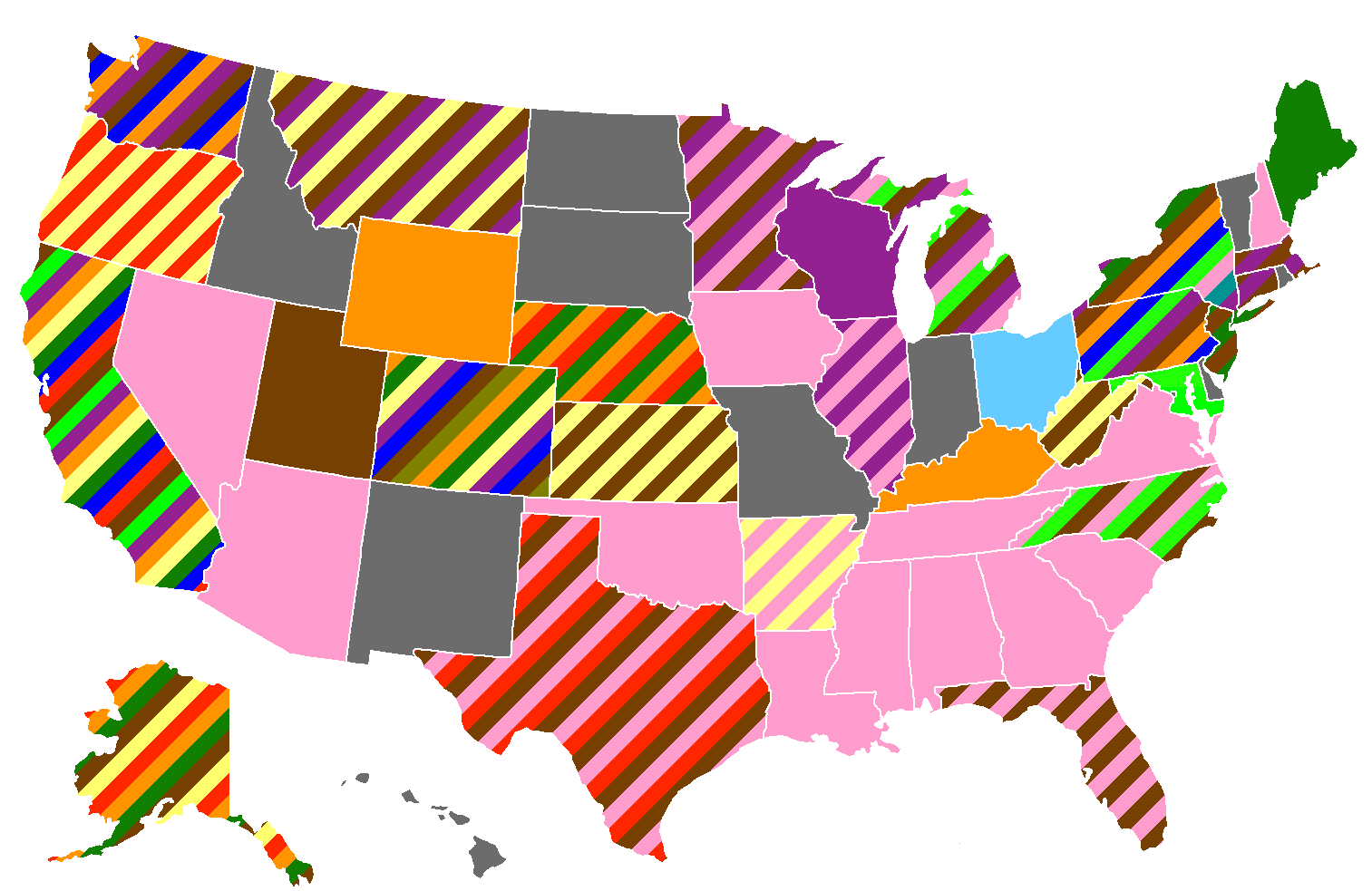
Oppose: The map already used to be like that and it caused too many problems especially with the margin of error. We don't need to over complicate things and it's best to keep the map consistent with the GOP map for clarity. Prcc27 ( talk) 21:42, 11 January 2016 (UTC)
- But to clarify, there is no margin of error in this map. We are simply ignoring the concept of MOE. We're just listing toss-up, leaning and strong leads. I also agree with you about consistency with GOP page. I think the GOP page should also reflect the same concept. I was hoping that this group would represent both wiki pages. All4peace ( talk) 15:20, 12 January 2016 (UTC)
Suggestion: A new section (at top) called: "Aggregate Polling"
With races that are very active, especially in the early states (Iowa/New Hampshire), the results from different can seem erratic. Once Hillary is leading by 10, then by 5, then down by 15 to Bernie in New Hampshire. It's a seesaw, and that's not very proper at displaying for the readers. Here is my recommendation:
1. Aggregation where there are multiple polling in the past month only, otherwise just show last poll. 2. Present it in a table, so people can have a quick look at the status of each state, instead of scrolling state by state. 3. MOE is no longer applicable. We'll have to set a hard percentage for the front runner. For this example, I used 5% (Appears to be the case of most MOE's anyways) 4. We should apply aggregation to the map as well.
Here's an example. I hope you like it.
| State | No of Polls | Date | Hillary Clinton | Bernie Sanders | Martin O'Malley | Other/Undecided |
|---|---|---|---|---|---|---|
| Arizona | 1 | October 24-November 5, 2015 | 47% | 19% | 2% | 32% |
| Iowa | 8 | November 28-December 17, 2015 | 52% | 36% | 5% | 7% |
| New Hampshire | 5 | November 30-December 22, 2015 | 44% | 49% | 3% | 3% |
| South Carolina | 3 | December 5-17, 2015 | 63% | 27% | 3% | 11% |
All4peace ( talk) 04:24, 27 December 2015 (UTC)
- If Arizona only has one poll why would it be listed in the aggregate polling section, especially since it's more than a month old? Did you average the numbers yourself or did you get these numbers from a source? Prcc27 ( talk) 06:55, 27 December 2015 (UTC)
- @ Prcc27, Regarding Arizona, I see your point. To your second question, yes I did the math myself (Very straight forward). We can also use Real Clear Politics average polling. All4peace ( talk) 16:54, 27 December 2015 (UTC)
- I think we should add aggregate polling to the article similar to the way the Nationwide opinion polling for the Democratic Party 2016 presidential primaries page does it. But unfortunately there isn't an aggregate poll for every state. We could also have a separate map based on aggregate polling on the article or at least link to it. But AFAIK every state with an aggregate poll would be colored for Clinton except New Hampshire. Prcc27 ( talk) 22:54, 27 December 2015 (UTC)
- Real Clear Politics has averages for most states. I'm not sure if we need a second map, but I support your suggestion we should add aggregate polling to the article similar to the way the
Nationwide opinion polling for the Democratic Party 2016 presidential primaries page does it
All4peace (
talk) 07:05, 29 December 2015 (UTC)
- I'd echo this suggestion, though I'm a bit on the fence about the inclusion of 270ToWin merely on the scant amount of coverage on the site.
108.2.58.56 (
talk) 06:19, 5 January 2016 (UTC)
- @ Info por favor, @ I.am.a.qwerty, @ Tlhslobus, @ hugeTim, @ Prcc27, @ ArchPope Sextus VI Aggregation polling seems like a good idea, and I didn't hear much disagreement. Do we have consensus to implement aggregation? All4peace ( talk) 21:11, 11 January 2016 (UTC)
- Yes, I would have done it myself but it seemed too difficult.
Prcc27 (
talk) 21:33, 11 January 2016 (UTC)
- I'd just use the Real Clear Politics aggregation (rather than our own, ad hoc approach without basis in reliable sources), and just only include states they include. -
hugeTim (
talk) 21:36, 11 January 2016 (UTC)
- Why not use Huff Post and 270towin also..?
Prcc27 (
talk) 21:45, 11 January 2016 (UTC)
- I agree with
Prcc27. Showing three pollsters is more credible. Also, I agree with
hugeTim recommendation to only include states that they aggregate for.
All4peace (
talk) 15:18, 12 January 2016 (UTC)
- I'm fine with whatever. I was just having trouble picturing what this table of dozen states and three different poll aggregates is going to look like. -
hugeTim (
talk) 17:30, 12 January 2016 (UTC)
- I support including aggregations, but only if we are quoting other sources:HuffPost, 270, RealClear. For the aggregate table, can we please, for the love of wikifying, make the column headings the candidates’ names, as is shown in this proposed table? It makes it so much easier to visually get an overall feel of the race. Info por favor ( talk) 19:13, 12 January 2016 (UTC)
- I'm fine with whatever. I was just having trouble picturing what this table of dozen states and three different poll aggregates is going to look like. -
hugeTim (
talk) 17:30, 12 January 2016 (UTC)
- I agree with
Prcc27. Showing three pollsters is more credible. Also, I agree with
hugeTim recommendation to only include states that they aggregate for.
All4peace (
talk) 15:18, 12 January 2016 (UTC)
- Why not use Huff Post and 270towin also..?
Prcc27 (
talk) 21:45, 11 January 2016 (UTC)
- I'd just use the Real Clear Politics aggregation (rather than our own, ad hoc approach without basis in reliable sources), and just only include states they include. -
hugeTim (
talk) 21:36, 11 January 2016 (UTC)
- I'd echo this suggestion, though I'm a bit on the fence about the inclusion of 270ToWin merely on the scant amount of coverage on the site.
108.2.58.56 (
talk) 06:19, 5 January 2016 (UTC)
- Real Clear Politics has averages for most states. I'm not sure if we need a second map, but I support your suggestion we should add aggregate polling to the article similar to the way the
Nationwide opinion polling for the Democratic Party 2016 presidential primaries page does it
All4peace (
talk) 07:05, 29 December 2015 (UTC)
Qunnipiac poll
Who deleted the last Quinnipiac poll?— Preceding unsigned comment added by 93.149.243.179 ( talk • contribs) 20:06, 13 January 2016 (UTC)
Alaska
Alaska is a closed caucus state, but if appears that you can register as a Democrat on election day. Should we include the Independents in the poll or only the Democrats? I lean towards only the Democrats since they are already eligible to vote in the caucus. Prcc27 ( talk) 06:22, 24 January 2016 (UTC)
- More than half of Alaskans are unaffiliated and 13.8% are declared as democrat, so I'm inclined to include unaffiliated voters rather than not simply because of the number of them. Iowa polling includes unaffiliated voters who are likely caucus-goers (you can switch your affiliation on the day of the caucus there, too). I guess it's kind of a catch-22 here because this poll didn't filter out people who aren't likely to vote. 68.0.198.145 ( talk) 13:03, 24 January 2016 (UTC)
- On the GOP side Alaska does have a closed caucus. The democratic caucus however, is open. Therefore unaffiliated voters should be included. In addition the eletion map should be adjusted, — Preceding unsigned comment added by 88.76.26.158 ( talk • contribs)
- Since the Alaska Democratic caucuses are open to independents, and voters can register on the same day they vote, the Registered Independent tallies should be included in this poll. Otherwise, it's filtering out independent voters who have stated their preference and who have no barrier to voting for the Democrats in the caucus. 65.129.137.230 ( talk) 19:16, 24 January 2016 (UTC)
| This is an archive of past discussions. Do not edit the contents of this page. If you wish to start a new discussion or revive an old one, please do so on the current talk page. |
| Archive 1 | Archive 2 |
map
The map does not match with the polls, I think? 83.80.208.22 ( talk) 17:24, 19 February 2015 (UTC)
Vermont
Is Vermont with 46% Clinton en 42% Sanders not shared? 83.80.208.22 ( talk) 12:00, 24 February 2015 (UTC)
- Nope. Not when the poll's only between the 2 candidates. Also, we don't know what the margin of error is.
Tiller54 (
talk) 18:13, 24 February 2015 (UTC)
- Here (
http://www.castleton.edu/about-castleton/the-castleton-polling-institute/poll-results/vermont-election-poll-2014/) is the margin of error of the poll and its number of people polled. I have already added the information to the article.
Nitroxium (
talk) 22:43, 1 May 2015 (UTC)
- According to this site [
[1]], Vermont has an open primary; I think that it be more accurate to have the overall percentage (36-29 in favor of Bernie Sanders) rather than just among Democrats. Vermont also lacks party registration as seen on my previous link, which makes "Democrats" a rather vague classification. The Castleton polling link that was previously mentioned has the full data in a PDF (see page 16 in the PDF) that is available on the site.
Teak the Kiwi (
talk) 20:50, 3 May 2015 (UTC)
- I agree, actually. If it's an open primary, then leaving out the independents would be unrealistic.
Nitroxium (
talk) 01:32, 4 May 2015 (UTC)
- The problem is that the poll does not narrow it down to "independents who plan to vote in the Democratic primary" or even "Democratic-leaning independents", but simply independents as a whole, which includes many people who will not be voting in the Democratic primary. Unless a poll specifically includes one of those two phrases, it's safer to just use the results among Democrats only. Additionally, there's no results among just Democrats and independents combined, the only cumulative results are among Democrats, independents, AND Republicans combined, which is obviously not a relevant result for a Democratic primary.
Robryant1 (
talk) 19:49, 4 May 2015 (UTC)
- The poll gives an option for "not voting in the Democratic primary" which 1% of Republicans and 1% of Independents mark. Does that mean the ones that didn't mark this option are voting in the Democratic primary? I say we either show that Sanders is ahead 36-29 or we shouldn't use the poll at all if it's too inaccurate! Prcc27 ( talk) 14:00, 28 July 2015 (UTC)
- @ Nitroxium: Before you re-revert I just want to make sure that you read what I said above. Saying that Clinton has a lead in Vermont is misleading especially when Independents favor Sanders over Clinton and anyone (including Republicans) can vote in the Democratic primary. Since the poll gives the option "not voting in the Democratic primary" and the people surveyed could have marked that option if that was the case- I'd say it's safe to say Sanders has the lead in Vermont. Prcc27 ( talk) 20:54, 28 July 2015 (UTC)
- The problem is that the poll does not narrow it down to "independents who plan to vote in the Democratic primary" or even "Democratic-leaning independents", but simply independents as a whole, which includes many people who will not be voting in the Democratic primary. Unless a poll specifically includes one of those two phrases, it's safer to just use the results among Democrats only. Additionally, there's no results among just Democrats and independents combined, the only cumulative results are among Democrats, independents, AND Republicans combined, which is obviously not a relevant result for a Democratic primary.
Robryant1 (
talk) 19:49, 4 May 2015 (UTC)
- I agree, actually. If it's an open primary, then leaving out the independents would be unrealistic.
Nitroxium (
talk) 01:32, 4 May 2015 (UTC)
- According to this site [
[1]], Vermont has an open primary; I think that it be more accurate to have the overall percentage (36-29 in favor of Bernie Sanders) rather than just among Democrats. Vermont also lacks party registration as seen on my previous link, which makes "Democrats" a rather vague classification. The Castleton polling link that was previously mentioned has the full data in a PDF (see page 16 in the PDF) that is available on the site.
Teak the Kiwi (
talk) 20:50, 3 May 2015 (UTC)
- Here (
http://www.castleton.edu/about-castleton/the-castleton-polling-institute/poll-results/vermont-election-poll-2014/) is the margin of error of the poll and its number of people polled. I have already added the information to the article.
Nitroxium (
talk) 22:43, 1 May 2015 (UTC)
Fix the map
Clinton has a weak lead in Washington according to the map, but the poll we're using to justify this was taken a day after another poll indicated Clinton has a strong lead. I think we should stripe states that have conflicting percentages within a 3 month time. We would probably need to use an svg text editable map which isn't actually a bad idea. Also, IMHO there only needs to be three shades of green at the most! I think we should consolidate the two darkest shades of green. Prcc27 ( talk) 16:03, 28 July 2015 (UTC) @ Nitroxium: Sorry to ping you and revert you again.. But per above the other map was problematic and inaccurate. the Public opinion of same-sex marriage USA map uses the striping system for conflicting polls just like the map I made. And the GOP map is way more cluttered than the Democrat map and I'm pretty sure the Democrat map won't get as bad especially since there are a lot of states that haven't even been polled/aren't polled that often. It's usually the early voting states that get polled the most. The reason why I picked the 3 month time period is because public opinion isn't likely to change too much in that amount of time and just because the most recent poll says something doesn't mean it's necessarily true. I might be willing to decrease it to 2 months- 1 month would be pushing it IMO. But the current system will not work because it's absolutely bogus to think that Clinton had a 33% lead in Washington one day, and then the very next day all of the sudden she only has a 9% lead. Prcc27 ( talk) 08:33, 29 July 2015 (UTC)
- There are way too many cases of a presidential primary or general election that can show you that 3 months are way too much time to clump together, since even in just one month or even in two weeks big changes can happen. The solution to the case is to use aggregates by RealClearPolitics or HuffingtonPost, but it is expected right now that the map won't be perfect, considering we are early in the primaries and polls aren't coming out as often. People have the reading capability to scroll down and see the polls for themselves. The same Republican primaries map you show updates as new polls come out as well, and it won't be long until a new Washington poll comes out.
Nitroxium (
talk) 15:48, 29 July 2015 (UTC)
- Beyond that, different shades of green gives more information to the reader.
Nitroxium (
talk) 15:53, 29 July 2015 (UTC)
- @
Nitroxium: It's a little
WP:CRYSTAL to speculate that Washington will come out with a new poll soon especially since many states haven't even been polled yet. If we change the time period to 1 month then NH would be double striped instead of triple striped (which is good and would make the map easier to read). Also, many people just look at the map without going through every single table on the article because it's quicker that way. For the many people that do do that- they are being mislead. The newest poll isn't anything special if it was done the same month or even 1 day after like Washington. If we aren't going to use striping, then there needs to be a new color added that says "conflicting poll results within a 1 month period of time". As for the percentages... the GOP doesn't have them on there map and anyone with a 30% lead is doing well in the state regardless of how high they're lead is. Having an extra color for 3 states is unnecessary because the other states above 30% are pretty strong leads for Clinton too. It might have been needed when this was a one woman's race (well, not really), but now that Vermont is fixed there are one too many extra colors.
Prcc27 (
talk) 19:43, 29 July 2015 (UTC)
- Well, you are making the assumption that people come into the article and only look at the map, which is not a sourced claim. I assume you haven't been on this page ever since its creation, but before there was a 69+ color and has since disappeared, so there's the same amount of colors as there always has been. What matters isn't that Clinton is strong or not, but how strong she is. Finally, we can't surely affirm 100% that they are conflicting polls, though I understand your point. Like I said before, our best bet would be an aggregate from RCP or HuffPost or one of our own following the same rules they apply.
Nitroxium (
talk) 22:27, 29 July 2015 (UTC)
- Maybe people do, maybe people don't. But the purpose of the map is to sum up the article at a mere glance and the map is misleading and leaving out the conflicting polls. Does the GOP Primary map have percentages? No, the most important thing about any primary map is to show what states a candidate is leading in. Since the Democratic Primary isn't as competitive some percentages may be necessary to provide sufficient information. But the main reason the percentages could be necessary is to show how much the other candidates need to catch up in order to lead the state. If a candidate leads by less than 10% then it should be fairly easy for the other candidate(s) to catch up; 10%-29%- somewhat difficult; but 30%+ is very difficult for the other candidates to catch up whether it's a 30% lead or a 50% lead. But having any type of percentage map is difficult because it doesn't take into account the margin of error which means in reality a state could fall under 2 or more colors. Anyways, I only weakly oppose the 50%-69% color, but I strongly oppose having states with different poll results within a month colored a solid color. "we can't surely affirm 100% that they are conflicting polls". What do you mean? It is very clear that the polls have contradictory results. The most recent Washington poll says Clinton has a 9% lead but a poll taken the day before says she has a 33% lead. And you don't think it's misleading to only color Washington "Clinton ahead, <10%"..? I don't know what RCP and HuffPost have anything to do with our conversation because neither Washington, Iowa, nor New Hampshire were polled by either one of them! Prcc27 ( talk) 23:06, 29 July 2015 (UTC)
- Oh okay, just looked up the definition of aggregate so now I understand what you mean... That might work Idk if they have one for some of the states. It'd be inconsistent if we don't use aggregates on all states. Furthermore, aggregates use older polling data which doesn't take into account that a candidate might be on a trend, and any polls that are older by 3 months+ than the most recent poll are irrelevant to the current opinion of a candidate. Prcc27 ( talk) 23:25, 29 July 2015 (UTC)
- There are aggregates on any state that has several polls on them and they are based on recent polls. They are very useful tools in case you want to see trends. I would use them or create our own aggregates, making our own rules on this very talk page (preferably based on the rules RCP or HuffPost use). I wanted to save stripes for whenever there is a virtual tie, just like the Republicans are doing, in order to keep more of a consistent format all along the elections articles. (Even though their primary is a much different situation, it's very possible we'll get virtual ties in the future.) Concerning your last sentence, you are right in saying that old polls do little in giving information, hence why I added the footnote at the end of the legends.
Nitroxium (
talk) 02:03, 30 July 2015 (UTC)
- Sounds great, but I can't find an aggregate for Washington. Prcc27 ( talk) 03:50, 30 July 2015 (UTC)
- I propose we create our own then, RCP keeps it really simple by making averages of the polls. We could keep it as an average of polls within a timeframe of a month. Clearly, not all states will require aggregates since some have only one poll or only one recent poll within a timeframe of a month.
Nitroxium (
talk) 04:25, 30 July 2015 (UTC)
- How do we make one? I feel like in order to not violate WP:OR we have to use an aggregate from a reliable source. If you can link me to an aggregate that would be nice! Prcc27 ( talk) 04:29, 30 July 2015 (UTC)
- I know RCP has aggregates on all states, though not all of them are easily accesible. Let me try to find a way to access them.
Nitroxium (
talk) 04:49, 30 July 2015 (UTC)
- I noticed that when you try to average the polls within a certain time frame- it just shows the average for all polls every taken. I can only support not striping and using aggregates if it actually averages only certain polls- not all of them. But if you can tell me how to do it that would be great. And hopefully you find the one for Washington.. Prcc27 ( talk) 10:03, 30 July 2015 (UTC)
- Let me ask you a question, are the WA polls the only ones you consider conflicting?
Nitroxium (
talk) 14:54, 30 July 2015 (UTC)
- No, less than one month isn't really enough time to confidentially say a candidate is on a trend. If there are polls with different results within 30 days then they are conflicting. So I'd stripe Iowa and New Hampshire too. Prcc27 ( talk) 20:58, 30 July 2015 (UTC)
- See, that's completely borderline
WP:OR. You are making your own conclusions about the polls when there are many possibilities about them. Iowa and New Hampshire are states that are more immersed in the process than other states and as such, their numbers will change more rapidly at this stage. Another example is if some event happens that changes people's opinions of a candidate in a short amount of time. You can't say they are conflicting polls, as many factors come into play. In Washington, Clinton could have gone down 1 point and Sanders could have gone up 1 point during the weekend and the two polls wouldn't contradict each other within the margin of error.
- Fair enough, but Washington wasn't within the margin of error. Clinton's lead dropped 24% in 1 day, that's 18% outside the margin of error! Did some event happen the day after the Public Policy Polling that caused Clinton's lead to plummet drastically? I highly doubt it. Idk where you got that 1% difference idea from because that was not the case in Washington... I stand by my opinion that Washington is conflicting. Prcc27 ( talk) 23:32, 30 July 2015 (UTC)
- First, you can't compare the results in PPP with the polls for Gravis including Elizabeth Warren. People could very easily switch from Clinton to Warren if she was an option in the primaries and there is absolutely no conflict there. Therefore, we must compare the results of PPP with the Gravis results WITHOUT Warren. In the PPP poll, she has 57% with a margin of error of 5%, meaning it could be a support of 52%. In the Gravis poll, she has a support of 45% with a margin of error of 6%, meaning it could be 51%. Likewise with Sanders, in PPP he has 24% which could be 29% and in Gravis he has 36% which could be 30%. Hence why if there was a change of 1% of support from Clinton to Sanders during the next few days (which is completely plausible), these two polls are not conflicting. Nitroxium ( talk) 02:39, 31 July 2015 (UTC)
- I must add, the Gravis poll without Warren still includes De Blasio, which means there doesn't even have to be a 1% change of support in the next days. Clinton could have lost 2% to De Blasio in the Gravis poll. There's many possibilities.
Nitroxium (
talk) 02:56, 31 July 2015 (UTC)
- It doesn't matter, why only color Washington with the most recent poll? The poll the day before is just as reliable as the one that's more recent only by a day. I didn't say the more recent poll isn't reliable, what I'm saying is that since these polls happened almost on the same day they should both be used. Both polls are accurate but they have different results that deserve to be represented on the map to give an accurate reflection of the situation. So if the PPP poll was conducted the day after the Gravis poll does that mean Washington would be colored medium green instead of light green? What happens if a poll is conducted on the same exact day; which poll would we have used if this was the case? Either way the fact that the map doesn't take into account the margin of error means it's very inaccurate. I think we should get a third opinion to settle this once and for all! Prcc27 ( talk) 03:27, 31 July 2015 (UTC)
- This has been the rule for the republicans and for the democrats since day one of making this wikipedia page. Yes, if the PPP poll were to have come out a day after, it would be medium green currently. I don't think people should be limited in their reading comprehension to the map and stripes are limited to virtual ties. The map does take into account margin of error, though; the footnote you provided touches the very same problem you present, you point out that the map is not completely accurate due to margin of errors. That is unfortunately not our problem, but a problem of statistics and polling as a whole. They will never be 100% reliable. Us saying that the polls are contradicting or mixing them up in a map when they aren't from the same polling firms and don't even have the same candidates on each poll would definitely be
WP:OR.
Nitroxium (
talk) 03:43, 31 July 2015 (UTC)
- Using your logic, Washington is colored wrong! You said that taking the margin of error into account Clinton could either have a 51% or 52% lead while Sanders could either have a 29% or 30% lead. 51% minus 30% doesn't equal a 10% or less lead for Clinton (which is currently what Washington is colored for)- it equals 21%. So yes, the most recent poll is very close to accurate if and only if you adjust the margin of error so that Clinton has 51% and Sanders has a 30%. But that means that the poll's claim that Clinton has a 45% lead and Sanders has a 36% lead is not accurate when you take into account the poll taken the day before, so Washington should definitely not be colored light green! Prcc27 ( talk) 05:46, 31 July 2015 (UTC)
- Yes, but we can only work with what we're given. We can't change the numbers around and make our own conclusions as per
WP:OR.
Nitroxium (
talk) 23:32, 31 July 2015 (UTC)
- Yes, but that's why we should include both colors. That way the readers can make their own conclusions if they see fit. If the readers only see one color for Washington they will think that all recent polls indicate that Clinton has a 10% or less lead when another very recent poll indicates she has a 30%-49% lead. It isn't WP:OR to include all polls that were done almost the same day as each other. The PPP poll is just as reliable as the Gravis poll so both should be used. Also, I'm starting to think that Florida should be striped too since the dates the polls were taken overlap. Prcc27 ( talk) 07:16, 1 August 2015 (UTC)
- By including both colors, you are coming to the conclusion that they are conflicting polls and that is WP:OR. By reading the footnote about margins of error, readers will scroll down to see the polls for themselves. You cannot come to the conclusion that they are conflicting polls, there is no 100% certainty of that. Nitroxium ( talk) 03:37, 2 August 2015 (UTC)
- Yes, but we can only work with what we're given. We can't change the numbers around and make our own conclusions as per
WP:OR.
Nitroxium (
talk) 23:32, 31 July 2015 (UTC)
- This has been the rule for the republicans and for the democrats since day one of making this wikipedia page. Yes, if the PPP poll were to have come out a day after, it would be medium green currently. I don't think people should be limited in their reading comprehension to the map and stripes are limited to virtual ties. The map does take into account margin of error, though; the footnote you provided touches the very same problem you present, you point out that the map is not completely accurate due to margin of errors. That is unfortunately not our problem, but a problem of statistics and polling as a whole. They will never be 100% reliable. Us saying that the polls are contradicting or mixing them up in a map when they aren't from the same polling firms and don't even have the same candidates on each poll would definitely be
WP:OR.
Nitroxium (
talk) 03:43, 31 July 2015 (UTC)
- See, that's completely borderline
WP:OR. You are making your own conclusions about the polls when there are many possibilities about them. Iowa and New Hampshire are states that are more immersed in the process than other states and as such, their numbers will change more rapidly at this stage. Another example is if some event happens that changes people's opinions of a candidate in a short amount of time. You can't say they are conflicting polls, as many factors come into play. In Washington, Clinton could have gone down 1 point and Sanders could have gone up 1 point during the weekend and the two polls wouldn't contradict each other within the margin of error.
- I know RCP has aggregates on all states, though not all of them are easily accesible. Let me try to find a way to access them.
Nitroxium (
talk) 04:49, 30 July 2015 (UTC)
- There are aggregates on any state that has several polls on them and they are based on recent polls. They are very useful tools in case you want to see trends. I would use them or create our own aggregates, making our own rules on this very talk page (preferably based on the rules RCP or HuffPost use). I wanted to save stripes for whenever there is a virtual tie, just like the Republicans are doing, in order to keep more of a consistent format all along the elections articles. (Even though their primary is a much different situation, it's very possible we'll get virtual ties in the future.) Concerning your last sentence, you are right in saying that old polls do little in giving information, hence why I added the footnote at the end of the legends.
Nitroxium (
talk) 02:03, 30 July 2015 (UTC)
- Well, you are making the assumption that people come into the article and only look at the map, which is not a sourced claim. I assume you haven't been on this page ever since its creation, but before there was a 69+ color and has since disappeared, so there's the same amount of colors as there always has been. What matters isn't that Clinton is strong or not, but how strong she is. Finally, we can't surely affirm 100% that they are conflicting polls, though I understand your point. Like I said before, our best bet would be an aggregate from RCP or HuffPost or one of our own following the same rules they apply.
Nitroxium (
talk) 22:27, 29 July 2015 (UTC)
- @
Nitroxium: It's a little
WP:CRYSTAL to speculate that Washington will come out with a new poll soon especially since many states haven't even been polled yet. If we change the time period to 1 month then NH would be double striped instead of triple striped (which is good and would make the map easier to read). Also, many people just look at the map without going through every single table on the article because it's quicker that way. For the many people that do do that- they are being mislead. The newest poll isn't anything special if it was done the same month or even 1 day after like Washington. If we aren't going to use striping, then there needs to be a new color added that says "conflicting poll results within a 1 month period of time". As for the percentages... the GOP doesn't have them on there map and anyone with a 30% lead is doing well in the state regardless of how high they're lead is. Having an extra color for 3 states is unnecessary because the other states above 30% are pretty strong leads for Clinton too. It might have been needed when this was a one woman's race (well, not really), but now that Vermont is fixed there are one too many extra colors.
Prcc27 (
talk) 19:43, 29 July 2015 (UTC)
- Beyond that, different shades of green gives more information to the reader.
Nitroxium (
talk) 15:53, 29 July 2015 (UTC)
You already explained to me that both polls are accurate with each other within 1%, but that's if and only if Clinton has a 21% lead which the map does have Washington colored as. And it's not the polls that are conflicting, it's that the map doesn't take into account the margin of error and quite frankly a footnote isn't enough. If readers see Washington striped with two colors and they see the margin of error footnote- they will be more likely to scroll down to find out why Washington is striped and to find out what those margin of errors for Washington are. Then they will be able to come to the conclusion that Clinton has about a 21% lead (which is pretty much what you concluded from the polls yourself) or they could come to the conclusion that Clinton does in fact have a less than 10% lead because the poll that says so is more recent. Regardless, purposely leaving out information on the map adds WP:UNDUE bias and may be fraudulent. Prcc27 ( talk) 04:14, 2 August 2015 (UTC)
- We are not leaving out any information, we are avoiding
WP:OR. As per
WP:OR, it is permitted in talk pages and I am allowed to make my own interpretation of the data but that should not be reflected on the article itself.
Nitroxium (
talk) 08:12, 2 August 2015 (UTC)
- Okay, assuming what you said about WP:OR is true, I am also allowed to make my own interpretation of the data that should not be reflected on the article. "By including both colors, you are coming to the conclusion that they are conflicting polls and that is WP:OR." Well personally I might feel that way, but that's only my interpretation and that's not the reason why I'd change the map. Maybe the polls are conflicting or maybe they aren't when you take the margin of error into account (I actually agree with both statements). It doesn't matter, the point is we have two reliable and recent polls that qualify for two different colors not because they are conflicting, but because just like any poll there is a margin of error. Including all recent polls instead of giving WP:UNDUE WEIGHT to the ones that are more recent only by a day or two does not violate Wikipedia policy and it certainly doesn't violate WP:OR. I don't think it makes sense to argue whether or not the polls are conflicting, because the real argument is should we include the most recent poll or should we also include polls that were taken a day or two before the most recent poll too? It isn't right to cherry pick which polls we use on the map when it's obvious that both are equally or about equally WP:RELIABLE. Prcc27 ( talk) 09:59, 2 August 2015 (UTC)
- We aren't cherry picking and we aren't lying about anything. It's clear that we are only putting the very most recent poll on the map and that people must read the section of states in order to get a complete view of the situation. By showing both colors we are coming to the conclusion that one poll by itself is not reliable and that they are conflicting. The only thing we can say about reliability of a poll is that it has a margin of error that may not be represented fully in the map.
Nitroxium (
talk) 21:20, 3 August 2015 (UTC)
- Just as North of Eden said on the Dispute resolution it isn't original research to summarize an obvious truth. By only showing one color on the map it makes it seem like only one poll itself is reliable and the other one taken 1 day before isn't as reliable. Both are just as reliable and striping the map would show that. Prcc27 ( talk) 23:26, 3 August 2015 (UTC)
- We aren't cherry picking and we aren't lying about anything. It's clear that we are only putting the very most recent poll on the map and that people must read the section of states in order to get a complete view of the situation. By showing both colors we are coming to the conclusion that one poll by itself is not reliable and that they are conflicting. The only thing we can say about reliability of a poll is that it has a margin of error that may not be represented fully in the map.
Nitroxium (
talk) 21:20, 3 August 2015 (UTC)
Get rid of the percentages
I fell like it's time to get rid of the percentages on the map. They are not used on the GOP primary article, and they were not used on the 2008 Democratic primary article even though in August 2007 Clinton had just as much of a commanding lead as she does now in 2015. She had a lead in 29 states compared to her current lead in 28 states. I think it would be smart to be consistent throughout the articles. If a map without percentages can be used in 2007 when she had a commanding lead- a map like that can also be used now since Clinton's situation is as similar then as it is now! We should only have three colors (unless other candidates start to lead in states): "Clinton lead", "Clinton/Sanders tied", and "Sanders lead". Since there are three states that Sanders leads or ties in- the percentages are no longer needed. The reason why the map had them in the first place is because Clinton used to lead in every single state (except for Vermont which was incorrectly colored in her favor). But now we have two candidates that are leading in states instead of one. Prcc27 ( talk) 04:05, 11 August 2015 (UTC)
New poll by RKM Research shows Bernie up on Hillary (44% Bernie, 37% Hillary)
Please update this page with the poll results here: http://www.wcvb.com/politics/new-poll-shows-sanders-ahead-of-clinton-in-new-hampshire/34665480
Please additionally update the count of states Bernie is winning in to TWO. — Preceding unsigned comment added by 74.107.74.186 ( talk) 03:30, 12 August 2015 (UTC)
Note on margins of errors and statistical ties
To pre-empt any dispute on how these work, refer to this discussion Ramaksoud2000 ( Talk to me) 07:00, 13 August 2015 (UTC)
Please update Iowa -- Hillary 37% Bernie 30% and within margin of erorr AKA a statistical tie.
Poll results here: www.desmoinesregister.com/story/news/politics/iowa-poll/2015/08/29/iowa-poll-democrats-august/71387664/ — Preceding unsigned comment added by 74.107.74.186 ( talk • contribs) 22:26, 29 August 2015 (UTC)
The map states that there are 3 states shared between Hillary and Sanders. First of all, I don't believe that these states do exist. And if they do, they need to be reflected in the map so people wouldn't be guessing. Also, if these are Oregon, Iowa and West Virginia, then I would be very disappointed. Only Oregon qualifies, but the other two don't (Iowa and West Virginia). They are NOT within the margin of error as I explained before. In Iowa, Hillary is up by 7% and the margin is 4.9%. We have to be unbiased in Wikipedia. Finally, when a state is shared, the two results should be highlighted as blue to make it clear to the reader. All4peace ( talk) 05:19, 30 August 2015 (UTC)
- @ All4peace: In Iowa the margin of error is ± 4.9% meaning that you can either add or subtract that number and be within the margin of error. Clinton could have as low as 32.1% support and Sanders could have as high as 34.9% which means it's possible that Sanders is actually leading in that state. I think Iowa, West Virginia, New Hampshire, Oregon, Wisconsin, and Washington should all be striped! Prcc27 ( talk) 08:49, 30 August 2015 (UTC)
- @
Prcc27:This is exactly why the chart said 3 states. Please revert back to that change. In regards to the map, whoever made the map graphic will have to do it. Reach out to that user.
- You need to gain consensus through discussion first. Please share your thoughts pertaining to the margin of error so we can have a thorough discussion. This is also being discussed here. And actually All4peace made a good point on that talk page "if candidate A went down by 2%, and candidate B went up by 2%, that's a total change of 4%" so I changed my mind and I oppose striping Iowa, West Virginia, New Hampshire, Oregon, Wisconsin, and Washington. Prcc27 ( talk) 18:27, 30 August 2015 (UTC)
- @ Prcc27:Margins of error work both ways. You are correct in your original estimation that Hillary could be as low as 32, and Sanders as high as 34 / 35. I change my mind about West Virginia because we'd need more polling to determine a better idea. As for Oregon, I would apply the same ruling as in Iowa. For Washington, I haven't seen polls so I cannot comment. For what it's worth, NY Times uses this logic for when they call something a 'statistical tie.' Reporter Alan Rapperport confirmed this to me via email. In addition, Morning Joe confirmed Monday morning their belief the Iowa poll is within the margin of error. I support striping Iowa, but not striping Oregon, Washington, West Virginia, or Oregon.
- @
Prcc27:This is exactly why the chart said 3 states. Please revert back to that change. In regards to the map, whoever made the map graphic will have to do it. Reach out to that user.
New poll from West Virginia shows statistical tie.
http://www.wvgazettemail.com/article/20150826/GZ01/150829633
3.21% + or -, 36 for Hillary vs 32 for Bernie.
Please update the map to reflect this. — Preceding unsigned comment added by 74.107.74.186 ( talk) 17:49, 28 August 2015 (UTC)
- Once Hillary begins to lose more states, the Inevitable's surrogates will talk among themselves and change the map criteria again as to keep in tune with HRC's campaign of foreign FB friends, fake Twitter followers, and Wikipedia manipulation.
JaskaPDX (
talk) 07:49, 29 August 2015 (UTC)
- We had some on the endorsement article and it was simply ignored. This needs some formal mediation and I don't know Wikipedia enough to go through the process. If someone wants to lend a hand I can provide all the pertinent information and then they could format the request for mediation. IMO, both these articles need to be locked down so only long-standing Wikipedia editors can edit that page. I don't even know if this is possible. If someone wants to lend a hand, I'm happy to provide the brief of what has occurred (instances of manipulation, talk page discussions, informal mediation by other editors that was then completely ignored, etc.). Trust me, if I knew Wikipedia better, I'd have done this months ago. Until then, I'll keep calling out it out once in a while. I don't hide that I support Clinton's opponent and that certainly turned me on to this issue, but it's dishonest politics at it's core and they shouldn't be manipulating Wikipedia as part of their paper tiger campaigning. JaskaPDX ( talk) 00:17, 8 September 2015 (UTC)
- Once Hillary begins to lose more states, the Inevitable's surrogates will talk among themselves and change the map criteria again as to keep in tune with HRC's campaign of foreign FB friends, fake Twitter followers, and Wikipedia manipulation.
JaskaPDX (
talk) 07:49, 29 August 2015 (UTC)
6 Month Old Polls May Not Accurately Reflect Current Polling Opinions
Polls that are nearing 6 months old are not likely very accurate to the current opinions held in each state. Perhaps 6 months is too long a period to wait before removing polls from the map. 3 or 4 months may be more accurate. However, I do understand that the map will likely look very empty at this stage in the election cycle if we were to make this change. Maybe a significantly darker shade for older polls? Of course, this would also be unlike the current Republican polling map and I understand you wish to keep those similar. In any case, the last poll for Connecticut occurred 6 months ago (March 6-9), so that should be altered. 2ft7Ninja ( talk) 20:05, 9 September 2015 (UTC)
- I agree with you that polls that are about 4 or 5 months old may be too old to include on the map. For this reason I proposed
having a lighter color for polls prior to the candidate's official campaign launch, but it was reverted. In any case, I removed Connecticut's color (I didn't need to change the numbers since Georgia's addition was not reflected in the legend). Next to remove will be Massachussetts on September 19th.
SPQRobin (
talk) 22:17, 9 September 2015 (UTC)
- If it isn't a problem on the GOP map it shouldn't be a problem on the Democratic map. Otherwise, we should have a similar discussion about shading on the GOP talk page. Btw, If we do make the change I'd prefer a lighter shade for older polls but only if we do the same on the GOP map. I think we should wait until tomorrow before removing Connecticut since the poll was taken 6 months ago: not yet outside the 6 month period.
Prcc27 (
talk) 00:10, 10 September 2015 (UTC)
- Well, both primaries are fundamentally different: the Democratic one had a clear frontrunner since the very first poll whereas the Republican one includes many candidates (with only a recent frontrunner) so it makes sense to adapt the respective maps to this reality if necessary. We don't need to have 100% identical maps just for the sake of it. As for Connecticut, did you really revert its removal just for these few remaining hours? That is really nitpicking imho.
SPQRobin (
talk) 02:16, 10 September 2015 (UTC)
- But what does the Democrats having a front runner have to do with whether or not a 4 month old poll is accurate? Obviously it won't work on the GOP map, but if a 4 month old poll is reliable enough for that map it's reliable enough for this map. So even though it's easier to do different shading for polls for 4-6 months old on the DEM map- if the GOP map can survive without out it so can the DEM map. I honestly don't think it would do any good. Yes a lot can change in 4 months and the momentum can switch from one candidate to the other in that time but tbh the same could be done in 2 months or even 1 month. And if the Democrats have had a clear front runner since the very first poll like you suggest then why do you expect the poll results to be any different now than from 4 months ago? Prcc27 ( talk) 03:27, 10 September 2015 (UTC)
- I'm not going to go in details or argue further about this, but my point was mostly that (imho) there are two separate situations and therefore it might be necessary to treat them differently i.e. we don't necessarily need to have an identical system for the two maps. SPQRobin ( talk) 16:07, 10 September 2015 (UTC)
- Well, both primaries are fundamentally different: the Democratic one had a clear frontrunner since the very first poll whereas the Republican one includes many candidates (with only a recent frontrunner) so it makes sense to adapt the respective maps to this reality if necessary. We don't need to have 100% identical maps just for the sake of it. As for Connecticut, did you really revert its removal just for these few remaining hours? That is really nitpicking imho.
SPQRobin (
talk) 02:16, 10 September 2015 (UTC)
- If it isn't a problem on the GOP map it shouldn't be a problem on the Democratic map. Otherwise, we should have a similar discussion about shading on the GOP talk page. Btw, If we do make the change I'd prefer a lighter shade for older polls but only if we do the same on the GOP map. I think we should wait until tomorrow before removing Connecticut since the poll was taken 6 months ago: not yet outside the 6 month period.
Prcc27 (
talk) 00:10, 10 September 2015 (UTC)
Iowa now belongs to Bernie Sanders per new CBS poll confirming Quinnipiac's findings - please update map
New poll from CBS today. Results: Bernie 43% Clinton 33% Biden 10%
Here: https://d25d2506sfb94s.cloudfront.net/cumulus_uploads/document/3zimki4xtx/Iowa_Release_20150913.pdf — Preceding unsigned comment added by 74.107.74.186 ( talk) 17:20, 13 September 2015 (UTC)
Better Map
Could we change the map such as the gop map?
*AR, CO, KS, MD, VT based on polls over six months old. Please note that some states have polls with margin of errors that may not be reflected accurately on this map.
|
2016 U.S. presidential election | |
|---|---|
| Republican Party | |
| Democratic Party | |
| Third parties | |
| Related races | |
| |
83.80.208.22 ( talk) 09:34, 12 August 2015 (UTC)
- I have preferred the system we have right now. — Preceding
unsigned comment added by
186.176.169.49 (
talk) 23:28, 12 August 2015 (UTC)
- Support getting rid of percentages per "Get rid of the percentages" section above! Prcc27 ( talk) 23:31, 12 August 2015 (UTC)
- For the record, Ramaksoud2000 mentioned on the commons talk page that they agree with me and Nitroxium mentioned on the dispute resolution that they disagree with me. The current !vote right now is keep percentages 1 vote (since Nitroxium accidentally used an i.p.) , get rid of percentages 3 votes. Prcc27 ( talk) 23:35, 12 August 2015 (UTC)
- And
here is what the map would look like...
Prcc27 (
talk) 07:46, 13 August 2015 (UTC)
- Paging Leo Chapin III and Tiller54 who originally worked on the map and Neutrality who had some disagreements about the map earlier. Nitroxium ( talk) 19:37, 13 August 2015 (UTC)
- I reiterate my earlier position that the map should go entirely. It feels very
WP:OR to me, and I think it has a tendency to mislead since (1) polling is of highly variable quality and (2) some polls are much older than others.
Neutrality
talk 19:54, 13 August 2015 (UTC)
- @
Neutrality: There's an easy solution to #2. We could color states with polls older than 6 states gray (which is what is done on the GOP map)! But assuming the map stays, which sounds better: showing which candidate leads and what percentages they lead by, or just showing which candidate leads?
Prcc27 (
talk) 20:31, 13 August 2015 (UTC)
- After all the discussions that have happened, it has occured to me that the map has and always will continue making cotroversies due to there being many ways of interpreting its coloring. In this sense,
Neutrality is right in that it feels
WP:OR, since it has many interpretations to it. There will be no other way of resolving the "conflicting polls" issue that Prcc27 has pointed out than removing the map. I would agree with removing the map entirely.
Nitroxium (
talk) 20:37, 13 August 2015 (UTC)
- But if we want to be consistent with the GOP article (which you always seem to advocate for) we either remove both maps or keep both maps. Also, before pinging people you might want to look at
WP:CANVASS.
Prcc27 (
talk) 20:40, 13 August 2015 (UTC)
- I have pinged the appropriate people, Neutrality had concerns about the map, though I did not know he wanted to delete it and the other two originally created the map. I would propose to delete the GOP map as well.
Nitroxium (
talk) 20:42, 13 August 2015 (UTC)
- You would or you will?
Prcc27 (
talk) 20:46, 13 August 2015 (UTC)
- I think the answer to that is obvious, no need for the accusatory tone. Let's give time for the other editors to weigh in their opinion for a richer discussion.
Nitroxium (
talk) 11:57, 14 August 2015 (UTC)
- If there is consensus to remove the map then yes, we will remove it. But until then, we have to find out how we will proceed with the map. There is currently consensus to get rid of the percentages and I will probably do so in a very short time!
Prcc27 (
talk) 17:41, 14 August 2015 (UTC)
- Personally, I think having a map is a helpful summary of the article's topic. I'd imagine that a fair number of readers aren't particularly interested in digging through all the individual polls in the rest of the article. Going by the most recent poll alone, I agree, is probably not a perfect representation of information, but to start combining polls might take us into "original research" territory. As long as it is clear that only the most recent poll is shown on the map, I think that is probably good enough, and the most neutral way we could include a map at all. The many different shadings for Hillary Clinton I would concur are necessary anymore since there are a few states where she is behind Sanders.
Leo Chapin III (
talk) 05:12, 15 August 2015 (UTC)
- To me it just seems too cluttered and AFAIK there has never been a percentage map like this even though in 2007 Clinton had a similar lead. If a reader can read through the GOP article to see by how much a candidate is leading by- then the same can be done on this article. The percentages were added to the map when Clinton lead in every state (except Vermont which was inaccurately colored in her favor). But now Sanders is leading in some states, one of them being a crucial early state. The percentages aren't that desirable, and one user not involved in this discussion actually thanked me for my edit. Prcc27 ( talk) 05:27, 15 August 2015 (UTC)
- Personally, I think having a map is a helpful summary of the article's topic. I'd imagine that a fair number of readers aren't particularly interested in digging through all the individual polls in the rest of the article. Going by the most recent poll alone, I agree, is probably not a perfect representation of information, but to start combining polls might take us into "original research" territory. As long as it is clear that only the most recent poll is shown on the map, I think that is probably good enough, and the most neutral way we could include a map at all. The many different shadings for Hillary Clinton I would concur are necessary anymore since there are a few states where she is behind Sanders.
Leo Chapin III (
talk) 05:12, 15 August 2015 (UTC)
- If there is consensus to remove the map then yes, we will remove it. But until then, we have to find out how we will proceed with the map. There is currently consensus to get rid of the percentages and I will probably do so in a very short time!
Prcc27 (
talk) 17:41, 14 August 2015 (UTC)
- I think the answer to that is obvious, no need for the accusatory tone. Let's give time for the other editors to weigh in their opinion for a richer discussion.
Nitroxium (
talk) 11:57, 14 August 2015 (UTC)
- You would or you will?
Prcc27 (
talk) 20:46, 13 August 2015 (UTC)
- I have pinged the appropriate people, Neutrality had concerns about the map, though I did not know he wanted to delete it and the other two originally created the map. I would propose to delete the GOP map as well.
Nitroxium (
talk) 20:42, 13 August 2015 (UTC)
- But if we want to be consistent with the GOP article (which you always seem to advocate for) we either remove both maps or keep both maps. Also, before pinging people you might want to look at
WP:CANVASS.
Prcc27 (
talk) 20:40, 13 August 2015 (UTC)
- After all the discussions that have happened, it has occured to me that the map has and always will continue making cotroversies due to there being many ways of interpreting its coloring. In this sense,
Neutrality is right in that it feels
WP:OR, since it has many interpretations to it. There will be no other way of resolving the "conflicting polls" issue that Prcc27 has pointed out than removing the map. I would agree with removing the map entirely.
Nitroxium (
talk) 20:37, 13 August 2015 (UTC)
- @
Neutrality: There's an easy solution to #2. We could color states with polls older than 6 states gray (which is what is done on the GOP map)! But assuming the map stays, which sounds better: showing which candidate leads and what percentages they lead by, or just showing which candidate leads?
Prcc27 (
talk) 20:31, 13 August 2015 (UTC)
- I reiterate my earlier position that the map should go entirely. It feels very
WP:OR to me, and I think it has a tendency to mislead since (1) polling is of highly variable quality and (2) some polls are much older than others.
Neutrality
talk 19:54, 13 August 2015 (UTC)
I was about to rage at the changed map, but I actually like the logic of it as long as the statistical ties are striped or whatever like the GOP map. The GOP map actually looks so much better without 50 colors in a few states. And adding a recentness to it is good. I remember the 2012 maps were like that. Good work, yall!-- Metallurgist ( talk) 14:00, 23 August 2015 (UTC)
- I've been viewing this page for a while now, and don't think that the strips on the map are a good idea. I mean, the states where the margins of error overlap aren't really ties, are they, it's just that we're less than 95% certain that the person who is listed as ahead in the poll is actually ahead. I think a shading system (like there was before) would work better. It could even be based on the % certainty that they're ahead, instead of their point lead. The GOP page is different because there are so many fairly competitive candidates running that it's hard to do a shading system, but I think that for this map it would work just fine. Anyways, that's just my two cents. Otherwise, it's a great page!
ArchPope Sextus VI (
talk) 17:42, 11 September 2015 (UTC)
- @
ArchPope Sextus VI: I would prefer a map where if Clinton leads but is in the margin of error of Sanders it is striped dark green/light blue and if it's the reverse it is striped dark blue/light green.
Here's an example (Clinton leads in Oregon; Sanders leads in Iowa).
Prcc27 (
talk) 18:25, 11 September 2015 (UTC)
- @ Prcc27: To clarify, my main problem with the map as it is is that it fails to demonstrate an understanding of the concept of margin of error. Specifically, a) it treats margin of error as an absolute, that is, if the margin of error between two candidates doesn't overlap, then there is no way the poll could be wrong and b) it treats states where margins of error overlap as tied, even though the candidate who was ahead in the poll is more likely to be in the lead than the others. Your solution fixes b), but it would be good if the map dealt with a) as well. I know these concerns have been discussed here: https://commons.wikimedia.org/wiki/User_talk:Prcc27#File:Polling_map_for_the_2016_Democratic_primaries.svg yet it doesn't really answer what I've said. ArchPope Sextus VI ( talk) 18:27, 14 September 2015 (UTC)
- @
ArchPope Sextus VI: I would prefer a map where if Clinton leads but is in the margin of error of Sanders it is striped dark green/light blue and if it's the reverse it is striped dark blue/light green.
Here's an example (Clinton leads in Oregon; Sanders leads in Iowa).
Prcc27 (
talk) 18:25, 11 September 2015 (UTC)
- I've been viewing this page for a while now, and don't think that the strips on the map are a good idea. I mean, the states where the margins of error overlap aren't really ties, are they, it's just that we're less than 95% certain that the person who is listed as ahead in the poll is actually ahead. I think a shading system (like there was before) would work better. It could even be based on the % certainty that they're ahead, instead of their point lead. The GOP page is different because there are so many fairly competitive candidates running that it's hard to do a shading system, but I think that for this map it would work just fine. Anyways, that's just my two cents. Otherwise, it's a great page!
ArchPope Sextus VI (
talk) 17:42, 11 September 2015 (UTC)
Vermont Poll Shows Bernie Sanders Enormously Ahead of Clinton
http://www.wcax.com/story/30064232/poll-bernie-sanders-popular-in-vt-even-among-republicans
Sanders at 65%, Hillary 14%. Expected. Please update the map to show Sanders ahead in Vermont.
PS: Why is NH new shared again? That's one poll result going against a trend. — Preceding unsigned comment added by 74.107.74.186 ( talk) 22:39, 18 September 2015 (UTC)
- Not done I don't have powerpoint so I can't access the original poll to make sure it's legitimate. Also, you'll notice in the footnote section for the map it says "only the most recent polls are reflected". And the most recent poll in NH could indicate that Sander's support has shrunk.
Prcc27 (
talk) 22:59, 18 September 2015 (UTC)
- Done. Found a site with the original poll
[2].
Prcc27 (
talk) 23:35, 18 September 2015 (UTC)
CNN/ORC poll for NH: Sanders 46, Clinton 30, Biden 14
Please hand NH back to Sanders. Full results: http://i2.cdn.turner.com/cnn/2015/images/09/24/cnnorcdemocrats2016newhampshire.pdf — Preceding unsigned comment added by 74.107.74.186 ( talk • contribs) 22:20, 24 September 2015 (UTC)
CNN Poll - New Hampshire back in Blue
Full poll: http://i2.cdn.turner.com/cnn/2015/images/09/24/cnnorcdemocrats2016newhampshire.pdf — Preceding unsigned comment added by 131.215.141.159 ( talk) 22:31, 24 September 2015 (UTC)
Utah poll shows Sanders ahead of Clinton and Biden
Link: http://utahpolicy.com/index.php/features/today-at-utah-policy/7050- — Preceding unsigned comment added by 74.107.74.186 ( talk) 16:48, 21 September 2015 (UTC)
I updated the Utah section. The map needs to be updated still, to show it as a tossup. — Preceding unsigned comment added by 131.215.141.159 ( talk) 17:18, 21 September 2015 (UTC)
- I updated the map. SPQRobin ( talk) 18:12, 21 September 2015 (UTC)
- I changed the data to reflect the poll - which was among all Utahn's. The Utah caucus is a semi open caucus, with Independents Being able to caucus. - so I thought that the detailed numbers were more valid than the one liner in the article that gives the democratic voter numbers — Preceding
unsigned comment added by
50.0.150.103 (
talk) 15:31, 22 September 2015 (UTC)
- It also includes Republicans, which makes the result utterly irrelevant for a Democratic primary, especially when you consider the fact that Utah is a heavily Republican state. I think there needs to be a consensus on polls of this type that only include all adults and Democrats only. Obviously an ideal poll (and most polls) includes Democrats and independents who are likely to vote in a Democratic primary, but if we're presented with the choice between just Democrats or Dems, Indies, AND Republicans, I personally think it's clear that the former is more valuable, if imperfect. Since the previous Dan Jones polls in Utah showed the results among Democrats only, I'm reverting it back for now. — Preceding
unsigned comment added by
Robryant1 (
talk •
contribs) 19:04, 22 September 2015 (UTC)
- Utah has an open caucus. The definition of an Open caucus is - "In an Open primary or caucus, any voter - regardless of party registration - may vote in the primary of either major party (but not both!): Democrats may, if they wish, pass up their own party's primary to vote in the Republican primary, while Republicans may choose to pass up their own party's primary to vote in the Democratic primary; Independents may vote in either major party's primary. In addition, a voter's party affiliation is unaffected by which primary he or she might have chosen to vote in: for example, a Democrat who chooses to vote in the Republican primary remains a registered Democrat and an Independent who votes in the Democratic primary remains a member of neither major party."
- Link: http://www.thegreenpapers.com/P16/UT-D
- Link: http://www.thegreenpapers.com/Definitions.html#Open
- Further, the Dan Jones poll for Utah is consistent in reporting its results for the entire group in all three of the polls with a one liner reporting the democrats only partial percentages. While it is clear, that when there is weak support for candidates, unaffiliated voters and non Democrat voters will not participate in the Democratic caucuses. However, in other situations, where there is strong support or antipathy for particular candidates, there is a much greater chance of such voters participating. In my opinion, this appears to be one of those years, and the original poll results, rather than the one liner are more informative.
- It also includes Republicans, which makes the result utterly irrelevant for a Democratic primary, especially when you consider the fact that Utah is a heavily Republican state. I think there needs to be a consensus on polls of this type that only include all adults and Democrats only. Obviously an ideal poll (and most polls) includes Democrats and independents who are likely to vote in a Democratic primary, but if we're presented with the choice between just Democrats or Dems, Indies, AND Republicans, I personally think it's clear that the former is more valuable, if imperfect. Since the previous Dan Jones polls in Utah showed the results among Democrats only, I'm reverting it back for now. — Preceding
unsigned comment added by
Robryant1 (
talk •
contribs) 19:04, 22 September 2015 (UTC)
- With Utah being a semi-open, the results of him being ahead should be the ones used. If this was a closed state, I would say use the tied numbers. — Preceding unsigned comment added by 74.107.74.186 ( talk) 22:22, 24 September 2015 (UTC)
Utah map should have been updated to show Sanders has the state, not a tossup. Alternatively, since the Dan Jones polls include Republicans (that explains the ~50% that Don't Know), and these Republicans could have chosen Sanders to spite Hillary, this poll may be garbage for the purposes of this page, and should be ignored. I believe it is garbage because of the high disparity between it and every other Democratic poll in addition to the low number of respondents willing to back a candidate. I think the 604 person sample included all respondents on both questions for the GOP and Dem sides and are thus not representative of the theme of this page. Utah went 75-25 in the 2012 general election. The GOP question indicated 19% Don't Know. This lines up with the approximate proportion of voters who will vote Democratic in the general election, however the Dem question shows 34% Don't Know. This suggests to me that both questions were asked of all 604 respondents and that some Republicans attempted to spoil the result of the Dem question. I think we should either give Utah completely to Bernie, not striped, by following the results of the poll; or we should ignore all Dan Jones polls conducted for UtahPolicy.com thus far because they can reasonably be shown to be non-representative of the goal of this page. I make that distinction on the end because there is one Idaho poll conducted by Dan Jones that lists the preference for the Democratic candidates among all Idahoans and only among Democrats albeit without the sample size and MOE. @ SPQRobin: @ Prcc27: Jfaulk111 ( talk) 16:08, 25 September 2015 (UTC)
- If you only include the Democrats' numbers it shouldn't be an issue. Prcc27 ( talk) 17:50, 25 September 2015 (UTC)
After rereading it, I see where this is correct. I swear I read the thing 5 times over. I missed the section at the bottom regarding only the Democratic numbers. Sorry for the oversight! — Preceding unsigned comment added by Jfaulk111 ( talk • contribs) 20:16, 25 September 2015 (UTC)
Why is Iowa green?
Bernie Sanders has won 4 of the last 5 polls. So let me get this straight - this page isn't using the average of multiple polls for some states and for others is relying on months' old polling data. This page is lacking integrity. JaskaPDX ( talk) 10:21, 26 September 2015 (UTC)
- If the window were tightened from 6 months to 3 months, there are only four states that are currently represented that would go blank. The method that has been chosen is to use only the last poll for each state. Bernie has won only 1 of the last 5 polls, and if a five poll average is used, Iowa would still be green. The people who usually edit this page are doing a great job. I am a Bernie supporter, too, but the usual editors are making sure that all the Wikipedia guidelines are followed, they debate things thoroughly, and they ensure the page has integrity. Thank you to the editors who have made this election season so much more fun with this page! Jfaulk111 ( talk) 14:49, 26 September 2015 (UTC)
- If we would have used an aggregate poll (a bunch of polls that have been averaged together) Iowa would not have gone blue in the first place! You might have been thinking about NH when you said Bernie won 4 of the last 5 polls. The current consensus is to color a state based on the most recent poll. As for "old polling data" we determined (or at least the GOP article did) that any polling data over 6 months is old. While that is the consensus, consensus can certainly change. I happen to be a Bernie Sanders supporter too and wouldn't mind coloring Iowa blue, but I can only do that when the most recent poll says he is in the lead. Prcc27 ( talk) 19:13, 26 September 2015 (UTC)
- To me it seems to make more sense to use a poll average, to have more accurate data and to avoid having to flip a state too often. NH also temporarily went back to a tie due to one poll. As for Iowa currently, it depends on how many polls you take for the average; I suppose Iowa would be a tie if we take the last three to five polls. That said, using only the latest poll has been how it's always done so far afaik, and I guess a poll average may be more difficult to use in a crowded race like the current Republican primary. SPQRobin ( talk) 22:24, 26 September 2015 (UTC)
polls
2 new Iowa: http://loras.edu/LorasCollege/files/d6/d69775e6-870f-465d-98fa-370cba8097b6.pdf http://www.desmoinesregister.com/story/news/politics/iowa-poll/2015/01/31/iowa-poll-hillary-clinton-big-lead/22661331/ 83.80.208.22 ( talk) 11:45, 1 February 2015 (UTC)
- New Hampshire http://images.businessweek.com/cms/2015-02-07/sunday-rev.pdf 83.80.208.22 ( talk) 11:27, 9 February 2015 (UTC)
- Iowa, New ham and South Carolina:
http://newscms.nbcnews.com/sites/newscms/files/iowa_february_2015_annotated_questionnaire_nbc_news-marist_poll.pdf http://newscms.nbcnews.com/sites/newscms/files/new_hampshire_february_2015_annotated_questionnaire_nbc_news-marist_poll.pdf http://newscms.nbcnews.com/sites/newscms/files/south_carolina_february_2015_annotated_questionnaire_nbc_news-marist_poll.pdf
- California Democratic Presidential Primary http://www.field.com/fieldpollonline/subscribers/Rls2496.pdf 83.80.208.22 ( talk) 17:21, 19 February 2015 (UTC)
- Iowa http://www.quinnipiac.edu/news-and-events/quinnipiac-university-poll/iowa/release-detail?ReleaseID=2168 and Nevada http://gravismarketing.com/polling-and-market-research/current-nevada-polling-scott-walker-leads-bush-does-best-against-clinton/ 83.80.208.22 ( talk) 11:41, 28 February 2015 (UTC)
- again http://gravismarketing.com/polling-and-market-research/florida-poll-jeb-walker-lead-in-gop-sunshine-state-poll/ 83.80.208.22 ( talk) 14:56, 4 March 2015 (UTC)
- CALIFORNIA http://www.field.com/fieldpollonline/subscribers/Rls2506.pdf 83.80.208.22 ( talk) 16:26, 25 May 2015 (UTC)
- http://gravismarketing.com/polling-and-market-research/current-new-hampshire-primary-political-poll/ 83.80.208.22 ( talk) 15:23, 26 March 2015 (UTC)
- http://gravismarketing.com/polling-and-market-research/current-montana-polling-2/ 83.80.208.22 ( talk) 11:21, 29 March 2015 (UTC)
- NC http://www.nccivitas.org/wp-content/uploads/2015/03/dem-primary-xtabs-3.25.15.pdf
- NH one normal and one with al gore http://www.bostonherald.com/sites/default/files/blog_posts/FPU-BH-0315-Dem.pdf 83.80.208.22 ( talk) 13:54, 1 April 2015 (UTC)
- Ohio, Florida and Pennsylvania http://www.quinnipiac.edu/news-and-events/quinnipiac-university-poll/2016-presidential-swing-state-polls/release-detail?ReleaseID=2182 145.52.140.192 ( talk) 11:17, 2 April 2015 (UTC)
- NJ http://www.quinnipiac.edu/news-and-events/quinnipiac-university-poll/new-jersey/release-detail?ReleaseID=2219 83.80.208.22 ( talk) 13:20, 21 April 2015 (UTC)
- NH http://gravismarketing.com/polling-and-market-research/new-hampshire-poll-ayotte-opens-up-6-point-lead-walker-others-lead-clinton/ 83.80.208.22 ( talk) 11:39, 27 April 2015 (UTC)
- IOWA http://loras.edu/LorasCollege/files/ac/ac4d24be-7f13-429d-abf2-c304653a342d.pdf 83.80.208.22 ( talk) 13:57, 30 April 2015 (UTC)
- NH https://cola.unh.edu/sites/cola.unh.edu/files/research_publications/gsp2015_spring_demprim050515.pdf 83.80.208.22 ( talk) 20:41, 6 May 2015 (UTC)
- CALIFORNIA http://www.field.com/fieldpollonline/subscribers/Rls2506.pdf 83.80.208.22 ( talk) 16:27, 25 May 2015 (UTC)
- Ohio http://www.publicpolicypolling.com/pdf/2015/PPP_Release_OH_61015.pdf 83.80.208.22 ( talk) 09:47, 11 June 2015 (UTC)
- SC http://morningconsult.com/wp-content/uploads/2015/06/150502_crosstabs_mc_SC_v1_AD.pdf 83.80.208.22 ( talk) 09:43, 17 June 2015 (UTC)
- NH http://morningconsult.com/wp-content/uploads/2015/06/150502_crosstabs_mc_NH_v1_AD.pdf 83.80.208.22 ( talk) 09:43, 17 June 2015 (UTC)
- Iowa http://morningconsult.com/wp-content/uploads/2015/06/150502_crosstabs_mc_IA_v1_AD.pdf 83.80.208.22 ( talk) 09:43, 17 June 2015 (UTC)
- NH https://www.suffolk.edu/documents/SUPRC/6_16_2015_final_marginals.pdf 83.80.208.22 ( talk) 09:48, 17 June 2015 (UTC)
- Ohio, FL, PA http://www.quinnipiac.edu/images/polling/ps/ps06182015_Sk32gth.pdf 83.80.208.22 ( talk) 09:34, 23 June 2015 (UTC)
- Iowa http://www.quinnipiac.edu/news-and-events/quinnipiac-university-poll/iowa/release-detail?releaseid=2277 2ft7Ninja ( talk) 11:36, 10 September 2015 (UTC)
A poll from Maryland was released a few days ago and a Idaho poll was released today
Idaho: http://idahopoliticsweekly.com/politics/636-poll-trump-and-sanders-lead-2016-field-in-idaho
Anonymous1706 ( talk) 03:11, 16 October 2015 (UTC)
Maine now tied between Clinton and Sanders
Poll here: https://drive.google.com/file/d/0B6Ak7rw5iSECYjRCTjhjakxfb1U/view — Preceding unsigned comment added by 98.169.44.13 ( talk) 13:54, 16 October 2015 (UTC)
Polls with Joe Biden on them
I propose that now that Joe Biden is officially not running, all polls must put preference over the results without Biden in them. In other words, if a poll has results with and without Biden, only post the results without Biden. Though, if a poll has no results without Biden, post them as is. Nitroxium ( talk) 19:40, 21 October 2015 (UTC)
- Oppose: both polls need to be posted on the article. However, we can use the poll without Biden for coloring the map which as of now does not affect any states. Prcc27 ( talk) 05:26, 24 October 2015 (UTC)
Latest NH poll
Bernie Sanders is leading again in the latest NH poll: http://www.scribd.com/doc/286125782/BloombergPolitics-SaintAnselmNewHampshirePoll Please adjust the map accordingly. Thanks so much for keeping it up to date. 67.1.121.105 ( talk) 16:03, 24 October 2015 (UTC)
Please update NH to be for Sanders, and Iowa to be tied - new CBS poll
New CBS poll for Iowa and NH:
https://today.yougov.com/news/2015/10/25/clinton-surges-early-states-carson-levels-trump-io/
Iowa: Clinton 46%, Sanders 43% = TIED
NH: Sanders 54%, Clinton 39% = SANDERS AHEAD — Preceding unsigned comment added by 72.23.221.33 ( talk) 14:43, 25 October 2015 (UTC)
Maryland polling
Clinton polling ahead in Maryland as of an October 2015 poll by the WashPost. Could someone update the map to color Maryland green?— Preceding unsigned comment added by Godwin1996 ( talk • contribs) 10:40, 29 October 2015 (UTC)
Averaging polls
I saw some concerns about averaging polls earlier, but I'm going to speak up in support of it. The recent Monmouth poll has HRC jumping by nearly 20 points in at most 3 days after the CBS/YouGov poll. There's no way that that there's that big of a shift that quickly (other sources are attributing it to the different demographics polled by Monmouth). I'd like to see a rolling average used (maybe the last 7-14 days?) used instead of the most recent polls in Iowa and NH, in particular, instead of having the map colors swinging back and forth when trends have Sanders ahead in NH and HRC ahead in Iowa.
Now that I think of it, this does affect the MoE issue... Regardless, I really don't think the latest poll for any state should necessarily have the final say for the colors on the map. 23.25.224.97 ( talk) 18:24, 27 October 2015 (UTC)
Iowa caucuses are very hard to poll for. On Feb 1 2016, anybody over the age of 17 years and 3 months can show up at the precinct, and will be registered on site, and can take part in the caucus. Most polls are done based on registration data, and should normally result in an unbiased sample. In most years, they will. However,this election cycle could be like the 2008 election cycle, and because of the Sanders factor, many people who would not normally be expected to caucus will show up at the precinct. The only way to correctly poll is to sample the entire population over the age of 17, and get their likelihood to caucus and base the results on that.
Similarly in New Hampshire, you can register to vote on election day, and can request the ballot of either party. So the polling issues are similar to Iowa.
This is the reason, that IMO, the YouGov/CBS methodology is more correct (though they should be polling the entire population over the age of 18 as opposed to only registered voters)
These are things to consider when interpreting polling data. It is not simple to do, however, I do think that there should be a place where the caveats of the poll are easily accessible — Preceding unsigned comment added by 50.0.150.103 ( talk) 20:57, 27 October 2015 (UTC)
- Any averages included here should be those calculated by reliable sources. Otherwise, it would be original
WP:SYNTHESIS. -
hugeTim (
talk) 21:24, 27 October 2015 (UTC)
- Realclearpolitics does a simple average (last five polls...not based on sort of timeframe. Though it shouldn't really matter at this point anyway). Link here: http://www.realclearpolitics.com/epolls/2016/president/ia/iowa_democratic_presidential_caucus-3195.html 68.0.198.145 ( talk) 22:23, 27 October 2015 (UTC)
- I strongly support average polling. Now we're getting several polls that even conflict with each others with few days from each other. We should have a section for average polling, as well as present the average poll for each state as the first row. All4peace ( talk) 19:44, 4 November 2015 (UTC)
The Map Isn't Updating
I've tried updated the map to reflect the fact that Washington has not had a poll in six months, but the image won't update. After re-uploading, the previous image was correct, but the second upload wasn't. I then reverted, but the revert is different than the original I was reverting to. Clearly, there is some sort of bug here. Does anybody know how to fix it/what's going on? — Preceding unsigned comment added by ArchPope Sextus VI ( talk • contribs) 22:31, 20 November 2015 (UTC)
- It is a known bug. A dirty fix is to slightly change the size of the image in the article (from 400px to 402px). This forces wikipedia to rerender the map. Info por favor ( talk) 19:24, 25 November 2015 (UTC)
Discuss Margins of Errors in the map (Again)
- Which of the three methods, as described by All4peace, is best? Info por favor ( talk) 18:42, 25 November 2015 (UTC)
We've been discussing margin of errors and statistical ties for a while now, but there's no consistency and no consensus. So can we reach a FINAL decision? I really don't care which approach the group prefers. I'm ok with ANY option as long as it is consistent.
Here are the three options, with Pro's and Con's of each one:
1. Ignore Margins of Error
Pros: No headaches. Simple. If a candidate is leading a state, the state will be shaded in his or her color.
Cons: Quick changes, and ignore very close races.
Today: Hillary would lead 32 and Bernie would lead 4
2. Difference is less than or equal to (one) Margin of Error (This is the current method)
Pros: It gives a better view of close races.
Cons: Not the most accurate method in determining Margin of Error in a poll.
Today: Hillary would lead 31, Bernie would lead 3 and one would be shared
3. Difference is less than or equal to twice the Margin of Error
Pros: It's the most accurate scientifically
Cons: The range can very wide (up to 14% difference) which make many states as shared, even if a candidate is 10 points above another candidate.
Today: Hillary would lead 29, Bernie would lead 2 and 5 would be shared
4. Difference of less than 5%
Pros: Not controversial and not unscientific. Easy to understand.
Cons: Ignores margins of errors and sample sizes.
My personal preference is option 4. But I really don't care. Whichever decision is finalized, I'm ok with it. Let's be consistent.
All4peace ( talk) 17:23, 24 November 2015 (UTC)
- Hi All4peace, could you please link to the current consensus for method 2, as you say this is the current method? Thank you. :‐)
- I vote 1 or 3; I do not know why we would use a method (2) which has no mathematical basis. If pollsters intended margins of error to be interpreted as is described in method 2, they would report the numbers as twice the size.
- I think it would be great to note when a state is really tied, 44%‒45% e.g., and when there is a mathematical possibility that it is tied, 40%‒30% with a MOE of ±5.0% e.g.*
- The MOE means that, according to the guidelines set by the professional organizations to which accredited polling firms belong, their understanding of the probability of the sample size’s opinion reflecting the opinion of the entire population in question (likely democratic caucus goers, e.g.) is that, 95% of the time each candidate will be supported by EITHER reported_number+margin_of_error OR reported_number−margin_of_error (the reported number MINUS the margin of error). This is applied to both candidates.
- So, a 40%‒30% with a MOE of ±5.0% publication is considered, by professional organizations’ standards, to have a probability of reflecting the opinion of the entire population, as being between 45%‒25% and 35%‒35%, 95% percent of the time in the real world. This also means that, the professional organizations predict that, 5% of real world opinions (for the entire population) will be >45% to <25% or >35% to <35%, that is, misrepresentative of the entire population by more than the margin of error.
- *This would probably be considered original research.
- That said, Method 2 should probably be considered original research, as it does not use the MOE numbers which polling firms release, and which are reported as “news” by reliable sources in the way in which polling firms intend them to be understood, even if the reliable sources do not understand what the margin of error means (which I believe they typically don’t.)
- ― Info por favor ( talk) 18:16, 25 November 2015 (UTC)
- 1) - I don't care which one is used, though it may be a good idea to check with the Talk pages of other articles on the primaries. (Which I guess is a weakish vote for if it ain't broke don't fix it)
- 2) - Just for the record, technically the above-mentioned '95% of the time' overstates the accuracy of polls, because it ignores the possibility of systemic errors (for instance nice people are more likely to helpfully take the time to answer an unknown pollster's questions, so polls usually systematically overstate support for candidates liked by 'nice' people, tho some polls may be somewhat arbitrarily adjusted to try to offset this - similarly for people with lots if free time on their hands, and there may be dozens of such unknown systemic factors at play in any given poll). The 95% figure is just the accuracy the poll should have if we could be sure there were no significant systemic errors (but we can never be sure of that). However I'm not sure that such technicalities are all that relevant to improving this article, except that they may perhaps be helpful to anybody wanting to add a footnote about the meaning of error margins. Tlhslobus ( talk) 00:15, 26 November 2015 (UTC)
- Info por favor, I don't have evidence of the use of Method 2, but I can assure you that this method was used on this page for a long time (We can check history if you want). Also, if you refer to GOP statewide page today, clearly they're using Method 2. For example, in California, only Trump is considered leading, when method 3 would make him tied with Ben Carson (see below). But again, I don't have a strong opinion on which method to be used as long as there is consensus. All4peace ( talk) 17:11, 26 November 2015 (UTC)
| Poll source | Date | 1st | 2nd | 3rd | Other |
|---|---|---|---|---|---|
|
LA Times/USC
Margin of error: ± 5.3%
|
Aug 29-Sep 8, 2015 | Donald Trump 24% |
Ben Carson 18% |
Ted Cruz 6% | Jeb Bush 6%, Marco Rubio 5%, Carly Fiorina 5%, Mike Huckabee 2%, Scott Walker 2%, John Kasich 2%, Rand Paul 2%, Chris Christie 1%, Rick Santorum 1%, Rick Perry 1%, Others 3%, undecided 20% |
- Regarding consensus, we should be mindful that the GOP statewide page also factors MOE, (not sure if option 2 or 3). That said, we should not choose option one if only to appeal to the reader (providing an info graphic of the states with close polling). I.am.a.qwerty ( talk) 06:54, 26 November 2015 (UTC)
@Everyone, please read the box, at right, and if you are willing, the
Wikipedia article, “Margin of error” from which it comes. It really explains how this works in a slightly clear way that is somewhat comprehensible. Quote: “The margin of error is usually defined as the "radius" (or half the width) of a
confidence interval for a particular
statistic from a survey.” i.e. two radii = one diameter = size of the confidence interval
Please stop saying (I don’t know if anyone has on this talk page, but people have left it as an edit summary on the map file on Wikimedia) other editors are using “twice the margin of error”. That makes as much sense as insisting that the circumference of a circle is equal to πr, and lambasting people who point out that the circumference of a circle is equal to 2πr as “doing it wrong” and “just doubling the number to make the result look better to themselves”.
The confidence interval equals one diameter. The margin of error equals one radius.
One radius, plus one radius, equals one diameter.
Notice, in the image at right, that the smallest margin of error represented is 2%, while the confidence interval (on the x axis) for that MOE ranges from 48% to 52%; id est, a difference of 4%! Why? Because the confidence interval is 2% in either direction on a number line; that’s what the symbol ± means.
I do apologise for speaking violently, no offence is intended. Please assume good faith if I am being overly harsh. 〜 Info por favor ( talk) 16:45, 28 November 2015 (UTC)
-
Info por favor, as I mentioned earlier, scientifically you're right. To achieve a 95% confidence level, the interval is (-x, +x). This is often seen as (-MOE,+MOE) which is not accurate, so it's not surprising that it's referred to as 2xMOE (twice the margin). But that's besides the point. The important question that should be asked here: What do we want to represent to the reader that's most meaningful? If you're concerned that Option 2 is simply not scientific (You probably mean misleading as it only has a confidence level of 67%), I understand your view. My concern of Option 3, it will make too many states statistically tied (Just imagine the GOP map!). So even if a candidate is leading with 90% confidence in a state, it would be considered a statistical tie. It's not my preference. If you rather settle for a hard percentage of 5%, that might me be more informative and less controversial. I'm starting to lean towards the 5% hard percentage. (Edit: I just added Option 4: Hard 5%)
All4peace (
talk) 17:26, 28 November 2015 (UTC)
- All4peace, you make a great point about how unwieldy the Republican primary map would be if the map actually displayed all the candidates who could be tied for being the most selected or outright be the most selected within the 95% confidence interval, as the Republican primary article claims the map at that article does. I noticed this article never describes what the blue highlighting in the tables means or what stripes on the map mean. We should avoid "statistical tie" as that does not seem to be what pollsters would use; they would say ‘inside the margin of error’. All this article does, by way of explanation, is say that Green means the secretary is ahead and blue means the senator is ahead.
- I think this gets to a bigger question of is it encyclopedic to have maps on political election polling articles ? Can maps present any information about opinion polling in a neutral point of view way ? Wikipedia is not meant to contain original research, and picking a number, such as the difference, in percentage points, between the reported numbers for various candidates, as being 5, so that a 45%–40%–5% (10% undecided) poll would be shared between the top two candidates, but a 26%–20%–1% (53% undecided) poll would be awarded to the top candidate in the poll is original research. I am not saying that as a criticism. I have made a lot of map graphics for political Wikipedia articles that were based on original research. I even got a Wikipedia graphic design barnstar for one. But the guidelines say we are not supposed to use original research, so I would like to try to follow the guidelines, to the best of my ability, from now on, now that I understand what I was doing more as original research. That said I could be totally wrong about picking a number being original research. I am no kind of expert—just an armchair politics fan with a keyboard. Info por favor ( talk) 00:17, 29 November 2015 (UTC)
- Info por favor, yes, the 5% is an arbitary number and considered original research. Why not 6% or 10%? I have no justification to support one over the other. All4peace ( talk) 01:57, 29 November 2015 (UTC)
- I think the above discussion strengthens my 'If it ain't broke don't fix it' attitude. The map we currently have seems fine (regardless of what rule was used to make it), in the sense of giving the reader a quick and fairly accurate visual overview of the current situation. It's probably bound to be 'wrong' in minor details, if only through being out of date due lack of manpower/personpower, but so what? In practice we can't make it perfect and keep it perfect, but the question is then would it improve the article if we scrapped it, and my answer is probably not (as it would tend to make the reader less informed), so we should keep it (and update it as often as we reasonably can, preferably telling the reader when its relevant dates ('based on polls from ab/cd/2015 or 2016 to de/fg/2015 or 2016'), probably using whatever method was used to create its present condition). No doubt there are dozens of rules that could be cited against this approach, but the rule in its favor is WP:IAR, and the related Pillar of Wikipedia that says Wikipedia has no firm rules. Tlhslobus ( talk) 03:20, 30 November 2015 (UTC)
- I've come in a bit late to this discussion, but here's my two cents. I think it would be best if we shaded it with a system in which red corresponded to say, Hillary's lead, on a scale from 0-255 corresponding to her latest performance in a poll from 0-100%. And then green would correspond to Bernie's performance, and red to O'Malley's. I'm not familiar with the svg format so I'm not sure how easy this would be, but if it is reasonably easy to implement it would allow any user, regardless of their statistical knowledge, to quickly assess the current polling situation. I have to go now, so I'm cutting it off a bit short, but please do ask any questions or list any concerns you have about this approach.
ArchPope Sextus VI (
talk) 17:58, 1 December 2015 (UTC)
- What do reliable sources making similar determinations (for purposes of a state map) do? We should do whatever is most prevalent among the best reliable sources. -
hugeTim (
talk) 14:13, 2 December 2015 (UTC)
- I think this is part of the problem-there are no reliable sources that at least I know of that have a map like this.
ArchPope Sextus VI (
talk) 17:07, 2 December 2015 (UTC)
- I see. Well, here's one marginally reliable source of some relevance:
http://uselectionatlas.org/POLLS/PRESIDENT/2016/polls.php -
hugeTim (
talk) 23:05, 2 December 2015 (UTC)
- @ hugeTim, @ ArchPope Sextus VI, most maps don't include MOE. They have "heat" maps. I'm not only referring to the US. They typically have: Safe, leaning & toss up, with leaning having a lighter color. Here's an example without reference to what are the weights. In hugeTim's example, it even had strong (>10%), lean (>5%), weak (>2%) and toss up (<2%). This other map has different weighting, but the same idea. All4peace ( talk) 18:01, 3 December 2015 (UTC)
- @ hugeTim, oh, I see what you mean. I was only thinking of maps regarding the 2016 Democratic Primary. Yes, if we look further afield then we could use the format of similar types of maps. @ All4peace, yes, I agree, however, I think we need to include some information on how O'Malley is polling in each state on the map. That is why I suggest using the RGB format. ArchPope Sextus VI ( talk) 18:19, 3 December 2015 (UTC)
- @
ArchPope Sextus VI, I agree with RGB format absolutely. In Canada, they mostly have five parties, and they also use the Strong, Lean format based on percentages. Here's
an example (Not the best example).
All4peace (
talk) 18:31, 3 December 2015 (UTC)
- We used a similar format on the map in the past but then we decided to change it. I'm not sure I'd want to use the format, and we should note that it wouldn't fix the margin of error problem...
Prcc27 (
talk) 19:07, 3 December 2015 (UTC)
- @ I.am.a.qwerty, @ Tlhslobus, @ hugeTim, @ All4peace, @ Prcc27, @ Info por favor, here's a partially complete version I made so you guys can see what it's like: https://www.dropbox.com/s/nlw3spanyu7oj7d/Polling%20Map%20Test.svg?dl=0 . The redder it is, the more support Hillary has, greener Bernie, bluer O'Malley. ArchPope Sextus VI ( talk) 20:23, 3 December 2015 (UTC)
- Here, I've completed it:
- @
ArchPope Sextus VI, your map is really brilliant. Really. But I think it's difficult to maintain and can be hard to understand for a new user. I thought I can provide an example. I hope you like it.
All4peace (
talk) 18:31, 4 December 2015 (UTC)
Tossup (0-5%), Lean lead (>5%-15%), Strong lead (>15%) - @
I.am.a.qwerty, @
Tlhslobus, @
hugeTim, @
Prcc27, @
Info por favor, @
ArchPope Sextus VI - Is this subject closed? Are we sticking with the status quo? Using Option 3 (most scientific)? Using hard percentages (see proposed maps)? Let's just agree to something. Here're my preferences in order: 1- Hard percentages (see my map). 2- Option 3, as @Info por favor suggests. 3- Status quo.
All4peace (
talk) 19:43, 21 December 2015 (UTC)
- Seems like status quo is the most accepted option, and it works pretty well.
ArchPope Sextus VI (
talk) 03:56, 22 December 2015 (UTC)
- I support All4peace's proposal with the blue/green map with 0 to 5, 5 to 15, 15 or more. I think it is better. I think we should include all polls that are less than 14 or 21 days old in any given state or, if no poll is that new, simply the one poll that is most recent. Info por favor ( talk) 18:31, 23 December 2015 (UTC)
- @ I.am.a.qwerty, @ Tlhslobus, @ hugeTim, @ Prcc27, @ ArchPope Sextus VI Do we have an agreement? With the race tightening and Iowa elections only 3 weeks from now, I think it would make more sense to update the map. Thanks. All4peace ( talk) 21:09, 11 January 2016 (UTC)
- I agree with Info por favor. Support change to blue/green map. - hugeTim ( talk) 21:33, 11 January 2016 (UTC)
- Seems like status quo is the most accepted option, and it works pretty well.
ArchPope Sextus VI (
talk) 03:56, 22 December 2015 (UTC)
- @
I.am.a.qwerty, @
Tlhslobus, @
hugeTim, @
Prcc27, @
Info por favor, @
ArchPope Sextus VI - Is this subject closed? Are we sticking with the status quo? Using Option 3 (most scientific)? Using hard percentages (see proposed maps)? Let's just agree to something. Here're my preferences in order: 1- Hard percentages (see my map). 2- Option 3, as @Info por favor suggests. 3- Status quo.
All4peace (
talk) 19:43, 21 December 2015 (UTC)
- @
ArchPope Sextus VI, your map is really brilliant. Really. But I think it's difficult to maintain and can be hard to understand for a new user. I thought I can provide an example. I hope you like it.
All4peace (
talk) 18:31, 4 December 2015 (UTC)
- We used a similar format on the map in the past but then we decided to change it. I'm not sure I'd want to use the format, and we should note that it wouldn't fix the margin of error problem...
Prcc27 (
talk) 19:07, 3 December 2015 (UTC)
- I see. Well, here's one marginally reliable source of some relevance:
http://uselectionatlas.org/POLLS/PRESIDENT/2016/polls.php -
hugeTim (
talk) 23:05, 2 December 2015 (UTC)
- I think this is part of the problem-there are no reliable sources that at least I know of that have a map like this.
ArchPope Sextus VI (
talk) 17:07, 2 December 2015 (UTC)
- What do reliable sources making similar determinations (for purposes of a state map) do? We should do whatever is most prevalent among the best reliable sources. -
hugeTim (
talk) 14:13, 2 December 2015 (UTC)
Oppose: The map already used to be like that and it caused too many problems especially with the margin of error. We don't need to over complicate things and it's best to keep the map consistent with the GOP map for clarity. Prcc27 ( talk) 21:42, 11 January 2016 (UTC)
- But to clarify, there is no margin of error in this map. We are simply ignoring the concept of MOE. We're just listing toss-up, leaning and strong leads. I also agree with you about consistency with GOP page. I think the GOP page should also reflect the same concept. I was hoping that this group would represent both wiki pages. All4peace ( talk) 15:20, 12 January 2016 (UTC)
Suggestion: A new section (at top) called: "Aggregate Polling"
With races that are very active, especially in the early states (Iowa/New Hampshire), the results from different can seem erratic. Once Hillary is leading by 10, then by 5, then down by 15 to Bernie in New Hampshire. It's a seesaw, and that's not very proper at displaying for the readers. Here is my recommendation:
1. Aggregation where there are multiple polling in the past month only, otherwise just show last poll. 2. Present it in a table, so people can have a quick look at the status of each state, instead of scrolling state by state. 3. MOE is no longer applicable. We'll have to set a hard percentage for the front runner. For this example, I used 5% (Appears to be the case of most MOE's anyways) 4. We should apply aggregation to the map as well.
Here's an example. I hope you like it.
| State | No of Polls | Date | Hillary Clinton | Bernie Sanders | Martin O'Malley | Other/Undecided |
|---|---|---|---|---|---|---|
| Arizona | 1 | October 24-November 5, 2015 | 47% | 19% | 2% | 32% |
| Iowa | 8 | November 28-December 17, 2015 | 52% | 36% | 5% | 7% |
| New Hampshire | 5 | November 30-December 22, 2015 | 44% | 49% | 3% | 3% |
| South Carolina | 3 | December 5-17, 2015 | 63% | 27% | 3% | 11% |
All4peace ( talk) 04:24, 27 December 2015 (UTC)
- If Arizona only has one poll why would it be listed in the aggregate polling section, especially since it's more than a month old? Did you average the numbers yourself or did you get these numbers from a source? Prcc27 ( talk) 06:55, 27 December 2015 (UTC)
- @ Prcc27, Regarding Arizona, I see your point. To your second question, yes I did the math myself (Very straight forward). We can also use Real Clear Politics average polling. All4peace ( talk) 16:54, 27 December 2015 (UTC)
- I think we should add aggregate polling to the article similar to the way the Nationwide opinion polling for the Democratic Party 2016 presidential primaries page does it. But unfortunately there isn't an aggregate poll for every state. We could also have a separate map based on aggregate polling on the article or at least link to it. But AFAIK every state with an aggregate poll would be colored for Clinton except New Hampshire. Prcc27 ( talk) 22:54, 27 December 2015 (UTC)
- Real Clear Politics has averages for most states. I'm not sure if we need a second map, but I support your suggestion we should add aggregate polling to the article similar to the way the
Nationwide opinion polling for the Democratic Party 2016 presidential primaries page does it
All4peace (
talk) 07:05, 29 December 2015 (UTC)
- I'd echo this suggestion, though I'm a bit on the fence about the inclusion of 270ToWin merely on the scant amount of coverage on the site.
108.2.58.56 (
talk) 06:19, 5 January 2016 (UTC)
- @ Info por favor, @ I.am.a.qwerty, @ Tlhslobus, @ hugeTim, @ Prcc27, @ ArchPope Sextus VI Aggregation polling seems like a good idea, and I didn't hear much disagreement. Do we have consensus to implement aggregation? All4peace ( talk) 21:11, 11 January 2016 (UTC)
- Yes, I would have done it myself but it seemed too difficult.
Prcc27 (
talk) 21:33, 11 January 2016 (UTC)
- I'd just use the Real Clear Politics aggregation (rather than our own, ad hoc approach without basis in reliable sources), and just only include states they include. -
hugeTim (
talk) 21:36, 11 January 2016 (UTC)
- Why not use Huff Post and 270towin also..?
Prcc27 (
talk) 21:45, 11 January 2016 (UTC)
- I agree with
Prcc27. Showing three pollsters is more credible. Also, I agree with
hugeTim recommendation to only include states that they aggregate for.
All4peace (
talk) 15:18, 12 January 2016 (UTC)
- I'm fine with whatever. I was just having trouble picturing what this table of dozen states and three different poll aggregates is going to look like. -
hugeTim (
talk) 17:30, 12 January 2016 (UTC)
- I support including aggregations, but only if we are quoting other sources:HuffPost, 270, RealClear. For the aggregate table, can we please, for the love of wikifying, make the column headings the candidates’ names, as is shown in this proposed table? It makes it so much easier to visually get an overall feel of the race. Info por favor ( talk) 19:13, 12 January 2016 (UTC)
- I'm fine with whatever. I was just having trouble picturing what this table of dozen states and three different poll aggregates is going to look like. -
hugeTim (
talk) 17:30, 12 January 2016 (UTC)
- I agree with
Prcc27. Showing three pollsters is more credible. Also, I agree with
hugeTim recommendation to only include states that they aggregate for.
All4peace (
talk) 15:18, 12 January 2016 (UTC)
- Why not use Huff Post and 270towin also..?
Prcc27 (
talk) 21:45, 11 January 2016 (UTC)
- I'd just use the Real Clear Politics aggregation (rather than our own, ad hoc approach without basis in reliable sources), and just only include states they include. -
hugeTim (
talk) 21:36, 11 January 2016 (UTC)
- I'd echo this suggestion, though I'm a bit on the fence about the inclusion of 270ToWin merely on the scant amount of coverage on the site.
108.2.58.56 (
talk) 06:19, 5 January 2016 (UTC)
- Real Clear Politics has averages for most states. I'm not sure if we need a second map, but I support your suggestion we should add aggregate polling to the article similar to the way the
Nationwide opinion polling for the Democratic Party 2016 presidential primaries page does it
All4peace (
talk) 07:05, 29 December 2015 (UTC)
Qunnipiac poll
Who deleted the last Quinnipiac poll?— Preceding unsigned comment added by 93.149.243.179 ( talk • contribs) 20:06, 13 January 2016 (UTC)
Alaska
Alaska is a closed caucus state, but if appears that you can register as a Democrat on election day. Should we include the Independents in the poll or only the Democrats? I lean towards only the Democrats since they are already eligible to vote in the caucus. Prcc27 ( talk) 06:22, 24 January 2016 (UTC)
- More than half of Alaskans are unaffiliated and 13.8% are declared as democrat, so I'm inclined to include unaffiliated voters rather than not simply because of the number of them. Iowa polling includes unaffiliated voters who are likely caucus-goers (you can switch your affiliation on the day of the caucus there, too). I guess it's kind of a catch-22 here because this poll didn't filter out people who aren't likely to vote. 68.0.198.145 ( talk) 13:03, 24 January 2016 (UTC)
- On the GOP side Alaska does have a closed caucus. The democratic caucus however, is open. Therefore unaffiliated voters should be included. In addition the eletion map should be adjusted, — Preceding unsigned comment added by 88.76.26.158 ( talk • contribs)
- Since the Alaska Democratic caucuses are open to independents, and voters can register on the same day they vote, the Registered Independent tallies should be included in this poll. Otherwise, it's filtering out independent voters who have stated their preference and who have no barrier to voting for the Democrats in the caucus. 65.129.137.230 ( talk) 19:16, 24 January 2016 (UTC)