|
| This It is of interest to the following WikiProjects: | |||||||||||||||||||||||||||
| ||||||||||||||||||||||||||||
.png)
.jpg)

|
Is there any article on Audible spectrum? Anwar ( talk) 19:35, 3 May 2008 (UTC)
Isn't the exact range of the visible spectrum disputed?--Luke Elms 20:33, 17 May 2008 (UTC)
- Not that I know of. It is widely accepted that there is no "exact range", since the sensivities curves fall gradually to zero at both ends. Dicklyon ( talk) 21:33, 17 May 2008 (UTC)
Human eyes do not see wavelengths, they see frequencies. The color of light perceived through water, for example, is not massively affected by the drastic decrease in wavelength because the frequency is about the same. — Preceding unsigned comment added by 129.210.115.18 ( talk) 21:50, 18 June 2013 (UTC)
Other sources (many, I think) indicate not the round numbers "400 to 700," as in this article, but 380 nm to 750 nm or more. as in the electromagnetic spectrum article (the citation of Biology: Concepts and Applications looks tertiary at best). Yellowing on of the lens of the eye due to aging causes loss of sensitivity at the short wavelength end. I recommend that someone correct the numbers in the article and propagate the changes throughout. Eric Drexler ( talk) 12:33, 17 March 2013 (UTC)
Here are authoritative sources that present quantitative data re. human eye sensitivity vs. wavelength (and age of subject, at the violet end):
- Sensitivity to about 750 nm: SPECTRAL SENSITIVITY OF THE CONES IN THE DARK ADAPTED HUMAN EYE, YUN HSIA AND C. H. GRAHAM, Proceedings of the National Academy of Sciences, VOL.38,1952.
- Sensitivity to about 380 nm: Changes in Scotopic Visibility Thresholds with Age, RALPH D. GUNKEL, O.D.; PETER GOURAS, M.D., January 1963, Vol 69, No. 1.
The article should be corrected, and perhaps other articles as well. There’s a lot of misinformation in circulation. Eric Drexler ( talk) 12:58, 17 March 2013 (UTC)
- Agree. I set it back the last time someone (not logged in) changed it with no explanation, but this seems to be sufficient. I do remember reading that the "usual" scotopic curve was based on a very small number of samples, so perhaps some better explanation of this is required? Aside: A fiber optic salesman once told me that I could not see 850 nm MM ethernet signal. Therefore, I must have imagined it even though it did seem highly correlated with whether the fiber was plugged in, the transmitter was on, etc. ;). I think perhaps it illustrated what Dicklyon is saying above about curves gradually falling. Ehusman ( talk) 20:54, 24 March 2013 (UTC)
Saw a short article a while ago in a science news magazine that Birds see more of the spectrum than we do. They have additional cells in their retina that also have a tiny bubble of oil over them.
The speculation was that the non-bird animals or proto-mammals that survived the extinction of the dinosaurs (the great K-T Extinction) were almost exclusively nocturnal types and did not need the extra part of the spectrum anyway. I got the impression that this part of the extension was not at either end of our visible spectrum, but somewhere nearer the center. I am not sure this makes sense, but maybe some can look into it. WonderWheeler ( talk) 23:20, 20 August 2008 (UTC)
Birds are tetrachromats and can see down to 320 nanometers in the ultraviolet, whereas since we are trichromats, our violet limit is 380 nanometers. Pigeons are pentachromats and besides seeing into the ultraviolet, can also see into the infrared beyond 750 nanometers. Keraunos ( talk) 05:20, 22 March 2011 (UTC)
While all the notes about other species are interesting, I think that the tendency (especially of new editors) to simply chime in on the article with unsourced factoids about this or that species' abilities needs some kind of control. After all, the article begins with the true statement that the article is about what the human eye sees. The introductory paragraph that diverges onto the topic of other species is not only slightly off topic, it also begins to look like it was designed by committee. Which of course it was! Ehusman ( talk) 21:00, 24 March 2013 (UTC)

I've made an image of the visible spectrum in Inkscape (a rectangle with a linear gradient having various transition points), which got pulled out of this article rather quickly because it looked odd. My aim is/was to try to make it represent the spectrum using transition points that are as precise as possible and fit the RGB colours represented on the respective colour pages ( red, orange, yellow, green, blue, violet). Spectral violet is obviously a tricky one, not actually being in the RGB Gamut. I've already reduced the luminosity of a few colours to make it blend better -- any ideas on how to improve it? Perhaps a logarithmic representation would be better? gringer ( talk) 03:14, 28 August 2008 (UTC)

Here is a logarithmic representation, with wavelengths at the boundaries marked. gringer ( talk) 04:11, 28 August 2008 (UTC)
- Those are much better than your first attempt. I don't see any reason not to stick with linear frequency scale. You've still got some pretty visible Mach bands, though (bright stripes that appear due to the discontinuous slopes, at violet, yellow, and red). Dicklyon ( talk) 15:27, 28 August 2008 (UTC)
- The reason I did both linear and logarithmic is that there doesn't seem to be a consistent convention for what to use (e.g. here). I had to reduce the luminosity of a few colours to remove the Mach bands (although I don't think it's possible to get rid of the yellow one completely without reducing the yellow to something that doesn't look yellow). I also added in a cyan transition point at 495nm, because without that the green->blue transition is really bad (and also because I noticed Dkroll2's comments on this page).
- Well, it doesn't appear to me that Dkroll2's comments make any sense, certainly not about cyan being brighter for reason he made up, as it contradicts what is well known about comparative brightness of different wavelengths. And that source that copies stuff from wikipedia without giving the actual source is also not worth paying attention to. The scales that people are likely to use are linear wavelength and linear frequency; log is OK, too, but for the visible spectrum the range is so small that it doesn't really matter much; just stick to linear. To avoid Mach bands, just don't allow any discontinuities of the slope of the signals in the different color channels, or at least not of the effective luminance, or L*. Dicklyon ( talk) 05:21, 29 August 2008 (UTC)
- Using logarithmic scale is much better than linear because in order to represent the whole electromagnetic spectrum, a logarithmic scale is required. Also, using the logarithmic scale highlights the interesting fact that our color vision is capable of registering just under one octave of the electromagnetic spectrum. Keraunos ( talk) 05:15, 22 March 2011 (UTC)
- How did you pick the RGB values? Since the spectral locus is clearly out-of-gamut for sRGB, it seems like a bit of a challenge. You definitely should not use the RGB values from red, orange, etc. — jacobolus (t) 07:36, 29 August 2008 (UTC)
- I did actually take the values from red, orange, etc., but the Violet colour was the only one which mentioned an approximate wavelength for the nearest equivalent RGB values. So, for all the others, I assumed the colour point was the (linear) centre of the range... and I've just realised that I should probably fix that for the logarithmic scale. I've since reduced the luminosity a bit, but tried to keep the same hue. gringer 10:10, 29 August 2008 (UTC)
- Okay, I found a paper and Excel spreadsheet that referred to the Wright-Guild experiments that led to the CIE_1931_color_space. It included wavelengths for the red/green/blue reference colours, as well as yellow and cyan. I assumed RGB red/green/blue corresponds with those reference colours, and adjusted the colour points on the gradients to fit with the matching wavelengths. One thing that I've just realised, is that I could calculate the refraction of particular wavelengths to work out where they would lie when projected through a prism, which would be neither linear nor logarithmic.... gringer 02:31, 30 August 2008 (UTC)
- as mentioned before, it's not ideal, but maybe it isn't as bad as I originally thought it was. I just had a look at Image:CRT_phosphors.png, and noticed that the dominant wavelength of the blue and green phosphors is at most about 10nm out of the monochromatic wavelength that Wright used. The red looks to be a bit out (maybe 670-680nm vs 650), although it's hard to tell because the peaks aren't smooth. This patent talks about peak emission spectra for phosphors used in an LCD screen, "600-660nm (red [vs 650nm]), 500-560nm (green [vs 530nm]), or 400-460nm (blue [vs 460nm])". I would consider these to be a fairly good correlation with the monochromatic values in the 1931 experiment, if only accidental. gringer ( talk) 22:49, 31 August 2008 (UTC)

I uploaded an inverse spectrum (linear by wavelength). Mach bands seem to be a bit more noticeable in this one. I've since realised that doing the whole "make it look like a prism" thing is silly, because dispersion is probably not going to be a nice function of wavelength, and is material-dependent. gringer ( talk) 03:54, 30 August 2008 (UTC)
- What does “inverse spectrum” mean? That looks to me like it’s merely reversed left–right. I’m not sure I see the point. — jacobolus (t) 06:04, 30 August 2008 (UTC)
- Er, "inverse [wavelength] spectrum" as in linear frequency (as mentioned by Dicklyon 05:21, 29 August 2008 (UTC)). The boundaries and ranges are different — the violet band takes up a much greater range in this one, and yellow was so small that I couldn't put the wavelength numerical values inside the region. gringer ( talk) 11:49, 30 August 2008 (UTC)
I believe CIE publishes tables of 2° and 10° standard observer values for the spectrum, as XYZ or xyY coordinates. I’m not sure how to track such a table down though. Dicklyon, do any of your color science books have something like that at the back? — jacobolus (t) 06:14, 30 August 2008 (UTC)
- Sure, the standard observer curves are widely available (e.g. here p 112). But if you try to make a picture of a spectrum using them, all the resulting colors are outside the sRGB gamut; so the problem is how to depect the spectrum in RGB, not how to compute spectral colors per se. Dicklyon ( talk) 06:53, 30 August 2008 (UTC)
This seems pretty reasonable, and ends up with several renderings to choose from. — jacobolus (t) 12:30, 30 August 2008 (UTC)
Spectral colors
Skoch3 ( talk) 07:50, 3 November 2008 (UTC): I changed the text for spectral colors (and included a link). I took out the reference to rainbows, because rainbows have significant overlap of colors with each other, and thus the colors are not spectral.
New image needed


Skoch3 (
talk) 07:56, 3 November 2008 (UTC): While I can see that a significant amount of work has been put into this image of the spectrum, I think as is it is very misleading. As far as simulations go, it is quite different from the image on the
spectral color page (the spectral colors are on the outside horseshoe...and are quite different from the current image on this section). However, I think much better than a simulation would be a good photo of a white light spectrum, spread out by a diffraction grating, along with wavelength calibration. I am thinking of switching to add the image to the right, above. The most striking thing missing to me is the cyan color, which is lacking in the current simulated image. I agree that the NASA image is a bit dark.
-
Skoch3 (
talk) 08:00, 3 November 2008 (UTC): There is also a very high resolution image of the solar spectrum
on this NOAO page...but it would be tough for reader to interpret.
- If you're wanting a good representation of the spectrum, a JPEG image is a bad idea, due to the type of image compression it carries out. A bitmap (e.g. PNG) file, at a minimum, would be acceptable, as long as it were derived from a RAW image, rather than a JPEG. The SVG files I've created keep getting replaced by other synthesised bitmap images, which would be better done as SVG files due to scaling, text compression, etc. -- I'd much rather have an actual photograph, but that requires a bit more effort. gringer ( talk) 04:11, 17 November 2008 (UTC)
The actual data spectrum from NASA represents a particular source, whereas the brighter illustration is about the general concept of visible sprectrum. The latter works better as an illustration, I think. It's hard to make good representations of pure spectral colors in RGB; the chromaticity plot has other goals, being normalized by x+y+z such that it doesn't go black at the ends of the spectrum, and also shows purples. The existing image is also not great, having poor yellow and cyan. Dicklyon ( talk) 20:54, 3 November 2008 (UTC)
- ... Generically: the colors and spectral range shown in a photo will be distorted by the response of the sensors. Eric Drexler ( talk) 12:38, 17 March 2013 (UTC)
"In the illustration, the narrow red, green and blue bars show the relative mixture of these three colors used to produce the color directly above.
what illustration? 12.125.134.114 ( talk) 16:22, 8 October 2008 (UTC)
I changed the name from visble spectrum to visible light spectrum -- Chicagobears94 ( talk) 21:21, 10 January 2009 (UTC)
- Why? -- Old Moonraker ( talk) 21:53, 10 January 2009 (UTC)
Actually, you moved it to Visible Light Spectrum, which anyone who has been editting wikipedia should know is improper capitalization. I moved it back. If you think that Visible light spectrum would be better than Visible spectrum, make a proposal here and we can talk about it. You're not the only one likely to have an opinion on this. Dicklyon ( talk) 06:39, 11 January 2009 (UTC)
Merge with Light
Why do we have this article and also have the Light article whose first line says: "Light, or visible light, is electromagnetic radiation of a wavelength that is visible". Also, we have Visible Light redirect here. -- MarsRover ( talk) 19:54, 21 March 2009 (UTC)
- Did you actually look at the articles? They seem to me to have very distinct topics. Dicklyon ( talk) 20:55, 21 March 2009 (UTC)
- Yes, I did. How are they "very distinct topics"?
- If "visible light" redirects here is not just about the spectrum range. And this is the main article for the
Electromagnetic spectrum#Visible radiation (light) section which is about the radiation not the spectrum. And why wouldn't we following the same pattern for "
Infrared" and "
Ultraviolet"? --
MarsRover (
talk) 22:17, 21 March 2009 (UTC)
- Visible spectrum is the primary article on visible light per se. Light is the article on light in general. Note that in physics light refers to any type of electromagnetic radiation, visible or not. The article light focuses on general properties of EM radiation, and on science history related to light. I fixed its first line to emphasize the "visible" part a bit less, while still retaining the fact that the term is primarily used to refer to visible light.-- Srleffler ( talk) 01:20, 22 March 2009 (UTC)
- Oppose - The spectrum is notable and distinct from the light which causes it. -- SEWilco ( talk) 22:18, 21 March 2009 (UTC)
- Oppose - I'm not convinced by the clever word play either. The topics are separate and it only makes sense to separate them. Optics is primarily the study of visible light (but also infrared and ultraviolet too, according to our article), and as you pointed out, correctly links here. One could mention that the visible spectrum is ultimately defined by our eyes' physiology, not the arbitrary distances of 390 through 700 nanometers. I understand the point that it's all the same thing really, but from the vantage point that this is an encyclopedia, it's best to have the items separate and I plan to remove the tags in a couple days if nobody objects. JameKelly ( talk) 12:51, 6 April 2009 (UTC)
 Done
Done- If anyone objects, feel free to change it back and reopen the discussion on this talk page. JameKelly ( talk) 11:42, 8 April 2009 (UTC)
I had previously attempted to merge light with electromagnetic radiation, which was rejected, but the discussion appeared to suggest that the best way of consolidating the information was to perform a merge or partial merge between visible spectrum and light, called either light or visible light. I was wondering how this might be achieved. Serendi pod ous 15:27, 5 October 2009 (UTC)
- The "done" above refers to the removal of the opposed merge proposal with light. What has changed? Dicklyon ( talk) 23:25, 5 October 2009 (UTC)
- The first step in "how it might be achieved" is to get consensus for the change. There is opposition to what you propose, both here and at Talk:Electromagnetic radiation.
- I'm happy with having three articles on light: Light provides a general-level discussion of the phenomenon. Electromagnetic radiation provides greater technical detail, and Visible spectrum discusses issues particular to the spectrum of visible light. I oppose merging any of these with any other. I am open to the argument that Visible light should redirect to Light rather than to here.-- Srleffler ( talk) 01:10, 6 October 2009 (UTC)
Re: removal of indigo from the table. I approve. If I had noticed that the table was drawn from a source I would have removed it too.
The idea that there is a distinct colour "indigo" in the spectrum between blue and violet has no basis in objective fact nor even unbiased qualitative observation. It was added because of Newton's bias that the number of colours should be the same as the number of notes in the musical scale.-- Srleffler ( talk) 23:29, 4 December 2009 (UTC)
- I appreciate the feedback. Dicklyon ( talk) 04:13, 5 December 2009 (UTC)
- Newton's "blue" probably referred to something like 488nm (close to cyan) whereas his "indigo" probably referred to something like 464nm (same as what's now called "blue" in sRGB). 142.119.100.34 ( talk) 04:58, 11 May 2024 (UTC)
Capabilities of one's vision seems to be dependent on their growth environment, culture and perhaps even language. Therefore talking about distinct colors is highly subjective matter. See "BBC Horizon: Do you see what I see?" or this YouTube clip: http://www.youtube.com/watch?v=4b71rT9fU-I . — Preceding unsigned comment added by 80.75.107.170 ( talk) 09:09, 16 May 2012 (UTC)
The image at the top of the page, showing a narrow beam of white light passing through a prism, is quite inaccurate and needs replacing. The problem is that the beam as it is shown inside the prism, after having passed through the left-side wall, is still a narrow beam of white light when it should be already diverging into color separations as it has been refracted once. Other images on the web get this part correct.
TimProof ( talk) 20:51, 18 March 2010 (UTC)
- Britannica has a nice diagram here, and wikipedia has this diagram. It's pretty hard, I'd speculate, to take a good picture of a beam of light going through a prism – you'd need something like a broad-spectrum laser, with the whole set up in some kind of smoke or fog to scatter some of the beam towards the camera. Even doing a decent 3d render is probably pretty tricky. I'm not sure it's such a big deal, but if you want to try to make a better one, go for it! – jacobolus (t) 22:15, 18 March 2010 (UTC)


Hi everyone. There are currently a ton of spectrum images spread through English wikipedia & the rest of wikimedia projects. I’ve stuck the ones I could find over to the right (this doesn’t include the vertically oriented ones, or the couple that were flipped right-to-left, or scaled logarithmically, but otherwise identical to one shown here). None of them seems to me to have an especially legitimate methodology behind its construction, and most don’t even explain how they were generated. This is understandable enough – there’s no clear right approach to rendering something that falls so far outside the sRGB gamut. Still, I’ve been playing with it, and the best rendering I can come up with results from the steps: (1) Use the CIE 1931 standard observer data to define XYZ at each wavelength; (2) Convert each XYZ triplet to CIECAM02 space, assuming D65 white point and “average” surround; (3) Apply a bit of a gamma curve to the resulting J values, to brighten the darkest parts so they’re a bit easier to see; (4) Compress this gamma-adjusted J to fall between 8 (the sRGB black point) and 75 – i.e. map [0, 100] onto [8, 75] – so that we can get a decent amount of chroma at every point; (5) For each (new) J value, and each h, take the point within the sRGB gamut with maximum possible chroma. Some of these steps are somewhat arbitrary, but the key parts of this method are (A) perceived hues are preserved, and (B) The relative lightness is preserved, with just enough fudging to make things look somewhat reasonable.
Anyway, I’m going to keep fiddling a bit, and then upload the result I get. It might be worth even ending up with two different renders by different methods (in particular, it might be worth ignoring or partially ignoring relative lightness, and just taking the most colorful possible color for each hue, so we can have a bright yellow, a bright cyan, etc.), so that readers can compare them. Having 6 or 10 though, as we do now, seems sort of absurd. We should try to get some kind of consensus about color content, and then about what labels/etc. are necessary, and then just put up a couple of these, in SVG format, and recommend (on all the image description pages) that articles use those.
Cheers,
jacobolus
(t) 20:10, 6 April 2010 (UTC)

- Okay, here is the gradient I came up with. After the steps listed above, I also smoothed out the sharpest peaks of chroma, to try to avoid especially jarring sharp edges. In particular, notice how a lot of the previous spectra represented long/short wavelengths using colors of extra-spectral purple-red and purple-violet hues. This seems at least a bit misleading. This last image maintains the CIECAM02 JCh hue at each wavelength. – jacobolus (t) 03:18, 7 April 2010 (UTC)
- Hmm, one problem with this is that Wikipedia’s SVG renderer doesn’t seem to add an sRGB profile to the png images that it renders, as it should. Which means that in browsers which do not color manage untagged images (Safari), the color will be off. (Internet Explorer as usual is just beyond hope, as far as I know). – jacobolus (t) 03:35, 7 April 2010 (UTC)
- No one has any thoughts about this? Well, there’s no hurry. I’ll wait another few weeks before boldly starting to replace diagrams. –
jacobolus
(t) 00:36, 20 April 2010 (UTC)
- You commented that "None of them seems to me to have an especially legitimate methodology behind its construction, and most don’t even explain how they were generated." I disagree about at least one of them, probably because it was my creation. From the description page of
image:Linear_visible_spectrum.svg: "Colour ranges were taken from 'CRC Handbook of Fundamental Spectroscopic Correlation Charts.' (see w:Visible spectrum) Except for violet (400nm), reference colour points were taken from here." What's not legitimate about that?
gringer (
talk)
- SVG images are, by definition, sRGB; There was no listed methodology for bringing spectral colors into the sRGB gamut. The excel file linked is about describing the creation of the CIE standard observer, not about drawing a computer-monitor representation of a spectrum. In other words, either there is no clearly articulated methodology for that image (to be generous), or else it is clearly wrong. –
jacobolus
(t) 00:29, 26 July 2010 (UTC)
- I presume you have already read my comment above (in
this section), albeit ages ago, which was in response to one of your comments: "I just had a look at Image:CRT_phosphors.png, and noticed that the dominant wavelength of the blue and green phosphors is at most about 10nm out of the monochromatic wavelength that Wright used.... peak emission spectra for phosphors... [are] a fairly good correlation with the monochromatic values in the 1931 experiment, if only accidental." I guess I just don't understand what it is that you are trying to achieve with your colour experiments. Are you testing these out on different display apparatus with different viewing angles? should we be using some version of colour-managed SVG files? What am I missing here?
gringer (
talk) 10:25, 26 July 2010 (UTC)
- SVG is color-managed by definition: sRGB is explicitly declared to be its color space in the specification. Furthermore, the spectrum locus is quite far out of the sRGB gamut (or any physical RGB display’s gamut), and therefore some methodology for bringing points on the spectrum locus into gamut must be explained and defended. There are many possible ways to map colors, and no RGB representation will do justice to (e.g.) the appearance of light split by a prism. I would suggest starting with colors assuming equal energy for each wavelength, but taking D65 to be the white point (as is specified for sRGB), and then colors brought into the sRGB gamut by keeping hue constant in some reasonably perceptually uniform space (I would pick CIECAM02 but IPT might also be a decent choice), and by scaling lightness so that decent chroma could be achieved throughout the spectrum. As a final step it might be worth smoothing out some parts so that sharp corners in amount of chroma aren’t so noticeable. Do you see how the preceding few sentences clearly explain a methodology? There is no similar explanation for your image. –
jacobolus
(t) 16:46, 26 July 2010 (UTC)
- Sort of, but there seems to be bits missing even from your method. How many sample points do you use to generate the spectrum? How are intermediate values interpolated, and is the standard way for doing this for SVG gradients sufficient? How much does lightness get scaled by? Is that scaling different for each sample point? How do you tell when decent chroma is achieved? For the purposes of a detailed explanation, I'll attempt to be more explicit about what I did: The approach I have used is as outlined in the image description. I used inkscape to draw a gradient, with reference points at the extremes (black at 380nm and 750nm) and at seven colours, namely violet (400nm), blue (460nm), cyan (495nm), green (530nm), yellow (580nm), orange (605nm) and red (650nm) [these points can be found by looking at the SVG file]. These points (excluding violet) were taken where the pure colours are found in Wright's tables (e.g. at 460nm, 0.000r + 0.000g + 1.000b), and are generally in the middle of the ranges from here. Full saturation RGB values for all colours were taken from the respective wikipedia colour pages (e.g. Orange (colour)). For violet, I used the 'electric violet' approximate wavelength and full-saturation colour from Violet (colour). Saturation was reduced at all reference points to remove mach bands, as suggested by Dicklyon, making the saturation of colours in the image appear similar to this. That should be enough information for another person to reproduce my image, but I was of the understanding that this information was previously (perhaps implicitly) retrievable from the SVG file and image description. gringer ( talk) 10:30, 27 July 2010 (UTC)
- SVG is color-managed by definition: sRGB is explicitly declared to be its color space in the specification. Furthermore, the spectrum locus is quite far out of the sRGB gamut (or any physical RGB display’s gamut), and therefore some methodology for bringing points on the spectrum locus into gamut must be explained and defended. There are many possible ways to map colors, and no RGB representation will do justice to (e.g.) the appearance of light split by a prism. I would suggest starting with colors assuming equal energy for each wavelength, but taking D65 to be the white point (as is specified for sRGB), and then colors brought into the sRGB gamut by keeping hue constant in some reasonably perceptually uniform space (I would pick CIECAM02 but IPT might also be a decent choice), and by scaling lightness so that decent chroma could be achieved throughout the spectrum. As a final step it might be worth smoothing out some parts so that sharp corners in amount of chroma aren’t so noticeable. Do you see how the preceding few sentences clearly explain a methodology? There is no similar explanation for your image. –
jacobolus
(t) 16:46, 26 July 2010 (UTC)
- I presume you have already read my comment above (in
this section), albeit ages ago, which was in response to one of your comments: "I just had a look at Image:CRT_phosphors.png, and noticed that the dominant wavelength of the blue and green phosphors is at most about 10nm out of the monochromatic wavelength that Wright used.... peak emission spectra for phosphors... [are] a fairly good correlation with the monochromatic values in the 1931 experiment, if only accidental." I guess I just don't understand what it is that you are trying to achieve with your colour experiments. Are you testing these out on different display apparatus with different viewing angles? should we be using some version of colour-managed SVG files? What am I missing here?
gringer (
talk) 10:25, 26 July 2010 (UTC)
- SVG images are, by definition, sRGB; There was no listed methodology for bringing spectral colors into the sRGB gamut. The excel file linked is about describing the creation of the CIE standard observer, not about drawing a computer-monitor representation of a spectrum. In other words, either there is no clearly articulated methodology for that image (to be generous), or else it is clearly wrong. –
jacobolus
(t) 00:29, 26 July 2010 (UTC)
- You commented that "None of them seems to me to have an especially legitimate methodology behind its construction, and most don’t even explain how they were generated." I disagree about at least one of them, probably because it was my creation. From the description page of
image:Linear_visible_spectrum.svg: "Colour ranges were taken from 'CRC Handbook of Fundamental Spectroscopic Correlation Charts.' (see w:Visible spectrum) Except for violet (400nm), reference colour points were taken from here." What's not legitimate about that?
gringer (
talk)
![[1]](https://upload.wikimedia.org/wikipedia/en/f/fc/Jacobolus_spectrum.png)
![[2]](https://upload.wikimedia.org/wikipedia/en/thumb/f/fc/Jacobolus_spectrum.png/799px-Jacobolus_spectrum.png)
- In case this wasn’t clear, I haven’t completely specified a way to generate a spectrum image, only made suggestions about some of what I think the proper decisions should be, and criticized the large number of differing spectrum images which don't explain the choices they make or the reasons for those choices at all, or make choices that I don’t think are necessarily good ones. – jacobolus (t) 19:10, 27 July 2010 (UTC)
- Since Wikipedia’s back-end software renders these SVG files to PNG images, I think it makes sense to make a gradient with a point every 5 nm (if not every 1 nm). Anyway, now that I understand your methodology, I believe that it is completely arbitrary and a poor way to draw a spectrum. The colors shown in wikipedia articles for a color name are not the same as points along the spectrum locus for some specific wavelength, and as a worst example “electric violet” is a completely made up thing. Therefore, you’re going to run into a few problems: (1) your lightness along the gradient is going to go up and down arbitrarily, based on the sRGB primaries, (2) Your colors at each point are only very roughly related to the hue of spectrum locus colors at the same wavelength, (3) You haven't explained how you reduced saturation but if you used HSL/HSV "saturation" recognize that that dimension is only loosely related to human visual perception, (4) the use of only 7 points is the cause of what you’re calling “mach bands”, not the particular saturation of colors chosen, and the way to avoid sharp corners is to use more points, not to reduce the saturation (at least up to a point). In simpler terms: I think your method is insupportable. – jacobolus (t) 19:22, 27 July 2010 (UTC)
- Thanks for your critique of my process, jacobolus. I've now changed my image to use a different (hopefully more supportable) process, based on the general theory from this page. For completeness, here is the modified description for my image: Spectral XY locus coordinates and theory behind generating the gradient were found here. Every 10nm, a line between the spectral locus and the D65 white point was intersected with the nearest pair of primary colour points (e.g. the red-green line). Colours were then converted to RGB using the prodedure here, and intensity adjusted by the square root of the intensity found here. Code used to generate the colour gradient can be found here. gringer ( talk) 11:51, 28 July 2010 (UTC)
- Okay, so to save me a bit of time, could you please tell me what colour spaces you know of where constant hue lines are straight? gringer ( talk) 22:09, 28 July 2010 (UTC)
- Thinking about this some more, I realise I need two straight-line curves, one for the limits of sRGB space, and the other for the white to spectral colour curve. I suspect that CIELUV may work for the second, but I'm not sure how to plot the sRGB space on that (except by an exhaustive search over various triplets). gringer ( talk) 22:50, 28 July 2010 (UTC)
- Hrm? To save you time at what? I suggested above mapping points on the spectrum locus into sRGB gamut in the IPT or CIECAM02 spaces (there’s no good reason to consider CIELUV for any part of this), but there’s not really any single right answer here. Sometime fairly soon I’ll try to make some SVG/PNG files (beyond just the one already above which doesn’t have any axis labels) with a more complete description of the approach I took. As for “white to spectral color curve”, I don’t understand what you mean. – jacobolus (t) 03:03, 29 July 2010 (UTC)
- To save me research time. Your comments have inspired me to attempt to improve
my image, but I'm quite naive in terms of my colour space knowledge (which is probably quite obvious to many people here). I currently see a few problems with my approach for generating the gradient (which is completely automated, no "that looks right" involved):
- 1. I have assumed that the <spectral point> to <D65 white point> curve is a straight line
- 2. When reducing intensity (because the spectrum is not full brightness throughout), I assume each R,G,B value is reduced to the same degree
- 3. The intensity reduction is carried out using a 2.2th root function (I changed to that from square root) — The sRGB gamma curve is not a straightforward nth root curve (and I'm not sure if I should be doing gamma correction anyway).
- 4. Perceived colour does not always represent the actual colour, so compensation for the colour of the screen surrounding the image may be required (and possibly the gradient curve itself).
- Those are the ones I know about, and can recall off the top of my head. gringer ( talk) 09:44, 29 July 2010 (UTC)
- I just read here, and noticed that the gamma correction is part of the conversion I do to non-linear sRGB values, so I need to alter the colour intensity before doing this gamma correction, but after the conversion to linear sRGB values. gringer ( talk) 10:09, 29 July 2010 (UTC)
- To save me research time. Your comments have inspired me to attempt to improve
my image, but I'm quite naive in terms of my colour space knowledge (which is probably quite obvious to many people here). I currently see a few problems with my approach for generating the gradient (which is completely automated, no "that looks right" involved):
- Better than just updating the colors of image:Linear visible spectrum.svg would be to agree on some methodology or couple of methodologies, make a new set of 1-3 spectrum images, and replace the uses of all the current spectrum images with those, then suggesting that unused (by any wikimedia project) images be deleted, and listing the new images in the “other versions” sections of the description pages for the others. – jacobolus (t) 12:32, 29 July 2010 (UTC)
- this paper notes that both CIELAB and CIECAM97 are non-linear with respect to constant hue lines from the origin, and they had trouble generating a modified colour space with linear hue lines, even given data from past experiments, so I'm going to guess that linear hue colour spaces don't [yet] exist. gringer ( talk) 14:40, 29 July 2010 (UTC)
- You’re right, CIELAB has some notable problems. As for whether a decent space exists: CIECAM02 or IPT are both (w/r/t hue linearity) about as good as the psychophysical data we have. here’s one source – jacobolus (t) 15:29, 29 July 2010 (UTC)
- I'm now doing a binary search along the chroma dimension in CIECAM02 space (they're stretching definitions a bit by calling those transformations invertible). My current image uses a Dark viewing condition, and the brightness of spectral colours is multiplied by the Adaptation factor before doing the search (because otherwise colours near yellow are quite washed out). It's improved the red end of the spectrum quite a lot (orange actually looks like orange now), but the short end of green is too blue, and there's a very obvious colour jump at around 460nm. gringer ( talk) 16:21, 31 July 2010 (UTC)
- You should probably match the viewing conditions of sRGB. As I said before, I made a spectrum image that I think works pretty well. I need to clean it up and add labels though. (to the right) – jacobolus (t) 16:45, 31 July 2010 (UTC)
- The XYZ <-> CIECAM02 transformations are certainly invertible, though it sounds like your binary search is mapping out-of-gamut colors into the sRGB gamut perhaps? That would of course clip some 3-d volume onto the flat gamut surface, and thus not possibly be invertible (no matter the space). – jacobolus (t) 16:48, 31 July 2010 (UTC)
- A stretch because of calculations like this [C source from CIECAM02 links]:
 if (abs(sin(hr)) >= abs(cos(hr))) {
   p4 = p1 / sin(hr);
   cb = (p2 * (2.0 + p3) * (460.0 / 1403.0)) /
        (p4 + (2.0 + p3) * (220.0 / 1403.0) *
        (cos(hr) / sin(hr)) - (27.0 / 1403.0) +
        p3 * (6300.0 / 1403.0));
   ca = cb * (cos(hr) / sin(hr));
 }
 else {
   p5 = p1 / cos(hr);
   ca = (p2 * (2.0 + p3) * (460.0 / 1403.0)) /
        (p5 + (2.0 + p3) * (220.0 / 1403.0) -
        ((27.0 / 1403.0) - p3 * (6300.0 / 1403.0)) *
        (sin(hr) / cos(hr)));
   cb = ca * (sin(hr) / cos(hr));
 }
- or this, if you prefer Excel code:
=if((H94=0),0,if(abs(sin(H83*pi()/180))>=abs(cos(H83*pi()/180)),(((H90/H48)+0.305)*(2+(21/20))*(460/1403))
/(((H89/H94)/sin(H83*pi()/180))+(2+(21/20))*(220/1403)*(cos(H83*pi()/180)/sin(H83*pi()/180))-(27/1403)+
(21/20)*(6300/1403))*(cos(H83*pi()/180)/sin(H83*pi()/180)),(((H90/H48)+0.305)*(2+(21/20))*(460/1403))/(((H89
/H94)/cos(H83*pi()/180))+(2+(21/20))*(220/1403)-((27/1403)-(21/20)*(6300/1403))*(sin(H83*pi()
/180)/cos(H83*pi()/180)))))
- Right, I've updated all three of my images ( linear, logarithmic, inverse). I applied a smoothing function on the chroma to get rid of hard transitions (particularly in the blue area). I still don't [mathematically] like the reverse CIECAM02 formulas, but I think we're stuck with them until a better invertible model comes along. I also think I've got some of the CIECAM02 parameters incorrect, because the yellows in particular are very desaturated when I match preserving brighness — I needed to use a line towards a much darker grey in order to get reasonable output in the yellow region. gringer ( talk) 06:25, 5 August 2010 (UTC)

I have taken an independent approach to render a visible spectrum. Currently PNG only since
gnuplot has difficulties to create proper SVG images (or I didn't find out the right way). The method is similar to that of
gringer, i.e. a binary search along a constant-hue line in CIECAM02, with some modifications: I have used 1 nm instead of 10 nm spacing, no reduction of brightness towards the grey axis and I used a simple Gaussian blur as smoothing algorithm (this might be enhanced later). Furthermore, I made a gamma correction with power 1.2 to enhance the brightness at the violet and red end. In addition, the spectral intensity had to be weighted with a quite high color temperature to compensate the suppression of blue due to the projection onto the sRGB gamut border. I chose a 2500010000 K blackbody spectrum as a good compromise. The result seems to be promising; I get slightly higher saturation compared to the original image. I see here that the color representation in the thumbnail is not identical to that in the local image viewer, and there are more prominent Mach bands (btw what are the reasons for that? How are PNGs scaled here?). Soo please view the full-scale image on the media viewer to see it correcly. What are the opinions on this result? What can be done to improve this (especially to get an identical color representation)?--
SiriusB (
talk) 17:30, 17 December 2016 (UTC)

Update: I have finally succeeded to create an SVG version (I needed to first create a PDF which I transformed into SVG via Inkscape). Direct SVG output from gnuplot was found corrupted by the Wikimedia upload server.-- SiriusB ( talk) 19:27, 17 December 2016 (UTC)
One more update: I found that different browsers display the colors quite differently; my image and that by gringer look best in e.g. Firefox while the display under Safari (OS-X) is not optimal (somewhat "bumpy" in saturation and brightness). It seems that Safari uses a different RGB space or so for image display. The same is true for the standard document viewer under OS-X (Preview).-- SiriusB ( talk) 20:00, 17 December 2016 (UTC)
- Looks good, but this is an SVG file with an embedded image, and not a native SVG file (see here). While gaussian blur works well in the case of an embedded image, many browsers (and probably also wikimedia's conversion code) do not support blurring in native SVG. gringer ( talk) 18:33, 21 December 2016 (UTC)
- The problem is that gnuplot does not seem to support native SVGs with image data. Is there a way to convert an embedded image into a proper SVG (e.g. via some kind of interpolation)? BTW the Gaussian blur has been applied in the program which calculates the color data (before the gamma correction is applied), not via an image processor, so the image data are smoothed before the SVG/PNG has been created.-- SiriusB ( talk) 08:39, 23 December 2016 (UTC)
- Manual editing (or a programmatic version of that) to generate the appropriate stop colours, as you have done, is the way that I did it. I'm not aware of any better way. gringer ( talk) 03:39, 8 January 2017 (UTC)
Human beings are actually capable of distinguishing UV light that they cannot directly perceive due to fluorescence of material within the eye itself. Because human beings are intelligent enough to deduce the presence of UV, it can be said that people can see UV because when looking at a source of near-UV; it is distinguishable from other sources of light because of the fuzzy/blurry area that will appear to surround it. This is a direct indicator that one is seeing fluorescence in the eye itself, and thus, light that is capable of inducing this fluorescence. Additionally, it seems likely that many other mammals could eventually be trained to make this distinction as well, although other mammals would likely never have any idea of what was actually going on with the photons themselves, etc ... so why is it said that human beings are "blind" to this frequency of light, when we so clearly are not?
- Following this logic, we can "see" any radiation (focused to the eye) which is strong enough to affect it, through various processes (upconversion, local heating, mild damage, etc). As I understand, the idea is to separate frequencies which cause "direct" effect.
Materialscientist (
talk) 00:24, 29 April 2010 (UTC)
- "My God, It's Full Of Stars!" ... Yeah I suppose you are right, although a trip to Home Depot to get a special bulb is a whole lot cheaper and more common than a Moonshot. Zaphraud ( talk) 01:44, 10 June 2010 (UTC)
- Humans are quite capable of seeing UV light, out eyes simply block it out physically with a physical part of the eye; when people have the lens or something removed from their eyes (some types of cataract surgery or via accident) can lead to the UV light entering the back of the eye and the people clearly seeing UV light as an overly-intense, bright, glowing violet light; this is not the same as being able to sense other portions of the spectrum which humans eyes can not process at all. 24.84.31.39 ( talk) —Preceding undated comment added 13:48, 31 December 2015 (UTC)
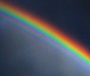
Violet needs some discussion as what is a tertiary colour, blue + blue + red link This is violet seen on our pictures, and article pictures. The violet you see through a spectrometer has fluoresent background glow about it. To recreate this effect you could put some fluorent matterial in a camera. The reason you see it as violet, that is some mixing of red, arises from the lift in the spectral tail of the rho cone cell in the eye. helpful diagram. So to repeat: the colour violet shown is not the colour from a spectrometer even though they stimulate the eye in the same way firstly by two, secondly by one wavelength of light - a hue and a spectral colour. The second issue arising from the problematic violet, is our ability to add an unrealistic amount of red to it making it purple and even magenta. Rainbows have these colours, but this is due the addition of red by the underlying Airy Rings. I will try to find an excellent link for everyone from the US NavalLabs. Here is a picture for you. rainbow What I would like to discuss is how to intelligently add this information into this page. I think it is important as links the colour wheel cycle with the linear spectra, and allows the decerning reader to identify unrealistically retouched photos. I will ask how to include pictures and referencs, but in the meantime thanks in advance for any thoughts. Drhillteach ( talk) 13:02, 9 May 2010 (UTC)
- Everything said here makes perfect sense to me in a clear way except for the part about how it would allow one to discern less than perfect photo-editing. While I can see how the information would be useful in specific cases, like where spectra are visible in the photo, in the absence of lens-flare how often does that happen? Also, what assurances does this detection make against legitimate corrections that most cameras probably make as the signal from the CCD is processed into an actual image? It would be harsh to label such a photo as being "edited"; even when there is no implication of fraud, at the very least human involvement in the process is implied - so is there any way to clarify the use of this technique, to distinguish badly edited or forged photographs from those that are simply automatically color-corrected in the usual way? Zaphraud ( talk) 01:54, 10 June 2010 (UTC)
No doubt this was discussed and settled ages ago, but what is the reason why the article use the word "cyan" (which to me is a subtractive, printer's color, not a spectral color) and not the time-honored, hallowed, Newton-approved "indigo?" Is there a citation, in the "citation required" sense, to some authority that has decided it is better or more accurate or a recommended practice to use the name "cyan" for the spectral color between "blue" and "violet?" IMHO the article explains the traditional use of the name "indigo" adequately, but does not explain the article's own use of the word "cyan;" I think it should, if only in a footnote. Dpbsmith (talk) 22:31, 28 August 2010 (UTC)
- You’re right. There is no reason cyan should be here. The word implies the printer’s subtractive primary (a light greenish blue), and should not be used to stand for blue-green generally. There’s really no authority behind the use of cyan as this article uses it, as far as I know, though in general categorizing the spectrum is somewhat arbitrary and observer-specific. As for indigo: it’s not really a generally recognized “basic” color category (at least in English), and was made up mainly so that Newton could break things into 7 categories for musical/etc. analogy. – jacobolus (t) 10:37, 29 August 2010 (UTC)
- A better source of the color names of various wavelengths might be this JOSA paper from 1943, which has a diagram which has been widely copied and used as a basis for other diagrams. (e.g. the lines in this image). Then again, that diagram is trying to fit colors to ISCC–NBS names, which means that there’s also no “violet” but only “bluish purple” and “purplish blue”. – jacobolus (t) 10:45, 29 August 2010 (UTC)
- Well, if other editors don't remember a good reason for naming "cyan" as a color of the spectrum, and agree that it's really a name for a subtractive color, then I'm thinking that a) maybe cyan should not be used. I'm also thinking that b) maybe whatever set of names is used needs a footnote, and that c) a color between blue and violet should be named and cited. It doesn't need to be a really heavy-duty citation IMHO, even a modern textbook would do, but the choice of name shouldn't be an arbitrary editor's decision and it should be explained. The footnote should mention what other names might be used. A native-Russian-speaking correspondent of mine says, by the way, "In Russian, the light-blue color is called 'goluboy,' and it is used much more frequently than cyan or indigo in English. In fact, I now recall being surprised that there was no color in English corresponding to goluboy. Baby-blue, sky-blue -- these were derivative names, not clean ones like goluboy. And so, at least in Russian, Newton's seven colors have fairly equal representation." Dpbsmith (talk) 15:51, 29 August 2010 (UTC)
- I'm not familiar with the ISCC–NBS but our article on it does include "violet" as an "intermediate" category. In fact the names used source Jacobolus cites do not accord with the article, i.e. perhaps the authors of the image were not trying to fit it to ISCC-NBS names. I notice that our article gives a name "purplish blue" but does not mention any "bluish purple." I'm thinking I like the idea of using the name "purplish blue" for the color between blue and violet, with a footnote explaining it traditionally called "indigo," because the name "purplish blue" is easily understood by readers who may be vague about indigo--if you were shown a swatch and asked whether it was "indigo," "cobalt blue," or "royal blue" would you be confident in answering? And the name "purplish blue" conveys uncertainty about its psychological primacy. Dpbsmith (talk) 16:25, 29 August 2010 (UTC)
- If you’re interested, shoot me an email and I’ll send you a copy of the Kelly paper. I believe that “royal blue” is typically more blue/less purple than “cobalt blue” which is less purple than “indigo” (sometimes called “blue-violet” or “purplish blue”), which is less purple than “violet” (this Kelly paper uses the term “bluish purple” for what the ISCC–NBS system calls “violet”; the two can be considered synonyms in this context) which is less purple than “purple”. Anyway, the main point is that our current set of categories is pretty arbitrary, and I can’t tell what its source is. Any set of categories is in some sense arbitrary (though I believe there have been some studies measuring a typical viewer’s boundaries between color categories), so it might be worth showing a couple of different historical categorizations, but we should have sources for whatever we do say, and “cyan” probably doesn’t belong. (Oh, also, that’s my (woefully incomplete) ISCC–NBS article. I’ll happily send you PDFs of various papers/books about that too, if you want.) – jacobolus (t) 19:26, 31 August 2010 (UTC)
- From the intro to that paper: “The development of the ISCC-NBS system of color names [...] suggested to the author the possibility of adapting the same system of names to the description of colors of other than drugs and medicines. In this paper the possibility of applying this system to the colors of self-luminous sources is explored in the hope of offering a basis for the resolution of the conflicting terminology now used for flares, fluorescent and phosphorescent materials, and signal lights. This system could not displace precise specifications in terms of either chromaticity coordinates or standard filters such as are used for railway signal lights (3), but it is expected to provide color names recognized by the general public as appropriate. The spacing of the color-name boundaries is based on that of the ISCC-NBS system (1), but the shape of the boundaries is based on the extensive data collected by the O.S.A. subcommittee (4) on the spacing of the Munsell colors. Both spacing and shape have been modified in accordance with observations by two observers.” I’m not quite sure what the reason is for Kelly’s use of “yellowish orange” instead of “orange yellow”, addition of new categories “red purple” (between “reddish purple” and “purplish red”) and “blue green” (between “bluish green” and “greenish blue”), and use of the name “bluish purple” instead of “violet”. Maybe just his personal aesthetic preferences? Otherwise the categories are the same. – jacobolus (t) 19:30, 31 August 2010 (UTC)
- Actually, Table I from that paper is especially useful: here's a link. Here’s a link to Kelly’s diagram. (These are under copyright, and since Wikipedia’s image policy only supports hosting fair-use images if they’ll be used directly in articles, I put them at imgur instead). – jacobolus (t) 19:38, 31 August 2010 (UTC)
- Here is a paper that talks about a "cyan laser", even in the title. Given that lasers are monochromatic light, it seems reasonable to suggest that this paper at least demonstrates that cyan is a spectral colour. gringer ( talk) 23:01, 1 September 2010 (UTC)

- Sure, the word cyan is used by various people for greenish blue and blue-green. But the term is very strongly associated with the subtractive primary, used for instance for one of the inks used in process printing, or one of the dyes of a dye-transfer photographic process. Many computer graphics type sources, especially sources without much grounding in color science, refer to the additive mixture of blue and green additive primaries as “cyan” for lack of a better term (sometimes it is even suggested that RGB images could be reproduced in CMY inks by inverting each of the RGB image components), and this usage has spread somewhat, but I think the term cyan is closely enough associated with the subtractive primary that it’s misleading to use it in partition of the visible spectrum, especially since nearly all reliable sources for such partition use some term other than cyan for this range (e.g. “greenish blue”) – jacobolus (t) 22:08, 2 September 2010 (UTC)
- As WP's own article on Cyan explains, cyan is both the name of a subtractive primary and of an additive secondary color (equal amounts of blue and green). It comes up so often in computer graphics, and so many people these days have computers, that there might be some question about how badly a reference is needed. Zyxwv99 ( talk) 03:28, 12 September 2013 (UTC)
- @ Zyxwv99: By "there might be some question about how badly a reference is needed", did you mean "It should be obvious, so we don't need a reference"? I've been a (home) computer user since at least the mid-80s (Apple IIe), and I've only ever thought of "cyan" as referring to the subtractive color. That's certainly what it means in the most common usage in my experience, which is computer-related: printer inks, which come in the subtractive primaries cyan, magenta, and yellow ( CMYK). That's what I thought the Newton reference (which I just now tagged "citation needed") was about. Clarification is definitely needed here! -- Thnidu ( talk) 04:15, 22 January 2014 (UTC)
Cyan is in no way an alternative to indigo. Indigo in on the violet side of blue. Cyan is on the green side of blue. Dicklyon ( talk) 04:30, 22 January 2014 (UTC)
The introductory paragraph of this article currently remarks: "The spectrum does not, however, contain all the colors that the human eyes and brain can distinguish. Unsaturated colors such as pink, or purple variations such as magenta, are absent, for example, because they can be made only by a mix of multiple wavelengths."
Although the general idea is correct, I think the wording should be revised to avoid misinformation. Magenta (50% blue, 50% red, 0% green) is a fully saturated color; see http://en.wikipedia.org/wiki/Magenta. Pink can also be a fully saturated color depending what type of pink it is. White might be a better color choice here, although even white/gray could be said to be within the spectrum, namely manifested as black, depending on what kind of spectrum is being referred to. To avoid any kind of confusion, it might be best to reference a color such as 40% blue, 40% red, 20% green. 67.53.36.194 ( talk) 22:46, 16 March 2012 (UTC)
- I would suggest the word "purity" instead of "saturation". See also Colorfulness#Excitation_purity.-- SiriusB ( talk) 08:52, 1 February 2013 (UTC)
In the lede it says:
- "The visible spectrum is the portion of the electromagnetic spectrum that is visible to (can be detected by) the human eye."
I don't think we should define the word "visible" here. Even though the definition provided is a perfectly valid definition, it is not the only possible definition of "visible." Many people who are legally blind have eyes that can detect light. Since "visible" is a common word, it should not require a definition. Also, "Visible spectrum" is a noun phrase that cannot be analyzed entirely in terms of its constituent parts. The temperate zone of the Earth, for example, is actually defined astronomically, and only coincides very roughly with the region in which temperate climate occurs.
Next, the range 390nm - 700nm seems odd. Even though it's referenced (to a textbook) I don't think it's one of the five most commonly cited ranges, or even in the top ten. The 390 at one end suggests a degree of precision that is not matched by the 700 at the other end. I suggest we go back to 400nm - 700nm, but qualify it with words such as "conventional," "nominal," or "customary." For example: "The conventional range of the visible spectrum is 400nm - 700nm. This range is, of course, purely nominal."
After that we could mention a few alternative ranges. For example, the CIE range for photopic (color) vision, 360nm - 830nm, and the CIE range for scotopic (night) vision, 380nm - 780nm. There's also a much narrower range, 420nm - 680nm, that comes up occasionally in technical literature, especially biochemistry. Even though that may seem exceedingly narrow, most people rarely see anything below 420nm or above 680nm, not because we are not capable of seeing it, but because our sensitivity at those wavelengths is so weak that they are drowned out by more visible wavelengths.
And finally, two subjects near and dear to my heart.
1) Nowadays many people have access to exotic light sources such as ultraviolet and infrared lasers, diodes, etc. As a result, many people are seeing light at wavelengths far beyond the more widely published ranges. For example, many people who work with uv lasers in the 320s and 330s can see the Rayleigh scattering. At the opposite end, a $15 5mW 980nm laser pointer shined directly into the eye (reasonably safe for up to 0.25 sec.) is clearly visible. In other words, people are "seeing the impossible."
2) Over the years there has been quite a bit of fundamental research into the extremes of human vision. The upshot is that the actual of range of human vision is about 300nm - 1100nm, but with qualifications. For example, children can usually see down to about 300nm, teens and young adults to 315nm, the elderly usually not below 400nm, the middle aged highly variable. In the low 300s color perception and visual acuity are seriously compromised. The more extreme the wavelength (both in uv and ir) the brighter the light needs to be in order to be visible. Eye damage is a serious concern for wavelengths below 320nm (because of the inherent dangers of uv at those wavelengths) and for brightness reasons above 950nm. Zyxwv99 ( talk) 02:33, 22 September 2013 (UTC)
References
400-700nm
- Encyclopædia Britannica
http://www.britannica.com/EBchecked/topic/340440/light
- Textbook of Practical Physiology
G.K. Pal, Pal, G.K., Orient Blackswan, 2001 - Physiology - 530 pages http://books.google.com/books?id=CcJvIiesqp8C&pg=PA387
- Vision
Pierre A. Buser, Michel Imbert, MIT Press, 1992 - Medical - 559 pages http://books.google.com/books?id=NSZvt8Ld2-8C&pg=PA50
CIE
- Handbook of Optical Metrology: Principles and Applications, edited by Toru Yoshizawa
http://books.google.com/books?id=DdzBQsqPbzcC&pg=PA5
LIMITS
"In young adults, wavelengths as high as 1000 nm or down to 300 nm may be seen, but the standard range for human vision is typically given as 400-700 nm." Scott E. Umbaugh
- Digital Image Processing and Analysis: Human and Computer Vision Applications with CVIPtools
http://books.google.com/books?id=UQTMw5uoGHgC&pg=PA405
"Limits of the eye's overall range of sensitivity extends from about 310 to 1050 nanometers, but strong illumination is necessary for sensation at these wavelength extremes."
- Color and Light in Nature
David K. Lynch, William Charles Livingston, Cambridge University Press, 2001 http://books.google.com/books?id=4Abp5FdhskAC&pg=PA231
ULTRAVIOLET
"Wave length 334 mμ was described as highly unsaturated blue, bluish gray and silver; 313 mμ was given as light without color, almost colorless, gray with a trace of blue..."
- The Color of Ultraviolet Light
Albert Bachem The American Journal of Psychology, Vol. 66, No. 2 (Apr., 1953), pp. 251-260 http://www.jstor.org/discover/10.2307/1418730?uid=3739256&uid=2129&uid=2&uid=70&uid=4&sid=21102663451727
"According to different authors, under appropriate conditions seeing is possible in the ultra-violet down to a wave-length as small as 3100 Å. This fact has been confirmed on 21 persons (age 25–50 years)..." W. de GROOT
- Seeing in the Ultra-Violet
Nature 134, 494-494 (29 September 1934) | doi:10.1038/134494a0 http://www.nature.com/nature/journal/v134/n3387/abs/134494a0.html
INFRARED Infrared color reversal
- Color Vision: From Genes to Perception
edited by Karl R. Gegenfurtner, Lindsay T. Sharpe Cambridge University Press, May 28, 2001 - Medical - 492 pages http://books.google.com/books?id=4zQMQLLVkFYC&pg=PA93
"The foveal sensitivity to several near-infrared laser wavelengths was measured. It was found that the eye could respond to radiation at wavelengths at least as far as 1064 nm. A continuous 1064 nm laser source appeared red, but a 1060 nm pulsed laser source appeared green, which suggests the presence of second harmonic generation in the retina."
- Visual sensitivity of the eye to infrared laser radiation
David H. Sliney, Robert T. Wangemann, James K. Franks, and Myron L. Wolbarsht Affiliations JOSA, Vol. 66, Issue 4, pp. 339-341 (1976) http://dx.doi.org/10.1364/JOSA.66.000339
Zyxwv99 ( talk) 23:38, 22 September 2013 (UTC)
- This all seems excellent stuff. Why not make some changes to the article? Martin Hogbin ( talk) 13:56, 12 February 2014 (UTC)
This lede states:"A typical human eye will respond to wavelengths from about 390 to 700 nm.[1]" The lede for the article "Light" states:"Under ideal laboratory conditions, people can see infrared up to at least 1050 nm,[8] children and young adults ultraviolet down to about 310 to 313 nm.[9][10][11]" (reference [8] actually states a 1064nm laser was detectable). There are several problems with this lede. First, a "typical" human eye will not only "respond" to visible light, it will "respond" to x-rays and microwaves as well. I'm not sure how to phrase it: 'will see', 'can visualize', 'will visually respond to', 'can sense', but a bald statement about an undefined response is inaccurate. Second, the human eye's sensitivity, especially to UV, diminishes throughout life, hence "typical" isn't very well defined here (and its meaning is unclear, imho). If I recall CIE did define a color space - but that was based on experts in the field (which we should presume biases the result). I've been involved in color matching my entire professional career (35 years), and I've read in numerous texts that the visible spectrum is 430 to 690nm, (Halliday & Resnick (1967) claim that the eye's sensitivity is maximum at 555nm and that it drops to 1% at 430 and 690nm, for a "standard observer"). It seems obvious to me that "typical" eyesight is like "typical" skin color or height or weight. That is, there ain't one. Its a moving target; we all are getting older. Unless there are some useful (global) norms for color vision acuity (?), I think we need to say both that most of us can see colors between 430nm (say) and 680nm under 'typical' viewing conditions and that there are reports of light perception as high as 1064nm, in the lab, and as low as 313nm (I'd like to see another reference confirming that the 1060nm result isn't due to harmonics). Abitslow ( talk) 19:59, 7 June 2014 (UTC)
- In the Sliney (1976) study, the 1060 nm pulsed laser did in fact generate a harmonic in the retina at 530 nm. It was those harmonics that inspired the study in the first place. Sliney was the U.S. Army's leading expert on laser eye injuries. Many soldiers reported were getting hit in the eye with near-infrared lasers from about a thousand yards away, usually escaping injury, but reporting that they saw a green light. It turns out that longer wavelengths of near ir can do that, but only in short pulses. Continuous wave doesn't do that. The average minimum amount of power needed to see 1064 nm (CW) was 0.069 mW, with 20-minute dark-adapted eyes, 3mm diameter beam, and three filters, each blocking out 99.9 of light more than 5 nm from the target wavelength. Nowadays huge numbers of people own or work with near ir lasers. I have a 300 mW 808 nm that produces clearly visible light, and a 5 mW 980 nm that I can see clearly when shined (briefly) directly into the eye. You can buy lasers like this on eBay for $15. They use them for fake currency detection, as some national currencies have dyes that reverse-fluoresce under 980 (reverse Stokes uptake).
- The business about 310 nm UV is definitely age dependent, but only up to a point. Between 310 and 302 the opacity of the lens and cornea each increase by several orders of magnitude (how many varies with age). Up to age 30, nearly everyone can see UV down to 310. Between age 30 and 45 the lower limit of vision in the UV gradually increases, eventually extending into the ordinary violet.
- Both the UV and ir research has been repeated by multiple studies, and confirmed by the millions of people worldwide who work with exotic wavelengths. And yes, people can see x-rays, gamma rays, and beta particles, the latter two generating Cerenkov radiation in the retina. At 310 nm people who can see that low have good visual acuity up to 4 inches, with some very limited color perception. In the near infrared, things are crystal clear.
- The most widely cited figure for "visible light" is 400-700nm. Every field of human endeavor that involves light and color has it's own range. However, the 400-700 nm figure is the non-specialized range. Obviously this involves consensus decisions, value judgements, opinions about where to draw the line. However, it is not our job to improve the English language by redefining commonly used words. Words mean what they mean. Zyxwv99 ( talk) 21:15, 8 June 2014 (UTC)
- Update: I just thought of a solution to this. We're basically arguing over the lede, which I haven't even touched in this article. I think the place to start is with the body of the article. There we can explain the most widely used definitions of visible light, including who uses them. The 400-700 nm range seems to be used mainly for didactic (teaching) purposes, e.g., introductory textbooks, encyclopedias, etc. Zyxwv99 ( talk) 13:32, 9 June 2014 (UTC)
Color Wavelength Frequency Photon energy violet 380–450 nm 668–789 THz 2.75–3.26 eV blue 450–495 nm 606–668 THz 2.50–2.75 eV green 495–570 nm 526–606 THz 2.17–2.50 eV yellow 570–590 nm 508–526 THz 2.10–2.17 eV orange 590–620 nm 484–508 THz 2.00–2.10 eV red 620–750 nm 400–484 THz 1.65–2.00 eV
should be changed to
Color Wavelength Frequency Photon energy violet 380–450 nm 789-668 THz 2.75–3.26 eV blue 450–495 nm 668-606 THz 2.50–2.75 eV green 495–570 nm 606-526 THz 2.17–2.50 eV yellow 570–590 nm 526-508 THz 2.10–2.17 eV orange 590–620 nm 508-484 THz 2.00–2.10 eV red 620–750 nm 484-400 THz 1.65–2.00 eV — Preceding unsigned comment added by Tempedi ( talk • contribs) 15:57, 31 May 2017 (UTC)
The section "Animal color vision" makes this statement about snakes: "other snakes with the organ may detect warm bodies from a meter away." However, no "organ" is mentioned in this section, so it is unclear what is meant here by "the organ." Presumably there was something here previously about which organ allows a snake to perceive radiant heat, but no such reference is present now. This statement needs to be made clearer. — Preceding unsigned comment added by 2601:602:8480:3343:2145:CFCE:C4CA:A507 ( talk) 05:03, 4 February 2019 (UTC)
I don't know if it is already mentioned in this quite large page, but... I want to say that when the spectrum from a sunlit prism (corners 60°) is observed at a large distance (the distance prism - projection screen) then one shall notice the absence of the colors orange, yellow, yellowish green, cyan (greenish blue), and indigo. There's only the three colors red, green, and ultramarine blue (the same colors from the RGB color model). So... Sir Isaac Newton's color system (red, orange, yellow, green, blue, indigo, violet) is a bit childish or schoolish. Johann Wolfgang von Goethe also knew about this rather childish approach of Newton and noticed Newton's wrong observations after he (Goethe) performed his own experiments with sunlit prism. Moreover, there's no violet in the spectrum of white light! Sir Isaac Newton observed the Primary Rainbow but he didn't knew about the existence of the Supernumerary Arcs on the "inside" (on the blue part) of the bow. He noticed a color that he called violet, but... what he really observed was the "overlap" of the ultramarine blue from the Primary Rainbow with the red from the first Supernumerary Arc. This "overlap" is the color Magenta (deep pink). Newton must have been unaware of the existence of the "overlap-color" Magenta, thus... he thought he observed the color violet. DannyJ.Caes ( talk) 07:25, 5 August 2019 (UTC)
- Perhaps a case of anomalous color vision (indeed, deuteranomaly can be found in 6% men). Or crankery. Incnis Mrsi ( talk) 09:59, 5 August 2019 (UTC)
- Anyway it’s the spectral color article where color perception is to be addressed. “Visible spectrum” mostly stresses the fact that certain part of the EM spectrum is visible. Incnis Mrsi ( talk) 10:15, 5 August 2019 (UTC)
- Goethe's work is covered at Theory of Colours. Fundamentally, Newton and Goethe explored two different aspects of light. Newton's work correctly addresses the spectral composition of light, and identifies the apparent colors of monochromatic radiation. Goethe's work addresses aspects of human color vision that are ignored in Newton's work. From a physics perspective, Newton's work is fundamental—physics cares about the nature of light itself, not how colors appear to the eye. The Newtonian model cannot easily tell you where pink or brown come from, however. (NB: You cannot make a brown spotlight.)-- Srleffler ( talk) 18:09, 29 August 2019 (UTC)
The chart is incorrect at the end of spectrum: the atmosphere is quite transparent to the long waves. — Preceding unsigned comment added by 2003:DF:2812:FF05:EEF4:BBFF:FE36:3F5C ( talk) 07:42, 25 September 2020 (UTC)
- According to NASA the ionosphere is opaque to wavelengths longer than about 10 m. [3]-- Srleffler ( talk) 16:16, 27 September 2020 (UTC)
While reorganising the article Optical window, I noticed that although this atmospheric window is characterised as optical, its range also covers the UV and infrared spectra. After some research I found that many valid sources differentiate between the visible and optical spectra, defining the visible spectrum as the one the human eye can detect and the optical spectrum as the one including the UV, the visible and the infrared spectra (see for example Frank L. Pedrotti's "Introduction to optics", Cambridge University Press, 2017, pp. 7-8). It seems that at some point in scientific history the terms optical and visible coincided, something that might hold true for many contemporary scientific fields as well. However, the matter should be looked into and this article should probably not present the terms visible spectrum and optical spectrum as synonymous.-- L'OrfeoGreco ( talk) 04:07, 28 December 2021 (UTC)
The only reference for this section is a page that describes the purpose of gamma correction and uses the gray projection thing as an illustration of part of the reasoning behind it, and the section gets that wrong. I propose someone just throw a link to a relevant RGB color explanation page in place of the entire section and be done with it. I'm not doing it because this talk page appears to be the most insane bitchfest on Wikipedia over a tiny article I've seen to date. A Shortfall Of Gravitas ( talk) 18:57, 25 April 2022 (UTC)
- Removed:

For color-accurate reproduction, a spectrum can be projected onto a uniform gray field. The resulting mixed colors can have all their R, G, B coordinates non-negative, and so can be reproduced without distortion. This accurately simulates looking at a spectrum on a gray background. [1]
- I left the rest because the fact that you can't truly represent the entire visible spectum in RGB color space is a really important point.-- Srleffler ( talk) 04:25, 26 April 2022 (UTC)
References
- ^ "Reproducing Visible Spectra". RepairFAQ.org. Retrieved 2011-02-09.
This article is difficult to disambiguate from light, especially when there is also electromagnetic radiation. There is also lots of overlap with spectral colors, but I think that is easy enough to separate. Separating from light is harder, but as I've gleaned from talk:light and previous discussions here, light should head more in a physics/physical direction and visible spectrum should focus more on the biology/evolution/visual side of things. I've gone with that and expanded greatly on the basis of the visible range while removing some of the physics based information that belong in light or the color information that belongs in one of a hundred color based articles like gamut. Discussions of color doesn't have much place in this article, imho, and maybe I'll even pare #history down to suit. Curran919 ( talk) 14:54, 29 August 2023 (UTC)
- I like your additions to the article, but I'm not sure I agree with the change in overall direction you are proposing. This article's topic is, as the name suggests, the visible spectrum itself, rather than visible light (which should be covered at Light). The spectral colors and the history of observation of the spectrum are core. The limits of the spectrum and their biological origins are also on-topic.
- Yes, this article has strong overlap with spectral colors. This article's focus should be the physics, biology, and history, while the other article focuses on the application to gamut and color spaces. It's not unusual for complicated topics to have multiple overlapping articles focused on different aspects of the topic.-- Srleffler ( talk) 21:41, 2 September 2023 (UTC)
I don't know about this one. Having 2 similar articles and disambiguating them is hard enough so most people just merge them together, but this is a different case. Visible spectrum is just a fancier word for visible light, so they should be merged, right? Well, this one's gonna sound off, but hear me out.
"Light" should be an article about all types of light, not just visible light. Instead, visible light should either be its own article or merged with visible spectrum. Besides, both article's first sentence is basically the same wording but tweaked to suit their different names. This just makes it clear even further that visible light and visible spectrum is clearly almost identical in every aspect because their leads read nearly the same.
So what do you think? Is it ok? 2001:44C8:40B2:3790:8876:61FA:ACAC:B779 ( talk) 17:10, 24 January 2024 (UTC)
- No, "visible spectrum" is not just a fancier word for visible light. It is the spectrum of the light, rather than the light itself.
- There was a long discussion about the idea in your second paragraph ages ago, and we settled on "Light" = "visible light", with Electromagnetic radiation covering the broader concept. You will find lots of people object to any proposal to make Light cover the broader definition of the term.-- Srleffler ( talk) 05:42, 25 January 2024 (UTC)
- B-Class vital articles
- Wikipedia level-4 vital articles
- Wikipedia vital articles in Physical sciences
- B-Class level-4 vital articles
- Wikipedia level-4 vital articles in Physical sciences
- B-Class vital articles in Physical sciences
- B-Class color articles
- Top-importance color articles
- All WikiProject Color pages
- B-Class physics articles
- Top-importance physics articles
- B-Class physics articles of Top-importance
- B-Class visual arts articles
- WikiProject Visual arts articles
|
| This It is of interest to the following WikiProjects: | |||||||||||||||||||||||||||
| ||||||||||||||||||||||||||||
|
Is there any article on Audible spectrum? Anwar ( talk) 19:35, 3 May 2008 (UTC)
Isn't the exact range of the visible spectrum disputed?--Luke Elms 20:33, 17 May 2008 (UTC)
- Not that I know of. It is widely accepted that there is no "exact range", since the sensivities curves fall gradually to zero at both ends. Dicklyon ( talk) 21:33, 17 May 2008 (UTC)
Human eyes do not see wavelengths, they see frequencies. The color of light perceived through water, for example, is not massively affected by the drastic decrease in wavelength because the frequency is about the same. — Preceding unsigned comment added by 129.210.115.18 ( talk) 21:50, 18 June 2013 (UTC)
Other sources (many, I think) indicate not the round numbers "400 to 700," as in this article, but 380 nm to 750 nm or more. as in the electromagnetic spectrum article (the citation of Biology: Concepts and Applications looks tertiary at best). Yellowing on of the lens of the eye due to aging causes loss of sensitivity at the short wavelength end. I recommend that someone correct the numbers in the article and propagate the changes throughout. Eric Drexler ( talk) 12:33, 17 March 2013 (UTC)
Here are authoritative sources that present quantitative data re. human eye sensitivity vs. wavelength (and age of subject, at the violet end):
- Sensitivity to about 750 nm: SPECTRAL SENSITIVITY OF THE CONES IN THE DARK ADAPTED HUMAN EYE, YUN HSIA AND C. H. GRAHAM, Proceedings of the National Academy of Sciences, VOL.38,1952.
- Sensitivity to about 380 nm: Changes in Scotopic Visibility Thresholds with Age, RALPH D. GUNKEL, O.D.; PETER GOURAS, M.D., January 1963, Vol 69, No. 1.
The article should be corrected, and perhaps other articles as well. There’s a lot of misinformation in circulation. Eric Drexler ( talk) 12:58, 17 March 2013 (UTC)
- Agree. I set it back the last time someone (not logged in) changed it with no explanation, but this seems to be sufficient. I do remember reading that the "usual" scotopic curve was based on a very small number of samples, so perhaps some better explanation of this is required? Aside: A fiber optic salesman once told me that I could not see 850 nm MM ethernet signal. Therefore, I must have imagined it even though it did seem highly correlated with whether the fiber was plugged in, the transmitter was on, etc. ;). I think perhaps it illustrated what Dicklyon is saying above about curves gradually falling. Ehusman ( talk) 20:54, 24 March 2013 (UTC)
Saw a short article a while ago in a science news magazine that Birds see more of the spectrum than we do. They have additional cells in their retina that also have a tiny bubble of oil over them.
The speculation was that the non-bird animals or proto-mammals that survived the extinction of the dinosaurs (the great K-T Extinction) were almost exclusively nocturnal types and did not need the extra part of the spectrum anyway. I got the impression that this part of the extension was not at either end of our visible spectrum, but somewhere nearer the center. I am not sure this makes sense, but maybe some can look into it. WonderWheeler ( talk) 23:20, 20 August 2008 (UTC)
Birds are tetrachromats and can see down to 320 nanometers in the ultraviolet, whereas since we are trichromats, our violet limit is 380 nanometers. Pigeons are pentachromats and besides seeing into the ultraviolet, can also see into the infrared beyond 750 nanometers. Keraunos ( talk) 05:20, 22 March 2011 (UTC)
While all the notes about other species are interesting, I think that the tendency (especially of new editors) to simply chime in on the article with unsourced factoids about this or that species' abilities needs some kind of control. After all, the article begins with the true statement that the article is about what the human eye sees. The introductory paragraph that diverges onto the topic of other species is not only slightly off topic, it also begins to look like it was designed by committee. Which of course it was! Ehusman ( talk) 21:00, 24 March 2013 (UTC)
I've made an image of the visible spectrum in Inkscape (a rectangle with a linear gradient having various transition points), which got pulled out of this article rather quickly because it looked odd. My aim is/was to try to make it represent the spectrum using transition points that are as precise as possible and fit the RGB colours represented on the respective colour pages ( red, orange, yellow, green, blue, violet). Spectral violet is obviously a tricky one, not actually being in the RGB Gamut. I've already reduced the luminosity of a few colours to make it blend better -- any ideas on how to improve it? Perhaps a logarithmic representation would be better? gringer ( talk) 03:14, 28 August 2008 (UTC)
Here is a logarithmic representation, with wavelengths at the boundaries marked. gringer ( talk) 04:11, 28 August 2008 (UTC)
- Those are much better than your first attempt. I don't see any reason not to stick with linear frequency scale. You've still got some pretty visible Mach bands, though (bright stripes that appear due to the discontinuous slopes, at violet, yellow, and red). Dicklyon ( talk) 15:27, 28 August 2008 (UTC)
- The reason I did both linear and logarithmic is that there doesn't seem to be a consistent convention for what to use (e.g. here). I had to reduce the luminosity of a few colours to remove the Mach bands (although I don't think it's possible to get rid of the yellow one completely without reducing the yellow to something that doesn't look yellow). I also added in a cyan transition point at 495nm, because without that the green->blue transition is really bad (and also because I noticed Dkroll2's comments on this page).
- Well, it doesn't appear to me that Dkroll2's comments make any sense, certainly not about cyan being brighter for reason he made up, as it contradicts what is well known about comparative brightness of different wavelengths. And that source that copies stuff from wikipedia without giving the actual source is also not worth paying attention to. The scales that people are likely to use are linear wavelength and linear frequency; log is OK, too, but for the visible spectrum the range is so small that it doesn't really matter much; just stick to linear. To avoid Mach bands, just don't allow any discontinuities of the slope of the signals in the different color channels, or at least not of the effective luminance, or L*. Dicklyon ( talk) 05:21, 29 August 2008 (UTC)
- Using logarithmic scale is much better than linear because in order to represent the whole electromagnetic spectrum, a logarithmic scale is required. Also, using the logarithmic scale highlights the interesting fact that our color vision is capable of registering just under one octave of the electromagnetic spectrum. Keraunos ( talk) 05:15, 22 March 2011 (UTC)
- How did you pick the RGB values? Since the spectral locus is clearly out-of-gamut for sRGB, it seems like a bit of a challenge. You definitely should not use the RGB values from red, orange, etc. — jacobolus (t) 07:36, 29 August 2008 (UTC)
- I did actually take the values from red, orange, etc., but the Violet colour was the only one which mentioned an approximate wavelength for the nearest equivalent RGB values. So, for all the others, I assumed the colour point was the (linear) centre of the range... and I've just realised that I should probably fix that for the logarithmic scale. I've since reduced the luminosity a bit, but tried to keep the same hue. gringer 10:10, 29 August 2008 (UTC)
- Okay, I found a paper and Excel spreadsheet that referred to the Wright-Guild experiments that led to the CIE_1931_color_space. It included wavelengths for the red/green/blue reference colours, as well as yellow and cyan. I assumed RGB red/green/blue corresponds with those reference colours, and adjusted the colour points on the gradients to fit with the matching wavelengths. One thing that I've just realised, is that I could calculate the refraction of particular wavelengths to work out where they would lie when projected through a prism, which would be neither linear nor logarithmic.... gringer 02:31, 30 August 2008 (UTC)
- as mentioned before, it's not ideal, but maybe it isn't as bad as I originally thought it was. I just had a look at Image:CRT_phosphors.png, and noticed that the dominant wavelength of the blue and green phosphors is at most about 10nm out of the monochromatic wavelength that Wright used. The red looks to be a bit out (maybe 670-680nm vs 650), although it's hard to tell because the peaks aren't smooth. This patent talks about peak emission spectra for phosphors used in an LCD screen, "600-660nm (red [vs 650nm]), 500-560nm (green [vs 530nm]), or 400-460nm (blue [vs 460nm])". I would consider these to be a fairly good correlation with the monochromatic values in the 1931 experiment, if only accidental. gringer ( talk) 22:49, 31 August 2008 (UTC)
I uploaded an inverse spectrum (linear by wavelength). Mach bands seem to be a bit more noticeable in this one. I've since realised that doing the whole "make it look like a prism" thing is silly, because dispersion is probably not going to be a nice function of wavelength, and is material-dependent. gringer ( talk) 03:54, 30 August 2008 (UTC)
- What does “inverse spectrum” mean? That looks to me like it’s merely reversed left–right. I’m not sure I see the point. — jacobolus (t) 06:04, 30 August 2008 (UTC)
- Er, "inverse [wavelength] spectrum" as in linear frequency (as mentioned by Dicklyon 05:21, 29 August 2008 (UTC)). The boundaries and ranges are different — the violet band takes up a much greater range in this one, and yellow was so small that I couldn't put the wavelength numerical values inside the region. gringer ( talk) 11:49, 30 August 2008 (UTC)
I believe CIE publishes tables of 2° and 10° standard observer values for the spectrum, as XYZ or xyY coordinates. I’m not sure how to track such a table down though. Dicklyon, do any of your color science books have something like that at the back? — jacobolus (t) 06:14, 30 August 2008 (UTC)
- Sure, the standard observer curves are widely available (e.g. here p 112). But if you try to make a picture of a spectrum using them, all the resulting colors are outside the sRGB gamut; so the problem is how to depect the spectrum in RGB, not how to compute spectral colors per se. Dicklyon ( talk) 06:53, 30 August 2008 (UTC)
This seems pretty reasonable, and ends up with several renderings to choose from. — jacobolus (t) 12:30, 30 August 2008 (UTC)
Spectral colors
Skoch3 ( talk) 07:50, 3 November 2008 (UTC): I changed the text for spectral colors (and included a link). I took out the reference to rainbows, because rainbows have significant overlap of colors with each other, and thus the colors are not spectral.
New image needed
Skoch3 (
talk) 07:56, 3 November 2008 (UTC): While I can see that a significant amount of work has been put into this image of the spectrum, I think as is it is very misleading. As far as simulations go, it is quite different from the image on the
spectral color page (the spectral colors are on the outside horseshoe...and are quite different from the current image on this section). However, I think much better than a simulation would be a good photo of a white light spectrum, spread out by a diffraction grating, along with wavelength calibration. I am thinking of switching to add the image to the right, above. The most striking thing missing to me is the cyan color, which is lacking in the current simulated image. I agree that the NASA image is a bit dark.
-
Skoch3 (
talk) 08:00, 3 November 2008 (UTC): There is also a very high resolution image of the solar spectrum
on this NOAO page...but it would be tough for reader to interpret.
- If you're wanting a good representation of the spectrum, a JPEG image is a bad idea, due to the type of image compression it carries out. A bitmap (e.g. PNG) file, at a minimum, would be acceptable, as long as it were derived from a RAW image, rather than a JPEG. The SVG files I've created keep getting replaced by other synthesised bitmap images, which would be better done as SVG files due to scaling, text compression, etc. -- I'd much rather have an actual photograph, but that requires a bit more effort. gringer ( talk) 04:11, 17 November 2008 (UTC)
The actual data spectrum from NASA represents a particular source, whereas the brighter illustration is about the general concept of visible sprectrum. The latter works better as an illustration, I think. It's hard to make good representations of pure spectral colors in RGB; the chromaticity plot has other goals, being normalized by x+y+z such that it doesn't go black at the ends of the spectrum, and also shows purples. The existing image is also not great, having poor yellow and cyan. Dicklyon ( talk) 20:54, 3 November 2008 (UTC)
- ... Generically: the colors and spectral range shown in a photo will be distorted by the response of the sensors. Eric Drexler ( talk) 12:38, 17 March 2013 (UTC)
"In the illustration, the narrow red, green and blue bars show the relative mixture of these three colors used to produce the color directly above.
what illustration? 12.125.134.114 ( talk) 16:22, 8 October 2008 (UTC)
I changed the name from visble spectrum to visible light spectrum -- Chicagobears94 ( talk) 21:21, 10 January 2009 (UTC)
- Why? -- Old Moonraker ( talk) 21:53, 10 January 2009 (UTC)
Actually, you moved it to Visible Light Spectrum, which anyone who has been editting wikipedia should know is improper capitalization. I moved it back. If you think that Visible light spectrum would be better than Visible spectrum, make a proposal here and we can talk about it. You're not the only one likely to have an opinion on this. Dicklyon ( talk) 06:39, 11 January 2009 (UTC)
Merge with Light
Why do we have this article and also have the Light article whose first line says: "Light, or visible light, is electromagnetic radiation of a wavelength that is visible". Also, we have Visible Light redirect here. -- MarsRover ( talk) 19:54, 21 March 2009 (UTC)
- Did you actually look at the articles? They seem to me to have very distinct topics. Dicklyon ( talk) 20:55, 21 March 2009 (UTC)
- Yes, I did. How are they "very distinct topics"?
- If "visible light" redirects here is not just about the spectrum range. And this is the main article for the
Electromagnetic spectrum#Visible radiation (light) section which is about the radiation not the spectrum. And why wouldn't we following the same pattern for "
Infrared" and "
Ultraviolet"? --
MarsRover (
talk) 22:17, 21 March 2009 (UTC)
- Visible spectrum is the primary article on visible light per se. Light is the article on light in general. Note that in physics light refers to any type of electromagnetic radiation, visible or not. The article light focuses on general properties of EM radiation, and on science history related to light. I fixed its first line to emphasize the "visible" part a bit less, while still retaining the fact that the term is primarily used to refer to visible light.-- Srleffler ( talk) 01:20, 22 March 2009 (UTC)
- Oppose - The spectrum is notable and distinct from the light which causes it. -- SEWilco ( talk) 22:18, 21 March 2009 (UTC)
- Oppose - I'm not convinced by the clever word play either. The topics are separate and it only makes sense to separate them. Optics is primarily the study of visible light (but also infrared and ultraviolet too, according to our article), and as you pointed out, correctly links here. One could mention that the visible spectrum is ultimately defined by our eyes' physiology, not the arbitrary distances of 390 through 700 nanometers. I understand the point that it's all the same thing really, but from the vantage point that this is an encyclopedia, it's best to have the items separate and I plan to remove the tags in a couple days if nobody objects. JameKelly ( talk) 12:51, 6 April 2009 (UTC)
- Done
- If anyone objects, feel free to change it back and reopen the discussion on this talk page. JameKelly ( talk) 11:42, 8 April 2009 (UTC)
I had previously attempted to merge light with electromagnetic radiation, which was rejected, but the discussion appeared to suggest that the best way of consolidating the information was to perform a merge or partial merge between visible spectrum and light, called either light or visible light. I was wondering how this might be achieved. Serendi pod ous 15:27, 5 October 2009 (UTC)
- The "done" above refers to the removal of the opposed merge proposal with light. What has changed? Dicklyon ( talk) 23:25, 5 October 2009 (UTC)
- The first step in "how it might be achieved" is to get consensus for the change. There is opposition to what you propose, both here and at Talk:Electromagnetic radiation.
- I'm happy with having three articles on light: Light provides a general-level discussion of the phenomenon. Electromagnetic radiation provides greater technical detail, and Visible spectrum discusses issues particular to the spectrum of visible light. I oppose merging any of these with any other. I am open to the argument that Visible light should redirect to Light rather than to here.-- Srleffler ( talk) 01:10, 6 October 2009 (UTC)
Re: removal of indigo from the table. I approve. If I had noticed that the table was drawn from a source I would have removed it too.
The idea that there is a distinct colour "indigo" in the spectrum between blue and violet has no basis in objective fact nor even unbiased qualitative observation. It was added because of Newton's bias that the number of colours should be the same as the number of notes in the musical scale.-- Srleffler ( talk) 23:29, 4 December 2009 (UTC)
- I appreciate the feedback. Dicklyon ( talk) 04:13, 5 December 2009 (UTC)
- Newton's "blue" probably referred to something like 488nm (close to cyan) whereas his "indigo" probably referred to something like 464nm (same as what's now called "blue" in sRGB). 142.119.100.34 ( talk) 04:58, 11 May 2024 (UTC)
Capabilities of one's vision seems to be dependent on their growth environment, culture and perhaps even language. Therefore talking about distinct colors is highly subjective matter. See "BBC Horizon: Do you see what I see?" or this YouTube clip: http://www.youtube.com/watch?v=4b71rT9fU-I . — Preceding unsigned comment added by 80.75.107.170 ( talk) 09:09, 16 May 2012 (UTC)
The image at the top of the page, showing a narrow beam of white light passing through a prism, is quite inaccurate and needs replacing. The problem is that the beam as it is shown inside the prism, after having passed through the left-side wall, is still a narrow beam of white light when it should be already diverging into color separations as it has been refracted once. Other images on the web get this part correct.
TimProof ( talk) 20:51, 18 March 2010 (UTC)
- Britannica has a nice diagram here, and wikipedia has this diagram. It's pretty hard, I'd speculate, to take a good picture of a beam of light going through a prism – you'd need something like a broad-spectrum laser, with the whole set up in some kind of smoke or fog to scatter some of the beam towards the camera. Even doing a decent 3d render is probably pretty tricky. I'm not sure it's such a big deal, but if you want to try to make a better one, go for it! – jacobolus (t) 22:15, 18 March 2010 (UTC)
Hi everyone. There are currently a ton of spectrum images spread through English wikipedia & the rest of wikimedia projects. I’ve stuck the ones I could find over to the right (this doesn’t include the vertically oriented ones, or the couple that were flipped right-to-left, or scaled logarithmically, but otherwise identical to one shown here). None of them seems to me to have an especially legitimate methodology behind its construction, and most don’t even explain how they were generated. This is understandable enough – there’s no clear right approach to rendering something that falls so far outside the sRGB gamut. Still, I’ve been playing with it, and the best rendering I can come up with results from the steps: (1) Use the CIE 1931 standard observer data to define XYZ at each wavelength; (2) Convert each XYZ triplet to CIECAM02 space, assuming D65 white point and “average” surround; (3) Apply a bit of a gamma curve to the resulting J values, to brighten the darkest parts so they’re a bit easier to see; (4) Compress this gamma-adjusted J to fall between 8 (the sRGB black point) and 75 – i.e. map [0, 100] onto [8, 75] – so that we can get a decent amount of chroma at every point; (5) For each (new) J value, and each h, take the point within the sRGB gamut with maximum possible chroma. Some of these steps are somewhat arbitrary, but the key parts of this method are (A) perceived hues are preserved, and (B) The relative lightness is preserved, with just enough fudging to make things look somewhat reasonable.
Anyway, I’m going to keep fiddling a bit, and then upload the result I get. It might be worth even ending up with two different renders by different methods (in particular, it might be worth ignoring or partially ignoring relative lightness, and just taking the most colorful possible color for each hue, so we can have a bright yellow, a bright cyan, etc.), so that readers can compare them. Having 6 or 10 though, as we do now, seems sort of absurd. We should try to get some kind of consensus about color content, and then about what labels/etc. are necessary, and then just put up a couple of these, in SVG format, and recommend (on all the image description pages) that articles use those.
Cheers,
jacobolus
(t) 20:10, 6 April 2010 (UTC)
- Okay, here is the gradient I came up with. After the steps listed above, I also smoothed out the sharpest peaks of chroma, to try to avoid especially jarring sharp edges. In particular, notice how a lot of the previous spectra represented long/short wavelengths using colors of extra-spectral purple-red and purple-violet hues. This seems at least a bit misleading. This last image maintains the CIECAM02 JCh hue at each wavelength. – jacobolus (t) 03:18, 7 April 2010 (UTC)
- Hmm, one problem with this is that Wikipedia’s SVG renderer doesn’t seem to add an sRGB profile to the png images that it renders, as it should. Which means that in browsers which do not color manage untagged images (Safari), the color will be off. (Internet Explorer as usual is just beyond hope, as far as I know). – jacobolus (t) 03:35, 7 April 2010 (UTC)
- No one has any thoughts about this? Well, there’s no hurry. I’ll wait another few weeks before boldly starting to replace diagrams. –
jacobolus
(t) 00:36, 20 April 2010 (UTC)
- You commented that "None of them seems to me to have an especially legitimate methodology behind its construction, and most don’t even explain how they were generated." I disagree about at least one of them, probably because it was my creation. From the description page of
image:Linear_visible_spectrum.svg: "Colour ranges were taken from 'CRC Handbook of Fundamental Spectroscopic Correlation Charts.' (see w:Visible spectrum) Except for violet (400nm), reference colour points were taken from here." What's not legitimate about that?
gringer (
talk)
- SVG images are, by definition, sRGB; There was no listed methodology for bringing spectral colors into the sRGB gamut. The excel file linked is about describing the creation of the CIE standard observer, not about drawing a computer-monitor representation of a spectrum. In other words, either there is no clearly articulated methodology for that image (to be generous), or else it is clearly wrong. –
jacobolus
(t) 00:29, 26 July 2010 (UTC)
- I presume you have already read my comment above (in
this section), albeit ages ago, which was in response to one of your comments: "I just had a look at Image:CRT_phosphors.png, and noticed that the dominant wavelength of the blue and green phosphors is at most about 10nm out of the monochromatic wavelength that Wright used.... peak emission spectra for phosphors... [are] a fairly good correlation with the monochromatic values in the 1931 experiment, if only accidental." I guess I just don't understand what it is that you are trying to achieve with your colour experiments. Are you testing these out on different display apparatus with different viewing angles? should we be using some version of colour-managed SVG files? What am I missing here?
gringer (
talk) 10:25, 26 July 2010 (UTC)
- SVG is color-managed by definition: sRGB is explicitly declared to be its color space in the specification. Furthermore, the spectrum locus is quite far out of the sRGB gamut (or any physical RGB display’s gamut), and therefore some methodology for bringing points on the spectrum locus into gamut must be explained and defended. There are many possible ways to map colors, and no RGB representation will do justice to (e.g.) the appearance of light split by a prism. I would suggest starting with colors assuming equal energy for each wavelength, but taking D65 to be the white point (as is specified for sRGB), and then colors brought into the sRGB gamut by keeping hue constant in some reasonably perceptually uniform space (I would pick CIECAM02 but IPT might also be a decent choice), and by scaling lightness so that decent chroma could be achieved throughout the spectrum. As a final step it might be worth smoothing out some parts so that sharp corners in amount of chroma aren’t so noticeable. Do you see how the preceding few sentences clearly explain a methodology? There is no similar explanation for your image. –
jacobolus
(t) 16:46, 26 July 2010 (UTC)
- Sort of, but there seems to be bits missing even from your method. How many sample points do you use to generate the spectrum? How are intermediate values interpolated, and is the standard way for doing this for SVG gradients sufficient? How much does lightness get scaled by? Is that scaling different for each sample point? How do you tell when decent chroma is achieved? For the purposes of a detailed explanation, I'll attempt to be more explicit about what I did: The approach I have used is as outlined in the image description. I used inkscape to draw a gradient, with reference points at the extremes (black at 380nm and 750nm) and at seven colours, namely violet (400nm), blue (460nm), cyan (495nm), green (530nm), yellow (580nm), orange (605nm) and red (650nm) [these points can be found by looking at the SVG file]. These points (excluding violet) were taken where the pure colours are found in Wright's tables (e.g. at 460nm, 0.000r + 0.000g + 1.000b), and are generally in the middle of the ranges from here. Full saturation RGB values for all colours were taken from the respective wikipedia colour pages (e.g. Orange (colour)). For violet, I used the 'electric violet' approximate wavelength and full-saturation colour from Violet (colour). Saturation was reduced at all reference points to remove mach bands, as suggested by Dicklyon, making the saturation of colours in the image appear similar to this. That should be enough information for another person to reproduce my image, but I was of the understanding that this information was previously (perhaps implicitly) retrievable from the SVG file and image description. gringer ( talk) 10:30, 27 July 2010 (UTC)
- SVG is color-managed by definition: sRGB is explicitly declared to be its color space in the specification. Furthermore, the spectrum locus is quite far out of the sRGB gamut (or any physical RGB display’s gamut), and therefore some methodology for bringing points on the spectrum locus into gamut must be explained and defended. There are many possible ways to map colors, and no RGB representation will do justice to (e.g.) the appearance of light split by a prism. I would suggest starting with colors assuming equal energy for each wavelength, but taking D65 to be the white point (as is specified for sRGB), and then colors brought into the sRGB gamut by keeping hue constant in some reasonably perceptually uniform space (I would pick CIECAM02 but IPT might also be a decent choice), and by scaling lightness so that decent chroma could be achieved throughout the spectrum. As a final step it might be worth smoothing out some parts so that sharp corners in amount of chroma aren’t so noticeable. Do you see how the preceding few sentences clearly explain a methodology? There is no similar explanation for your image. –
jacobolus
(t) 16:46, 26 July 2010 (UTC)
- I presume you have already read my comment above (in
this section), albeit ages ago, which was in response to one of your comments: "I just had a look at Image:CRT_phosphors.png, and noticed that the dominant wavelength of the blue and green phosphors is at most about 10nm out of the monochromatic wavelength that Wright used.... peak emission spectra for phosphors... [are] a fairly good correlation with the monochromatic values in the 1931 experiment, if only accidental." I guess I just don't understand what it is that you are trying to achieve with your colour experiments. Are you testing these out on different display apparatus with different viewing angles? should we be using some version of colour-managed SVG files? What am I missing here?
gringer (
talk) 10:25, 26 July 2010 (UTC)
- SVG images are, by definition, sRGB; There was no listed methodology for bringing spectral colors into the sRGB gamut. The excel file linked is about describing the creation of the CIE standard observer, not about drawing a computer-monitor representation of a spectrum. In other words, either there is no clearly articulated methodology for that image (to be generous), or else it is clearly wrong. –
jacobolus
(t) 00:29, 26 July 2010 (UTC)
- You commented that "None of them seems to me to have an especially legitimate methodology behind its construction, and most don’t even explain how they were generated." I disagree about at least one of them, probably because it was my creation. From the description page of
image:Linear_visible_spectrum.svg: "Colour ranges were taken from 'CRC Handbook of Fundamental Spectroscopic Correlation Charts.' (see w:Visible spectrum) Except for violet (400nm), reference colour points were taken from here." What's not legitimate about that?
gringer (
talk)
- In case this wasn’t clear, I haven’t completely specified a way to generate a spectrum image, only made suggestions about some of what I think the proper decisions should be, and criticized the large number of differing spectrum images which don't explain the choices they make or the reasons for those choices at all, or make choices that I don’t think are necessarily good ones. – jacobolus (t) 19:10, 27 July 2010 (UTC)
- Since Wikipedia’s back-end software renders these SVG files to PNG images, I think it makes sense to make a gradient with a point every 5 nm (if not every 1 nm). Anyway, now that I understand your methodology, I believe that it is completely arbitrary and a poor way to draw a spectrum. The colors shown in wikipedia articles for a color name are not the same as points along the spectrum locus for some specific wavelength, and as a worst example “electric violet” is a completely made up thing. Therefore, you’re going to run into a few problems: (1) your lightness along the gradient is going to go up and down arbitrarily, based on the sRGB primaries, (2) Your colors at each point are only very roughly related to the hue of spectrum locus colors at the same wavelength, (3) You haven't explained how you reduced saturation but if you used HSL/HSV "saturation" recognize that that dimension is only loosely related to human visual perception, (4) the use of only 7 points is the cause of what you’re calling “mach bands”, not the particular saturation of colors chosen, and the way to avoid sharp corners is to use more points, not to reduce the saturation (at least up to a point). In simpler terms: I think your method is insupportable. – jacobolus (t) 19:22, 27 July 2010 (UTC)
- Thanks for your critique of my process, jacobolus. I've now changed my image to use a different (hopefully more supportable) process, based on the general theory from this page. For completeness, here is the modified description for my image: Spectral XY locus coordinates and theory behind generating the gradient were found here. Every 10nm, a line between the spectral locus and the D65 white point was intersected with the nearest pair of primary colour points (e.g. the red-green line). Colours were then converted to RGB using the prodedure here, and intensity adjusted by the square root of the intensity found here. Code used to generate the colour gradient can be found here. gringer ( talk) 11:51, 28 July 2010 (UTC)
- Okay, so to save me a bit of time, could you please tell me what colour spaces you know of where constant hue lines are straight? gringer ( talk) 22:09, 28 July 2010 (UTC)
- Thinking about this some more, I realise I need two straight-line curves, one for the limits of sRGB space, and the other for the white to spectral colour curve. I suspect that CIELUV may work for the second, but I'm not sure how to plot the sRGB space on that (except by an exhaustive search over various triplets). gringer ( talk) 22:50, 28 July 2010 (UTC)
- Hrm? To save you time at what? I suggested above mapping points on the spectrum locus into sRGB gamut in the IPT or CIECAM02 spaces (there’s no good reason to consider CIELUV for any part of this), but there’s not really any single right answer here. Sometime fairly soon I’ll try to make some SVG/PNG files (beyond just the one already above which doesn’t have any axis labels) with a more complete description of the approach I took. As for “white to spectral color curve”, I don’t understand what you mean. – jacobolus (t) 03:03, 29 July 2010 (UTC)
- To save me research time. Your comments have inspired me to attempt to improve
my image, but I'm quite naive in terms of my colour space knowledge (which is probably quite obvious to many people here). I currently see a few problems with my approach for generating the gradient (which is completely automated, no "that looks right" involved):
- 1. I have assumed that the <spectral point> to <D65 white point> curve is a straight line
- 2. When reducing intensity (because the spectrum is not full brightness throughout), I assume each R,G,B value is reduced to the same degree
- 3. The intensity reduction is carried out using a 2.2th root function (I changed to that from square root) — The sRGB gamma curve is not a straightforward nth root curve (and I'm not sure if I should be doing gamma correction anyway).
- 4. Perceived colour does not always represent the actual colour, so compensation for the colour of the screen surrounding the image may be required (and possibly the gradient curve itself).
- Those are the ones I know about, and can recall off the top of my head. gringer ( talk) 09:44, 29 July 2010 (UTC)
- I just read here, and noticed that the gamma correction is part of the conversion I do to non-linear sRGB values, so I need to alter the colour intensity before doing this gamma correction, but after the conversion to linear sRGB values. gringer ( talk) 10:09, 29 July 2010 (UTC)
- To save me research time. Your comments have inspired me to attempt to improve
my image, but I'm quite naive in terms of my colour space knowledge (which is probably quite obvious to many people here). I currently see a few problems with my approach for generating the gradient (which is completely automated, no "that looks right" involved):
- Better than just updating the colors of image:Linear visible spectrum.svg would be to agree on some methodology or couple of methodologies, make a new set of 1-3 spectrum images, and replace the uses of all the current spectrum images with those, then suggesting that unused (by any wikimedia project) images be deleted, and listing the new images in the “other versions” sections of the description pages for the others. – jacobolus (t) 12:32, 29 July 2010 (UTC)
- this paper notes that both CIELAB and CIECAM97 are non-linear with respect to constant hue lines from the origin, and they had trouble generating a modified colour space with linear hue lines, even given data from past experiments, so I'm going to guess that linear hue colour spaces don't [yet] exist. gringer ( talk) 14:40, 29 July 2010 (UTC)
- You’re right, CIELAB has some notable problems. As for whether a decent space exists: CIECAM02 or IPT are both (w/r/t hue linearity) about as good as the psychophysical data we have. here’s one source – jacobolus (t) 15:29, 29 July 2010 (UTC)
- I'm now doing a binary search along the chroma dimension in CIECAM02 space (they're stretching definitions a bit by calling those transformations invertible). My current image uses a Dark viewing condition, and the brightness of spectral colours is multiplied by the Adaptation factor before doing the search (because otherwise colours near yellow are quite washed out). It's improved the red end of the spectrum quite a lot (orange actually looks like orange now), but the short end of green is too blue, and there's a very obvious colour jump at around 460nm. gringer ( talk) 16:21, 31 July 2010 (UTC)
- You should probably match the viewing conditions of sRGB. As I said before, I made a spectrum image that I think works pretty well. I need to clean it up and add labels though. (to the right) – jacobolus (t) 16:45, 31 July 2010 (UTC)
- The XYZ <-> CIECAM02 transformations are certainly invertible, though it sounds like your binary search is mapping out-of-gamut colors into the sRGB gamut perhaps? That would of course clip some 3-d volume onto the flat gamut surface, and thus not possibly be invertible (no matter the space). – jacobolus (t) 16:48, 31 July 2010 (UTC)
- A stretch because of calculations like this [C source from CIECAM02 links]:
 if (abs(sin(hr)) >= abs(cos(hr))) {
   p4 = p1 / sin(hr);
   cb = (p2 * (2.0 + p3) * (460.0 / 1403.0)) /
        (p4 + (2.0 + p3) * (220.0 / 1403.0) *
        (cos(hr) / sin(hr)) - (27.0 / 1403.0) +
        p3 * (6300.0 / 1403.0));
   ca = cb * (cos(hr) / sin(hr));
 }
 else {
   p5 = p1 / cos(hr);
   ca = (p2 * (2.0 + p3) * (460.0 / 1403.0)) /
        (p5 + (2.0 + p3) * (220.0 / 1403.0) -
        ((27.0 / 1403.0) - p3 * (6300.0 / 1403.0)) *
        (sin(hr) / cos(hr)));
   cb = ca * (sin(hr) / cos(hr));
 }
- or this, if you prefer Excel code:
=if((H94=0),0,if(abs(sin(H83*pi()/180))>=abs(cos(H83*pi()/180)),(((H90/H48)+0.305)*(2+(21/20))*(460/1403))
/(((H89/H94)/sin(H83*pi()/180))+(2+(21/20))*(220/1403)*(cos(H83*pi()/180)/sin(H83*pi()/180))-(27/1403)+
(21/20)*(6300/1403))*(cos(H83*pi()/180)/sin(H83*pi()/180)),(((H90/H48)+0.305)*(2+(21/20))*(460/1403))/(((H89
/H94)/cos(H83*pi()/180))+(2+(21/20))*(220/1403)-((27/1403)-(21/20)*(6300/1403))*(sin(H83*pi()
/180)/cos(H83*pi()/180)))))
- Right, I've updated all three of my images ( linear, logarithmic, inverse). I applied a smoothing function on the chroma to get rid of hard transitions (particularly in the blue area). I still don't [mathematically] like the reverse CIECAM02 formulas, but I think we're stuck with them until a better invertible model comes along. I also think I've got some of the CIECAM02 parameters incorrect, because the yellows in particular are very desaturated when I match preserving brighness — I needed to use a line towards a much darker grey in order to get reasonable output in the yellow region. gringer ( talk) 06:25, 5 August 2010 (UTC)
I have taken an independent approach to render a visible spectrum. Currently PNG only since
gnuplot has difficulties to create proper SVG images (or I didn't find out the right way). The method is similar to that of
gringer, i.e. a binary search along a constant-hue line in CIECAM02, with some modifications: I have used 1 nm instead of 10 nm spacing, no reduction of brightness towards the grey axis and I used a simple Gaussian blur as smoothing algorithm (this might be enhanced later). Furthermore, I made a gamma correction with power 1.2 to enhance the brightness at the violet and red end. In addition, the spectral intensity had to be weighted with a quite high color temperature to compensate the suppression of blue due to the projection onto the sRGB gamut border. I chose a 2500010000 K blackbody spectrum as a good compromise. The result seems to be promising; I get slightly higher saturation compared to the original image. I see here that the color representation in the thumbnail is not identical to that in the local image viewer, and there are more prominent Mach bands (btw what are the reasons for that? How are PNGs scaled here?). Soo please view the full-scale image on the media viewer to see it correcly. What are the opinions on this result? What can be done to improve this (especially to get an identical color representation)?--
SiriusB (
talk) 17:30, 17 December 2016 (UTC)
Update: I have finally succeeded to create an SVG version (I needed to first create a PDF which I transformed into SVG via Inkscape). Direct SVG output from gnuplot was found corrupted by the Wikimedia upload server.-- SiriusB ( talk) 19:27, 17 December 2016 (UTC)
One more update: I found that different browsers display the colors quite differently; my image and that by gringer look best in e.g. Firefox while the display under Safari (OS-X) is not optimal (somewhat "bumpy" in saturation and brightness). It seems that Safari uses a different RGB space or so for image display. The same is true for the standard document viewer under OS-X (Preview).-- SiriusB ( talk) 20:00, 17 December 2016 (UTC)
- Looks good, but this is an SVG file with an embedded image, and not a native SVG file (see here). While gaussian blur works well in the case of an embedded image, many browsers (and probably also wikimedia's conversion code) do not support blurring in native SVG. gringer ( talk) 18:33, 21 December 2016 (UTC)
- The problem is that gnuplot does not seem to support native SVGs with image data. Is there a way to convert an embedded image into a proper SVG (e.g. via some kind of interpolation)? BTW the Gaussian blur has been applied in the program which calculates the color data (before the gamma correction is applied), not via an image processor, so the image data are smoothed before the SVG/PNG has been created.-- SiriusB ( talk) 08:39, 23 December 2016 (UTC)
- Manual editing (or a programmatic version of that) to generate the appropriate stop colours, as you have done, is the way that I did it. I'm not aware of any better way. gringer ( talk) 03:39, 8 January 2017 (UTC)
Human beings are actually capable of distinguishing UV light that they cannot directly perceive due to fluorescence of material within the eye itself. Because human beings are intelligent enough to deduce the presence of UV, it can be said that people can see UV because when looking at a source of near-UV; it is distinguishable from other sources of light because of the fuzzy/blurry area that will appear to surround it. This is a direct indicator that one is seeing fluorescence in the eye itself, and thus, light that is capable of inducing this fluorescence. Additionally, it seems likely that many other mammals could eventually be trained to make this distinction as well, although other mammals would likely never have any idea of what was actually going on with the photons themselves, etc ... so why is it said that human beings are "blind" to this frequency of light, when we so clearly are not?
- Following this logic, we can "see" any radiation (focused to the eye) which is strong enough to affect it, through various processes (upconversion, local heating, mild damage, etc). As I understand, the idea is to separate frequencies which cause "direct" effect.
Materialscientist (
talk) 00:24, 29 April 2010 (UTC)
- "My God, It's Full Of Stars!" ... Yeah I suppose you are right, although a trip to Home Depot to get a special bulb is a whole lot cheaper and more common than a Moonshot. Zaphraud ( talk) 01:44, 10 June 2010 (UTC)
- Humans are quite capable of seeing UV light, out eyes simply block it out physically with a physical part of the eye; when people have the lens or something removed from their eyes (some types of cataract surgery or via accident) can lead to the UV light entering the back of the eye and the people clearly seeing UV light as an overly-intense, bright, glowing violet light; this is not the same as being able to sense other portions of the spectrum which humans eyes can not process at all. 24.84.31.39 ( talk) —Preceding undated comment added 13:48, 31 December 2015 (UTC)
Violet needs some discussion as what is a tertiary colour, blue + blue + red link This is violet seen on our pictures, and article pictures. The violet you see through a spectrometer has fluoresent background glow about it. To recreate this effect you could put some fluorent matterial in a camera. The reason you see it as violet, that is some mixing of red, arises from the lift in the spectral tail of the rho cone cell in the eye. helpful diagram. So to repeat: the colour violet shown is not the colour from a spectrometer even though they stimulate the eye in the same way firstly by two, secondly by one wavelength of light - a hue and a spectral colour. The second issue arising from the problematic violet, is our ability to add an unrealistic amount of red to it making it purple and even magenta. Rainbows have these colours, but this is due the addition of red by the underlying Airy Rings. I will try to find an excellent link for everyone from the US NavalLabs. Here is a picture for you. rainbow What I would like to discuss is how to intelligently add this information into this page. I think it is important as links the colour wheel cycle with the linear spectra, and allows the decerning reader to identify unrealistically retouched photos. I will ask how to include pictures and referencs, but in the meantime thanks in advance for any thoughts. Drhillteach ( talk) 13:02, 9 May 2010 (UTC)
- Everything said here makes perfect sense to me in a clear way except for the part about how it would allow one to discern less than perfect photo-editing. While I can see how the information would be useful in specific cases, like where spectra are visible in the photo, in the absence of lens-flare how often does that happen? Also, what assurances does this detection make against legitimate corrections that most cameras probably make as the signal from the CCD is processed into an actual image? It would be harsh to label such a photo as being "edited"; even when there is no implication of fraud, at the very least human involvement in the process is implied - so is there any way to clarify the use of this technique, to distinguish badly edited or forged photographs from those that are simply automatically color-corrected in the usual way? Zaphraud ( talk) 01:54, 10 June 2010 (UTC)
No doubt this was discussed and settled ages ago, but what is the reason why the article use the word "cyan" (which to me is a subtractive, printer's color, not a spectral color) and not the time-honored, hallowed, Newton-approved "indigo?" Is there a citation, in the "citation required" sense, to some authority that has decided it is better or more accurate or a recommended practice to use the name "cyan" for the spectral color between "blue" and "violet?" IMHO the article explains the traditional use of the name "indigo" adequately, but does not explain the article's own use of the word "cyan;" I think it should, if only in a footnote. Dpbsmith (talk) 22:31, 28 August 2010 (UTC)
- You’re right. There is no reason cyan should be here. The word implies the printer’s subtractive primary (a light greenish blue), and should not be used to stand for blue-green generally. There’s really no authority behind the use of cyan as this article uses it, as far as I know, though in general categorizing the spectrum is somewhat arbitrary and observer-specific. As for indigo: it’s not really a generally recognized “basic” color category (at least in English), and was made up mainly so that Newton could break things into 7 categories for musical/etc. analogy. – jacobolus (t) 10:37, 29 August 2010 (UTC)
- A better source of the color names of various wavelengths might be this JOSA paper from 1943, which has a diagram which has been widely copied and used as a basis for other diagrams. (e.g. the lines in this image). Then again, that diagram is trying to fit colors to ISCC–NBS names, which means that there’s also no “violet” but only “bluish purple” and “purplish blue”. – jacobolus (t) 10:45, 29 August 2010 (UTC)
- Well, if other editors don't remember a good reason for naming "cyan" as a color of the spectrum, and agree that it's really a name for a subtractive color, then I'm thinking that a) maybe cyan should not be used. I'm also thinking that b) maybe whatever set of names is used needs a footnote, and that c) a color between blue and violet should be named and cited. It doesn't need to be a really heavy-duty citation IMHO, even a modern textbook would do, but the choice of name shouldn't be an arbitrary editor's decision and it should be explained. The footnote should mention what other names might be used. A native-Russian-speaking correspondent of mine says, by the way, "In Russian, the light-blue color is called 'goluboy,' and it is used much more frequently than cyan or indigo in English. In fact, I now recall being surprised that there was no color in English corresponding to goluboy. Baby-blue, sky-blue -- these were derivative names, not clean ones like goluboy. And so, at least in Russian, Newton's seven colors have fairly equal representation." Dpbsmith (talk) 15:51, 29 August 2010 (UTC)
- I'm not familiar with the ISCC–NBS but our article on it does include "violet" as an "intermediate" category. In fact the names used source Jacobolus cites do not accord with the article, i.e. perhaps the authors of the image were not trying to fit it to ISCC-NBS names. I notice that our article gives a name "purplish blue" but does not mention any "bluish purple." I'm thinking I like the idea of using the name "purplish blue" for the color between blue and violet, with a footnote explaining it traditionally called "indigo," because the name "purplish blue" is easily understood by readers who may be vague about indigo--if you were shown a swatch and asked whether it was "indigo," "cobalt blue," or "royal blue" would you be confident in answering? And the name "purplish blue" conveys uncertainty about its psychological primacy. Dpbsmith (talk) 16:25, 29 August 2010 (UTC)
- If you’re interested, shoot me an email and I’ll send you a copy of the Kelly paper. I believe that “royal blue” is typically more blue/less purple than “cobalt blue” which is less purple than “indigo” (sometimes called “blue-violet” or “purplish blue”), which is less purple than “violet” (this Kelly paper uses the term “bluish purple” for what the ISCC–NBS system calls “violet”; the two can be considered synonyms in this context) which is less purple than “purple”. Anyway, the main point is that our current set of categories is pretty arbitrary, and I can’t tell what its source is. Any set of categories is in some sense arbitrary (though I believe there have been some studies measuring a typical viewer’s boundaries between color categories), so it might be worth showing a couple of different historical categorizations, but we should have sources for whatever we do say, and “cyan” probably doesn’t belong. (Oh, also, that’s my (woefully incomplete) ISCC–NBS article. I’ll happily send you PDFs of various papers/books about that too, if you want.) – jacobolus (t) 19:26, 31 August 2010 (UTC)
- From the intro to that paper: “The development of the ISCC-NBS system of color names [...] suggested to the author the possibility of adapting the same system of names to the description of colors of other than drugs and medicines. In this paper the possibility of applying this system to the colors of self-luminous sources is explored in the hope of offering a basis for the resolution of the conflicting terminology now used for flares, fluorescent and phosphorescent materials, and signal lights. This system could not displace precise specifications in terms of either chromaticity coordinates or standard filters such as are used for railway signal lights (3), but it is expected to provide color names recognized by the general public as appropriate. The spacing of the color-name boundaries is based on that of the ISCC-NBS system (1), but the shape of the boundaries is based on the extensive data collected by the O.S.A. subcommittee (4) on the spacing of the Munsell colors. Both spacing and shape have been modified in accordance with observations by two observers.” I’m not quite sure what the reason is for Kelly’s use of “yellowish orange” instead of “orange yellow”, addition of new categories “red purple” (between “reddish purple” and “purplish red”) and “blue green” (between “bluish green” and “greenish blue”), and use of the name “bluish purple” instead of “violet”. Maybe just his personal aesthetic preferences? Otherwise the categories are the same. – jacobolus (t) 19:30, 31 August 2010 (UTC)
- Actually, Table I from that paper is especially useful: here's a link. Here’s a link to Kelly’s diagram. (These are under copyright, and since Wikipedia’s image policy only supports hosting fair-use images if they’ll be used directly in articles, I put them at imgur instead). – jacobolus (t) 19:38, 31 August 2010 (UTC)
- Here is a paper that talks about a "cyan laser", even in the title. Given that lasers are monochromatic light, it seems reasonable to suggest that this paper at least demonstrates that cyan is a spectral colour. gringer ( talk) 23:01, 1 September 2010 (UTC)
- Sure, the word cyan is used by various people for greenish blue and blue-green. But the term is very strongly associated with the subtractive primary, used for instance for one of the inks used in process printing, or one of the dyes of a dye-transfer photographic process. Many computer graphics type sources, especially sources without much grounding in color science, refer to the additive mixture of blue and green additive primaries as “cyan” for lack of a better term (sometimes it is even suggested that RGB images could be reproduced in CMY inks by inverting each of the RGB image components), and this usage has spread somewhat, but I think the term cyan is closely enough associated with the subtractive primary that it’s misleading to use it in partition of the visible spectrum, especially since nearly all reliable sources for such partition use some term other than cyan for this range (e.g. “greenish blue”) – jacobolus (t) 22:08, 2 September 2010 (UTC)
- As WP's own article on Cyan explains, cyan is both the name of a subtractive primary and of an additive secondary color (equal amounts of blue and green). It comes up so often in computer graphics, and so many people these days have computers, that there might be some question about how badly a reference is needed. Zyxwv99 ( talk) 03:28, 12 September 2013 (UTC)
- @ Zyxwv99: By "there might be some question about how badly a reference is needed", did you mean "It should be obvious, so we don't need a reference"? I've been a (home) computer user since at least the mid-80s (Apple IIe), and I've only ever thought of "cyan" as referring to the subtractive color. That's certainly what it means in the most common usage in my experience, which is computer-related: printer inks, which come in the subtractive primaries cyan, magenta, and yellow ( CMYK). That's what I thought the Newton reference (which I just now tagged "citation needed") was about. Clarification is definitely needed here! -- Thnidu ( talk) 04:15, 22 January 2014 (UTC)
Cyan is in no way an alternative to indigo. Indigo in on the violet side of blue. Cyan is on the green side of blue. Dicklyon ( talk) 04:30, 22 January 2014 (UTC)
The introductory paragraph of this article currently remarks: "The spectrum does not, however, contain all the colors that the human eyes and brain can distinguish. Unsaturated colors such as pink, or purple variations such as magenta, are absent, for example, because they can be made only by a mix of multiple wavelengths."
Although the general idea is correct, I think the wording should be revised to avoid misinformation. Magenta (50% blue, 50% red, 0% green) is a fully saturated color; see http://en.wikipedia.org/wiki/Magenta. Pink can also be a fully saturated color depending what type of pink it is. White might be a better color choice here, although even white/gray could be said to be within the spectrum, namely manifested as black, depending on what kind of spectrum is being referred to. To avoid any kind of confusion, it might be best to reference a color such as 40% blue, 40% red, 20% green. 67.53.36.194 ( talk) 22:46, 16 March 2012 (UTC)
- I would suggest the word "purity" instead of "saturation". See also Colorfulness#Excitation_purity.-- SiriusB ( talk) 08:52, 1 February 2013 (UTC)
In the lede it says:
- "The visible spectrum is the portion of the electromagnetic spectrum that is visible to (can be detected by) the human eye."
I don't think we should define the word "visible" here. Even though the definition provided is a perfectly valid definition, it is not the only possible definition of "visible." Many people who are legally blind have eyes that can detect light. Since "visible" is a common word, it should not require a definition. Also, "Visible spectrum" is a noun phrase that cannot be analyzed entirely in terms of its constituent parts. The temperate zone of the Earth, for example, is actually defined astronomically, and only coincides very roughly with the region in which temperate climate occurs.
Next, the range 390nm - 700nm seems odd. Even though it's referenced (to a textbook) I don't think it's one of the five most commonly cited ranges, or even in the top ten. The 390 at one end suggests a degree of precision that is not matched by the 700 at the other end. I suggest we go back to 400nm - 700nm, but qualify it with words such as "conventional," "nominal," or "customary." For example: "The conventional range of the visible spectrum is 400nm - 700nm. This range is, of course, purely nominal."
After that we could mention a few alternative ranges. For example, the CIE range for photopic (color) vision, 360nm - 830nm, and the CIE range for scotopic (night) vision, 380nm - 780nm. There's also a much narrower range, 420nm - 680nm, that comes up occasionally in technical literature, especially biochemistry. Even though that may seem exceedingly narrow, most people rarely see anything below 420nm or above 680nm, not because we are not capable of seeing it, but because our sensitivity at those wavelengths is so weak that they are drowned out by more visible wavelengths.
And finally, two subjects near and dear to my heart.
1) Nowadays many people have access to exotic light sources such as ultraviolet and infrared lasers, diodes, etc. As a result, many people are seeing light at wavelengths far beyond the more widely published ranges. For example, many people who work with uv lasers in the 320s and 330s can see the Rayleigh scattering. At the opposite end, a $15 5mW 980nm laser pointer shined directly into the eye (reasonably safe for up to 0.25 sec.) is clearly visible. In other words, people are "seeing the impossible."
2) Over the years there has been quite a bit of fundamental research into the extremes of human vision. The upshot is that the actual of range of human vision is about 300nm - 1100nm, but with qualifications. For example, children can usually see down to about 300nm, teens and young adults to 315nm, the elderly usually not below 400nm, the middle aged highly variable. In the low 300s color perception and visual acuity are seriously compromised. The more extreme the wavelength (both in uv and ir) the brighter the light needs to be in order to be visible. Eye damage is a serious concern for wavelengths below 320nm (because of the inherent dangers of uv at those wavelengths) and for brightness reasons above 950nm. Zyxwv99 ( talk) 02:33, 22 September 2013 (UTC)
References
400-700nm
- Encyclopædia Britannica
http://www.britannica.com/EBchecked/topic/340440/light
- Textbook of Practical Physiology
G.K. Pal, Pal, G.K., Orient Blackswan, 2001 - Physiology - 530 pages http://books.google.com/books?id=CcJvIiesqp8C&pg=PA387
- Vision
Pierre A. Buser, Michel Imbert, MIT Press, 1992 - Medical - 559 pages http://books.google.com/books?id=NSZvt8Ld2-8C&pg=PA50
CIE
- Handbook of Optical Metrology: Principles and Applications, edited by Toru Yoshizawa
http://books.google.com/books?id=DdzBQsqPbzcC&pg=PA5
LIMITS
"In young adults, wavelengths as high as 1000 nm or down to 300 nm may be seen, but the standard range for human vision is typically given as 400-700 nm." Scott E. Umbaugh
- Digital Image Processing and Analysis: Human and Computer Vision Applications with CVIPtools
http://books.google.com/books?id=UQTMw5uoGHgC&pg=PA405
"Limits of the eye's overall range of sensitivity extends from about 310 to 1050 nanometers, but strong illumination is necessary for sensation at these wavelength extremes."
- Color and Light in Nature
David K. Lynch, William Charles Livingston, Cambridge University Press, 2001 http://books.google.com/books?id=4Abp5FdhskAC&pg=PA231
ULTRAVIOLET
"Wave length 334 mμ was described as highly unsaturated blue, bluish gray and silver; 313 mμ was given as light without color, almost colorless, gray with a trace of blue..."
- The Color of Ultraviolet Light
Albert Bachem The American Journal of Psychology, Vol. 66, No. 2 (Apr., 1953), pp. 251-260 http://www.jstor.org/discover/10.2307/1418730?uid=3739256&uid=2129&uid=2&uid=70&uid=4&sid=21102663451727
"According to different authors, under appropriate conditions seeing is possible in the ultra-violet down to a wave-length as small as 3100 Å. This fact has been confirmed on 21 persons (age 25–50 years)..." W. de GROOT
- Seeing in the Ultra-Violet
Nature 134, 494-494 (29 September 1934) | doi:10.1038/134494a0 http://www.nature.com/nature/journal/v134/n3387/abs/134494a0.html
INFRARED Infrared color reversal
- Color Vision: From Genes to Perception
edited by Karl R. Gegenfurtner, Lindsay T. Sharpe Cambridge University Press, May 28, 2001 - Medical - 492 pages http://books.google.com/books?id=4zQMQLLVkFYC&pg=PA93
"The foveal sensitivity to several near-infrared laser wavelengths was measured. It was found that the eye could respond to radiation at wavelengths at least as far as 1064 nm. A continuous 1064 nm laser source appeared red, but a 1060 nm pulsed laser source appeared green, which suggests the presence of second harmonic generation in the retina."
- Visual sensitivity of the eye to infrared laser radiation
David H. Sliney, Robert T. Wangemann, James K. Franks, and Myron L. Wolbarsht Affiliations JOSA, Vol. 66, Issue 4, pp. 339-341 (1976) http://dx.doi.org/10.1364/JOSA.66.000339
Zyxwv99 ( talk) 23:38, 22 September 2013 (UTC)
- This all seems excellent stuff. Why not make some changes to the article? Martin Hogbin ( talk) 13:56, 12 February 2014 (UTC)
This lede states:"A typical human eye will respond to wavelengths from about 390 to 700 nm.[1]" The lede for the article "Light" states:"Under ideal laboratory conditions, people can see infrared up to at least 1050 nm,[8] children and young adults ultraviolet down to about 310 to 313 nm.[9][10][11]" (reference [8] actually states a 1064nm laser was detectable). There are several problems with this lede. First, a "typical" human eye will not only "respond" to visible light, it will "respond" to x-rays and microwaves as well. I'm not sure how to phrase it: 'will see', 'can visualize', 'will visually respond to', 'can sense', but a bald statement about an undefined response is inaccurate. Second, the human eye's sensitivity, especially to UV, diminishes throughout life, hence "typical" isn't very well defined here (and its meaning is unclear, imho). If I recall CIE did define a color space - but that was based on experts in the field (which we should presume biases the result). I've been involved in color matching my entire professional career (35 years), and I've read in numerous texts that the visible spectrum is 430 to 690nm, (Halliday & Resnick (1967) claim that the eye's sensitivity is maximum at 555nm and that it drops to 1% at 430 and 690nm, for a "standard observer"). It seems obvious to me that "typical" eyesight is like "typical" skin color or height or weight. That is, there ain't one. Its a moving target; we all are getting older. Unless there are some useful (global) norms for color vision acuity (?), I think we need to say both that most of us can see colors between 430nm (say) and 680nm under 'typical' viewing conditions and that there are reports of light perception as high as 1064nm, in the lab, and as low as 313nm (I'd like to see another reference confirming that the 1060nm result isn't due to harmonics). Abitslow ( talk) 19:59, 7 June 2014 (UTC)
- In the Sliney (1976) study, the 1060 nm pulsed laser did in fact generate a harmonic in the retina at 530 nm. It was those harmonics that inspired the study in the first place. Sliney was the U.S. Army's leading expert on laser eye injuries. Many soldiers reported were getting hit in the eye with near-infrared lasers from about a thousand yards away, usually escaping injury, but reporting that they saw a green light. It turns out that longer wavelengths of near ir can do that, but only in short pulses. Continuous wave doesn't do that. The average minimum amount of power needed to see 1064 nm (CW) was 0.069 mW, with 20-minute dark-adapted eyes, 3mm diameter beam, and three filters, each blocking out 99.9 of light more than 5 nm from the target wavelength. Nowadays huge numbers of people own or work with near ir lasers. I have a 300 mW 808 nm that produces clearly visible light, and a 5 mW 980 nm that I can see clearly when shined (briefly) directly into the eye. You can buy lasers like this on eBay for $15. They use them for fake currency detection, as some national currencies have dyes that reverse-fluoresce under 980 (reverse Stokes uptake).
- The business about 310 nm UV is definitely age dependent, but only up to a point. Between 310 and 302 the opacity of the lens and cornea each increase by several orders of magnitude (how many varies with age). Up to age 30, nearly everyone can see UV down to 310. Between age 30 and 45 the lower limit of vision in the UV gradually increases, eventually extending into the ordinary violet.
- Both the UV and ir research has been repeated by multiple studies, and confirmed by the millions of people worldwide who work with exotic wavelengths. And yes, people can see x-rays, gamma rays, and beta particles, the latter two generating Cerenkov radiation in the retina. At 310 nm people who can see that low have good visual acuity up to 4 inches, with some very limited color perception. In the near infrared, things are crystal clear.
- The most widely cited figure for "visible light" is 400-700nm. Every field of human endeavor that involves light and color has it's own range. However, the 400-700 nm figure is the non-specialized range. Obviously this involves consensus decisions, value judgements, opinions about where to draw the line. However, it is not our job to improve the English language by redefining commonly used words. Words mean what they mean. Zyxwv99 ( talk) 21:15, 8 June 2014 (UTC)
- Update: I just thought of a solution to this. We're basically arguing over the lede, which I haven't even touched in this article. I think the place to start is with the body of the article. There we can explain the most widely used definitions of visible light, including who uses them. The 400-700 nm range seems to be used mainly for didactic (teaching) purposes, e.g., introductory textbooks, encyclopedias, etc. Zyxwv99 ( talk) 13:32, 9 June 2014 (UTC)
Color Wavelength Frequency Photon energy violet 380–450 nm 668–789 THz 2.75–3.26 eV blue 450–495 nm 606–668 THz 2.50–2.75 eV green 495–570 nm 526–606 THz 2.17–2.50 eV yellow 570–590 nm 508–526 THz 2.10–2.17 eV orange 590–620 nm 484–508 THz 2.00–2.10 eV red 620–750 nm 400–484 THz 1.65–2.00 eV
should be changed to
Color Wavelength Frequency Photon energy violet 380–450 nm 789-668 THz 2.75–3.26 eV blue 450–495 nm 668-606 THz 2.50–2.75 eV green 495–570 nm 606-526 THz 2.17–2.50 eV yellow 570–590 nm 526-508 THz 2.10–2.17 eV orange 590–620 nm 508-484 THz 2.00–2.10 eV red 620–750 nm 484-400 THz 1.65–2.00 eV — Preceding unsigned comment added by Tempedi ( talk • contribs) 15:57, 31 May 2017 (UTC)
The section "Animal color vision" makes this statement about snakes: "other snakes with the organ may detect warm bodies from a meter away." However, no "organ" is mentioned in this section, so it is unclear what is meant here by "the organ." Presumably there was something here previously about which organ allows a snake to perceive radiant heat, but no such reference is present now. This statement needs to be made clearer. — Preceding unsigned comment added by 2601:602:8480:3343:2145:CFCE:C4CA:A507 ( talk) 05:03, 4 February 2019 (UTC)
I don't know if it is already mentioned in this quite large page, but... I want to say that when the spectrum from a sunlit prism (corners 60°) is observed at a large distance (the distance prism - projection screen) then one shall notice the absence of the colors orange, yellow, yellowish green, cyan (greenish blue), and indigo. There's only the three colors red, green, and ultramarine blue (the same colors from the RGB color model). So... Sir Isaac Newton's color system (red, orange, yellow, green, blue, indigo, violet) is a bit childish or schoolish. Johann Wolfgang von Goethe also knew about this rather childish approach of Newton and noticed Newton's wrong observations after he (Goethe) performed his own experiments with sunlit prism. Moreover, there's no violet in the spectrum of white light! Sir Isaac Newton observed the Primary Rainbow but he didn't knew about the existence of the Supernumerary Arcs on the "inside" (on the blue part) of the bow. He noticed a color that he called violet, but... what he really observed was the "overlap" of the ultramarine blue from the Primary Rainbow with the red from the first Supernumerary Arc. This "overlap" is the color Magenta (deep pink). Newton must have been unaware of the existence of the "overlap-color" Magenta, thus... he thought he observed the color violet. DannyJ.Caes ( talk) 07:25, 5 August 2019 (UTC)
- Perhaps a case of anomalous color vision (indeed, deuteranomaly can be found in 6% men). Or crankery. Incnis Mrsi ( talk) 09:59, 5 August 2019 (UTC)
- Anyway it’s the spectral color article where color perception is to be addressed. “Visible spectrum” mostly stresses the fact that certain part of the EM spectrum is visible. Incnis Mrsi ( talk) 10:15, 5 August 2019 (UTC)
- Goethe's work is covered at Theory of Colours. Fundamentally, Newton and Goethe explored two different aspects of light. Newton's work correctly addresses the spectral composition of light, and identifies the apparent colors of monochromatic radiation. Goethe's work addresses aspects of human color vision that are ignored in Newton's work. From a physics perspective, Newton's work is fundamental—physics cares about the nature of light itself, not how colors appear to the eye. The Newtonian model cannot easily tell you where pink or brown come from, however. (NB: You cannot make a brown spotlight.)-- Srleffler ( talk) 18:09, 29 August 2019 (UTC)
The chart is incorrect at the end of spectrum: the atmosphere is quite transparent to the long waves. — Preceding unsigned comment added by 2003:DF:2812:FF05:EEF4:BBFF:FE36:3F5C ( talk) 07:42, 25 September 2020 (UTC)
- According to NASA the ionosphere is opaque to wavelengths longer than about 10 m. [3]-- Srleffler ( talk) 16:16, 27 September 2020 (UTC)
While reorganising the article Optical window, I noticed that although this atmospheric window is characterised as optical, its range also covers the UV and infrared spectra. After some research I found that many valid sources differentiate between the visible and optical spectra, defining the visible spectrum as the one the human eye can detect and the optical spectrum as the one including the UV, the visible and the infrared spectra (see for example Frank L. Pedrotti's "Introduction to optics", Cambridge University Press, 2017, pp. 7-8). It seems that at some point in scientific history the terms optical and visible coincided, something that might hold true for many contemporary scientific fields as well. However, the matter should be looked into and this article should probably not present the terms visible spectrum and optical spectrum as synonymous.-- L'OrfeoGreco ( talk) 04:07, 28 December 2021 (UTC)
The only reference for this section is a page that describes the purpose of gamma correction and uses the gray projection thing as an illustration of part of the reasoning behind it, and the section gets that wrong. I propose someone just throw a link to a relevant RGB color explanation page in place of the entire section and be done with it. I'm not doing it because this talk page appears to be the most insane bitchfest on Wikipedia over a tiny article I've seen to date. A Shortfall Of Gravitas ( talk) 18:57, 25 April 2022 (UTC)
- Removed:
For color-accurate reproduction, a spectrum can be projected onto a uniform gray field. The resulting mixed colors can have all their R, G, B coordinates non-negative, and so can be reproduced without distortion. This accurately simulates looking at a spectrum on a gray background. [1]
- I left the rest because the fact that you can't truly represent the entire visible spectum in RGB color space is a really important point.-- Srleffler ( talk) 04:25, 26 April 2022 (UTC)
References
- ^ "Reproducing Visible Spectra". RepairFAQ.org. Retrieved 2011-02-09.
This article is difficult to disambiguate from light, especially when there is also electromagnetic radiation. There is also lots of overlap with spectral colors, but I think that is easy enough to separate. Separating from light is harder, but as I've gleaned from talk:light and previous discussions here, light should head more in a physics/physical direction and visible spectrum should focus more on the biology/evolution/visual side of things. I've gone with that and expanded greatly on the basis of the visible range while removing some of the physics based information that belong in light or the color information that belongs in one of a hundred color based articles like gamut. Discussions of color doesn't have much place in this article, imho, and maybe I'll even pare #history down to suit. Curran919 ( talk) 14:54, 29 August 2023 (UTC)
- I like your additions to the article, but I'm not sure I agree with the change in overall direction you are proposing. This article's topic is, as the name suggests, the visible spectrum itself, rather than visible light (which should be covered at Light). The spectral colors and the history of observation of the spectrum are core. The limits of the spectrum and their biological origins are also on-topic.
- Yes, this article has strong overlap with spectral colors. This article's focus should be the physics, biology, and history, while the other article focuses on the application to gamut and color spaces. It's not unusual for complicated topics to have multiple overlapping articles focused on different aspects of the topic.-- Srleffler ( talk) 21:41, 2 September 2023 (UTC)
I don't know about this one. Having 2 similar articles and disambiguating them is hard enough so most people just merge them together, but this is a different case. Visible spectrum is just a fancier word for visible light, so they should be merged, right? Well, this one's gonna sound off, but hear me out.
"Light" should be an article about all types of light, not just visible light. Instead, visible light should either be its own article or merged with visible spectrum. Besides, both article's first sentence is basically the same wording but tweaked to suit their different names. This just makes it clear even further that visible light and visible spectrum is clearly almost identical in every aspect because their leads read nearly the same.
So what do you think? Is it ok? 2001:44C8:40B2:3790:8876:61FA:ACAC:B779 ( talk) 17:10, 24 January 2024 (UTC)
- No, "visible spectrum" is not just a fancier word for visible light. It is the spectrum of the light, rather than the light itself.
- There was a long discussion about the idea in your second paragraph ages ago, and we settled on "Light" = "visible light", with Electromagnetic radiation covering the broader concept. You will find lots of people object to any proposal to make Light cover the broader definition of the term.-- Srleffler ( talk) 05:42, 25 January 2024 (UTC)
- B-Class vital articles
- Wikipedia level-4 vital articles
- Wikipedia vital articles in Physical sciences
- B-Class level-4 vital articles
- Wikipedia level-4 vital articles in Physical sciences
- B-Class vital articles in Physical sciences
- B-Class color articles
- Top-importance color articles
- All WikiProject Color pages
- B-Class physics articles
- Top-importance physics articles
- B-Class physics articles of Top-importance
- B-Class visual arts articles
- WikiProject Visual arts articles