


-
 1
1 -
 2
2 -
 3
3 -
 4
4 -
 5
5 -
 6
6 -
 7
7 -
 8
8 -
 9
9
| This is the
talk page for discussing improvements to the
Legality of cannabis by U.S. jurisdiction article. This is not a forum for general discussion of the article's subject. |
Article policies
|
| Find sources: Google ( books · news · scholar · free images · WP refs) · FENS · JSTOR · TWL |
|
Archives:
1Auto-archiving period: 90 days
|
|
| This article is written in American English, which has its own spelling conventions (color, defense, traveled) and some terms that are used in it may be different or absent from other varieties of English. According to the relevant style guide, this should not be changed without broad consensus. |
| This article is rated List-class on Wikipedia's
content assessment scale. It is of interest to the following WikiProjects: | ||||||||||||||||||||||||||||||||||
| ||||||||||||||||||||||||||||||||||
|
| This article was created or improved during WikiProject Cannabis' "420 Collaboration" in 2017, 2018, 2019, 2020, 2021, and 2023. |
Jamesy0627144 and all who are interested. I think the main SVG map should have 5 colors. See main SVG map at the top of the article:
This map below has 5 colors, and does a good job of summarizing the current marijuana laws in the US. I think the main SVG map should keep its existing 3 colors, and add 2 more colors. Maybe Cmglee can help in adding 2 more colors to the main map.
See map source with more info. Hover to see state and territory names there.


"State regulated" is in the map title for a reason. Some states enacted "CBD/low THC programs" shown on the map in orange. This map does not show access to federally-regulated hemp-derived CBD ( cannabidiol), delta-8-THC, etc.. Those are available in many states due to the federal 2014 and 2018 Farm Bills linked in Wikipedia: Cannabidiol#United States. Some states have restricted access to those hemp-derived substances. For more info see: [1] [2] [3] [4] [5].
It looks like the Northern Mariana Islands are currently using the blue color in the legend: "Adult use only, no medical regulated program". -- Timeshifter ( talk) 10:29, 23 April 2024 (UTC)
- I strongly disagree with that for the reasons mentioned previously:
- • Epidoliex (CBD) is legal in all 50 states now.
- • Over the counter sale of CBD is legal in most states now including Kansas, Nebraska, and Idaho.
- • Several of the low-THC/high-CBD laws have little to no practical impact (as outlined in the MPP document).
- In other words, CBD is available across the country now, so these laws, several of which were basically irrelevant to being with, are even less relevant now. Maps should not be overcomplicated, and adding two more colors would just unnecessarily overcomplicate it. The extra color was eliminated from the map three years ago for good reason.-- Jamesy0627144 ( talk) 22:03, 23 April 2024 (UTC)
Marinol is legal in all 50 states now too. Like Epidiolex. Both are prescription only. The current map says nothing about either one of them. The current map says nothing about the hemp-derived CBD you are talking about. A separate map should cover hemp-derived CBD. A map is not needed for Marinol and Epidiolex. Since they are available by prescription in all 50 states.
The 2 maps are exactly the same for the main 2 colors: State recreational, and state comprehensive medical.
The gray areas in the current map are the same states as the orange and white states in the map above. But the map above is much more informative.
Orange and white could be added to the existing map. A link to the MPP article can be put in the legend.
The map caption can state that the CBD/low THC state programs have little to no practical impact in most of those states. Or as the MPP article states concerning those states: "All but two of the laws — Georgia’s and Iowa’s — fail to allow for realistic, in-state access."
Both maps only cover the state regulated programs. But with 2 more colors readers have a much better map. A map that covers all the state regulated cannabis programs. And they have the "D" for decriminalized. Which is also at the state level.
@ Cmglee: The current SVG map could be combined with this map's SVG:

Then we could have state names on the map here. A simple list could be placed in the article for the decriminalized states.
The resulting map could be used as a template for other maps in this article, and others. A delta-8-THC map. A map for cannabis record clearance. Etc..
I found a template that lets one add legends to an SVG image. And optionally to make them links too. See template and example:
- Template:Annotated image
- File:Arthropod head problem 02.svg
- Template:Annotated image/Arthropod head problem
References
- ^ Ruppert, E. E.; Fox, R. S. & Barnes, R. D. (2004). Invertebrate Zoology (7th ed.). Brooks / Cole. p. 520. ISBN 0030259827. who cite Ax, P. (2000). Multicellular Animals: The Phylogenetic System of the Metazoa. Vol. 2. Berlin: Springer. p. 396.
Here is a map with color backgrounds, links, and legend:

Schengen Area (EU)
Schengen Area (non-EU)
Partially Implemented (EU)
Working to implement later (EU)
Common Travel Area (EU & Non-EU)
Azores,
Madeira and
Canary Islands are also in the Schengen Area
This is a clickable map
-- Timeshifter ( talk) 15:01, 25 April 2024 (UTC)
- The current map says nothing about the hemp-derived CBD you are talking about. A separate map should cover hemp-derived CBD.
- What do you mean separate map? I thought you wanted the map at the top of the article to be changed.
- But the map above is much more informative.
- More information does not necessarily mean better if it's low value information. Especially on maps, which are only supposed to convey very basic information and for which it's good to use as few colors as possible, because then you have less issues with the colors bleeding together for people that have issues seeing colors or for people viewing the map in black and white, such as on a printout. The current map at the top of the article is very easy to read and shows simply and clearly the areas of the U.S. that have the most liberalized cannabis laws (the northeast and west coast) and the areas lacking in significant reform (south/southeast and middle part of U.S.), which you can tell by looking at the map right away, without even really looking at the legend. The darkest states represent the highest level of reform (recreational), the less dark states represent a lower level of reform (medical), and the least dark states represent the states that do not have either reform. This is in contrast to the NCSL map, which does not follow this convention and for which there are states like Indiana and Tennessee colored in the most darkly when the laws they passed are basically worthless. The colors of the NCSL map are nice and soothing I guess, but functionally it is not a good map.
- The map caption can state that the CBD/low THC state programs have little to no practical impact in most of those states. Or as the MPP article states concerning those states: "All but two of the laws — Georgia’s and Iowa’s — fail to allow for realistic, in-state access."
- A note would probably be OK stating that some states have more limited low-THC medical cannabis laws (not considered to be "comprehensive"), which are not shown on the map. But I really do not think the extra color should be added back in for the three main reasons mentioned in my previous post, and also the reasons mentioned above.
- Also, a color definitely shouldn't be added for the single case of the Northern Mariana Islands, which is really a very minor point that they have a recreational law without having a medical law. Legalizing recreational use means people can use it for whatever reason they want, including medical – so that is basically all-encompassing and there is no need to go into more detail than that. And actually I have seen information that NMI does in fact have a medical cannabis program, such as here and here, so it appears that NCSL is not really on top of things with their map.
- Then we could have state names on the map here. A simple list could be placed in the article for the decriminalized states.
- Please no. There is no need to spell out the name of the states on the map, especially at the expense of removing the D's which is actually useful information. If you are just talking about a map for delta-8 though, the D's do not need to be on that map – although the state names are still unnecessary, especially when they pop up when hovering the mouse over any state, which is the case with the current map at the top. But absolutely this is a bad idea for the main map at the top.-- Jamesy0627144 ( talk) 19:44, 26 April 2024 (UTC)
I think an added gallery of separate maps at the bottom of the article may solve most problems. It keeps the main map at the top of the article simpler, as desired by some.
- CBD/low THC
- Delta-8-THC
- Cannabis offense record clearance
- Hemp-derived CBD
- Etc.
When possible, the maps should be editable so that mistakes can be corrected. Such as with the Northern Mariana Islands on the NCSL 5-color map. All gallery maps, whether made by users, or pulled from websites, can have a date put on them so readers know the last date at which the map is accurate.
If possible, I think the maps should have 2-letter state abbreviations. Even on the main map. An asterisk can be used instead of "D" on the main map.
I found some time, and started a map gallery. The maps wrap. Narrow your browser window to see. See: Help:Table/Advanced#Side by side tables/images. It is a more customizable image gallery method.
| Delta-8 THC legal status by state. [1] |
 |
| Cannabis offense record clearance by state. [2] |
 |
References
- ^ Johnson, Lee (October 31, 2023). "Is Delta-8 THC Legal? A State-by-State Analysis (Fact Checked)". CBD Oracle. Retrieved 29 April 2024. Fact-checked on March 10, 2024, by Neil Willner, co-chair of the RCCB law firm's cannabis group.
- ^ Bryan, Kate (9 April 2024). "Cannabis Overview". National Conference of State Legislatures. Retrieved 29 April 2024.
The "Universal symbols for recreational legal states" do not need this more complex gallery method. -- Timeshifter ( talk) 15:00, 29 April 2024 (UTC)
I've added a single sentence (probably all the article should have until things move forwards or more analysis appears) about the annoucement today of plans to move Cannabis to Schedule III. I don't think we should say more than that until something happens; alternatively, if nothing comes of it, we should probably delete it outright. Also mentioning this at Cannabis in the United States. Adam Cuerden ( talk)Has about 8.9% of all FPs. 21:00, 1 May 2024 (UTC)
Timeshifter and I are currently tied up in a dispute over the coloring of the D's on the main U.S. cannabis map, which he would like to make purely black. This may seem like kind of a minor issue but since the map appears at the top of this highly viewed article, as well as at the top of other highly viewed cannabis articles, I'm giving a heads up here since I don't think many people are subscribed to the map Commons page. Feel free to weigh in, we are kind of at a stalemate and some outside perspective would probably help.-- Jamesy0627144 ( talk) 18:51, 2 May 2024 (UTC)
I now support having only 3 colors in the main map at the top of the page. The 5-color map is great if one understands how bogus nearly all of the CBD/low-THC state programs are. Otherwise one may think those states actually have a better medical program than they actually have.
Back to the current 3-color map. I, and many others, often confuse the state names if they are not written on the map (full names or 2-letter abbreviations).
If there is no state name or abbreviation on the map, then the state name should pop up when hovering over the state in the thumbnail map. Currently, the state name only pops up after clicking on the map twice. Try it and see.
There are various US map templates where the state names pop up, even from the thumbnail map:

A US map with territories could be used the same way. There does not need to be any text on the map. The state names can be made to pop up just from hovering over the blank state. The states can be colored any way we want.
If desired, the map can be made such that clicking on the state takes one to that state in the table. This template is made for that:
The text can be removed from the map, and the states colored any way we want. For more info see:
-- Timeshifter ( talk) 23:38, 3 May 2024 (UTC)
- After looking at the above map a bit I kind of understand how it works now (involving a wikipedia template built on top of a wikimedia SVG file) but it's definitely more complicated than the current SVG map and especially the code of the SVG file is more complicated and lacking in organization. I would say the map definitely couldn't be used without adding territories because you need to show the three territories that have legalized recreational cannabis and one that has legalized medical use. The state names popping up without the extra clicking is nice but I don't think see it as a huge benefit and as far as clicking the state to connect to the entry in the table that seems like a lesser benefit, especially with the horizontal table of contents which has now been added and I don't think most people mind scrolling to a state's entry to begin with. I love the simplicity in code while at the same time the fine detail in borders of the current map that
Heitordp created (especially how the territories were done) and I think people here have become accustomed to using and editing it. IMO opinion it works great and there is not a need to replace it, and I have never heard anyone complain about it until all of a sudden the last couple of weeks. I would still strongly suggest leaving the map the way it is.--
Jamesy0627144 (
talk)
05:43, 5 May 2024 (UTC)
- The map could look exactly the same as it does now. The only difference a reader would see is the state name popping up while hovering over a state.
- Occasionally a state color has to be changed due to changes in the law. That is easy to do once one looks at the SVG text with any text editor. I have gotten pretty good at figuring out where this is happening in the SVG for US maps. Same for adding or removing the "D" from states. -- Timeshifter ( talk) 10:14, 6 May 2024 (UTC)
See Template:Flatlist. Example below with all 50 states (no Washington, DC).
The above flat list has been added at the beginning of the table of states:
Via the id= method discussed here:
A flat list (without all 50 states) is in the article section linked below. It is in the map caption:
Clicking the state on the map there will also work. Map does not have to be there, but it is convenient.
I had to put nowiki tags around an Alaska reference (that I had not added) before I could work on the table in a sandbox.
When I removed the tags here, I got a blacklist filter warning for legalweedalaska dot com
Here is the removed reference:
<ref>{{cite web|url=http://legalweedalaska.com|title=Legal Weed Alaska|last=Labs|first=Kelley Code|access-date=January 24, 2017}}</ref>
I know from past experience that sometimes a specific reference can be removed from the blacklist if you ask. Depends on the reference.
Here is another possibility for the "By state" section of the article. Put this just above it.
Table of contents. Click states on map, or in list.

-- Timeshifter ( talk) 23:55, 7 May 2024 (UTC)
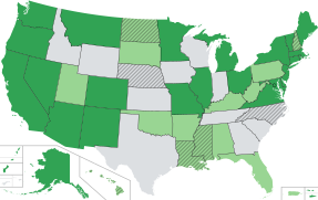
Hey everyone. So Timeshifter and I have been in a dispute over the past week or so over whether the D's on the map need to be colored black for accessibility purposes, rather the dark red that I proposed as an alternative to the pure red which was used for many years (the pure red as Timeshifter correctly pointed out was not sufficient for accessibility purposes). I made a post at WikiProject Maps asking for more input on the matter but haven't gotten much support for my position over there, lol. So the D's are probably going to have to be changed to pure black, which isn't the end of the world but I don't care for the current color scheme of the map with the black D's substituted for red. So I came up with some alternative color schemes using this site and uploaded some samples to see what people thought. I also came up with a 9th color scheme which I took from Help:Using colours and made the borders black instead of white. I'm kind of liking 9 the best, with 3, 4 and, 8 also being decent. Thoughts?
: Actually I'm kind of liking 8 the best after having more time for these to sink in.


-- Jamesy0627144 ( talk) 17:40, 9 May 2024 (UTC)
- I like the original map colors (as does TheTechnician27) that have been around a long time. They aren't washed out pastels. And they work well with the white borders.
- But for the decriminalized states I would prefer white diagonal striping on top of the state color. Instead of using "D" on the map. As suggested by SportingFlyer at Wikipedia talk:WikiProject Maps#Must the text used within maps always be pure black?

- I'm not saying this just a compromise: I actually really enjoy both Jamesy's Map 6 (now that we no longer use the light green for CBD, I think this looks great, with the cherry on top being that cannabis is commonly associated with the color green) and the stripes idea. In fact, I think I enjoy Map 6 moreso than the previous color scheme of the blue with the green, mainly because I feel like the darker green we used would be better off associated with full (recreational and medicinal) legalization, and the contrast is easily discernible but not jarring jarring. Moreover, I like Timeshifter's/SportingFlyer's idea of using diagonal stripes instead of the 'D' for decriminalization. I believe it would 1) make it considerably easier to, at a glance, determine which states are decriminalized while also having accessibility, 2) look more aesthetically pleasing, and 3) more intuitively (and interlingually) convey what's happening. Thus, my vote is for Jamesy's Map 6 with diagonal stripes for decriminalized states; I actually believe that would look fantastic so long as the color scheme in Map 6 is suitable for those with accessibility issues as Jamesy says it is.
TheTechnician27
(Talk page)
01:56, 10 May 2024 (UTC)
- That sounds OK to me. As long as there is no color blindness problem. Someone needs to run this map's colors through the tester pages. -- Timeshifter ( talk) 07:17, 10 May 2024 (UTC)
See: Wikipedia talk:WikiProject Maps#Diagonal striping alternating between white and a US state's background color. -- Timeshifter ( talk) 01:17, 10 May 2024 (UTC)
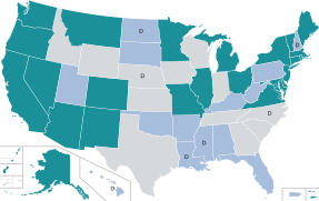
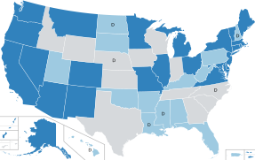
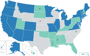
For anyone not paying attention to the discussion at WikiProject Maps, we found a way to do the hatching and I have proposed five maps that I think would be acceptable, which are shown below.
-
 all green
 -
 blue and neon green
 -
 4
4 -
 8
8 -
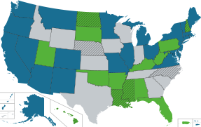 current colors


Timeshifter has proposed this one:

Comment over there I guess to keep it in one place, even though I am not sure if maybe the conversation would be better suited over here now that we have figured out the technical issue.-- Jamesy0627144 ( talk) 21:14, 11 May 2024 (UTC)
TheTechnician27. Please compare these 2 maps. The larger size (350px wide) is the same as in the map template at the top of the article. What do you think of the map with the lighter green #80CE69? The blue and gray colors are the same. I find it easier to read the "D", especially at smaller thumbnail map sizes. I also made the white borders slightly wider in the map with the lighter green. The new map does very well in all the color blindness and contrast testers. I increased the size of the D in the 2nd set of maps below.


Larger font size for the "D":

-- Timeshifter ( talk) 17:38, 17 May 2024 (UTC)
- Lighter green looks OK to me but I wouldn't increase the size of the D's much otherwise it starts to look rather cartoonish... which I would say starts to occur once you increase it to more than 19 or 20 px. As far as thumbnail size, I'm not worried about what the map looks like at 180 px (the size you posted), 100 px, or anything like that. The standard thumbnail size is 220 px and I have never even seen the map used at anything other than 350 px.-- Jamesy0627144 ( talk) 05:20, 18 May 2024 (UTC)
You never know when an image may be used at standard thumb size (no pixels indicated in wikitext) in Wikipedia or off Wikipedia.
For logged-in users they set the thumbnail size here:
- Special:Preferences#mw-prefsection-rendering - From 120px to 400px.
I don't think the enlarged D size looks cartoonish. The size of the enlarged "D" in the above map is the maximum size I would use because a larger size would not fit in the state of New Hampshire. If larger sizes were used in the other states I can see that it would look weird at a certain point. But the current SVG code only allows one to change the D size in all states. And I see no need to increase the D size more than I already did.
In cell phones the larger D size matters even more. The larger D size helps me see it clearly in all locations: thumbs, desktops, mobile, tablets, etc.. Here is 220px thumbnail:
I find the larger D essential for my ability to read it. I am sure many others will find it helpful too. If we were already at this larger D size, there would be people ticked off if it were reduced in size. Especially to the tiny size it is now.
On my iphone SE 2020 I can't read the small Ds at 350px. I have to break out the magnifying glass, or use pinch-zoom. I can read the larger Ds at 350px without any aids. -- Timeshifter ( talk) 14:40, 18 May 2024 (UTC)
- I just disagree that we should worry about what the map looks like at 220 px, 180 px, 120 px, or anything like that, since the map is never even used that way and people can just set the size at 350 px when the map is added to articles in the future or use Template:Legality of cannabis by US state which already sets the size at 350 px. And I don't know why increasing to 27 px is now "essential" when you previously said you don't have any problem seeing the black D's, even at smaller map sizes.
I can miss the "D" on the small state of New Hampshire if not paying attention. Red text was especially bad. Whereas pure black stands out even at smaller map sizes. I don't have to squint, or make an effort.
- https://commons.wikimedia.org/wiki/File_talk:Map_of_US_state_cannabis_laws.svg#Color_of_D's
- Let's just increase the D's to 19 or 20 px and be done with it already. Between making the D's black, making the green lighter, and increasing the D's some I think the map would be plenty accessible, as you yourself previously indicated.--
Jamesy0627144 (
talk)
01:21, 19 May 2024 (UTC)
- If I am right up on the monitor I can see the smaller D at 350px size. But if I am farther away, as I often am, then it is difficult. I am 3 feet away now, and it is difficult for me to make out the small D at 350px, and impossible at 220px, which I believe is the default thumbnail size.
- People often put images in articles at thumbnail size without indicating a pixel size.
- I am using a 27 inch monitor at the kitchen table. This is the PC I use the most at home. I am sitting in a high-back chair that I can tilt forward or back on. So 3 feet away is very comfortable. I know I am not alone in doing this.
- I don't get why you almost always seek minimum accessibility versus trying to make the maps more accessible.
- And you ignored what I wrote about cell phones: "In cell phones the larger D size matters even more." It's definitely essential for cell phones. Concerning your "seeing" ability it's like you only see what you want to see. I also wrote:
On my iphone SE 2020 I can't read the small Ds at 350px. I have to break out the magnifying glass, or use pinch-zoom. I can read the larger Ds at 350px without any aids.
- --
Timeshifter (
talk)
02:21, 19 May 2024 (UTC)
- I don't know about that. You said before you can see the black D's without squinting or making any extra effort, even at smaller map sizes. So I don't know why you are now saying something different on both accounts.
I don't get why you almost always seek minimum accessibility versus trying to make the maps more accessible.
- That's not true actually. I have said multiple times that the pure red D's did not provide sufficient contrast and have thanked you for pointing that out. I also lightened the shade of green which you then reverted saying "Pure black worked fine against the original darker green color", "pure black is better with the darker green", and "The extra contrast from the pure black is more helpful against a darker shade of green.". Now you want to change it back saying the complete opposite of what you said before which I said would be fine to change it to what I originally proposed. I have also said that increasing the size of the D's some would be fine up to 20 px perhaps. So it is simply not true that I am seeking to minimize accessibility.... but I also do care about the appearance of the map as someone who has been very active in redesigning and maintaining it over the past 6+ years.-- Jamesy0627144 ( talk) 05:14, 19 May 2024 (UTC)
The map was reverted from the lighter shades of blue and green back to the original darker shades at the request of TheTechnician27. Edit summary:
Reverted to version as of 13:01, 29 April 2024 (UTC). Discussion at Wikipedia talk:WikiProject Maps favors the black text and higher contrast. TheTechnician27 and I favor the original background colors for now.
TheTechnician27 found the lighter shades to be washed out. The reversion also allowed me to go back to the pure black for the text. That pure black was also preferred at Wikipedia talk:WikiProject Maps#Must the text used within maps always be pure black?
I preferred the pure black text against the dark green background. As opposed to the maroon text color you liked. The darker green was the background color at the time. I never said I was against the lighter green background. I fully intended to ask about using the lighter green later. As I am doing now.
Concerning the hatching (diagonal lines) discussed at Wikipedia talk:WikiProject Maps#Diagonal striping alternating between white and a US state's background color you wrote (and I agreed):
Let's just leave the map the way it is.
That is the map with darker shades of blue and green. The map preferred by TheTechnician27.
You still haven't addressed the cell phone text size issues I brought up now. Do we need to go to Wikipedia talk:WikiProject Maps again so that people more concerned about accessibility can weigh in? Over 50 percent of website traffic is from cell phones. -- Timeshifter ( talk) 14:21, 19 May 2024 (UTC)
- Of course appearance on cell phones should be considered and yes it is true that they account for a large percentage of traffic. Please don't pretend that increasing the size to 27 is "essential" though after previously saying you "don't have to squint, or make an effort" to see the D's at their current size. I definitely do think they could be increased some though.--
Jamesy0627144 (
talk)
18:49, 19 May 2024 (UTC)
- I was talking about desktop monitors until this thread. As I said, and you ignored:
If I am right up on the monitor I can see the smaller D at 350px size. But if I am farther away, as I often am, then it is difficult. I am 3 feet away now, and it is difficult for me to make out the small D at 350px
- The increase in text size is essential for cell phones. As I wrote:
On my iphone SE 2020 I can't read the small Ds at 350px. I have to break out the magnifying glass, or use pinch-zoom. I can read the larger Ds at 350px without any aids.
- --
Timeshifter (
talk)
19:25, 19 May 2024 (UTC)
- You mentioned cell phones in the very next sentence, so it is obvious you were referring to both desktop and cell phone there in stating that there was no problem. Here is the full quote:
I can miss the "D" on the small state of New Hampshire if not paying attention. Red text was especially bad. Whereas pure black stands out even at smaller map sizes. I don't have to squint, or make an effort. This is even more important on cell phones.
- https://commons.wikimedia.org/wiki/File_talk:Map_of_US_state_cannabis_laws.svg#Color_of_D's
- We were talking about cell phones throughout that discussion actually, such as how the map needed to be changed so you wouldn't have to turn up the brightness on your phone in the sunlight, because you said it uses up too much battery power to do that.--
Jamesy0627144 (
talk)
20:57, 19 May 2024 (UTC)
- OK. My bad. Discussion before though was theoretical. I hadn't actually looked at the 350px map on a cell phone until this thread. And I never said that I had actually tested anything back then on a cell phone. -- Timeshifter ( talk) 22:05, 19 May 2024 (UTC)
In regards to the recent change with the following edit summary:
Reverted to version as of 06:15, 26 May 2024 (UTC). Jamesy0627144 has not said the larger D size is too big for his cell phone. Or that he is able to clearly see the smaller D on his cell phone.
!. Yes, size 27 D's is still too big whether using my cell phone or desktop.
2. Yes, size 17 D's are clearly visible on my cell phone. I have repeatedly said though that I wouldn't be opposed to increasing the size some. So I went ahead and increased the size to 19 instead of 27, and if you want to I think increasing the size to 20 would be OK too.-- Jamesy0627144 ( talk) 04:09, 1 June 2024 (UTC)
- I updated the file names for the above maps to the map versions at the time of their posting. Back then we were comparing 2 different green colors, and between 19px "D" and 27px "D".
- Currently we are comparing these 2 maps below at 350px wide (same as the template). We are only comparing the ability to distinguish the "D" in cell phones. It seems we have agreed on the lighter green color 80CE69.
- These 2 maps below compare 27px and 20px "D". I find the size 27px "D" much easier to distinguish on my cell phone.
- Do you not find the 27px "D" easier to distinguish on your cell phone at the 350px width below (as in Template:Legality of cannabis by US state)?

-- Timeshifter ( talk) 08:21, 1 June 2024 (UTC)
Do you not find the 27px "D" easier to distinguish on your cell phone at the 350px width below (as in Template:Legality of cannabis by US state)?
- No.--
Jamesy0627144 (
talk)
17:11, 7 June 2024 (UTC)
- Jamesy0627144. Well, would you mind allowing me and others to be able to more easily distinguish it at 350px-wide template size and smaller on cell phones? I find it difficult to distinguish the "D" on my iphone SE 2020. -- Timeshifter ( talk) 02:23, 8 June 2024 (UTC)
See: Wikipedia talk:WikiProject Maps#Ability to distinguish "D" on map on cell phones. -- Timeshifter ( talk) 08:49, 1 June 2024 (UTC)
Categories:
- Wikipedia articles that use American English
- List-Class Cannabis articles
- Mid-importance Cannabis articles
- WikiProject Cannabis articles
- List-Class law articles
- Low-importance law articles
- WikiProject Law articles
- List-Class United States articles
- Low-importance United States articles
- List-Class United States articles of Low-importance
- Articles created or improved during WikiProject United States' 50,000 Challenge
- WikiProject United States articles
- Articles created or improved during 420 Collaboration 2017
- Articles created or improved during 420 Collaboration 2018
- Articles created or improved during 420 Collaboration 2019
- Articles created or improved during 420 Collaboration 2020
- Articles created or improved during 420 Collaboration 2021
- Articles created or improved during 420 Collaboration 2023
| This is the
talk page for discussing improvements to the
Legality of cannabis by U.S. jurisdiction article. This is not a forum for general discussion of the article's subject. |
Article policies
|
| Find sources: Google ( books · news · scholar · free images · WP refs) · FENS · JSTOR · TWL |
|
Archives:
1Auto-archiving period: 90 days
|
|
| This article is written in American English, which has its own spelling conventions (color, defense, traveled) and some terms that are used in it may be different or absent from other varieties of English. According to the relevant style guide, this should not be changed without broad consensus. |
| This article is rated List-class on Wikipedia's
content assessment scale. It is of interest to the following WikiProjects: | ||||||||||||||||||||||||||||||||||
| ||||||||||||||||||||||||||||||||||
|
| This article was created or improved during WikiProject Cannabis' "420 Collaboration" in 2017, 2018, 2019, 2020, 2021, and 2023. |
Jamesy0627144 and all who are interested. I think the main SVG map should have 5 colors. See main SVG map at the top of the article:
This map below has 5 colors, and does a good job of summarizing the current marijuana laws in the US. I think the main SVG map should keep its existing 3 colors, and add 2 more colors. Maybe Cmglee can help in adding 2 more colors to the main map.
See map source with more info. Hover to see state and territory names there.
"State regulated" is in the map title for a reason. Some states enacted "CBD/low THC programs" shown on the map in orange. This map does not show access to federally-regulated hemp-derived CBD ( cannabidiol), delta-8-THC, etc.. Those are available in many states due to the federal 2014 and 2018 Farm Bills linked in Wikipedia: Cannabidiol#United States. Some states have restricted access to those hemp-derived substances. For more info see: [1] [2] [3] [4] [5].
It looks like the Northern Mariana Islands are currently using the blue color in the legend: "Adult use only, no medical regulated program". -- Timeshifter ( talk) 10:29, 23 April 2024 (UTC)
- I strongly disagree with that for the reasons mentioned previously:
- • Epidoliex (CBD) is legal in all 50 states now.
- • Over the counter sale of CBD is legal in most states now including Kansas, Nebraska, and Idaho.
- • Several of the low-THC/high-CBD laws have little to no practical impact (as outlined in the MPP document).
- In other words, CBD is available across the country now, so these laws, several of which were basically irrelevant to being with, are even less relevant now. Maps should not be overcomplicated, and adding two more colors would just unnecessarily overcomplicate it. The extra color was eliminated from the map three years ago for good reason.-- Jamesy0627144 ( talk) 22:03, 23 April 2024 (UTC)
Marinol is legal in all 50 states now too. Like Epidiolex. Both are prescription only. The current map says nothing about either one of them. The current map says nothing about the hemp-derived CBD you are talking about. A separate map should cover hemp-derived CBD. A map is not needed for Marinol and Epidiolex. Since they are available by prescription in all 50 states.
The 2 maps are exactly the same for the main 2 colors: State recreational, and state comprehensive medical.
The gray areas in the current map are the same states as the orange and white states in the map above. But the map above is much more informative.
Orange and white could be added to the existing map. A link to the MPP article can be put in the legend.
The map caption can state that the CBD/low THC state programs have little to no practical impact in most of those states. Or as the MPP article states concerning those states: "All but two of the laws — Georgia’s and Iowa’s — fail to allow for realistic, in-state access."
Both maps only cover the state regulated programs. But with 2 more colors readers have a much better map. A map that covers all the state regulated cannabis programs. And they have the "D" for decriminalized. Which is also at the state level.
@ Cmglee: The current SVG map could be combined with this map's SVG:
Then we could have state names on the map here. A simple list could be placed in the article for the decriminalized states.
The resulting map could be used as a template for other maps in this article, and others. A delta-8-THC map. A map for cannabis record clearance. Etc..
I found a template that lets one add legends to an SVG image. And optionally to make them links too. See template and example:
- Template:Annotated image
- File:Arthropod head problem 02.svg
- Template:Annotated image/Arthropod head problem
References
- ^ Ruppert, E. E.; Fox, R. S. & Barnes, R. D. (2004). Invertebrate Zoology (7th ed.). Brooks / Cole. p. 520. ISBN 0030259827. who cite Ax, P. (2000). Multicellular Animals: The Phylogenetic System of the Metazoa. Vol. 2. Berlin: Springer. p. 396.
Here is a map with color backgrounds, links, and legend:
Schengen Area (EU)
Schengen Area (non-EU)
Partially Implemented (EU)
Working to implement later (EU)
Common Travel Area (EU & Non-EU)
Azores,
Madeira and
Canary Islands are also in the Schengen Area
This is a clickable map
-- Timeshifter ( talk) 15:01, 25 April 2024 (UTC)
- The current map says nothing about the hemp-derived CBD you are talking about. A separate map should cover hemp-derived CBD.
- What do you mean separate map? I thought you wanted the map at the top of the article to be changed.
- But the map above is much more informative.
- More information does not necessarily mean better if it's low value information. Especially on maps, which are only supposed to convey very basic information and for which it's good to use as few colors as possible, because then you have less issues with the colors bleeding together for people that have issues seeing colors or for people viewing the map in black and white, such as on a printout. The current map at the top of the article is very easy to read and shows simply and clearly the areas of the U.S. that have the most liberalized cannabis laws (the northeast and west coast) and the areas lacking in significant reform (south/southeast and middle part of U.S.), which you can tell by looking at the map right away, without even really looking at the legend. The darkest states represent the highest level of reform (recreational), the less dark states represent a lower level of reform (medical), and the least dark states represent the states that do not have either reform. This is in contrast to the NCSL map, which does not follow this convention and for which there are states like Indiana and Tennessee colored in the most darkly when the laws they passed are basically worthless. The colors of the NCSL map are nice and soothing I guess, but functionally it is not a good map.
- The map caption can state that the CBD/low THC state programs have little to no practical impact in most of those states. Or as the MPP article states concerning those states: "All but two of the laws — Georgia’s and Iowa’s — fail to allow for realistic, in-state access."
- A note would probably be OK stating that some states have more limited low-THC medical cannabis laws (not considered to be "comprehensive"), which are not shown on the map. But I really do not think the extra color should be added back in for the three main reasons mentioned in my previous post, and also the reasons mentioned above.
- Also, a color definitely shouldn't be added for the single case of the Northern Mariana Islands, which is really a very minor point that they have a recreational law without having a medical law. Legalizing recreational use means people can use it for whatever reason they want, including medical – so that is basically all-encompassing and there is no need to go into more detail than that. And actually I have seen information that NMI does in fact have a medical cannabis program, such as here and here, so it appears that NCSL is not really on top of things with their map.
- Then we could have state names on the map here. A simple list could be placed in the article for the decriminalized states.
- Please no. There is no need to spell out the name of the states on the map, especially at the expense of removing the D's which is actually useful information. If you are just talking about a map for delta-8 though, the D's do not need to be on that map – although the state names are still unnecessary, especially when they pop up when hovering the mouse over any state, which is the case with the current map at the top. But absolutely this is a bad idea for the main map at the top.-- Jamesy0627144 ( talk) 19:44, 26 April 2024 (UTC)
I think an added gallery of separate maps at the bottom of the article may solve most problems. It keeps the main map at the top of the article simpler, as desired by some.
- CBD/low THC
- Delta-8-THC
- Cannabis offense record clearance
- Hemp-derived CBD
- Etc.
When possible, the maps should be editable so that mistakes can be corrected. Such as with the Northern Mariana Islands on the NCSL 5-color map. All gallery maps, whether made by users, or pulled from websites, can have a date put on them so readers know the last date at which the map is accurate.
If possible, I think the maps should have 2-letter state abbreviations. Even on the main map. An asterisk can be used instead of "D" on the main map.
I found some time, and started a map gallery. The maps wrap. Narrow your browser window to see. See: Help:Table/Advanced#Side by side tables/images. It is a more customizable image gallery method.
| Delta-8 THC legal status by state. [1] |
|
| Cannabis offense record clearance by state. [2] |
|
References
- ^ Johnson, Lee (October 31, 2023). "Is Delta-8 THC Legal? A State-by-State Analysis (Fact Checked)". CBD Oracle. Retrieved 29 April 2024. Fact-checked on March 10, 2024, by Neil Willner, co-chair of the RCCB law firm's cannabis group.
- ^ Bryan, Kate (9 April 2024). "Cannabis Overview". National Conference of State Legislatures. Retrieved 29 April 2024.
The "Universal symbols for recreational legal states" do not need this more complex gallery method. -- Timeshifter ( talk) 15:00, 29 April 2024 (UTC)
I've added a single sentence (probably all the article should have until things move forwards or more analysis appears) about the annoucement today of plans to move Cannabis to Schedule III. I don't think we should say more than that until something happens; alternatively, if nothing comes of it, we should probably delete it outright. Also mentioning this at Cannabis in the United States. Adam Cuerden ( talk)Has about 8.9% of all FPs. 21:00, 1 May 2024 (UTC)
Timeshifter and I are currently tied up in a dispute over the coloring of the D's on the main U.S. cannabis map, which he would like to make purely black. This may seem like kind of a minor issue but since the map appears at the top of this highly viewed article, as well as at the top of other highly viewed cannabis articles, I'm giving a heads up here since I don't think many people are subscribed to the map Commons page. Feel free to weigh in, we are kind of at a stalemate and some outside perspective would probably help.-- Jamesy0627144 ( talk) 18:51, 2 May 2024 (UTC)
I now support having only 3 colors in the main map at the top of the page. The 5-color map is great if one understands how bogus nearly all of the CBD/low-THC state programs are. Otherwise one may think those states actually have a better medical program than they actually have.
Back to the current 3-color map. I, and many others, often confuse the state names if they are not written on the map (full names or 2-letter abbreviations).
If there is no state name or abbreviation on the map, then the state name should pop up when hovering over the state in the thumbnail map. Currently, the state name only pops up after clicking on the map twice. Try it and see.
There are various US map templates where the state names pop up, even from the thumbnail map:
A US map with territories could be used the same way. There does not need to be any text on the map. The state names can be made to pop up just from hovering over the blank state. The states can be colored any way we want.
If desired, the map can be made such that clicking on the state takes one to that state in the table. This template is made for that:
The text can be removed from the map, and the states colored any way we want. For more info see:
-- Timeshifter ( talk) 23:38, 3 May 2024 (UTC)
- After looking at the above map a bit I kind of understand how it works now (involving a wikipedia template built on top of a wikimedia SVG file) but it's definitely more complicated than the current SVG map and especially the code of the SVG file is more complicated and lacking in organization. I would say the map definitely couldn't be used without adding territories because you need to show the three territories that have legalized recreational cannabis and one that has legalized medical use. The state names popping up without the extra clicking is nice but I don't think see it as a huge benefit and as far as clicking the state to connect to the entry in the table that seems like a lesser benefit, especially with the horizontal table of contents which has now been added and I don't think most people mind scrolling to a state's entry to begin with. I love the simplicity in code while at the same time the fine detail in borders of the current map that
Heitordp created (especially how the territories were done) and I think people here have become accustomed to using and editing it. IMO opinion it works great and there is not a need to replace it, and I have never heard anyone complain about it until all of a sudden the last couple of weeks. I would still strongly suggest leaving the map the way it is.--
Jamesy0627144 (
talk)
05:43, 5 May 2024 (UTC)
- The map could look exactly the same as it does now. The only difference a reader would see is the state name popping up while hovering over a state.
- Occasionally a state color has to be changed due to changes in the law. That is easy to do once one looks at the SVG text with any text editor. I have gotten pretty good at figuring out where this is happening in the SVG for US maps. Same for adding or removing the "D" from states. -- Timeshifter ( talk) 10:14, 6 May 2024 (UTC)
See Template:Flatlist. Example below with all 50 states (no Washington, DC).
The above flat list has been added at the beginning of the table of states:
Via the id= method discussed here:
A flat list (without all 50 states) is in the article section linked below. It is in the map caption:
Clicking the state on the map there will also work. Map does not have to be there, but it is convenient.
I had to put nowiki tags around an Alaska reference (that I had not added) before I could work on the table in a sandbox.
When I removed the tags here, I got a blacklist filter warning for legalweedalaska dot com
Here is the removed reference:
<ref>{{cite web|url=http://legalweedalaska.com|title=Legal Weed Alaska|last=Labs|first=Kelley Code|access-date=January 24, 2017}}</ref>
I know from past experience that sometimes a specific reference can be removed from the blacklist if you ask. Depends on the reference.
Here is another possibility for the "By state" section of the article. Put this just above it.
Table of contents. Click states on map, or in list.
-- Timeshifter ( talk) 23:55, 7 May 2024 (UTC)
Hey everyone. So Timeshifter and I have been in a dispute over the past week or so over whether the D's on the map need to be colored black for accessibility purposes, rather the dark red that I proposed as an alternative to the pure red which was used for many years (the pure red as Timeshifter correctly pointed out was not sufficient for accessibility purposes). I made a post at WikiProject Maps asking for more input on the matter but haven't gotten much support for my position over there, lol. So the D's are probably going to have to be changed to pure black, which isn't the end of the world but I don't care for the current color scheme of the map with the black D's substituted for red. So I came up with some alternative color schemes using this site and uploaded some samples to see what people thought. I also came up with a 9th color scheme which I took from Help:Using colours and made the borders black instead of white. I'm kind of liking 9 the best, with 3, 4 and, 8 also being decent. Thoughts?
: Actually I'm kind of liking 8 the best after having more time for these to sink in.
-
1
-
2
-
3
-
4
-
5
-
6
-
7
-
8
-
9
-- Jamesy0627144 ( talk) 17:40, 9 May 2024 (UTC)
- I like the original map colors (as does TheTechnician27) that have been around a long time. They aren't washed out pastels. And they work well with the white borders.
- But for the decriminalized states I would prefer white diagonal striping on top of the state color. Instead of using "D" on the map. As suggested by SportingFlyer at Wikipedia talk:WikiProject Maps#Must the text used within maps always be pure black?
- I'm not saying this just a compromise: I actually really enjoy both Jamesy's Map 6 (now that we no longer use the light green for CBD, I think this looks great, with the cherry on top being that cannabis is commonly associated with the color green) and the stripes idea. In fact, I think I enjoy Map 6 moreso than the previous color scheme of the blue with the green, mainly because I feel like the darker green we used would be better off associated with full (recreational and medicinal) legalization, and the contrast is easily discernible but not jarring jarring. Moreover, I like Timeshifter's/SportingFlyer's idea of using diagonal stripes instead of the 'D' for decriminalization. I believe it would 1) make it considerably easier to, at a glance, determine which states are decriminalized while also having accessibility, 2) look more aesthetically pleasing, and 3) more intuitively (and interlingually) convey what's happening. Thus, my vote is for Jamesy's Map 6 with diagonal stripes for decriminalized states; I actually believe that would look fantastic so long as the color scheme in Map 6 is suitable for those with accessibility issues as Jamesy says it is.
TheTechnician27
(Talk page)
01:56, 10 May 2024 (UTC)
- That sounds OK to me. As long as there is no color blindness problem. Someone needs to run this map's colors through the tester pages. -- Timeshifter ( talk) 07:17, 10 May 2024 (UTC)
See: Wikipedia talk:WikiProject Maps#Diagonal striping alternating between white and a US state's background color. -- Timeshifter ( talk) 01:17, 10 May 2024 (UTC)
For anyone not paying attention to the discussion at WikiProject Maps, we found a way to do the hatching and I have proposed five maps that I think would be acceptable, which are shown below.
-
all green
-
blue and neon green
-
4
-
8
-
current colors
Timeshifter has proposed this one:
Comment over there I guess to keep it in one place, even though I am not sure if maybe the conversation would be better suited over here now that we have figured out the technical issue.-- Jamesy0627144 ( talk) 21:14, 11 May 2024 (UTC)
TheTechnician27. Please compare these 2 maps. The larger size (350px wide) is the same as in the map template at the top of the article. What do you think of the map with the lighter green #80CE69? The blue and gray colors are the same. I find it easier to read the "D", especially at smaller thumbnail map sizes. I also made the white borders slightly wider in the map with the lighter green. The new map does very well in all the color blindness and contrast testers. I increased the size of the D in the 2nd set of maps below.
Larger font size for the "D":
-- Timeshifter ( talk) 17:38, 17 May 2024 (UTC)
- Lighter green looks OK to me but I wouldn't increase the size of the D's much otherwise it starts to look rather cartoonish... which I would say starts to occur once you increase it to more than 19 or 20 px. As far as thumbnail size, I'm not worried about what the map looks like at 180 px (the size you posted), 100 px, or anything like that. The standard thumbnail size is 220 px and I have never even seen the map used at anything other than 350 px.-- Jamesy0627144 ( talk) 05:20, 18 May 2024 (UTC)
You never know when an image may be used at standard thumb size (no pixels indicated in wikitext) in Wikipedia or off Wikipedia.
For logged-in users they set the thumbnail size here:
- Special:Preferences#mw-prefsection-rendering - From 120px to 400px.
I don't think the enlarged D size looks cartoonish. The size of the enlarged "D" in the above map is the maximum size I would use because a larger size would not fit in the state of New Hampshire. If larger sizes were used in the other states I can see that it would look weird at a certain point. But the current SVG code only allows one to change the D size in all states. And I see no need to increase the D size more than I already did.
In cell phones the larger D size matters even more. The larger D size helps me see it clearly in all locations: thumbs, desktops, mobile, tablets, etc.. Here is 220px thumbnail:
I find the larger D essential for my ability to read it. I am sure many others will find it helpful too. If we were already at this larger D size, there would be people ticked off if it were reduced in size. Especially to the tiny size it is now.
On my iphone SE 2020 I can't read the small Ds at 350px. I have to break out the magnifying glass, or use pinch-zoom. I can read the larger Ds at 350px without any aids. -- Timeshifter ( talk) 14:40, 18 May 2024 (UTC)
- I just disagree that we should worry about what the map looks like at 220 px, 180 px, 120 px, or anything like that, since the map is never even used that way and people can just set the size at 350 px when the map is added to articles in the future or use Template:Legality of cannabis by US state which already sets the size at 350 px. And I don't know why increasing to 27 px is now "essential" when you previously said you don't have any problem seeing the black D's, even at smaller map sizes.
I can miss the "D" on the small state of New Hampshire if not paying attention. Red text was especially bad. Whereas pure black stands out even at smaller map sizes. I don't have to squint, or make an effort.
- https://commons.wikimedia.org/wiki/File_talk:Map_of_US_state_cannabis_laws.svg#Color_of_D's
- Let's just increase the D's to 19 or 20 px and be done with it already. Between making the D's black, making the green lighter, and increasing the D's some I think the map would be plenty accessible, as you yourself previously indicated.--
Jamesy0627144 (
talk)
01:21, 19 May 2024 (UTC)
- If I am right up on the monitor I can see the smaller D at 350px size. But if I am farther away, as I often am, then it is difficult. I am 3 feet away now, and it is difficult for me to make out the small D at 350px, and impossible at 220px, which I believe is the default thumbnail size.
- People often put images in articles at thumbnail size without indicating a pixel size.
- I am using a 27 inch monitor at the kitchen table. This is the PC I use the most at home. I am sitting in a high-back chair that I can tilt forward or back on. So 3 feet away is very comfortable. I know I am not alone in doing this.
- I don't get why you almost always seek minimum accessibility versus trying to make the maps more accessible.
- And you ignored what I wrote about cell phones: "In cell phones the larger D size matters even more." It's definitely essential for cell phones. Concerning your "seeing" ability it's like you only see what you want to see. I also wrote:
On my iphone SE 2020 I can't read the small Ds at 350px. I have to break out the magnifying glass, or use pinch-zoom. I can read the larger Ds at 350px without any aids.
- --
Timeshifter (
talk)
02:21, 19 May 2024 (UTC)
- I don't know about that. You said before you can see the black D's without squinting or making any extra effort, even at smaller map sizes. So I don't know why you are now saying something different on both accounts.
I don't get why you almost always seek minimum accessibility versus trying to make the maps more accessible.
- That's not true actually. I have said multiple times that the pure red D's did not provide sufficient contrast and have thanked you for pointing that out. I also lightened the shade of green which you then reverted saying "Pure black worked fine against the original darker green color", "pure black is better with the darker green", and "The extra contrast from the pure black is more helpful against a darker shade of green.". Now you want to change it back saying the complete opposite of what you said before which I said would be fine to change it to what I originally proposed. I have also said that increasing the size of the D's some would be fine up to 20 px perhaps. So it is simply not true that I am seeking to minimize accessibility.... but I also do care about the appearance of the map as someone who has been very active in redesigning and maintaining it over the past 6+ years.-- Jamesy0627144 ( talk) 05:14, 19 May 2024 (UTC)
The map was reverted from the lighter shades of blue and green back to the original darker shades at the request of TheTechnician27. Edit summary:
Reverted to version as of 13:01, 29 April 2024 (UTC). Discussion at Wikipedia talk:WikiProject Maps favors the black text and higher contrast. TheTechnician27 and I favor the original background colors for now.
TheTechnician27 found the lighter shades to be washed out. The reversion also allowed me to go back to the pure black for the text. That pure black was also preferred at Wikipedia talk:WikiProject Maps#Must the text used within maps always be pure black?
I preferred the pure black text against the dark green background. As opposed to the maroon text color you liked. The darker green was the background color at the time. I never said I was against the lighter green background. I fully intended to ask about using the lighter green later. As I am doing now.
Concerning the hatching (diagonal lines) discussed at Wikipedia talk:WikiProject Maps#Diagonal striping alternating between white and a US state's background color you wrote (and I agreed):
Let's just leave the map the way it is.
That is the map with darker shades of blue and green. The map preferred by TheTechnician27.
You still haven't addressed the cell phone text size issues I brought up now. Do we need to go to Wikipedia talk:WikiProject Maps again so that people more concerned about accessibility can weigh in? Over 50 percent of website traffic is from cell phones. -- Timeshifter ( talk) 14:21, 19 May 2024 (UTC)
- Of course appearance on cell phones should be considered and yes it is true that they account for a large percentage of traffic. Please don't pretend that increasing the size to 27 is "essential" though after previously saying you "don't have to squint, or make an effort" to see the D's at their current size. I definitely do think they could be increased some though.--
Jamesy0627144 (
talk)
18:49, 19 May 2024 (UTC)
- I was talking about desktop monitors until this thread. As I said, and you ignored:
If I am right up on the monitor I can see the smaller D at 350px size. But if I am farther away, as I often am, then it is difficult. I am 3 feet away now, and it is difficult for me to make out the small D at 350px
- The increase in text size is essential for cell phones. As I wrote:
On my iphone SE 2020 I can't read the small Ds at 350px. I have to break out the magnifying glass, or use pinch-zoom. I can read the larger Ds at 350px without any aids.
- --
Timeshifter (
talk)
19:25, 19 May 2024 (UTC)
- You mentioned cell phones in the very next sentence, so it is obvious you were referring to both desktop and cell phone there in stating that there was no problem. Here is the full quote:
I can miss the "D" on the small state of New Hampshire if not paying attention. Red text was especially bad. Whereas pure black stands out even at smaller map sizes. I don't have to squint, or make an effort. This is even more important on cell phones.
- https://commons.wikimedia.org/wiki/File_talk:Map_of_US_state_cannabis_laws.svg#Color_of_D's
- We were talking about cell phones throughout that discussion actually, such as how the map needed to be changed so you wouldn't have to turn up the brightness on your phone in the sunlight, because you said it uses up too much battery power to do that.--
Jamesy0627144 (
talk)
20:57, 19 May 2024 (UTC)
- OK. My bad. Discussion before though was theoretical. I hadn't actually looked at the 350px map on a cell phone until this thread. And I never said that I had actually tested anything back then on a cell phone. -- Timeshifter ( talk) 22:05, 19 May 2024 (UTC)
In regards to the recent change with the following edit summary:
Reverted to version as of 06:15, 26 May 2024 (UTC). Jamesy0627144 has not said the larger D size is too big for his cell phone. Or that he is able to clearly see the smaller D on his cell phone.
!. Yes, size 27 D's is still too big whether using my cell phone or desktop.
2. Yes, size 17 D's are clearly visible on my cell phone. I have repeatedly said though that I wouldn't be opposed to increasing the size some. So I went ahead and increased the size to 19 instead of 27, and if you want to I think increasing the size to 20 would be OK too.-- Jamesy0627144 ( talk) 04:09, 1 June 2024 (UTC)
- I updated the file names for the above maps to the map versions at the time of their posting. Back then we were comparing 2 different green colors, and between 19px "D" and 27px "D".
- Currently we are comparing these 2 maps below at 350px wide (same as the template). We are only comparing the ability to distinguish the "D" in cell phones. It seems we have agreed on the lighter green color 80CE69.
- These 2 maps below compare 27px and 20px "D". I find the size 27px "D" much easier to distinguish on my cell phone.
- Do you not find the 27px "D" easier to distinguish on your cell phone at the 350px width below (as in Template:Legality of cannabis by US state)?
-- Timeshifter ( talk) 08:21, 1 June 2024 (UTC)
Do you not find the 27px "D" easier to distinguish on your cell phone at the 350px width below (as in Template:Legality of cannabis by US state)?
- No.--
Jamesy0627144 (
talk)
17:11, 7 June 2024 (UTC)
- Jamesy0627144. Well, would you mind allowing me and others to be able to more easily distinguish it at 350px-wide template size and smaller on cell phones? I find it difficult to distinguish the "D" on my iphone SE 2020. -- Timeshifter ( talk) 02:23, 8 June 2024 (UTC)
See: Wikipedia talk:WikiProject Maps#Ability to distinguish "D" on map on cell phones. -- Timeshifter ( talk) 08:49, 1 June 2024 (UTC)
Categories:
- Wikipedia articles that use American English
- List-Class Cannabis articles
- Mid-importance Cannabis articles
- WikiProject Cannabis articles
- List-Class law articles
- Low-importance law articles
- WikiProject Law articles
- List-Class United States articles
- Low-importance United States articles
- List-Class United States articles of Low-importance
- Articles created or improved during WikiProject United States' 50,000 Challenge
- WikiProject United States articles
- Articles created or improved during 420 Collaboration 2017
- Articles created or improved during 420 Collaboration 2018
- Articles created or improved during 420 Collaboration 2019
- Articles created or improved during 420 Collaboration 2020
- Articles created or improved during 420 Collaboration 2021
- Articles created or improved during 420 Collaboration 2023