 | |
| Category | Sans-serif |
|---|---|
| Classification | Neo-grotesque |
| Designer(s) |
Konrad Friedrich Bauer Walter Baum |
| Foundry | Bauer Type Foundry |
| Date released | 1957 |

This article includes a list of general
references, but it lacks sufficient corresponding
inline citations. (October 2014) |
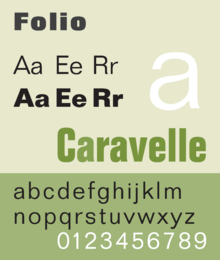
Folio is a sans-serif typeface in the neo-grotesque style designed by Konrad Friedrich Bauer and Walter Baum in 1957 for the Bauer Type Foundry (German: Bauersche Gießerei). [1] Bauer licensed the design to Fonderie Typographique Française for sale in France under the name Caravelle. [2]
Folio is considered part of the International Typographic Style, with Helvetica and Univers also released at the same time. All three are modeled after Akzidenz-Grotesk. [3] However, Folio more closely follows the original model than the other two, [3] which have larger x-heights. [1] The typeface experienced moderate success in the United States. [3] The typeface family was extended in 1963, adding an Extra Bold weight and a Bold Condensed width. [3] Bauer released 17 styles of Folio between 1956 and 1969. [2]
Folio Extended (Folio Halbfett) included alternate versions of upper case A, E, M, N, and R.
The cold type version was issued by Hell AG. [3]
Usages
Lowe's uses various weights of Folio on all in-store signage.
Little Caesars also uses various weights for some restaurant signage.
Universal Studios used Folio Bold Extended for TV-show covers from the 60's and 70's.
Tempe, Arizona uses Folio Medium under their seal in street signs.
English singer-songwriter Mabel has used Folio Extra Bold Italic for her album covers since the release of the single "One Shot".
The New Art Dealers Alliance uses Folio medium. [4] Identity designed by Geoff Han and Francesca Grassi.
Musicians Stan Getz and João Gilberto used Folio Extra Bold on the cover of their 1964 album Getz/Gilberto.
Since 2020, singer-songwriter Lady GaGa uses Folio Regular on her website. [5]
The current Universal Television logo uses this font in both Light and Bold.
Notes
- ^ a b Meggs, Phillip B.; Carter, Rob (1993). Typographic Specimens: The Great Typefaces. Wiley. p. 139. ISBN 0-471-28429-7.
- ^ a b "Folio in use". Fonts in Use. Retrieved 2020-01-15.
- ^ a b c d e "Folio® Font Family Typeface Story". Fonts.com. Retrieved 2020-01-15.
- ^ "Home". New Art Dealers Alliance (NADA). Retrieved 2020-01-15.
- ^ "Lady GaGa". ladygaga.com. Retrieved 2020-11-03.
References
- Jaspert, Berry and Johnson. Encyclopaedia of Type Faces. Cassell Paperback, London; 2001. ISBN 1-84188-139-2.
- Macmillan, Neil. An A–Z of Type Designers. Yale University Press: 2006. ISBN 0-300-11151-7.
 | |
| Category | Sans-serif |
|---|---|
| Classification | Neo-grotesque |
| Designer(s) |
Konrad Friedrich Bauer Walter Baum |
| Foundry | Bauer Type Foundry |
| Date released | 1957 |

This article includes a list of general
references, but it lacks sufficient corresponding
inline citations. (October 2014) |
Folio is a sans-serif typeface in the neo-grotesque style designed by Konrad Friedrich Bauer and Walter Baum in 1957 for the Bauer Type Foundry (German: Bauersche Gießerei). [1] Bauer licensed the design to Fonderie Typographique Française for sale in France under the name Caravelle. [2]
Folio is considered part of the International Typographic Style, with Helvetica and Univers also released at the same time. All three are modeled after Akzidenz-Grotesk. [3] However, Folio more closely follows the original model than the other two, [3] which have larger x-heights. [1] The typeface experienced moderate success in the United States. [3] The typeface family was extended in 1963, adding an Extra Bold weight and a Bold Condensed width. [3] Bauer released 17 styles of Folio between 1956 and 1969. [2]
Folio Extended (Folio Halbfett) included alternate versions of upper case A, E, M, N, and R.
The cold type version was issued by Hell AG. [3]
Usages
Lowe's uses various weights of Folio on all in-store signage.
Little Caesars also uses various weights for some restaurant signage.
Universal Studios used Folio Bold Extended for TV-show covers from the 60's and 70's.
Tempe, Arizona uses Folio Medium under their seal in street signs.
English singer-songwriter Mabel has used Folio Extra Bold Italic for her album covers since the release of the single "One Shot".
The New Art Dealers Alliance uses Folio medium. [4] Identity designed by Geoff Han and Francesca Grassi.
Musicians Stan Getz and João Gilberto used Folio Extra Bold on the cover of their 1964 album Getz/Gilberto.
Since 2020, singer-songwriter Lady GaGa uses Folio Regular on her website. [5]
The current Universal Television logo uses this font in both Light and Bold.
Notes
- ^ a b Meggs, Phillip B.; Carter, Rob (1993). Typographic Specimens: The Great Typefaces. Wiley. p. 139. ISBN 0-471-28429-7.
- ^ a b "Folio in use". Fonts in Use. Retrieved 2020-01-15.
- ^ a b c d e "Folio® Font Family Typeface Story". Fonts.com. Retrieved 2020-01-15.
- ^ "Home". New Art Dealers Alliance (NADA). Retrieved 2020-01-15.
- ^ "Lady GaGa". ladygaga.com. Retrieved 2020-11-03.
References
- Jaspert, Berry and Johnson. Encyclopaedia of Type Faces. Cassell Paperback, London; 2001. ISBN 1-84188-139-2.
- Macmillan, Neil. An A–Z of Type Designers. Yale University Press: 2006. ISBN 0-300-11151-7.