Size of this preview:
800 × 488 pixels. Other resolutions:
320 × 195 pixels |
640 × 391 pixels |
1,024 × 625 pixels |
1,280 × 781 pixels |
2,560 × 1,562 pixels |
4,631 × 2,826 pixels.
Original file (4,631 × 2,826 pixels, file size: 654 KB, MIME type: image/png)
| This is a file from the
Wikimedia Commons. Information from its
description page there is shown below. Commons is a freely licensed media file repository. You can help. |
Summary
| Description |
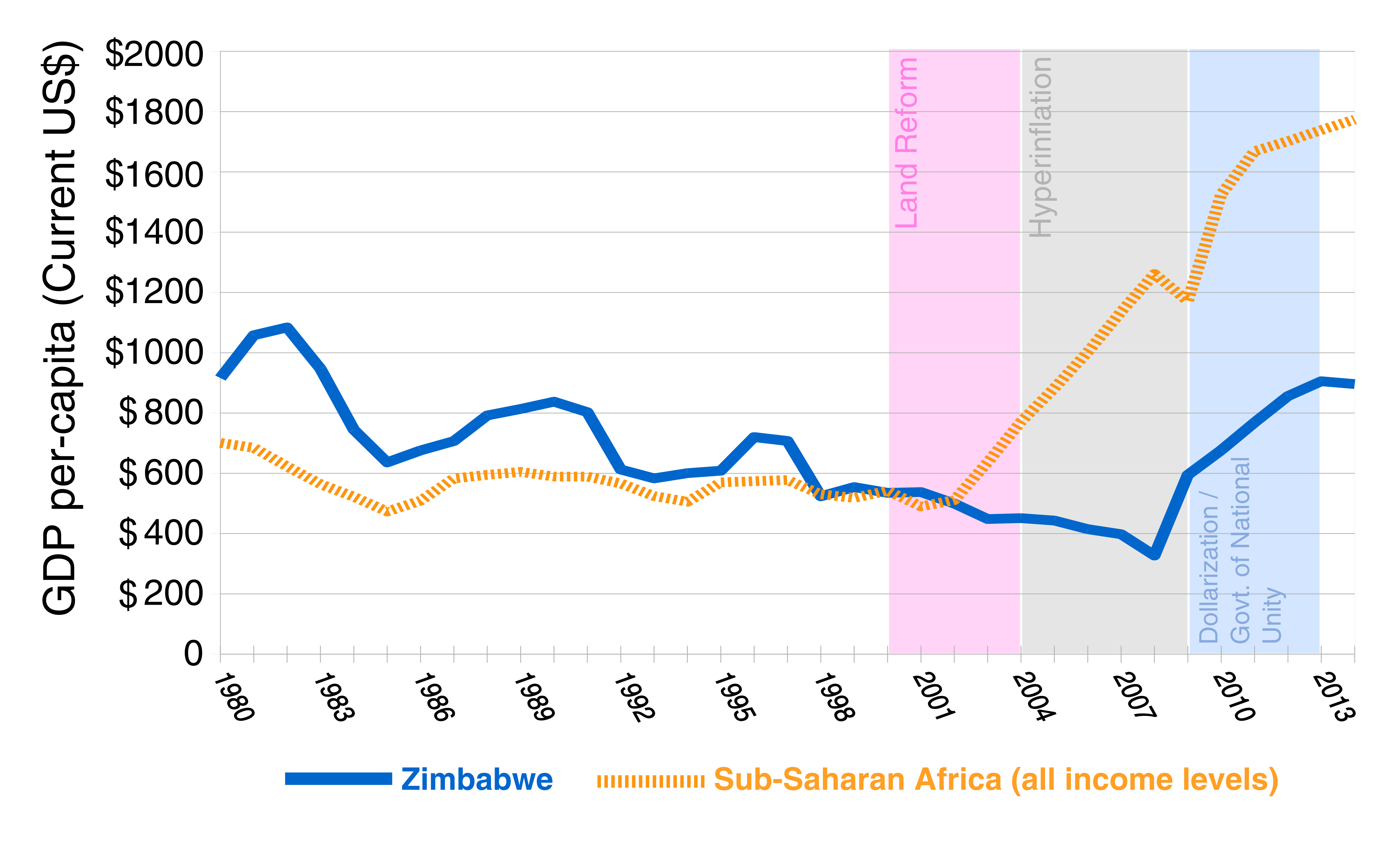
English: This graph illustrates the GDP per capita in current US dollars from 1980 to 2014. The graph compares Zimbabwe (blue) and all of Sub-Sarah Africa's (yellow) GDP per capita. Different periods in Zimbabwe's recent economic history such as the land reform period (pink), hyperinflation (grey), and dollarization/government of national unity period (blue) are highlighted on the graph. Made using data from the World Development Indicators, World Bank, available at:
http://databank.worldbank.org/ddp/home.do? |
| Date | |
| Source | Own work |
| Author | Discott |
Licensing
I, the copyright holder of this work, hereby publish it under the following license:
This file is licensed under the
Creative Commons
Attribution-Share Alike 4.0 International license.
- You are free:
- to share – to copy, distribute and transmit the work
- to remix – to adapt the work
- Under the following conditions:
- attribution – You must give appropriate credit, provide a link to the license, and indicate if changes were made. You may do so in any reasonable manner, but not in any way that suggests the licensor endorses you or your use.
- share alike – If you remix, transform, or build upon the material, you must distribute your contributions under the same or compatible license as the original.
File history
Click on a date/time to view the file as it appeared at that time.
| Date/Time | Thumbnail | Dimensions | User | Comment | |
|---|---|---|---|---|---|
| current | 21:07, 18 October 2015 |
| 4,631 × 2,826 (654 KB) | Discott | Added Dollar units to y-axis and coloured periods to illustrate different periods in Zim's recent economic history. |
| 20:49, 18 October 2015 |
 | 4,528 × 2,826 (546 KB) | Discott | User created page with UploadWizard |
File usage
The following pages on the English Wikipedia use this file (pages on other projects are not listed):
Global file usage
The following other wikis use this file:
- Usage on ar.wikipedia.org
- Usage on bn.wikipedia.org
Metadata
Size of this preview:
800 × 488 pixels. Other resolutions:
320 × 195 pixels |
640 × 391 pixels |
1,024 × 625 pixels |
1,280 × 781 pixels |
2,560 × 1,562 pixels |
4,631 × 2,826 pixels.
Original file (4,631 × 2,826 pixels, file size: 654 KB, MIME type: image/png)
| This is a file from the
Wikimedia Commons. Information from its
description page there is shown below. Commons is a freely licensed media file repository. You can help. |
Summary
| Description |
English: This graph illustrates the GDP per capita in current US dollars from 1980 to 2014. The graph compares Zimbabwe (blue) and all of Sub-Sarah Africa's (yellow) GDP per capita. Different periods in Zimbabwe's recent economic history such as the land reform period (pink), hyperinflation (grey), and dollarization/government of national unity period (blue) are highlighted on the graph. Made using data from the World Development Indicators, World Bank, available at:
http://databank.worldbank.org/ddp/home.do? |
| Date | |
| Source | Own work |
| Author | Discott |
Licensing
I, the copyright holder of this work, hereby publish it under the following license:
This file is licensed under the
Creative Commons
Attribution-Share Alike 4.0 International license.
- You are free:
- to share – to copy, distribute and transmit the work
- to remix – to adapt the work
- Under the following conditions:
- attribution – You must give appropriate credit, provide a link to the license, and indicate if changes were made. You may do so in any reasonable manner, but not in any way that suggests the licensor endorses you or your use.
- share alike – If you remix, transform, or build upon the material, you must distribute your contributions under the same or compatible license as the original.
File history
Click on a date/time to view the file as it appeared at that time.
| Date/Time | Thumbnail | Dimensions | User | Comment | |
|---|---|---|---|---|---|
| current | 21:07, 18 October 2015 |
| 4,631 × 2,826 (654 KB) | Discott | Added Dollar units to y-axis and coloured periods to illustrate different periods in Zim's recent economic history. |
| 20:49, 18 October 2015 |
| 4,528 × 2,826 (546 KB) | Discott | User created page with UploadWizard |
File usage
The following pages on the English Wikipedia use this file (pages on other projects are not listed):
Global file usage
The following other wikis use this file:
- Usage on ar.wikipedia.org
- Usage on bn.wikipedia.org