
Size of this preview:
800 × 600 pixels. Other resolutions:
320 × 240 pixels |
640 × 480 pixels |
960 × 720 pixels.
Original file (960 × 720 pixels, file size: 65 KB, MIME type: image/png)
| This is a file from the
Wikimedia Commons. Information from its
description page there is shown below. Commons is a freely licensed media file repository. You can help. |
.png)
Summary
| Description |
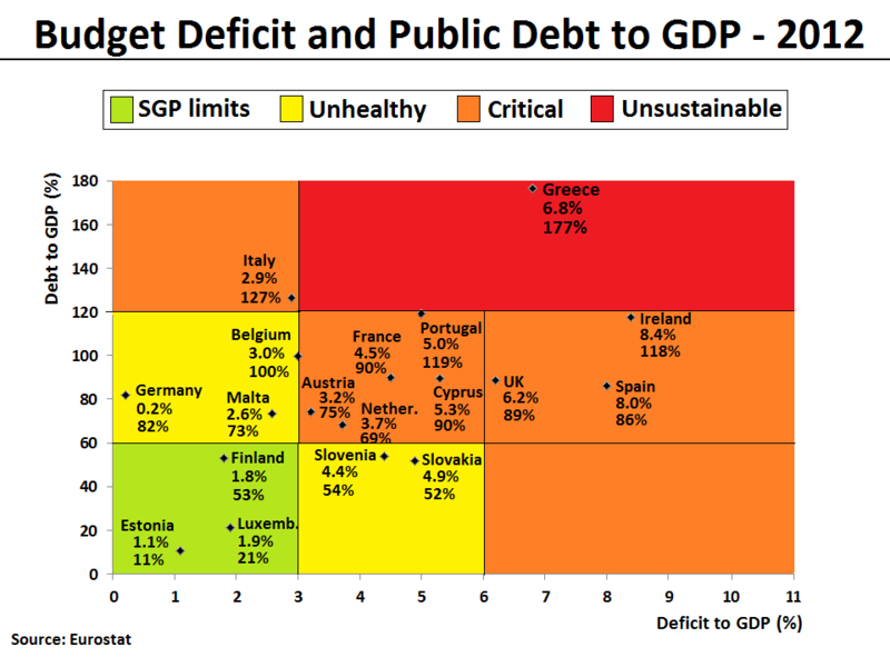
English: The Debt-to-GDP ratio and Budget deficit to GDP ratio have been plotted for all eurozone countries and UK in 2012. The same plot can also be found here with
2009 figures. The figures indicate the fiscal health of the countries in the plot. Generally, the farther up and to the right a country goes, the higher the risk for investors. The following 4 areas have been given a background color in the plot to reflect the level of fiscal health:
|
| Date | |
| Source | Own work. Data for the chart is from the Eurostat database [1] [2], which normally will be identical with the European Commision's AMECO database [3] [4]. In the current version of the file, the figures are based on recorded data for the first 3 quarters and forecasted data for the last 4th quarter of 2012. The data can also be found published by the European Commission's latest Autumn Economic Forecast 2012 report. |
| Author | Danish Expert |
| Other versions | العربيَّة |
.png)
-ar.png)

|
This graph image could be re-created using
vector graphics as an
SVG file. This has several advantages; see
Commons:Media for cleanup for more information. If an SVG form of this image is available, please upload it and afterwards replace this template with
{{
vector version available|new image name}}
.
It is recommended to name the SVG file “Budget Deficit and Public Debt to GDP in 2012 (for selected EU Members).svg”—then the template Vector version available (or Vva) does not need the new image name parameter. |
Licensing
I, the copyright holder of this work, hereby publish it under the following license:
This file is licensed under the
Creative Commons
Attribution-Share Alike 3.0 Unported license.
- You are free:
- to share – to copy, distribute and transmit the work
- to remix – to adapt the work
- Under the following conditions:
- attribution – You must give appropriate credit, provide a link to the license, and indicate if changes were made. You may do so in any reasonable manner, but not in any way that suggests the licensor endorses you or your use.
- share alike – If you remix, transform, or build upon the material, you must distribute your contributions under the same or compatible license as the original.
File history
Click on a date/time to view the file as it appeared at that time.
| Date/Time | Thumbnail | Dimensions | User | Comment | |
|---|---|---|---|---|---|
| current | 17:47, 30 November 2012 |
| 960 × 720 (65 KB) | Danish Expert | Data extended to cover all Eurozone countries and UK for comparison. |
| 12:52, 30 November 2012 |
 | 960 × 720 (55 KB) | Danish Expert | Changed definition for the Unhealthy area, so that it now is more directly related to the official European SGP limits. Meaning that a country now needs to comply with 1 out of 2 fiscal SGP limits (and not exceed by far with the second), in order to be... | |
| 17:12, 29 November 2012 |
 | 960 × 720 (54 KB) | Danish Expert | Color top-legend added. Y-axis stopped at 180 instead of 200, in order to improve layout with some more whitespace around the top-legend. | |
| 10:26, 29 November 2012 |
 | 960 × 720 (57 KB) | Danish Expert | Clarified the concept of "unsustainable levels" by introducing a red color for this particular window, and leaving the orrange color only to map the area commonly referred to as "critical levels". | |
| 18:54, 25 November 2012 |
 | 960 × 720 (57 KB) | Danish Expert | User created page with UploadWizard |
File usage
The following pages on the English Wikipedia use this file (pages on other projects are not listed):
Global file usage
The following other wikis use this file:
- Usage on ar.wikipedia.org
- Usage on ja.wikipedia.org
- Usage on pt.wikipedia.org
Metadata
.png)
Size of this preview:
800 × 600 pixels. Other resolutions:
320 × 240 pixels |
640 × 480 pixels |
960 × 720 pixels.
Original file (960 × 720 pixels, file size: 65 KB, MIME type: image/png)
| This is a file from the
Wikimedia Commons. Information from its
description page there is shown below. Commons is a freely licensed media file repository. You can help. |
Summary
| Description |
English: The Debt-to-GDP ratio and Budget deficit to GDP ratio have been plotted for all eurozone countries and UK in 2012. The same plot can also be found here with
2009 figures. The figures indicate the fiscal health of the countries in the plot. Generally, the farther up and to the right a country goes, the higher the risk for investors. The following 4 areas have been given a background color in the plot to reflect the level of fiscal health:
|
| Date | |
| Source | Own work. Data for the chart is from the Eurostat database [1] [2], which normally will be identical with the European Commision's AMECO database [3] [4]. In the current version of the file, the figures are based on recorded data for the first 3 quarters and forecasted data for the last 4th quarter of 2012. The data can also be found published by the European Commission's latest Autumn Economic Forecast 2012 report. |
| Author | Danish Expert |
| Other versions | العربيَّة |
|
|
This graph image could be re-created using
vector graphics as an
SVG file. This has several advantages; see
Commons:Media for cleanup for more information. If an SVG form of this image is available, please upload it and afterwards replace this template with
{{
vector version available|new image name}}
.
It is recommended to name the SVG file “Budget Deficit and Public Debt to GDP in 2012 (for selected EU Members).svg”—then the template Vector version available (or Vva) does not need the new image name parameter. |
Licensing
I, the copyright holder of this work, hereby publish it under the following license:
This file is licensed under the
Creative Commons
Attribution-Share Alike 3.0 Unported license.
- You are free:
- to share – to copy, distribute and transmit the work
- to remix – to adapt the work
- Under the following conditions:
- attribution – You must give appropriate credit, provide a link to the license, and indicate if changes were made. You may do so in any reasonable manner, but not in any way that suggests the licensor endorses you or your use.
- share alike – If you remix, transform, or build upon the material, you must distribute your contributions under the same or compatible license as the original.
File history
Click on a date/time to view the file as it appeared at that time.
| Date/Time | Thumbnail | Dimensions | User | Comment | |
|---|---|---|---|---|---|
| current | 17:47, 30 November 2012 |
| 960 × 720 (65 KB) | Danish Expert | Data extended to cover all Eurozone countries and UK for comparison. |
| 12:52, 30 November 2012 |
| 960 × 720 (55 KB) | Danish Expert | Changed definition for the Unhealthy area, so that it now is more directly related to the official European SGP limits. Meaning that a country now needs to comply with 1 out of 2 fiscal SGP limits (and not exceed by far with the second), in order to be... | |
| 17:12, 29 November 2012 |
| 960 × 720 (54 KB) | Danish Expert | Color top-legend added. Y-axis stopped at 180 instead of 200, in order to improve layout with some more whitespace around the top-legend. | |
| 10:26, 29 November 2012 |
| 960 × 720 (57 KB) | Danish Expert | Clarified the concept of "unsustainable levels" by introducing a red color for this particular window, and leaving the orrange color only to map the area commonly referred to as "critical levels". | |
| 18:54, 25 November 2012 |
| 960 × 720 (57 KB) | Danish Expert | User created page with UploadWizard |
File usage
The following pages on the English Wikipedia use this file (pages on other projects are not listed):
Global file usage
The following other wikis use this file:
- Usage on ar.wikipedia.org
- Usage on ja.wikipedia.org
- Usage on pt.wikipedia.org