


.jpg)


_(2).jpg)

.jpg)
.jpg)


-
 The flag of Dominica features a sisserou parrot, a national symbol.
 -
 Flag of Nicaragua, although at this size the individual bands of the rainbow are nearly indistinguishable.
 -
 The flag of the suffragettes (United Kingdom). Purple represents loyalty and dignity, white purity and green hope.
 -
 Wiphala emblem. Official variant flag of Bolivia since 2009
(Redirected from
8000FF)
| Violet | |
|---|---|
   .jpg) | |
| Spectral coordinates | |
| Wavelength | 380–435 nm |
| Frequency | 790–690 THz |
|
| |
| Hex triplet | #8000FF |
| sRGBB ( r, g, b) | (128, 0, 255) |
| HSV ( h, s, v) | (270°, 100%, 100%) |
| CIELChuv ( L, C, h) | (41, 134, 275°) |
| Source | W3C [1] |
| B: Normalized to [0–255] (byte) H: Normalized to [0–100] (hundred) | |
Violet is the color of light at the short wavelength end of the visible spectrum. It is one of the seven colors that Isaac Newton labeled when dividing the spectrum of visible light in 1672. Violet light has a wavelength between approximately 380 and 435 nanometers. [2] The color's name is derived from the Viola genus of flowers. [3] [4]
In the RGB color model used in computer and television screens, violet is produced by mixing red and blue light, with more blue than red. In the RYB color model historically used by painters, violet is created with a combination of red and blue pigments and is located between blue and purple on the color wheel. In the CMYK color model used in printing, violet is created with a combination of magenta and cyan pigments, with more magenta than cyan. On the RGB/ CMY( K) color wheel, violet is located between blue and magenta.
Violet is closely associated with purple. In optics, violet is a spectral color (referring to the color of different single wavelengths of light), whereas purple is the color of various combinations of red and blue (or violet) light, [5] [6] some of which humans perceive as similar to violet. In common usage, both terms are used to refer to a variety of colors between blue and red in hue. [7] [8] [9]
Violet has a long history of association with royalty, originally because Tyrian purple dye was extremely expensive in antiquity. [10] The emperors of Rome wore purple togas, as did the Byzantine emperors. During the Middle Ages, violet was worn by bishops and university professors and was often used in art as the color of the robes of the Virgin Mary. [11] In Chinese painting, the color violet represents the "unity transcending the duality of Yin and yang" and "the ultimate harmony of the universe". [12] In New Age thinking, purple and/or violet is associated with the crown chakra. [13] One European study suggests that violet is the color people most often associate with extravagance, individualism, vanity and ambiguity. [14]

The word violet as a color name derives from the Middle English and Old French violete, in turn from the Latin viola, the name of the violet flower. [3] [4] The first recorded use as a color name in English was in 1370. [15]
Violet is closely associated with purple. In optics, violet is a spectral color: It refers to the color of any different single wavelength of light on the short wavelength end of the visible spectrum (between approximately 380 and 435 nanometers), [16] [17] whereas purple is the color of various combinations of red, blue and violet light, [5] [6] some of which some humans perceive as similar to violet. In common usage, both terms are used to refer to a variety of colors between blue and red in hue. [7] [8] [9] Historically, violet has tended to be used for bluer hues and purple for redder hues. [7] [18] [19] In the traditional color wheel used by painters, violet and purple are both placed between red and blue, with violet being closer to blue. [20]

Violet is at one end of the spectrum of visible light, between blue light, which has a longer wavelength, and ultraviolet light, which has a shorter wavelength and is not visible to humans. Violet wavelengths are between approximately 380 and 435 nanometers. Violet objects often appear dark, because human vision becomes less sensitive at wavelengths this short.[ citation needed] The reason why to (typical trichromat) humans violet light appears a bit reddish compared to spectral blue (despite spectral red being at the other end of the visible spectrum) is, according to the opponent process hypothesis of color vision, that the S- cone type (i.e. the one most sensitive to short wavelengths) contributes a bit of red to the red-versus-green opponent channel (which at the longer blue wavelengths gets counteracted by the M-cone type). [21] Computer and television screens, using the RGB color model, cannot produce actual violet light and instead mimic it by combining blue light at high intensity with red light at less intensity.
Violet objects are normally composed-light violet. Objects reflecting spectral violet appear very dark, because human vision is relatively insensitive to those wavelengths.[ citation needed] Monochromatic lamps emitting spectral-violet wavelengths can be roughly approximated by the color named electric violet, which is a composed-light violet producing a similar effect to the human eye.[ citation needed]
The earliest violet pigments used by humans, found in prehistoric cave paintings, were made from the minerals manganese and hematite. Manganese is still used today by the Aranda people, a group of indigenous Australians, as a traditional pigment for coloring the skin during rituals. It is also used by the Hopi Indians of Arizona to color ritual objects.
The most famous violet-purple dye in the ancient world was Tyrian purple, made from a type of sea snail called the murex, found around the Mediterranean.
In western Polynesia, residents of the islands made a violet dye similar to Tyrian purple from the sea urchin. In Central America, the inhabitants made a dye from a different sea snail, the purpura, found on the coasts of Costa Rica and Nicaragua. The Mayans used this color to dye fabric for religious ceremonies, and the Aztecs used it for paintings of ideograms, where it symbolized royalty. [22]
During the Middle Ages, most artists made purple or violet on their paintings by combining red and blue pigments; usually blue azurite or lapis-lazuli with red ochre, cinnabar or minium. They also combined lake colors by mixing dye with powder; woad or indigo dye for blue and cochineal dye for red. [22]
Orcein, or purple moss, was another common violet dye. It was known to the ancient Greeks and Hebrews, was made from a Mediterranean lichen called archil or dyer's moss ( Roccella tinctoria), combined with an ammoniac, usually urine. Orcein began to achieve popularity again in the 19th century, when violet and purple became the color of demi-mourning, worn after a widow or widower had worn black for a certain time, before he or she returned to wearing ordinary colors. [23]
In the 18th century, chemists in England, France and Germany began to create the first synthetic dyes. Two synthetic purple dyes were invented at about the same time. Cudbear is a dye extracted from orchil lichens that can be used to dye wool and silk, without the use of mordant. Cudbear was developed by Cuthbert Gordon of Scotland: production began in 1758, The lichen is first boiled in a solution of ammonium carbonate. The mixture is then cooled and ammonia is added and the mixture is kept damp for 3–4 weeks. Then the lichen is dried and ground to powder. The manufacture details were carefully protected, with a ten-foot high wall built around the manufacturing facility, and staff consisting of Highlanders sworn to secrecy.
French purple was developed in France at about the same time. The lichen is extracted by urine or ammonia. Then the extract is acidified, the dissolved dye precipitates and is washed. Then it is dissolved in ammonia again, the solution is heated in air until it becomes purple, then it is precipitated with calcium chloride; the resulting dye was more solid and stable than other purples.
Cobalt violet is a synthetic pigment that was invented in the second half of the 19th century, and is made by a similar process as cobalt blue, cerulean blue and cobalt green. It is the violet pigment most commonly used today by artists, along with manganese violet.
Mauveine, also known as aniline purple and Perkin's mauve, was the first synthetic organic chemical dye, [24] [25] discovered serendipitously in 1856. Its chemical name is 3-amino-2,±9-dimethyl-5-phenyl-7-(p-tolylamino) phenazinium acetate.
In the 1950s, a new family of violet synthetic organic pigments called quinacridones came onto the market. They had originally been discovered in 1896, synthesized in 1936 and manufactured in the 1950s. The colors in the group range from deep red to violet in color, and have the molecular formula C20H12N2O2. They have strong resistance to sunlight and washing, and are used in oil paints, watercolors and acrylics, as well as in automobile coatings and other industrial coatings.
-
 In amethyst, the violet color arises from an impurity of iron in the quartz.
 -
 Chemical structure of pigment violet 29. Violet pigments typically have several rings.
 -
 Manganese violet, a popular inorganic pigment.
-
 The marine hatchetfish (here eating a small crustacean) lives in extreme depths.
 -
 The purple sea urchin.
 -
 The violet carpenter bee ( Xylocopa violacea) is one of the largest bees in Europe.
 -
 The violet-backed starling is found in Sub-Saharan Africa.
 -
 The violet sabrewing is found in Central America.
 -
 The imperial amazon parrot is featured on the national flag of Dominica, making it the only national flag in the world with a violet color.
-

-
 Crocus flowers.
 -
 Lilac flowers
 -
 Pansy flowers.
 -
 Sweet violet flowers.
 -

-

-
 Wisteria blooms are a light violet color.
 -
 An eggplant.
Violet is one of the oldest colors used by humans. Traces of very dark violet, made by grinding the mineral manganese, mixed with water or animal fat and then brushed on the cave wall or applied with the fingers, are found in the prehistoric cave art in Pech Merle, in France, dating back about 25,000 years. It has also been found in the cave of Altamira and Lascaux. [26] It was sometimes used as an alternative to black charcoal. Sticks of manganese, used for drawing, have been found at sites occupied by Neanderthals in France and Israel. From the grinding tools at various sites, it appears it may also have been used to color the body and to decorate animal skins.
More recently, the earliest dates on cave paintings have been pushed back farther than 35,000 years. Hand paintings on rock walls in Australia may be even older, dating back as far as 50,000 years.
Berries of the genus rubus, such as blackberries, were a common source of dyes in antiquity. The ancient Egyptians made a kind of violet dye by combining the juice of the mulberry with crushed green grapes. The Roman historian Pliny the Elder reported that the Gauls used a violet dye made from bilberry to color the clothing of slaves. These dyes made a satisfactory purple, but it faded quickly in sunlight and when washed. [27]
Violet and purple retained their status as the color of emperors and princes of the church throughout the long rule of the Byzantine Empire.
While violet was worn less frequently by Medieval and Renaissance kings and princes, it was worn by the professors of many of Europe's new universities. Their robes were modeled after those of the clergy, and they often wore square violet caps and violet robes, or black robes with violet trim.
Violet also played an important part in the religious paintings of the Renaissance. Angels and the Virgin Mary were often portrayed wearing violet robes. The 15th-century Florentine painter Cennino Cennini advised artists: "If you want to make a lovely violet colour, take fine lacca, ultramarine blue (the same amount of the one as of the other)..." For fresco painters, he advised a less-expensive version, made of a mixture of blue indigo and red hematite. [28]
-
 The Wilton Diptych (1395), painted for King Richard II.
 -
 A violet-clad angel from the Resurrection of Christ by Raphael (1483–1520).
In the 18th century, purple was a color worn by royalty, aristocrats and other wealthy people. Good-quality purple fabric was too expensive for ordinary people.
The first cobalt violet, the intensely red-violet cobalt arsenate, was highly toxic. Although it persisted in some paint lines into the 20th century, it was displaced by less toxic cobalt compounds such as cobalt phosphate. Cobalt violet appeared in the second half of the 19th century, broadening the palette of artists with its range of purple colors. Cobalt violet was used by Paul Signac (1863–1935), Claude Monet (1840–1926) and Georges Seurat (1859–1891). [29] Today, cobalt ammonium phosphate, cobalt lithium phosphate and cobalt phosphate are available for use by artists. Cobalt ammonium phosphate is the most reddish of the three. Cobalt phosphate is available in two varieties — a deep less saturated blueish type and a lighter and brighter somewhat more reddish type. Cobalt lithium phosphate is a saturated lighter-valued bluish violet. A color similar to cobalt ammonium phosphate, cobalt magnesium borate, was introduced in the later 20th century but was not deemed sufficiently lightfast for artistic use. Cobalt violet is the only truly lightfast purple pigment with relatively strong color saturation. All other light-stable purple pigments are dull by comparison. The high price of the pigment and the toxicity of cobalt have limited its use.
In the 1860s, the popularity of using violet colors suddenly rose among painters and other artists. [7] For example, Vincent van Gogh (1853–1890) was an avid student of color theory. He used violet in many of his paintings of the 1880s, including his paintings of irises and the swirling and mysterious skies of his starry night paintings, and often combined it with its complementary color, yellow. In his painting of his bedroom in Arles (1888), he used several sets of complementary colors; violet and yellow, red and green and orange and blue. In a letter about the painting to his brother Theo, he wrote, "The color here...should be suggestive of sleep and repose in general....The walls are a pale violet. The floor is of red tiles. The wood of the bed and the chairs are fresh butter yellow, the sheet and the pillows light lemon green. The bedspread bright scarlet. The window green. The bed table orange. The bowl blue. The doors lilac....The painting should rest the head or the imagination." [30]
In 1856, a young British chemist named William Henry Perkin was trying to make a synthetic quinine. His experiments produced instead an unexpected residue, which turned out to be the first synthetic aniline dye, a deep purple [7] color called mauveine, or abbreviated simply to mauve (the dye being named after the lighter color of the mallow [mauve] flower). Used to dye clothes, it became extremely fashionable among the nobility and upper classes in Europe, particularly after Queen Victoria wore a silk gown dyed with mauveine to the Royal Exhibition of 1862. Prior to Perkin's discovery, mauve was a color which only the aristocracy and rich could afford to wear. Perkin developed an industrial process, built a factory, and produced the dye by the ton so almost anyone could wear mauve. It was the first of a series of modern industrial dyes which completely transformed both the chemical industry and fashion. [31]
-
 Charles de Bourbon, the future King Carlos III of Spain (1725).
 -
 In England, pre-Raphaelite painters like Arthur Hughes were particularly enchanted by purple and violet. This is April Love (1856).
 -
 Nocturne: Trafalgar Square Chelsea Snow (1876) by James McNeill Whistler, used violet to create a wintery mood.
 -


Violet or purple neckties became popular at the end of the first decade of the 21st century, particularly among political and business leaders.[ citation needed]
In a European survey, three percent of respondents said violet is their favorite color, ranking it behind blue, green, red, black and yellow (in that order), and tied with orange. Ten percent called it their least favorite color; brown, pink and gray were more unpopular. [14]
Because of its status as the color of Roman emperors, monarchs and princes, purple and violet are often associated with luxury. Certain luxury goods, such as watches and jewelry, are often placed in boxes lined with violet velvet, since violet is the complementary color of yellow and shows gold to best advantage.
While violet is the color of humility in the symbolism of the Catholic Church, it has exactly the opposite meaning in general society. A European poll in 2000 showed it was the color most commonly associated with vanity. [32] As a color that rarely exists in nature and so attracts attention, it is seen as a color of individualism and extravagance.

In Japan, violet was a popular color introduced into dress during the Heian period (794–1185). The dye was made from the root of the alkanet plant ( Anchusa officinalis), known as murasaki in Japanese. At about the same time, Japanese painters began to use a pigment made from the same plant. [33]
The " New Age Prophetess", Alice Bailey, in her system called the Seven Rays which classifies humans into seven different metaphysical psychological types, the "seventh ray" of "Ceremonial Order" is represented by the color violet. People who have this metaphysical psychological type are said to be "on the Violet Ray". [34]
In the Ascended Master Teachings, the color violet is used to represent the Ascended Master St. Germain. [35]
The Invocation of the Violet Flame is a system of meditation practice used in the "I AM" Activity and by the Church Universal and Triumphant (both Ascended Master Teaching religions).

In the Roman Catholic church, violet is worn by bishops and archbishops, red by cardinals and white by the Pope. Ordinary priests wear black. As in many other Western churches, violet is the liturgical color of Advent and Lent, which respectively celebrate the expectant waiting and preparation for the celebration of the Crucifixion of Jesus and the time for penance and/or mourning.
A stained glass window installed in the early 1920s in the Cathedral of Our Lady of the Angels in Los Angeles depicts God the Father wearing a violet robe. [36]
After the Vatican II Council, which modified many of the rules of the Catholic church, priests began to wear violet robes when celebrating masses for the dead. Black was no longer used, since it was the color of mourning outside the church and deemed inappropriate in a religious ceremony. [37]
In Hinduism, violet is used to symbolically represent the seventh, crown chakra ( Sahasrara). [38]

In the early 20th century, violet, white and gold were the colors of the women's suffrage movement in the United States, seeking the right to vote for women. The colors were said to represent liberty and dignity. [39] [40] For this reason, the postage stamp issued in 1936 to honor Susan B. Anthony, a prominent leader of the suffrage movement in the United States, was colored the reddish tone of violet sometimes known as red-violet.
In 1908, Emmeline Pethick-Lawrence, co-editor of the Women's Social and Political Union (WSPU) newspaper, designed the color scheme for the suffragette movement in Britain and Ireland, with violet for loyalty and dignity, white for purity and green for hope. [41] [42] [43]
The pan-European movement Volt Europa and its national subsidiary parties use violet in their uniforms. [44]
A small New Age political party in Germany with about 1,150 members is called The Violet Party. It believes in direct democracy, a guaranteed minimum income and politics based on spirituality. It was founded in Dortmund in 2001. [45]
Violet flowers and their color became symbolically associated with lesbian love. [46] It was used as a special code by lesbians and bisexual women for self-identification and also to communicate support for the sexual preference. [47] [48] This connection originates from the poet Sappho and fragments of her poems. In one poem, she describes a lost love wearing a garland of "violet tiaras, braided rosebuds, dill and crocus twined around" her neck. [49] In another fragment, she recalls her lover as having "put around yourself [many wreaths] of violets and roses." [50] [51]
The labrys lesbian flag, created in 1999 by graphic designer Sean Campbell, [52] [53] features a labrys superimposed on the inverted black triangle set against a violet background. [54] [55]
![]() Media related to
Purple flags at Wikimedia Commons
Media related to
Purple flags at Wikimedia Commons


.svg)

- ^ Çelik, Tantek; Lilley, Chris, eds. (18 January 2022). "CSS Color Module Level 3". W3C. w3.org. Retrieved 10 September 2022.
- ^ Georgia State University Department of Physics and Astronomy. "Spectral Colors". HyperPhysics site. Retrieved 20 October 2017.
- ^ a b "violet, n.1". OED Online. Oxford University Press. Retrieved 6 April 2020.
- ^ a b "Violet". Webster's Third New International Dictionary, Unabridged. Retrieved 6 April 2020.
- ^ a b P. U.P. A Gilbert and Willy Haeberli (2008). Physics in the Arts. Academic Press. p. 112. ISBN 978-0-12-374150-9.
- ^ a b Louis Bevier Spinney (1911). A Text-book of Physics. Macmillan Co. p. 573.
- ^ a b c d e Tager, A.; Kirchner, E.; Fedorovskaya, E. (2021). "Computational evidence of first extensive usage of violet in the 1860s". Color Research & Application. 46 (5): 961–977. doi: 10.1002/col.22638. S2CID 233671776.
- ^ a b Fehrman, K.R.; Fehrman, C. (2004). Color - the secret influence. Upper Saddle River: Pearson Education.
- ^ a b Matschi, M. (2005). "Color terms in English: Onomasiological and Semasiological aspects" (PDF). Onomasiology Online. 5: 56–139. Archived (PDF) from the original on 9 October 2022.
- ^ Dunn, Casey (9 October 2013). "The Color of Royalty, Bestowed by Science and Snails". The New York Times. ISSN 0362-4331. Retrieved 4 April 2020.
- ^ Elliot, Charlene (Winter 2008). "Purple pasts: Color codification in the ancient world". Law and Social Inquiry. 33 (1): 173–194. doi: 10.1111/j.1747-4469.2008.00097.x. S2CID 145236881. Retrieved 26 June 2021.
- ^ Varichon, Anne Colors:What They Mean and How to Make Them New York:2006 Abrams Page 138
- ^ "Meanings of Purple/Violet - Color Wheel Artists". www.color-wheel-artist.com. Archived from the original on 8 May 2017. Retrieved 15 January 2022.
- ^ a b Eva Heller, Psychologie de la couleur: effets et symboliques. p. 4. "La plus individualist et extravagant des coulours." (associated by 26 percent of respondents to survey with "extravagance", by 22 percent with "individualism", 24 percent with "vanity", 21 percent with "ambiguity").
- ^ Maerz and Paul A Dictionary of Color New York: 1930 McGraw-Hill Page 207
- ^ J. W. G. Hunt (1980). Measuring Color. Ellis Horwood Ltd. ISBN 0-7458-0125-0.
- ^ Georgia State University Department of Physics and Astronomy. "Spectral Colors". HyperPhysics site. Retrieved 20 October 2017.
- ^ "violet, n.1". OED Online. Oxford University Press. Retrieved 6 April 2020.
- ^ "Violet". Webster's Third New International Dictionary, Unabridged. Retrieved 6 April 2020.
- ^ Parkhurst, Charles; Feller, Robert L. (15 March 2007). "Who invented the color wheel?". Color Research & Application. 7 (3): 217–230. doi: 10.1002/col.5080070302.
- ^ Machado, G.M.; Oliveira, M.M.; Fernandes, L. (November 2009), "A Physiologically-based Model for Simulation of Color Vision Deficiency", IEEE Transactions on Visualization and Computer Graphics, 15 (6), Institute of Electrical and Electronics Engineers (IEEE): 1291–1298, doi: 10.1109/TVCG.2009.113, hdl: 10183/27630, ISSN 1077-2626, PMID 19834201, S2CID 6200253 Figure 2 shows S-cones contributing +0.40 to the "r − g" opponent channel.
- ^ a b Anne Carichon (2000), Couleurs: pigments et teintures dans les mains des peuples. p. 133
- ^ Anne Carichon (2000), Couleurs: pigments et teintures dans les mains des peuples. p. 144
- ^ Hubner K (2006). "History – 150 Years of mauveine". Chemie in unserer Zeit. 40 (4): 274–275. doi: 10.1002/ciuz.200690054.
- ^ Anthony S. Travis (1990). "Perkin's Mauve: Ancestor of the Organic Chemical Industry". Technology and Culture. 31 (1): 51–82. doi: 10.2307/3105760. JSTOR 3105760. S2CID 112031120.
- ^ Phillip Ball (2001), Bright earth- Art and the Invention of Colour, p. 84
- ^ Anne Varichon (2000), Couleurs: pigments et teintures dans les mains des peuples, p. 146–148
- ^ Lara Broecke, Cennino cennini's Il Libro dell'Arte: a New English Translation and Commentary with Italian Transcription, Archetype 2015, p. 115
- ^ Isabel Roelofs (2012), La couleur expliquée aux artistes, p. 52–53
- ^ John Gage (2006), La Couleur dans l'art, p. 50–51. Citing Letter 554 from Van Gogh to Theo. (translation of excerpt by D.R. Siefkin)
- ^ Garfield, S. (2000). Mauve: How One Man Invented a Colour That Changed the World. Faber and Faber, London, UK. ISBN 978-0-571-20197-6.
- ^ Eva Heller, Psychologie de la couleur: effets et symboliques, p. 167
- ^ Anne Varichon, Couleurs: pigments et teintures dans les mains des peuples, p. 139
- ^ Bailey, Alice A. (1995). The Seven Rays of Life. New York: Lucis Publishing Company. ISBN 978-0-85330-142-4.
- ^ "St. Germain" ( dictated through Elizabeth Clare Prophet) Studies in Alchemy: the Science of Self-Transformation 1974:Colorado Springs, Colorado, USA Summit Lighthouse Pages 80–90 [Occult] Biographical sketch of St. Germain
- ^ Stained glass window in the Cathedral of the Angels in Los Angeles, California depicting God the Father wearing a purple/violet robe:
- ^ Eva Heller, Psychologie de la couleur: effets et symboliques. p. 166
- ^ Stevens, Samantha. The Seven Rays: a Universal Guide to the Archangels. City: Insomniac Press, 2004. ISBN 1-894663-49-7 p. 24
- ^ LaCroix, Allison (26 October 2015). "The National Woman's Party And the Meaning Behind Their Purple, White, and Gold Textiles". National Woman's Party. Belmont-Paul Women's Equality National Monument. Archived from the original on 9 November 2016. Retrieved 30 July 2018.
- ^ Eva Heller, Psychologie de la couleur: effets et symboliques. illustration 75
- ^ "Dress & the Suffragettes". Chertsey Museum. Retrieved 1 September 2021.
- ^ Blackman, Cally (8 October 2015). "How the Suffragettes used fashion to further the cause". The Guardian. Retrieved 1 September 2021.
- ^ "WSPU Flag". Parliament of the United Kingdom. Retrieved 1 September 2021.
- ^ "The Pan-European Political Movement". Volt Europa. Retrieved 5 August 2022.
- ^ "Die Violetten - Neue Ideen in der Politik". Die Violetten.
- ^ "Gay Symbols Through the Ages". The Alyson Almanac: A Treasury of Information for the Gay and Lesbian Community. Boston, Massachusetts: Alyson Publications. 1989. p. 100. ISBN 0-932870-19-8.
- ^ Myers, JoAnne (2003). Historical Dictionary of the Lesbian Liberation Movement: Still the Rage (1st ed.). Lanham, Maryland: The Scarecrow Press. p. 242. ISBN 978-0810845060. LCCN 2002156624.
- ^ Horak, Laura (2016). "Lesbians Take Center Stage: The Captive (1926–1928)". Girls Will Be Boys: Cross-Dressed Women, Lesbians, and American Cinema, 1908-1934. Rutgers University Press. pp. 143–144. ISBN 978-0-8135-7483-7.
- ^ Barnard, Mary (1958). Sappho: A New Translation (1st ed.). University of California Press. p. 42. ISBN 9780520223127. LCCN 58006520.
- ^ Collecott, Diana (1999). H.D. and Sapphic Modernism 1910–1950 (1st ed.). Cambridge, UK: Cambridge University Press. p. 216. ISBN 978-0-521-55078-9.
- ^ Fantham, Elaine; Foley, Helene Peet; Kampen, Natalie Boymel; Pomeroy, Sarah B.; Shapiro, H. A. (1994). Women in the Classical World: Image and Text (1st ed.). New York: Oxford University Press. p. 15. ISBN 978-0-19-506727-9.
- ^ "Why don't lesbians have a pride flag of our own? - AfterEllen". 9 September 2015. Archived from the original on 9 September 2015. Retrieved 9 April 2023.
- ^ Brabaw, Kasandra. "A Complete Guide To All The LGBTQ+ Flags & What They Mean". www.refinery29.com. Retrieved 9 April 2023.
- ^ "Gay Symbols Through the Ages". The Alyson Almanac: A Treasury of Information for the Gay and Lesbian Community. Boston, Massachusetts: Alyson Publications. 1989. pp. 99–100. ISBN 0-932870-19-8.
- ^ Murphy, Timothy F., ed. (2000). Reader's Guide to Lesbian and Gay Studies (1st ed.). Chicago, Illinois: Fitzroy Dearborn Publishers. p. 44. ISBN 1-57958-142-0.
- Ball, Philip (2001). Bright Earth, Art and the Invention of Colour. Hazan (French translation). ISBN 978-2-7541-0503-3.
- Heller, Eva (2009). Psychologie de la couleur: Effets et symboliques. Pyramyd (French translation). ISBN 978-2-35017-156-2.
- Pastoureau, Michel (2005). Le petit livre des couleurs. Editions du Panama. ISBN 978-2-7578-0310-3.
- Gage, John (1993). Colour and Culture - Practice and Meaning from Antiquity to Abstraction. Thames and Hudson (Page numbers cited from French translation). ISBN 978-2-87811-295-5.
- Gage, John (2006). La Couleur dans l'art. Thames and Hudson. ISBN 978-2-87811-325-9.
- Varichon, Anne (2000). Couleurs: pigments et teintures dans les mains des peuples. Seuil. ISBN 978-2-02084697-4.
- Zuffi, Stefano (2012). Color in Art. Abrams. ISBN 978-1-4197-0111-5.
- Roelofs, Isabelle (2012). La couleur expliquée aux artistes. Groupe Eyrolles. ISBN 978-2-212-13486-5.
- Broecke, Lara (2015). Cennino Cennini's Il Libro dell'Arte: a New English Translation and Commentary with Italian Transcription. Archetype. ISBN 978-1-909492-28-8.
-
 Media related to
Violet at Wikimedia Commons
Media related to
Violet at Wikimedia Commons
| |
| Gamma rays | |
| X-rays | |
| Ultraviolet | |
| Visible (optical) | |
| Infrared | |
| Microwaves | |
| Radio | |
| Wavelength types | |

Color topics | ||||||||||
|---|---|---|---|---|---|---|---|---|---|---|
| Color science |
|  | ||||||||
|
Color philosophy |
| |||||||||
| Color terms |
| |||||||||
| Color organizations | ||||||||||
| Names |
| |||||||||
| Related | ||||||||||
(Redirected from
8000FF)
| Violet | |
|---|---|
| |
| Spectral coordinates | |
| Wavelength | 380–435 nm |
| Frequency | 790–690 THz |
|
| |
| Hex triplet | #8000FF |
| sRGBB ( r, g, b) | (128, 0, 255) |
| HSV ( h, s, v) | (270°, 100%, 100%) |
| CIELChuv ( L, C, h) | (41, 134, 275°) |
| Source | W3C [1] |
| B: Normalized to [0–255] (byte) H: Normalized to [0–100] (hundred) | |
Violet is the color of light at the short wavelength end of the visible spectrum. It is one of the seven colors that Isaac Newton labeled when dividing the spectrum of visible light in 1672. Violet light has a wavelength between approximately 380 and 435 nanometers. [2] The color's name is derived from the Viola genus of flowers. [3] [4]
In the RGB color model used in computer and television screens, violet is produced by mixing red and blue light, with more blue than red. In the RYB color model historically used by painters, violet is created with a combination of red and blue pigments and is located between blue and purple on the color wheel. In the CMYK color model used in printing, violet is created with a combination of magenta and cyan pigments, with more magenta than cyan. On the RGB/ CMY( K) color wheel, violet is located between blue and magenta.
Violet is closely associated with purple. In optics, violet is a spectral color (referring to the color of different single wavelengths of light), whereas purple is the color of various combinations of red and blue (or violet) light, [5] [6] some of which humans perceive as similar to violet. In common usage, both terms are used to refer to a variety of colors between blue and red in hue. [7] [8] [9]
Violet has a long history of association with royalty, originally because Tyrian purple dye was extremely expensive in antiquity. [10] The emperors of Rome wore purple togas, as did the Byzantine emperors. During the Middle Ages, violet was worn by bishops and university professors and was often used in art as the color of the robes of the Virgin Mary. [11] In Chinese painting, the color violet represents the "unity transcending the duality of Yin and yang" and "the ultimate harmony of the universe". [12] In New Age thinking, purple and/or violet is associated with the crown chakra. [13] One European study suggests that violet is the color people most often associate with extravagance, individualism, vanity and ambiguity. [14]
The word violet as a color name derives from the Middle English and Old French violete, in turn from the Latin viola, the name of the violet flower. [3] [4] The first recorded use as a color name in English was in 1370. [15]
Violet is closely associated with purple. In optics, violet is a spectral color: It refers to the color of any different single wavelength of light on the short wavelength end of the visible spectrum (between approximately 380 and 435 nanometers), [16] [17] whereas purple is the color of various combinations of red, blue and violet light, [5] [6] some of which some humans perceive as similar to violet. In common usage, both terms are used to refer to a variety of colors between blue and red in hue. [7] [8] [9] Historically, violet has tended to be used for bluer hues and purple for redder hues. [7] [18] [19] In the traditional color wheel used by painters, violet and purple are both placed between red and blue, with violet being closer to blue. [20]
Violet is at one end of the spectrum of visible light, between blue light, which has a longer wavelength, and ultraviolet light, which has a shorter wavelength and is not visible to humans. Violet wavelengths are between approximately 380 and 435 nanometers. Violet objects often appear dark, because human vision becomes less sensitive at wavelengths this short.[ citation needed] The reason why to (typical trichromat) humans violet light appears a bit reddish compared to spectral blue (despite spectral red being at the other end of the visible spectrum) is, according to the opponent process hypothesis of color vision, that the S- cone type (i.e. the one most sensitive to short wavelengths) contributes a bit of red to the red-versus-green opponent channel (which at the longer blue wavelengths gets counteracted by the M-cone type). [21] Computer and television screens, using the RGB color model, cannot produce actual violet light and instead mimic it by combining blue light at high intensity with red light at less intensity.
Violet objects are normally composed-light violet. Objects reflecting spectral violet appear very dark, because human vision is relatively insensitive to those wavelengths.[ citation needed] Monochromatic lamps emitting spectral-violet wavelengths can be roughly approximated by the color named electric violet, which is a composed-light violet producing a similar effect to the human eye.[ citation needed]
The earliest violet pigments used by humans, found in prehistoric cave paintings, were made from the minerals manganese and hematite. Manganese is still used today by the Aranda people, a group of indigenous Australians, as a traditional pigment for coloring the skin during rituals. It is also used by the Hopi Indians of Arizona to color ritual objects.
The most famous violet-purple dye in the ancient world was Tyrian purple, made from a type of sea snail called the murex, found around the Mediterranean.
In western Polynesia, residents of the islands made a violet dye similar to Tyrian purple from the sea urchin. In Central America, the inhabitants made a dye from a different sea snail, the purpura, found on the coasts of Costa Rica and Nicaragua. The Mayans used this color to dye fabric for religious ceremonies, and the Aztecs used it for paintings of ideograms, where it symbolized royalty. [22]
During the Middle Ages, most artists made purple or violet on their paintings by combining red and blue pigments; usually blue azurite or lapis-lazuli with red ochre, cinnabar or minium. They also combined lake colors by mixing dye with powder; woad or indigo dye for blue and cochineal dye for red. [22]
Orcein, or purple moss, was another common violet dye. It was known to the ancient Greeks and Hebrews, was made from a Mediterranean lichen called archil or dyer's moss ( Roccella tinctoria), combined with an ammoniac, usually urine. Orcein began to achieve popularity again in the 19th century, when violet and purple became the color of demi-mourning, worn after a widow or widower had worn black for a certain time, before he or she returned to wearing ordinary colors. [23]
In the 18th century, chemists in England, France and Germany began to create the first synthetic dyes. Two synthetic purple dyes were invented at about the same time. Cudbear is a dye extracted from orchil lichens that can be used to dye wool and silk, without the use of mordant. Cudbear was developed by Cuthbert Gordon of Scotland: production began in 1758, The lichen is first boiled in a solution of ammonium carbonate. The mixture is then cooled and ammonia is added and the mixture is kept damp for 3–4 weeks. Then the lichen is dried and ground to powder. The manufacture details were carefully protected, with a ten-foot high wall built around the manufacturing facility, and staff consisting of Highlanders sworn to secrecy.
French purple was developed in France at about the same time. The lichen is extracted by urine or ammonia. Then the extract is acidified, the dissolved dye precipitates and is washed. Then it is dissolved in ammonia again, the solution is heated in air until it becomes purple, then it is precipitated with calcium chloride; the resulting dye was more solid and stable than other purples.
Cobalt violet is a synthetic pigment that was invented in the second half of the 19th century, and is made by a similar process as cobalt blue, cerulean blue and cobalt green. It is the violet pigment most commonly used today by artists, along with manganese violet.
Mauveine, also known as aniline purple and Perkin's mauve, was the first synthetic organic chemical dye, [24] [25] discovered serendipitously in 1856. Its chemical name is 3-amino-2,±9-dimethyl-5-phenyl-7-(p-tolylamino) phenazinium acetate.
In the 1950s, a new family of violet synthetic organic pigments called quinacridones came onto the market. They had originally been discovered in 1896, synthesized in 1936 and manufactured in the 1950s. The colors in the group range from deep red to violet in color, and have the molecular formula C20H12N2O2. They have strong resistance to sunlight and washing, and are used in oil paints, watercolors and acrylics, as well as in automobile coatings and other industrial coatings.
-
In amethyst, the violet color arises from an impurity of iron in the quartz.
-
Chemical structure of pigment violet 29. Violet pigments typically have several rings.
-
Manganese violet, a popular inorganic pigment.
-
The marine hatchetfish (here eating a small crustacean) lives in extreme depths.
-
The purple sea urchin.
-
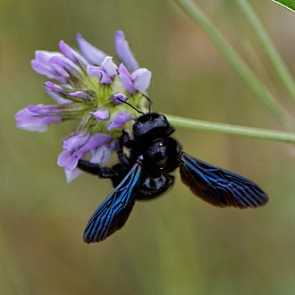
The violet carpenter bee ( Xylocopa violacea) is one of the largest bees in Europe.
-
The violet-backed starling is found in Sub-Saharan Africa.
-
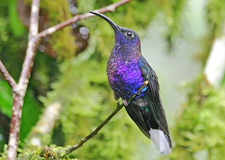
The violet sabrewing is found in Central America.
-
The imperial amazon parrot is featured on the national flag of Dominica, making it the only national flag in the world with a violet color.
-
-
Crocus flowers.
-
Lilac flowers
-
Pansy flowers.
-
Sweet violet flowers.
-
-
-
Wisteria blooms are a light violet color.
-
An eggplant.
Violet is one of the oldest colors used by humans. Traces of very dark violet, made by grinding the mineral manganese, mixed with water or animal fat and then brushed on the cave wall or applied with the fingers, are found in the prehistoric cave art in Pech Merle, in France, dating back about 25,000 years. It has also been found in the cave of Altamira and Lascaux. [26] It was sometimes used as an alternative to black charcoal. Sticks of manganese, used for drawing, have been found at sites occupied by Neanderthals in France and Israel. From the grinding tools at various sites, it appears it may also have been used to color the body and to decorate animal skins.
More recently, the earliest dates on cave paintings have been pushed back farther than 35,000 years. Hand paintings on rock walls in Australia may be even older, dating back as far as 50,000 years.
Berries of the genus rubus, such as blackberries, were a common source of dyes in antiquity. The ancient Egyptians made a kind of violet dye by combining the juice of the mulberry with crushed green grapes. The Roman historian Pliny the Elder reported that the Gauls used a violet dye made from bilberry to color the clothing of slaves. These dyes made a satisfactory purple, but it faded quickly in sunlight and when washed. [27]
Violet and purple retained their status as the color of emperors and princes of the church throughout the long rule of the Byzantine Empire.
While violet was worn less frequently by Medieval and Renaissance kings and princes, it was worn by the professors of many of Europe's new universities. Their robes were modeled after those of the clergy, and they often wore square violet caps and violet robes, or black robes with violet trim.
Violet also played an important part in the religious paintings of the Renaissance. Angels and the Virgin Mary were often portrayed wearing violet robes. The 15th-century Florentine painter Cennino Cennini advised artists: "If you want to make a lovely violet colour, take fine lacca, ultramarine blue (the same amount of the one as of the other)..." For fresco painters, he advised a less-expensive version, made of a mixture of blue indigo and red hematite. [28]
-
The Wilton Diptych (1395), painted for King Richard II.
-
A violet-clad angel from the Resurrection of Christ by Raphael (1483–1520).
In the 18th century, purple was a color worn by royalty, aristocrats and other wealthy people. Good-quality purple fabric was too expensive for ordinary people.
The first cobalt violet, the intensely red-violet cobalt arsenate, was highly toxic. Although it persisted in some paint lines into the 20th century, it was displaced by less toxic cobalt compounds such as cobalt phosphate. Cobalt violet appeared in the second half of the 19th century, broadening the palette of artists with its range of purple colors. Cobalt violet was used by Paul Signac (1863–1935), Claude Monet (1840–1926) and Georges Seurat (1859–1891). [29] Today, cobalt ammonium phosphate, cobalt lithium phosphate and cobalt phosphate are available for use by artists. Cobalt ammonium phosphate is the most reddish of the three. Cobalt phosphate is available in two varieties — a deep less saturated blueish type and a lighter and brighter somewhat more reddish type. Cobalt lithium phosphate is a saturated lighter-valued bluish violet. A color similar to cobalt ammonium phosphate, cobalt magnesium borate, was introduced in the later 20th century but was not deemed sufficiently lightfast for artistic use. Cobalt violet is the only truly lightfast purple pigment with relatively strong color saturation. All other light-stable purple pigments are dull by comparison. The high price of the pigment and the toxicity of cobalt have limited its use.
In the 1860s, the popularity of using violet colors suddenly rose among painters and other artists. [7] For example, Vincent van Gogh (1853–1890) was an avid student of color theory. He used violet in many of his paintings of the 1880s, including his paintings of irises and the swirling and mysterious skies of his starry night paintings, and often combined it with its complementary color, yellow. In his painting of his bedroom in Arles (1888), he used several sets of complementary colors; violet and yellow, red and green and orange and blue. In a letter about the painting to his brother Theo, he wrote, "The color here...should be suggestive of sleep and repose in general....The walls are a pale violet. The floor is of red tiles. The wood of the bed and the chairs are fresh butter yellow, the sheet and the pillows light lemon green. The bedspread bright scarlet. The window green. The bed table orange. The bowl blue. The doors lilac....The painting should rest the head or the imagination." [30]
In 1856, a young British chemist named William Henry Perkin was trying to make a synthetic quinine. His experiments produced instead an unexpected residue, which turned out to be the first synthetic aniline dye, a deep purple [7] color called mauveine, or abbreviated simply to mauve (the dye being named after the lighter color of the mallow [mauve] flower). Used to dye clothes, it became extremely fashionable among the nobility and upper classes in Europe, particularly after Queen Victoria wore a silk gown dyed with mauveine to the Royal Exhibition of 1862. Prior to Perkin's discovery, mauve was a color which only the aristocracy and rich could afford to wear. Perkin developed an industrial process, built a factory, and produced the dye by the ton so almost anyone could wear mauve. It was the first of a series of modern industrial dyes which completely transformed both the chemical industry and fashion. [31]
-
Charles de Bourbon, the future King Carlos III of Spain (1725).
-
In England, pre-Raphaelite painters like Arthur Hughes were particularly enchanted by purple and violet. This is April Love (1856).
-
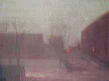
Nocturne: Trafalgar Square Chelsea Snow (1876) by James McNeill Whistler, used violet to create a wintery mood.
-
Violet or purple neckties became popular at the end of the first decade of the 21st century, particularly among political and business leaders.[ citation needed]
In a European survey, three percent of respondents said violet is their favorite color, ranking it behind blue, green, red, black and yellow (in that order), and tied with orange. Ten percent called it their least favorite color; brown, pink and gray were more unpopular. [14]
Because of its status as the color of Roman emperors, monarchs and princes, purple and violet are often associated with luxury. Certain luxury goods, such as watches and jewelry, are often placed in boxes lined with violet velvet, since violet is the complementary color of yellow and shows gold to best advantage.
While violet is the color of humility in the symbolism of the Catholic Church, it has exactly the opposite meaning in general society. A European poll in 2000 showed it was the color most commonly associated with vanity. [32] As a color that rarely exists in nature and so attracts attention, it is seen as a color of individualism and extravagance.
In Japan, violet was a popular color introduced into dress during the Heian period (794–1185). The dye was made from the root of the alkanet plant ( Anchusa officinalis), known as murasaki in Japanese. At about the same time, Japanese painters began to use a pigment made from the same plant. [33]
The " New Age Prophetess", Alice Bailey, in her system called the Seven Rays which classifies humans into seven different metaphysical psychological types, the "seventh ray" of "Ceremonial Order" is represented by the color violet. People who have this metaphysical psychological type are said to be "on the Violet Ray". [34]
In the Ascended Master Teachings, the color violet is used to represent the Ascended Master St. Germain. [35]
The Invocation of the Violet Flame is a system of meditation practice used in the "I AM" Activity and by the Church Universal and Triumphant (both Ascended Master Teaching religions).
In the Roman Catholic church, violet is worn by bishops and archbishops, red by cardinals and white by the Pope. Ordinary priests wear black. As in many other Western churches, violet is the liturgical color of Advent and Lent, which respectively celebrate the expectant waiting and preparation for the celebration of the Crucifixion of Jesus and the time for penance and/or mourning.
A stained glass window installed in the early 1920s in the Cathedral of Our Lady of the Angels in Los Angeles depicts God the Father wearing a violet robe. [36]
After the Vatican II Council, which modified many of the rules of the Catholic church, priests began to wear violet robes when celebrating masses for the dead. Black was no longer used, since it was the color of mourning outside the church and deemed inappropriate in a religious ceremony. [37]
In Hinduism, violet is used to symbolically represent the seventh, crown chakra ( Sahasrara). [38]
In the early 20th century, violet, white and gold were the colors of the women's suffrage movement in the United States, seeking the right to vote for women. The colors were said to represent liberty and dignity. [39] [40] For this reason, the postage stamp issued in 1936 to honor Susan B. Anthony, a prominent leader of the suffrage movement in the United States, was colored the reddish tone of violet sometimes known as red-violet.
In 1908, Emmeline Pethick-Lawrence, co-editor of the Women's Social and Political Union (WSPU) newspaper, designed the color scheme for the suffragette movement in Britain and Ireland, with violet for loyalty and dignity, white for purity and green for hope. [41] [42] [43]
The pan-European movement Volt Europa and its national subsidiary parties use violet in their uniforms. [44]
A small New Age political party in Germany with about 1,150 members is called The Violet Party. It believes in direct democracy, a guaranteed minimum income and politics based on spirituality. It was founded in Dortmund in 2001. [45]
Violet flowers and their color became symbolically associated with lesbian love. [46] It was used as a special code by lesbians and bisexual women for self-identification and also to communicate support for the sexual preference. [47] [48] This connection originates from the poet Sappho and fragments of her poems. In one poem, she describes a lost love wearing a garland of "violet tiaras, braided rosebuds, dill and crocus twined around" her neck. [49] In another fragment, she recalls her lover as having "put around yourself [many wreaths] of violets and roses." [50] [51]
The labrys lesbian flag, created in 1999 by graphic designer Sean Campbell, [52] [53] features a labrys superimposed on the inverted black triangle set against a violet background. [54] [55]
![]() Media related to
Purple flags at Wikimedia Commons
Media related to
Purple flags at Wikimedia Commons
-
The flag of Dominica features a sisserou parrot, a national symbol.
-
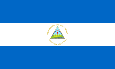
Flag of Nicaragua, although at this size the individual bands of the rainbow are nearly indistinguishable.
-
The flag of the suffragettes (United Kingdom). Purple represents loyalty and dignity, white purity and green hope.
-
Wiphala emblem. Official variant flag of Bolivia since 2009
- ^ Çelik, Tantek; Lilley, Chris, eds. (18 January 2022). "CSS Color Module Level 3". W3C. w3.org. Retrieved 10 September 2022.
- ^ Georgia State University Department of Physics and Astronomy. "Spectral Colors". HyperPhysics site. Retrieved 20 October 2017.
- ^ a b "violet, n.1". OED Online. Oxford University Press. Retrieved 6 April 2020.
- ^ a b "Violet". Webster's Third New International Dictionary, Unabridged. Retrieved 6 April 2020.
- ^ a b P. U.P. A Gilbert and Willy Haeberli (2008). Physics in the Arts. Academic Press. p. 112. ISBN 978-0-12-374150-9.
- ^ a b Louis Bevier Spinney (1911). A Text-book of Physics. Macmillan Co. p. 573.
- ^ a b c d e Tager, A.; Kirchner, E.; Fedorovskaya, E. (2021). "Computational evidence of first extensive usage of violet in the 1860s". Color Research & Application. 46 (5): 961–977. doi: 10.1002/col.22638. S2CID 233671776.
- ^ a b Fehrman, K.R.; Fehrman, C. (2004). Color - the secret influence. Upper Saddle River: Pearson Education.
- ^ a b Matschi, M. (2005). "Color terms in English: Onomasiological and Semasiological aspects" (PDF). Onomasiology Online. 5: 56–139. Archived (PDF) from the original on 9 October 2022.
- ^ Dunn, Casey (9 October 2013). "The Color of Royalty, Bestowed by Science and Snails". The New York Times. ISSN 0362-4331. Retrieved 4 April 2020.
- ^ Elliot, Charlene (Winter 2008). "Purple pasts: Color codification in the ancient world". Law and Social Inquiry. 33 (1): 173–194. doi: 10.1111/j.1747-4469.2008.00097.x. S2CID 145236881. Retrieved 26 June 2021.
- ^ Varichon, Anne Colors:What They Mean and How to Make Them New York:2006 Abrams Page 138
- ^ "Meanings of Purple/Violet - Color Wheel Artists". www.color-wheel-artist.com. Archived from the original on 8 May 2017. Retrieved 15 January 2022.
- ^ a b Eva Heller, Psychologie de la couleur: effets et symboliques. p. 4. "La plus individualist et extravagant des coulours." (associated by 26 percent of respondents to survey with "extravagance", by 22 percent with "individualism", 24 percent with "vanity", 21 percent with "ambiguity").
- ^ Maerz and Paul A Dictionary of Color New York: 1930 McGraw-Hill Page 207
- ^ J. W. G. Hunt (1980). Measuring Color. Ellis Horwood Ltd. ISBN 0-7458-0125-0.
- ^ Georgia State University Department of Physics and Astronomy. "Spectral Colors". HyperPhysics site. Retrieved 20 October 2017.
- ^ "violet, n.1". OED Online. Oxford University Press. Retrieved 6 April 2020.
- ^ "Violet". Webster's Third New International Dictionary, Unabridged. Retrieved 6 April 2020.
- ^ Parkhurst, Charles; Feller, Robert L. (15 March 2007). "Who invented the color wheel?". Color Research & Application. 7 (3): 217–230. doi: 10.1002/col.5080070302.
- ^ Machado, G.M.; Oliveira, M.M.; Fernandes, L. (November 2009), "A Physiologically-based Model for Simulation of Color Vision Deficiency", IEEE Transactions on Visualization and Computer Graphics, 15 (6), Institute of Electrical and Electronics Engineers (IEEE): 1291–1298, doi: 10.1109/TVCG.2009.113, hdl: 10183/27630, ISSN 1077-2626, PMID 19834201, S2CID 6200253 Figure 2 shows S-cones contributing +0.40 to the "r − g" opponent channel.
- ^ a b Anne Carichon (2000), Couleurs: pigments et teintures dans les mains des peuples. p. 133
- ^ Anne Carichon (2000), Couleurs: pigments et teintures dans les mains des peuples. p. 144
- ^ Hubner K (2006). "History – 150 Years of mauveine". Chemie in unserer Zeit. 40 (4): 274–275. doi: 10.1002/ciuz.200690054.
- ^ Anthony S. Travis (1990). "Perkin's Mauve: Ancestor of the Organic Chemical Industry". Technology and Culture. 31 (1): 51–82. doi: 10.2307/3105760. JSTOR 3105760. S2CID 112031120.
- ^ Phillip Ball (2001), Bright earth- Art and the Invention of Colour, p. 84
- ^ Anne Varichon (2000), Couleurs: pigments et teintures dans les mains des peuples, p. 146–148
- ^ Lara Broecke, Cennino cennini's Il Libro dell'Arte: a New English Translation and Commentary with Italian Transcription, Archetype 2015, p. 115
- ^ Isabel Roelofs (2012), La couleur expliquée aux artistes, p. 52–53
- ^ John Gage (2006), La Couleur dans l'art, p. 50–51. Citing Letter 554 from Van Gogh to Theo. (translation of excerpt by D.R. Siefkin)
- ^ Garfield, S. (2000). Mauve: How One Man Invented a Colour That Changed the World. Faber and Faber, London, UK. ISBN 978-0-571-20197-6.
- ^ Eva Heller, Psychologie de la couleur: effets et symboliques, p. 167
- ^ Anne Varichon, Couleurs: pigments et teintures dans les mains des peuples, p. 139
- ^ Bailey, Alice A. (1995). The Seven Rays of Life. New York: Lucis Publishing Company. ISBN 978-0-85330-142-4.
- ^ "St. Germain" ( dictated through Elizabeth Clare Prophet) Studies in Alchemy: the Science of Self-Transformation 1974:Colorado Springs, Colorado, USA Summit Lighthouse Pages 80–90 [Occult] Biographical sketch of St. Germain
- ^ Stained glass window in the Cathedral of the Angels in Los Angeles, California depicting God the Father wearing a purple/violet robe:
- ^ Eva Heller, Psychologie de la couleur: effets et symboliques. p. 166
- ^ Stevens, Samantha. The Seven Rays: a Universal Guide to the Archangels. City: Insomniac Press, 2004. ISBN 1-894663-49-7 p. 24
- ^ LaCroix, Allison (26 October 2015). "The National Woman's Party And the Meaning Behind Their Purple, White, and Gold Textiles". National Woman's Party. Belmont-Paul Women's Equality National Monument. Archived from the original on 9 November 2016. Retrieved 30 July 2018.
- ^ Eva Heller, Psychologie de la couleur: effets et symboliques. illustration 75
- ^ "Dress & the Suffragettes". Chertsey Museum. Retrieved 1 September 2021.
- ^ Blackman, Cally (8 October 2015). "How the Suffragettes used fashion to further the cause". The Guardian. Retrieved 1 September 2021.
- ^ "WSPU Flag". Parliament of the United Kingdom. Retrieved 1 September 2021.
- ^ "The Pan-European Political Movement". Volt Europa. Retrieved 5 August 2022.
- ^ "Die Violetten - Neue Ideen in der Politik". Die Violetten.
- ^ "Gay Symbols Through the Ages". The Alyson Almanac: A Treasury of Information for the Gay and Lesbian Community. Boston, Massachusetts: Alyson Publications. 1989. p. 100. ISBN 0-932870-19-8.
- ^ Myers, JoAnne (2003). Historical Dictionary of the Lesbian Liberation Movement: Still the Rage (1st ed.). Lanham, Maryland: The Scarecrow Press. p. 242. ISBN 978-0810845060. LCCN 2002156624.
- ^ Horak, Laura (2016). "Lesbians Take Center Stage: The Captive (1926–1928)". Girls Will Be Boys: Cross-Dressed Women, Lesbians, and American Cinema, 1908-1934. Rutgers University Press. pp. 143–144. ISBN 978-0-8135-7483-7.
- ^ Barnard, Mary (1958). Sappho: A New Translation (1st ed.). University of California Press. p. 42. ISBN 9780520223127. LCCN 58006520.
- ^ Collecott, Diana (1999). H.D. and Sapphic Modernism 1910–1950 (1st ed.). Cambridge, UK: Cambridge University Press. p. 216. ISBN 978-0-521-55078-9.
- ^ Fantham, Elaine; Foley, Helene Peet; Kampen, Natalie Boymel; Pomeroy, Sarah B.; Shapiro, H. A. (1994). Women in the Classical World: Image and Text (1st ed.). New York: Oxford University Press. p. 15. ISBN 978-0-19-506727-9.
- ^ "Why don't lesbians have a pride flag of our own? - AfterEllen". 9 September 2015. Archived from the original on 9 September 2015. Retrieved 9 April 2023.
- ^ Brabaw, Kasandra. "A Complete Guide To All The LGBTQ+ Flags & What They Mean". www.refinery29.com. Retrieved 9 April 2023.
- ^ "Gay Symbols Through the Ages". The Alyson Almanac: A Treasury of Information for the Gay and Lesbian Community. Boston, Massachusetts: Alyson Publications. 1989. pp. 99–100. ISBN 0-932870-19-8.
- ^ Murphy, Timothy F., ed. (2000). Reader's Guide to Lesbian and Gay Studies (1st ed.). Chicago, Illinois: Fitzroy Dearborn Publishers. p. 44. ISBN 1-57958-142-0.
- Ball, Philip (2001). Bright Earth, Art and the Invention of Colour. Hazan (French translation). ISBN 978-2-7541-0503-3.
- Heller, Eva (2009). Psychologie de la couleur: Effets et symboliques. Pyramyd (French translation). ISBN 978-2-35017-156-2.
- Pastoureau, Michel (2005). Le petit livre des couleurs. Editions du Panama. ISBN 978-2-7578-0310-3.
- Gage, John (1993). Colour and Culture - Practice and Meaning from Antiquity to Abstraction. Thames and Hudson (Page numbers cited from French translation). ISBN 978-2-87811-295-5.
- Gage, John (2006). La Couleur dans l'art. Thames and Hudson. ISBN 978-2-87811-325-9.
- Varichon, Anne (2000). Couleurs: pigments et teintures dans les mains des peuples. Seuil. ISBN 978-2-02084697-4.
- Zuffi, Stefano (2012). Color in Art. Abrams. ISBN 978-1-4197-0111-5.
- Roelofs, Isabelle (2012). La couleur expliquée aux artistes. Groupe Eyrolles. ISBN 978-2-212-13486-5.
- Broecke, Lara (2015). Cennino Cennini's Il Libro dell'Arte: a New English Translation and Commentary with Italian Transcription. Archetype. ISBN 978-1-909492-28-8.
-
Media related to
Violet at Wikimedia Commons
| |
| Gamma rays | |
| X-rays | |
| Ultraviolet | |
| Visible (optical) | |
| Infrared | |
| Microwaves | |
| Radio | |
| Wavelength types | |
Color topics | ||||||||||
|---|---|---|---|---|---|---|---|---|---|---|
| Color science |
| | ||||||||
|
Color philosophy |
| |||||||||
| Color terms |
| |||||||||
| Color organizations | ||||||||||
| Names |
| |||||||||
| Related | ||||||||||